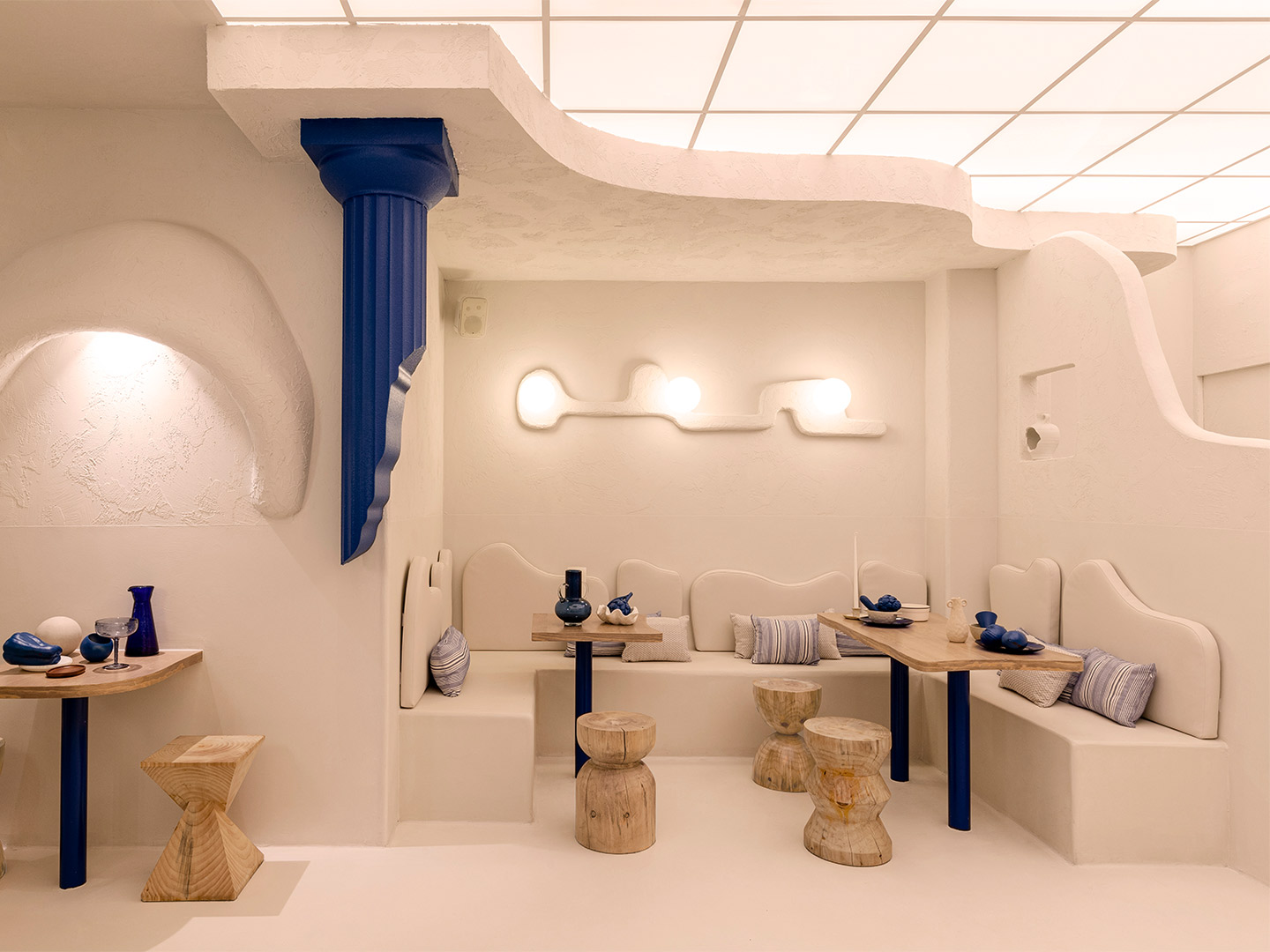
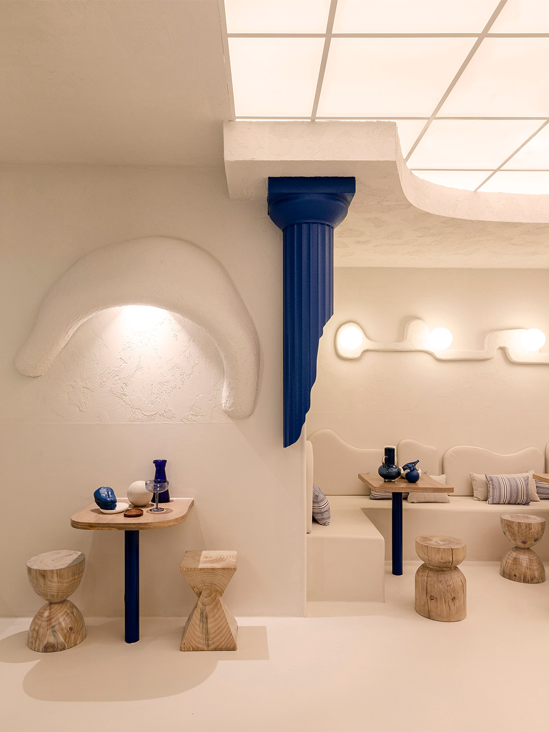
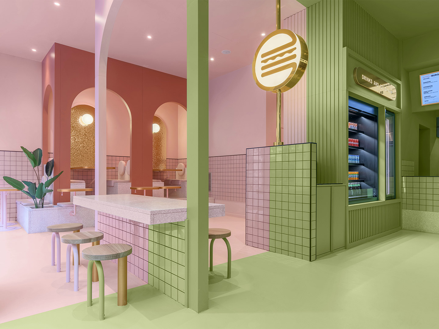
A mix of crumbling Doric columns, textured stucco walls and the national blue-and-white colour scheme ticks all the boxes for a typical Greece-inspired scheme. But for the latest establishment in the portfolio of restaurateur Thanasis Skopelitis, settling on the expected was simply not an option. Joined by her business colleague Ana Cañete, who is responsible for brand and product development, Thanasis made contact with Masquespacio, one of Spain’s most outside-the-box design offices. They briefed the designers to craft the look and feel of the first Egeo restaurant in Valencia, challenging them to remix classic Greek design tropes with the unconventional flair for which they are well known.
The move into Valencia marks the next step in Thanasis’ chain of Egeo souvlaki restaurants, building upon two already established venues in Madrid. Offering generous servings of skewer-grilled meat and vegetables, the Greek restaurants boast a strong following of food-loving locals whose loyalty is hoped to be replicated on Spain’s southeastern coast. “When Ana and Thanasis commented to us that they wanted to open an Egeo in Valencia, we were immediately excited about the idea,” enthuses Christophe Penasse, one of Masquespacio’s two founders.
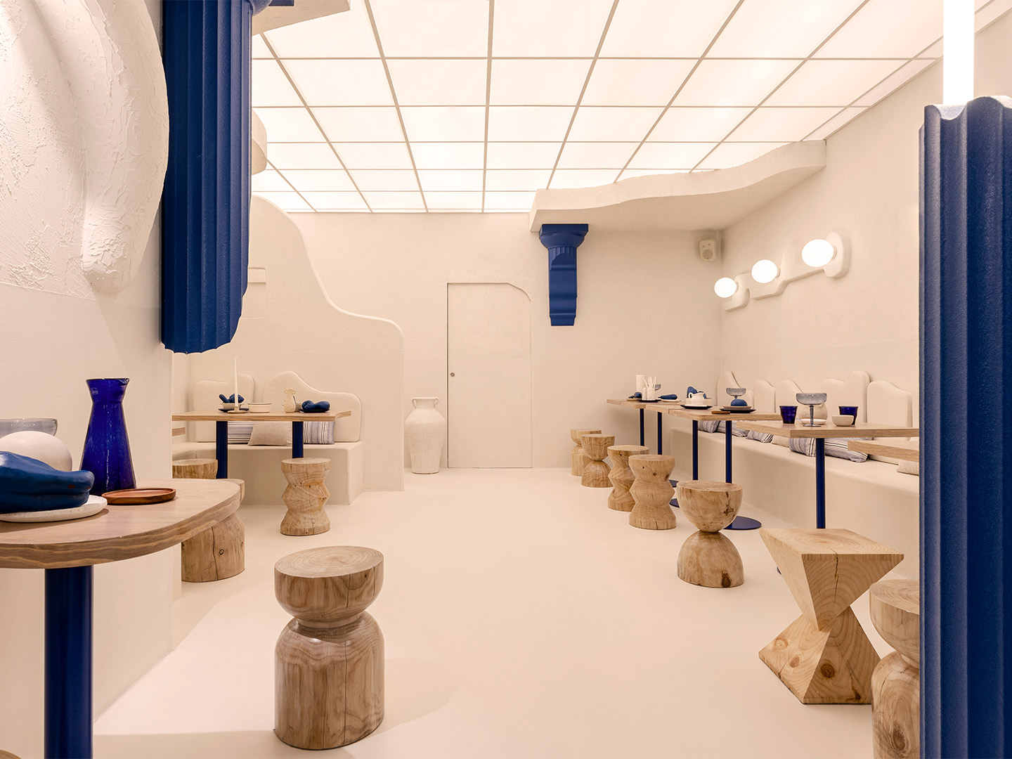
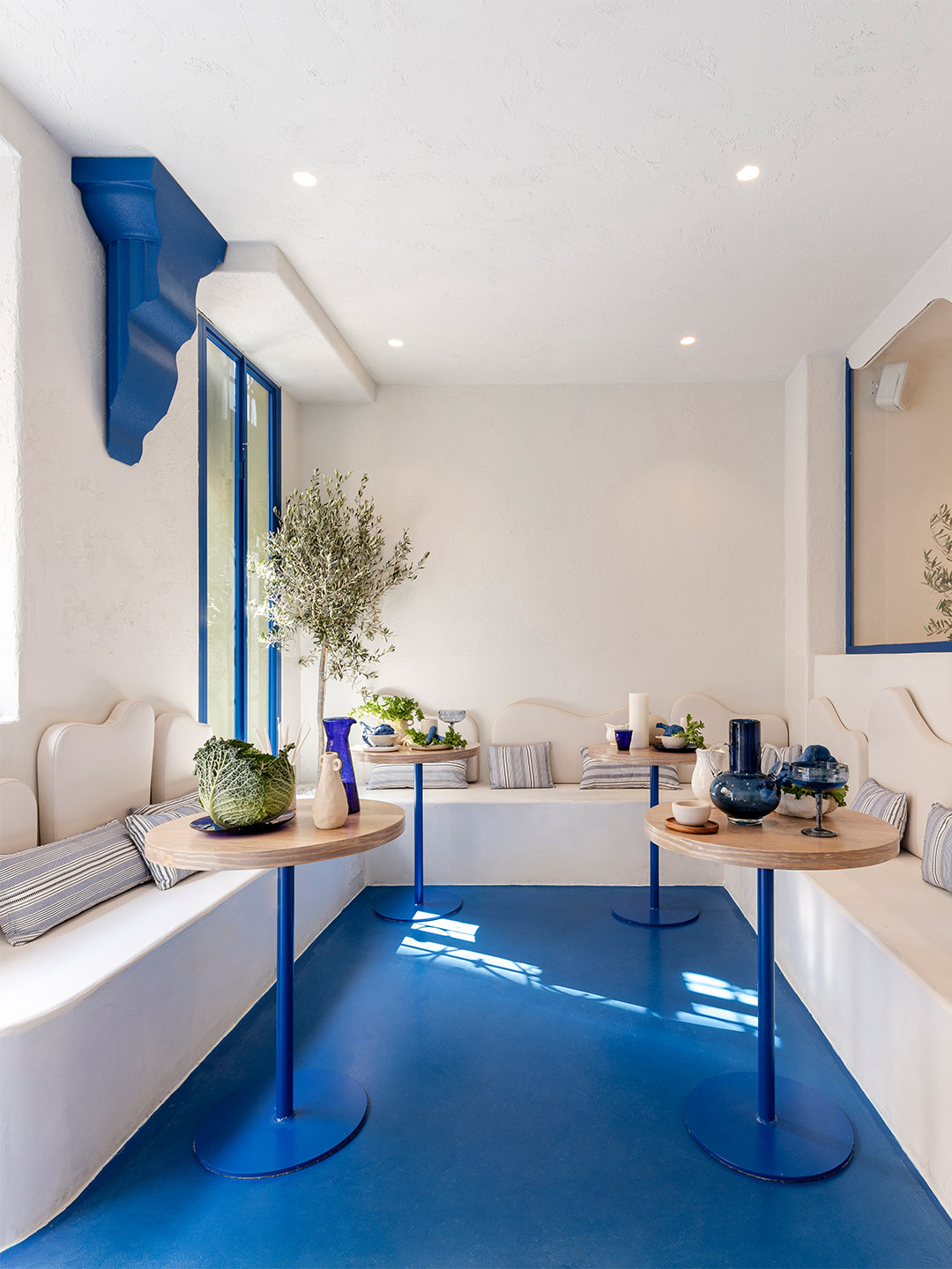
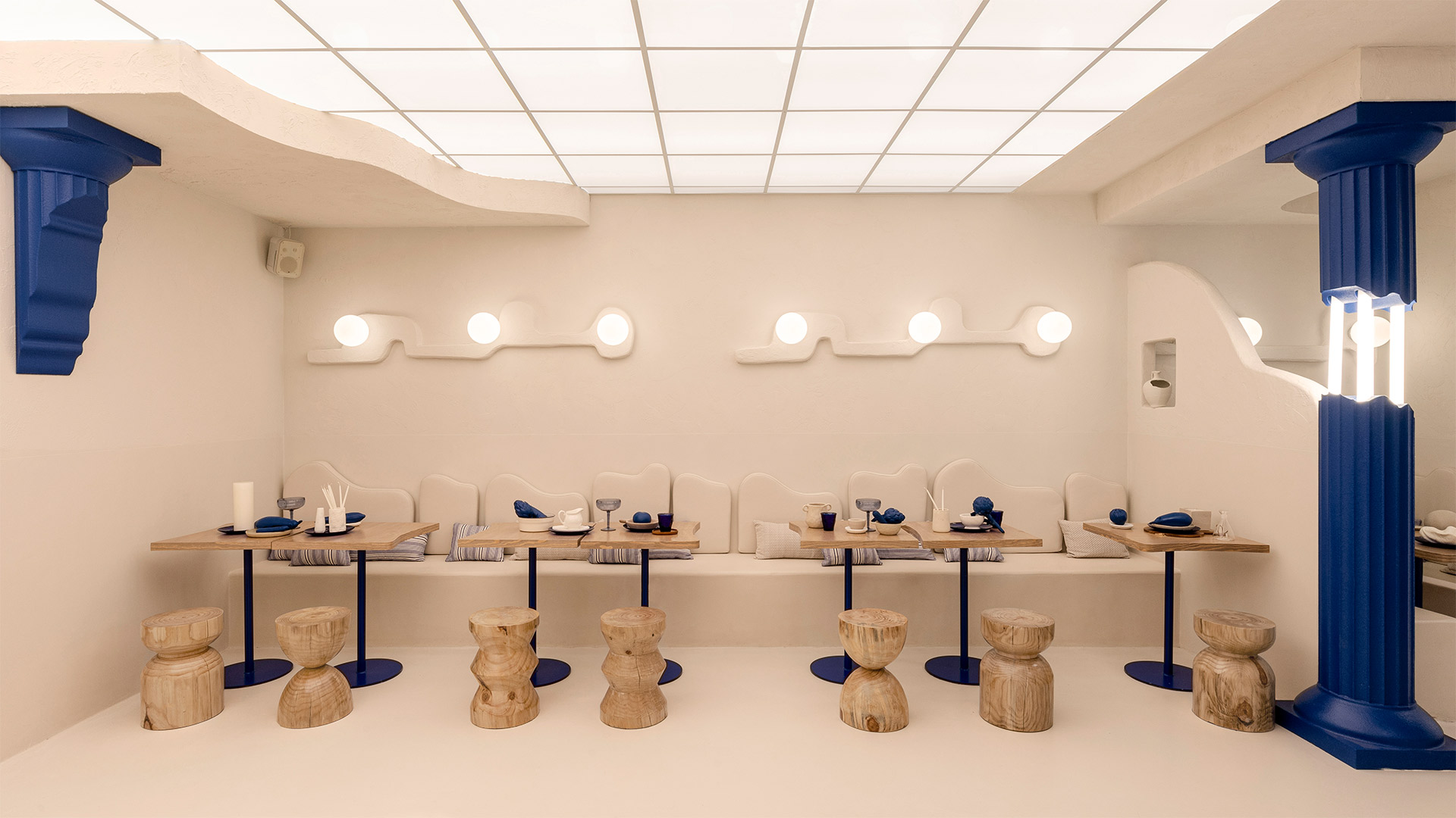
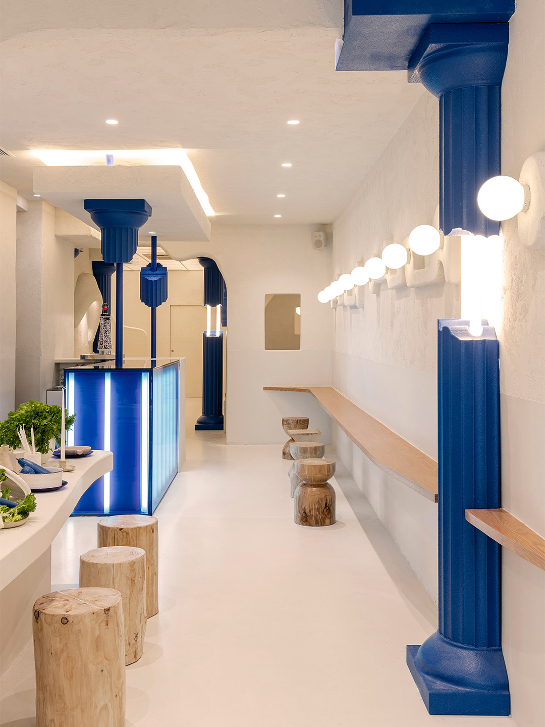
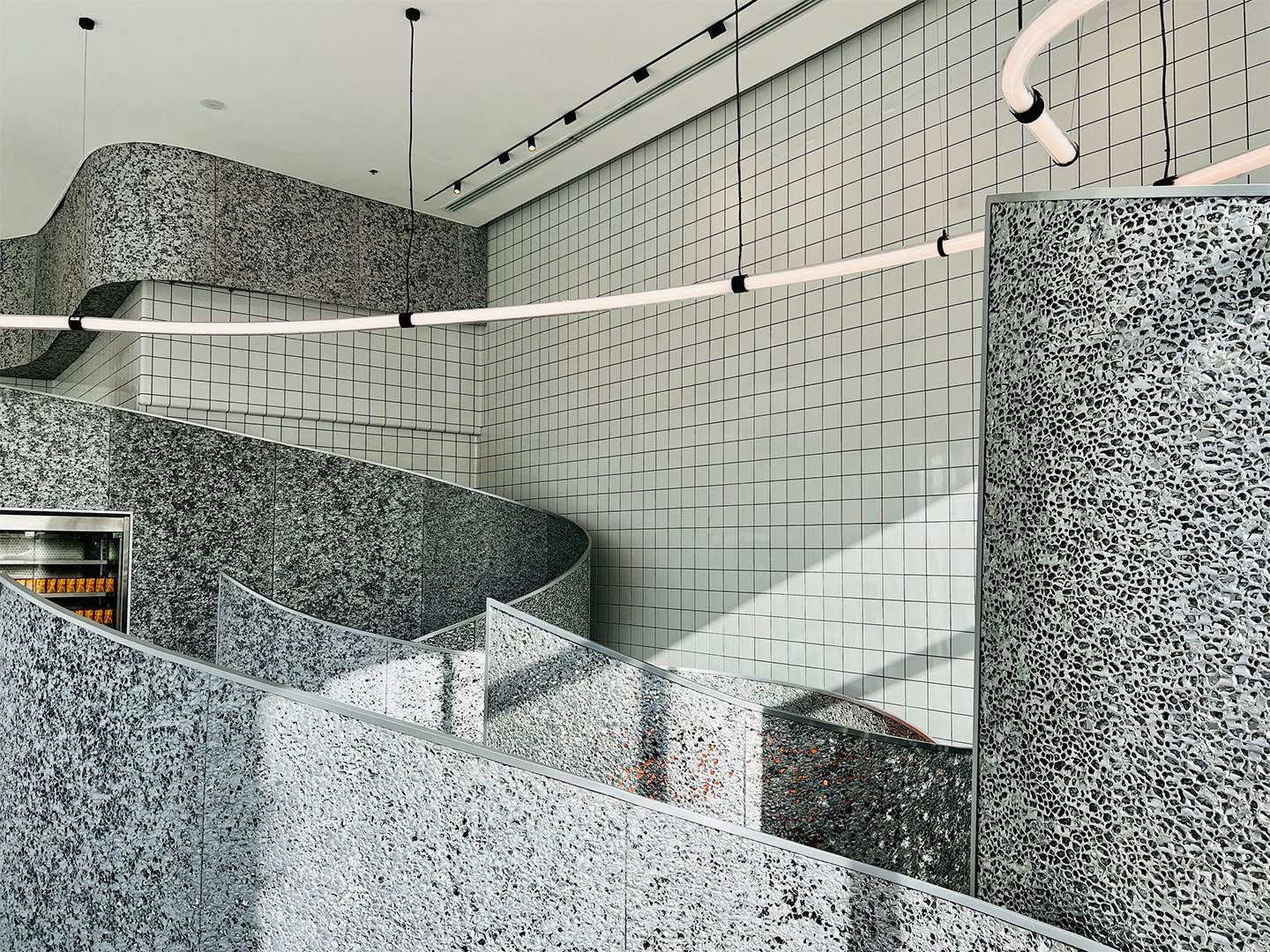
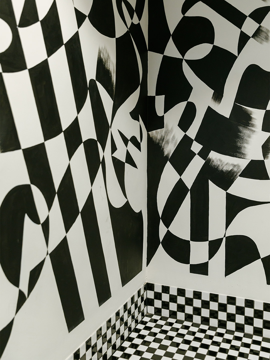
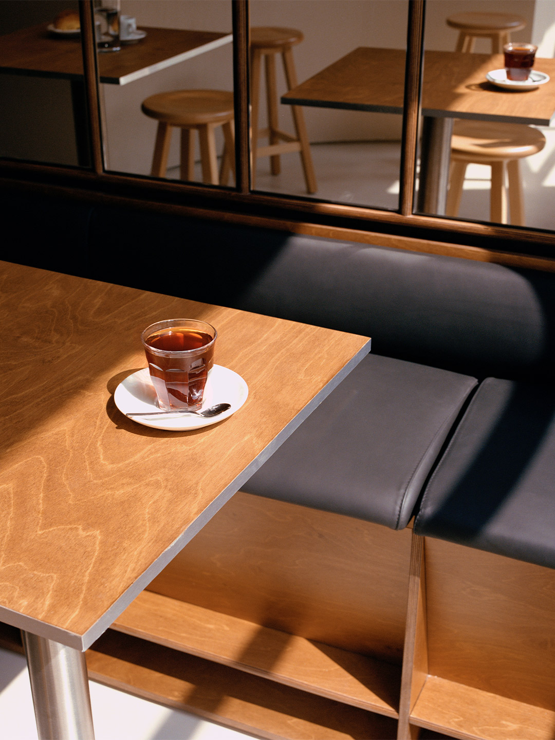
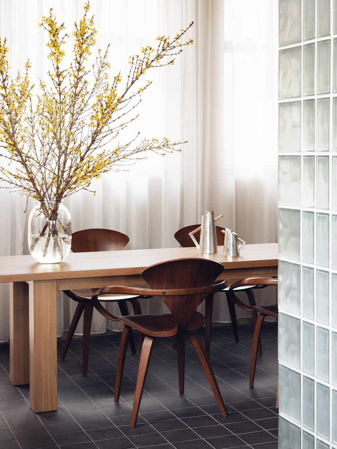
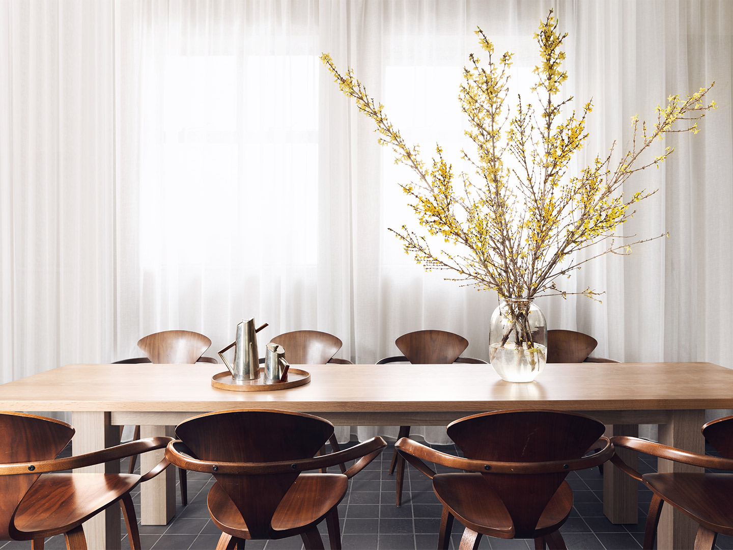
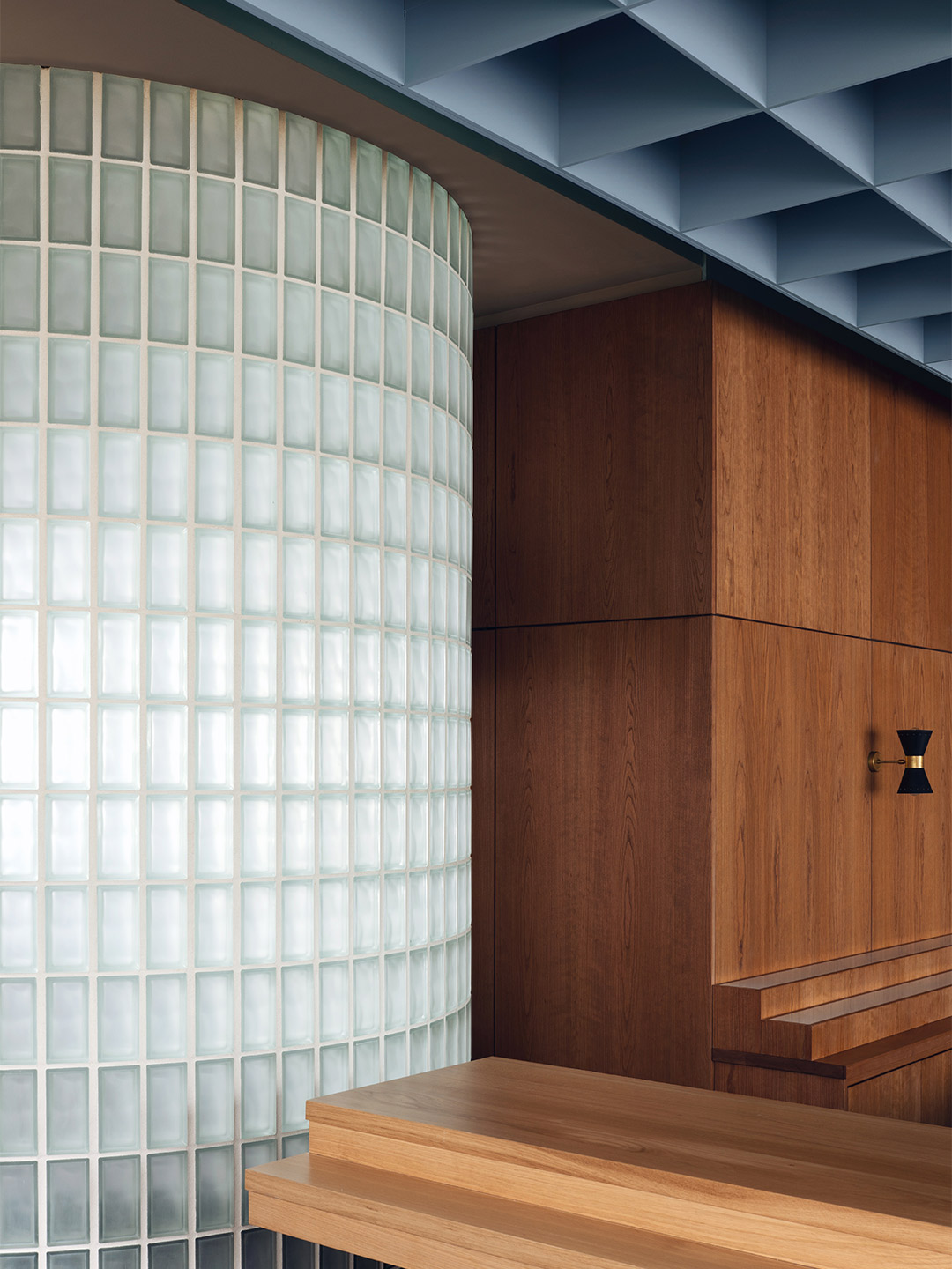
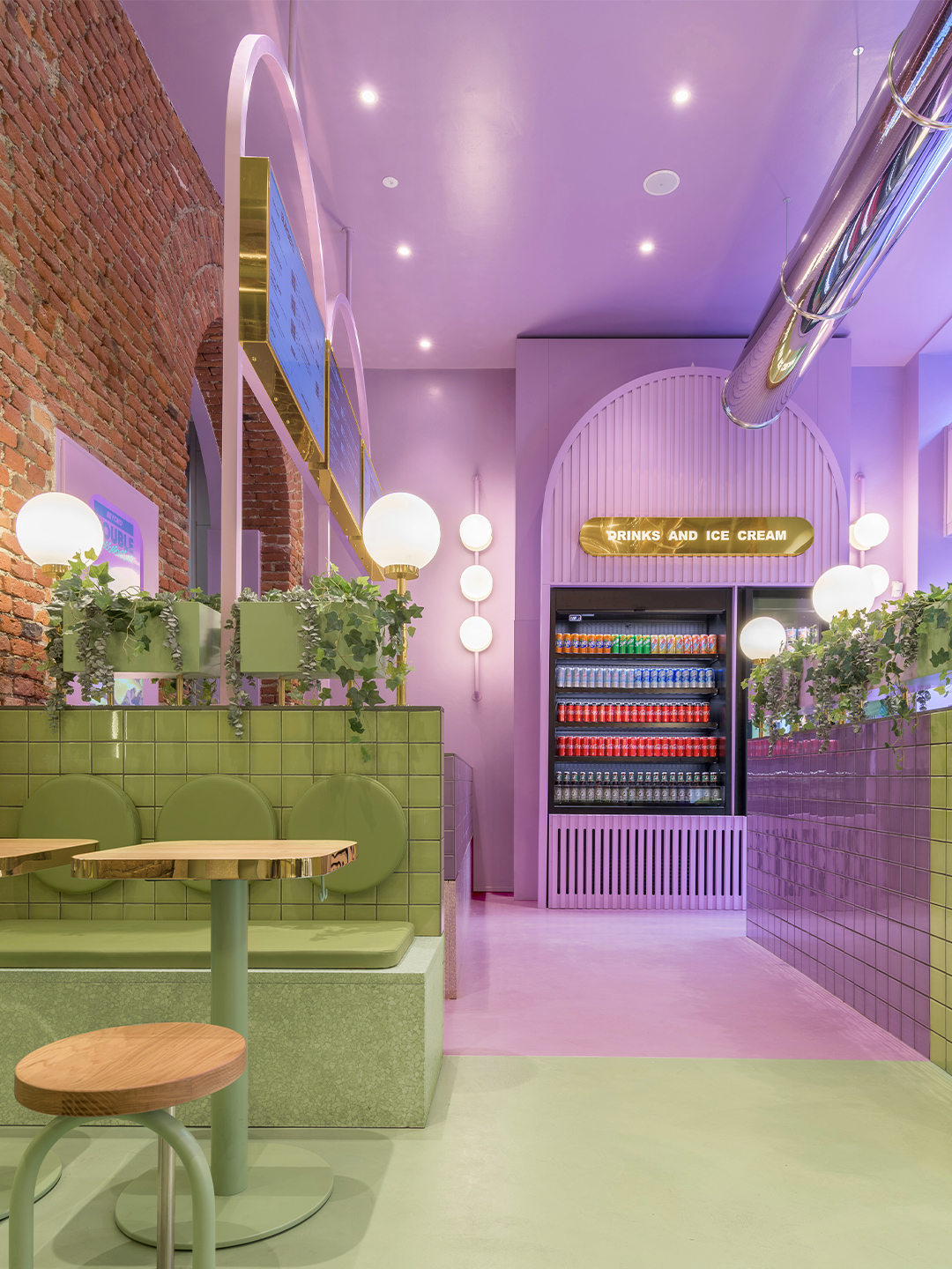
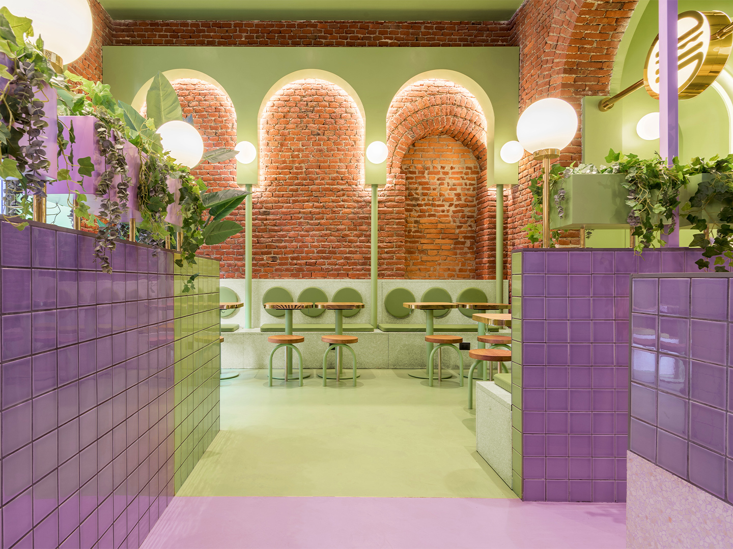
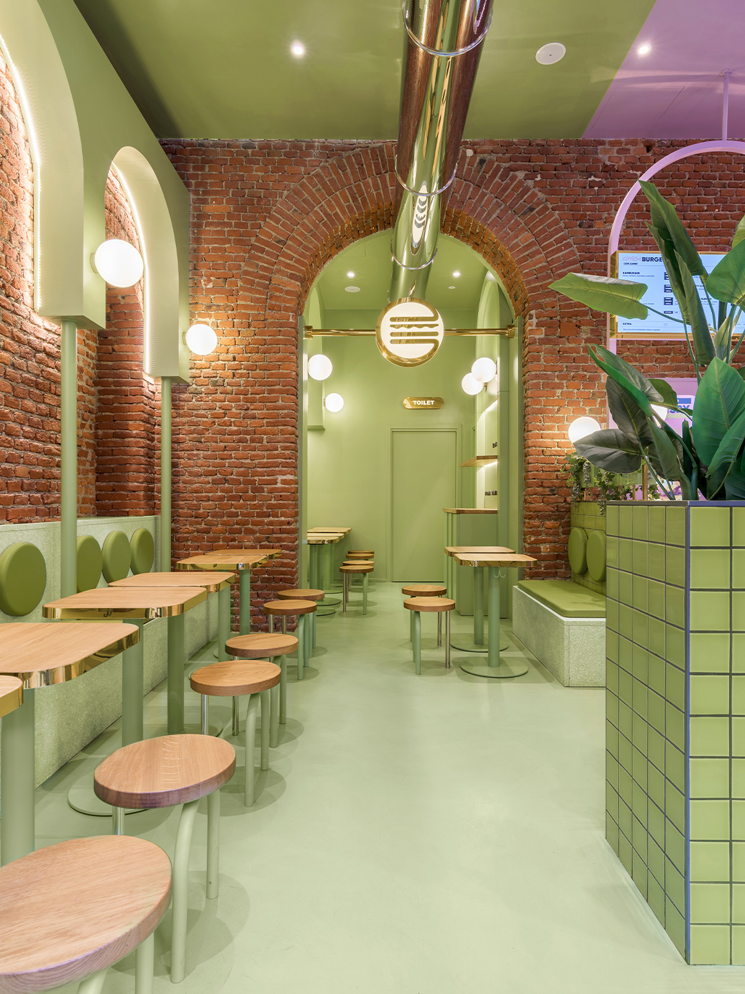
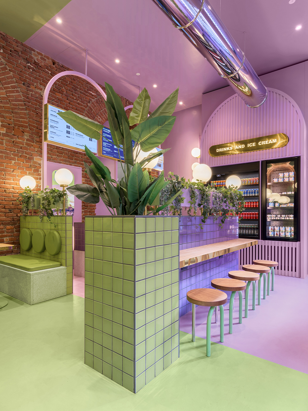
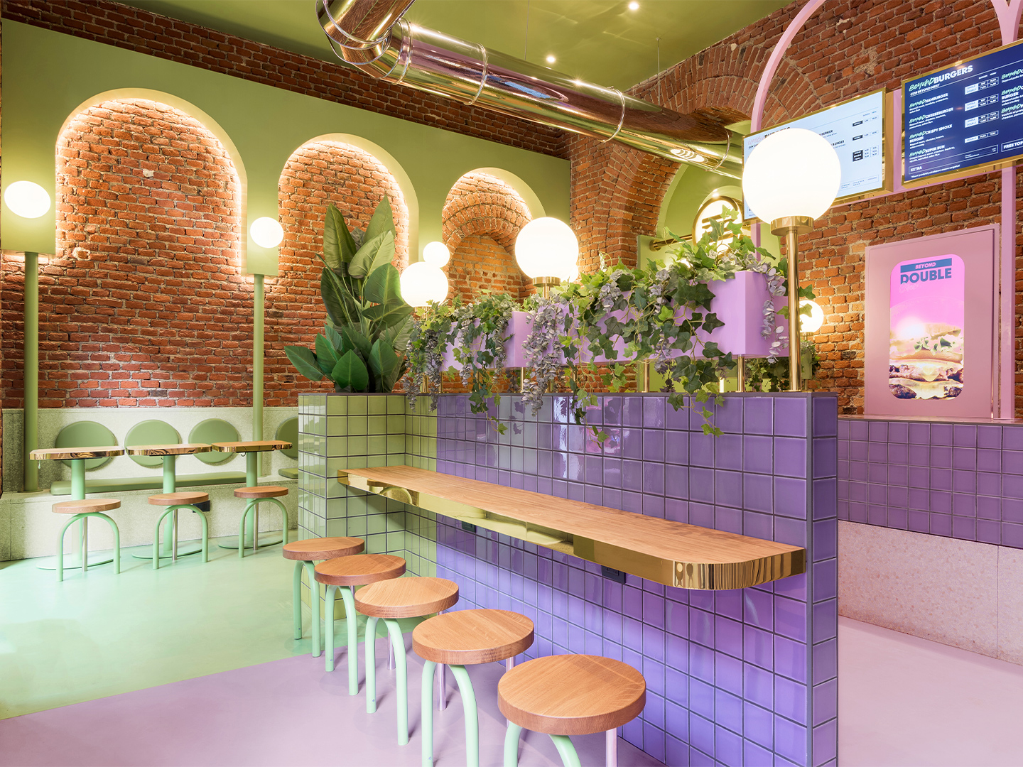
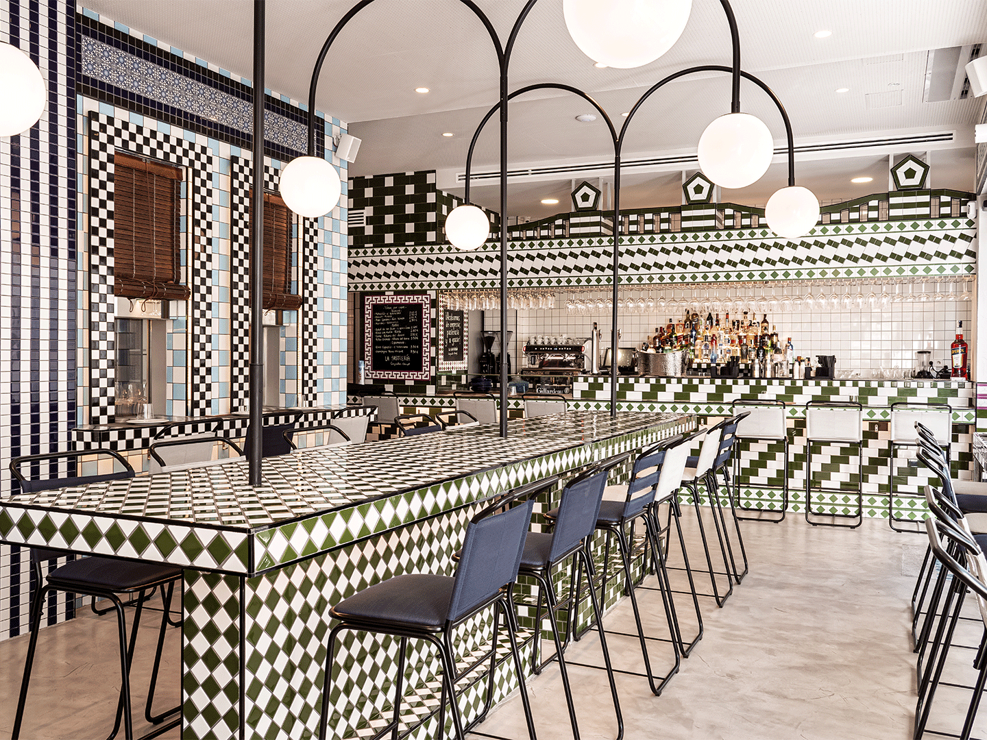
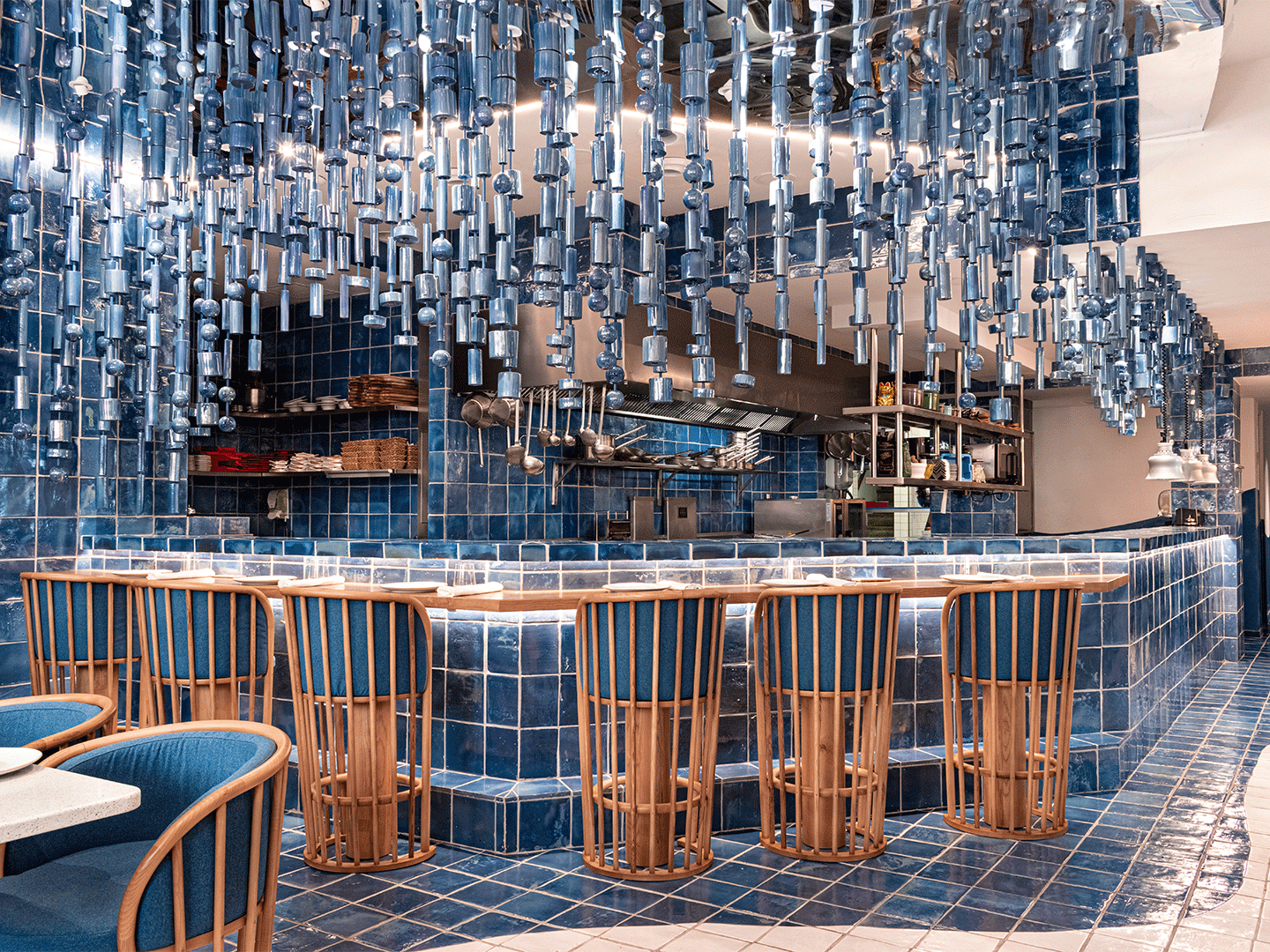
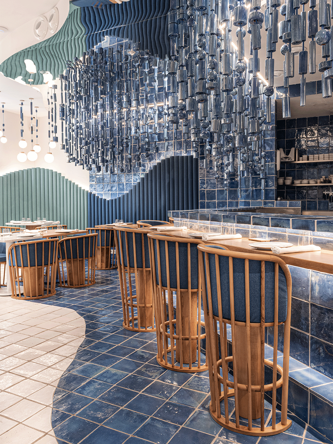
Egeo Greek restaurant in Valencia by Masquespacio
Having long felt a “special connection” with the history of Greek culture and cuisine, Christophe and his associate, Ana Milena Hernández, say that the opportunity to develop the new restaurant was something of a bucket-list item now struck from their agenda. “We have long been keen to develop a Greek restaurant,” admits Christophe, who says the biggest challenge the studio faced in designing the new restaurant was that the clients didn’t want “a huge change” from their first venues in Madrid. Rather, Thanasis and Ana were seeking something that could give continuity to Egeo’s pre-existing interior design identity.
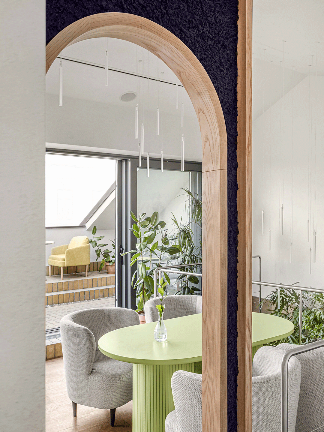
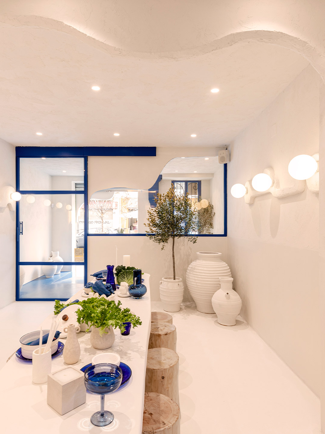
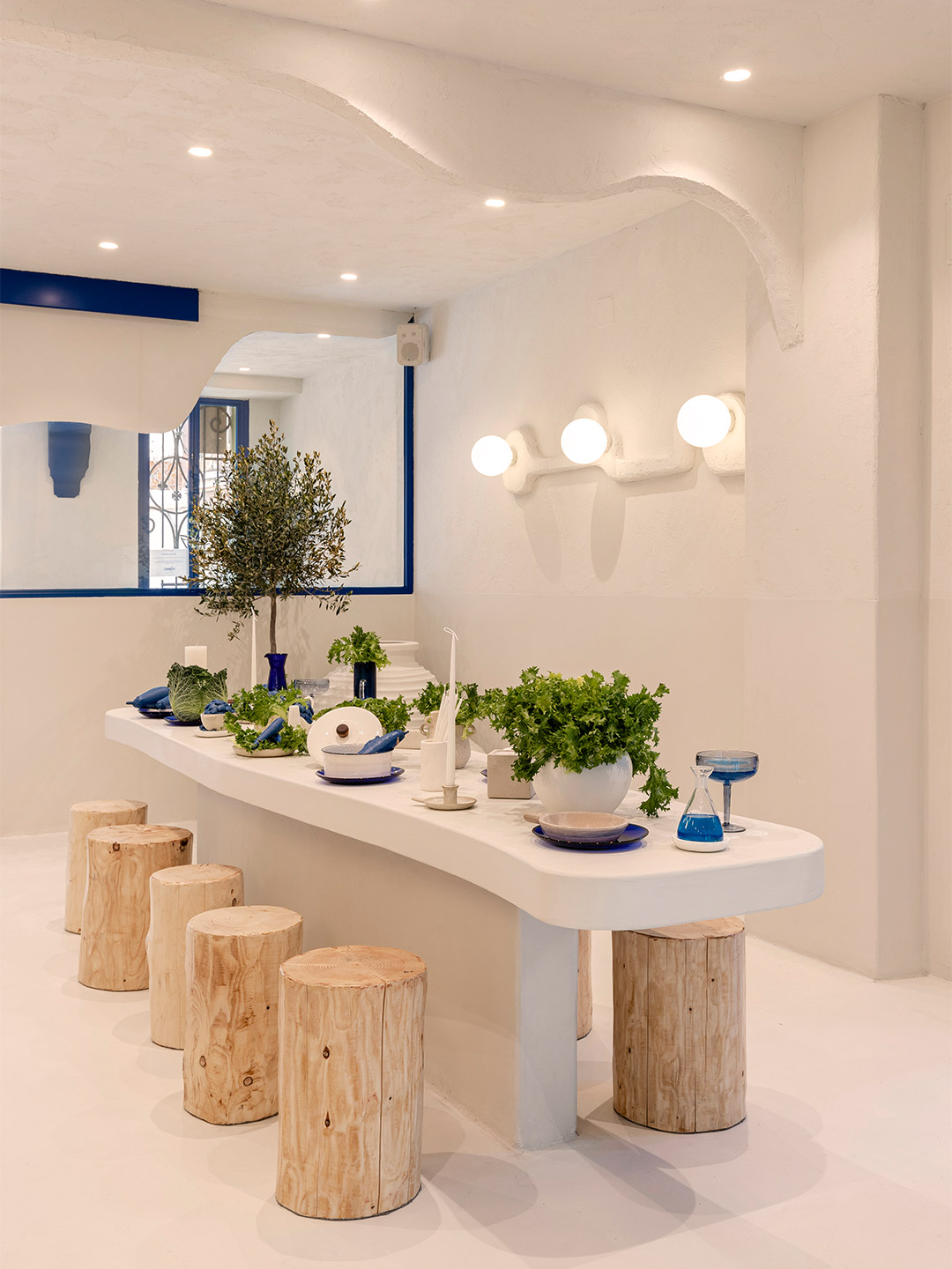
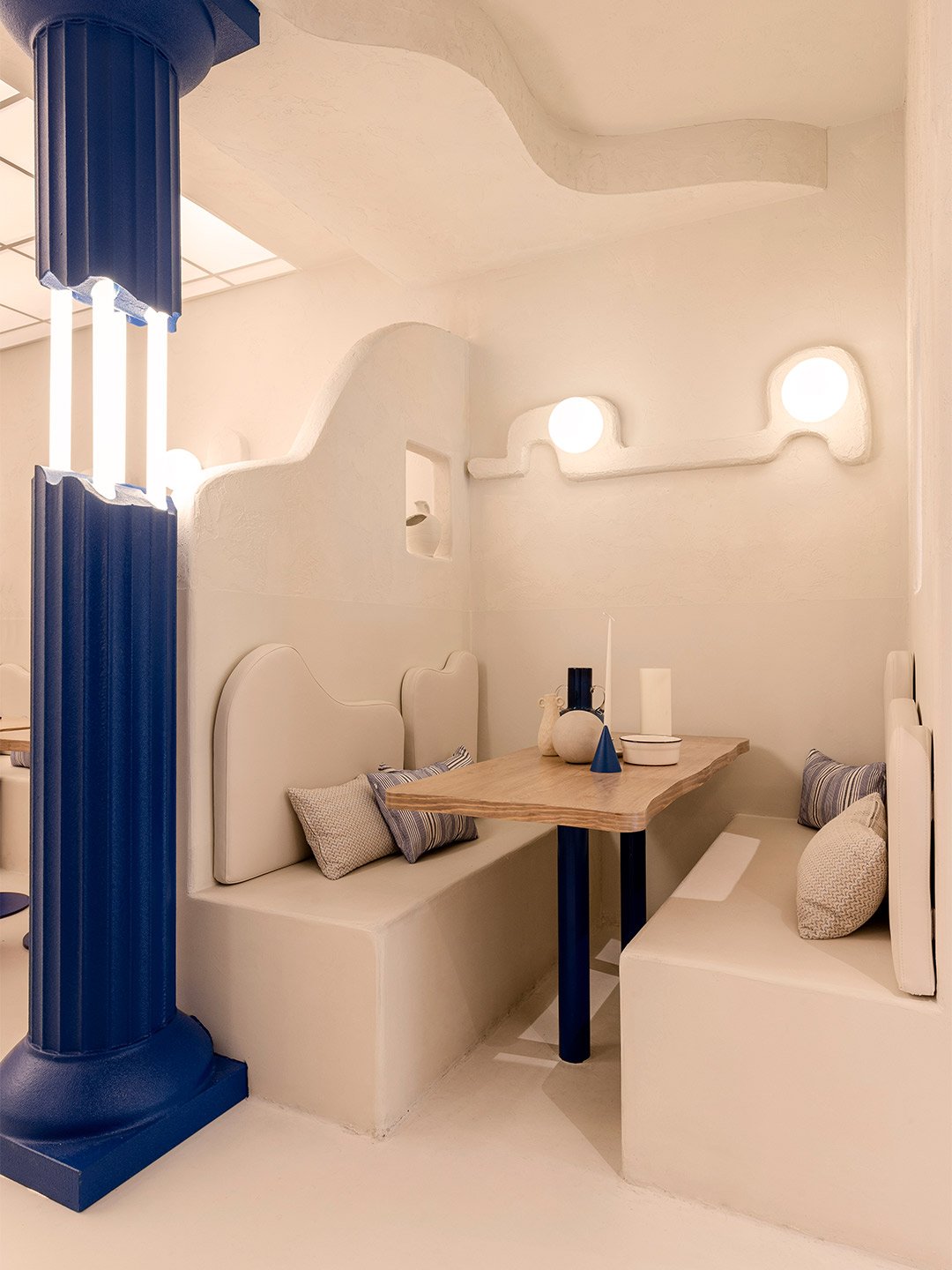
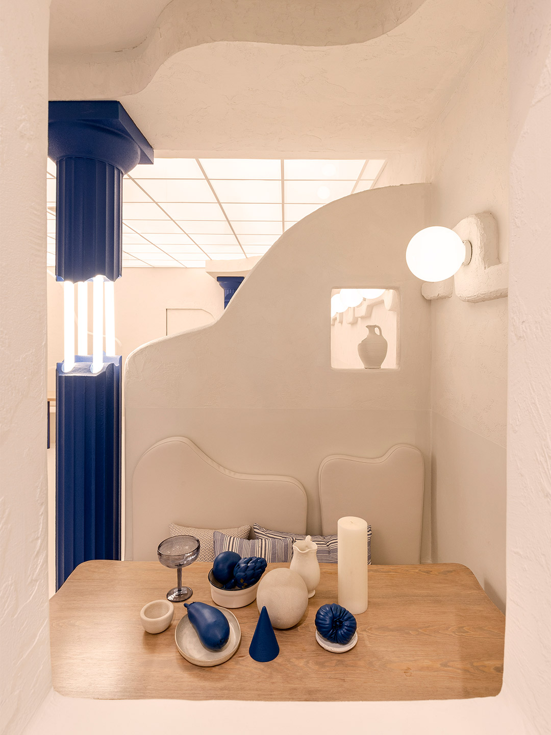
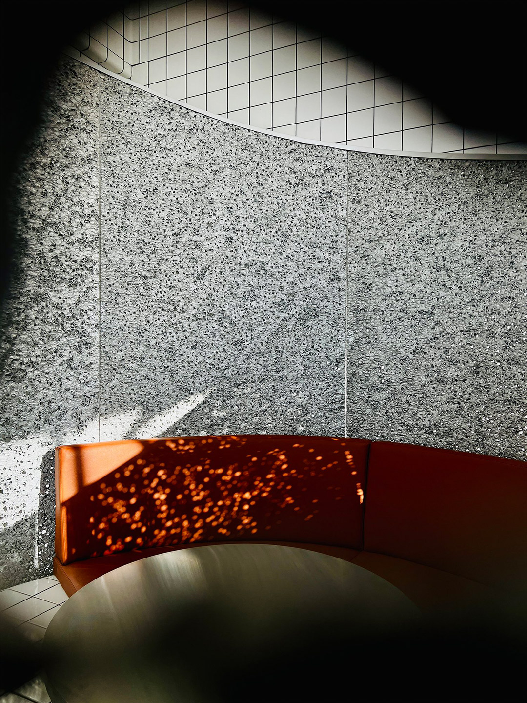
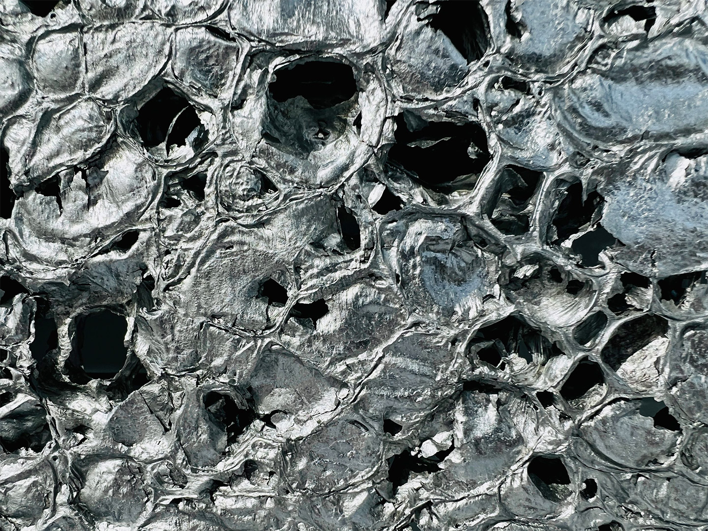
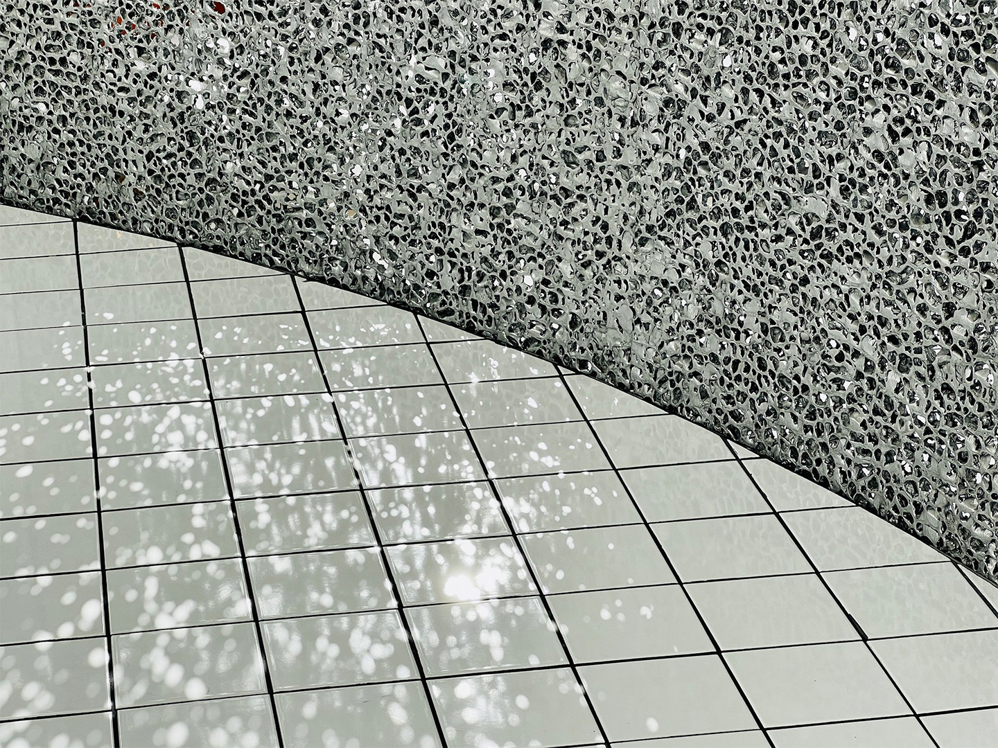
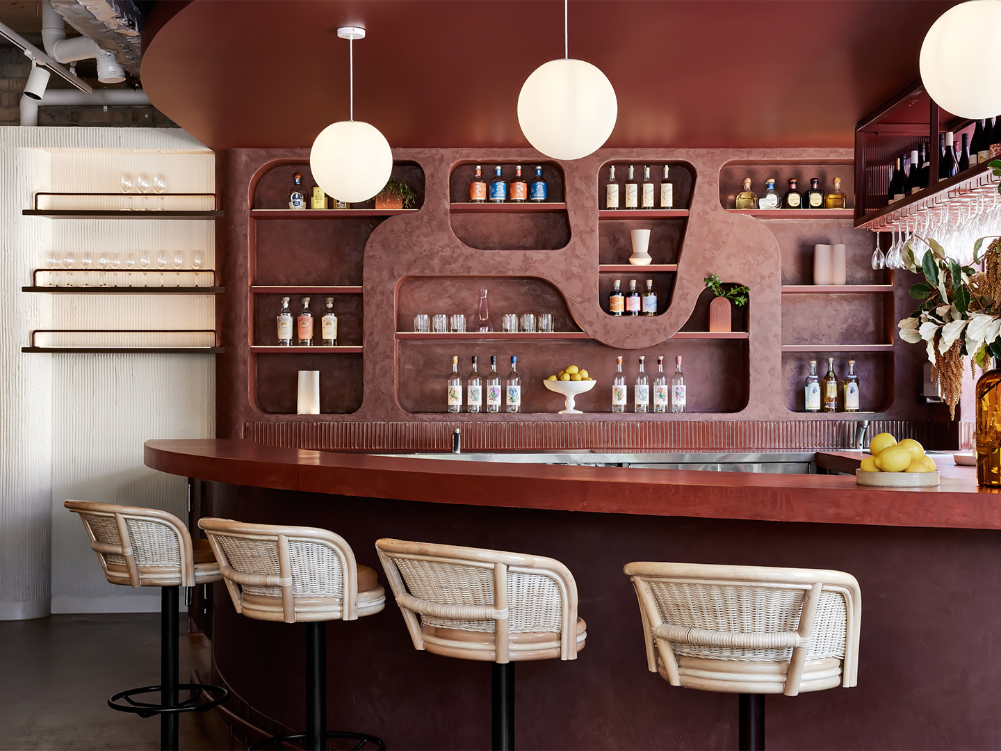
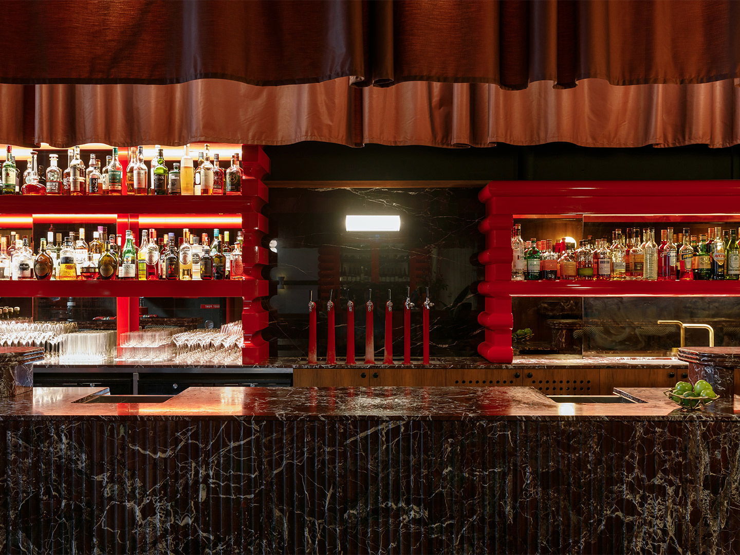
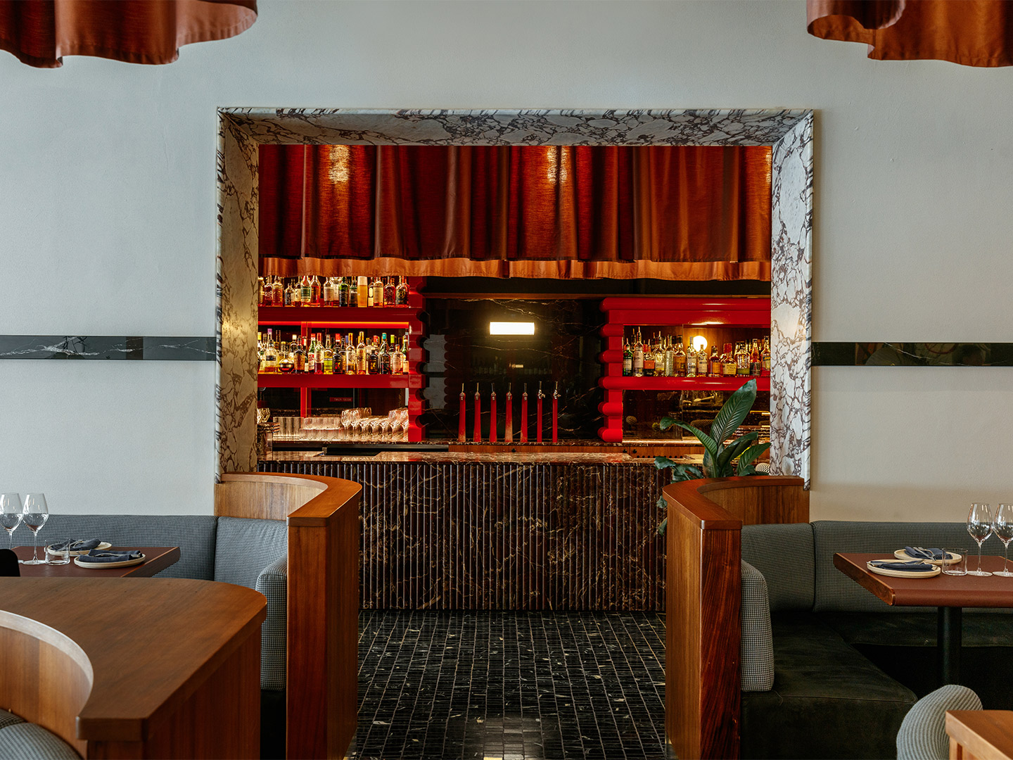
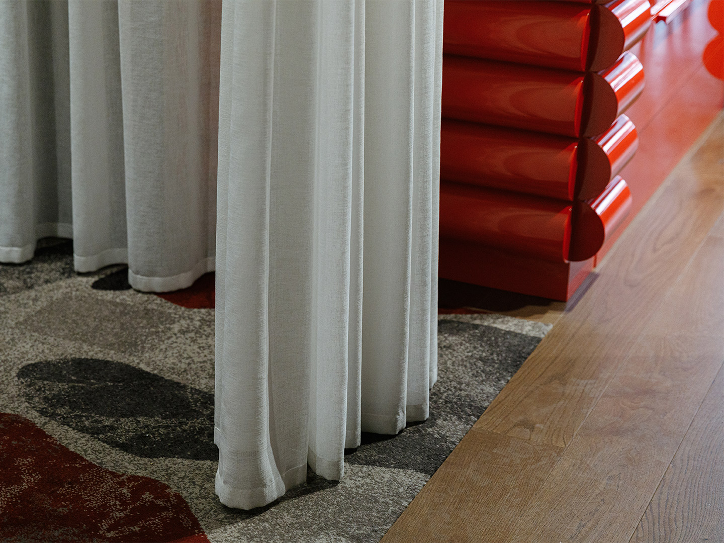
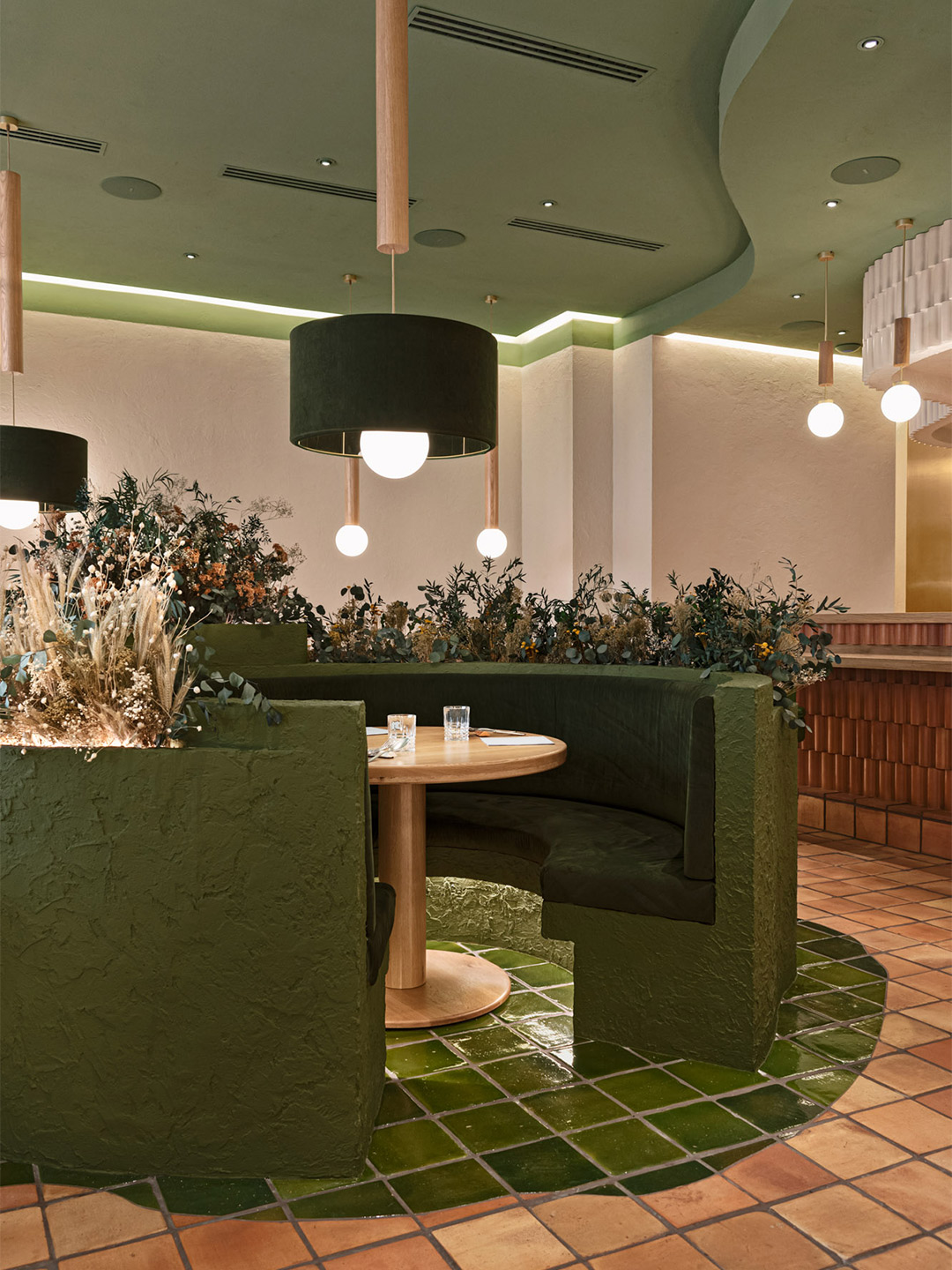
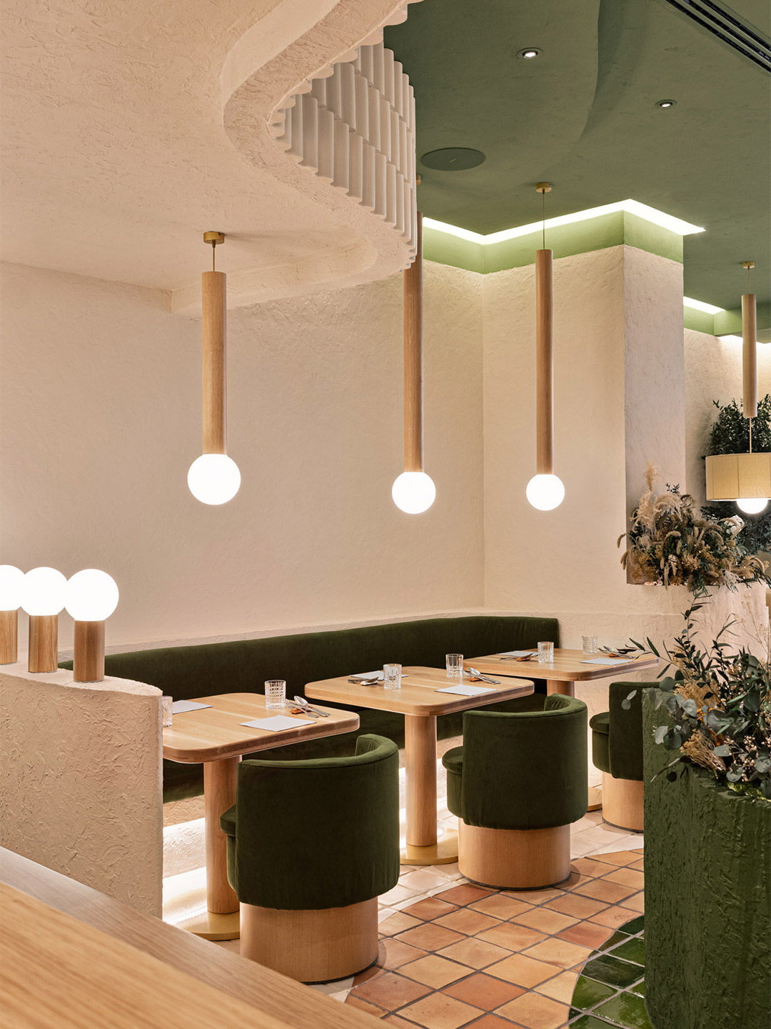
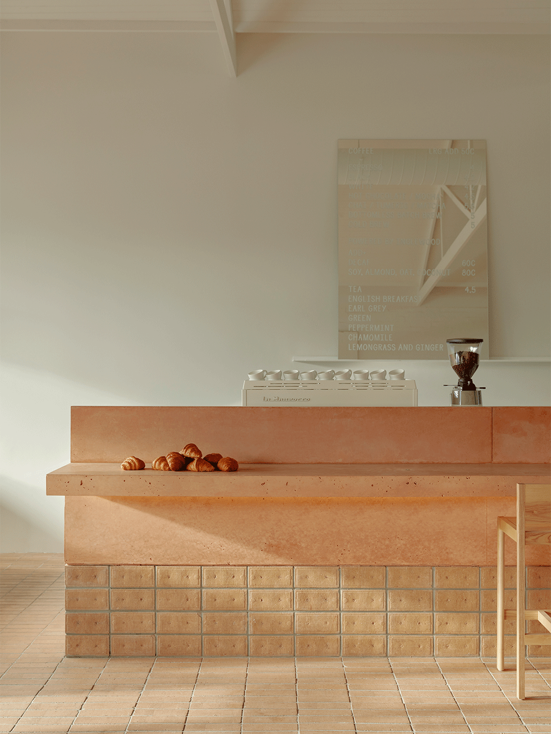
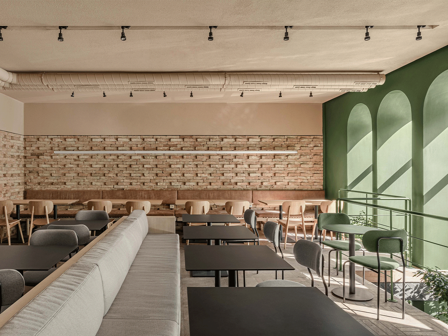
“If you follow our work, you know that we like to break with the existing [so] it was a huge challenge for us to respect their minimalistic Greek design and at the same time offer a different experience,” Christophe reveals. In response, Masquespacio maintained Egeo’s trademark blue and white colour palette. But in an effort to bring the diner “closer to Greece”, the studio applied to the walls of the restaurant a beautiful “cementish” finish, similar to the material that defines the vernacular architecture of the Greek islands. “We tried to materialise Greece in the space,” Christophe’s colleague Ana adds, “further than just using the usual white and blue colour palette.”
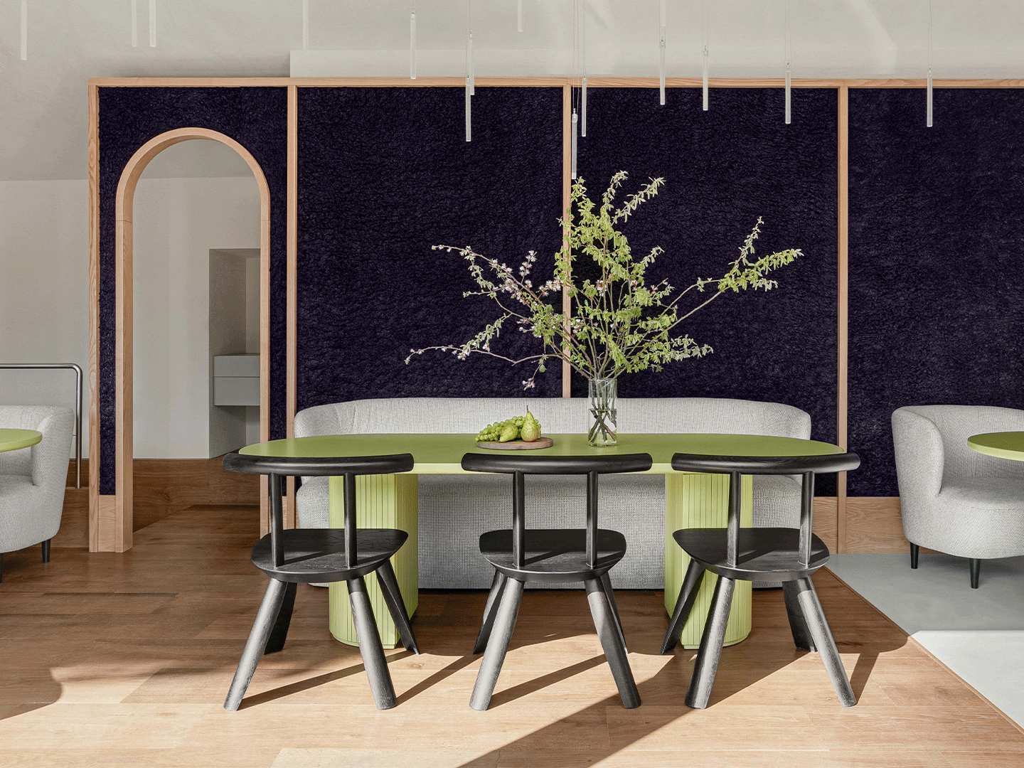
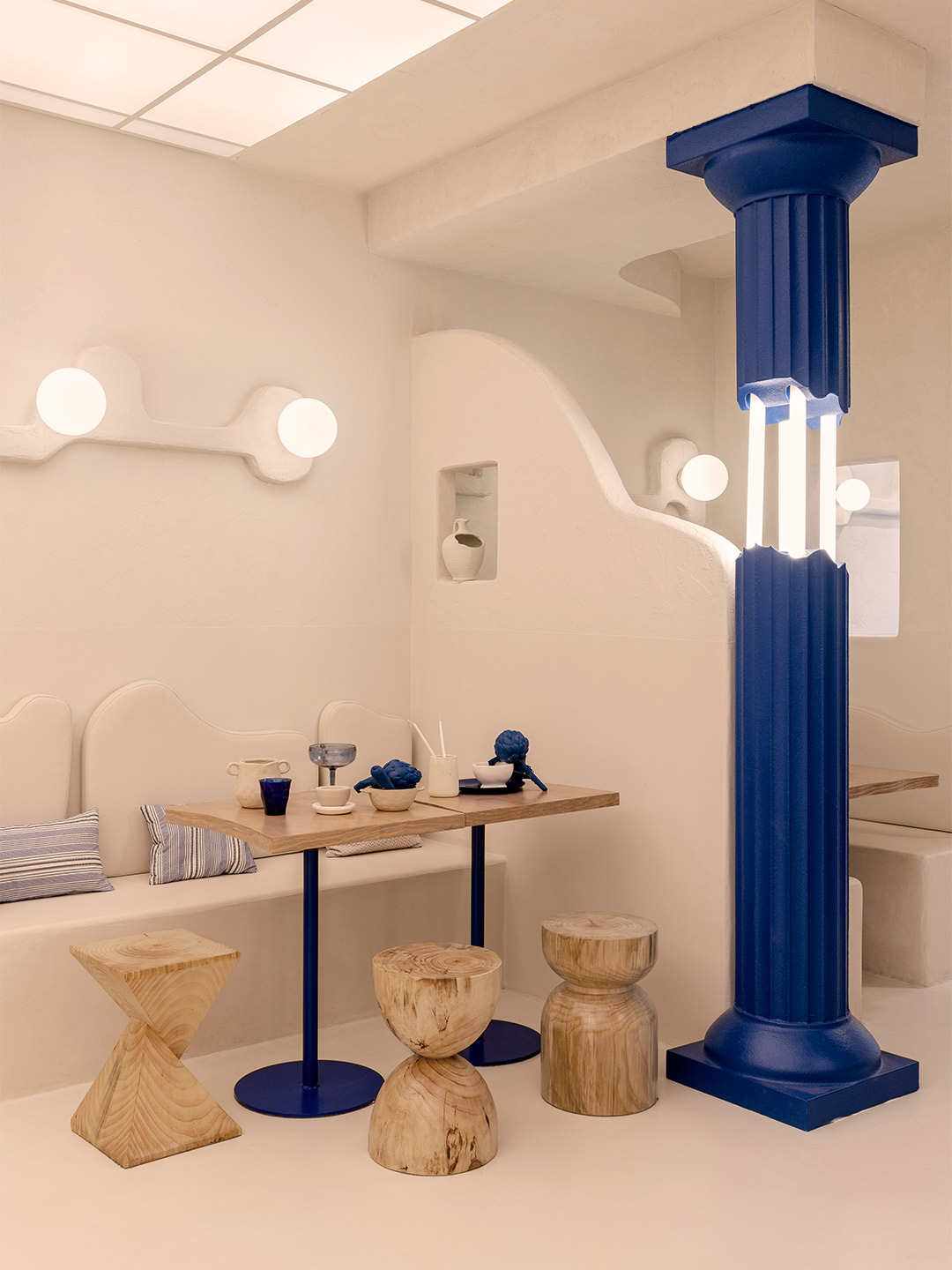
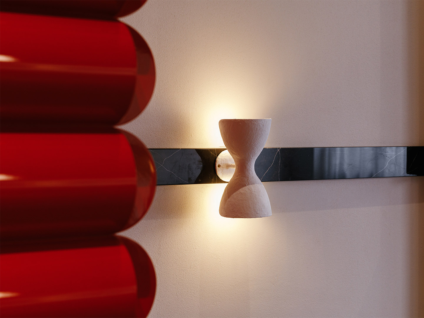
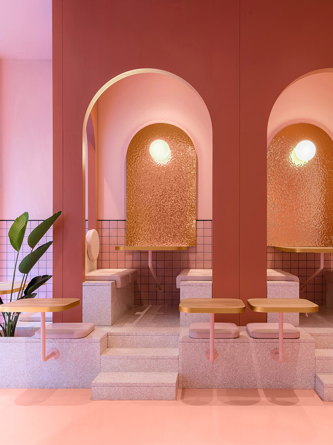
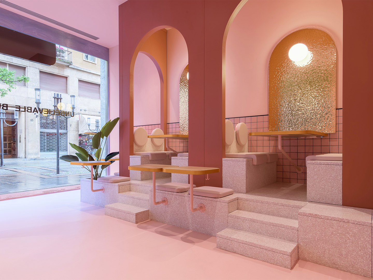
The shapes to which the stucco-like finish is applied take the form of organic wall sculptures, becoming one of the signature features of the space. The designers say this decorative effect continues the search to represent the essence of Greek architecture, traditionally shaped from wood and mud and centred around a garden or courtyard – a heritage that’s honoured in the design of the restaurant. The most stand-out element, however, is a series of blue-painted Greek columns in a deliberately deteriorated condition. “The question we asked ourselves with the introduction of the columns was: how do we modernise this traditional Greek architecture element that is represented in a classical state in Greek restaurants all around the world?” Ana says.
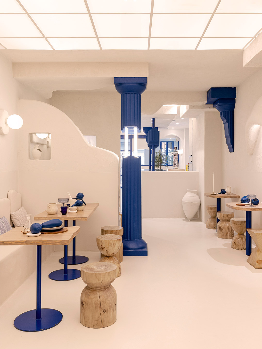
Her question was resolved by bringing the columns to life in the most modern way she and Christophe knew how. They were manufactured through cutting-edge 3D printing technology and coloured a deep indigo blue – a significant departure from the famously ancient Doric columns of the Parthenon. At the same time, LED tubes were added to link together the intentionally broken pieces of each structure. The typically cool white colour of the LEDs was challenged and tweaked, as was the production technique, making them a contemporary element produced with 21st-century know-how.
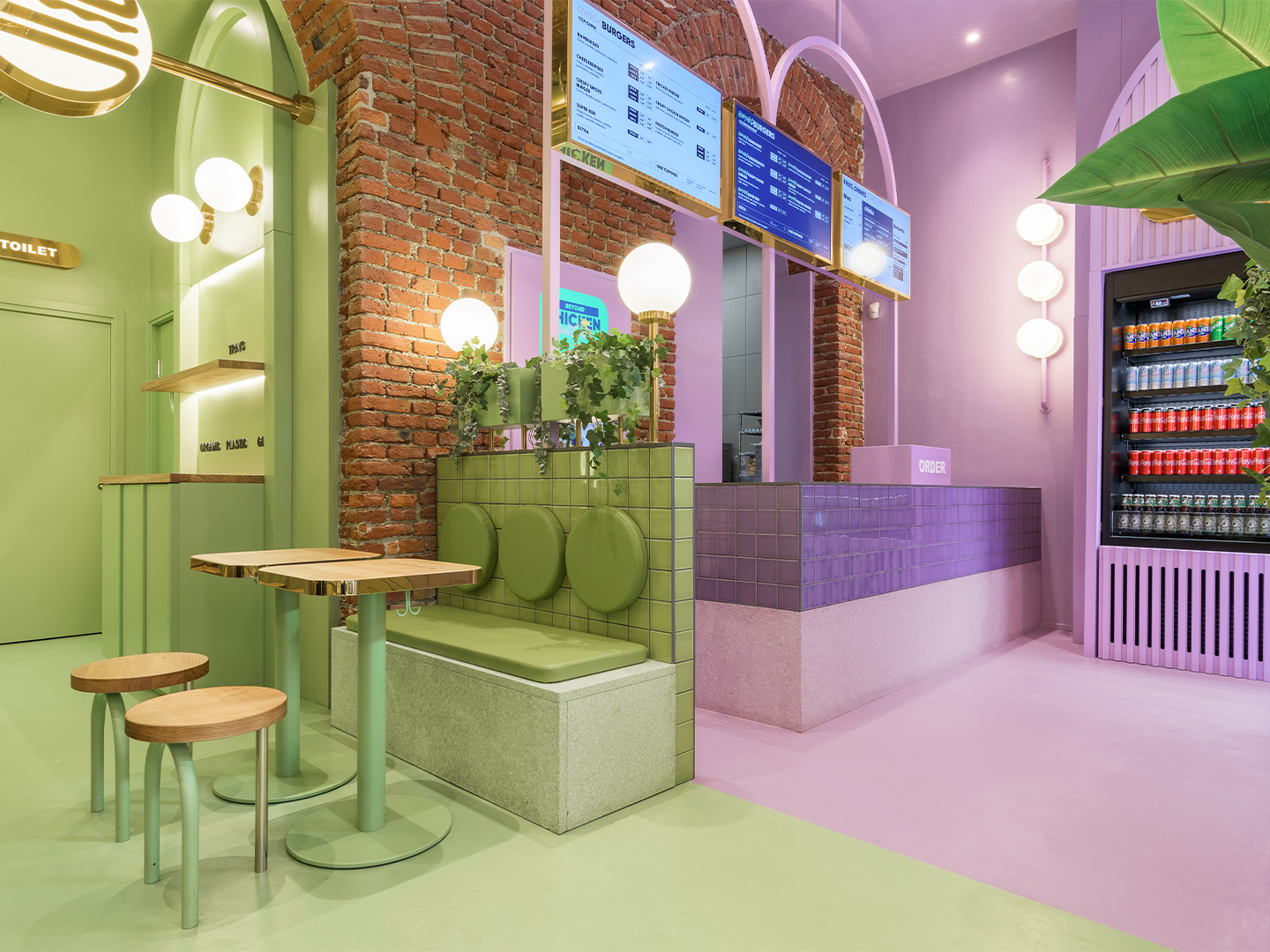
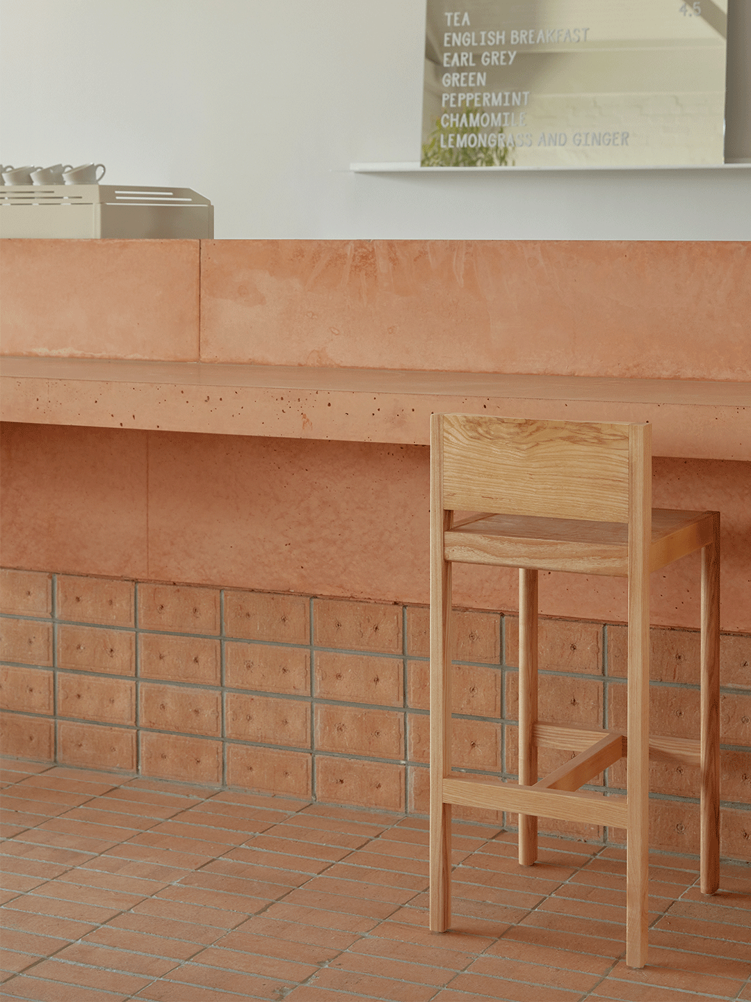
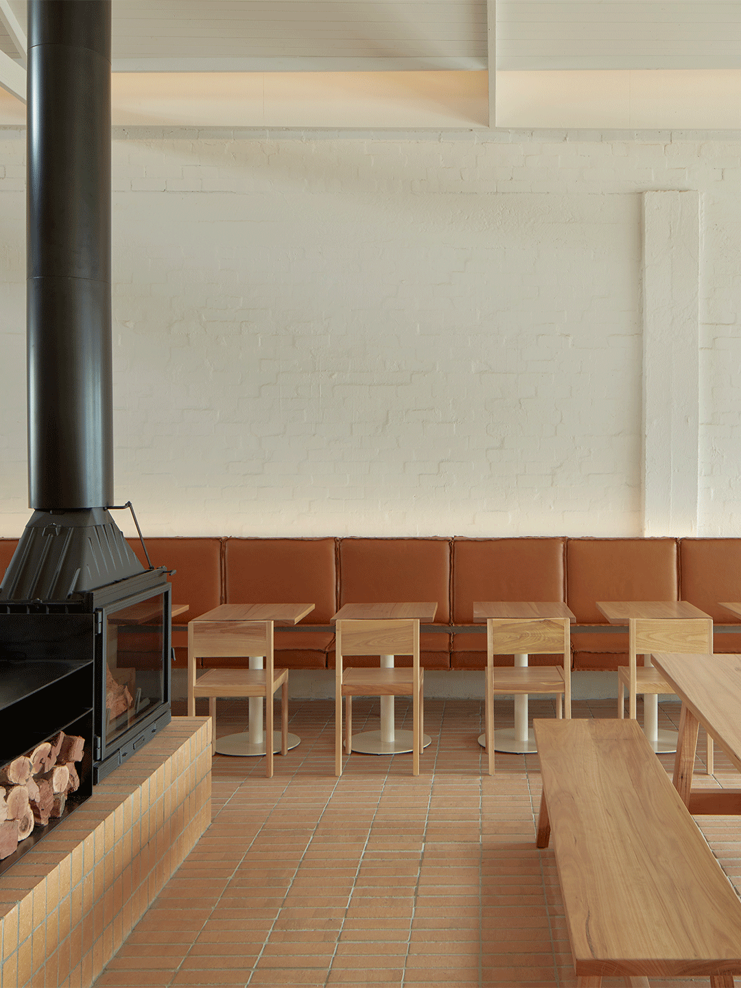
From furniture to light fittings, many similar shapes to those that Masquespacio has employed in the past make an appearance at Egeo Valencia. Reborn in crisp shades of white and blue, the pieces feel fresh while also bringing to the table lashings of Christophe and Ana’s inimitable style. They’re joined by chunky slab-like counters, raw timber stools – as though sliced straight from a tree – and Corfu-style pots of all sizes. “Last but not least, the order bar was situated in the middle of the space with the aim to recreate a bustling environment,” Christophe explains. Positioned beside a glowing grid of overhead lighting, the bar echoes the overarching goal of the fit-out: transporting diners to a place where they feel they’re ordering dishes of delectable souvlaki, Christophe says, “from a mobile kiosk in the middle of a Greek market”.
When Ana and Thanasis commented to us that they wanted to open an Egeo in Valencia, we were immediately excited about the idea.
Love the Egeo Greek restaurant in Valencia by Masquespacio? In Italy, Masquespacio also designed the Bun burger restaurant in Milan and in Turin. Catch up on more hospitality architecture and design and retail design, plus subscribe to receive the Daily Architecture News e-letter direct to your inbox.
Related stories
- Resa San Mamés student accommodation in Spain by Masquespacio.
- The bar and restaurant at La Sastrería in Valencia by Masquespacio.
- Mama Manana restaurant in Kyiv by Balbek Bureau.
- Gold ‘n’ arches: Bun burger restaurant in Milan by Masquespacio.
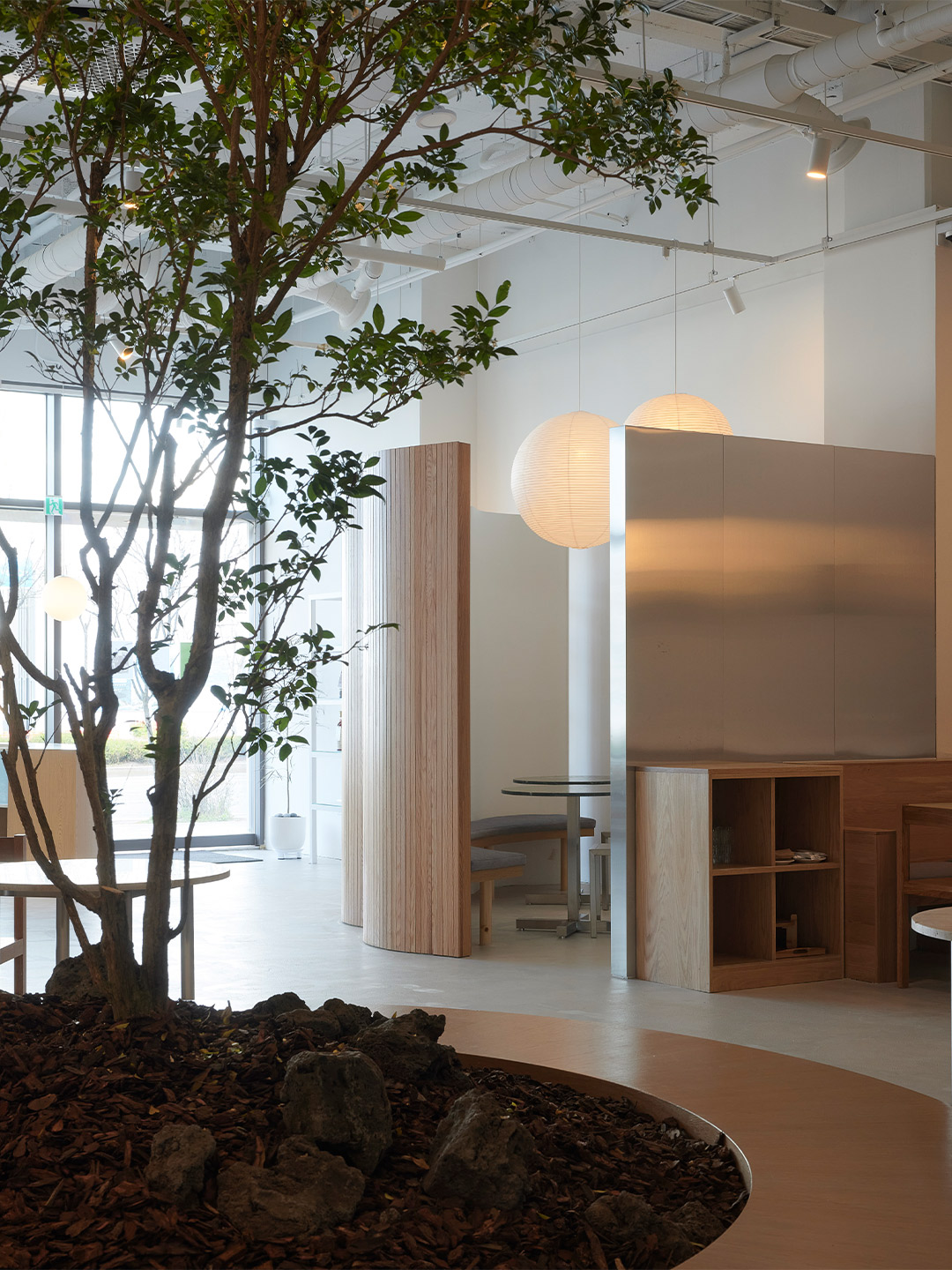
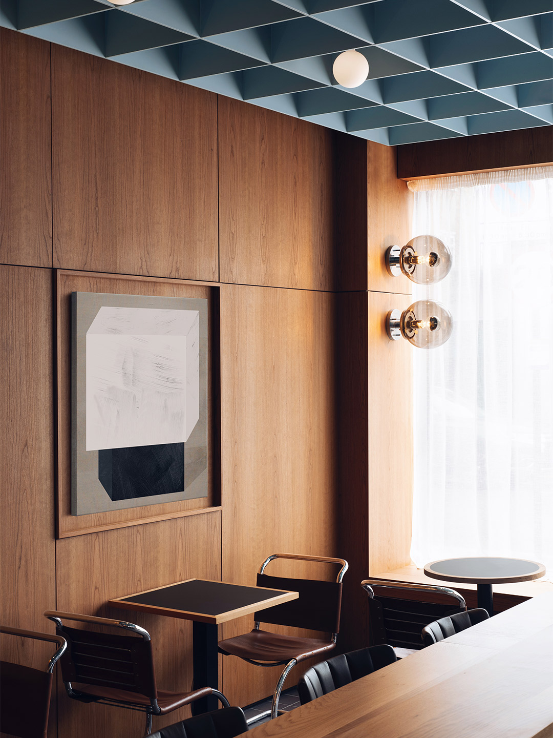
When South Korean design office Studio Studio was commissioned to create a restaurant in Incheon, a city bordering Seoul, they were presented with a “box-like” volume brimming with potential. Located on the lower floor of a housing complex, the site was one of many blank canvases enclosed by four unembellished walls. Adding pressure to the project, an unofficial contest between new interior fit-outs in the precinct became a driving force for the designers to create an exceptional space. “The game is won or lost by how the designer elegantly fills the box,” says Do Gwanghun, founder of Studio Studio, whose Seoul-based practice is credited for shaping Wall restaurant – a solid contender for the most sophisticated scheme in the sizeable complex.
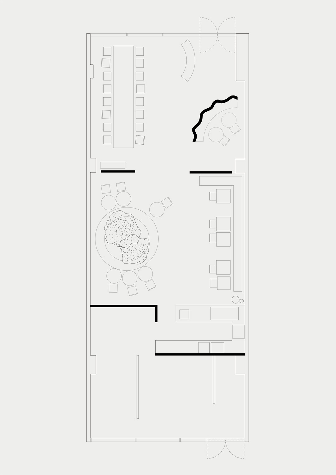
As its name suggests, Wall restaurant is all about the walls. How they divide the space, seperate the different functions of the project and – perhaps most importantly – cocoon the patrons as they drink or dine. “The main function of drinking wine and eating food is divided into different atmospheres in one space,” Do says, referring to the way in which the floor plan is split into three main segments. Pointing to the first of these areas, located towards the entry, Do says a “soft zoning” effect was established by employing low partition walls. “Because the walls are low, the space is not completely separated [from the next zone],” he explains.
Wall restaurant in South Korea by Studio Studio
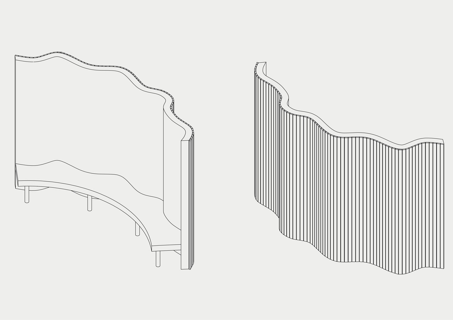
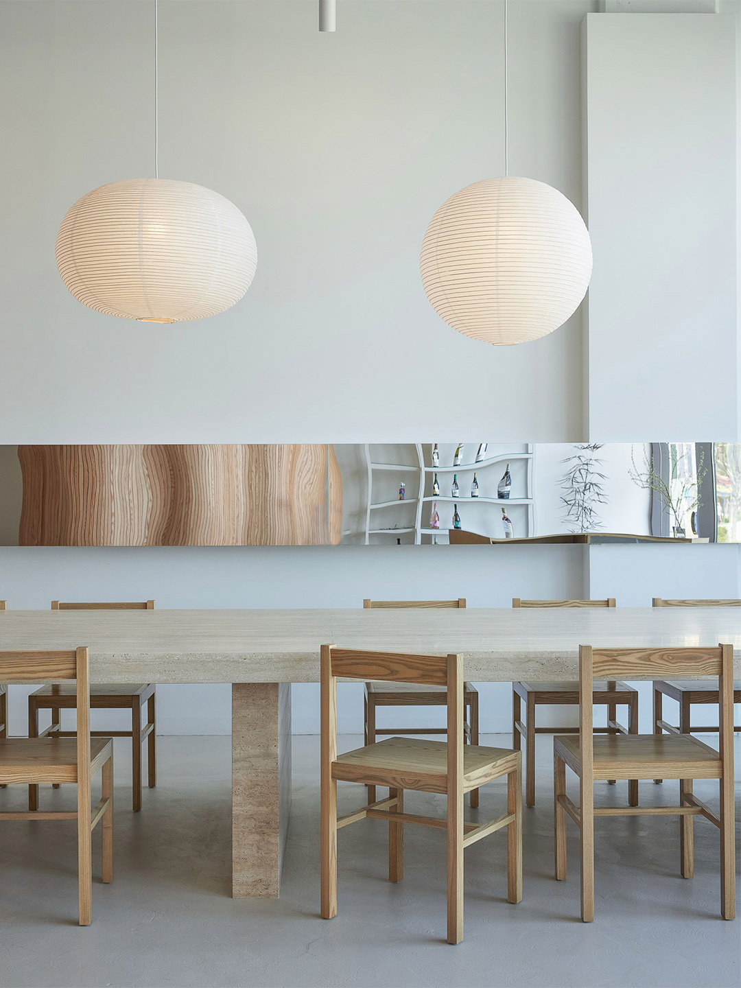
These partitions create a semi-private atmosphere throughout the diner. But to provide a more intimate experience in the first segment, a large decorative screen has been installed to form a small secluded room. Designed as an undulating surface clad in narrow strips of blond timber, the screen incorporates a curved bench on its inner face. When partnered with two round tables and chairs, the nook can accomodate up to six patrons who, under the glow of a suspended paper lantern, become shielded from street and restaurant views. In contrast, an oversized stone table with timber chairs encourages communal dining along the opposite wall. A series of four paper lanterns in offbeat organic shapes floats over the setting while a mirrored panel reflects the scene and creates the illusion of more space.
Straddled by the light-filled entry zone and the back-of-house area, the central space is memorable (and most definitely Instagrammable) for its large potted tree, whose branches will grow to form a verdant canopy above the diners. Landscaped with large rocks – reminiscent of an ancient Korean garden – the “pot” of the tree forms yet another bench. Lined with timber and accompanied by tables and chairs in mixed finishes, the circular bench echoes the experience of dining outdoors, perhaps in a public arcade or manicured garden. A banquette is positioned against the wall opposite the potted tree creating yet another contrasting zone, this time capable of accomodating tables of two or a single large group.
While shelving units that display the selection of wines are positioned throughout the diner, doubling as a sleek decorative device, the kitchen occupies a small pocket of the plan’s third segment (where the behind-the-scenes operations occur). Open to the dining spaces, the kitchen entertains patrons with the theatrics of food and beverage preparation. The openness also allows waitstaff to service the restaurant floor with ease, assisted by the arrangement of low walls, Do suggests, which “maximise” the space as employees and diners move from zone to zone. “Visitors feel the cluster of low walls as they step inside,” the designer adds. “This ‘community of walls’ is everything that makes up this project.”
Visitors feel the cluster of low walls as they step inside … this ‘community of walls’ is everything that makes up this project.

Love the office fit-out by Olson Kundig? Catch up on more architecture and design highlights. Plus, subscribe to receive the Daily Architecture News e-letter direct to your inbox.
Related stories
- Home tour: Bilgola Beach House in Sydney by Olson Kundig.
- ANOHA museum: 150 animals made from recycled materials inhabit a ‘spaceship’ by Olson Kundig.
- A 1960s London post office is now a swinging sushi restaurant.
- Hot desks: Spacial co-working office in Montreal by Ivy Studio.
- The YAP design office in Japan.
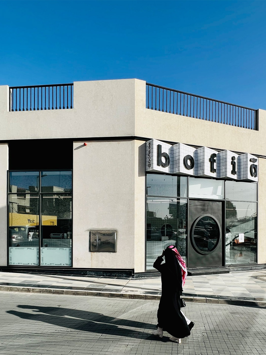
In Saudi Arabia, bofia is the name given to the unassuming canteens that dot the country’s roadsides, regularly visited by locals and travellers for quick, authentic and reasonably priced street food. In an attempt by Azaz Architects to find an architectural solution and material identity for a modern-day version of this no-fuss eatery style, the new Bofia restaurant reinterprets the unapologetic, blunt and straightforward nature of street-side dining, presenting equally delicious cuisine within a polished interior space.
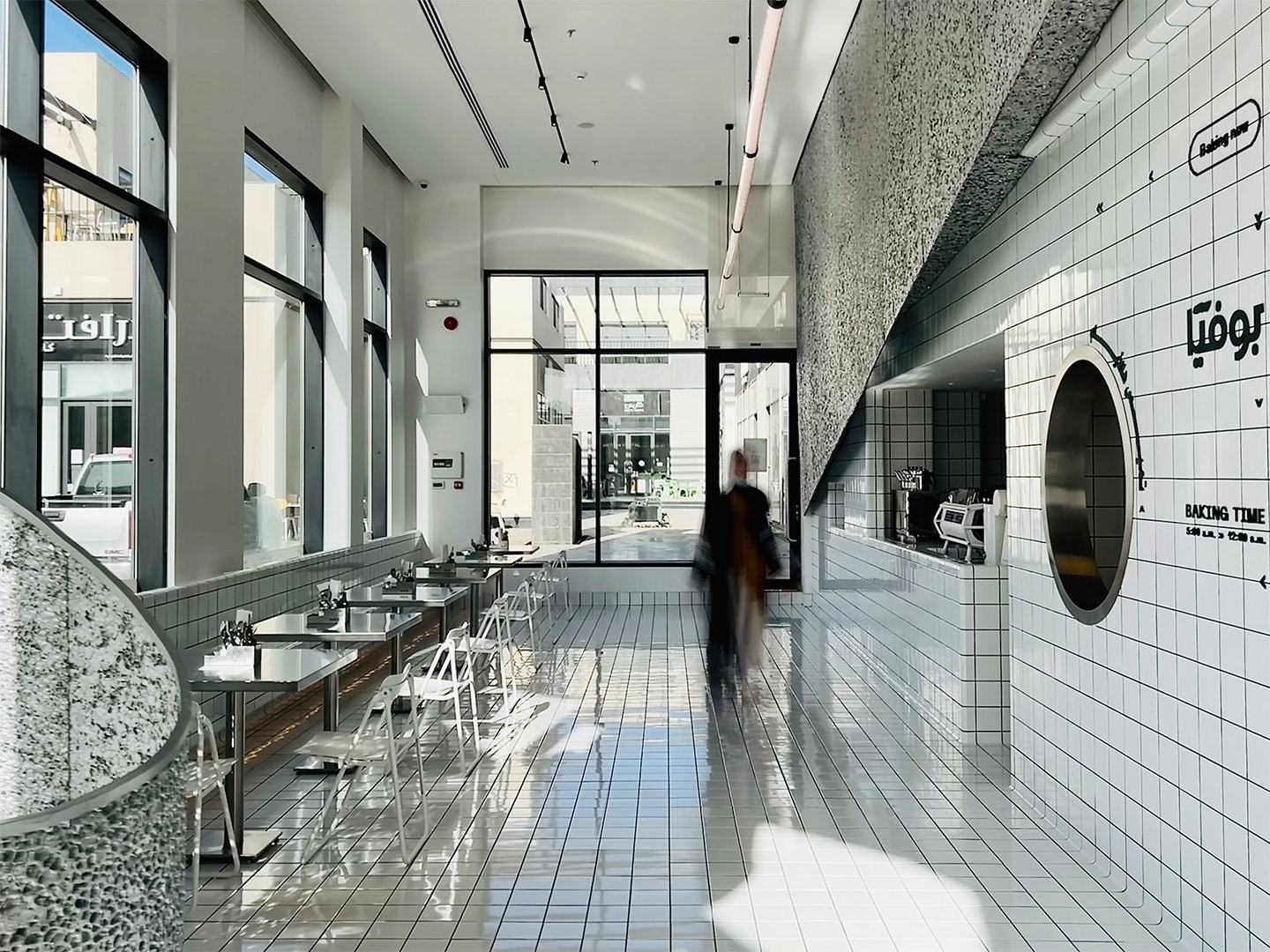
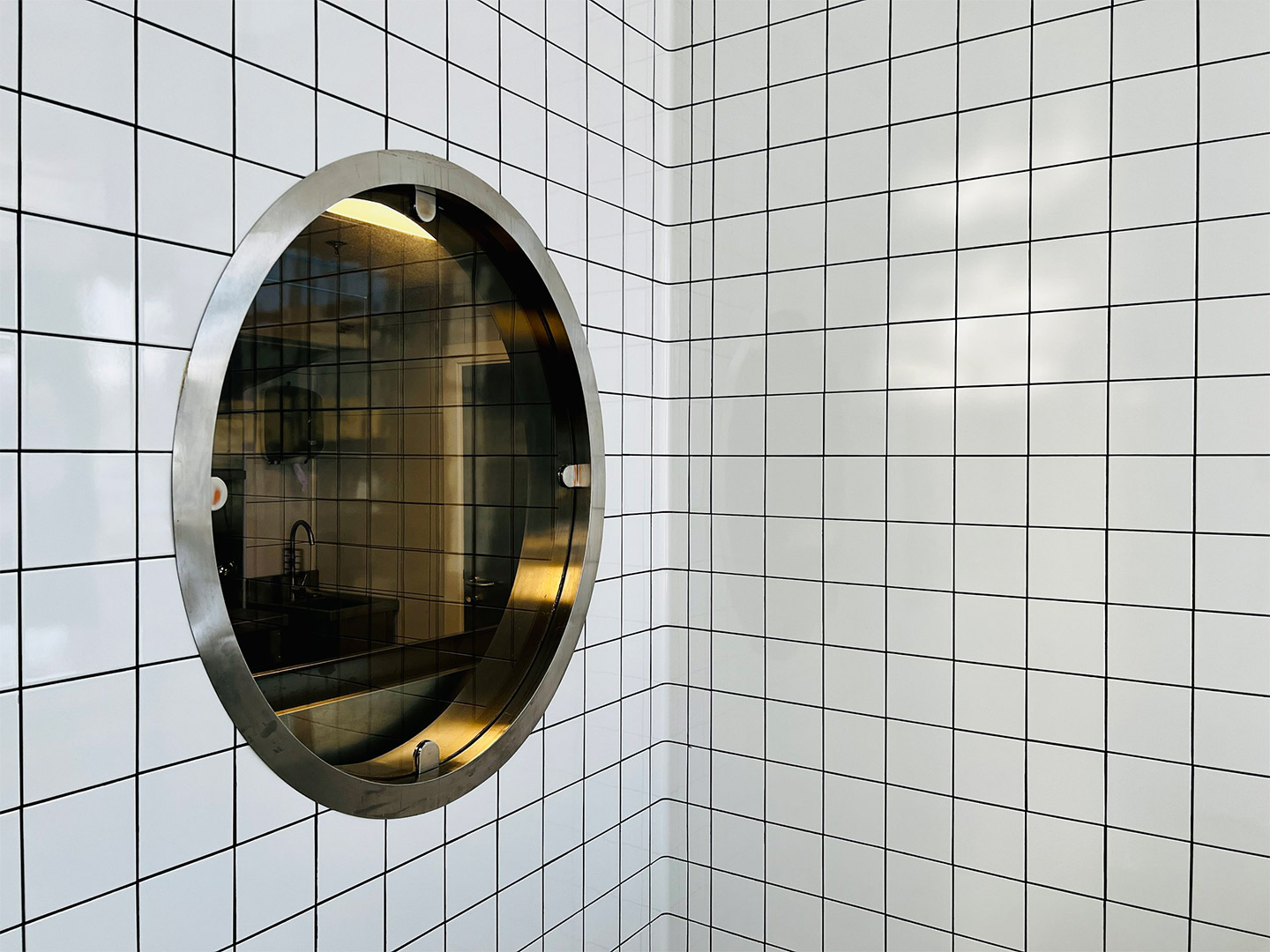
Located in the centre of Riyadh, the main financial hub and capital city of Saudi Arabia, the Bofia restaurant (also referred to as “The Tiled Cloud”) is tucked within an unassuming standalone structure. Exhibiting simple geometry and straight lines, the building was once described by the restaurant’s architects as feeling rather “ordinary” in the overall streetscape. That was, of course, before it was given a tiled marquee emblazoned with the name Bofia, positioned neatly above a new door with a circle-cut peephole framing a very different world.
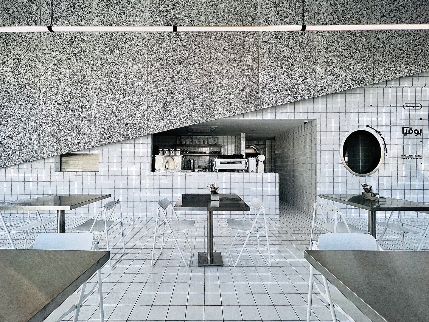
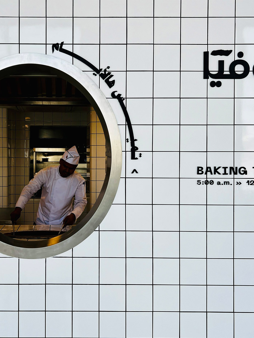
‘The Tiled Cloud’: Bofia restaurant in Riyadh by Azaz Architects
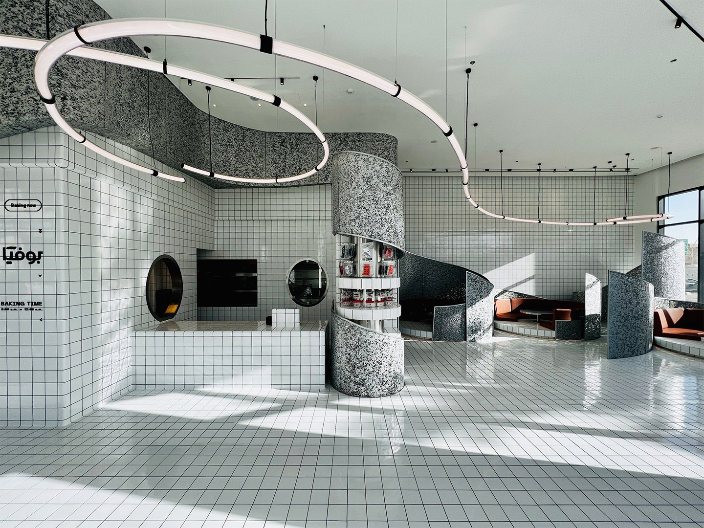
To create contrast from the grey-tinged street, the team at Azaz Architects played with the idea of forming a cloud-like installation inside the building. This approach sparked the restaurant’s nickname, The Tiled Cloud, and allows diners to experience a feeling of surprise and airiness as they enter the restaurant. “The interior mass is imagined as a cloud that floats within the space,” the architects say of their design response. “[It] seamlessly separates and lifts the busy back-of-house from the front-of-house areas.”
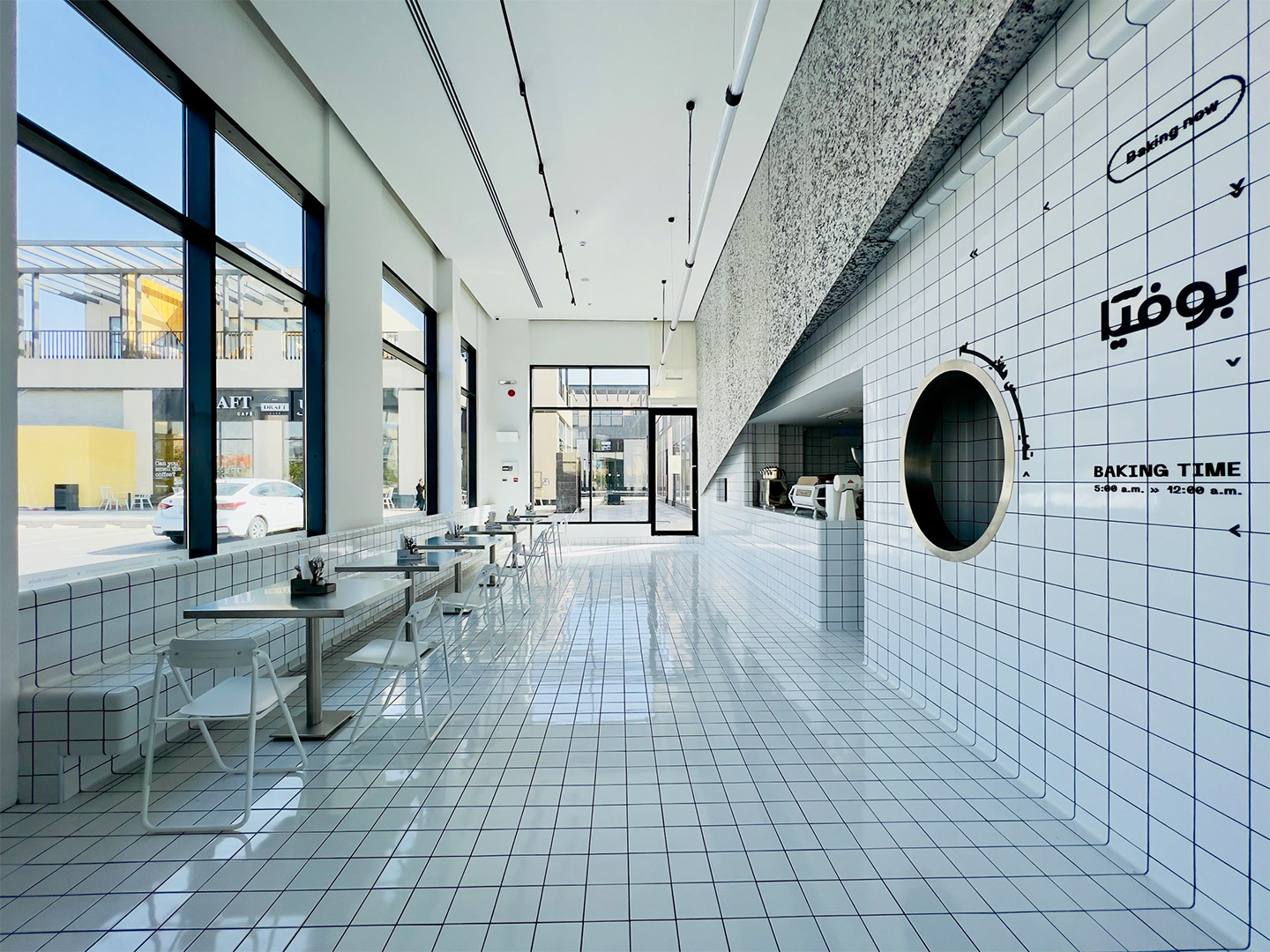
Capped with an angular panel of textured aluminium foam, the interior facade of the “cloud” is clad in crisp white tiles, mostly concealing the kitchen and staff-only spaces. The glossy square-format tiles extend across the floor of the L-shaped public zone, wrapping underneath guests’ feet to form a built-in banquette for dining along one window. Here, carefree steel tables and white folding chairs mimic the traditional set-up of street food outlets.
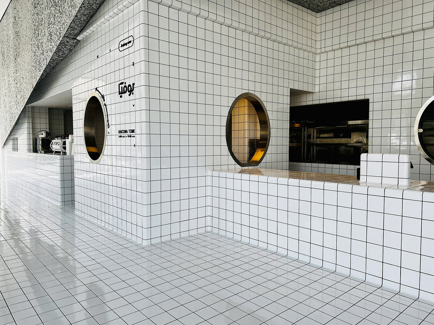
In the other smaller wing of the restaurant, the white tiles make an appearance on raised circular dining platforms, where upholstered bench seats are cocooned by curvy panels filled with the same aluminium foam that embellishes the main counter. These panels provide privacy for anyone dining in the booths. But when it reaches the central column, the foam peels back to reveal circular tiled shelving with retail products on display.
As with the planning of a traditional diner, the public area at Bofia is placed outside the back-of-house zone. It was important to the architects, however, that diners could sit within a close enough distance to the cloud-like facade that allows them to appreciate the architectural geometry on display. From their seats, diners can then also witness the action of the kitchen, observed through small cut-outs and round portholes carved into the tiled walls.
Overhead, the heavenly details continue with the addition of a “strike of light” that propels through the space, like a wobbly bolt of lightning that brings energy to the mostly white interior. Through smart programming the luminaire offers functional performance, as well as different “story-telling potential” during both daytime and nighttime service. “Interestingly, visitor and observer opinions have been evenly split on whether the design is considered minimalist or maximalist,” the Azaz team says. Either way, they suggest, the fit-out is “an architectural fantasy turned into reality”.
Interestingly, visitor and observer opinions have been evenly split on whether the design is considered minimalist or maximalist.
Catch up on more architecture, art and design highlights. Plus, subscribe to receive the Daily Architecture News e-letter direct to your inbox.
Related stories
- Venus Power collection of rugs by Patricia Urquiola for cc-tapis.
- Bitossi celebrates centenary in Florence with new museum and 7000-piece display.
- Casa R+1 residence in southern Spain by Puntofilipino.
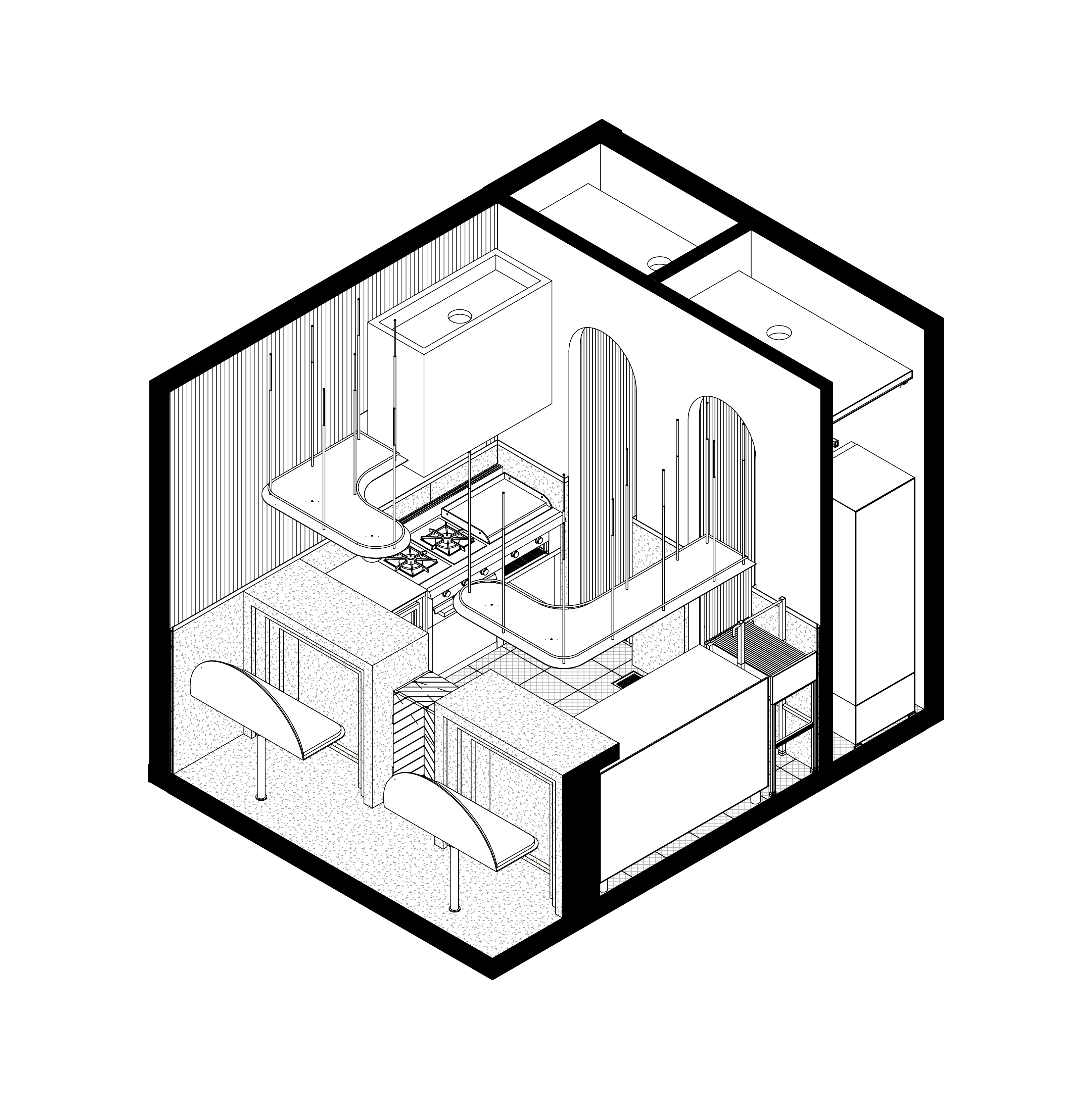
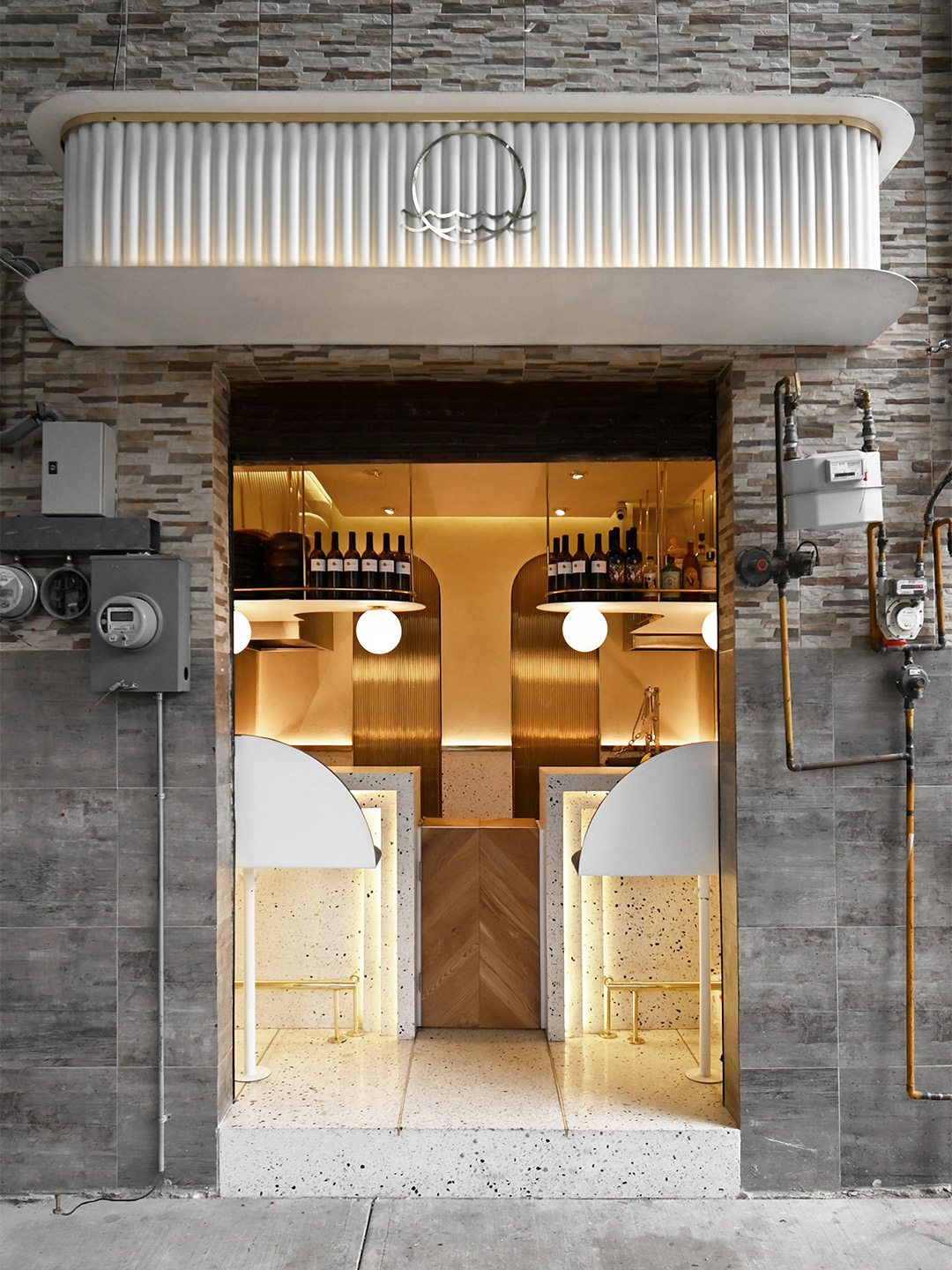
Testament to the sayings “good things come in small packages” and “size doesn’t matter”, the 10-square-metre Pargot restaurant packs a punch in the Roma Norte neighbourhood of Mexico City. Designed by local firm RA! Arquitectos, the tiny diner merges the traditional architecture of the region with influences of its ocean-focused menu. “The interior design takes us back to the Art Deco movement of the 1920s, generating a composition based on symmetry and balance between colour and geometry,” says the RA! team, led by practice co-founders Pedro Ramírez de Aguilar, Santiago Sierra and Cristóbal Ramírez de Aguilar.
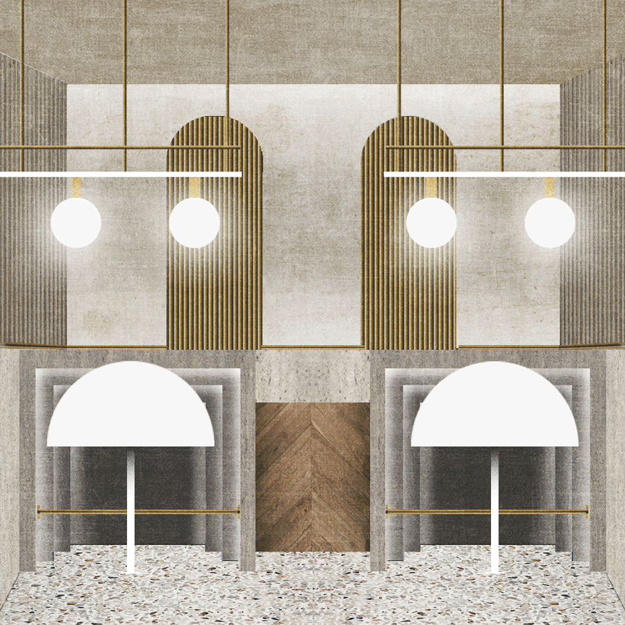
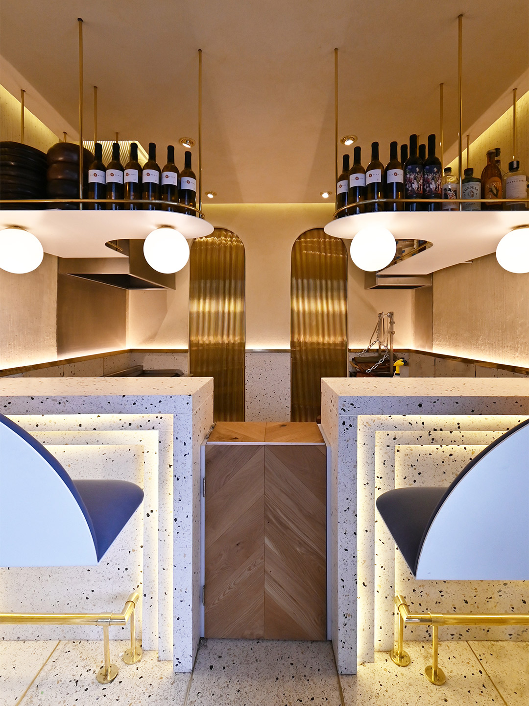
Tucked behind an unassuming roller door, between a messy patchwork of electrical wires and gas metres, the hole-in-the-wall footprint of Pargot doesn’t leave much to the imagination. The dining area is limited to a duo of high bars, each with bench seats, that flare out to accommodate four diners at any one time. Behind the counters, the small industrial kitchen is divided into hot and cold food areas, backdropped by a wall featuring two arches and two sliding brass doors. When opened, the rear doors create a change of atmosphere, transitioning the core colour palette from gold to navy, which the designers say “incites a sensation that brings us closer to the sea”.
Pargot restaurant in Mexico City by RA! Arquitectos
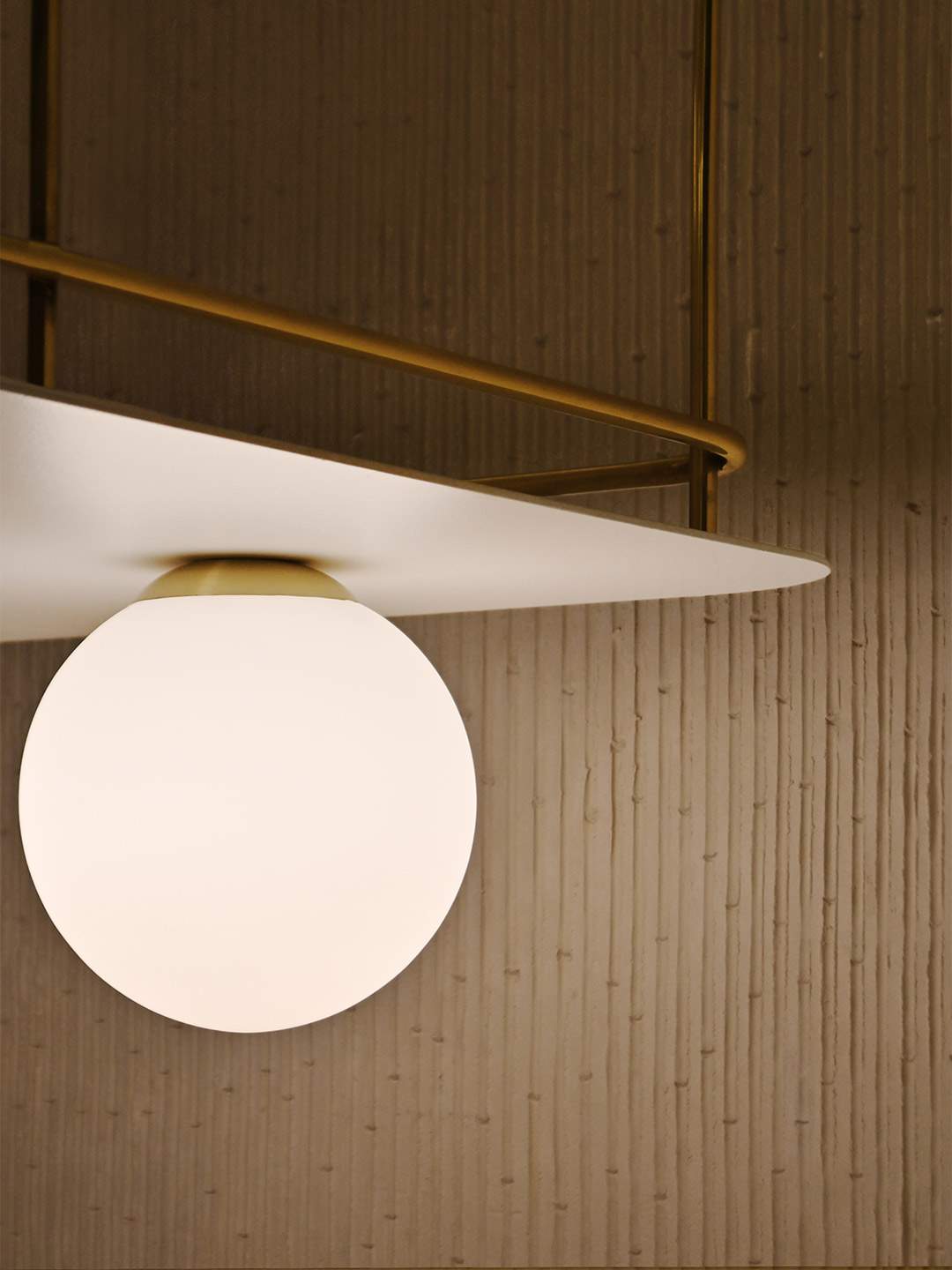
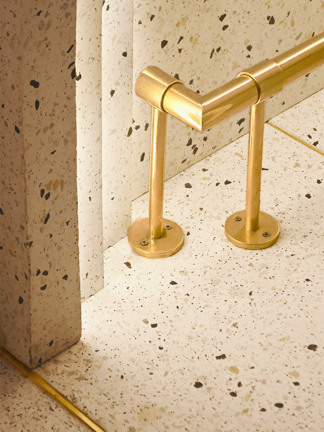
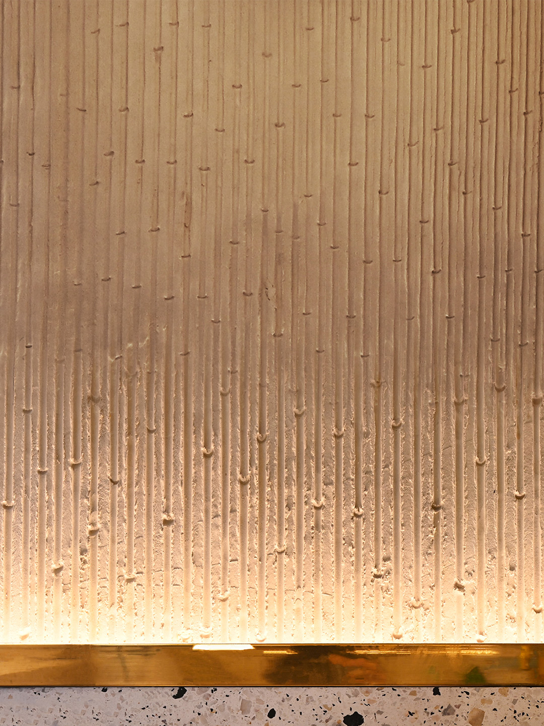
Ensuring the material palette is kept simple yet striking, the floor of the restaurant, the lower portion of the walls and the two bars are all composed of white-based concrete terrazzo, with blue, yellow and grey stones offering a nod “to the beaches and shells that we find on the sand,” the designers say. The upper part of the walls features a gentle shift in materiality thanks to a textured effect created with lengths of bamboo. Stems of the plant have been pressed into a plaster mix, revealing its notches and veins – a treatment which is accentuated by uplighting concealed behind a golden rail.
Efficient storage shelves suspended from the ceiling double as the bar area at the front of the kitchen, displaying a small selection of wines and spirits for diners to imbibe alongside delicious dishes. The gold-coloured metallic finish of both the shelf embellishments and the foot rails catches the light emitted from within the Art Deco detailing of the bar fronts and the floating orbs overhead, drawing in passers-by. Heightened by the grungy surrounds that lay before the restaurant’s front step, the result is a glimmering gem in a roughened street of Roma Norte, destined to satisfy the appetites of foodies and design lovers alike.
The interior design takes us back to the Art Deco movement of the 1920s, generating a composition based on symmetry and balance…
Catch up on more architecture, art and design highlights. Plus, subscribe to receive the Daily Architecture News e-letter direct to your inbox.
Related stories
- Venus Power collection of rugs by Patricia Urquiola for cc-tapis.
- Bitossi celebrates centenary in Florence with new museum and 7000-piece display.
- Casa R+1 residence in southern Spain by Puntofilipino.
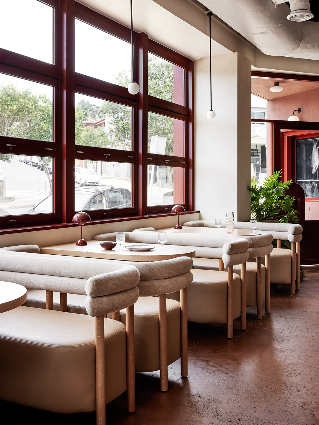
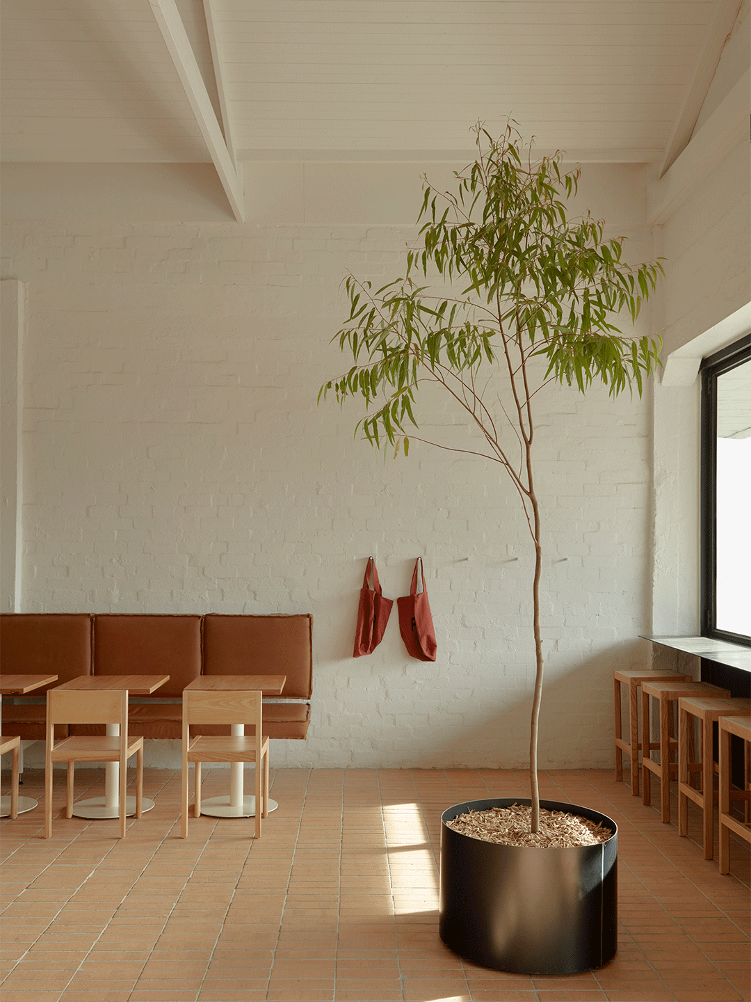
For emerging restaurateurs Jack Leary and Tim Christensen, founders of the Alma Group, the Northern Beaches in Sydney is becoming a regular backdrop to their gastronomic ventures. Towards the pointy end of the peninsula, Alma, the duo’s debut Mexican restaurant, has well and truly settled into the village of Avalon since opening its doors in 2017. At the southern end, nearer to Manly and the gateway to Sydney Harbour, the second establishment to join the lineup is a newcomer in the seaside suburb of Freshwater.
When discussing the design for St. Alma, the name given to the new diner, Jack and Tim felt strongly about two key points. They believed “first impressions are everything” – a mantra adopted with the launch of their first restaurant. But they also recognised it was important for St. Alma to “stand her ground” rather than become a pure replication of the Avalon premises. “We are both relatively new to owning venues, so we wanted this space [in Freshwater] to be a reflection of our journey, and for our patrons to benefit from the lessons we have learned along the way,” Jack says.
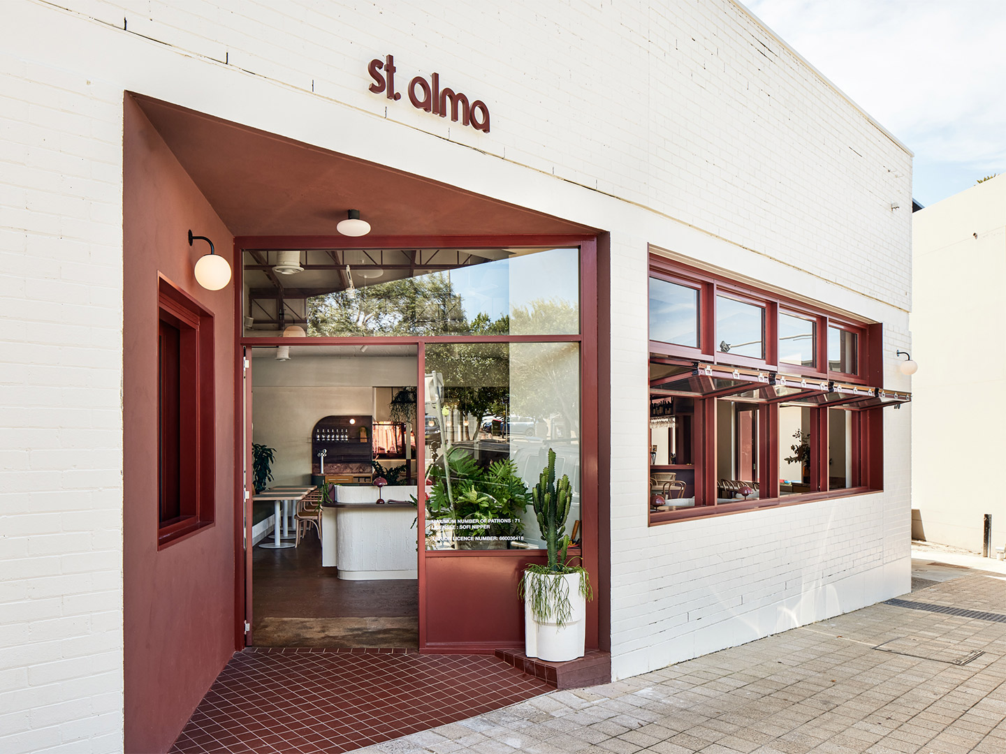
St. Alma restaurant Freshwater by Five Foot One
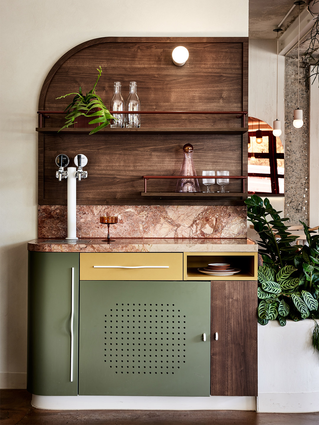
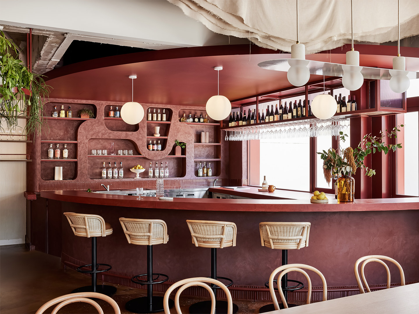
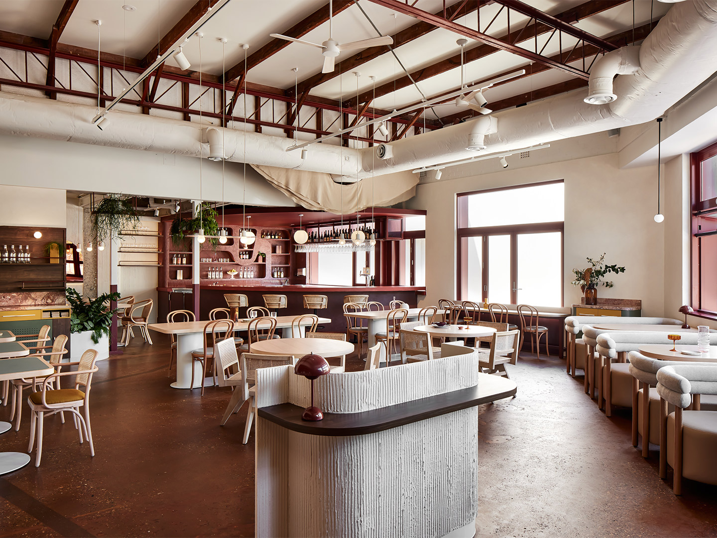
To craft an impressive interior that meets the brief of “minimal Mexican modernism”, while also being site specific and complementary to the cuisine on offer, the duo called in the design team from Five Foot One. The creative process that followed carved an unexpected path, guided by a demolition phase that uncovered fascinating features from the site’s former life as a bank. “It was a process that evolved over time,” says Kat Thompson, the Sydney-based director of Five Foot One. “A number of original features were retained – even the original safe of the bank was incorporated and restyled into the new structure,” she explains.
But perhaps the greatest surprise – or curveball – was revealed when the old standard-height ceiling was removed. “We discovered a wonderful ceiling with tremendous height running through the centre of the restaurant,” Kat recalls. “We had to make the most of this,” she adds, highlighting the woven-fabric ceiling feature that now hangs within the void, offering movement overhead as it’s exposed to the gentle ocean breeze.
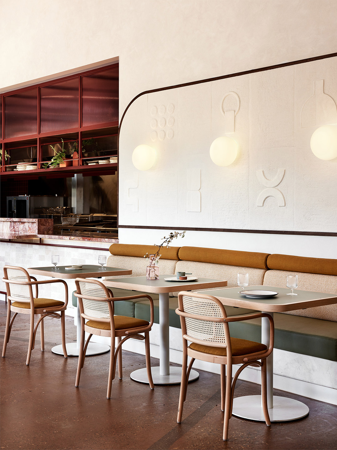
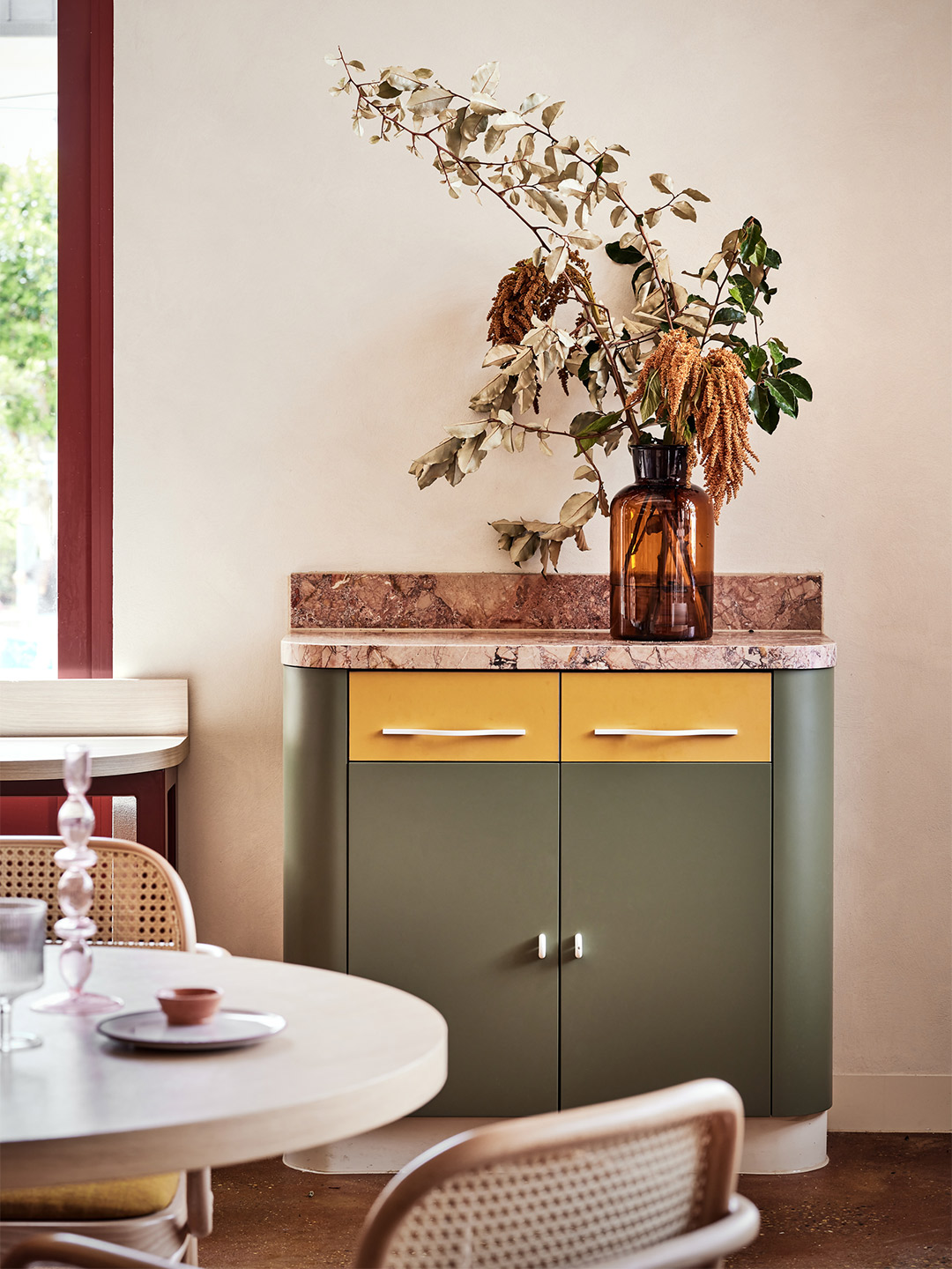
In planning the interior, the Five Foot One team dedicated great attention to layering texture, geometry and colour. “We channelled a fresh and light base palette as a response to the coastal setting and inserted vibrant colour blocking at key focal areas,” Kat says. “For example, striking burgundy has been used to highlight the front entrance as a way to draw guests in.” If that isn’t enough, the array of seafood displayed by the entrance of the venue should pull a crowd.
An appreciation for detail is seen in the eye-catching display shelving of the curved bar area. It also features in St. Alma’s collection of art – most notably a striking 4-meter-long sculpture that now takes pride of place in the middle of the restaurant. The artist responsible for the piece is Sam Leary, Jack’s mother, who collaborated closely with the design team to make sure her work resonated with the overarching vision for St. Alma.
Furniture was selected to reflect the restaurant’s relaxed ambience and seaside location, exampled by light timbers and woven materials, but it was also required to offer various sitting scenarios. “We wanted diners to be able to have a more intimate dining experience with stools at the bar and kitchen,” says Jack. “Here, guests can interact with the staff for a true Alma experience.” Conversely, the larger tables and booths along the walls and windows allow greater flexibility for big groups and special occasions.
Since opening in early January, the 100-seat restaurant has come alive, thanks to the Freshwater locals who bring vitality to the space and the staff who shape the uniquely “Alma” experience. It’s a place where diners can expect an eclectic mix of regional Mexican influences, given a delectable Australian spin through both flavour and design. “You could say we love to juxtapose a fun and engaging service style with a sophisticated dining experience and fit-out,” Jack says. “I’d sum it up as fresh and chic yet casual and soulful with an edgy twist.”
fivefootonedesign.com; st-alma.com.au
Since opening in early January, the 100-seat restaurant has come alive, thanks to the locals who bring vitality to the space and the staff who shape the uniquely “Alma” experience.
Catch up on more architecture, art and design highlights. Plus, subscribe to receive the Daily Architecture News e-letter direct to your inbox.
Related stories
- Tin Tin restaurant in India by Renesa Architecture.
- Nothing Fancy restaurant by Eduard Eremchuk and Katy Pititskaya.
- Refined diner: Papi restaurant in Paris by Neri&Hu.
- Living Bakkali restaurant in Valencia by Masquespacio.
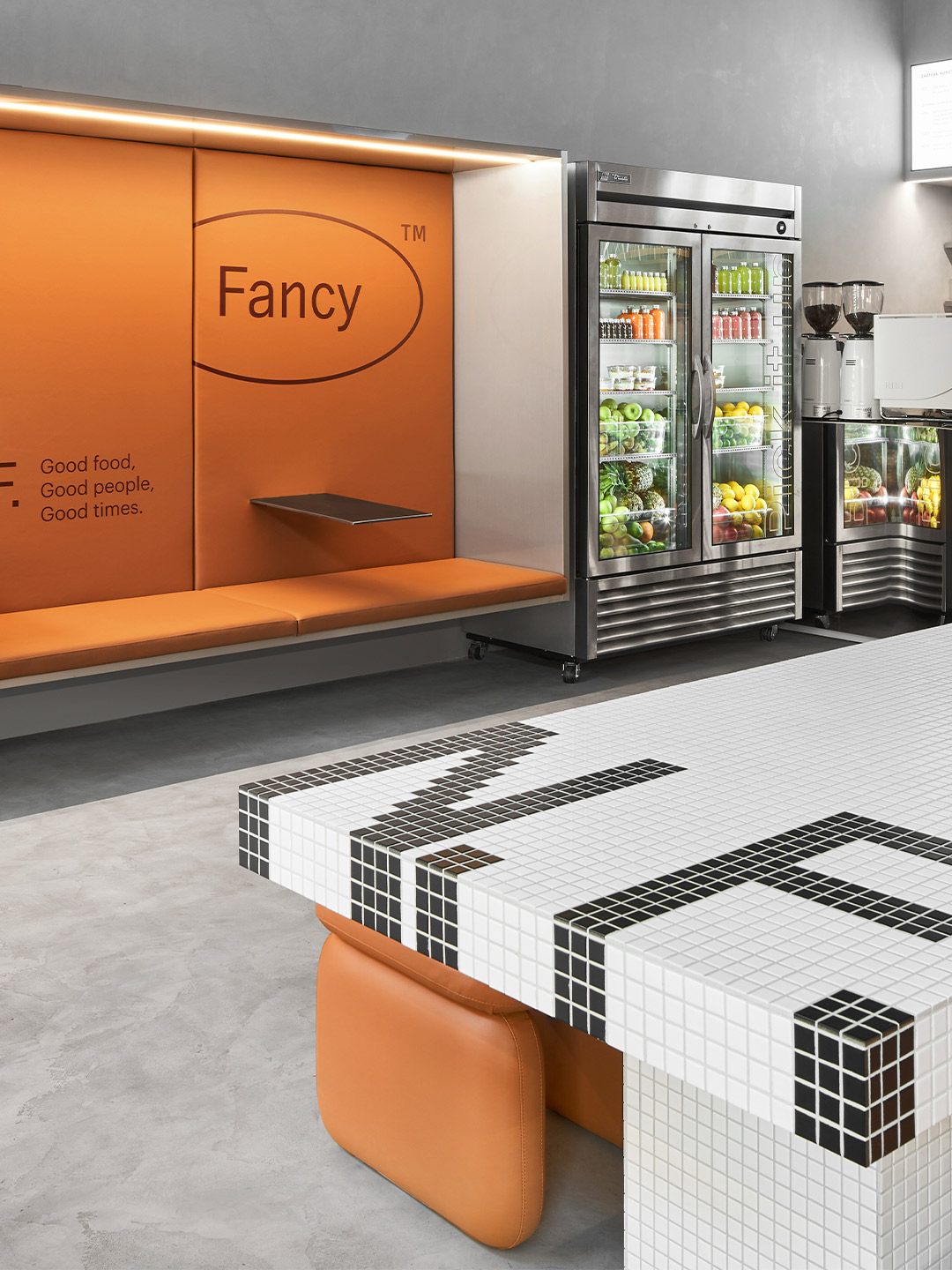
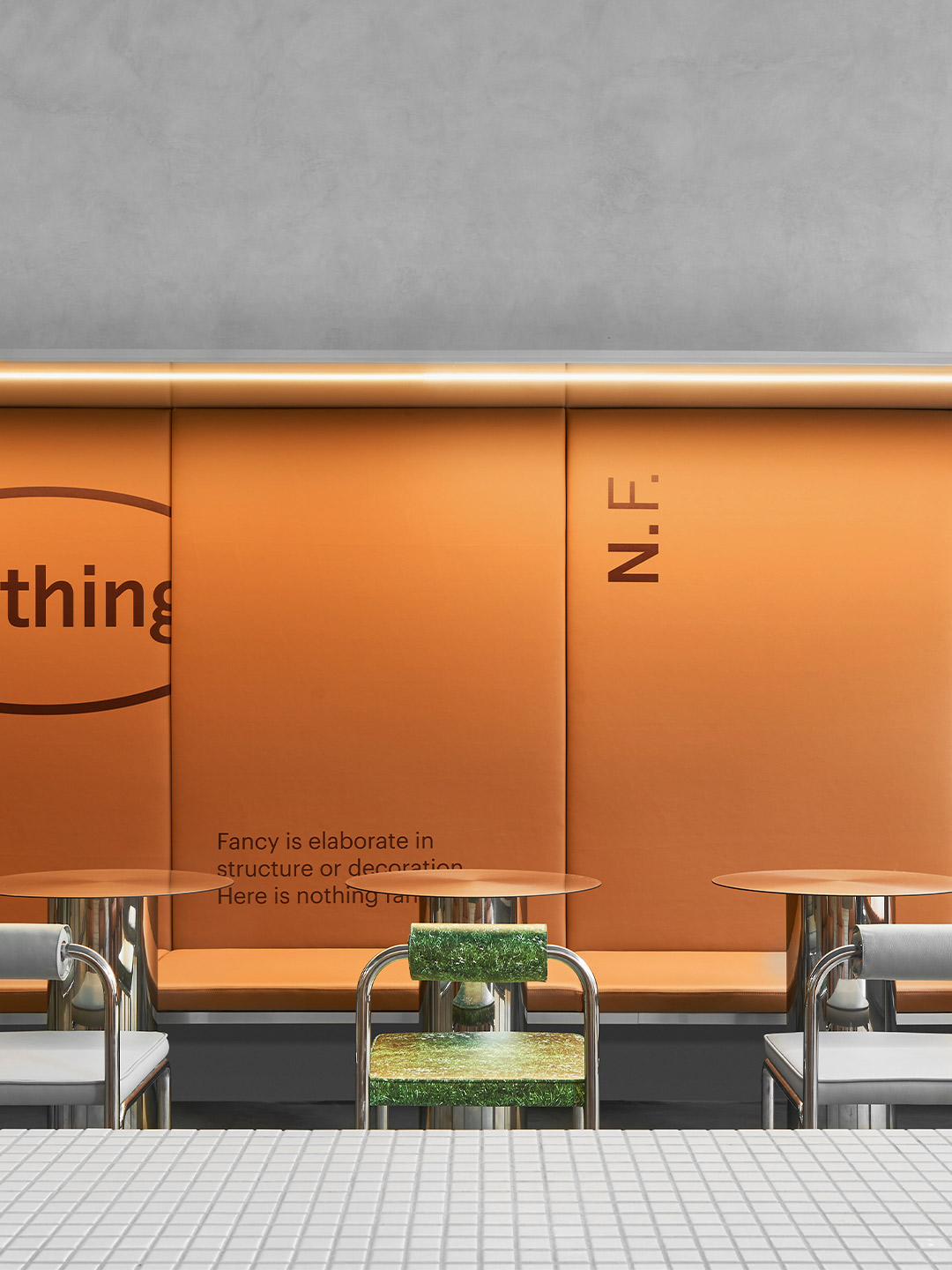
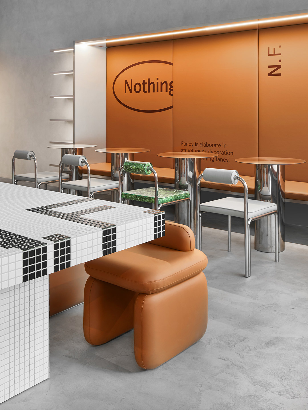
Time and again in the culinary world “health food” shops and cafes are singled out from the rest. So for architects Eduard Eremchuk and Katy Pititskaya the desire to normalise healthy eating became the driving force of their latest hospitality project. Given the name Nothing Fancy to reflect the cuisine on offer, the new restaurant nourishes its patrons with generous portions of “what our body needs every day,” Eduard and Katy say, pointing to a menu of quality ingredients prepared with the best available cooking technologies.
Located in Saint Petersburg, the 105-square-metre restaurant fit-out was inspired by the atmosphere of a typical Milanese cafe. Its point of difference, however, lies in the way Eduard and Katy blended the cafe archetype with a “futuristic” approach. “[We needed] to combine warm and cool tones, leather and metallic details in a very delicate way,” they explain. “We wanted to create a place where you might come every day, a space for real life.”
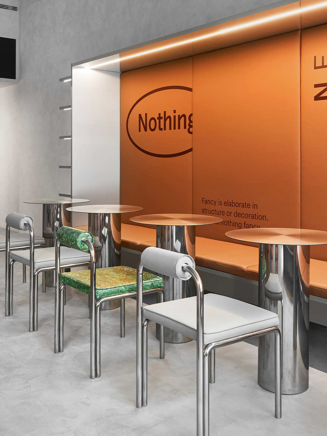
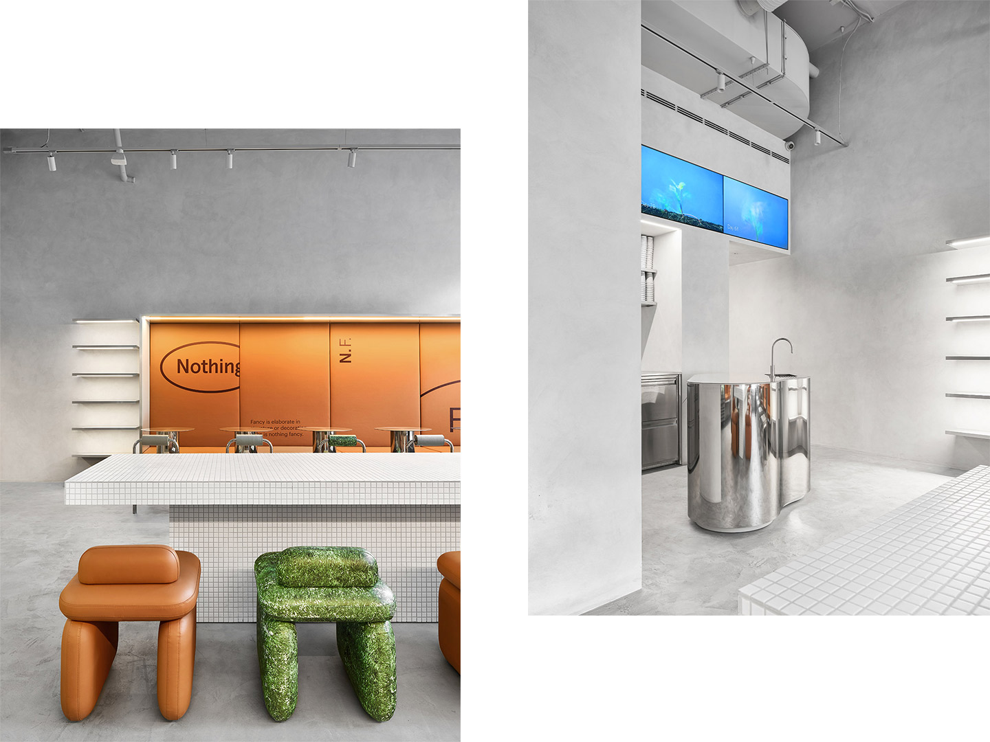
Nothing Fancy restaurant by Eduard Eremchuk and Katy Pititskaya
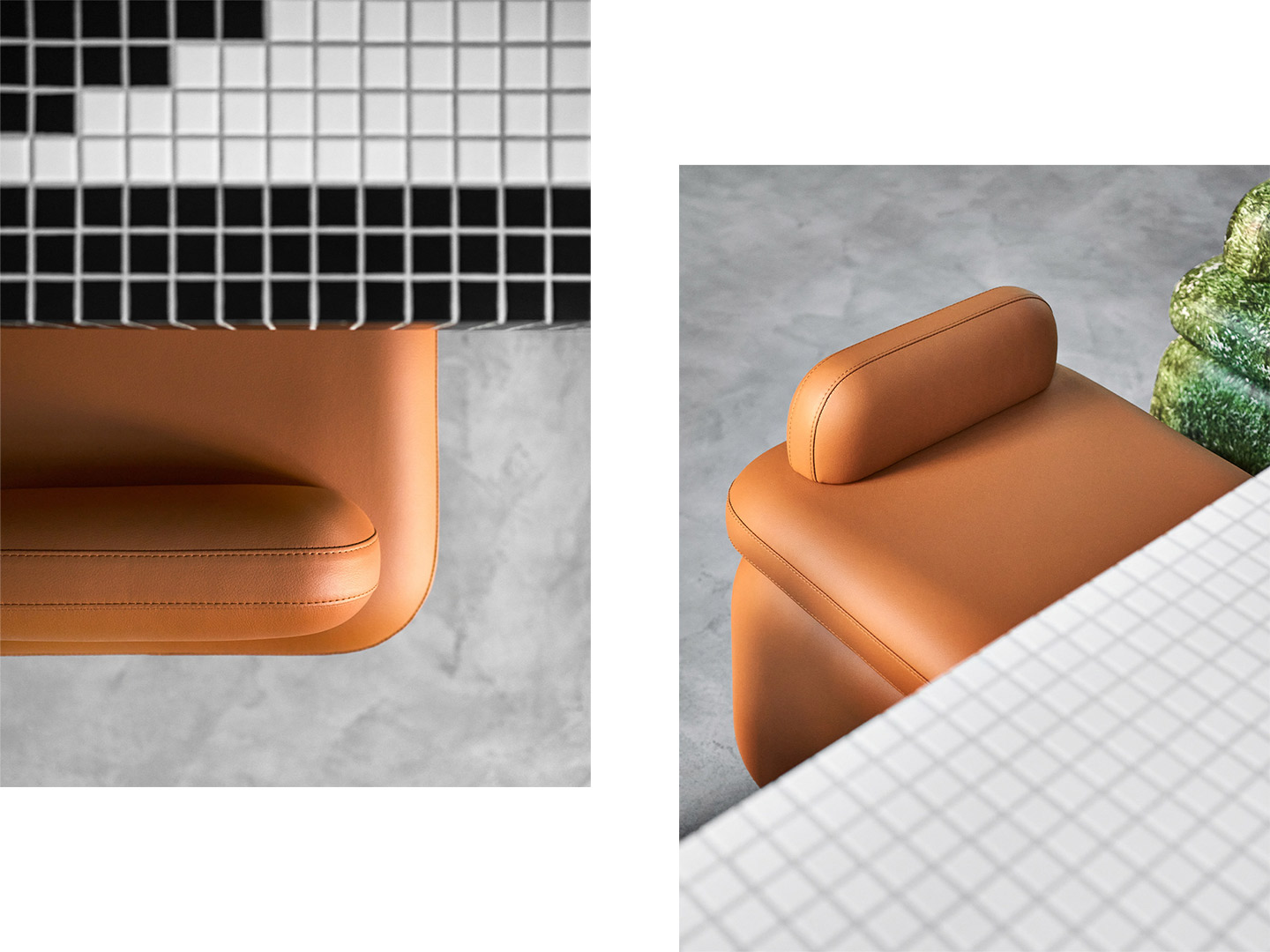
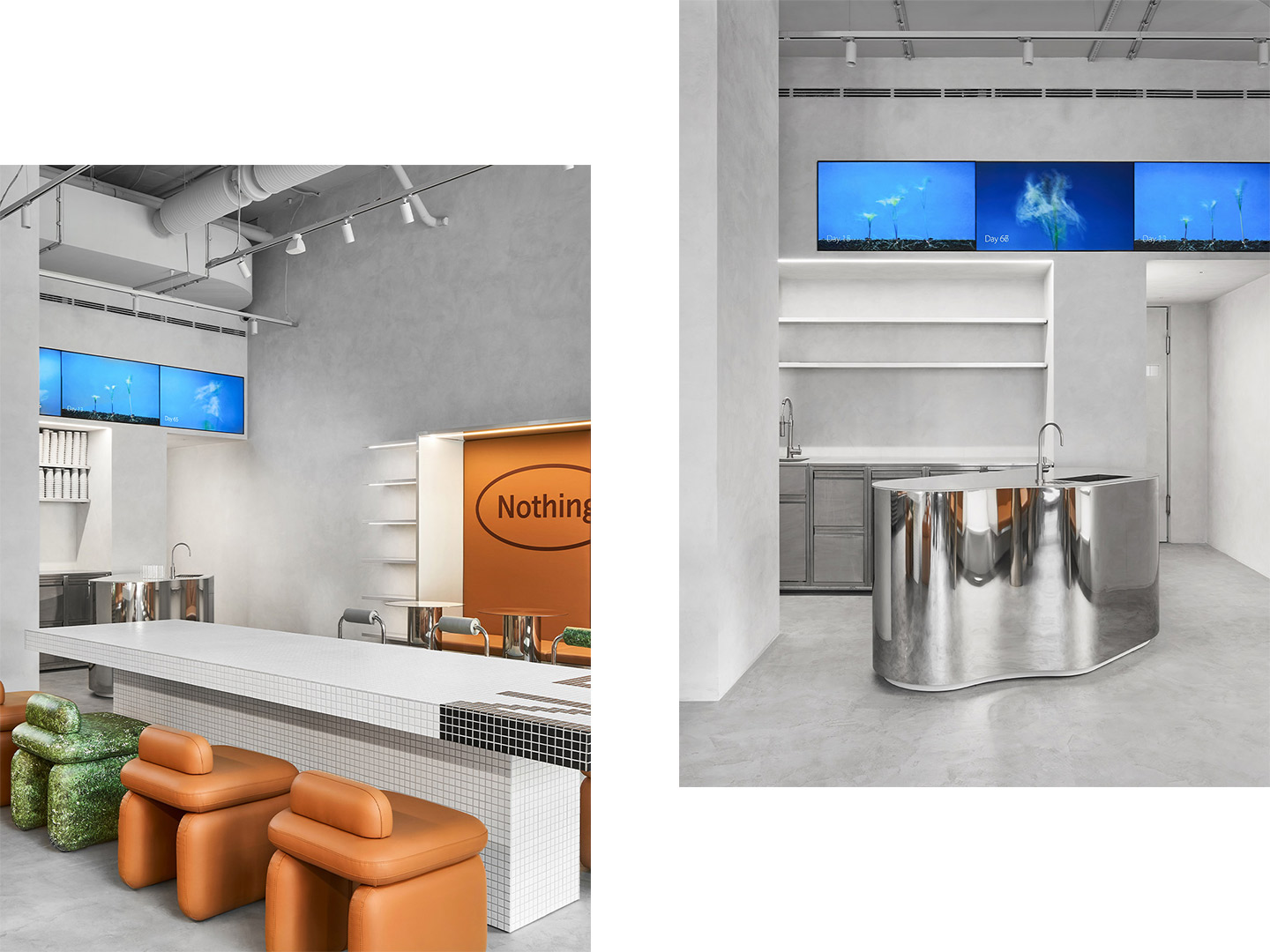
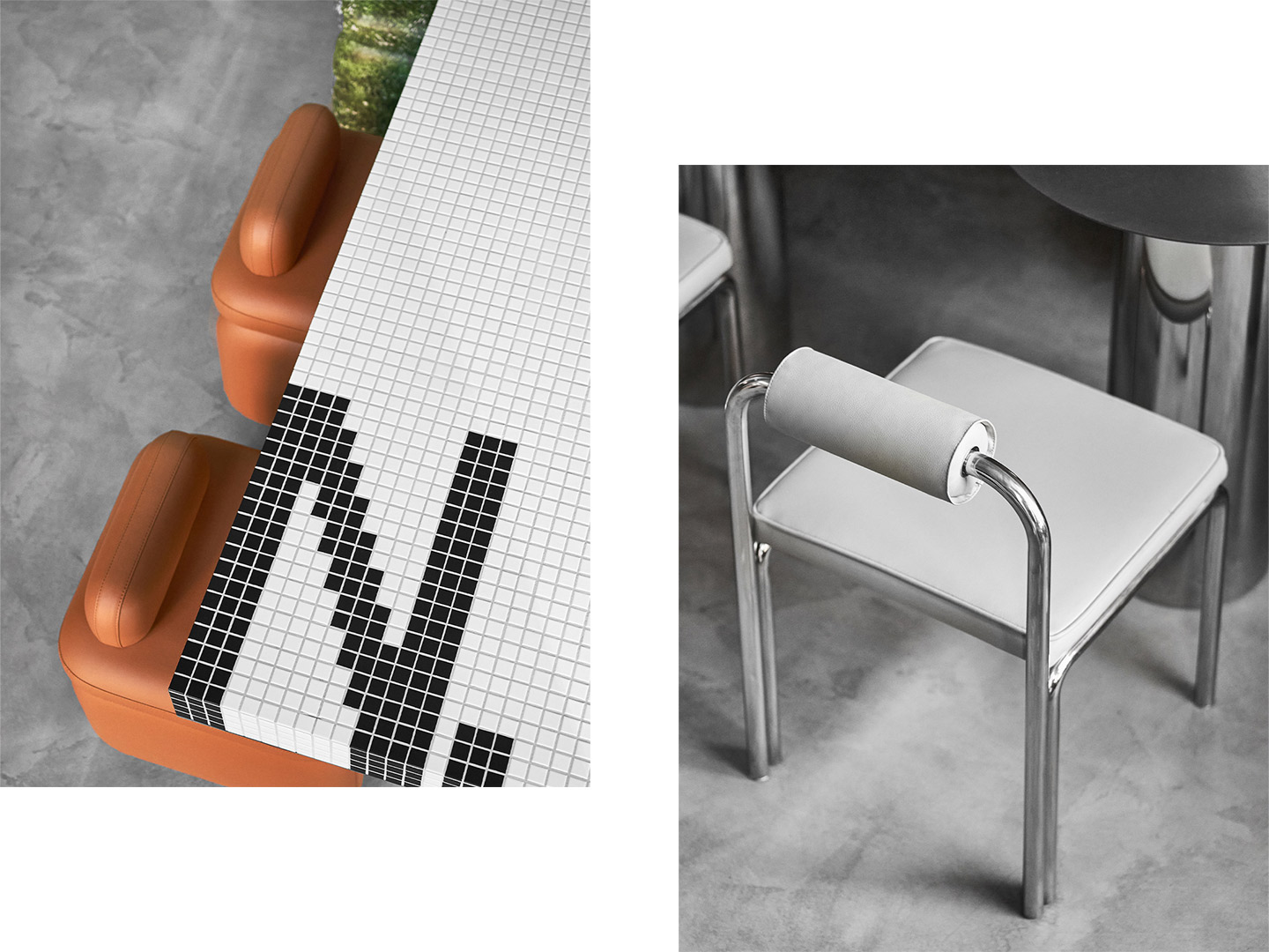
Within the interior of Nothing Fancy, the architects combined the patterning prevalent in Italian bistros with caramel-coloured leather, shimmering chrome details and mosaic tiles. It’s a mix of classic elements and contemporary style “in line with the spirit of the times,” they say. But the centrepiece of the space is perhaps its shapely main counter. “Upon entering, the visitor immediately pays all attention to the curved bar table. The piece is made of mirrored stainless steel – its curved shape reflects the space, mixing all the colours and details and creating a kaleidoscope effect.”
When it comes to dining in, there are three main zones on offer. The central spot is a large communal table, clad in black and white mosaic tiles, paired with flying ‘Alien’ chairs in faux leather. Designed by the architects, the chubby chairs balance a futuristic shape with warm, soft tones. “Some of the ‘Alien’ chairs have a grass print so they became a key point of the space. We saw how in Italian cafes they merge together some incongruous elements – for example, classic wooden boiserie or mosaic with a cheap grass printed tablecloth,” Eduard and Katy explain. “We loved this mix and wanted to bring it into our space.”
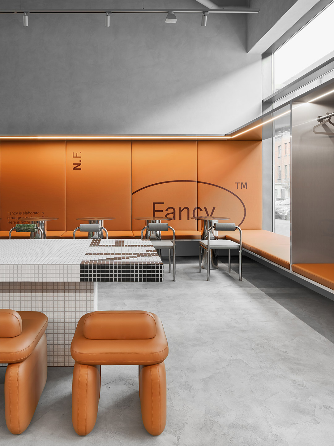
Along the two side walls of the restaurant, large niches frame lengthy banquette seats. One of these showcases a leather bench with wall-mounted stainless-steel tables, providing a perching spot for “fast dining”. The other niche, also with an upholstered bench, is joined by chairs and round stainless-steel tables in a more traditional arrangement. “These pieces repeat the reflective surfaces of the interior [and] its curved shapes,” explain the architects, who created the zone as a place where diners can sit and enjoy the buzz a little longer.
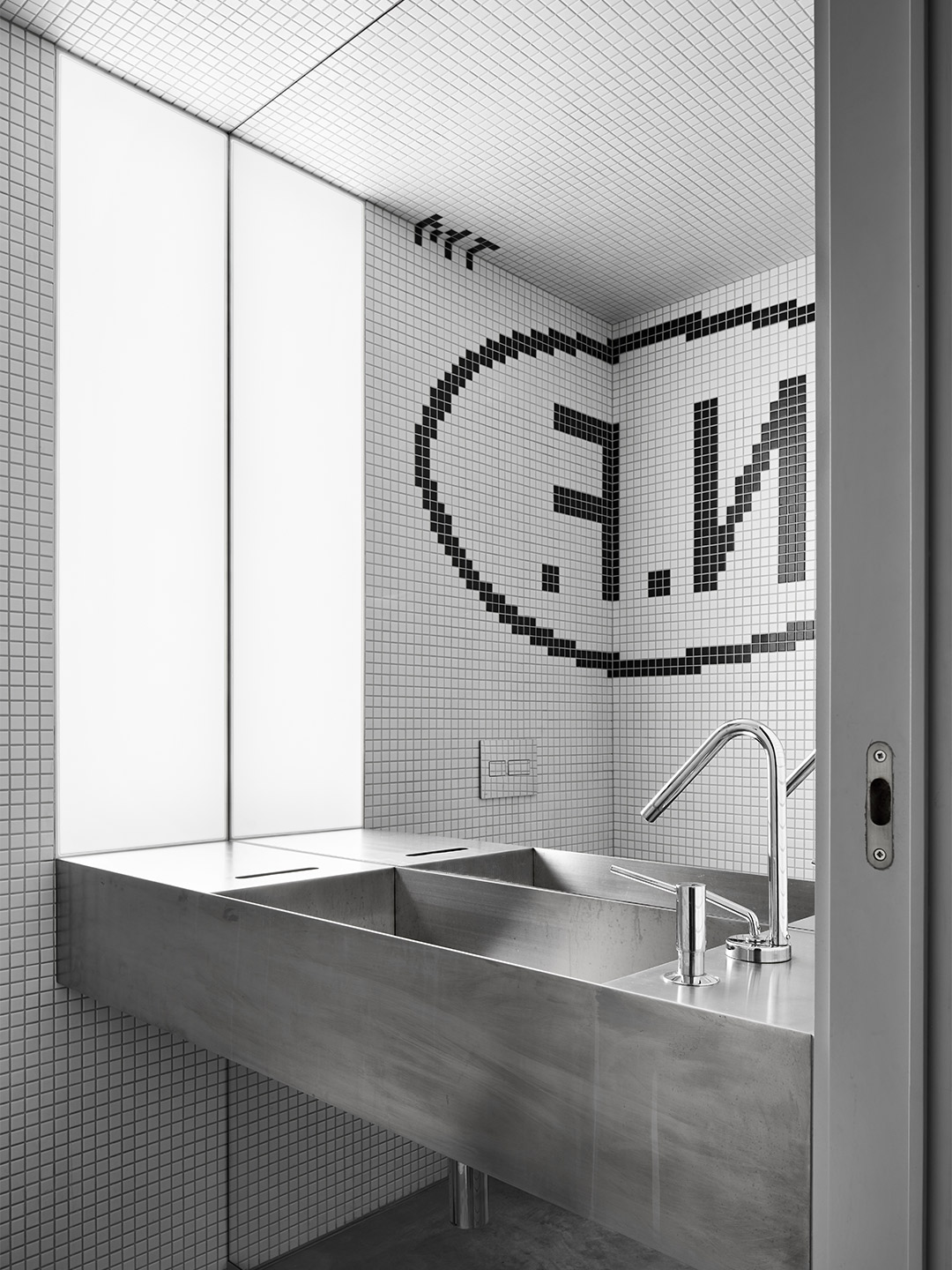
The Nothing Fancy logo is placed “at random” on several surfaces within the diner. Developed by Anton Gorbunov, the founder of local creative agency Liars Collective, the brand identity is printed on the chairs and the leather-lined walls of the niches. In the bathrooms, steel trough-style sinks are partnered with pixelated mosaic logos, mirroring the technique applied to the large share table and ensuring that no guest leaves the premises without knowing where they’ve been.
eduarderemchuk.com; pititskaya.com
“We wanted to create a place where you might come every day, a space for real life.”
Catch up on more architecture, art and design highlights. Plus, subscribe to receive the Daily Architecture News e-letter direct to your inbox.
Related stories
- Introducing the New Wave collection of 80s-inspired vases by Greg Natale.
- Greg Natale launches 70s-inspired glassware (and a signature cocktail for summer).
- Swatch list: Kelly Wearstler curates paint range for Farrow & Ball.
- Stokes 14: Architect William Smart’s creative studio in Sydney.
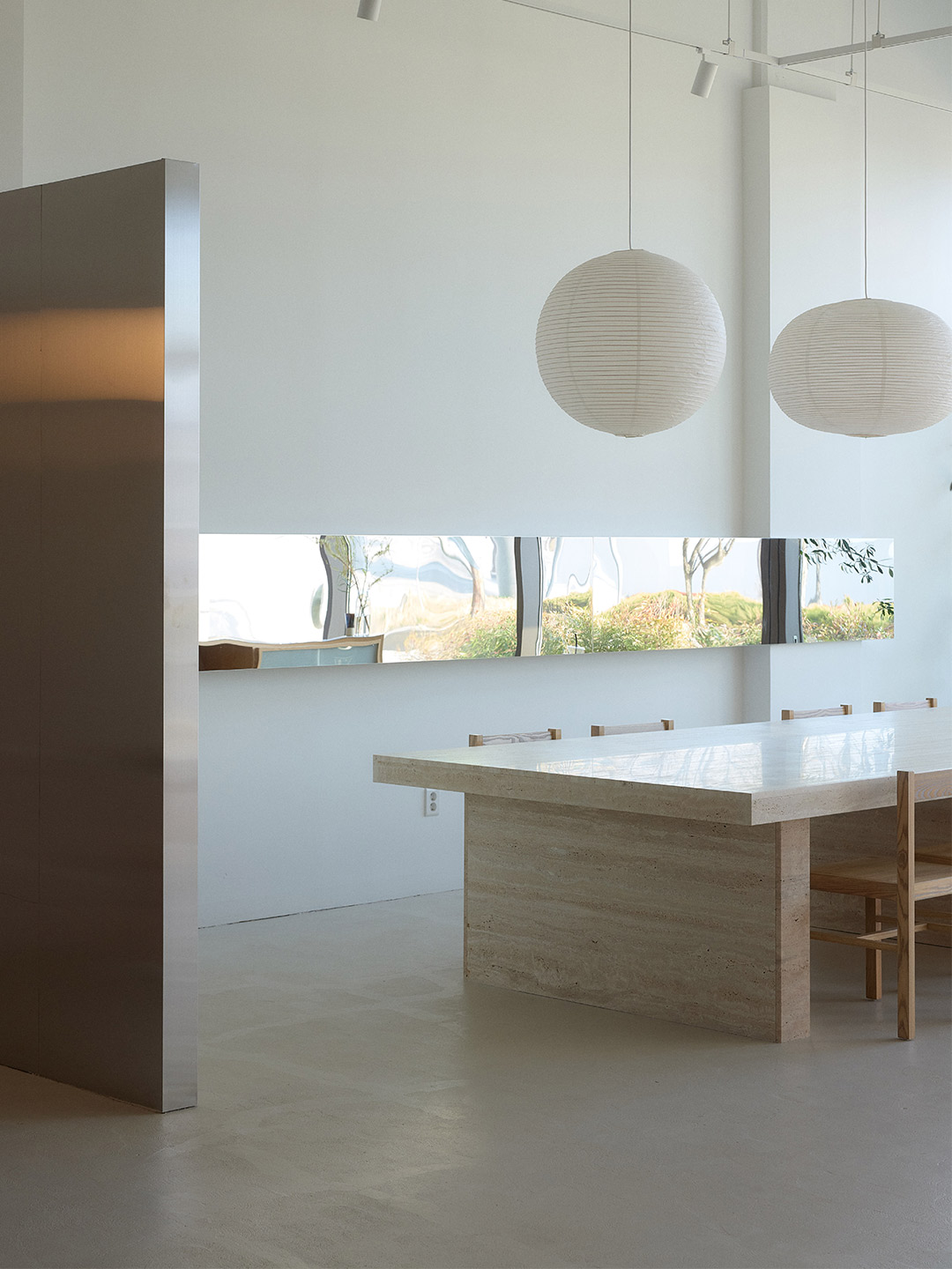
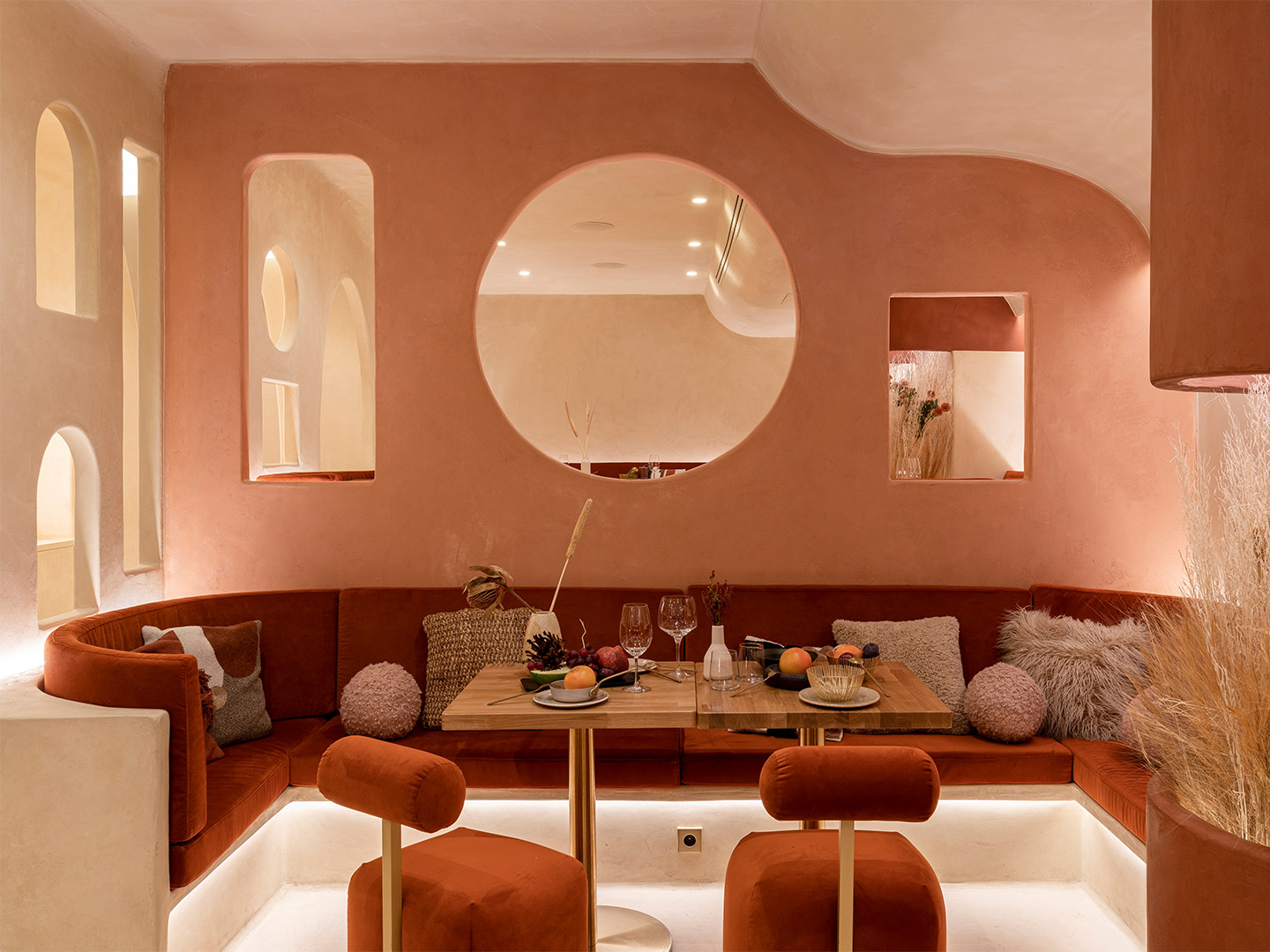
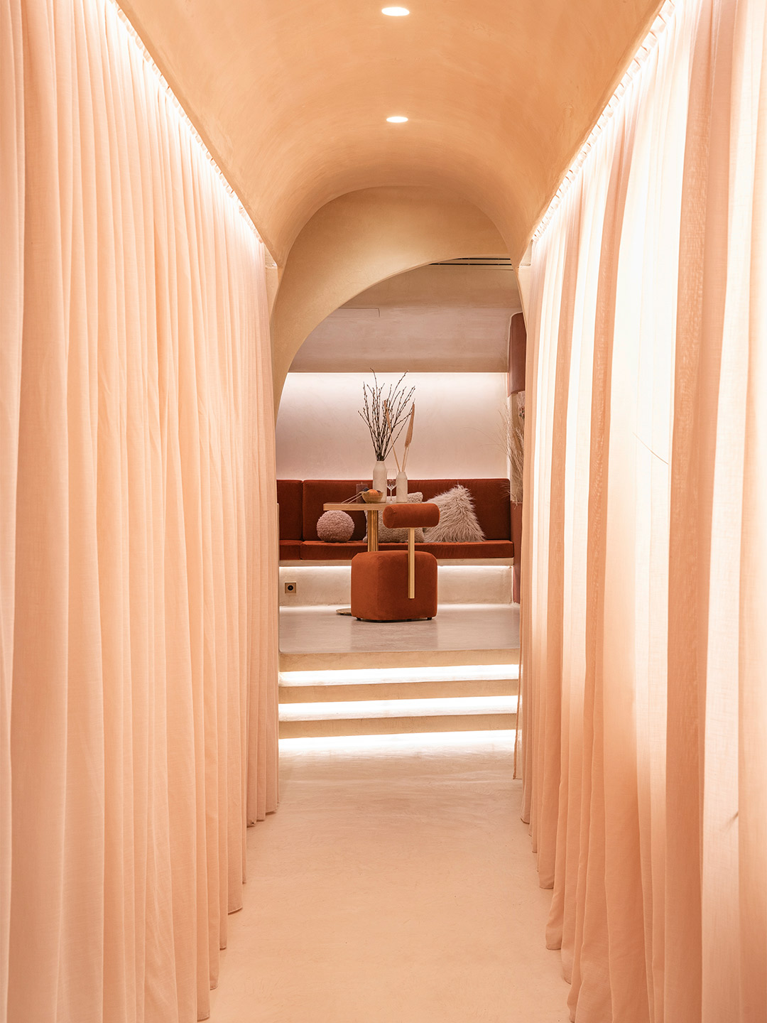
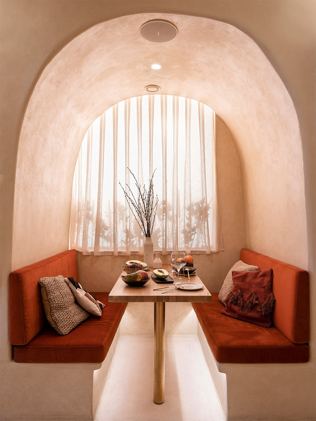
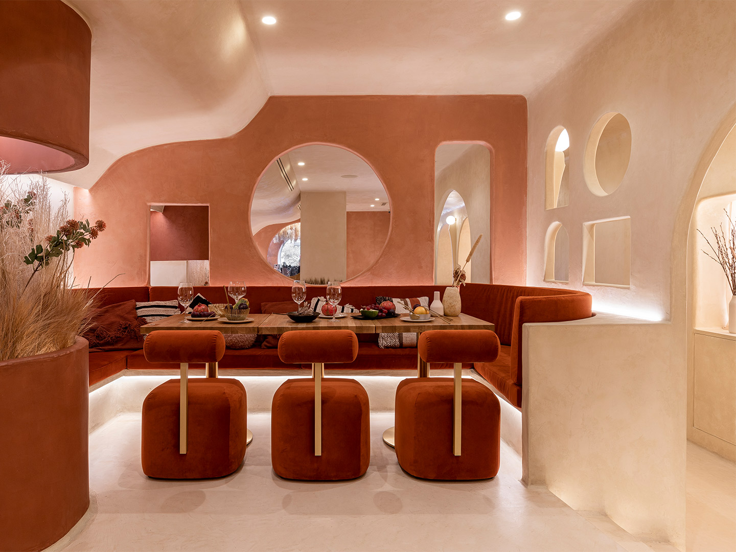
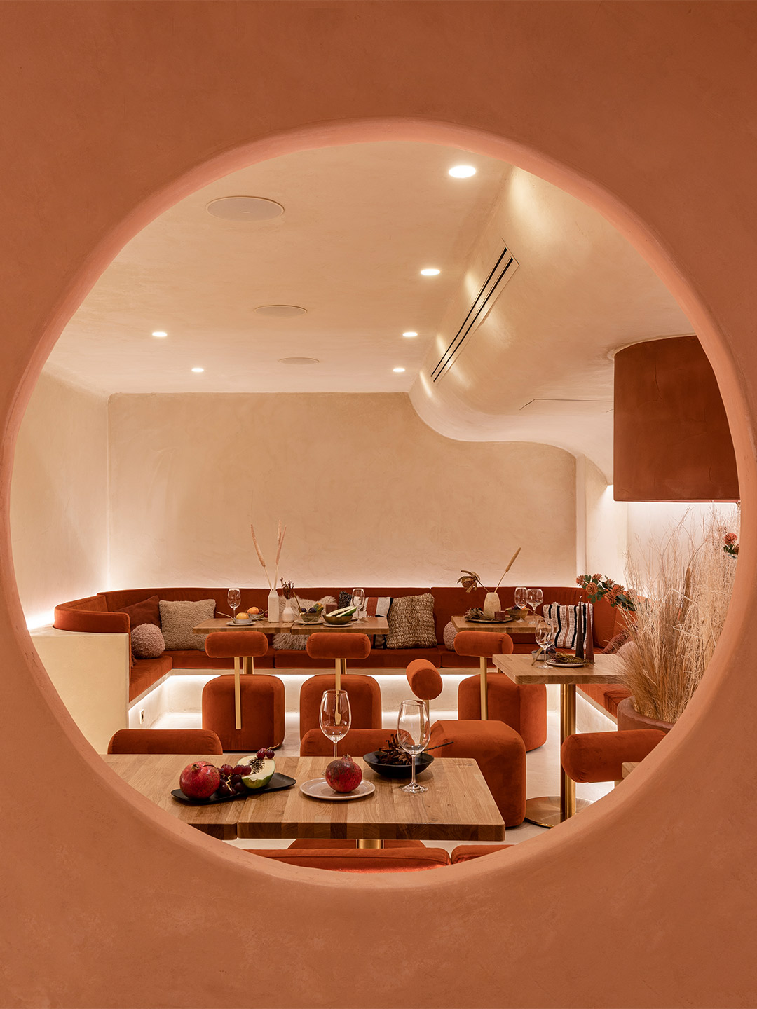
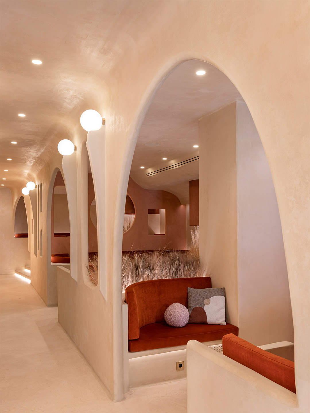
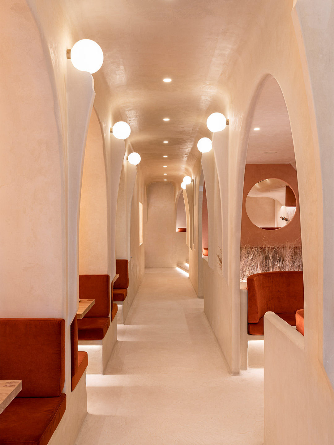
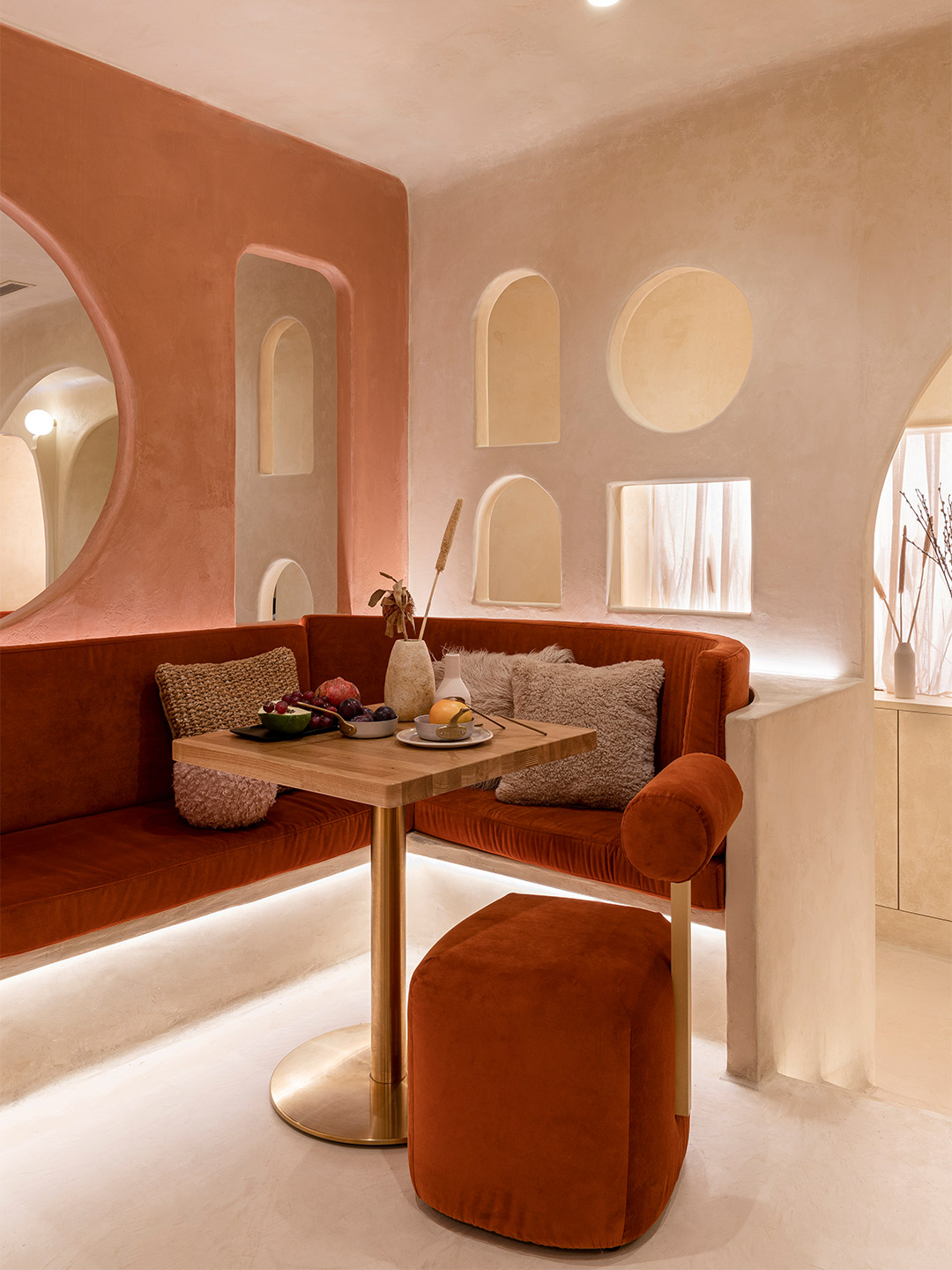
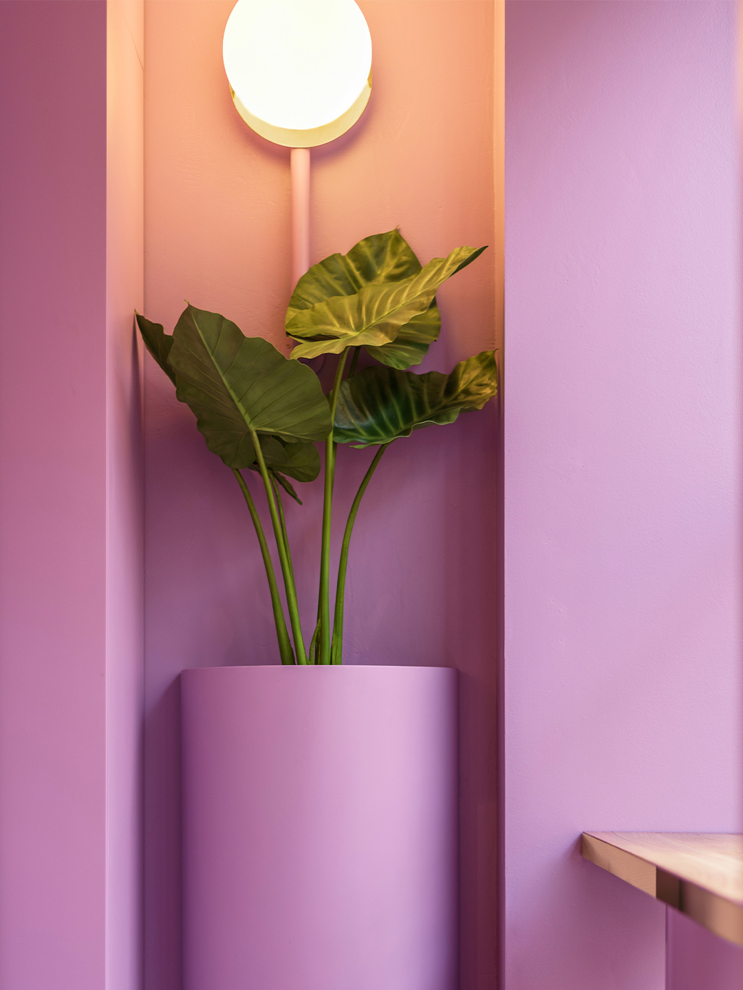
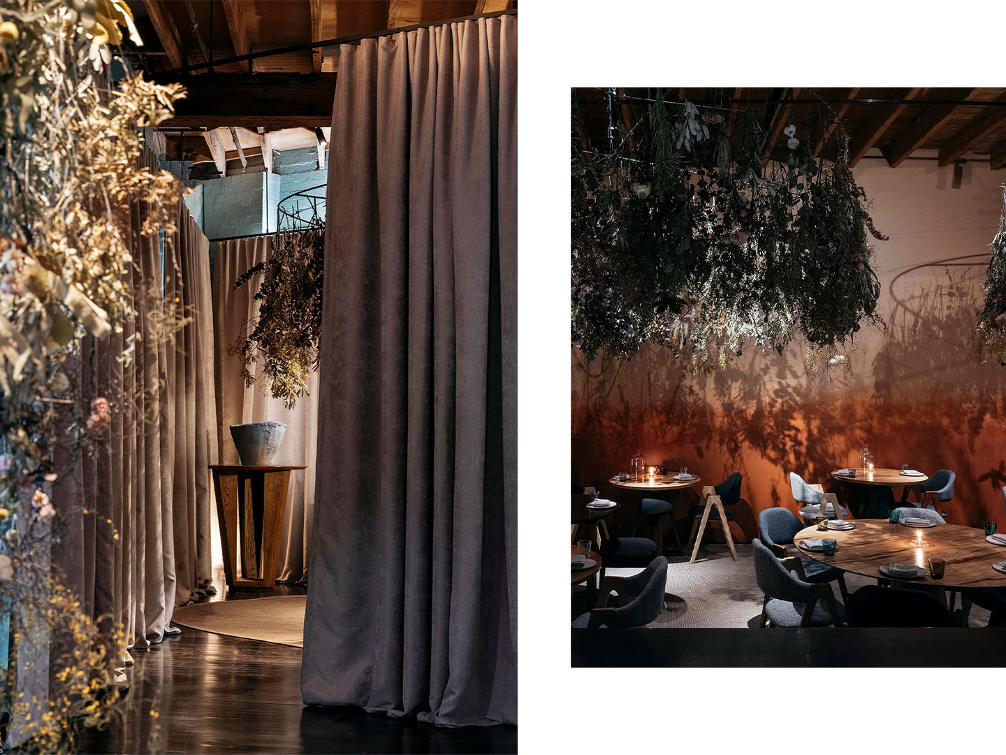
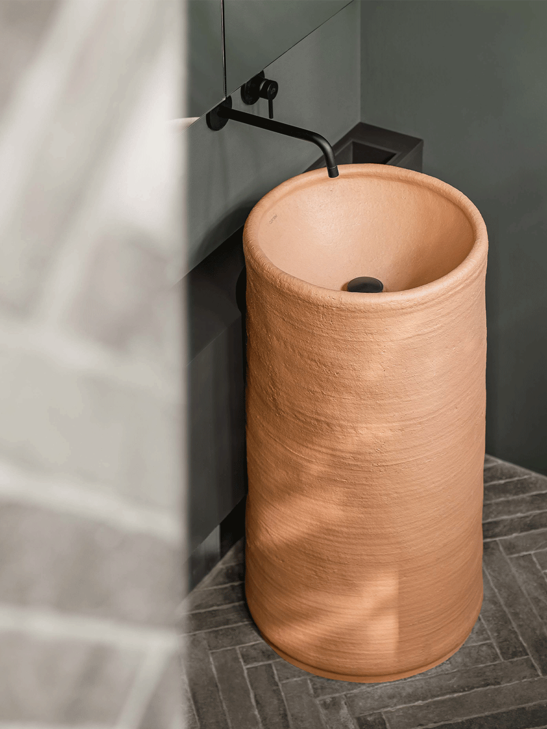
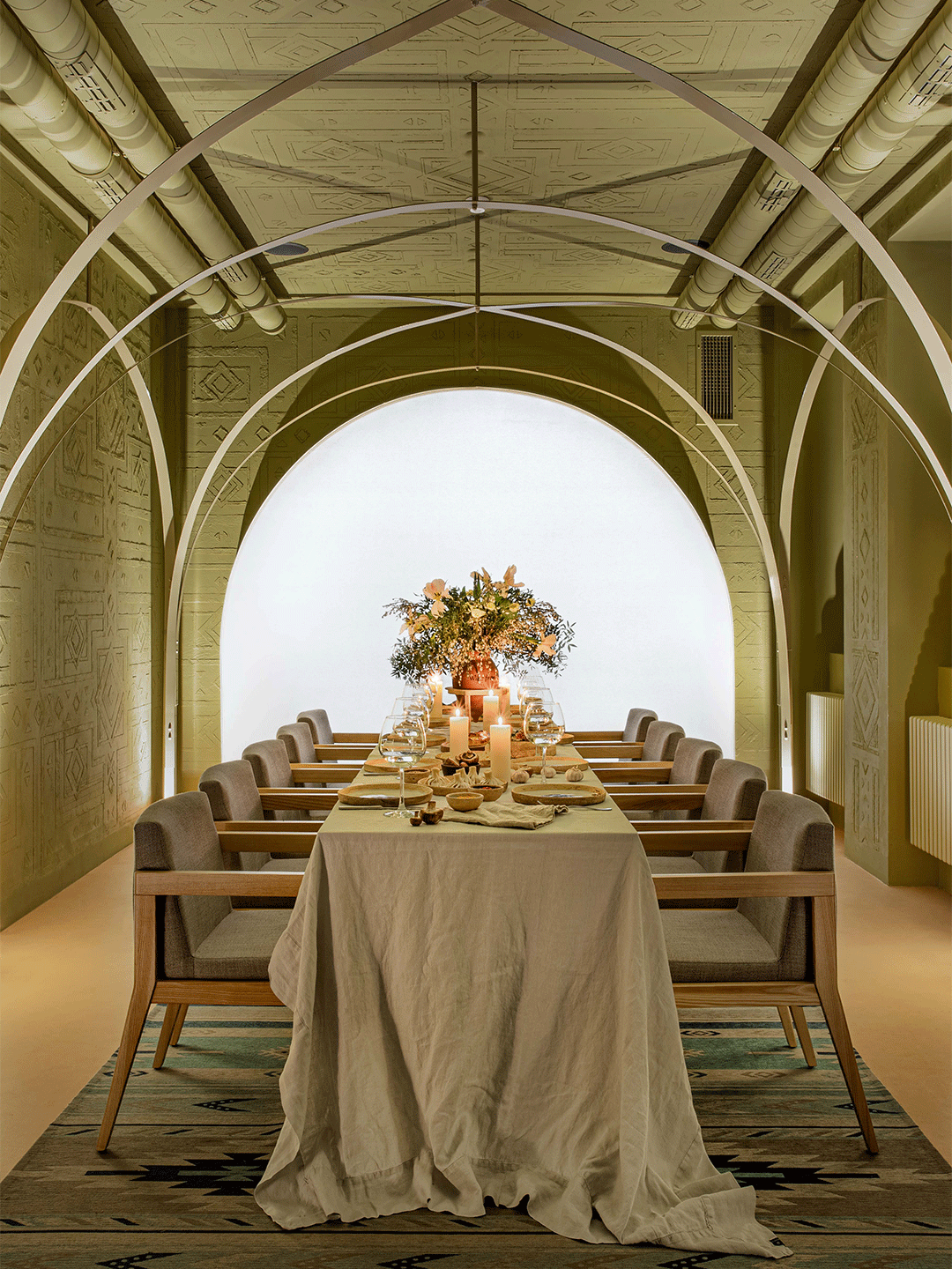
Serving curves and a spicy sun-kissed palette, Living Bakkali is a restaurant like no other. It’s a place where guests are invited to “live sensorial experiences” through its menu offering, heightened by a spirited atmosphere crafted by Valencia-based design studio Masquespacio. Inspired by the Middle East, Masquespacio’s founders Christophe Penasse and Ana Milena Hernández Palacios wish to take diners “to the most profound part of the desert,” through their design response, connecting them with “a marvellous environment that, for many, is unknown and full of mystique,” they say.
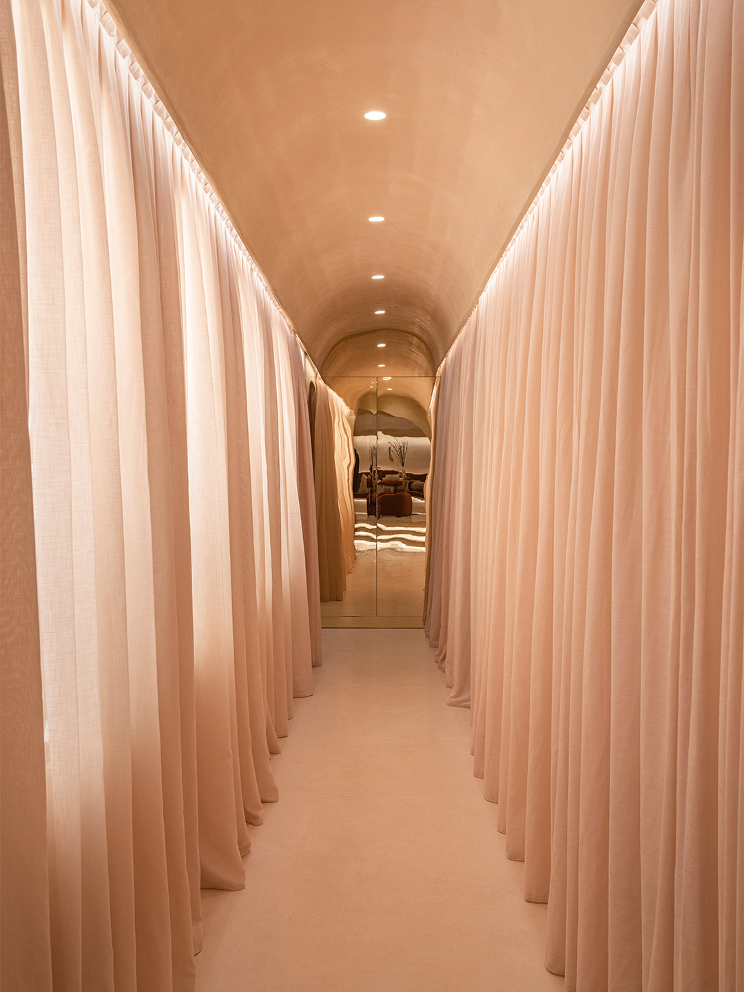
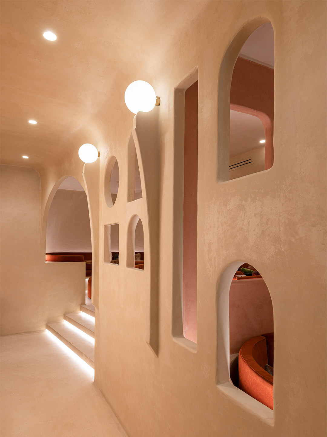
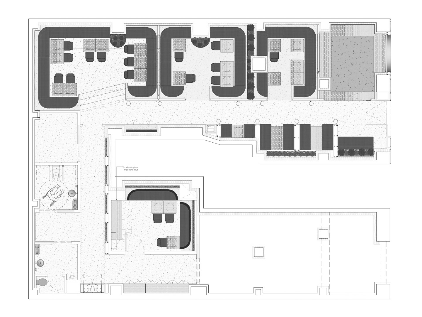
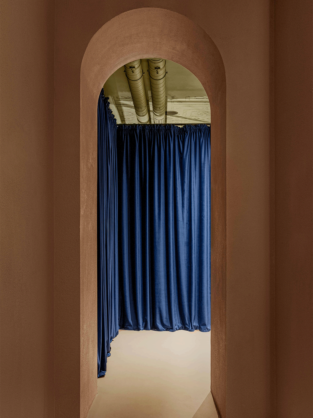
The way in which the Masquespacio team has presented the restaurant encourages diners to meander through a layout of key sitting areas, likened by the designers to “small corners as if you were at the fantastic Orient, with its lounge seats that invite different dining groups to relax and connect with each other”. At the same time, guests are further tempted to discover what the hidden corners of Living Bakkali might contain, partially revealed through a series of openings or internal “windows” realised in the style of Arabic architecture.
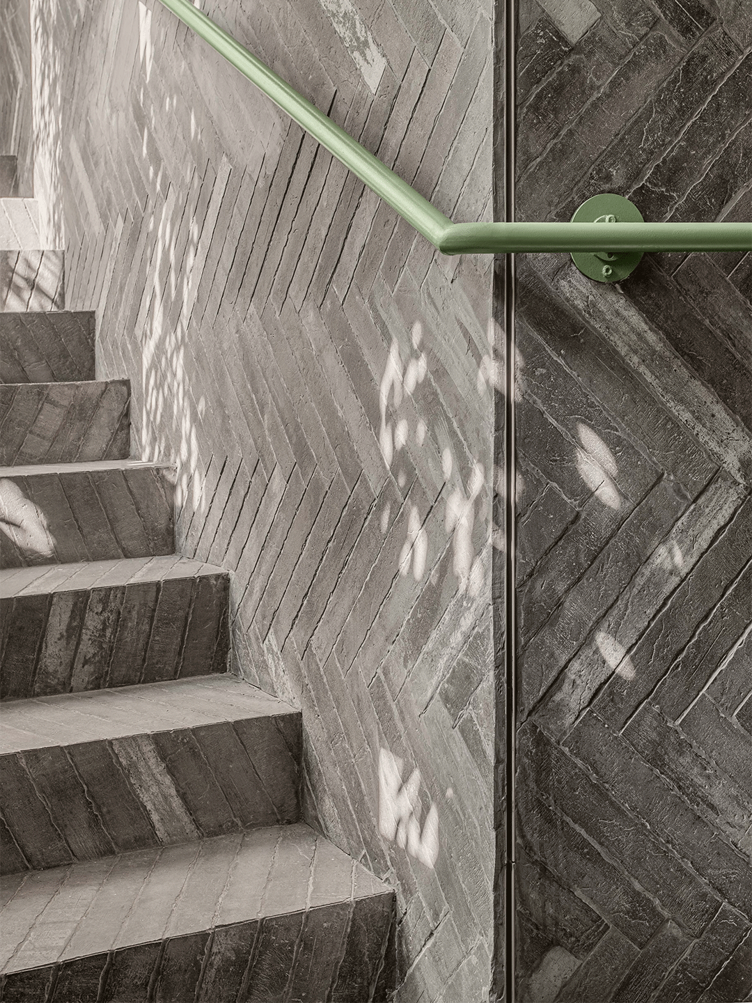
Living Bakkali restaurant in Valencia by Masquespacio
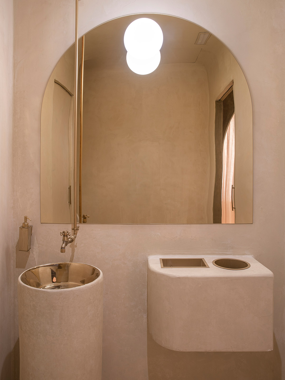
Connecting the entry with the kitchen, the central hall is responsible for guiding diners and staff through the space, from the more intimate seating areas (perfect for two), to the long benches intended for bigger groups. A space raised up on a higher level offers wider views of the bustling restaurant. “While the first part of the hall makes you feel as though you were walking through a street of ancient houses, the second part takes you through a corridor between curtains,” Christophe and Ana suggest. “This incorporates a private dining room and the restaurant’s bathrooms.”
Zooming in on the details, organic forms interact with each other in every moment of Living Bakkali. A sun-baked adobe effect is created on the walls, floors and ceilings, finished by hand in the tradition of the ancient houses that are aimed to be represented here. “On the ceiling, a more neutral but slightly contrasting colour palette that clearly reminds us of the desert has been applied,” the designers say. “Last but not least,” they reveal, “the lighting effects aim to highlight the mystery and beauty waiting to be discovered.”
Zooming in on the details, organic forms interact with each other in every moment of Living Bakkali.
In Italy, Masquespacio also designed the Bun burger restaurant in Milan and in Turin. Near Florence, famed Italian ceramics-maker Bitossi has opened a museum displaying its 5000-piece catalogue. Catch up on more hospitality architecture and design and retail design, plus subscribe to receive the Daily Architecture News e-letter direct to your inbox.
Related stories
- Resa San Mamés student accommodation in Spain by Masquespacio.
- The bar and restaurant at La Sastrería in Valencia by Masquespacio.
- Mama Manana restaurant in Kyiv by Balbek Bureau.
- Gold ‘n’ arches: Bun burger restaurant in Milan by Masquespacio.
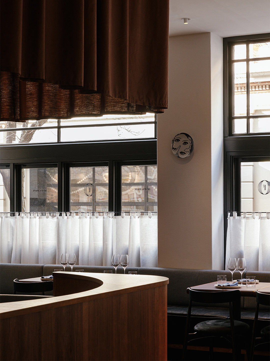
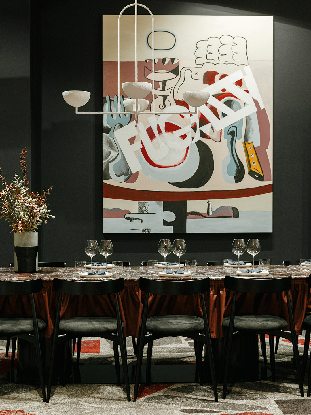
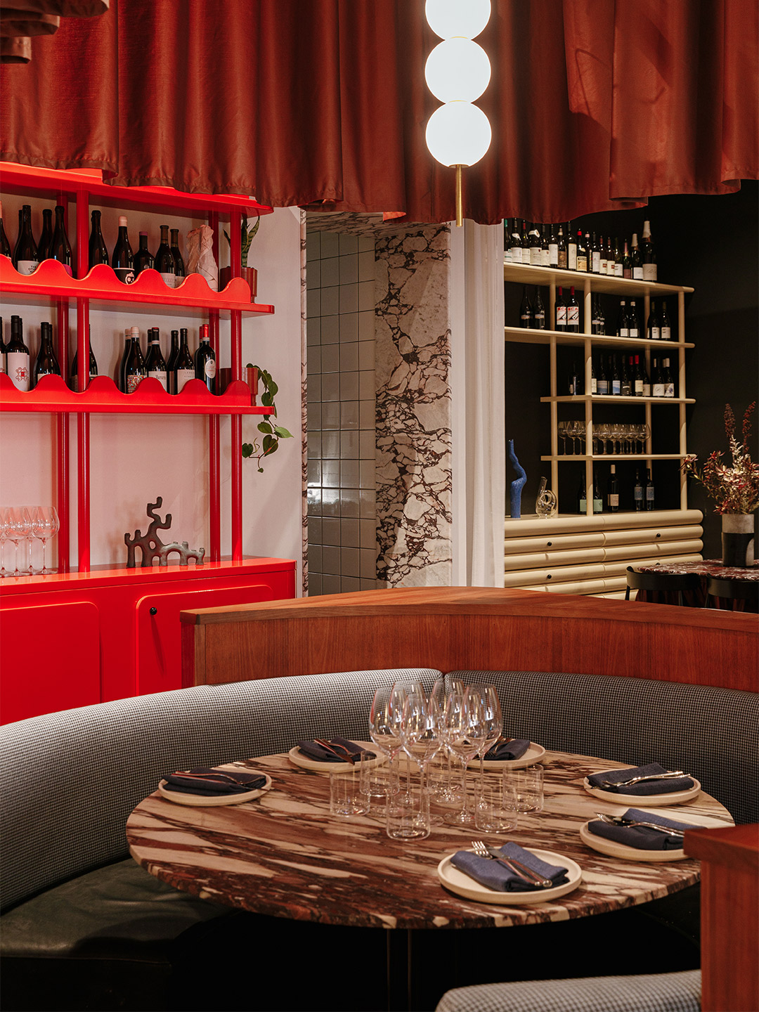
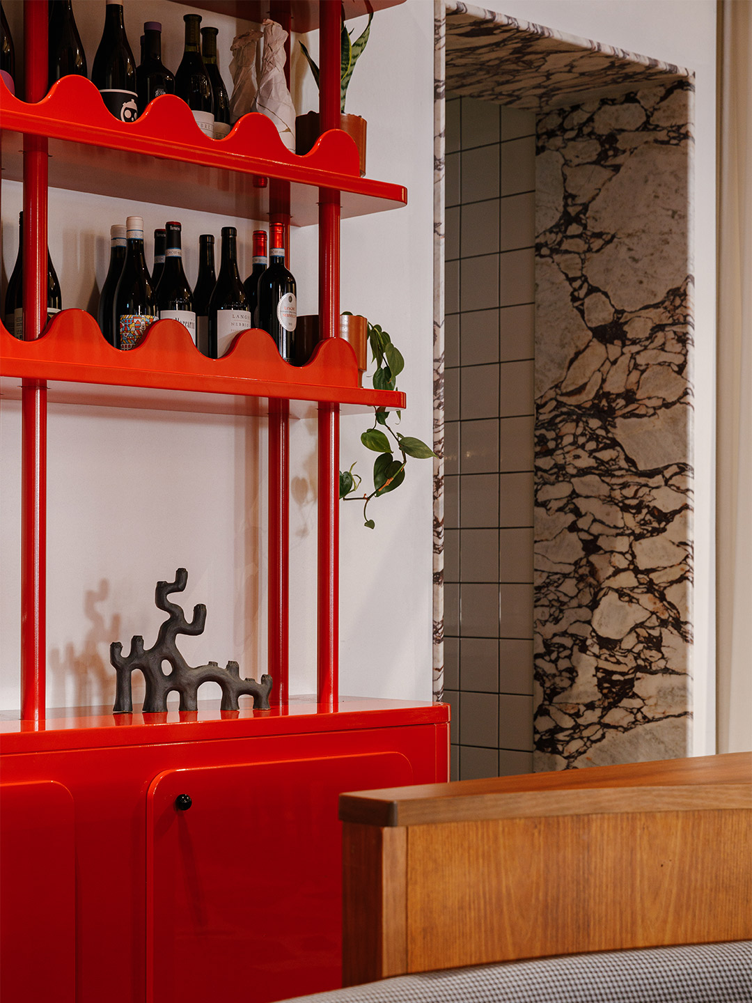
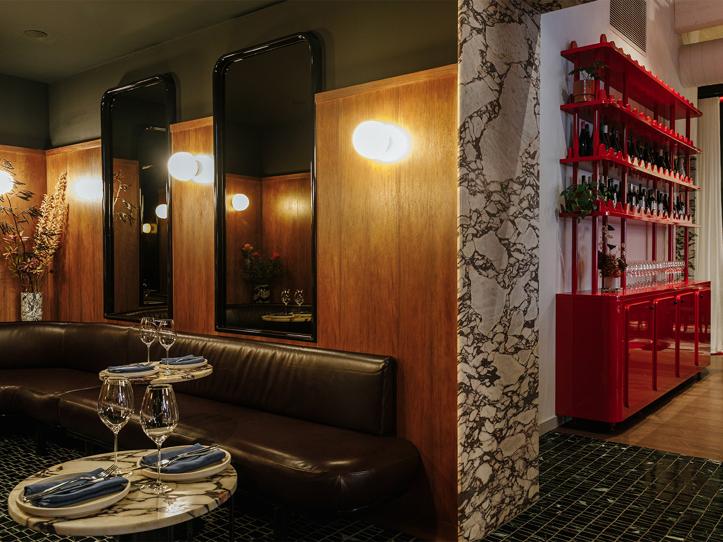
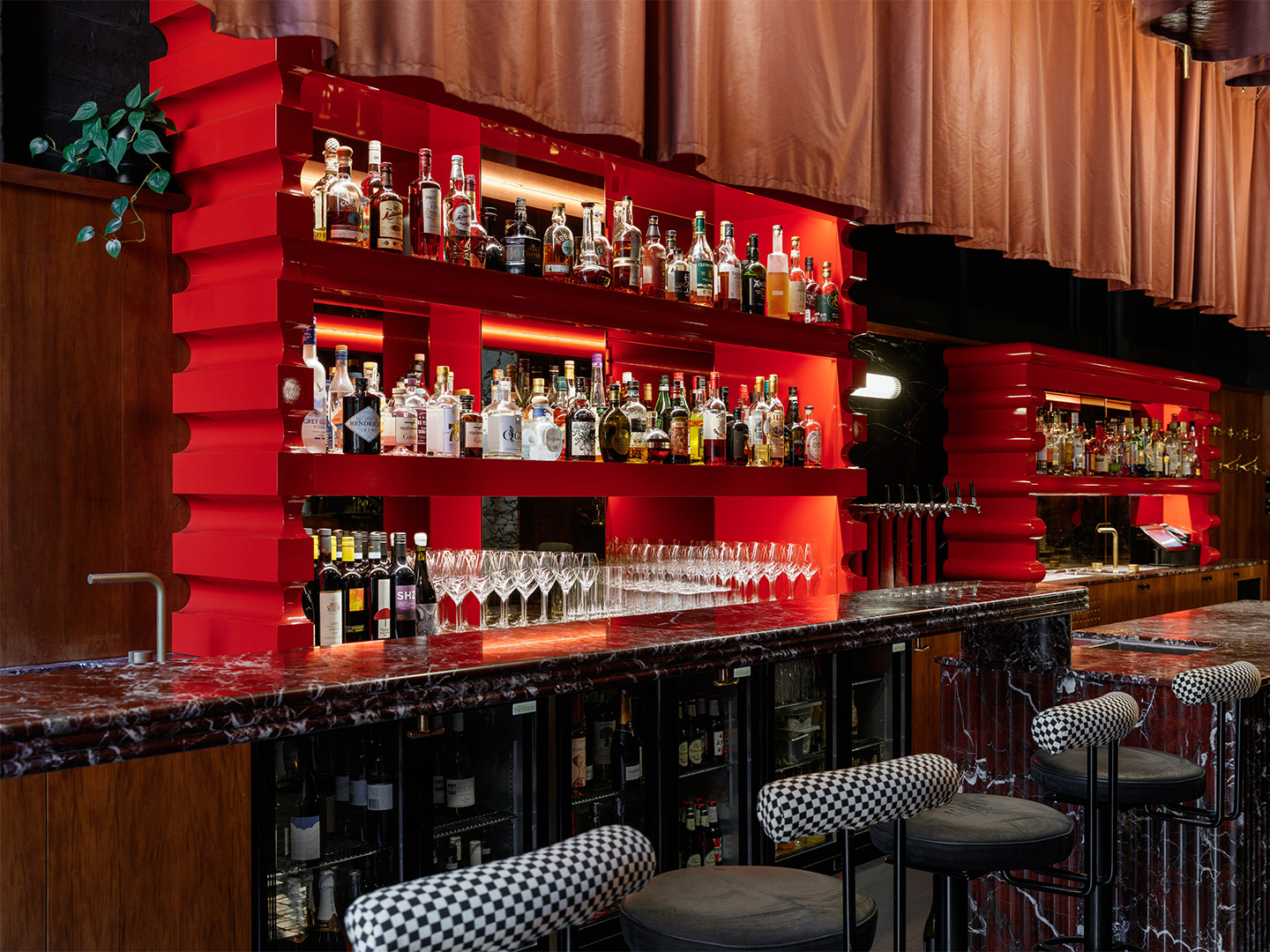
You have to hand it to Studio-Gram. Not only has the Adelaide-based firm succeeded in designing an out-of-the-box bar and restaurant with Italo-New York connections. (Where there’s not a red-and-white checked table cloth in sight.) They’ve also managed to lean into the wild ride that is the 2013 film Wolf of Wall Street and merge it with their design response. In fact, it was a cocaine-fuelled conversation from the all-American crime flick that inspired the venue’s name, Fugazzi.
The term, derived from the slang word fugazi, roughly meaning ‘fake’, was thrown around in the movie by Mark Hanna, played by Matthew McConaughey, and Leonardo DiCaprio’s character Jordan Belfort. Discussing the reality that nobody really knows whether the stock market is likely to go up, down (or as Hanna says, “sideways or in circles”), the two nefarious stockbrokers labelled the situation they found themselves in a “fugazi”.
Mark Hanna: It’s all a fugazi. Do you know what fugazi is?
Jordan Belfort: Fugazi, it’s a fake…
Mark Hanna: Yeah, fugayzi, fugazi. It’s a whazy. It’s a woozie. It’s fairy dust. It doesn’t exist. It’s never landed. It is no matter. It’s not on the elemental chart. It’s not f*cking real. Right?
Jordan Belfort: Right.
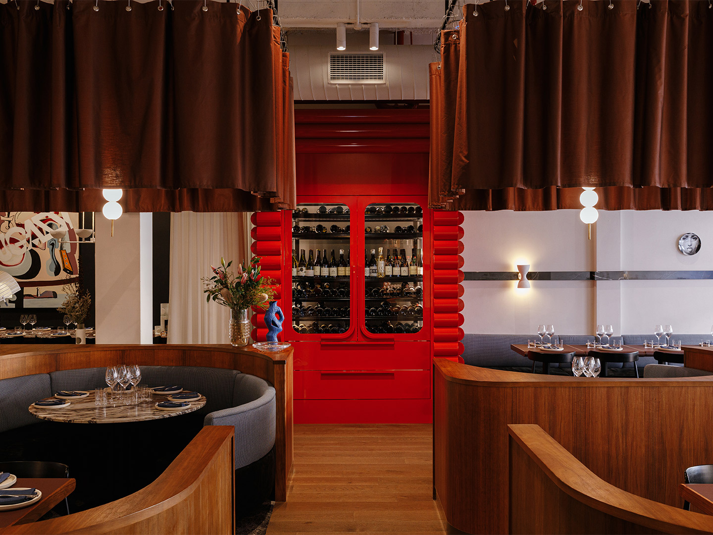
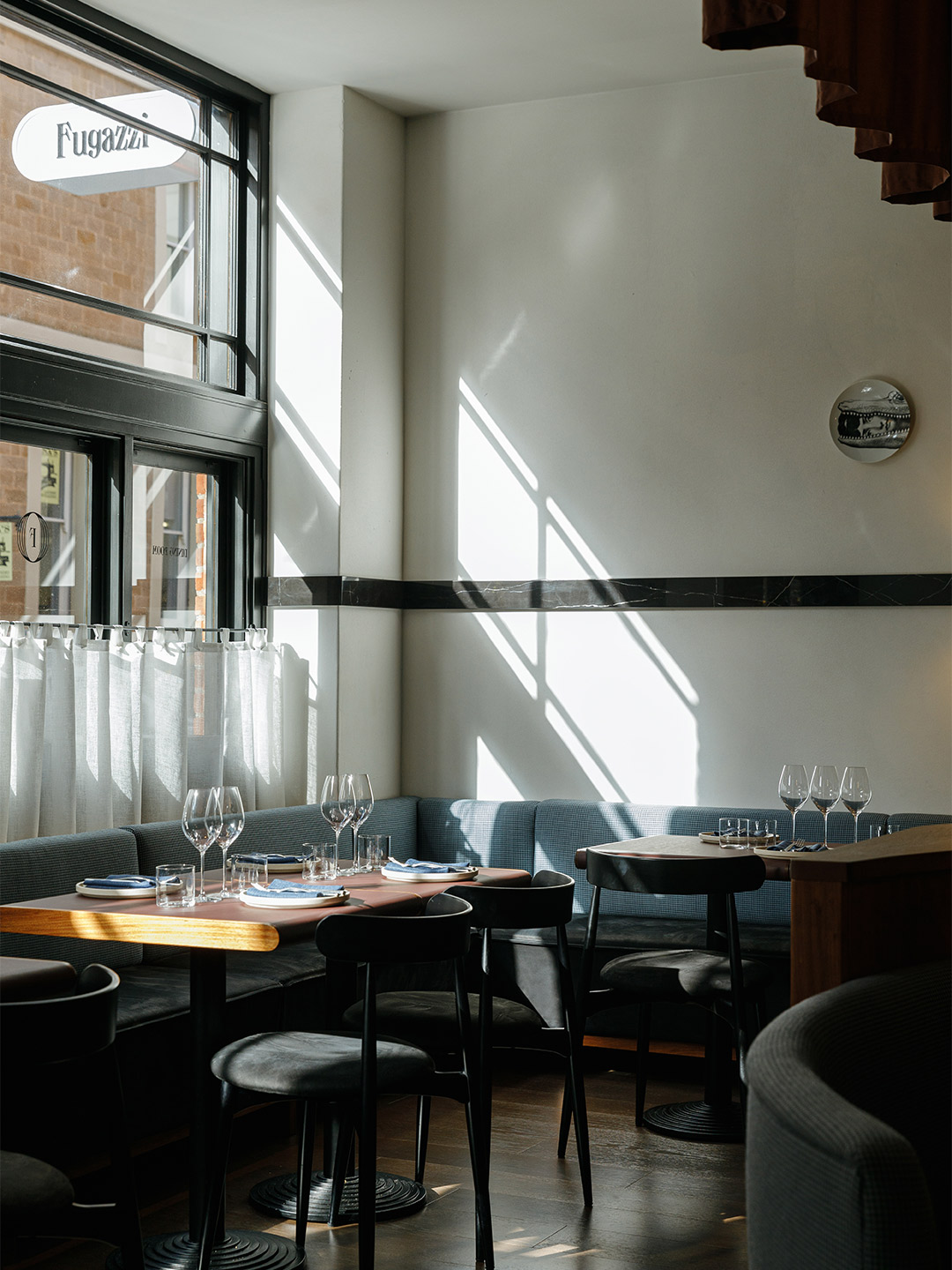
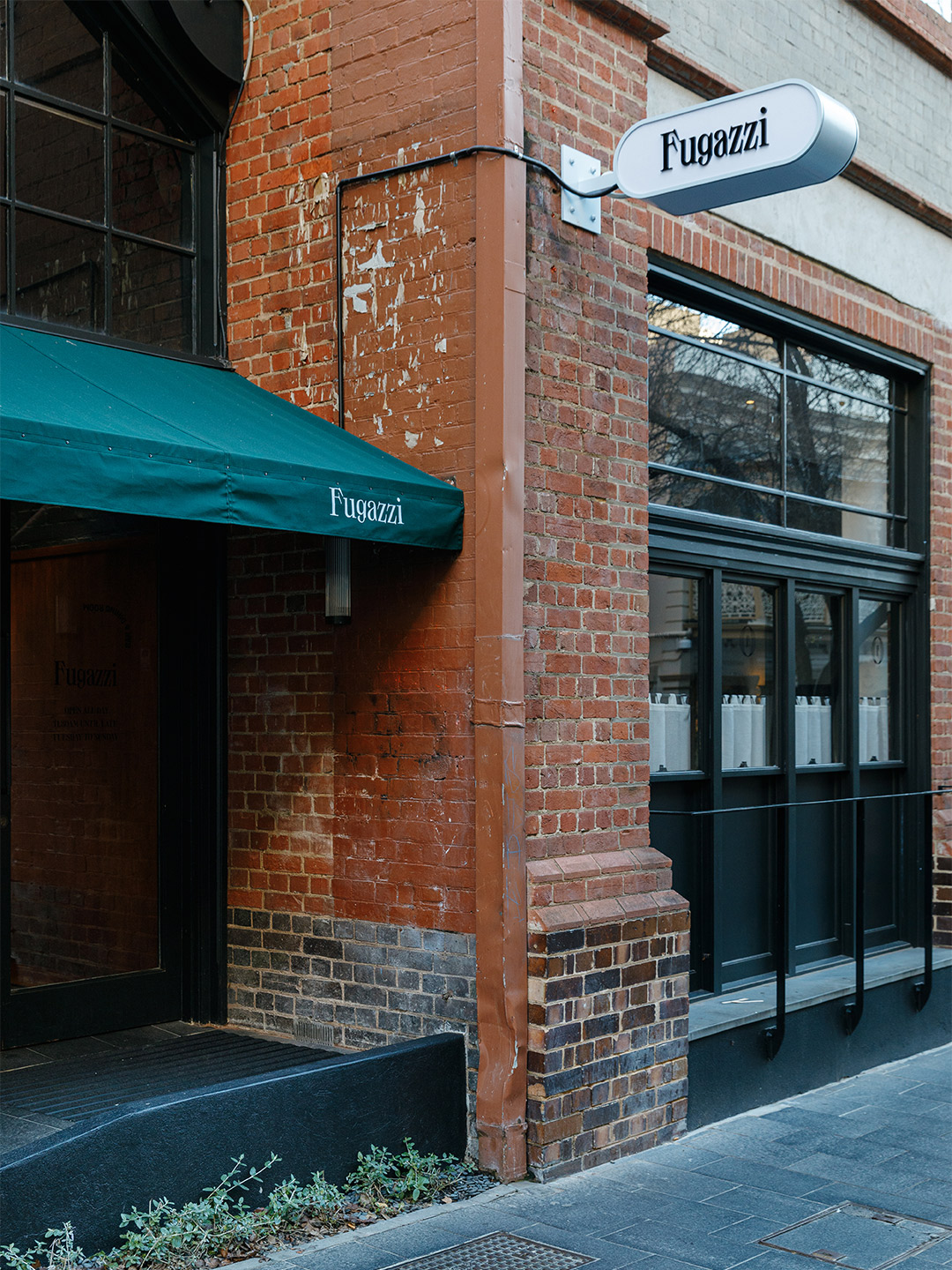
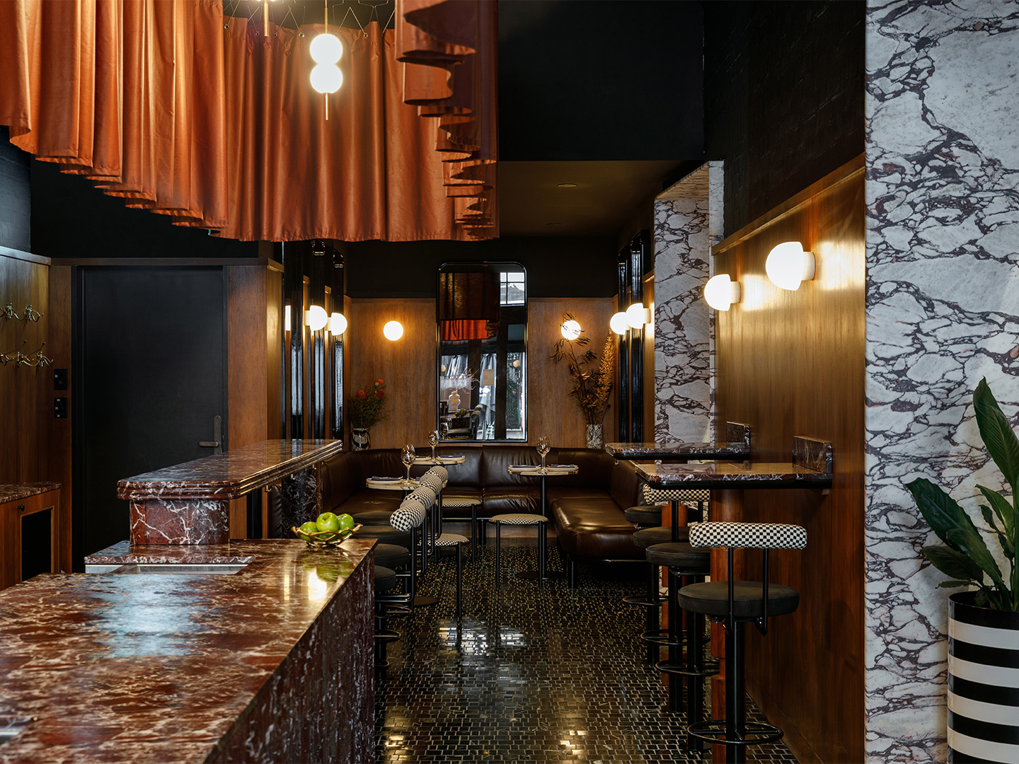
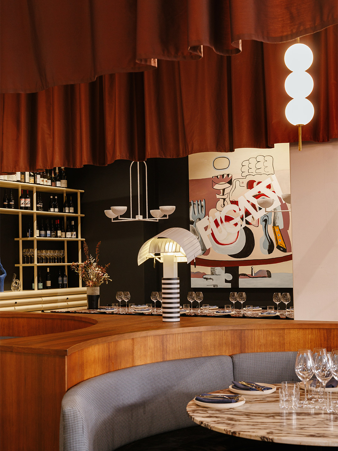
Fugazzi bar and restaurant in Adelaide by Studio-Gram
Blurring the line between today and yesterday, the Fugazzi bar and restaurant plays into this idea of existence, finding itself in a moment of déjà vu that prompts patrons to ask themselves if they’ve been here before. “[The venue is] a romantic, textural representation of the past, that simultaneously manages to remain firmly rooted in the contemporary,” remark the Studio-Gram team, headed up by founders Graham Charbonneau and Dave Bickmore.
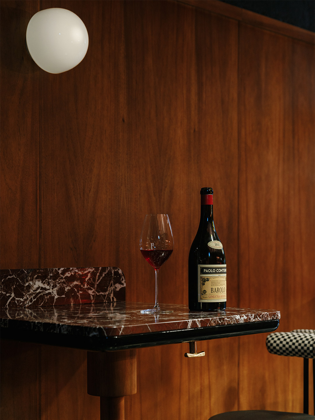
Fugazzi by name, but in no way fake by nature, the destination has been labelled by many an “overnight institution” since its opening on Adelaide’s Leigh Street in May of this year. It’s a pumping place where velvet, leather and marble is layered among custom joinery, statement shelves – and a pretty fabulous powder room – to create a decadent and luxurious atmosphere, designed to invoke a sense of nostalgia.
The client’s brief to the Studio-Gram team called for an elevated culinary experience, suggesting drinks and nibbles should be enjoyed in the bar area upon arrival, and longer stays welcomed in the dining room, encouraged by the plushness of its booths. As a result, there’s not a “bad seat” in the house, the designers insist. “The bar and the restaurant are altogether different experiences that serve to unite the whole, yet thrive as individual offerings,” they add.
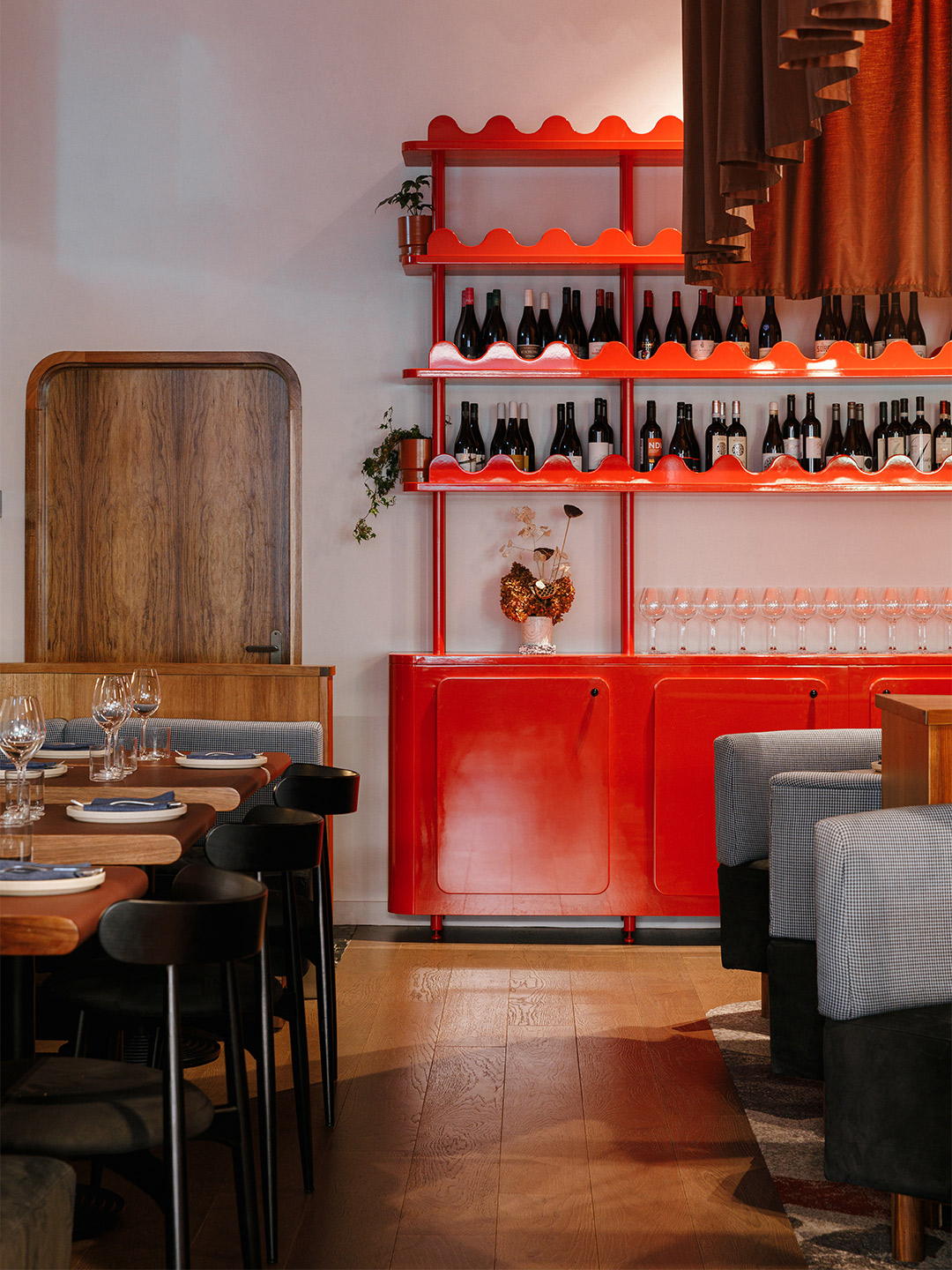
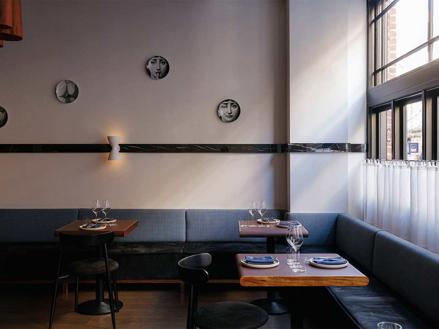
Rich in materiality and moody in execution, the bar area allows patrons to sink into its corners from day through to nightfall. The restaurant is much brighter, with carefully curated art and objet, and a sophisticated level of comfort. Custom joinery pieces with a range of circle-cut details, mostly featuring a high-gloss lipstick red finish, appear to unify the two spaces. “As a whole, the space feels made for the future,” the designers say, adding that patrons should expect an “an all-encompassing experience” where attentive service, good food and delicious drinks meet a familiar-feeling fit-out.
Demonstrating a sound understanding of the client’s brief, Fugazzi unifies hospitality-driven function with prodigious design. This is exampled by the resolution of the planning, including how the designers managed a narrow entry space to create a useable, standalone bar that works double-time to service the restaurant. Further, the typical raised bar where drink-making is separated from drink-consuming has been removed to showcase the craft behind the drinks. “To reveal the hospitality,” the Studio-Gram team say. “To create a bar that is as much about the service and presentation as it is about the making. A bar that truly engages with the patron.”
fugazzi.com.au; studio-gram.com.au
Fugazzi by name, but in no way fake by nature, the venue has been labelled an “overnight institution” by many.
Catch up on more architecture, art and design highlights. Plus, subscribe to receive the Daily Architecture News e-letter direct to your inbox.
Related stories
- Venus Power collection of rugs by Patricia Urquiola for cc-tapis.
- Bitossi celebrates centenary in Florence with new museum and 7000-piece display.
- Casa R+1 residence in southern Spain by Puntofilipino.
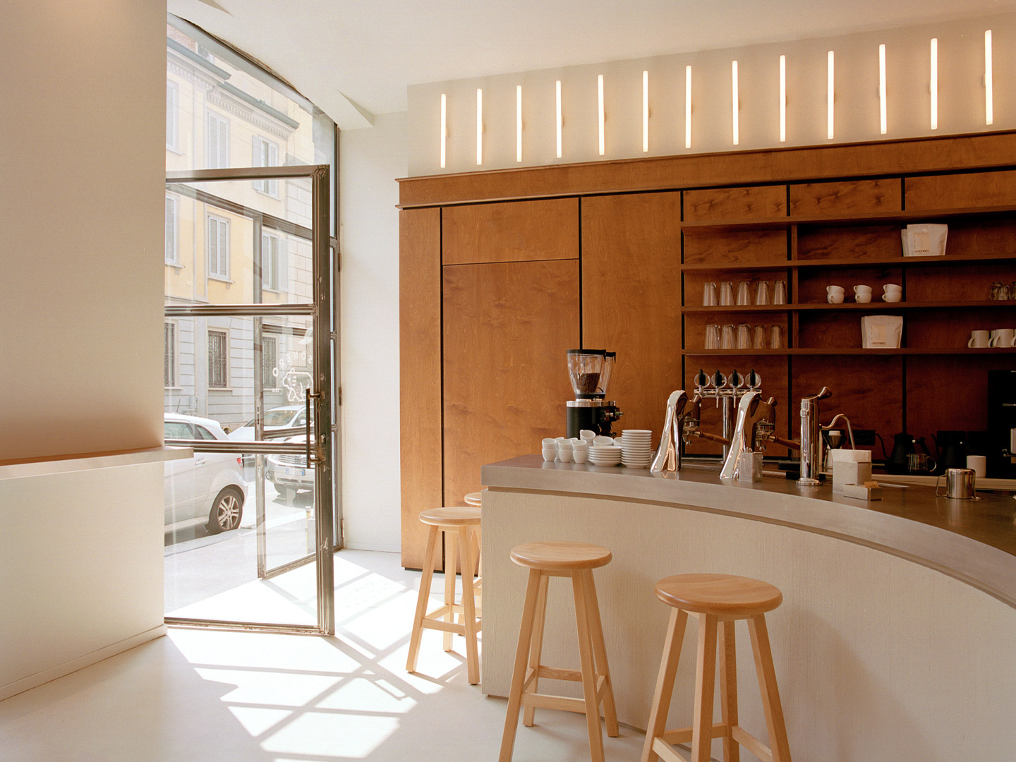
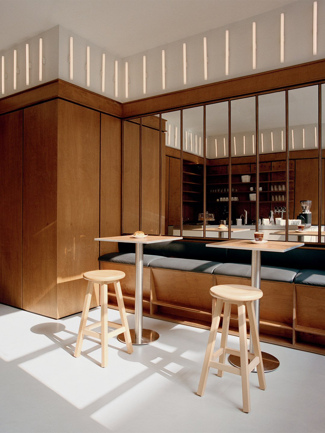
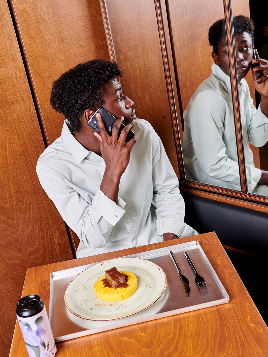
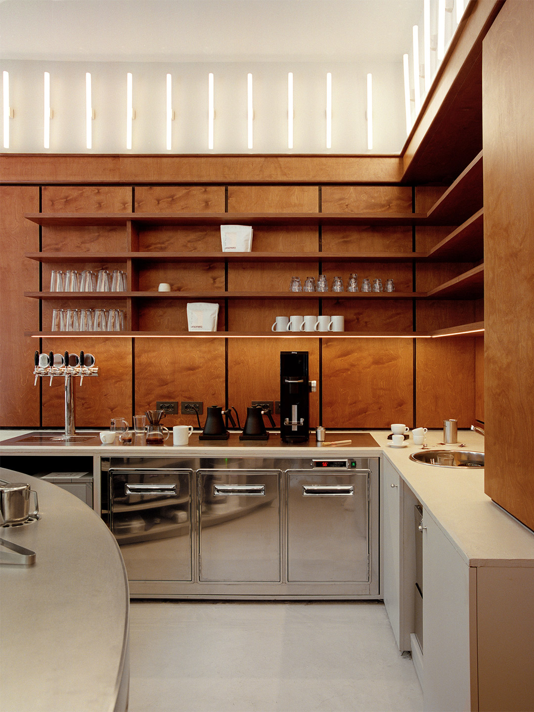
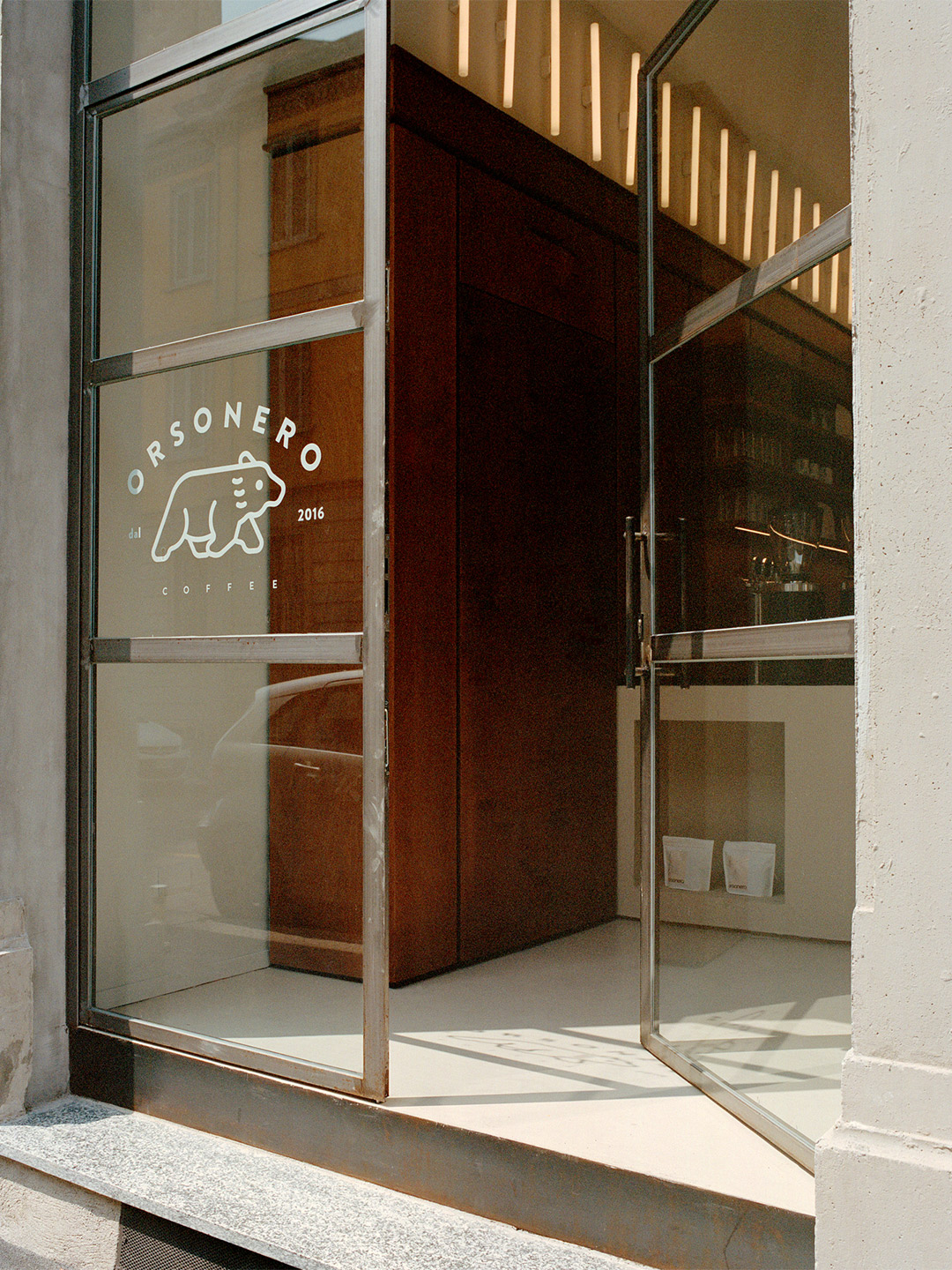
Inspired by the energy of London’s small food markets, META is a new culinary concept in Milan, spearheaded by the “twenty-something entrepreneurs” Ludovico Leopardi and Leo Schieppati. Just like its name, a portmanteau of the words ‘merging’ and ‘taste’, META sees the joining together of five temporary food outlets under the one roof. Cuisine-lovers who step inside META this month will discover the street-food restaurant (named Uovodiseppia) by Michelin Star chef Pino Cuttaia; the Young Rice diner, whose mission is to cook rice in innovative ways; an experimental food outlet, called Rare, where cooking methods include infrared technology; the Gusto 17 ice-cream shop; and Orsonero Coffee – one of Milan’s most popular espresso shops.
Located at Via Bonvesin de la Riva in Milan’s Zona Risorgimento, META features eight street-facing windows. It’s an outlook that was made famous by the old restaurant of master-chef Gualtiero Marchesi, who is credited for transforming the peninsula’s cuisine and training some of Italy’s best chefs. Inside the building, META’s open space is overlooked by the kitchens of the restaurants and accompanied by the retail room that houses Orsonero Coffee.
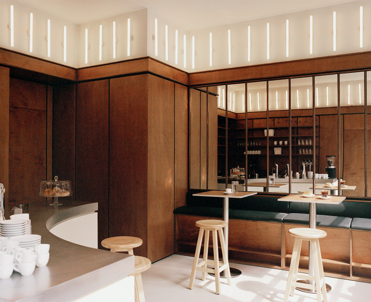
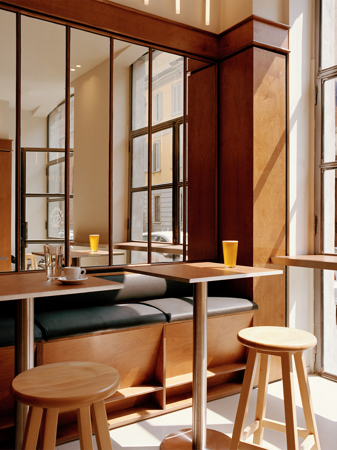
Orsonero Coffee at META in Milan by David/Nicolas
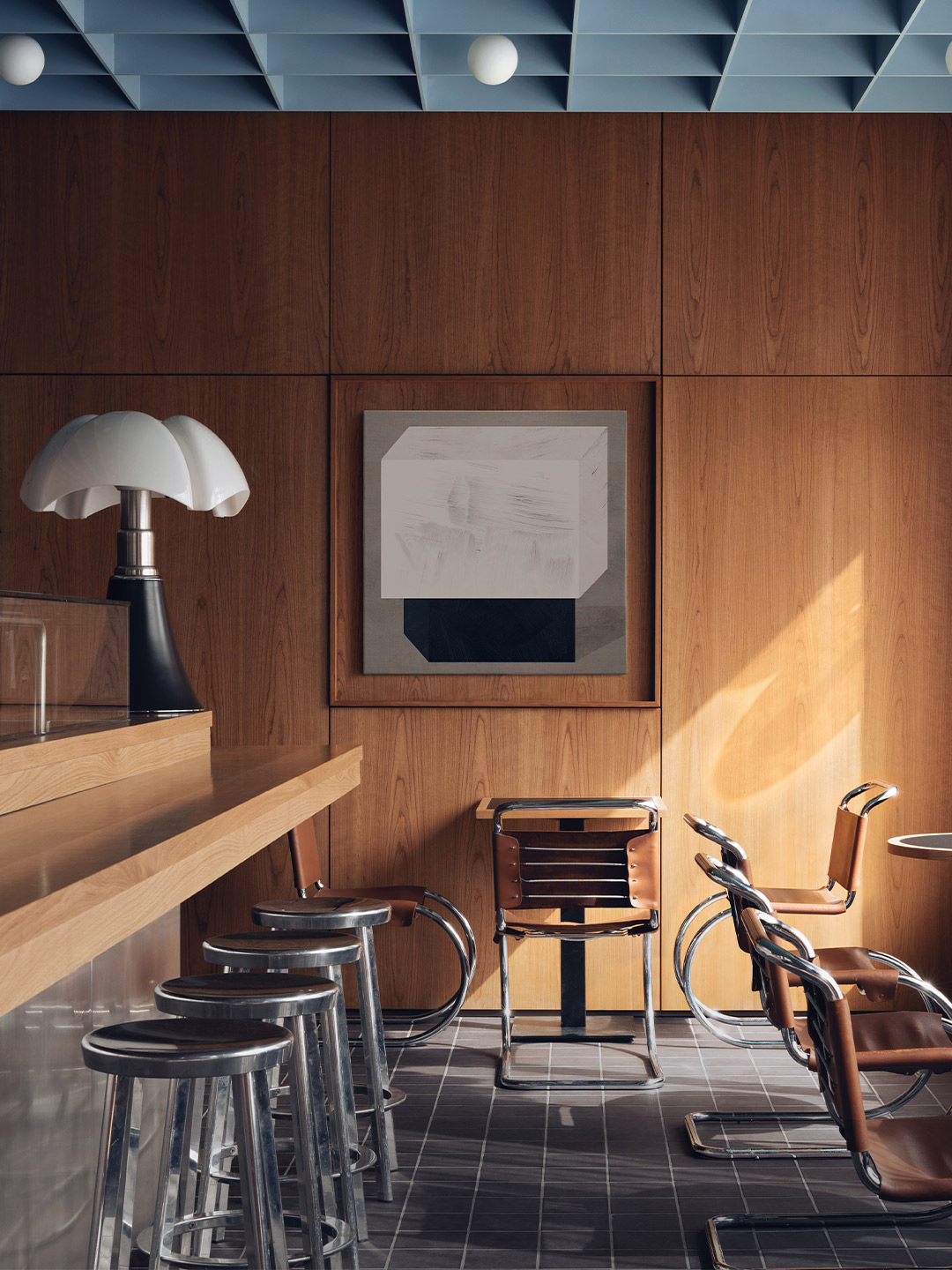
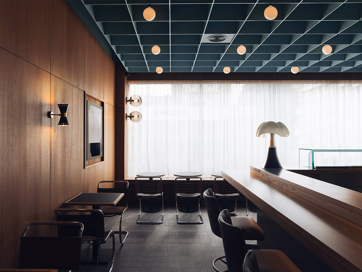
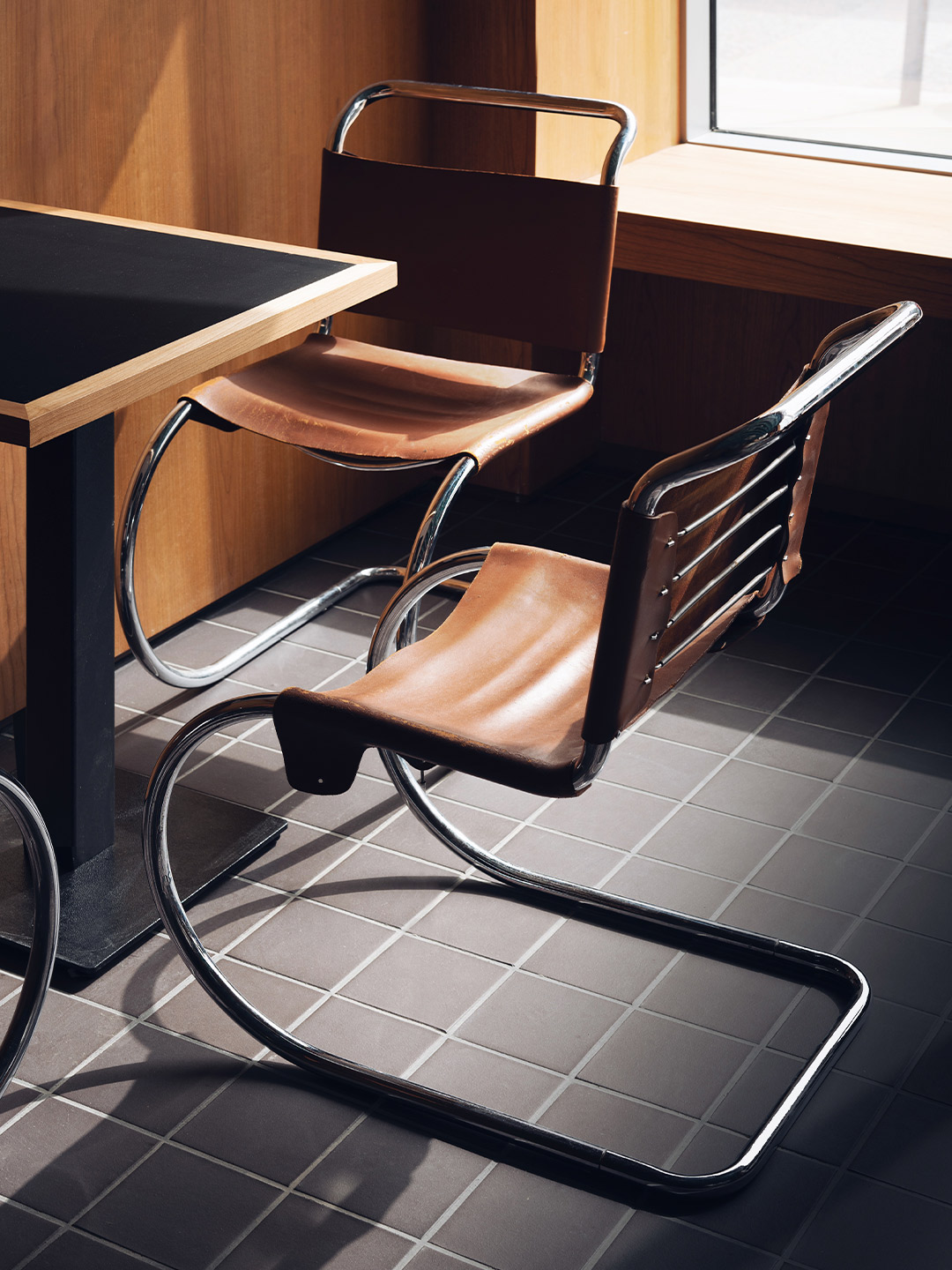
Zooming in on Orsonero, the interiors of the coffee spot were imagined by Beirut-based firm David/Nicolas, made up of design duo David Raffoul and Nicolas Moussallem. The award-winning team has created a vibrant atmosphere that plays up the contrast between the dark timber panelling and the neon batons on the walls, together exuding an overall sense of warmth.
The bustling space is made even more dynamic by the sweeping lines of the cafe’s service counter. Crowned by a thick polished-steel top, the counter lures in customers on the hunt for their daily brew. They gather in close to the glimmering espresso machines that are signed by high-end Italian manufacturer La Marzocco.
A cult-status coffee shop in Milan thanks to its many alternative extraction methods, Orsonero Coffee is managed by Canadian barista Brent Jopson. He’s a pioneer of Milan’s “Third Wave” coffee movement and, together with his team, offers customers specialty coffees as well as viennoiseries by day. Of an evening, the cafe shifts to serving aperitivo, including craft beers sourced from local micro-breweries.
But the innovations presented by Orsonero and META at-large aren’t just about the bricks-and-mortar retail format. The new-age food court is joined by a high-tech delivery platform, accessible via both app and web-browser, enabling users to place a single order from different outlets in one go. The delivery service relies on electric scooters, zero-impact packaging and cutting-edge sustainable practices, positioning META as a one-of-a-kind food collective that’s on a mission to reshape Milan’s culinary scene.
davidandnicolas.com; tastemeta.com
Crowned by a thick polished-steel top, the counter lures in customers on the hunt for their daily brew.
Catch up on more architecture, art and design highlights. Plus, subscribe to receive the Daily Architecture News e-letter direct to your inbox.
Related stories
- Venus Power collection of rugs by Patricia Urquiola for cc-tapis.
- Bitossi celebrates centenary in Florence with new museum and 7000-piece display.
- Casa R+1 residence in southern Spain by Puntofilipino.
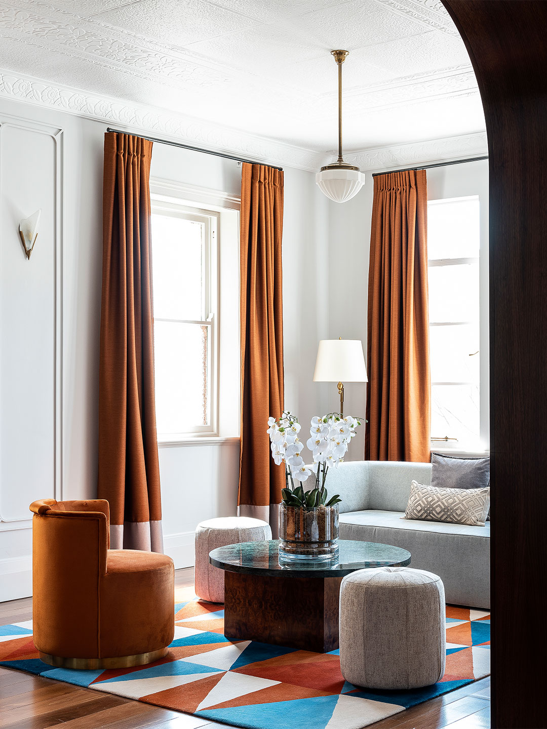
Named after the street it occupies, the Saint-André des Arts Hotel in Paris lies directly in the heart of Saint-Germain-des-Prés, a short stroll from the historic Procope restaurant. Once the favoured haunt of brooding artists and musicians, especially during the swinging sixties, the completely rejuvenated hotel is the latest gem in the Hôtels Paris Rive Gauche collection, ready and awaiting a new generation of movers and shakers.
Stepping off the street and passing through the hotel’s original solid-oak entrance doors, guests arrive in a lobby area seemingly preserved through time. Tunes from another era fill the space, resonating from a small record player in the corner. But an emerald-coloured lacquered rattan reception desk offers a glimpse of what’s to come – a daring arrangement of 1960s and ’70s-inspired furniture and fittings, sourced and imagined for the hotel by French designer Chloé Nègre.


Saint-André des Arts Hotel by Studio Chloé Nègre
From there on in, the interiors of Saint-André are a playground for cheerful curves, bold colour and enchanting patterns. Flower-shaped mirrors and table-stands join carefully sculpted timber detailing. Vibrant swirling carpets are illuminated by bulbous lamps decorated with lace-like fabrics. And the bedheads upstairs make a statement in a confident mix of colour gradients and materials.
Here and there, vintage furniture pieces are combined with custom makes. And modern classics make an appearance, too. Including examples by iconic designers from the late 1960s, such as Verner Panton’s ‘Fun’ ceiling and wall lights; Vico Magistretti’s ‘Eclisse’ lamp by Artemide; Henry Massonet’s ‘Tam Tam’ stools; and Anna Castelli Ferrieri’s ‘Componibili’ bedside tables by Kartell, each finished with a burr walnut top.
On the ground floor, to the right of the reception, the intimate salon features retro burgundy and beige floor tiles that immediately set the tone. Four custom armchairs in citrus yellow fabric, a wall-seat in burgundy velvet and a psychedelic 1960s-style mirror immerses guests in the hotel’s new mood. An ambience which the hotel staff describe as feeling “a little pop, a little bohemian, slightly daring but totally timeless”.


To the left is the bar with its celadon green ceramic wall tiles, earmarked by the hotel staff as “the perfect place to relax, delicately hidden from the street by netting on the windows”. Green velvet and leather wall-seats provide the space with a visual accent. As do the bespoke timber chairs that are placed around walnut-topped tables with “flower power” feet – a signature flourish of Chloé’s Paris-based studio.
The centrepiece of the room is a round rattan table (another custom piece by Chloé) that allows guests to share a moment together, seated in the vintage wooden chairs that accompany it. The large yellow tabletop echoes the velvet of the armchairs in the room next door. “This is the perfect place to enjoy breakfast,” the team insist. Towards the back of the room, the granite bar adds elegance to the space, which feels bright yet intimate during the day. In the evening, it offers the ideal hideaway for sipping a pre-dinner cocktail or a nightcap nearer to midnight.
The elevator, decorated with fabric representing artist Jean Cocteau’s work Le Dormeur, is responsible for transporting guests to the hotel’s 28 rooms, spread over four floors. A mezzanine wing offers two additional rooms bringing the total to 30 rooms. Several of these have an extra sofa bed, others interconnect, but “both [types] are perfect for family stays,” the hotel staff say. Room sizes range from a petite 14 square metres to about 29 square metres in the Prestige suites, costing from €179 (A$280) to €710 ($A1115) per night.


While each room at Saint-André has a unique layout (“this is a venerable building with a very Parisian feel,” the team say), each floor offers a different chromatic interpretation of the 1960s and ’70s. The curtains are the surprise stars of the rooms, featuring dreamy colours and alluring patterns that create an overall feeling of harmony. On the third floor, for example, Jim Thompson’s Melusine landscape (on fabric from Pierre Frey) sets the bar high for a joyful material palette to follow.
“You’ll love the original vaulted stone ceilings and zesty colours that give the space its energy,” the hotel team tell their guests. And whether your room has a view of the street and the rooftops of Paris or is one of those nestled under the eaves, both of which are part of the hotel’s resolutely Parisian charm, the team insist that each room is a “new encounter between colour and light, the present and the past”.
From the in-house spa to the charming lodgings, “everything at Saint-André has been designed to revitalise guests, far from the effervescence of the city,” the team say of the hotel’s foundations, now poised to witness a new chapter. A future backdropped by iconic design, glorious colour and the inimitable stylings of Chloé which the hotel staff predict will come with a few surprises. “Expect classics with a twist, touches of humour, arty objects… and a little craziness.”
chloenegre.com; saintandredesarts.com


Once the favoured haunt of brooding artists and musicians, especially during the swinging sixties, the completely rejuvenated hotel is the latest gem in the Hôtels Paris Rive Gauche collection.


Catch up on more architecture, art and design highlights. Plus, subscribe to receive the Daily Architecture News e-letter direct to your inbox.
Related stories
- Venus Power collection of rugs by Patricia Urquiola for cc-tapis.
- Bitossi celebrates centenary in Florence with new museum and 7000-piece display.
- Casa R+1 residence in southern Spain by Puntofilipino.
Named after the street it occupies, the Saint-André des Arts Hotel in Paris lies directly in the heart of Saint-Germain-des-Prés, a short stroll from the historic Procope restaurant. Once the favoured haunt of brooding artists and musicians, especially during the swinging sixties, the completely rejuvenated hotel is the latest gem in the Hôtels Paris Rive Gauche collection, ready and awaiting a new generation of movers and shakers.
“The post office was built in the 1960s and our design pays tribute to London’s modernist heritage of that era,” explains Alexy Kos and Che Huang, co-founders of Child Studio. “Our aim was to rediscover and celebrate the unique history of this building and the neighbourhood.”
Maido sushi restaurant in London by Child Studio
The late-modernist building casts its gaze along the leafy main street, watching over a nearby greengrocer and bookseller, a bank, library and a scattering of chic eateries and boutiques. Out the front, colourful blooms spill over pots suspended from typical London lampposts.
Inside the restaurant, the moody dining room welcomes visitors with a refreshing blend of European and Japanese design influences. “The Japanese references are subtle,” say the Child Studio team. “[They] present themselves through the choice of materials, the play of geometric patterns and the hand-crafted woodwork detailing.”
The dialogue between the East and West begins with the selection of antique and modern furniture: tubular steel chairs by Mies Van Der Rohe and moulded plywood armchairs by Norman Cherner (designed in 1958) are paired with cast-aluminium stools by Japanese designer Naoto Fukasawa.
The post office was built in the 1960s and our design pays tribute to London’s modernist heritage of that era.
Sixties style is introduced throughout the restaurant with walls lined in dark cherrywood panelling. Large abstract paintings are tucked within shallow timber-framed alcoves, set between brass wall sconces by Stilnovo, the Italian pioneers of rationalist design.
Overhead, Child Studio devised a suspended coffered ceiling – reminiscent of the pattern created by Japanese shoji screens – finished in a soft blue hue. The straightforward geometric layout of the ceiling is echoed on the floor, where a smaller grid of black quarry tiles provides gentle detail underfoot.
The star attraction of the restaurant is perhaps the open kitchen where the reflective steel panelling of the counter-front is partnered with a 1960s ‘Pipistrello’ lamp, designed by Italian architect Gae Aulenti. Behind the counter, Maido’s sushi master prepares and plates-up authentic Japanese cuisine, from eel and masago California rolls to “fatty tuna” sashimi.
Towards the rear of the restaurant, a curved glass-brick wall splits the dining room into two, creating a semi-private area. As daylight filters through the sheer curtains and the textured glass, a familiar atmosphere is born. “The inspiration for this feature came from the St John’s Wood Library, the next-door building of the same era,” say Alexy and Che. “The library entrance is a beautiful combination of square glass blocks and dark wooden framework.”
In other areas, sake bottles, arrangements of flowering cherry blossom and tea sets (comprising contemporary pots and traditional Japanese cups) reference typical Japanese eateries. Dovetailed with mid-century finishes and iconic furnishings, the result is a convivial place that balances cross-cultural cool with a touch of nostalgia.
childstudio.co; maidosushi.com
Catch up on more hospitality architecture and design and retail design, plus subscribe to receive the Daily Architecture News e-letter direct to your inbox.
Related stories
- Resa San Mamés student accommodation in Spain by Masquespacio.
- The bar and restaurant at La Sastrería in Valencia by Masquespacio.
- Mama Manana restaurant in Kyiv by Balbek Bureau.
- Gold ‘n’ arches: Bun burger restaurant in Milan by Masquespacio.
Named after the street it occupies, the Saint-André des Arts Hotel in Paris lies directly in the heart of Saint-Germain-des-Prés, a short stroll from the historic Procope restaurant. Once the favoured haunt of brooding artists and musicians, especially during the swinging sixties, the completely rejuvenated hotel is the latest gem in the Hôtels Paris Rive Gauche collection, ready and awaiting a new generation of movers and shakers.
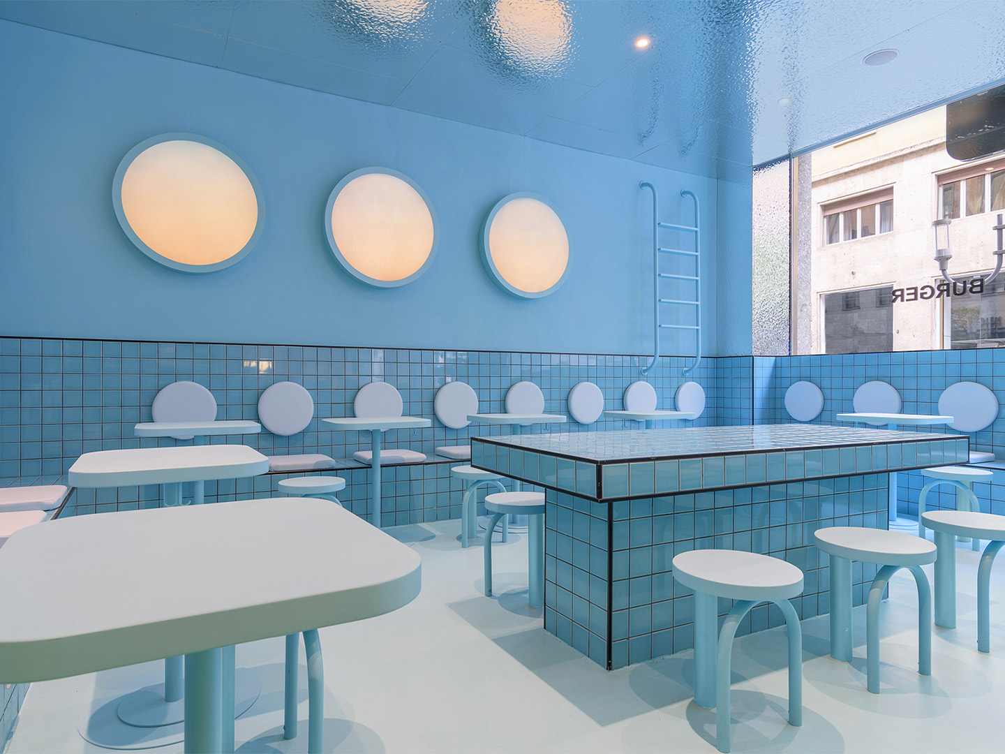
In Milan, this flexibility led to existing architectural archways and exposed bricks becoming defining features of the space. At the second Bun restaurant to open under Masquespacio’s vision, located in Turin, three existing windows informed the decision to expand the colour palette and split the interior into three clearly defined sections. “The idea to play with one colour for each window creates a visual effect from the outside that makes the spectator walk from one visual world into the other, travelling through different experiences in the same space,” says Ana, creative director of Masquespacio.
Bun burger restaurant in northern Italy by Masquespacio
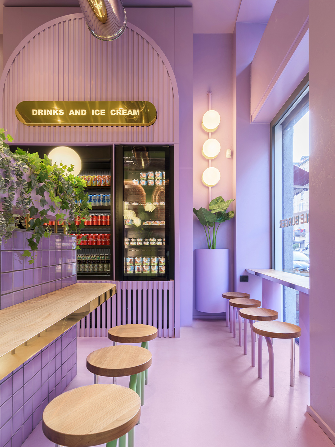
The new restaurant in Turin delivers diners from its front door to the counter via a ribbon of pastel green; the same “iconic” shade used at the Bun restaurant in Milan, explains Ana and Christophe. The trademark colour blankets the floor and ceiling and everything that falls within its territory. Including refrigerators, signage and the odd stool which didn’t quite make it over the line into the neighbouring colour zone.
On each side of the central entryway, the newly introduced pink and blue palette lures diners to two completely different sitting spaces. To the left, a segment of the restaurant swathed entirely in tones of fairy-floss pink tempts diners with two semi-private booths. Elevated from the ground level, the booths feature elegant archways – a nod to the fit-out in Milan – while the pink terrazzo stairs that lead to the dining zones pave the way for additional tables and chairs.
The idea to play with one colour for each window creates a visual effect from the outside that makes the spectator walk from one visual world into the other.
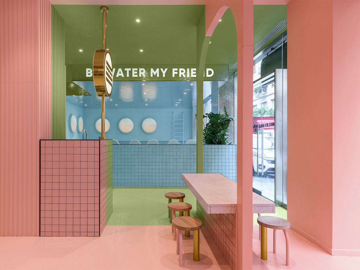
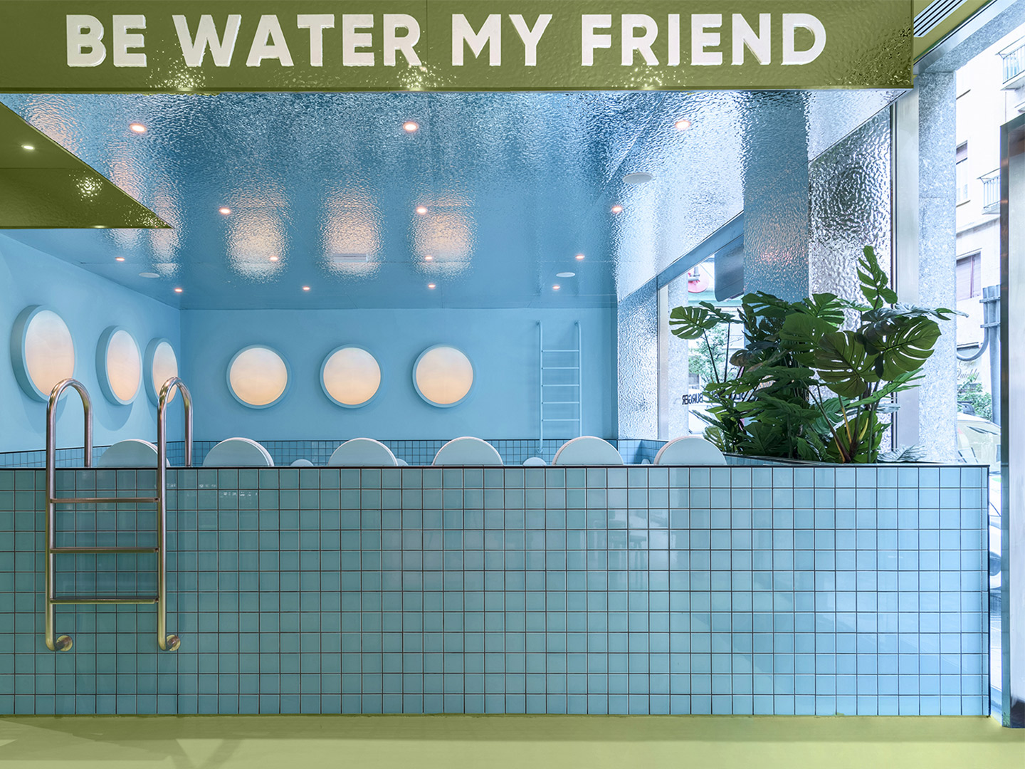
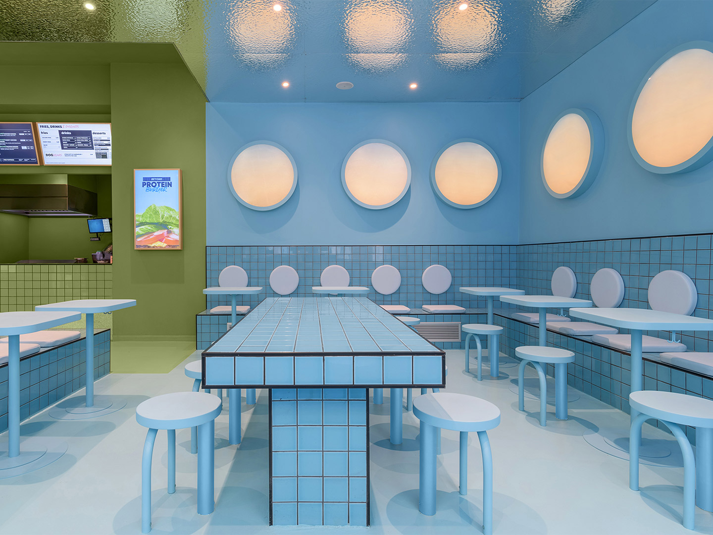
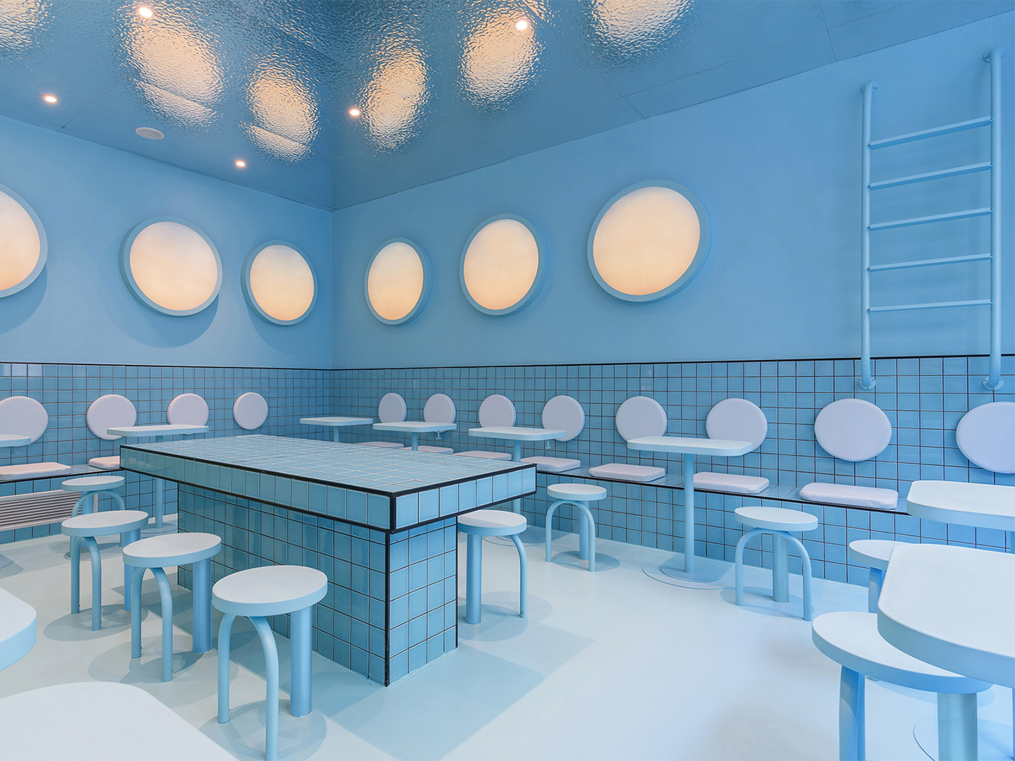
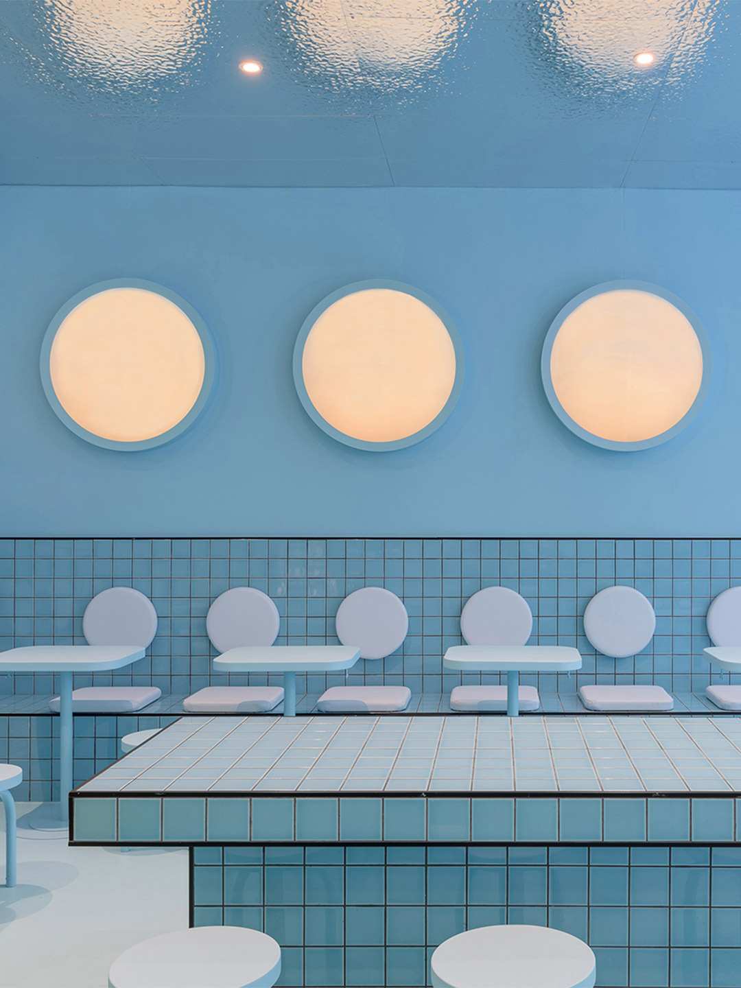
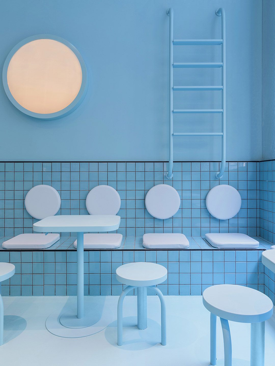
Emblazoned with the words ‘Be water my friend’ – a saying made famous by the late martial-arts star Bruce Lee – the blue zone to the right of the restaurant “adds a touch of fun,” remarks Ana. “[It] gives visitors the chance to enjoy the delicious Bun burgers in a space that simulates a huge swimming pool that would make them feel like floating in the water.” Featuring wall-mounted ladders plunging playfully into an ocean of pale-blue tiles, the swimming pool reference isn’t lost on diners. Especially when they consider the porthole-shaped light fittings and the metallic finish of the ceiling – a design device which mimics the effect of diving into a pool of water and looking up at its rippled surface.
With two completed Bun burger restaurants now tucked firmly under their belts, each united by memorable colour, shapes and materiality, Christophe and Ana intend to work on more of the chain’s outlets in Italy. Returning to Milan from Turin, the design duo will roll-out their refined interior design formula in selected spaces across the city, continuing their mission to make the Bun brand edgy, fun and instantly recognisable.
Also in Italy, Masquespacio designed the Bun burger restaurant in Milan. Catch up on more hospitality architecture and design and retail design, plus subscribe to receive the Daily Architecture News e-letter direct to your inbox.
Related stories
- Resa San Mamés student accommodation in Spain by Masquespacio.
- The bar and restaurant at La Sastrería in Valencia by Masquespacio.
- Mama Manana restaurant in Kyiv by Balbek Bureau.
- Gold ‘n’ arches: Bun burger restaurant in Milan by Masquespacio.
Named after the street it occupies, the Saint-André des Arts Hotel in Paris lies directly in the heart of Saint-Germain-des-Prés, a short stroll from the historic Procope restaurant. Once the favoured haunt of brooding artists and musicians, especially during the swinging sixties, the completely rejuvenated hotel is the latest gem in the Hôtels Paris Rive Gauche collection, ready and awaiting a new generation of movers and shakers.
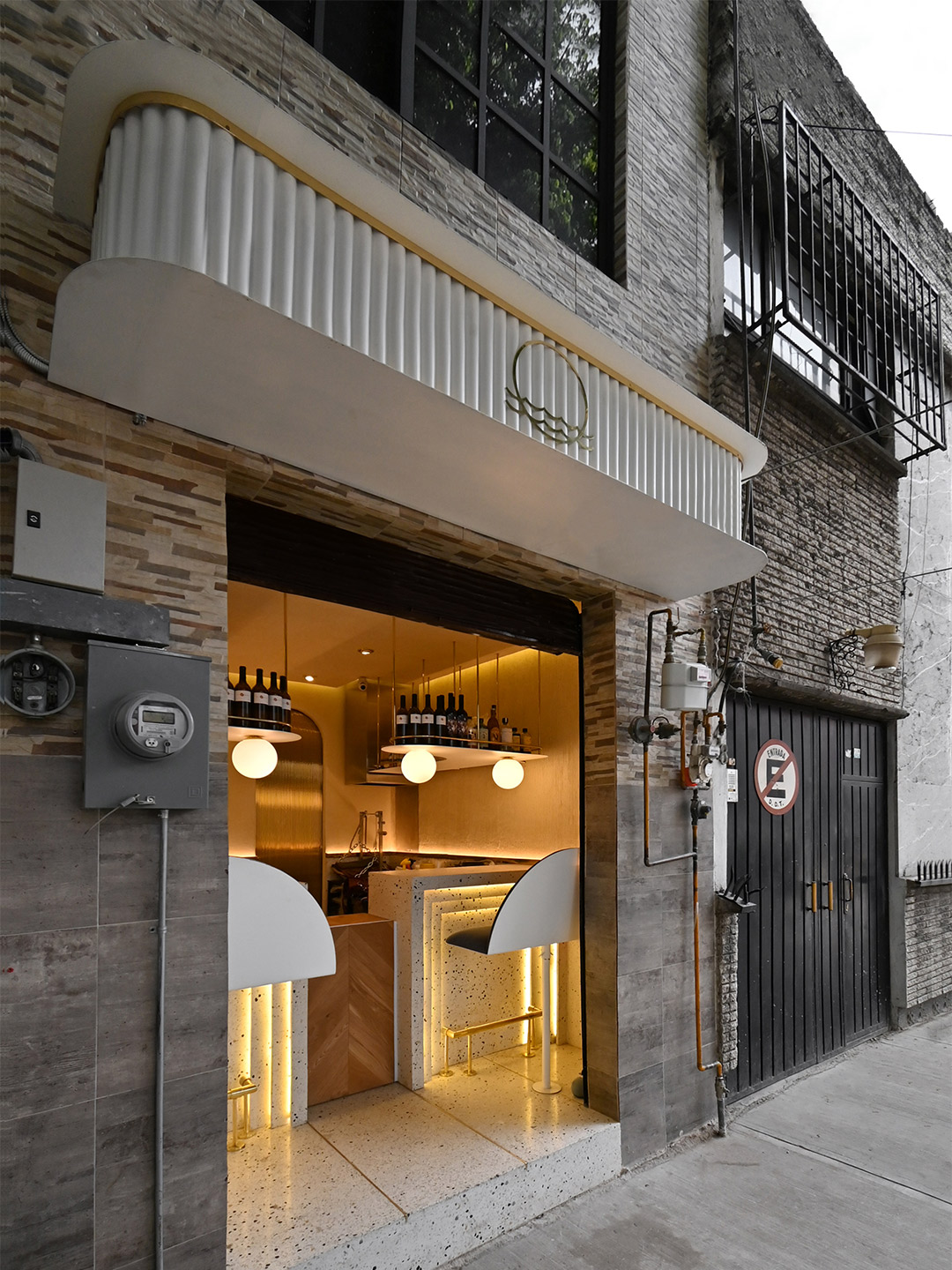
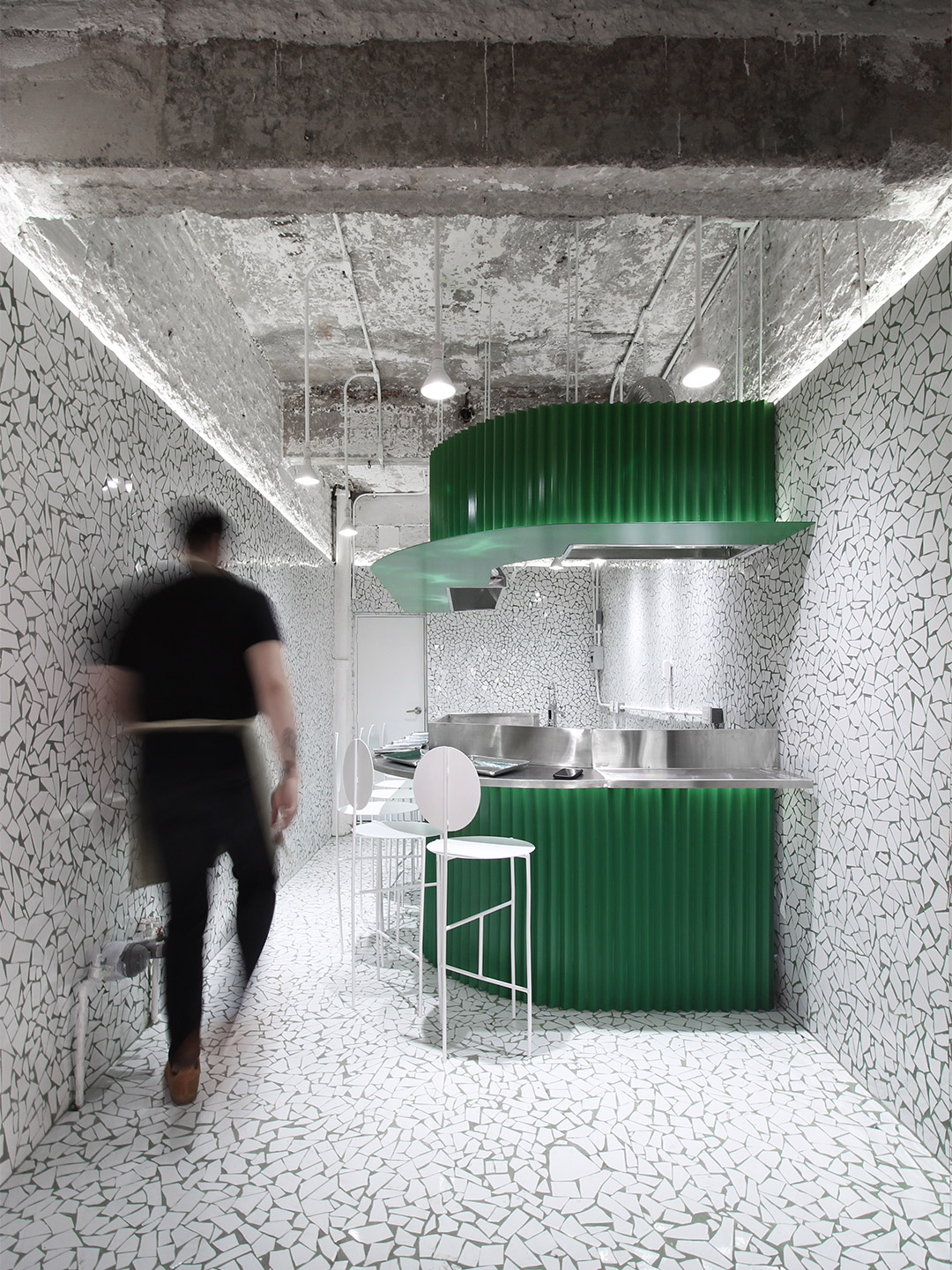
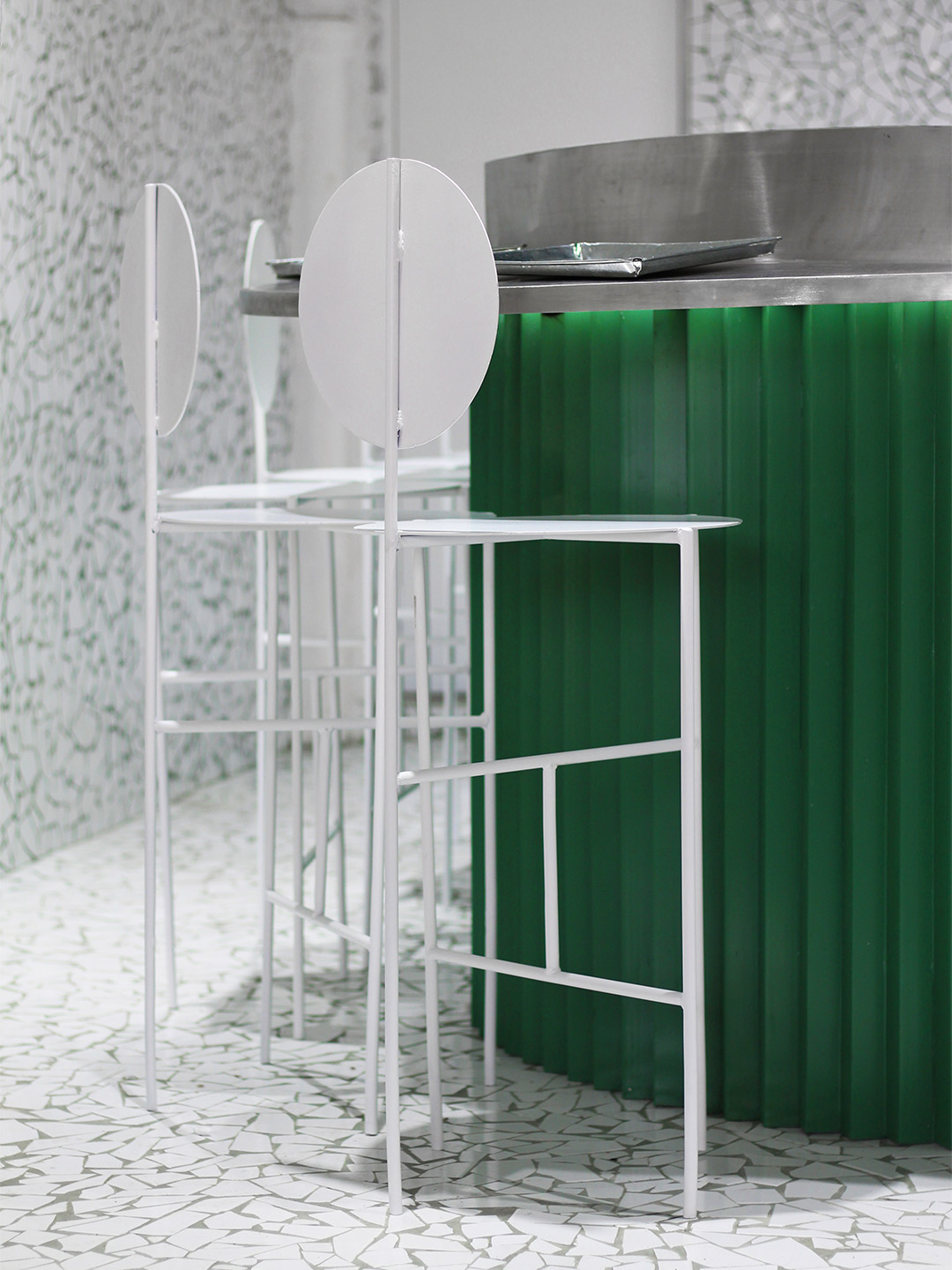
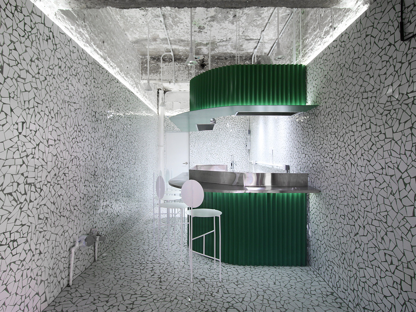
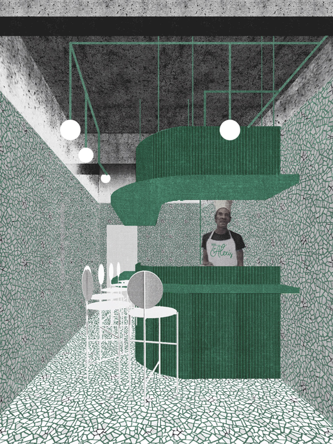
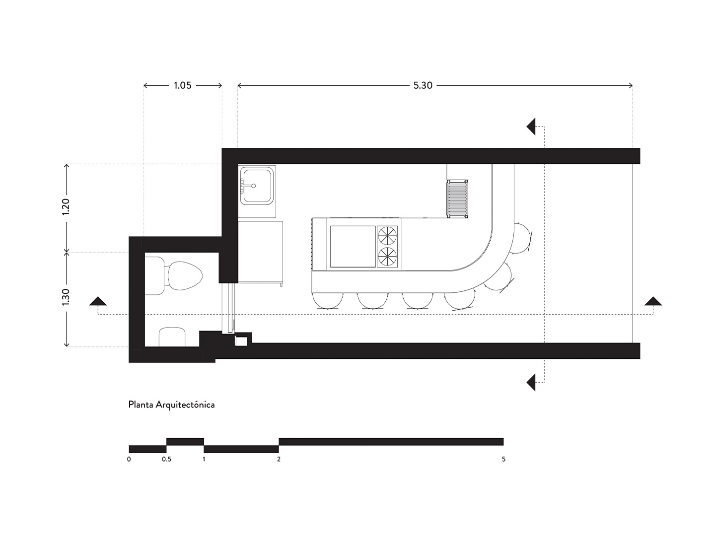
The Los Alexis taquería measures in at only 15-square-metres. But the small footprint was certainly no coincidence. The space reinterprets the scale and food-focussed theatrics of a taco-selling changarro (the name given to the type of small shops that line the city’s roadsides). Mirroring the tiny floor plan, the menu at Los Alexis is equally limited. The kitchen concentrates on delivering only two classic taco styles, taurinos and asada, where grilled meat is the key ingredient in each dish. Just as the minimal fare needs to pack a punch with diners, the restaurant renovation by RA! was also required to make an impact.
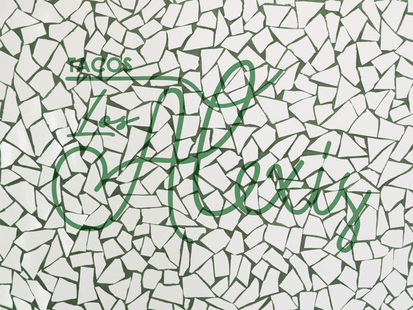
Los Alexis taquería in Mexico City by RA!
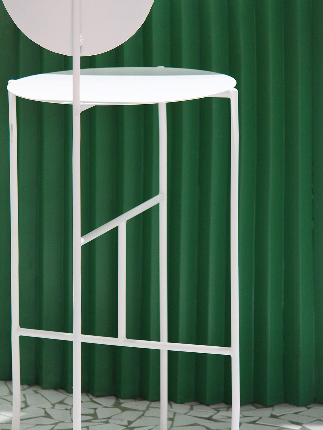
When viewed from the outside, and indeed from the shoebox interior, the focal point of the pint-sized taco restaurant is its counter. Swathed in punchy green, the bar and its concertina-fold facade playfully dominates the space. It also performs two simple tasks. Firstly, the bar format separates diners from the kitchen, where there’s just enough elbow room for the cooks to whip up tonnes of tacos. And, secondly, the bar and its six stools give permission for guests to indulge in a quick bite at the counter, perched in close proximity to the action of the kitchen.
Tiles are a commonly used material in Mexican architecture and design, so it’s only fitting that an age-old mosaic technique has been given a contemporary reboot by RA!. The design team specified smashed white tiles in countless shapes and sizes to hug the walls and line the floor of the restaurant. Between each glossy piece of broken tile, a sea of green-tinted grout visually connects the mosaic envelope to the colour of the bar.
Left mostly untouched during the renovation process, the ceiling of the restaurant is expressed in bare concrete. Only a new lighting system and the bulkhead containing exhaust facilities were added to the overhead space. The chalky texture and appealing patina of the concrete is highlighted by a horizontal ribbon of lighting that borders the top edge of the mosaic walls. Emitting a soft glow, the lighting pulls into focus a dynamic canvas where cult-status food and fleeting social interactions are set to deliver heightened levels of buzz and plenty of panache.
Catch up on more architecture and design highlights. Plus, subscribe to receive the Daily Architecture News e-letter direct to your inbox.
A hole-in-the-wall taquería has emerged in the Roma Norte region of Mexico City; a reimagined neighbourhood whose once upper-class footpaths are now frequented by cuisine-seeking hipsters.

Related stories
- Introducing the New Wave collection of 80s-inspired vases by Greg Natale.
- Carla Sozzani curates new colours for classic Arne Jacobsen chairs.
- Adam Goodrum stamps all-Australian style on new breezeblock design.
Named after the street it occupies, the Saint-André des Arts Hotel in Paris lies directly in the heart of Saint-Germain-des-Prés, a short stroll from the historic Procope restaurant. Once the favoured haunt of brooding artists and musicians, especially during the swinging sixties, the completely rejuvenated hotel is the latest gem in the Hôtels Paris Rive Gauche collection, ready and awaiting a new generation of movers and shakers.
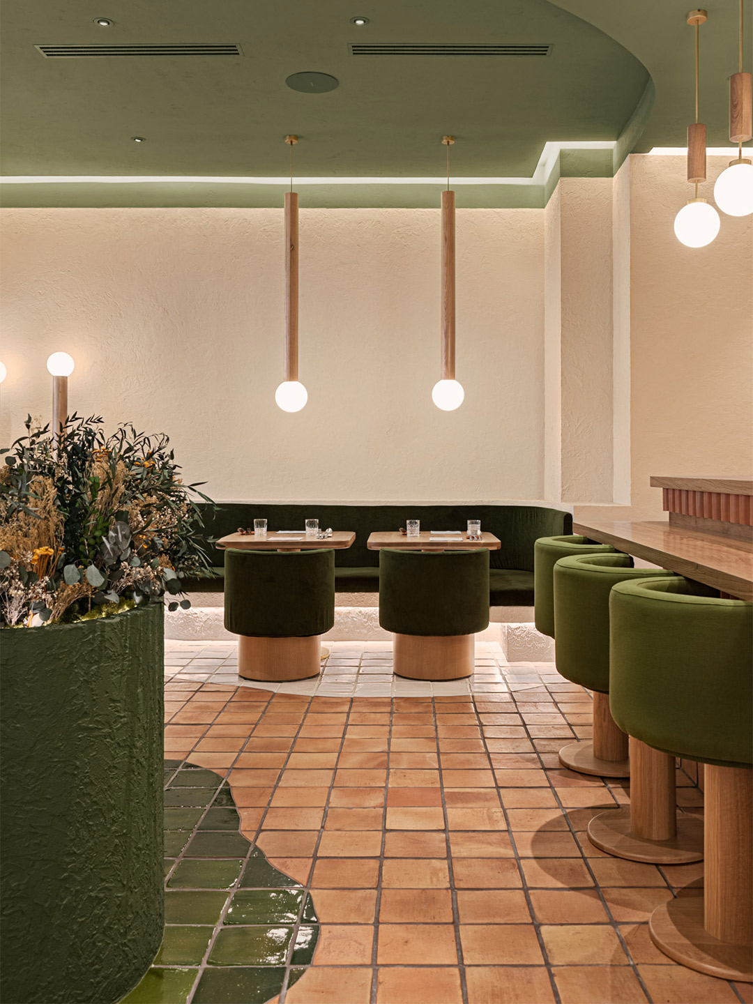
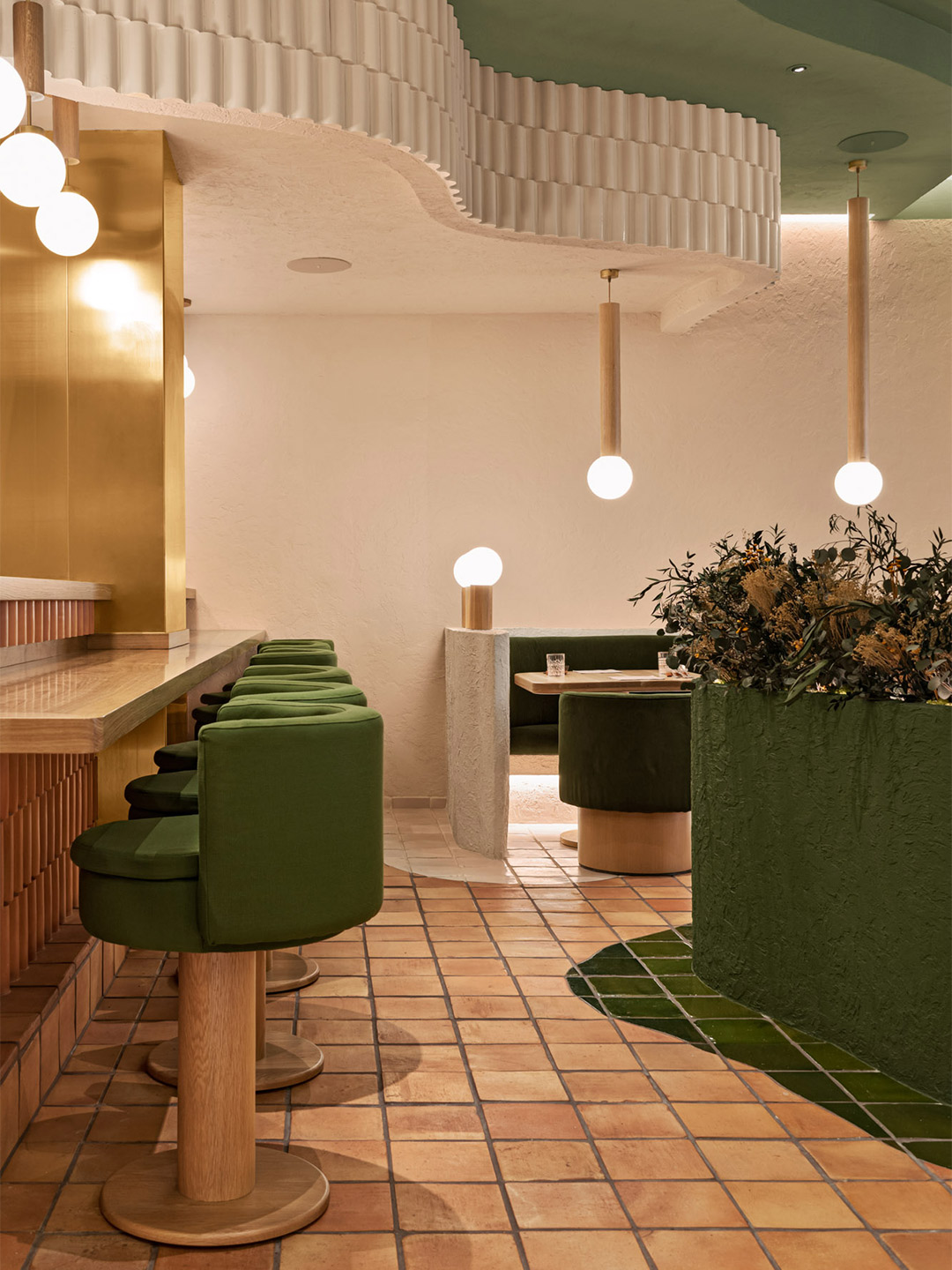
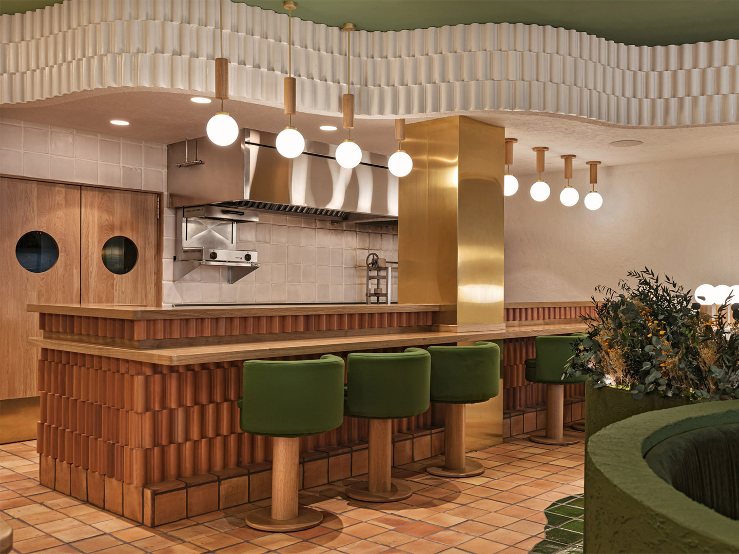
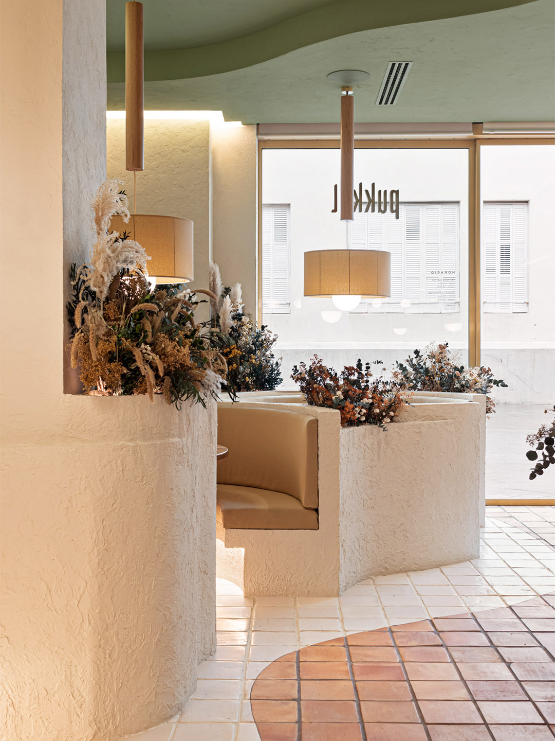
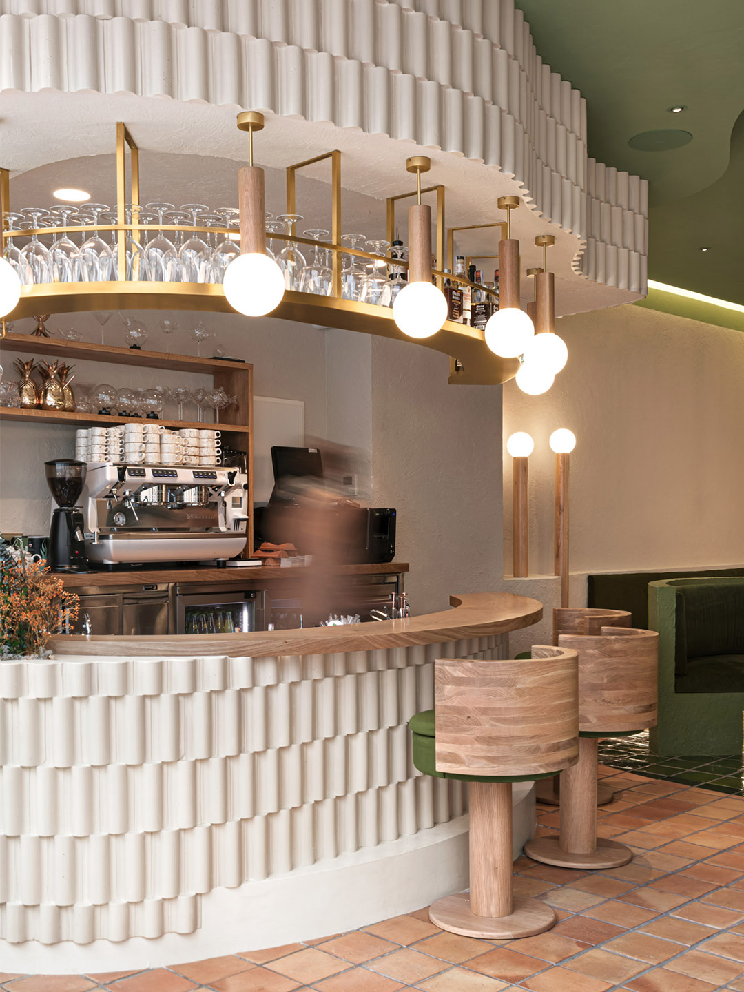
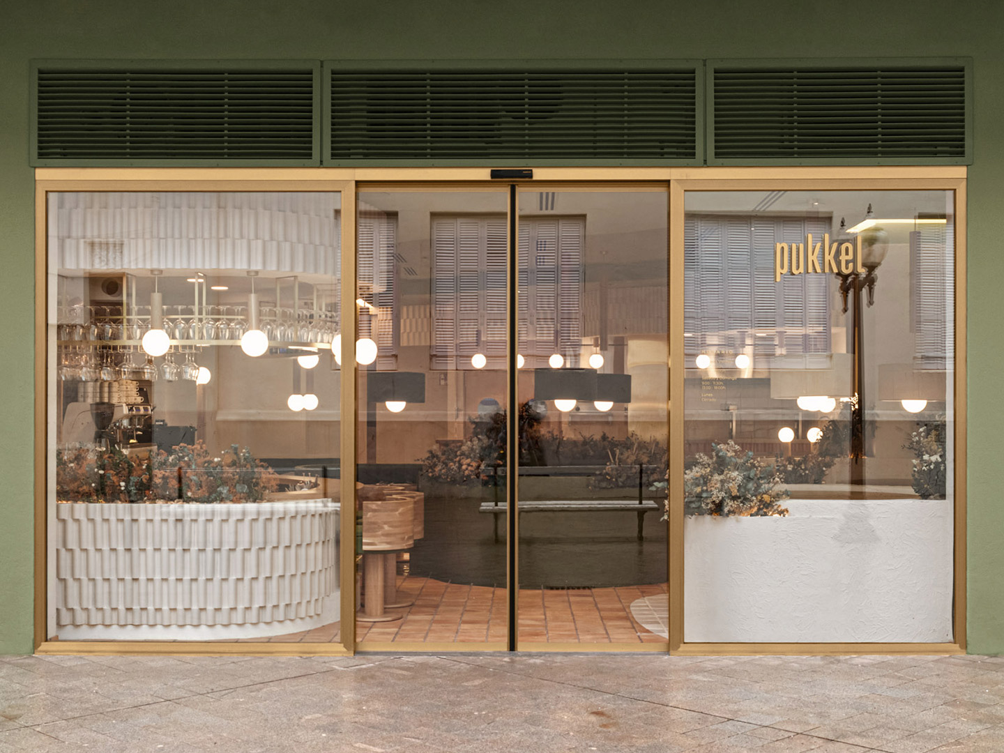
The design brief was straightforward, explains Masquespacio co-founders Christophe Penasse and Ana Hernández: to develop a “sensorial experience” that builds upon the health-focussed fare on offer at Pukkel. In response, the designers drew inspiration from the nearby Pyrenees mountains and the natural surroundings of the Aragon province, arriving at an earthy palette with the power to evolve each season through a “forest” of plants and flowers.
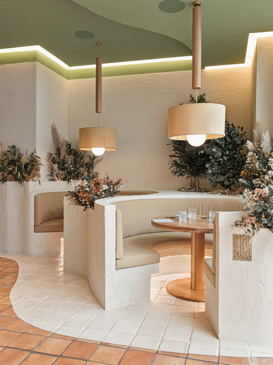
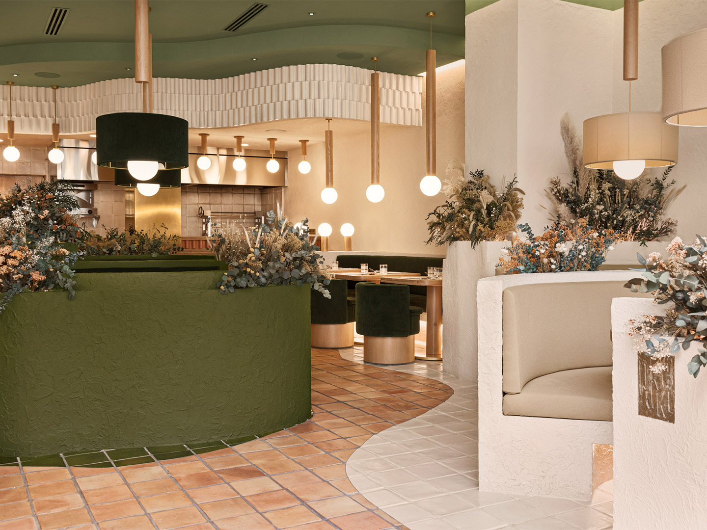
Pukkel restaurant in Huesca, Spain, by Masquespacio
“After a workshop with Jorge and Mikel, we immediately proposed to work with one hundred percent natural materials and integrate nature into the space,” says Christophe, whose next step, along with Ana, was to search for inspiring connections between the city and the salutary lifestyle promoted by Pukkel’s health-centric gastronomy. “We investigated the province of Huesca and started to discover the beauty of the mountains and parks in its surroundings,” Ana adds. “We definitely found the reference we were looking for and that fitted perfectly with the healthy lifestyle concept from Pukkel.”
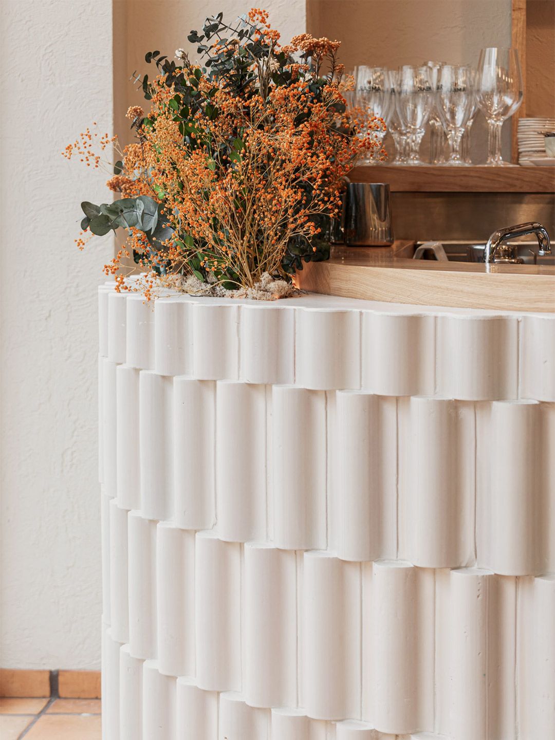
The result is a restaurant where diners are pleasantly reminded of nature first-and-foremost through colour: a grounding blend of terracotta, beige, sand and mushroom tones, offset harmoniously by warm white, sage and forest-inspired greens. Glimmers of gold arrive courtesy of metallic finishes that wrap furnishings, columns and drifts of light-fittings overhead, elevating the ambience of the interior to meet its fine-dining expectations.
After a workshop with Jorge and Mikel, we immediately proposed to work with one hundred percent natural materials and integrate nature into the space.
The materiality and planning of the restaurant also taps into the spirit of nature, beginning with the plushy banquette pods positioned beside meandering tiled pathways. “The imperfect forms are mainly organic and draw a path on the floor like if you were walking through the forest,” says the designers. “All around the path, circular spaces are recreated like if we were in the mountains and allow the customers to share a moment with family or with friends, disconnecting from the daily routine.”
The enchanting curves of the pathways and secluded banquettes are echoed on the ceiling through tiered levels of plasterwork that are capped with flowing ribbons of interlocking terracotta tiles. These tiers form bulkheads for concealed services while also appearing to trace undulating terrain like an extruded topographic map.
Terracotta is the key ingredient on the floors, bar fronts and some of the walls where tile patterns and profiles were designed by Masquespacio specially for Pukkel, including in the restrooms where sculptural terracotta tiles clad the bathroom furniture. Next to the ceramic tiles on the dining room walls, the application of rough stucco nods to the tactility of bare earth, says the designers, who also specified the textured stucco finish to appear on the curved framework of the banquettes.
It’s here, on top of the part-walls that cocoon the banquettes, where tufts of flowers and foliage are displayed in magnificent arrangements of differing heights. Some shoot up tall while others spill over, breaking up the sharp-edged lines of the joinery. Through this simple gesture by Masquespacio, the restaurant space is given permission to connect with the seasons and the produce-driven menu, offering scope for spatial transformation and an ever-changing atmosphere for returning guests.
Catch up on more hospitality architecture and design and retail design, plus subscribe to receive the Daily Architecture News e-letter direct to your inbox.
Related stories
- Resa San Mamés student accommodation in Spain by Masquespacio.
- The bar and restaurant at La Sastrería in Valencia by Masquespacio.
- Mama Manana restaurant in Kyiv by Balbek Bureau.
Few creative studios expertly juggle high-octane colour quite like Spanish design practice Masquespacio. The latest project to come from the dynamic designers – an upbeat restaurant in Milan belonging to the Bun burger chain – is testament to such seemingly effortless skill, spearheaded by practice co-founders Christophe Penasse and Ana Hernández.
Surprisingly, the Bun burger restaurant is Masquespacio’s first interior design project in Milan. And it’s one that saw the designers make a return to the Italian fashion and design capital outside of Milan Design Week, where in 2019 they presented an exhibition with Italian terracotta artisan Poggi Ugo, and in 2016 showed their Memphis-inspired Toadstool collection of furniture. The project also marks the design firm’s debut restaurant design for the Bun burger group.
Bun burger restaurant in Milan by Masquespacio
Located in the student-dense area of Viale Bligny, next to the Bocconi University in Milan, the newly completed diner unveils a new visual identity for the burger brand, daringly defined by Christophe and Ana’s signature use of saturated colour alongside gold ’n’ arches: glimmering gold accents and rows of archways that unwittingly nod to the nickname of another world-famous burger chain.
In recent years, the designers have observed an increase in hamburger restaurant chains appearing in the region, and around the world, but they say that most of them straddle a vintage-industrial design aesthetic. The fit-out conceived by Masquespacio for the Milanese outlet of Bun paves a completely different path. The restaurant is presented as an innovative, fresh-faced concept that showcases the authenticity of the Bun brand, its plastic-free attitude and, of course, the smash-hit burgers.
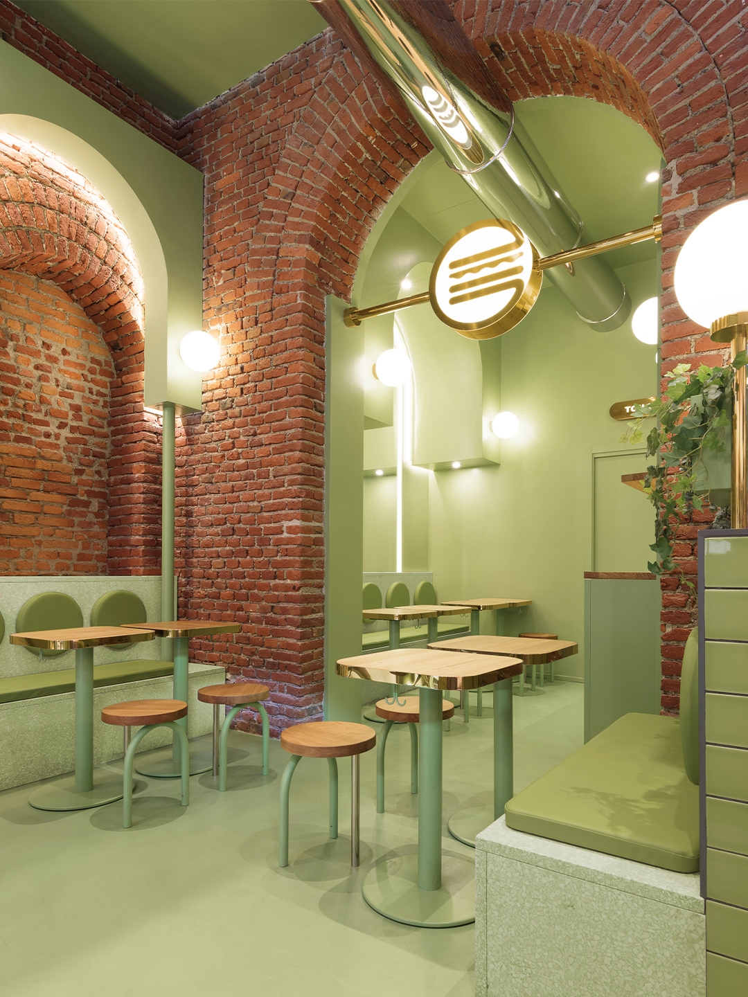
The Bun restaurant project in Milan began with Masquespacio’s designers Christophe and Ana investigating the existing elements of the site, fuelled by the underlying hope that the location would speak to them, perhaps through original architectural characteristics that could be incorporated into the final design response. “When we saw the beautiful bricks and arcs from the space it was evident for us that we would use these two elements as the starting point of the design,” Ana says.
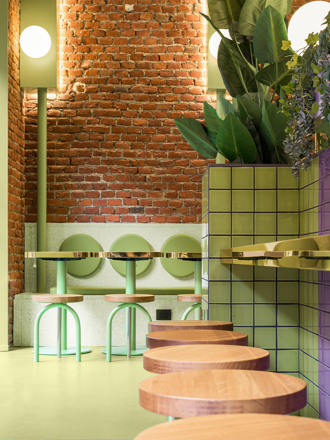
Enchanted by the existing brick archways, the design duo embraced the arch when developing a uniform aesthetic for the hamburger restaurant. New arc forms were constructed throughout the space and brought to the fore with a distinctive pairing of pastel purple and green: a statement-making two-tone colourway that offers a subtle salute to the burger bars of yesteryear.
Some of the archways are “totally independent” and others are “highlighting the already existing arcs from the interior architecture,” says the designers, who also specified terrazzo, block-colour tiles, spherical light shades, timber furniture and potted foliage throughout the 140-square-metre restaurant.
The result is a space where Masquespacio and Bun have successfully captured the interests – and satisfied the appetites – of a youthful demographic in Milan, while also building upon the Italian city’s reputation for edginess, polish and sophistication. For each party, that means it’s a mission accomplished. But so thrilled is the client with Masquespacio’s restaurant design, the creatives have revealed they are now set to collaborate with Bun on the creation of several new restaurants in the brand’s portfolio, including an outlet in Italy’s north-west: “The next one will be Bun’s first opening in Turin”.
masquespacio.com; bunburgers.com
Catch up on more office architecture and design and retail design, plus subscribe to receive the Daily Architecture News e-letter direct to your inbox.
When we saw the beautiful bricks and arcs from the space it was evident for us that we would use these two elements as the starting point of the design.

Related stories
- Resa San Mamés student accommodation in Spain by Masquespacio.
- The bar and restaurant at La Sastrería in Valencia by Masquespacio.
- Mama Manana restaurant in Kyiv by Balbek Bureau.
From well-dressed watering holes to exquisite fine-diners, Australia’s most beautiful establishments have been singled out by the 2020 Eat Drink Design Awards. The illustrious program, which is organised by Architecture Media, sets its sights on venues where aesthetics is as highly regarded as the bites and beverages they serve. The awards are presented across seven categories including Best Restaurant Design, Best Cafe Design and Best Bar Design.
Selected by a jury of industry experts, the 2020 line-up of winners are linked by threads of nostalgia. A theme which makes its way into the design responses via throwbacks to old-world elegance and classic European influences.
“Pining for the days when we could visit our favourite restaurants, cafes, and bars, the jury was drawn to venues with sentimentality and tradition at their core, but executed in a contemporary way,” says Cassie Hansen, jury chair and editor of Architecture Media’s Artichoke publication. “This year’s exemplary field of winners successfully remember and celebrate the times of the past, but forge a new future – one we can’t wait to explore.”
While this year’s celebration – and the industry it honours – was faced with its share of setbacks, the announcement of the award-winners (and runners-up) comes at a time when Australians can finally revisit the designer destinations. Not to mention, raise a socially distanced glass to the best in the business.
Now, ready your reservations – here are the winners of the 2020 Eat Drink Design Awards.
Best Bar Design
Leigh Street Wine Room by Studio Gram (Adelaide, South Australia)
Best Restaurant Design (joint winner)
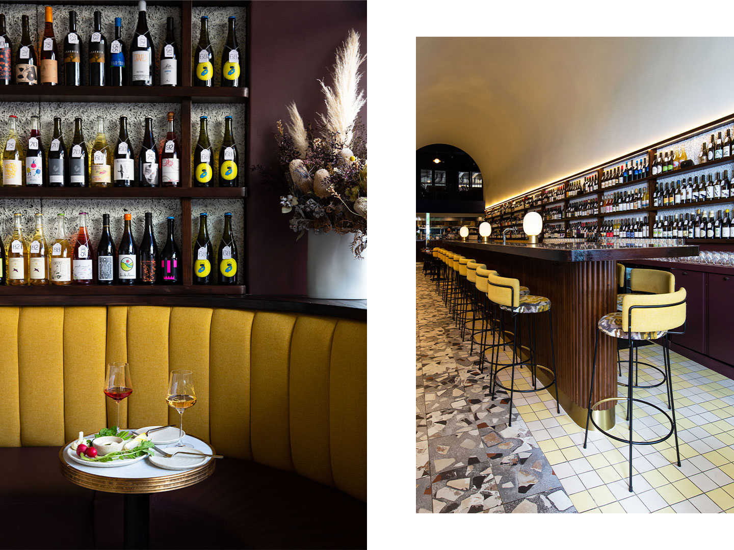
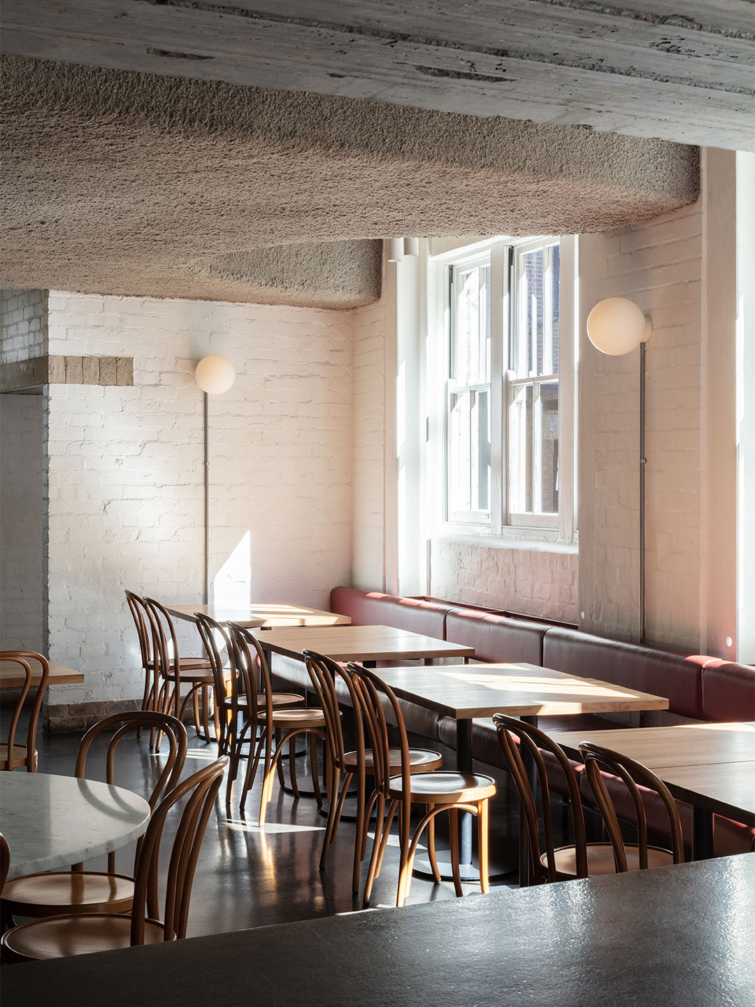
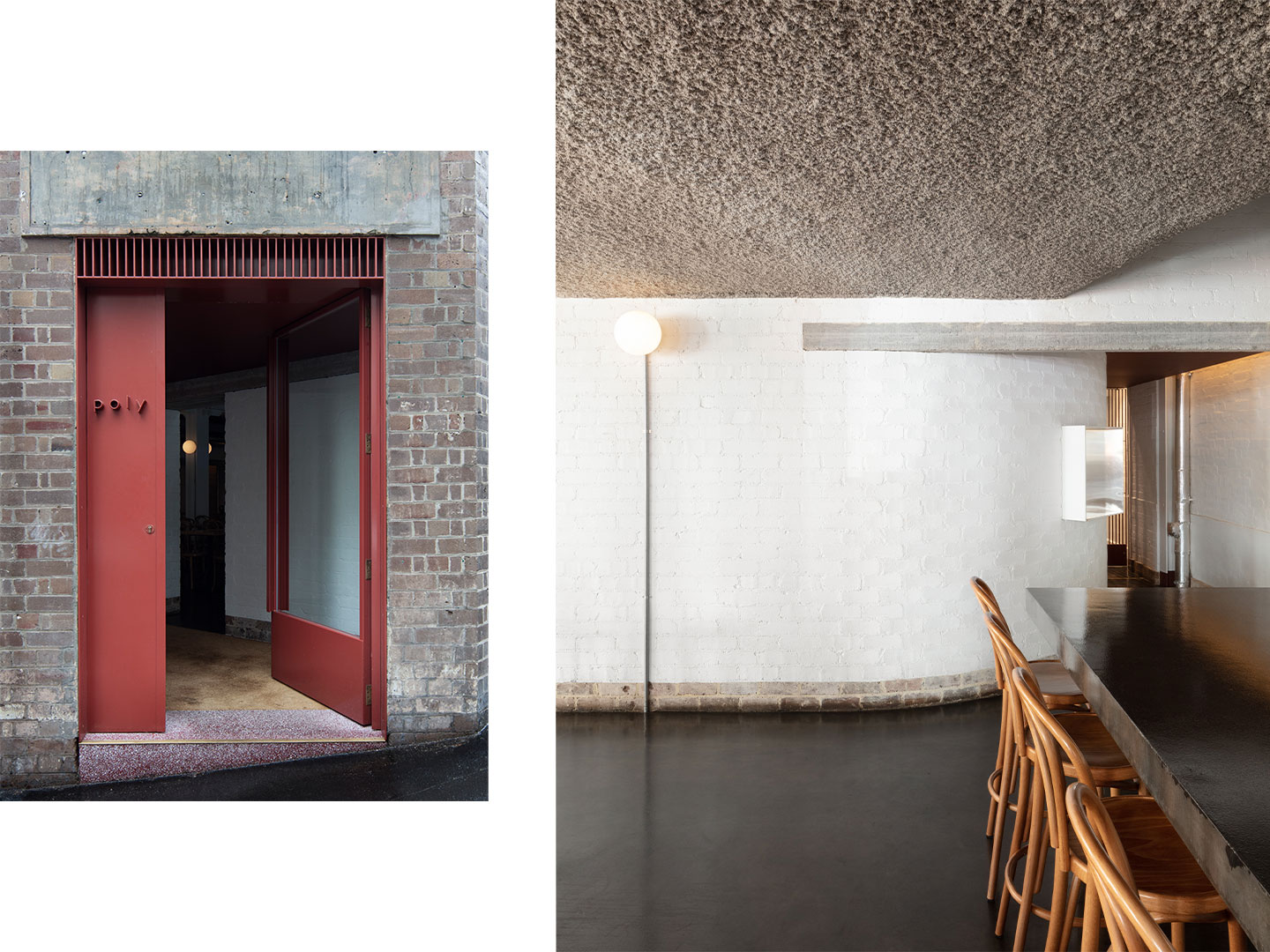
Poly by Anthony Gill Architects (Surry Hills, New South Wales)
Best Restaurant Design (joint winner)
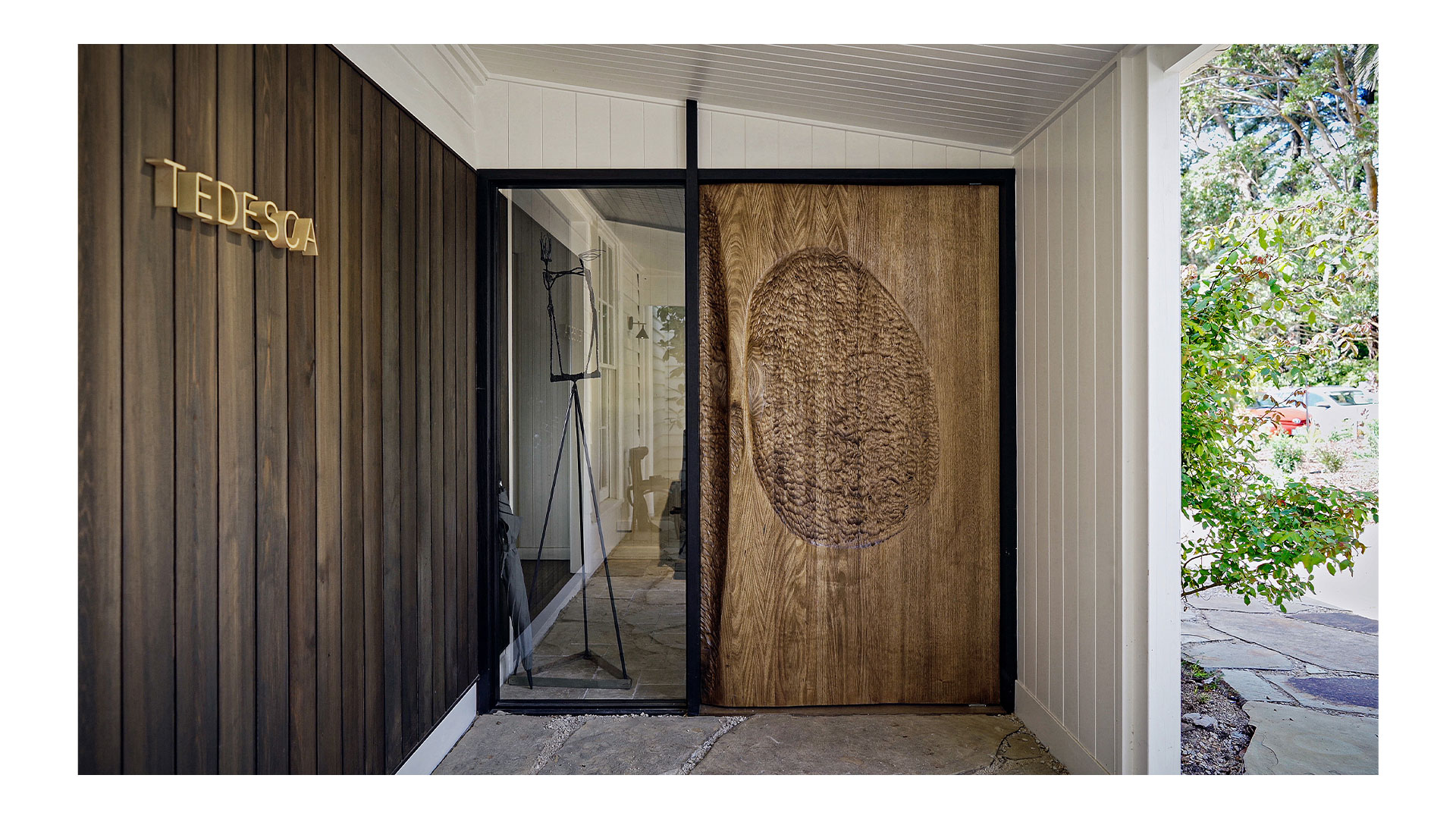
Osteria Tedesca by Cox Architecture (Red Hill, Victoria)
Best Cafe Design
There Cafe by Ewert Leaf (Footscray, Victoria)
Best Identity Design
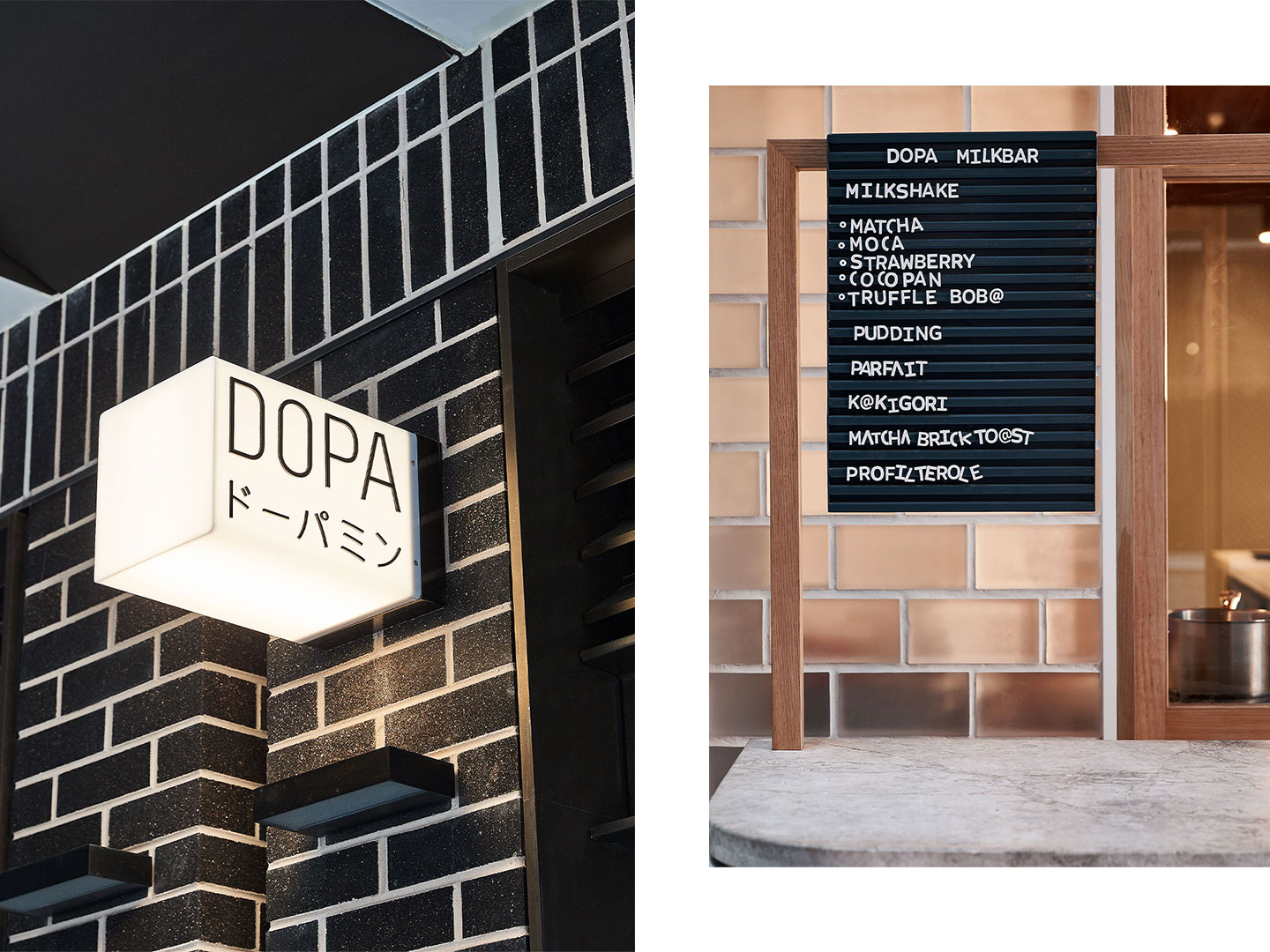
Dopa by The Colour Club (Haymarket, New South Wales)
Best Retail Design
Darling Exchange Market Hall by Anthony Gill Architects & Lendlease Design (Haymarket, New South Wales)
Best Installation Design
Orana in Residence by SJB with Orana, Promena Projects and Tracey Deep (Surry Hills, New South Wales)
Best Hotel Design
Tattersalls Hotel Armidale by Luchetti Krelle (Armidale, New South Wales)
The inductees to the 2020 Eat Drink Design Awards Hall of Fame are Skidmark Designs and Garner Davis Architects for Gin Palace (Melbourne, Victoria).
Related stories
- The 2020 Eat Drink Design Awards shortlist.
- Pull up an all-blue pew at Sydney’s newest gin bar, designed by YSG.
- The bar and restaurant at La Sastrería in Valencia by Masquespacio.
In this week’s architecture and design video round-up (above), you’re invited to settle in at Prior cafe, a chic neighbourhood eatery in the Melbourne suburb of Thornbury designed by local architects Ritz and Ghougassian.
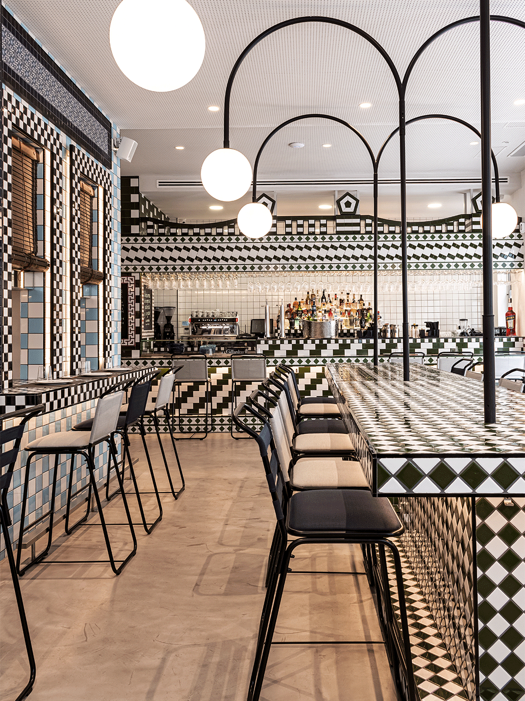
Spanish creative consultancy and interior design firm Masquespacio welcomes guests inside the bar and restaurant of La Sastrería where the deft use of tiles provides the spaces with two very different schemes. The Living Coral Biobank by Contreras Earl Architecture is set to spearhead a global rescue mission in Port Douglas, Queensland.
And finally this week, luxury automobile manufacturer Aston Martin has collaborated with architect Sir David Adjaye on five premium apartments in New York’s 130 William building.
For more information on each of these stories, see below.
- Prior Thornbury: Melbourne architecture practice Ritz & Ghougassian curated clean-lined fixtures and fittings beneath soaring white-painted cathedral ceilings at the Prior cafe in Thornbury. Read more.
- The Living Coral Biobank: Designed by Contreras Earl Architecture, the world’s first “coral ark” – a conservation facility that would safely store 800 species of coral – is planned for Port Douglas in Queensland. Read more.
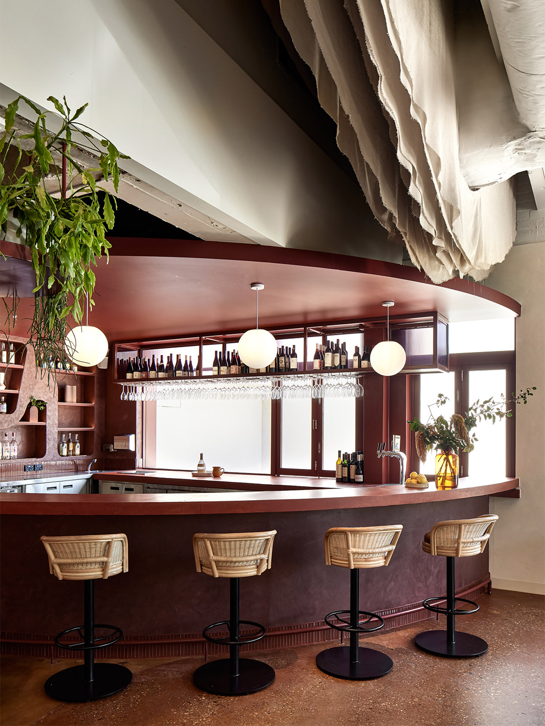
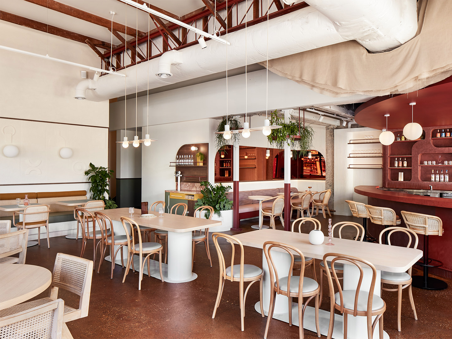
- La Sastrería bar: Created by local Spanish firm Masquespacio, the bar displays a patchwork of high-octane patterns produced with tiles that reinterpret the facades of neighbouring buildings. Read more.
- La Sastrería restaurant: Designers Masquespacio responded to the restaurant’s menu of ocean-focussed fare by creating a “huge wave” sculpture, culminating in a showpiece made of suspended ceramic objects. Read more.
- 130 William x Aston Martin: Aston Martin and architect Sir David Adjaye have collaborated on five luxurious homes at the 130 William building in New York, each packaged up with an equally exclusive Aston Martin SUV. Read more.
Pull up a pew at the bar at La Sastrería by Masquespacio and place yourself in the penthouse of 130 William in New York.
Related stories
Facing the tramline on High Street in Thornbury, Prior is a chic neighbourhood cafe that opened its doors to the inner Melbourne suburb in early 2020. Observing the eatery from the street, the building – a former print shop – is crowned by typically Art Deco detailing. Dramatic black windows frame the entrance of the 130-seat cafe. An equally theatrical awning is emblazoned with the single word ‘Prior’, positioned front and centre as if to indicate its strength as a headline act in this neck of the woods.
Stepping inside the pared-back cafe, the generously proportioned interior space basks in another kind of light. One of typically Australian feel where the designers, local architecture firm Ritz & Ghougassian, calmly curated clean-lined fixtures and fittings beneath soaring white-painted cathedral ceilings. A leather banquette lines the perimeter wall opposite the open kitchen. The central fireplace is on standby, ready to warm the mitts of patrons during the depths of Melbourne winters.
The floor and the face of the bar-height dining counter are lined with a combination of whole and face bricks. A rustic-looking material chosen for its ties to the original construction of the building. Jean-Paul Ghougassian, director at Ritz & Ghougassian, says the bricks, laid in a stack bond arrangement, offer just the right amount of warming colour plus a gentle textural quality. “As a studio, we try to reduce the number of colours used within a particular space in order to create a homogenous finality,” he says. “We wanted to bring a sense of exterior space to the interior. The brick breaks up the interior space much better than alternative materials such as concrete.”
Jean-Paul says the client’s brief was to create a vibrant, contemporary and welcoming neighbourhood cafe so the choice of brick was somewhat inevitable. “People often associate brick with Melbourne’s laneways, so I suppose our design was like tipping a hat to the city’s famous cafe culture.”
As a design studio, Ritz & Ghougassian has made a name for itself in Melbourne by creating several new cafes over recent years. One of the benefits of designing cafes – aside from the pleasure of seeing a project successfully completed – is the prospect of endless barista-made coffee from a grateful client, says Jean-Paul. “Unfortunately, we are based on the other side of the city from Prior,” he laughs. “But we do pop in for a coffee from time to time.”
ritzghougassian.com; priorthornbury.com.au
People often associate brick with Melbourne’s laneways, so I suppose our design was like tipping a hat to the city’s famous cafe culture.
Related stories
- Pull up an all-blue pew at Sydney’s newest gin bar, designed by YSG.
- Sky-high: Sydney Tower’s Bar 83 by Loopcreative.
- Inside the Ace Hotel Kyoto by Kengo Kuma and Commune.
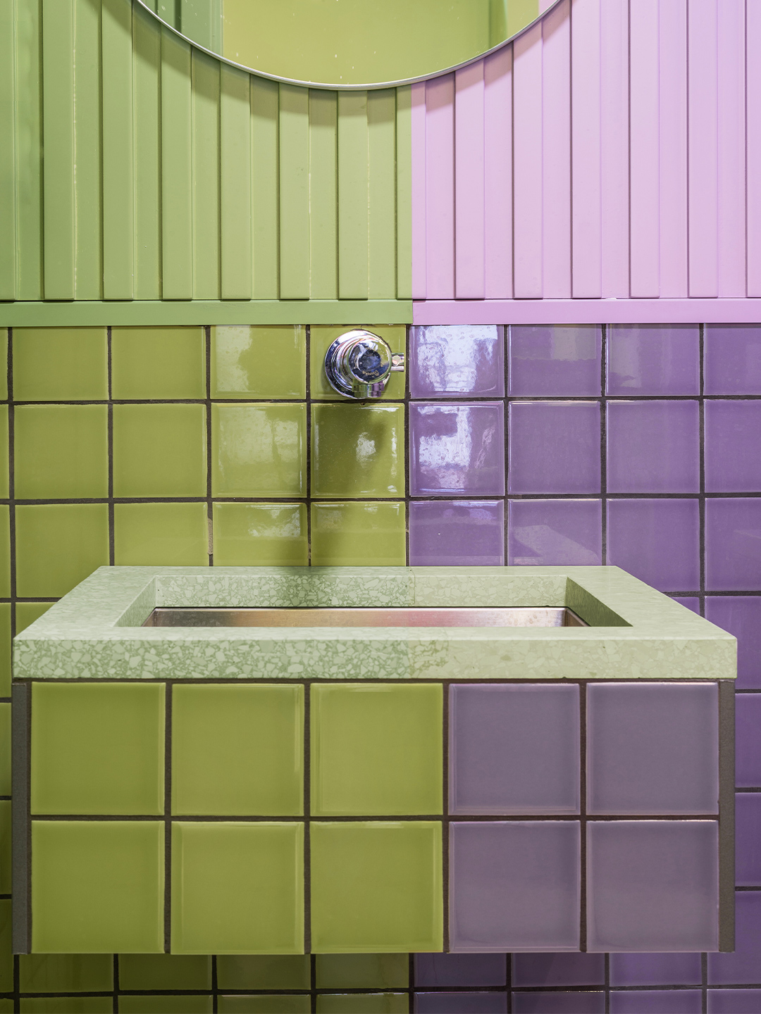
Chef Sergio Giraldo and bartender Cristóbal Bouchet always dreamt of opening their own restaurant. When the opportunity came along to do just that, their first port of call was a meeting with local Valencia-based design studio Masquespacio. Fuelled by the ambitious vision of the two young entrepreneurs, Masquespacio’s co-founders Christophe Penasse and Ana Hernández delivered the wondrous establishment now known as La Sastrería; a vibrant vessel where Sergio and Cristóbal can spearhead new culinary experiences in Spain.
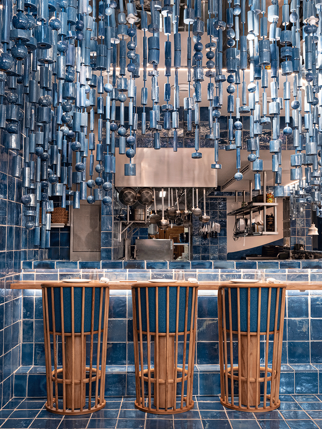
Located in Canyamelar-Cabanyal, the maritime neighbourhood of Valencia, La Sastrería is divided into three main sections: a bar, restaurant and a fish market. Masquespacio’s boundary-pushing design responses for the bar and restaurant – somewhat of a signature for the firm – are differentiated by the deft use of wall and floor tiles. A frenzy of custom-made tiles laid in all sorts of captivating patterns dominate the bar zone while the dining room is awash with handsome clay and ceramic tiles in ocean-inspired tones.
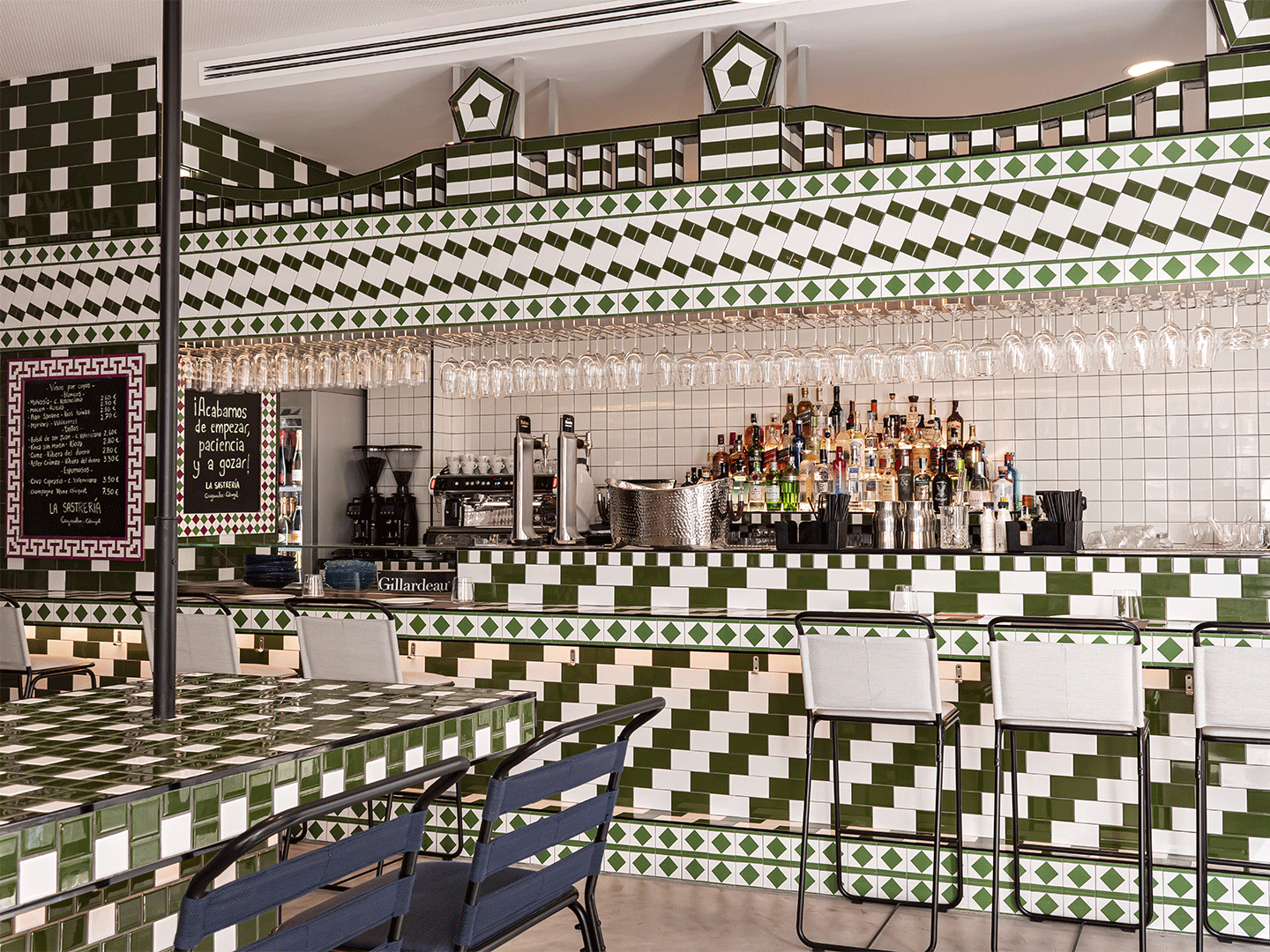
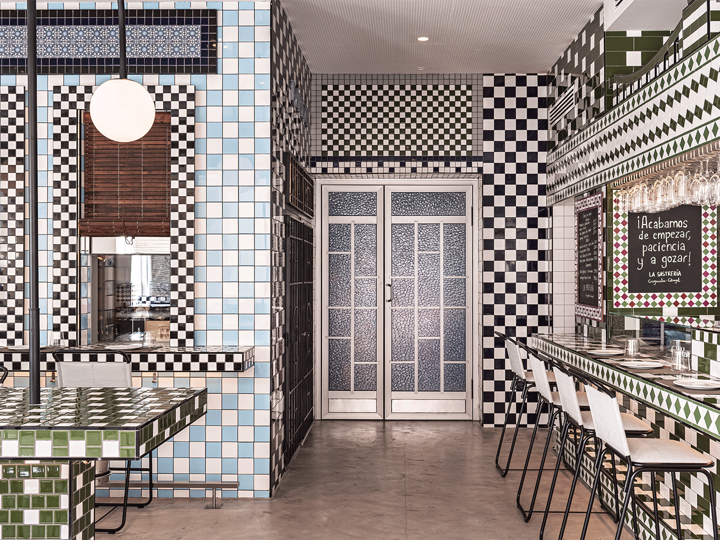
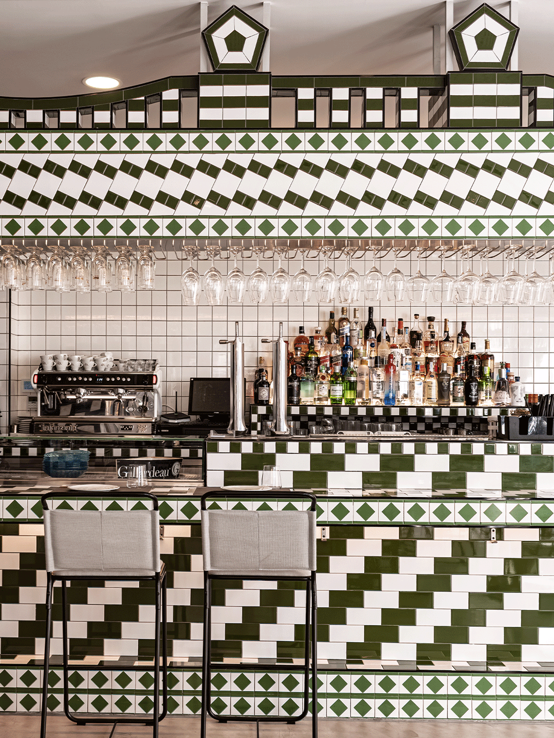
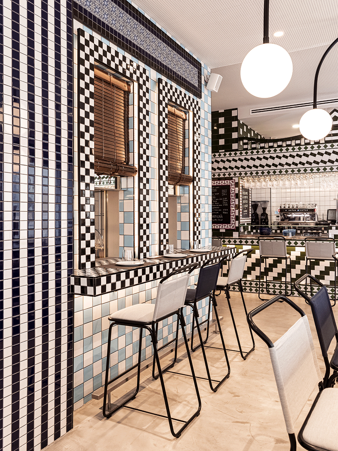
The bar and restaurant at La Sastrería in Valencia by Masquespacio
In the bar, almost every surface confidently displays a patchwork of high-octane patterns produced with tiles that reinterpret the similarly energetic facades of the neighbouring buildings. “Special attention has been given to the bar that looks like a facade on its own,” says Ana and Christophe. “In the middle, the attention is centred on the selection of spirits that will be used for cocktails – the speciality of Cristóbal and La Sastrería.”
While the bar outwardly references the architectural characteristics of the surrounding neighbourhood, look a little further and, more subtly, the design also considers the way the locals live and the social interactions that sculpt the charm of the region. “We tried to recreate the habits of the neighbours in the interior through the reinterpretation of the plastic chairs they take from their homes to the streets,” says Ana, Masquespacio’s creative director. “This represents the act of taking fresh air – tomar la fresca – during the warmest days, when the neighbours get on the streets and come together for a chit chat.”
Chef Sergio’s authentic local cuisine is the drawcard for the seafood-loving guests of the main dining room at La Sastrería. Here, the designers responded to the menu of ocean-focussed fare by creating a “huge wave” sculpture that builds momentum as it approaches the kitchen, culminating in a showpiece made of suspended ceramic pieces.
Elsewhere, an overflow of ocean-inspired hues floods the fit-out. “The floor of artisan ceramic [tiles] in white and blue makes us experience the division between the water and the sand of the sea, while the chairs designed for the space are a reference to the fishing boats,” explains Ana. “We wanted to create a scene focussed on the kitchen, submerging the whole restaurant as if you are in the middle of the sea. It’s pure fantasy, like Sergio’s dishes.”
Catch up on more architecture and design highlights just like La Sastrería by Masquespacio. Plus, subscribe to the Daily Architecture News e-letter for a weekly round-up delivered straight to your inbox.
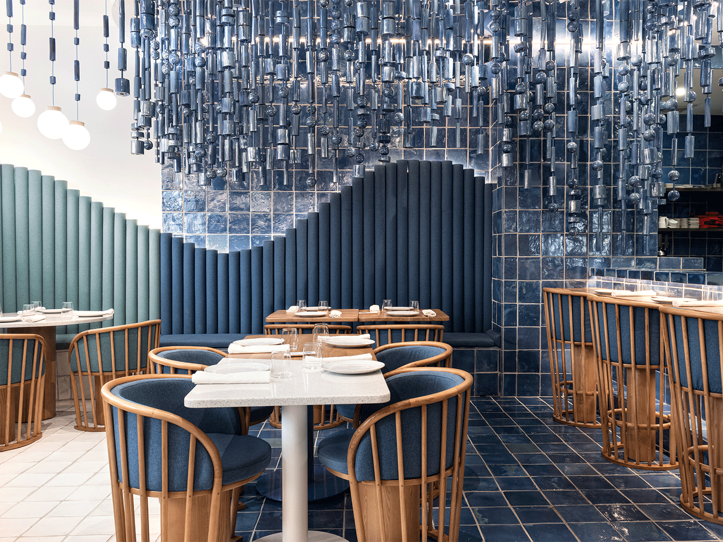
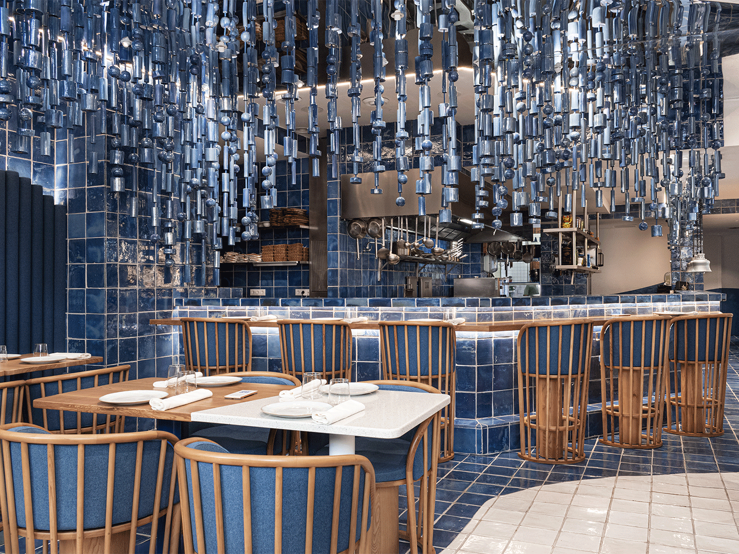
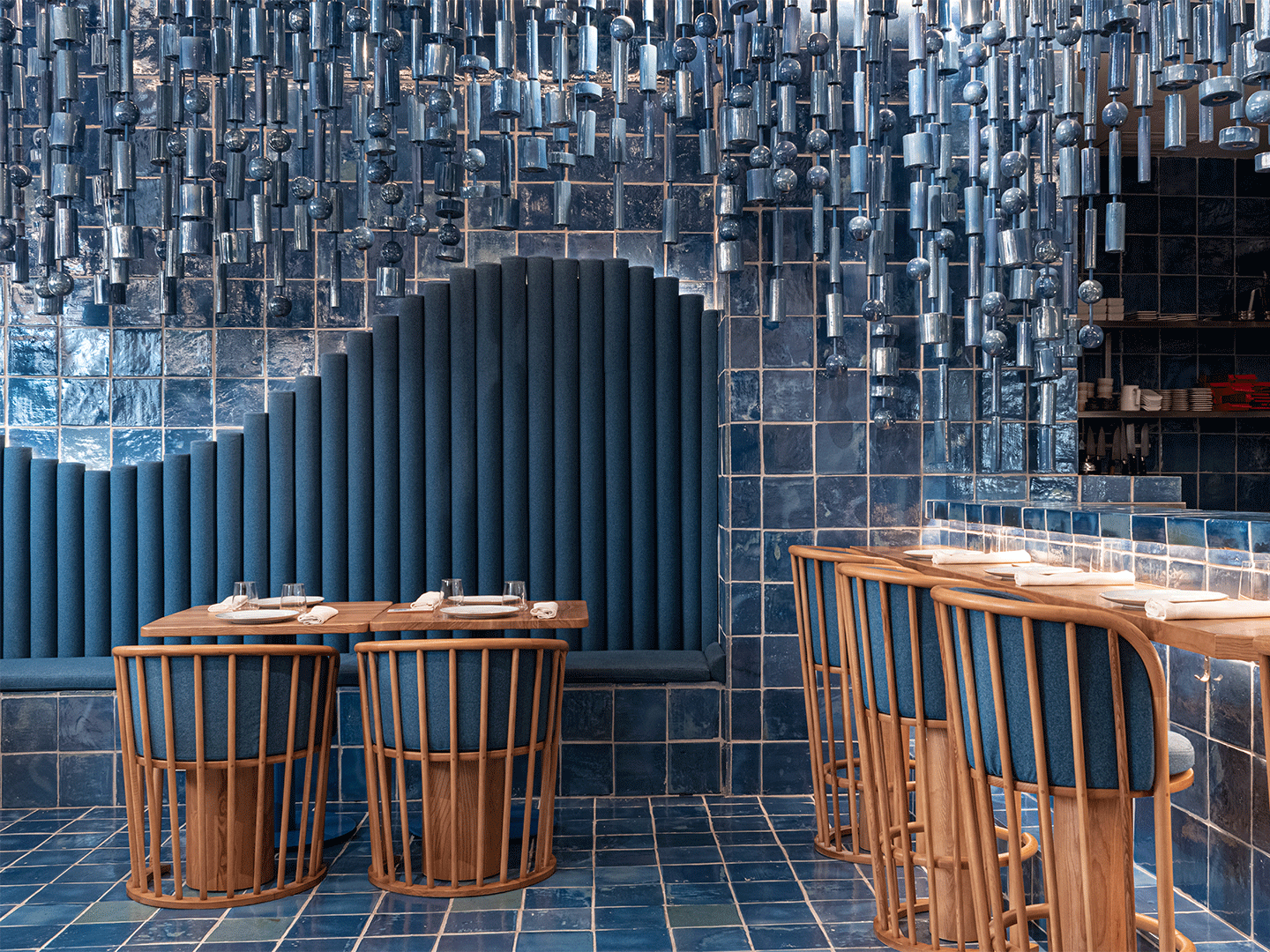
We wanted to create a scene focused on the kitchen, submerging the whole restaurant as if you are in the middle of the sea. It’s pure fantasy, like Sergio’s dishes.
Related stories
- Pull up an all-blue pew at Sydney’s newest gin bar, designed by YSG.
- Sky-high: Sydney Tower’s Bar 83 by Loopcreative.
- Inside the Ace Hotel Kyoto by Kengo Kuma and Commune.
Hailing from Georgia in the Caucasus region of Eurasia, the Mama Manana group of restaurants is built on the charming tale of a Georgian hostess. Known as Mama Manana, the story goes that she regularly greets guests at the doorstep of her home and warmly welcomes them inside with an abundance of kind-hearted hospitality. Tasked with designing the restaurant group’s latest outlet in Ukraine, local architecture and interiors firm Balbek Bureau, led by practice principal Slava Balbek, borrowed inspiration from this fable and harnessed its spirit of generosity in realising a contemporary restaurant setting.
Housed within an early 20th-century building on Prorizna Street in a historical part of central Kyiv, the new restaurant is just a few steps away from the rebuilt Golden Gate monument. For Balbek Bureau, it was the four levels of the building that inspired the design response. “Upon our first visit to the site, we decided on a visual design concept of a gradient. This concept helped us to separate the space, to create areas different in their seating style and functional purpose,” says the designers.
Stepping off the bustling street and into the restaurant, patrons find themselves in a functionally dynamic space, equipped to service a large number of people on the go. The hard seating is intended for fast-paced lunches, quick bites and brief business meetings.
A series of existing arched windows that overlook Prorizna Street became the floor’s prime architectural element. “We preserved their original form and painted [them] in fresh green,” says the designers. The textured brick walls are another focal point of the space, and the beginning of many decisions that nod to the rustic materiality of Mama’s fictional abode. “Through the play of light and shadow, [the bricks] create a unique perceptual experience,” says the architects. “Some of the brick we used for the flooring, to evoke the feel of a yard or a garden.”
An open kitchen allows guests to experience the theatre of preparing Georgian cuisine and to enjoy the appealing aromas. The kitchen area is bordered with a part-wall of concrete blocks that add to the textural quality of the first floor. Illuminated from the inside, the blocks emit a layer of soft light.
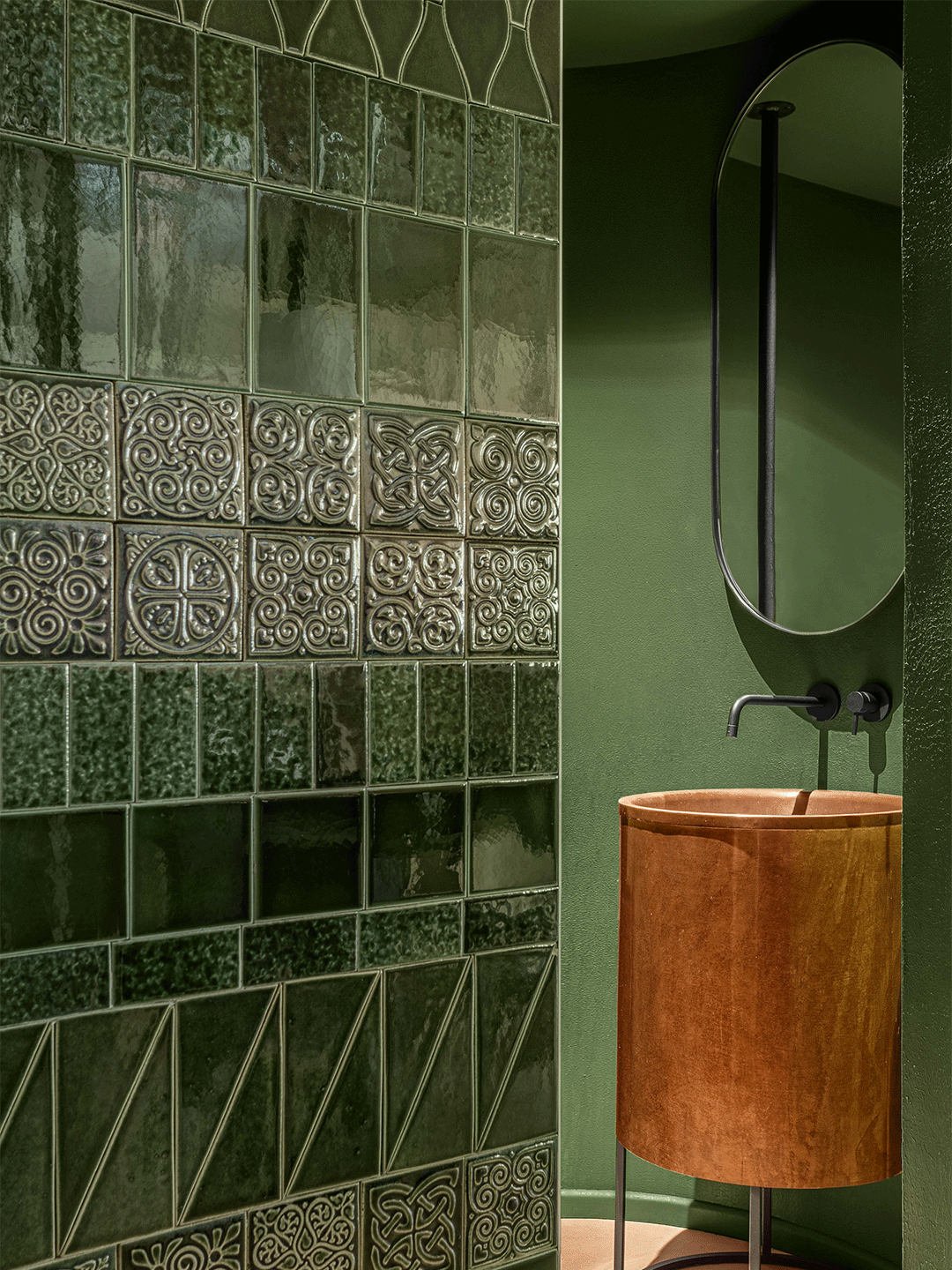
Descending to the basement where the restroom is located, the stairs and walls on each side are clad with slender rustic-looking tiles. Among the predominantly dark and moody palette, the cylindrical clay washbasin – handmade made by local craftspeople – provides an accentual contrast.
At the top of the stairs on the second level, a residential-scaled dining nook named the Banquet Room offers guests an intimate atmosphere for a private feast. The colour scheme is warmer than other spaces which, when combined with metal arches and Georgian ornaments, creates a memorable dining ambience. “We designed the ornament based on Georgian motifs, adapting it to the particularities of the space,” says the designers. “Armed with only their hands and rulers, the craftsmen spent several weeks putting up this unique ornamentation.”
The room is backdropped by an arch-shaped screen of flax, completing the vaulted composition of the room. To close off the area, guests need only draw the brilliant blue velvet curtains. “The rich blue colour plays to the festive quality of the room,” says the architects.
We designed the ornament based on Georgian motifs, adapting it to the particularities of the space.
Aligned with the firm’s “gradient” design approach, the material specifications are partially continued from the first floor to the second. “The flooring of the second floor mirrors the ceiling of the first,” says the design team. “On this level, we chose warmer colours and tactile materials to evoke the comfortable atmosphere of Mama Manana’s living room.”
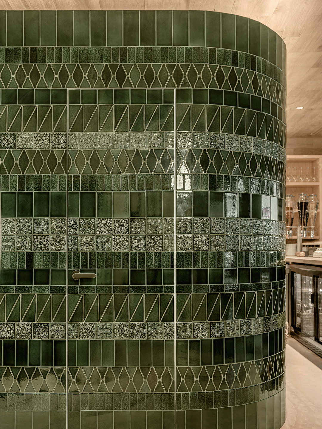
The hero piece outside of the Banquet Room is the green-tiled shaft with gently rounded corners – an installation which houses restrooms on one side and back-of-bar facilities on the other. The restaurant-facing surface of the curved wall is lined with eight types of tiles which vary in size and ornament, made by local atelier Detailes Mosaics.
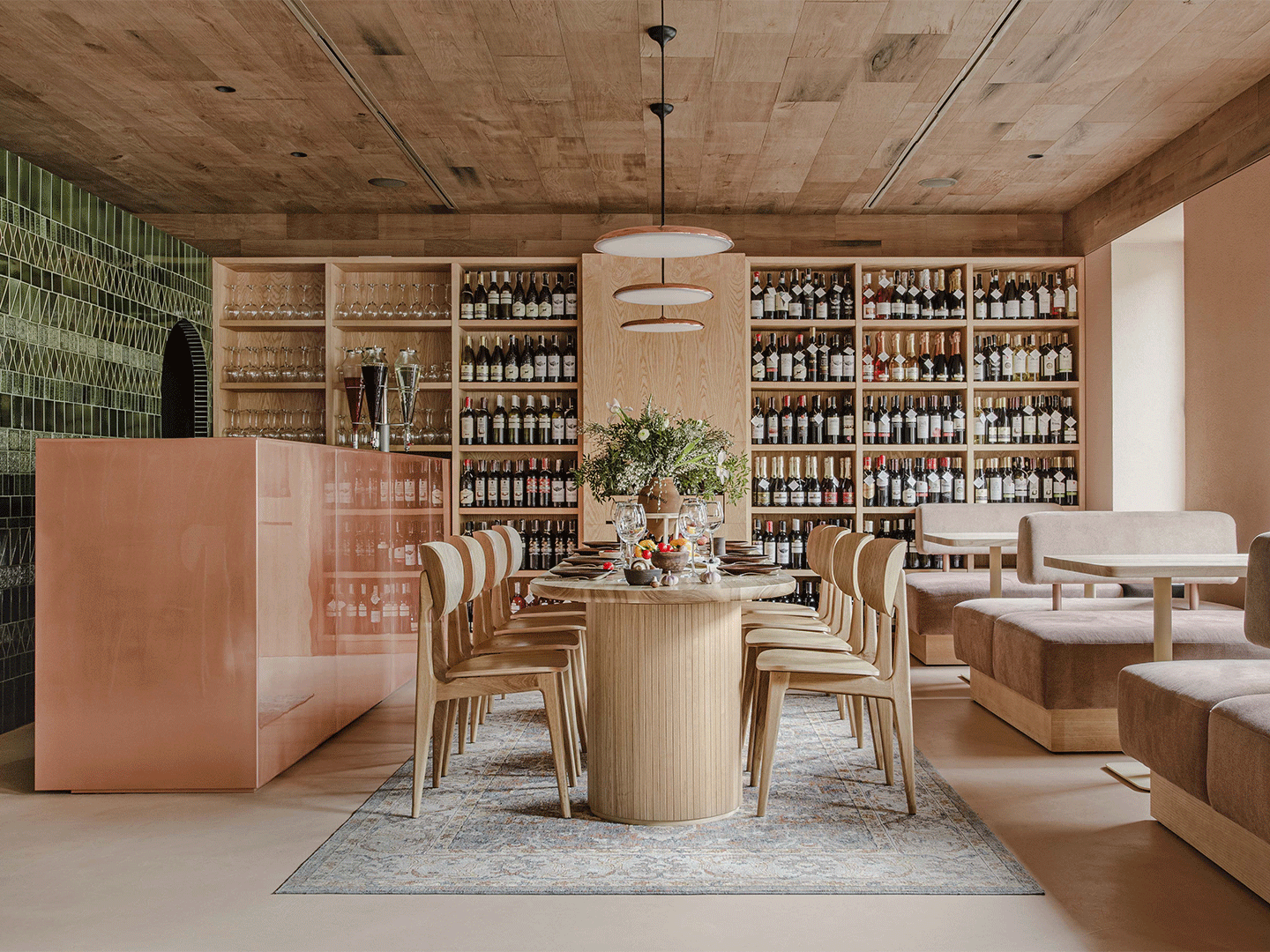
Standing proud against the green-tiled wall, the copper bar is positioned ahead of a large wine library and a communal dining table where three pendant lamps are made of the same copper. The stairwell to the third floor is enclosed by a metal sculpture that resembles rambling vines, finished in the pale terracotta hue of the walls. “Continuing to draw inspiration from our gradient concept, the light-coloured walls flow into a wooden ceiling made of 50-year-old oak,” says the architects. This oak continues upward to form the flooring of the third floor.
The third floor is the highest level of the restaurant and, with its glazed sliding partitions that open to the Kyiv skyline, is the brightest of all floors. “In the summertime, this floor transforms into a unified open space,” says the designers. The low-slung seating is relaxed and inviting, with generously sized armchairs and laid-back sofas placing diners in the perfect position to enjoy the aspect. “We decided to create two levels of seating on the terrace, which gives the guests sitting near the fencing a wonderful view of the street and the city.”
The intimate interior is separated from the staircase by a screen made of a material that emulates black fur – a nod to the traditional clothing worn by a Georgian shepherd. Above the dining table, an installation of candle-like luminaires (designed by Balbek Bureau, made by Vasyl Hrublyak) sets the space aglow. Appearing to float in the air, the lighting piece ensures a comforting atmosphere after nightfall, creating a cocooning spot beside the open fireplace where the mysterious Mama herself might just join guests for a nightcap.