Born of an artistic partnership between two creative minds, the latest collection from Gerringong-based Hegi Design House and Italian architect Pietro Franceschini is an exploration of Italian sensibility, reimagined for a contemporary Australian aesthetic. The collaboration formed after the Hegi team approached Pietro with visions of graceful curves and rich upholstery, wanting to encapsulate the feeling of fluidity with the weight of quality pieces. Pietro responded enthusiastically, excited by the chance to combine his artistic direction with Hegi’s unrivalled craftsmanship.
Designed in the Italian Riviera, the Urania collection was conceived during Pietro’s Covid-induced lockdown experience in Genova, where an unexpected friendship with a local painter led to one of the most creatively prolific times of his life. The name Urania is an homage to the picturesque sports club he spent a large amount of time in, discussing ideas, concepts and coming up with the intention behind the new furniture collection.
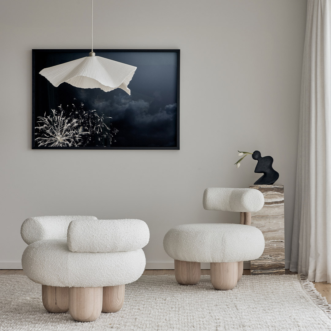
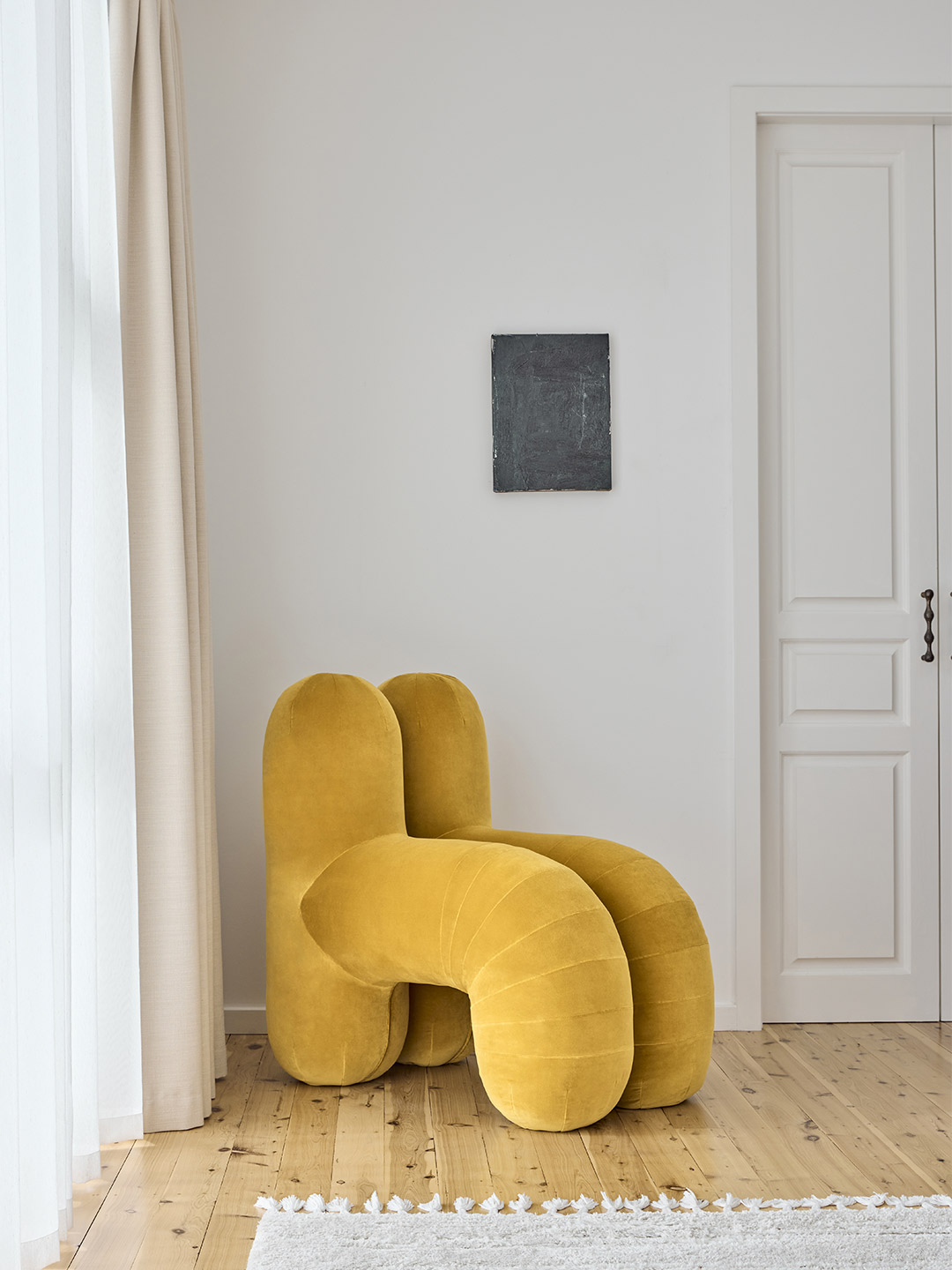
Hegi Design House x Pietro Franceschini furniture collaboration
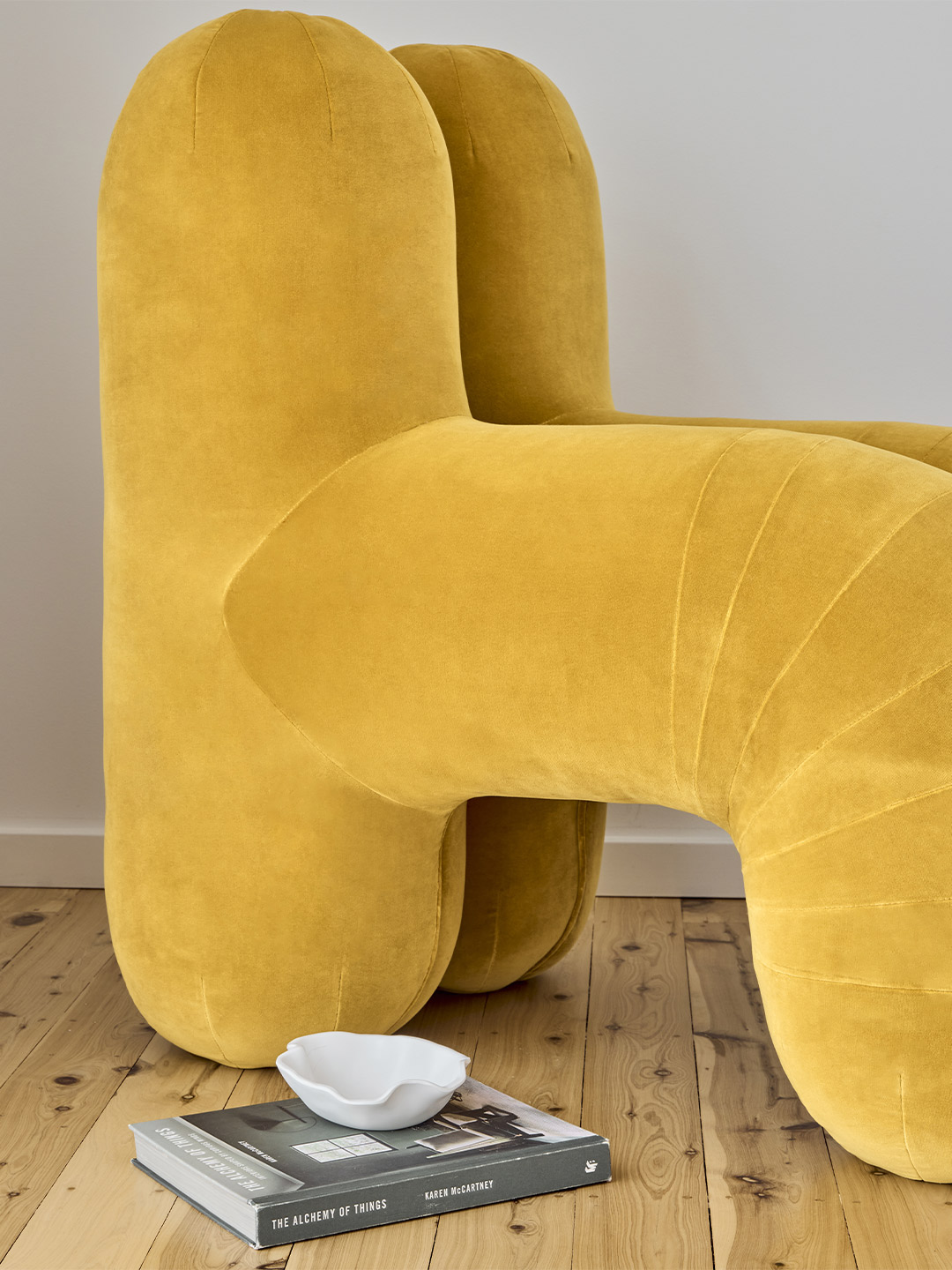
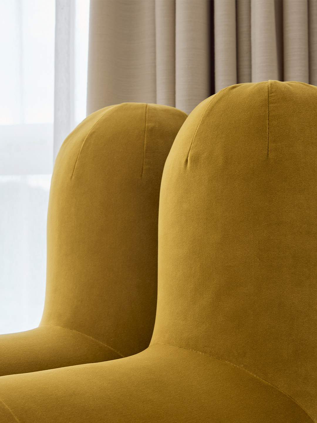
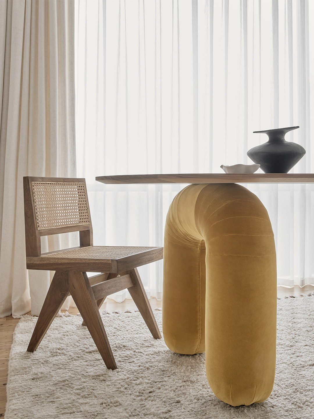
The Urania collection features three key pieces: the ‘Collo’ daybed, ‘Lavinia’ desk and the ‘Waldo’ chair, each offering a playful, fresh and instantly recognisable profile that is both gentle and solid. The modularity of the pieces was inspired by the classic ‘DS-600’ sofa by De Sede, with the idea being that, although upholstered, the pieces would appear as if made of stone. Luxuriously adorned with Rubelli velvet and offered in an array of customised finishes, the sculptural range is an exploration of sensuality with a hint of masculine form, where art and furniture intertwine.
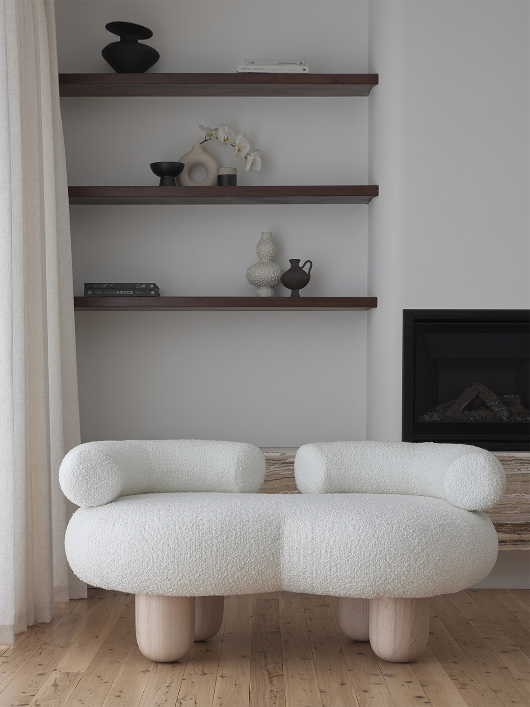
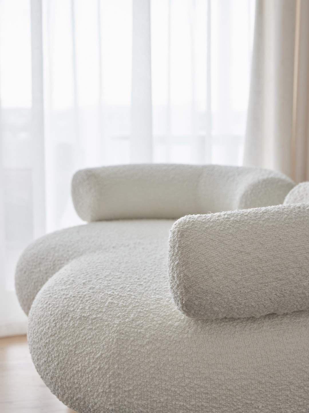
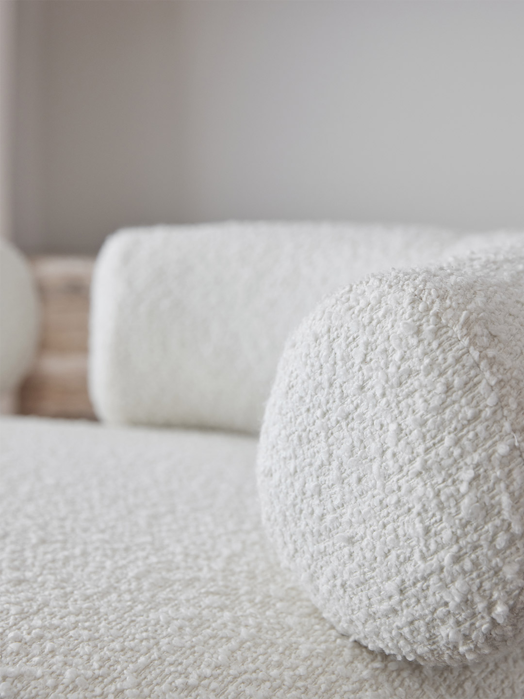
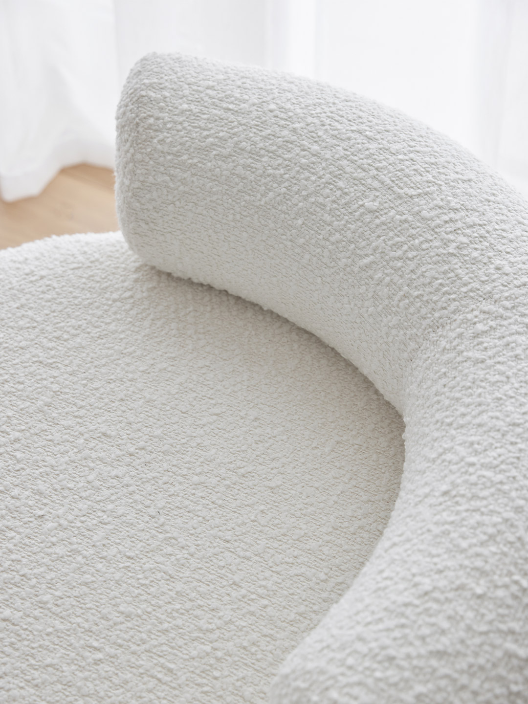
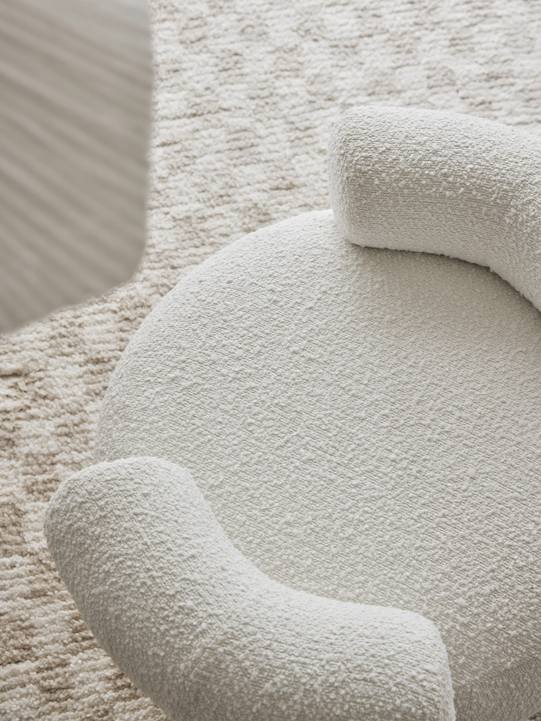
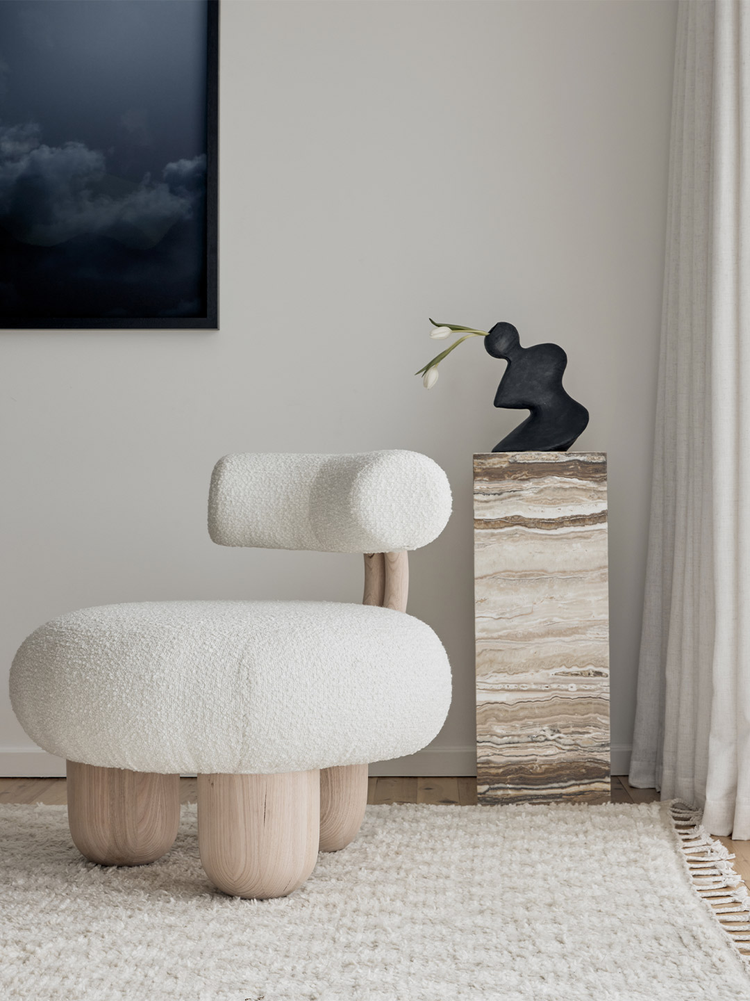
To coincide with Urania, the Bling Bling collection takes its style cues from the imagined hallowed grounds of Olympus. Its mythical halls, replete with marble and gold and palatial in scale, are reimagined in the sculptural form of the ‘Siamese’ sofa, chair and ottoman. Each cloud-like seat is upholstered in Dedar Artemidor boucle and sits on a base of sumptuously carved Victorian ash legs – the ultimate luxury item for any discerning collector.
As Pietro’s final offering, the ‘Six Variations’ chair is a sleek yet striking designer statement, with a futuristic profile that’s at once classic and contemporary, outrageous and playful. Made exclusively by Hegi Design House, the chair, as with the entire capsule collection, is a triumph of craftsmanship; the culmination in a true creative partnership where an inspired meeting of minds, forged from a collective appreciation for sustainable luxury and soulfulness, is grounded in effortless elegance.
hegidesignhouse.com; pietro-franceschini.com
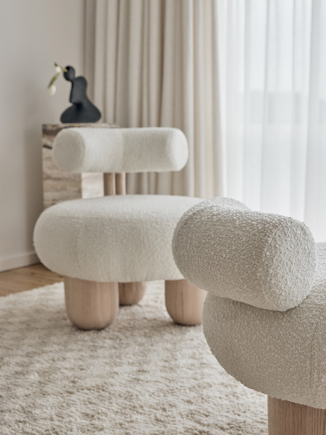
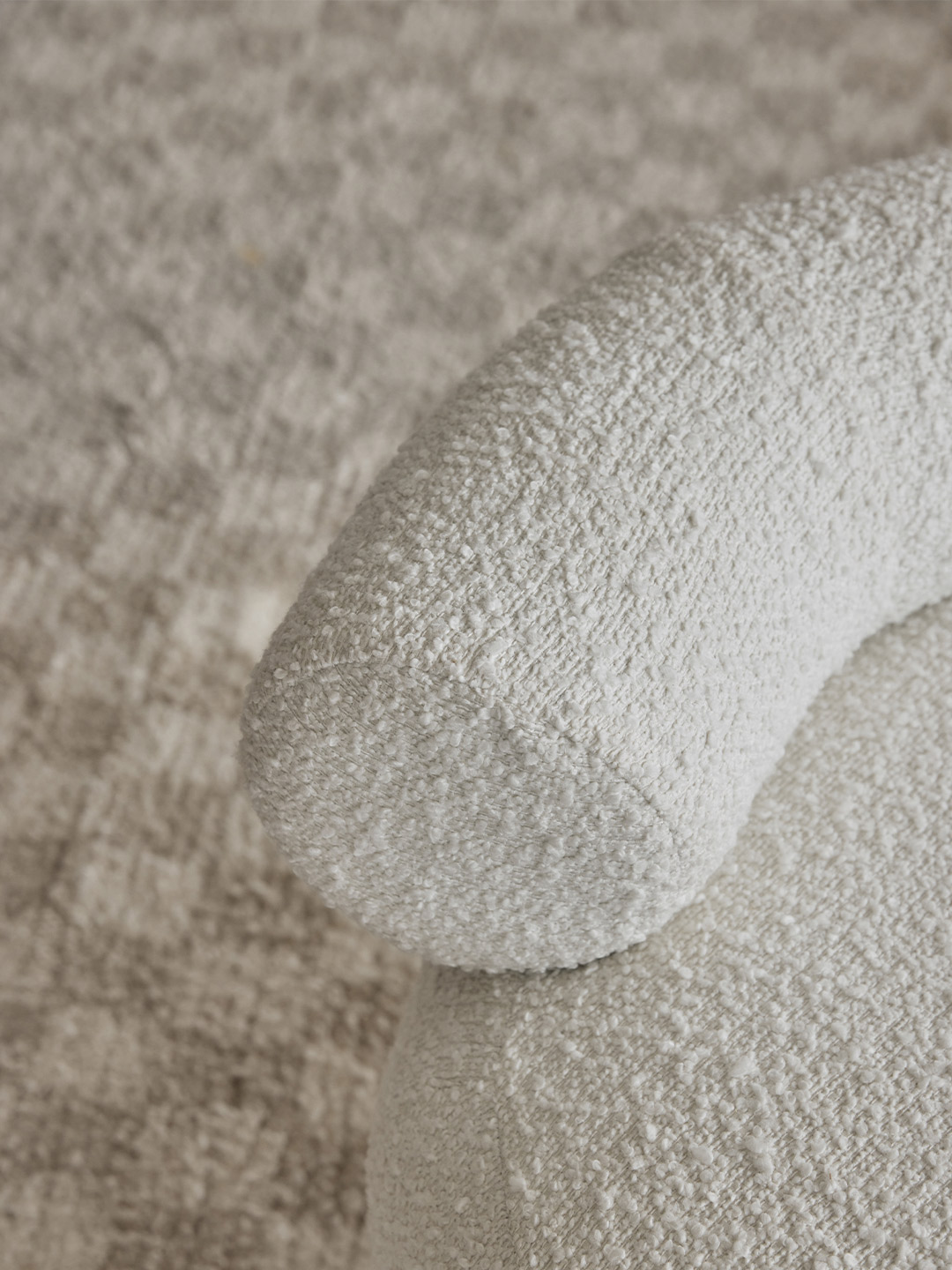
The Pietro Franceschini x Hegi Design House capsule collection is a triumph of craftsmanship. A true creative partnership that has culminated in an inspired meeting of minds…
Love the Hegi Design House x Pietro Franceschini collaboration? Catch up on more architecture and design highlights. Plus, subscribe to receive the Daily Architecture News e-letter direct to your inbox.
Related stories
- Bethan Gray launches Inky Dhow collection during 2022 Milan Design Week.
- Paved paradise: Fish Lane Town Square by Richards & Spence.
- A 1960s London post office is now a swinging sushi restaurant.
- Hot desks: Spacial co-working office in Montreal by Ivy Studio.
- Artful lodger: Inside the Ace Hotel Sydney by Flack Studio.
When South Korean design office Studio Studio was commissioned to create a restaurant in Incheon, a city bordering Seoul, they were presented with a “box-like” volume brimming with potential. Located on the lower floor of a housing complex, the site was one of many blank canvases enclosed by four unembellished walls. Adding pressure to the project, an unofficial contest between new interior fit-outs in the precinct became a driving force for the designers to create an exceptional space. “The game is won or lost by how the designer elegantly fills the box,” says Do Gwanghun, founder of Studio Studio, whose Seoul-based practice is credited for shaping Wall restaurant – a solid contender for the most sophisticated scheme in the sizeable complex.
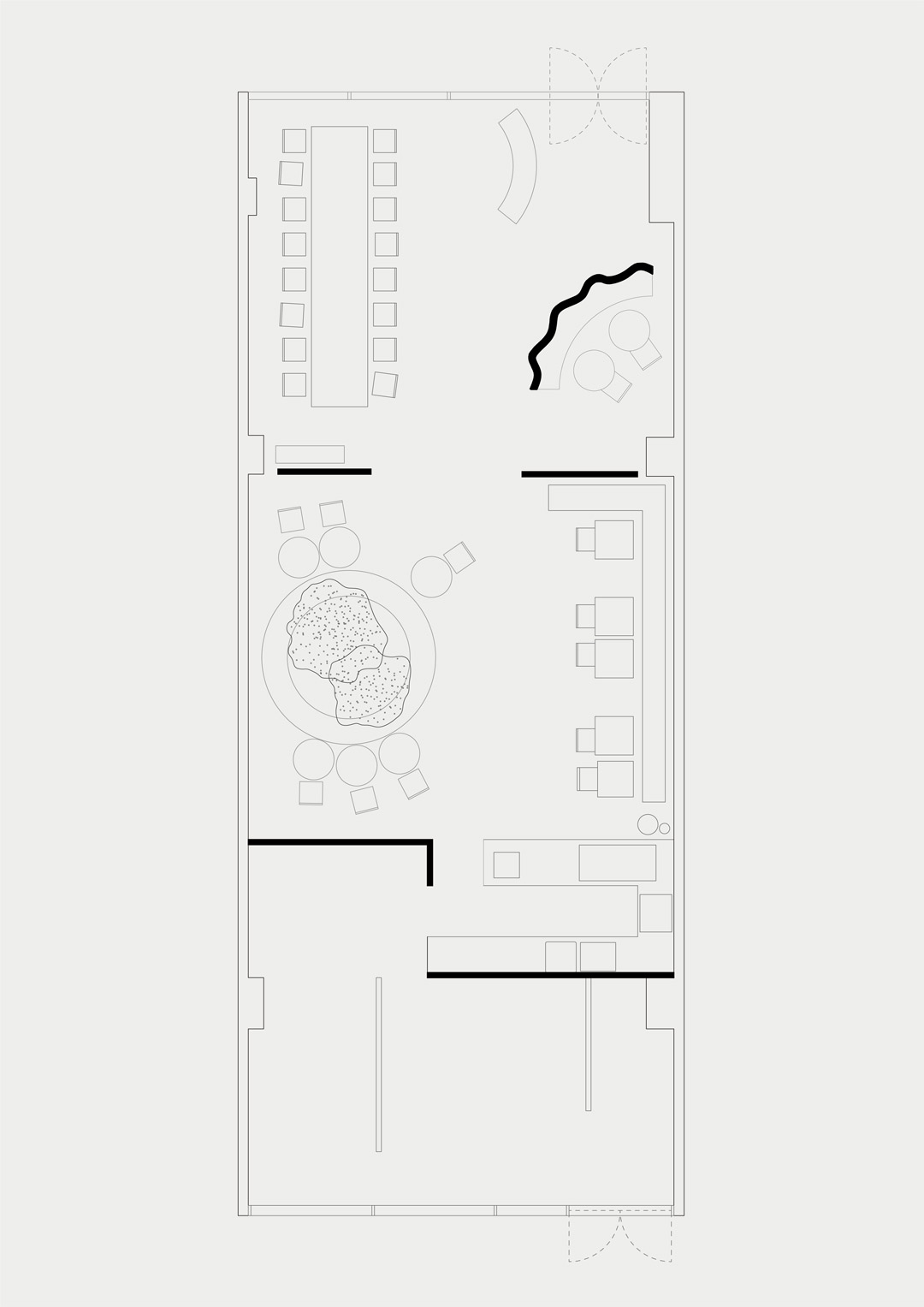
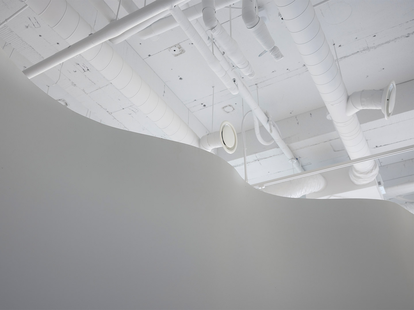
As its name suggests, Wall restaurant is all about the walls. How they divide the space, seperate the different functions of the project and – perhaps most importantly – cocoon the patrons as they drink or dine. “The main function of drinking wine and eating food is divided into different atmospheres in one space,” Do says, referring to the way in which the floor plan is split into three main segments. Pointing to the first of these areas, located towards the entry, Do says a “soft zoning” effect was established by employing low partition walls. “Because the walls are low, the space is not completely separated [from the next zone],” he explains.
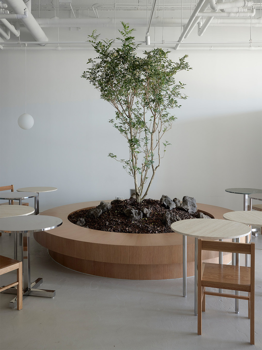
Wall restaurant in South Korea by Studio Studio
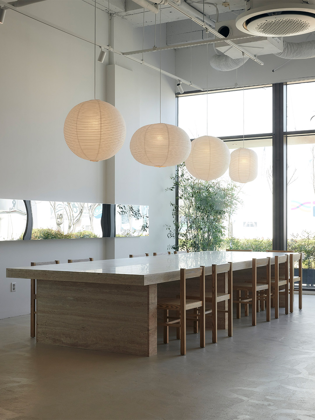
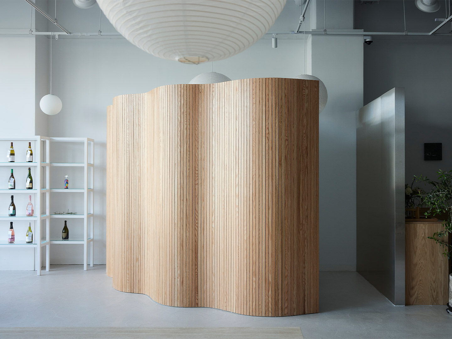
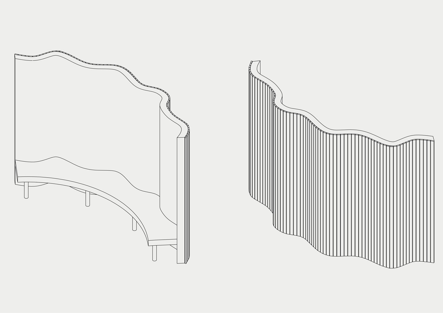
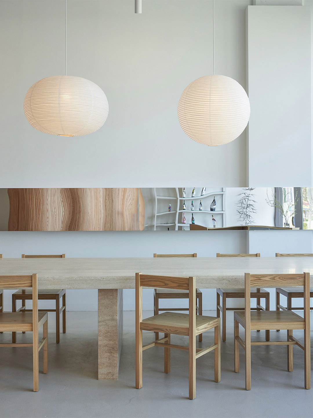
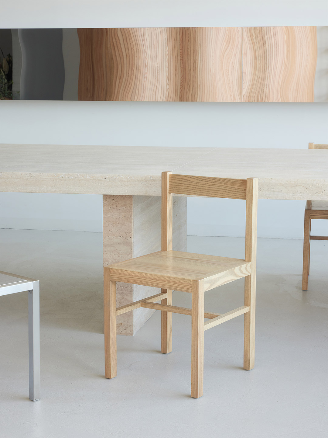
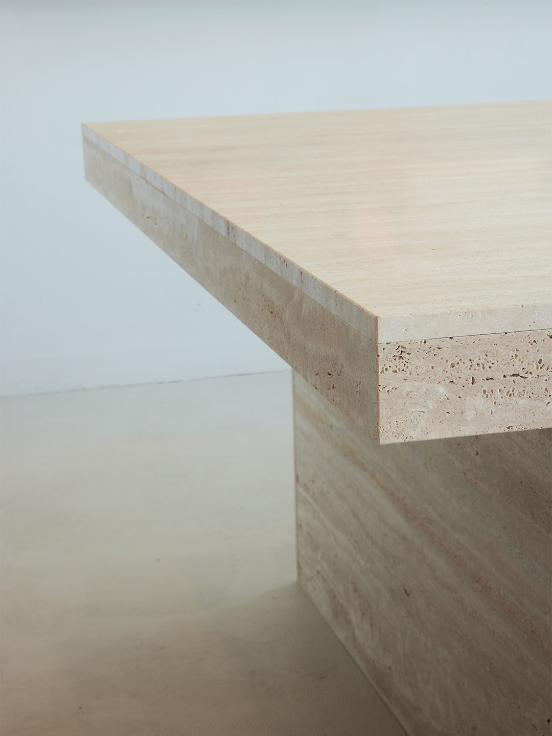
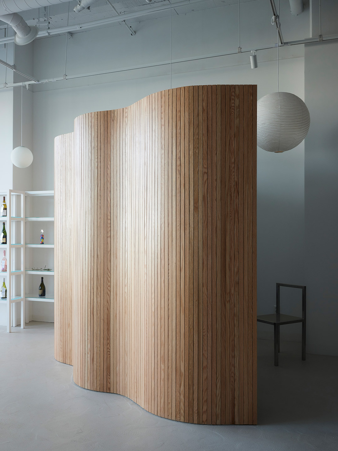
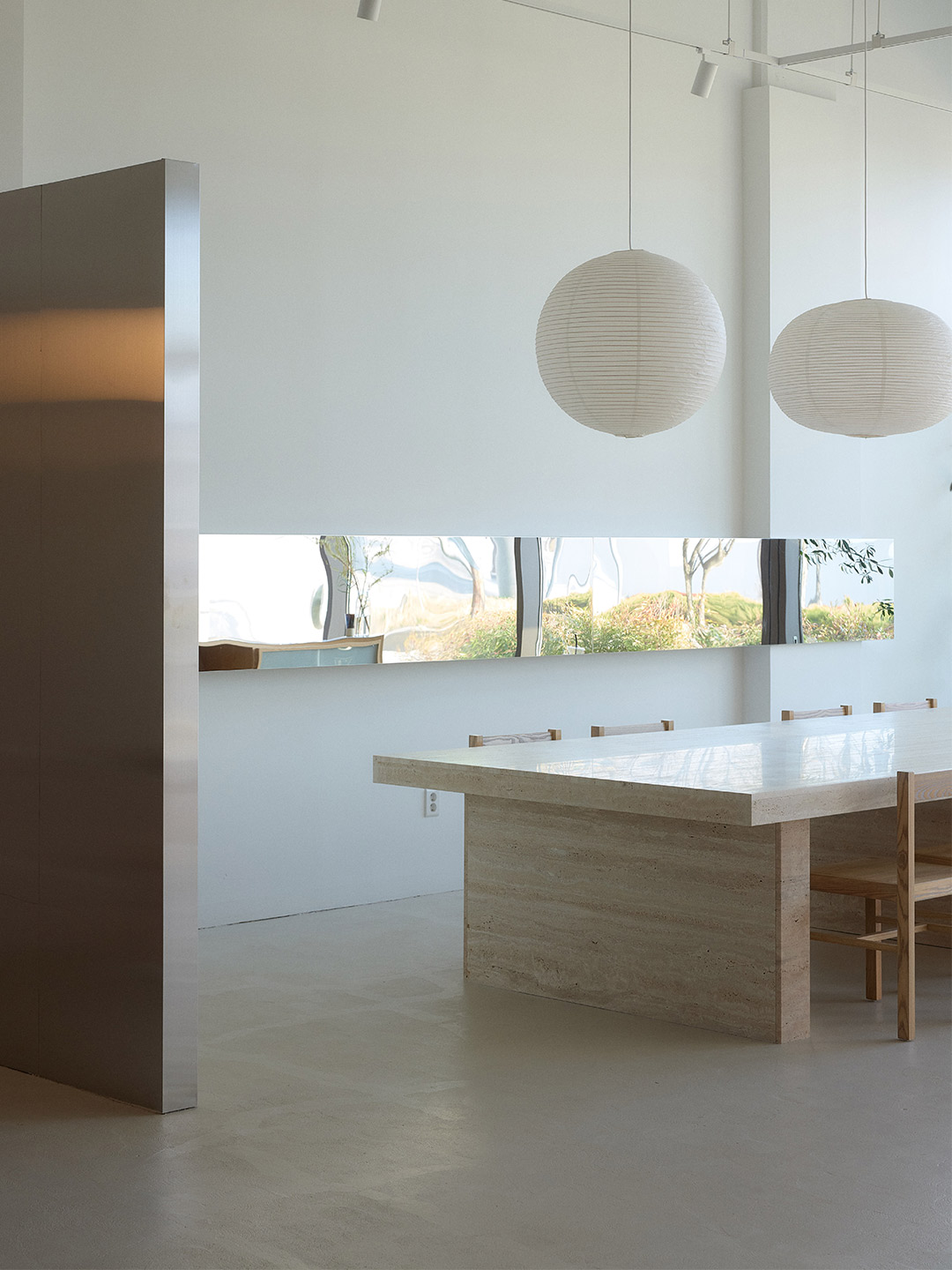
These partitions create a semi-private atmosphere throughout the diner. But to provide a more intimate experience in the first segment, a large decorative screen has been installed to form a small secluded room. Designed as an undulating surface clad in narrow strips of blond timber, the screen incorporates a curved bench on its inner face. When partnered with two round tables and chairs, the nook can accomodate up to six patrons who, under the glow of a suspended paper lantern, become shielded from street and restaurant views. In contrast, an oversized stone table with timber chairs encourages communal dining along the opposite wall. A series of four paper lanterns in offbeat organic shapes floats over the setting while a mirrored panel reflects the scene and creates the illusion of more space.
Straddled by the light-filled entry zone and the back-of-house area, the central space is memorable (and most definitely Instagrammable) for its large potted tree, whose branches will grow to form a verdant canopy above the diners. Landscaped with large rocks – reminiscent of an ancient Korean garden – the “pot” of the tree forms yet another bench. Lined with timber and accompanied by tables and chairs in mixed finishes, the circular bench echoes the experience of dining outdoors, perhaps in a public arcade or manicured garden. A banquette is positioned against the wall opposite the potted tree creating yet another contrasting zone, this time capable of accomodating tables of two or a single large group.
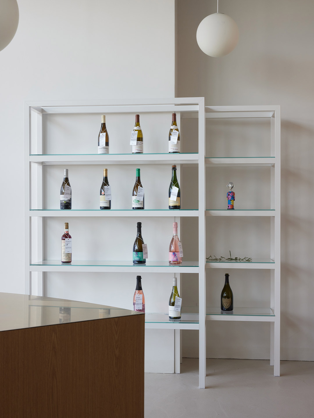
While shelving units that display the selection of wines are positioned throughout the diner, doubling as a sleek decorative device, the kitchen occupies a small pocket of the plan’s third segment (where the behind-the-scenes operations occur). Open to the dining spaces, the kitchen entertains patrons with the theatrics of food and beverage preparation. The openness also allows waitstaff to service the restaurant floor with ease, assisted by the arrangement of low walls, Do suggests, which “maximise” the space as employees and diners move from zone to zone. “Visitors feel the cluster of low walls as they step inside,” the designer adds. “This ‘community of walls’ is everything that makes up this project.”
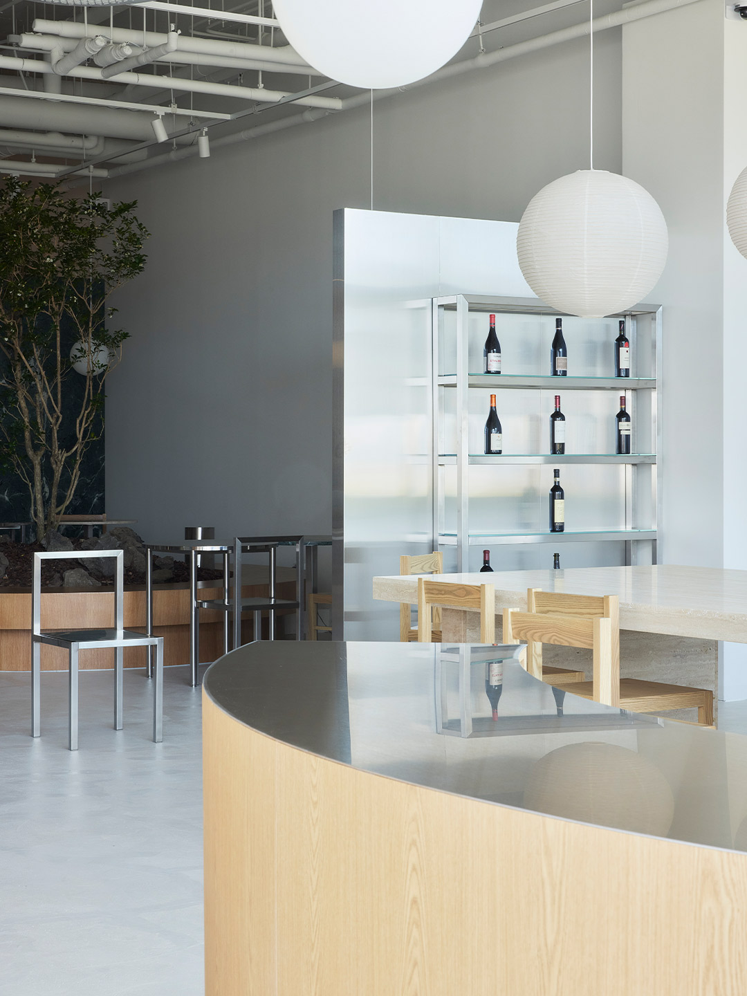
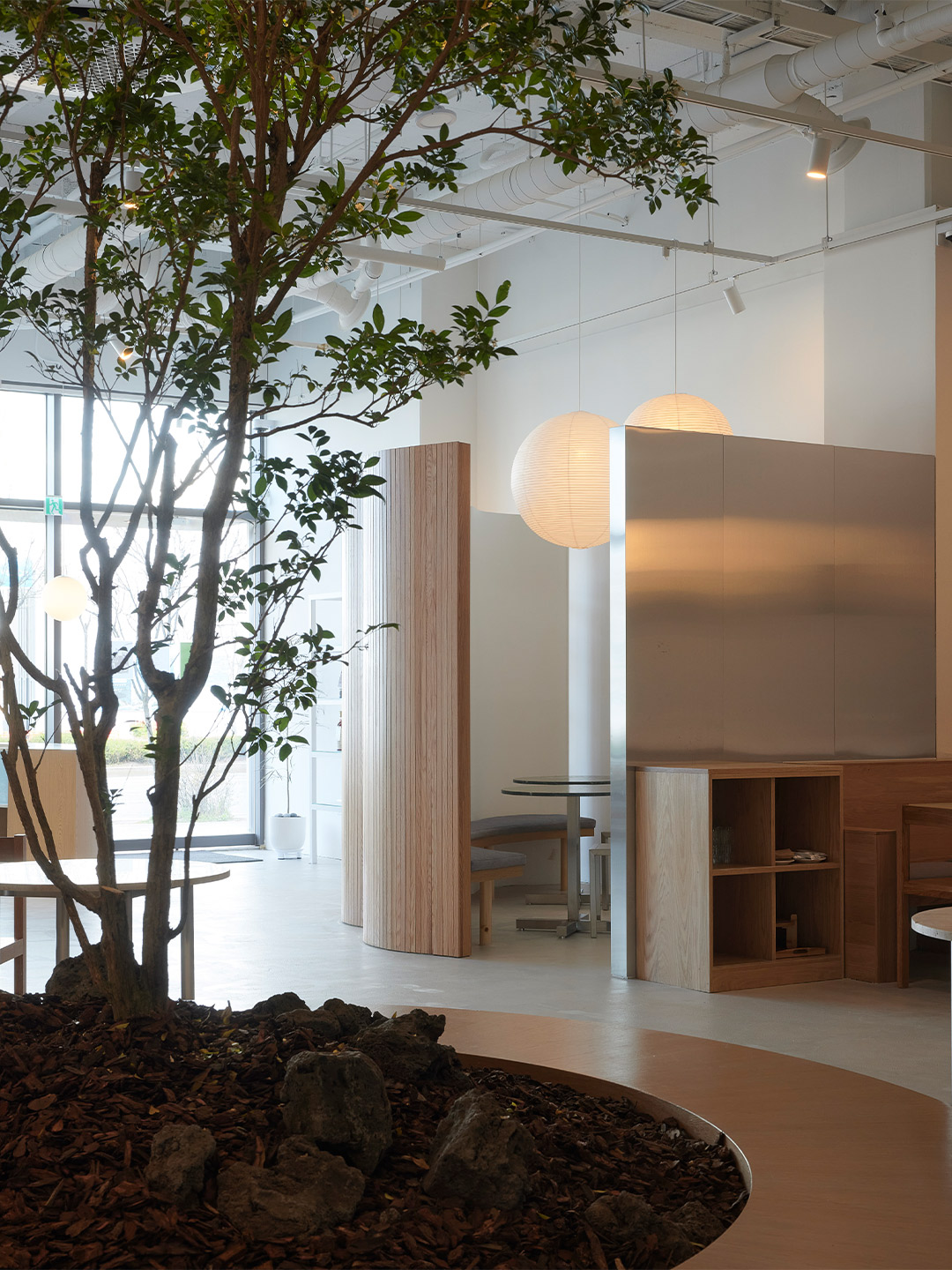
Visitors feel the cluster of low walls as they step inside … this ‘community of walls’ is everything that makes up this project.

Love the office fit-out by Olson Kundig? Catch up on more architecture and design highlights. Plus, subscribe to receive the Daily Architecture News e-letter direct to your inbox.
Related stories
- Home tour: Bilgola Beach House in Sydney by Olson Kundig.
- ANOHA museum: 150 animals made from recycled materials inhabit a ‘spaceship’ by Olson Kundig.
- A 1960s London post office is now a swinging sushi restaurant.
- Hot desks: Spacial co-working office in Montreal by Ivy Studio.
- The YAP design office in Japan.
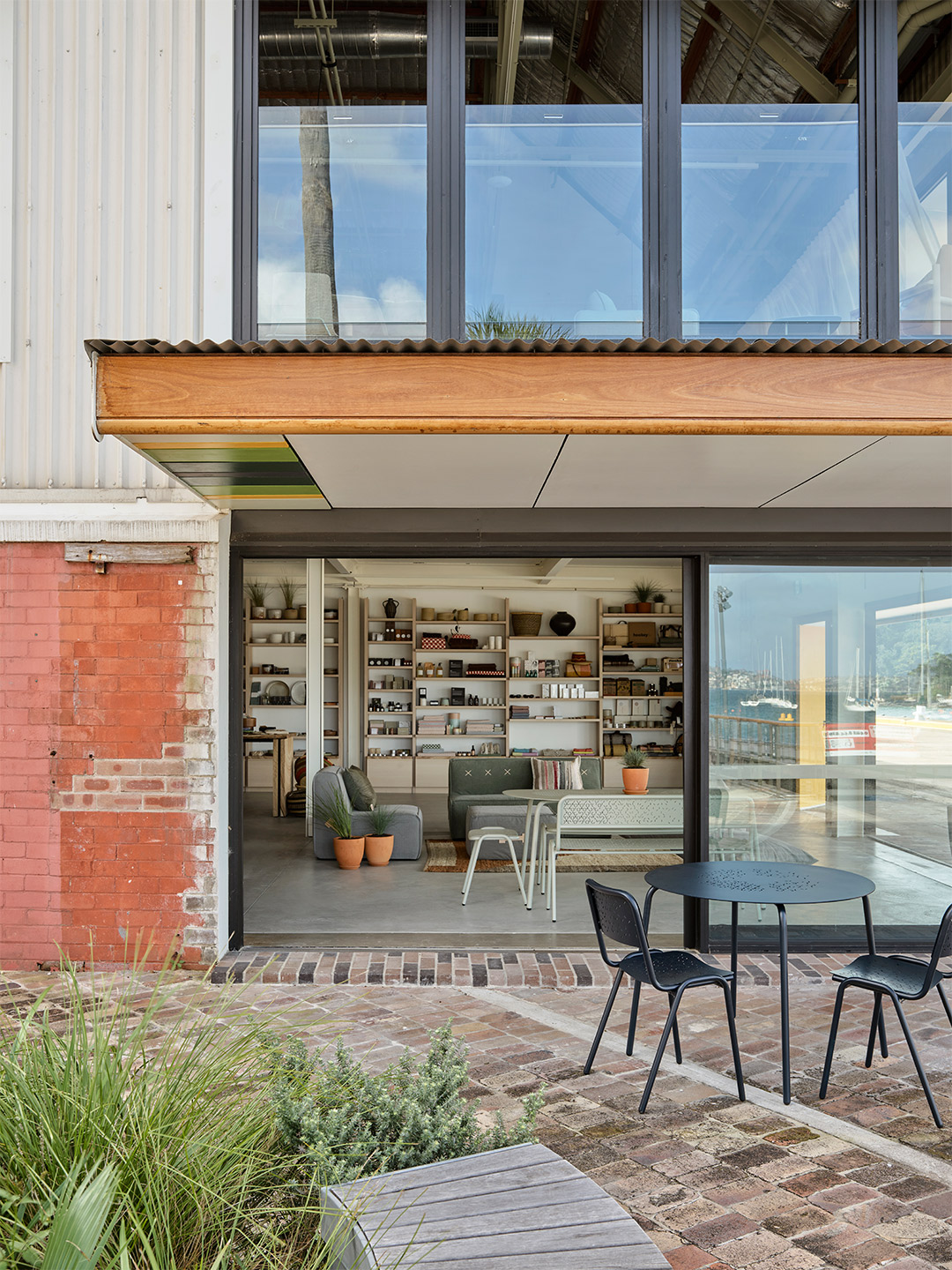
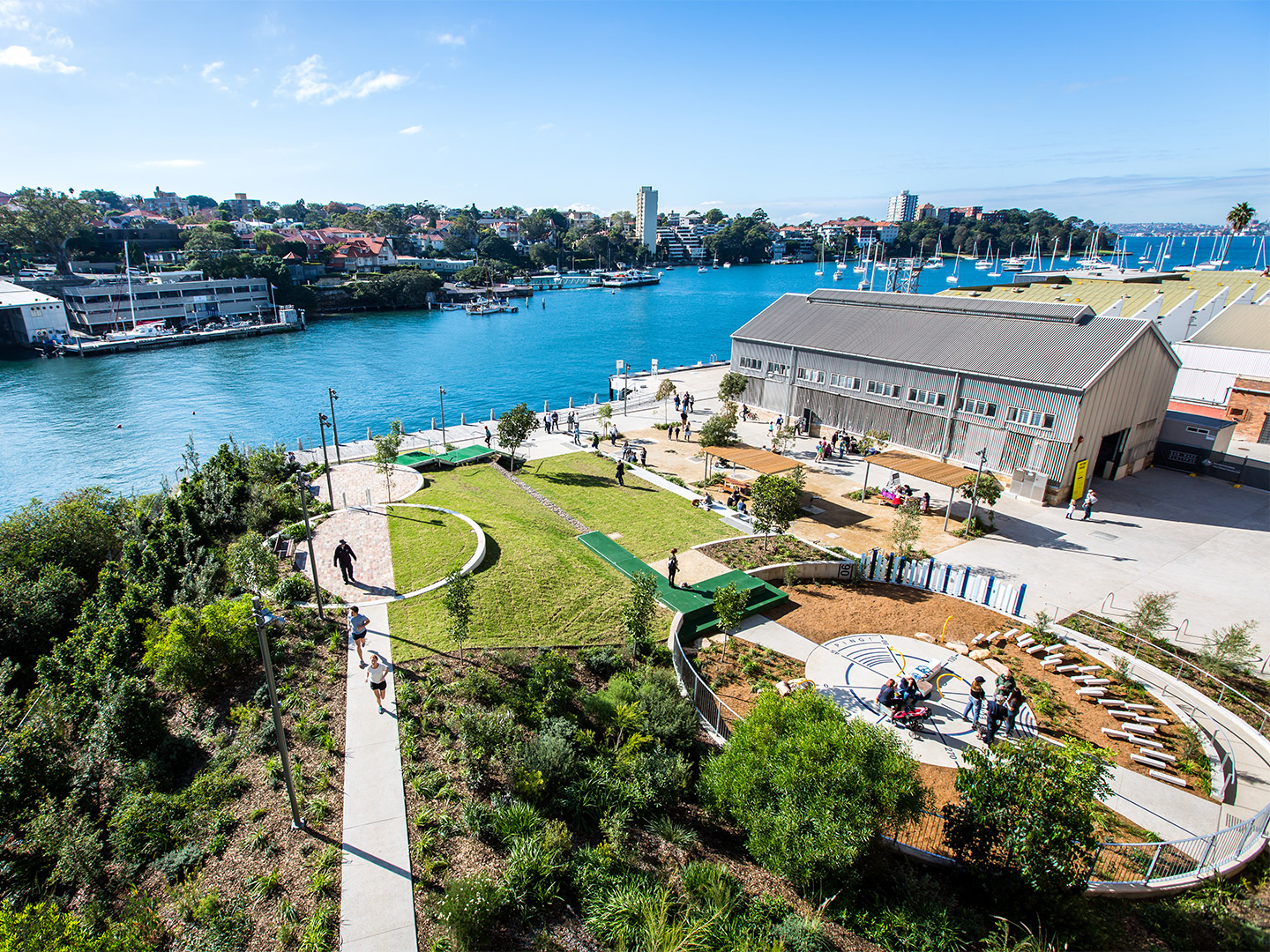
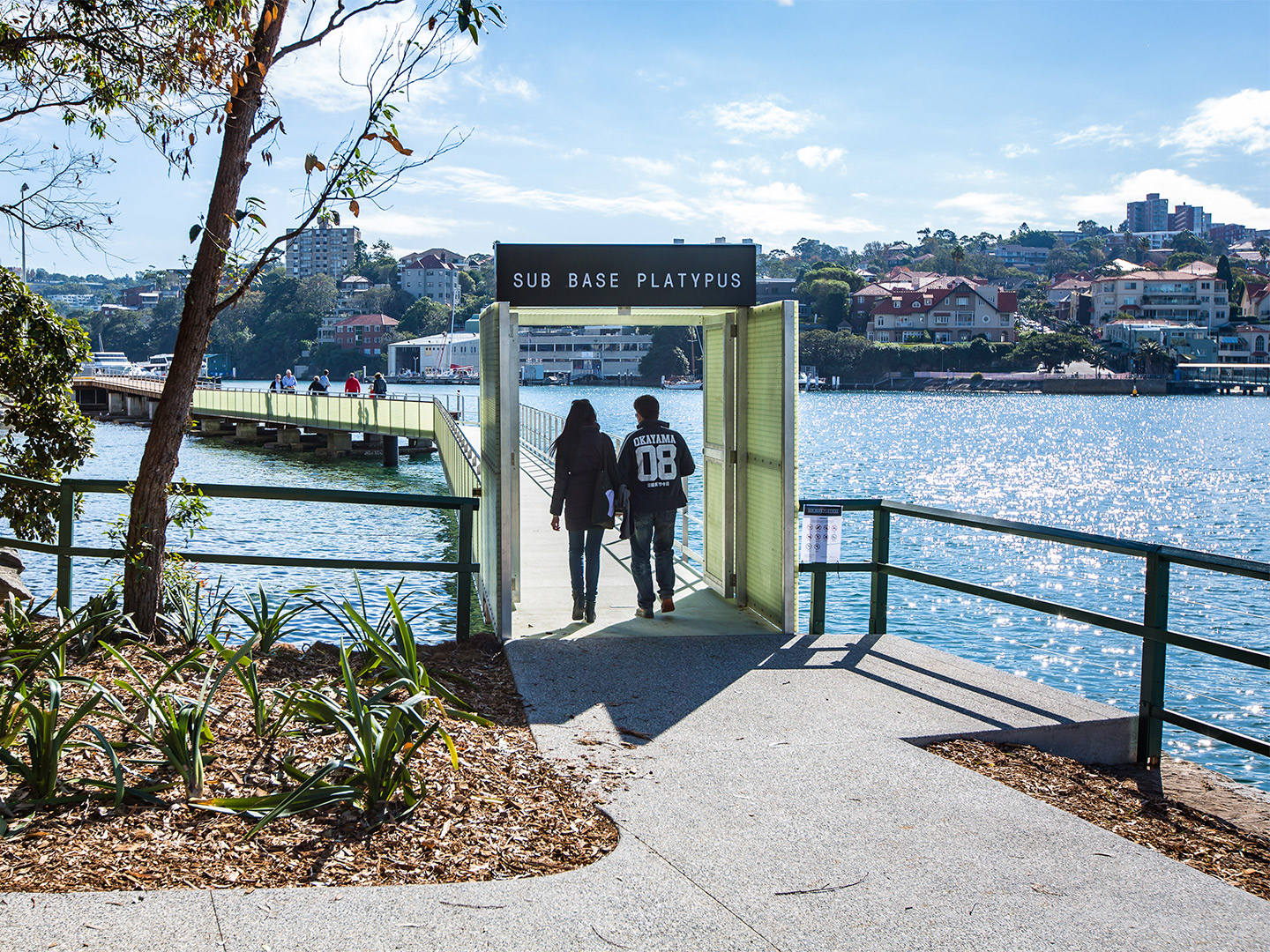
When the Sub Base Platypus precinct was officially launched by Sydney’s Harbour Trust in May of last year, it marked the first time the site had been opened to the public in 150 years. The storied parcel of prime real-estate was reimagined by ASPECT Studios and Lahznimmo Architects to celebrate its history as a former torpedo factory, submarine base and gasworks, as well as its harbour-side location – a feat which earned the project the Walter Burley Griffin Award for Urban Design in 2021. Ten months on, the precinct is now one of North Sydney’s most exciting recreation, retail and work hubs, where a scenic waterfront promenade and spectacular views across the iconic harbour lure in locals and visitors alike.
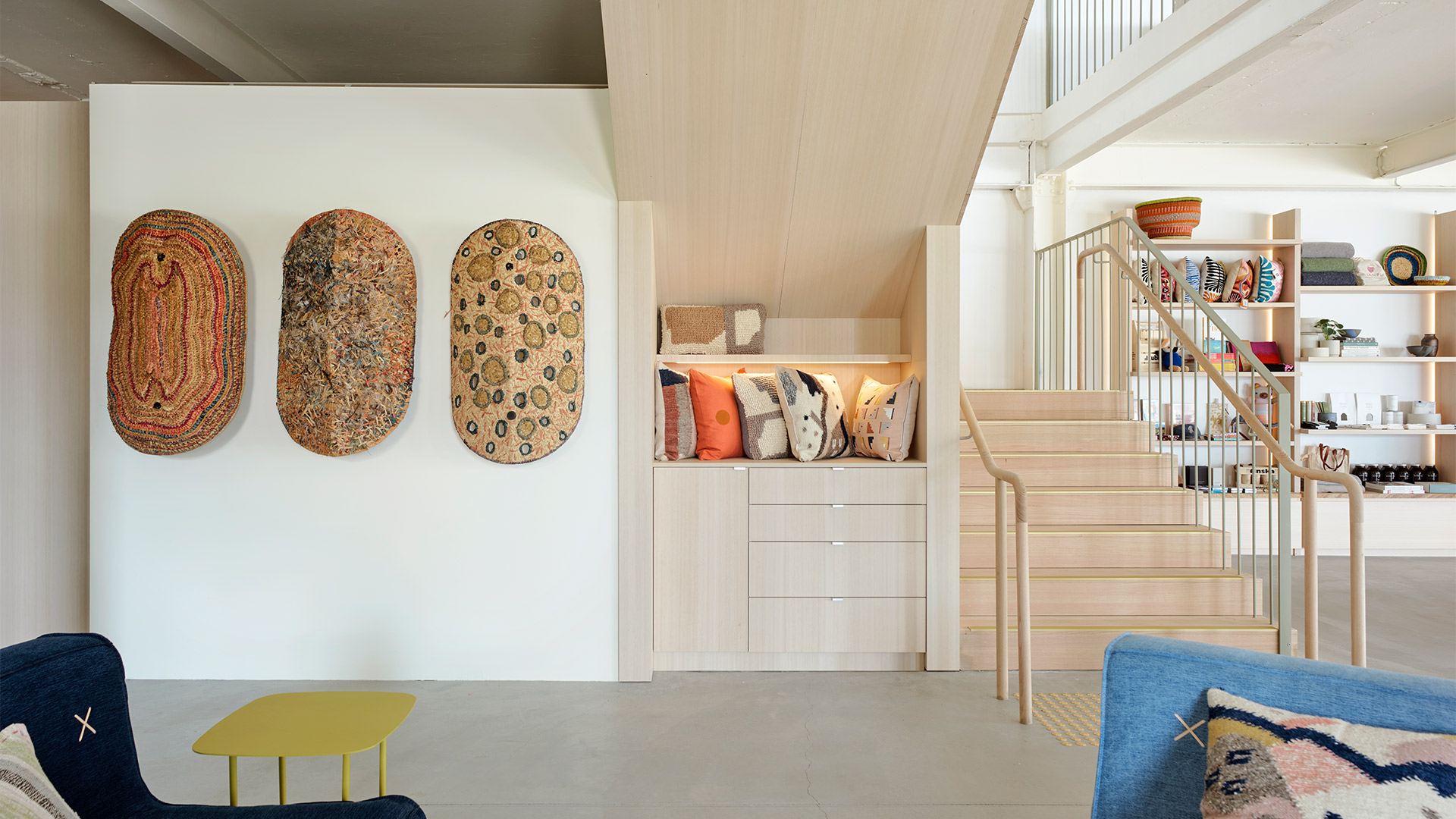
Joining the lineup of attractions this month is purpose-led lifestyle label Koskela, which will on Saturday launch a new concept store and home-base at Sub Base Platypus, starring refreshed branding by Frost*collective. Leaving behind the much-loved headquarters in Rosebery, Koskela co-founder Sasha Titchkosky says the new space, located on Cammeraygal land, will continue to showcase the best in Australian design and exhibitions by leading First Nations artists, while also adapting to a new-look retail landscape forged by the pandemic.
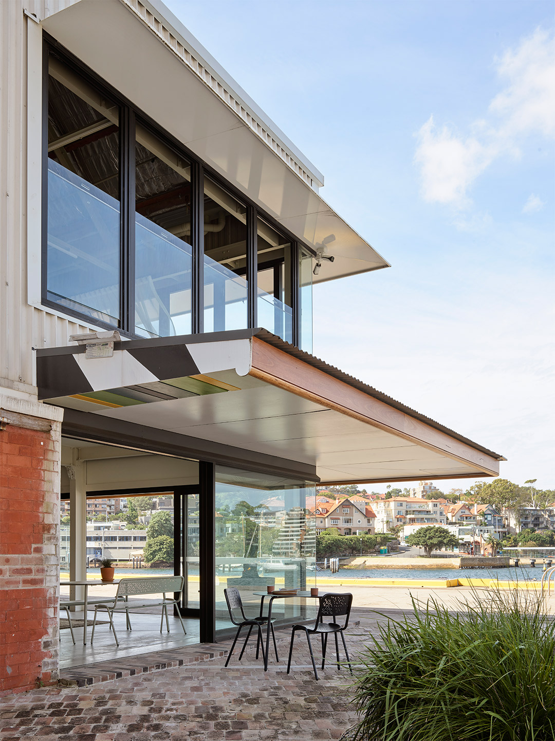
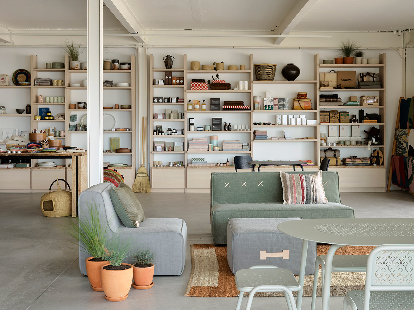
Koskela store opens in North Sydney’s Sub Base Platypus
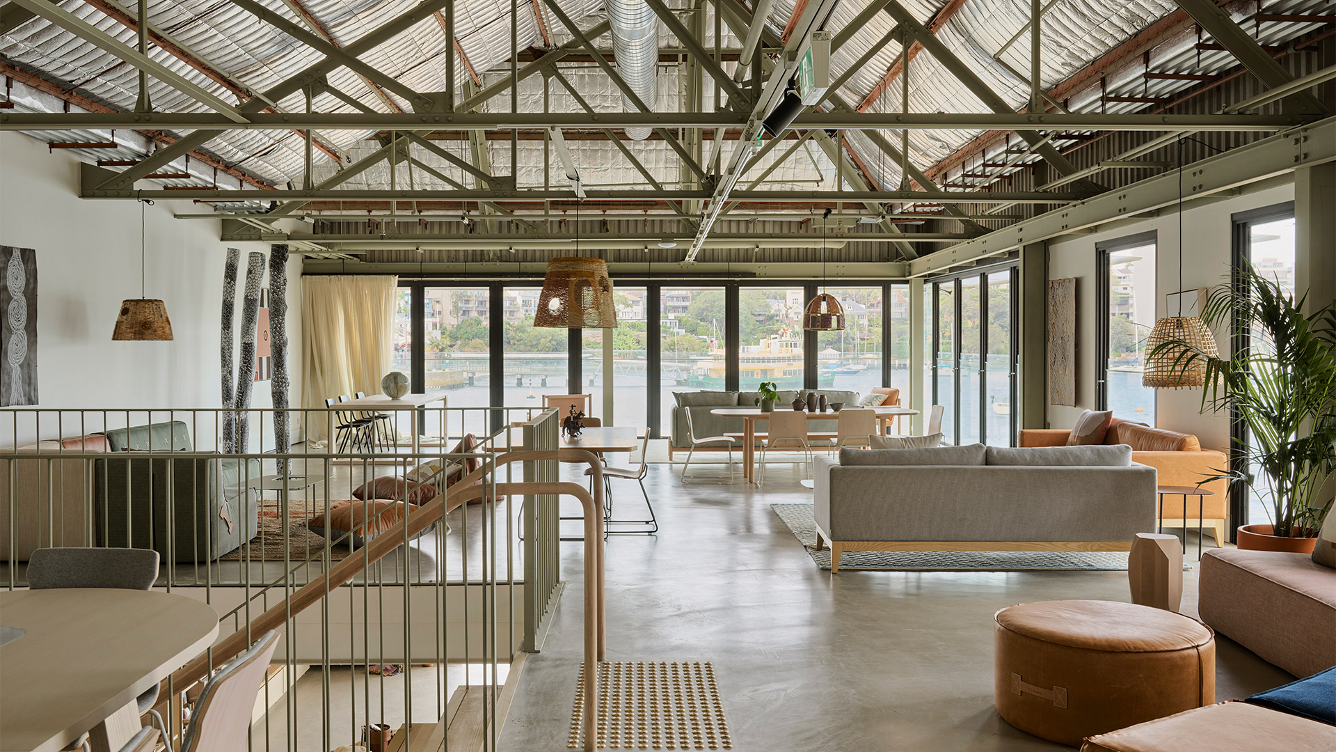
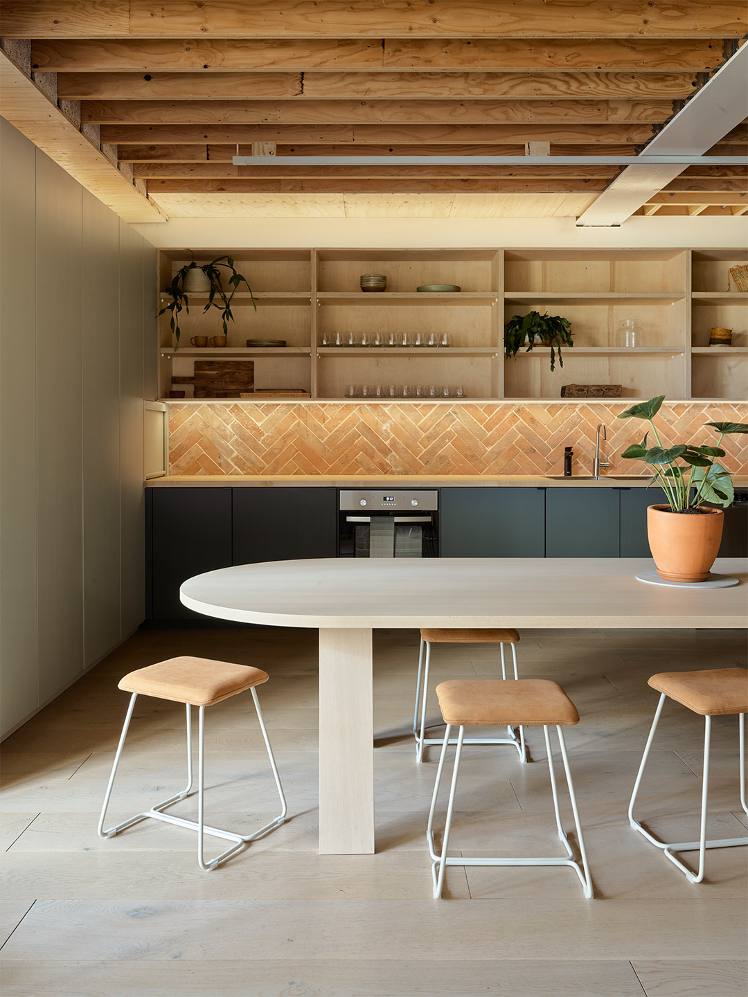
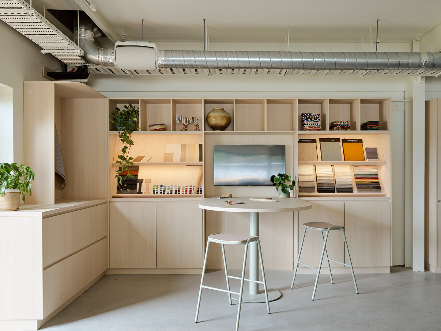
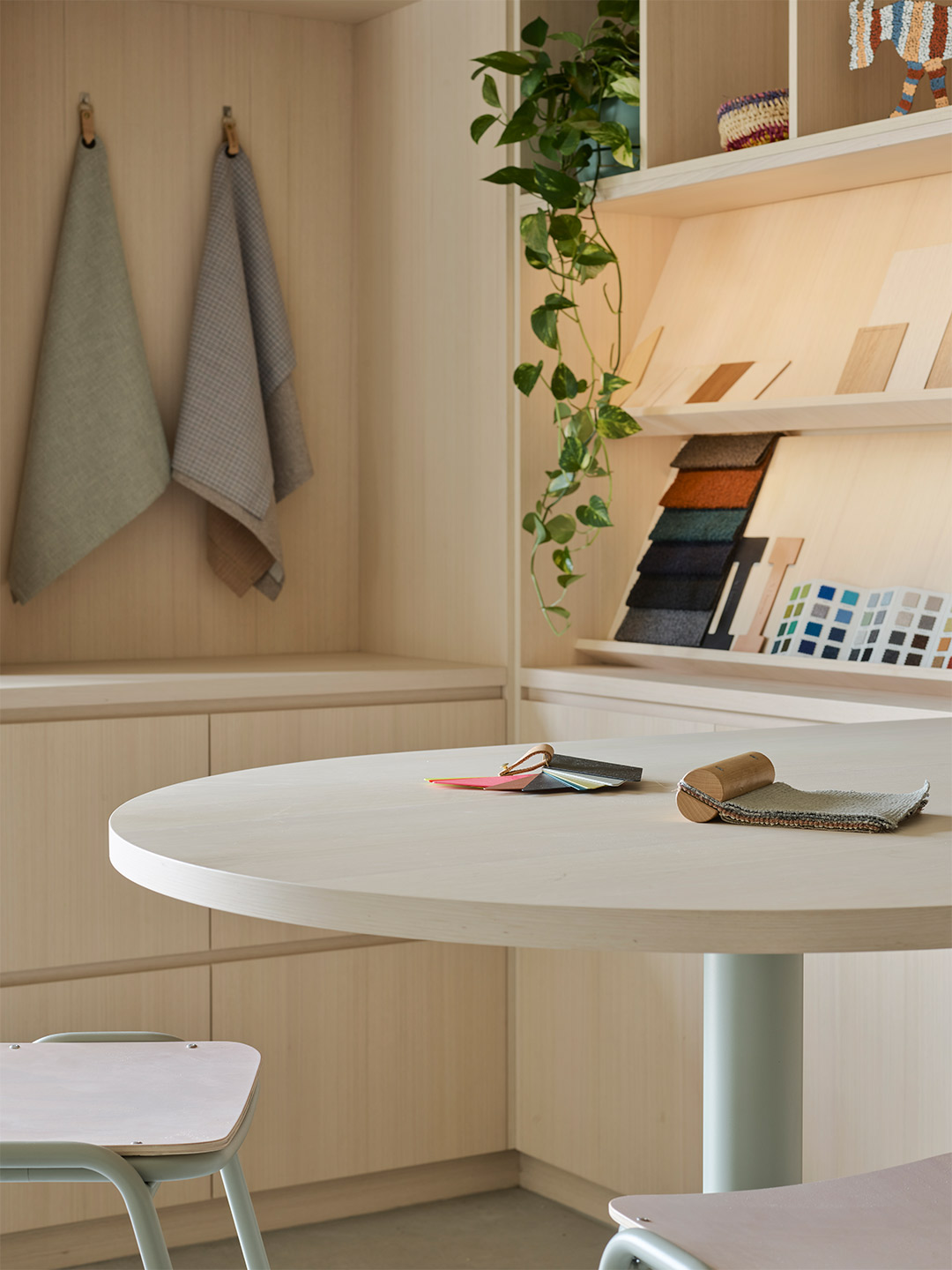
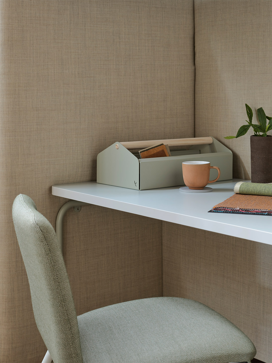
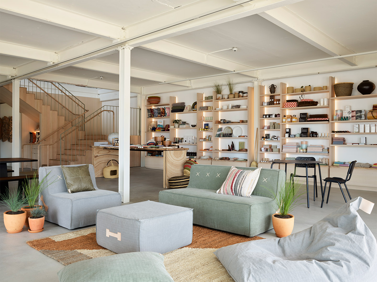
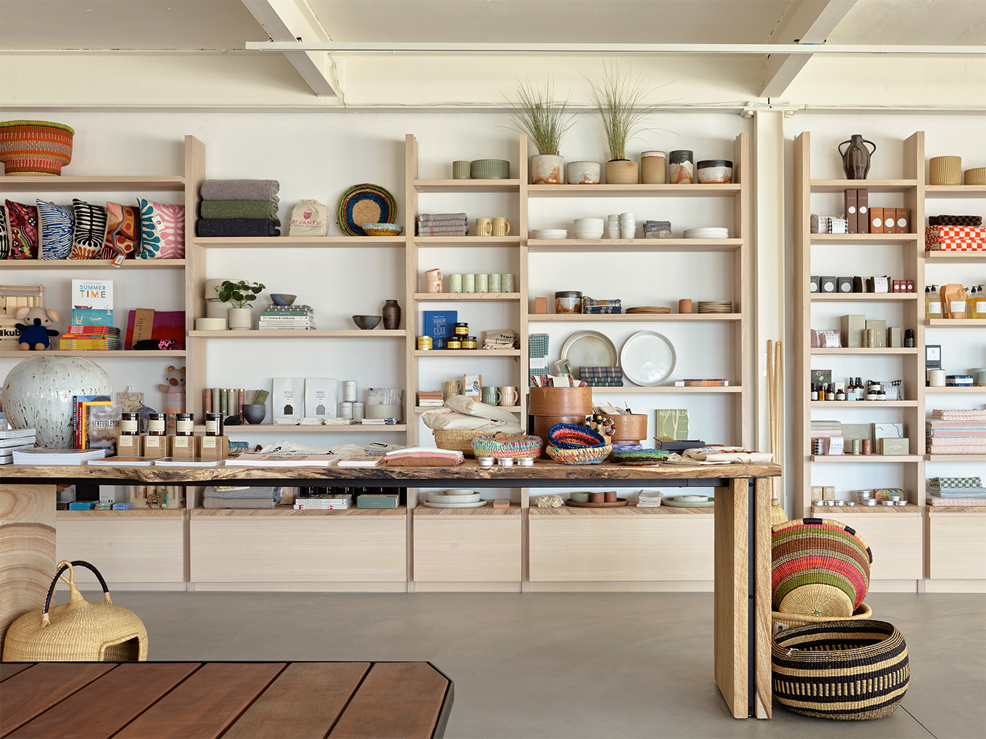
“The role of the store has changed since Covid and we think our new location reflects the type of experience customers are looking for,” Sasha explains. “We focussed on finding somewhere that captured the essence of Sydney and naturally the harbour was always front and centre.’’ Set over two light-filled levels, the 500-square-metre space is backdropped by solid Australian timbers and Sydney sandstone – both key features of the site and the area more broadly – while the curation of goods on offer appeals to shoppers in search of both beauty and longevity.
“We want to connect and make memories with our visitors, bringing true connection and meaning to the pieces that they own,” Sasha says of Koskela’s thoughtful range, adding that she hopes the purchases made from the store continue to become “treasured and maintained” heirlooms, acquired in an environment that is equal parts dazzling and laidback. “We are thrilled to have found a new home in this remarkable location – steeped in history and boasting beautiful waterside views,” Sasha says contentedly. “Even the motto for [the old] HMAS Platypus – ‘Nothing Too Difficult’ – seems apt for our new home.”
Located at Sub Base Platypus, 1008/120 High Street, North Sydney, the new Koskela store will open its doors from Saturday 19 March, trading 9am to 6pm. Bookings for in-store consultations available.
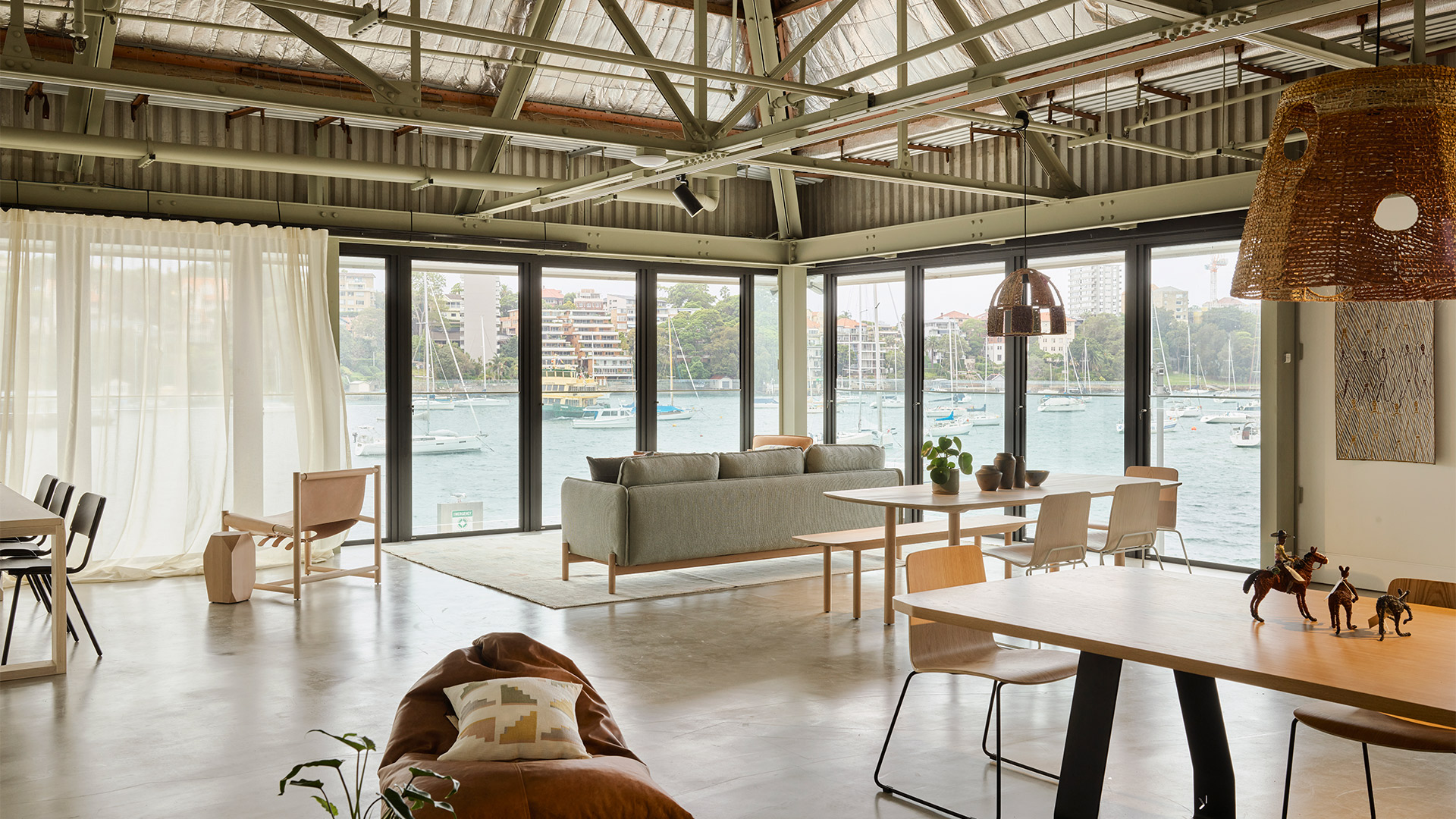
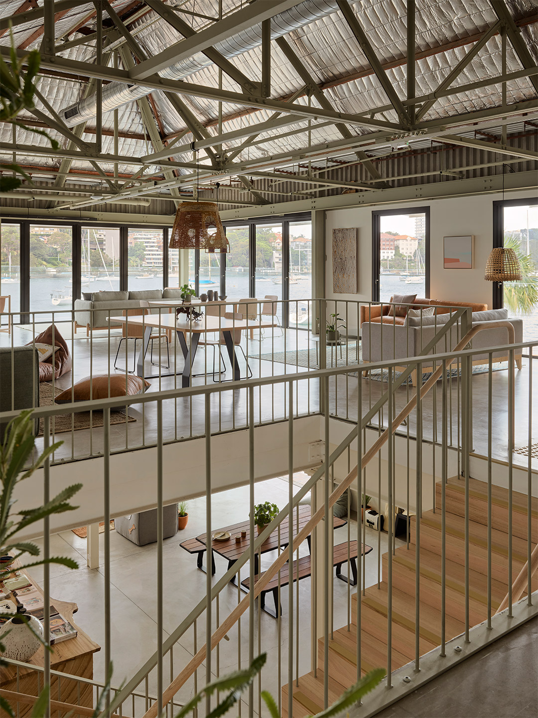
The role of the store has changed since Covid and we think our new location reflects the type of experience customers are looking for.
Catch up on more architecture, art and design highlights. Plus, subscribe to receive the Daily Architecture News e-letter direct to your inbox.
Related stories
- Venus Power collection of rugs by Patricia Urquiola for cc-tapis.
- Bitossi celebrates centenary in Florence with new museum and 7000-piece display.
- Casa R+1 residence in southern Spain by Puntofilipino.
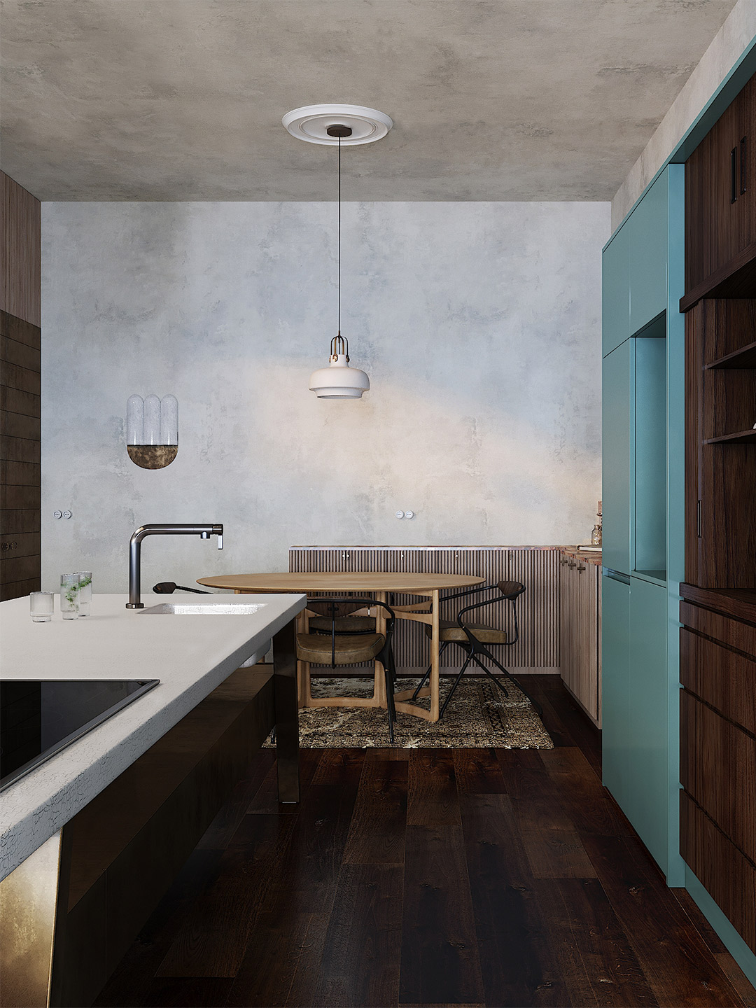
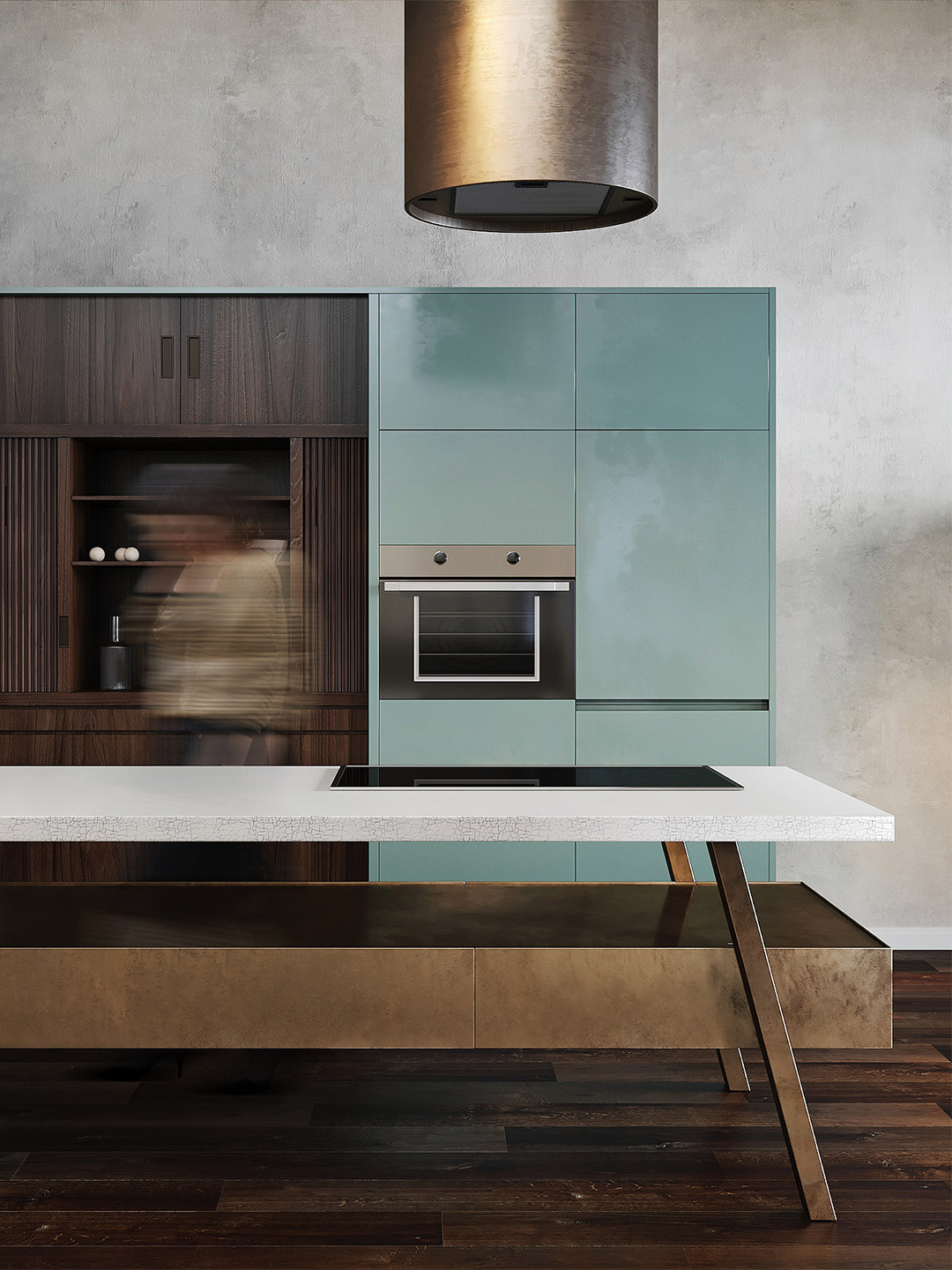
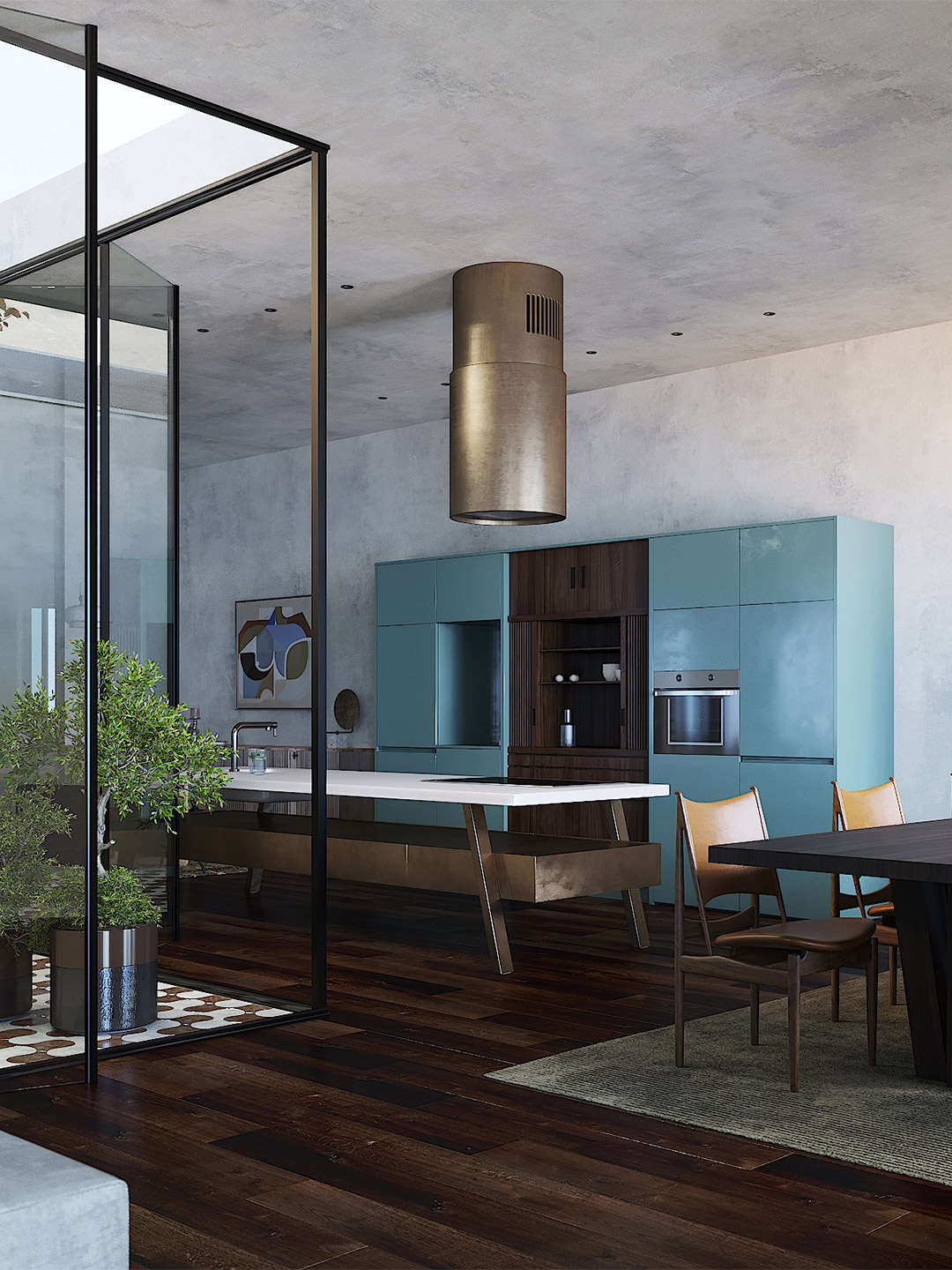
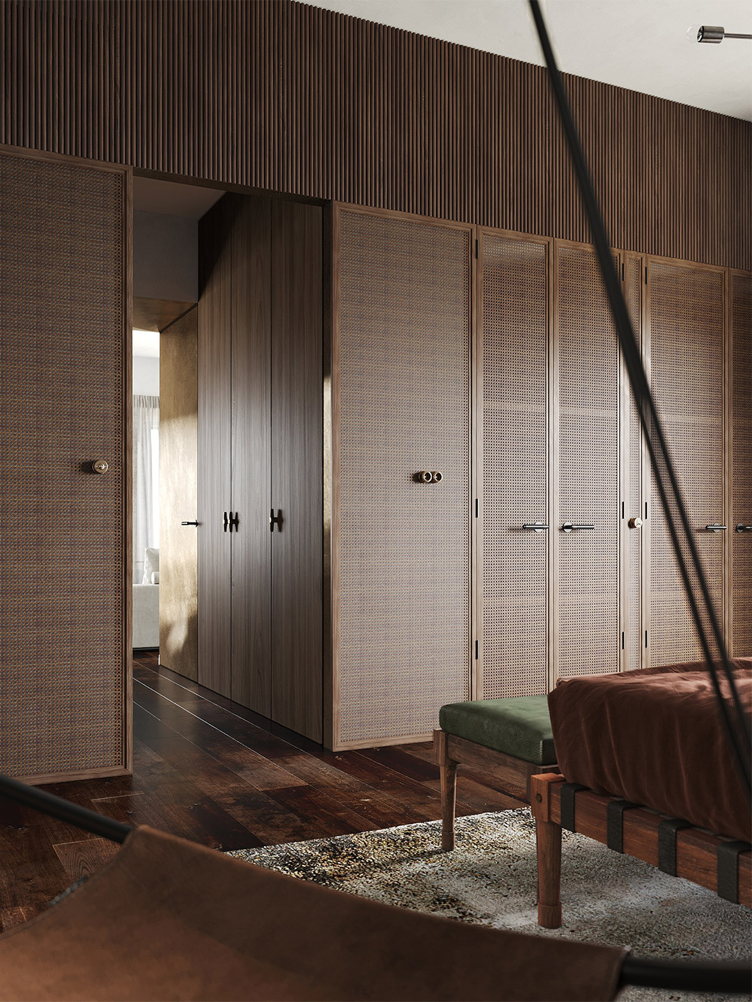
Conceived as an urban oasis for a couple working in the construction industry, the Casa R+1 residence in Almería is inspired by artists who have long travelled to Spain’s Andalusian coast in search of a tranquil retreat. The home’s interiors, created by Madrid-based design office Puntofilipino, feature a symphony of minimalist, richly textured and exquisitely detailed spaces. Central to the floor plan, an open-air ‘room’ connects the combined kitchen, living and dining spaces, allowing for the seamless transition between indoors and out: “a must in southern Spain,” insists Gema Gutiérrez, Puntofilipino’s founder and principal designer.
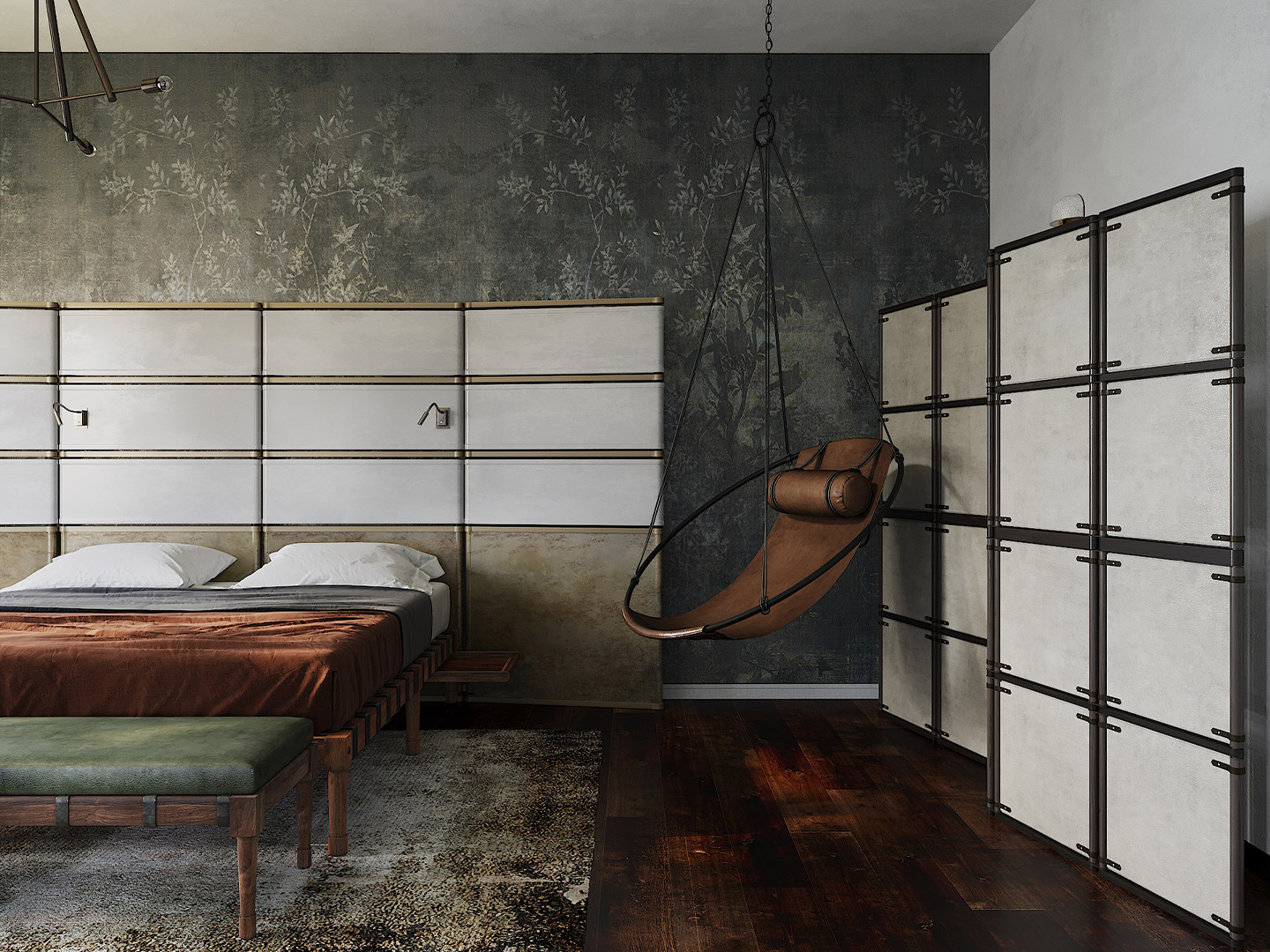
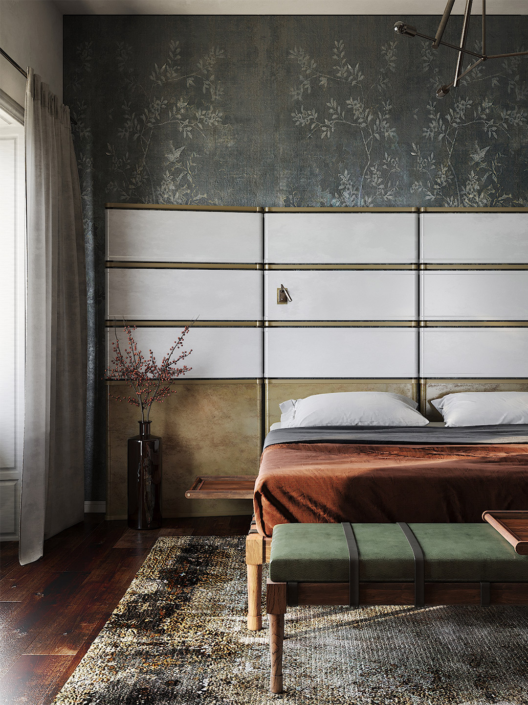
The project reflects the “vision of the family lifestyle”, Gema enthuses, adding that the aim of the completed residence was to achieve something which is “timeless and exudes a discreet luxury”. With this in mind, fine examples of classic furniture from France and Italy were playfully juxtaposed with contemporary and custom-made items, achieving the “desired mark of measured sobriety,” Gema says.
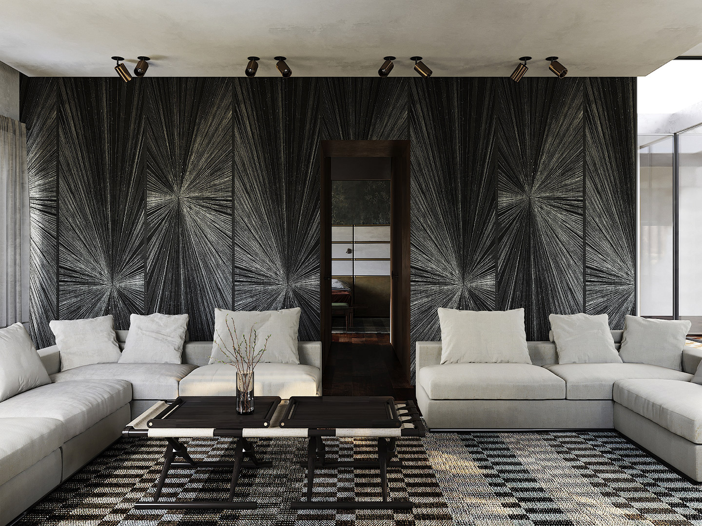
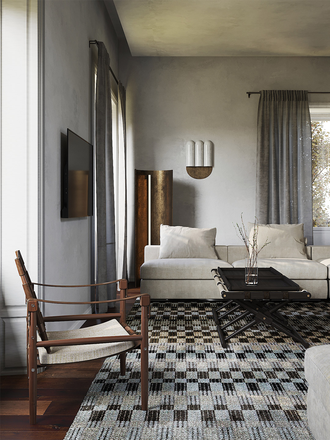
Casa R+1 residence in southern Spain by Puntofilipino
The melange of eclectic furnishings is a reflection of the owners’ deep-rooted passion for furniture; a love that’s matched only by the desire for peaceful spaces set aside for gardening, reading and meditation. Gema says: “The house is a paradigm of compositional delicacy, exemplifying how an urban dwelling can serve as a tranquil sanctuary.”
Bolstered by a restrained palette of muted tones and clean lines, the interiors are light and airy. It’s a feeling that arrives courtesy of high ceilings and sparse furnishings, and a series of expansive timber-framed windows, custom-designed by Puntofilipino. “Large windows allow green views of the gardens to take centre stage, complementing the understated interior design with vibrant accents,” Gema explains.
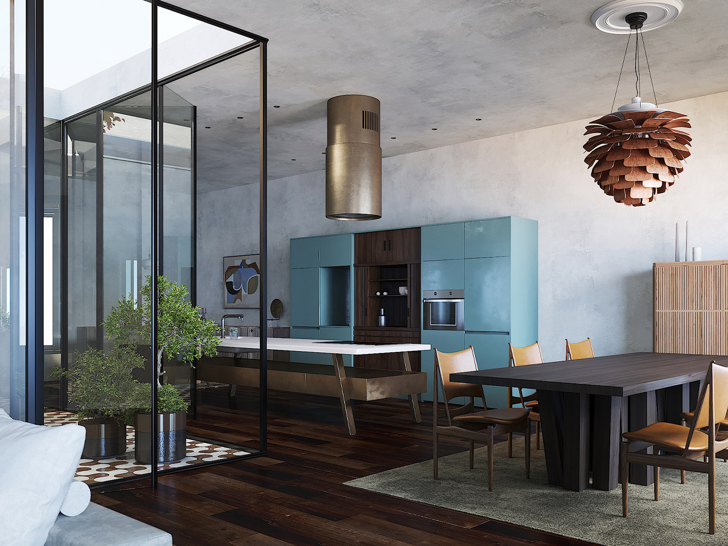
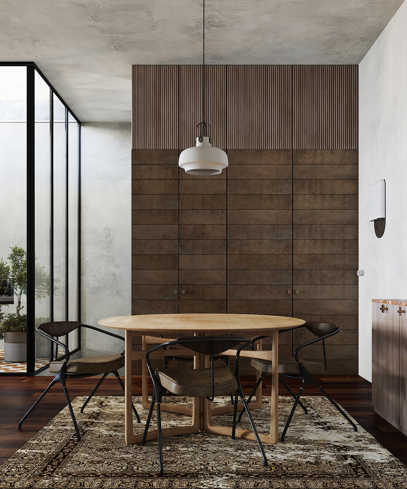
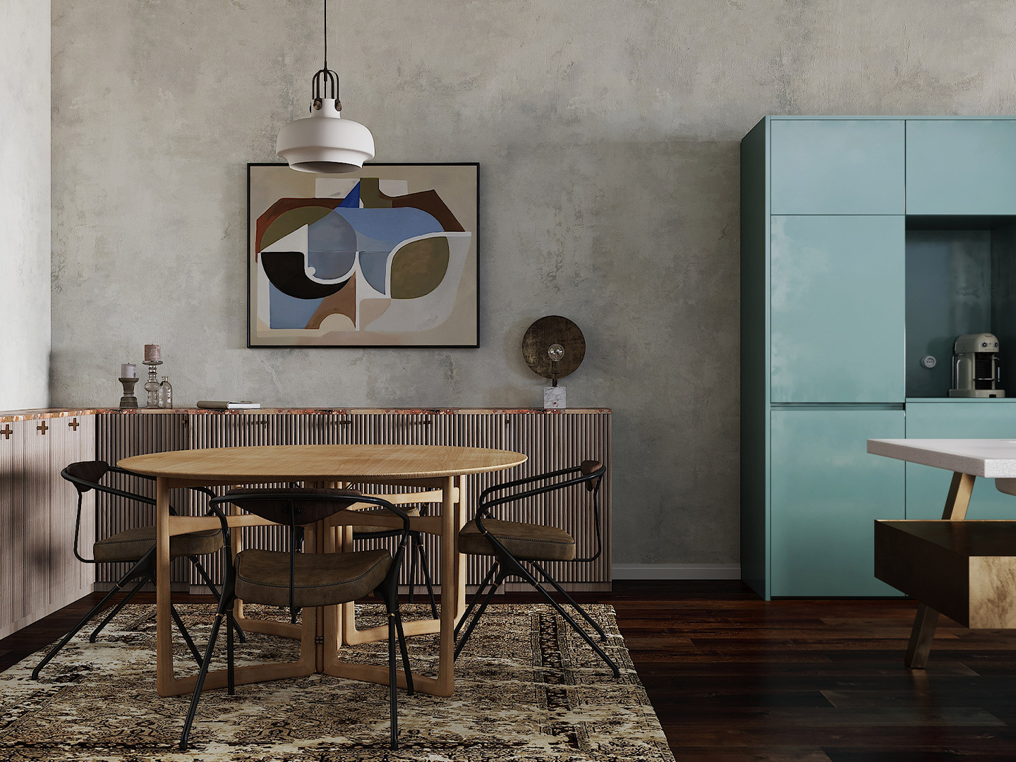
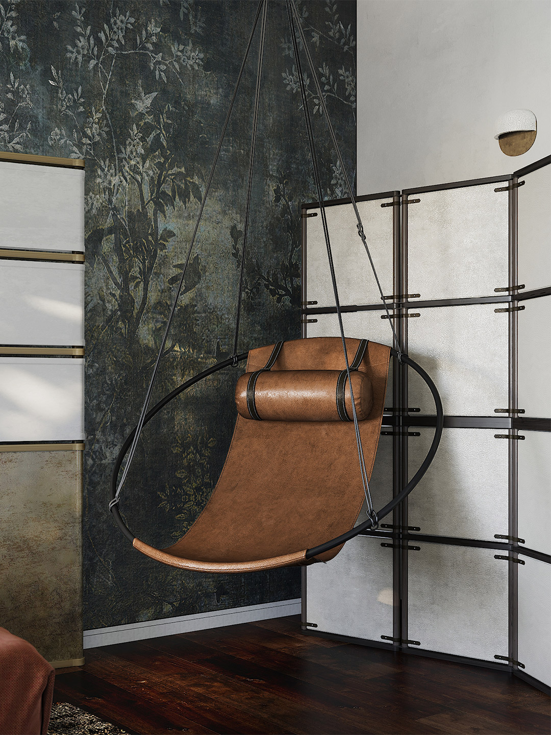
Beefing up the minimalist approach, the home is enhanced by a richly textured palette of handmade and natural materials, such as warm-white plaster finishes, hardwood floors and joinery, and exotic marble surfaces. Walls and cabinetry swathed in subtle blush and bolder turquoise add colourful accents; a series of bronze fixtures, including pendant lights and sconces by Emmanuelle Simon, infuse the home with sculptural exuberance.
Minimalist in design and, at times, austere in decoration, the interior of the CASA R+1 residence is furnished with carefully considered pieces, including examples from renowned firms Fornace Brioni, Gessi, Ceccotti Collezioni, Richard Wrightman Design, House of Finn Juhl and Vaselli.
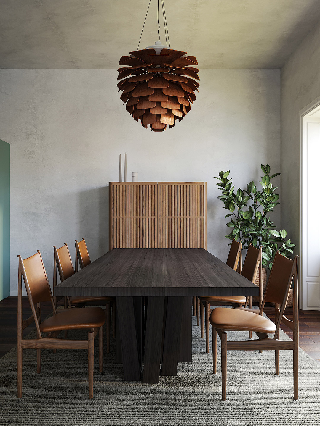
Among this stellar array, iconic pieces are mixed in. There’s the ‘PH Artichoke’ pendant by Louis Poulsen suspended above the dining table. And, in the sitting room, the traditional ‘Tessa’ chairs by Flexform: “chairs that pay tribute to the artisan heritage,” says Gema, whose thoughtful and meticulous design process has offered up a residence that feels remarkably fresh and modern, stamped with a sense of enduring sophistication.
The house is a paradigm of compositional delicacy, exemplifying how an urban dwelling can serve as a tranquil sanctuary.
Puntofilipino also designed the Memphis Milano apartment in Italy and the dark and moody Honeyz boutique in Berlin. Catch up on more architecture, art and design highlights. Plus, subscribe to receive the Daily Architecture News e-letter direct to your inbox.
Related stories
- Brooklyn’s famed brownstones inspired the Aesop Park Slope store.
- A 1960s London post office is now a swinging sushi restaurant.
- Designer diner: Los Alexis taquería in Mexico City by RA!.
Confidently rising to the challenge of creating a co-living space within a traditional shophouse on Singapore’s Blair Road, Ministry of Design (MOD) responded with a striking all-white scheme. Appropriately called Canvas House, the now ‘blank’ dwelling is targeted at expats seeking lengthy stays in the colourful Tanjong Pagar neighbourhood. “It is a neutral white canvas for the future to be dreamt upon, rather than a wholesale homage to the past,” says MOD founder-director Colin Seah.

The colonial shophouse buildings of Singapore, so-named due to the shared retail and residential functions, evolved from the early 19th century.
With a restricted budget and only four months to complete the project, MOD opted to blanket Canvas House with an all-white veil, a brave move that Colin says, “blurs the distinction between new and old” yet also “blurs the distinction between the spatial elements”, such as the intersection of ceilings and walls.
The objects, furniture and fittings that reside within the interior spaces – predominantly vintage, occasionally new – are painted the same shade of white as the house’s surfaces. “This allows the people using the space to truly activate the space, and be the prominent features, instead of merely inhabiting space,” says Colin.

Travelling through the dwelling, the only bursts of colour and immediately readable texture are provided by a series of what MDO call “playful, peek-a-boo vignettes”. These heightened sensory moments appear in the form of circular openings that reveal the original brickwork of the shophouse, and through the occasional discovery of traditional vintage screens and doors, decorative accessories and contemporary artwork.
MOD collaborated with local upcycling/plastic artist Kang on the creation of luminaires made from fused cling wrap, two of which glow softly at the entryway of Canvas House. The process of crafting these lighting pieces saw cling wrap layered and then heated to create a waterproof, leather-like material – a further celebration of old and new.


