Brisbane’s cultural precinct, made up of the Queensland Performing Arts Centre, Gallery of Modern Art, State Library and the Queensland Art Gallery, lines the southern bank of the Brisbane River as it winds its way through the city. This precinct provides a wonderful public and cultural asset, drawing people to the area – and with that, the vibrancy that makes cities desirable places to live.
Brisbane is booming. Currently, the Queensland capital has the highest growth rate of any Australian city. This has had an impact on the grain of the region – in areas such as West End and South Brisbane, residential towers are replacing the rambling boarding houses, workers’ cottages and industrial buildings. Some wish this change would occur at a slower rate, or at a more considered scale. Remnants, however, are there in parts of the city; they hold the potential to become cherished and celebrated.
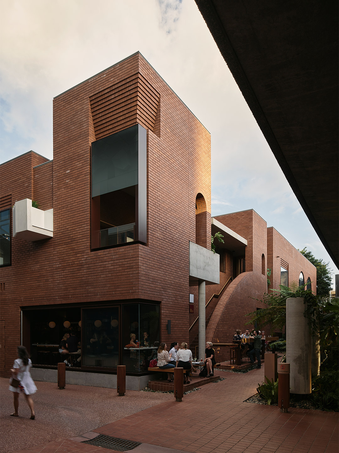
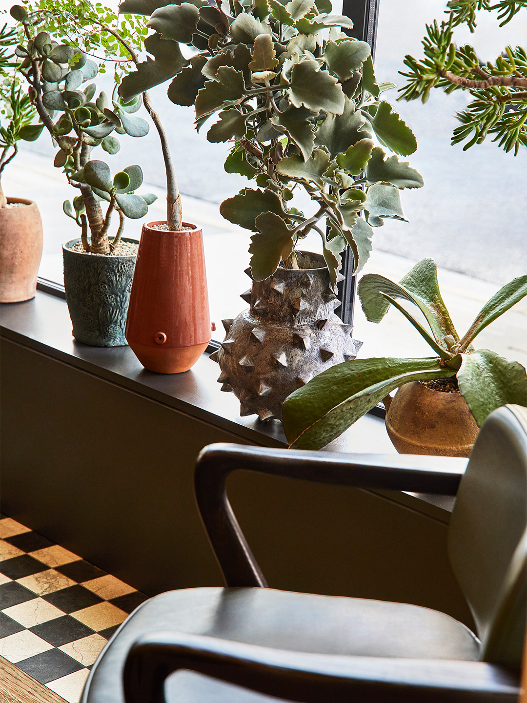
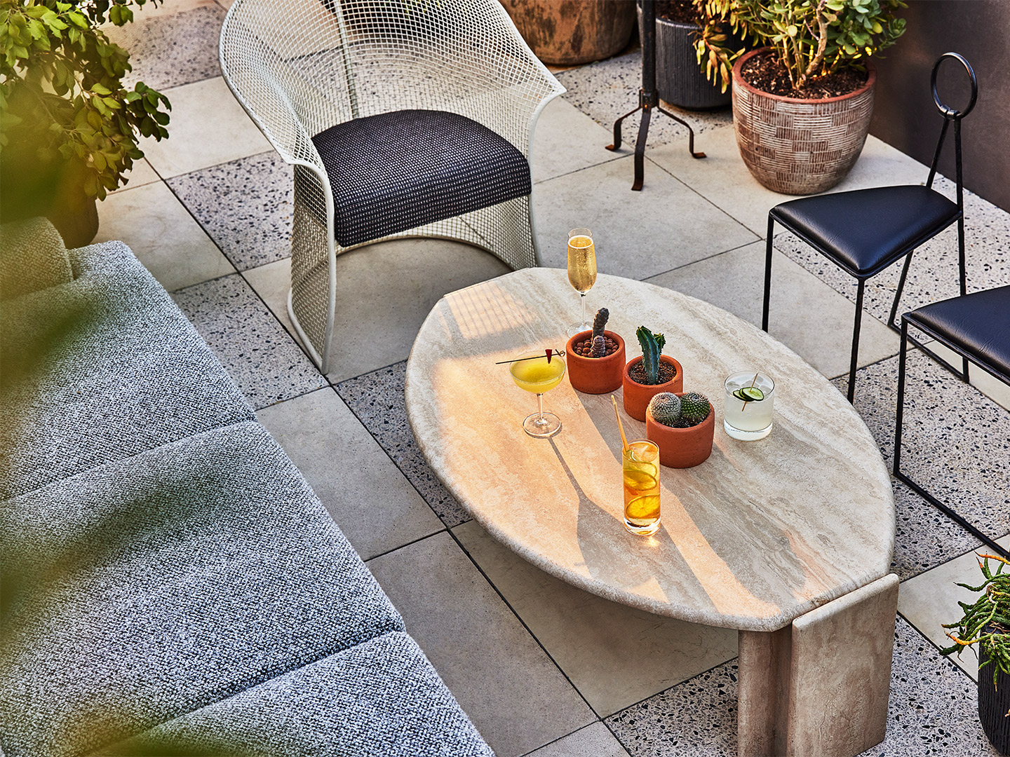
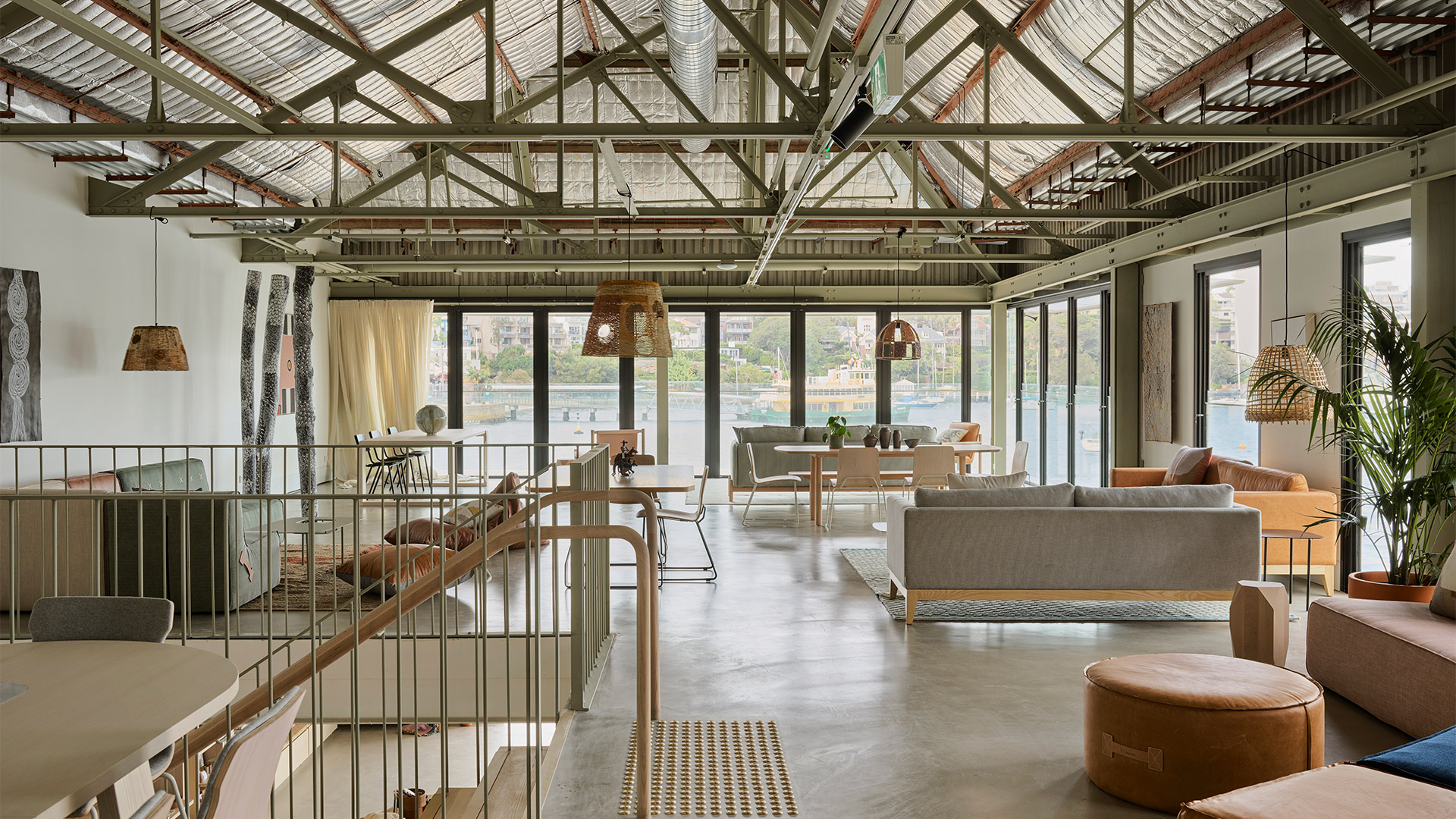
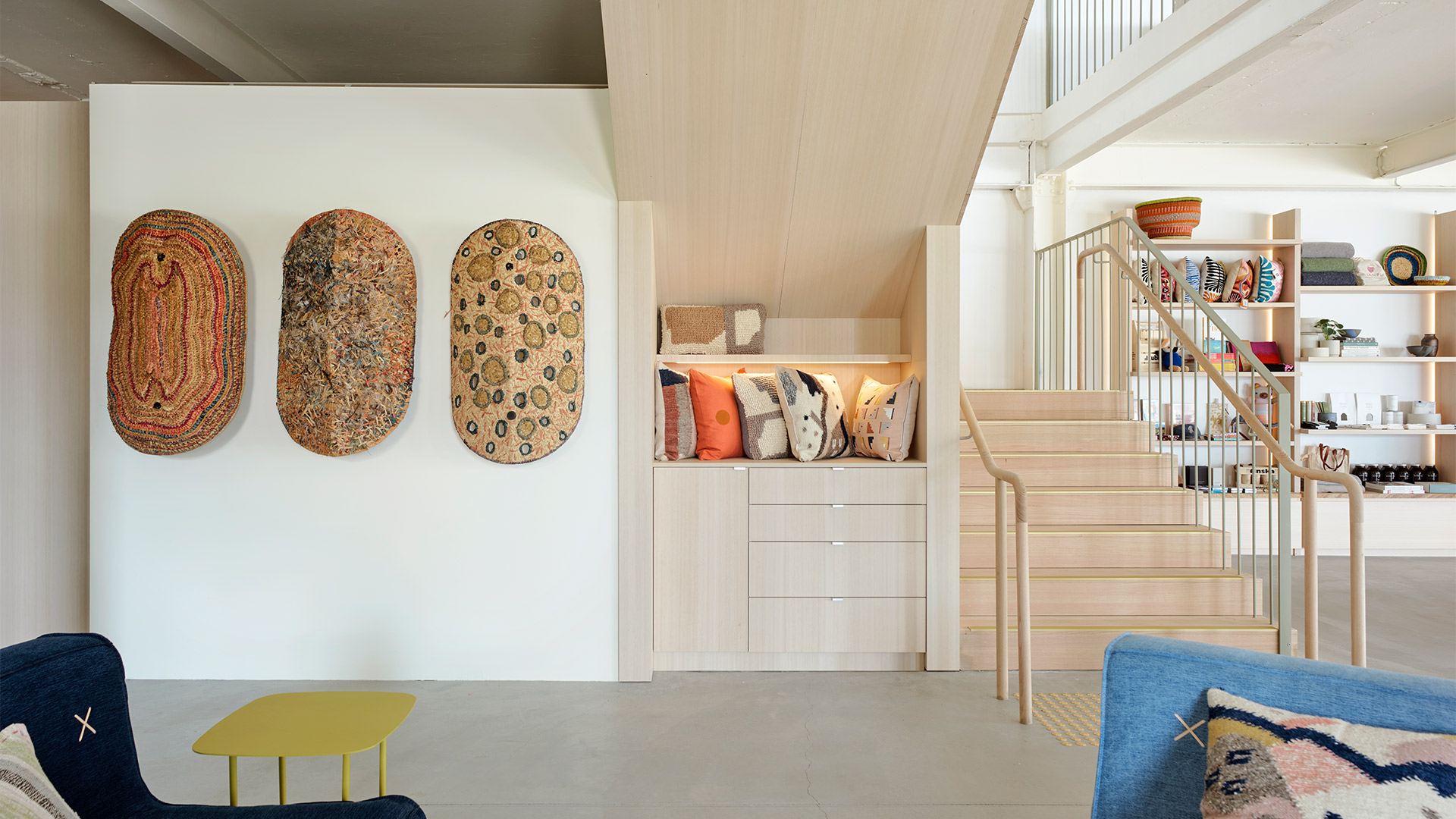
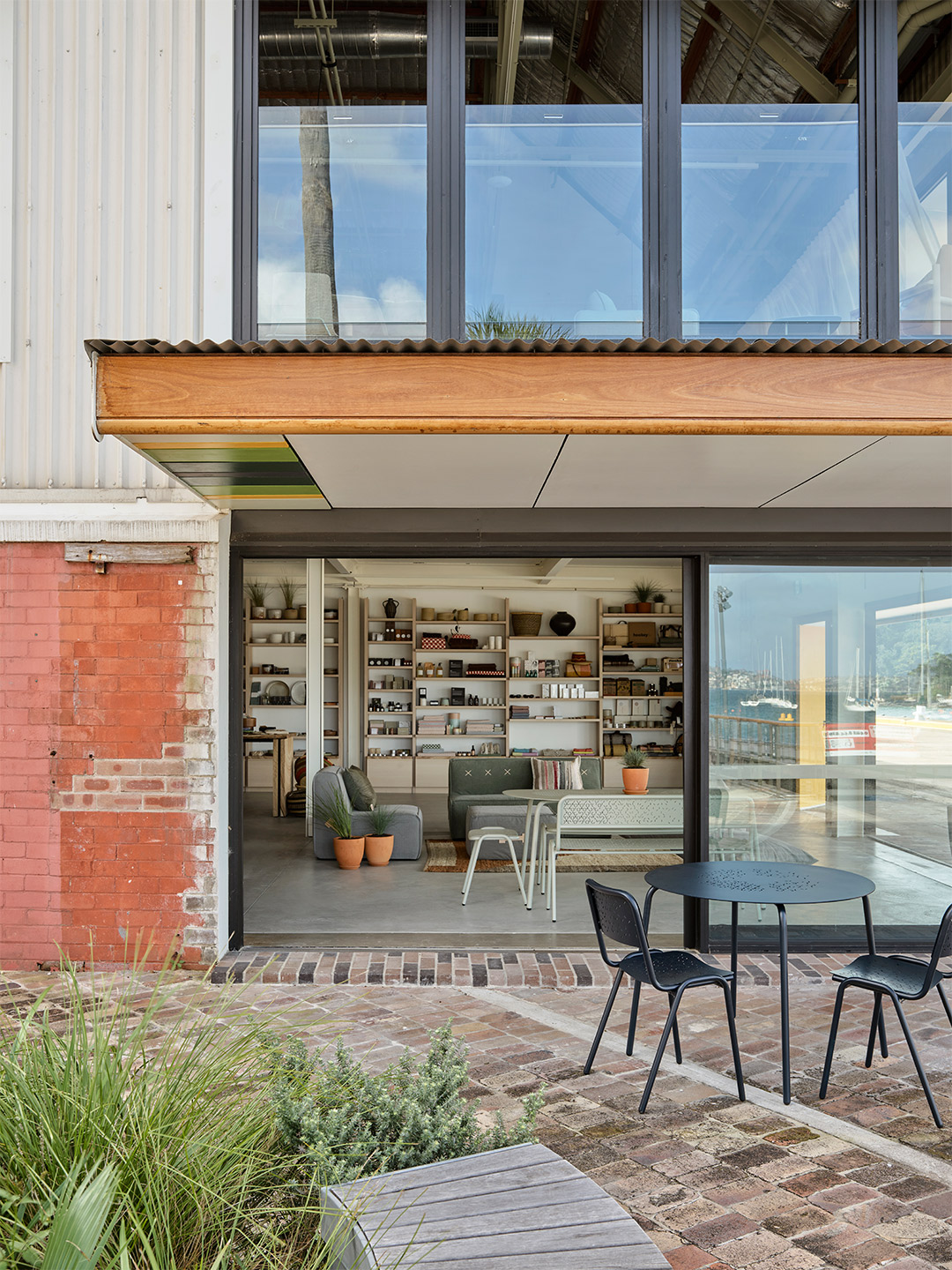
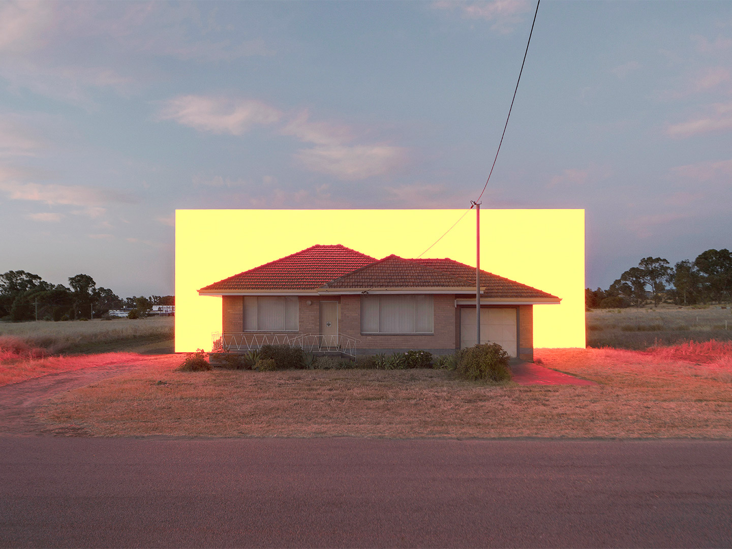
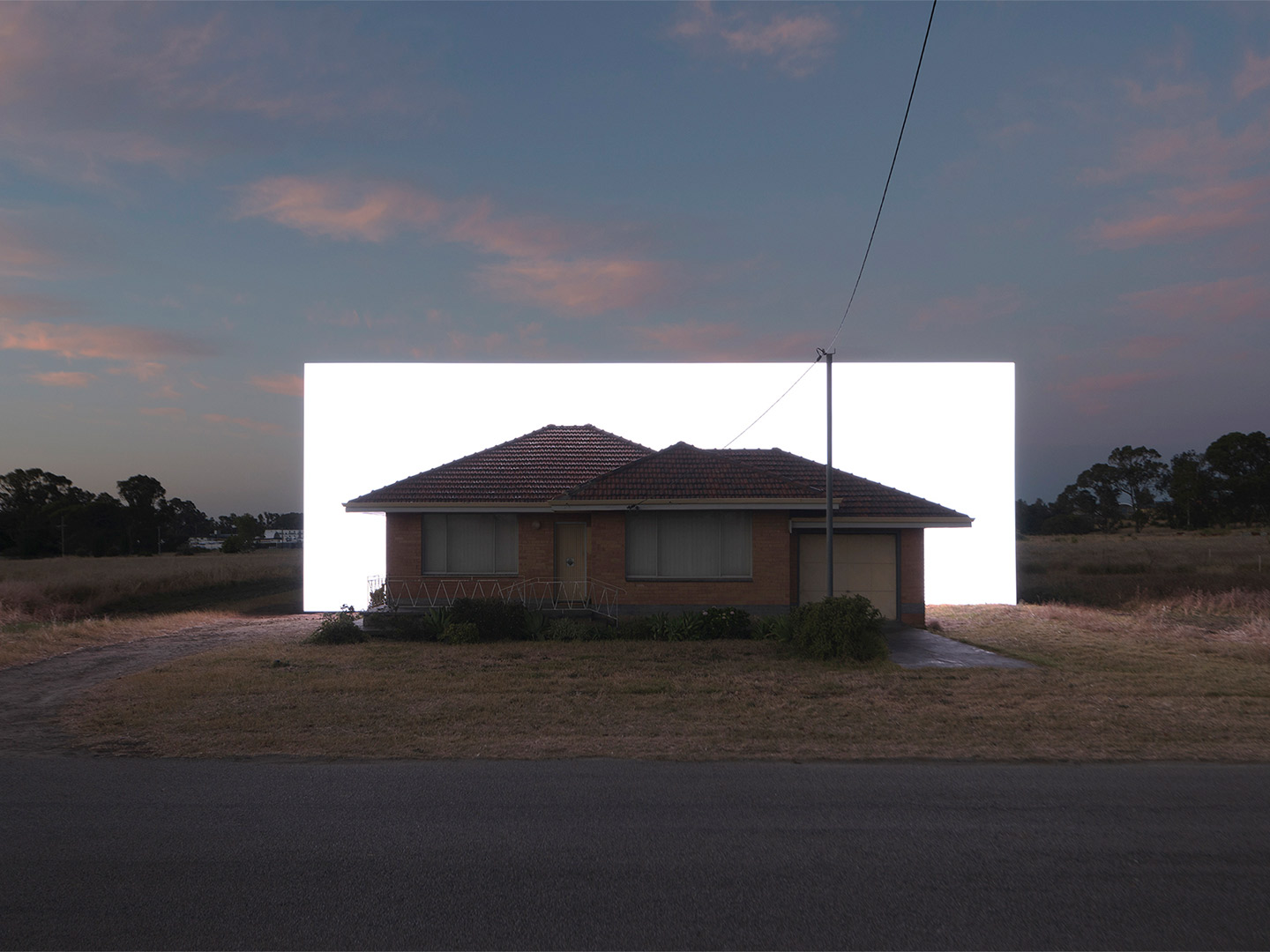
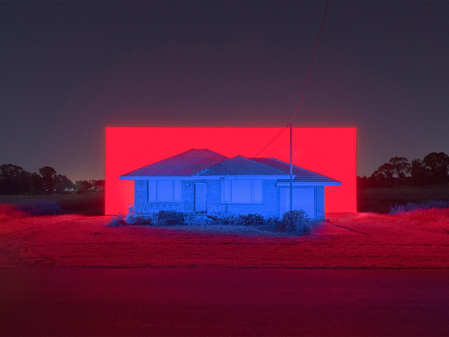
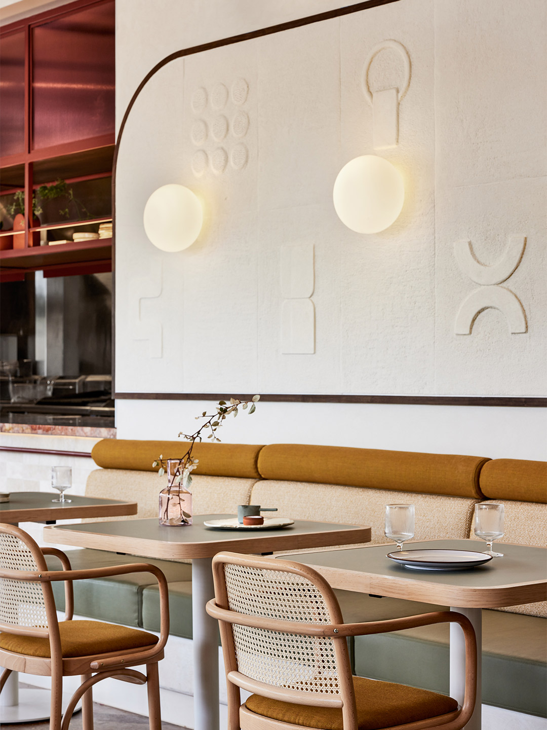
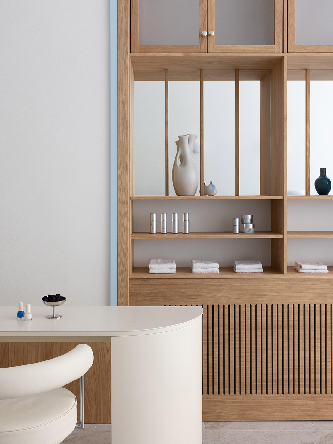
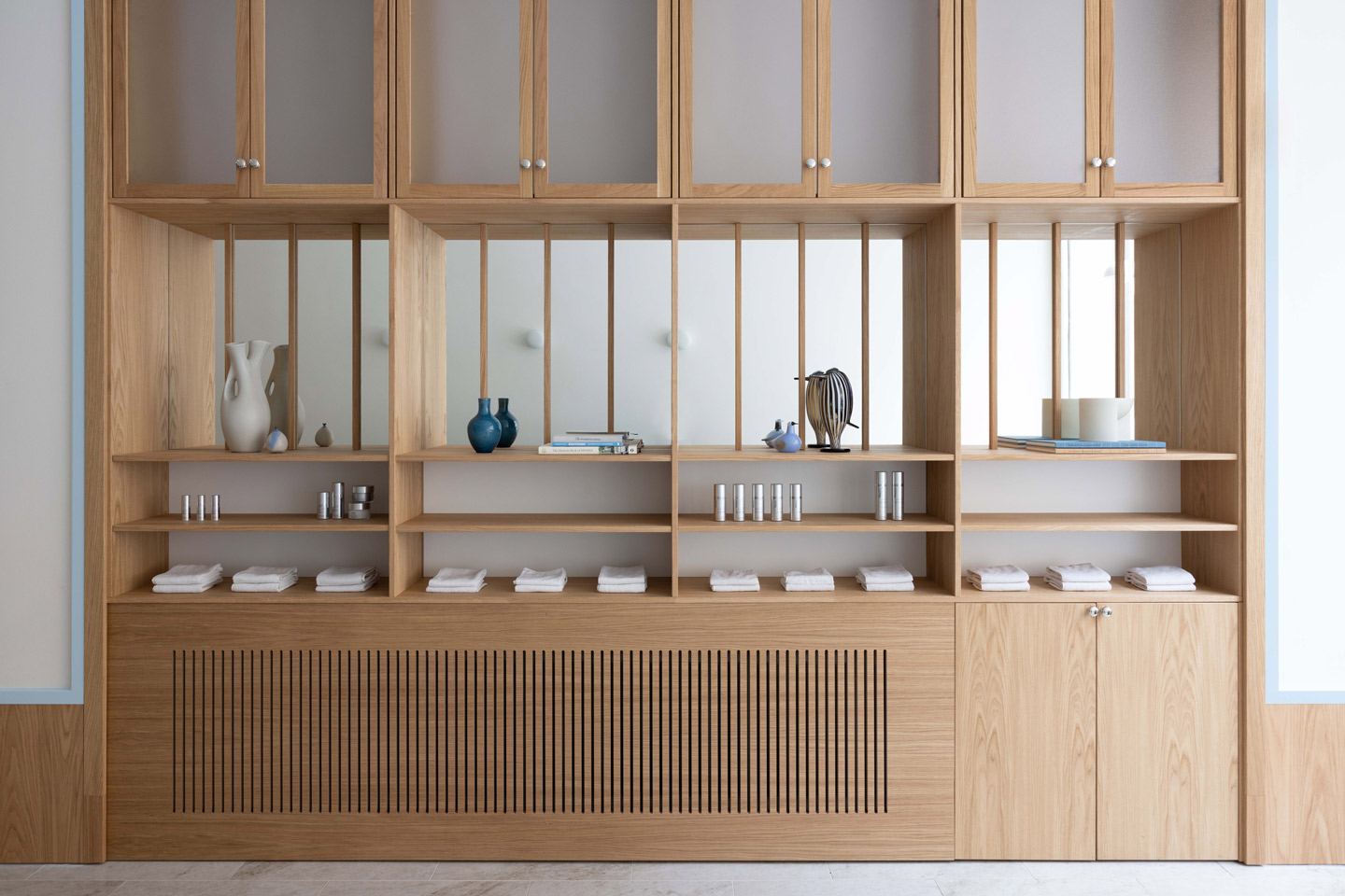
Fish Lane Town Square by Richards & Spence
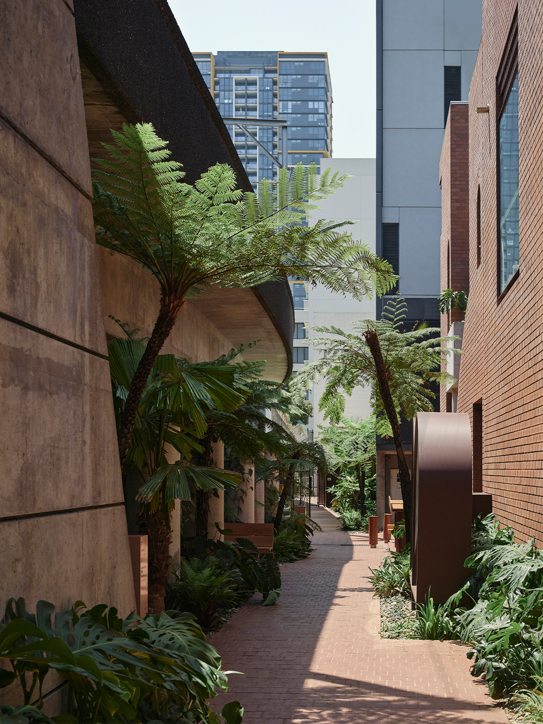
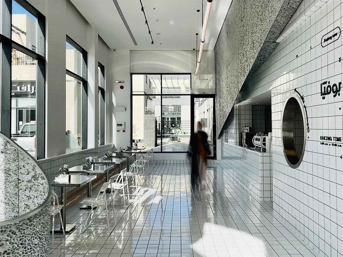
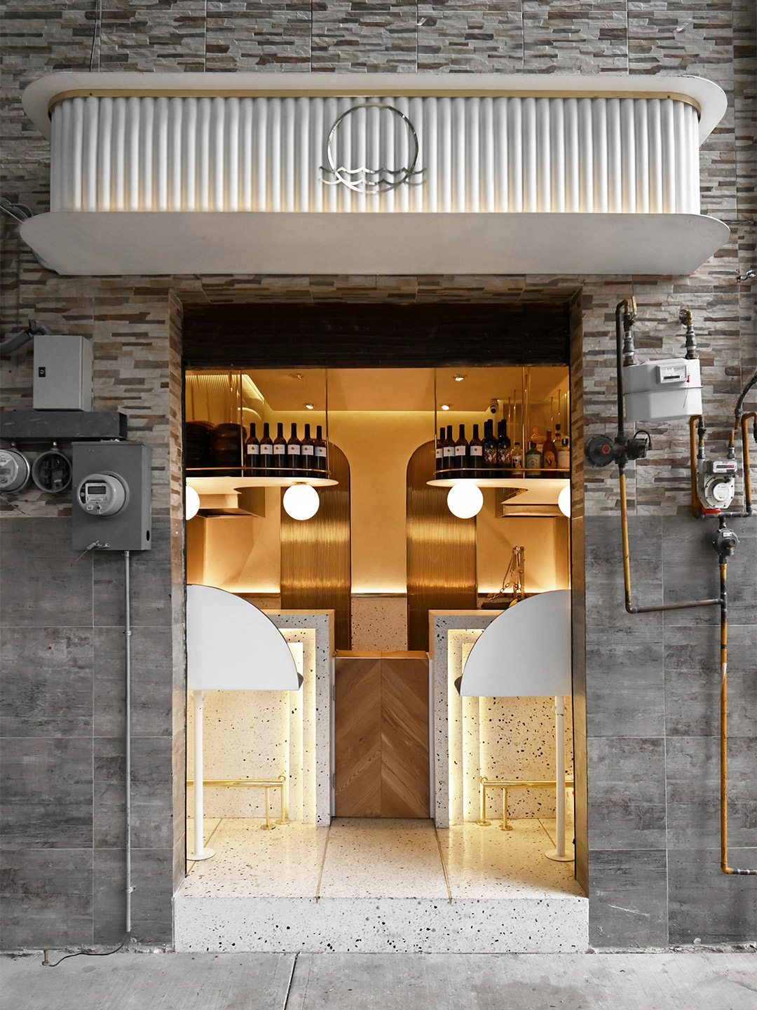
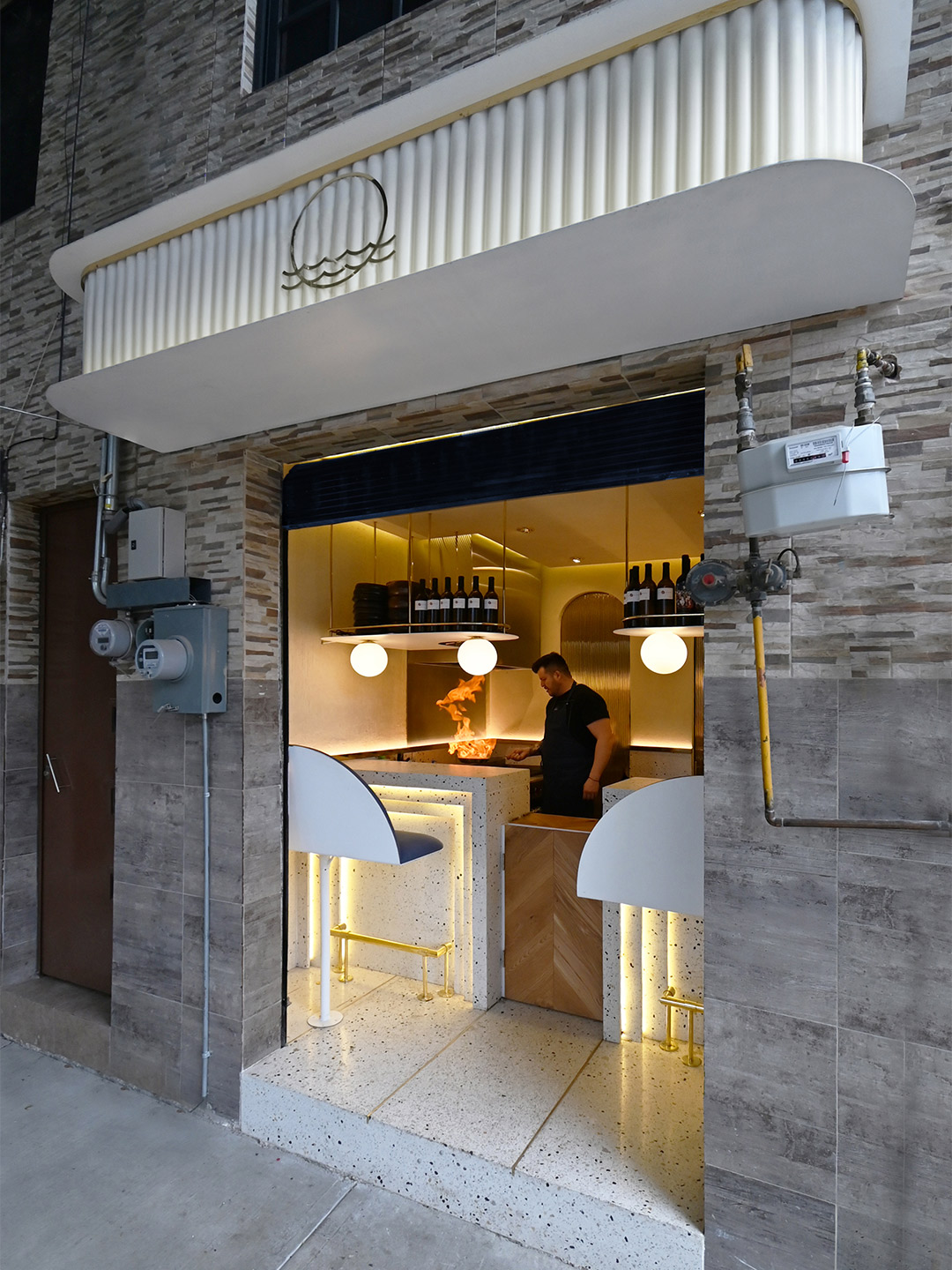
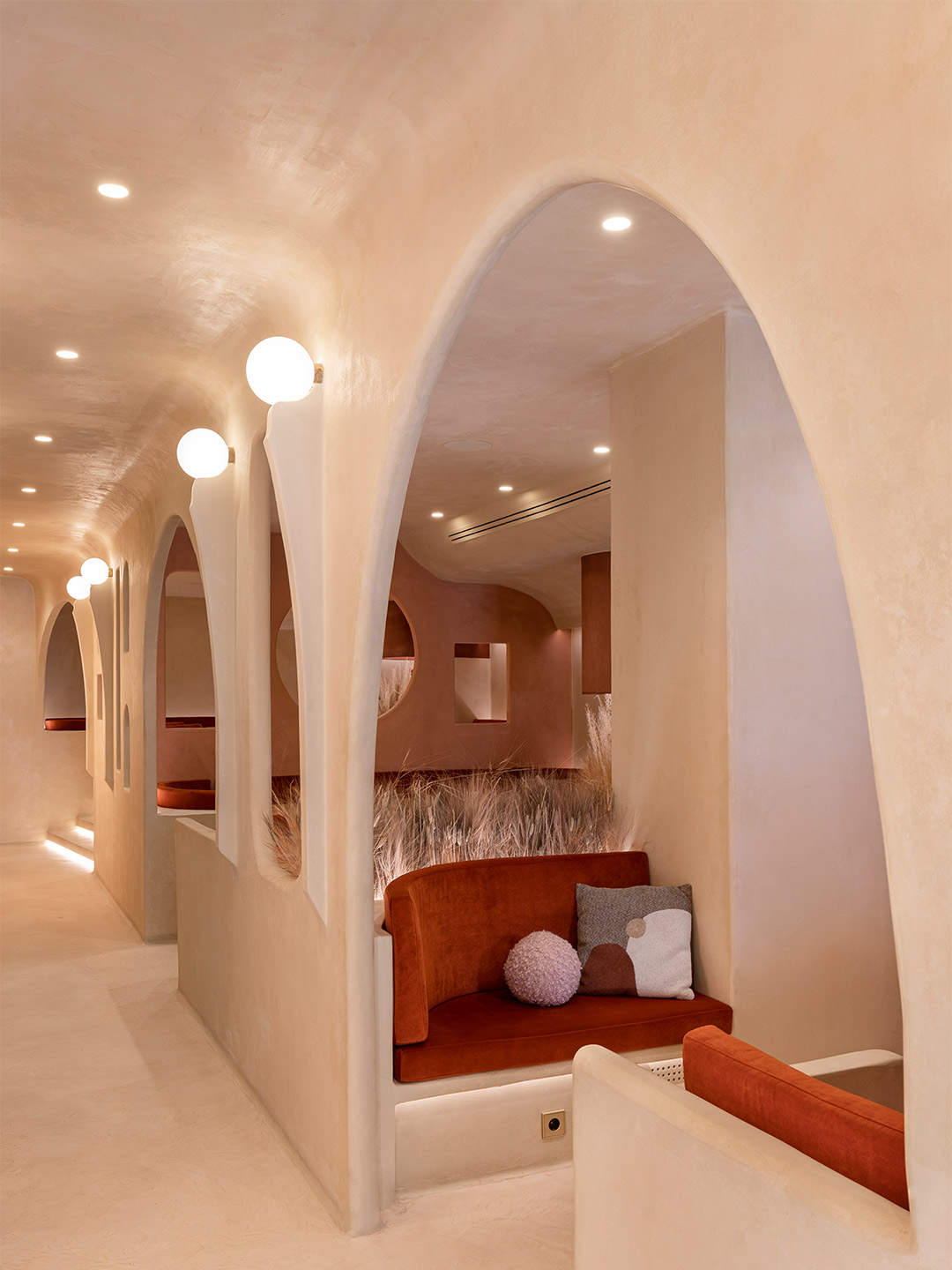
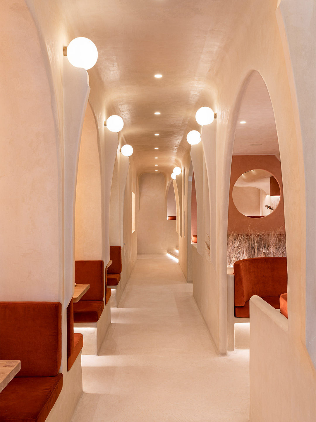
Fish Lane in South Brisbane is such a place. It’s a laneway that services during the day a collection of old and new with unplanned qualities, allowing a shortcut between the cultural precinct and West End. In recent years, the laneway, with landscape design by RPS Group, has undergone renewal. Public art was incorporated in a meaningful way; bars, cafes and other tenancies have established themselves; and the laneway has come to life, particularly at night and on weekends.
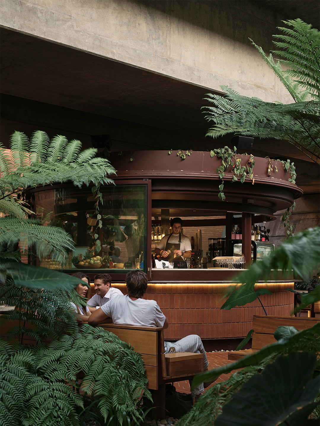
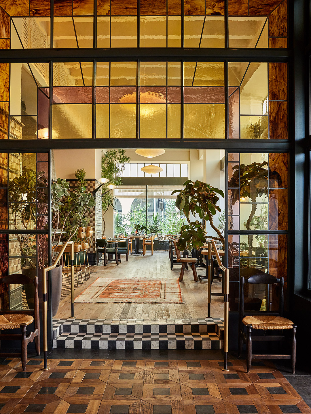
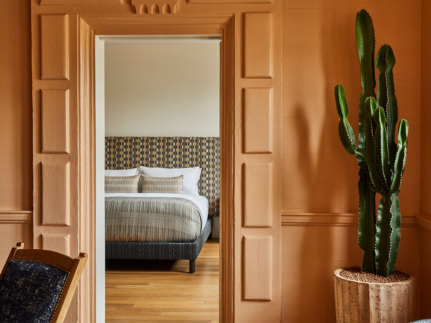
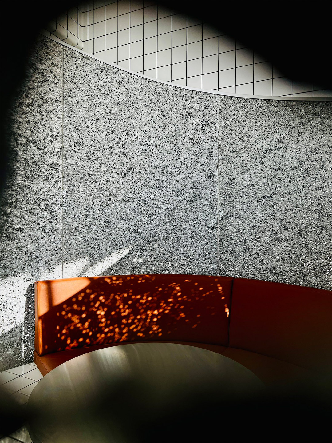
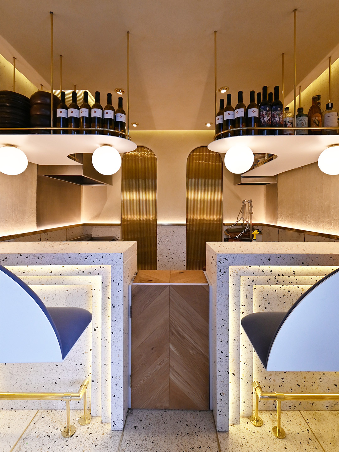
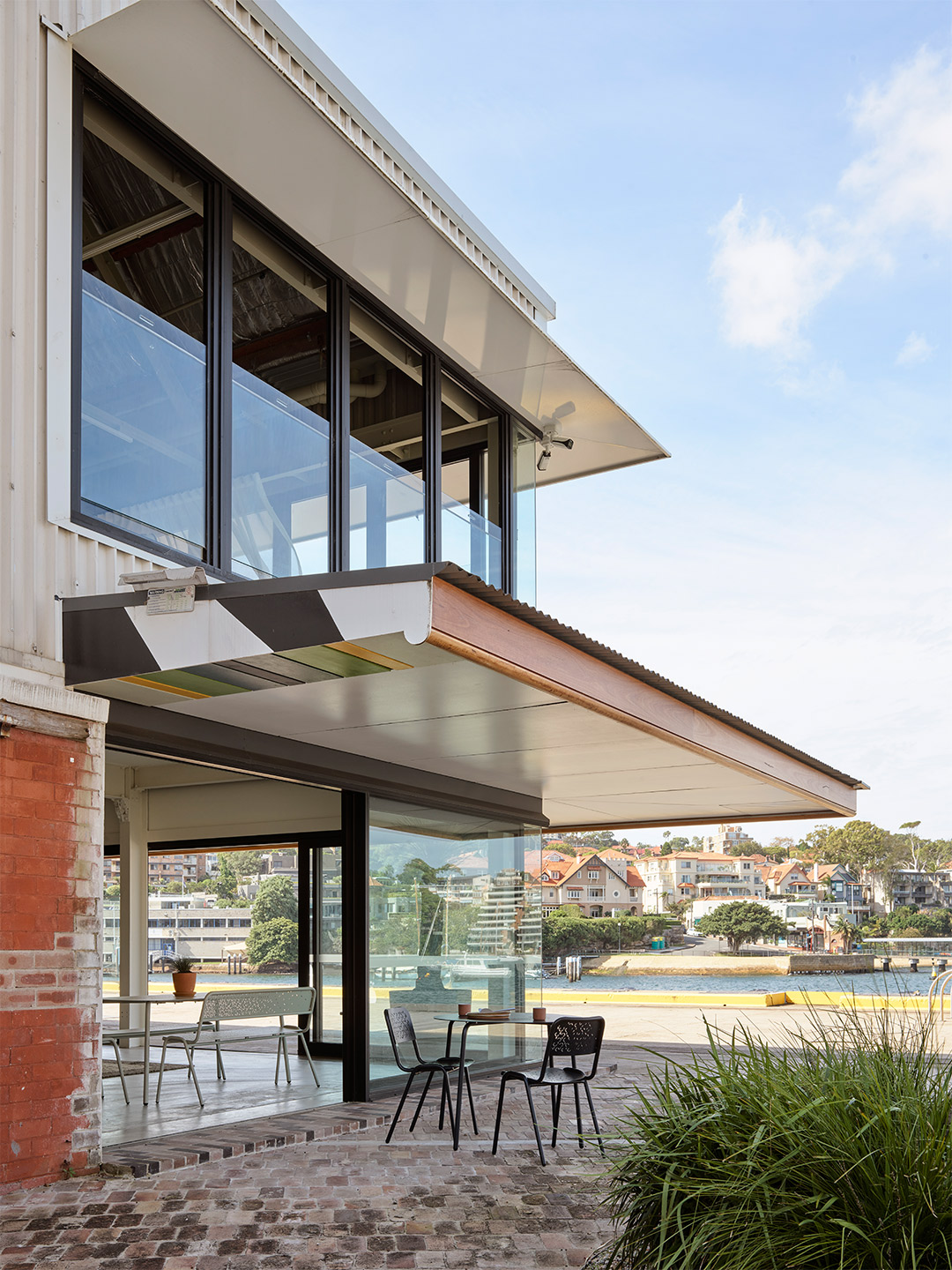
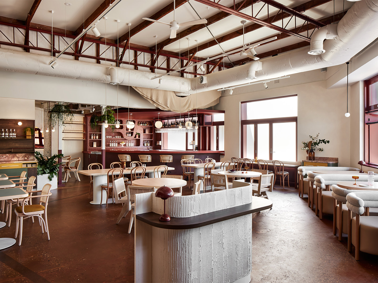
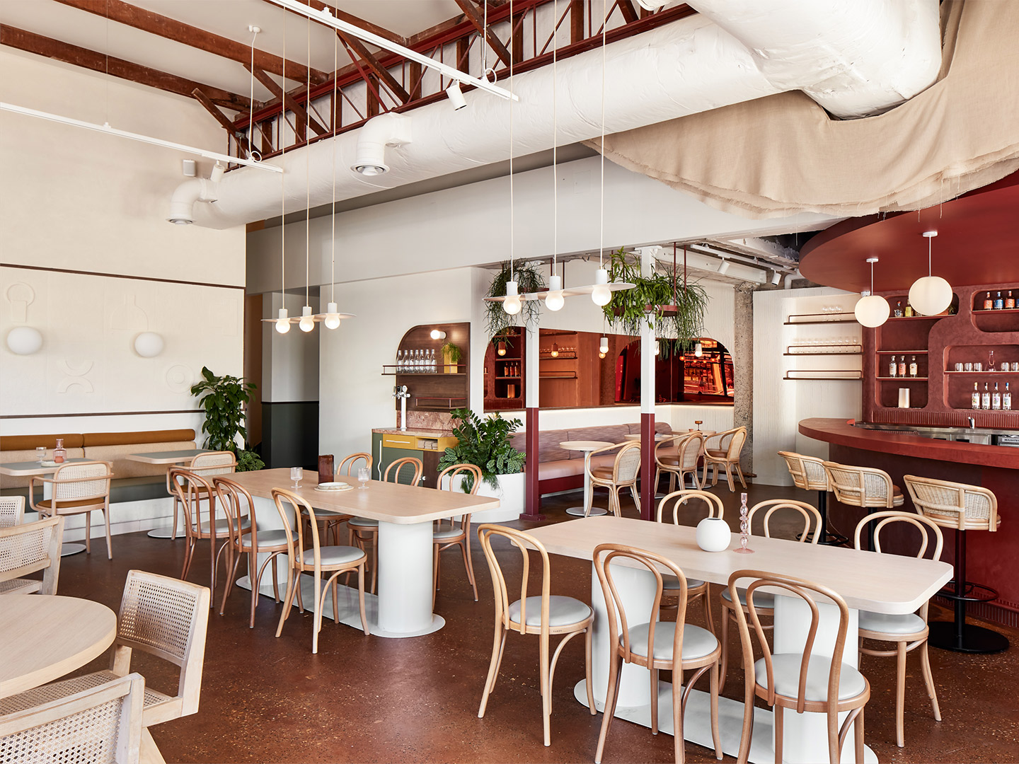
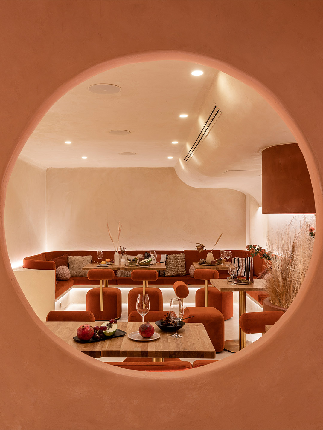
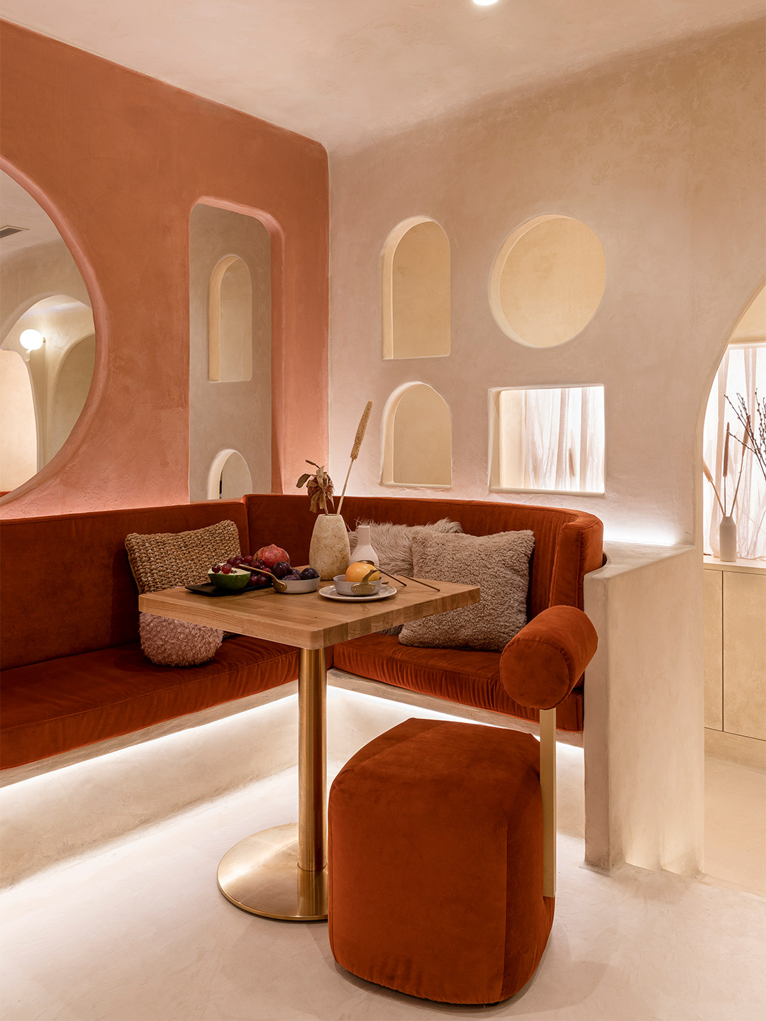
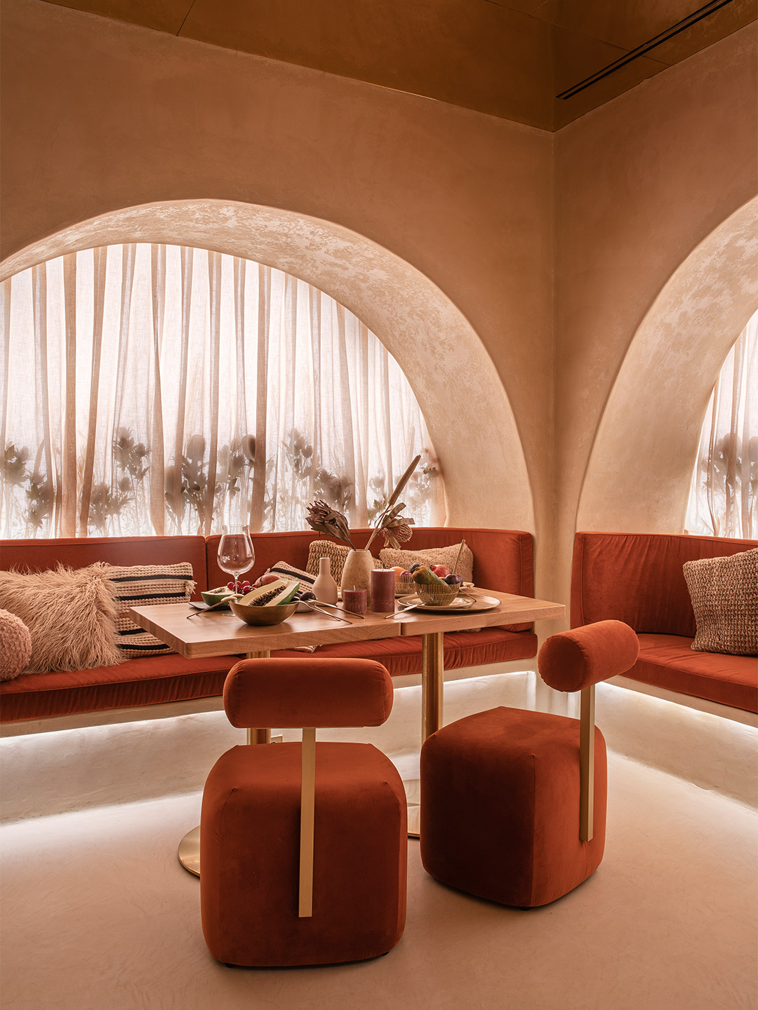
Fish Lane Town Square is the most recent addition to this renewal. Carefully and skilfully designed by Richards & Spence for Aria Property Group, it is an intriguing project. What was once a neglected space now offers the city a different type of public place, a meeting point and an urban setting to sit, relax and people watch.
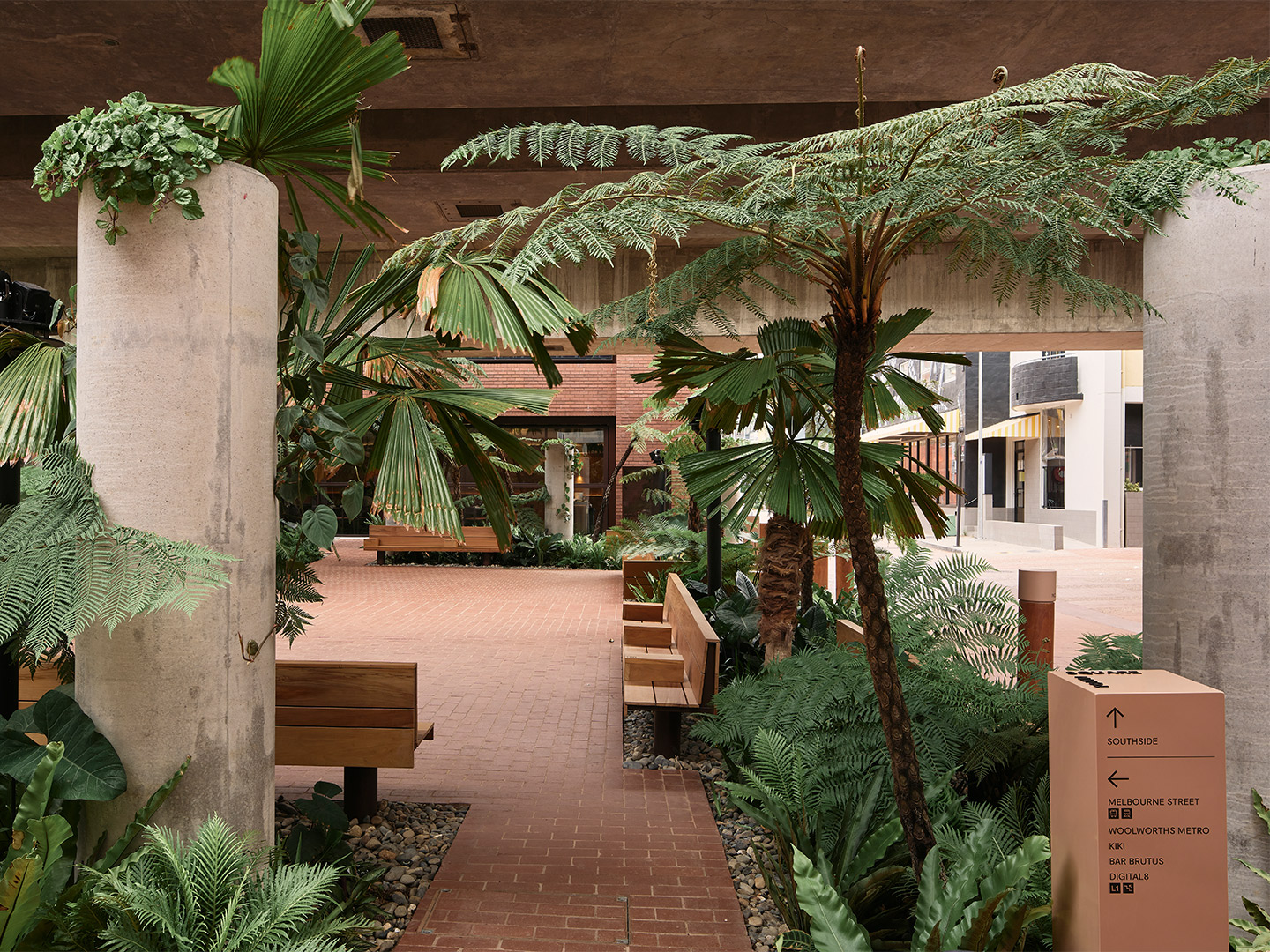
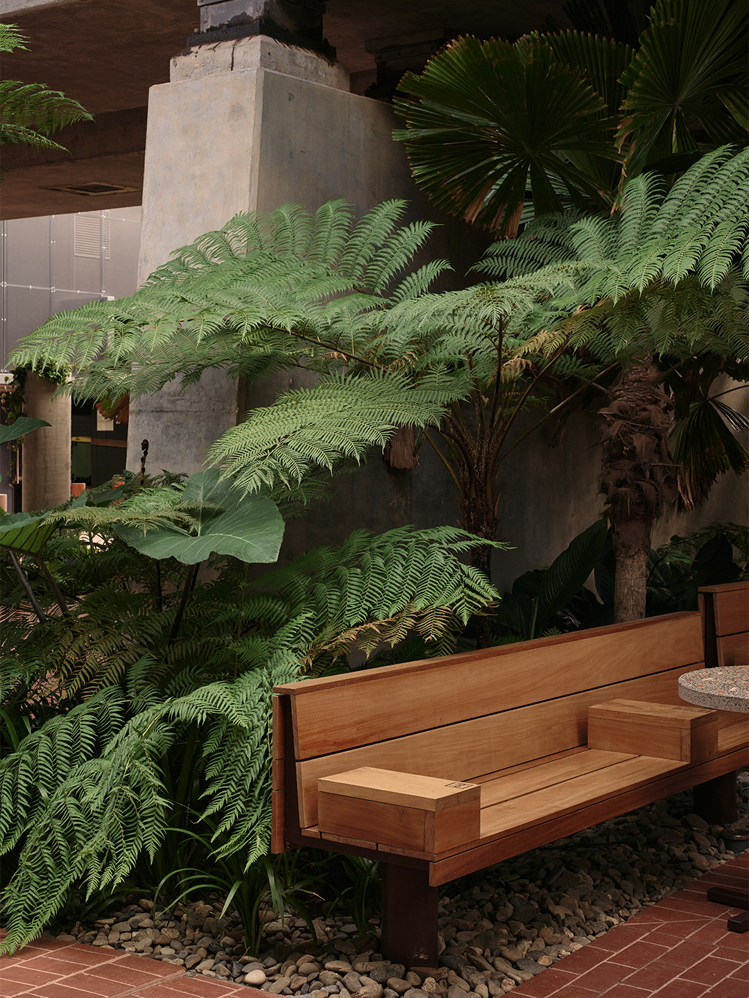
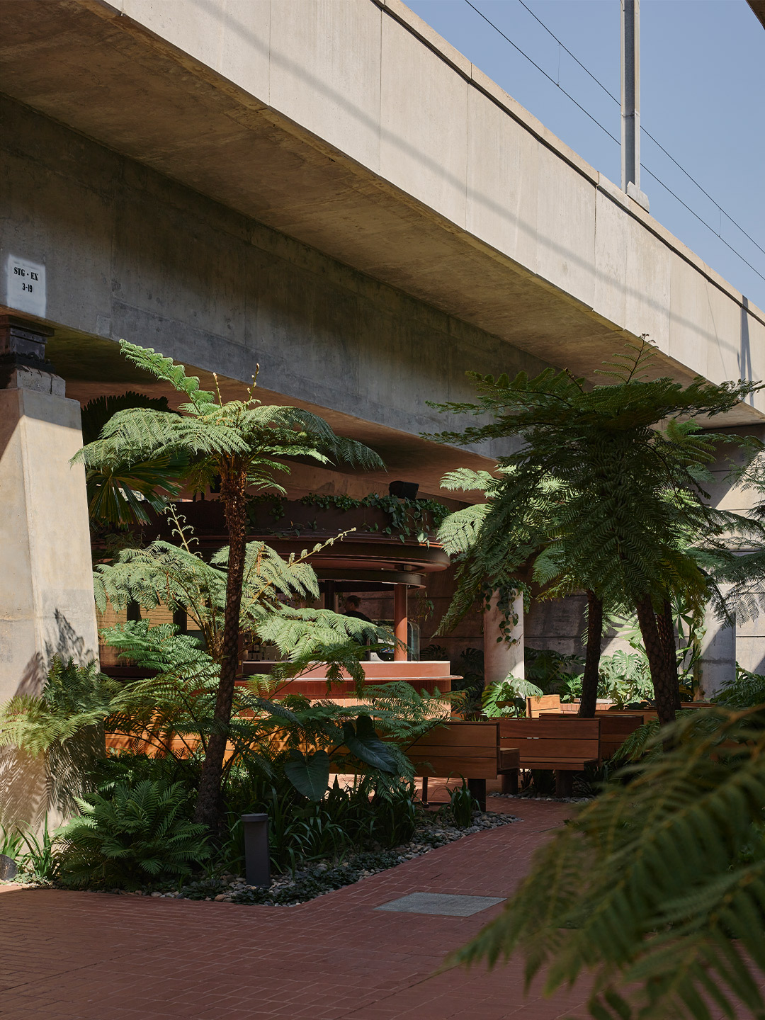
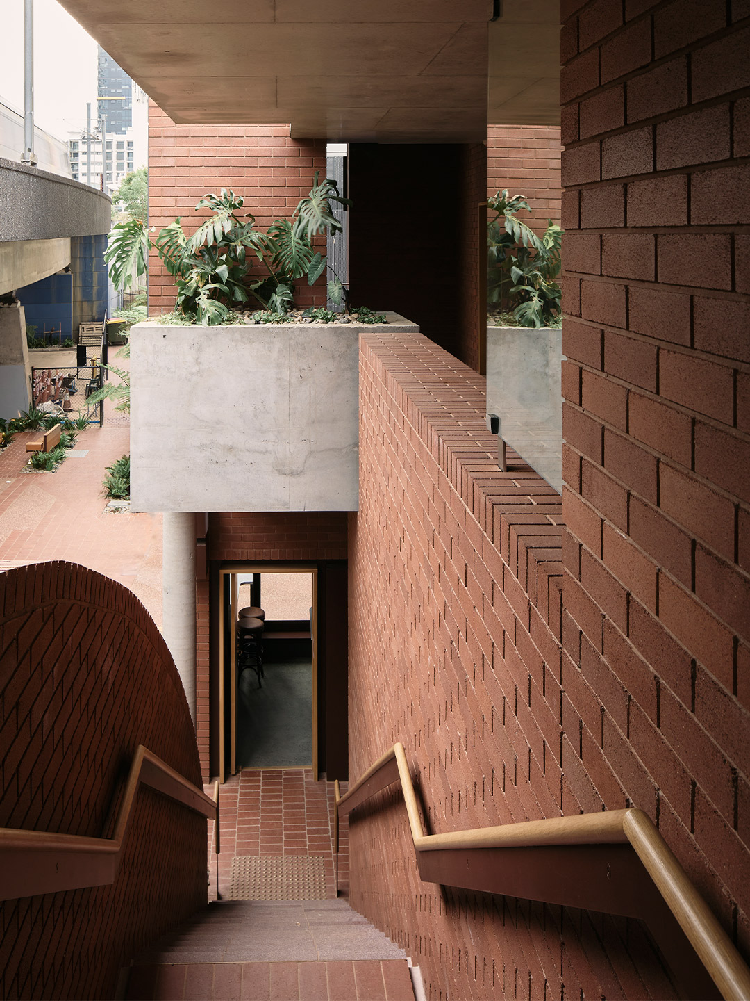
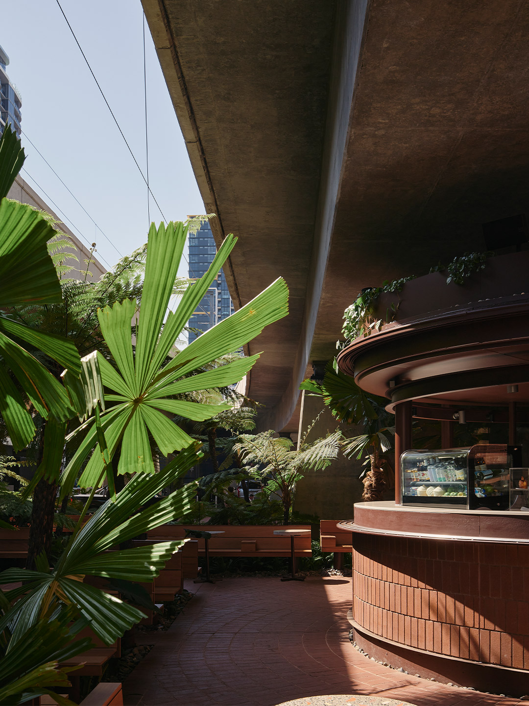
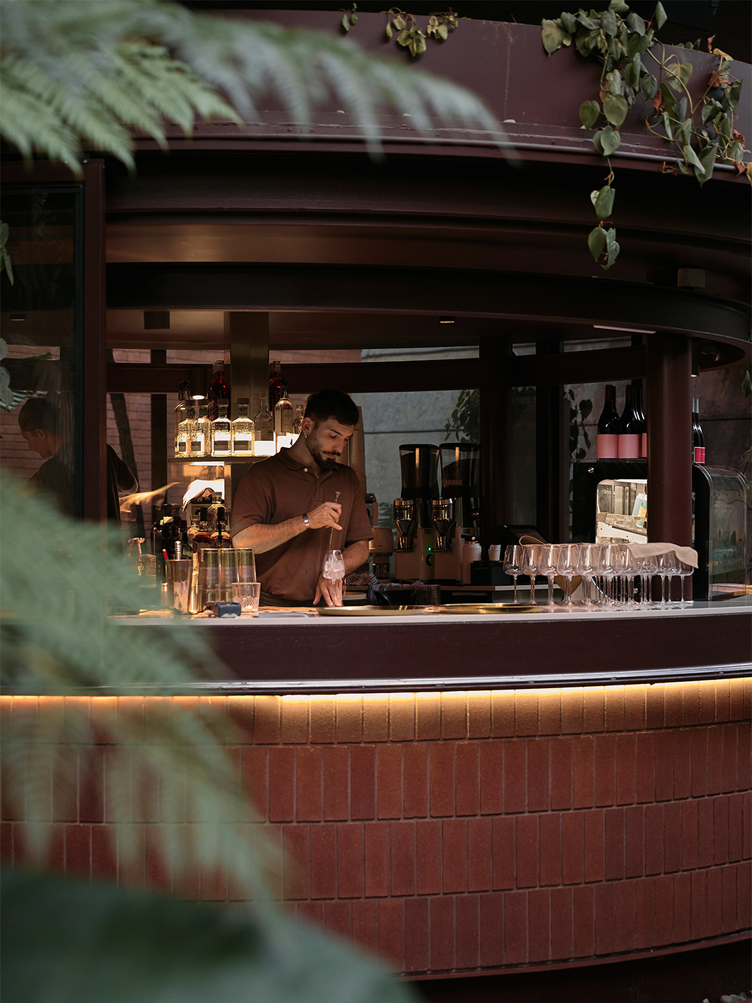
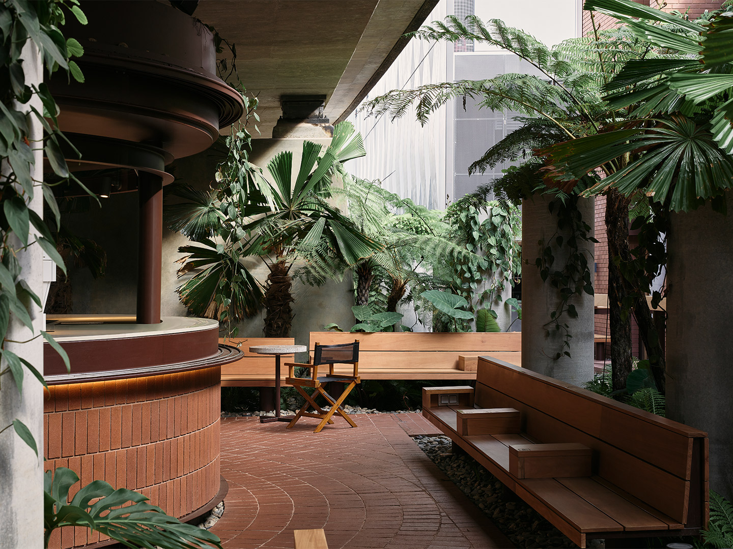
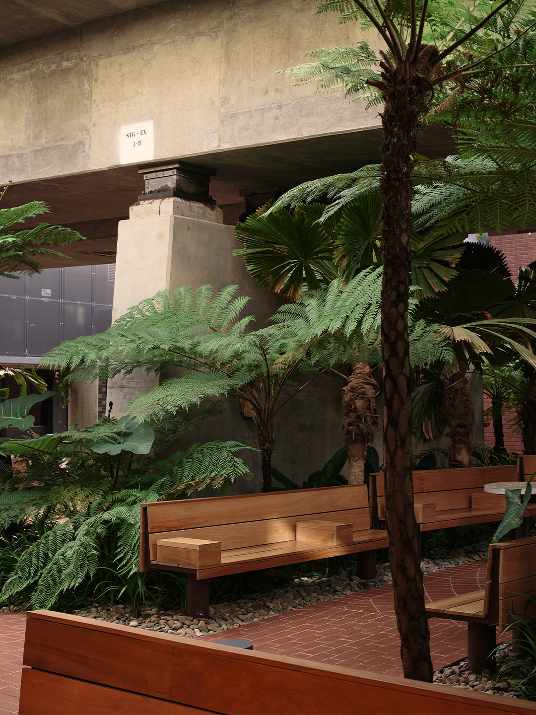
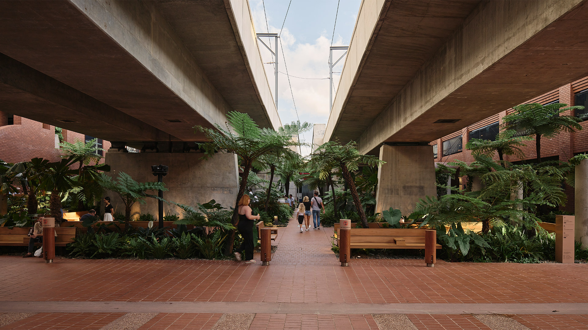
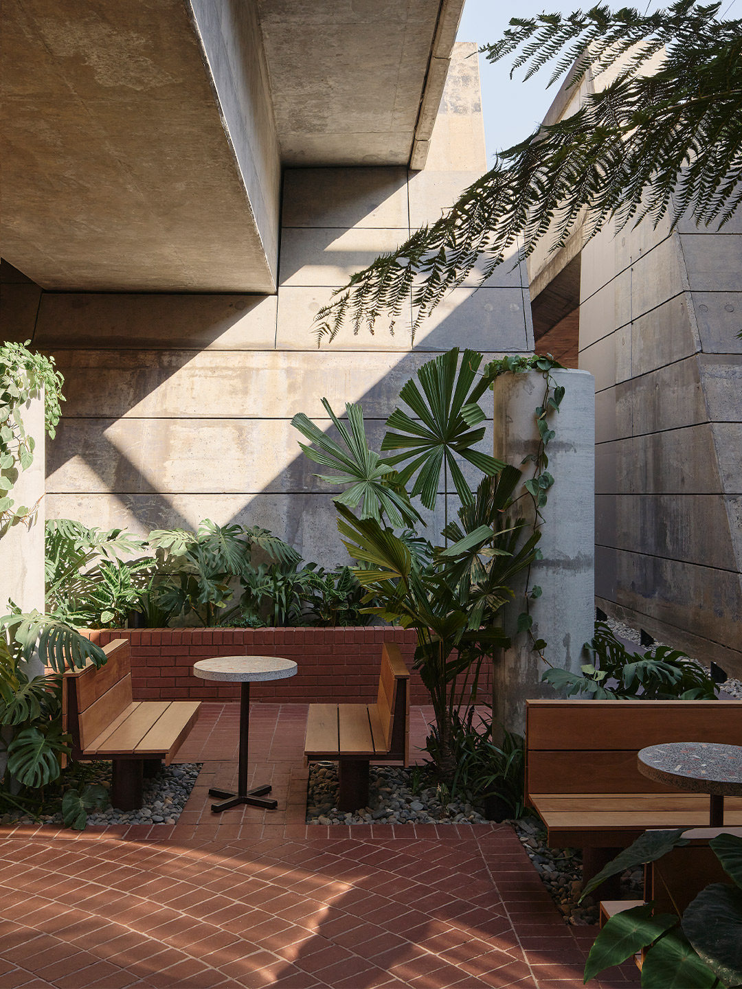
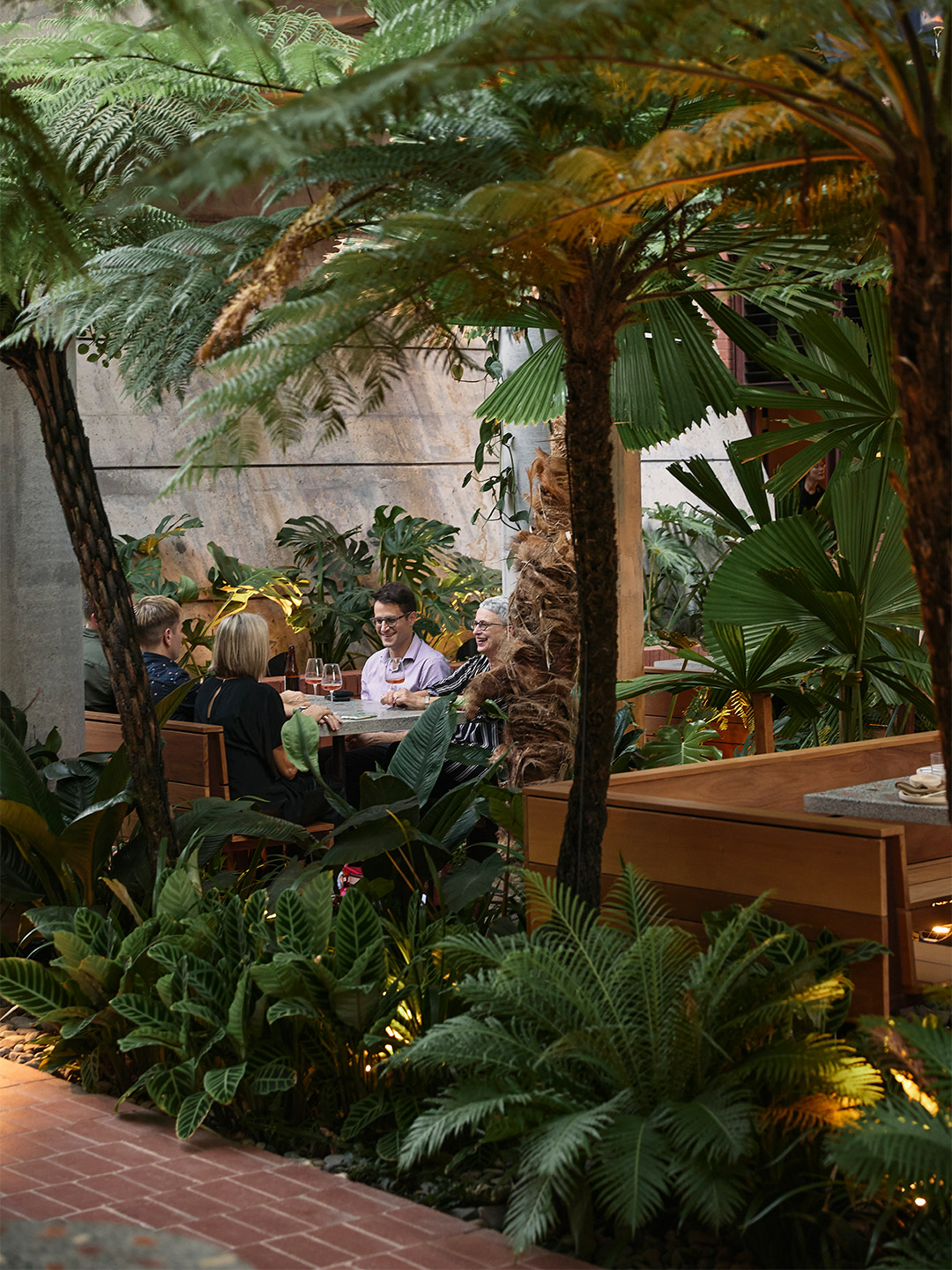
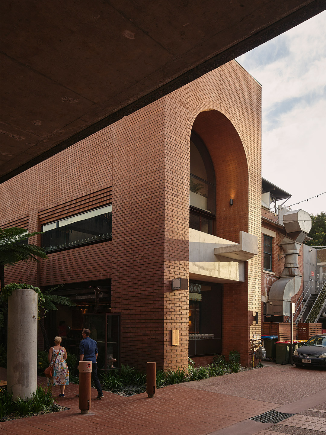
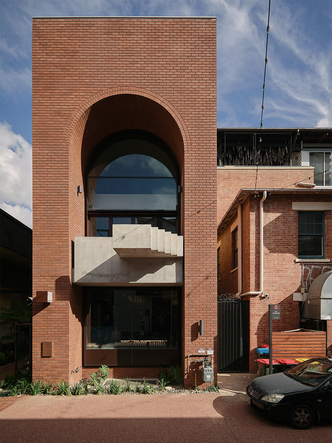
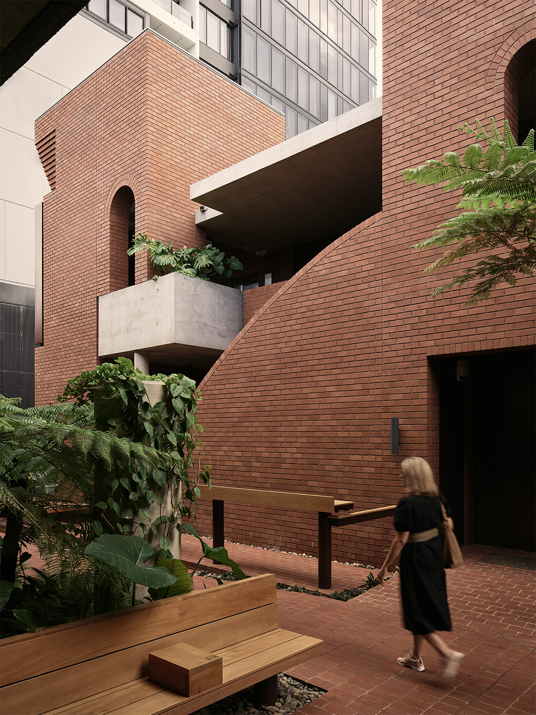
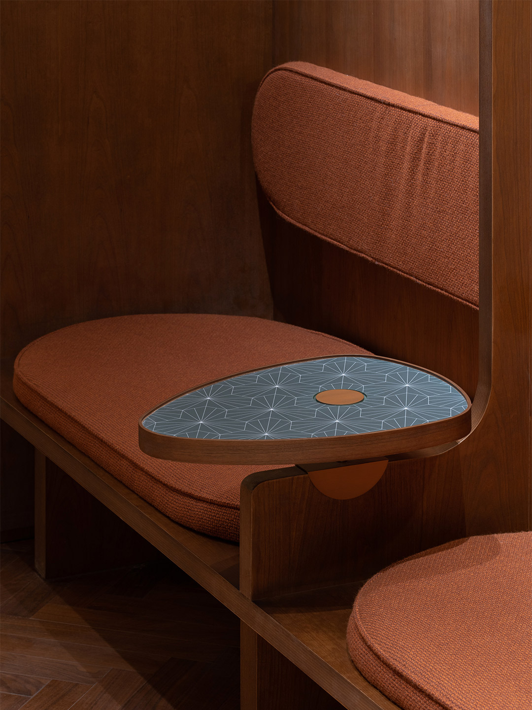
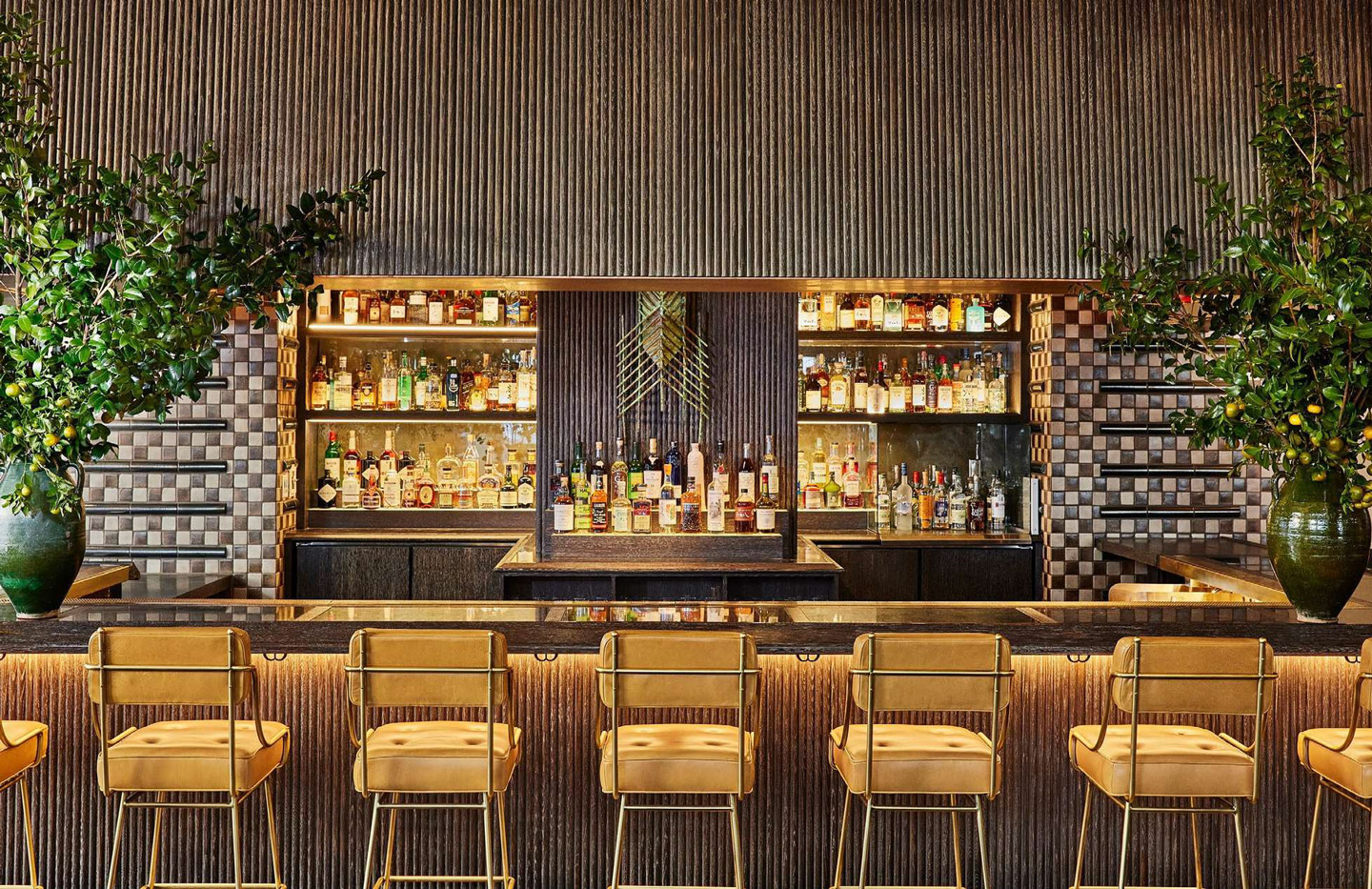
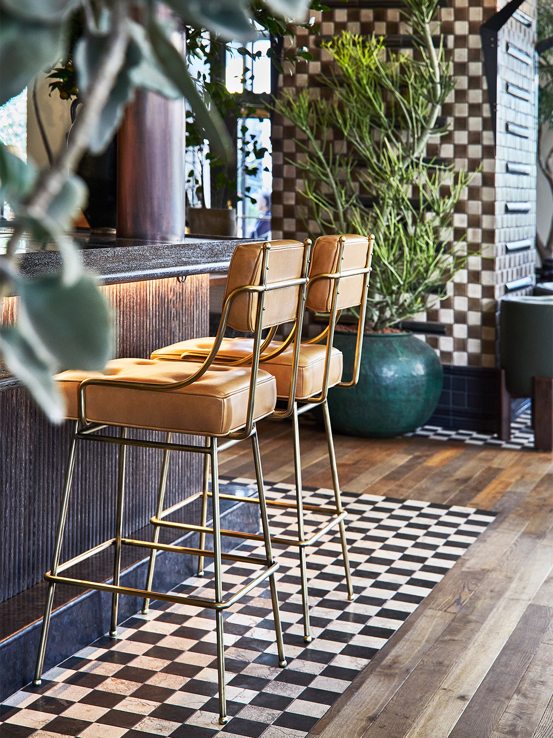
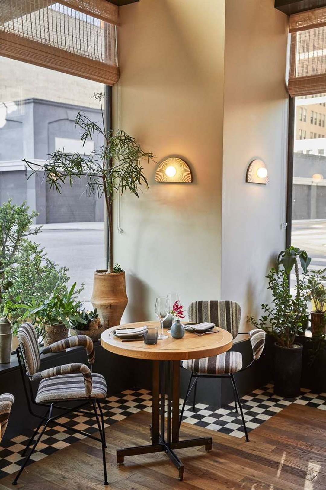
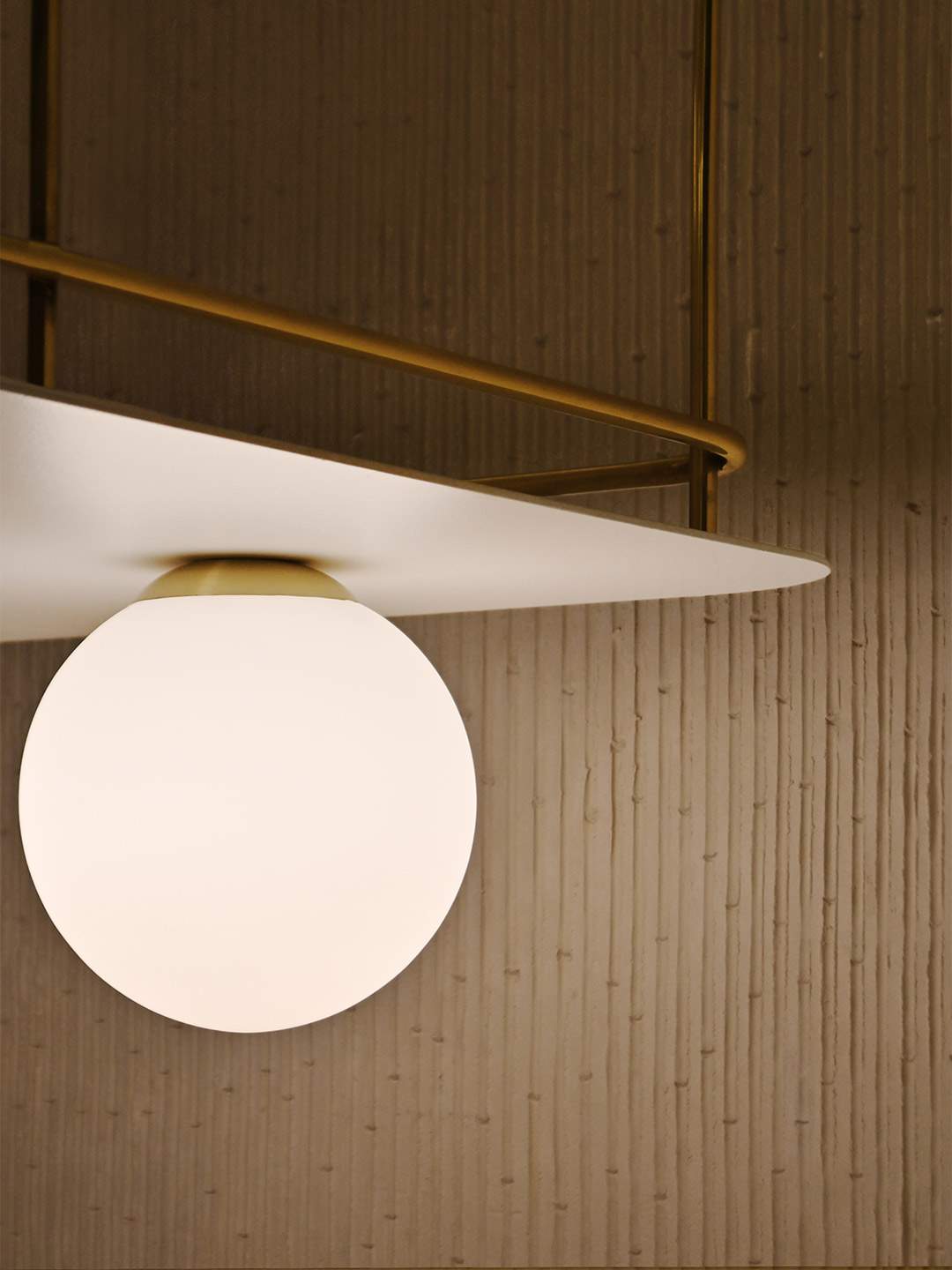
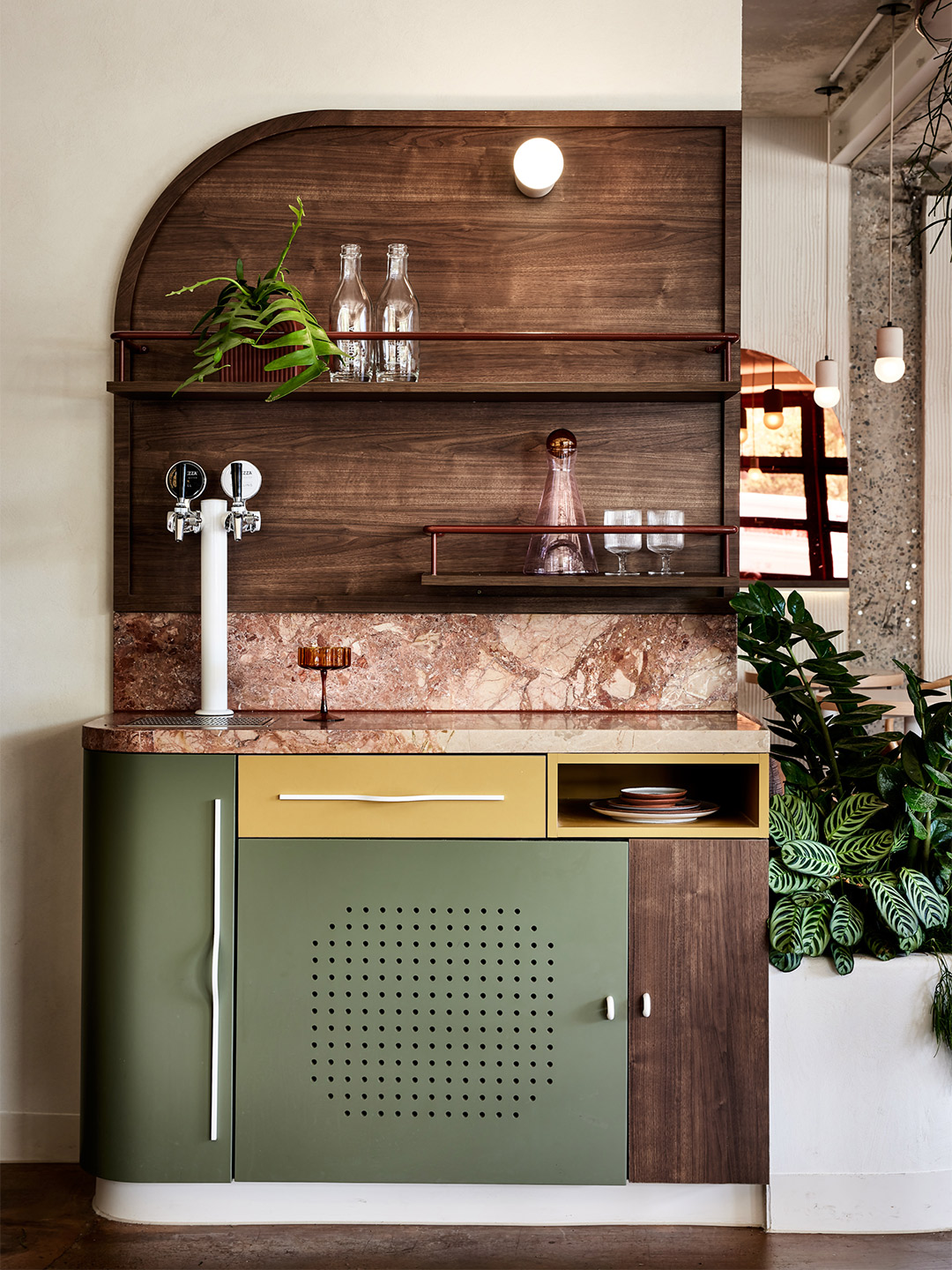
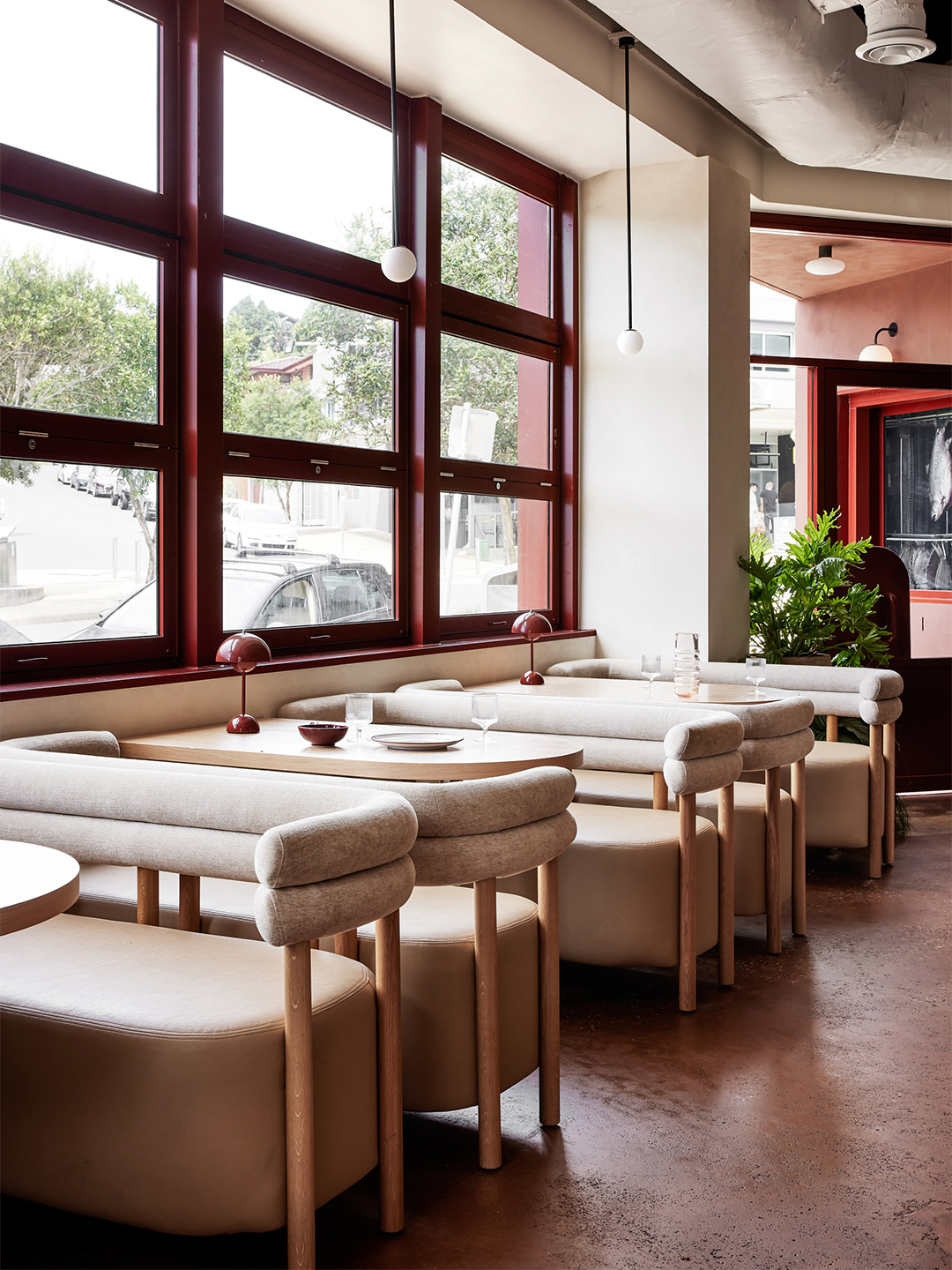
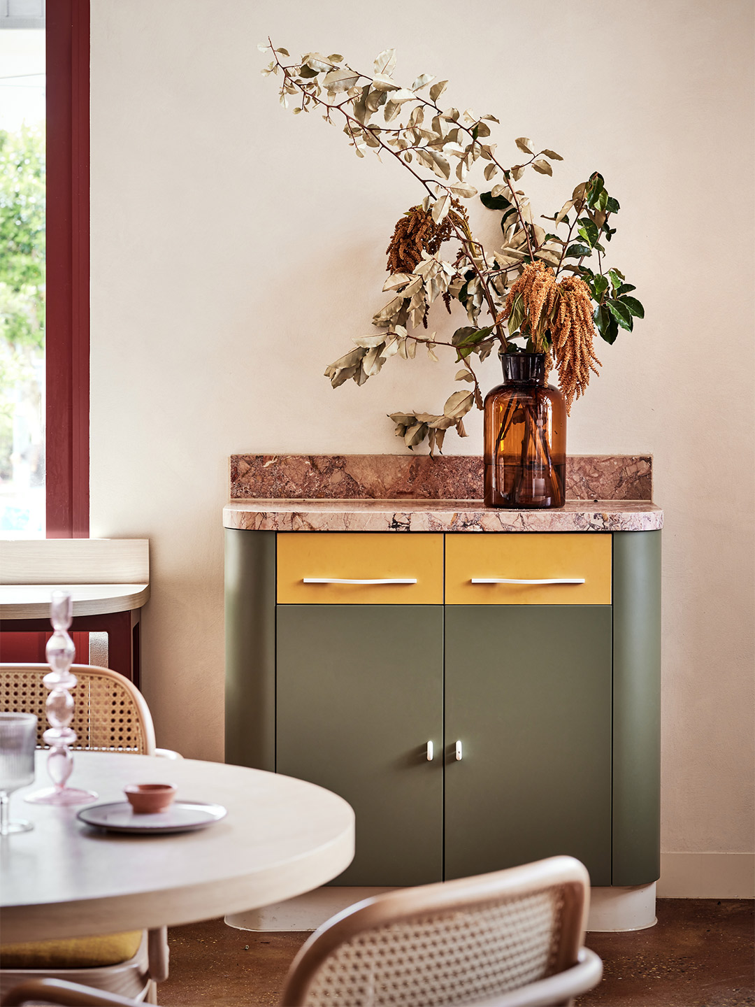
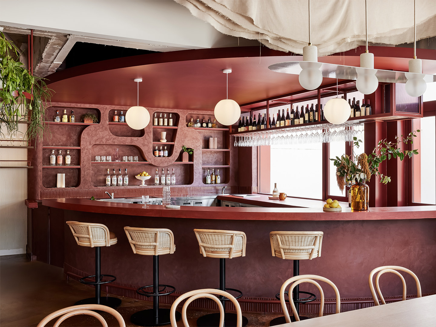
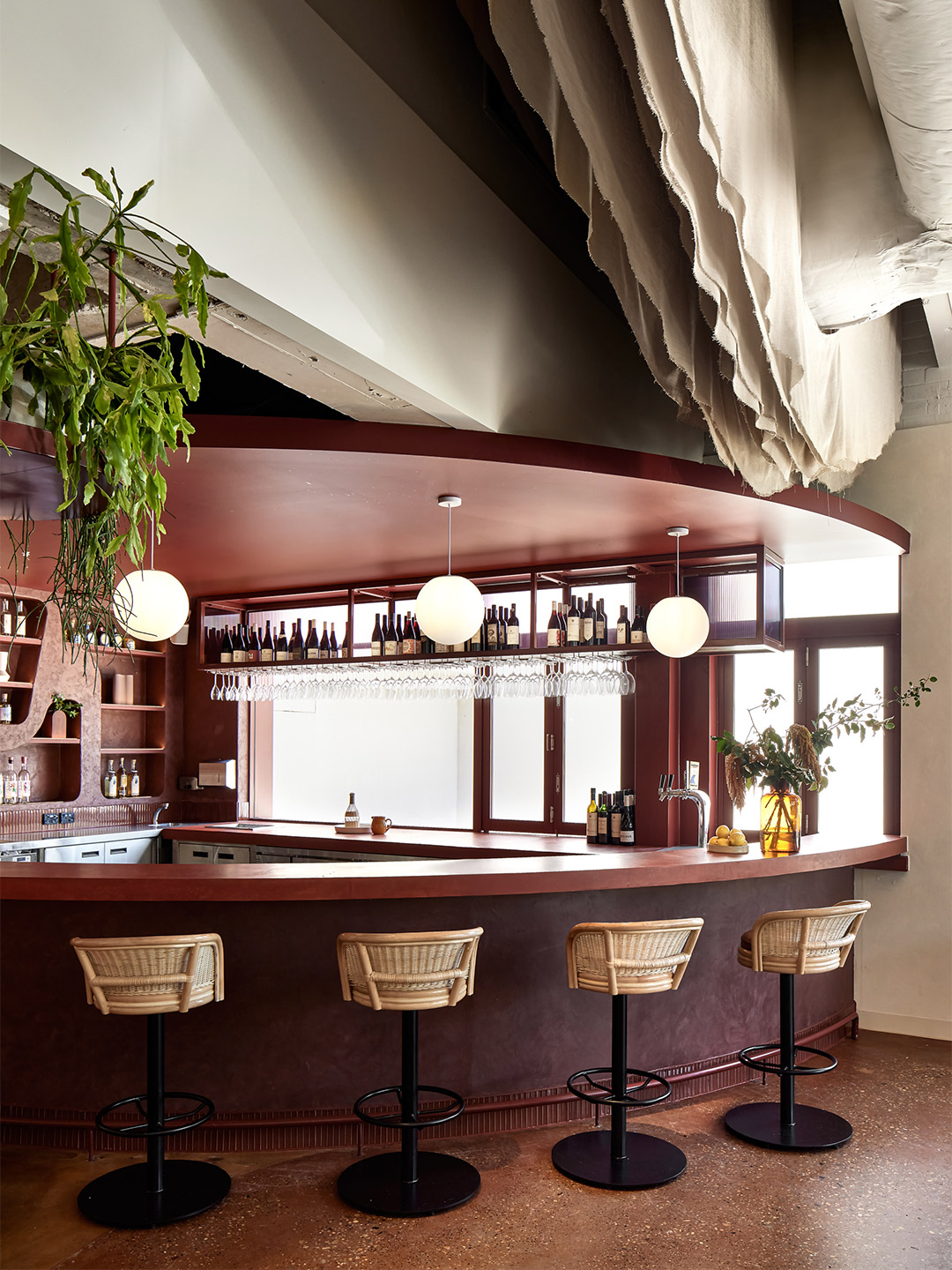
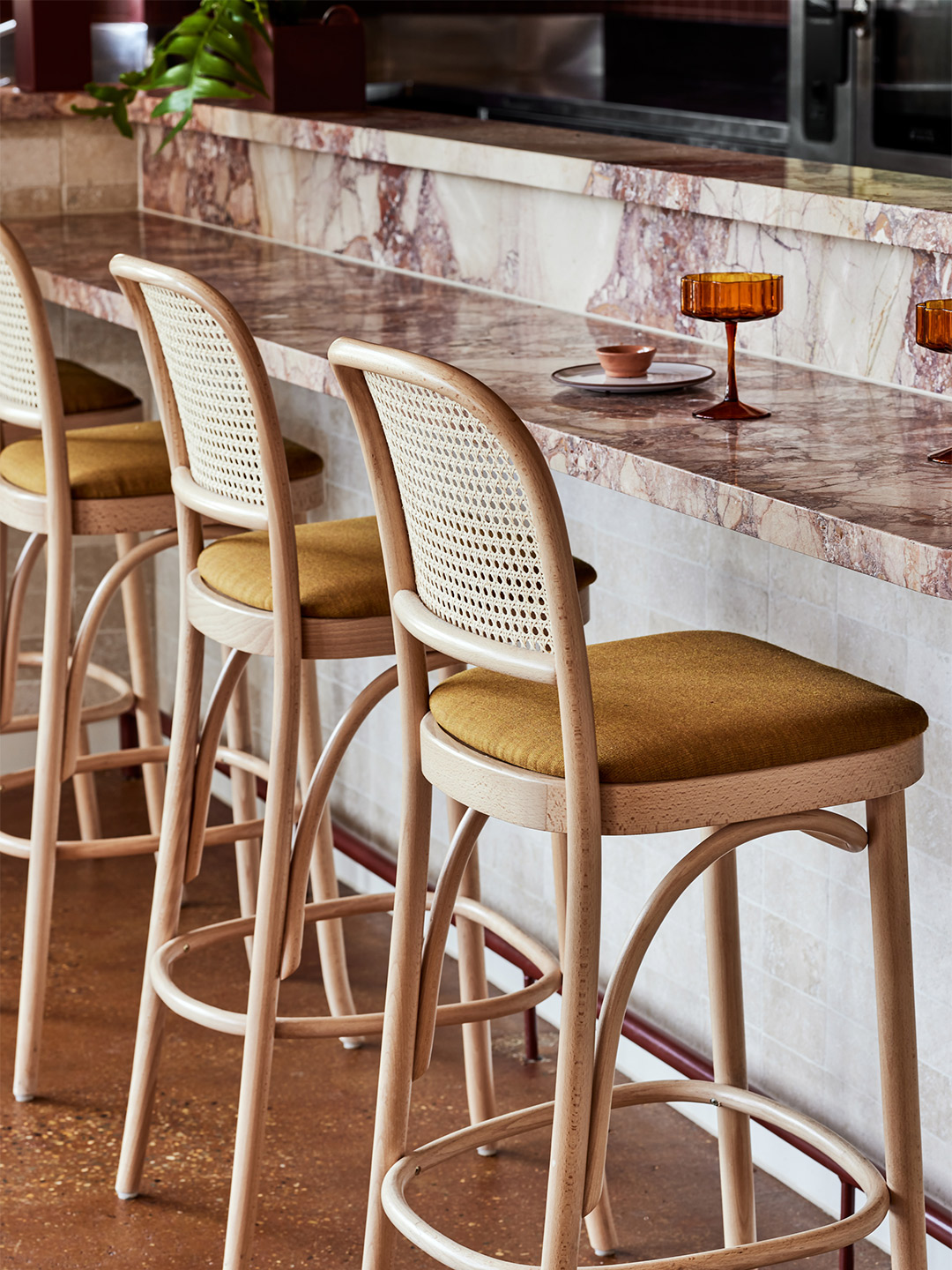
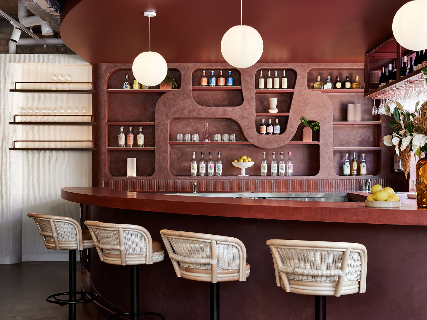
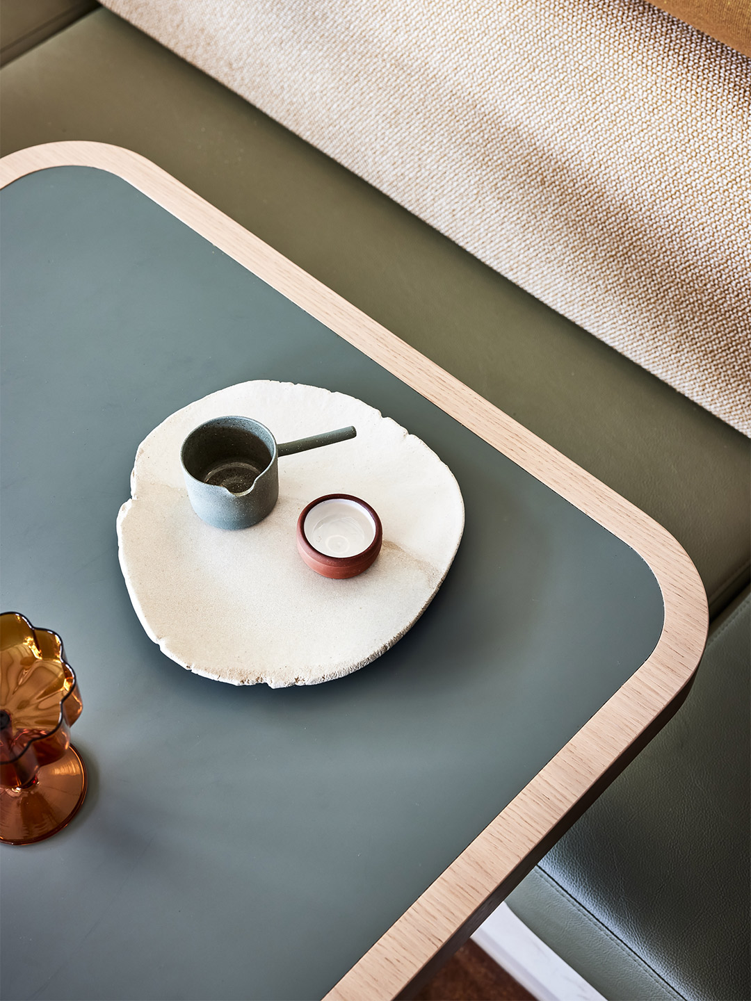
The site is not typical: it is a series of leftover spaces and is highly constrained. It fronts Fish Lane, a busy busway on Melbourne Street and is dissected by a rail overpass. Sites like these are often put in the too-hard basket, but Richards & Spence challenged these constraints to produce an outcome that is cohesive and rich. In many ways Fish Lane Town Square is not one project, but a series of smaller ones. Two thin masonry buildings run between Fish Lane and Melbourne Street, and act as edges to the outdoor space, which is sheltered by the rail overpass. There is a circular cafe-bar and considered hardwood seating distributed throughout the space, which creates more intimate areas.
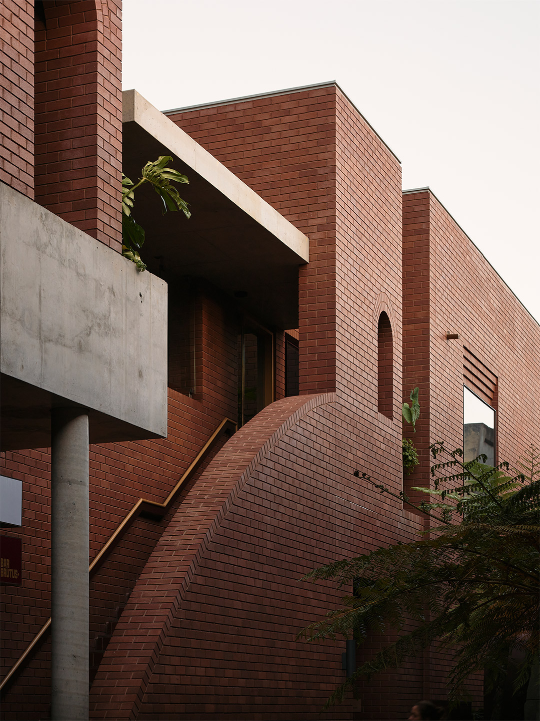
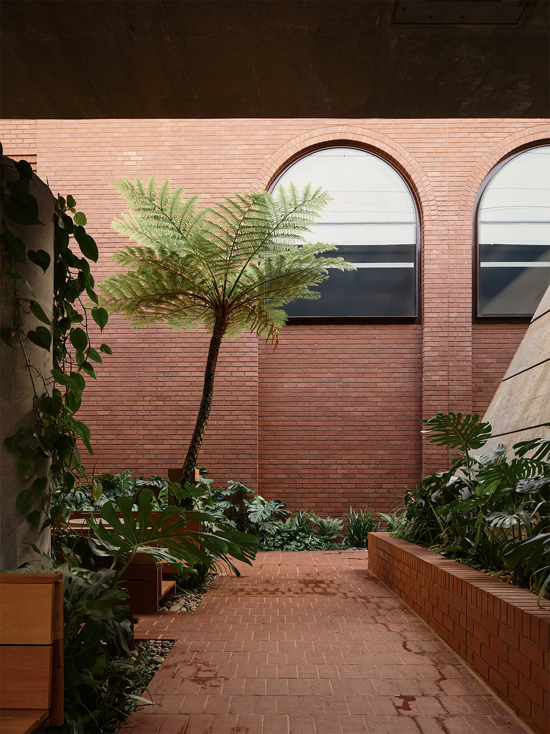
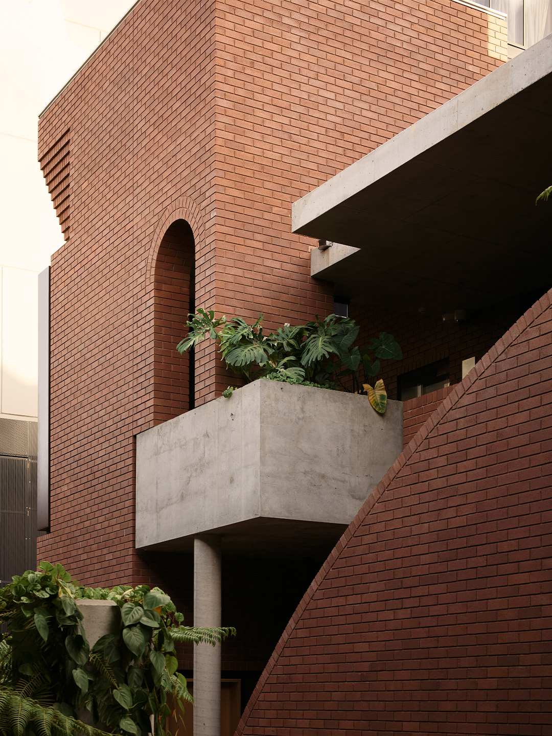
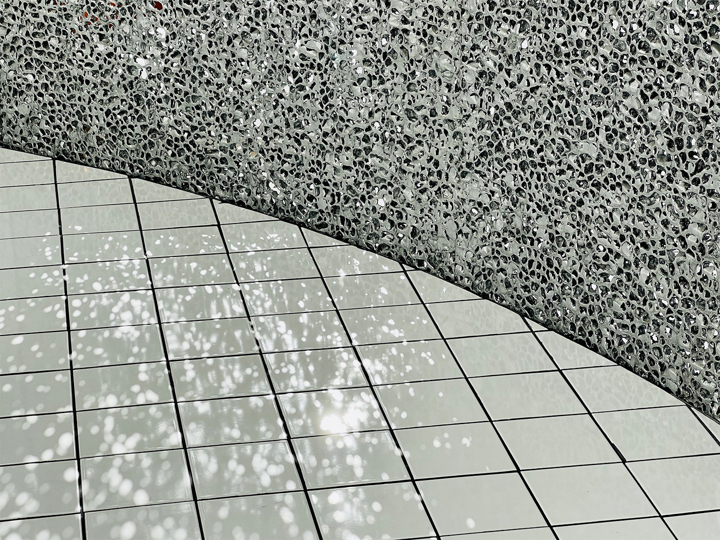
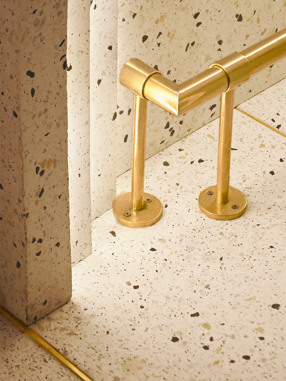
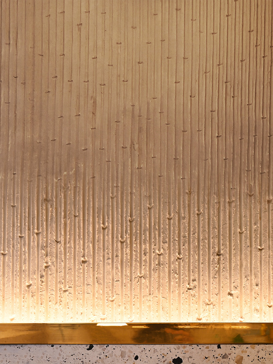
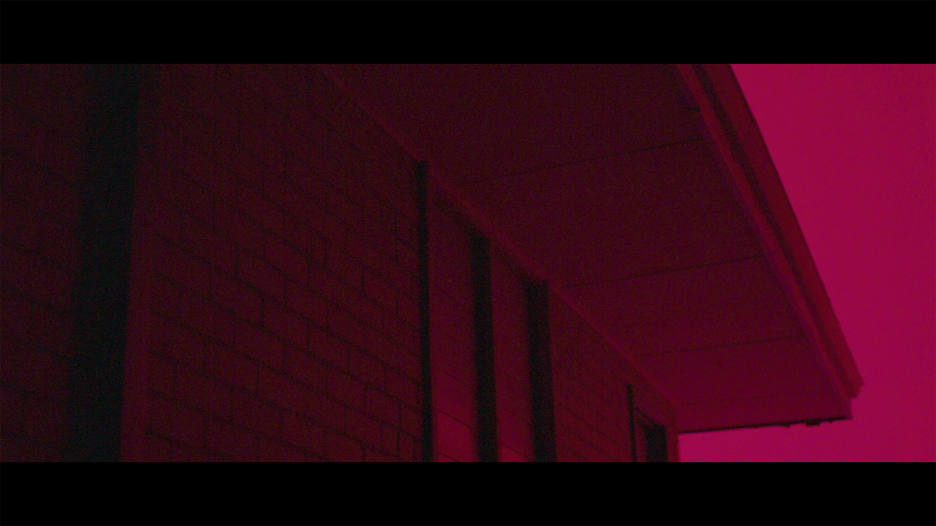
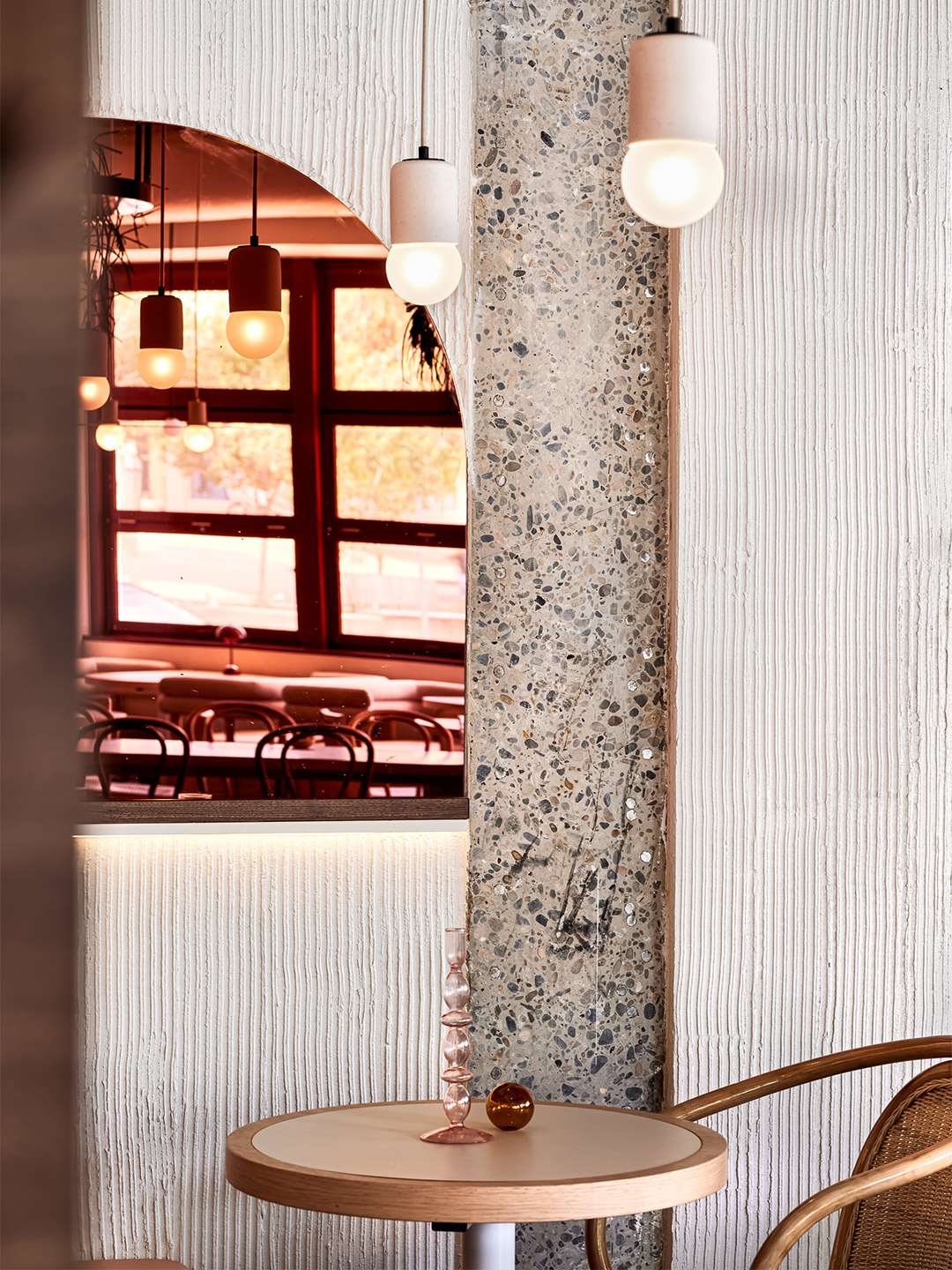
The design of the square knits-in well with the surrounding urban fabric and the brickwork continues the masonry language of the locality. The materials palette is restrained: red bricks, red pavers, raw concrete, painted metal, river stones, hardwood seats and bollards. It’s a beautiful sight when combined with the lush plantings and off-form concrete of the overpass. As the subtropical plantings, which include 3500 varieties, such as native violet, birds nest ferns, blue ginger and over 70 Australian tree ferns establish themselves, the square is taking on a life of its own and will continue to change with the seasons.
When walking up and down Fish Lane, the brickwork relates seamlessly to both old and new, and the pavers spill out and blur the edge of pedestrian territory. Richards & Spence has explored the language and detailing of brickwork: enjoying moments that provide relief within facades, depth to window recesses, test the skills of trades and have tipped their hat to architectural influences like Carlo Scarpa. Windows are detailed so as to not compromise the brickwork and provide moments within the overall composition of the buildings.
It is important to remember that, until recently, this space was an unloved car park. The architecture, landscape and materiality are all impressive, but it is perhaps the urban gesture that is most compelling. It recalls other unused spaces within the city, and what potential they hold in creating places and connections for people where previously there were none.
richardsandspence.com; explorefishlane.com.au
This feature first appeared in the fifth edition of FOLIO, a publication by Brickworks. Devoted to exploring how architectural ideas are turned into reality, the magazine presents world-class projects and experimental ideas in architecture and design. Request your free hard copy here.

Fish Lane Town Square is a refined public project by Richards & Spence that contributes strongly to Brisbane’s evolving city character.
Love the Fish Lane Town Square in Brisbane by Richards & Spence? Catch up on more hospitality design and architecture and commercial spaces. Plus, subscribe to the Daily Architecture News e-letter to receive weekly updates of the world’s best projects, ideas and exhibitions.
Related stories
- Hotel Les Deux Gares in Paris by Luke Edward Hall.
- Inside the Ace Hotel Kyoto by Kengo Kuma and Commune.
- Holiday maker: The Calile Hotel by Richards and Spence.
- Plesner Architects delivers decadence at the Six Senses Shaharut resort in Israel.
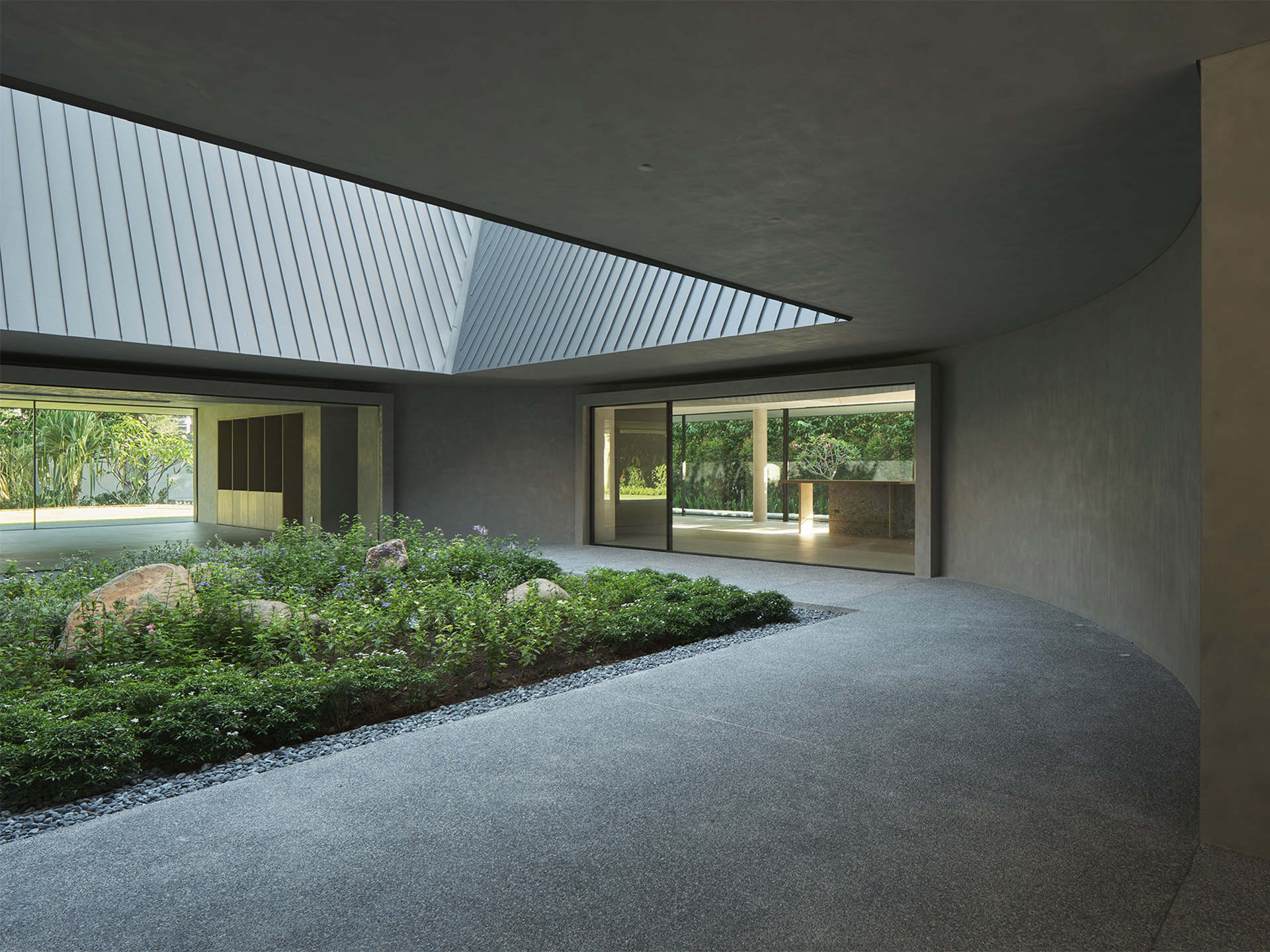
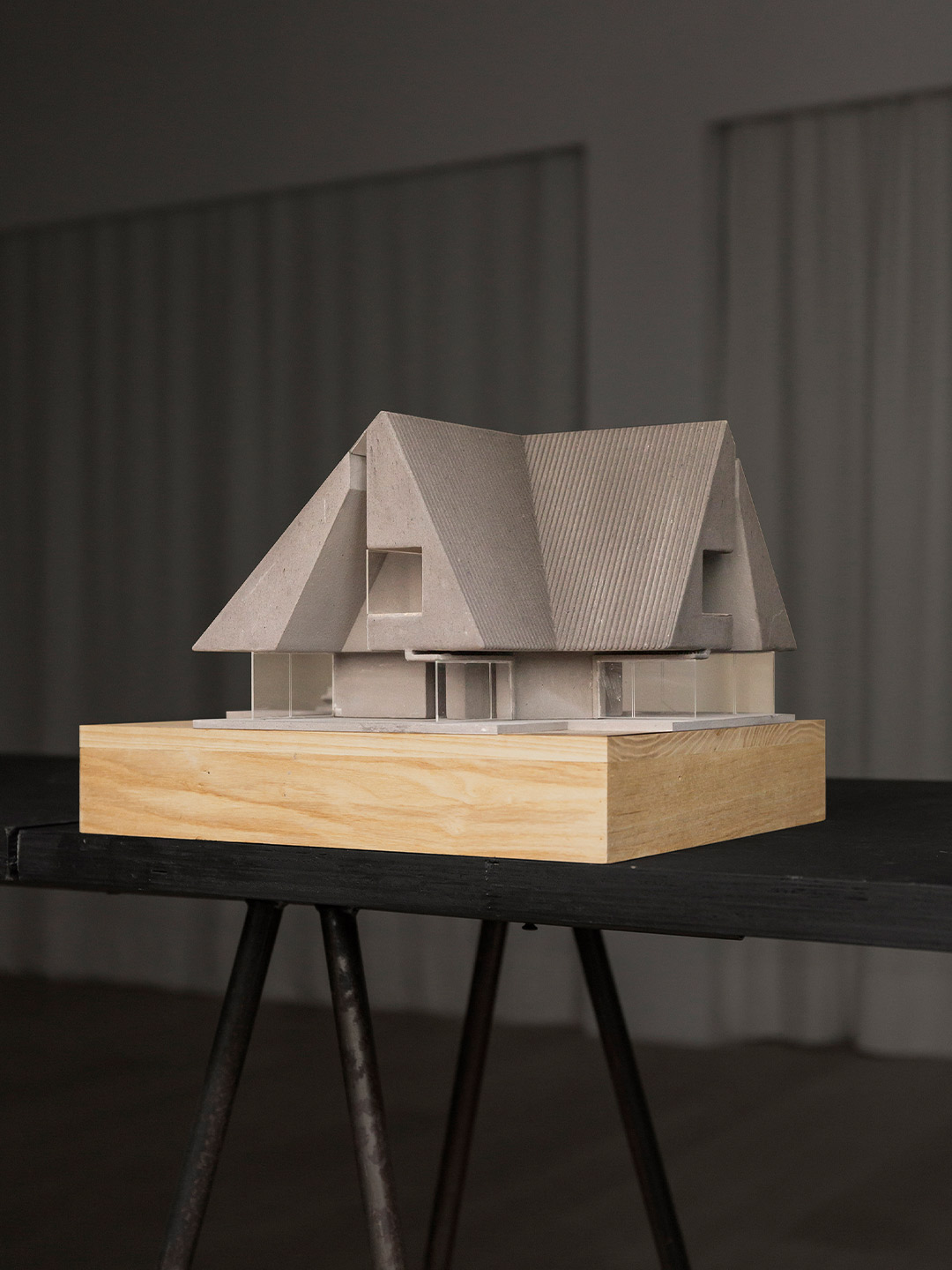
The traditional Chinese courtyard house or siheyuan is a typology well-known for its illustration of Confucian ideals, accommodating extended family units wherein many generations live under one roof. To live under the same roof means to live together, and this metaphor is the nexus that ties the notion of community, especially in an intimate context, to the form crafted for this project. For this private residence commission, Neri&Hu were given a set of unique requests by the client: the new house constructed in place of the previous one should accommodate all three siblings, who as adults have outgrown their shared house; it should include a small memorial space in the form of a garden for their late mother; and lastly, the new construction should retain the memory of the pitched-roof form, a defining feature of their childhood home.
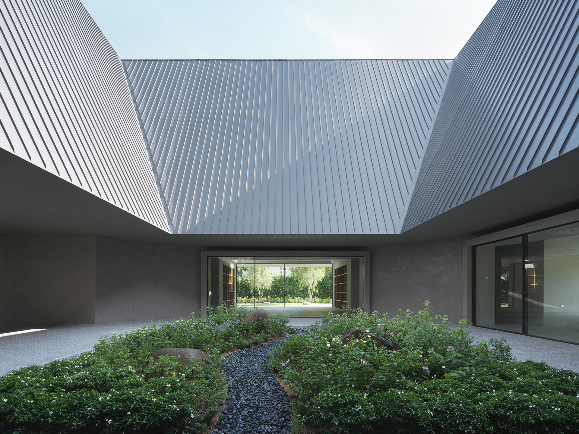
In this project, dubbed the House of Remembrance, Neri&Hu has explored how notions of communal living and collective memory can be expressed spatially. The original site featured a lush vegetated edge that formed a natural green buffer along the perimeter, a feature that the designers have retained. The previous house was built in the style of the British colonial bungalow, with hybrid elements of traditional Malay houses such as deep roof eaves for rain sheltering, as well as Victorian details. Understanding the functional importance of the roof and the client’s emotional attachment to its form, Neri&Hu embraced the symbolic nature of the pitched roof and combined it with a reinterpretation of the courtyard house.
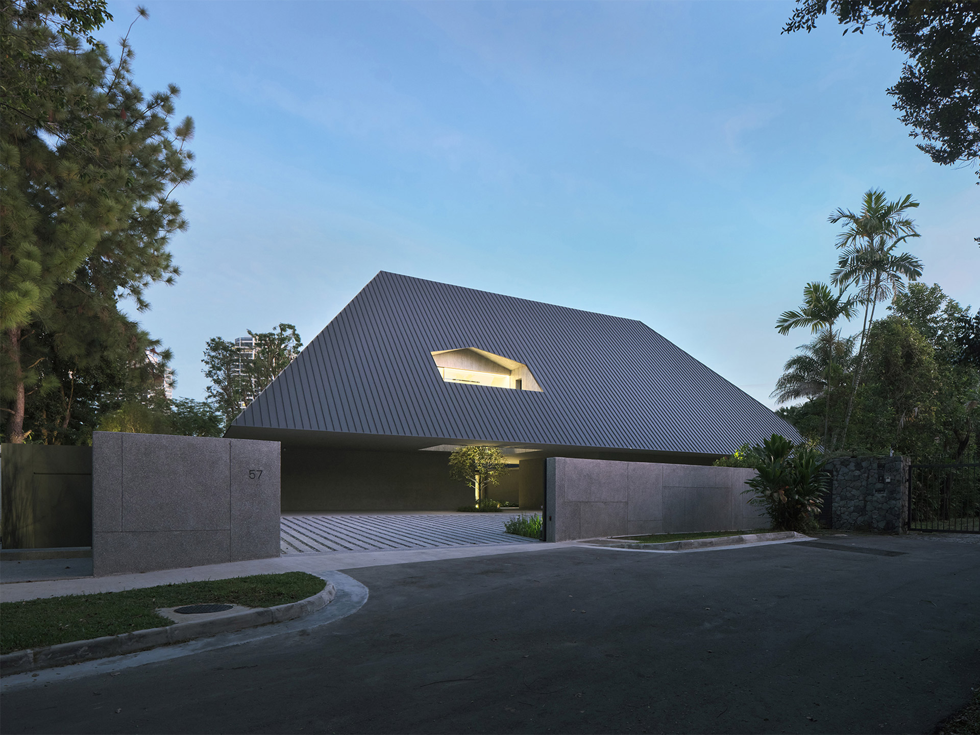
House of Remembrance in Singapore by Neri&Hu
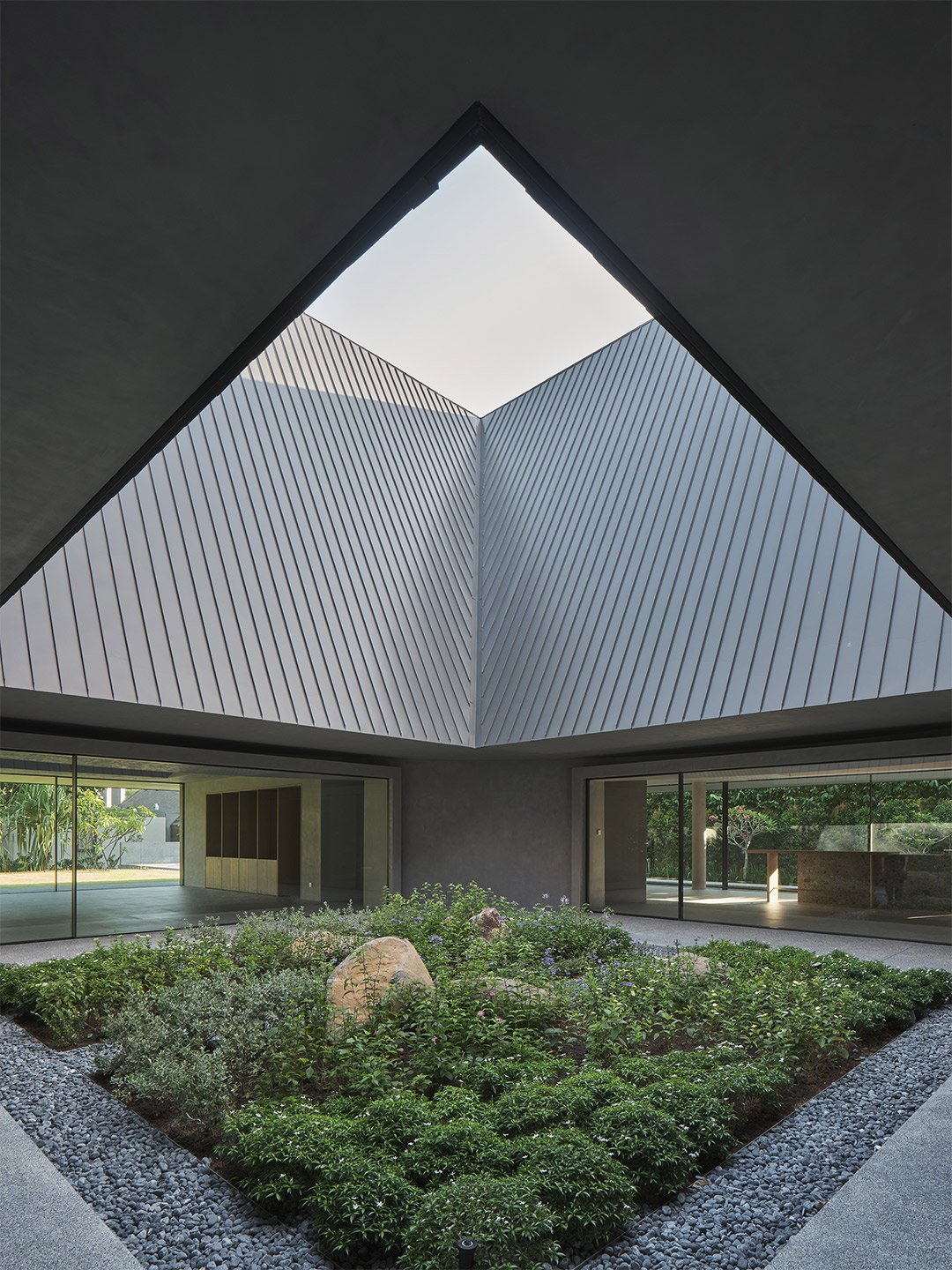
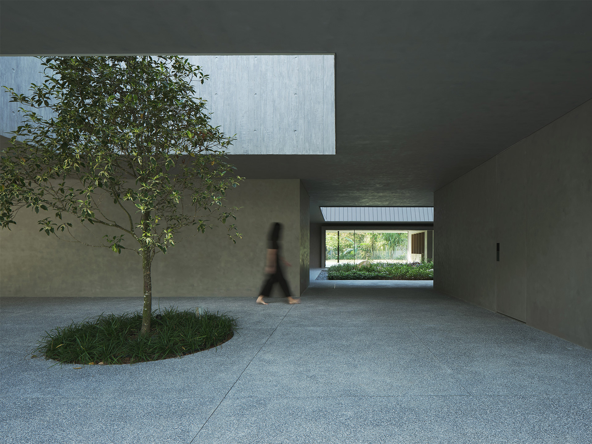
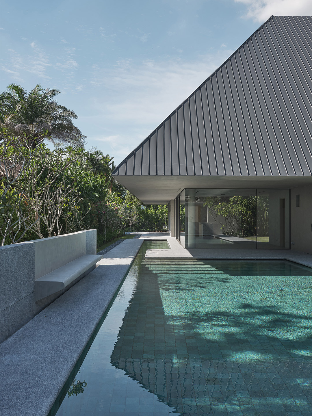
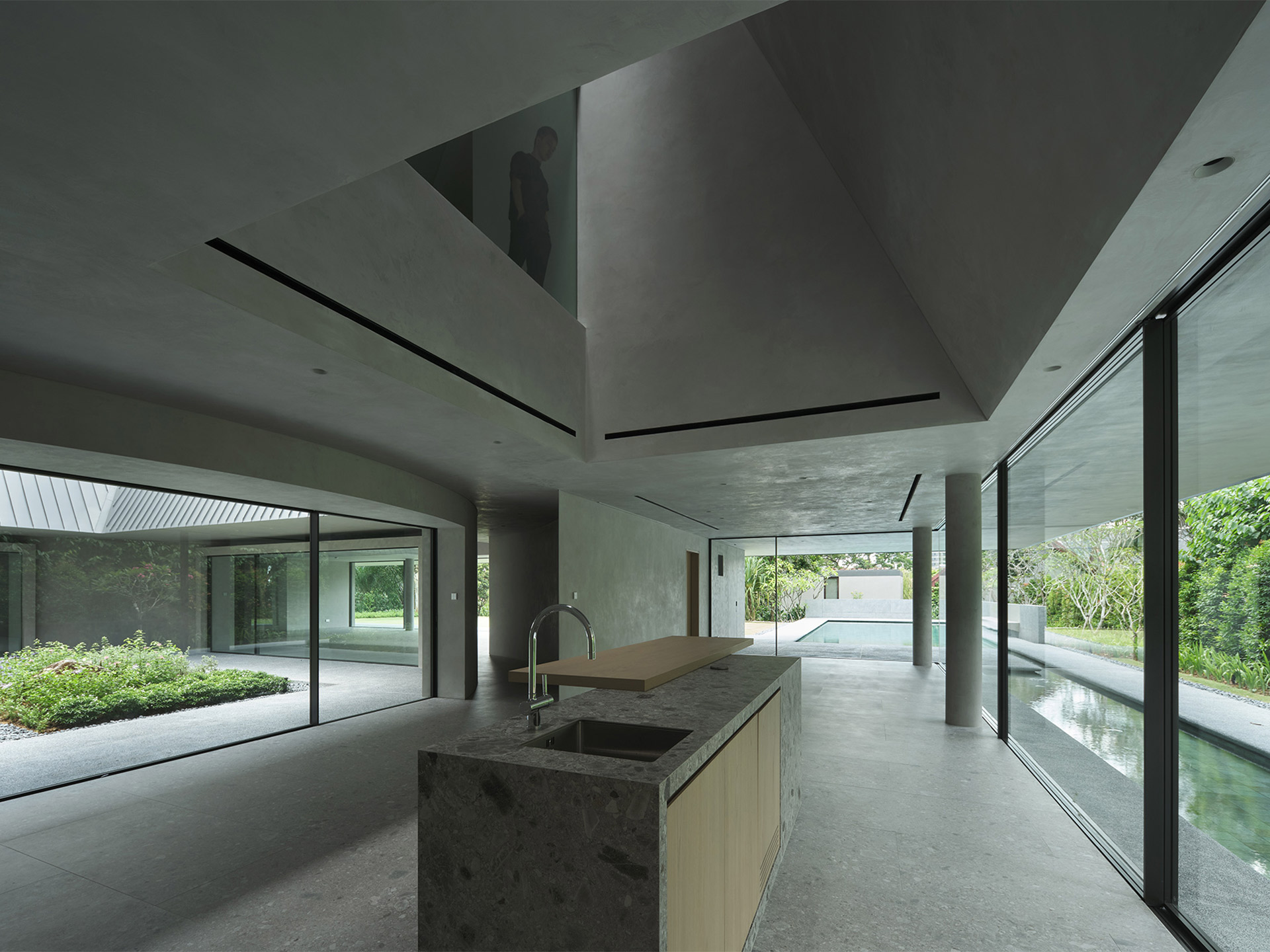
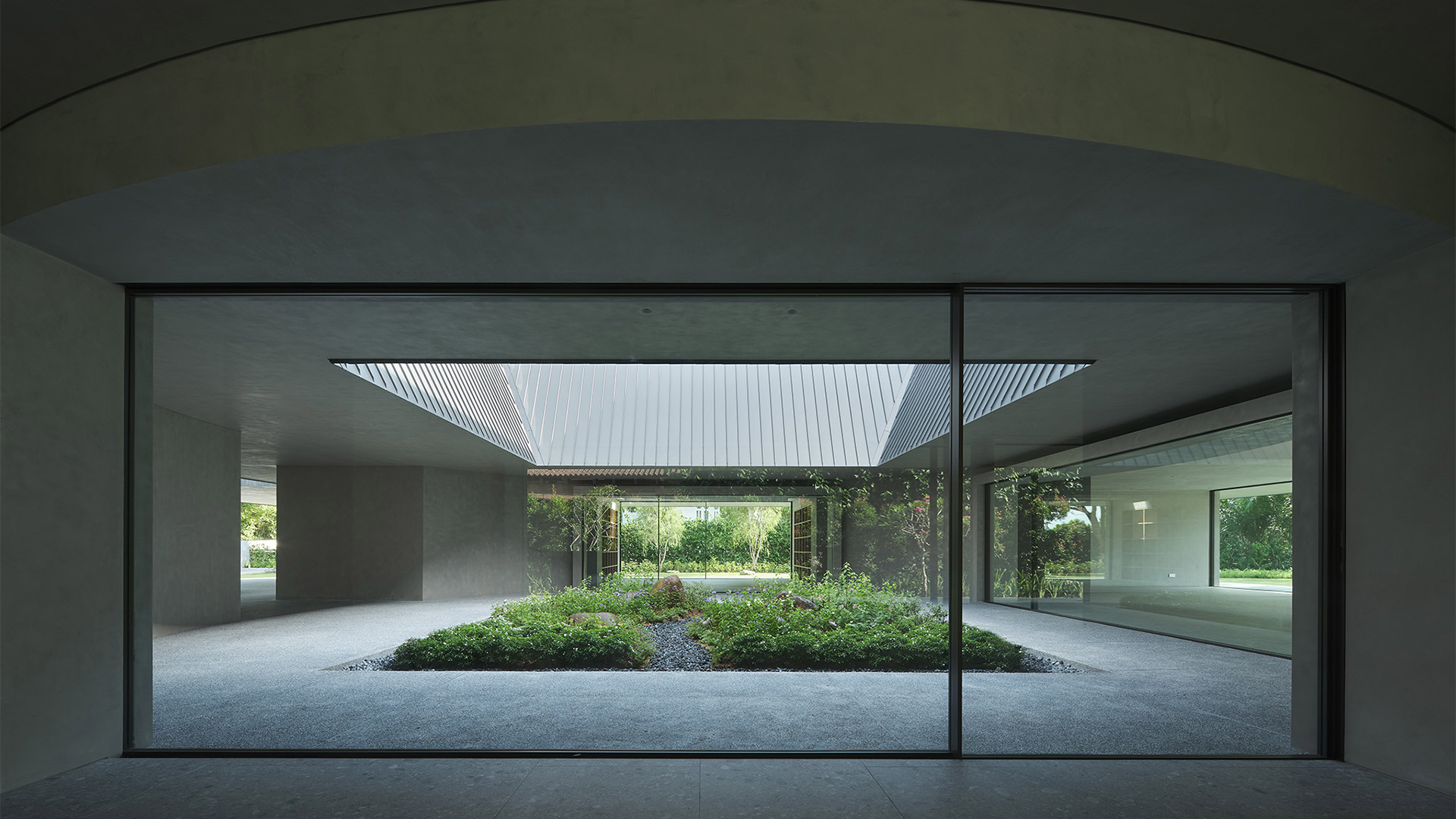
The new two-story house organises all communal spaces around a central garden, which occupies the courtyard space serving as a memorial garden for the family’s matriarch. The ground level is extroverted in nature, with expansive glass walls to connect all spaces to the gardens along the edge of the site. Neri&Hu aims to maximise visual transparency from the communal areas – living room, open kitchen, dining room and study – so that from the ground floor the inhabitants may look into the central memorial garden while cocooned by the dense vegetation surrounding the house. Large glass doors can slide open, so that in optimal temperate conditions the house can take advantage of cross ventilation and direct access to the gardens.
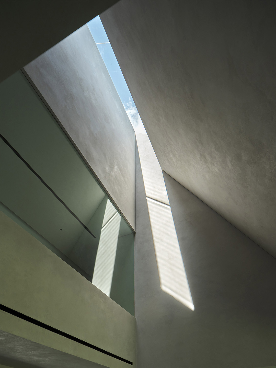
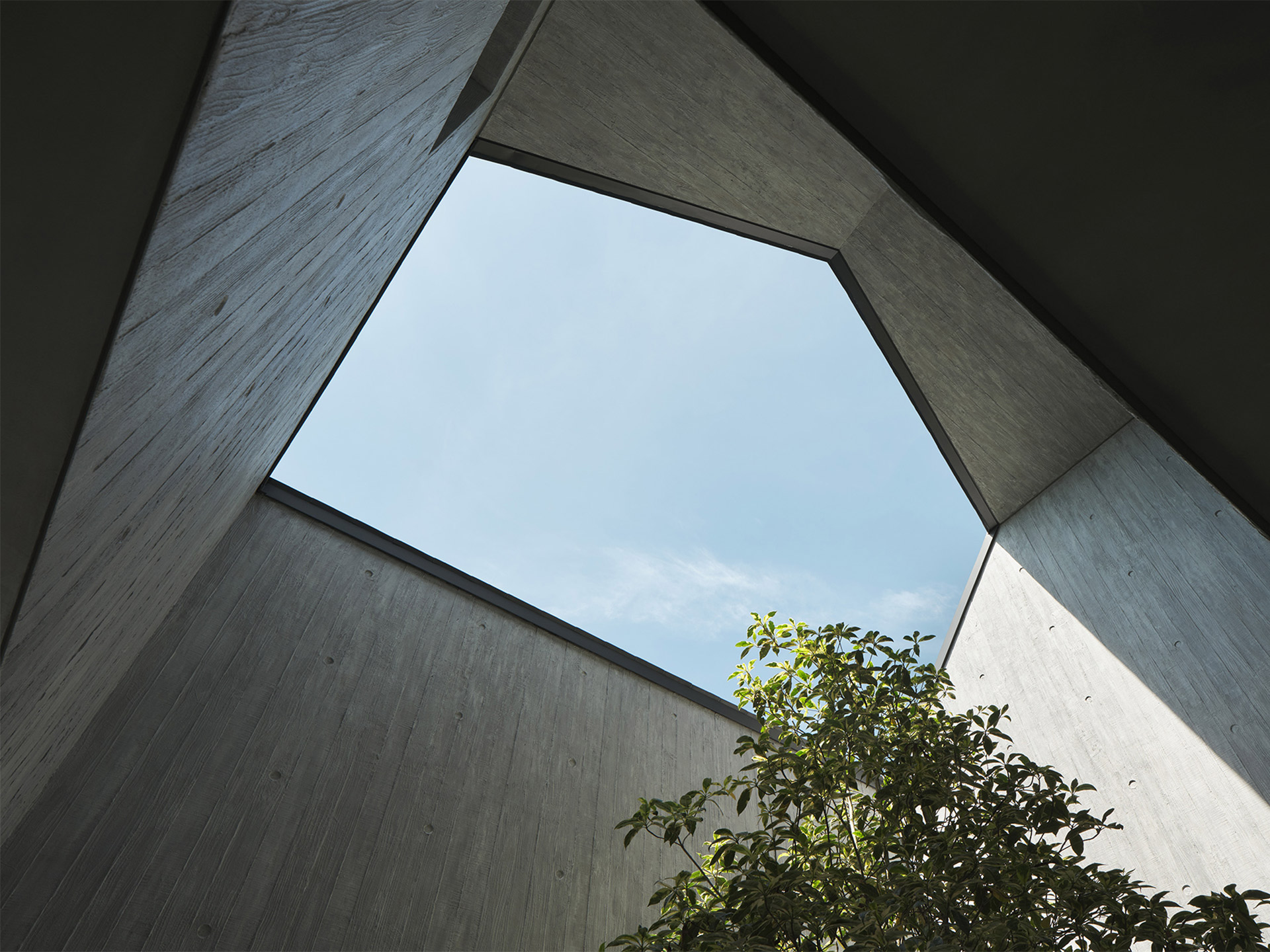
For the upper level, Neri&Hu pursues the idea of the pitched-roof form as not only a signifier of shelter, but also an element that both unifies and demarcates the public and private realms. All private bedrooms, located on the upper introverted level, are housed within the roof’s steep gables so that when seen from the exterior, the house retains the appearance of a single-story hipped-roof bungalow. Skylights and large glass walls connect to bedroom balconies where views are oriented outwards to the perimeter garden spaces. Through sectional interplay, the design team introduce three double-height areas to connect the communal functions and the corridors above. These spaces of interpenetration create vertical visual connections to allow one to peer into the public realm from the private.
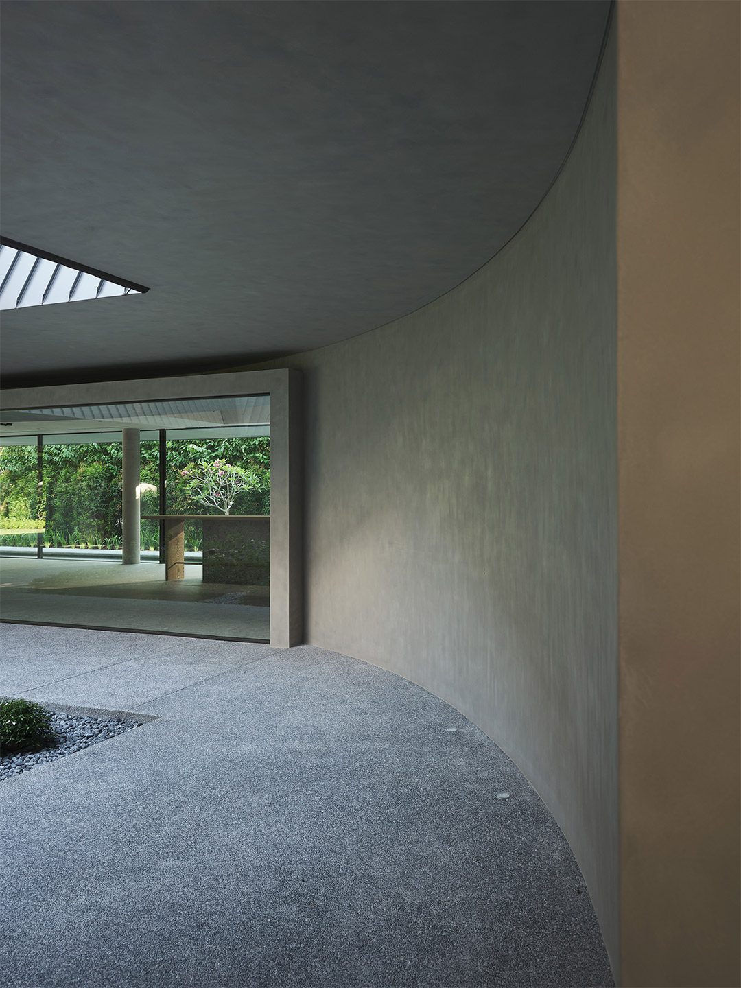
One can see a carved void in the roof volume, which frames a small tree before arriving at the central memorial garden. On the exterior, where balconies and sky wells are carved out from the volume of the pitched-roof form, the walls transition from smooth to board-formed concrete to take on the texture of wooden planks. The circulation on the ground floor is based on the shape of the circle to reinforce the ambulatory experience of walking in the round and to define the memorial space as a sacred element. Since the circle has no edges or terminating vantage points, it allows one to always find a return to the centre both spiritually and physically. The garden symbolically defines the heart of the home as an ever-palpable void, persisting as the common backdrop to the collective lives of all inhabitants.

The garden symbolically defines the heart of the home as an ever-palpable void, persisting as the common backdrop to the collective lives of all inhabitants
Love the House of Remembrance by Neri&Hu? Catch up on more hospitality architecture and design and residential design, plus subscribe to receive the Daily Architecture News e-letter direct to your inbox.
Related stories
- Resa San Mamés student accommodation in Spain by Masquespacio.
- The bar and restaurant at La Sastrería in Valencia by Masquespacio.
- Mama Manana restaurant in Kyiv by Balbek Bureau.
- Gold ‘n’ arches: Bun burger restaurant in Milan by Masquespacio.
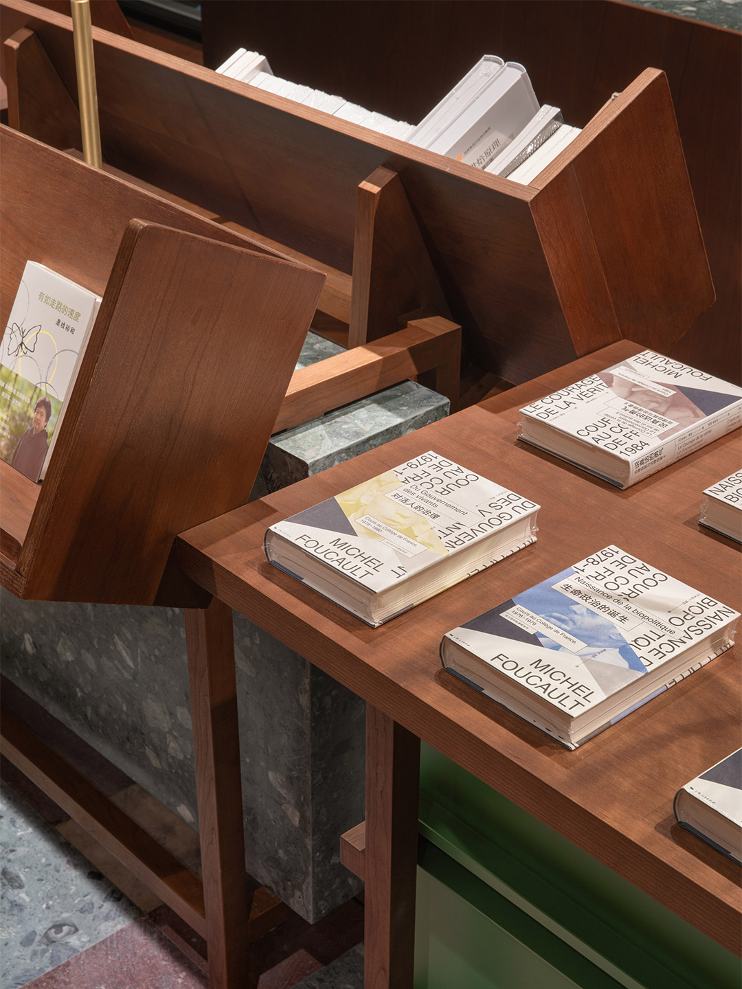
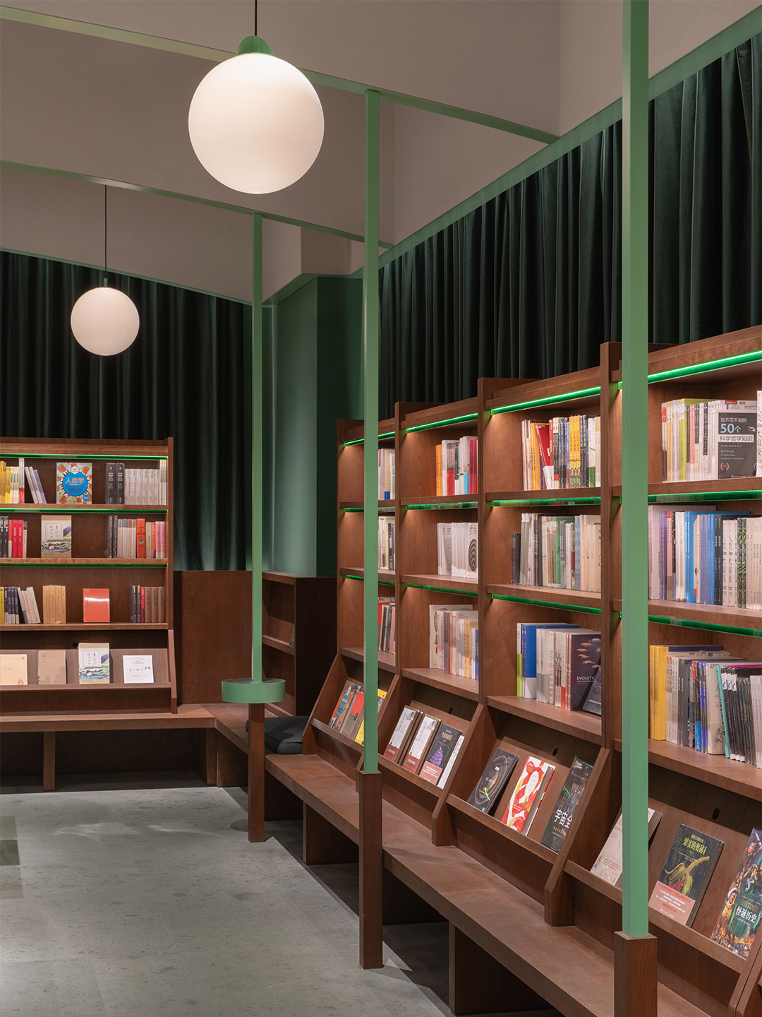
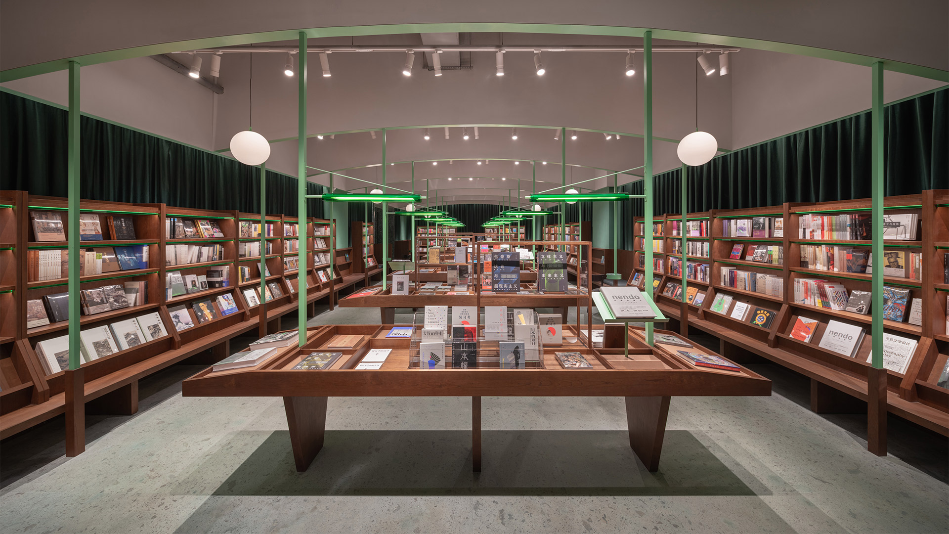
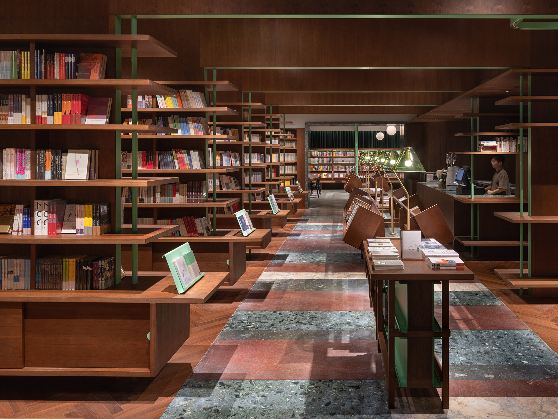
Published over two volumes, The Common Reader is a collection of essays exampling the eccentricity and entertaining brilliance of English writer Virginia Woolf as a literary critic. The same title was recently given to an independent bookstore in Hangzhou, the capital of China’s Zhejiang province. The store, designed by Shanghai-based architecture and interiors firm Atelier tao+c, takes inspiration from Woolf’s writings. But it also recalls the nostalgic experience of reading among the aisles in an intimate old library, where turning the pages of an unputdownable tome would capture the spirit and transport the mind.
From an early stage in the design process, the architects at Atelier tao+c reached a mutual understanding with their client that the Common Reader should not just be a “storage room” for books. Rather, it should also be a place for people to get involved with “collecting social memories and absorbing knowledge,” the tao+c team suggests. As such, the architects say they seized the opportunity to “probe” into reading behaviour. This investigation allowed them to craft an interior where readers can concentrate solely on reading, achieved by reducing the objects in the space to only what was necessary: bookshelves, display tables, seats and reading lights. “There are no other elements standing in the room,” the architects explain.
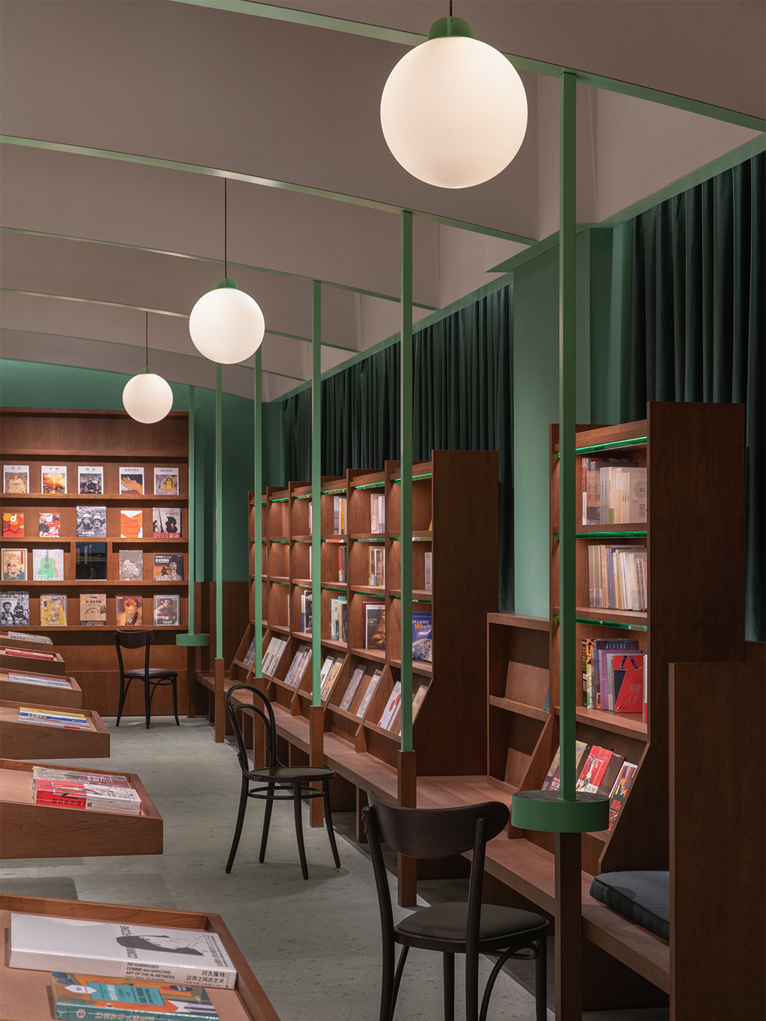
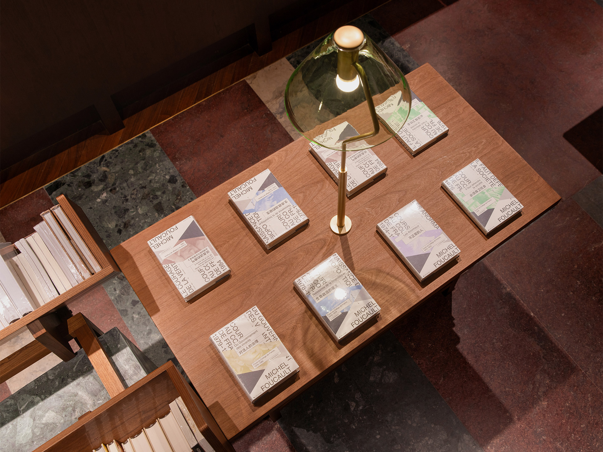
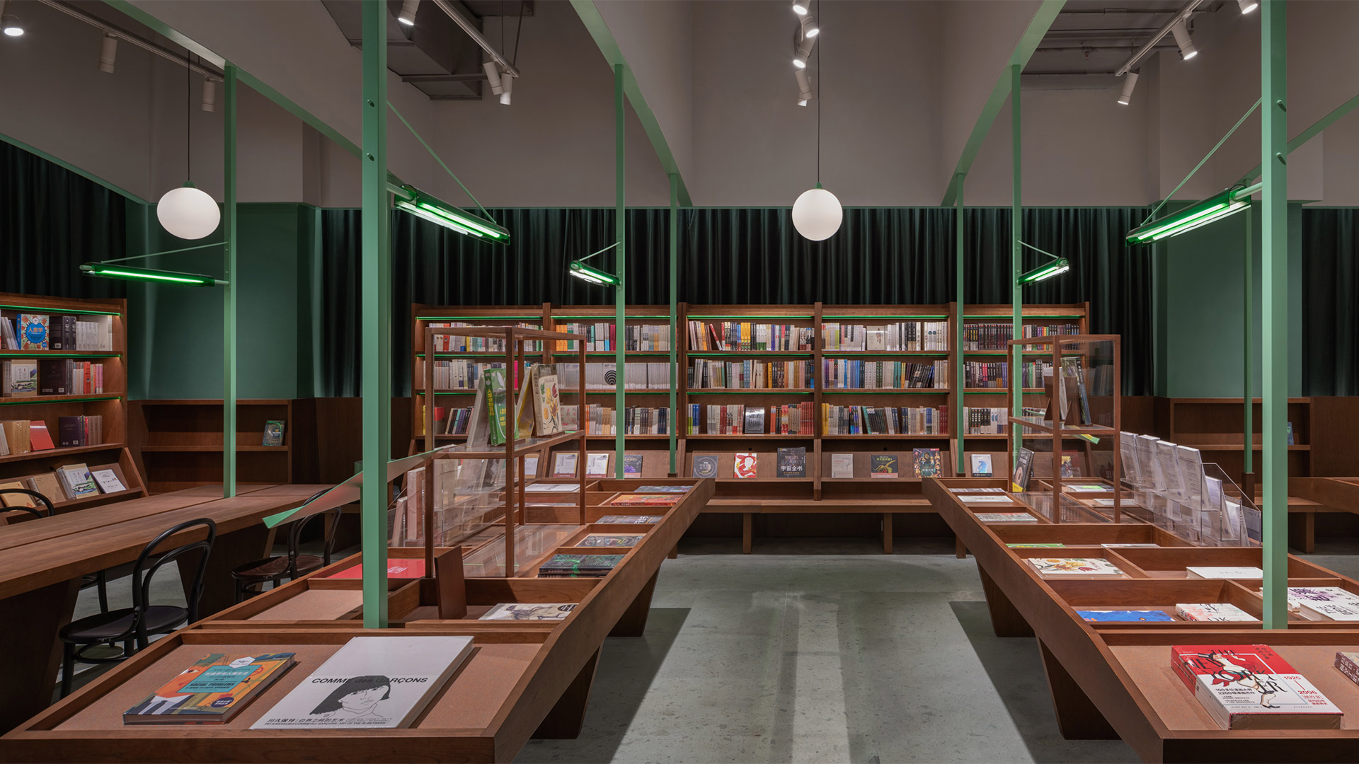
Common Reader bookstore in Hangzhou by Atelier tao+c
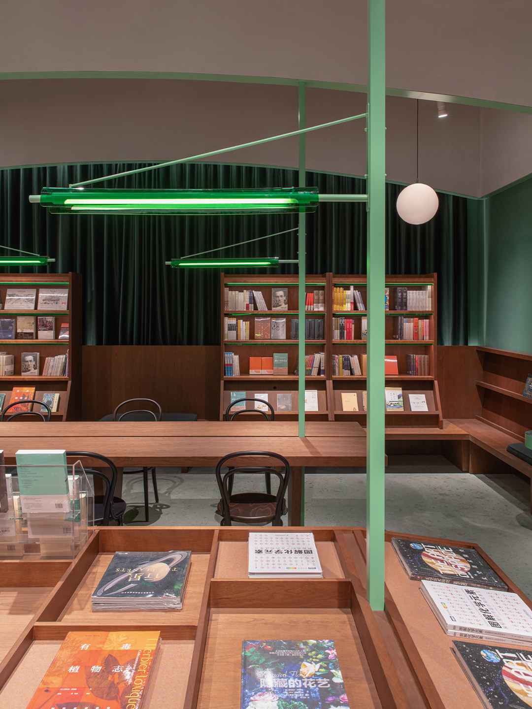
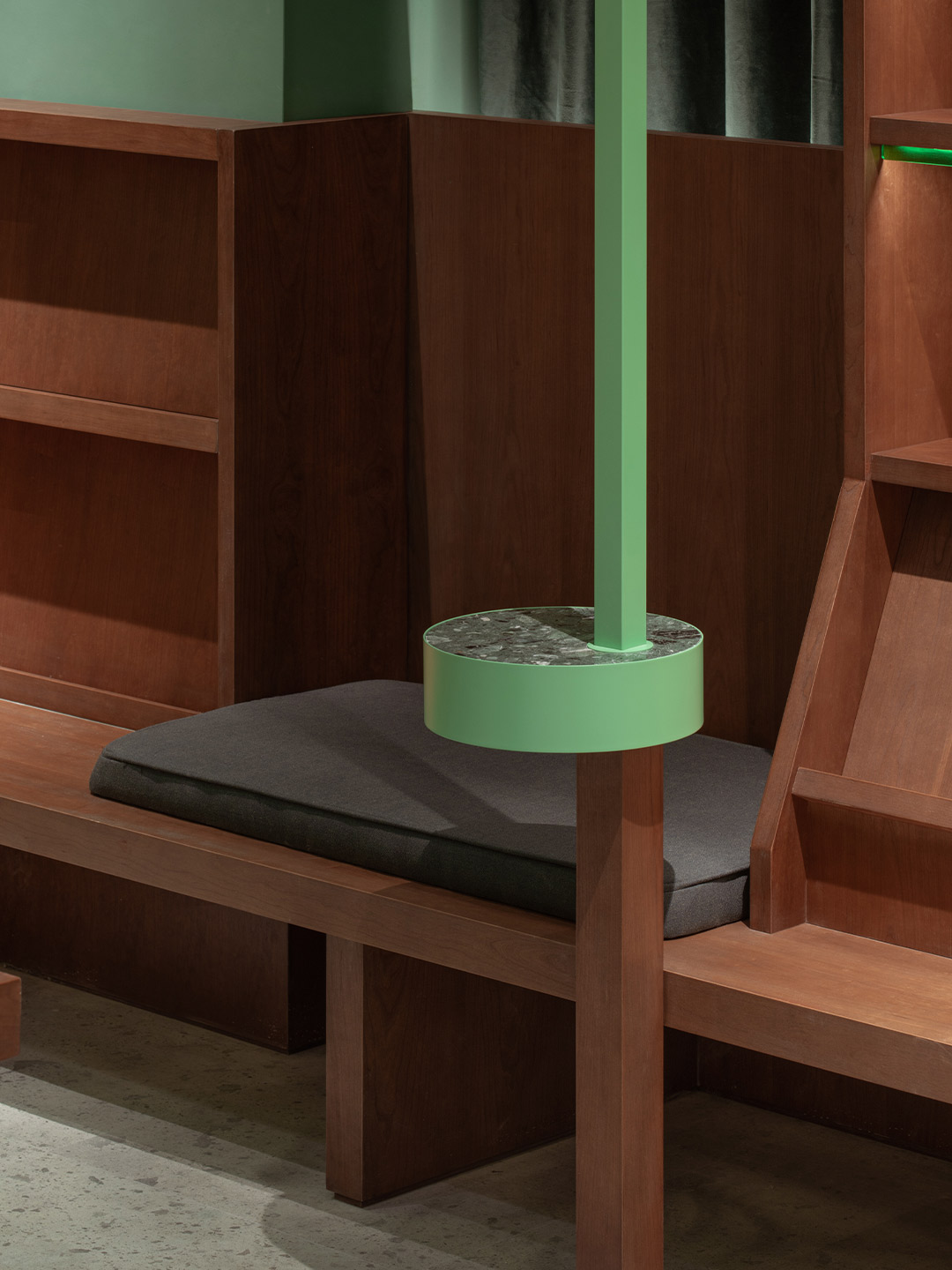
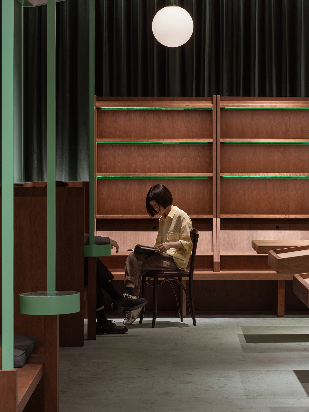
In order to encourage the bookstore’s visitors to find a spot and settle in, the tao+c team says they introduced a combination of dark-toned timbers and bright green detailing. This is intended to evoke people’s memories of spending time in classic woody-scented libraries, surrounded by the colours presented by the bindings of beautiful books. At the Common Reader, the ambiance created by the finishes alone invites readers to stay in, while the thoughtful patchwork of practical task lighting enables them to read and write.
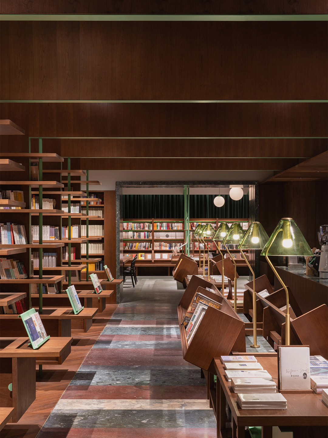
The L-shaped site was broken down into two rectangular rooms with two different atmospheres, where the layout of each space became informed by the direction of the bookshelves. In the room nearest to the street, dark green curtains cloak the perimeter, creating a soft boundary that offers a sense of privacy. A timber bench forms a continuous horizontal surface around the fringe of the space. The tall bookshelves are placed on top “like loose furniture,” the architects say. “Those bookshelves are hovering at a suitable height to ensure that every book is accessible,” they add.
The gaps between the sets of bookshelves form deep seats, here and there, so that people can sit and start reading as they discover their favourite book. In the centre of the atrium, seven display tables are equipped with customised glass bookshelves and magazine shelves, the surfaces of which are divided according to the size of the titles they showcase. “The horizontal array of tables and the vertical green metal columns [forms] the spatial sequence which enhances the feeling of depth,” the tao+ team says, adding that they believe this design technique also reminds people “of the old-time reading room”.
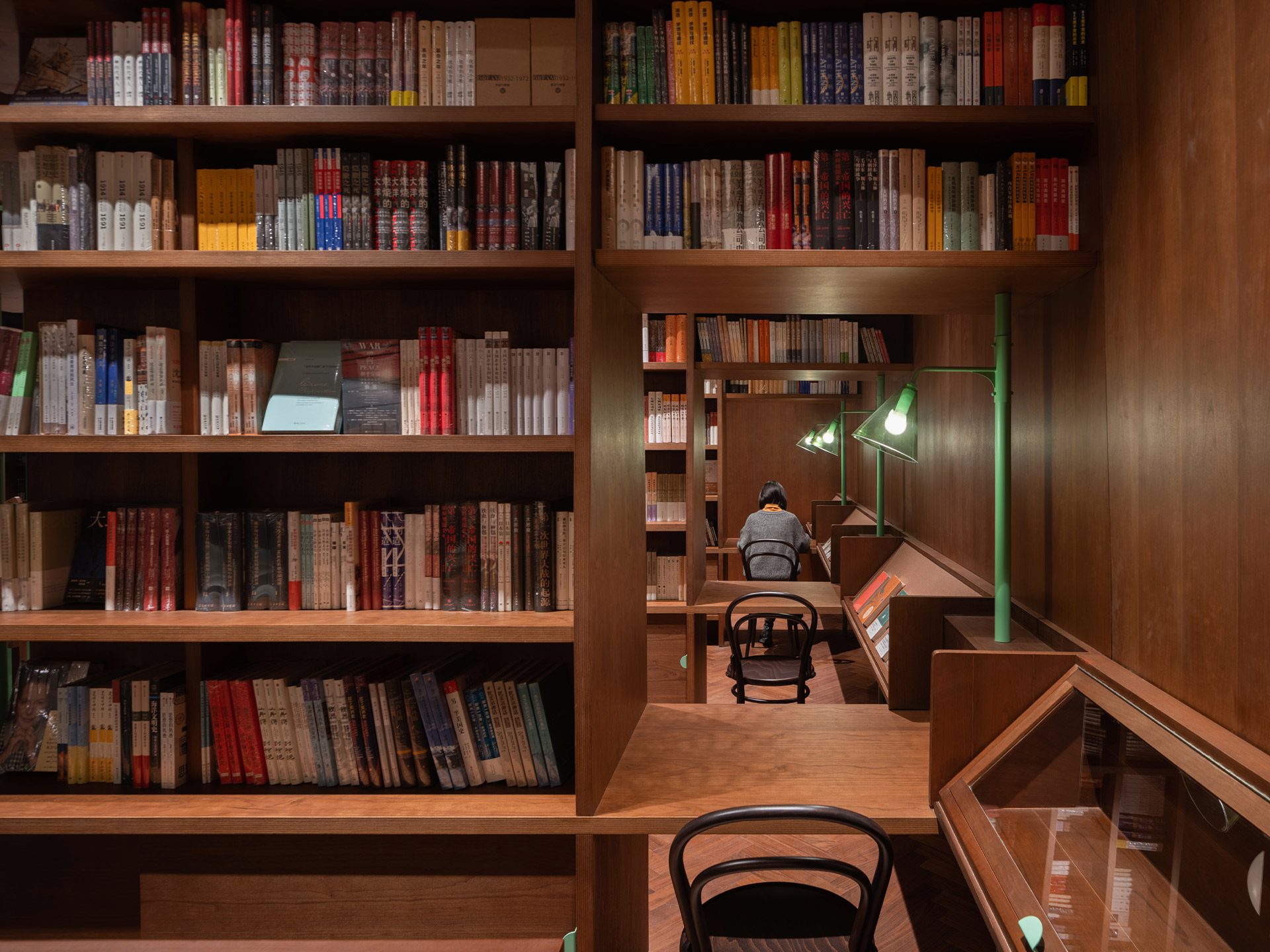
The other main zone in the bookstore is reached through a green stone doorway. It’s described by the architects as feeling “deeper” than the first room and invites readers to explore more thoroughly the private library ambiance of the bookstore. Here, the double-sided shelves form multiple layers in the space. “The distance of the bookshelves [and] the scale of the walkway have been deliberately compressed, constructing an intimate spatial atmosphere,” the designers say. “A four-sided enclosure was embedded at the end of each bookshelf, which functions as a single desk within a relatively private reading space,” they add, noting that the seats that service each desk are also rather isolated.
Like any good bookstore, Common Reader features a cafe that keeps its visitors caffeinated between chapters. Set to one side, the cafe’s banquettes feature partitions between diners, offering readers a moment of “tranquility without interfering with the neighbours,” the designers suggest. But this isn’t the only customer-focused detail. “Every bookshelf, seat, and lamp [has been] specifically designed for each book and conforms to human’s reading behaviours,” insists the tao+c team, highlighting the oblique angles of the bookshelves that make it easy to grab and replace books, the mix of reading spots, and the carefully curated mood. “Just in the arrangements of the bookshelves, together with the relationship of the seats, [the bookstore] advocates the renaissance of daily reading and poetry which is quietly growing in the metropolis.”
Every bookshelf, seat, and lamp [has been] specifically designed for each book and conforms to human’s reading behaviours.
Some quotes in this feature have been adjusted for clarity.
In Italy, Spanish design firm Masquespacio created the Bun burger restaurant in Milan and in Turin. Catch up on more hospitality architecture and design and retail design, plus subscribe to receive the Daily Architecture News e-letter direct to your inbox.
Related stories
- Resa San Mamés student accommodation in Spain by Masquespacio.
- The bar and restaurant at La Sastrería in Valencia by Masquespacio.
- Mama Manana restaurant in Kyiv by Balbek Bureau.
- Gold ‘n’ arches: Bun burger restaurant in Milan by Masquespacio.
In October 1992, the inaugural edition of Casa Decor was held in an old convent on General Oráa Street in Madrid. It marked the first time that fifty design professionals had come together with the shared intention of carrying out a revolutionary project, the likes of which had never before been seen in Spain. From decorators and interior designers to architects, landscapers and artists, the participants were each assigned an empty room in the abandoned convent. They transformed its many spaces into a snaking “catwalk” of design, where the latest trends and innovations were displayed in a mould-breaking showcase, far from any conventional format.
The great success of the debut edition – and those that followed in its footsteps – lies in its formula. Casa Decor is unique and exclusive, and focused on three fundamentals. Firstly, it brings together in historic locations a large group of professionals with experience and prestige who, with great enthusiasm, wish to show their work and creativity beyond their projects for clients. It loops in brands from the homes and lifestyle sector, willing to make themselves known outside the circuit of the typical fairs. And finally, Casa Decor opens its doors to a non-professional public who are eager to discover new sensory and immersive experiences.
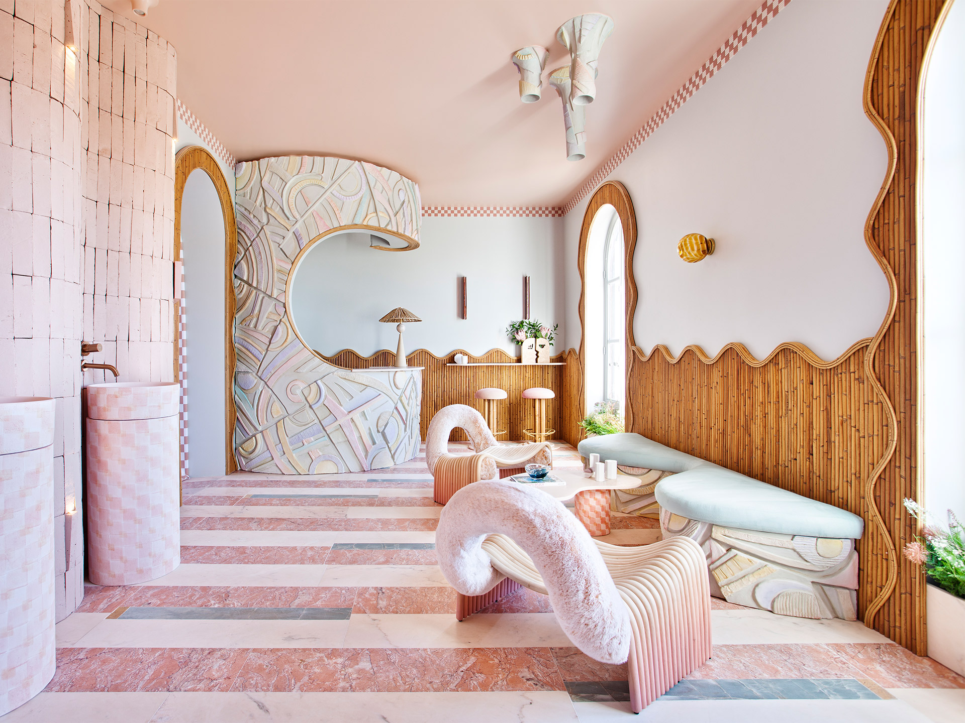
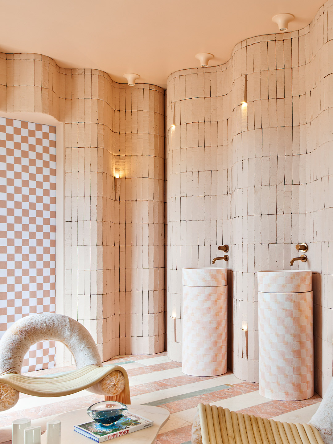
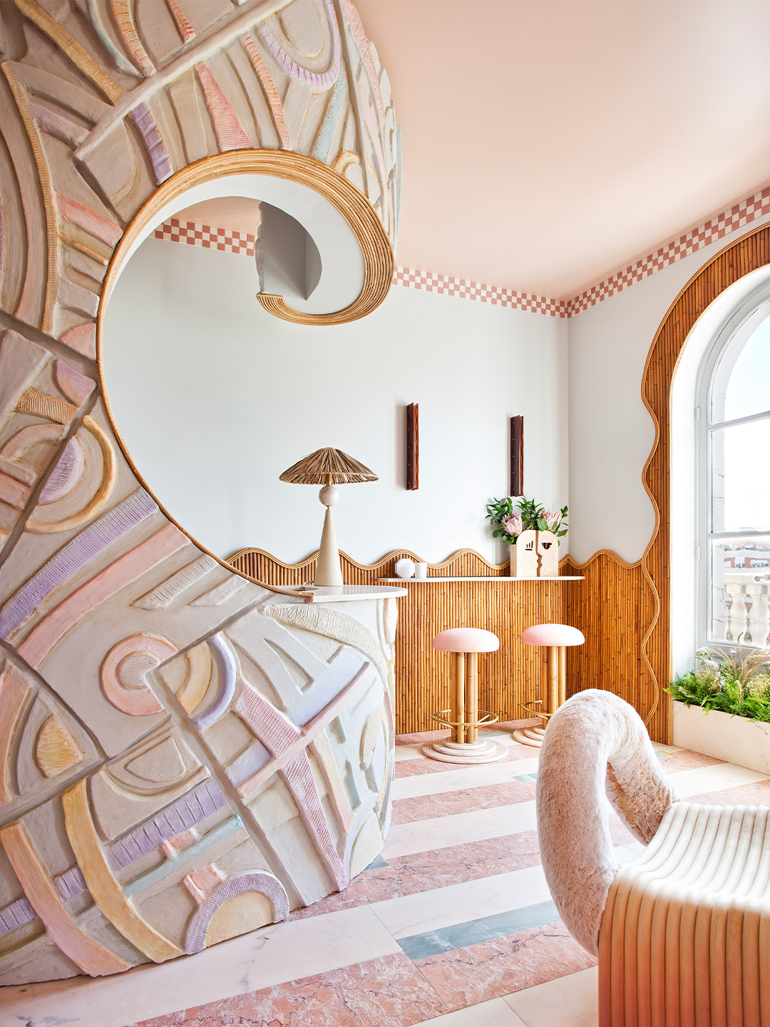
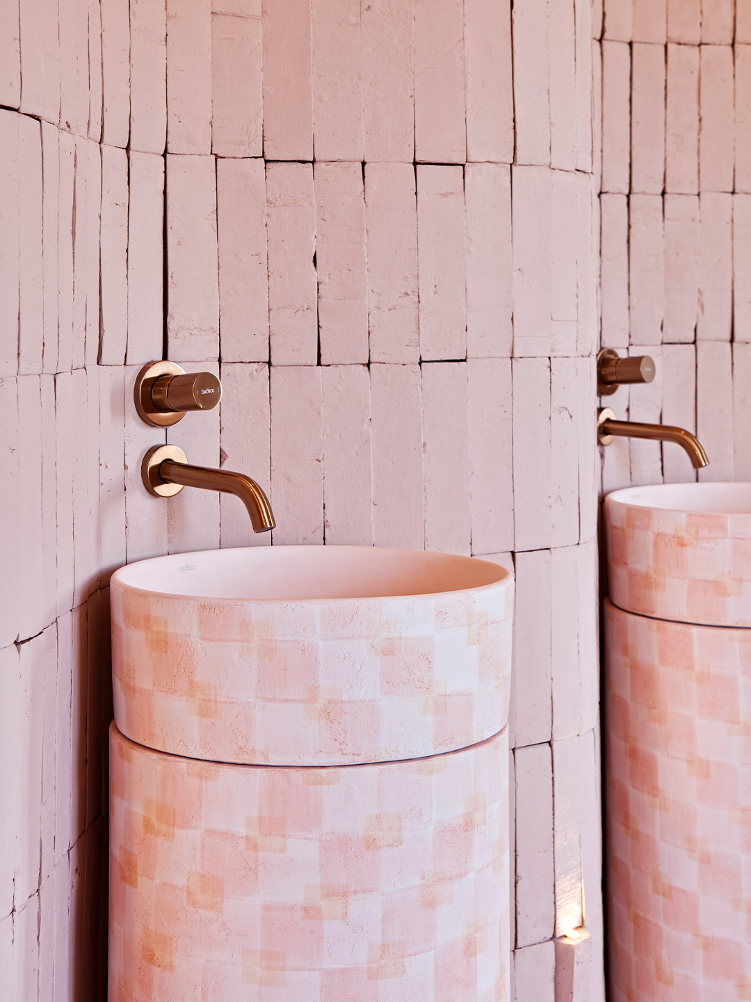
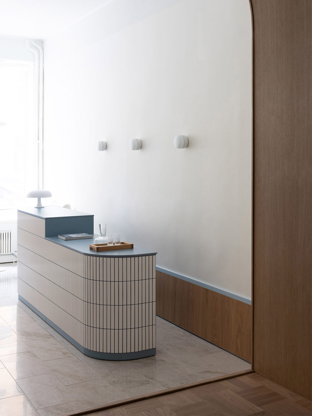
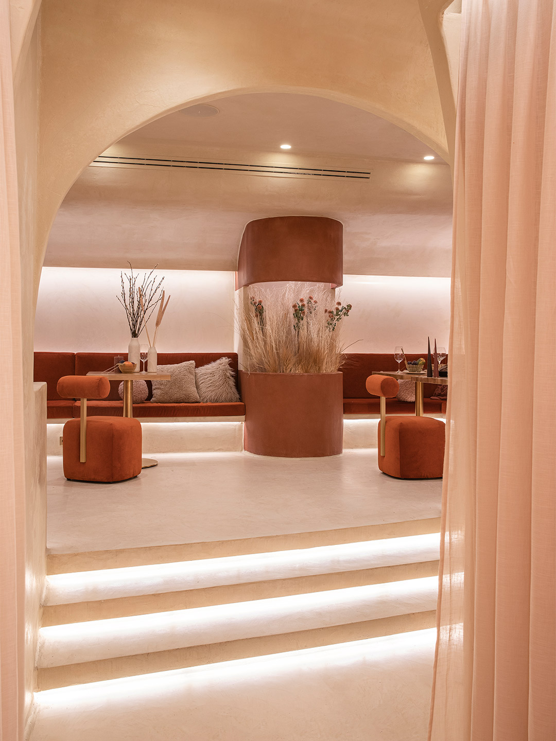
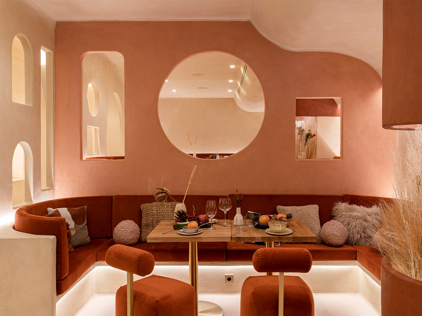
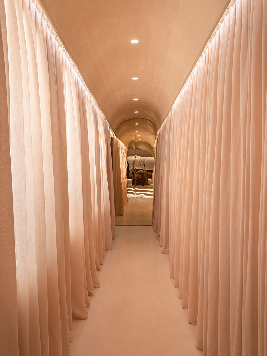
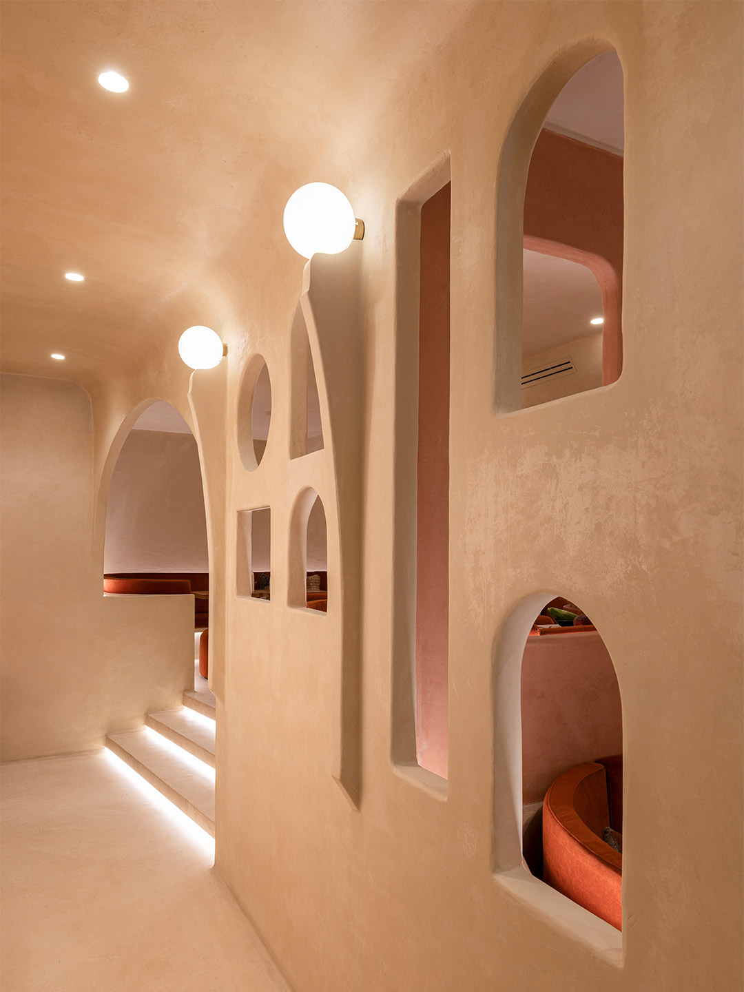
Patricia Bustos Studio unveils ‘Serene Touch’ installation for Bathco at Casa Decor 2022
For Casa Decor 2022, which is open for six weeks until May 22, the exhibition returns to the same neighbourhood that saw the birth of the first iteration 30 years ago, where 12 editions have cropped up since. On this occasion, the fair settles into the Goya 89 building in the commercial area of Goya Street, a 15-minute walk from the convent location of 1992. Built in 1920, the 4,600-square-metre residential building retains the original layout of the bourgeoisie homes that were common in this part of Madrid’s Salamanca district. In total, 54 spaces have been adapted across seven levels with many of the traditional elements retained. The succession of rooms, with high ceilings and an abundance of natural light, make magnificent vessels for the designers to do their best work, becoming a spectacular setting for Casa Decor’s 30th anniversary.
One of the spaces among this year’s presentation is the “hotel hall” – a new kind of hotel reception area by Patricia Bustos Studio, whose signature use of a dreamy pastel-coloured palette gives it a stand-out role. Created in partnership with bathroomware company Bathco, the conceptual interior, titled Serene Touch, is a tribute to the power of craftsmanship and how it can enhance experiences. It centres around the basin as a symbol of renewal and offers tactility through the diverse mix of materials put to use. “In a world in which we want to recover physical contact, the sink becomes a spring that returns us to space ready to use our most primitive and fundamental sense,” Patricia says, referencing what she believes is the first sense that humans develop at birth. “The one that produces the most pleasure – touch.”
Making use of shapely furniture and natural finishes such as hand-worked rattan, marble, ceramic and brick, Madrid-based Patricia explains that organic forms were employed in her studio’s design to reignite and encourage this sense of touch and exploration. “Feeling, in an era where everything is over-intellectualised, is presented to us as a way to explore what was always there,” she says. “Throughout all these years, craftsmanship has brought our body closer, through sight and touch, to experiences of beauty, respect and care. Now we flee to parallel universes without being aware of the loss of the corporeal and the impact it has on our lives, leading us to copied imaginaries, without soul, without meaning.”
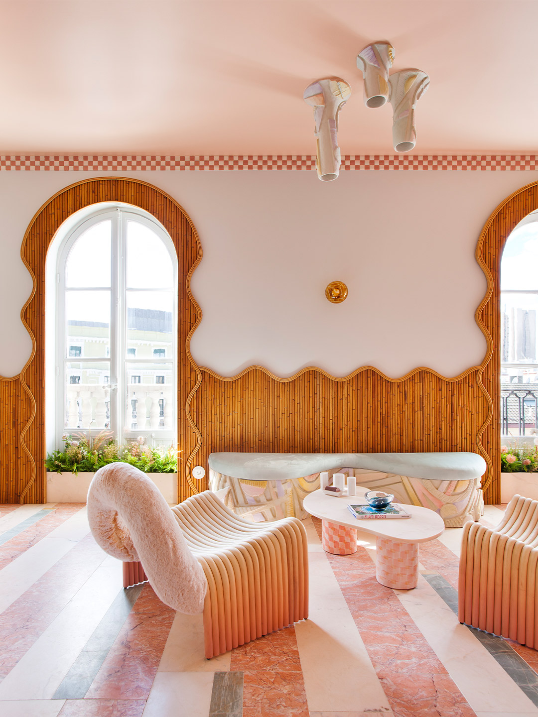
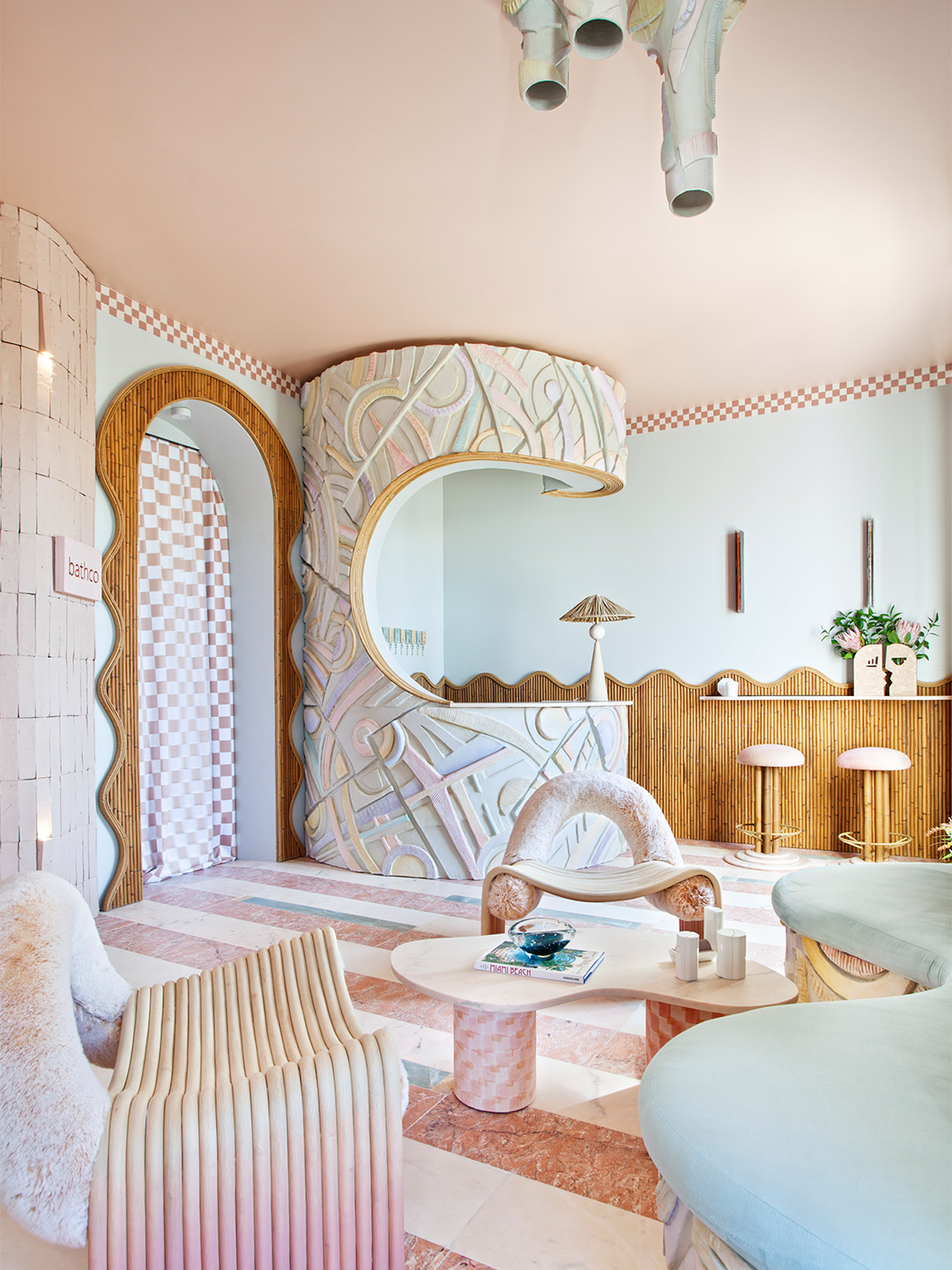
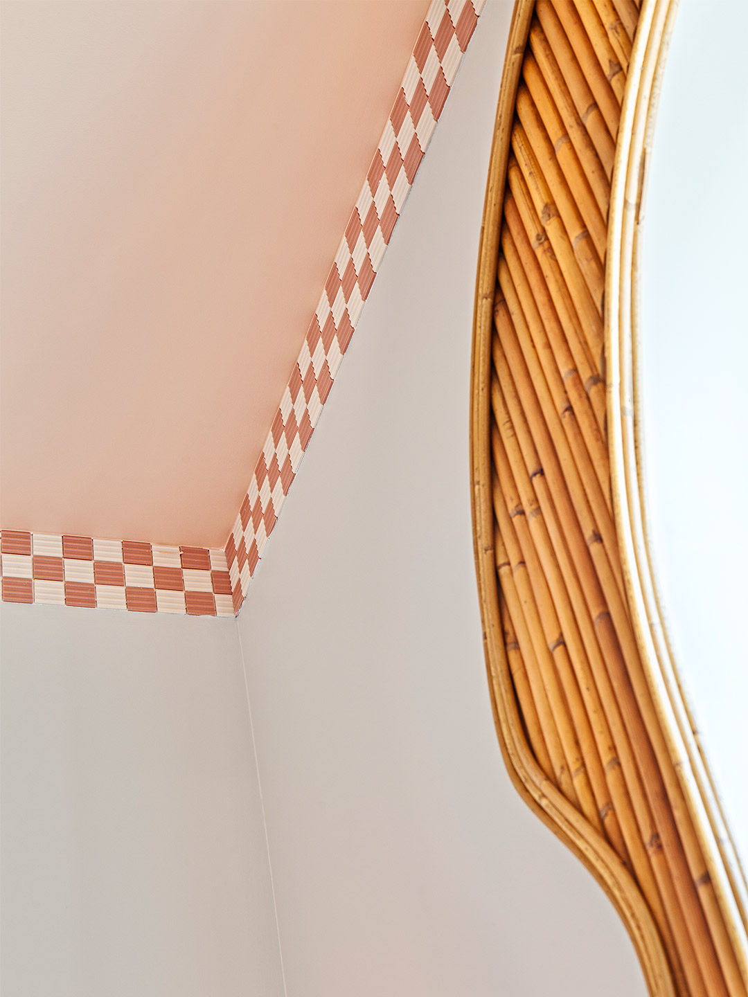
Adding to the appeal of the interior, the washbasins selected from Bathco’s range are unique and handmade. “We want to celebrate the imperfection of the artisan process, its affection, its nuances, its character and identity, making each product original,” says Patricia, who echoed the hand-painted chequerboard pattern of the ceramic basins on the legs of a low table, flowing drapes and as a cornice detail that traces the ceiling of the space. Enhancing the idea of imperfection, dry-stacked pink brick walls ripple behind the wet area. The wavy surface of the walls is then mirrored in the shape of the nearby panelling, connecting the doorway and windows in a gentle tide of rattan that brings warmth and inspiration. For the sculptural counter and central light-fitting, a troop of Bathco artists built the ceramic profiles by hand and painted them in gradients of pastel tones.
Over its 30 years, Casa Decor claims to have “anticipated” the houses of the future, suggesting that its presentations of inspiring rooms, such as Patricia’s, are eventually incorporated into homes and other spaces all around the world. With a similar level of passion, the exhibition’s organisers maintain a “real and inalienable” commitment to sustainability, something which must be applied in all areas of the exhibition. Imbued with its own character and personality, each Casa Decor building becomes the flagship to transmit the values of the exhibition: diversity, creativity and innovation. The buildings represent new challenges for design professionals and brands that, in turn, surprise and delight hordes of curious visitors each year.
casadecor.es; patricia-bustos.com
We want to celebrate the imperfection of the artisan process, its affection, its nuances, its character…
In Italy, Spanish design firm Masquespacio created the Bun burger restaurant in Milan and in Turin. Catch up on more hospitality architecture and design and retail design, plus subscribe to receive the Daily Architecture News e-letter direct to your inbox.
Related stories
- Resa San Mamés student accommodation in Spain by Masquespacio.
- The bar and restaurant at La Sastrería in Valencia by Masquespacio.
- Mama Manana restaurant in Kyiv by Balbek Bureau.
- Gold ‘n’ arches: Bun burger restaurant in Milan by Masquespacio.
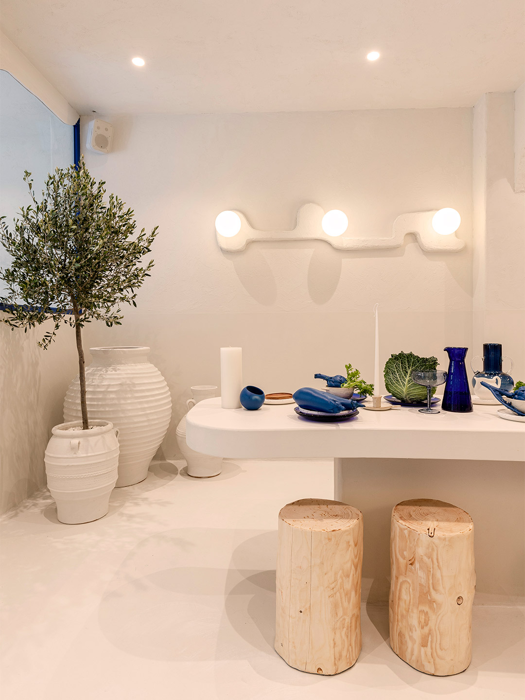
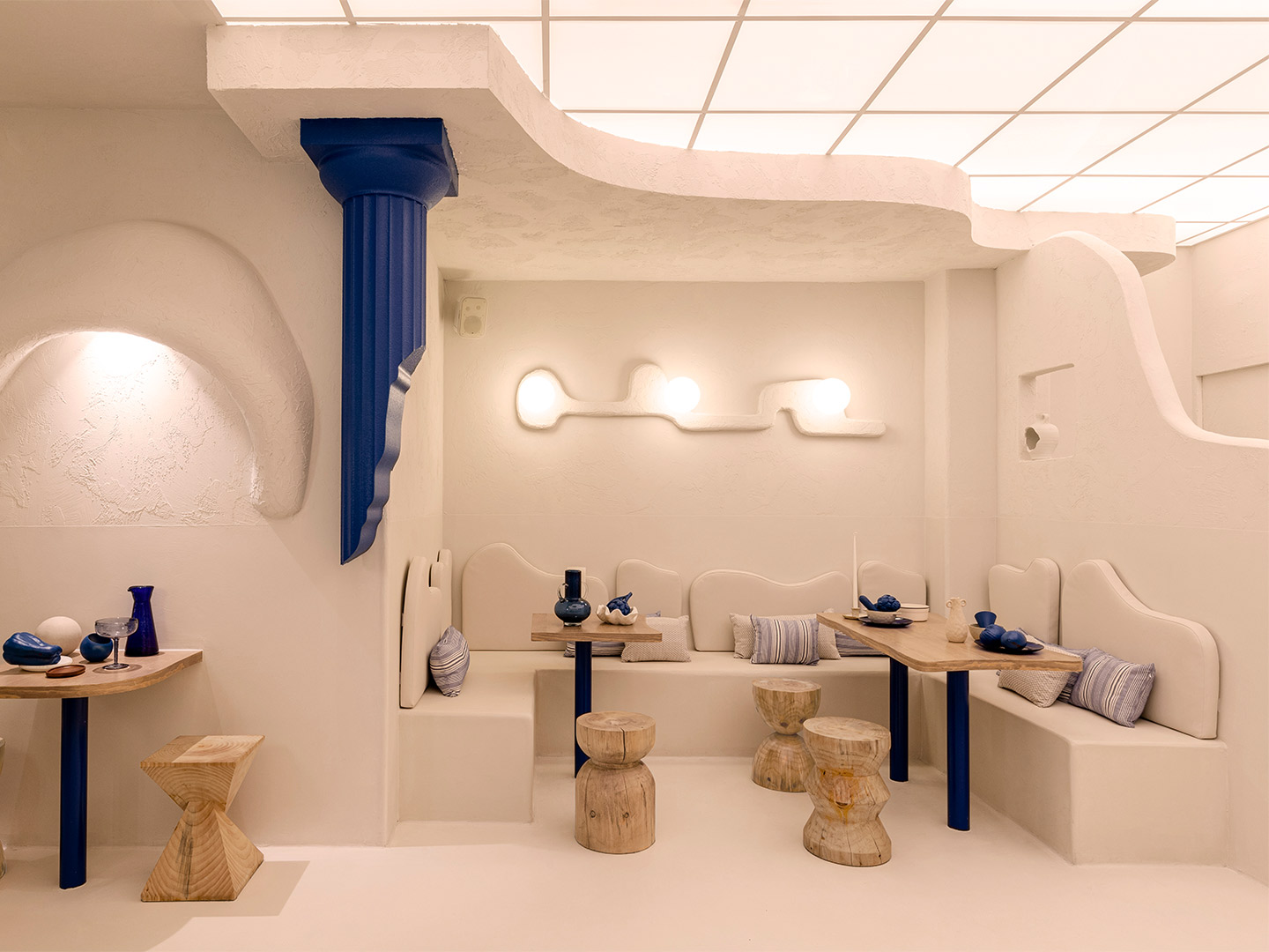
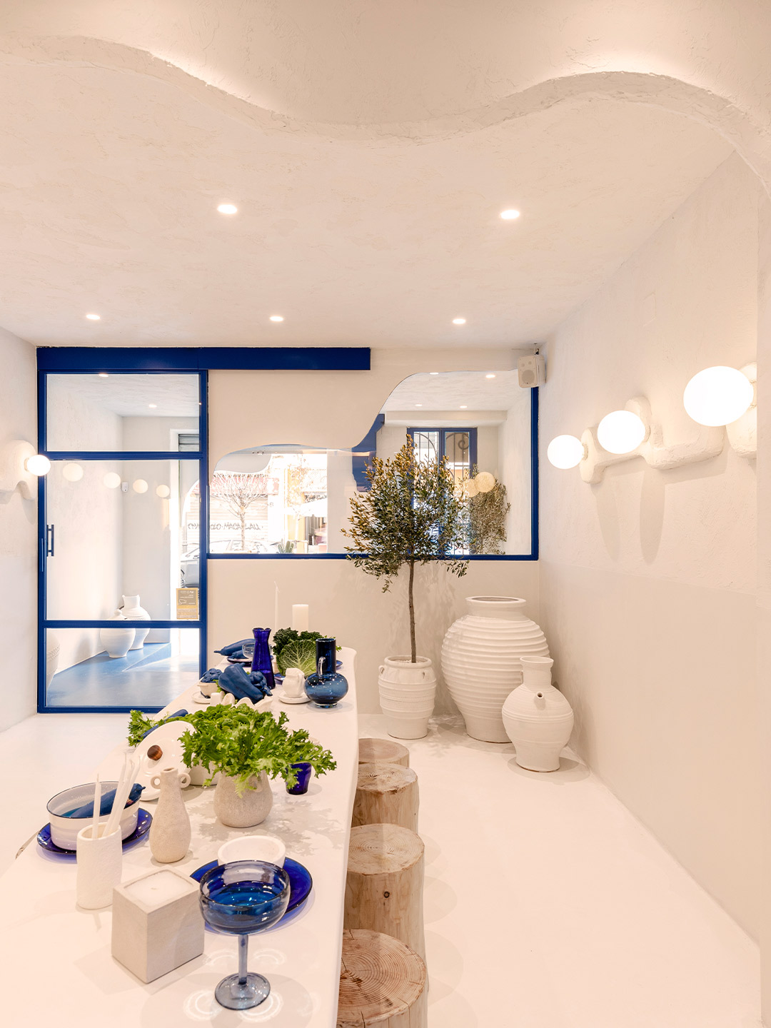
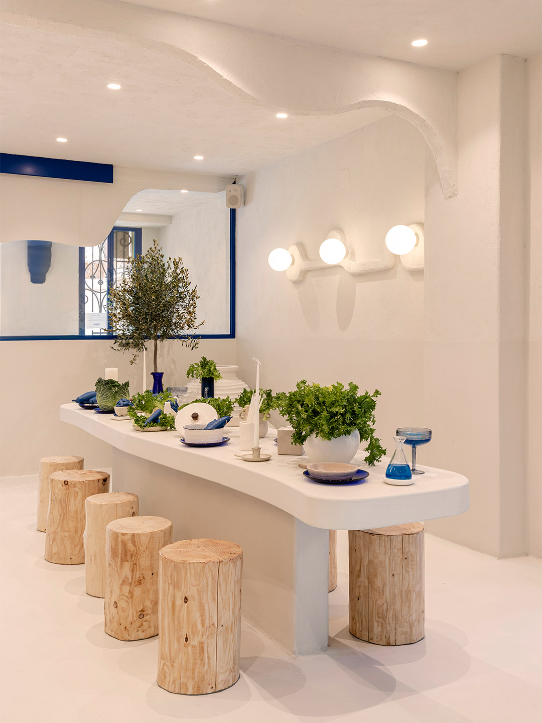
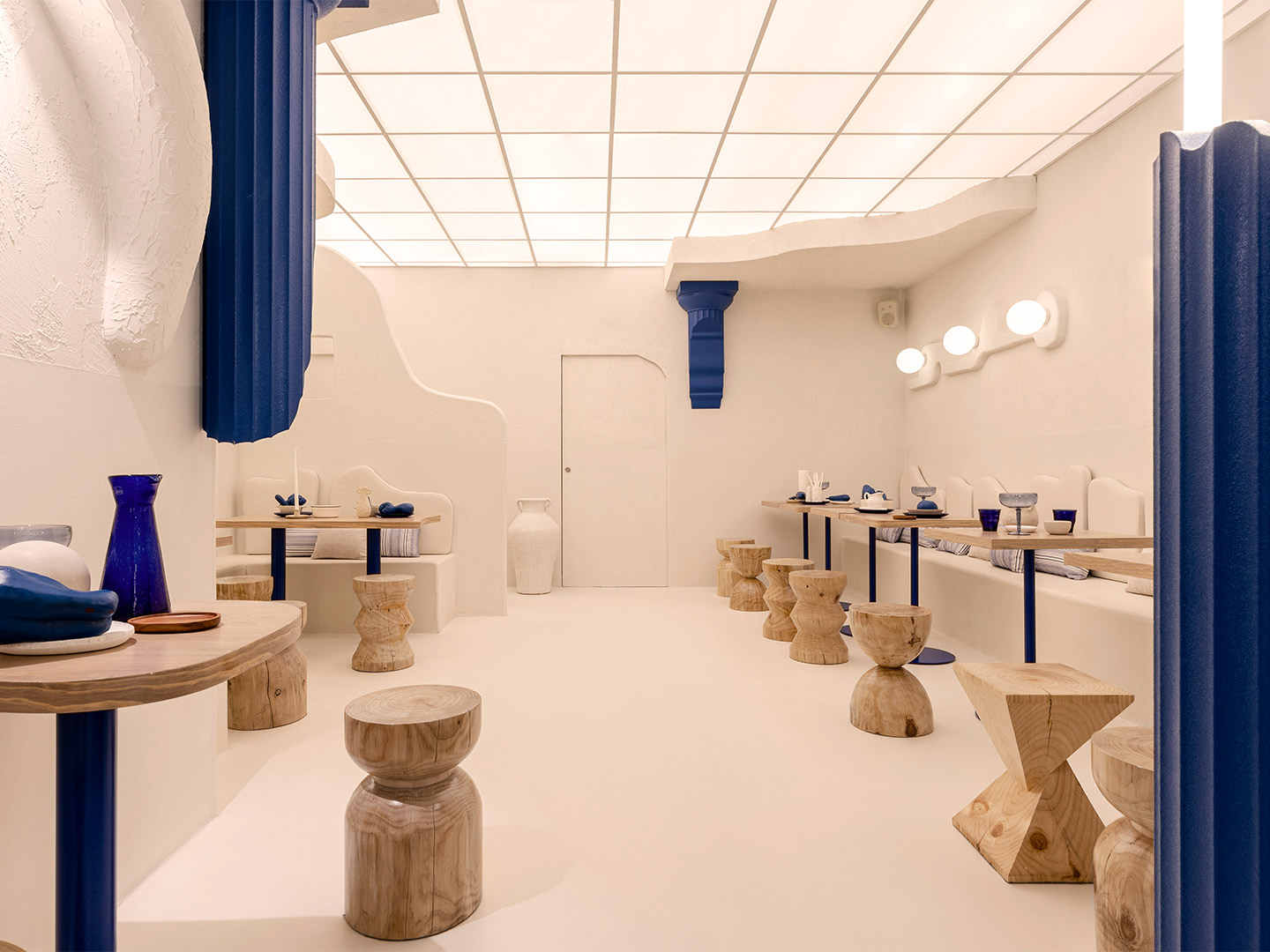
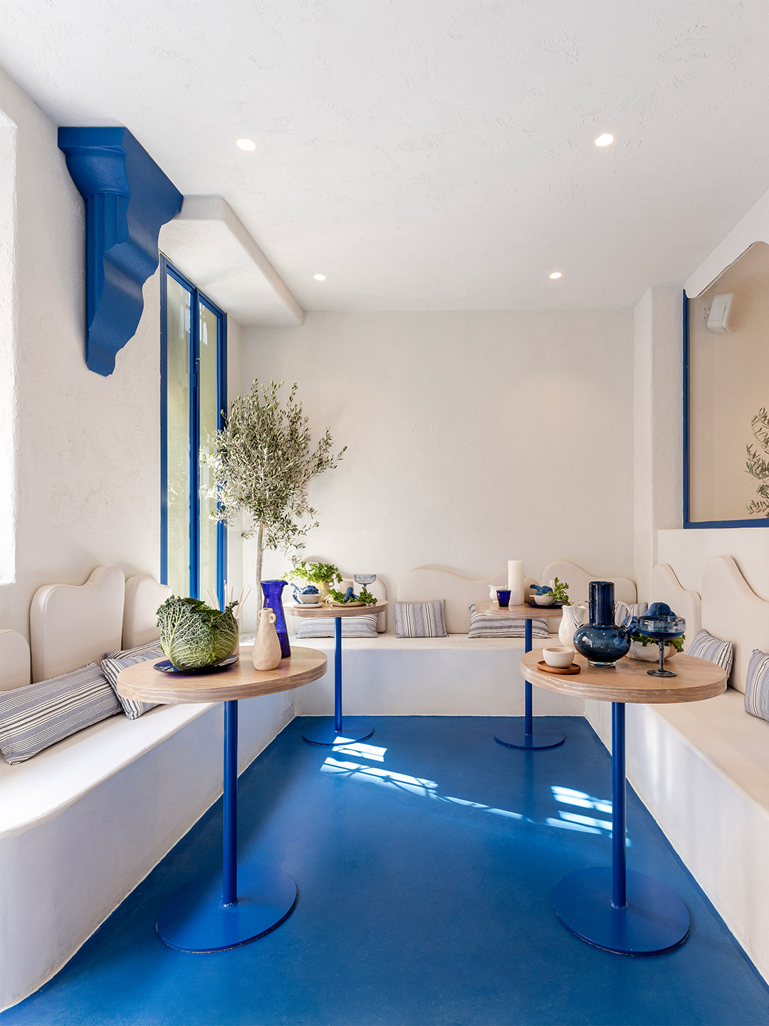
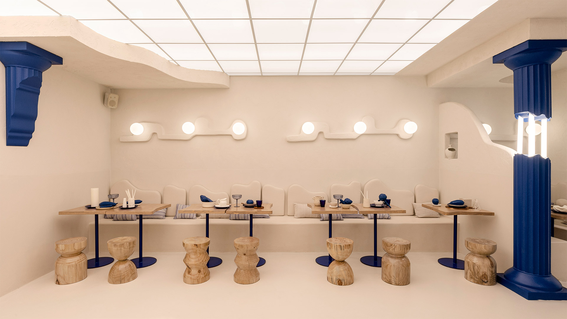
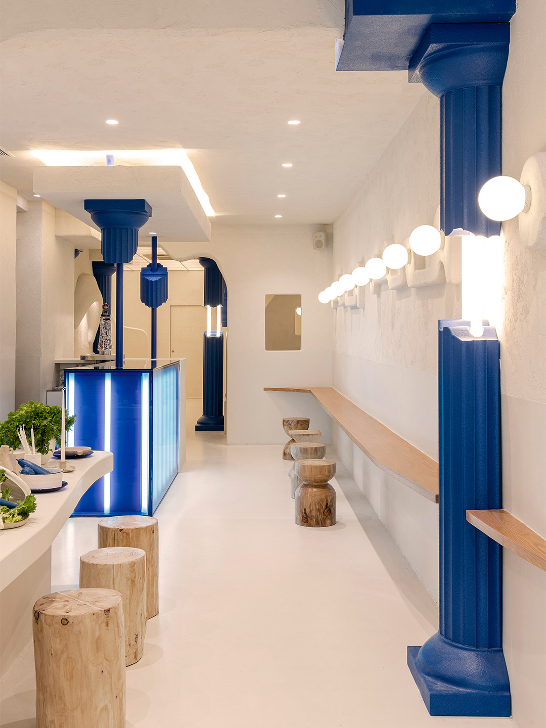
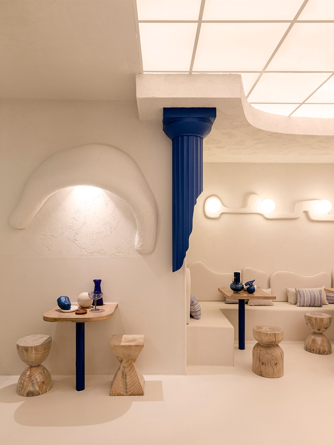
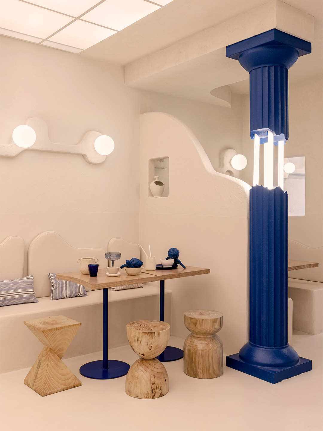
A mix of crumbling Doric columns, textured stucco walls and the national blue-and-white colour scheme ticks all the boxes for a typical Greece-inspired scheme. But for the latest establishment in the portfolio of restaurateur Thanasis Skopelitis, settling on the expected was simply not an option. Joined by her business colleague Ana Cañete, who is responsible for brand and product development, Thanasis made contact with Masquespacio, one of Spain’s most outside-the-box design offices. They briefed the designers to craft the look and feel of the first Egeo restaurant in Valencia, challenging them to remix classic Greek design tropes with the unconventional flair for which they are well known.
The move into Valencia marks the next step in Thanasis’ chain of Egeo souvlaki restaurants, building upon two already established venues in Madrid. Offering generous servings of skewer-grilled meat and vegetables, the Greek restaurants boast a strong following of food-loving locals whose loyalty is hoped to be replicated on Spain’s southeastern coast. “When Ana and Thanasis commented to us that they wanted to open an Egeo in Valencia, we were immediately excited about the idea,” enthuses Christophe Penasse, one of Masquespacio’s two founders.
Egeo Greek restaurant in Valencia by Masquespacio
Having long felt a “special connection” with the history of Greek culture and cuisine, Christophe and his associate, Ana Milena Hernández, say that the opportunity to develop the new restaurant was something of a bucket-list item now struck from their agenda. “We have long been keen to develop a Greek restaurant,” admits Christophe, who says the biggest challenge the studio faced in designing the new restaurant was that the clients didn’t want “a huge change” from their first venues in Madrid. Rather, Thanasis and Ana were seeking something that could give continuity to Egeo’s pre-existing interior design identity.
“If you follow our work, you know that we like to break with the existing [so] it was a huge challenge for us to respect their minimalistic Greek design and at the same time offer a different experience,” Christophe reveals. In response, Masquespacio maintained Egeo’s trademark blue and white colour palette. But in an effort to bring the diner “closer to Greece”, the studio applied to the walls of the restaurant a beautiful “cementish” finish, similar to the material that defines the vernacular architecture of the Greek islands. “We tried to materialise Greece in the space,” Christophe’s colleague Ana adds, “further than just using the usual white and blue colour palette.”
The shapes to which the stucco-like finish is applied take the form of organic wall sculptures, becoming one of the signature features of the space. The designers say this decorative effect continues the search to represent the essence of Greek architecture, traditionally shaped from wood and mud and centred around a garden or courtyard – a heritage that’s honoured in the design of the restaurant. The most stand-out element, however, is a series of blue-painted Greek columns in a deliberately deteriorated condition. “The question we asked ourselves with the introduction of the columns was: how do we modernise this traditional Greek architecture element that is represented in a classical state in Greek restaurants all around the world?” Ana says.
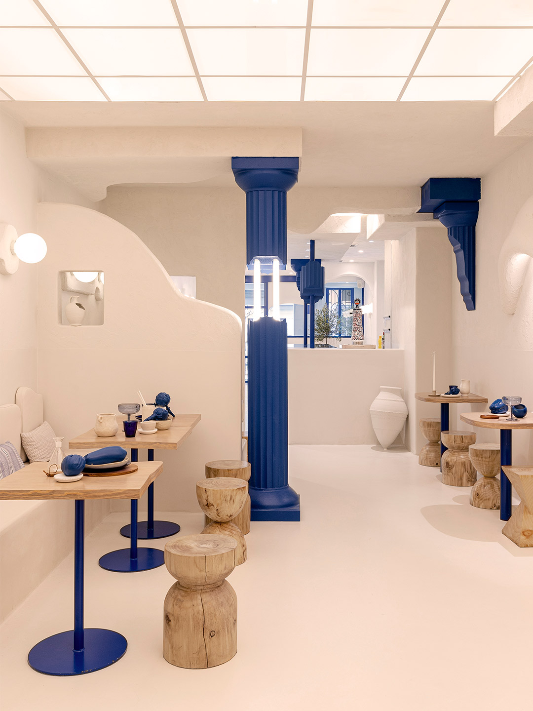
Her question was resolved by bringing the columns to life in the most modern way she and Christophe knew how. They were manufactured through cutting-edge 3D printing technology and coloured a deep indigo blue – a significant departure from the famously ancient Doric columns of the Parthenon. At the same time, LED tubes were added to link together the intentionally broken pieces of each structure. The typically cool white colour of the LEDs was challenged and tweaked, as was the production technique, making them a contemporary element produced with 21st-century know-how.
From furniture to light fittings, many similar shapes to those that Masquespacio has employed in the past make an appearance at Egeo Valencia. Reborn in crisp shades of white and blue, the pieces feel fresh while also bringing to the table lashings of Christophe and Ana’s inimitable style. They’re joined by chunky slab-like counters, raw timber stools – as though sliced straight from a tree – and Corfu-style pots of all sizes. “Last but not least, the order bar was situated in the middle of the space with the aim to recreate a bustling environment,” Christophe explains. Positioned beside a glowing grid of overhead lighting, the bar echoes the overarching goal of the fit-out: transporting diners to a place where they feel they’re ordering dishes of delectable souvlaki, Christophe says, “from a mobile kiosk in the middle of a Greek market”.
When Ana and Thanasis commented to us that they wanted to open an Egeo in Valencia, we were immediately excited about the idea.
Love the Egeo Greek restaurant in Valencia by Masquespacio? In Italy, Masquespacio also designed the Bun burger restaurant in Milan and in Turin. Catch up on more hospitality architecture and design and retail design, plus subscribe to receive the Daily Architecture News e-letter direct to your inbox.
Related stories
- Resa San Mamés student accommodation in Spain by Masquespacio.
- The bar and restaurant at La Sastrería in Valencia by Masquespacio.
- Mama Manana restaurant in Kyiv by Balbek Bureau.
- Gold ‘n’ arches: Bun burger restaurant in Milan by Masquespacio.
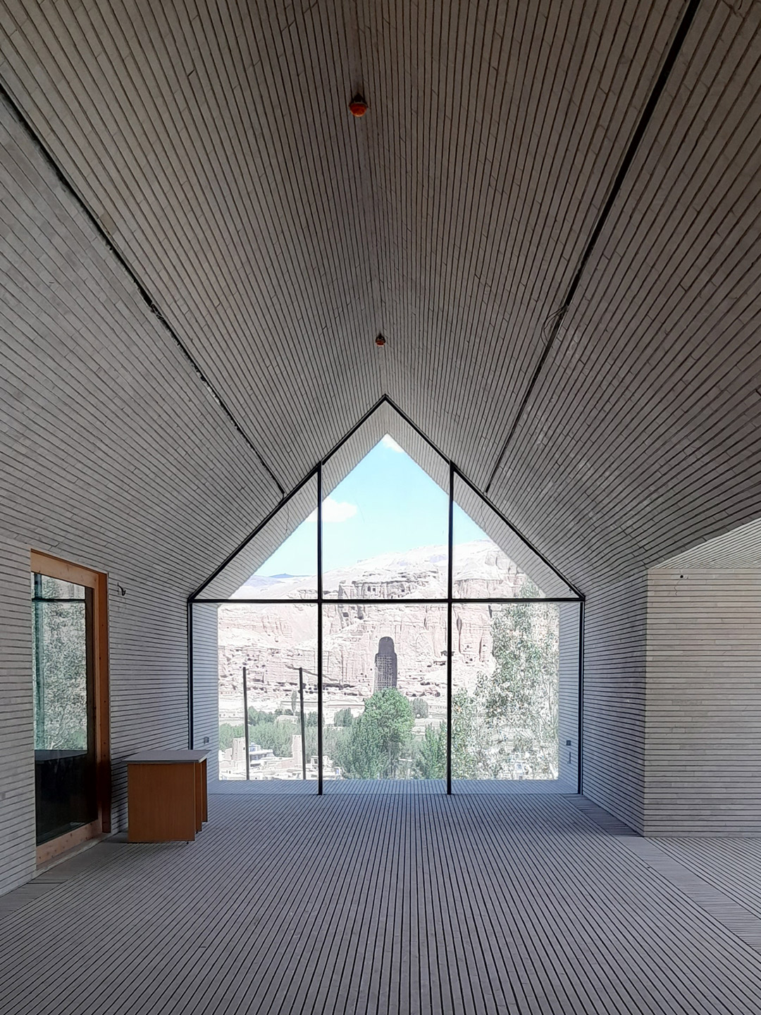
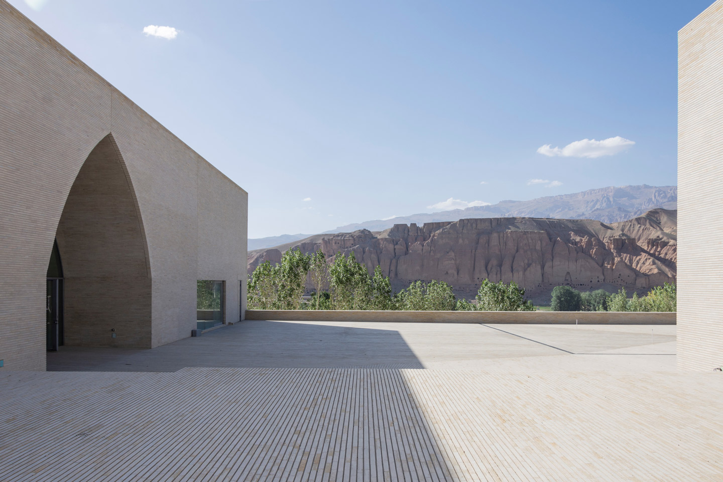
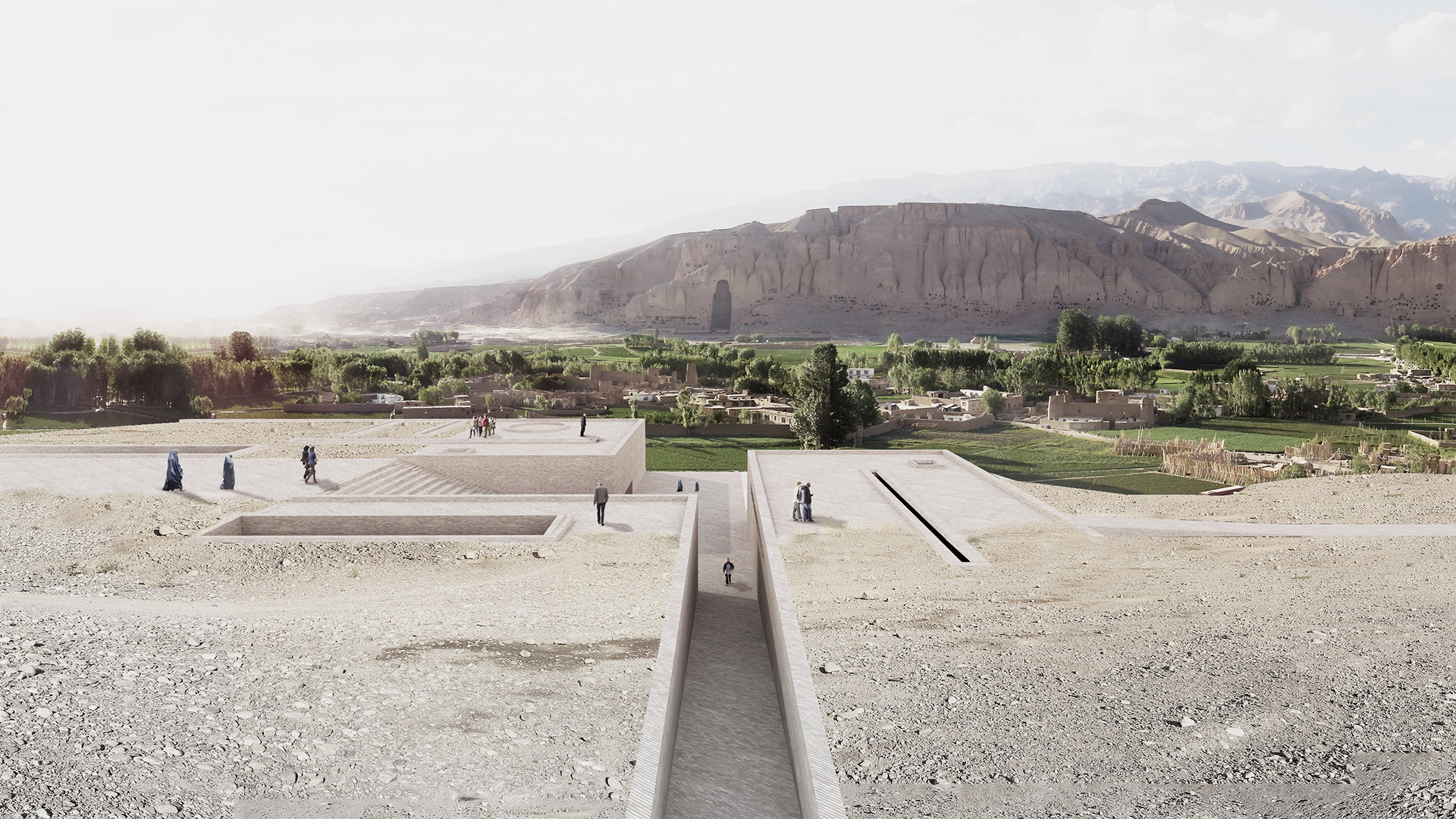
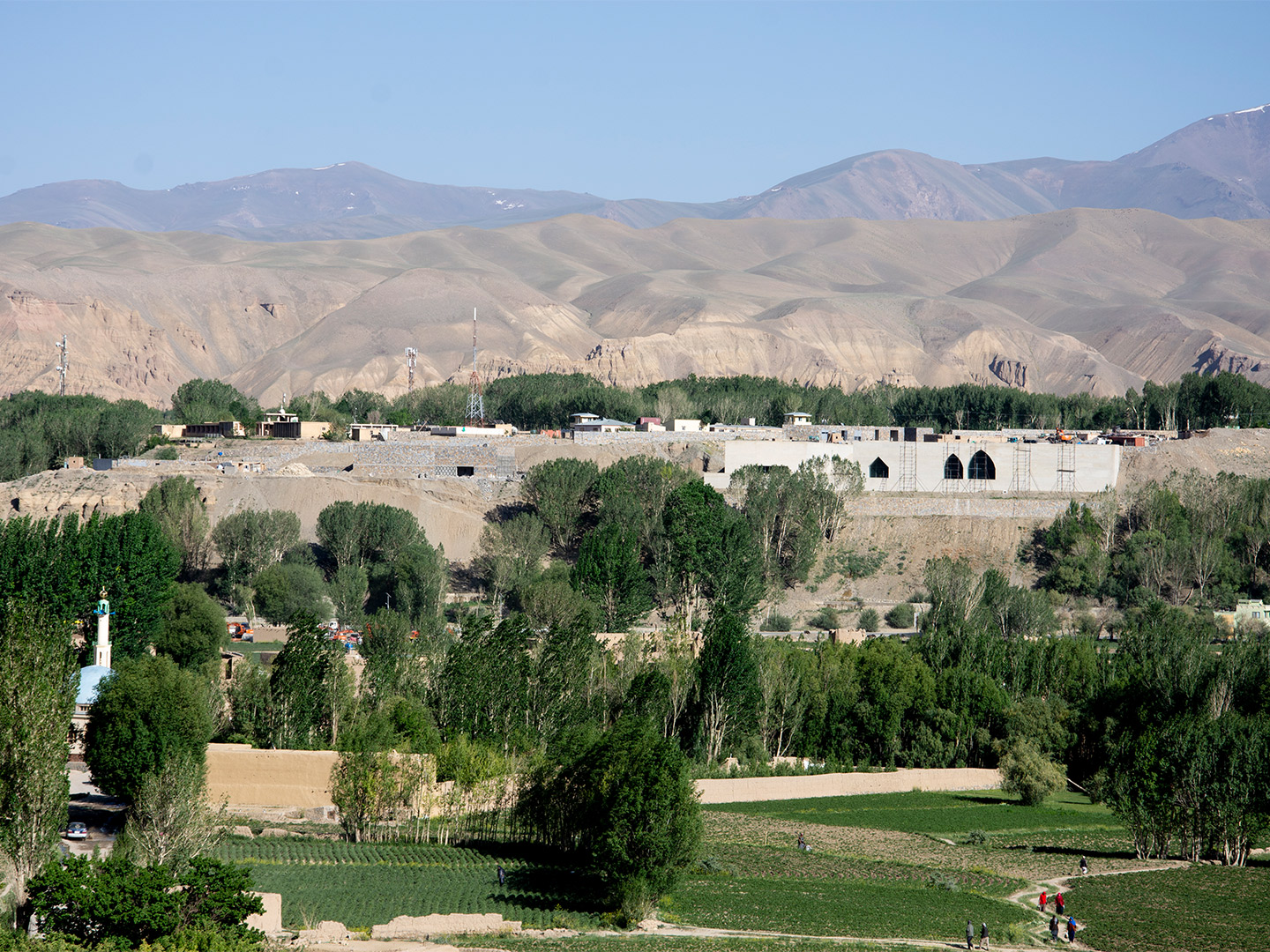
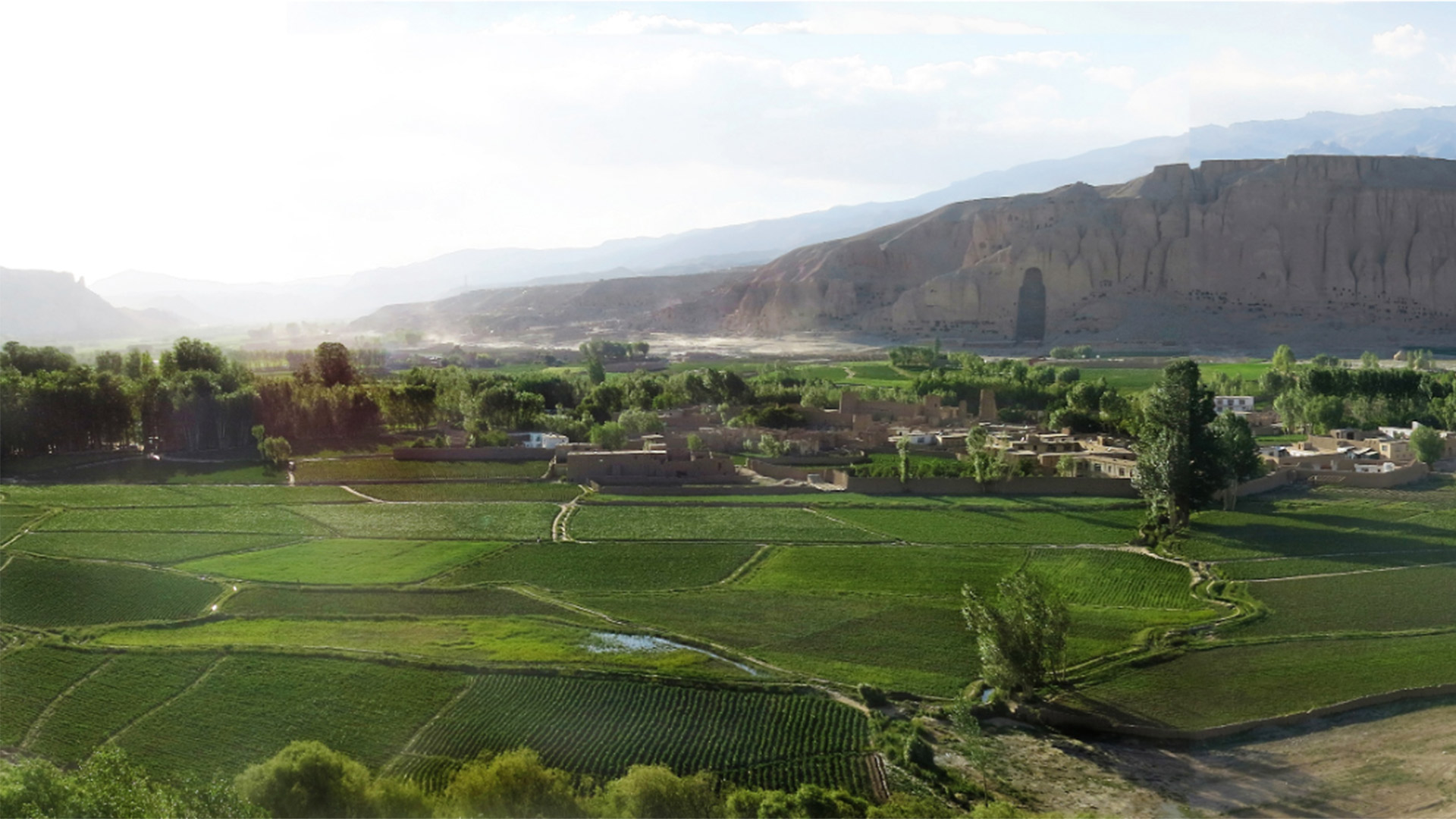
Found along Afghanistan’s ancient silk road, about 240 kilometres north-west of Kabul, Bamiyan Valley cradles the cultural and political affairs of the Hazára ethnic group. The valley is well-known for its abundance of natural and artistic beauty, as is its capital city, Bamiyan, the heart of the broader Bamiyan Provence. Headlining the region’s attractions is Band-e Amir Lake, with its dazzling azure waters haloed by natural travertine walls, and the ancient remains of the Zahak, Ghulghula and Buddha castles. But a newcomer by way of the Bamiyan Cultural Centre is expected to quickly climb the ranks, cementing itself as a much-loved destination for both tourists and the local community.
The centre arises in the wake of tragic events that date back over twenty years, to March 2001 when the Taliban destroyed two colossal Buddha statues that towered over the Bamiyan Valley. The statues, carved into the stone cliff-face approximately 1500 years ago, were considered the largest standing Buddha sculptures in the world, forming an integral part of both Buddhism and local culture. Tasked with safeguarding the remaining historical artefacts while also promoting new social and cultural developments in the region, the Bamiyan Cultural Centre was born from a 2014 international design competition, spearheaded by UNESCO with the economic support of the South Korean government.
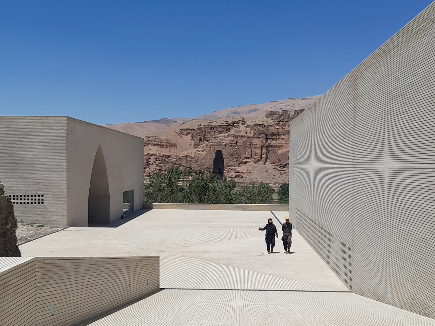
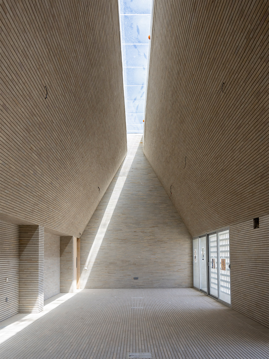
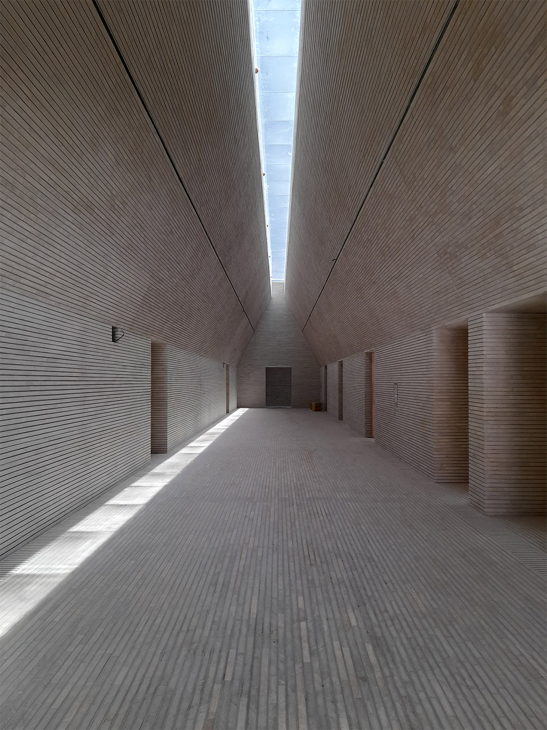
Bamiyan Cultural Centre in Afghanistan by M2R Arquitectos
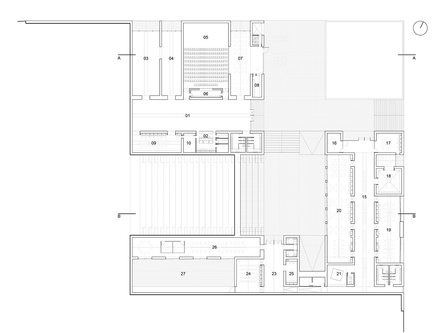
Selected from over 1000 competition entries, the proposal by Argentina-based design office M2R Arquitectos was announced as the winner, not least for its intentions to create a new and vital centre for communicating and sharing ideas in the Bamiyan region. “Our proposal tries to create not an object-building, but rather a meeting place,” the M2R Arquitectos team explains, pointing to the building’s nearly completed system of internal and external spaces, where the impressive landscape intertwines with the rich cultural activities that the centre will foster. These include permanent and temporary exhibitions, education and training sessions, lectures and cross-cultural performance events.
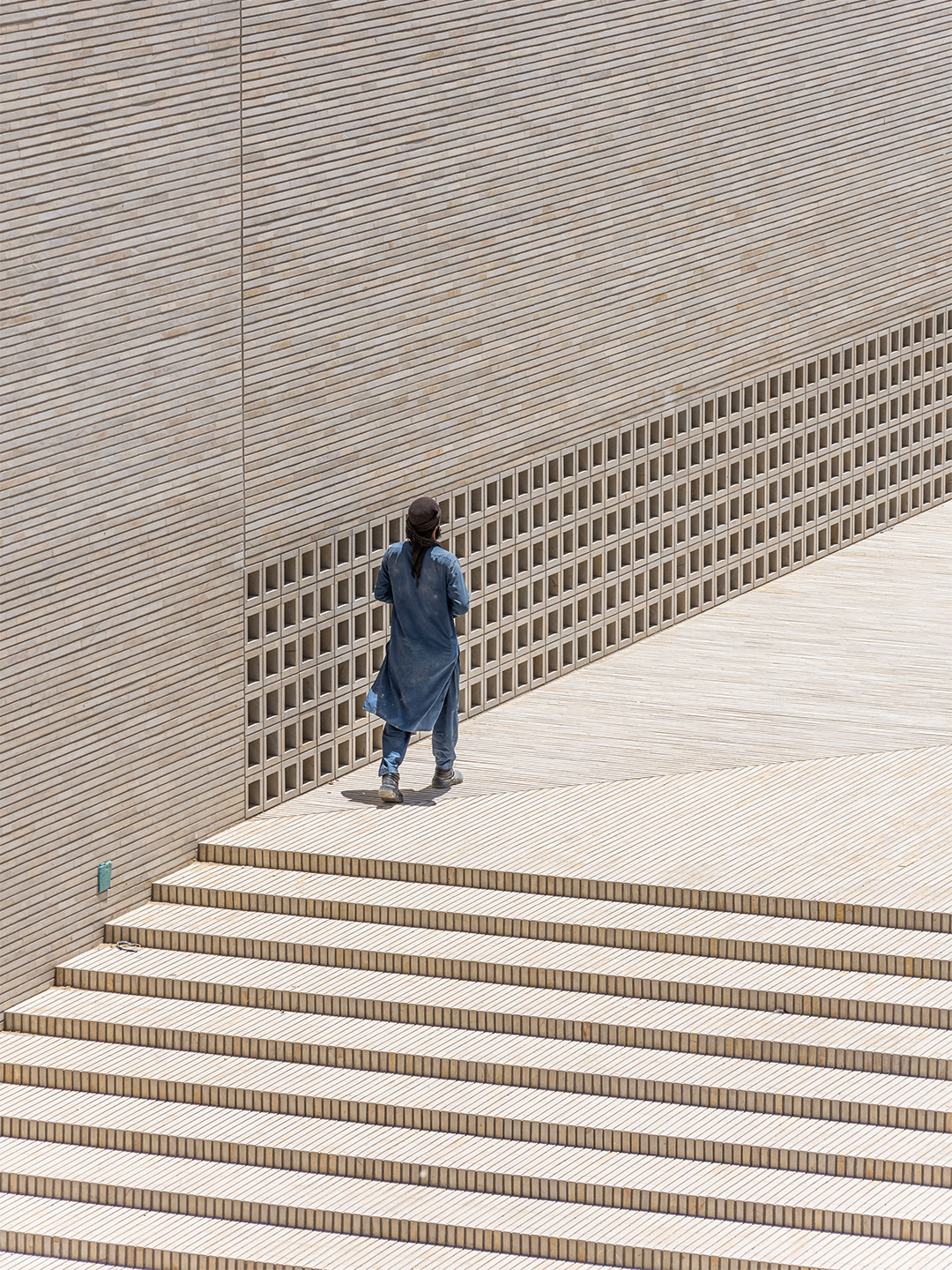
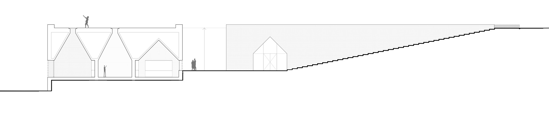
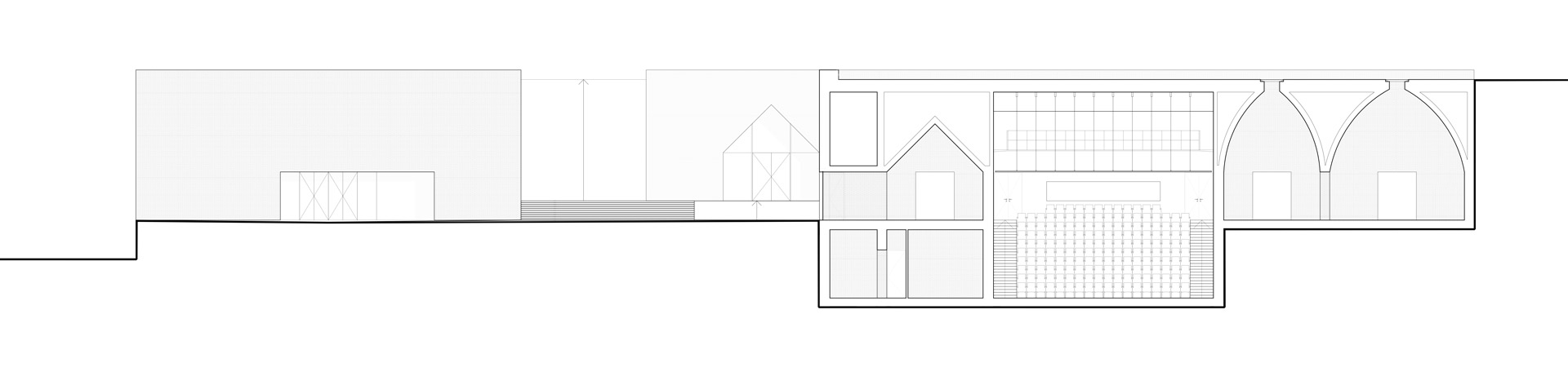
Due to the way in which the underbelly of the building is carved into the earth, the architects suggest the Bamiyan Cultural Centre is not simply built, but rather discovered. “This primordial architectural strategy creates a minimal negative-impact building that fully integrates into the landscape,” the M2R team explains. “It takes advantage of the thermal inertia and insulation of the ground,” they add, highlighting that the interiors of the centre are capable of remaining cool on the hottest of days. This is assisted by the use of slimline masonry bricks throughout the campus which offer a nod to the vernacular architecture of the region, where timber-framed brick and stone homes and public buildings are constructed to tackle the extreme climatic conditions.
When visitors first approach the centre, from the crest of the taupe-coloured escarpment, rather than finding a building hovering over the landscape they will first encounter a public garden, open to all of Bamiyan’s residents. Yet to be realised, the gardens will occupy the uppermost rooftops of the centre, adding to a series of viewing platforms where visitors and locals can meet, contemplate the diverse landscape and peek into the activities happening inside the facility. The centre itself, located beneath the entry level, forms a new man-made cliff face, drinking in unobstructed panoramic views across the Bamyan Valley and what remains of the “Buddha cliffs”.
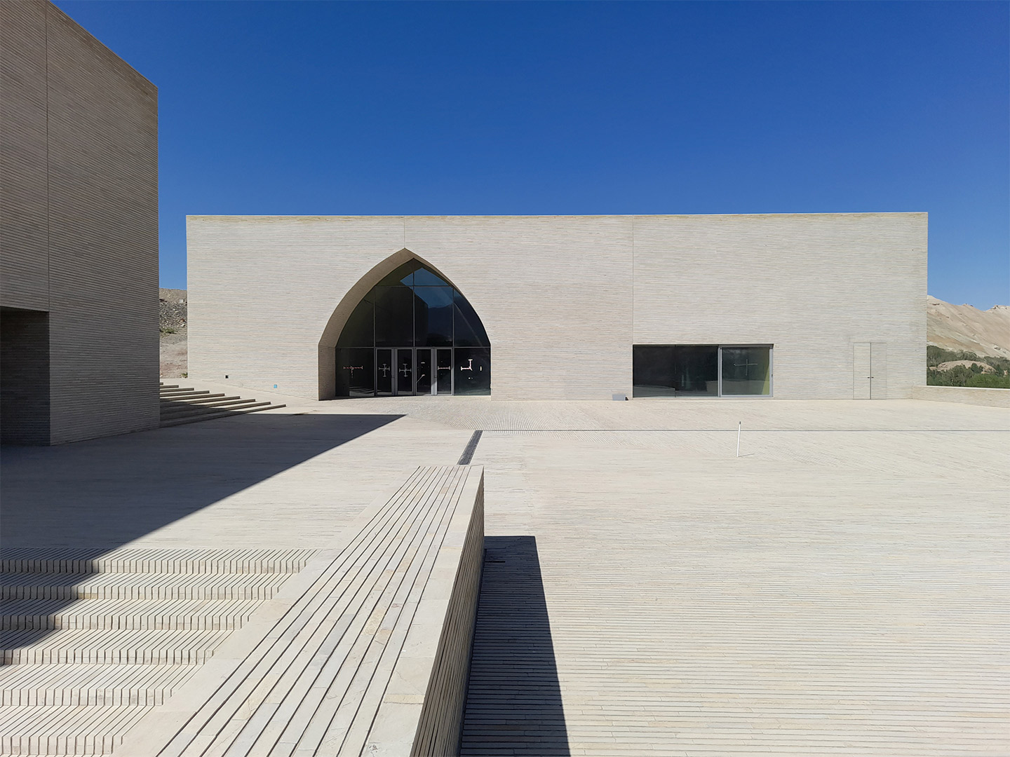
Aligned with the stone niche where the giant western Buddha once stood, a gentle ramp guides visitors down the site to a plaza that serves as the “vital core” for the centre. “This plaza will be an open space for cultural activities,” the M2R team points out, noting that the plaza and surrounding interstitial spaces are formed by the three buildings within which the program is divided. The public activities of the centre are hosted in the Performance and Exhibition Building, the Research and Education Building hosts the semi-public activities of the program and the Administrative Building facilitates the private activities. “This division of the program into seperate buildings allows each to work independently, reducing the cost of maintenance and heating,” the architects explain.
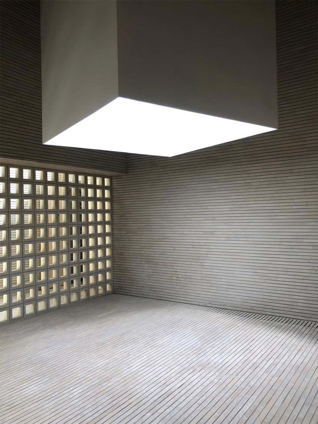
Inside the centre, the cavernous spaces are mostly devoid of discernible detail or ornament. Only the quiet patterning offered by pale, elongated bricks embellishes the floor and walls. Offsetting this, shafts of intense sunlight act as graphic strikethroughs that enter the vaulted rooms via slender cavities overhead. “By their sheer austerity, [the interiors] favour a contemplative and reflective attitude,” the M2R team says. “The skylights of the cultural centre create lines of light that move, following the path of the sun through the sky, making visible the passage of time.” The vaulted elevation of the exhibition area faces the western Buddha niche and frames the views towards it, giving a dramatic historic backdrop to the centre’s contemporary cultural manifestations. “This makes visible the contrast and continuity between Afghanistan’s past and present,” the architects conclude.
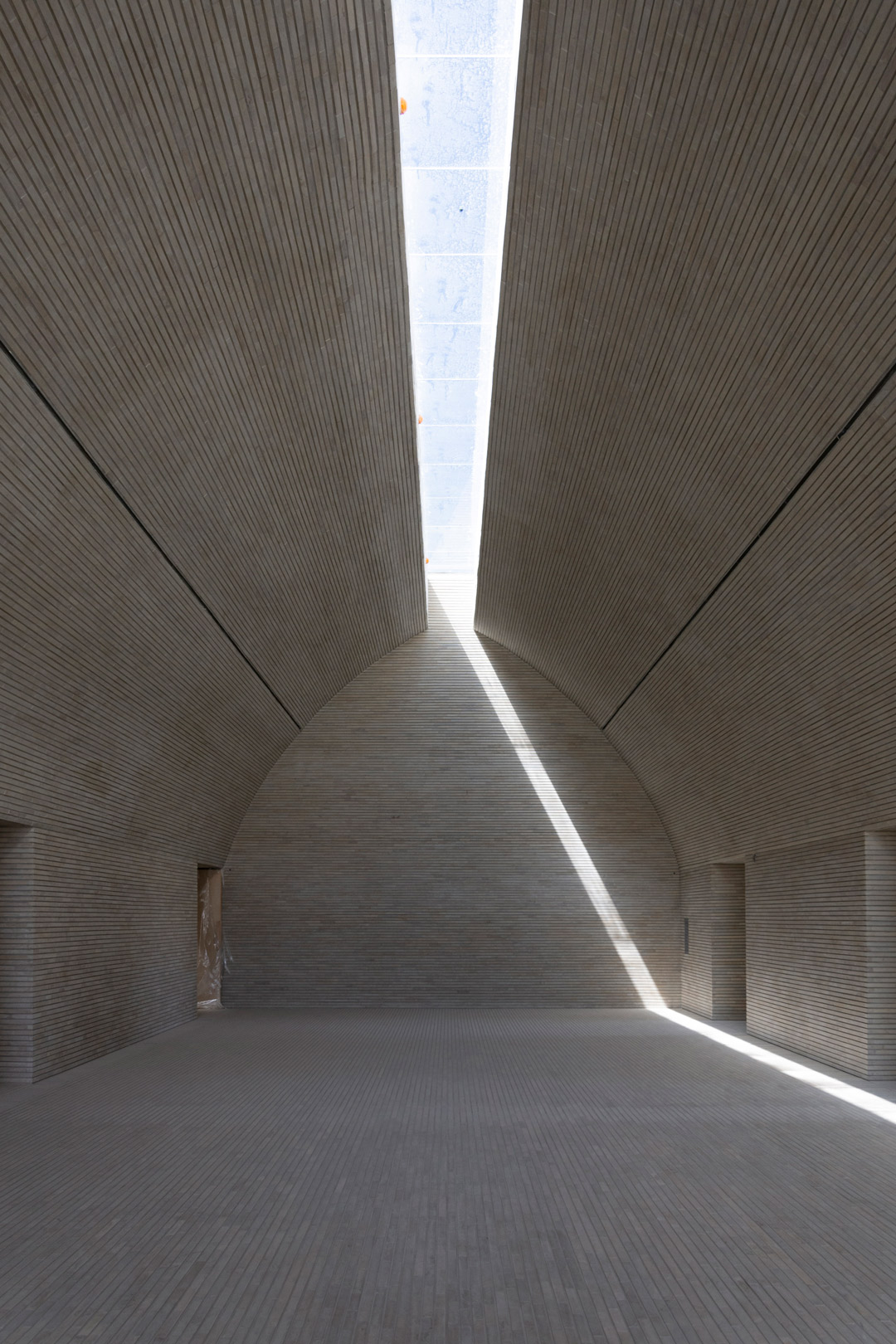
By their sheer austerity, [the interiors] favour a contemplative and reflective attitude.
Catch up on more of the latest architectural gestures and commercial design. Plus, join the mailing list to receive the Daily Architecture News e-letter direct to your inbox.
Related stories
- Could this be the new look for Sydney’s brutalist Sirius building?
- Skinny mini: The pencil thin hotel proposed for Sydney’s skyline.
- Sydney’s biggest pool since the 2000 Olympics is now open.
- Port Douglas retreat: Gurner reveals plans to open luxury hotel in Far North Queensland.
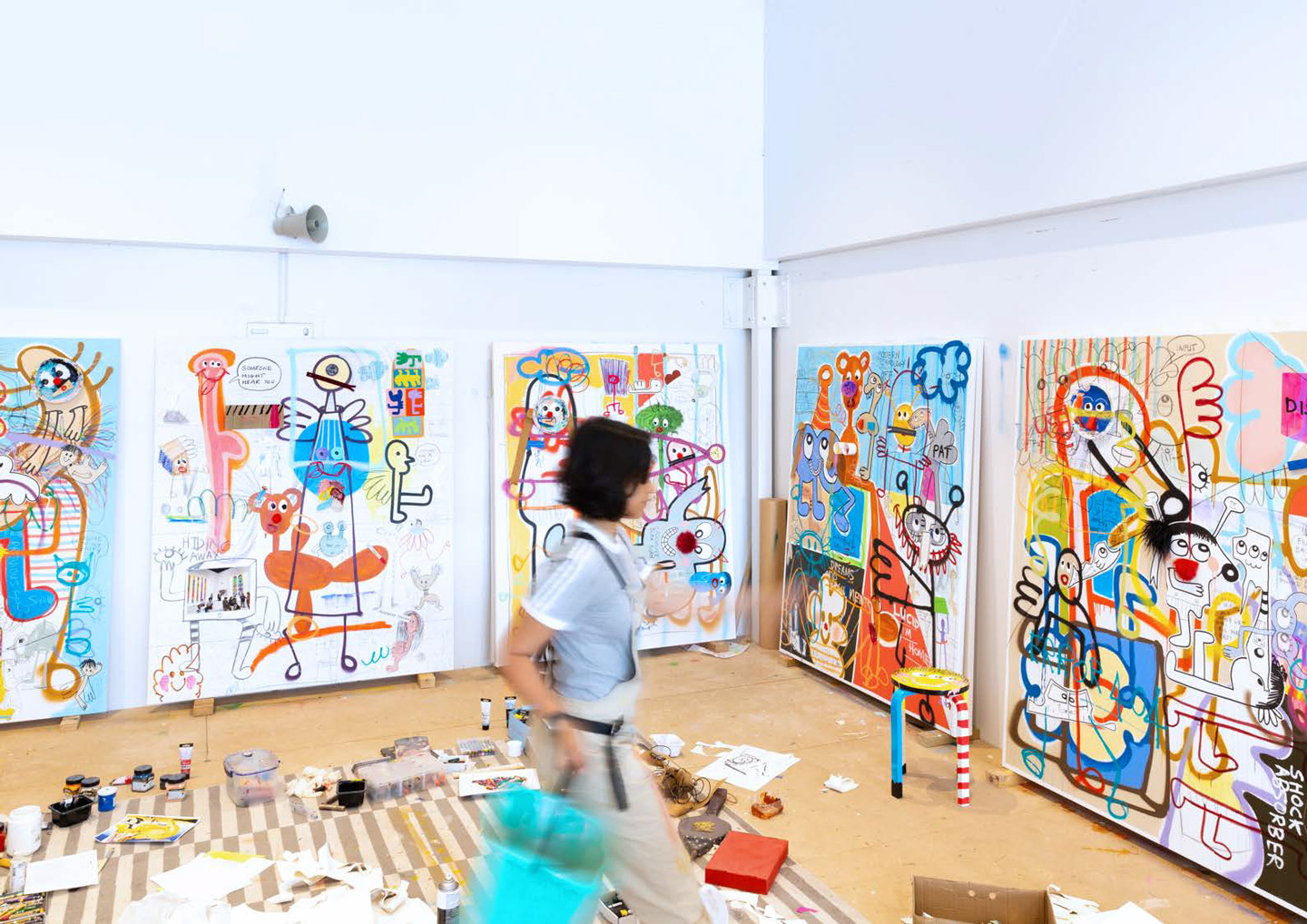
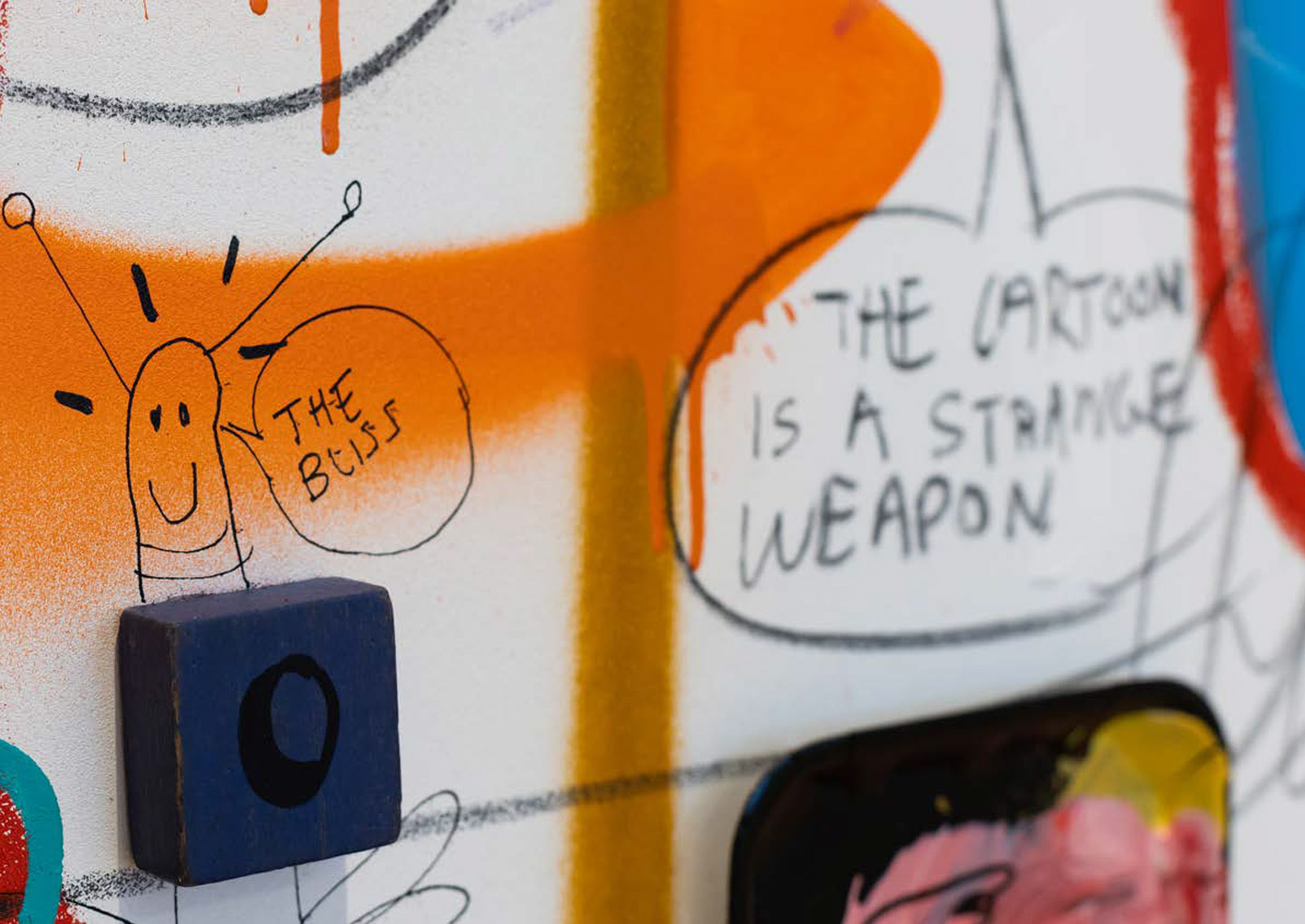
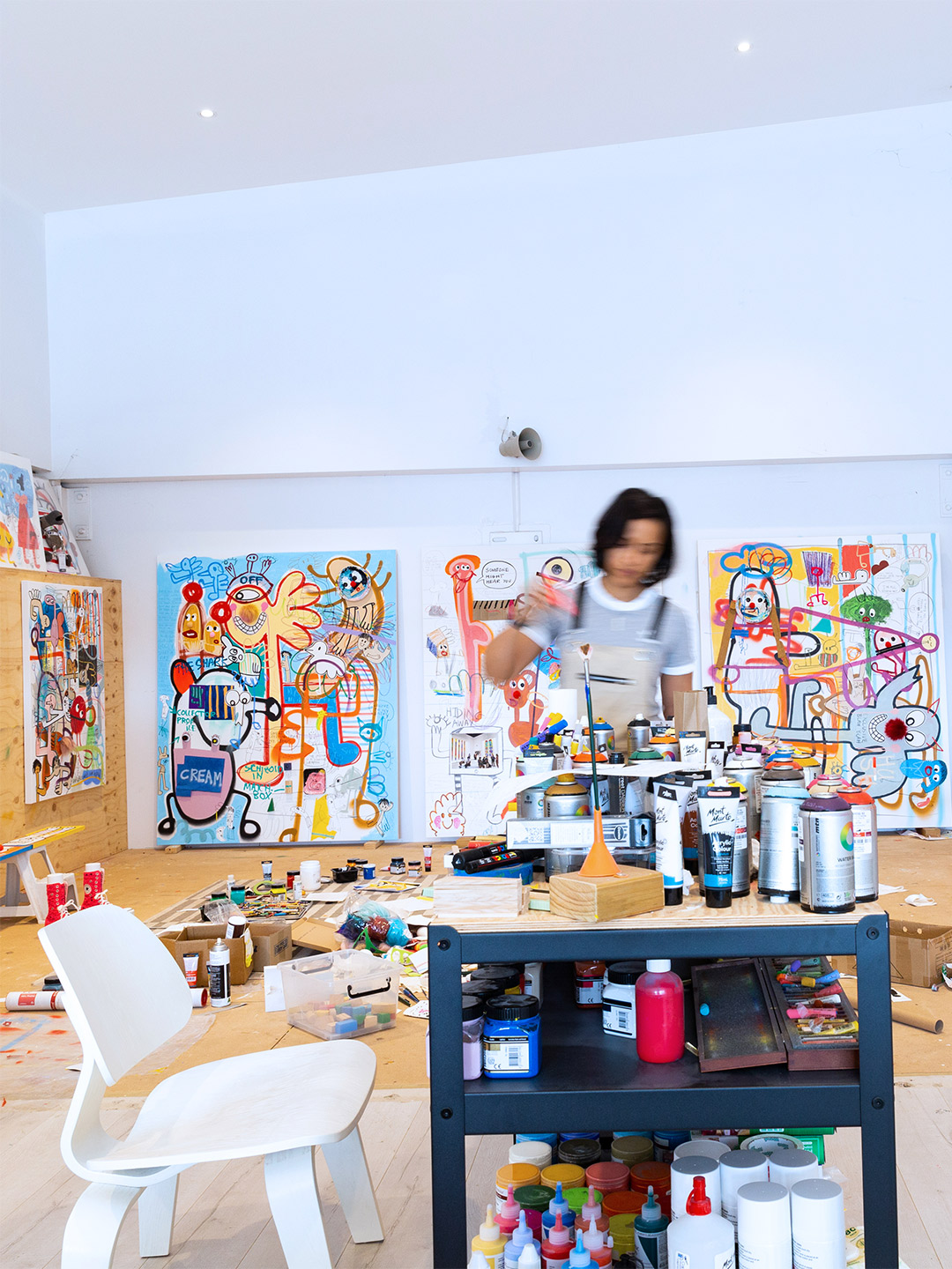
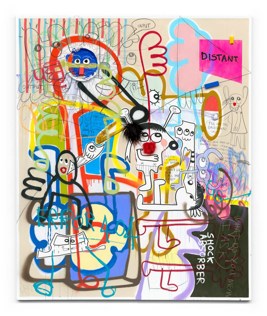
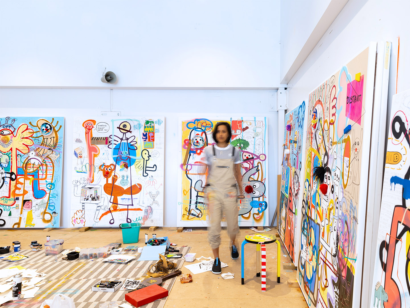
The first thing you need to know about Australian emerging artist Joi Murugavell is that she doesn’t like putting her artwork into words. “Because today’s truth becomes tomorrow’s lies,” we’re told in Joi’s latest catalogue, compiled to accompany her upcoming solo exhibition at the Peach Black Gallery in Chippendale, Sydney. Presented by art advisor Sarah Birtles, the high-octane exhibition will run from April 29 until May 2, showcasing five “double-mattress-sized” paintings, five collaged “toy paintings” and a large-scale installation work, each capturing the spontaneity and humour of life.
The exhibition’s title, Finding Mikey, is a direct reference to Joi’s working relationship with her colleague and friend – Mikey – who has long scanned and documented her colour-filled collages and paintings. “When I think of the title and why I called it that, I think of my practice and the people who are in it,” Joi explains. “Mikey would be someone I talk to a lot for work reasons, and I enjoy and learn from glimpses of who he is.”
Finding Mikey exhibition by artist Joi Murugavell
Over time, Joi began leaving secret symbols in her paintings specifically for Mikey to find. But only he knows which “tidbits” were intended specifically for his discovery. “Within each painting are hidden messages and clues left behind for Mikey,” Joi explains. “It’s a challenge for the viewer to work out which parts of the painting are for Mikey, which are nods to the network of people in my life, and which are coded for your own personal treasure hunt.”
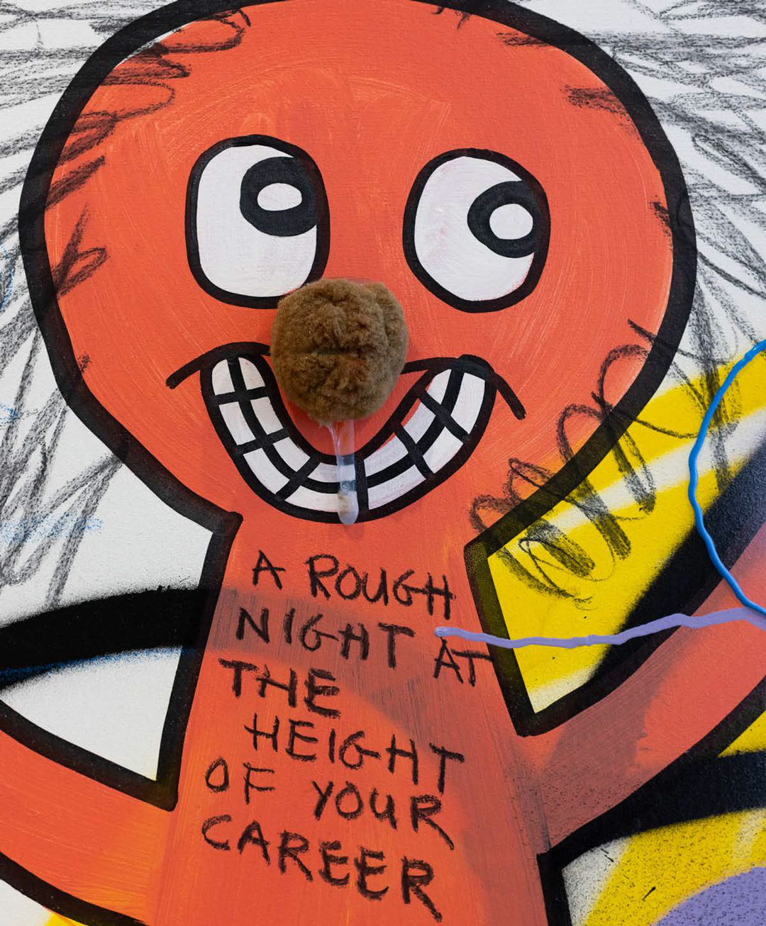
Each joyful quote, toon, toy and shape is a potential clue, we’re told, though there is no hierarchy among the colourful din. “We are allowed to love each brush stroke, pompom and pun equally,” the catalogue reads. “The words, toys and cartoon symbols often land like an inside joke you have been let in on – a message hidden within the painting hoping to be found and to resonate,” the artist explains. “No one is excluded from the fun.”


Above left: Collector Profile, 2021, acrylic, oil stick, wax crayon, spray paint, charcoal, collage on canvas 183 x 152cm. Above right: Studio Notes (the great defogger), 2021, acrylic, oil stick, wax crayon, spray paint, charcoal, collage on canvas 183 x 152cm.
Delivering playfulness in spades, the toys in Joi’s work nod to the artist’s evolution as a dreamer. Joi recalls she was one of “those children” who would create “epic worlds” in her imagination. First, with her toys as characters: “I think I played with toys behind closed doors till I was 15-ish. I’d make them talk to each other and reenact situations,” she says. Then, in vivid daydreams which would go on “way too long,” she admits.
But while Joi declares “I can’t stop seeing characters,” she hasn’t always felt at ease with their presence in her work. That was until one rainy night in her studio, when alone in the darkness, that the company of her “pictures” brought her comfort, just like the characters she’d dreamed up as a kid. “I just sat with them for a while,” she recalls. “That was the first time I felt that these pictures on my canvases could be friends.”
Finding Mikey opens April 29 at Peach Black Gallery, 126 Abercrombie Street, Chippendale, and continues until May 2. An opening event will be held on Friday April 29, 6-8pm. Entry to the exhibition is free.

Presented by art advisor Sarah Birtles, the high-octane exhibition will run from April 29 until May 2.


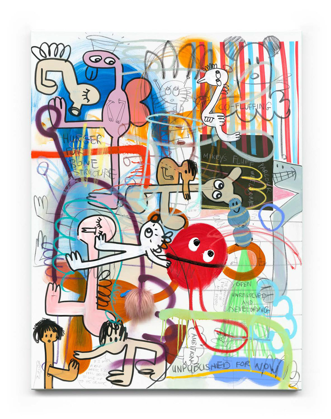
Above: Mikey’s Fluff Parlour, 2021, acrylic, oil stick, wax crayon, spray paint, charcoal, collage on canvas 120 x 90cm.

Catch up on more of the latest architectural gestures as well as art projects and exhibitions. Plus, join the mailing list to receive the Daily Architecture News e-letter direct to your inbox.
Related stories
- Could this be the new look for Sydney’s brutalist Sirius building?
- Skinny mini: The pencil thin hotel proposed for Sydney’s skyline.
- Sydney’s biggest pool since the 2000 Olympics is now open.
- Port Douglas retreat: Gurner reveals plans to open luxury hotel in Far North Queensland.
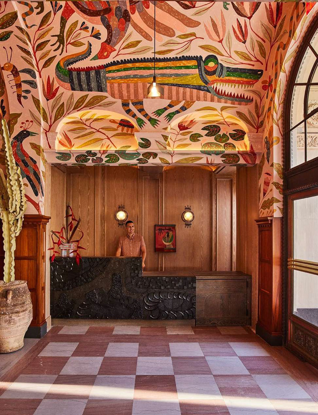
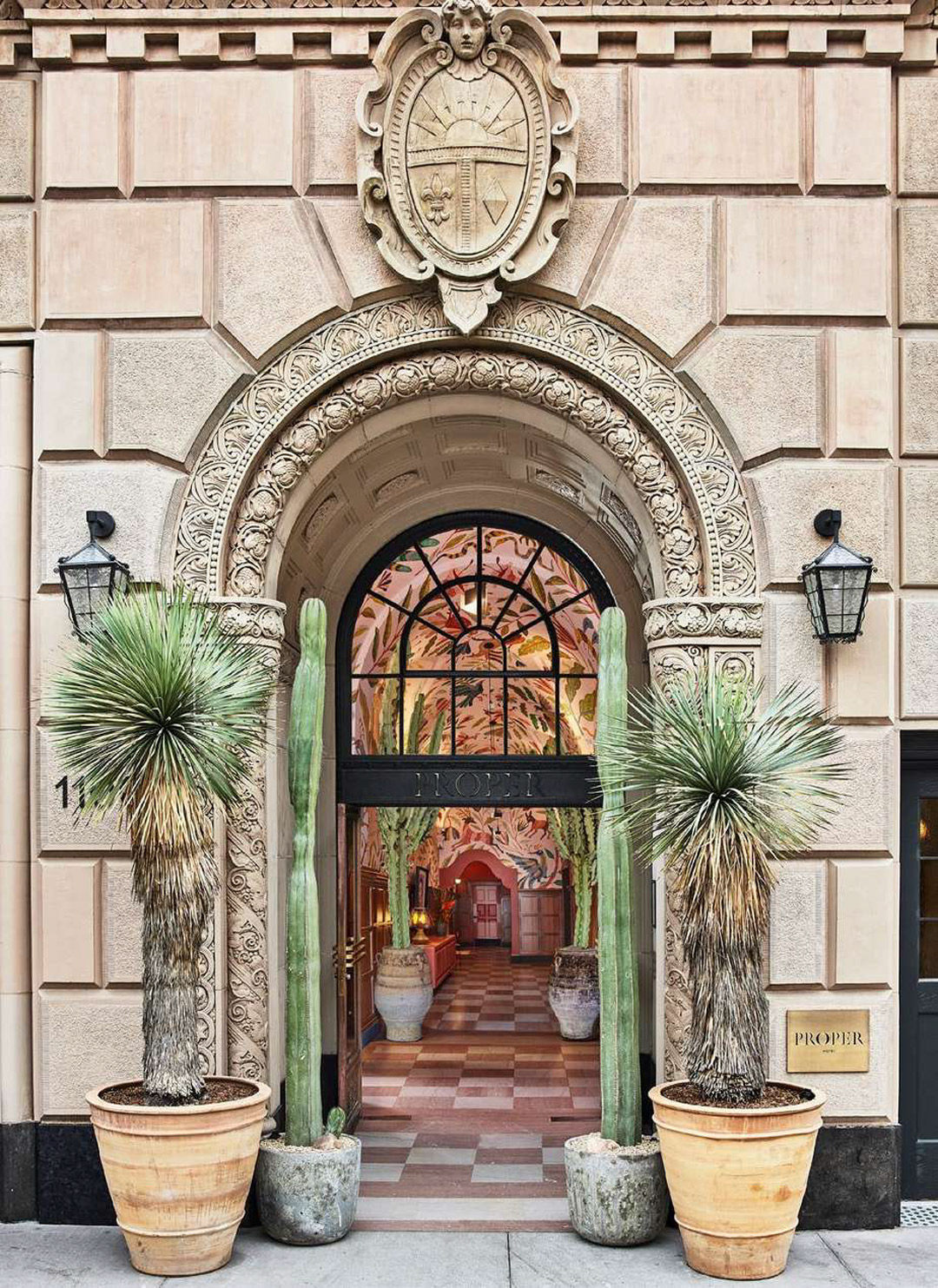
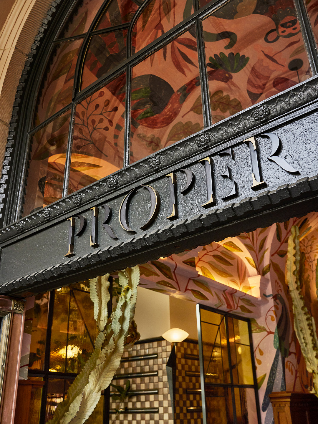
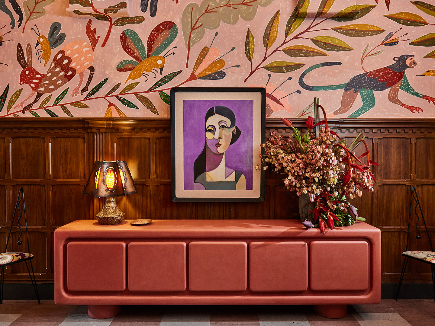
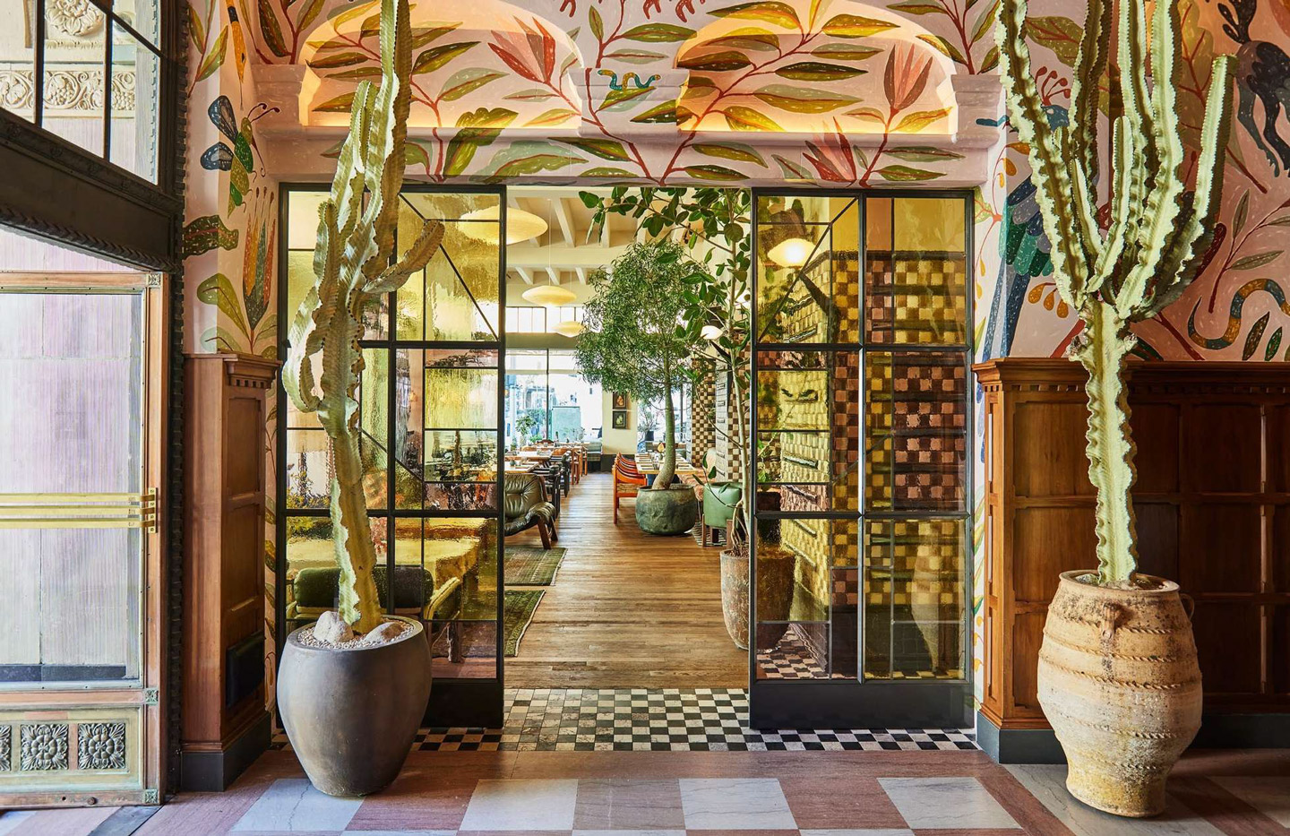
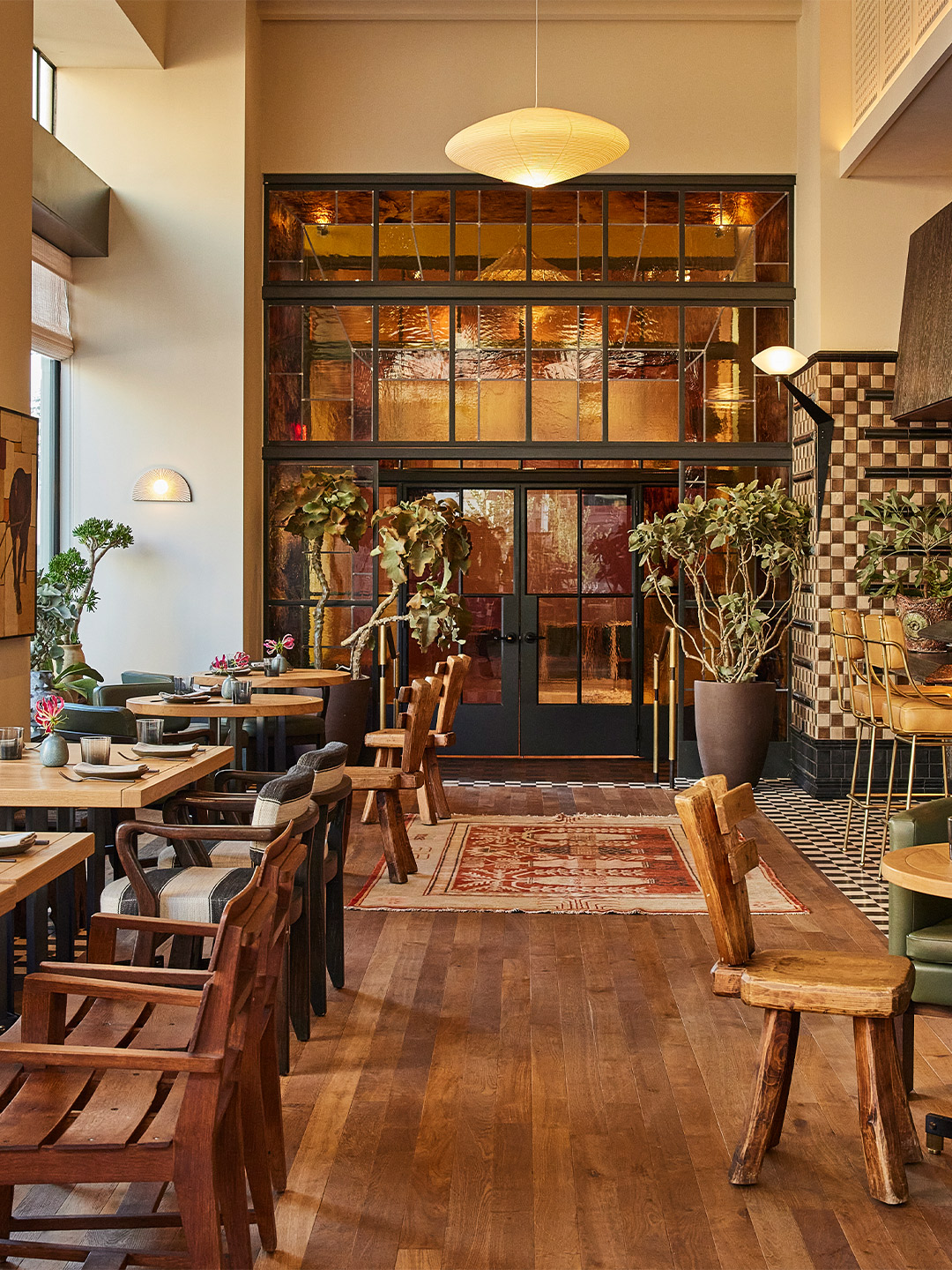
For her latest project, Kelly Wearstler, internationally recognised founder and principal of Kelly Wearstler design studio, has channelled her signature style into shaping the interiors of the new Downtown LA Proper Hotel. Set in a reimagined California Renaissance Revival building in the heart of Downtown’s South Park District, adjacent to the Fashion District, the 148-room hotel showcases a design that blends vintage elements from the property’s historic roots with modern influences, forging a lively hub for local creatives.
“Our Proper Hospitality team is deeply inspired by the pulse of this distinct and historic pocket of Downtown LA that speaks to our hometown’s past and future,” says Brian De Lowe, co-founder and president of Proper Hospitality. “We’re excited to be part of the renaissance taking place within the Broadway Corridor with partners who share our vision of creating a vibrant and welcoming hospitality experience that reflects the surrounding culture and community.”
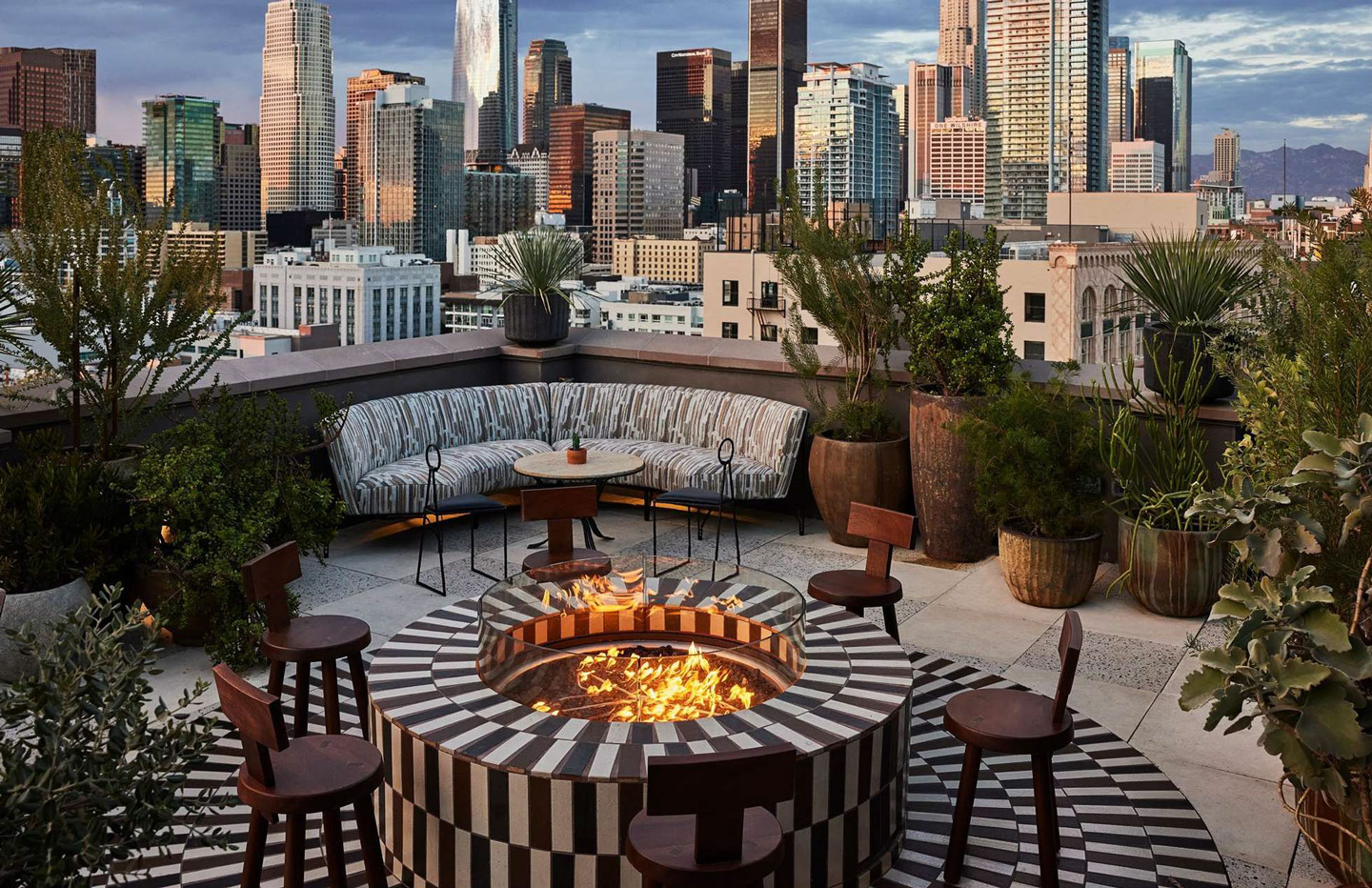
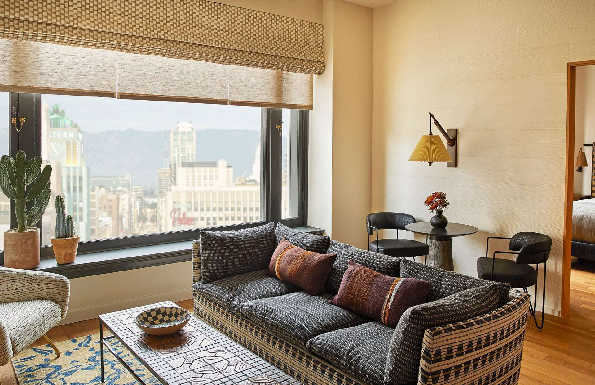
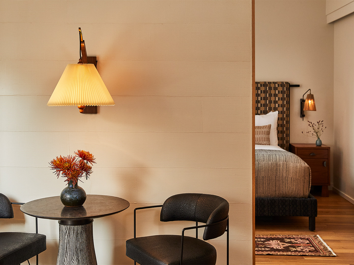
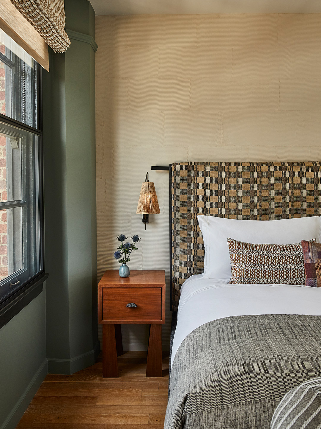
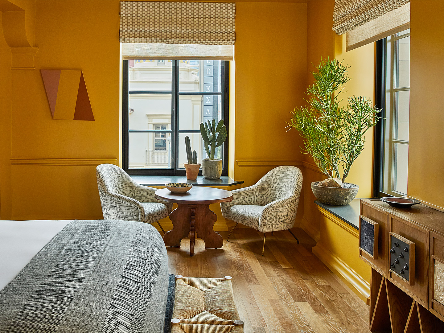
Downtown LA Proper Hotel by Kelly Wearstler design studio
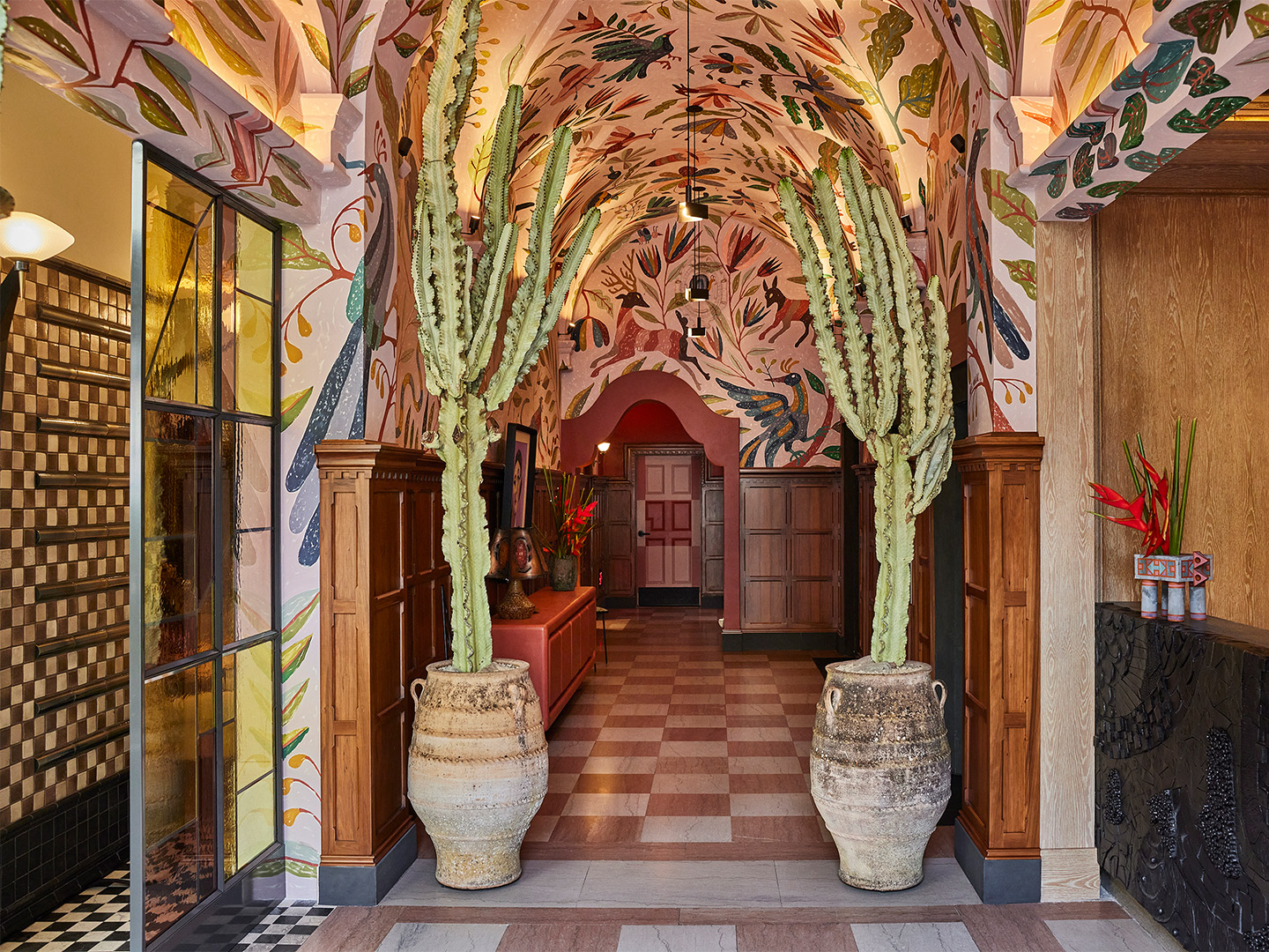
Constructed by iconic Los Angeles architects Curlett & Beelman in the 1920s, the property was initially a private club whose members included luminaries such as Cecil B. DeMille, and was subsequently a YWCA in the 1960s. The Kor Group, the LA-based real estate developer led by Proper Hospitality, and Kelly have reimagined this storied history with a modern palette, drawing inspiration from Downtown LA to layer vestiges from the 1920s with elements of Spanish, Portuguese, Mexican and Moroccan design.
In addition to vintage furniture and rugs, Kelly and her team haas employed more than 100 different kinds of hand-painted and custom tiles throughout the property, while site-specific murals and installations by local talents (such as stained glass by Judson Studios and ceramic works from Morgan Peck) bring further dimension to the public spaces.
“It was incredible working with the Proper Hospitality team to transform such an iconic and historic building in Downtown LA,” Kelly says. “The design of the hotel was greatly inspired by the community — early California, Spanish missions and the Los Angeles Herald Examiner building across the street. The building is also a Historic-Cultural Monument, so we maintained some of the original integrity and fabric, like the window casing and brickwork, while elevating it with contemporary jewel tones, patterns and plasterwork.”
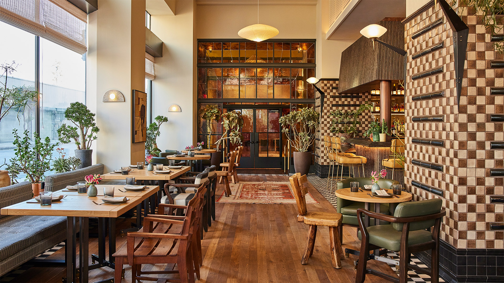
Deeply residential in feel, each of the rooms and suites is a canvas for curated pieces and specially designed furnishings with charcoal and mauve tones lending depth and warmth. Nodding to its former life as a YWCA, stand-out features of the hotel include the sizeable Proper Basketball Court and Proper Pool suite featuring a full-sized indoor swimming pool, accented by a ceramic mural by local artist Ben Medansky. Signature Proper comforts and in-room amenities include Fili D’oro Fine Linens, Aesop bath amenities, Kelly Wearstler x Parachute Home robes.
Celebrated chef Suzanne Goin and restaurateur Caroline Styne have joined the party to bring the culinary program to life in three distinct spaces. Lobby level restaurant and bar, Caldo Verde, is a focal point within the hotel and neighbourhood at-large, showcasing Suzanne and Caroline’s nuanced and warm approach to hospitality. Open for three meals a day, the restaurant draws inspiration from Portuguese and Spanish influences, while finding expression through the lens of Southern California.
In the weeks following the opening of the hotel, Cara Cara, the restaurant and lounge located on the rooftop, with sweeping and unobstructed city views, debuted with a menu similarly grounded in multicultural inspirations including Mexican flavours. Crafted to complement the unrivalled rooftop and poolside experience, dishes include local seafood aquachile, seasonal focaccia from the wood-fired oven and tacos. Later in the summer, Suzanne and Caroline will introduce Dalia, an intimate ground level classic cocktail lounge and bar showcasing small-batch spirits in refined presentations.
The design of the hotel was greatly inspired by the community — early California, Spanish missions and the Los Angeles Herald Examiner building across the street.


Catch up on more architecture, art and design highlights. Plus, join the mailing list to receive the Daily Architecture News e-letter direct to your inbox.
Related stories
- Home tour: Memphis Milano apartment in Italy by Puntofilipino.
- Home tour: New meets old at the hands of Channon Architects and Burton Architects.
- Home tour: The undulating Fold House in Canada by Partisans.
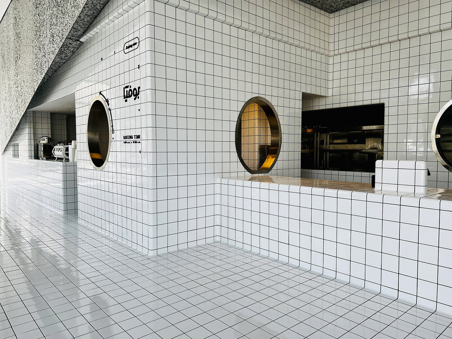
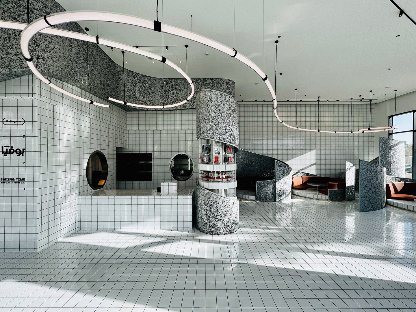
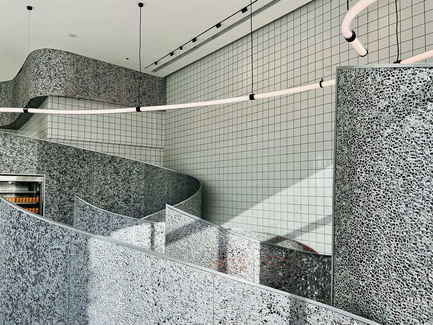
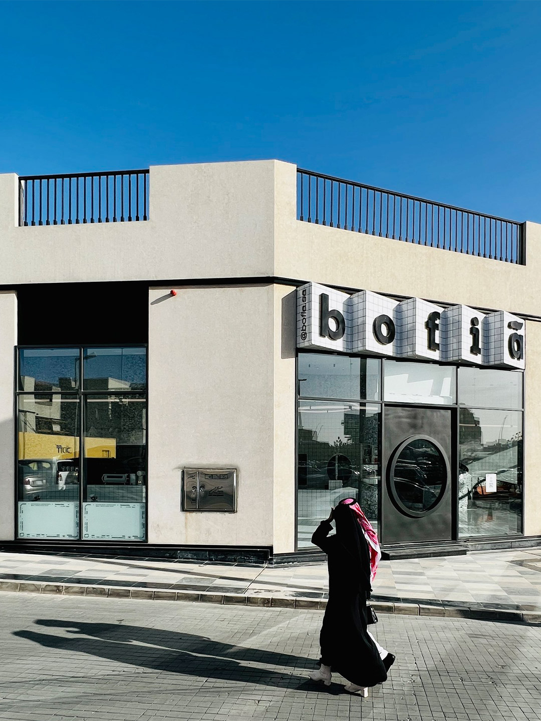
In Saudi Arabia, bofia is the name given to the unassuming canteens that dot the country’s roadsides, regularly visited by locals and travellers for quick, authentic and reasonably priced street food. In an attempt by Azaz Architects to find an architectural solution and material identity for a modern-day version of this no-fuss eatery style, the new Bofia restaurant reinterprets the unapologetic, blunt and straightforward nature of street-side dining, presenting equally delicious cuisine within a polished interior space.
Located in the centre of Riyadh, the main financial hub and capital city of Saudi Arabia, the Bofia restaurant (also referred to as “The Tiled Cloud”) is tucked within an unassuming standalone structure. Exhibiting simple geometry and straight lines, the building was once described by the restaurant’s architects as feeling rather “ordinary” in the overall streetscape. That was, of course, before it was given a tiled marquee emblazoned with the name Bofia, positioned neatly above a new door with a circle-cut peephole framing a very different world.
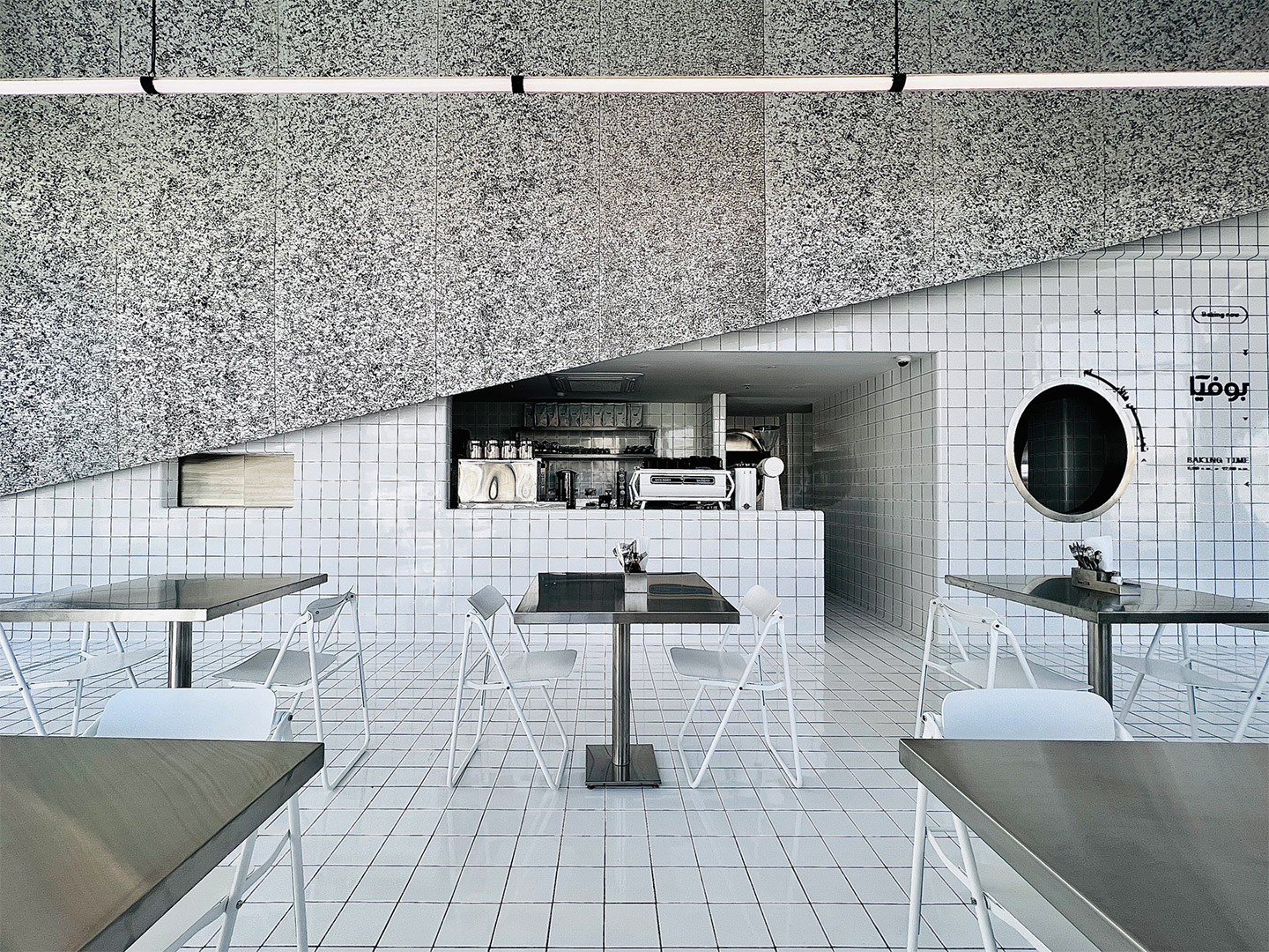
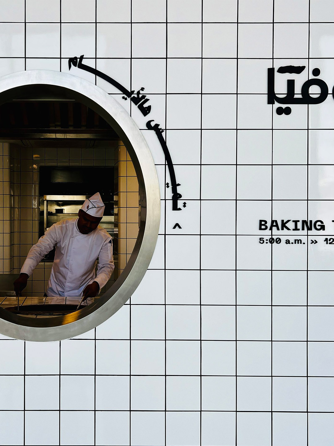
‘The Tiled Cloud’: Bofia restaurant in Riyadh by Azaz Architects
To create contrast from the grey-tinged street, the team at Azaz Architects played with the idea of forming a cloud-like installation inside the building. This approach sparked the restaurant’s nickname, The Tiled Cloud, and allows diners to experience a feeling of surprise and airiness as they enter the restaurant. “The interior mass is imagined as a cloud that floats within the space,” the architects say of their design response. “[It] seamlessly separates and lifts the busy back-of-house from the front-of-house areas.”
Capped with an angular panel of textured aluminium foam, the interior facade of the “cloud” is clad in crisp white tiles, mostly concealing the kitchen and staff-only spaces. The glossy square-format tiles extend across the floor of the L-shaped public zone, wrapping underneath guests’ feet to form a built-in banquette for dining along one window. Here, carefree steel tables and white folding chairs mimic the traditional set-up of street food outlets.
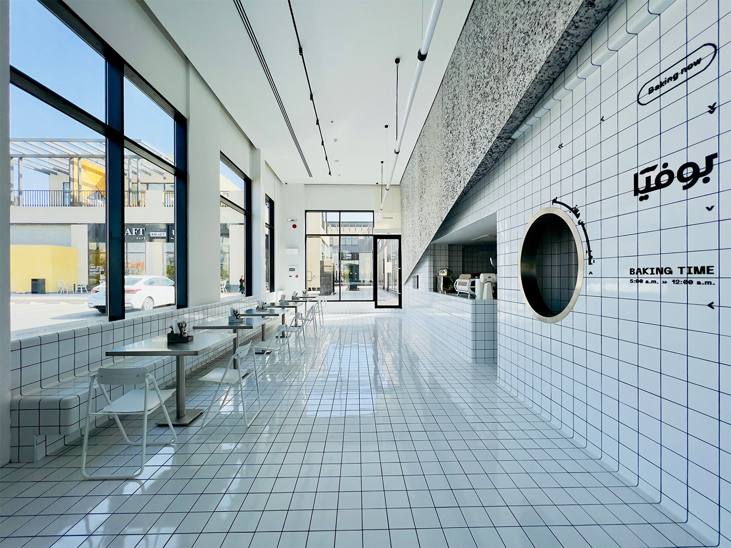
In the other smaller wing of the restaurant, the white tiles make an appearance on raised circular dining platforms, where upholstered bench seats are cocooned by curvy panels filled with the same aluminium foam that embellishes the main counter. These panels provide privacy for anyone dining in the booths. But when it reaches the central column, the foam peels back to reveal circular tiled shelving with retail products on display.
As with the planning of a traditional diner, the public area at Bofia is placed outside the back-of-house zone. It was important to the architects, however, that diners could sit within a close enough distance to the cloud-like facade that allows them to appreciate the architectural geometry on display. From their seats, diners can then also witness the action of the kitchen, observed through small cut-outs and round portholes carved into the tiled walls.
Overhead, the heavenly details continue with the addition of a “strike of light” that propels through the space, like a wobbly bolt of lightning that brings energy to the mostly white interior. Through smart programming the luminaire offers functional performance, as well as different “story-telling potential” during both daytime and nighttime service. “Interestingly, visitor and observer opinions have been evenly split on whether the design is considered minimalist or maximalist,” the Azaz team says. Either way, they suggest, the fit-out is “an architectural fantasy turned into reality”.
Interestingly, visitor and observer opinions have been evenly split on whether the design is considered minimalist or maximalist.
Catch up on more architecture, art and design highlights. Plus, subscribe to receive the Daily Architecture News e-letter direct to your inbox.
Related stories
- Venus Power collection of rugs by Patricia Urquiola for cc-tapis.
- Bitossi celebrates centenary in Florence with new museum and 7000-piece display.
- Casa R+1 residence in southern Spain by Puntofilipino.
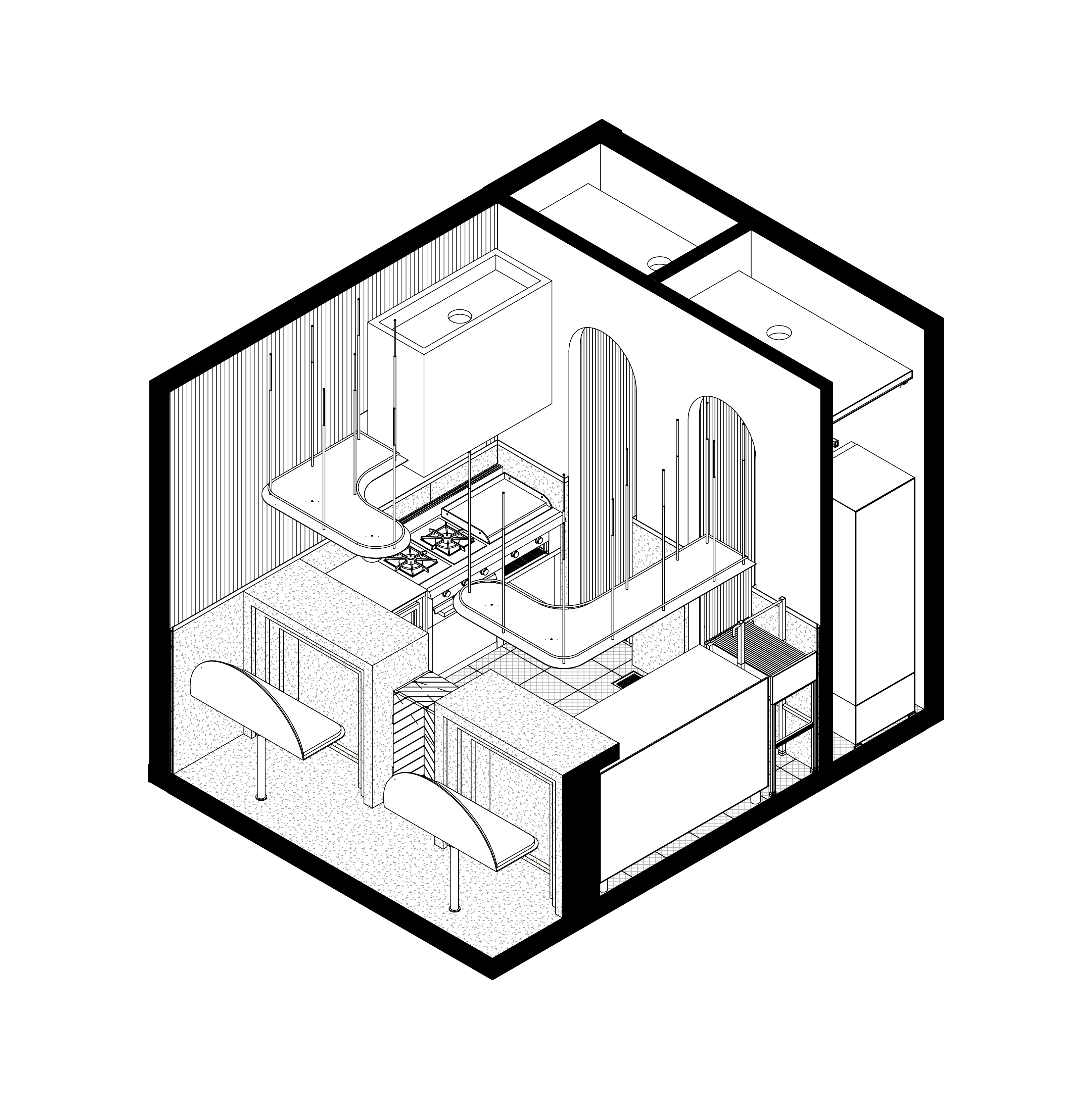
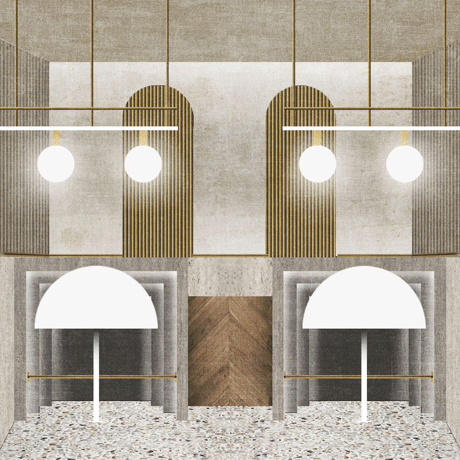
Testament to the sayings “good things come in small packages” and “size doesn’t matter”, the 10-square-metre Pargot restaurant packs a punch in the Roma Norte neighbourhood of Mexico City. Designed by local firm RA! Arquitectos, the tiny diner merges the traditional architecture of the region with influences of its ocean-focused menu. “The interior design takes us back to the Art Deco movement of the 1920s, generating a composition based on symmetry and balance between colour and geometry,” says the RA! team, led by practice co-founders Pedro Ramírez de Aguilar, Santiago Sierra and Cristóbal Ramírez de Aguilar.
Tucked behind an unassuming roller door, between a messy patchwork of electrical wires and gas metres, the hole-in-the-wall footprint of Pargot doesn’t leave much to the imagination. The dining area is limited to a duo of high bars, each with bench seats, that flare out to accommodate four diners at any one time. Behind the counters, the small industrial kitchen is divided into hot and cold food areas, backdropped by a wall featuring two arches and two sliding brass doors. When opened, the rear doors create a change of atmosphere, transitioning the core colour palette from gold to navy, which the designers say “incites a sensation that brings us closer to the sea”.
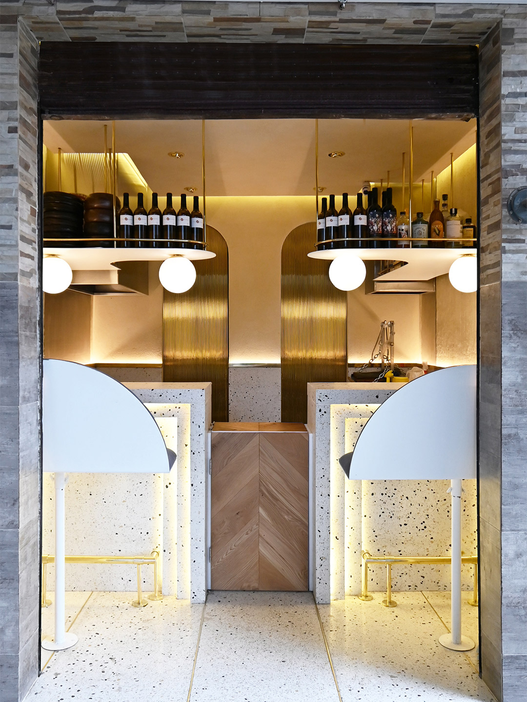
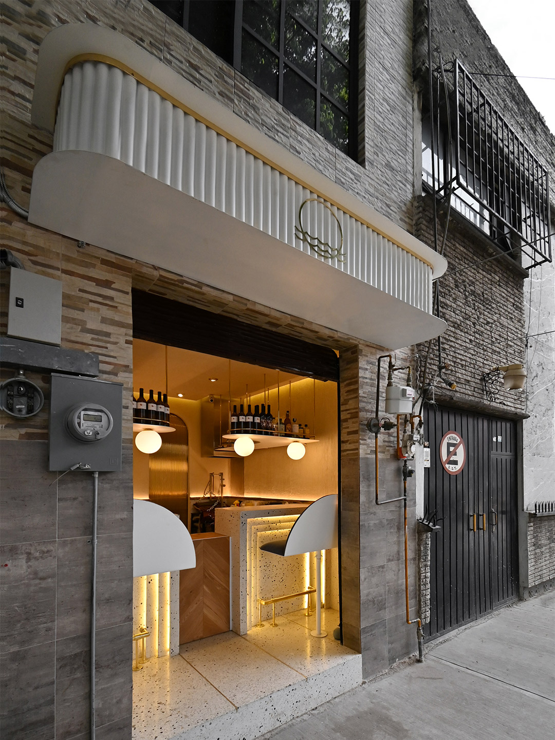
Pargot restaurant in Mexico City by RA! Arquitectos
Ensuring the material palette is kept simple yet striking, the floor of the restaurant, the lower portion of the walls and the two bars are all composed of white-based concrete terrazzo, with blue, yellow and grey stones offering a nod “to the beaches and shells that we find on the sand,” the designers say. The upper part of the walls features a gentle shift in materiality thanks to a textured effect created with lengths of bamboo. Stems of the plant have been pressed into a plaster mix, revealing its notches and veins – a treatment which is accentuated by uplighting concealed behind a golden rail.
Efficient storage shelves suspended from the ceiling double as the bar area at the front of the kitchen, displaying a small selection of wines and spirits for diners to imbibe alongside delicious dishes. The gold-coloured metallic finish of both the shelf embellishments and the foot rails catches the light emitted from within the Art Deco detailing of the bar fronts and the floating orbs overhead, drawing in passers-by. Heightened by the grungy surrounds that lay before the restaurant’s front step, the result is a glimmering gem in a roughened street of Roma Norte, destined to satisfy the appetites of foodies and design lovers alike.
The interior design takes us back to the Art Deco movement of the 1920s, generating a composition based on symmetry and balance…
Catch up on more architecture, art and design highlights. Plus, subscribe to receive the Daily Architecture News e-letter direct to your inbox.
Related stories
- Venus Power collection of rugs by Patricia Urquiola for cc-tapis.
- Bitossi celebrates centenary in Florence with new museum and 7000-piece display.
- Casa R+1 residence in southern Spain by Puntofilipino.
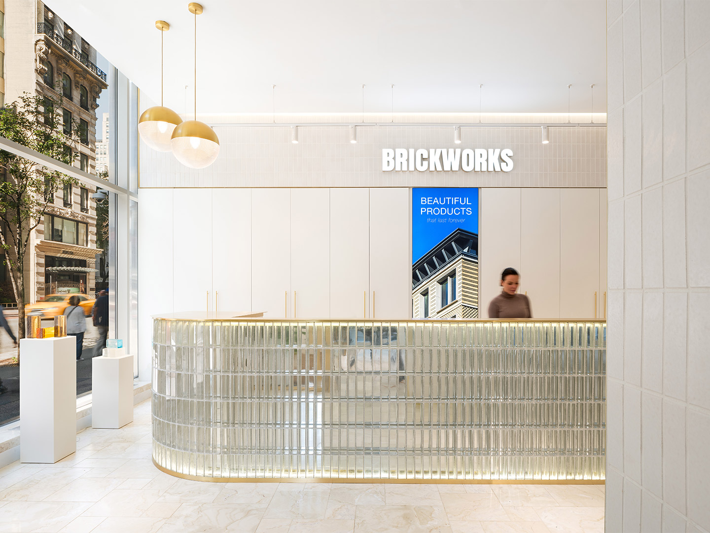
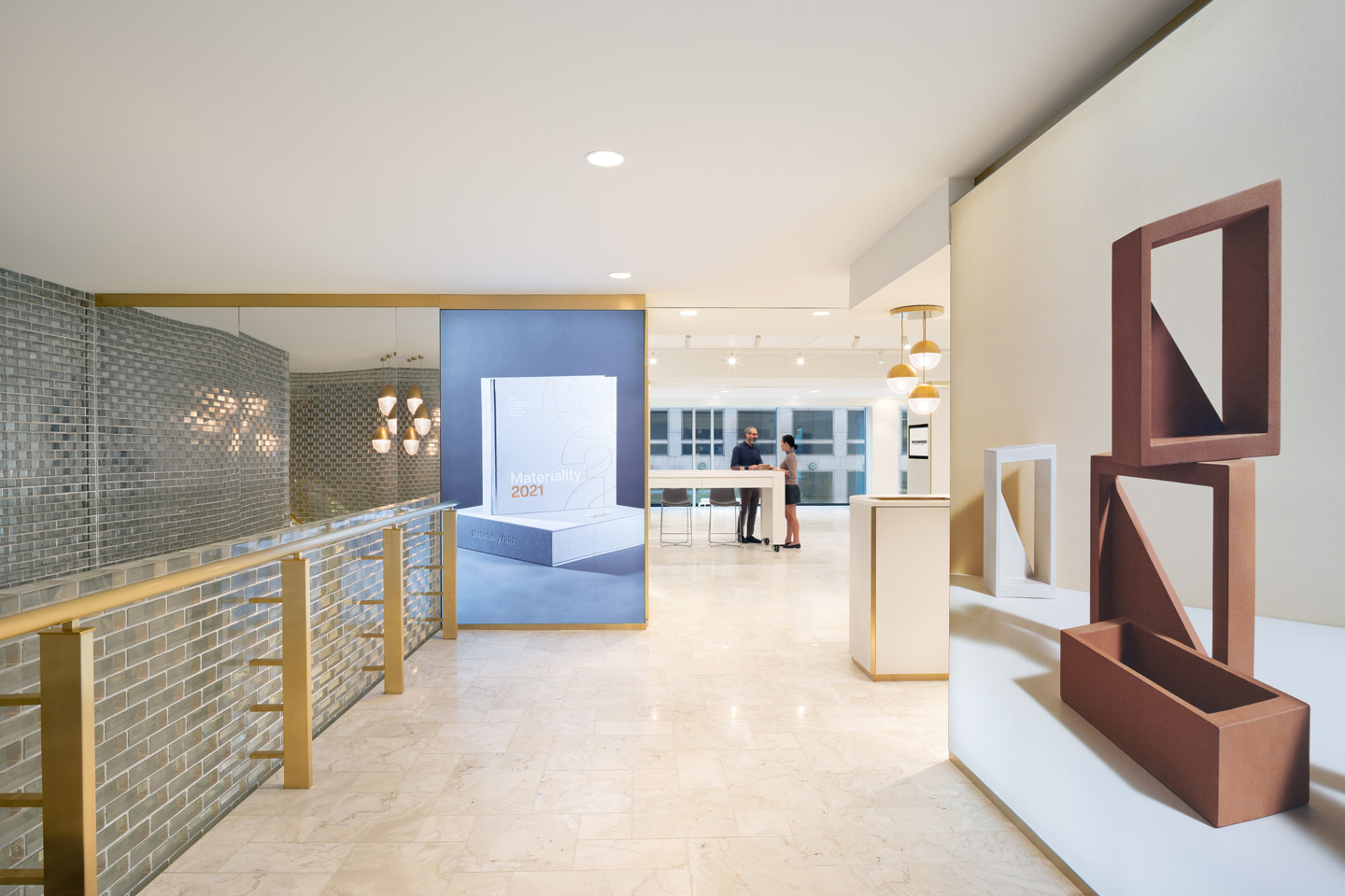
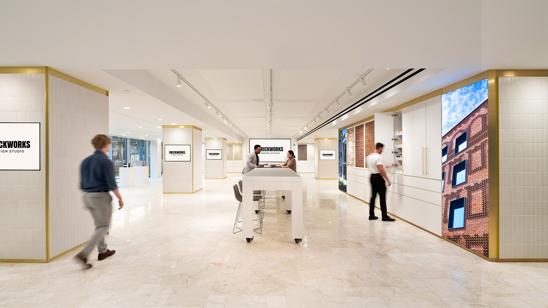
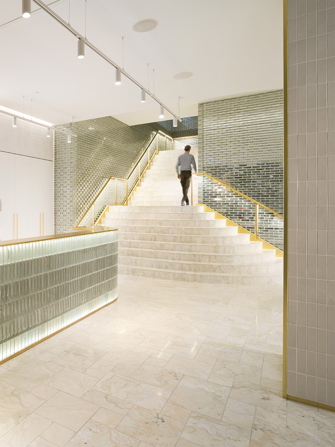
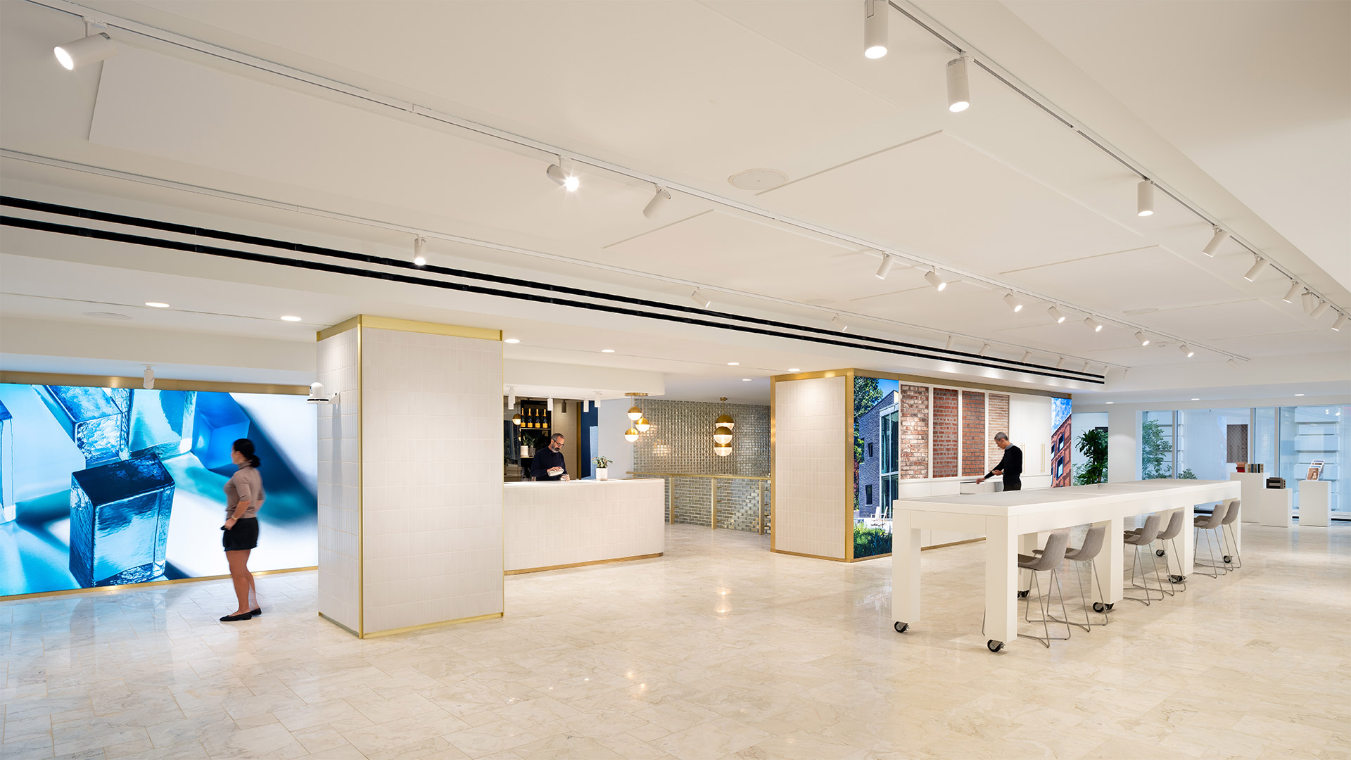
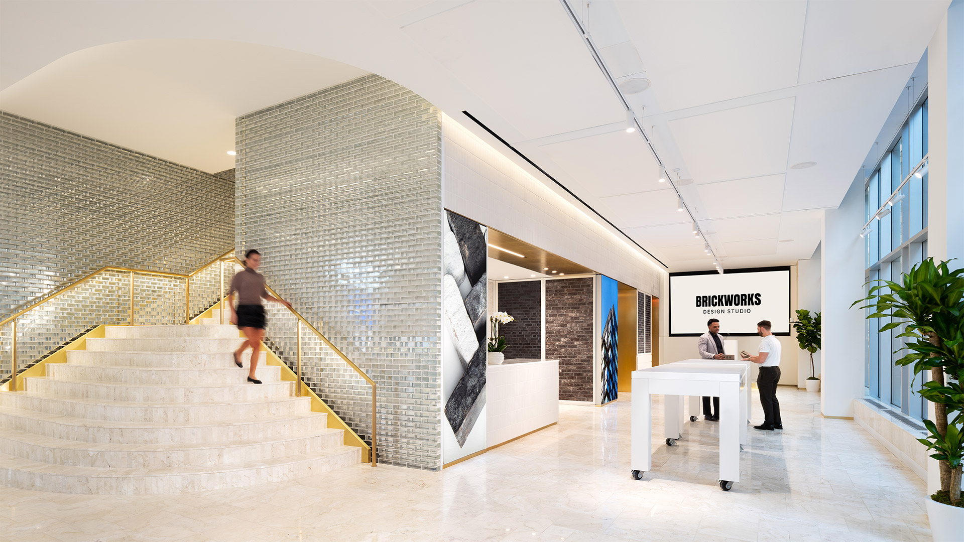
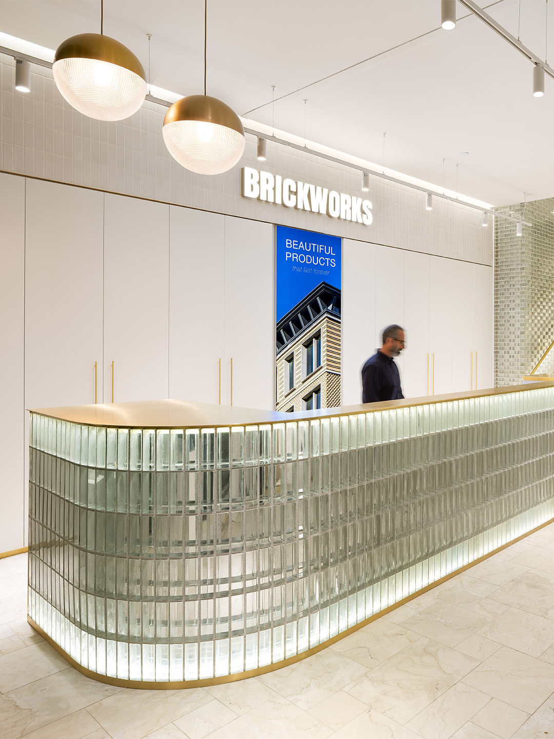
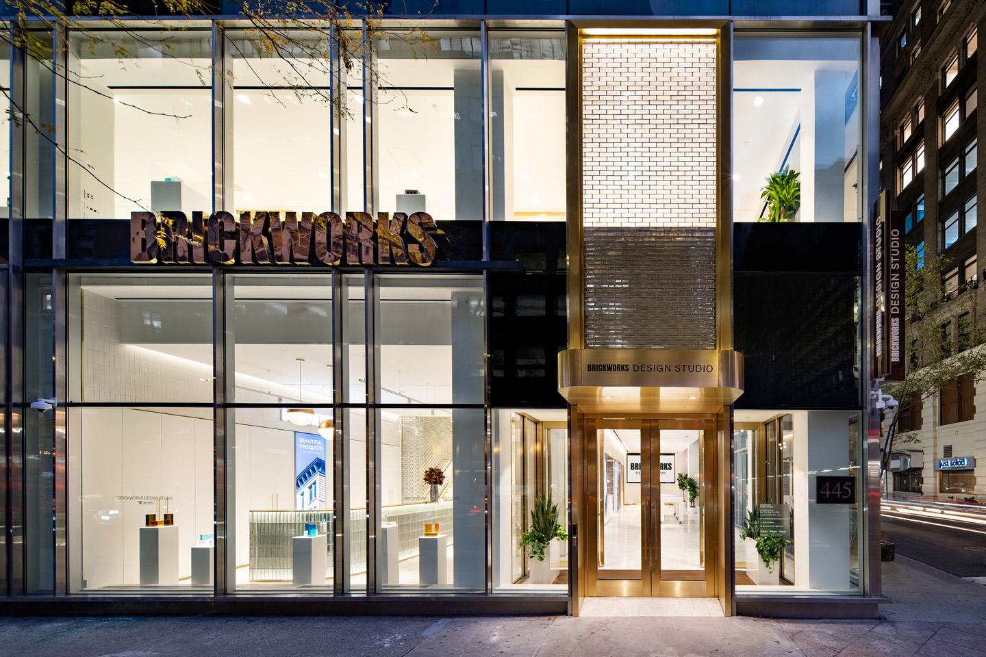
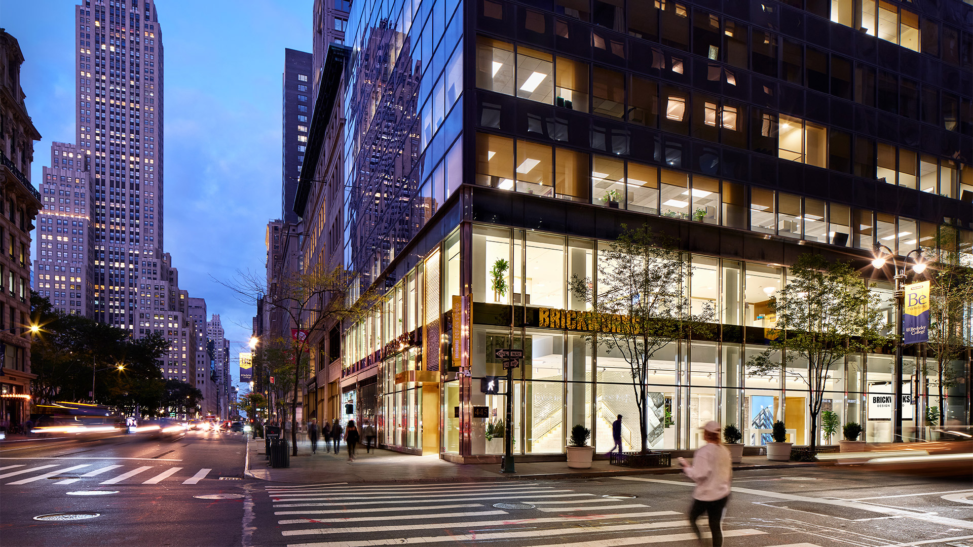
A monogrammed trunk from Louis Vuitton. Solid gold bracelets from Cartier. The latest Apple watch. And a batch of premium designer bricks. Not often are these luxurious products available to procure in the same place, but as of this month they are all on offer to peruse and purchase from one of the world’s most glamorous shopping strips. Brickworks Building Products – the maker of super-fine construction materials and parent company of North America’s Glen-Gery Bricks – has opened the doors to its flagship store on New York’s Fifth Avenue. Rubbing shoulders with the likes of Rolex, Saks and Tiffany & Co, the studio welcomes the Big Apple’s brimming pool of design talent to consult with experts, specify spectacular products and – most importantly – stay inspired.
Lindsay Partridge, managing director of Brickworks, says the company is “thrilled” to have opened its global flagship on New York’s most famous shopping street among other legendary brands, a stone’s throw from famed buildings such as the Empire State and Chrysler. “[The Design Studio] is a pivotal milestone for Brickworks,” he declares, referencing the continued expansion of the brand in North America. “It’s an honour to bring our expertise to New York City, home to some of the most diverse, lively and iconic architectural structures in the world.”
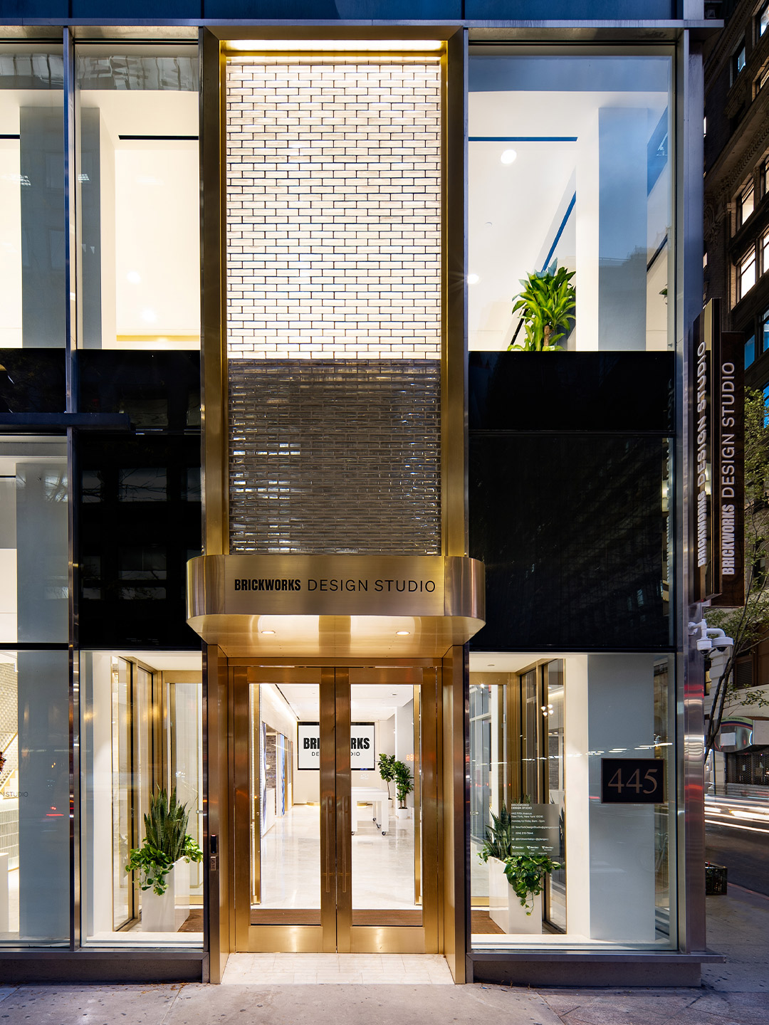
Brickworks opens New York Design Studio on Fifth Avenue
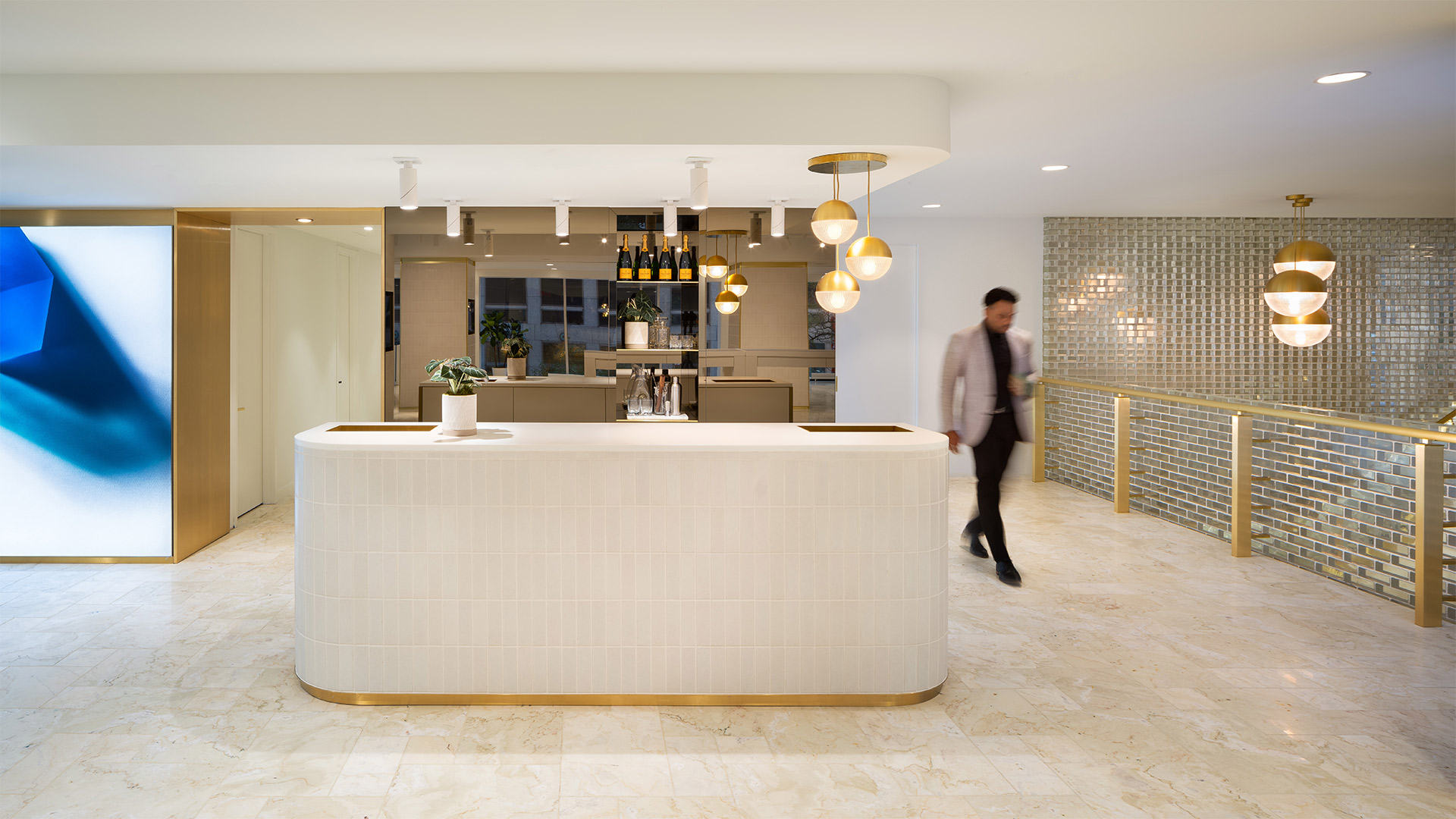
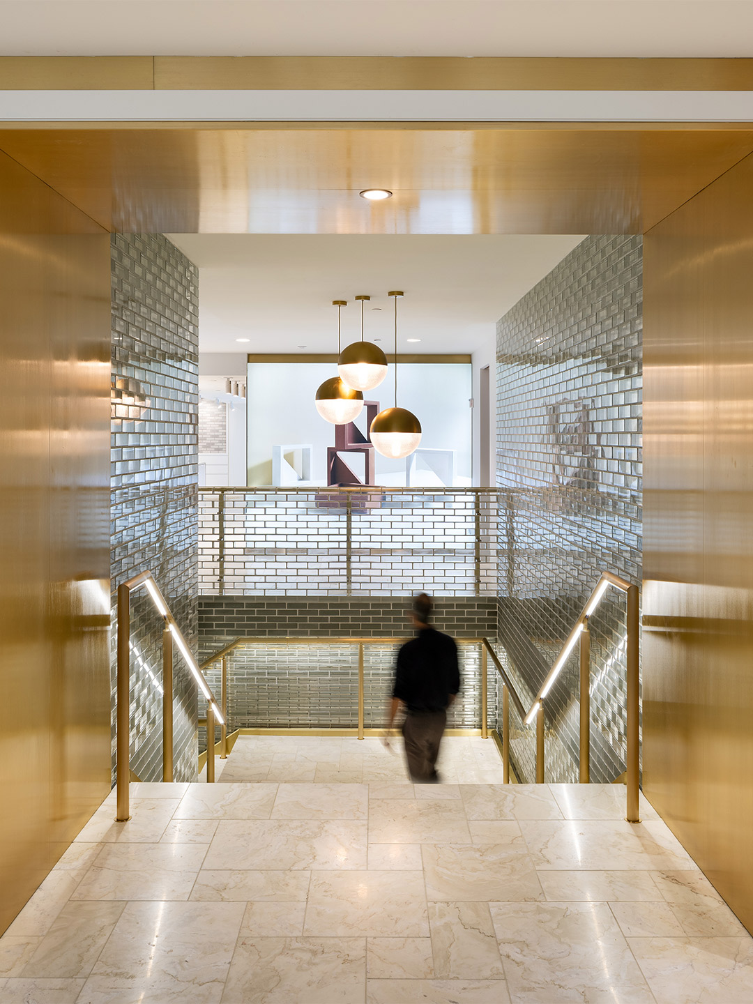
Synching up with the ambience created in other Brickworks Design Studios, including in Sydney, Brisbane and Melbourne, the New York showroom offers a light-filled canvas for the range of products to take centrestage. Set over two levels, walls of clear glass brick meet shimmering golden metallic surfaces. Product nooks filled with samples offer a modern take on apothecary-style drawers, beckoning visitors to touch and feel. And moveable consultation tables allow designers to lay-out their selections, backdropped by all-white surfaces.
It’s this ability to get up-close with Glen-Gery’s range that opens endless possibilities for trade professionals such as architects, designers, developers and builders. The studio features at least 20 product displays, including Glen-Gery’s 2022 releases, as well as international products from GB Masonry, Urbanstone and the award-winning ‘Kite Breeze’ breezeblock by celebrated Australian designer Adam Goodrum.
But as the suave-looking bar on the upper level suggests, Brickworks isn’t just about selling bricks. The company is well-regarded for spearheading industry events, architect speaker series’ and launching hefty monographs – all of which can be accommodated in the New York studio. Not confined to the limits of its four glittering walls, the showroom is also equipped with a state-of-the-art broadcast studio, offering a connection point with creatives from all around the world and a space to create engaging content for local and international audiences.
Brickworks New York Design Studio is located at 445 5th Avenue, New York.
glengery.com; brickworks.com.au
It’s an honour to bring our expertise to New York City, home to some of the most diverse, lively and iconic architectural structures in the world.
Brickworks Building Products is the owner of this masthead.
Catch up on more architecture, art and design highlights. Plus, subscribe to receive the Daily Architecture News e-letter direct to your inbox.
Related stories
- Venus Power collection of rugs by Patricia Urquiola for cc-tapis.
- Bitossi celebrates centenary in Florence with new museum and 7000-piece display.
- Casa R+1 residence in southern Spain by Puntofilipino.
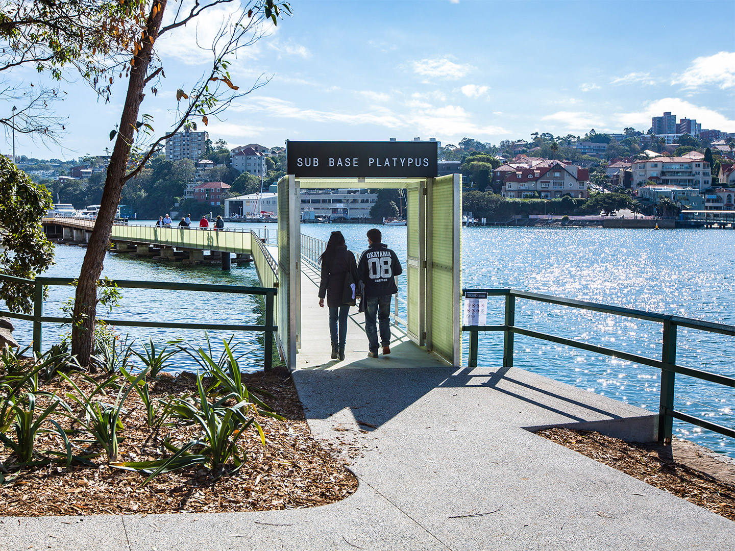
When the Sub Base Platypus precinct was officially launched by Sydney’s Harbour Trust in May of last year, it marked the first time the site had been opened to the public in 150 years. The storied parcel of prime real-estate was reimagined by ASPECT Studios and Lahznimmo Architects to celebrate its history as a former torpedo factory, submarine base and gasworks, as well as its harbour-side location – a feat which earned the project the Walter Burley Griffin Award for Urban Design in 2021. Ten months on, the precinct is now one of North Sydney’s most exciting recreation, retail and work hubs, where a scenic waterfront promenade and spectacular views across the iconic harbour lure in locals and visitors alike.
Joining the lineup of attractions this month is purpose-led lifestyle label Koskela, which will on Saturday launch a new concept store and home-base at Sub Base Platypus, starring refreshed branding by Frost*collective. Leaving behind the much-loved headquarters in Rosebery, Koskela co-founder Sasha Titchkosky says the new space, located on Cammeraygal land, will continue to showcase the best in Australian design and exhibitions by leading First Nations artists, while also adapting to a new-look retail landscape forged by the pandemic.
Koskela store opens in North Sydney’s Sub Base Platypus
“The role of the store has changed since Covid and we think our new location reflects the type of experience customers are looking for,” Sasha explains. “We focussed on finding somewhere that captured the essence of Sydney and naturally the harbour was always front and centre.’’ Set over two light-filled levels, the 500-square-metre space is backdropped by solid Australian timbers and Sydney sandstone – both key features of the site and the area more broadly – while the curation of goods on offer appeals to shoppers in search of both beauty and longevity.
“We want to connect and make memories with our visitors, bringing true connection and meaning to the pieces that they own,” Sasha says of Koskela’s thoughtful range, adding that she hopes the purchases made from the store continue to become “treasured and maintained” heirlooms, acquired in an environment that is equal parts dazzling and laidback. “We are thrilled to have found a new home in this remarkable location – steeped in history and boasting beautiful waterside views,” Sasha says contentedly. “Even the motto for [the old] HMAS Platypus – ‘Nothing Too Difficult’ – seems apt for our new home.”
Located at Sub Base Platypus, 1008/120 High Street, North Sydney, the new Koskela store will open its doors from Saturday 19 March, trading 9am to 6pm. Bookings for in-store consultations available.
The role of the store has changed since Covid and we think our new location reflects the type of experience customers are looking for.
Catch up on more architecture, art and design highlights. Plus, subscribe to receive the Daily Architecture News e-letter direct to your inbox.
Related stories
- Venus Power collection of rugs by Patricia Urquiola for cc-tapis.
- Bitossi celebrates centenary in Florence with new museum and 7000-piece display.
- Casa R+1 residence in southern Spain by Puntofilipino.
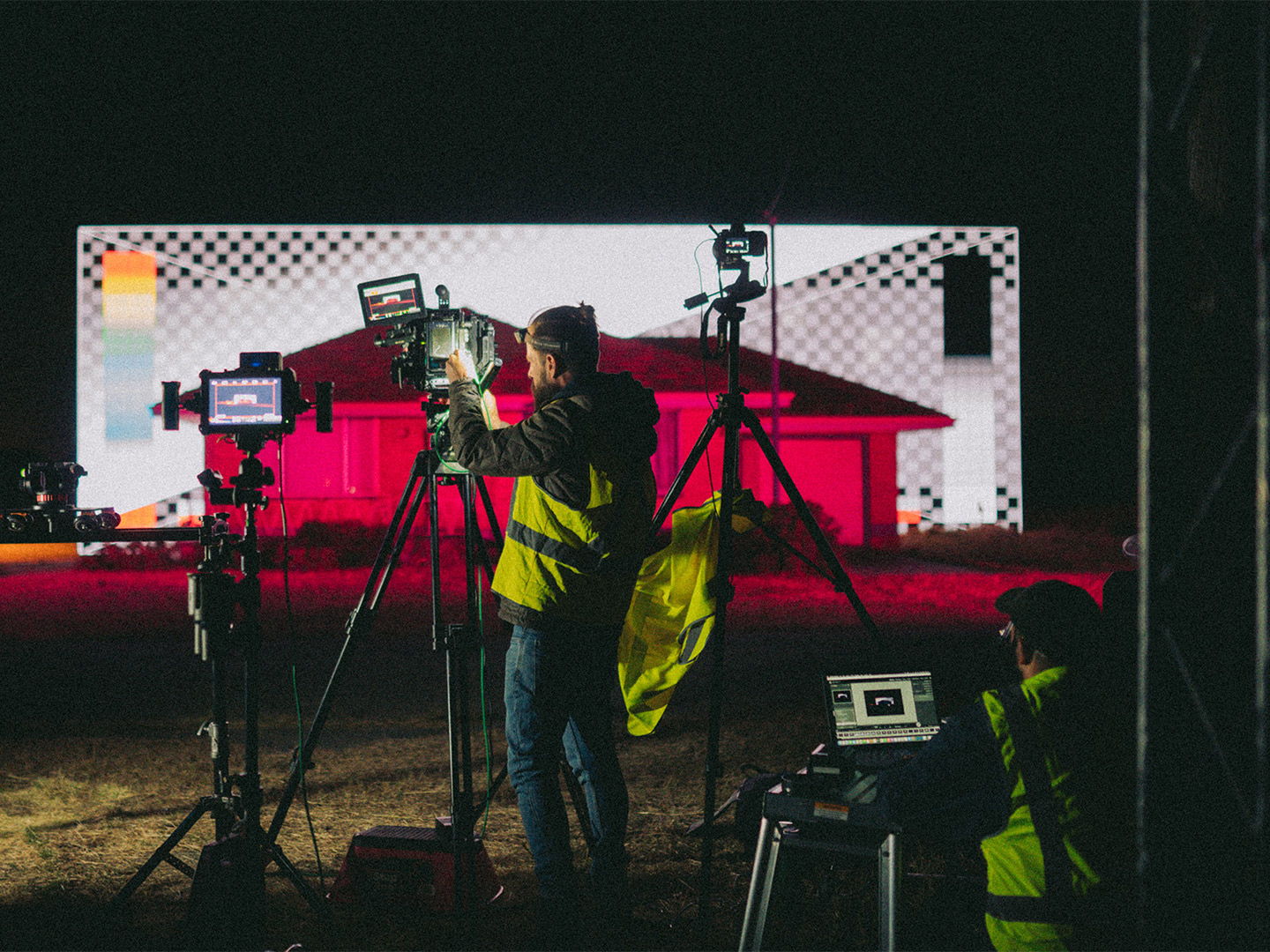
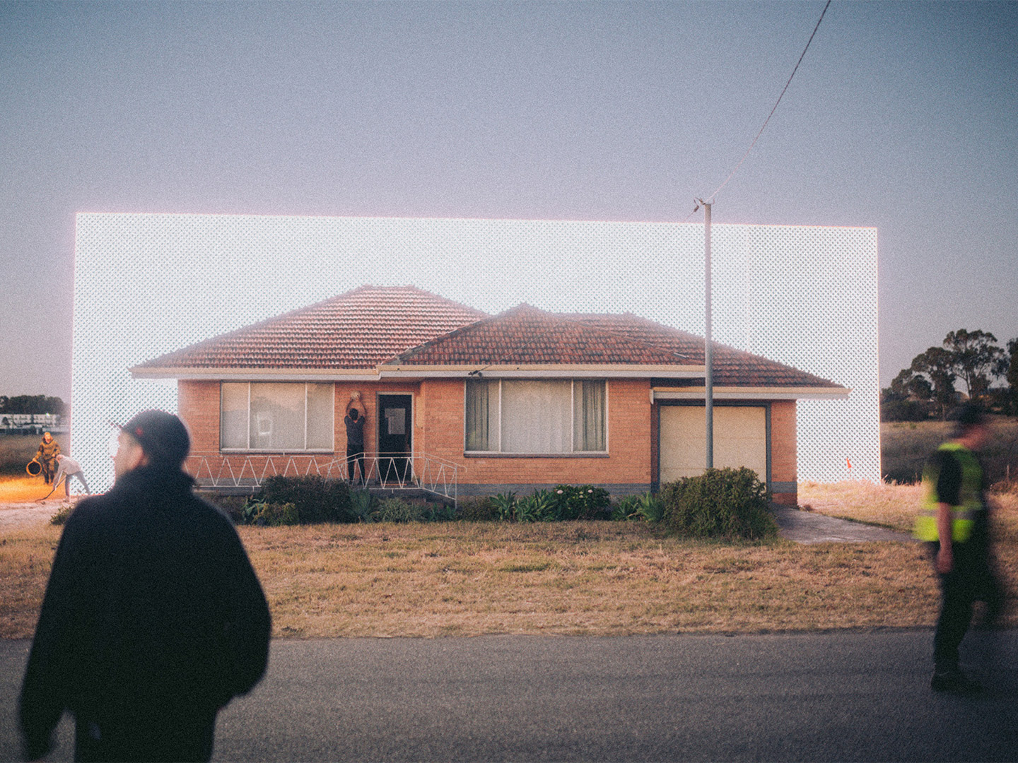
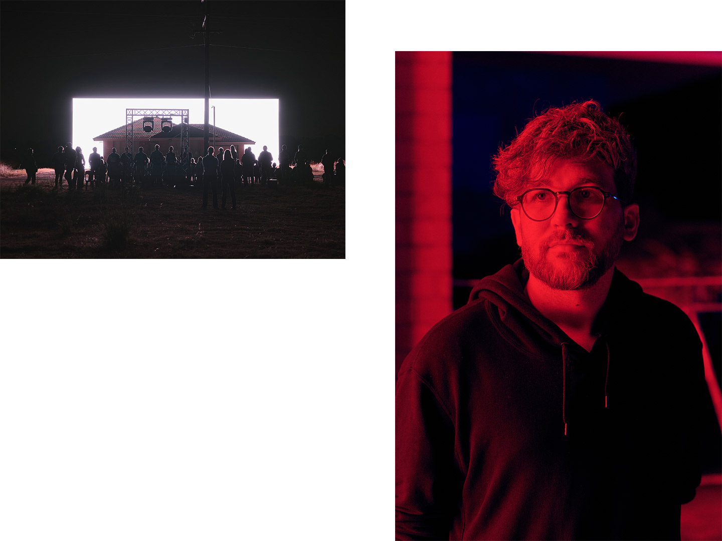
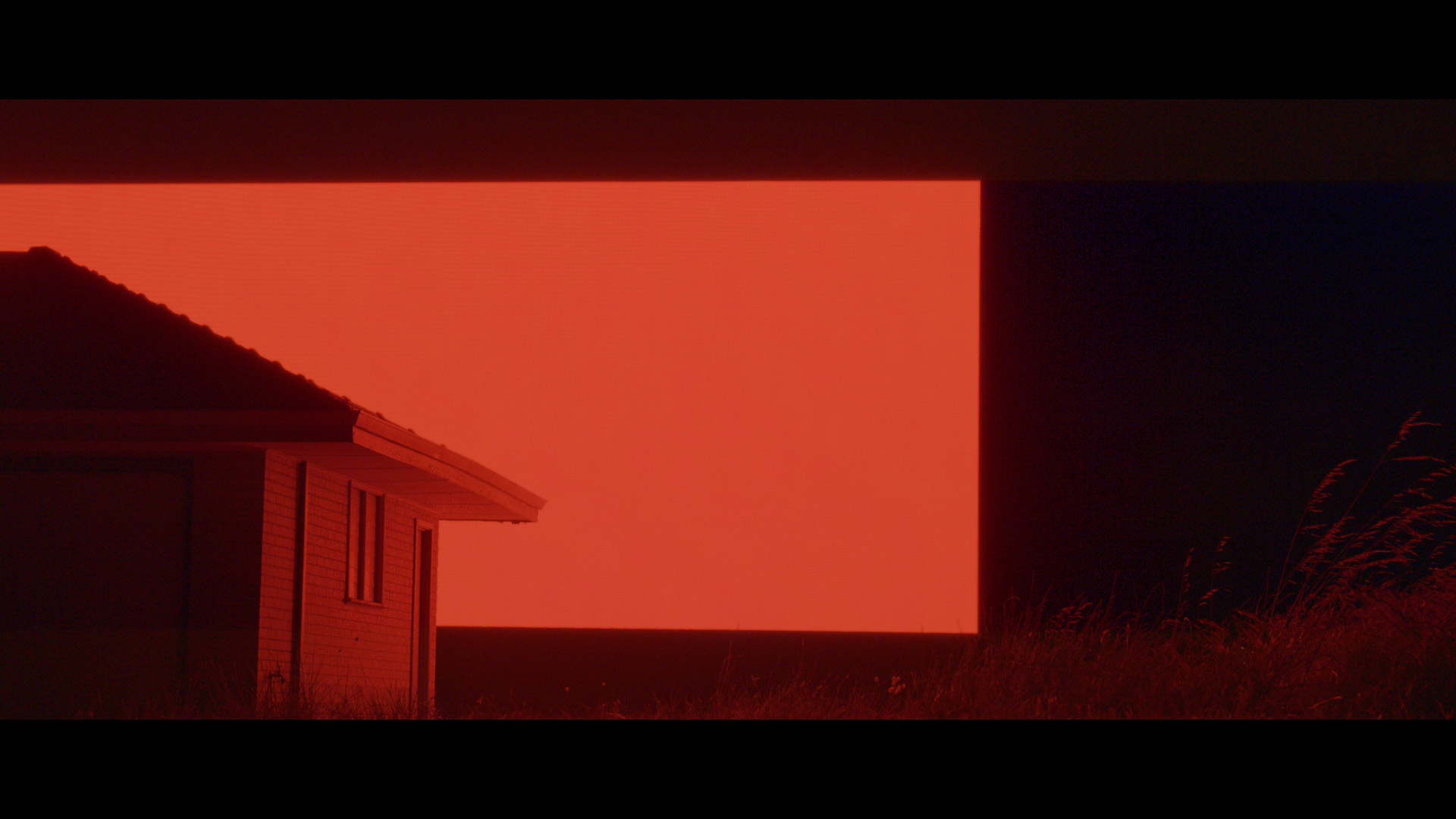
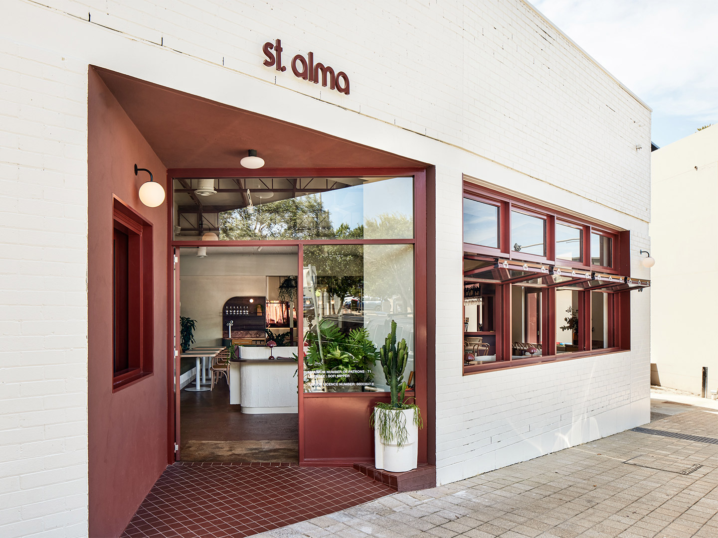
Facing a destiny punctuated by a wrecking ball, the second last “hold-out” home in Wattleup, Western Australia, has been given one final chance to make its mark. But not in any manner that you might have imagined. Before the unassuming brick-and-tile home is reduced to rubble, and the suburb it inhabits evaporates entirely, it became the site of an architectural intervention; a large-scale light and sound installation by Australian contemporary artist Ian Strange.
Ian first spotted the home in 2015, decades after it belonged to a thriving suburban township of over 700 residents. Since then, the house – like its neighbours – was sold to the Western Australian Land Authority, which plans to clear the plot for an industrial precinct ideated in the late ’90s.
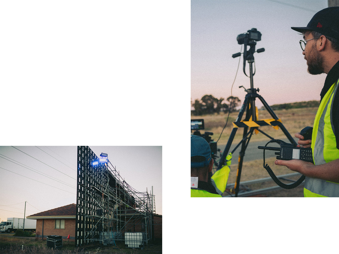
Having only conceptualised a proposal for the site in early 2021, the artist moved quickly to secure a six-week lease of the property before it meets its fate. Joined by a team of construction, film, production and lighting specialists, Ian built a stadium-sized LED video screen with programmed theatre lighting to bring his vision to life.
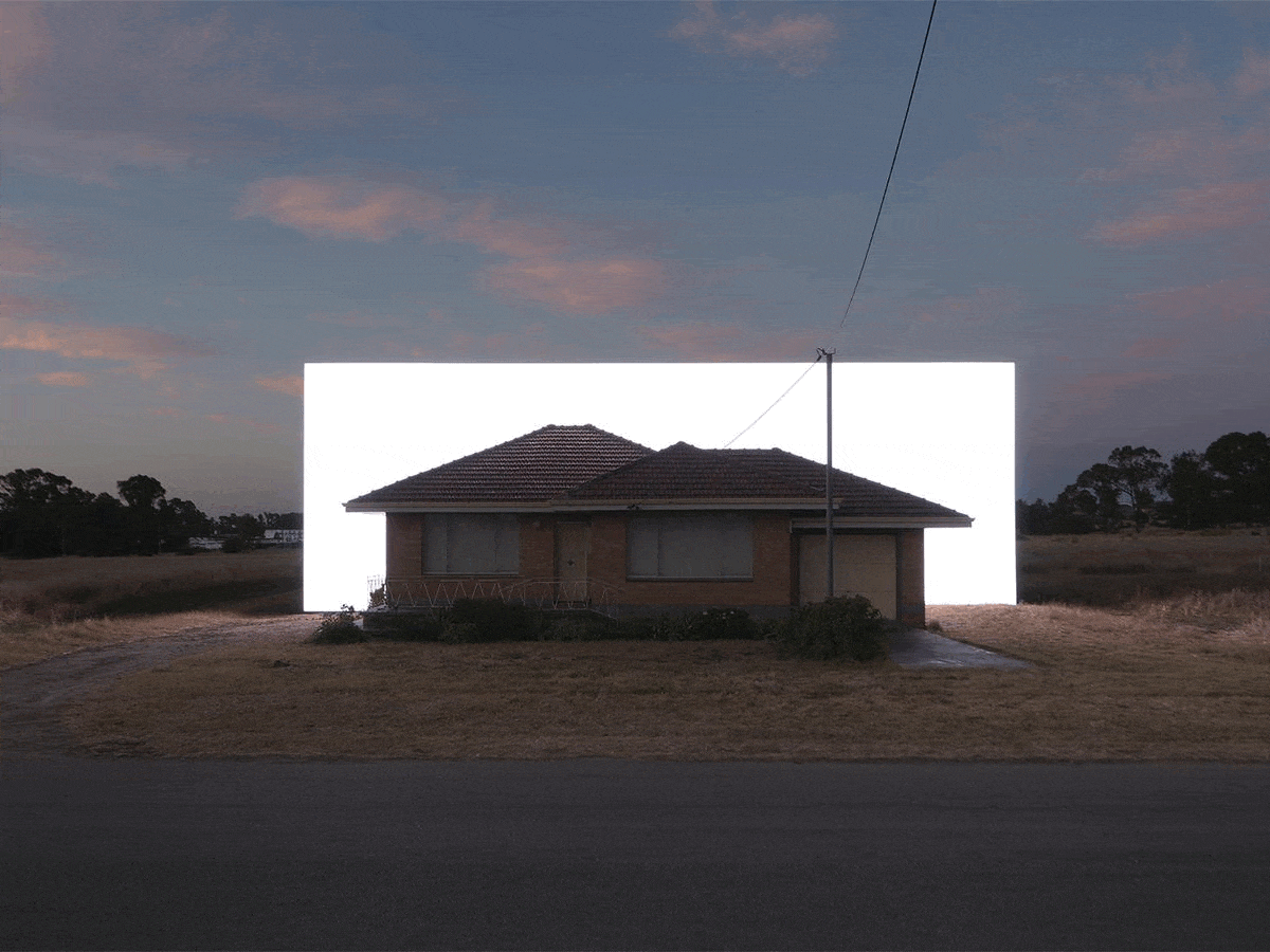
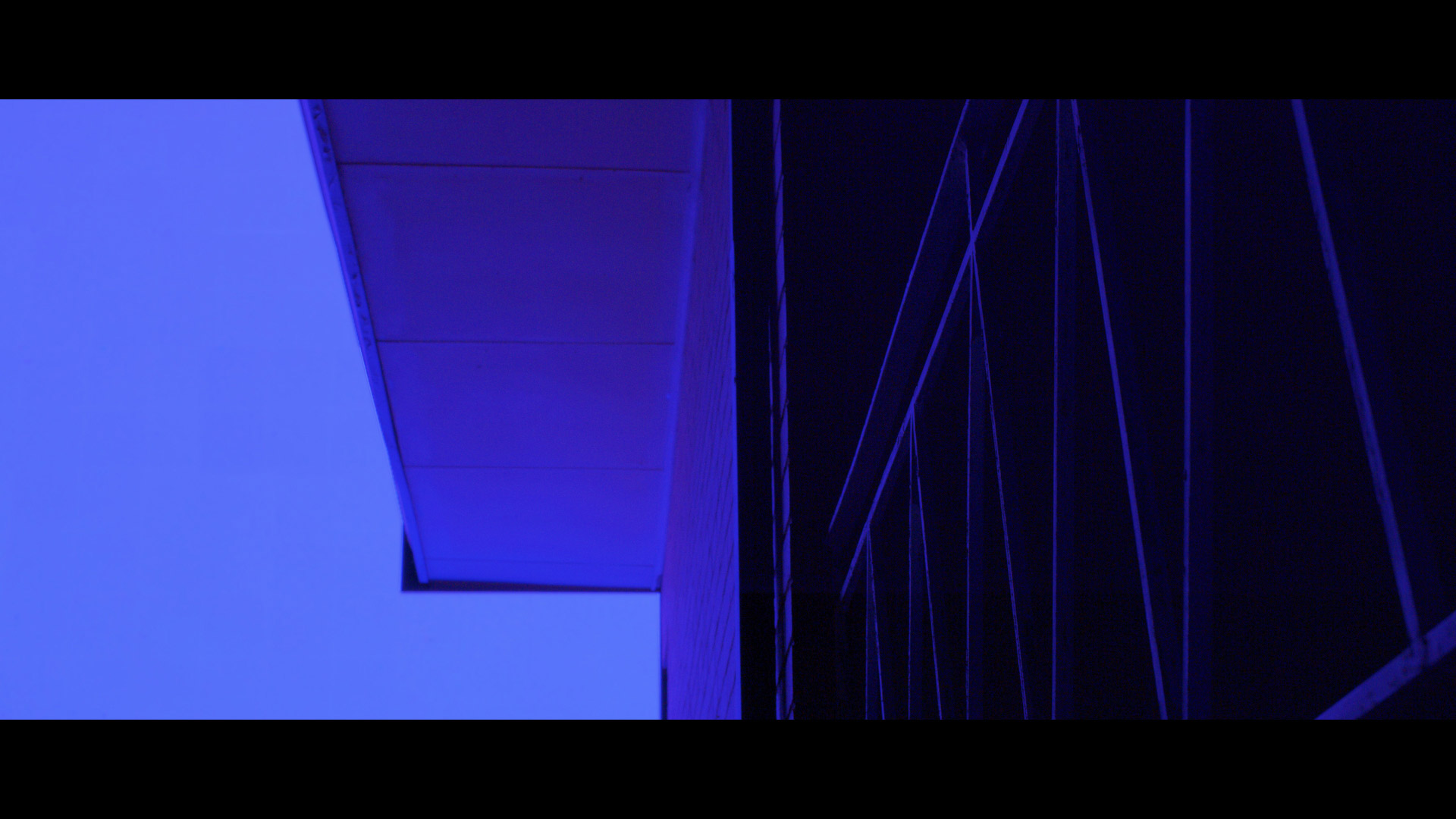
‘Dalison’ by Ian Strange
“The idea was to build this large-scale screen that would allow us to cut the house out of the landscape with light, to experience the home in shifting states of visibility, either silhouetted, isolated in darkness, or revealed in its vast, empty context,” Ian says of the project, which forms part of an ongoing body of work exploring ideas of “home” and social displacement around the world.
He adds: “Early on, I started to think about this project as a musical collaboration and I thought Trevor [Powers] was the perfect person to score that experience.” An acclaimed American musician and producer, Trevor’s original 18-minute composition of poetic, experimental sound, transformed the empty residence while Ian’s durational light installation eerily danced along.
Titled Dalison, in memoriam of the home’s address at 20 Dalison Avenue, the “eulogy” was documented by Ian and his collaborators over a period of three nights. The resulting 18-minute film and photographic works – a surviving record of the home and the temporary installation – will be shown in a series of exhibitions and screenings around the world.
ianstrange.com; dalisonproject.com
The artist moved quickly to secure a six-week lease of the property before it meets its fate.
Catch up on more architecture, art and design highlights. Plus, subscribe to receive the Daily Architecture News e-letter direct to your inbox.
Related stories
- Final days: ‘Intersections’ by Ian Strange lights up Sydney nights.
- Kelly Wearstler presents new lighting collection in virtual worlds.
- The Brick Bond in Delhi flips the script on showroom design.
For emerging restaurateurs Jack Leary and Tim Christensen, founders of the Alma Group, the Northern Beaches in Sydney is becoming a regular backdrop to their gastronomic ventures. Towards the pointy end of the peninsula, Alma, the duo’s debut Mexican restaurant, has well and truly settled into the village of Avalon since opening its doors in 2017. At the southern end, nearer to Manly and the gateway to Sydney Harbour, the second establishment to join the lineup is a newcomer in the seaside suburb of Freshwater.
When discussing the design for St. Alma, the name given to the new diner, Jack and Tim felt strongly about two key points. They believed “first impressions are everything” – a mantra adopted with the launch of their first restaurant. But they also recognised it was important for St. Alma to “stand her ground” rather than become a pure replication of the Avalon premises. “We are both relatively new to owning venues, so we wanted this space [in Freshwater] to be a reflection of our journey, and for our patrons to benefit from the lessons we have learned along the way,” Jack says.
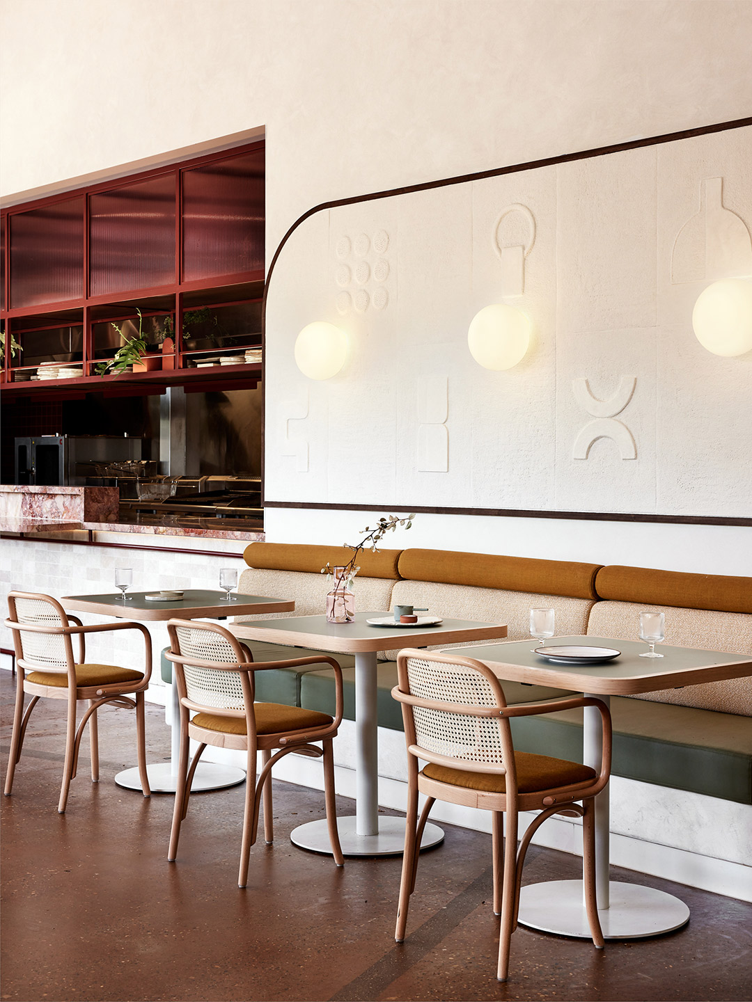
St. Alma restaurant Freshwater by Five Foot One
To craft an impressive interior that meets the brief of “minimal Mexican modernism”, while also being site specific and complementary to the cuisine on offer, the duo called in the design team from Five Foot One. The creative process that followed carved an unexpected path, guided by a demolition phase that uncovered fascinating features from the site’s former life as a bank. “It was a process that evolved over time,” says Kat Thompson, the Sydney-based director of Five Foot One. “A number of original features were retained – even the original safe of the bank was incorporated and restyled into the new structure,” she explains.
But perhaps the greatest surprise – or curveball – was revealed when the old standard-height ceiling was removed. “We discovered a wonderful ceiling with tremendous height running through the centre of the restaurant,” Kat recalls. “We had to make the most of this,” she adds, highlighting the woven-fabric ceiling feature that now hangs within the void, offering movement overhead as it’s exposed to the gentle ocean breeze.
In planning the interior, the Five Foot One team dedicated great attention to layering texture, geometry and colour. “We channelled a fresh and light base palette as a response to the coastal setting and inserted vibrant colour blocking at key focal areas,” Kat says. “For example, striking burgundy has been used to highlight the front entrance as a way to draw guests in.” If that isn’t enough, the array of seafood displayed by the entrance of the venue should pull a crowd.
An appreciation for detail is seen in the eye-catching display shelving of the curved bar area. It also features in St. Alma’s collection of art – most notably a striking 4-meter-long sculpture that now takes pride of place in the middle of the restaurant. The artist responsible for the piece is Sam Leary, Jack’s mother, who collaborated closely with the design team to make sure her work resonated with the overarching vision for St. Alma.
Furniture was selected to reflect the restaurant’s relaxed ambience and seaside location, exampled by light timbers and woven materials, but it was also required to offer various sitting scenarios. “We wanted diners to be able to have a more intimate dining experience with stools at the bar and kitchen,” says Jack. “Here, guests can interact with the staff for a true Alma experience.” Conversely, the larger tables and booths along the walls and windows allow greater flexibility for big groups and special occasions.
Since opening in early January, the 100-seat restaurant has come alive, thanks to the Freshwater locals who bring vitality to the space and the staff who shape the uniquely “Alma” experience. It’s a place where diners can expect an eclectic mix of regional Mexican influences, given a delectable Australian spin through both flavour and design. “You could say we love to juxtapose a fun and engaging service style with a sophisticated dining experience and fit-out,” Jack says. “I’d sum it up as fresh and chic yet casual and soulful with an edgy twist.”
fivefootonedesign.com; st-alma.com.au
Since opening in early January, the 100-seat restaurant has come alive, thanks to the locals who bring vitality to the space and the staff who shape the uniquely “Alma” experience.
Catch up on more architecture, art and design highlights. Plus, subscribe to receive the Daily Architecture News e-letter direct to your inbox.
Related stories
- Tin Tin restaurant in India by Renesa Architecture.
- Nothing Fancy restaurant by Eduard Eremchuk and Katy Pititskaya.
- Refined diner: Papi restaurant in Paris by Neri&Hu.
- Living Bakkali restaurant in Valencia by Masquespacio.
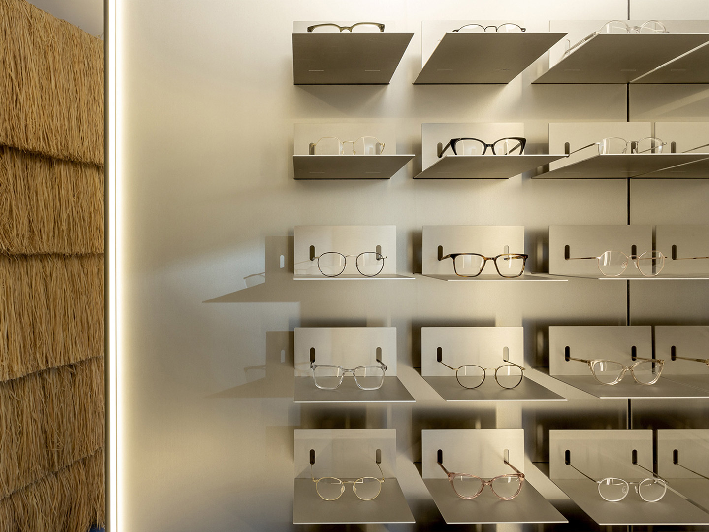
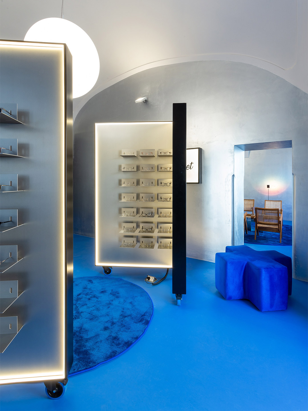
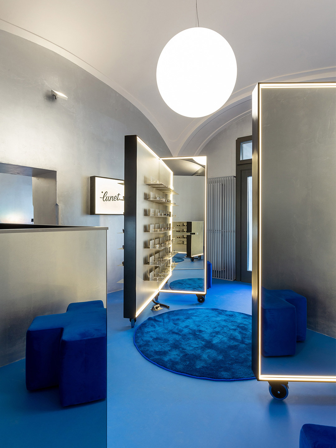
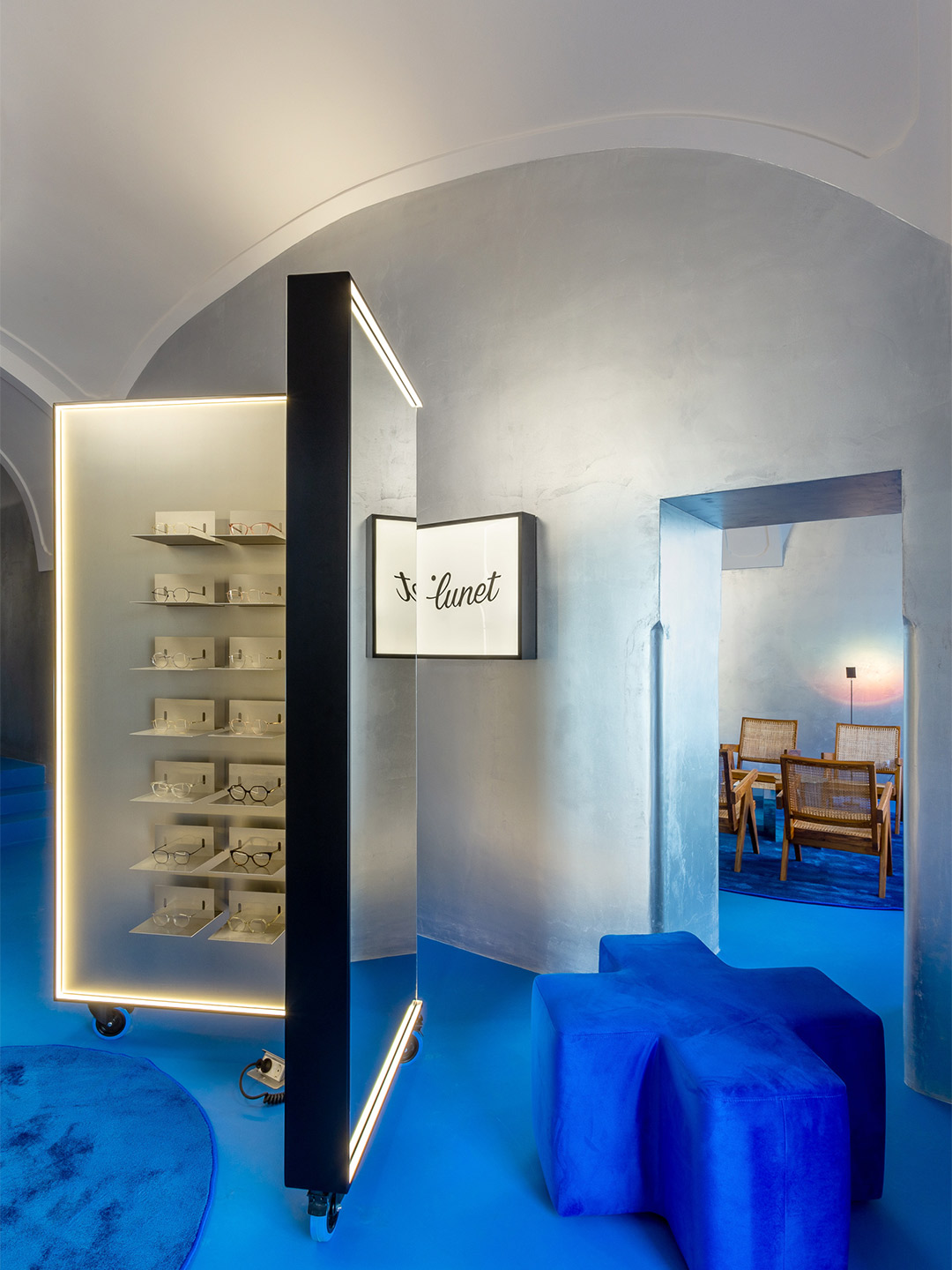
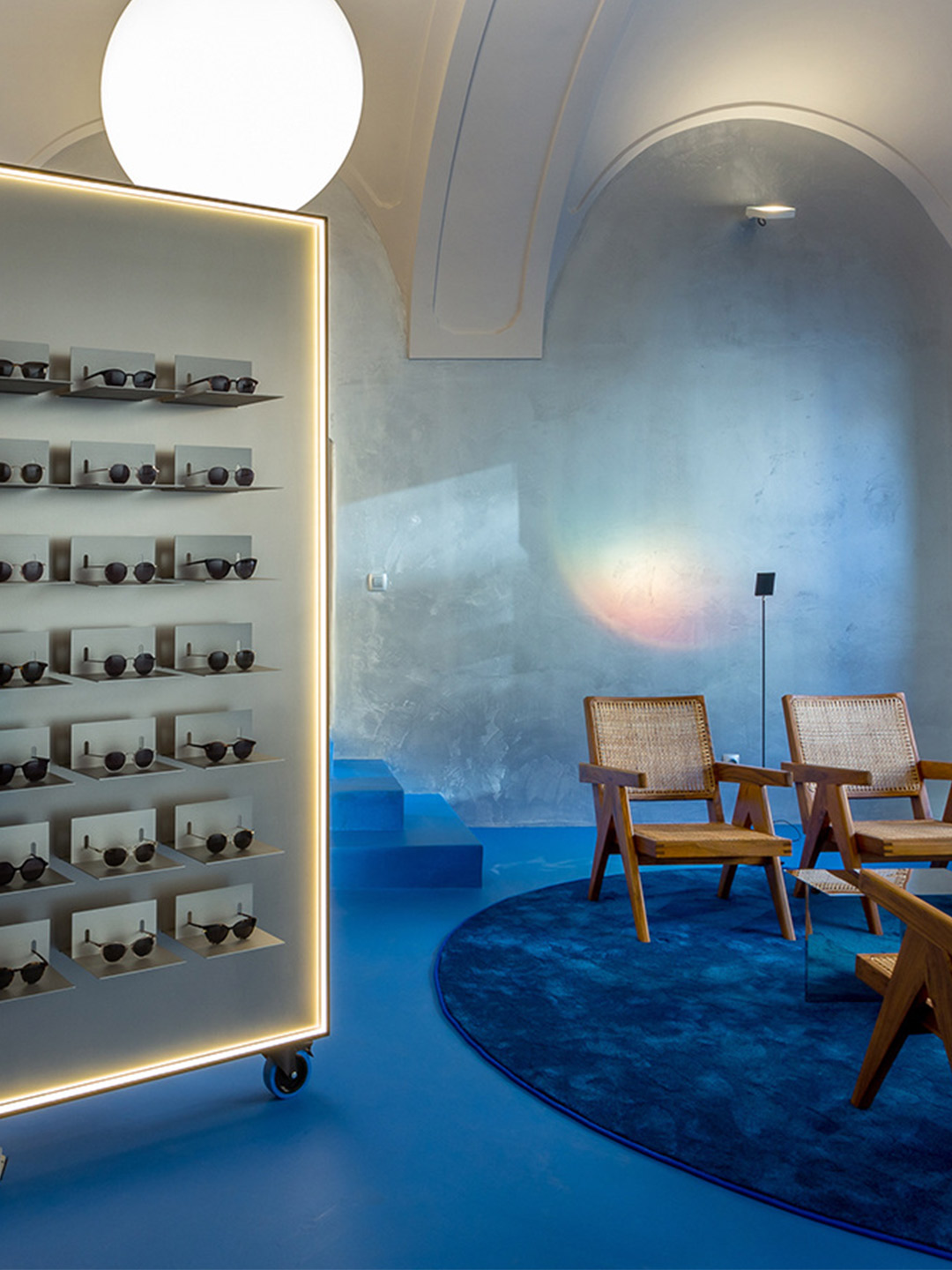
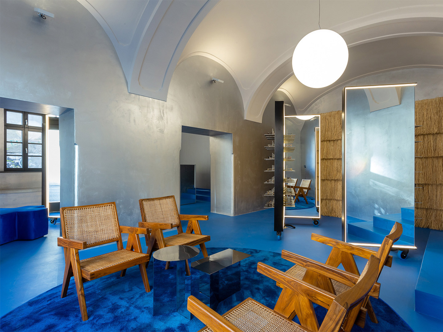
When architect Bogdan Ciocodeica designed the first Lunet eyewear store in Bucharest, Romania, he and the team at his eponymous studio established a suite of “key elements” that would eventually define the brand’s in-store experience. The fit-out was so resolved that when the opportunity arose to carve out Lunet’s second Romanian store, in the city of Cluj-Napoca, the studio was armed with a readymade lookbook from which they could pluck memorable moments to replicate.
Shimmering silver-lined surfaces and lashings of bold colour were among the gestures that made the cut, ensuring a continuation of Lunet’s retail aesthetic and unconventional approach towards the experience of buying eyeglasses. “The idea was to borrow a few of the elements from the first store in such a manner that it feels like you have stepped into the Lunet universe,” Bogdan says. “At the same time, [we created] a unique and specially designed space, adapted to the new context.”

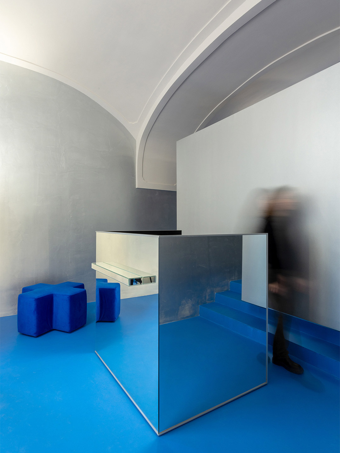
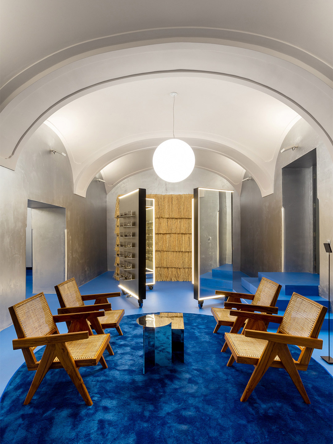
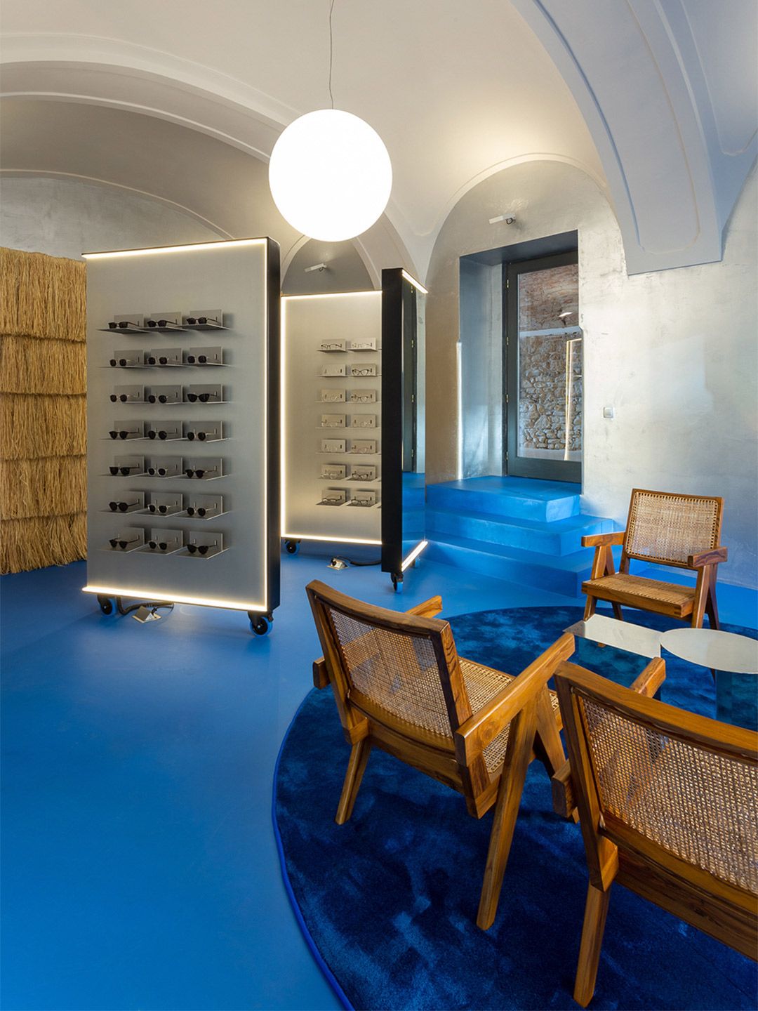
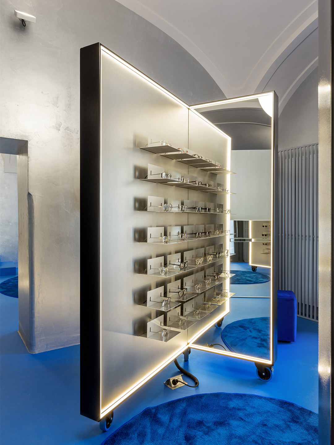
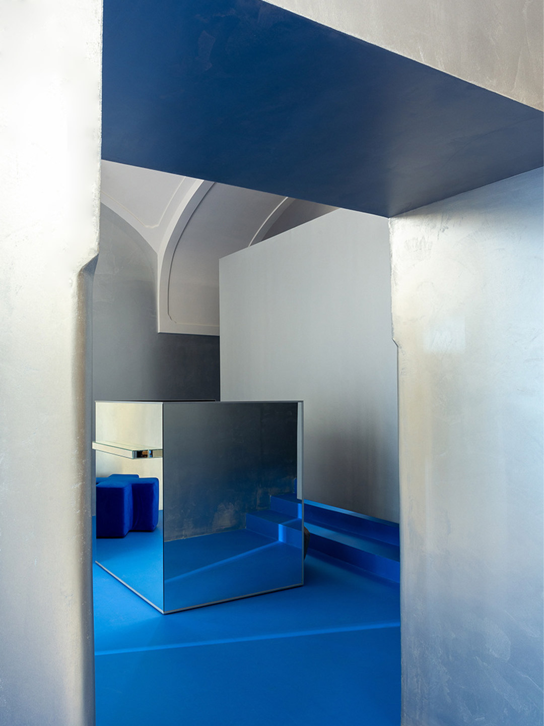
Lunet eyewear store in Romania by Bogdan Ciocodeica Studio
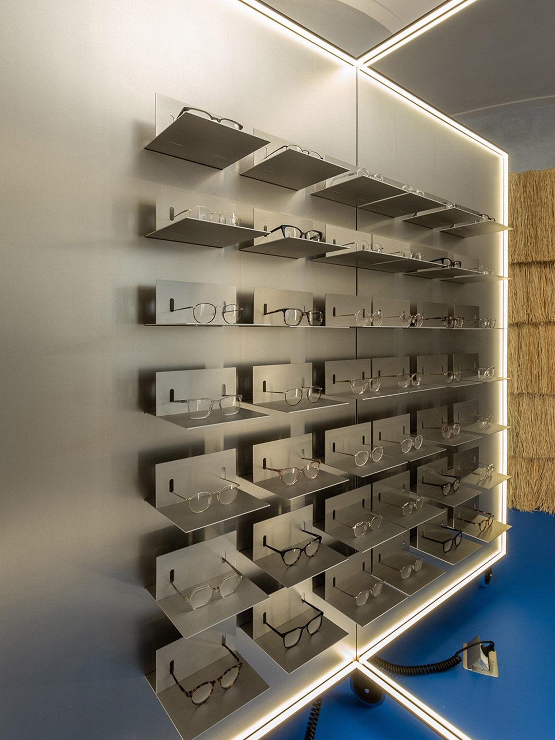
Located in an 18th-century building, in the unofficial capital of Transylvania, the store is designed as a “conversation” between old and new. “[It] aims to mitigate almost three hundred years of history with a contemporary aesthetic,” Bogdan says. But the store’s most important exchange is the way it communicates with potential clientele who seek to frame their faces with the latest eyewear. The moveable pieces of joinery that rise to this challenge adopt the same shape as those in Lunet’s first outlet, forming private “try-on” stations, as well as spaces for multiple customers to test-out specs at the same time. Such versatility “adds to the tailored, client-focused experience,” Bogdan explains.
The lighting of the store bolsters the overall customer experience, playing a crucial role in how the product and the retail space are each perceived. LED strips outline the shapes of the display units, and the mirrors they contain, offering a uniform blanket of light for customers trying on glasses. (Anyone that’s used a halo light for a more superior selfie will recognise the benefits of this.) Crowned by “floating” luminous spheres, the space at-large basks in the light bouncing back from the overhead arches and vaults that are directly illuminated, creating a soft and immersive atmosphere.
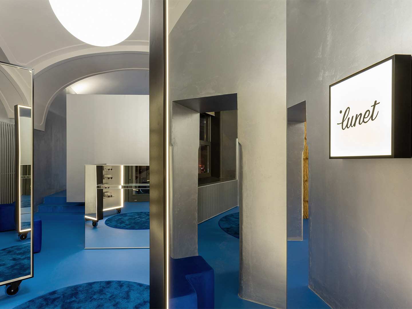
Reinterpreting the metallic curtains that line the perimeter of the first Lunet store, silver-painted walls in the Cluj-Napoca outlet act as a glittering buffer between the off-white ceiling and the vivid blue floor, rugs and occasional furniture that anchor the scheme. “The metallic silver walls, almost like those of a spaceship, descends from the future, enhanced by the sharp aluminium eyeglasses displays,” Bogdan suggests.
The dominating effect of the floor creates an “oasis of feel-good emotions,” the architect says, referencing the colour’s likeness to Majorelle blue, a shade made famous in the Marrakesh gardens of artist Jacques Majorelle. “The intense, vibrant blue is replayed in various textures, from the epoxy resin to the lush carpet, offering the perfect background for all the silver metallic elements and also for the natural textures.”
Raffia is one of those natural materials, tasked with wrapping the wall of the operational area in the showroom. It’s mounted in successive horizontal rows and trimmed to resemble the traditional reed-roof homes of Romania. Teak-and-cane easy chairs by Swiss architect Pierre Jeanneret add to the layer of warmth established by the raffia, beautifully paired (“and juxtaposed!” Bogdan declares) with the mirrored ‘Slit’ tables by Danish brand Hay.
Zooming out from the details, the entity aligns with Lunet’s core vision, steering away from the conservative-looking spaces typically associated with eyewear locations. It aims to provide a familiar experience, like a “living room”, Bogdan suggests, that encourages socialising, a sense of discovery and practical solutions. “The space continues to reimagine a new type of eyewear experience, one that focuses on emotions and human connection, making the purchase of glasses a memorable, positive interaction.”
ciocodeica.com; luneteyewear.com
Zooming out from the details, the entity aligns with Lunet’s core vision, steering away from the conservative-looking spaces typically associated with eyewear locations.
Catch up on more architecture, art and design highlights. Plus, subscribe to receive the Daily Architecture News e-letter direct to your inbox.
Related stories
- Introducing the New Wave collection of 80s-inspired vases by Greg Natale.
- Greg Natale launches 70s-inspired glassware (and a signature cocktail for summer).
- Swatch list: Kelly Wearstler curates paint range for Farrow & Ball.
- Stokes 14: Architect William Smart’s creative studio in Sydney.
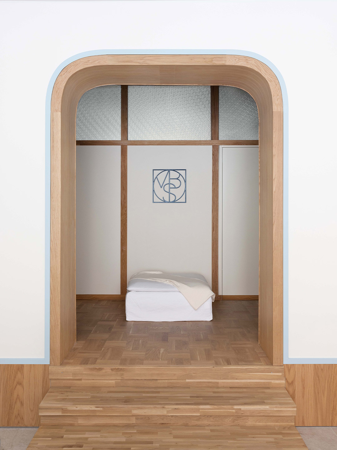
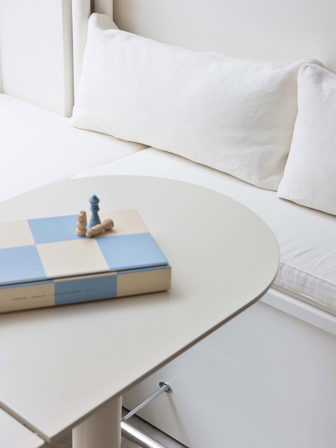
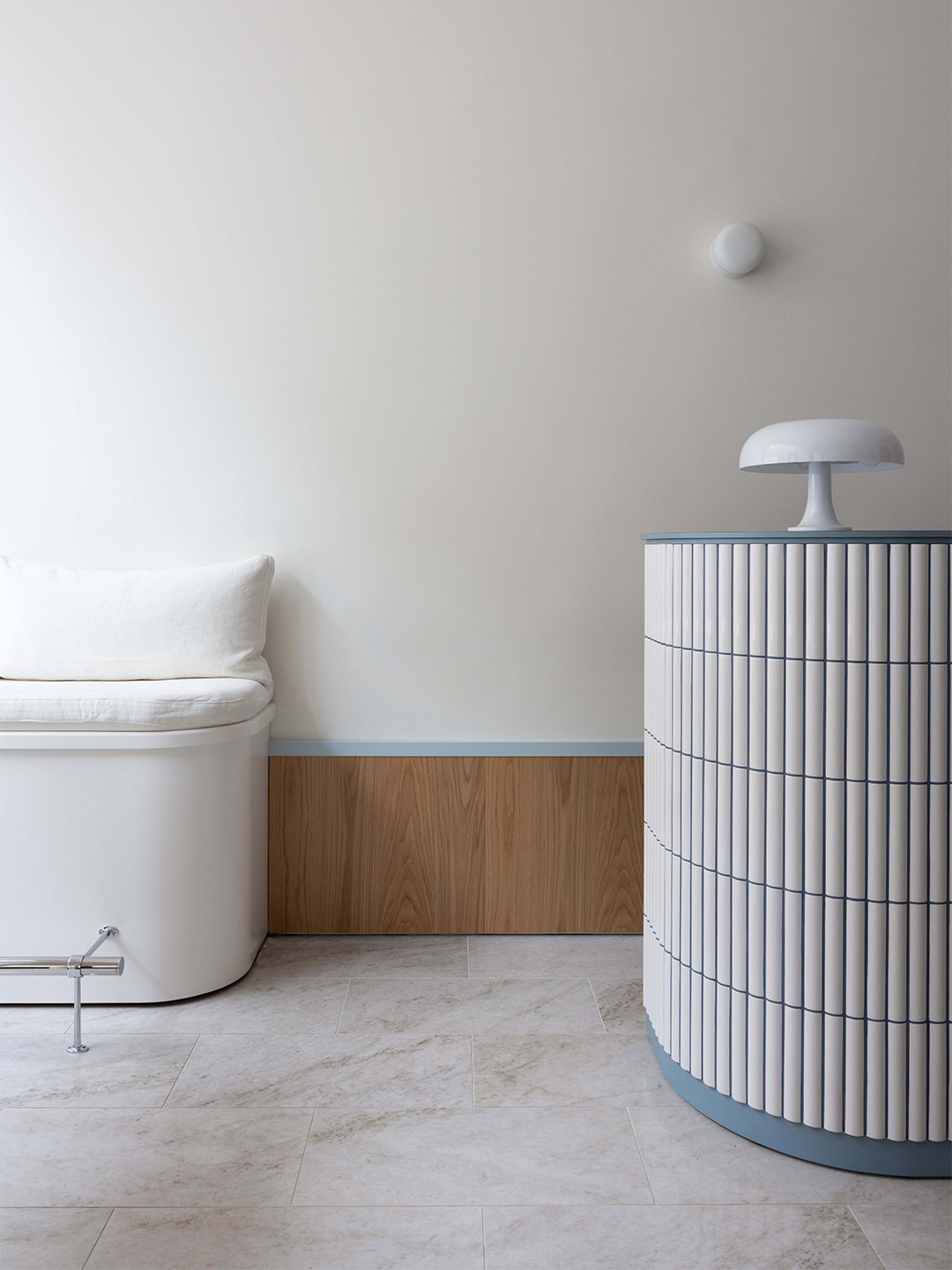
For architects Polina Sandström and Madeleine Klingspor, founders of Swedish practice ASKA, the 1930s aesthetic of a building in Stockholm was a rich source of inspiration. The design duo reawakened the modern Scandinavian style of the site (often categorised as Nordic functionalism or Funkis) for their latest rejuvenation project – a beauty clinic in the MBS by Malika portfolio. “The goal of the project [was] to create a specific and memorable experience,” Madeleine reveals.
The atmosphere within the MBS by Malika clinic is described by the ASKA team as feeling something akin to “modern nostalgia”. They arrived at this thematic title due to the way in which some of the design elements appear recognisable, giving the space “a rigid and trustworthy flavour,” the architects say. Other fragments, however, arrive unexpectedly, adding a “sharp and slightly playful touch,” they add. “This makes the design feel effortless while at the same time managing to surprise”.
MBS by Malika beauty clinic in Stockholm by ASKA
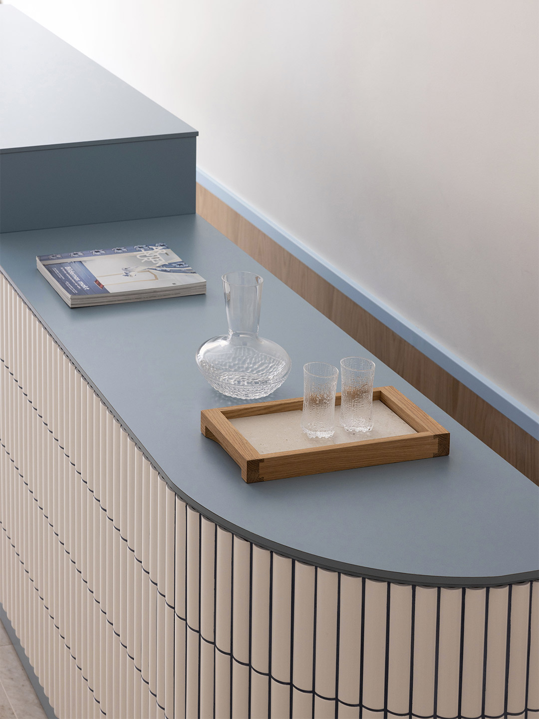
Typical Funkis-style materials, such as white Alvar Aalto-inspired tiles, oak veneer, compact laminate and structured glass dominate ASKA’s design response. But by adding details like the nickel-plated brass handles, linen fabrics and porcelain floor tiles (inspired by the Swedish Ekeberg marble), the architects were able to layer contemporary elegance and an air of exclusivity into the user experience.
“We saw potential in adding luxury, softness and a young vibe to this simple, strict and socialistic style,” Polina says of ASKA’s vision for the clinic. “[We believed] that something new and unique could rise from the merger,” she adds, which includes the layering of light and dark blue colour accents to deliver a modern and fresh feeling to the space.
In order to reach a conceptually strong and effective spatial composition, Polina and Madeleine worked across differing scales and disciplines, including designing most of the furniture. The cream-coloured lounge tables and nail manicure stations are just some of the items created exclusively for the venue. “[These pieces] aim to blend into the environment in a smooth, seamless way,” the designers say. “The reception desk, on the other hand, is something of a key piece, designed to capture the visitors’ focus thanks to its size and level of detailing.”
Sitting somewhere between blending in and standing out, all other finishing touches have been designed to reference and complement each other. “The shape of the three pseudo arches reappears in the form of the table-tops,” the designers point out. “The foot panel melts together with the product shelf [and] the dark blue tone of the grout on the reception desk goes hand-in-hand with the MBS logo.”
We saw potential in adding luxury, softness and a young vibe to this simple, strict and socialistic style.
Renesa Architecture also created the Tin Tin bar and restaurant in India. Catch up on more architecture, art and design highlights. Plus, subscribe to receive the Daily Architecture News e-letter direct to your inbox.
Related stories
- Introducing the New Wave collection of 80s-inspired vases by Greg Natale.
- Greg Natale launches 70s-inspired glassware (and a signature cocktail for summer).
- Swatch list: Kelly Wearstler curates paint range for Farrow & Ball.
- Stokes 14: Architect William Smart’s creative studio in Sydney.
Serving curves and a spicy sun-kissed palette, Living Bakkali is a restaurant like no other. It’s a place where guests are invited to “live sensorial experiences” through its menu offering, heightened by a spirited atmosphere crafted by Valencia-based design studio Masquespacio. Inspired by the Middle East, Masquespacio’s founders Christophe Penasse and Ana Milena Hernández Palacios wish to take diners “to the most profound part of the desert,” through their design response, connecting them with “a marvellous environment that, for many, is unknown and full of mystique,” they say.
The way in which the Masquespacio team has presented the restaurant encourages diners to meander through a layout of key sitting areas, likened by the designers to “small corners as if you were at the fantastic Orient, with its lounge seats that invite different dining groups to relax and connect with each other”. At the same time, guests are further tempted to discover what the hidden corners of Living Bakkali might contain, partially revealed through a series of openings or internal “windows” realised in the style of Arabic architecture.
Living Bakkali restaurant in Valencia by Masquespacio
Connecting the entry with the kitchen, the central hall is responsible for guiding diners and staff through the space, from the more intimate seating areas (perfect for two), to the long benches intended for bigger groups. A space raised up on a higher level offers wider views of the bustling restaurant. “While the first part of the hall makes you feel as though you were walking through a street of ancient houses, the second part takes you through a corridor between curtains,” Christophe and Ana suggest. “This incorporates a private dining room and the restaurant’s bathrooms.”
Zooming in on the details, organic forms interact with each other in every moment of Living Bakkali. A sun-baked adobe effect is created on the walls, floors and ceilings, finished by hand in the tradition of the ancient houses that are aimed to be represented here. “On the ceiling, a more neutral but slightly contrasting colour palette that clearly reminds us of the desert has been applied,” the designers say. “Last but not least,” they reveal, “the lighting effects aim to highlight the mystery and beauty waiting to be discovered.”
Zooming in on the details, organic forms interact with each other in every moment of Living Bakkali.
In Italy, Masquespacio also designed the Bun burger restaurant in Milan and in Turin. Near Florence, famed Italian ceramics-maker Bitossi has opened a museum displaying its 5000-piece catalogue. Catch up on more hospitality architecture and design and retail design, plus subscribe to receive the Daily Architecture News e-letter direct to your inbox.
Related stories
- Resa San Mamés student accommodation in Spain by Masquespacio.
- The bar and restaurant at La Sastrería in Valencia by Masquespacio.
- Mama Manana restaurant in Kyiv by Balbek Bureau.
- Gold ‘n’ arches: Bun burger restaurant in Milan by Masquespacio.
In need of a new HQ, the winemaker from Catalan label Clos Pachem approached the Harquitectes architecture office to provide the solution. But the brief that followed wasn’t quite as straightforward. “The challenge was to allow the winery itself to contribute to the biodynamic winemaking process,” explains the Harquitectes team, who responded to the client’s requests by creating a large pavilion-like structure, connected to the public realm by a zigzagging passageway. The Barcelona-based architects optimised the building’s behaviour based on passive principles “to the greatest possible extent,” they suggest, by harnessing the power of rainwater, airflow and the coolness of the earth.
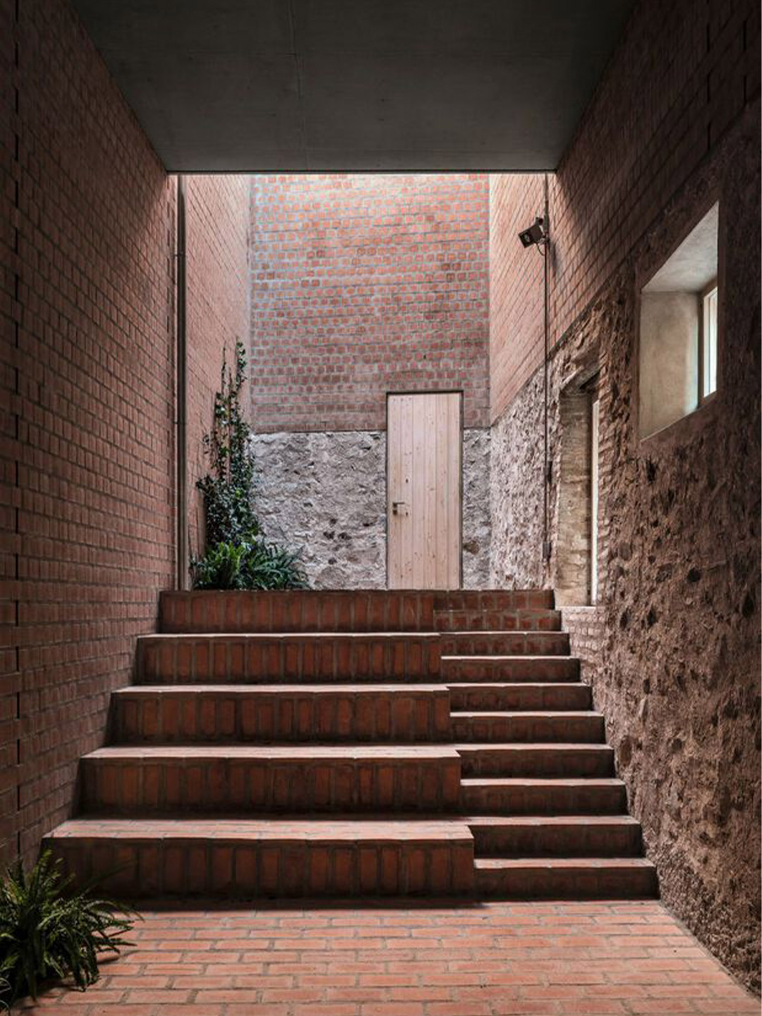
Located in the heart of the historic Gratallops village, in the Priorat region of Spain, the site of the winery traces the form of an L-shaped polygon. It’s hugged closely on its sides by narrow laneways and traditional row houses, and overlooked by the nearby church – the town’s most dominant structure. The site boundary is marked by an old stone wall – a former handball structure rising to 10 meters at one point – which follows an irregular line. The geometry of this wall (an amalgam of stone, brick and plaster rendering) became the starting point for the Clos Pachem project.
Clos Pachem Winery in Spain by Harquitectes
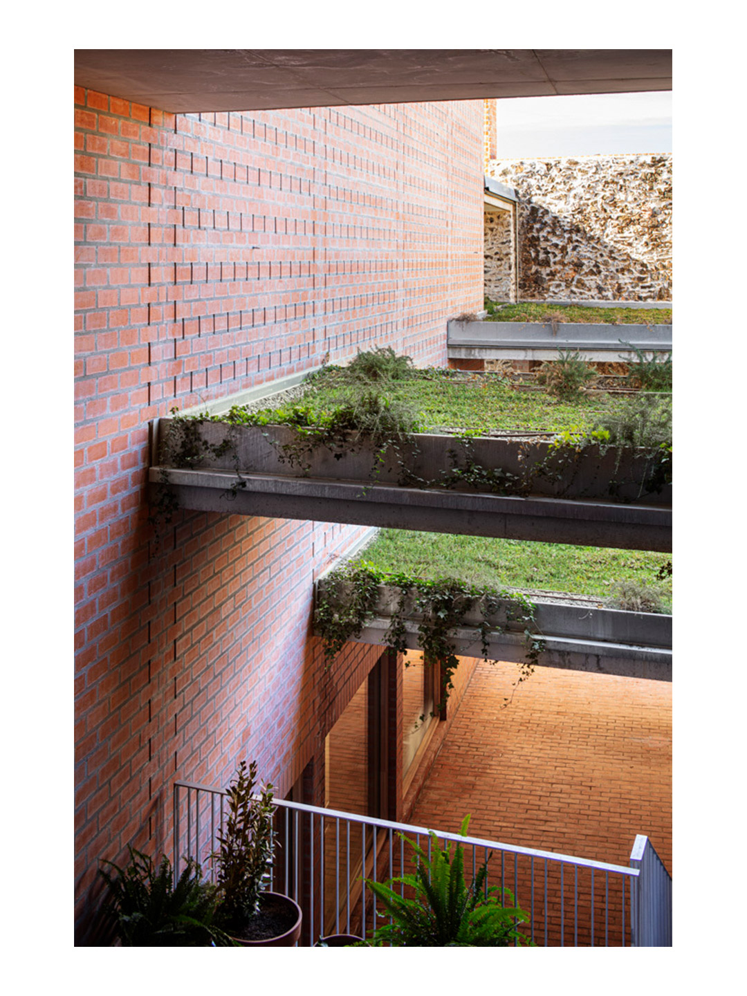
When overlaid with the area’s planning regulations, the client’s desire to build the biggest possible structure on the site led the architects to design two distinct zones. The first space is a large volume on a regular-shaped plan, as wide and high as allowed, designated to the task of winemaking. This is joined by the Z-shaped zone – nicknamed “the passage” by the architects – where the smaller spaces around the pavilion are gathered and put to use, extending like an inner lane that follows the geometry of the boundary wall. The passage performs as the main entrance to the precinct, and as a circulation and reception space for visitors and wine-tasting groups.
The interior of the central pavilion (where the wine fermentation vats are located) stretches to a height of three storeys. “This is the heart of the project, the space that really defines the winery,” say the Harquitectes team. “All the other spaces are articulated around it,” they add. The pavilion captures a large volume of fresh air, insulated by deep walls that measure up to 1.75 metres thick. It’s kept cool by a system of load-bearing brick walls in multiple layers set between pilasters, generating pockets of circulating air between the walls.
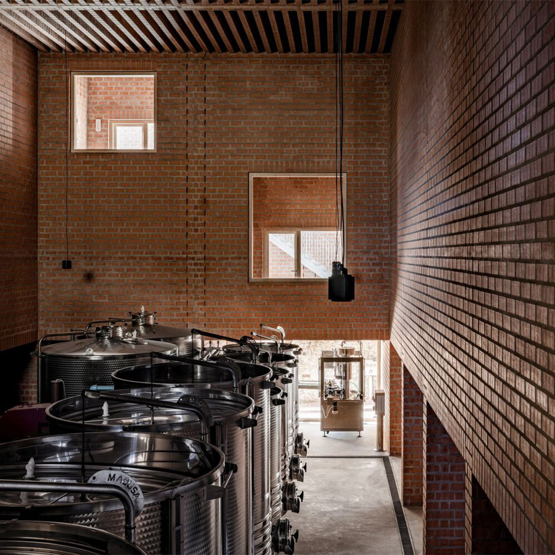
Small rooms within the large walls contain the winery’s complementary activities. Including on the ground floor, where a series of “chapel-like cavities” follow the rhythm of the structural pilasters around the perimeter of the central space. These spaces visually connect the building to the passage but also facilitate the manoeuvring and storage of machinery required in the winemaking cellar. Looking upwards, the nave is dark and dense, while on the ground floor, it expands, opening to the light in the passage; the place where both grapes and visitors are received.
This partially outdoor route follows a succession of roofs with different heights, combined with concrete slabs that form broad landings between the staircases. Rainwater falls and collects on the slabs (that have been transformed into green roofs) until it spills over from one to the next, descending ever more slowly as it flows through the passage. “[This helps] freshen the atmosphere and water the vegetation along the way,” the architects explain. From underneath, the slabs provide visitors with shelter from the rain. But they also block direct sunlight, creating a cool ambiance for the passage, “like a terraced garden,” the architects suggest, “where an outdoor tavern can be installed for wine sales, tastings and snacks”.
The most technologically demanding spaces – the barrel zone and the storeroom for bottled wine – require a perfectly stable moisture and temperature regime. For this reason, they are located in the basement, in direct contact with the earth. “The major challenge, however, is the vinification hall, with equally demanding thermal requirements that must be fulfilled without interaction with the ground,” the architects say. They resolved this with a two-part strategy. Firstly, by generating the greatest possible interior height to facilitate the stratification of the warm air at the top, away from the barrels. “Secondly, the hydrothermal stability of the interior is aided by maximising the inertia of the building systems,” the architects explain.
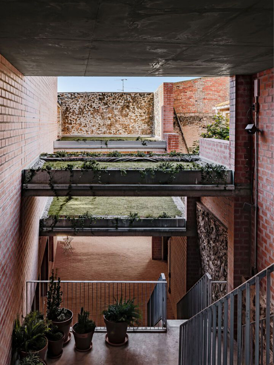
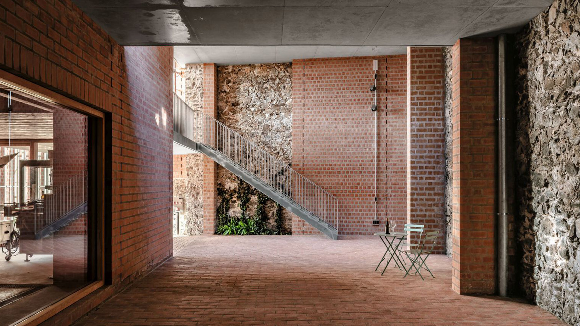
Another bioclimatic strategy is in action on the roof, whose central part is a cooling device that employs radiation from the night sky to refrigerate the floor slab. This device is made up of a closed-circuit water-cycling system that runs between two levels. The upper level provides contact with the outdoor environment, where water is used at night as a heat transfer fluid to dissipate the indoor ambient warmth. And the lower level is in contact with the floor, where a feeling of freshness is transferred to the interior. “This large-scale exchange between the pavilion’s interior and the temperature of the universe, through radiation, is an inexhaustible refrigeration source,” the architects explain.
Returning to the street, the facade of the Clos Pachem winery is capped with tiles and clad with a thin layer of lime mortar, which helps contextualise the building in the village setting and clearly differentiate its external materiality from the interior passageway. “Viewed from the outside, the building has a somewhat vernacular presence,” the architects suggest. “But as one enters the corridor, the building systems become deconstructed and slowly reveal the nature of the complex.”
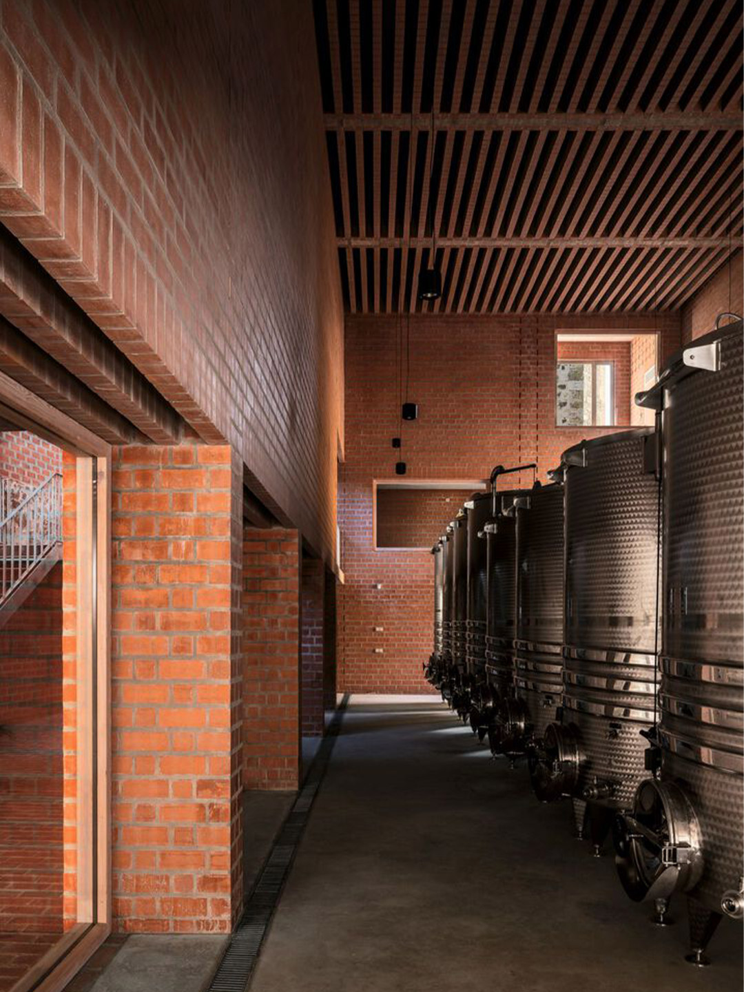
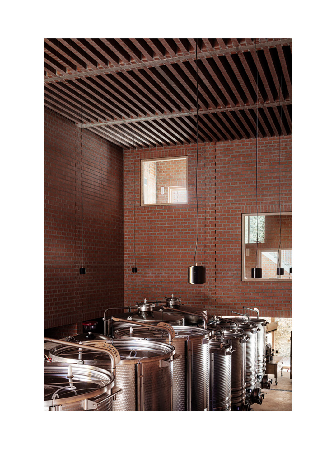
Viewed from the outside, the building has a somewhat vernacular presence. But as one enters the corridor, the building systems become deconstructed.
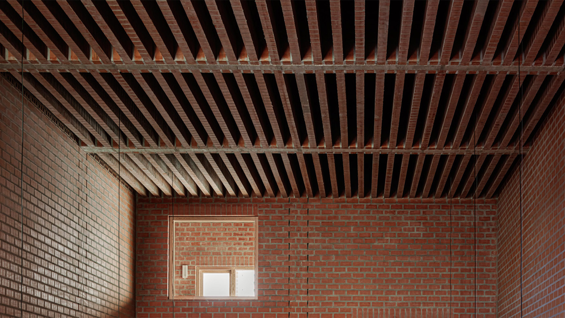
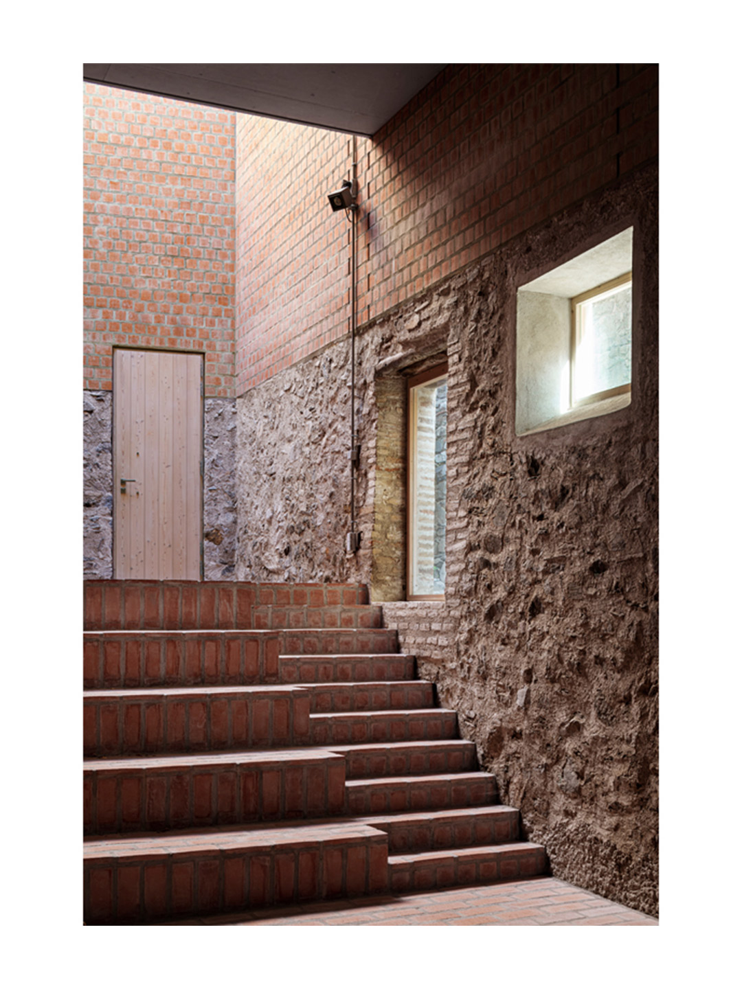
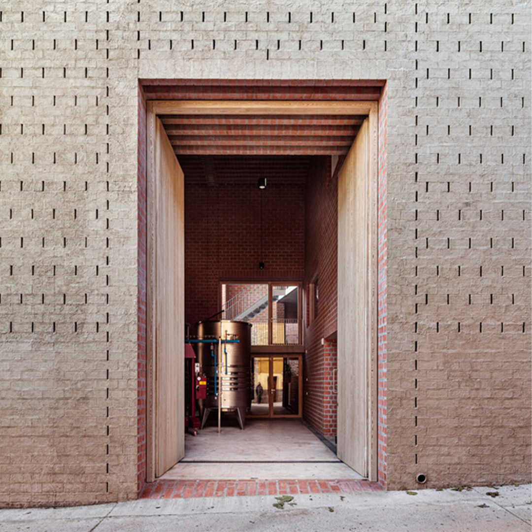
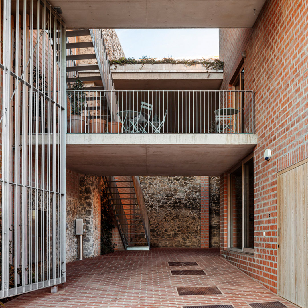
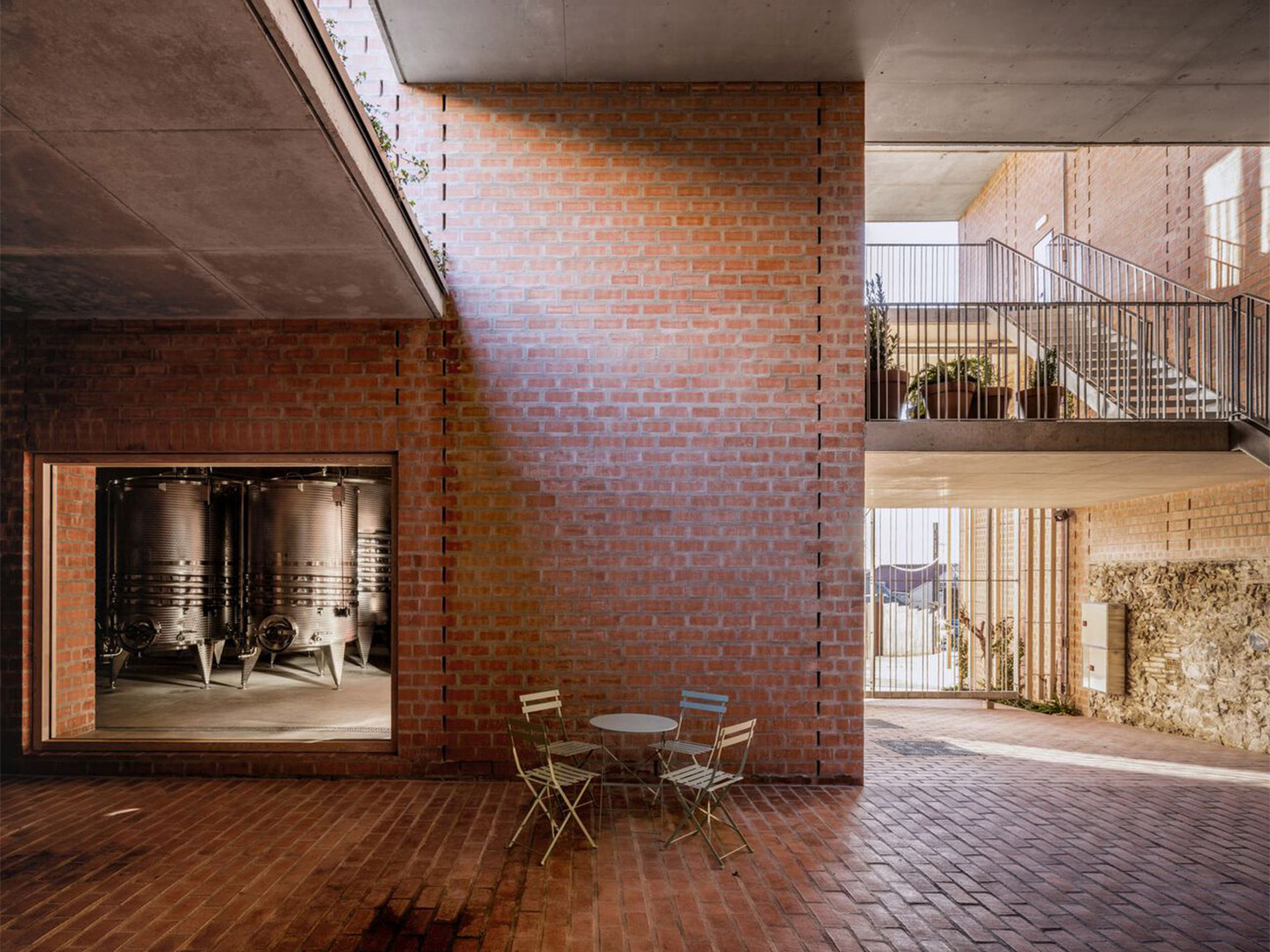
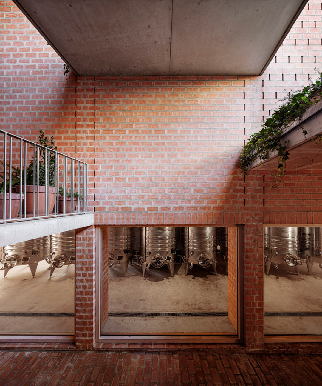
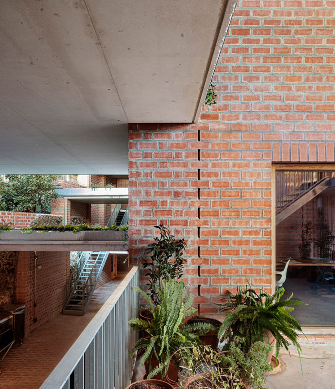
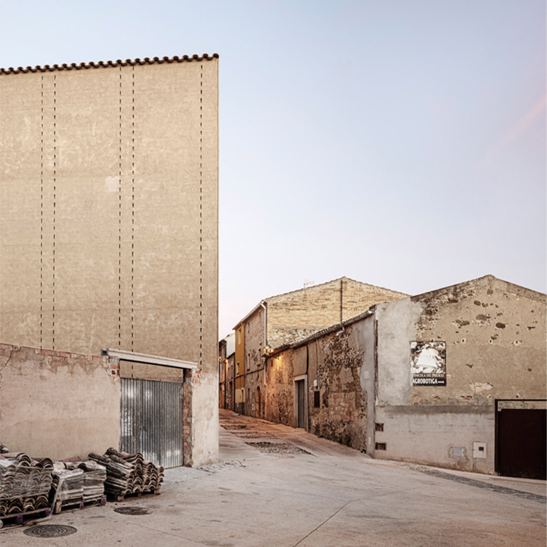
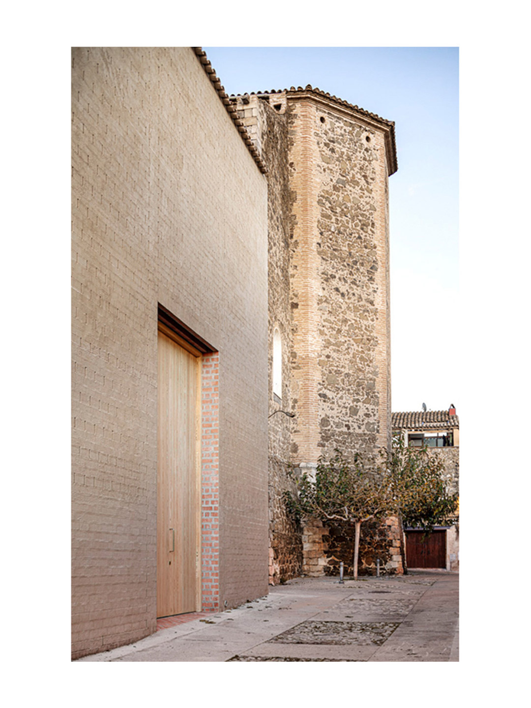
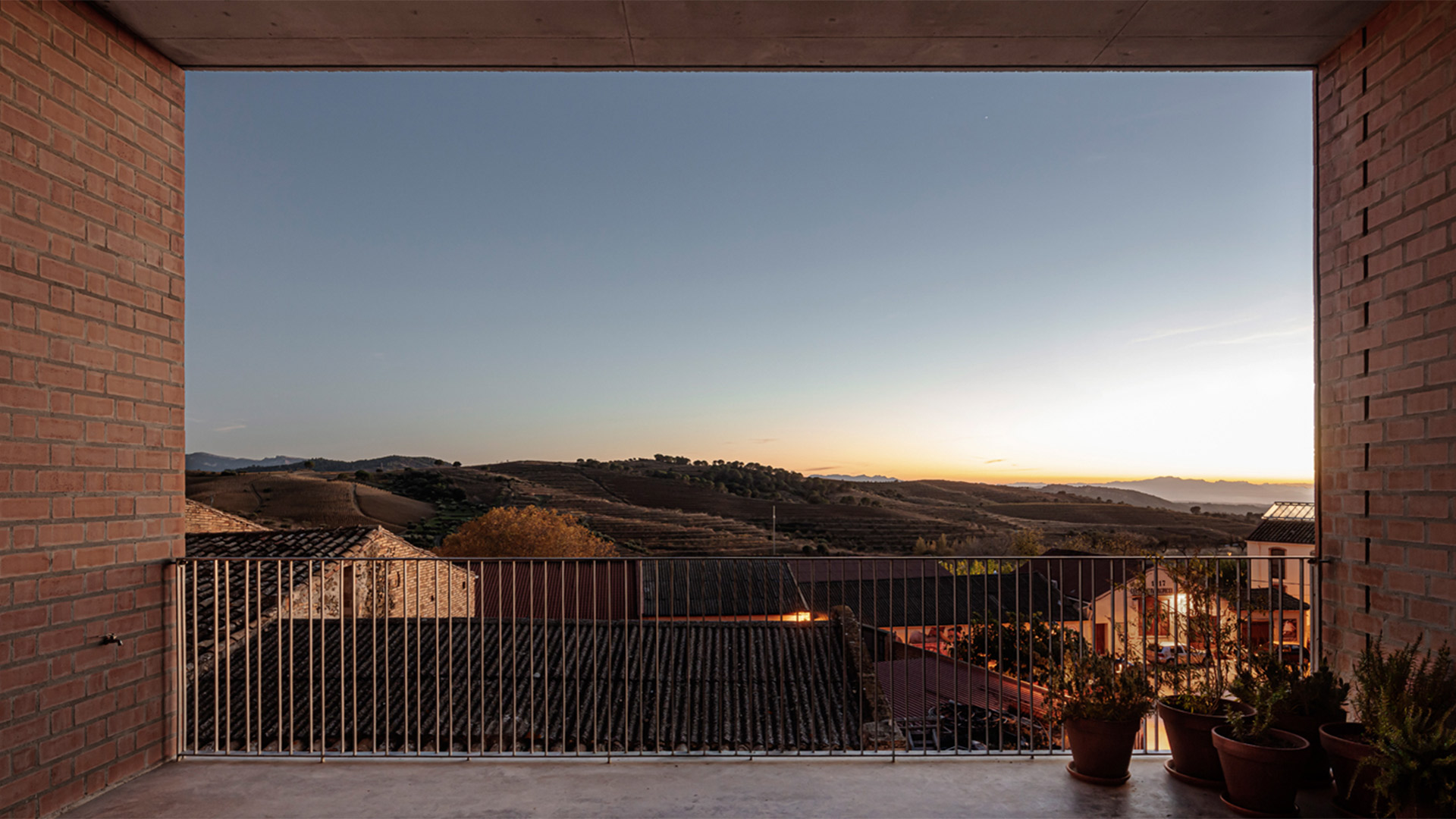
Catch up on more architecture, art and design highlights. Plus, subscribe to receive the Daily Architecture News e-letter direct to your inbox.
Related stories
- Venus Power collection of rugs by Patricia Urquiola for cc-tapis.
- Bitossi celebrates centenary in Florence with new museum and 7000-piece display.
- Casa R+1 residence in southern Spain by Puntofilipino.
Few materials illustrate the passage of time quite like brick, especially when historic examples are partnered side-by-side with contemporary masonry products. This is certainly true of the nearly completed Borough Yards development in London, where the new large-scale shopping and dining district is on track to rub shoulders with the old Borough Market in Southwark. Opening on December 13 with the area’s first cinema complex, the preliminary section of the precinct, titled Soap Yard, invites visitors to take a first look at the grounds ahead of the grand launch in spring of next year.
Tracing the path of a long-forgotten medieval-era street pattern, the Borough Yards project connects Borough Market to Clink Street and the River Thames. Along the route, a series of out-of-service warehouses, brick-lined archways and viaducts have been transformed into new and useable spaces. Developed by investment firm MARK and designed by London-based studio SPPARC, the precinct sensitively intertwines contemporary building additions with the historic architecture of the meandering site, employing innovative brickwork to connect the old structures with the new.
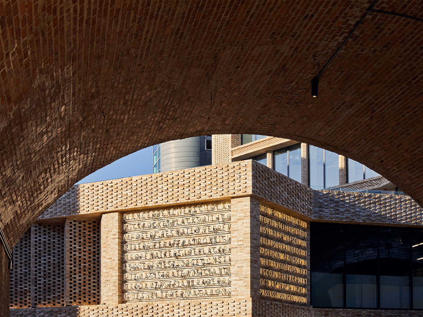
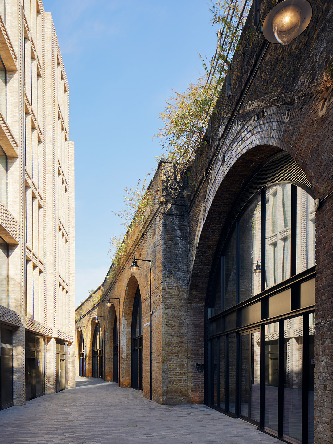
First look: Borough Yards in London prepares to welcome visitors
“We have always been passionate about two things: creating brands for places and breathing new life into heritage spaces and buildings, making them fit for purpose for the modern age,” says Marcus Meijer, CEO at MARK. “With Borough Yards, we saw an opportunity to do both,” he suggests. “Leveraging the world-famous reputation of Borough Market, and taking inspiration from the Victorian architecture that makes up the site, we have worked with SPPARC to deliver a new commercial and cultural district that is anchored with new public realm, and a compelling restaurant and bar offering, while also creating a new shopping destination in an area that has been historically underserved by retail.”
Fulfilling the role of increasing retail tenancies, an arcade area connecting the two ends of the district will see a series of restaurants and shops housed in the expansive double-height Victorian arches, with two new office buildings to be operated by The Office Group also located within the scheme. At the gateway to Borough Yards sits the 185-square-metre Paul Smith fashion store, which is now open on the corner of Stoney Street. Bold neon lighting by FRA Creative illuminates the new public square and will guide visitors from the Everyman cinema and Soap Yard precinct to the greater Borough Yards offering.
“At Borough Yards, retailers have a unique opportunity to build unforgettable flagship experiences in beautiful raw-brick, cathedral-scale spaces,” says Trevor Morriss, principal architect at SPPARC. “These splendid industrial structures weave and stitch history and heritage together with contemporary architecture.” From early 2022, Borough Yards’ first bars and restaurants will begin to open in these spaces, including Barrafina, featuring its archetypal marble bar; the second Parrillan venue, where diners can cook at their own tables over mini parrilla grills; and Bar Daskal, a Spanish wine and sherry bar offering cold tapas. Fried chicken will be on the menu at Butchies; the brunch-spot Brother Marcus will lure patrons with Eastern Mediterranean flavours; and Vinoteca will dish up fresh ingredients from the neighbouring Borough Market. More retail shops, new public spaces and further bars and restaurants will follow throughout the year.
boroughyards.com; thisismark.com; spparc.com
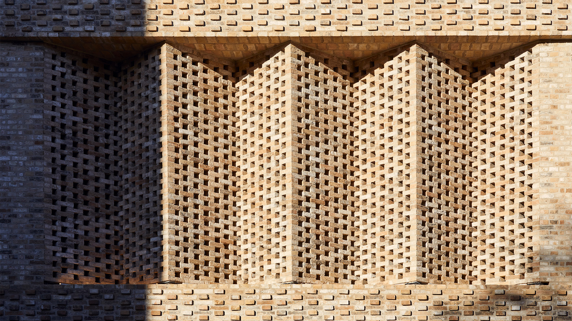
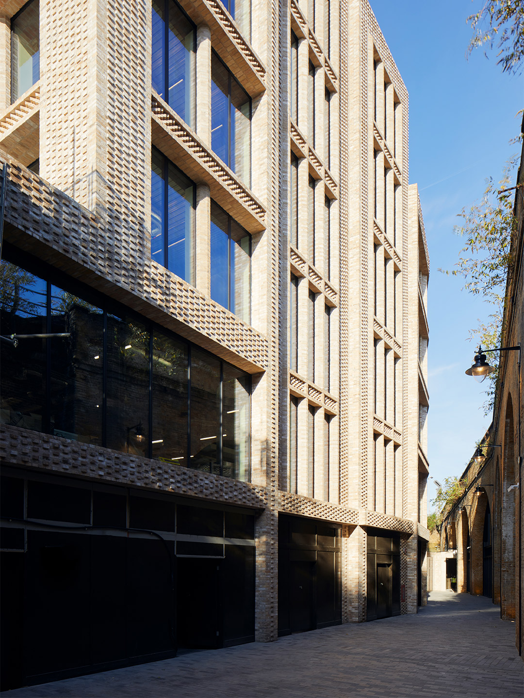
Few materials illustrate the passage of time quite like brick, especially when historic examples are partnered side-by-side with contemporary masonry products.
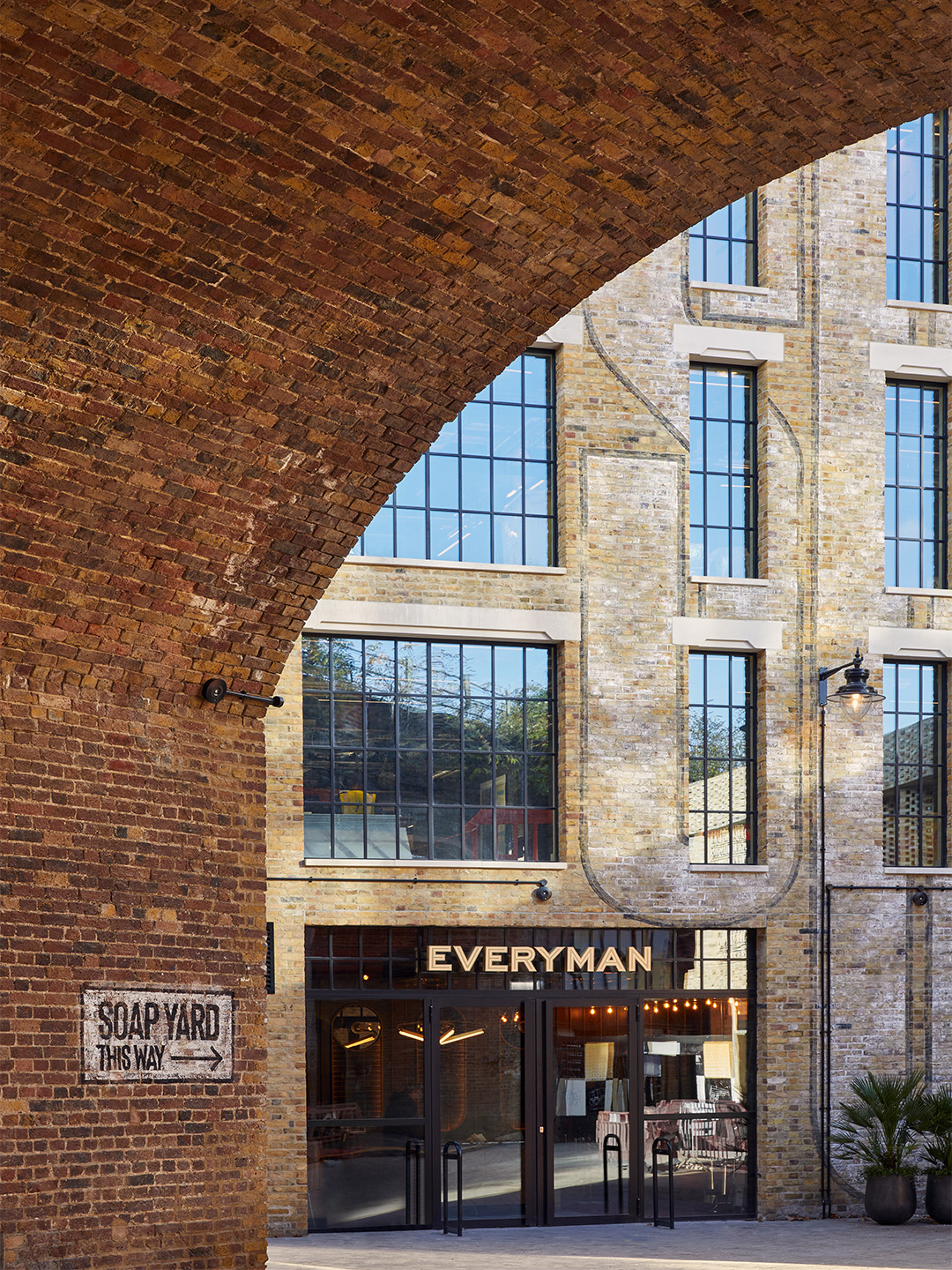
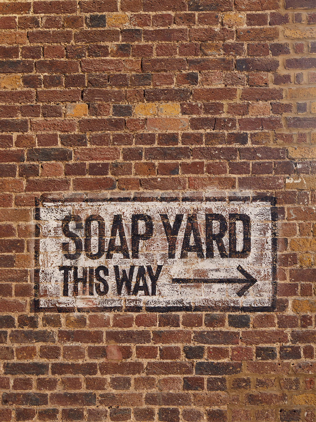
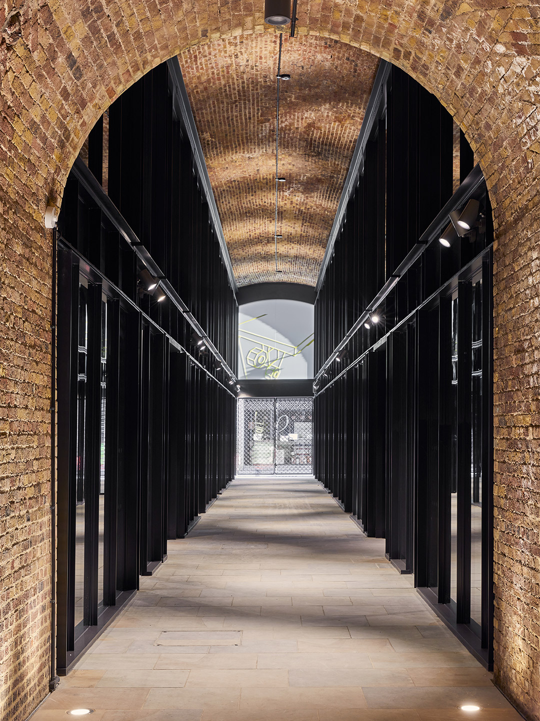
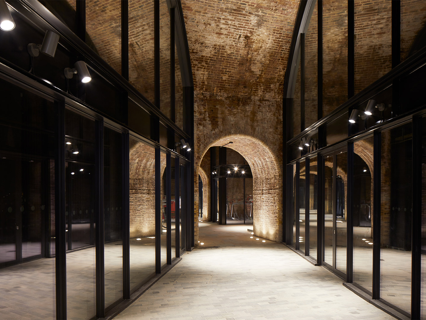
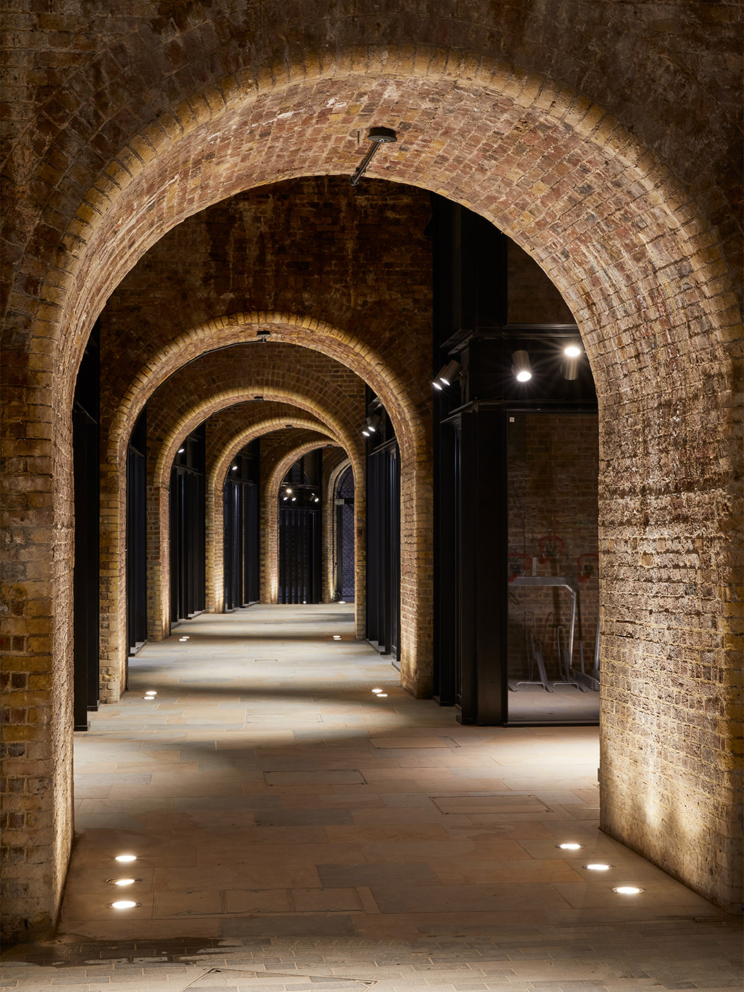
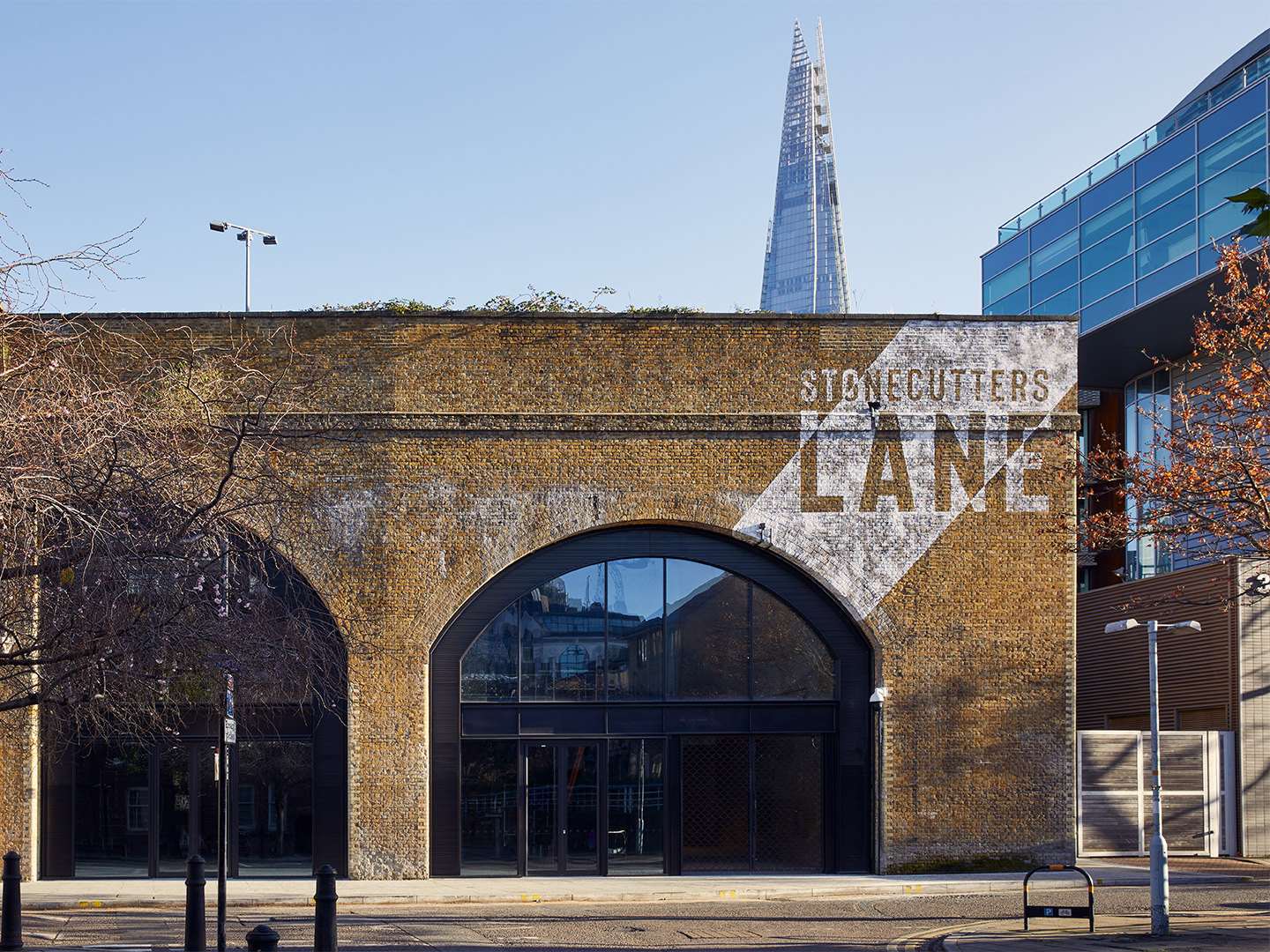
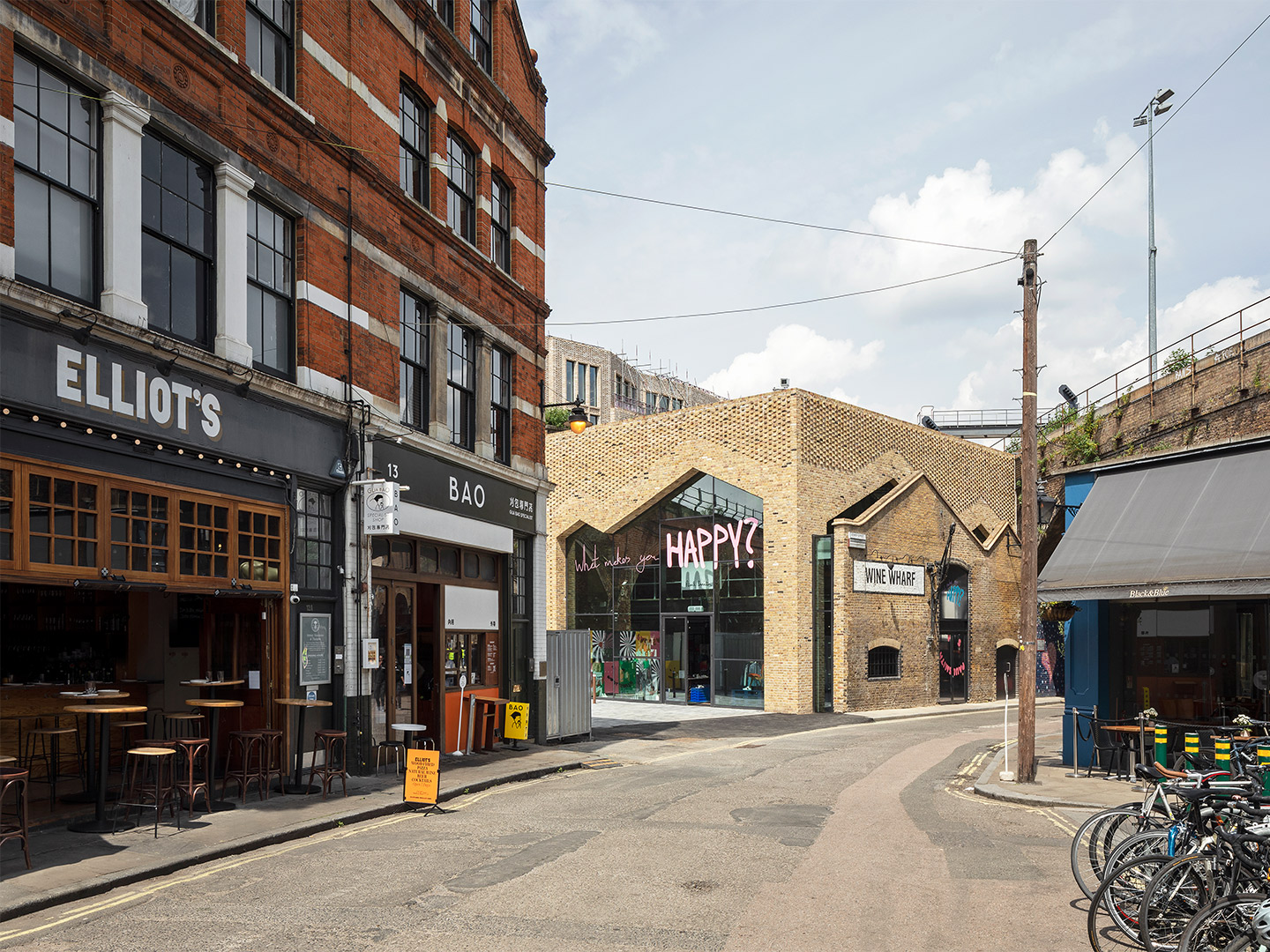
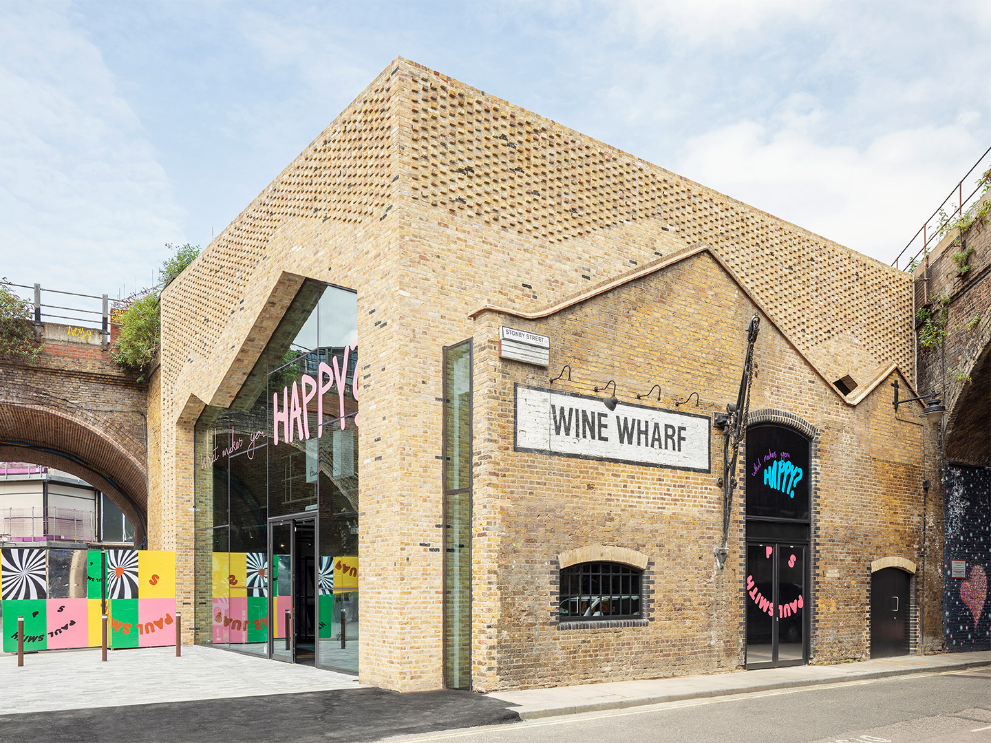
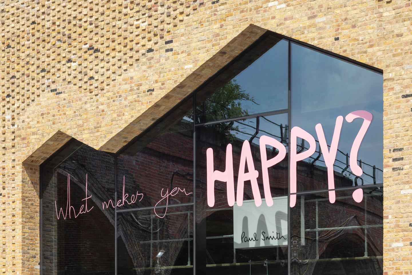
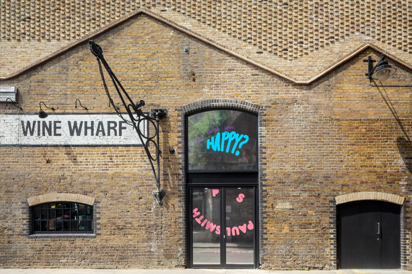
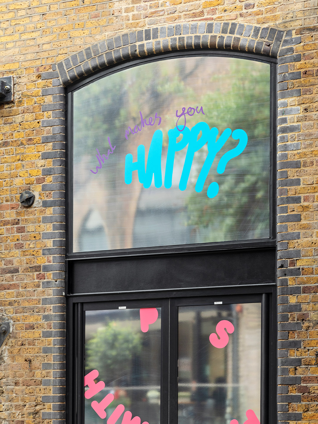
Catch up on more architecture, art and design highlights. Plus, subscribe to receive the Daily Architecture News e-letter direct to your inbox.
Related stories
- Venus Power collection of rugs by Patricia Urquiola for cc-tapis.
- Bitossi celebrates centenary in Florence with new museum and 7000-piece display.
- Casa R+1 residence in southern Spain by Puntofilipino.
Each year, when the International Festival of Lights is in full-swing, Mexico City becomes blanketed with spectacular lighting installations, providing a free, innovative and accessible light-art experience for public enjoyment. Born from the desire to reclaim and reinvigorate shared spaces at night, the festival, nicknamed Filux, also showcases the city’s dynamic architecture; a canvas that event organisers have long believed to be the stuff of light artists’ dreams. “After visiting different festivals around the world, we decided to innovate and make a light festival with a Mexican touch,” David Di Bona, Filux’s founding director, said in 2015. “Not only involving light projections on the facades of renowned buildings, but mixing in Mexico’s rich cultural history to create a unique festival that has become the first of its kind.”
Four years later, after the Festival of Lights had grown and evolved, it inspired the opening of Filux Lab in 2019. Situated in the city of Mérida, Yucatán, the lab inhabits a sensitively renovated colonial-style house that now acts as a versatile creative space, functioning most significantly as a gallery, as well as a workshop and point of research for artistic purposes. “It was our firm conviction to create a breeding ground for local talent, with an identity all of its own,” say the Filux team, still to this day led by David. “[This] made us design the first laboratory entirely dedicated to the experimentation, discussion, production and exhibition of art pieces related to the language of light and cinema.”

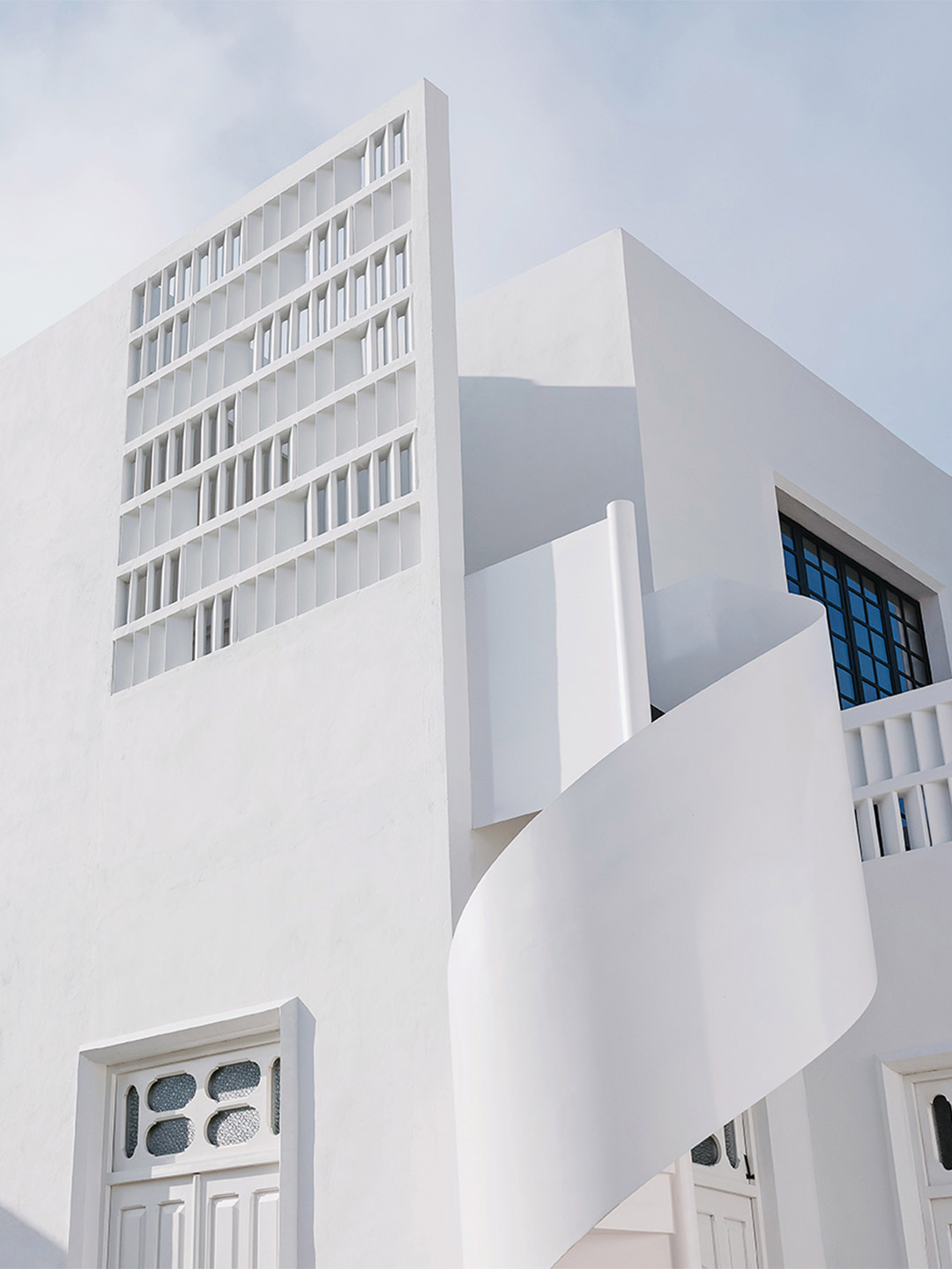
Filux Lab in Yucatán by Workshop Diseño y Construcción
Created in collaboration with the architects at Yucatán-based firm Workshop Diseño y Construcción, the lab’s ground floor contains five rooms. They were all part of the original structure before the renovation and can now be used by artists as flexible exhibition spaces. “The laboratory is designed in such a way that it can change and adapt easily,” the Workshop team say of their architectural response. “All the elements that make up the lab’s architecture, including floors, ceilings and doors can be used for the intervention of artists.”
Leaning further into the need for versatility, the architects crafted mostly white spaces, free of fixed lighting, so that the rooms are ready for quick and complete transformation. Externally, the rear esplanade, with its more modern and daring design, offers an open-air exhibition space that breaks away from the colonial architecture of the facade. But almost all of the lab’s outside walls invite users to experiment with height. “They’re ideal for projections,” the architects suggest of the towering surfaces. “And thanks to the different mouldings that are found around the openings, and the use of lattices, they offer endless options to play with lighting.”
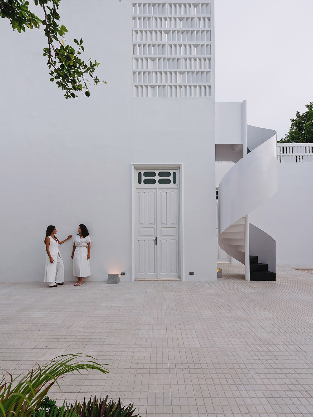
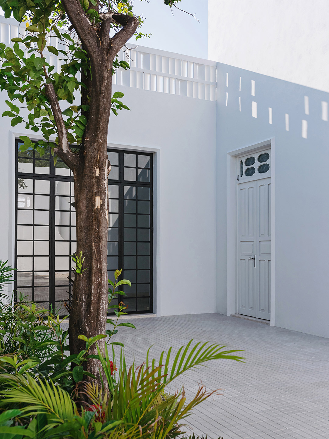
During daytime exhibitions, a spectacular contrast is created between the sunshine, and the projected lights and shadows that can be experienced inside the building. “At night, with the versatility of artificial lights, different luminous atmospheres can be created,” say the Workshop team. They add that when the building is in use, it can easily go unnoticed, shifting total focus to the works of art on display. “[The building] turns itself into a new work of art each time different forms of lighting are accommodated,” the architects say. “On the other hand, the building can stand-out and distinguish itself when there are no pieces exhibited.”
The second floor of the lab hosts an administrative area, including offices, a library (with a collection focused on light) and two sunny recreation terraces. It’s accessed by an elegant spiral staircase that finishes off the rear facade of the building. As with the level beneath it, the upper floor works as an independent space, but together they forge a sense of “artistic community”, acting as an energetic meeting point for artists, experts and the public.
“Our program connects us with the global scene of art through residencies, workshops, masterclasses, co-productions, forums and festivals that promote cultural exchange among artists, experts and a diverse audience,” the Filux team explain. Mirroring the ethos of the lab itself, the international program is based on practices and presentations that employ light and cinema as their starting point. “In this way, it consolidates itself as a global benchmark from Mexico to the world,” the architects conclude.
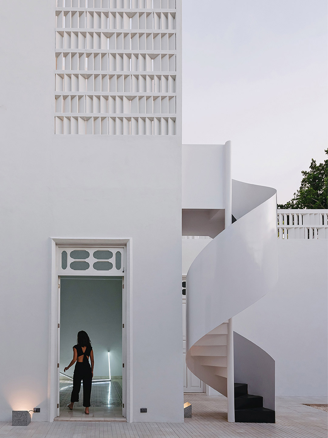
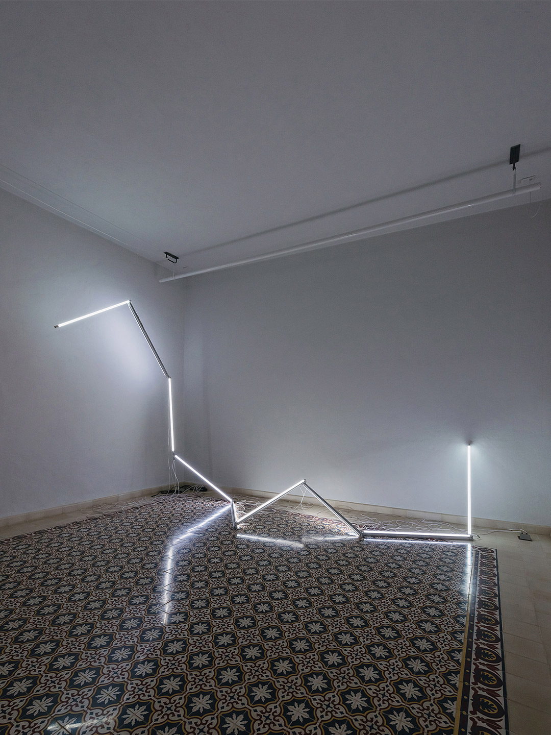
Leaning further into the need for versatility, the architects crafted mostly white spaces, free of fixed lighting, so that the rooms are ready for quick and complete transformation.
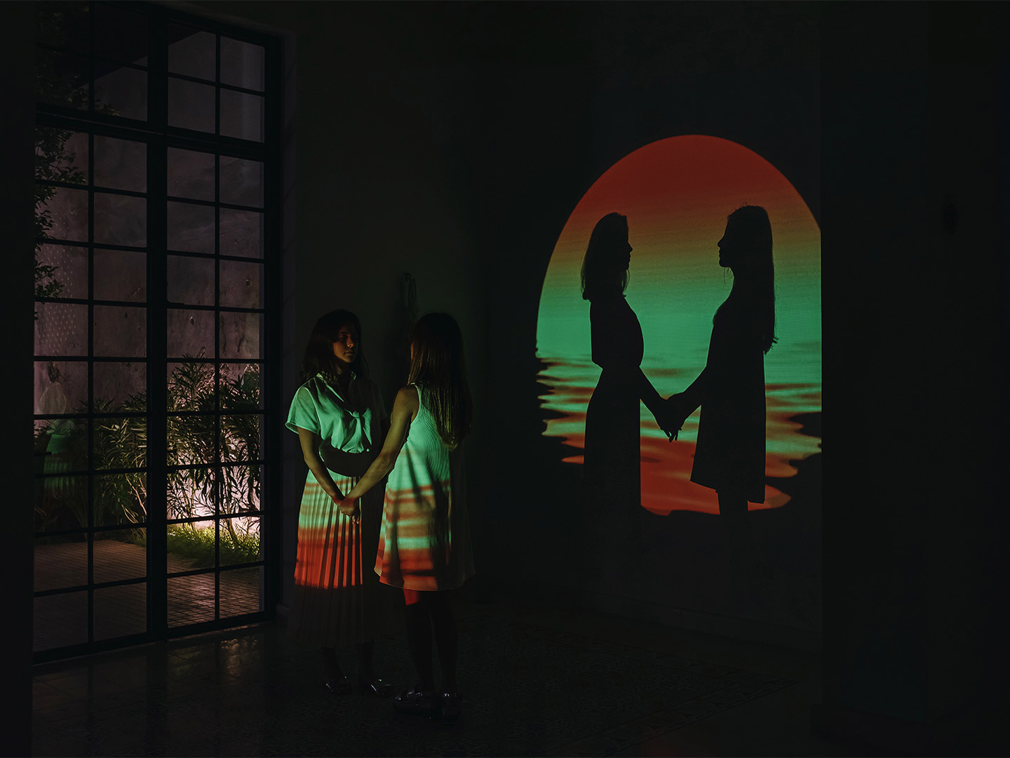
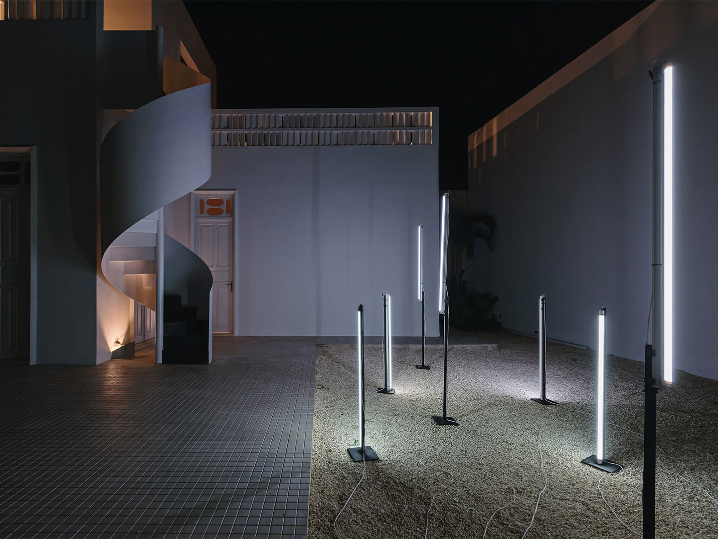
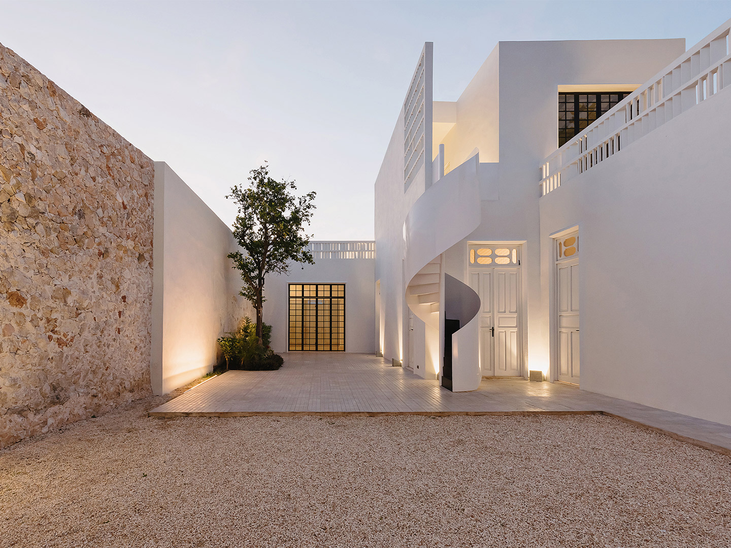
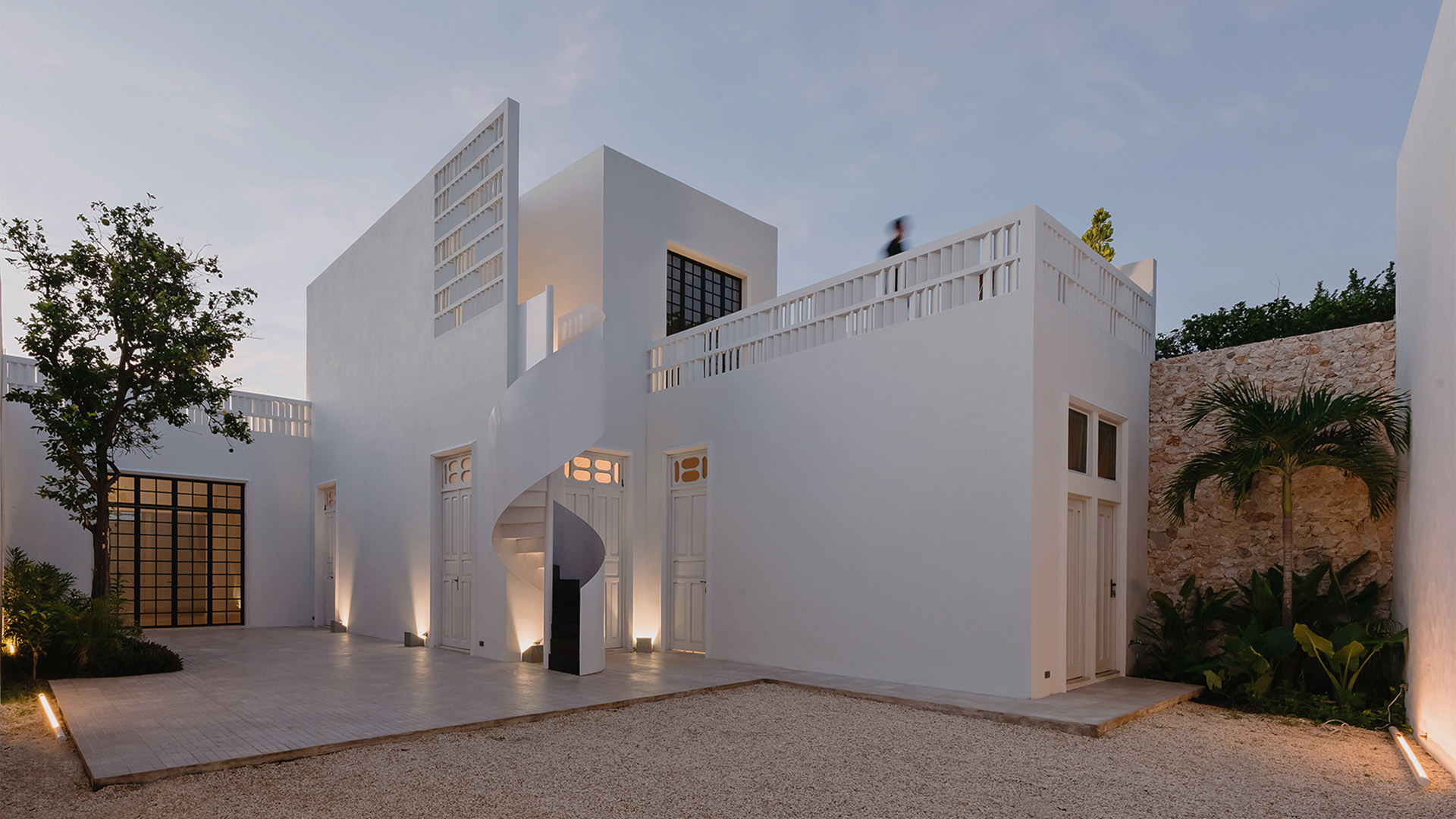
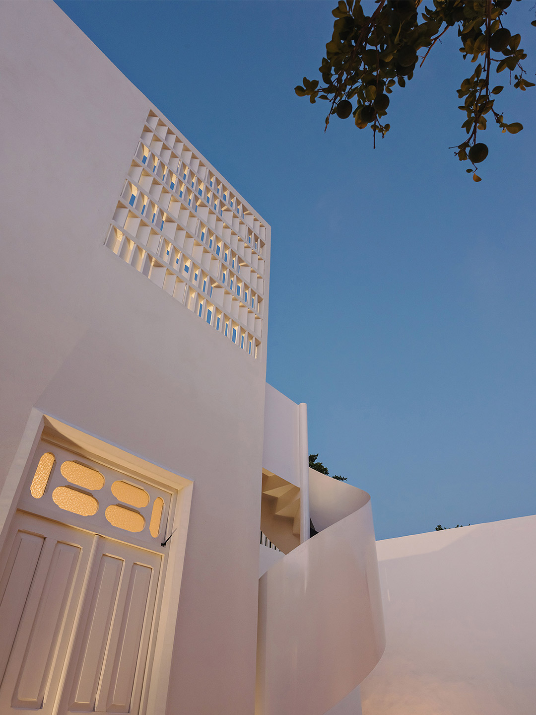
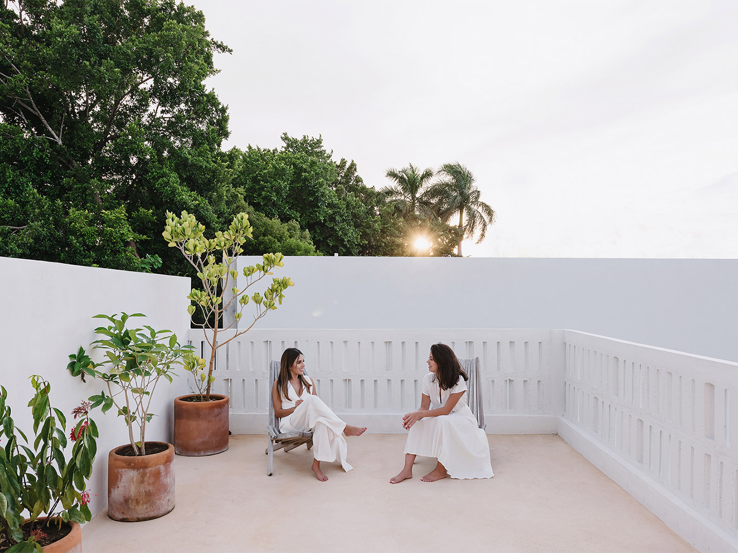
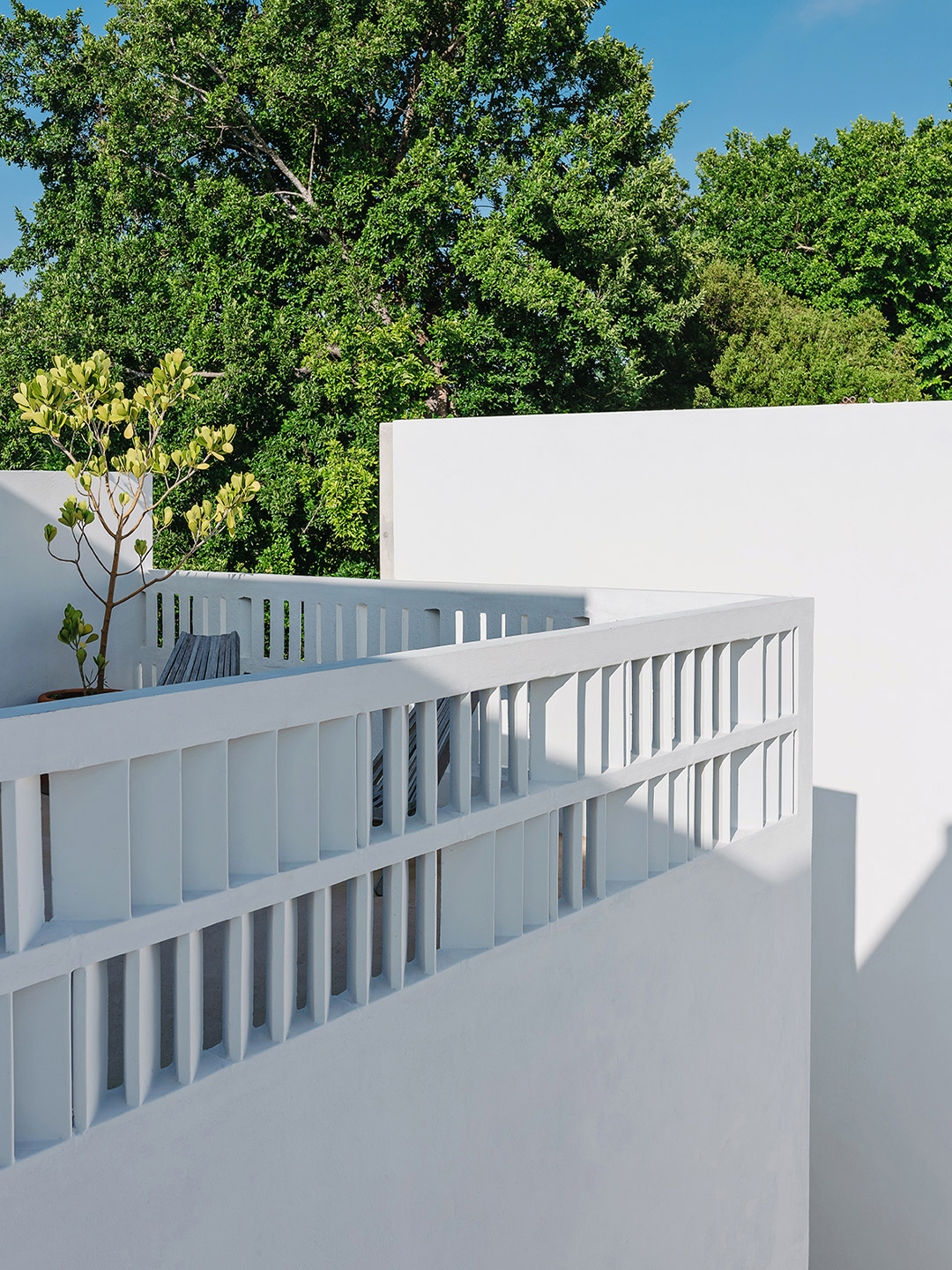
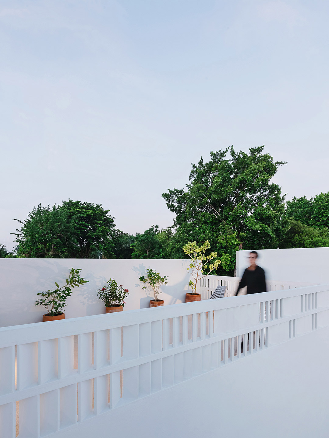
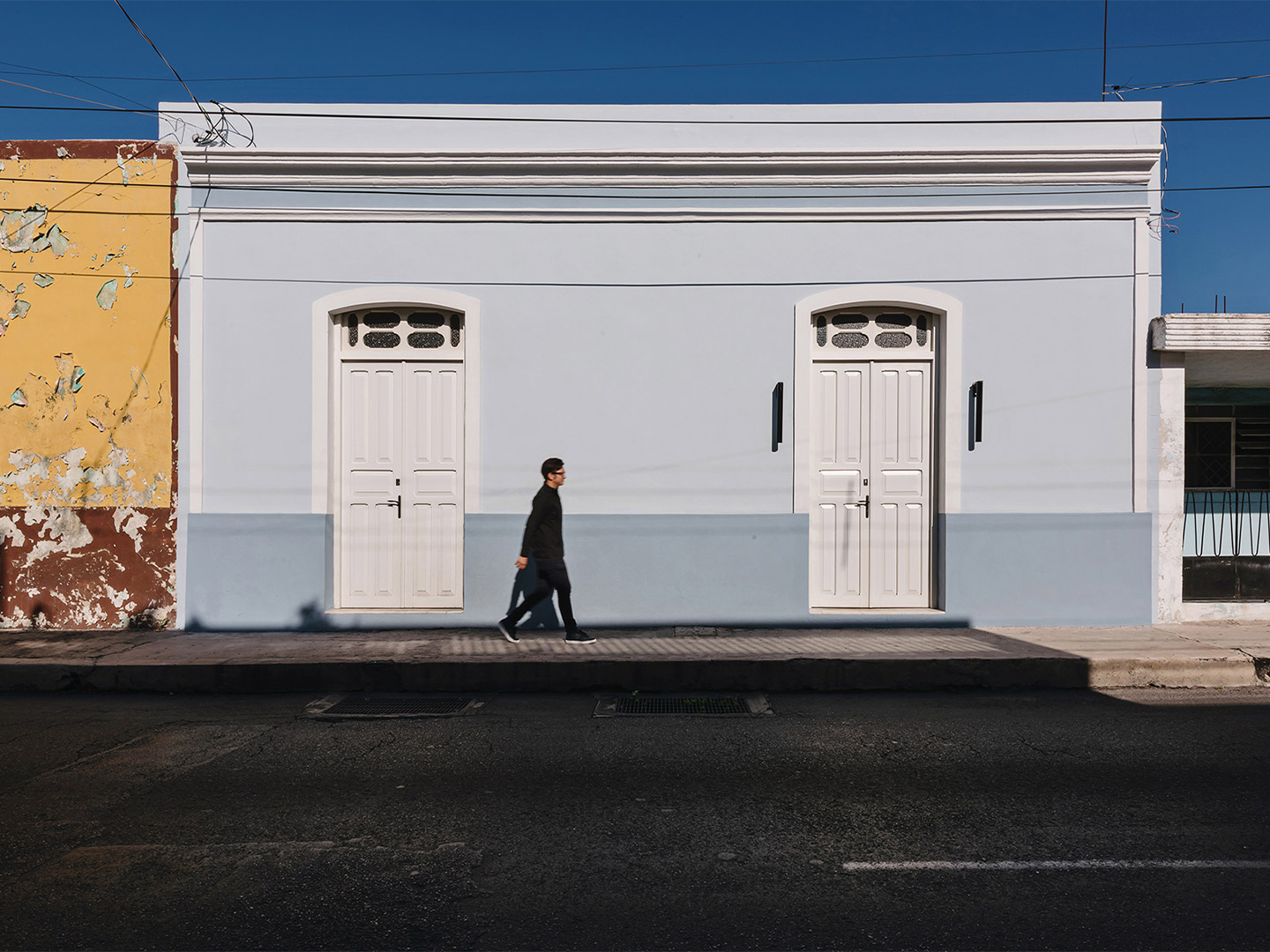
Photographs in this feature include works by Orfeo Quagliata, Toto Martínez/Benjamín García, Miguel Bolivar, Luis Ramírez, Diego Cano and Marcelo Schuster. Catch up on more architecture, art and design highlights. Plus, subscribe to receive the Daily Architecture News e-letter direct to your inbox.