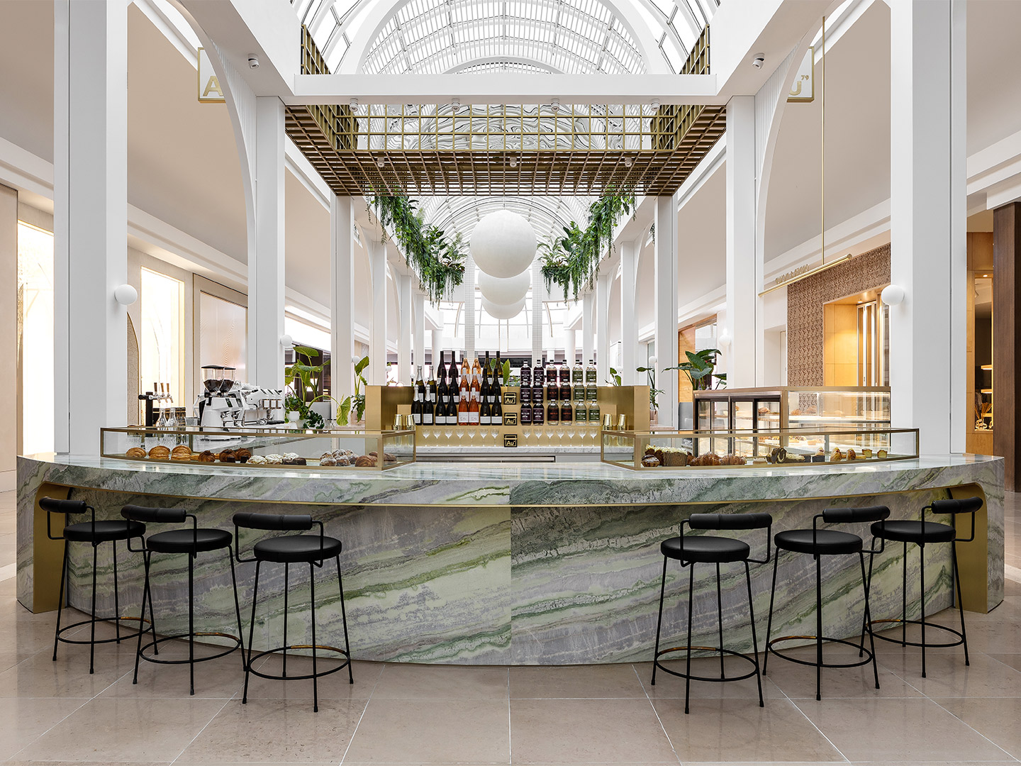
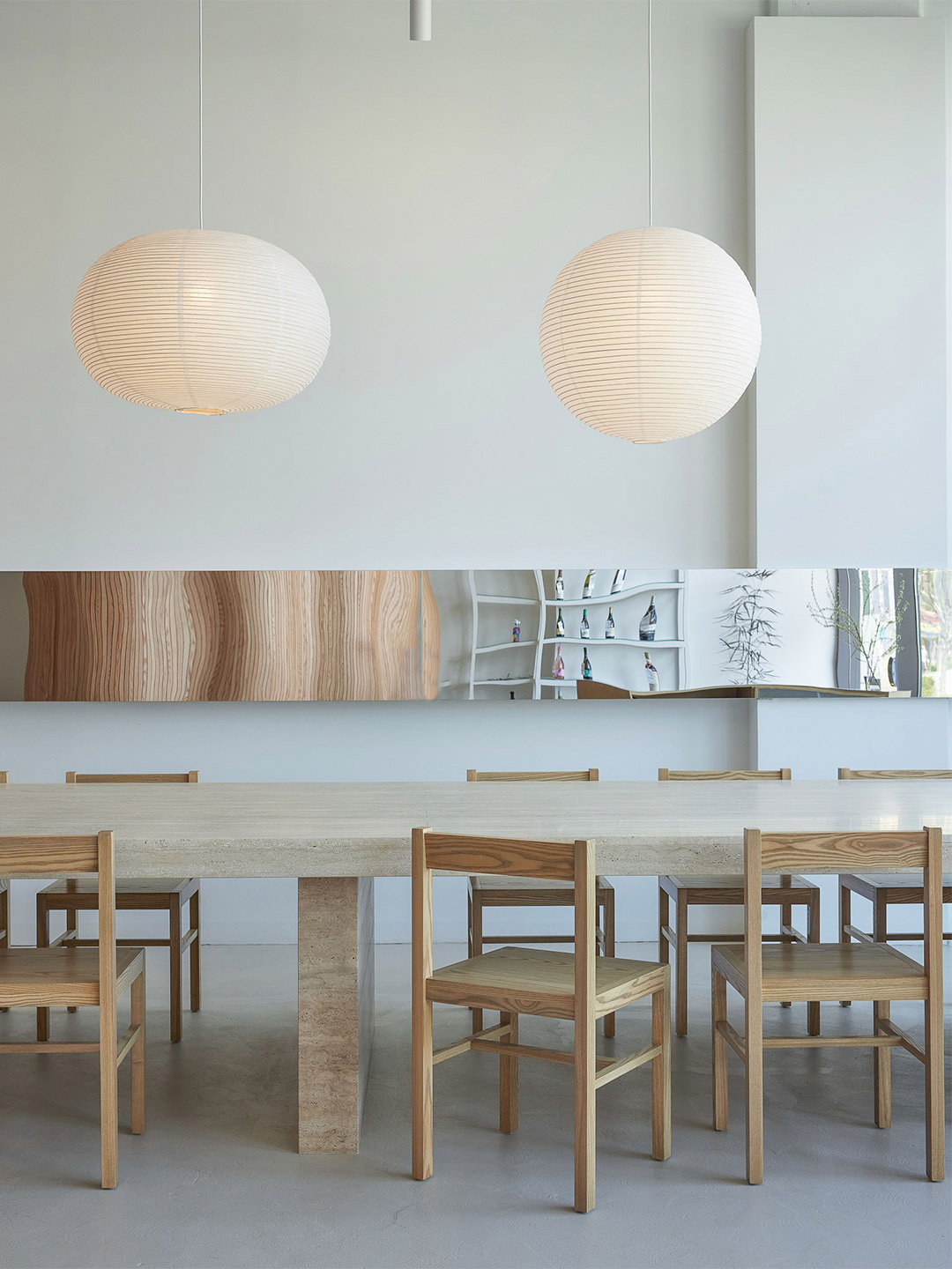
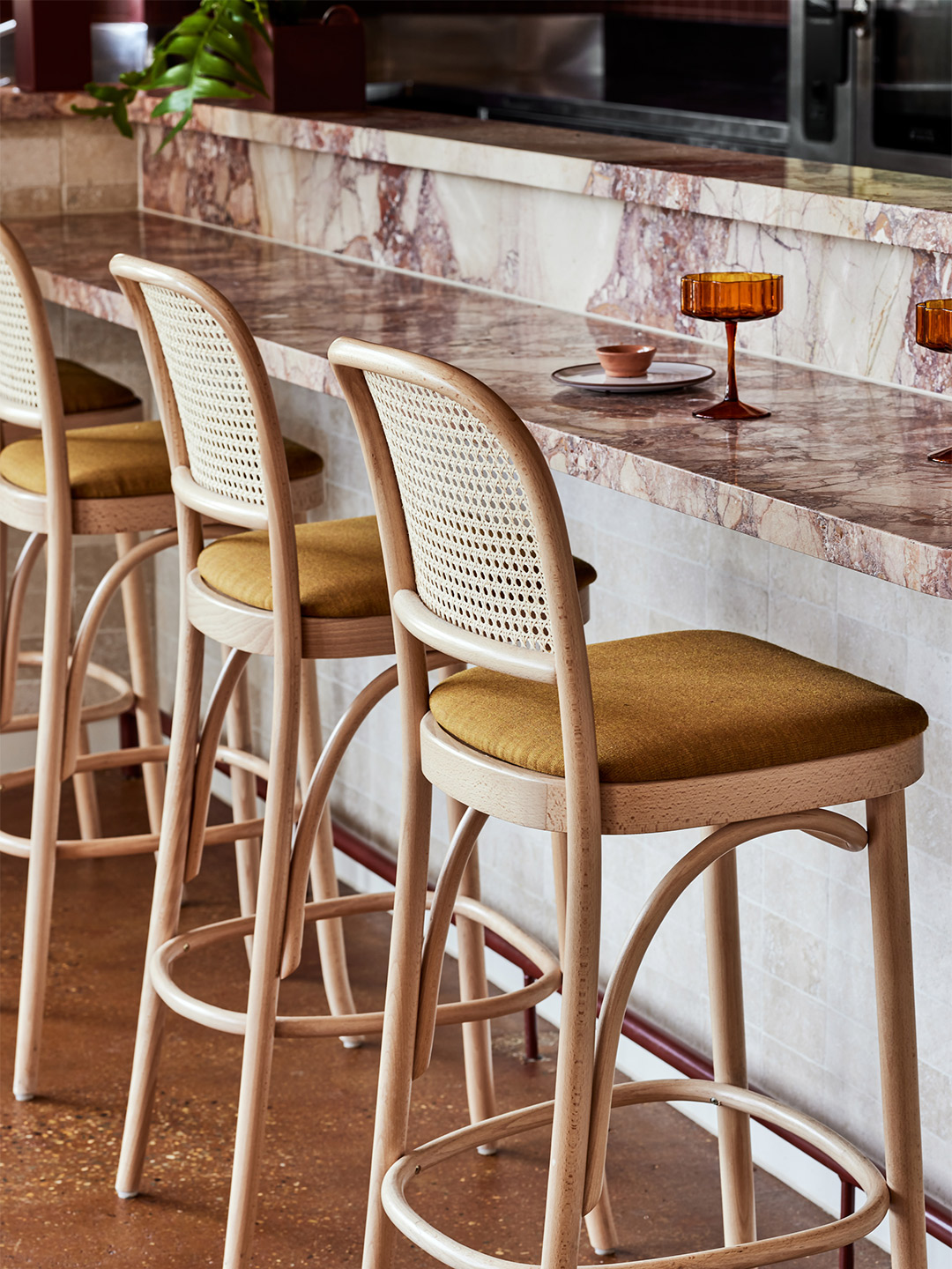
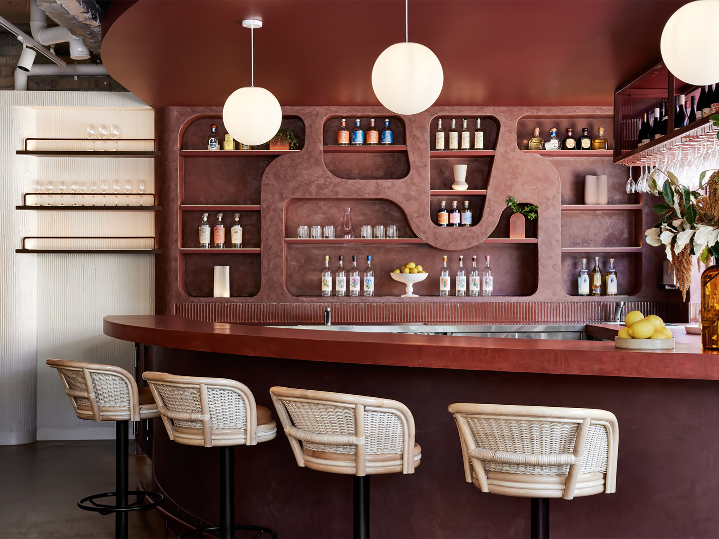
In a capital highly praised for its coffee culture, Au79 became one of Melbourne’s go-to purveyors of a caffeine hit with the opening of its first cafe in the inner-city suburb of Abbotsford. Representing a giant leap from the brand’s humble beginnings in a garage nearby, the look and feel of the debut outlet was created by local design office Mim Design, led by company founder and principal Miriam “Mim” Fanning. As the first cafe flourished, the Au79 team secured for their “second home” a kiosk-style site in the Chadstone shopping complex, once again tapping Mim to formulate the design. “It was essential for the new space to have a personality reflective of its location,” Miriam says, adding that part of the client’s brief for the new cafe was to maintain “a family resemblance” to its older sibling.
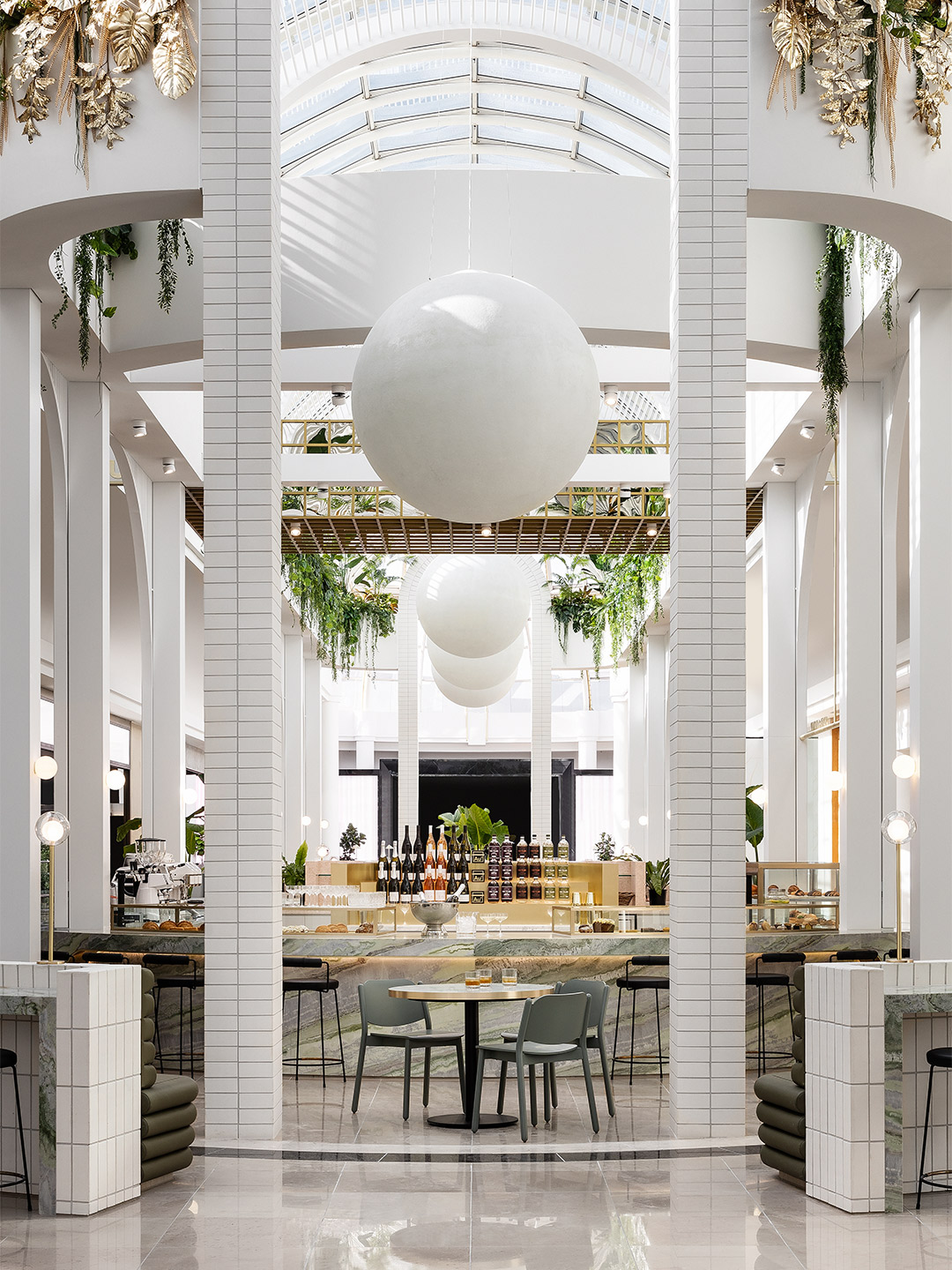
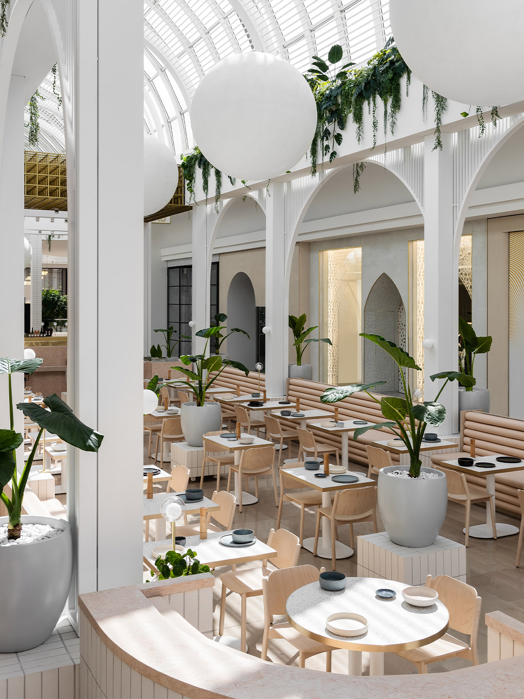
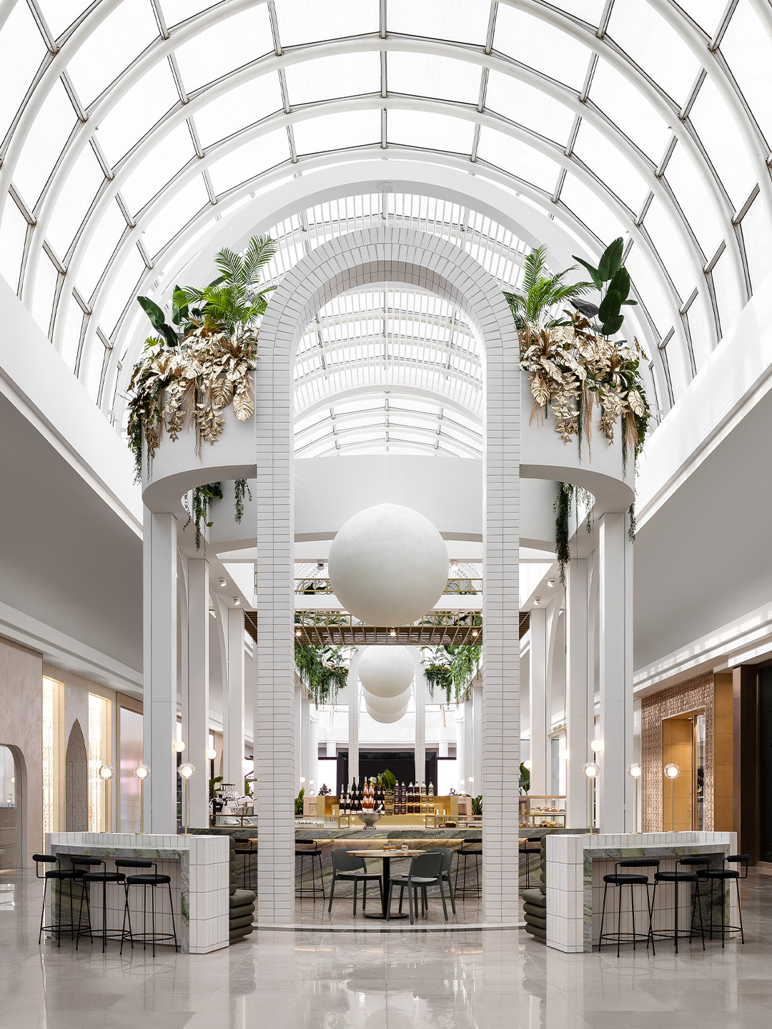
In addition to this, the client’s brief included the desire to create “a moment of pure gold,” Miriam reveals, prompting her team at Mim Design to craft a textural, gilded oasis within the confines of Chadstone. The dramatic, vaulted glass ceiling above the pill-shaped site inspired the designers to explore ideas of replicating a greenhouse sanctuary. Conjuring up visions of the Palm House at Schönbrunn Palace Park in Vienna, the greenhouses in the Botanical Garden of Curitiba in southern Brazil and the glass palaces of 19th-century France, the result is a chic place of serenity and respite, accessed via a short car trip from the CBD of Melbourne.
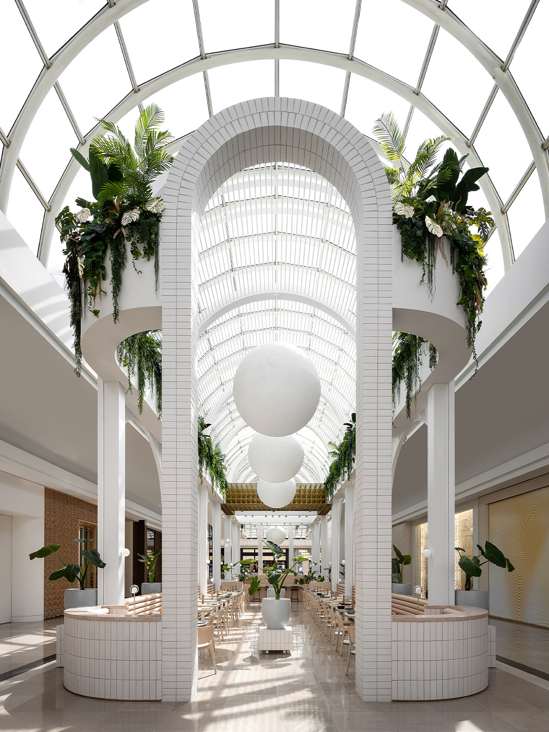
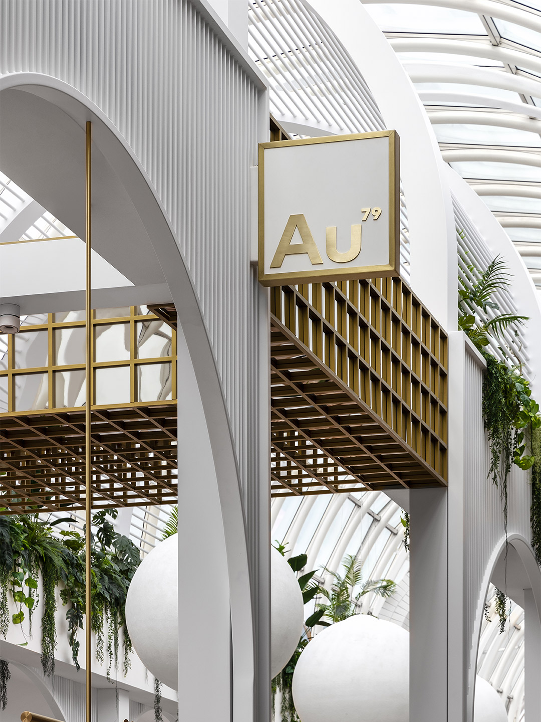
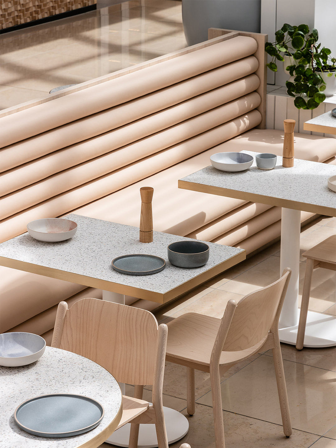
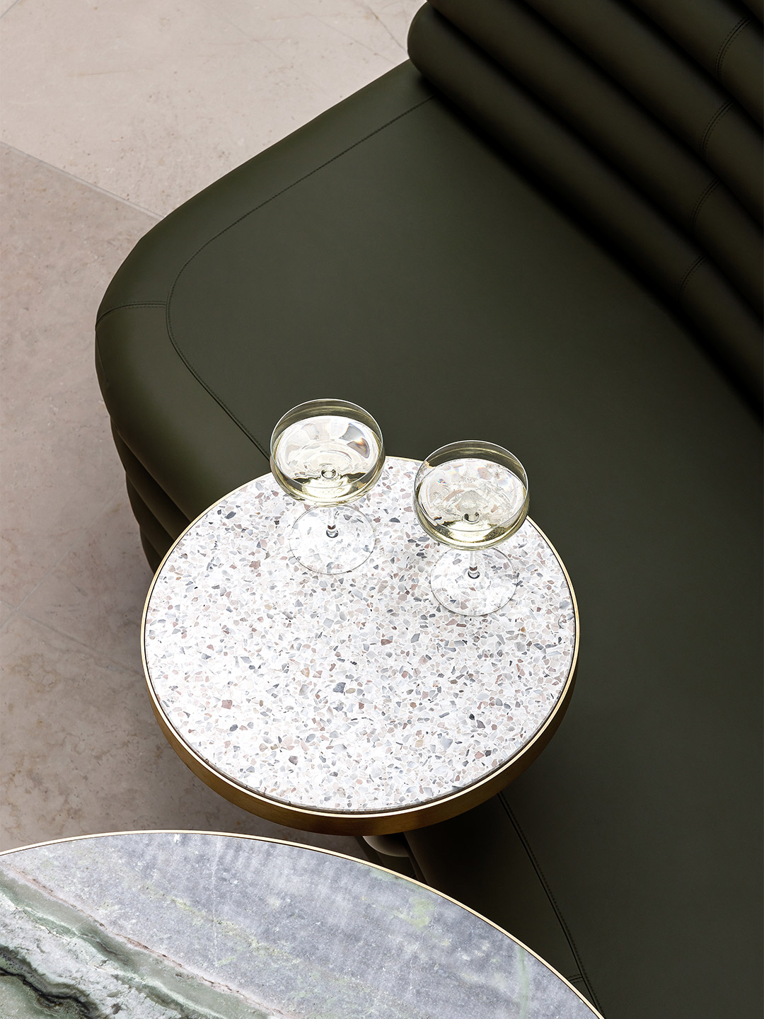
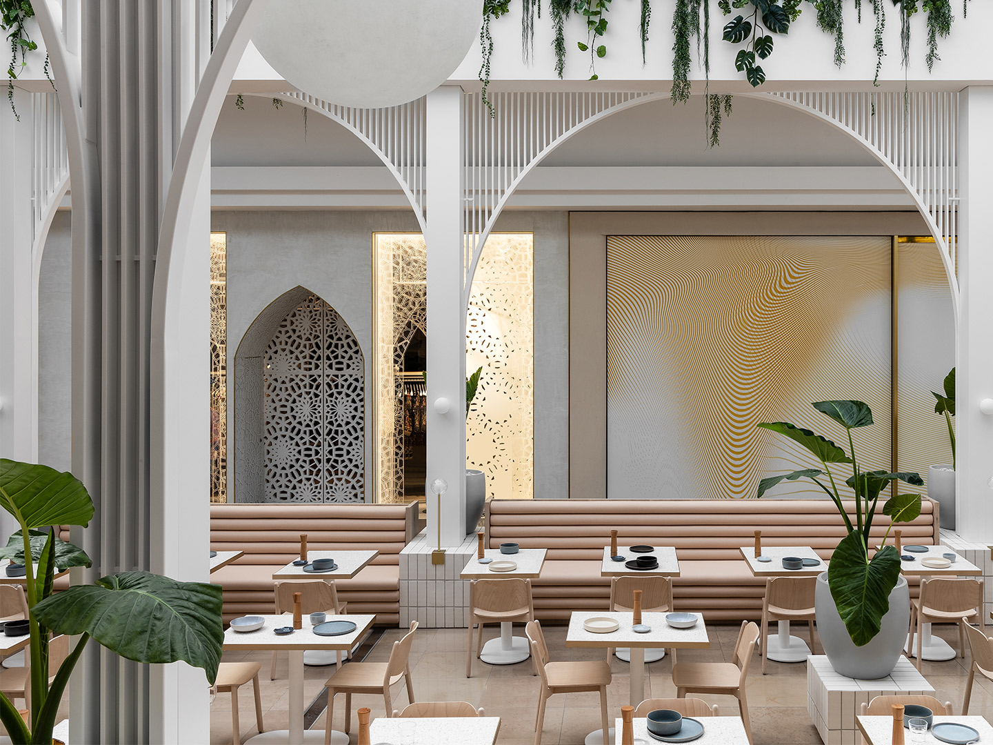
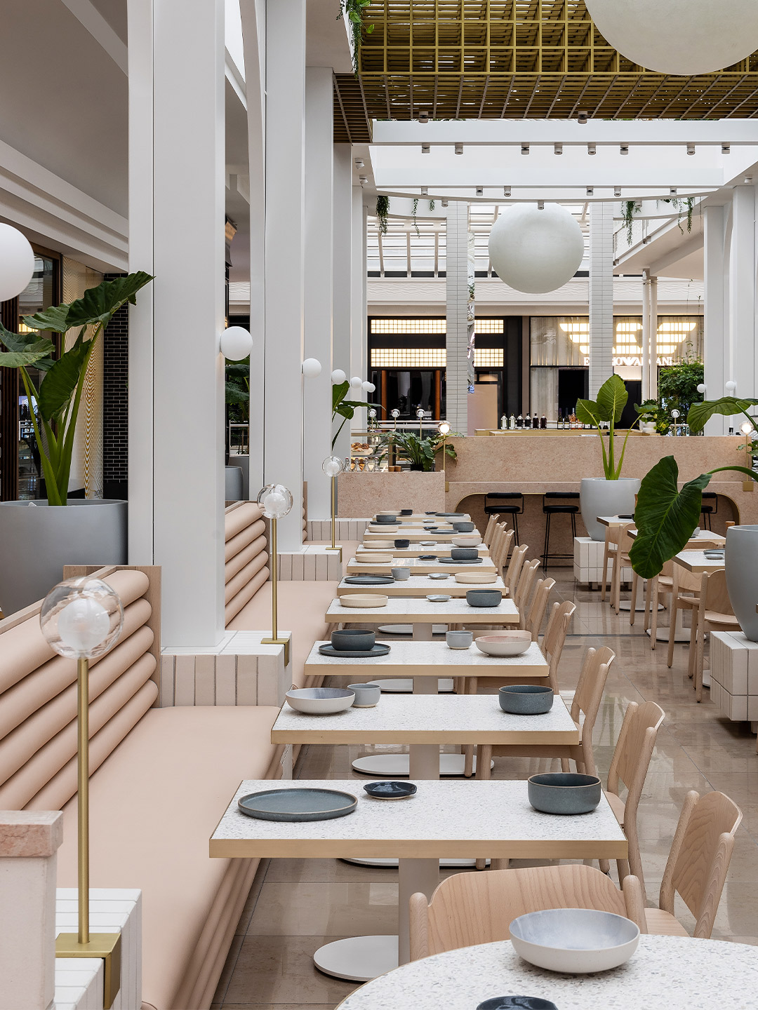
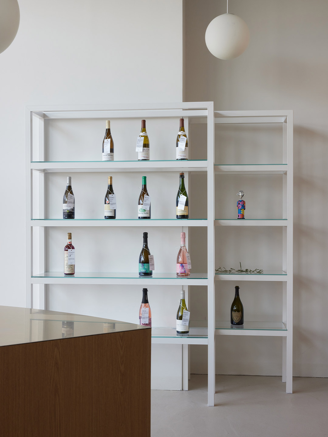
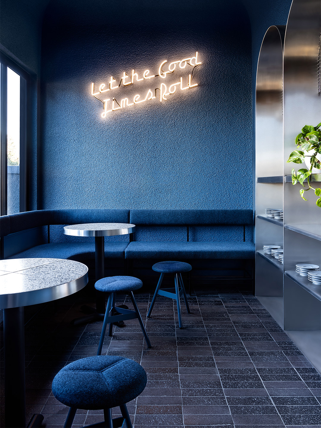
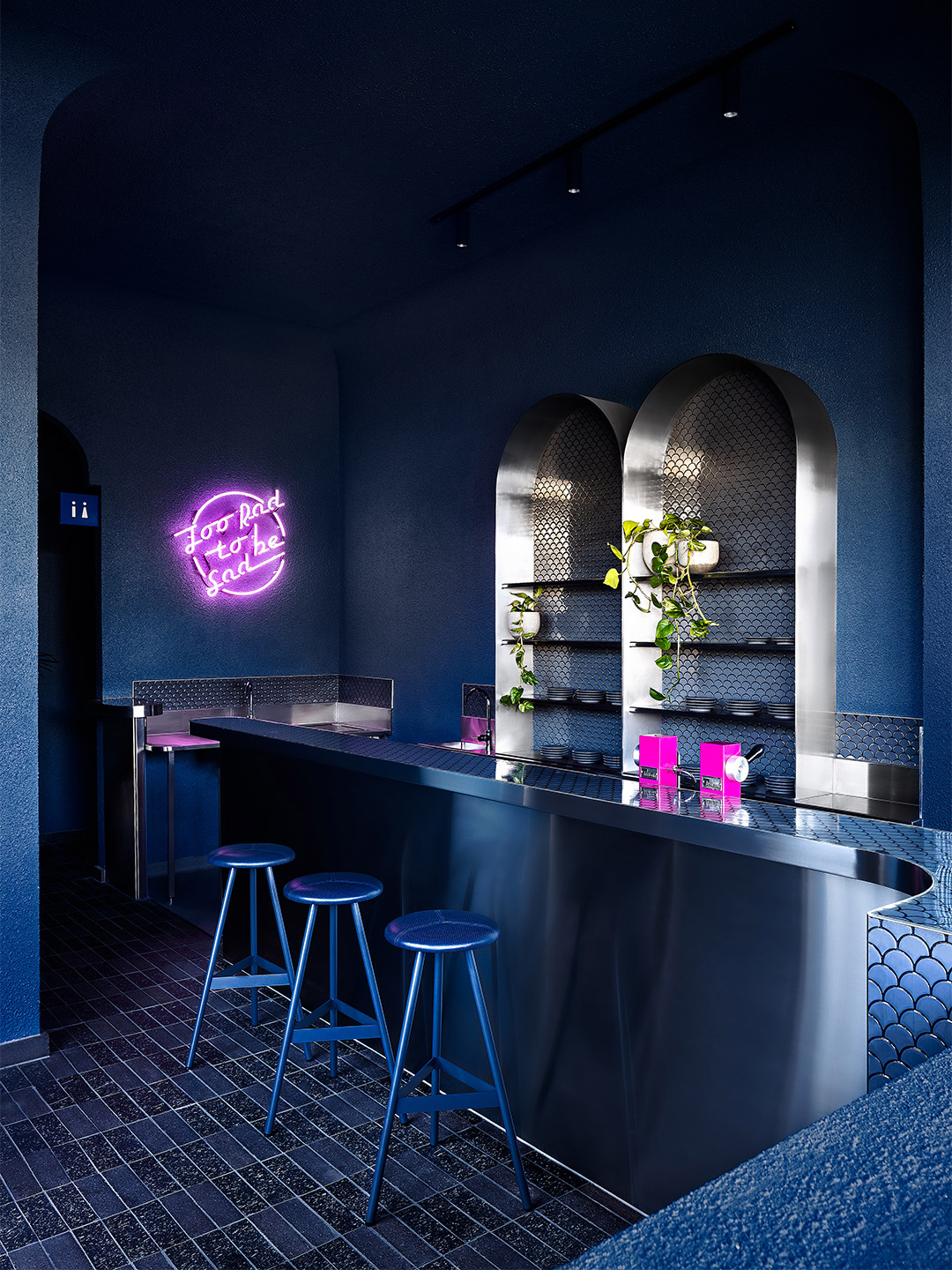
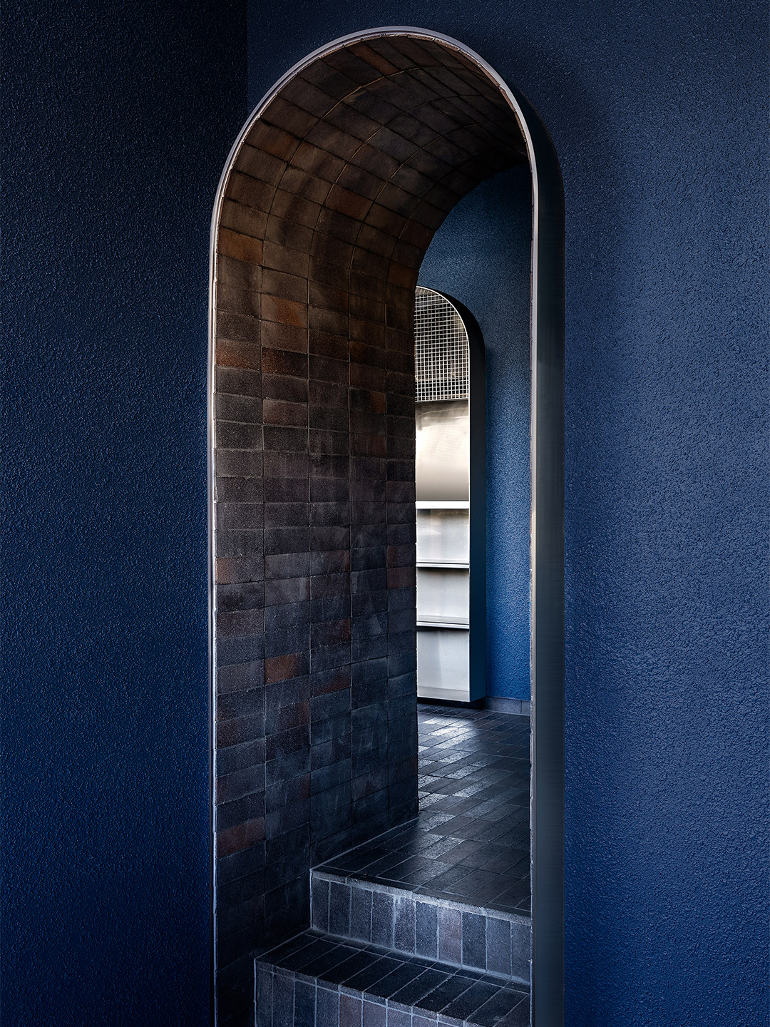
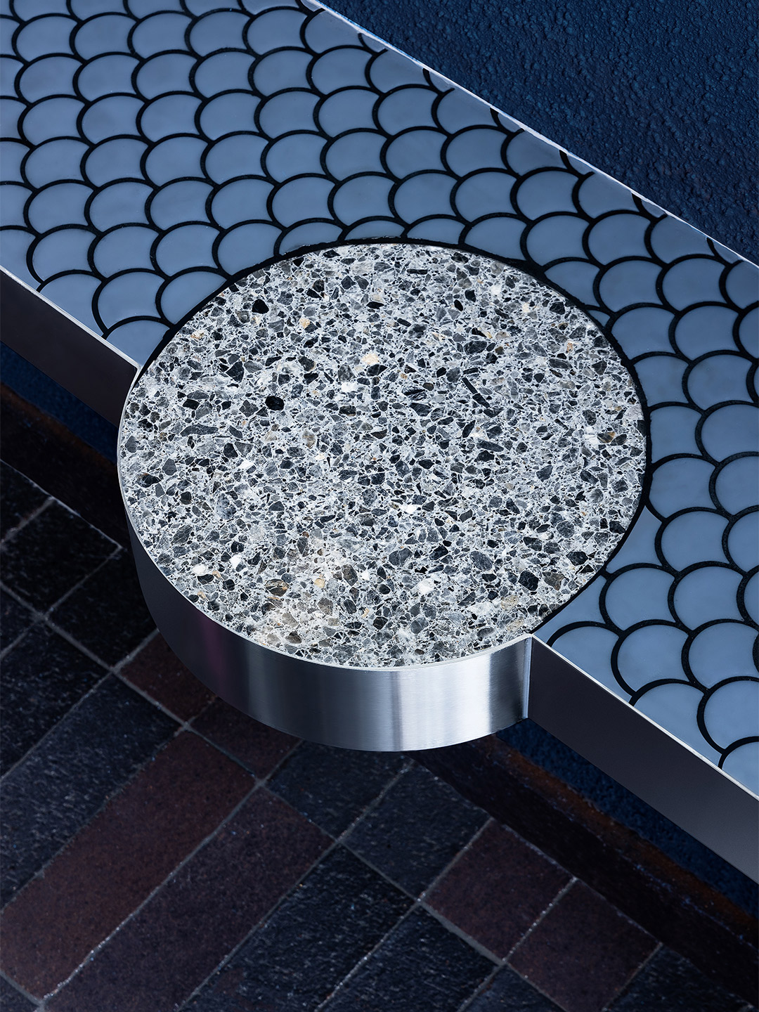
Au79 cafe at Chadstone by Mim Design
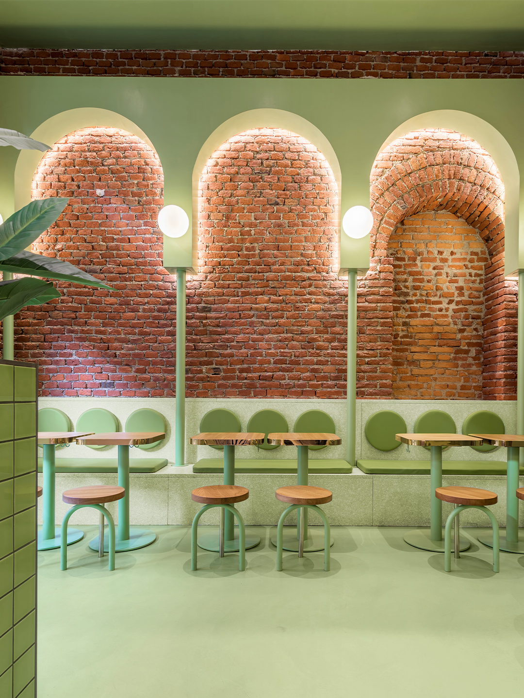
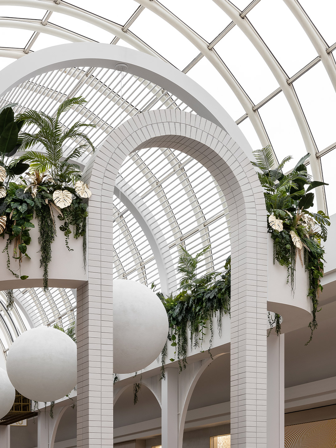
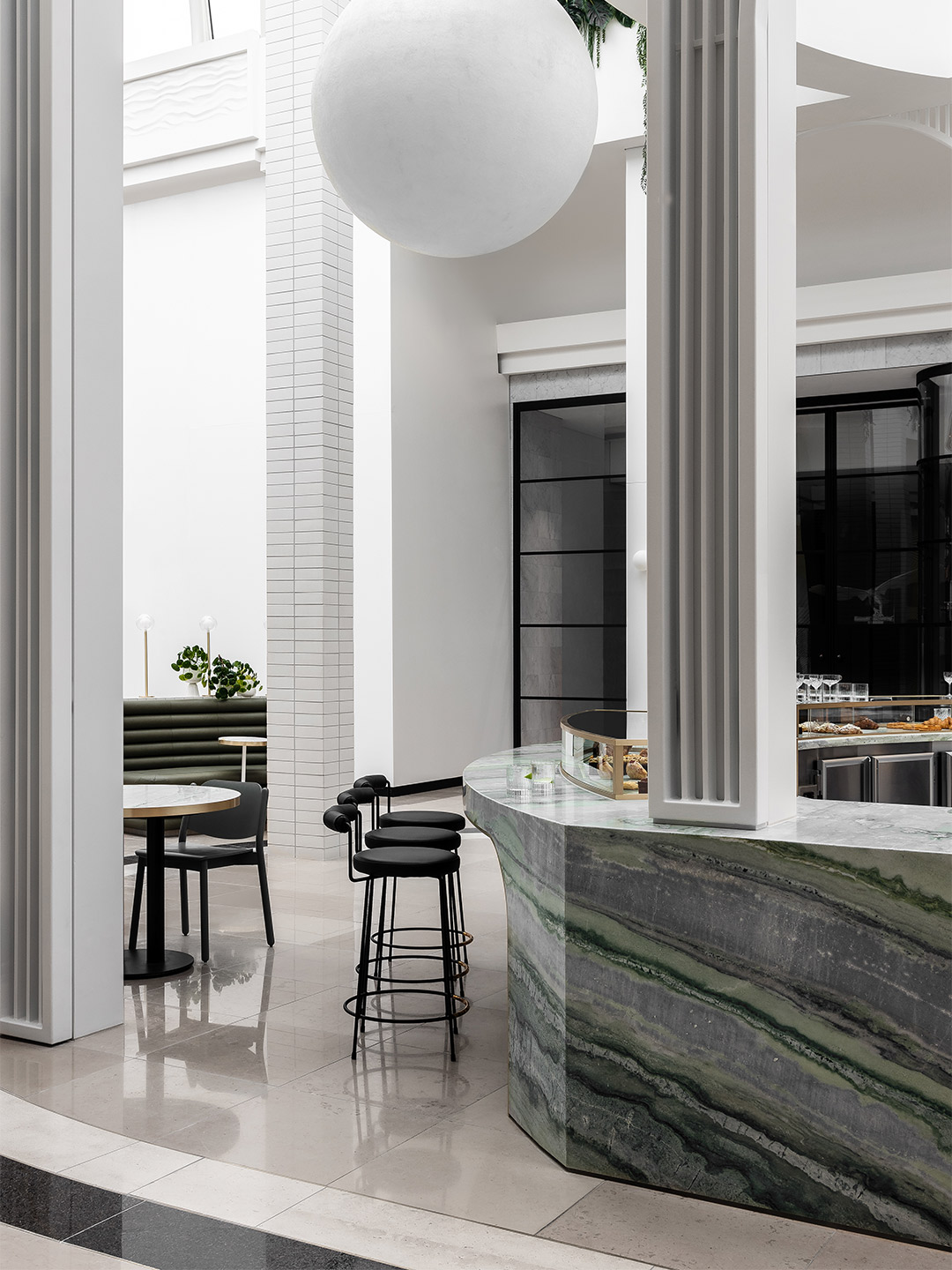
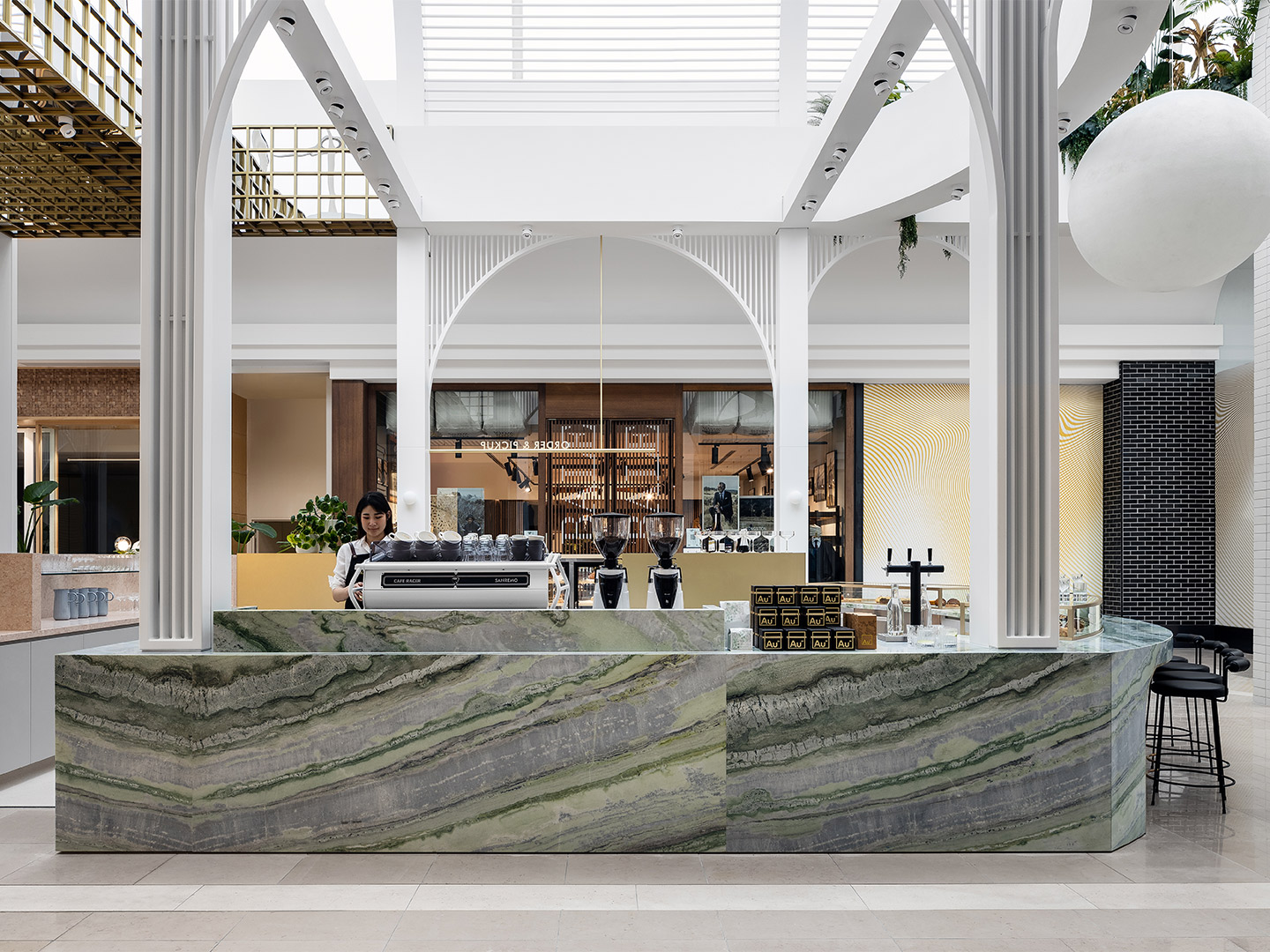
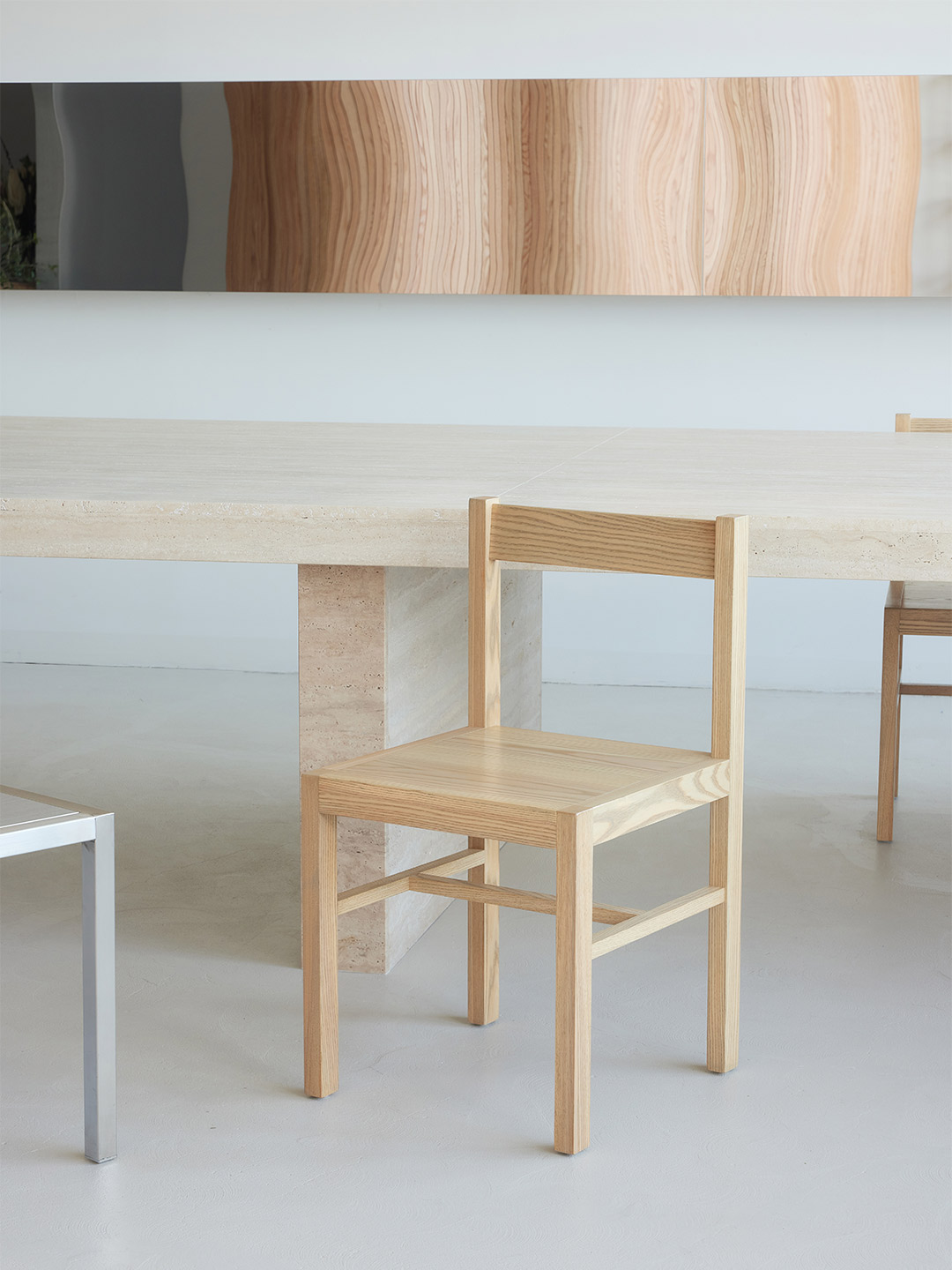
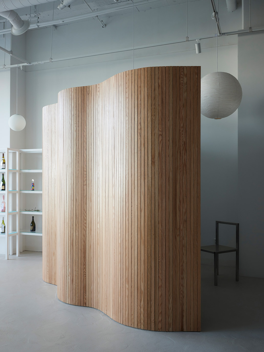
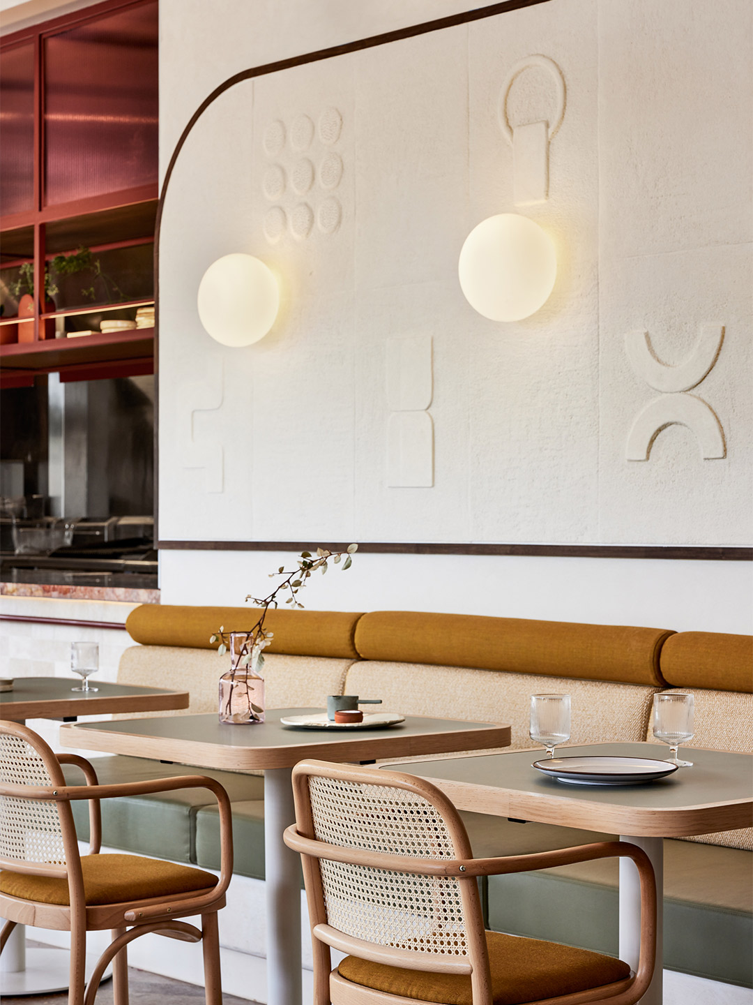
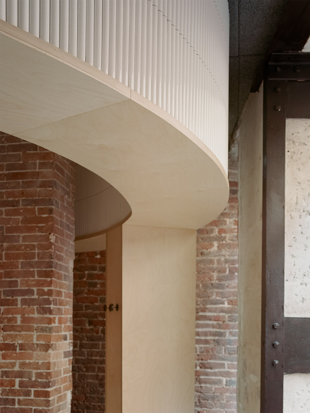
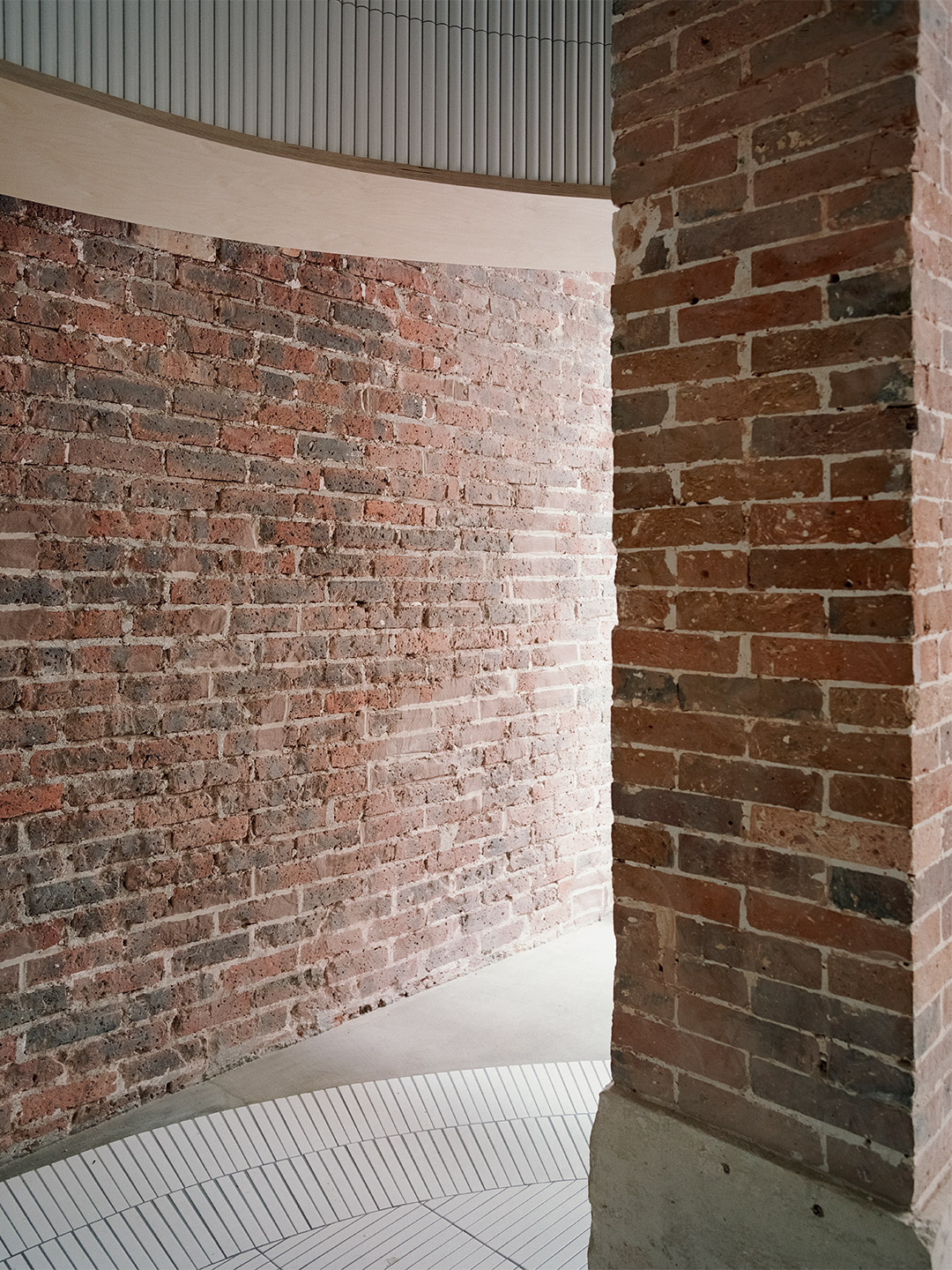
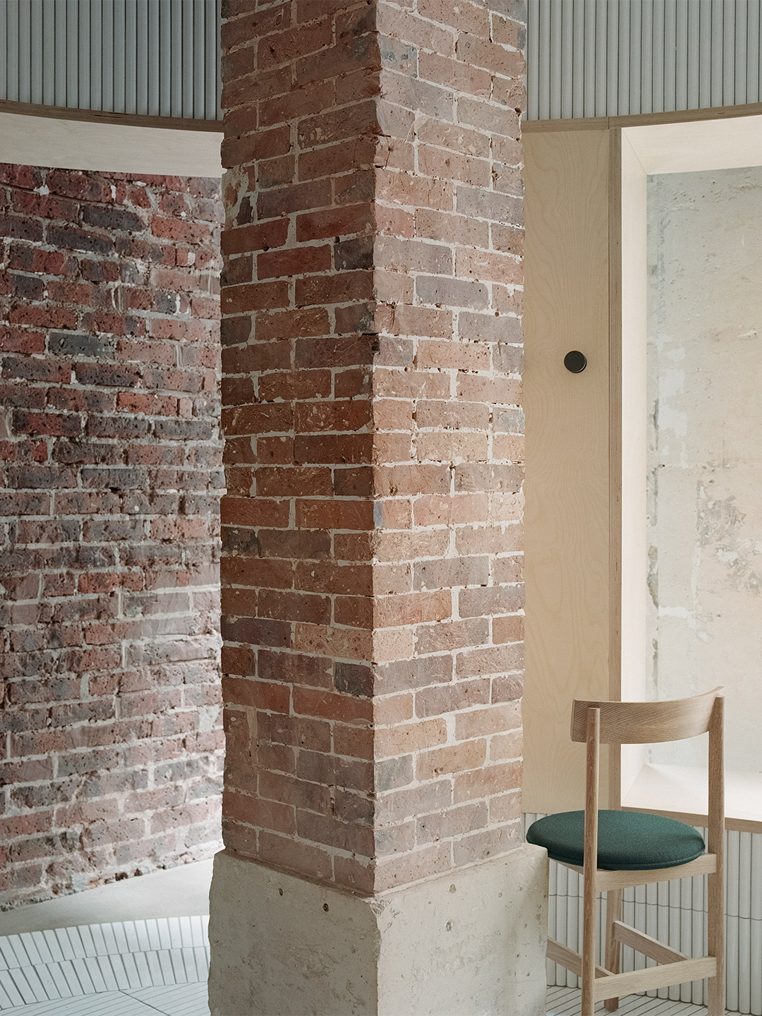
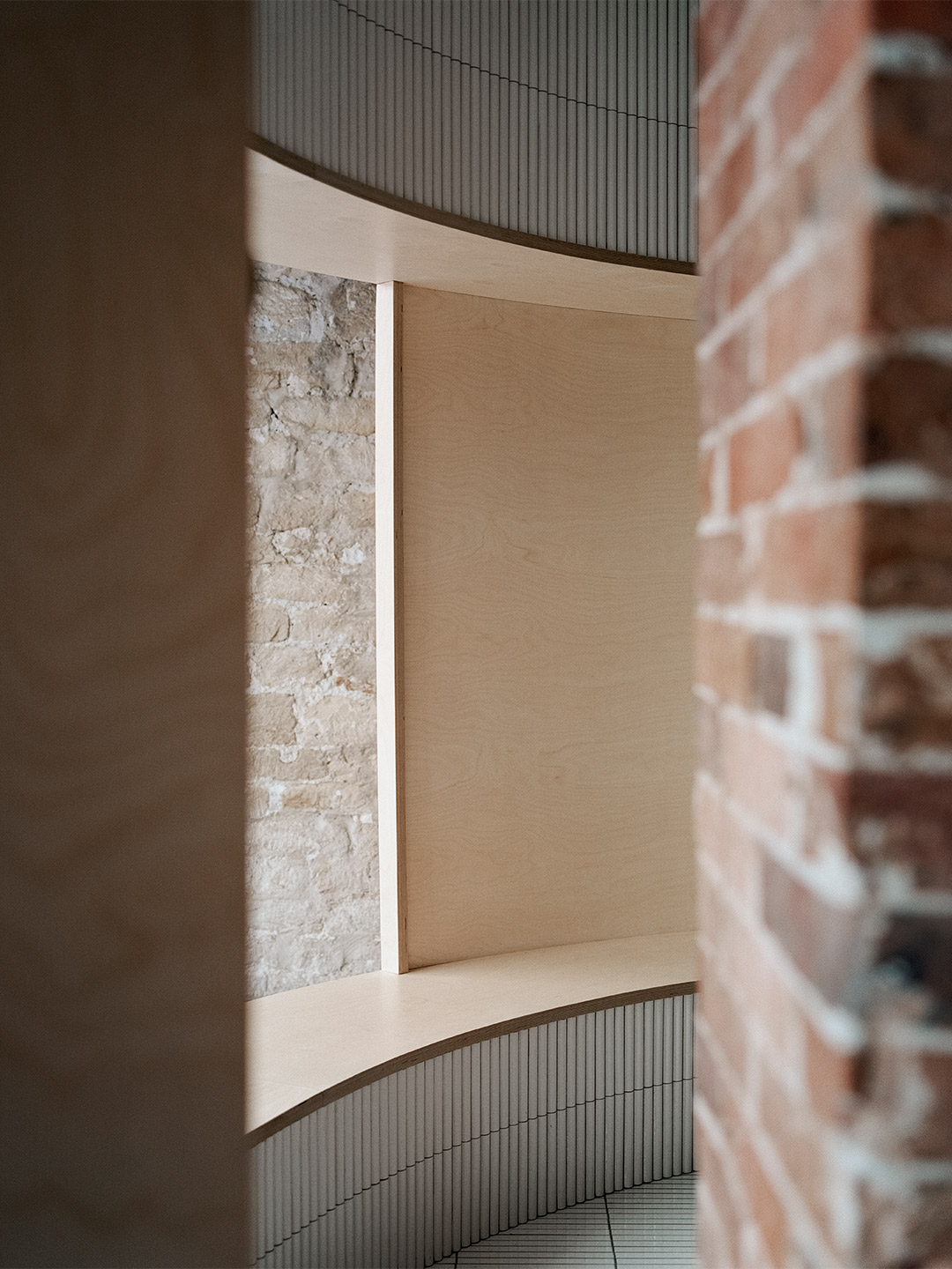
In order to address Au79’s visual and physical accessibility, the team at Mim Design applied a meticulous approach to planning. The cafe’s arched framework mimics the sweeping lines of the existing glass ceiling, establishing a strong architectural presence that embeds the cafe in its context. An off-site kitchen, however, dictated the position of the servery, which in turn divided the site into two key zones: the cafe and its bar. “The cafe addresses the main retail thoroughfare, while the bar offers a more intimate and exclusive experience facing the luxury retailers,” says Kieren Guerrero, project leader at Mim Design. The open floorplan that followed sensitively maintains visibility across the cafe to the shopfronts beyond, while the arched outlines produce a theatrical colonnade effect layered with a subtle sense of privacy.
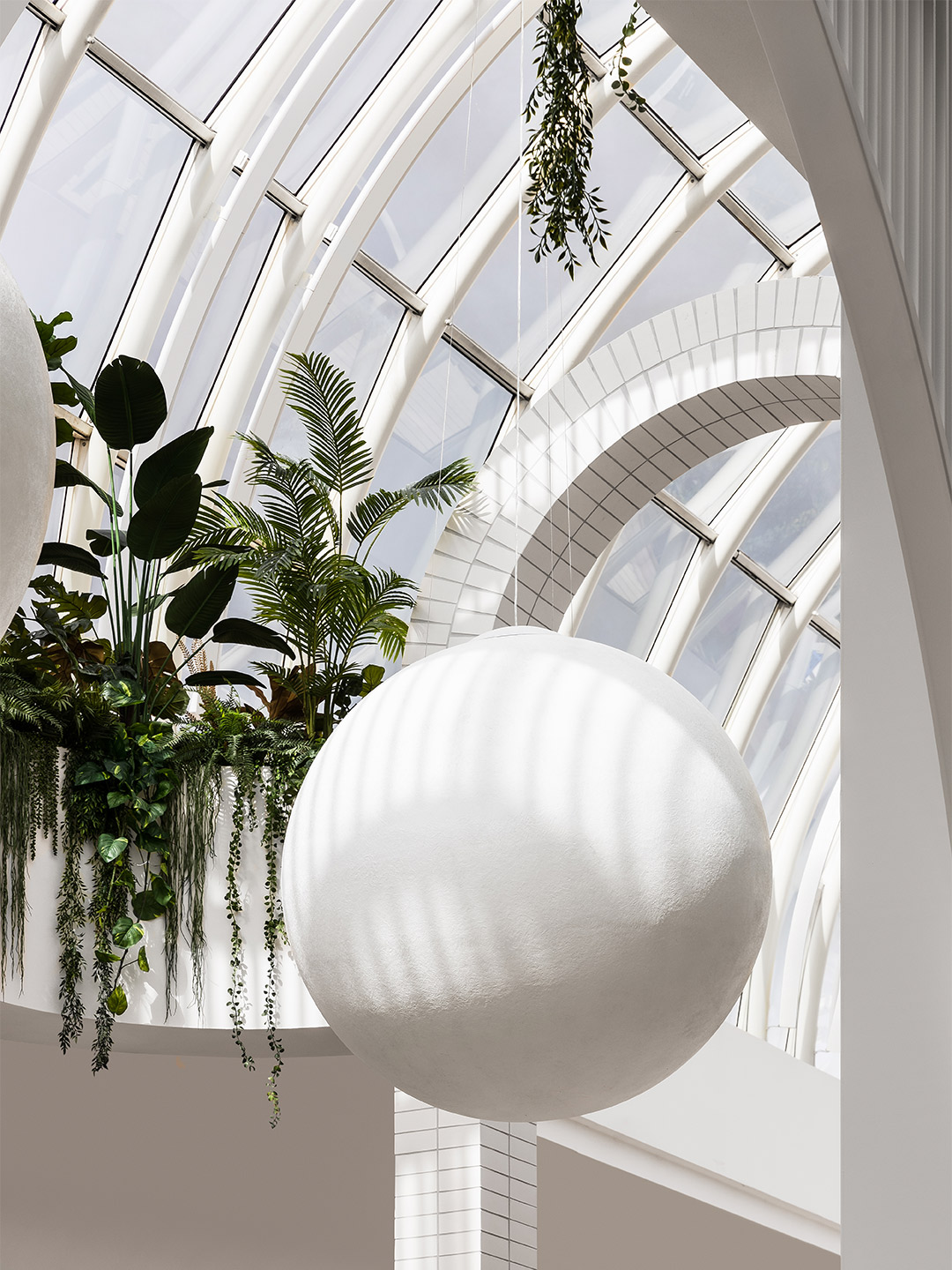
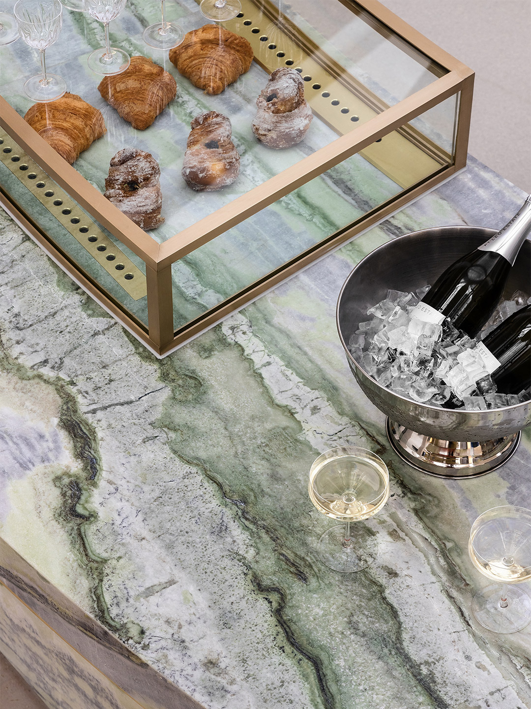
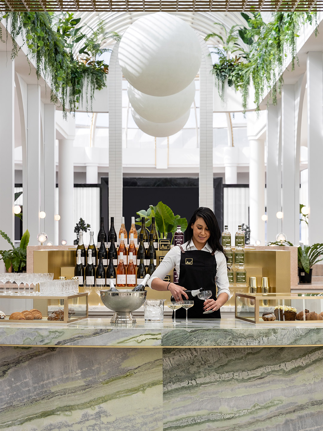
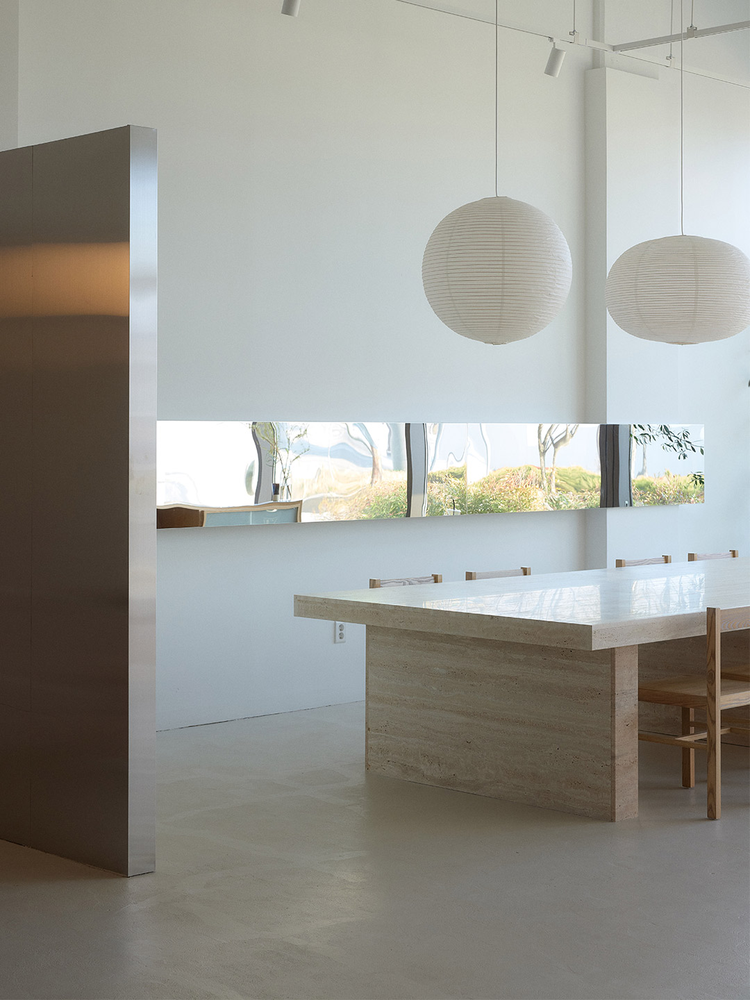
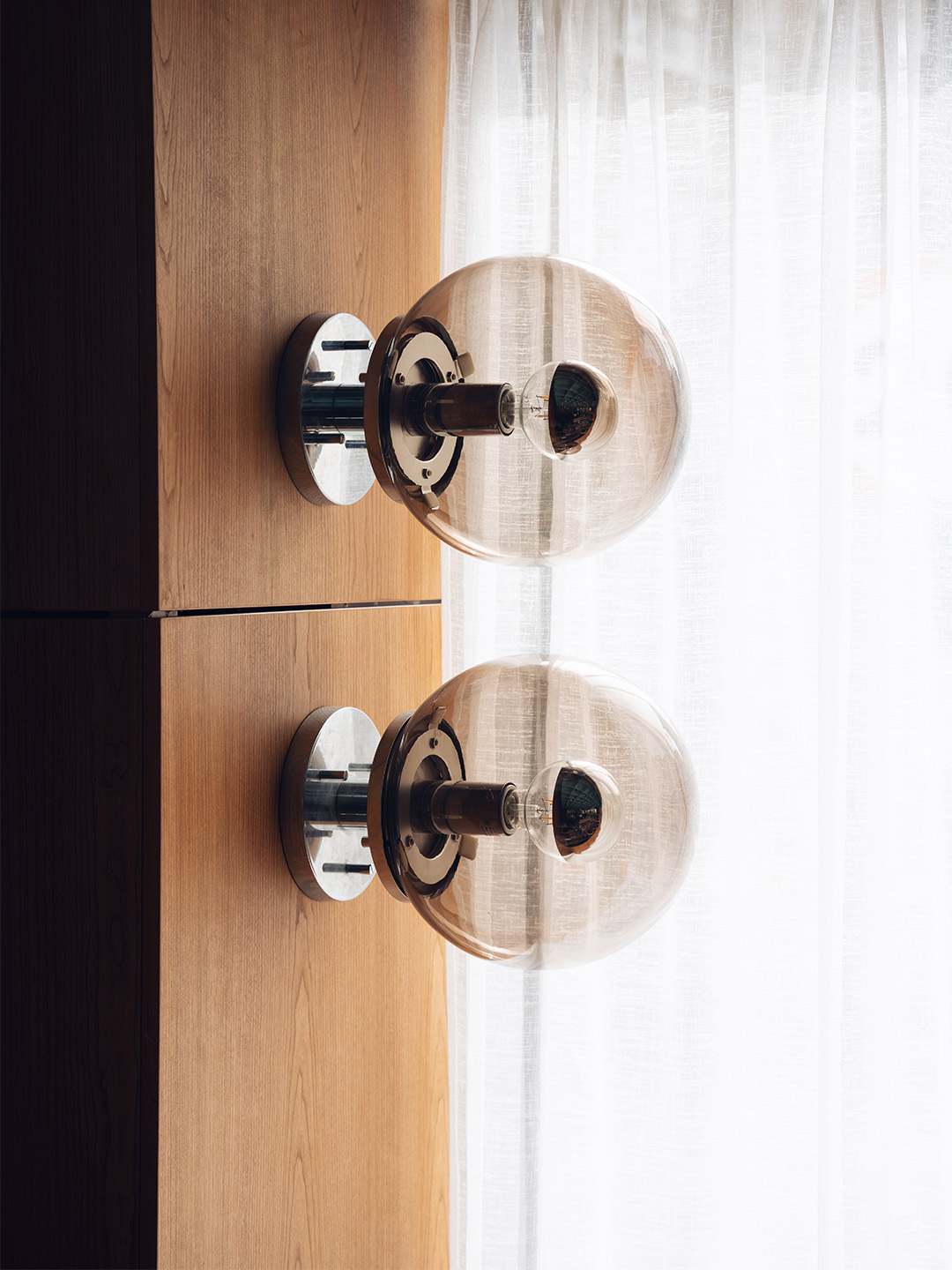
Circling back to the client’s brief, Mim’s design response for the Au79 Chadstone outlet reinterprets the narrative established in Abbotsford, upholding familiar gestures such as brass details, lush planting, scalloped profiles and tactile finishes. Furthermore, on approach to the new cafe, a curved stone bench flanked by brass-edged display cabinets articulates a strong sense of symmetry, which is employed consistently for the length of the site. The cafe zone is anchored by a brass “space-frame” canopy, while beyond that a perimeter of cascading plants and a series of over-scaled ball pendants define a haven-like bar area.
Aligned with Au79’s commitment to providing cafe service during the day into the early evening, these giant orbs of light reflect Mim Design’s interest in sculpting new experiences for patrons. “At night, we wanted to create the atmosphere of sitting under the glow of the moon,” suggests Kieren. The gentle illumination provided by the pendant lights allows the space to transition from day to night with ease, all the while maintaining a sense of presence and bringing new dimension to the cafe’s curved forms and palette of natural materials.
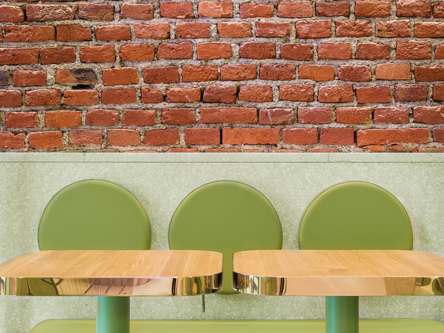
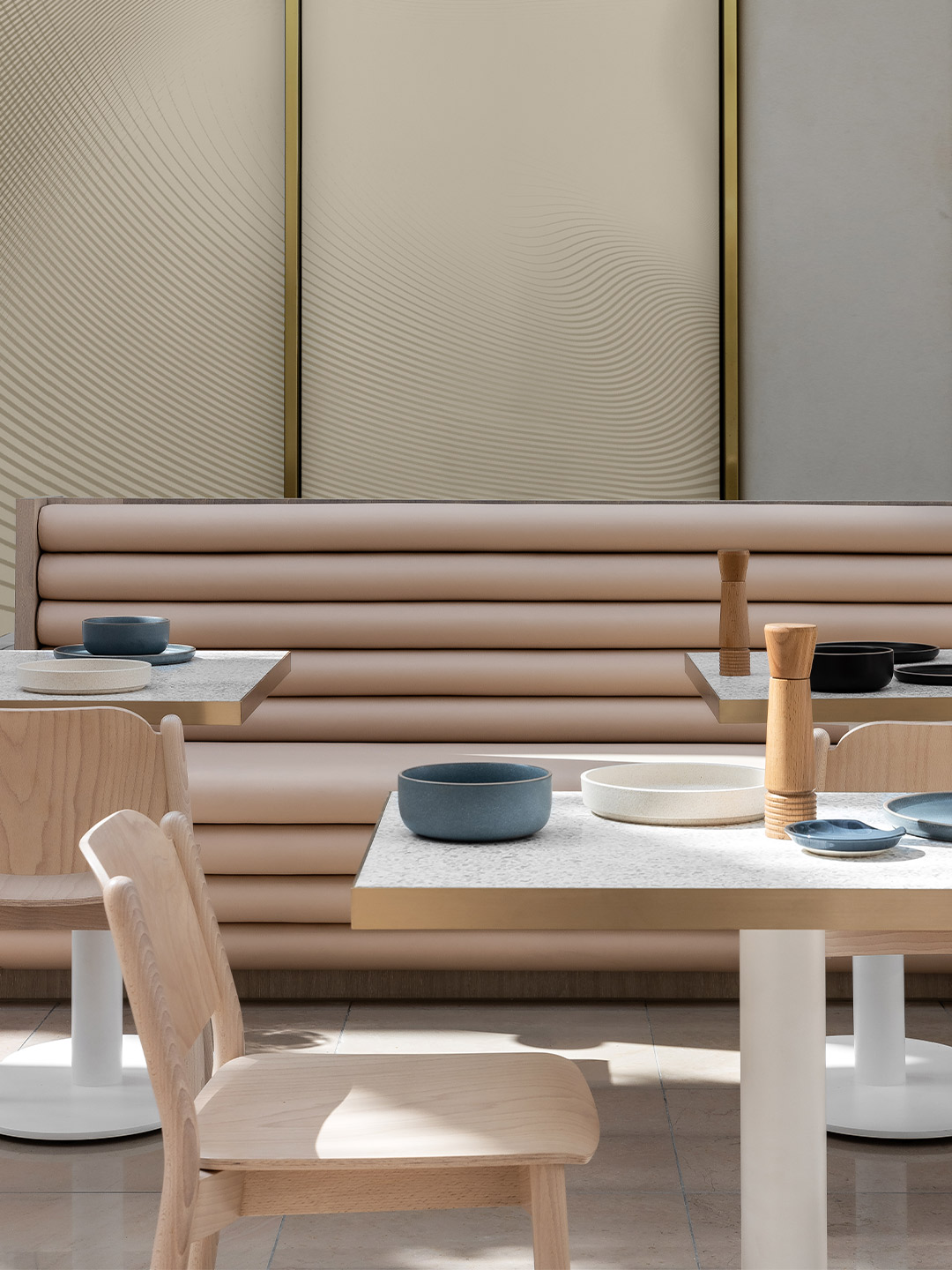
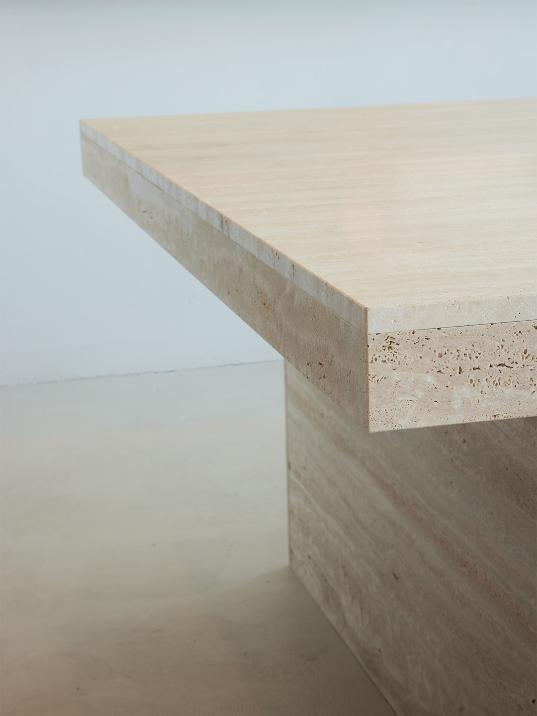
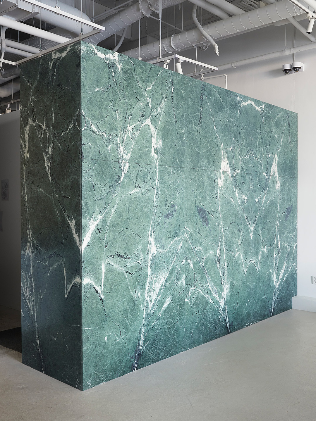
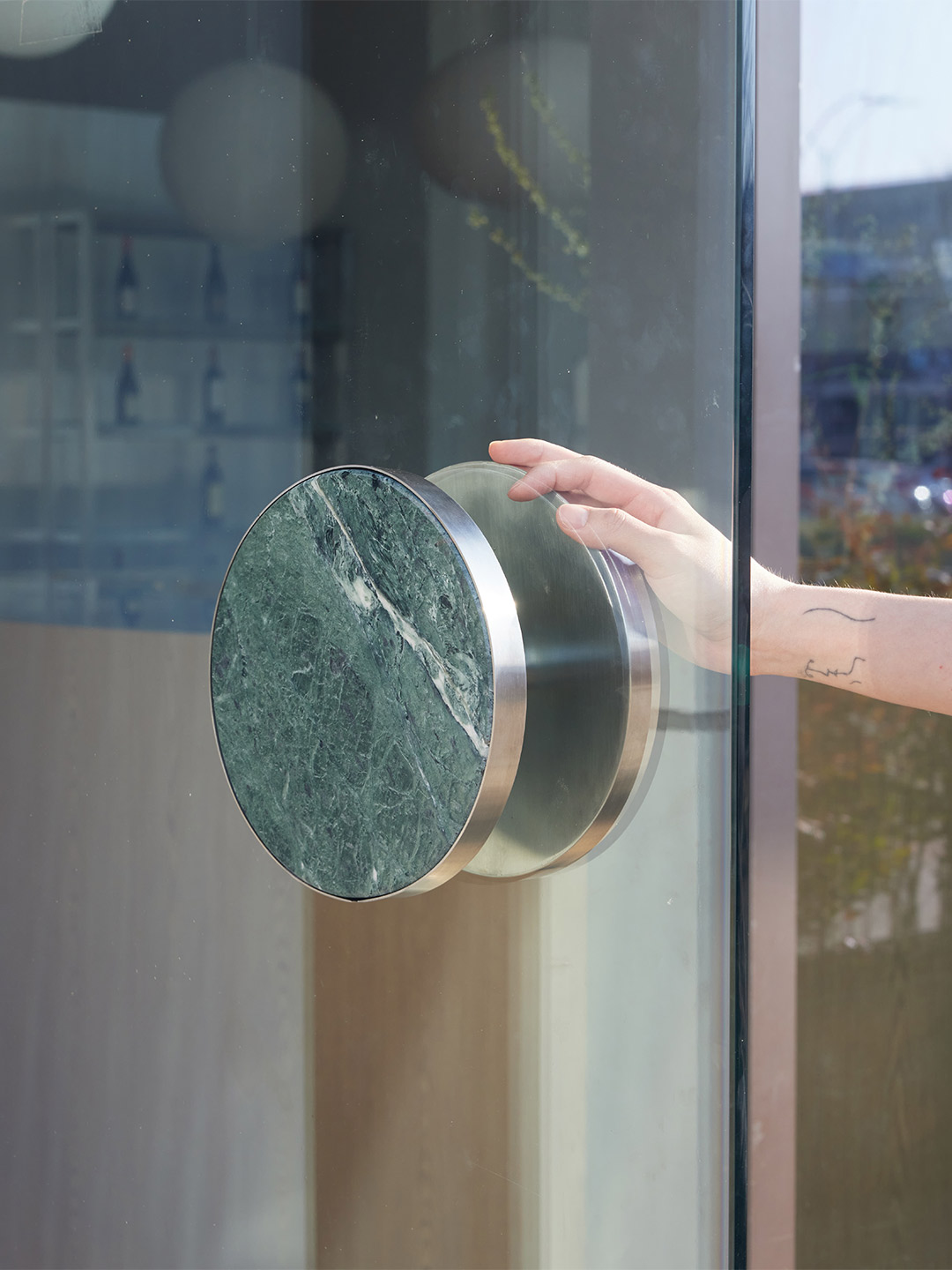
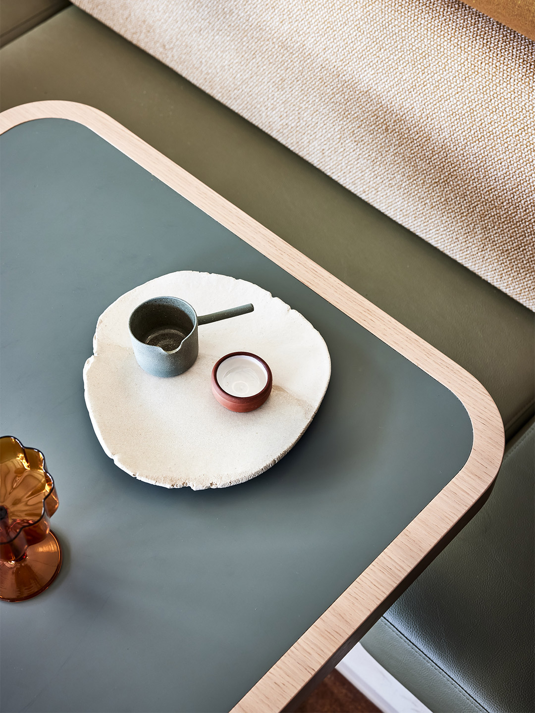
It’s the tonal combination of white brick and terrazzo, green-tinged stone and light natural leather that conjures a mood of relaxation and refinement at Chadstone, underscored by Mim’s commitment to high-quality materials and enduring design. Fixed banquette seating is cleverly built to the kiosk boundary, achieving mandatory seat numbers and maximising the available space. At the same time, relaxed furniture settings enable total flexibility, as does moveable joinery at the cafe’s front that allows the space to transform easily for all manner of events, from retail launches to cocktail soirees and fashion events.
“We sought to create a destination that redefines the expectation of what a kiosk is,” Miriam says of the cafe’s shopping centre locale. “A place considered to be a ‘built form’ that holds ideas of permanence and presence.” Indeed, Au79’s second cafe challenges the design norms of Chadstone, and shopping centres at-large, skilfully merging a sense of daringness with the desires of the client and the demands of its coffee-loving patrons. Existing as a refined and elegant gesture, it’s a beckoning space with new icon potential, inviting shoppers to put down their retail haul, take five and indulge.
mimdesign.com.au; au79cafe.com.au
It’s a beckoning space with new icon potential, inviting shoppers to put down their retail haul, take five and indulge.
Love the Au79 cafe at Chadstone by Mim Design? Catch up on more spectacular commercial spaces and hospitality design and architecture. Plus, subscribe to the Daily Architecture News e-letter to receive weekly updates of the world’s best projects, ideas and exhibitions.
Related stories
- Hotel Les Deux Gares in Paris by Luke Edward Hall.
- Inside the Ace Hotel Kyoto by Kengo Kuma and Commune.
- Holiday maker: The Calile Hotel by Richards and Spence.
- Plesner Architects delivers decadence at the Six Senses Shaharut resort in Israel.
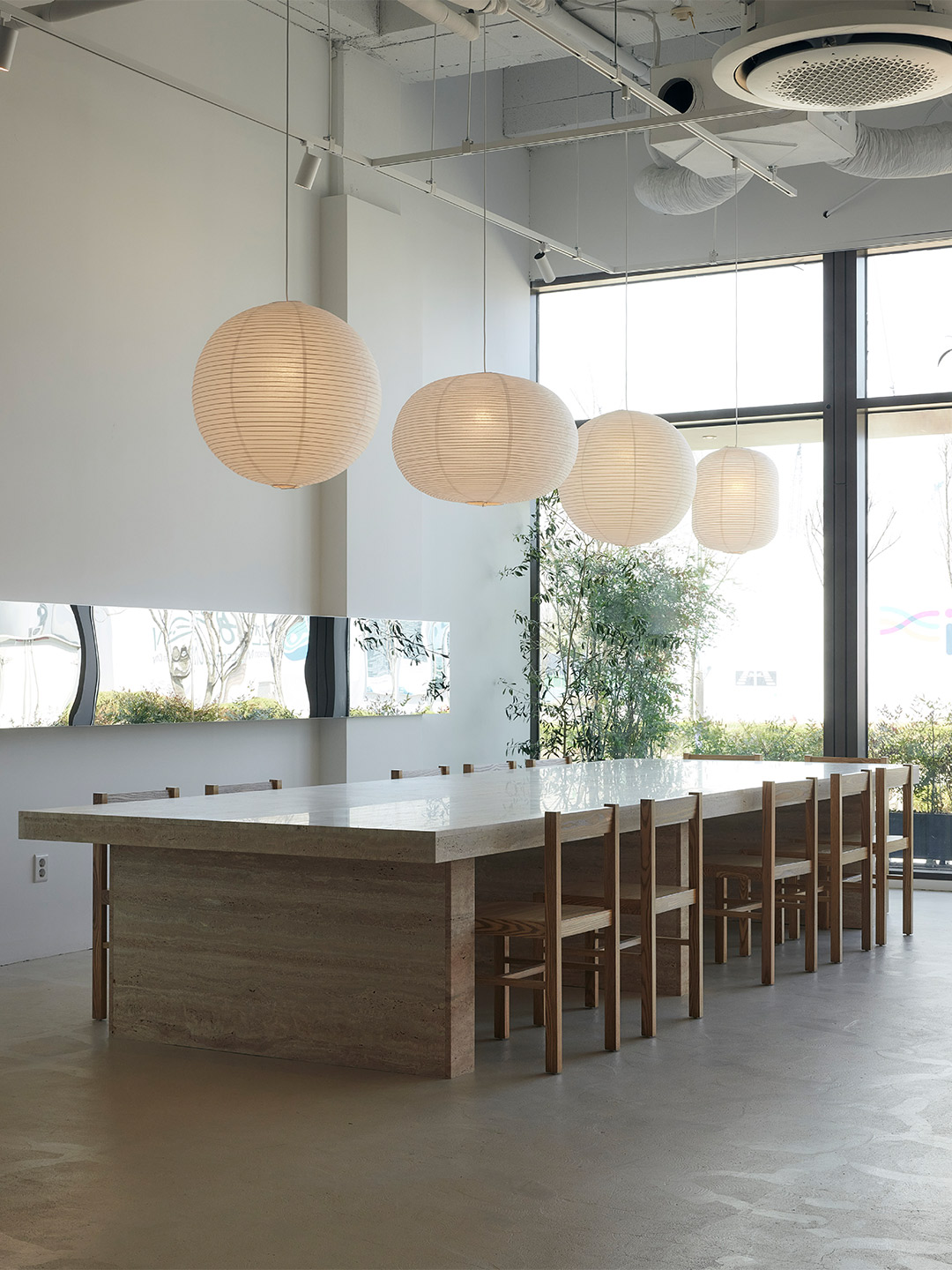
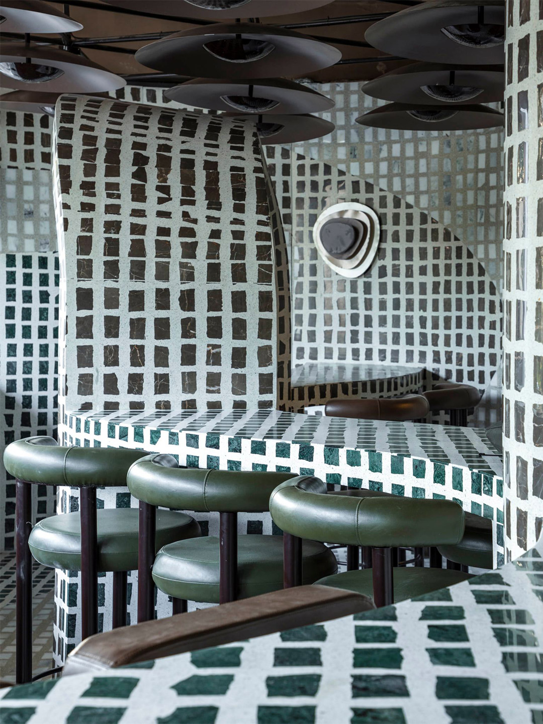
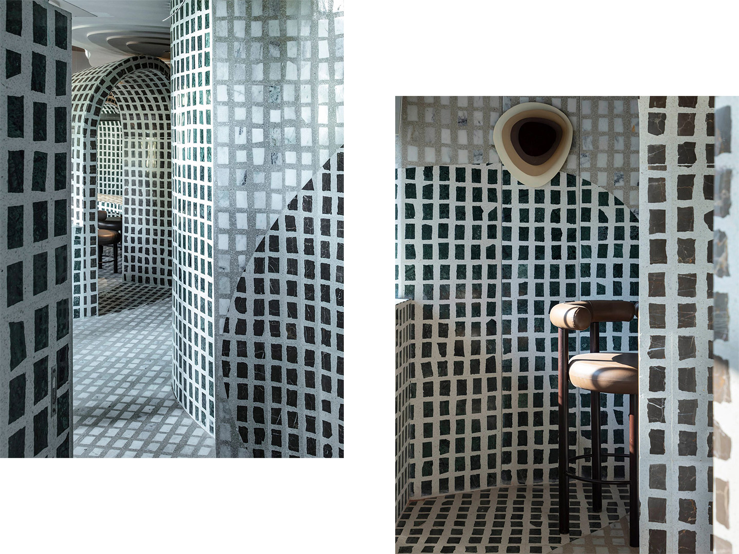
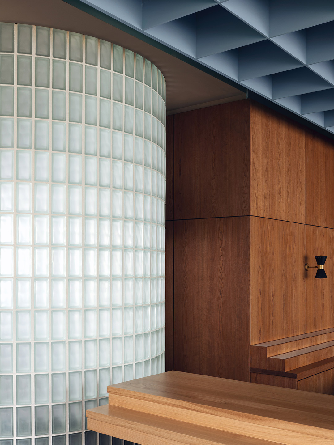
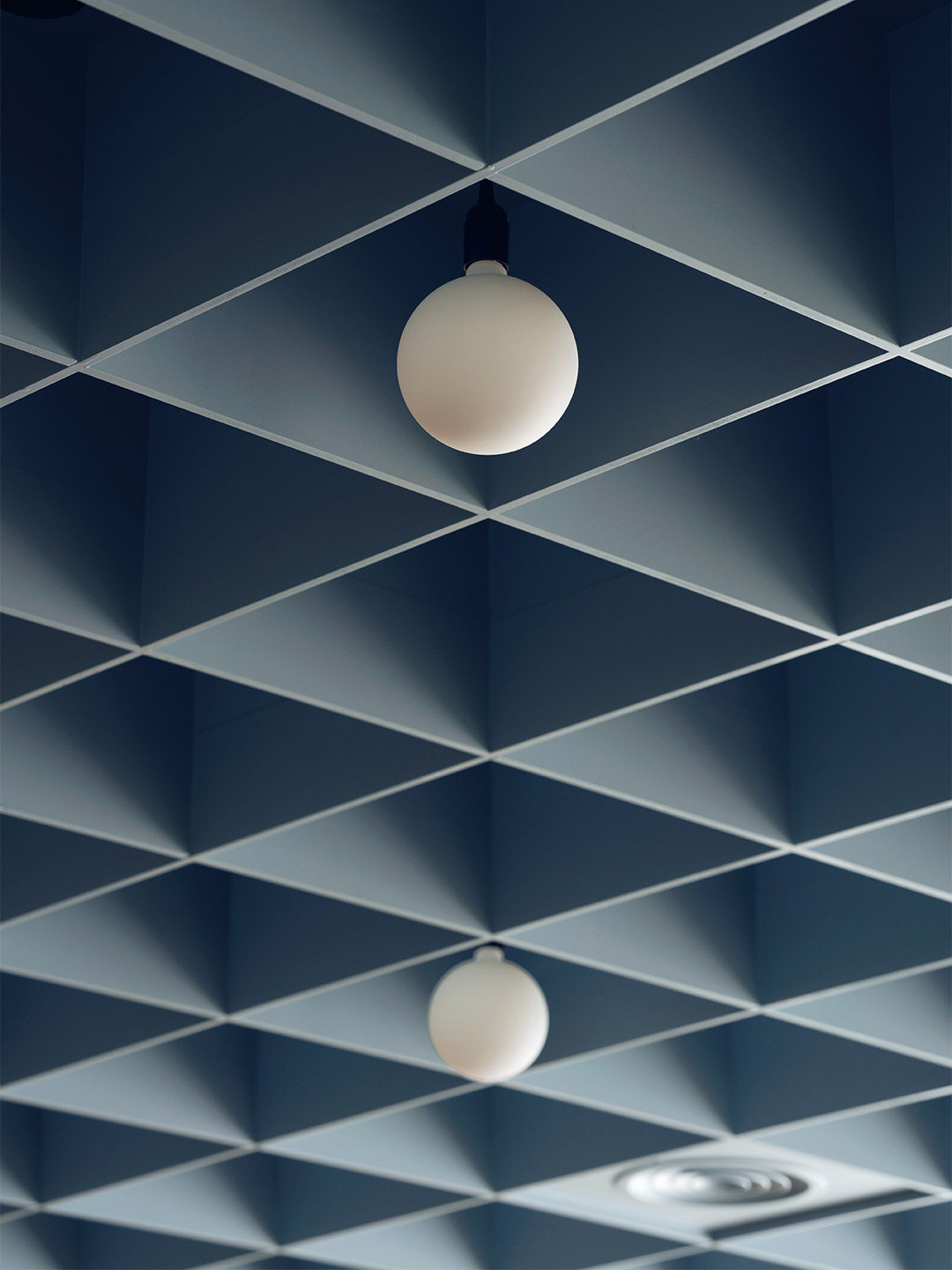
When South Korean design office Studio Studio was commissioned to create a restaurant in Incheon, a city bordering Seoul, they were presented with a “box-like” volume brimming with potential. Located on the lower floor of a housing complex, the site was one of many blank canvases enclosed by four unembellished walls. Adding pressure to the project, an unofficial contest between new interior fit-outs in the precinct became a driving force for the designers to create an exceptional space. “The game is won or lost by how the designer elegantly fills the box,” says Do Gwanghun, founder of Studio Studio, whose Seoul-based practice is credited for shaping Wall restaurant – a solid contender for the most sophisticated scheme in the sizeable complex.
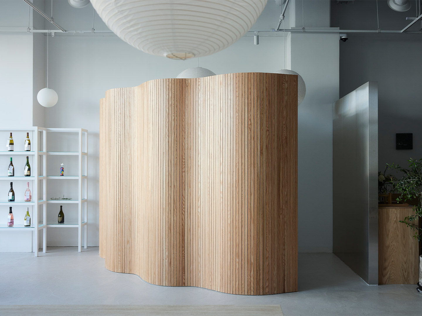
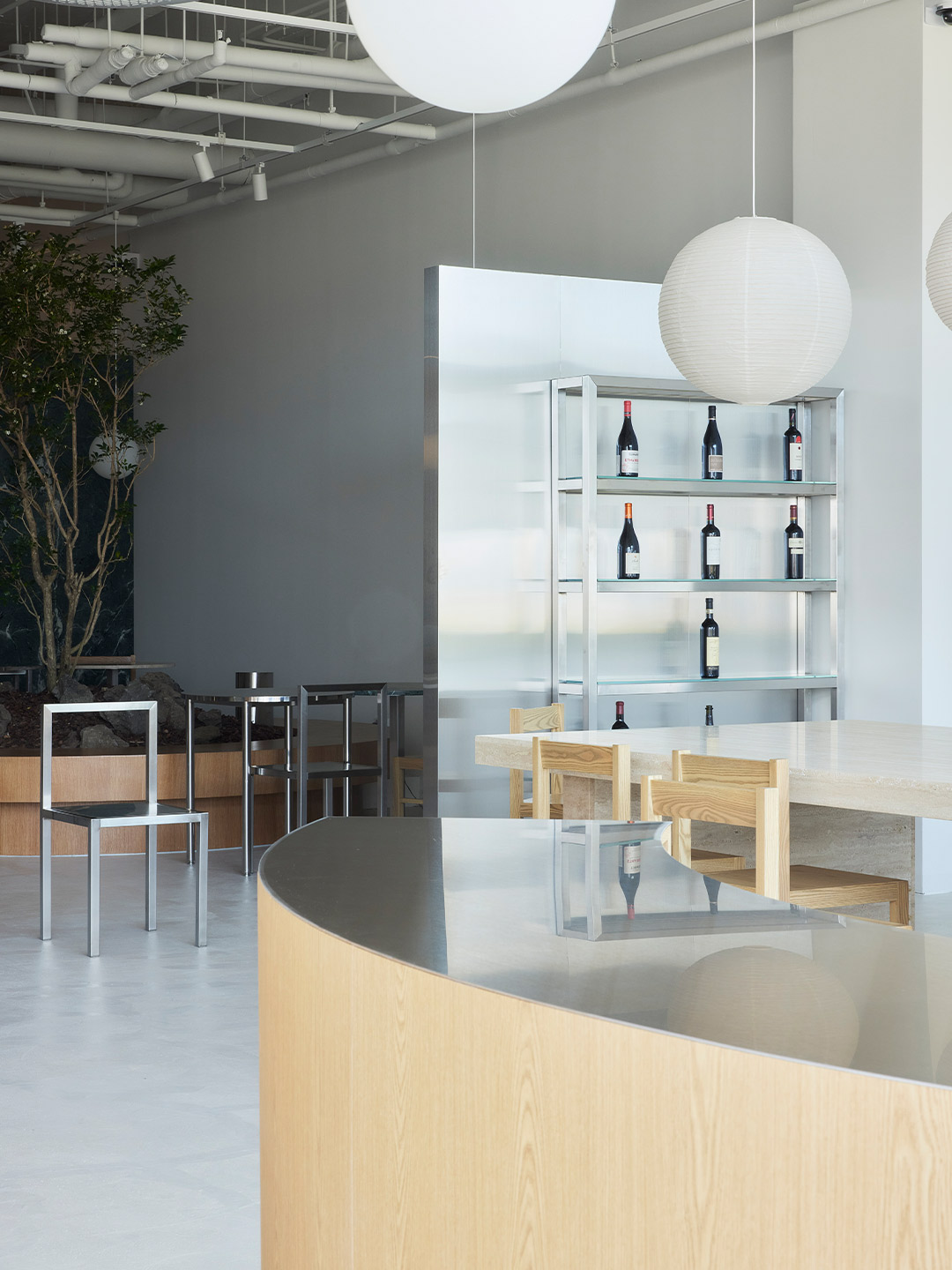
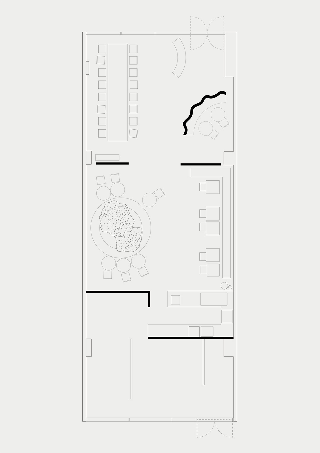
As its name suggests, Wall restaurant is all about the walls. How they divide the space, seperate the different functions of the project and – perhaps most importantly – cocoon the patrons as they drink or dine. “The main function of drinking wine and eating food is divided into different atmospheres in one space,” Do says, referring to the way in which the floor plan is split into three main segments. Pointing to the first of these areas, located towards the entry, Do says a “soft zoning” effect was established by employing low partition walls. “Because the walls are low, the space is not completely separated [from the next zone],” he explains.
Wall restaurant in South Korea by Studio Studio
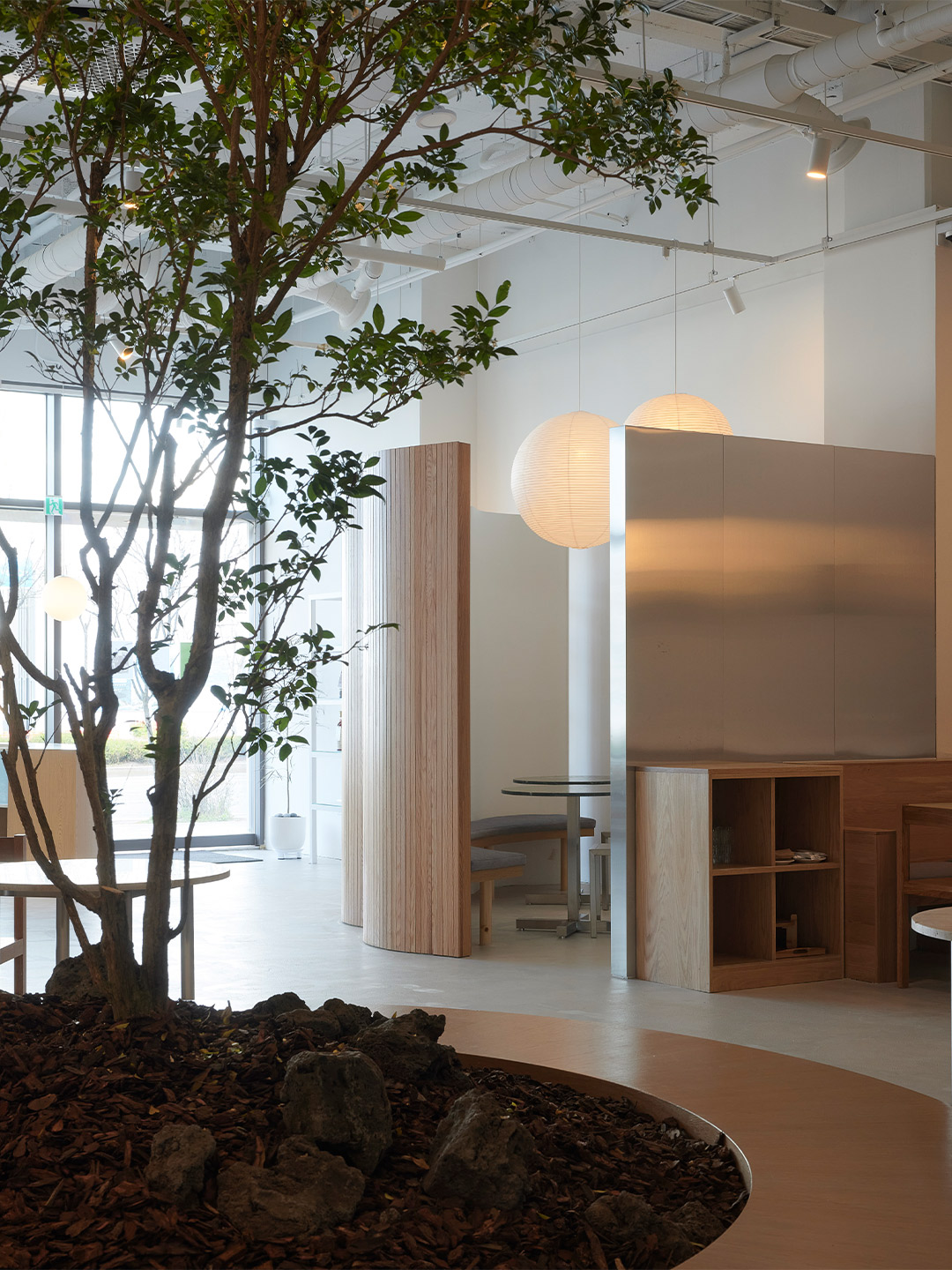
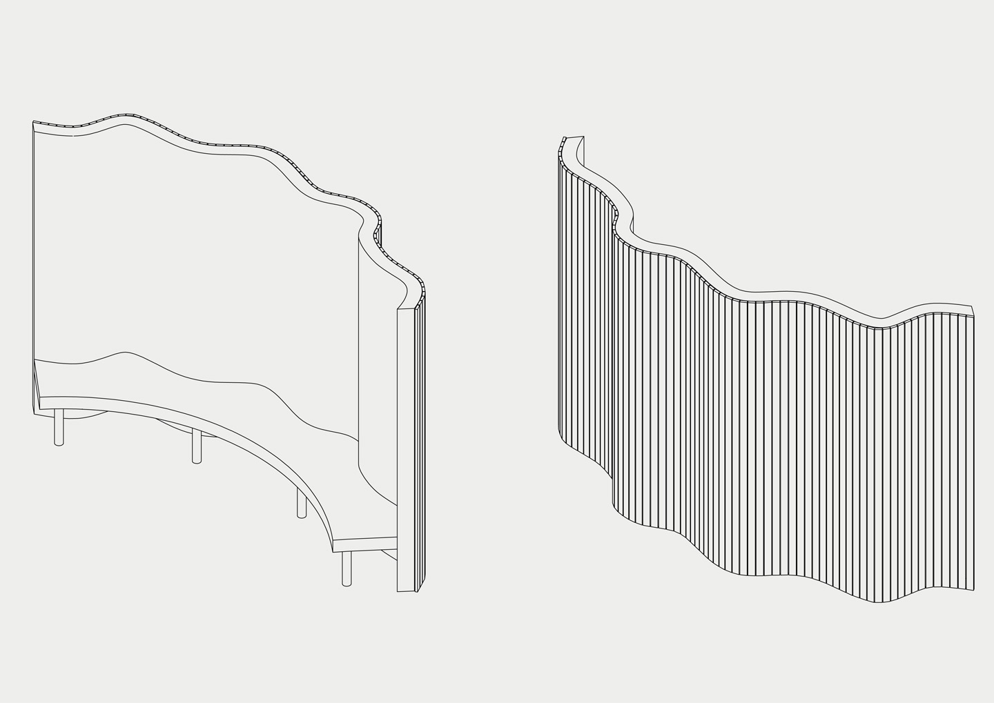
These partitions create a semi-private atmosphere throughout the diner. But to provide a more intimate experience in the first segment, a large decorative screen has been installed to form a small secluded room. Designed as an undulating surface clad in narrow strips of blond timber, the screen incorporates a curved bench on its inner face. When partnered with two round tables and chairs, the nook can accomodate up to six patrons who, under the glow of a suspended paper lantern, become shielded from street and restaurant views. In contrast, an oversized stone table with timber chairs encourages communal dining along the opposite wall. A series of four paper lanterns in offbeat organic shapes floats over the setting while a mirrored panel reflects the scene and creates the illusion of more space.
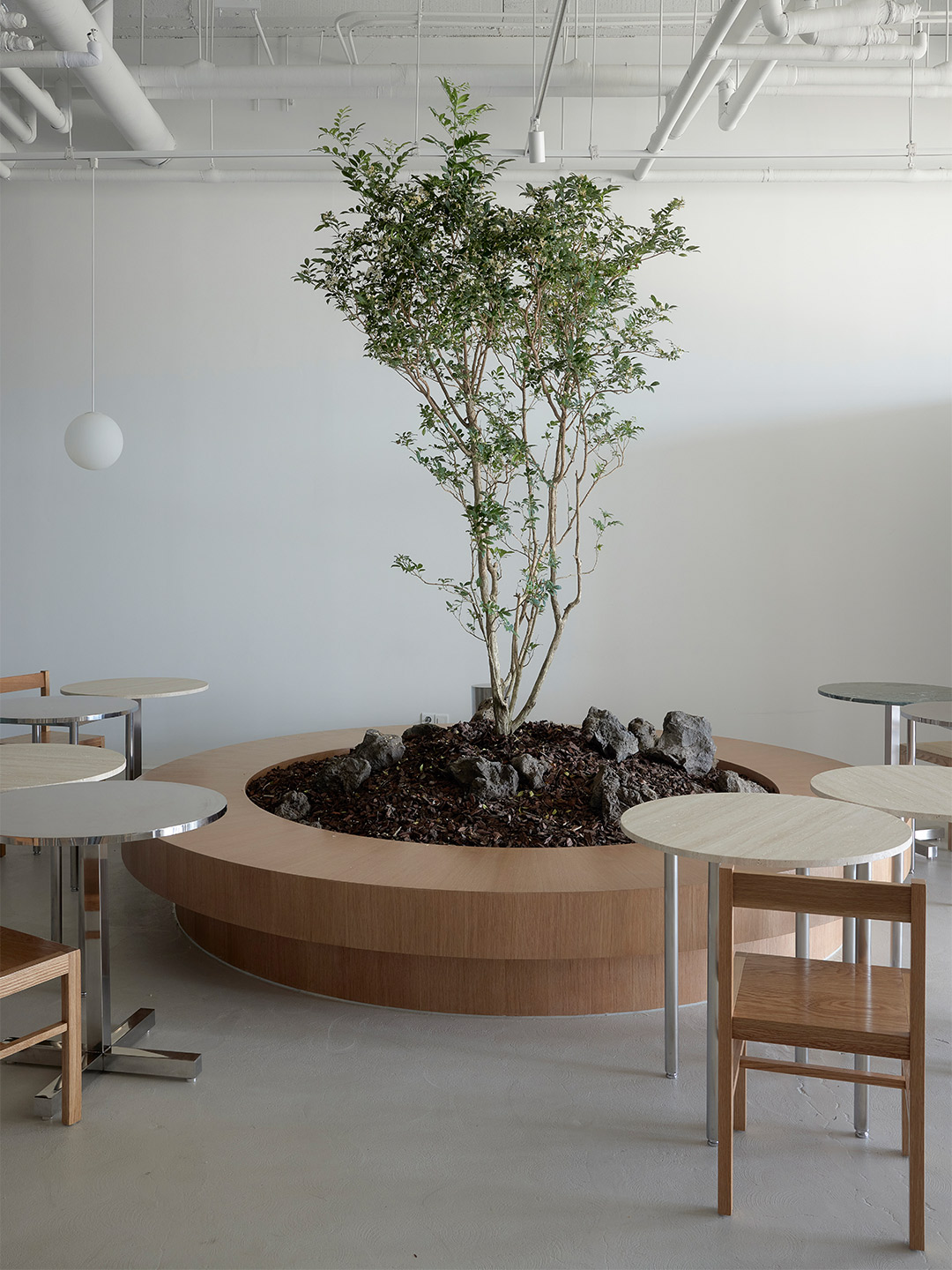
Straddled by the light-filled entry zone and the back-of-house area, the central space is memorable (and most definitely Instagrammable) for its large potted tree, whose branches will grow to form a verdant canopy above the diners. Landscaped with large rocks – reminiscent of an ancient Korean garden – the “pot” of the tree forms yet another bench. Lined with timber and accompanied by tables and chairs in mixed finishes, the circular bench echoes the experience of dining outdoors, perhaps in a public arcade or manicured garden. A banquette is positioned against the wall opposite the potted tree creating yet another contrasting zone, this time capable of accomodating tables of two or a single large group.
While shelving units that display the selection of wines are positioned throughout the diner, doubling as a sleek decorative device, the kitchen occupies a small pocket of the plan’s third segment (where the behind-the-scenes operations occur). Open to the dining spaces, the kitchen entertains patrons with the theatrics of food and beverage preparation. The openness also allows waitstaff to service the restaurant floor with ease, assisted by the arrangement of low walls, Do suggests, which “maximise” the space as employees and diners move from zone to zone. “Visitors feel the cluster of low walls as they step inside,” the designer adds. “This ‘community of walls’ is everything that makes up this project.”
Visitors feel the cluster of low walls as they step inside … this ‘community of walls’ is everything that makes up this project.

Love the office fit-out by Olson Kundig? Catch up on more architecture and design highlights. Plus, subscribe to receive the Daily Architecture News e-letter direct to your inbox.
Related stories
- Home tour: Bilgola Beach House in Sydney by Olson Kundig.
- ANOHA museum: 150 animals made from recycled materials inhabit a ‘spaceship’ by Olson Kundig.
- A 1960s London post office is now a swinging sushi restaurant.
- Hot desks: Spacial co-working office in Montreal by Ivy Studio.
- The YAP design office in Japan.
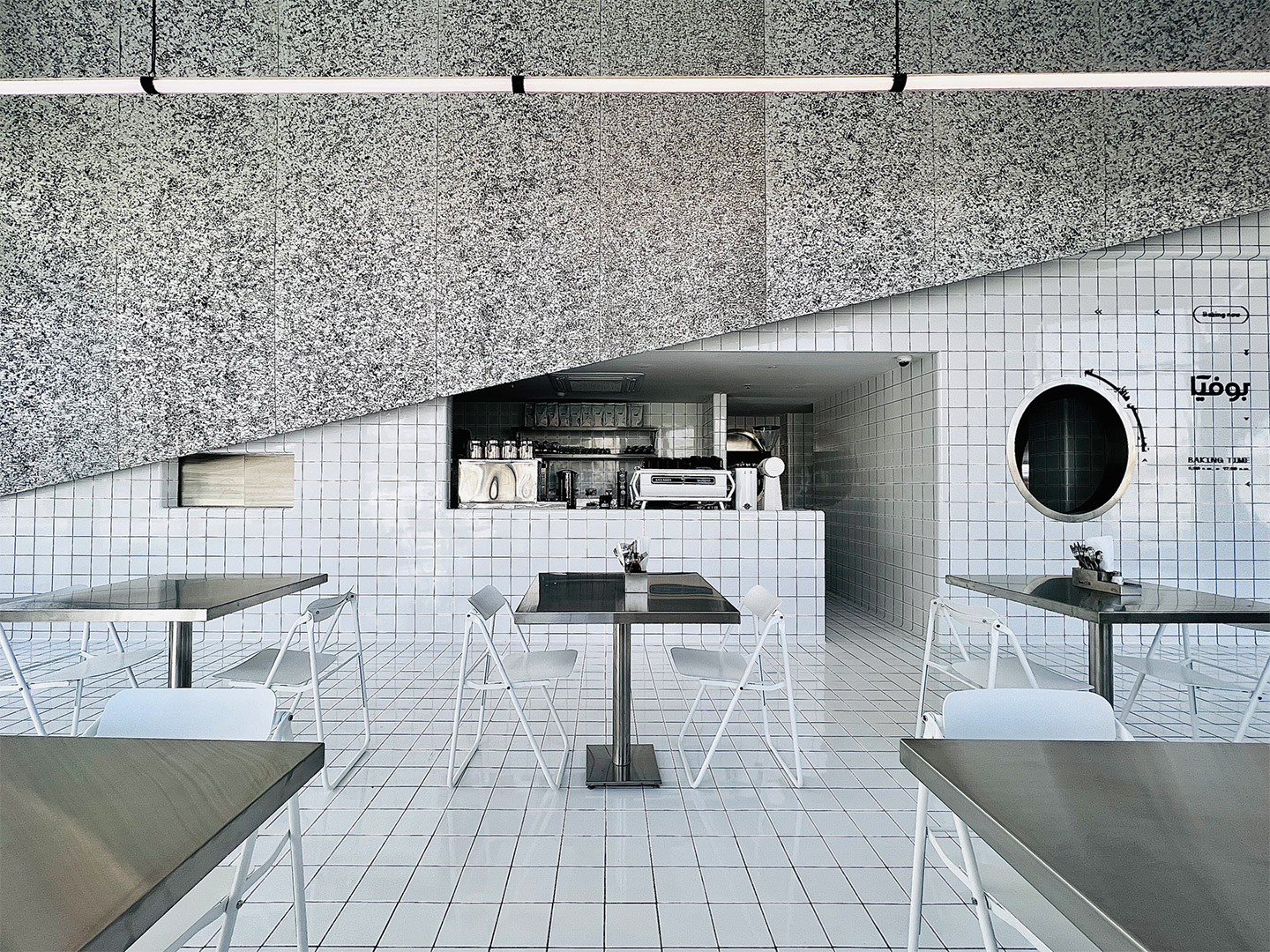
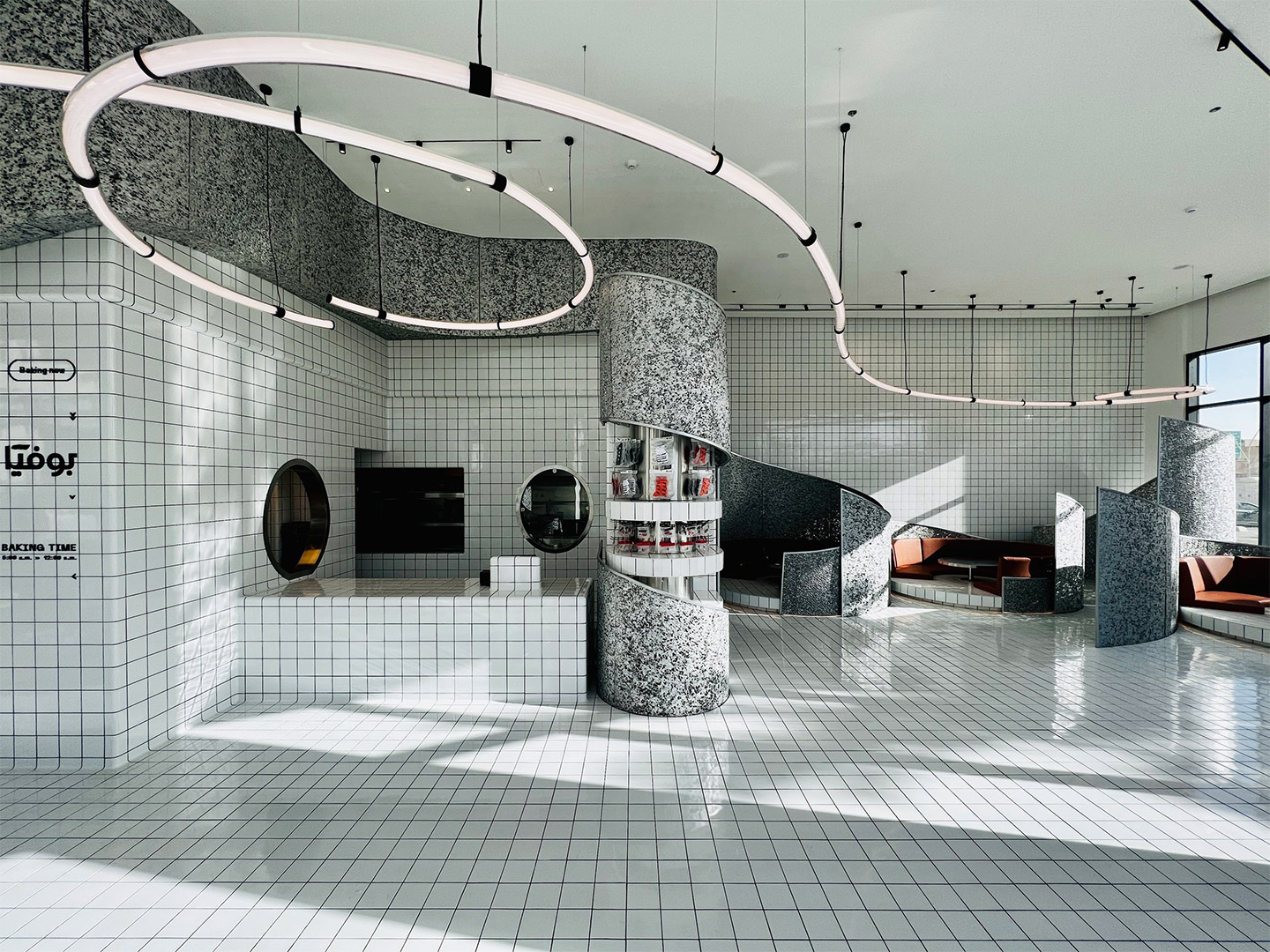
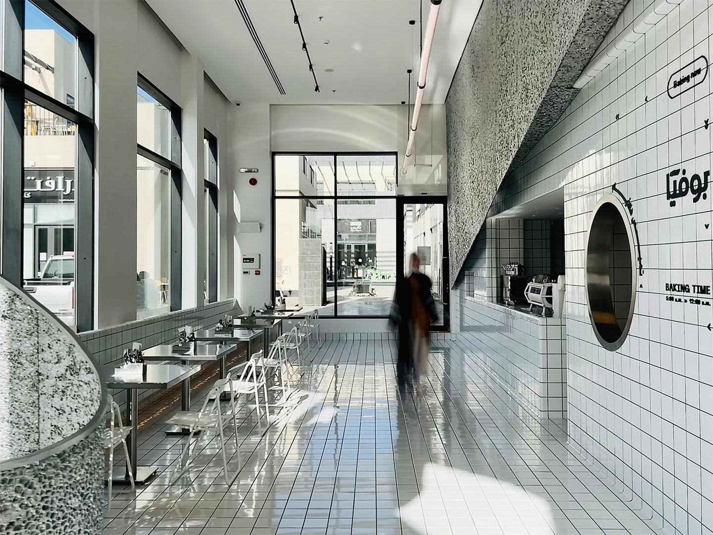
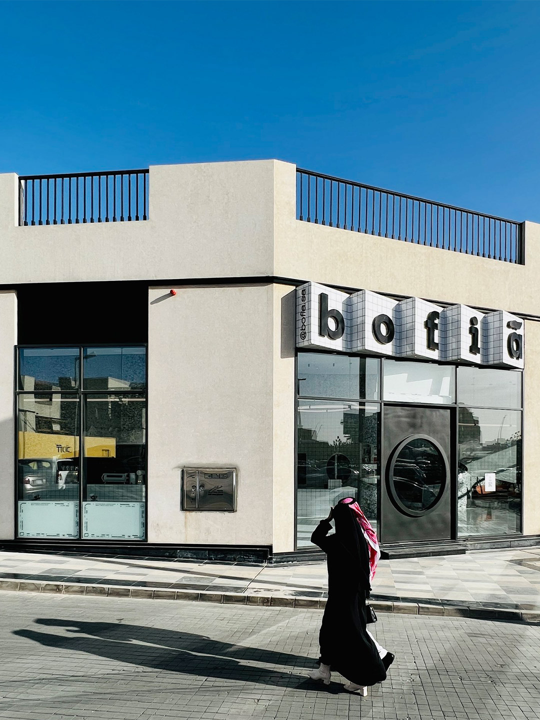
In Saudi Arabia, bofia is the name given to the unassuming canteens that dot the country’s roadsides, regularly visited by locals and travellers for quick, authentic and reasonably priced street food. In an attempt by Azaz Architects to find an architectural solution and material identity for a modern-day version of this no-fuss eatery style, the new Bofia restaurant reinterprets the unapologetic, blunt and straightforward nature of street-side dining, presenting equally delicious cuisine within a polished interior space.
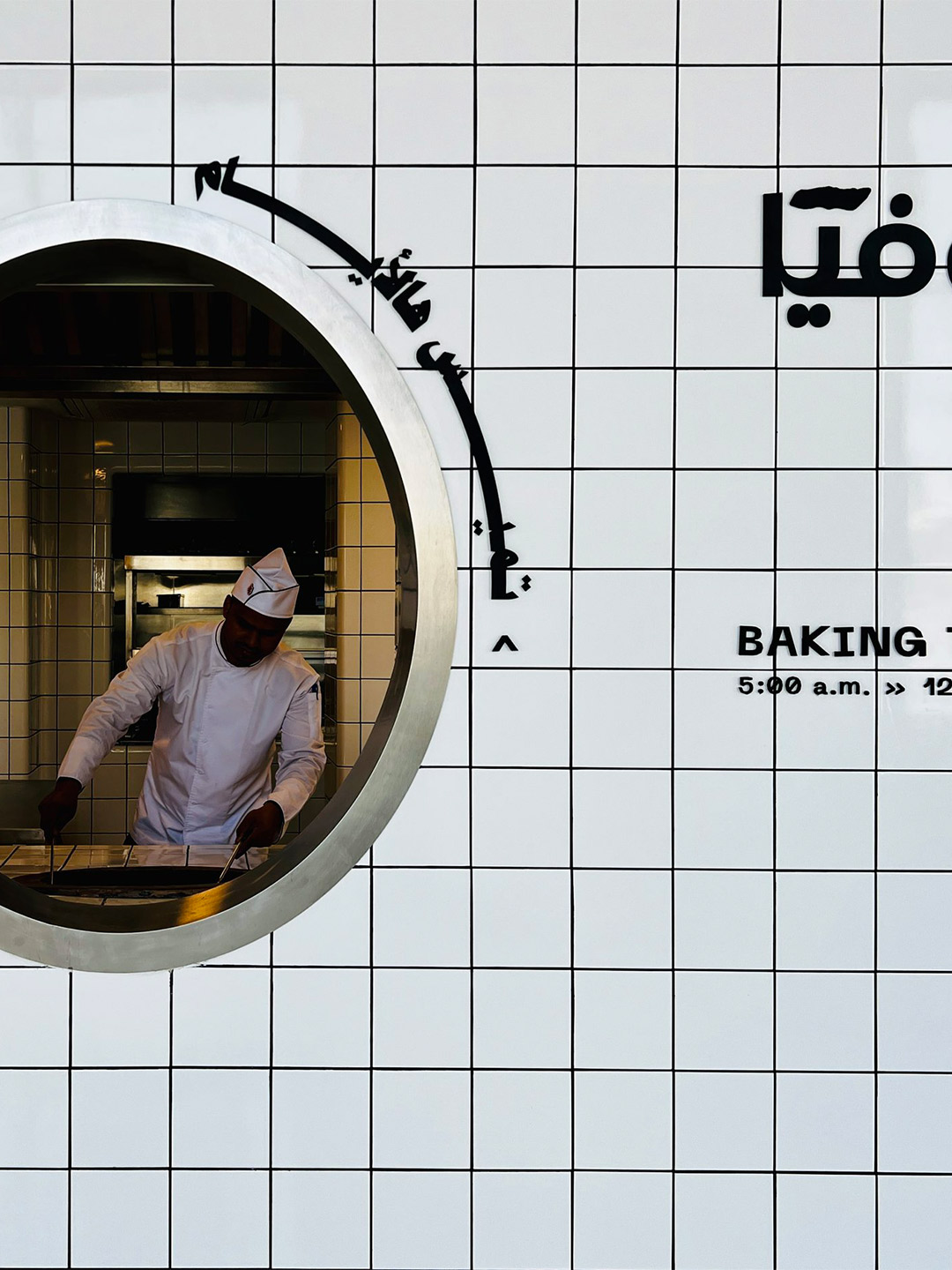
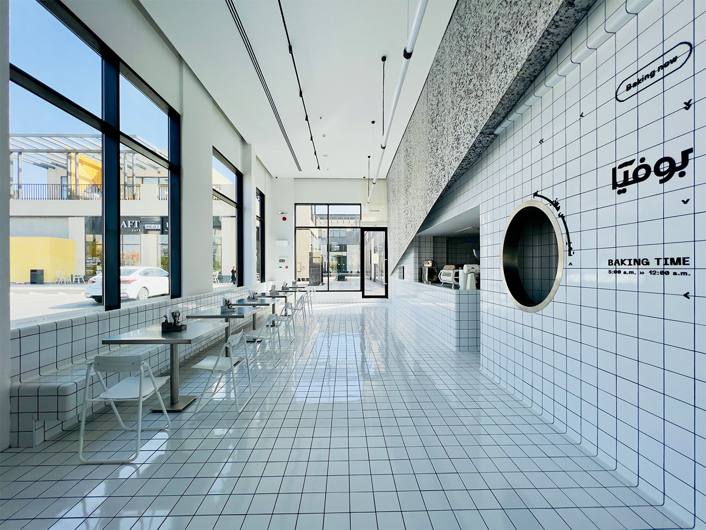
Located in the centre of Riyadh, the main financial hub and capital city of Saudi Arabia, the Bofia restaurant (also referred to as “The Tiled Cloud”) is tucked within an unassuming standalone structure. Exhibiting simple geometry and straight lines, the building was once described by the restaurant’s architects as feeling rather “ordinary” in the overall streetscape. That was, of course, before it was given a tiled marquee emblazoned with the name Bofia, positioned neatly above a new door with a circle-cut peephole framing a very different world.
‘The Tiled Cloud’: Bofia restaurant in Riyadh by Azaz Architects
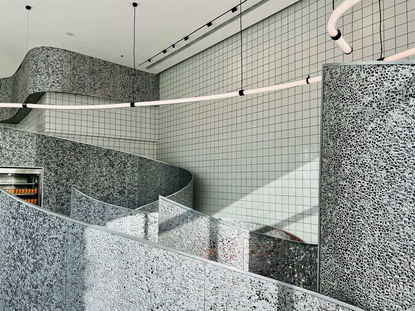
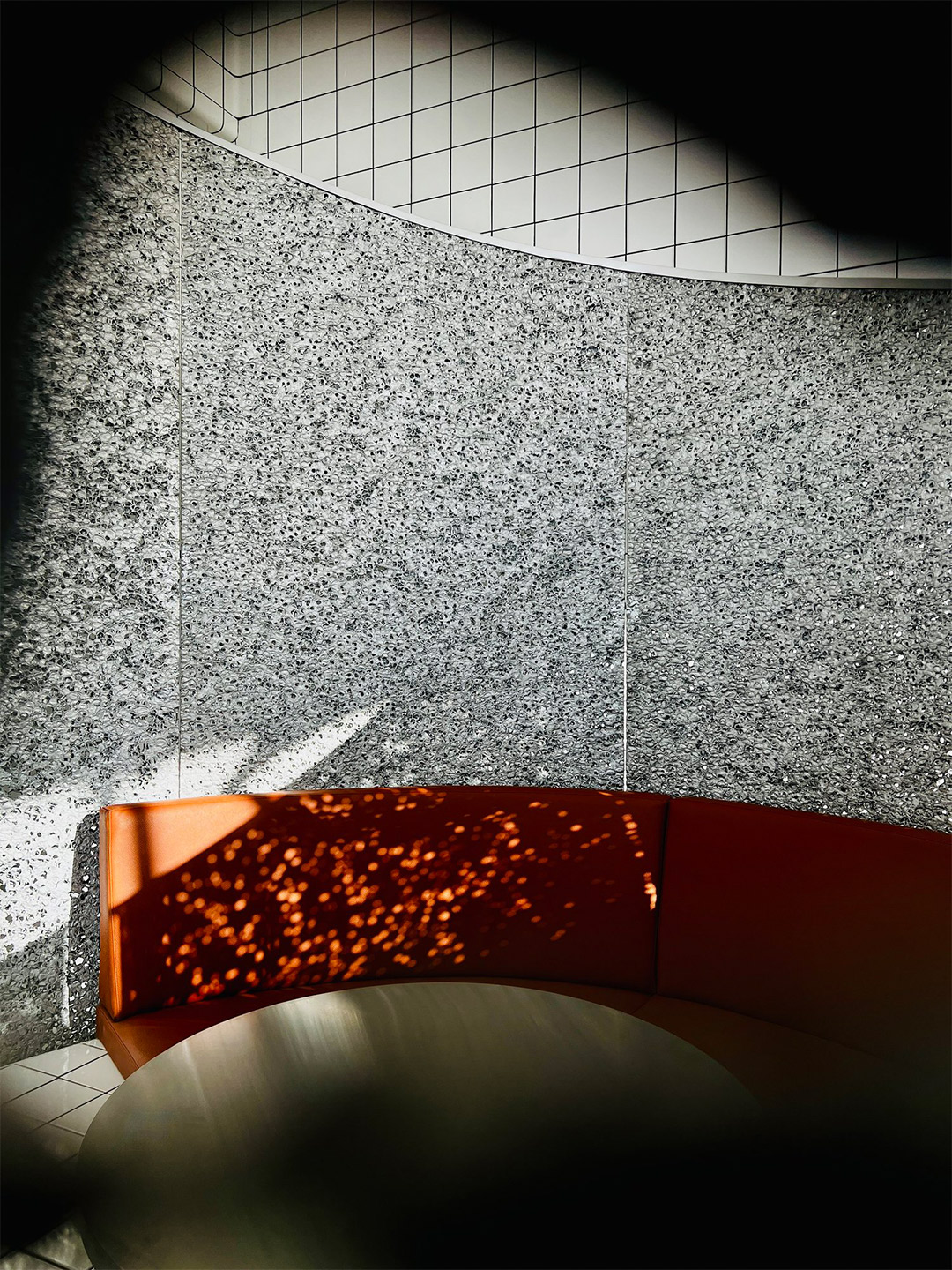
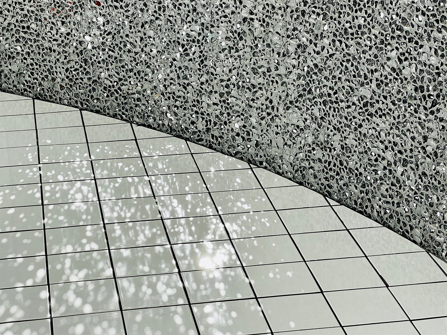
To create contrast from the grey-tinged street, the team at Azaz Architects played with the idea of forming a cloud-like installation inside the building. This approach sparked the restaurant’s nickname, The Tiled Cloud, and allows diners to experience a feeling of surprise and airiness as they enter the restaurant. “The interior mass is imagined as a cloud that floats within the space,” the architects say of their design response. “[It] seamlessly separates and lifts the busy back-of-house from the front-of-house areas.”
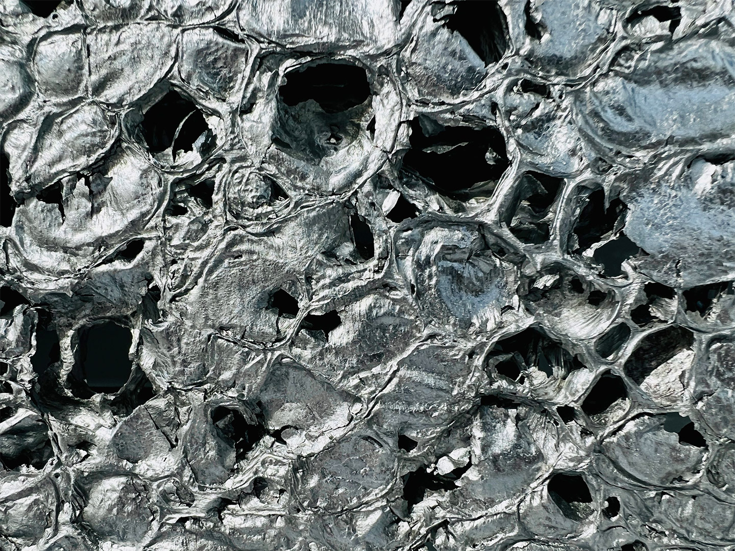
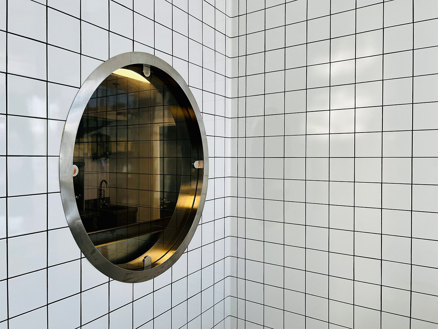
Capped with an angular panel of textured aluminium foam, the interior facade of the “cloud” is clad in crisp white tiles, mostly concealing the kitchen and staff-only spaces. The glossy square-format tiles extend across the floor of the L-shaped public zone, wrapping underneath guests’ feet to form a built-in banquette for dining along one window. Here, carefree steel tables and white folding chairs mimic the traditional set-up of street food outlets.
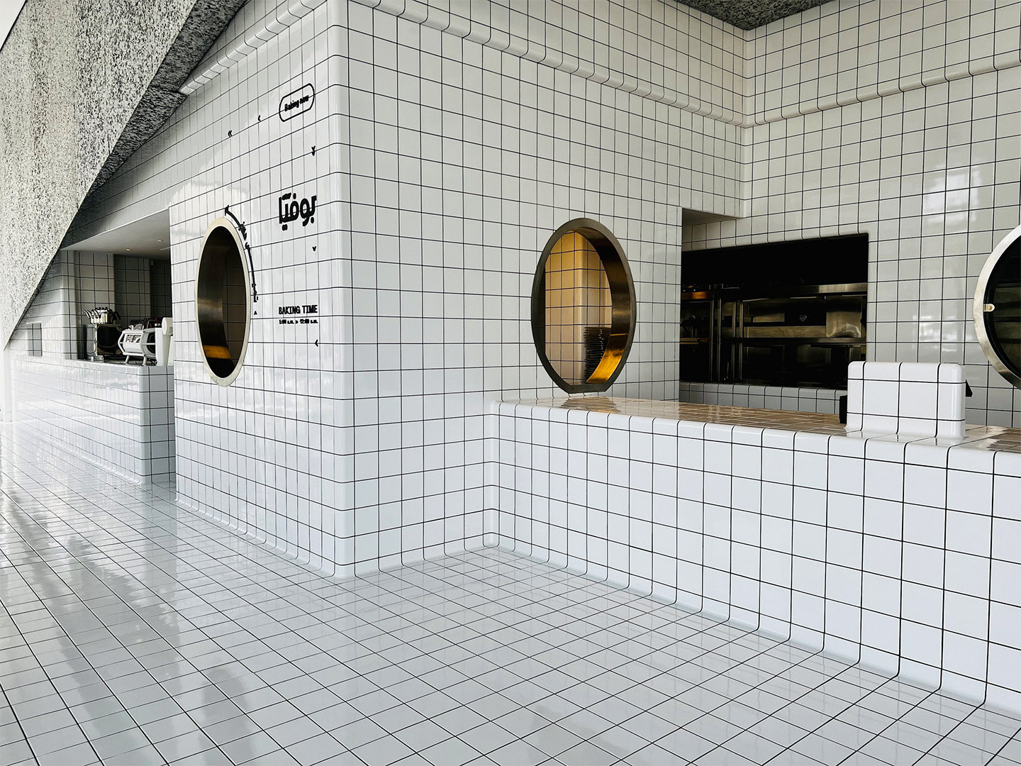
In the other smaller wing of the restaurant, the white tiles make an appearance on raised circular dining platforms, where upholstered bench seats are cocooned by curvy panels filled with the same aluminium foam that embellishes the main counter. These panels provide privacy for anyone dining in the booths. But when it reaches the central column, the foam peels back to reveal circular tiled shelving with retail products on display.
As with the planning of a traditional diner, the public area at Bofia is placed outside the back-of-house zone. It was important to the architects, however, that diners could sit within a close enough distance to the cloud-like facade that allows them to appreciate the architectural geometry on display. From their seats, diners can then also witness the action of the kitchen, observed through small cut-outs and round portholes carved into the tiled walls.
Overhead, the heavenly details continue with the addition of a “strike of light” that propels through the space, like a wobbly bolt of lightning that brings energy to the mostly white interior. Through smart programming the luminaire offers functional performance, as well as different “story-telling potential” during both daytime and nighttime service. “Interestingly, visitor and observer opinions have been evenly split on whether the design is considered minimalist or maximalist,” the Azaz team says. Either way, they suggest, the fit-out is “an architectural fantasy turned into reality”.
Interestingly, visitor and observer opinions have been evenly split on whether the design is considered minimalist or maximalist.
Catch up on more architecture, art and design highlights. Plus, subscribe to receive the Daily Architecture News e-letter direct to your inbox.
Related stories
- Venus Power collection of rugs by Patricia Urquiola for cc-tapis.
- Bitossi celebrates centenary in Florence with new museum and 7000-piece display.
- Casa R+1 residence in southern Spain by Puntofilipino.
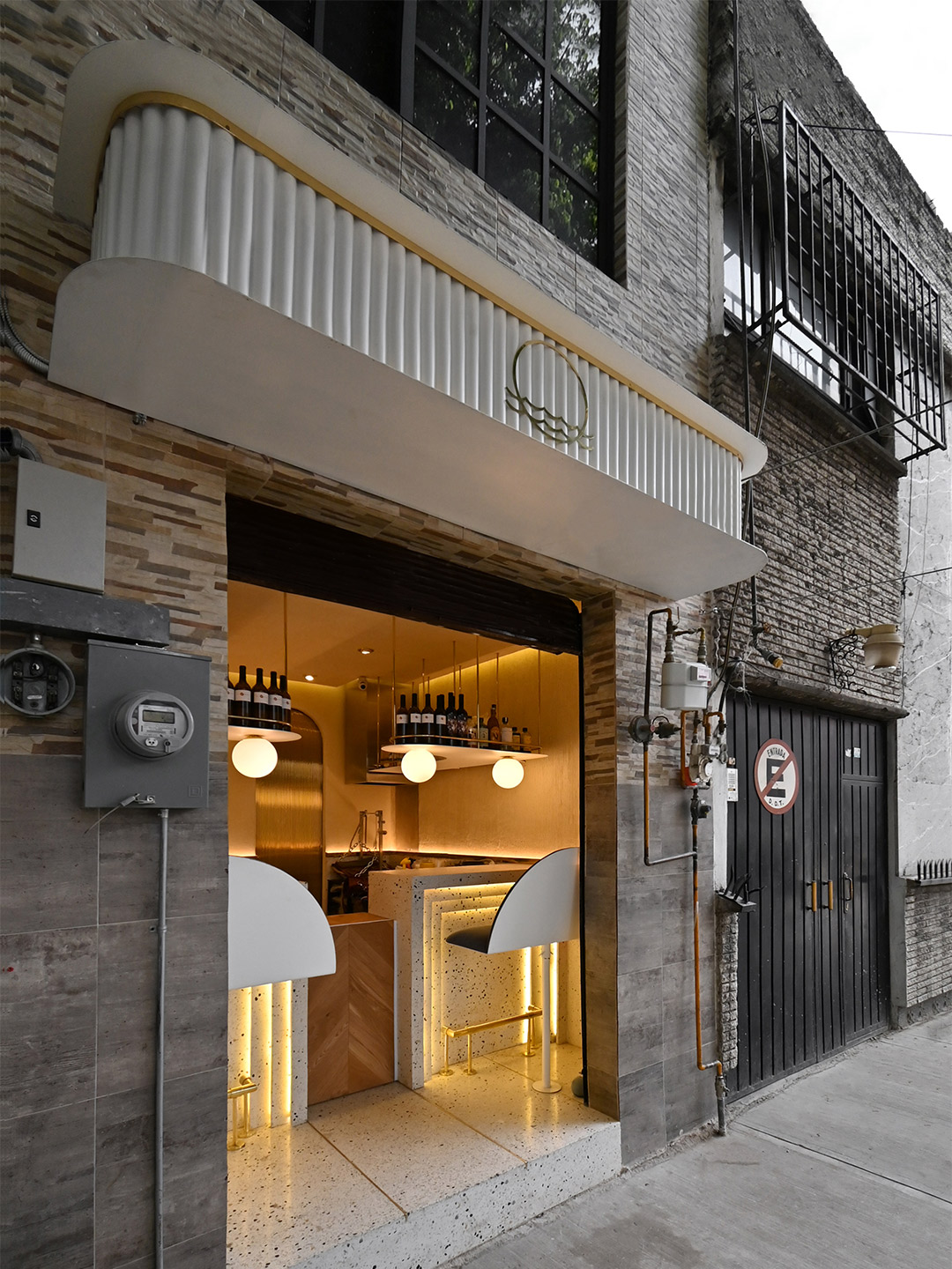
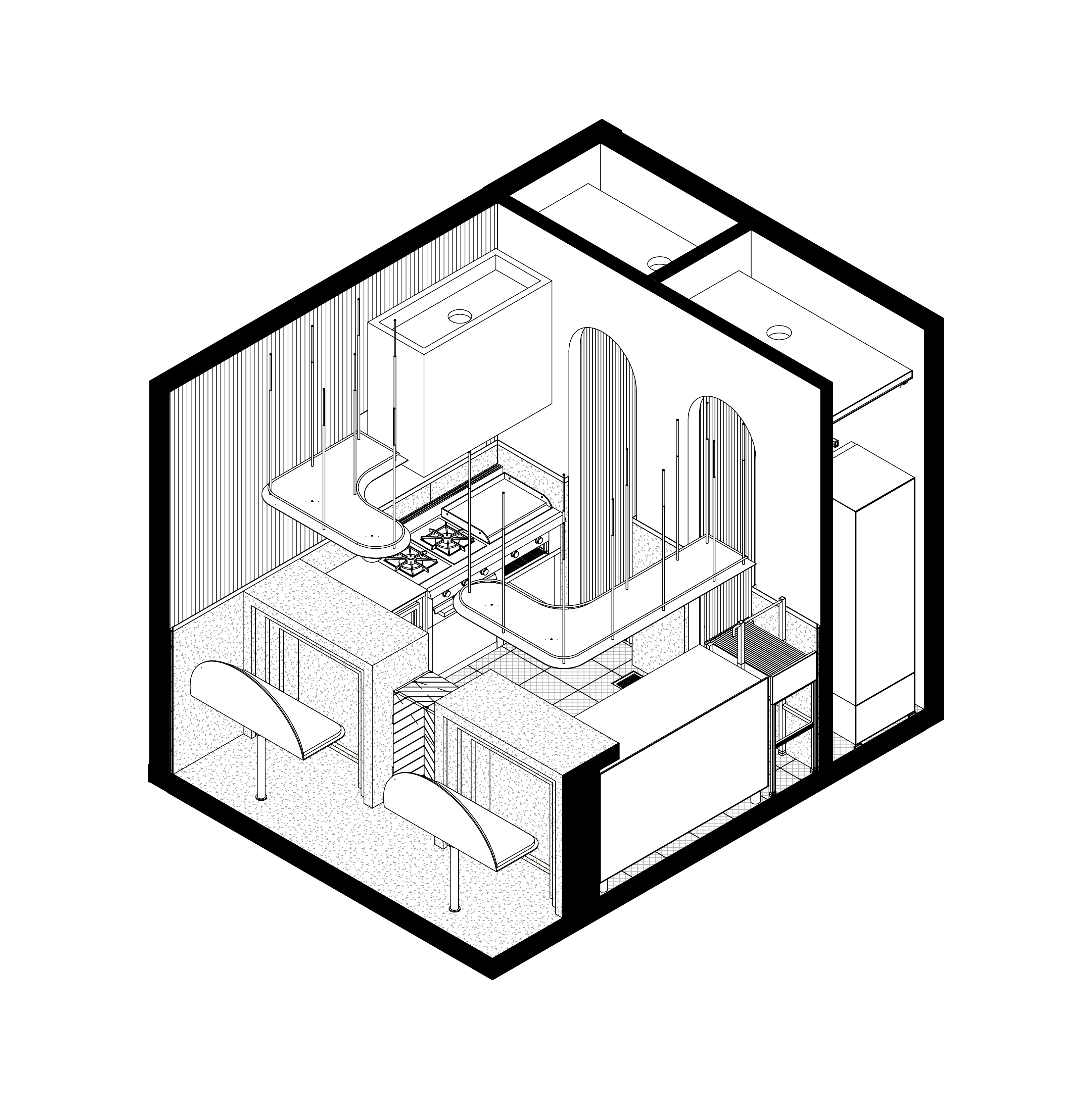
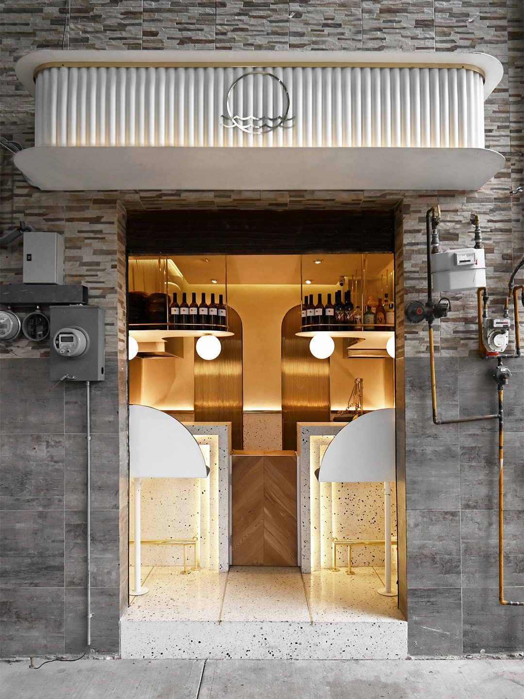
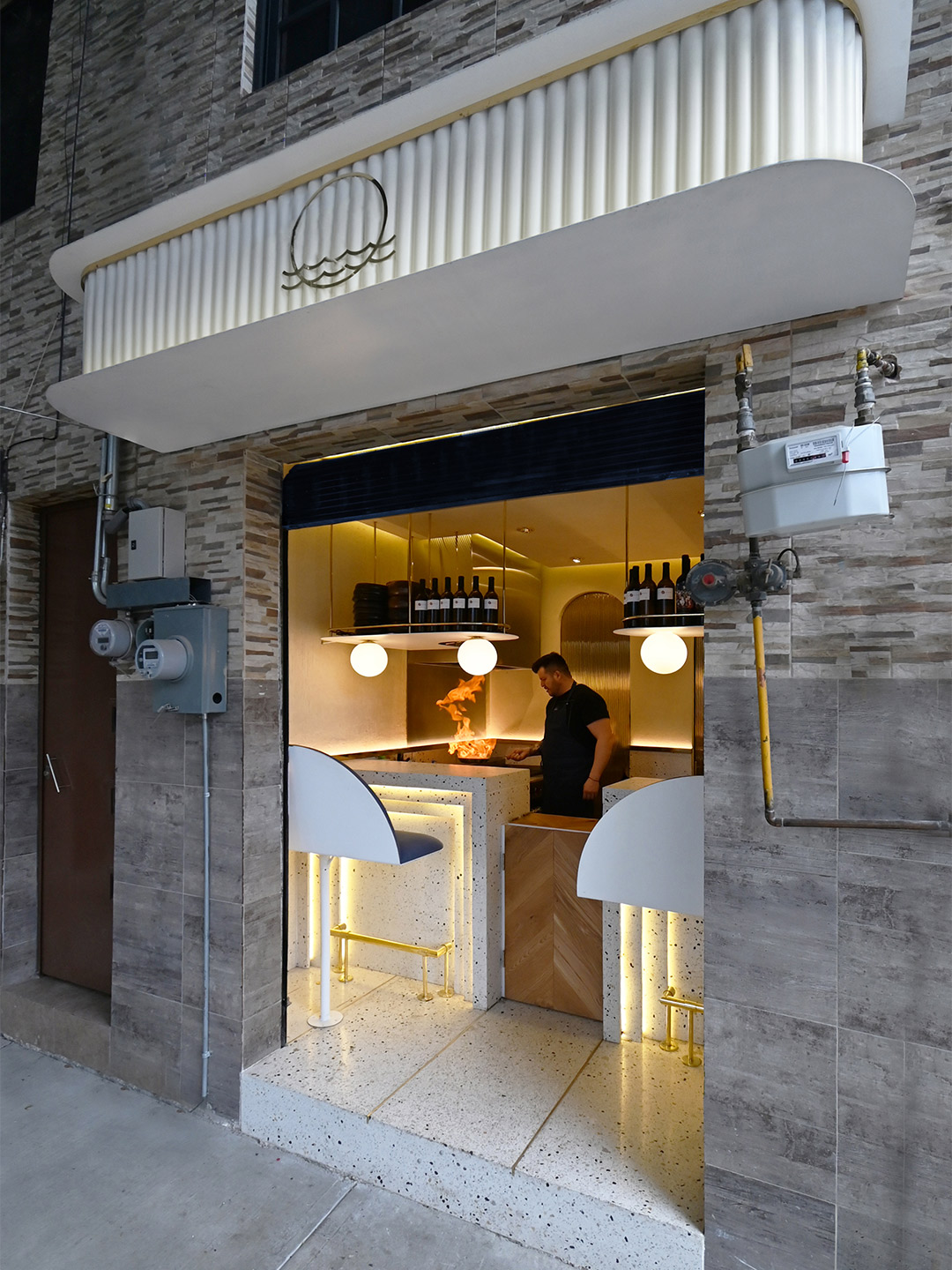
Testament to the sayings “good things come in small packages” and “size doesn’t matter”, the 10-square-metre Pargot restaurant packs a punch in the Roma Norte neighbourhood of Mexico City. Designed by local firm RA! Arquitectos, the tiny diner merges the traditional architecture of the region with influences of its ocean-focused menu. “The interior design takes us back to the Art Deco movement of the 1920s, generating a composition based on symmetry and balance between colour and geometry,” says the RA! team, led by practice co-founders Pedro Ramírez de Aguilar, Santiago Sierra and Cristóbal Ramírez de Aguilar.
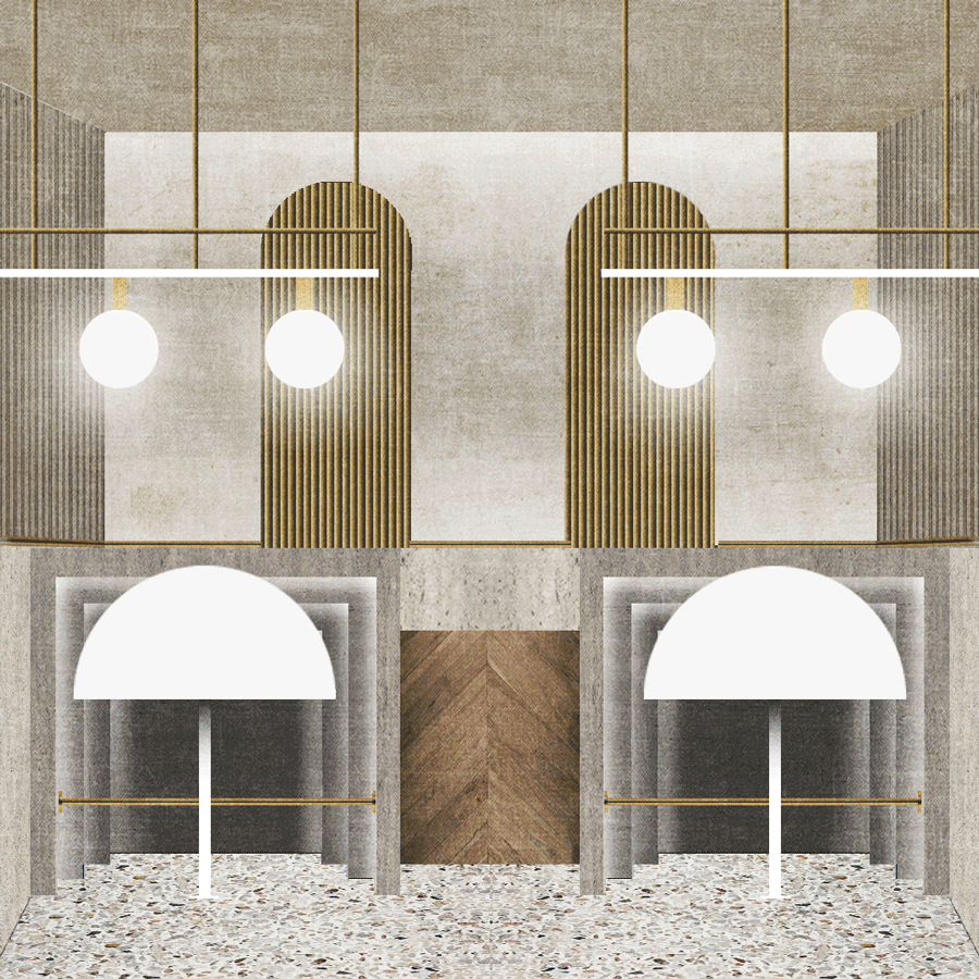
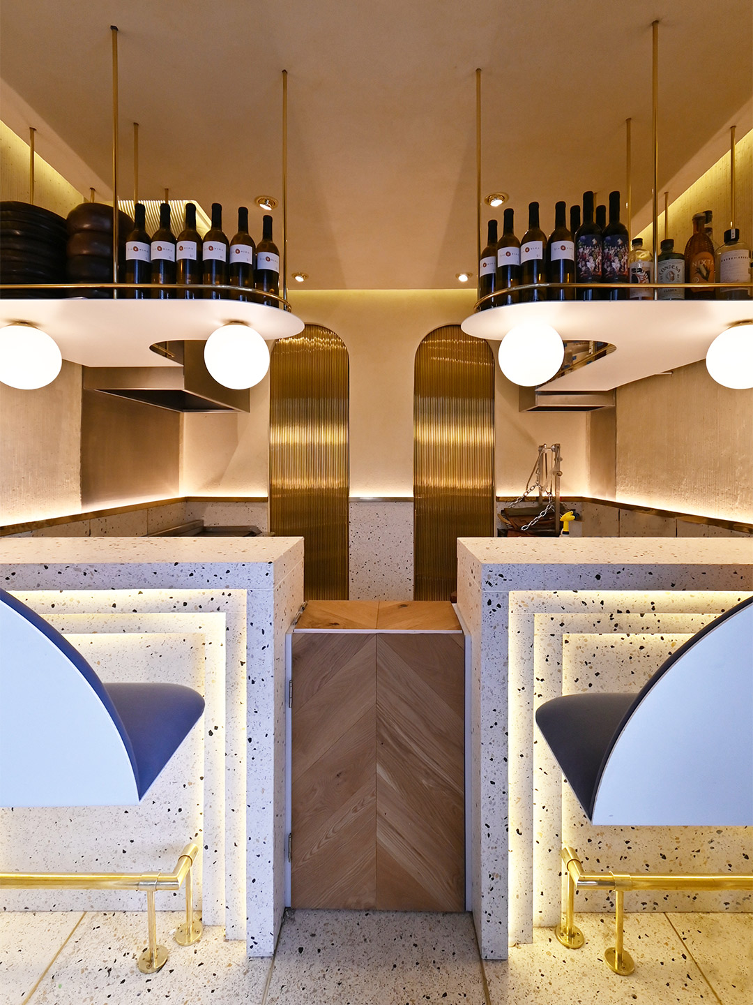
Tucked behind an unassuming roller door, between a messy patchwork of electrical wires and gas metres, the hole-in-the-wall footprint of Pargot doesn’t leave much to the imagination. The dining area is limited to a duo of high bars, each with bench seats, that flare out to accommodate four diners at any one time. Behind the counters, the small industrial kitchen is divided into hot and cold food areas, backdropped by a wall featuring two arches and two sliding brass doors. When opened, the rear doors create a change of atmosphere, transitioning the core colour palette from gold to navy, which the designers say “incites a sensation that brings us closer to the sea”.
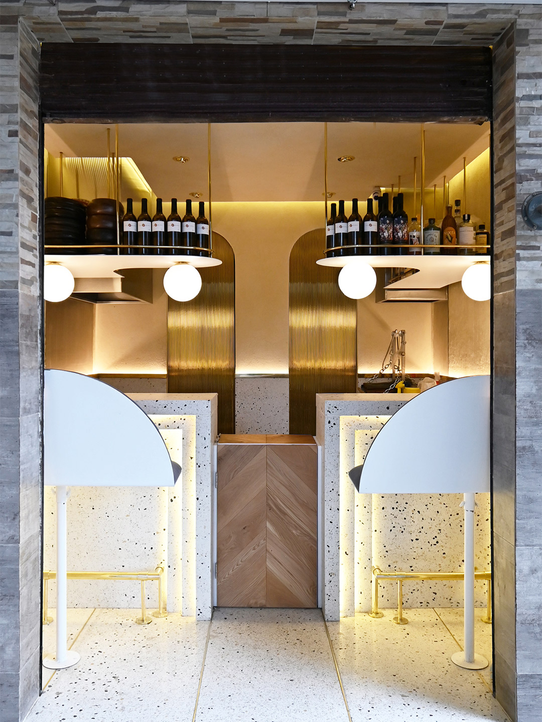
Pargot restaurant in Mexico City by RA! Arquitectos
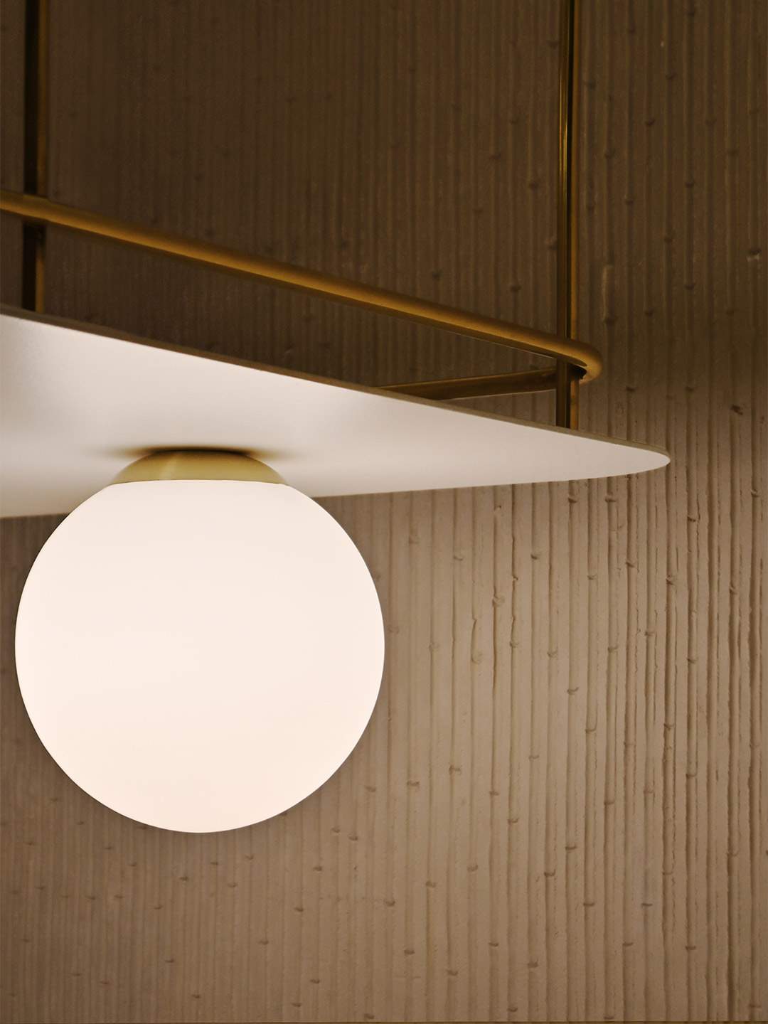
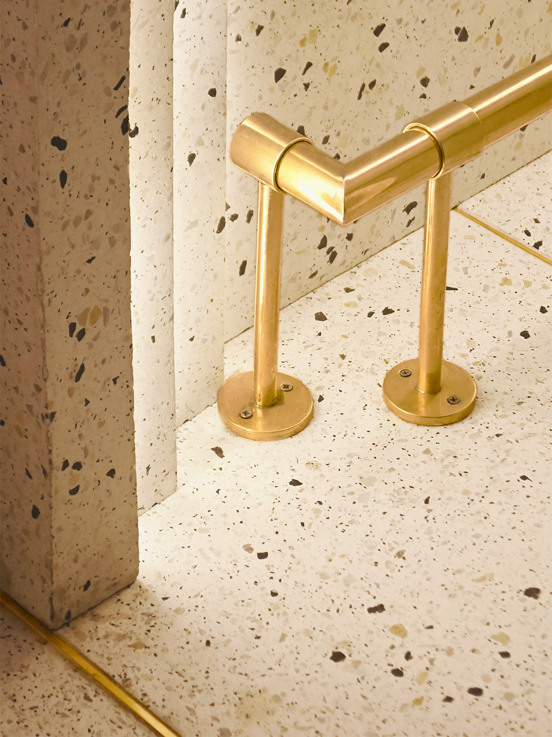
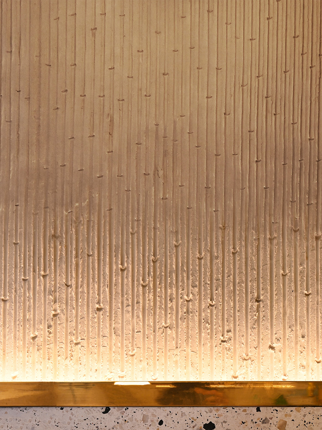
Ensuring the material palette is kept simple yet striking, the floor of the restaurant, the lower portion of the walls and the two bars are all composed of white-based concrete terrazzo, with blue, yellow and grey stones offering a nod “to the beaches and shells that we find on the sand,” the designers say. The upper part of the walls features a gentle shift in materiality thanks to a textured effect created with lengths of bamboo. Stems of the plant have been pressed into a plaster mix, revealing its notches and veins – a treatment which is accentuated by uplighting concealed behind a golden rail.
Efficient storage shelves suspended from the ceiling double as the bar area at the front of the kitchen, displaying a small selection of wines and spirits for diners to imbibe alongside delicious dishes. The gold-coloured metallic finish of both the shelf embellishments and the foot rails catches the light emitted from within the Art Deco detailing of the bar fronts and the floating orbs overhead, drawing in passers-by. Heightened by the grungy surrounds that lay before the restaurant’s front step, the result is a glimmering gem in a roughened street of Roma Norte, destined to satisfy the appetites of foodies and design lovers alike.
The interior design takes us back to the Art Deco movement of the 1920s, generating a composition based on symmetry and balance…
Catch up on more architecture, art and design highlights. Plus, subscribe to receive the Daily Architecture News e-letter direct to your inbox.
Related stories
- Venus Power collection of rugs by Patricia Urquiola for cc-tapis.
- Bitossi celebrates centenary in Florence with new museum and 7000-piece display.
- Casa R+1 residence in southern Spain by Puntofilipino.
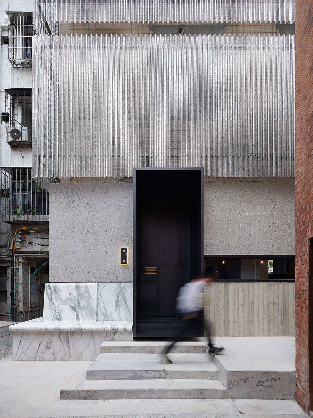
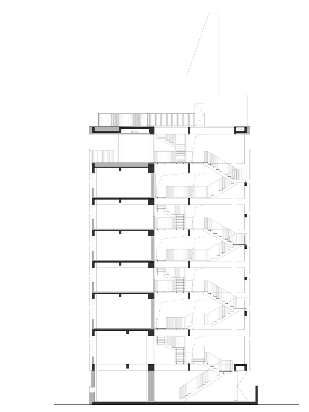
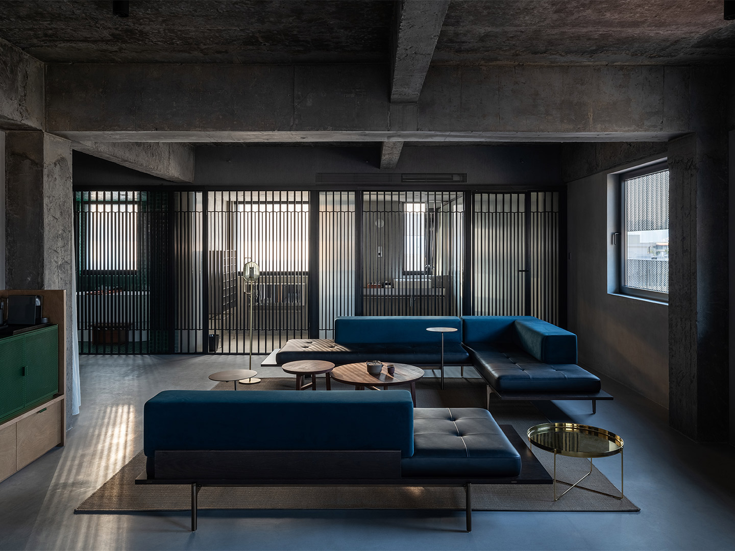
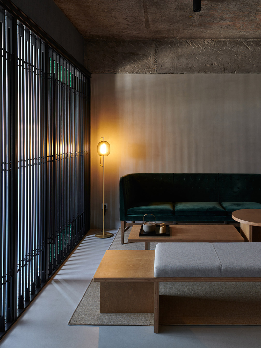
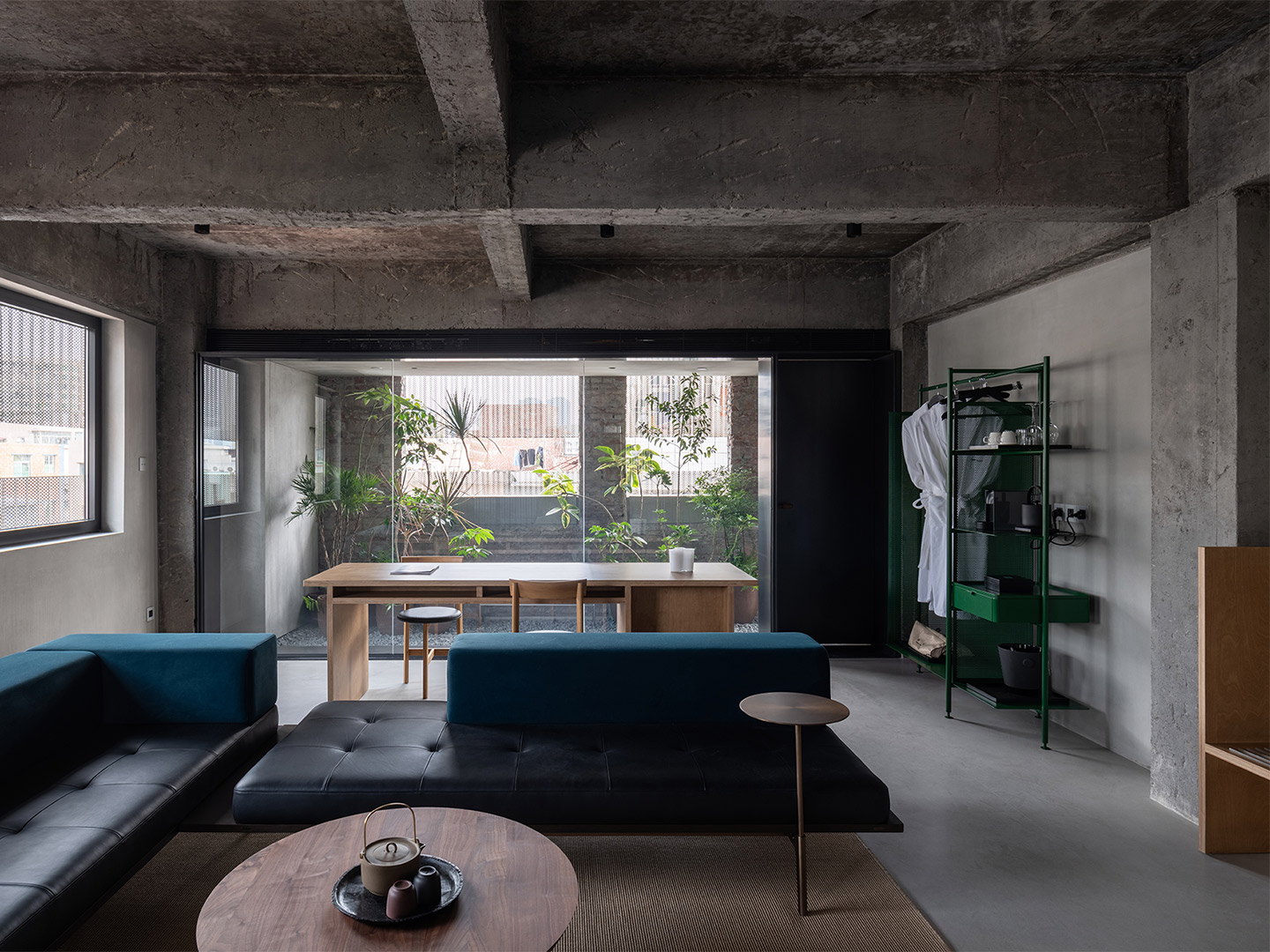
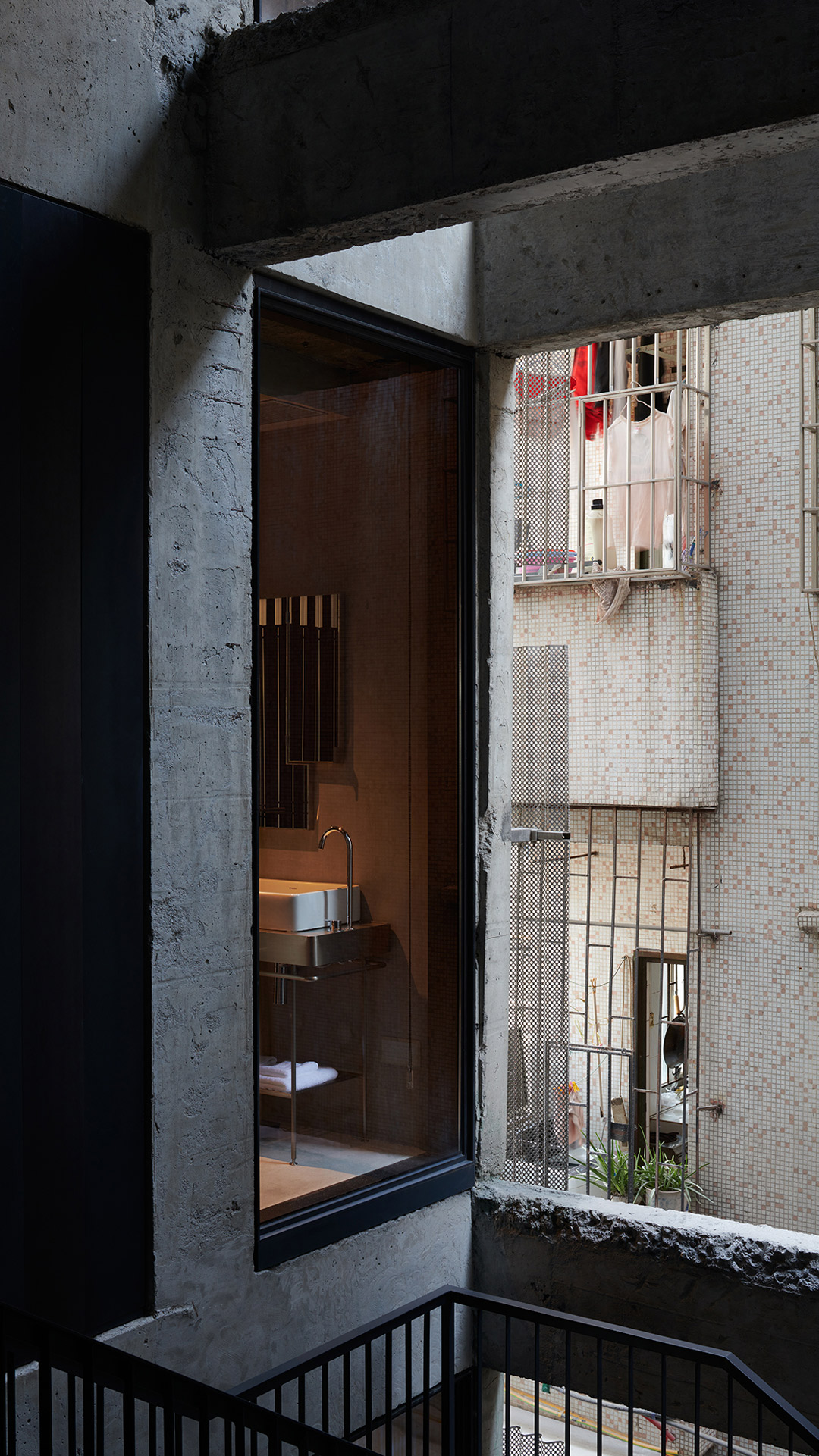
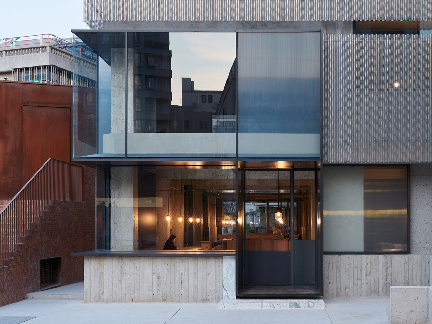
Translating to ‘urban village’, cheng-zhong-cun is a phenomenon where the remnants of pre-industrial settlements are nestled amidst a seemingly modern metropolis. Nantou City, the site of Neri&Hu’s adaptive reuse project for an eleven-room guesthouse, is an example of such an urban village. Situated at the heart of Shenzhen, a burgeoning city with astonishing growth, Nantou City has evolved from a well-heeled ancient capital to the overcrowded inner city it is now. Visitors today are immediately immersed in the tightly knit alleys, plazas and dead-ends, where residents, street vendors and nomads alike roam.
Inspired by the vibrant milieu of the alleyways in Nantou City, the project seeks to reflect on the cultural heritage of the mundane. Scenes of the everyday – people, objects and their settings – are the primary source material for design. To celebrate life in the urban village, the existing structure was cut into as a massing strategy, allowing such “urban incisions” to foster a new public realm on the inside of the previously private apartment block. At the same time, the excavation revealed the many material layers and building structures as if at an archeological site, only to allow new interventions to instigate unexpected dialogues between the past and the present.
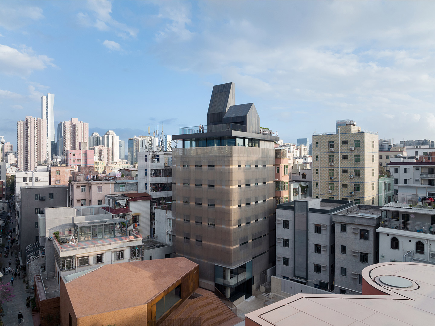
Nantou City Guesthouse in China by Neri&Hu
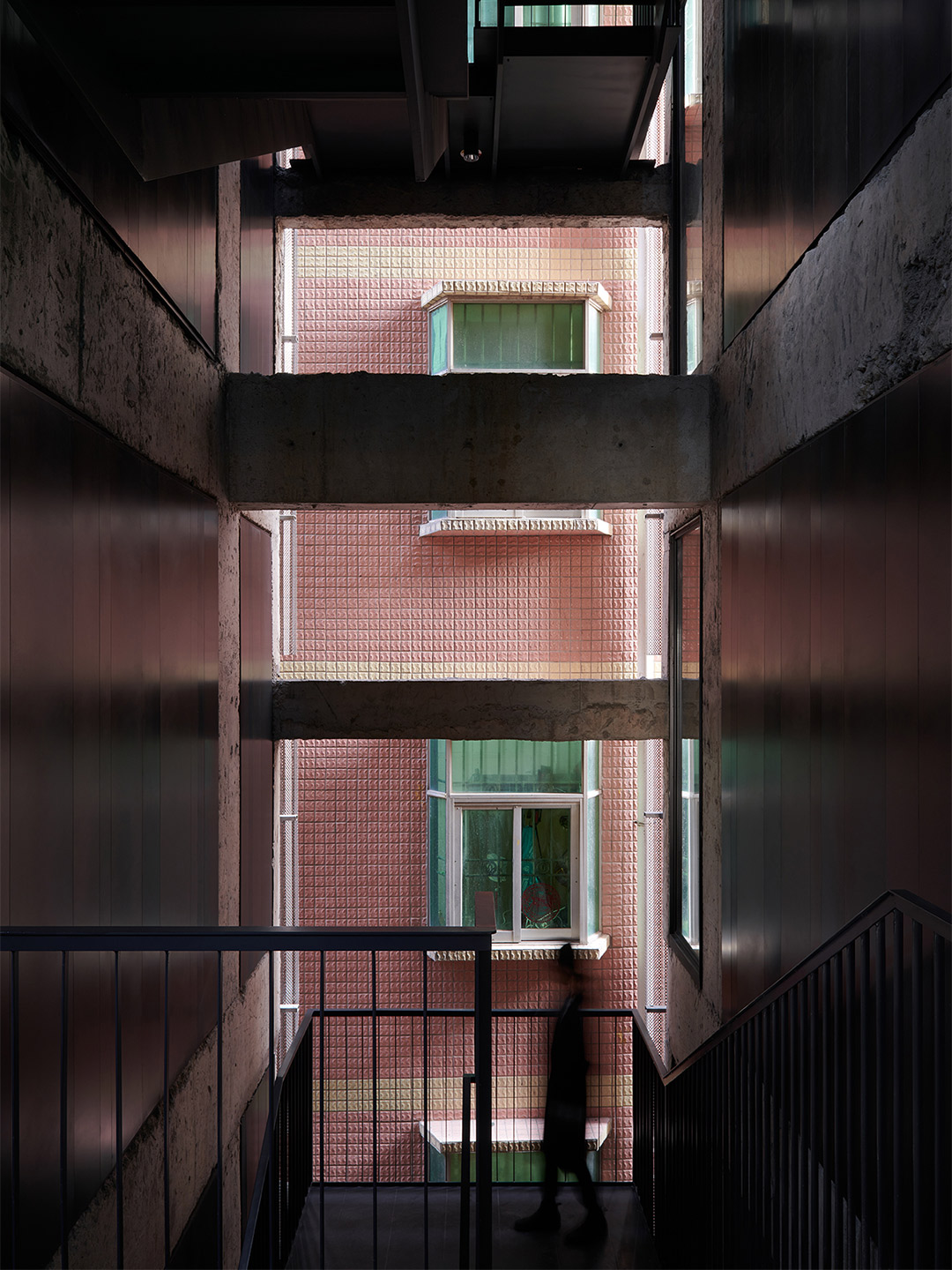
Throughout the research and design process for the Nantou City Guesthouse, Svetlana Boym’s writings on the topic of “reflective nostalgia” have guided the thinking behind the project. Rather than simply mimicking the past for its superficial material effects, the project has sought to unearth the possibilities of certain kinds of past that could invigorate our contemporary culture. A tectonic language was developed to articulate two divergent treatments that probe the notion of urban layering and the embracing of fragments: that of a light, screen-like cladding as the major façade element, and the other a heavier, expressive assemblage to contrast as a skyline “capping” atop.
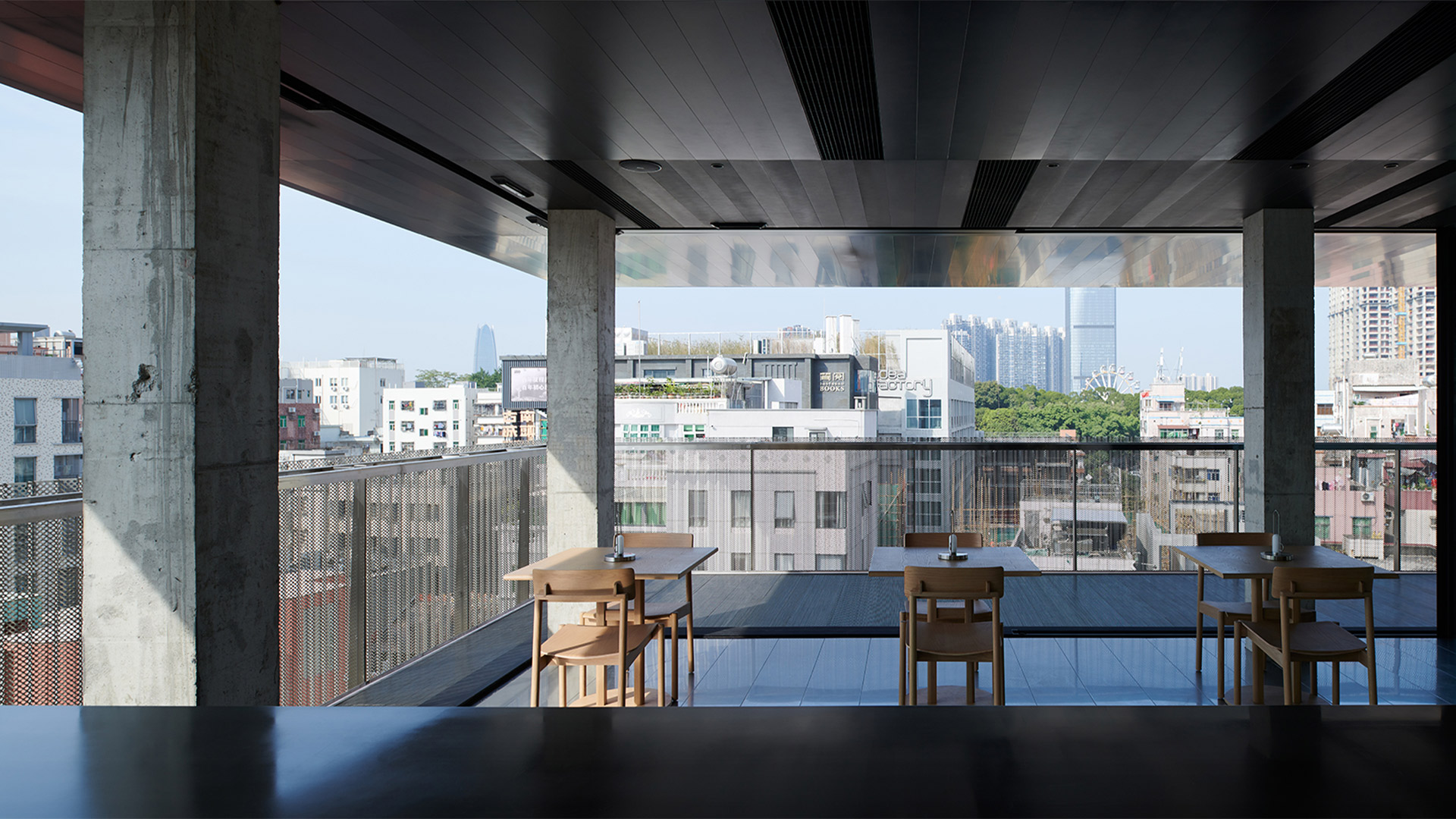
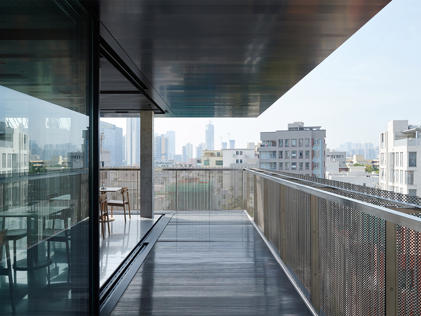
Like the bustling scenes in the alleyways below, the roofscape across the Nantou urban village has a life of its own, with makeshift gardens and vegetable farms popping up along the jagged skyline. To reframe views of this ever-evolving village, a flat floating roof is installed to create a dramatic panorama of the street life below, and a new public ground above. Housing public spaces and service functions, the metallic monoliths of the rooftop play on vernacular add-ons, which are much sought after by space-starved attic-level residents.
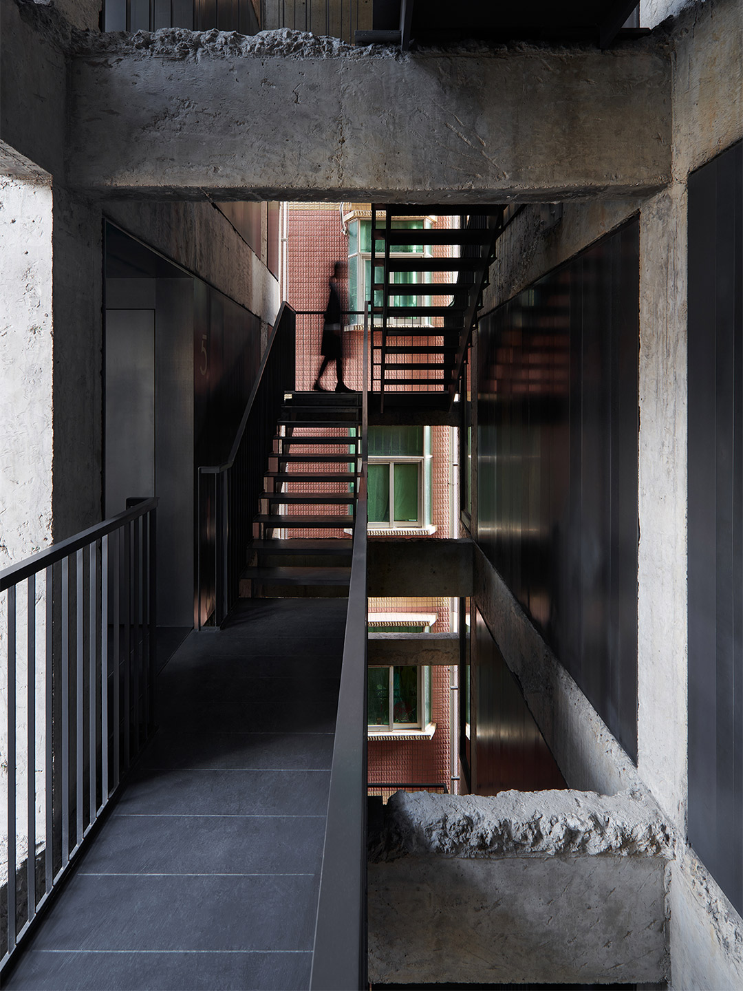
To engage with the uniquely organic circulation that is quintessential to Nantou’s urban fabric, the guesthouse’s access and public realms are designed to be woven back into the network of intricate alleyways found on site. The new entrance to the guesthouse is created by extending a side street directly into the heart of the building, as if to invite neighbours and friends into one’s private home.
Old and new are juxtaposed throughout the building to celebrate ruins. Once the visitor arrives at the building, the public gesture of opening up the building along the urban axis is turned upward. An existing stairwell that had previously connected all nine tenement floors was now cut open and expanded to create a new vertical courtyard. Natural elements are allowed to pass through from the open façades to the side and a light well above. A new metal stair suspended within the vertical courtyard takes the visitor on a journey to the guest rooms on the mid-levels, and finally to the public rooftop gardens.
Inspired by the vibrant milieu of the alleyways in Nantou City, the project seeks to reflect on the cultural heritage of the mundane.
Catch up on more architecture, art and design highlights. Plus, subscribe to receive the Daily Architecture News e-letter direct to your inbox.
Related stories
- Venus Power collection of rugs by Patricia Urquiola for cc-tapis.
- Bitossi celebrates centenary in Florence with new museum and 7000-piece display.
- Casa R+1 residence in southern Spain by Puntofilipino.
For emerging restaurateurs Jack Leary and Tim Christensen, founders of the Alma Group, the Northern Beaches in Sydney is becoming a regular backdrop to their gastronomic ventures. Towards the pointy end of the peninsula, Alma, the duo’s debut Mexican restaurant, has well and truly settled into the village of Avalon since opening its doors in 2017. At the southern end, nearer to Manly and the gateway to Sydney Harbour, the second establishment to join the lineup is a newcomer in the seaside suburb of Freshwater.
When discussing the design for St. Alma, the name given to the new diner, Jack and Tim felt strongly about two key points. They believed “first impressions are everything” – a mantra adopted with the launch of their first restaurant. But they also recognised it was important for St. Alma to “stand her ground” rather than become a pure replication of the Avalon premises. “We are both relatively new to owning venues, so we wanted this space [in Freshwater] to be a reflection of our journey, and for our patrons to benefit from the lessons we have learned along the way,” Jack says.
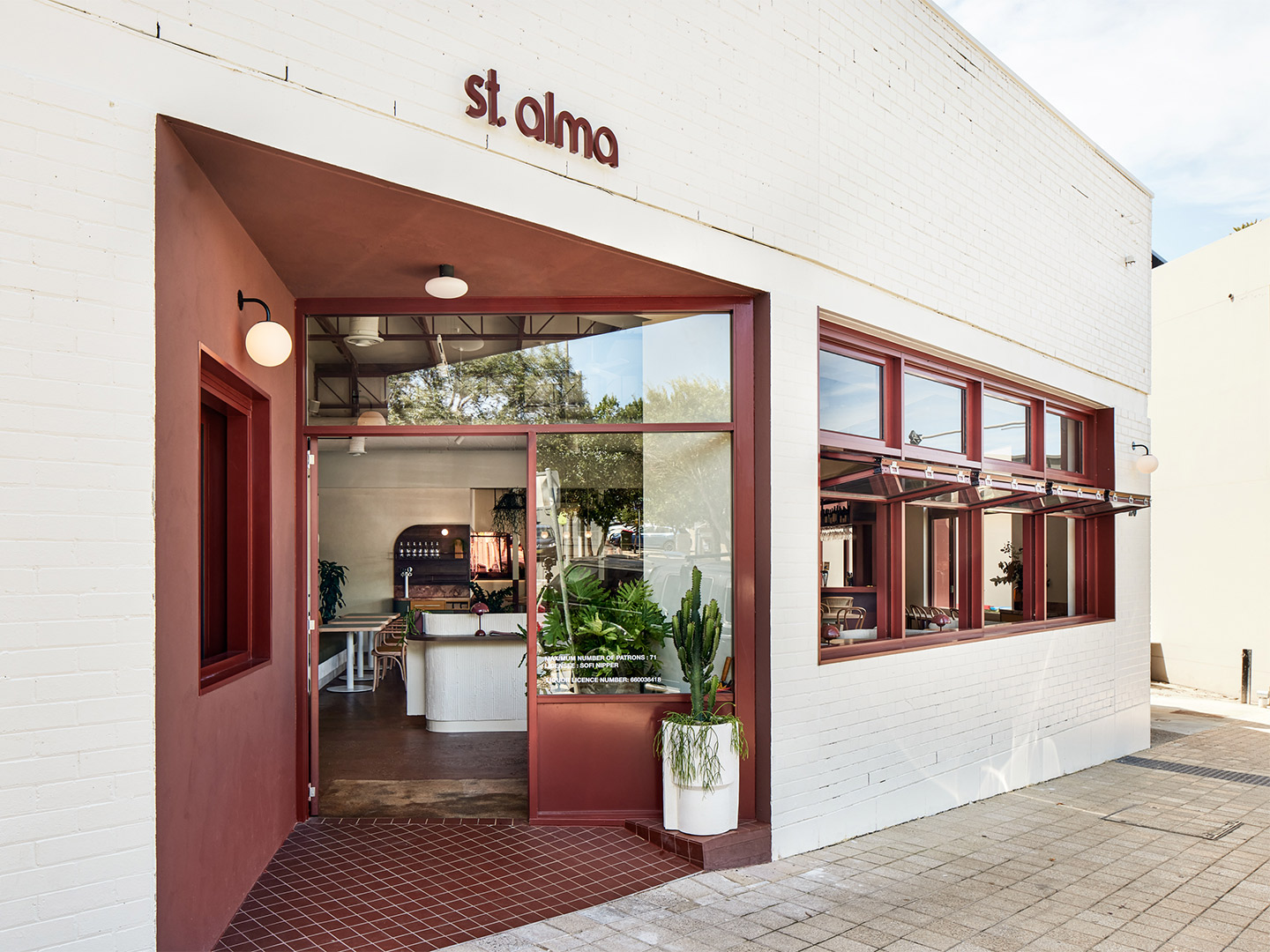
St. Alma restaurant Freshwater by Five Foot One
To craft an impressive interior that meets the brief of “minimal Mexican modernism”, while also being site specific and complementary to the cuisine on offer, the duo called in the design team from Five Foot One. The creative process that followed carved an unexpected path, guided by a demolition phase that uncovered fascinating features from the site’s former life as a bank. “It was a process that evolved over time,” says Kat Thompson, the Sydney-based director of Five Foot One. “A number of original features were retained – even the original safe of the bank was incorporated and restyled into the new structure,” she explains.
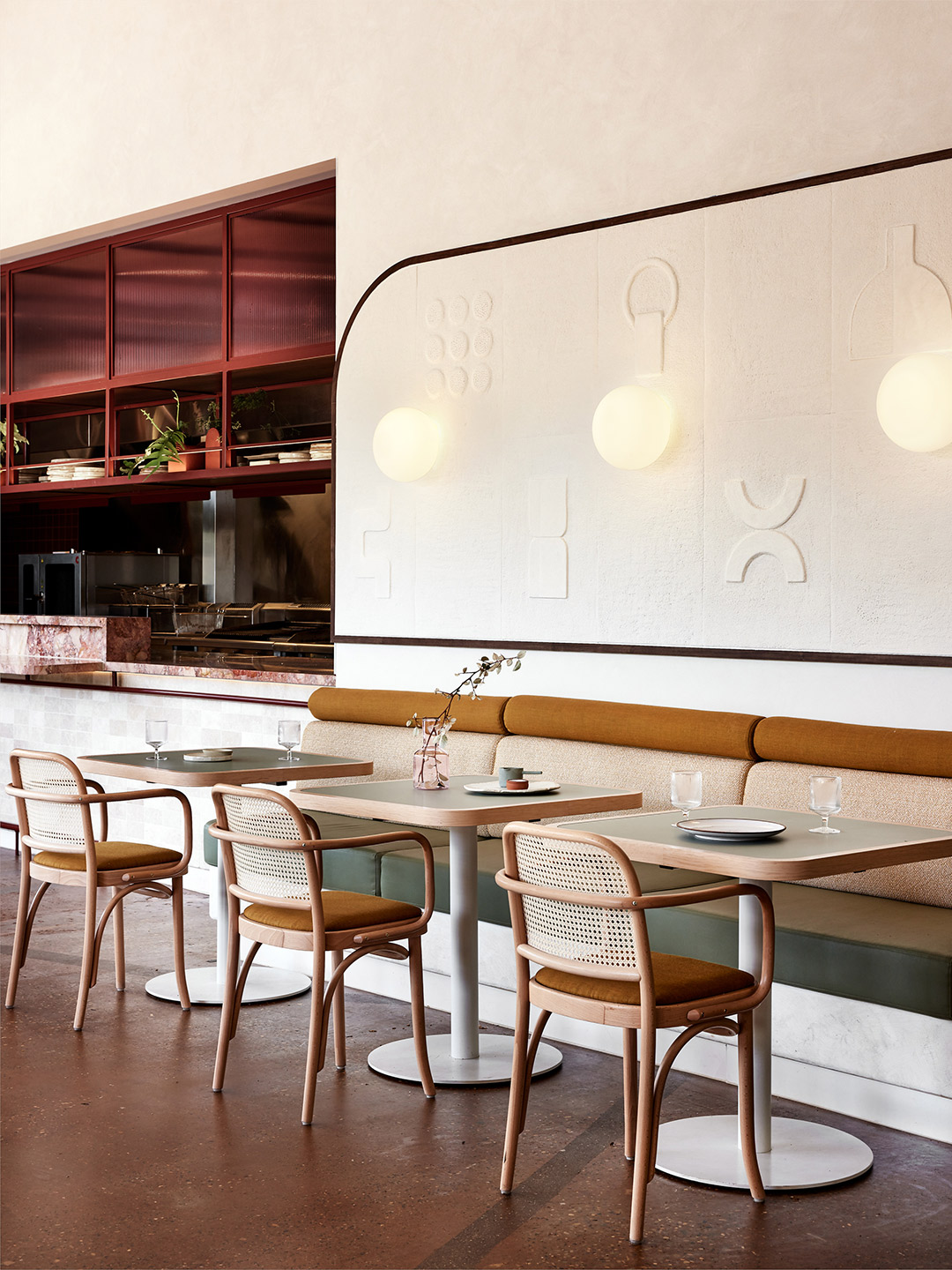
But perhaps the greatest surprise – or curveball – was revealed when the old standard-height ceiling was removed. “We discovered a wonderful ceiling with tremendous height running through the centre of the restaurant,” Kat recalls. “We had to make the most of this,” she adds, highlighting the woven-fabric ceiling feature that now hangs within the void, offering movement overhead as it’s exposed to the gentle ocean breeze.
In planning the interior, the Five Foot One team dedicated great attention to layering texture, geometry and colour. “We channelled a fresh and light base palette as a response to the coastal setting and inserted vibrant colour blocking at key focal areas,” Kat says. “For example, striking burgundy has been used to highlight the front entrance as a way to draw guests in.” If that isn’t enough, the array of seafood displayed by the entrance of the venue should pull a crowd.
An appreciation for detail is seen in the eye-catching display shelving of the curved bar area. It also features in St. Alma’s collection of art – most notably a striking 4-meter-long sculpture that now takes pride of place in the middle of the restaurant. The artist responsible for the piece is Sam Leary, Jack’s mother, who collaborated closely with the design team to make sure her work resonated with the overarching vision for St. Alma.
Furniture was selected to reflect the restaurant’s relaxed ambience and seaside location, exampled by light timbers and woven materials, but it was also required to offer various sitting scenarios. “We wanted diners to be able to have a more intimate dining experience with stools at the bar and kitchen,” says Jack. “Here, guests can interact with the staff for a true Alma experience.” Conversely, the larger tables and booths along the walls and windows allow greater flexibility for big groups and special occasions.
Since opening in early January, the 100-seat restaurant has come alive, thanks to the Freshwater locals who bring vitality to the space and the staff who shape the uniquely “Alma” experience. It’s a place where diners can expect an eclectic mix of regional Mexican influences, given a delectable Australian spin through both flavour and design. “You could say we love to juxtapose a fun and engaging service style with a sophisticated dining experience and fit-out,” Jack says. “I’d sum it up as fresh and chic yet casual and soulful with an edgy twist.”
fivefootonedesign.com; st-alma.com.au
Since opening in early January, the 100-seat restaurant has come alive, thanks to the locals who bring vitality to the space and the staff who shape the uniquely “Alma” experience.
Catch up on more architecture, art and design highlights. Plus, subscribe to receive the Daily Architecture News e-letter direct to your inbox.
Related stories
- Tin Tin restaurant in India by Renesa Architecture.
- Nothing Fancy restaurant by Eduard Eremchuk and Katy Pititskaya.
- Refined diner: Papi restaurant in Paris by Neri&Hu.
- Living Bakkali restaurant in Valencia by Masquespacio.
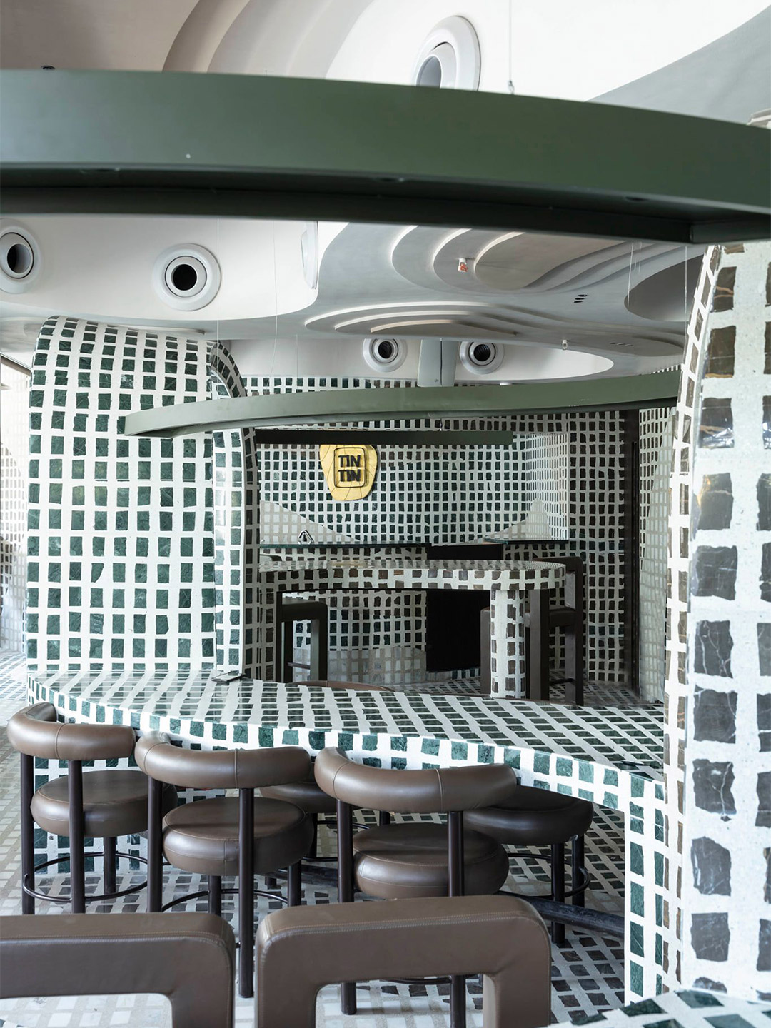
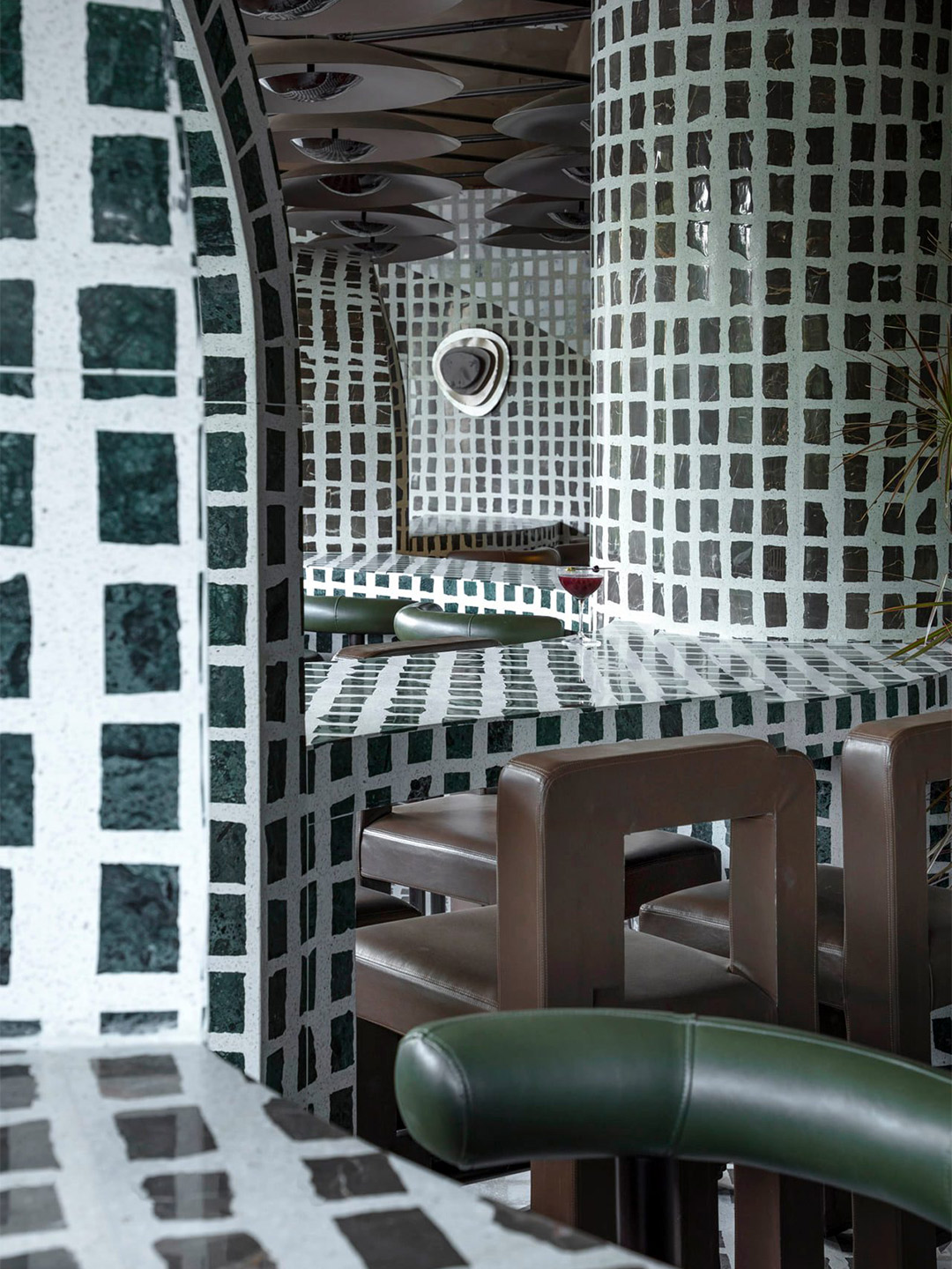
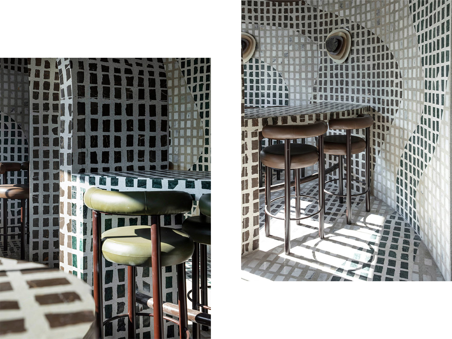
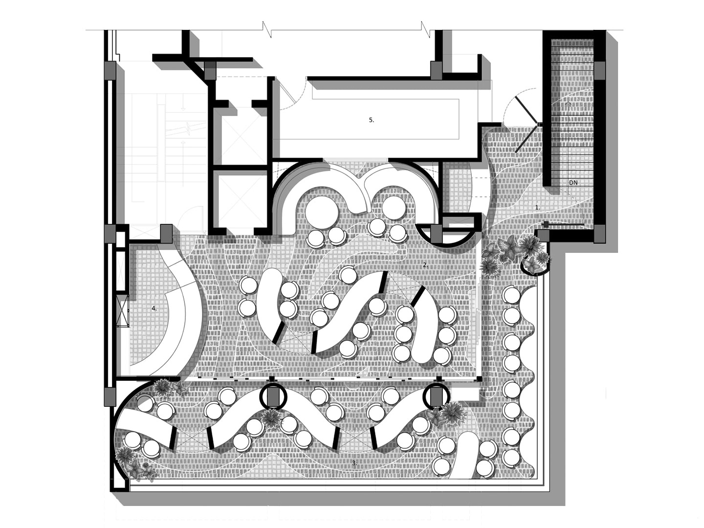
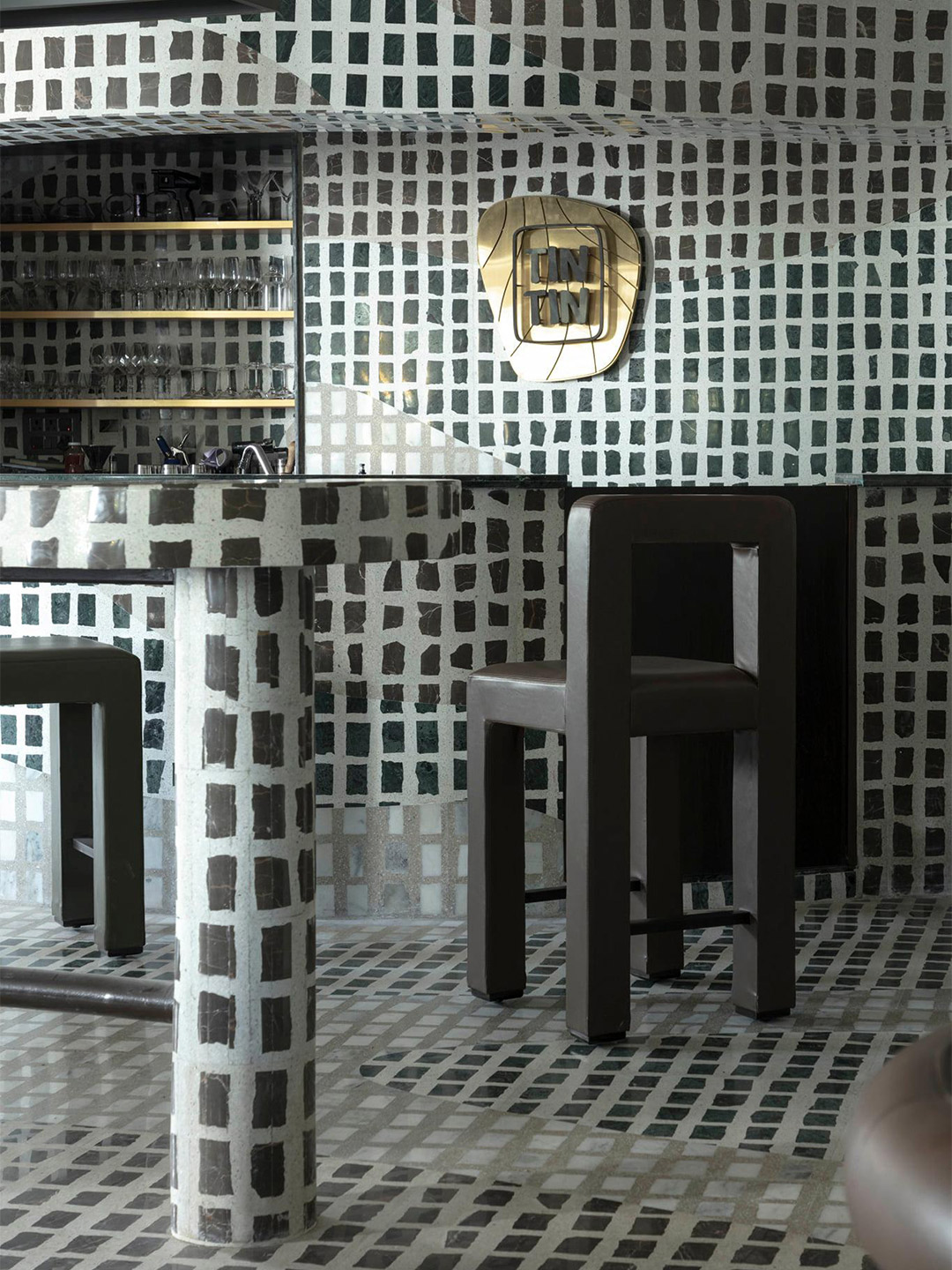
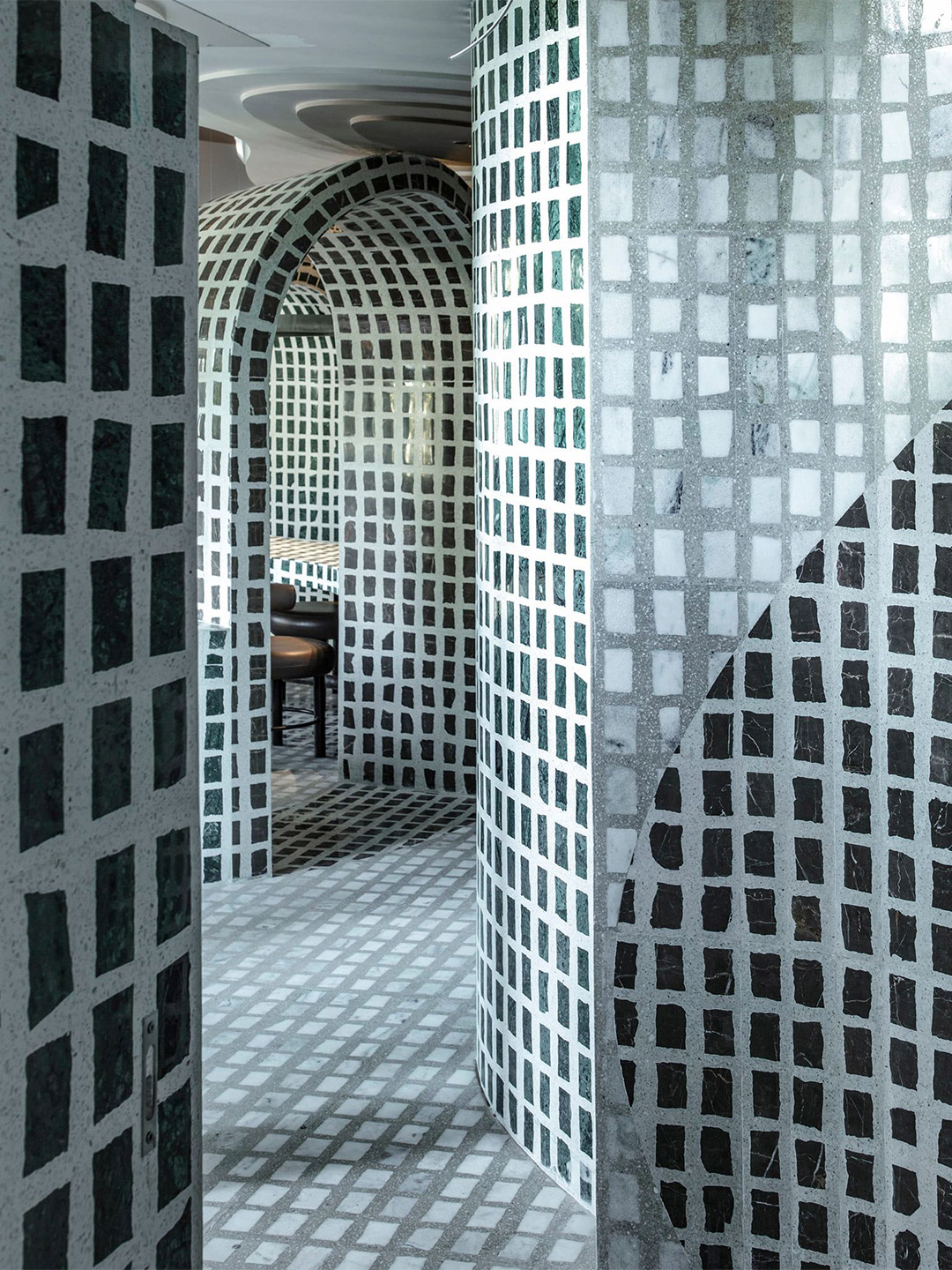
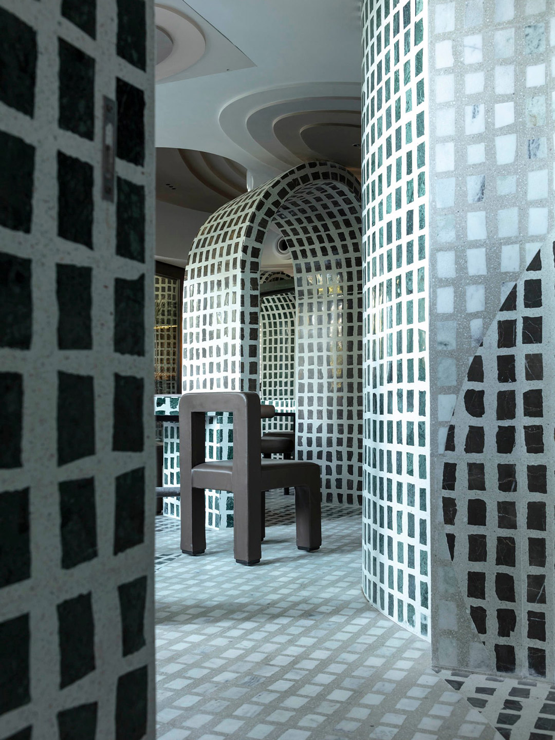
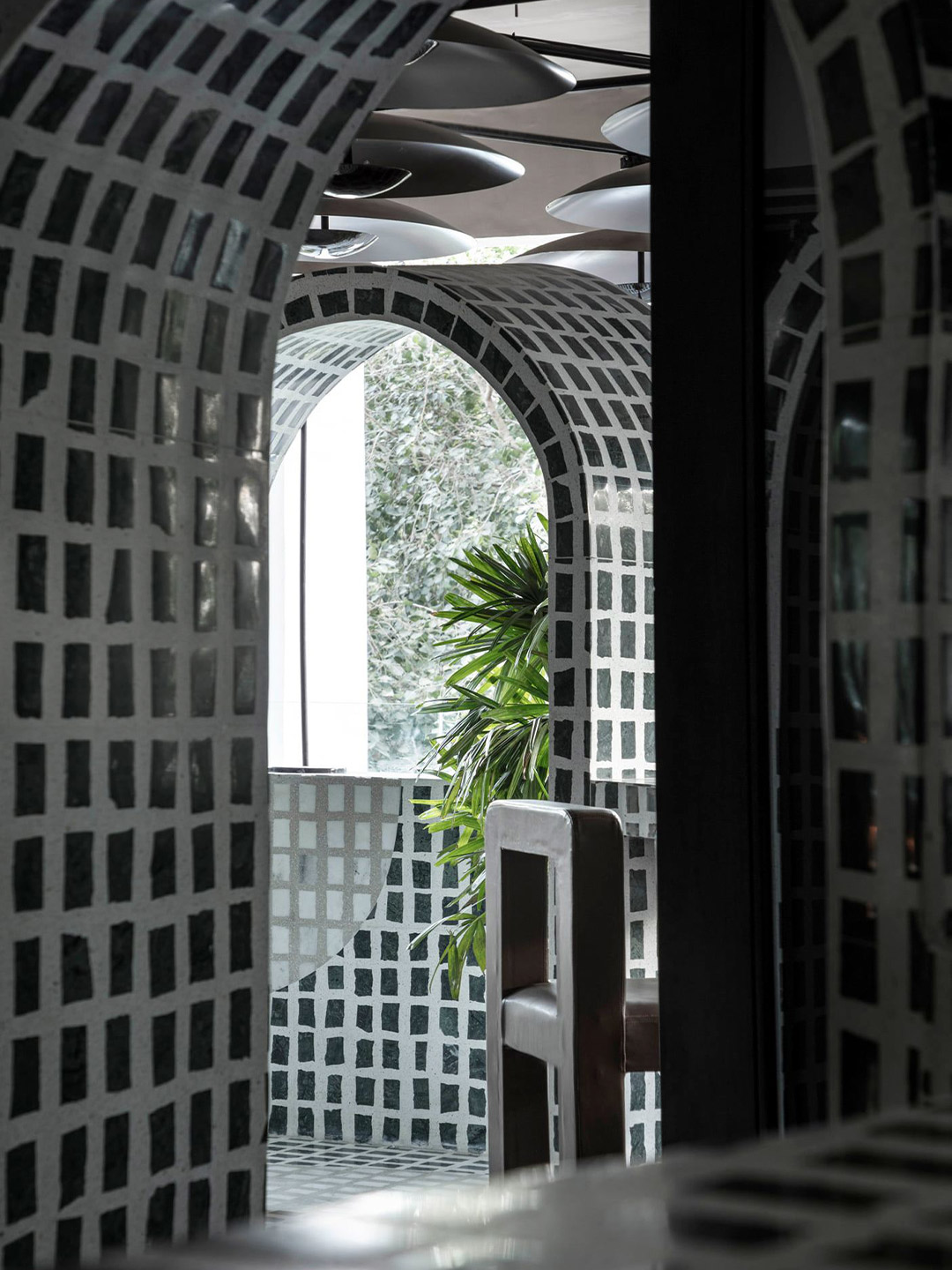
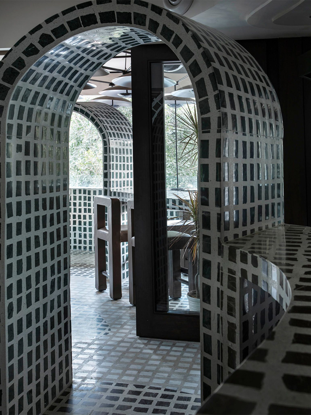
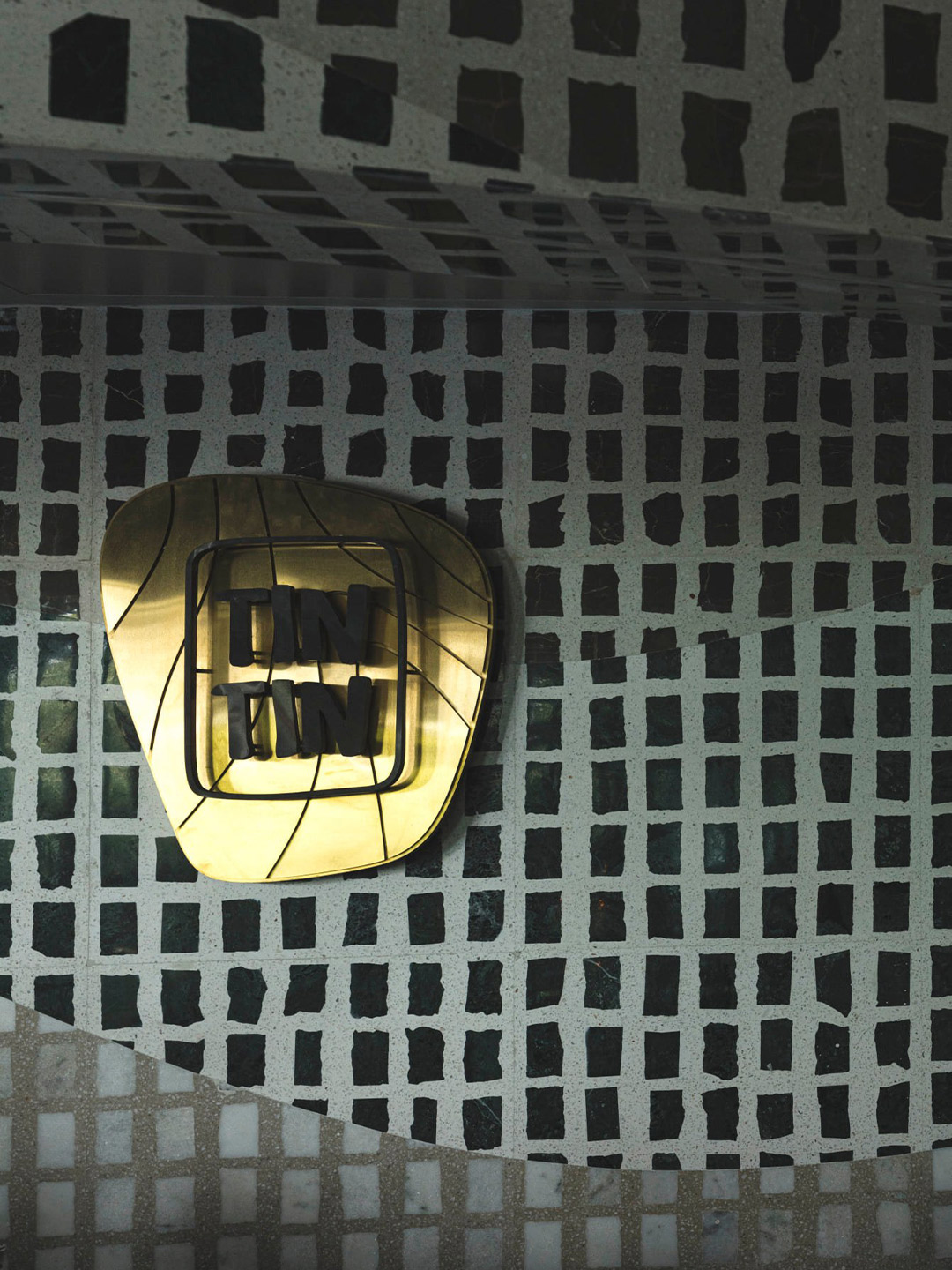
This pan-Asian dining venue in the centre of effervescent Chandigarh, Punjab, India, is described by its designers as an “undisputed cauldron of minimalism and indigenous materiality”. Emblazoned with the name Tin Tin, the restaurant, crafted by local architecture firm Renesa, unapologetically dives head-first into the realm of experimental design, an impetus that’s equally expressed through the venue’s gastronomical offerings.
With unconventionality resting at the heart of Tin Tin, the spin-off from its glaring commitment to materiality is an experience that engages the senses beyond expectation. The Renesa team focussed on crafting “a sense of Zen,” they insist, while at the same time they leant into the sensibilities of local Indian materiality to bring the wow factor. The venue walks the line between novelty and experiential dining, casting light on inventive practises that thoroughly explore Indian craftsmanship.
Tin Tin restaurant in India by Renesa Architecture
Tin Tin’s grotto-like feel comes from the stippled appearance of cast-on-site slivers of Indian stone and terrazzo that were painstakingly hand-laid over six months by a brigade of local stonemasons and casters. The deep shades of jade, umber brown, veined white, and “greige” bespeckle the space, casting a different mood in each pocket of the sprawling diner. The absence of rigid linear forms creates intimate nooks and organic “caves” that cocoon diners in an engaging embrace.
Revelling in the colour palette established by the surfaces, the restaurant’s furniture submits to curvilinear silhouettes that stitch organically into the varied space. “No two sights within the interior volume are identical,” the architects declare, referencing the spatial tapestry that unashamedly lures in its patrons. It’s a place almost purely guided by a sense of mystery and curiosity, where a medley of sweeping arches and contoured ceilings tempts diners on a journey of discovery.
With a variety of sitting areas on offer, from standalone high tables with stools to snaking communal counters, Tin Tin seamlessly transitions from a fine-dining space by day to a high-octane lounge at dusk. The combination of privacy, electric energy, cuisine and community operates hand-in-hand with its maze-like qualities, summoning “a tangible ambience doused in mystique,” the architects conclude.
The absence of rigid linear forms creates intimate nooks and organic “caves” that cocoon diners in an engaging embrace.
Catch up on more architecture, art and design highlights. Plus, subscribe to receive the Daily Architecture News e-letter direct to your inbox.
Related stories
- Introducing the New Wave collection of 80s-inspired vases by Greg Natale.
- Greg Natale launches 70s-inspired glassware (and a signature cocktail for summer).
- Swatch list: Kelly Wearstler curates paint range for Farrow & Ball.
- Stokes 14: Architect William Smart’s creative studio in Sydney.
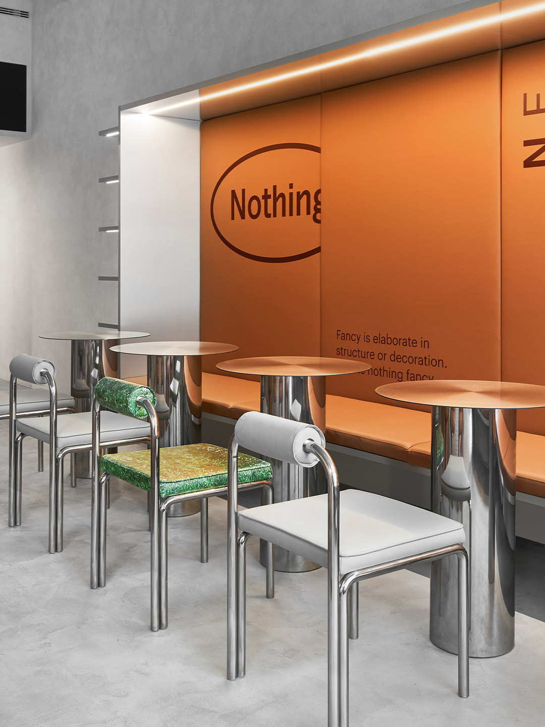
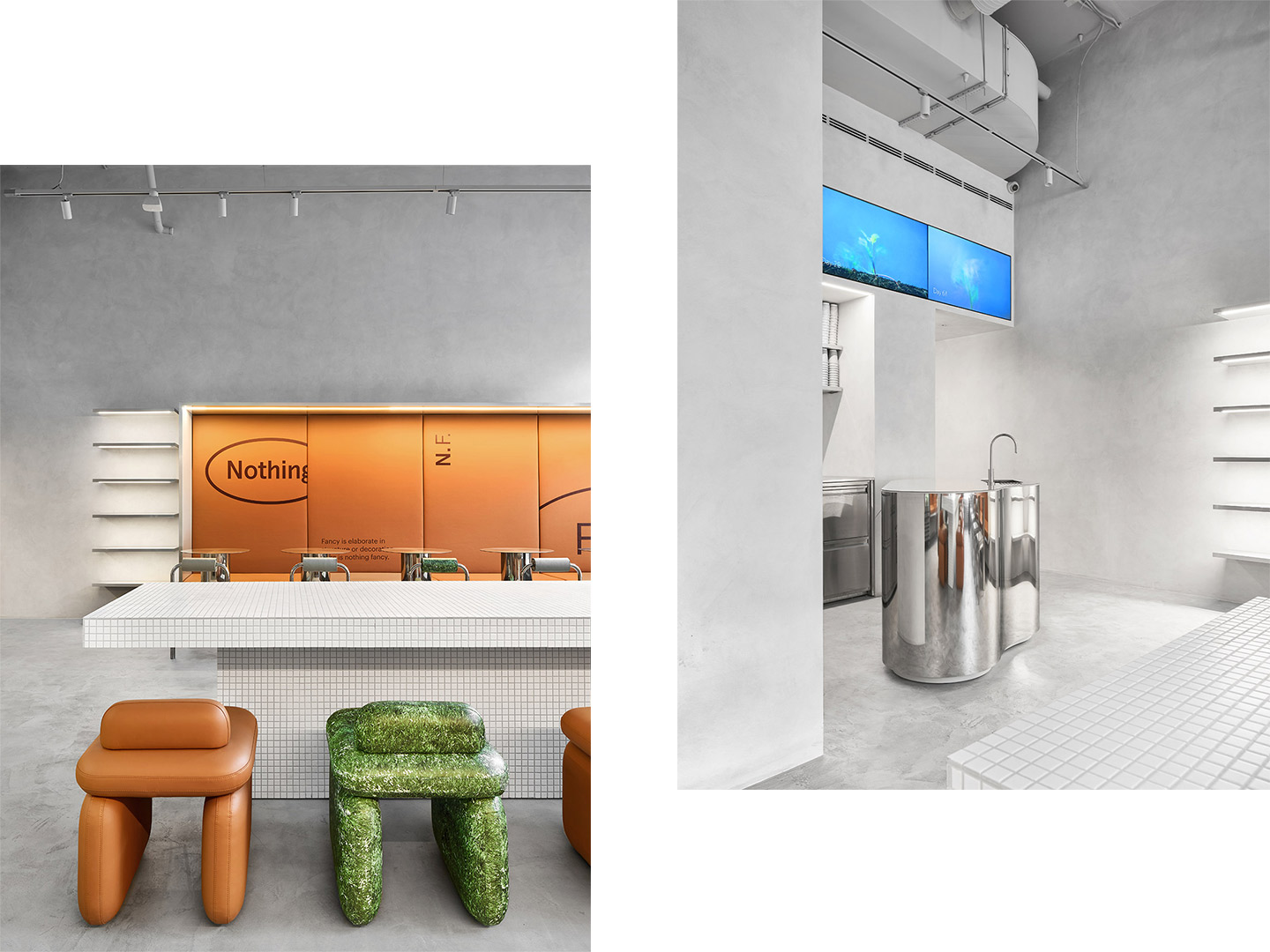
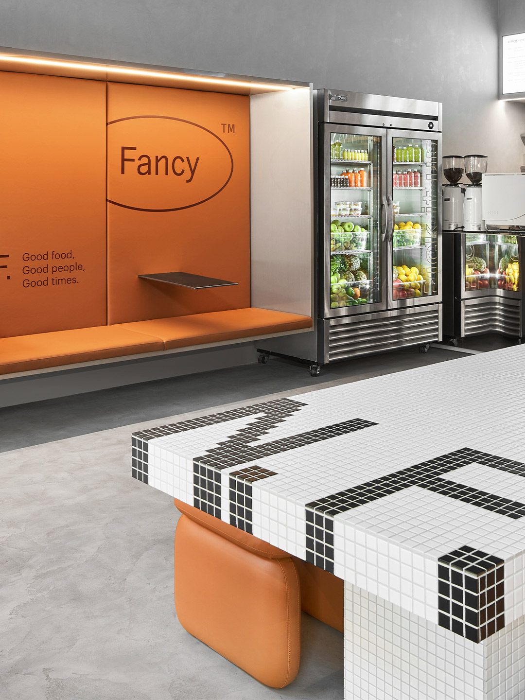
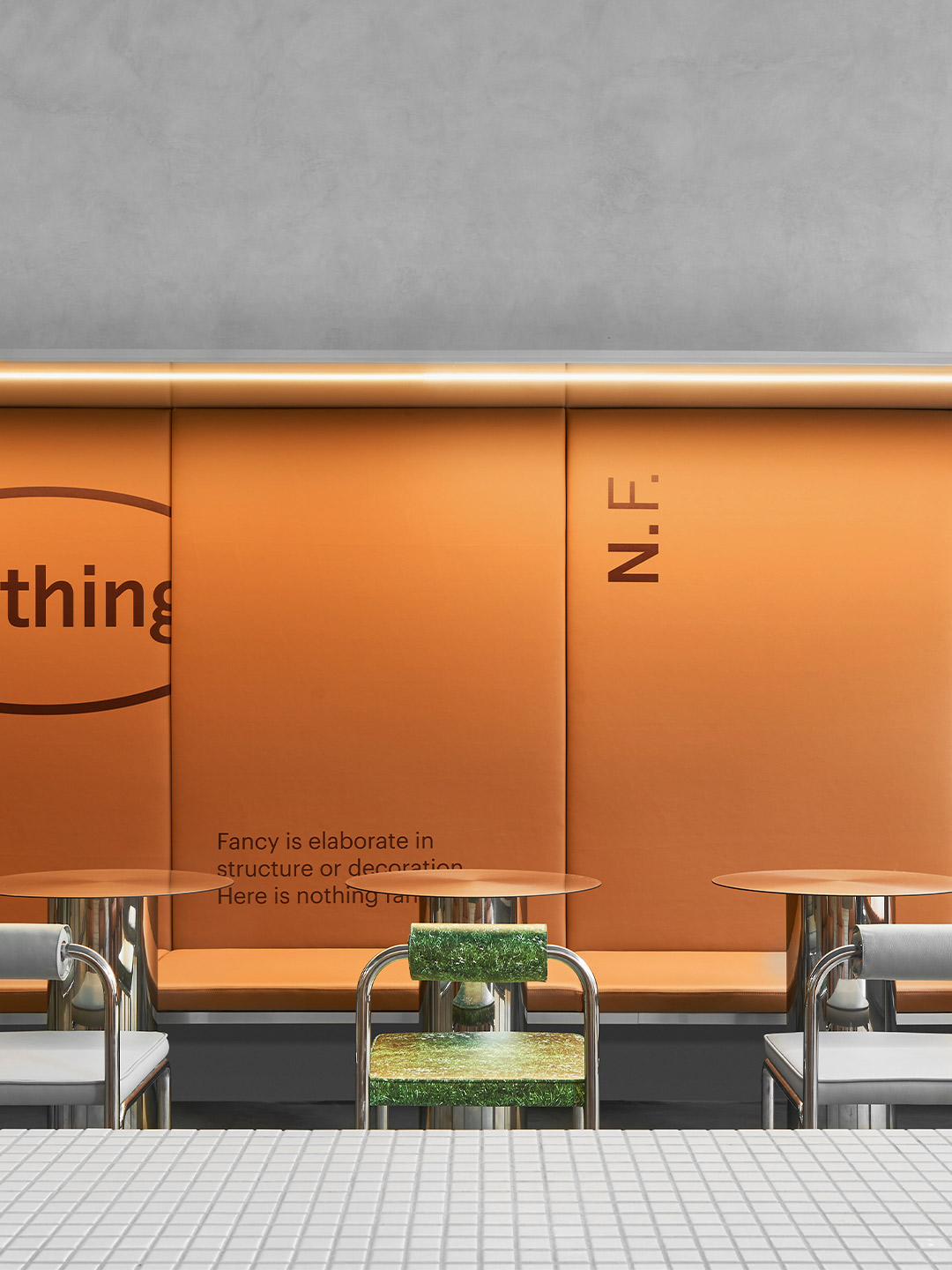
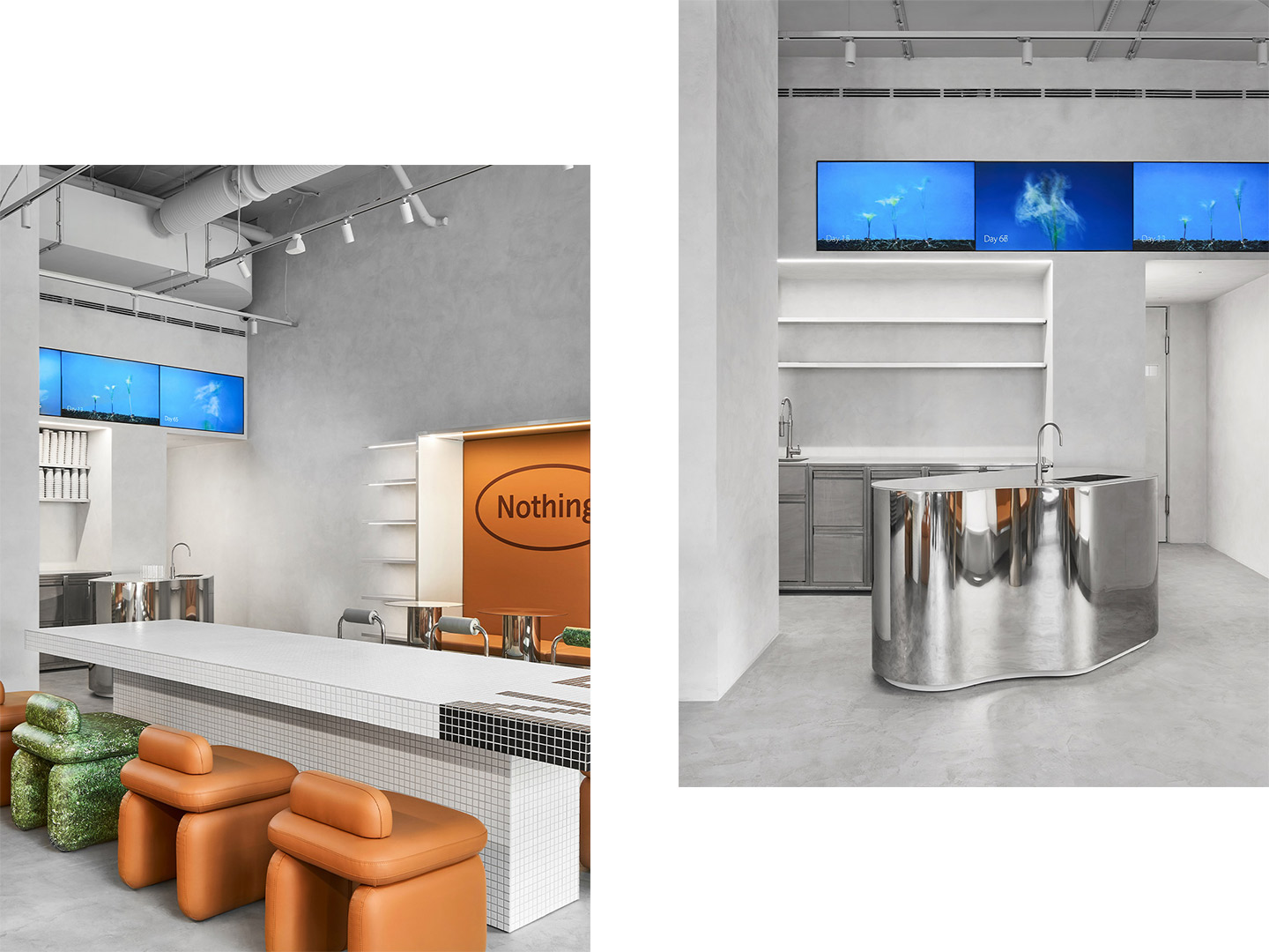
Time and again in the culinary world “health food” shops and cafes are singled out from the rest. So for architects Eduard Eremchuk and Katy Pititskaya the desire to normalise healthy eating became the driving force of their latest hospitality project. Given the name Nothing Fancy to reflect the cuisine on offer, the new restaurant nourishes its patrons with generous portions of “what our body needs every day,” Eduard and Katy say, pointing to a menu of quality ingredients prepared with the best available cooking technologies.
Located in Saint Petersburg, the 105-square-metre restaurant fit-out was inspired by the atmosphere of a typical Milanese cafe. Its point of difference, however, lies in the way Eduard and Katy blended the cafe archetype with a “futuristic” approach. “[We needed] to combine warm and cool tones, leather and metallic details in a very delicate way,” they explain. “We wanted to create a place where you might come every day, a space for real life.”
Nothing Fancy restaurant by Eduard Eremchuk and Katy Pititskaya
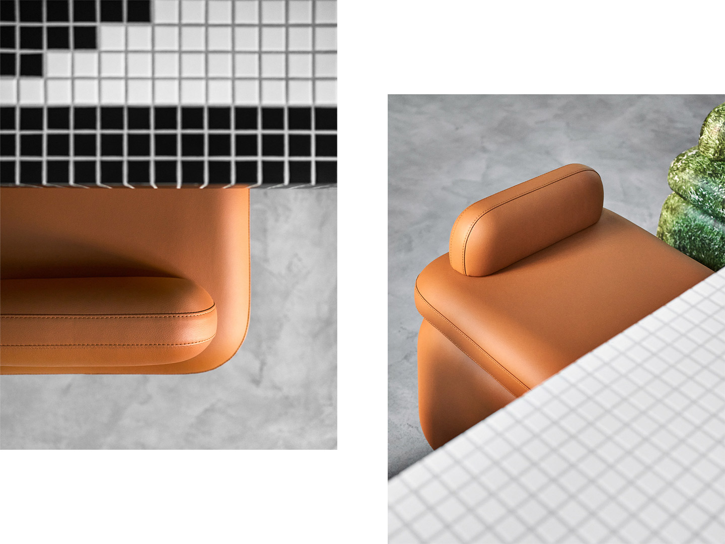
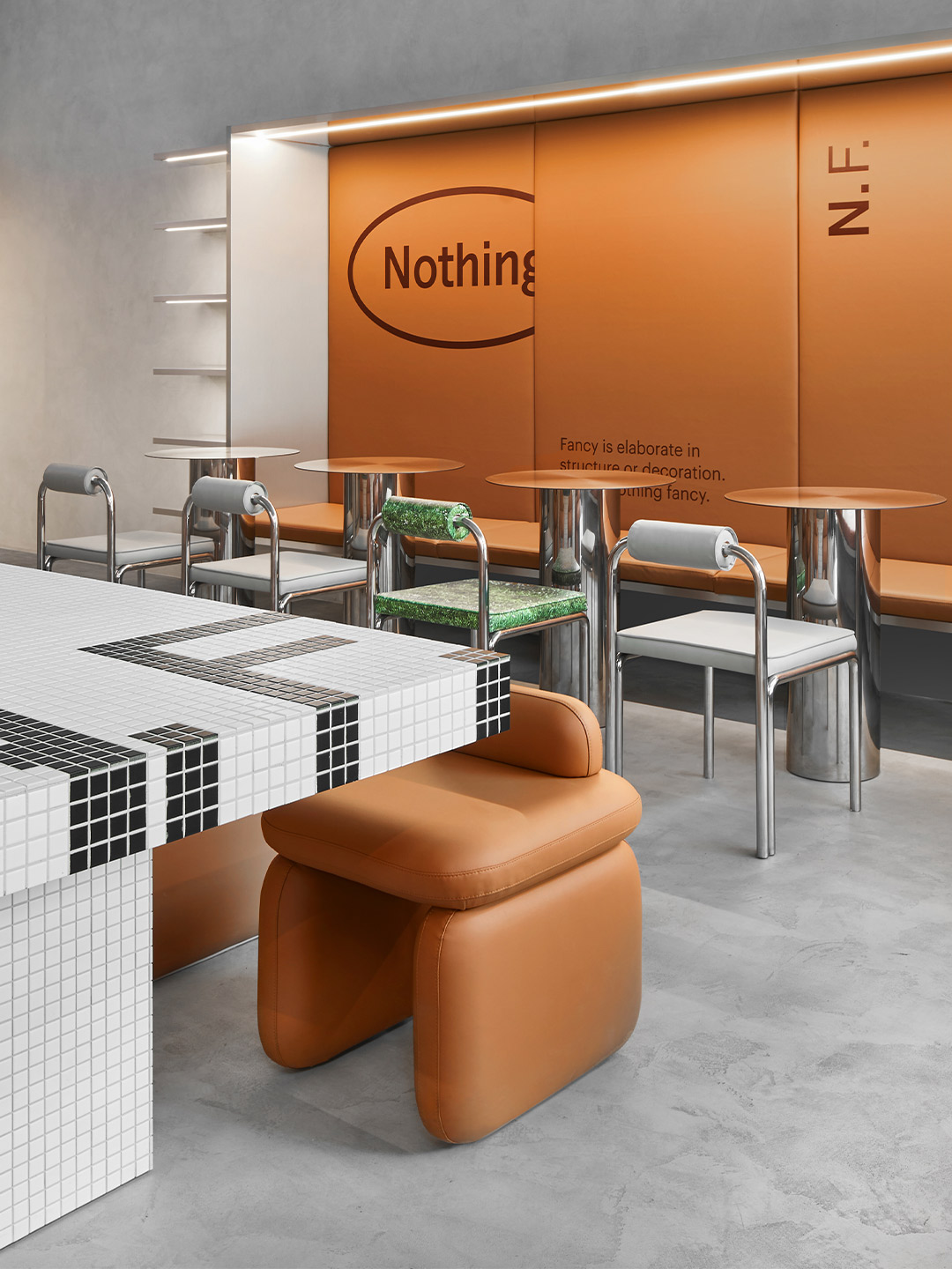
Within the interior of Nothing Fancy, the architects combined the patterning prevalent in Italian bistros with caramel-coloured leather, shimmering chrome details and mosaic tiles. It’s a mix of classic elements and contemporary style “in line with the spirit of the times,” they say. But the centrepiece of the space is perhaps its shapely main counter. “Upon entering, the visitor immediately pays all attention to the curved bar table. The piece is made of mirrored stainless steel – its curved shape reflects the space, mixing all the colours and details and creating a kaleidoscope effect.”
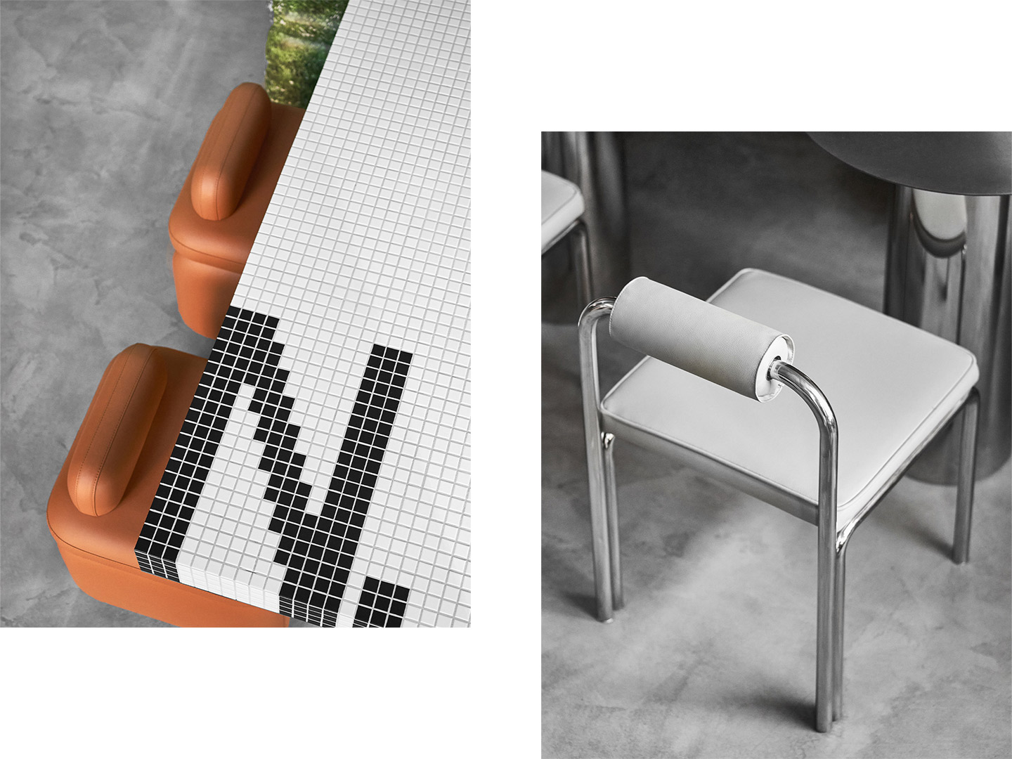
When it comes to dining in, there are three main zones on offer. The central spot is a large communal table, clad in black and white mosaic tiles, paired with flying ‘Alien’ chairs in faux leather. Designed by the architects, the chubby chairs balance a futuristic shape with warm, soft tones. “Some of the ‘Alien’ chairs have a grass print so they became a key point of the space. We saw how in Italian cafes they merge together some incongruous elements – for example, classic wooden boiserie or mosaic with a cheap grass printed tablecloth,” Eduard and Katy explain. “We loved this mix and wanted to bring it into our space.”
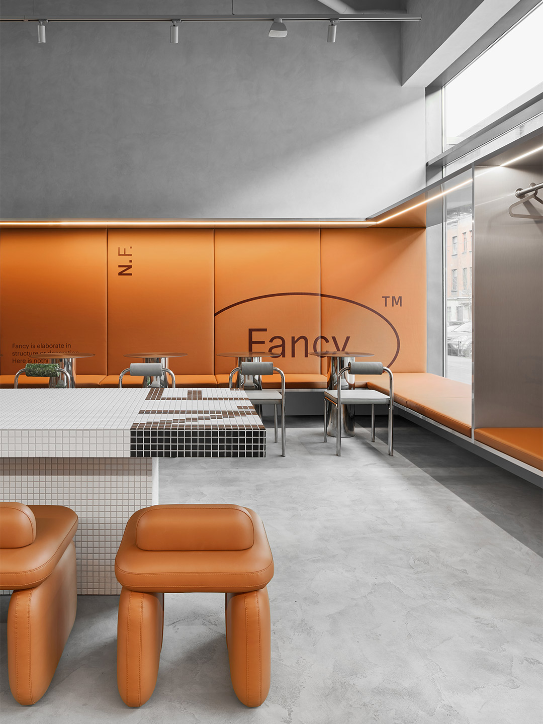
Along the two side walls of the restaurant, large niches frame lengthy banquette seats. One of these showcases a leather bench with wall-mounted stainless-steel tables, providing a perching spot for “fast dining”. The other niche, also with an upholstered bench, is joined by chairs and round stainless-steel tables in a more traditional arrangement. “These pieces repeat the reflective surfaces of the interior [and] its curved shapes,” explain the architects, who created the zone as a place where diners can sit and enjoy the buzz a little longer.
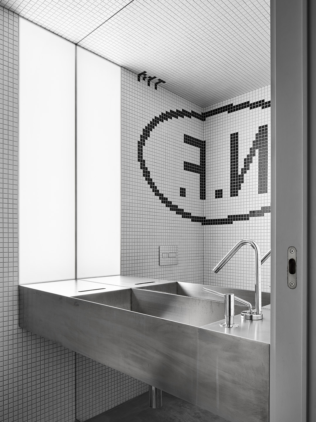
The Nothing Fancy logo is placed “at random” on several surfaces within the diner. Developed by Anton Gorbunov, the founder of local creative agency Liars Collective, the brand identity is printed on the chairs and the leather-lined walls of the niches. In the bathrooms, steel trough-style sinks are partnered with pixelated mosaic logos, mirroring the technique applied to the large share table and ensuring that no guest leaves the premises without knowing where they’ve been.
eduarderemchuk.com; pititskaya.com
“We wanted to create a place where you might come every day, a space for real life.”
Catch up on more architecture, art and design highlights. Plus, subscribe to receive the Daily Architecture News e-letter direct to your inbox.
Related stories
- Introducing the New Wave collection of 80s-inspired vases by Greg Natale.
- Greg Natale launches 70s-inspired glassware (and a signature cocktail for summer).
- Swatch list: Kelly Wearstler curates paint range for Farrow & Ball.
- Stokes 14: Architect William Smart’s creative studio in Sydney.
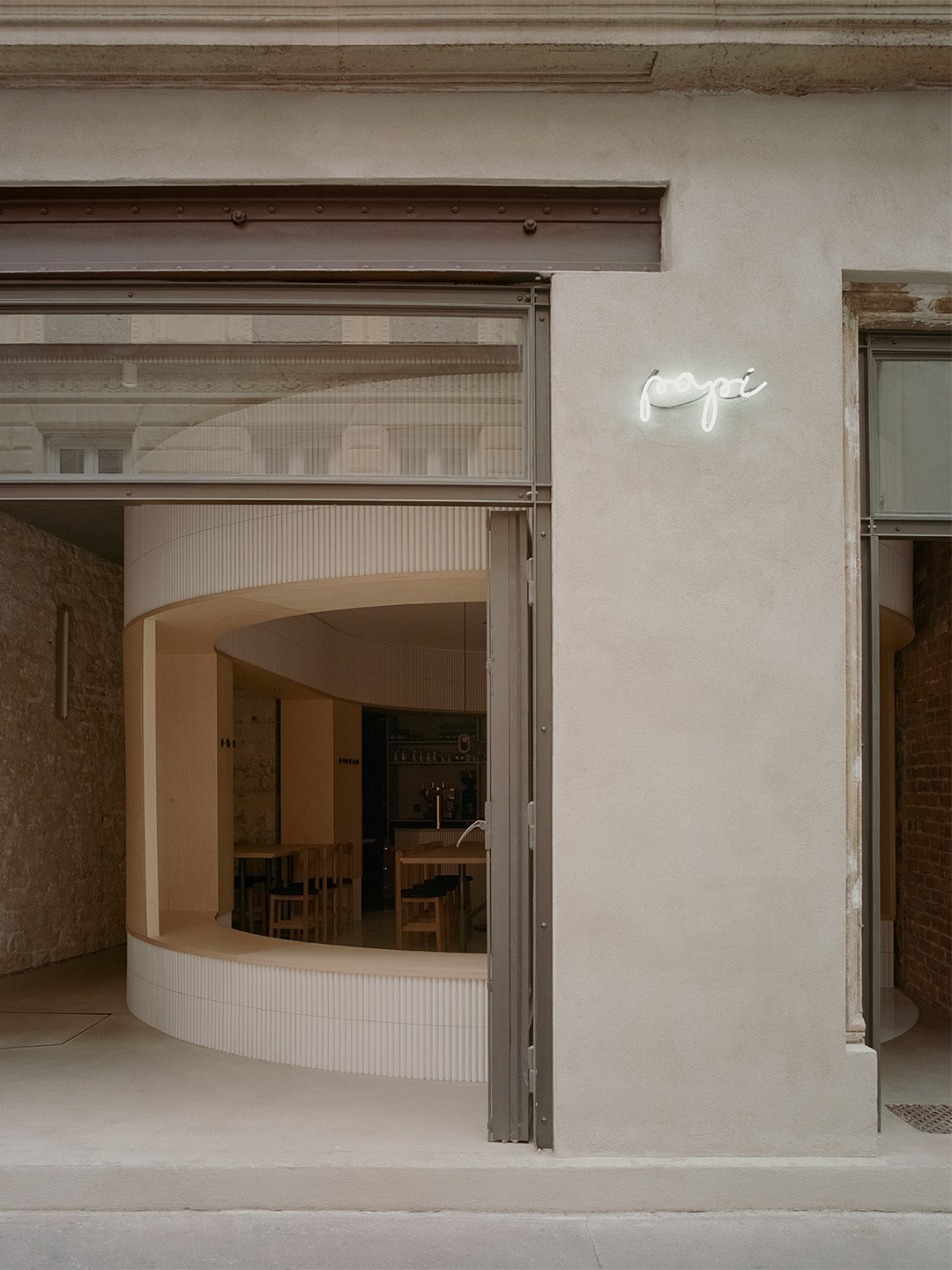
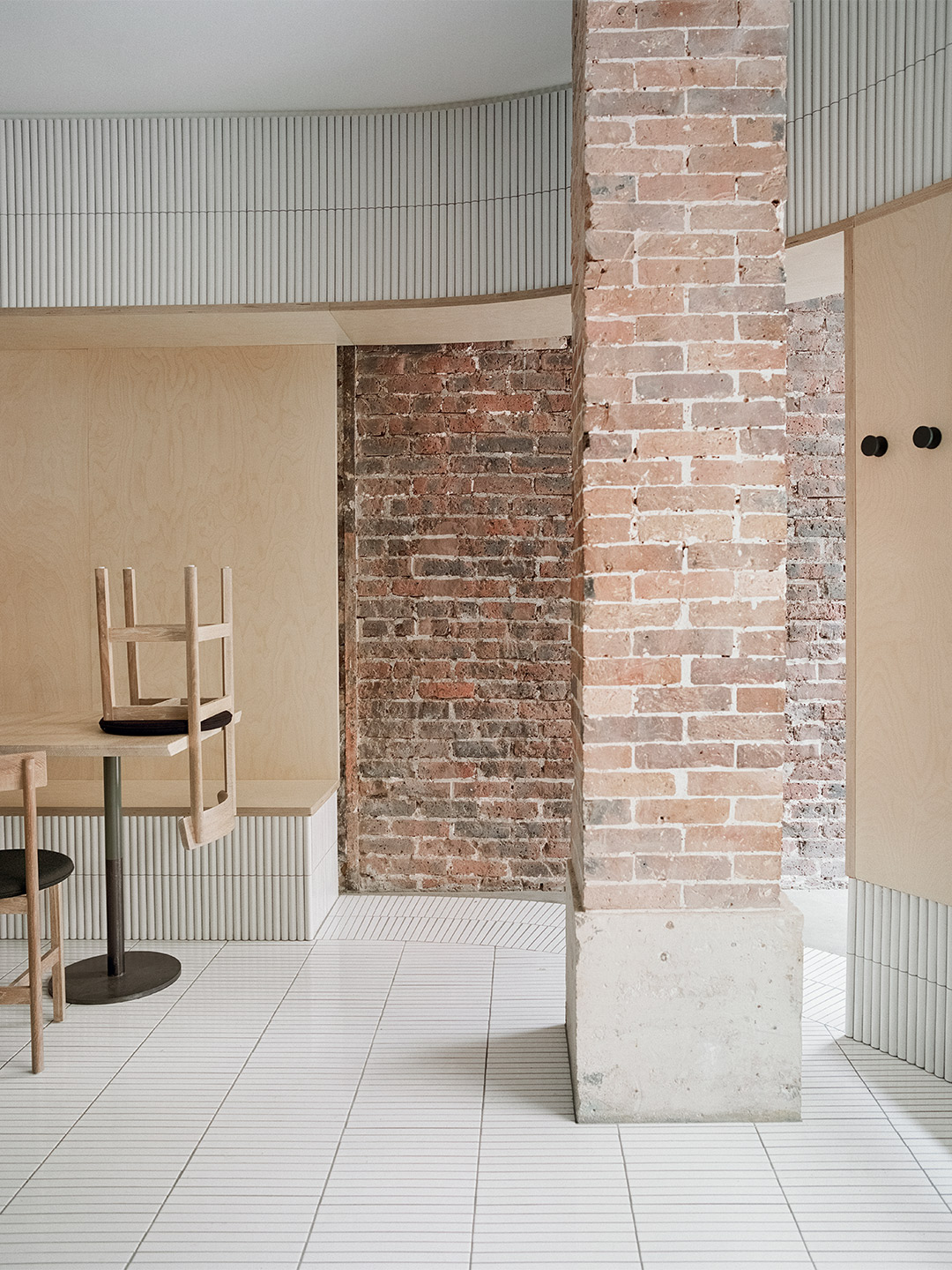
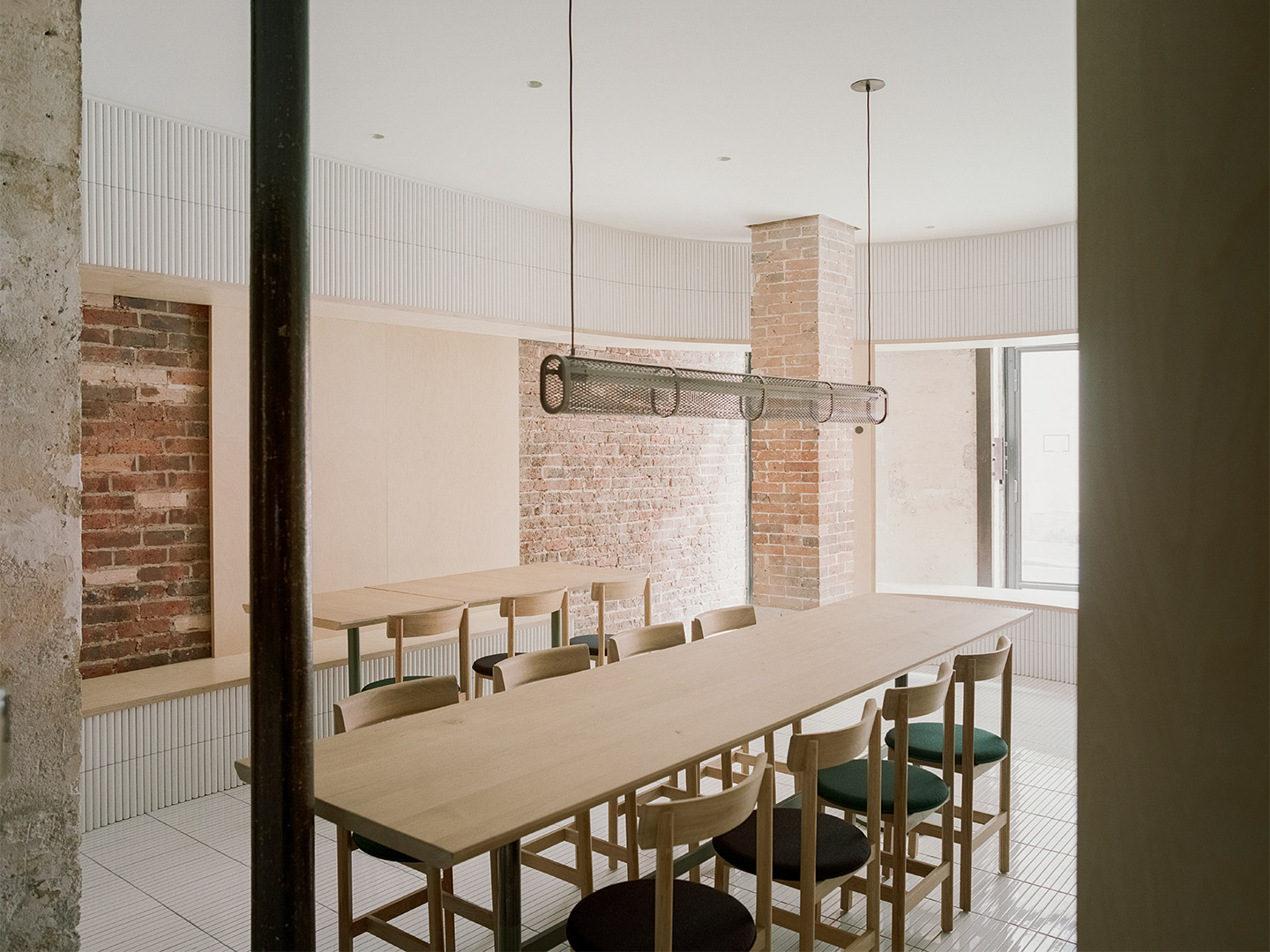
Nestled in the Grands Boulevards district of Paris’ 9th arrondissement, Papi is the latest establishment in the portfolio of emerging restaurateur Etienne Ryckeboer. Following the success of his debut seafood bar, Bulot Bulot, also located in Paris, Etienne once again brought together a dream team of contributors to conceive the restaurant. Shanghai-based architecture office Neri&Hu was tapped to craft Papi’s pared-back interiors, while Japanese culinary wizard, chef Akira Sugiura, was tasked with curating a seasonal menu of modern Italian dishes.
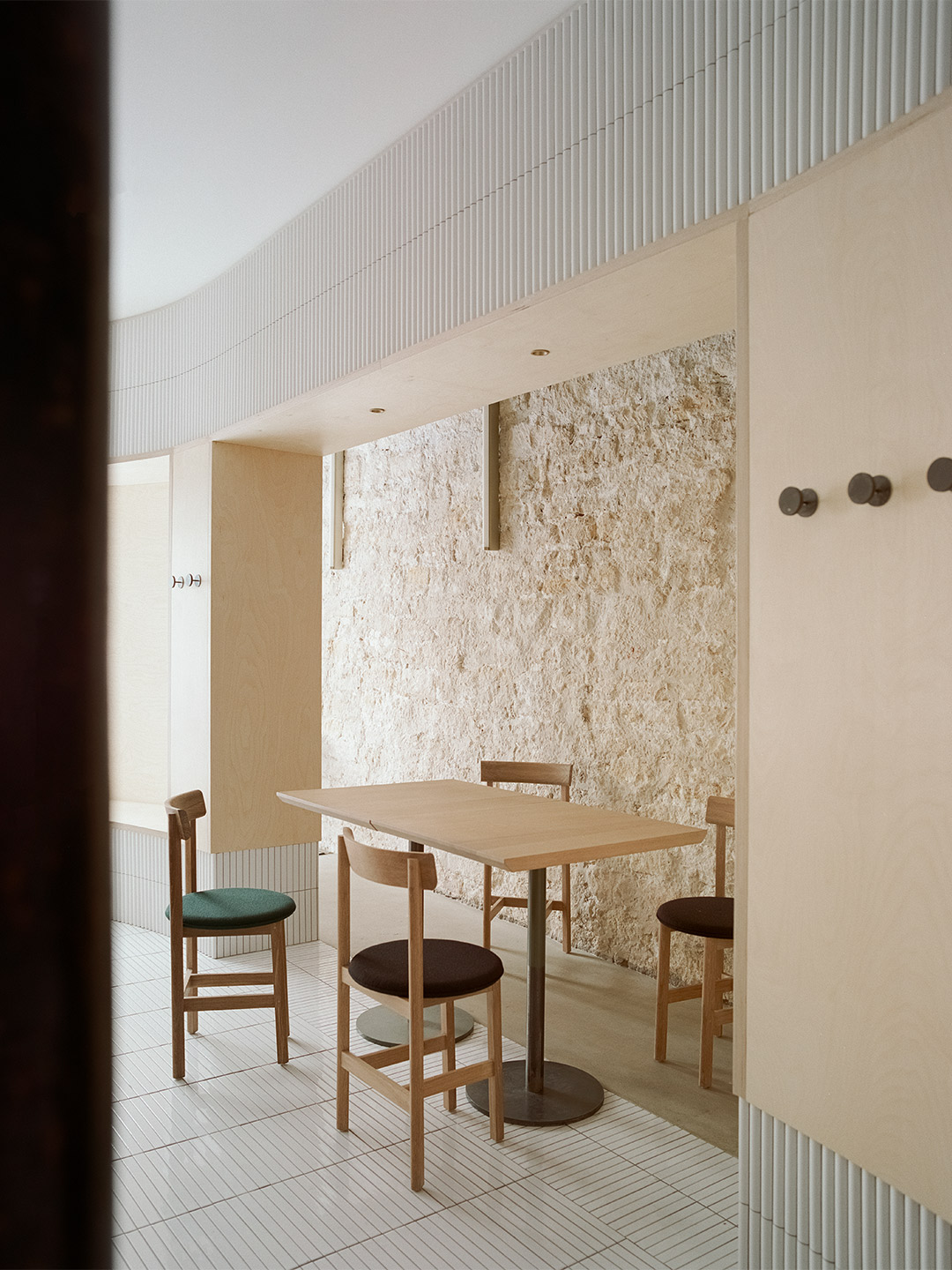
Located on the street level of a typical late 19th-century Haussmann building, Neri&Hu’s design concept for Papi celebrates “the layered material heritage that narrates Parisian history,” explains company founders, Lyndon Neri and Rossana Hu. “During the dismantling phase, the existing site was treated carefully, by stripping back the strata of finishes that have built up through the decades,” they say. This painstaking process revealed the beauty of the bare materials, allowing the architects to meticulously examine every element of the site. “The challenge was in resisting the urge to fix every imperfection,” they suggest, resulting in an approach that aimed to honour the “imprint of time” bestowed upon the surfaces.
Papi restaurant in Paris by Neri&Hu
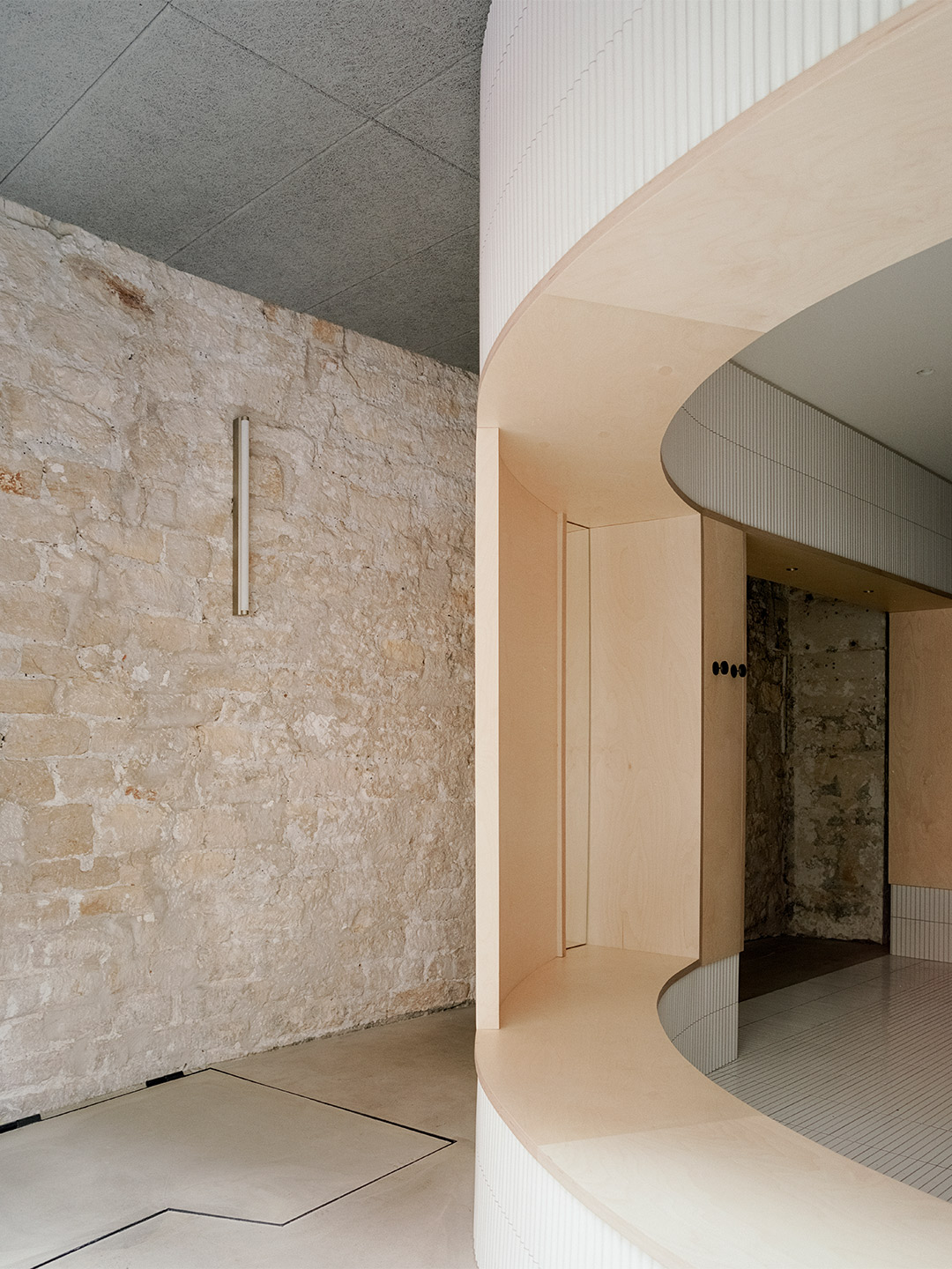
As the many layers were carefully peeled back, each exisiting fragment came to represent a different period in Paris’ history, forming a beautiful canvas on which the architects could add their new strokes. Within the interior, portions of the old limestone and brick walls, a raw steel column and a brick column were preserved and integrated into the restaurant’s design. On the facade, an existing steel beam lintel was given a feature role. A segment of the old stone moulding by the entry has also been left exposed, stitching the facade seamlessly to the neighbouring building.
Since it’s now fully openable to the fresh air, the new raw-steel-framed glass facade maintains a visual continuity between the street and the venue. “[It] effectively extends the public realm into the interior,” the architects explain. As guests enter the restaurant through the main door, they’re exposed to the clash of juxtaposing materials, both old and new, that now tell a story of sophistication. Mirrors are placed strategically to create dynamic perspectives and “voyeuristic moments” between indoors and out, inviting guests into cross gazes. The spatial and material strategies deployed create a layered reading against the historical backdrop, offering diners a variety of experiences to explore – “moments of both public introversion and private extroversion,” Lyndon and Rosanna suggest.
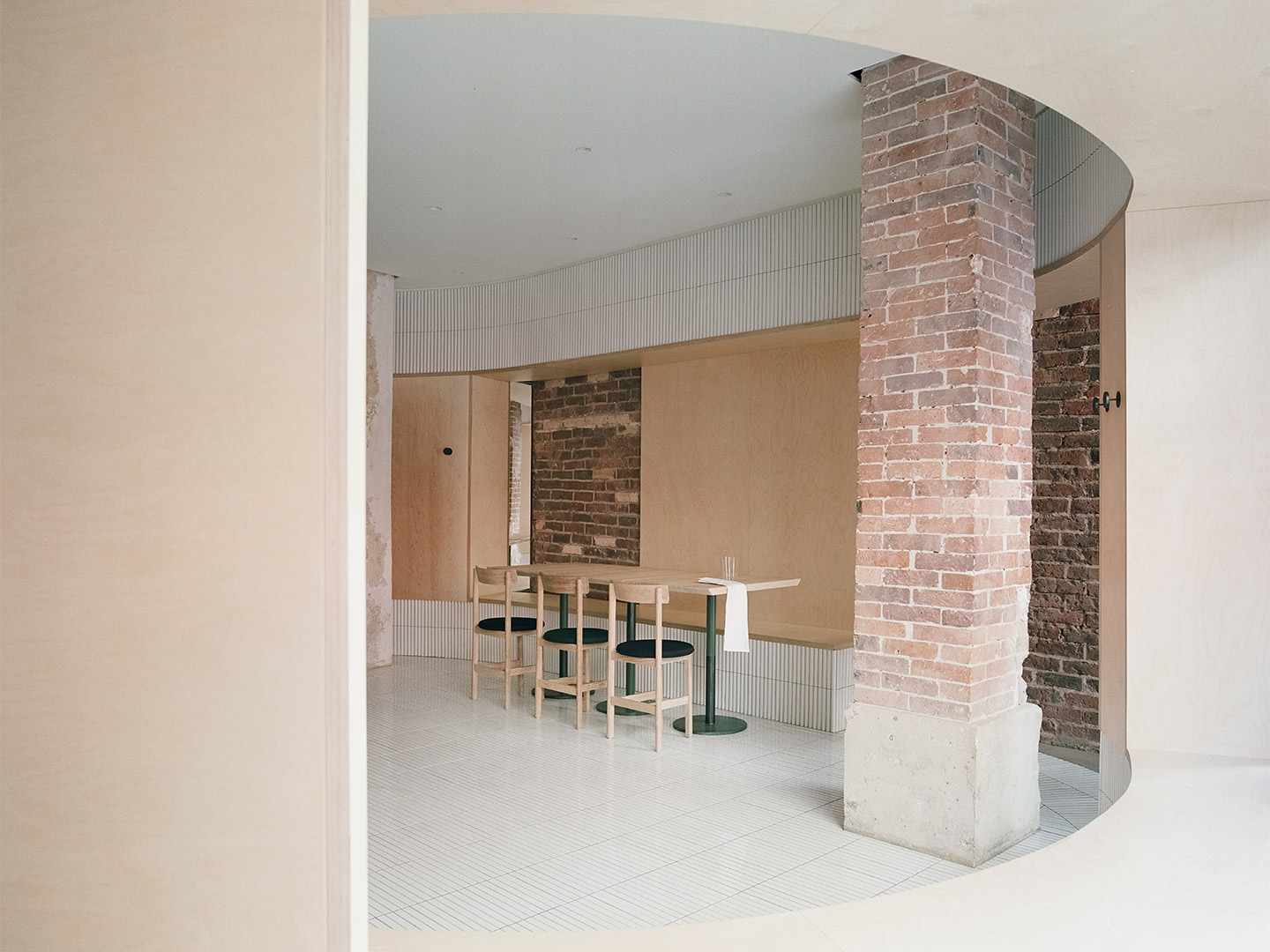
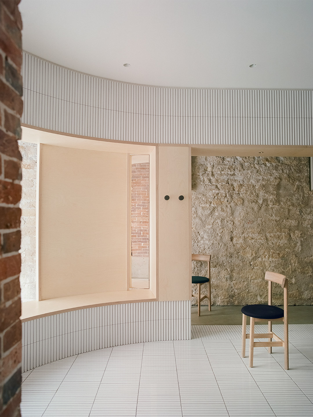
Despite the compact site, measuring in at just 52 square meters of usable area, Neri&Hu has introduced two independent shelters that sit within the existing shell, further enhancing the contrast between old and new. There’s an oblong volume forming an “arena-like” enclosure that integrates all the restaurant’s functional needs: seating, display, chef’s preparation space and privacy. Then there’s a seperate circle-shaped structure that contains the wood-fuelled oven. Clad in handmade convex-curved white ceramic tiles, the largest enclosure features broad openings framed with thick birch plywood that double as extra bench seating.
Upon entering the main arena, where the floor is adorned with narrow white ceramic tiles, Papi’s diners are instantly likened by the architects to “performers” on a stage. “[Guests at] the central communal table are illuminated by a long custom pendant light, while a series of lights by Viabizzuno create a stark modern contrast,” they explain. But whether diners are thought to be “performing” or perhaps spectating (imbibing, dining…) they’re kept comfortable on timber and fabric chairs from De La Espada, designed by Neri&Hu specifically to fit Papi’s limited footprint and delectably restrained aesthetic.
Upon entering the main arena, where the floor is adorned with white ceramic tiles, diners are instantly likened by the architects to “performers” on a stage.

Catch up on more architecture, art and design highlights. Plus, subscribe to receive the Daily Architecture News e-letter direct to your inbox.
Related stories
- Venus Power collection of rugs by Patricia Urquiola for cc-tapis.
- Bitossi celebrates centenary in Florence with new museum and 7000-piece display.
- Casa R+1 residence in southern Spain by Puntofilipino.
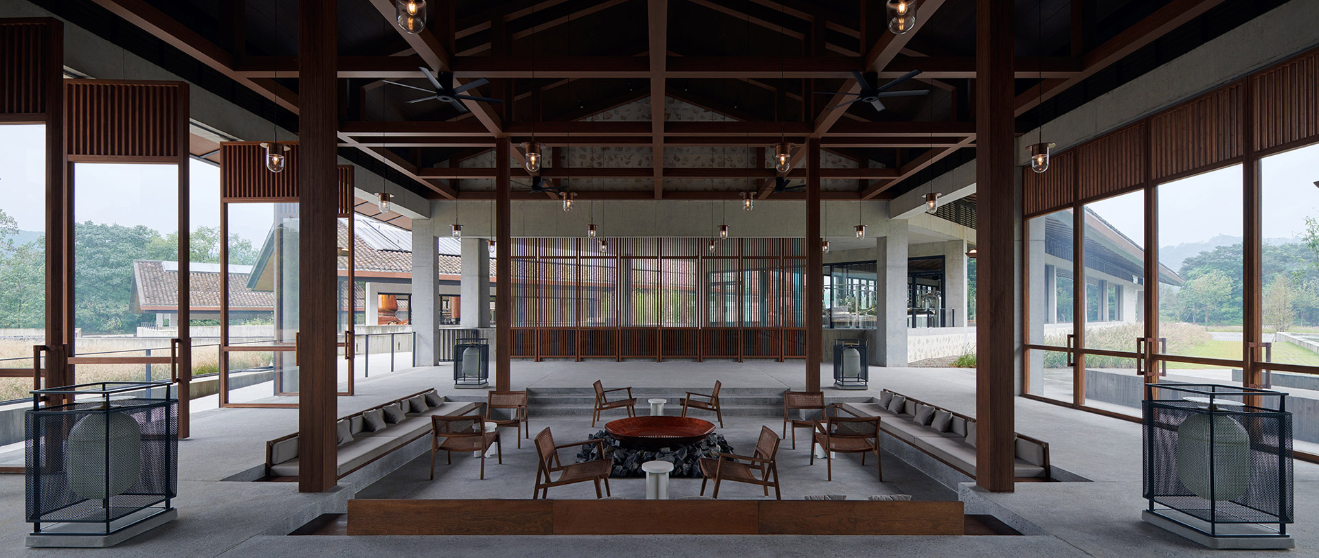
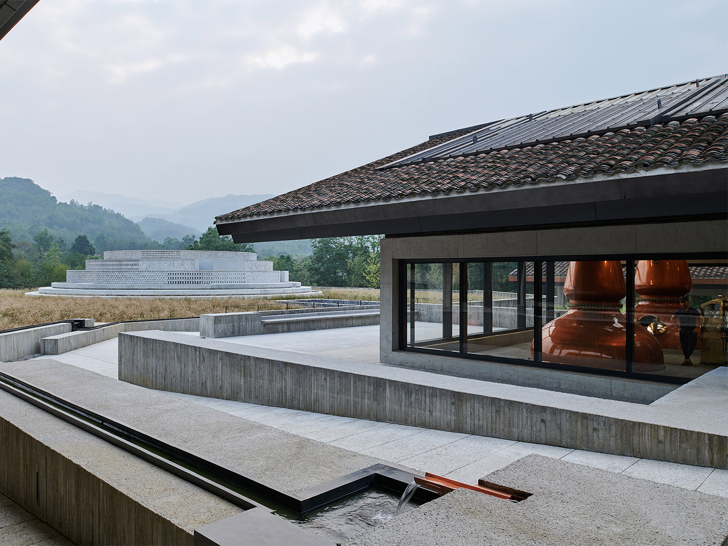
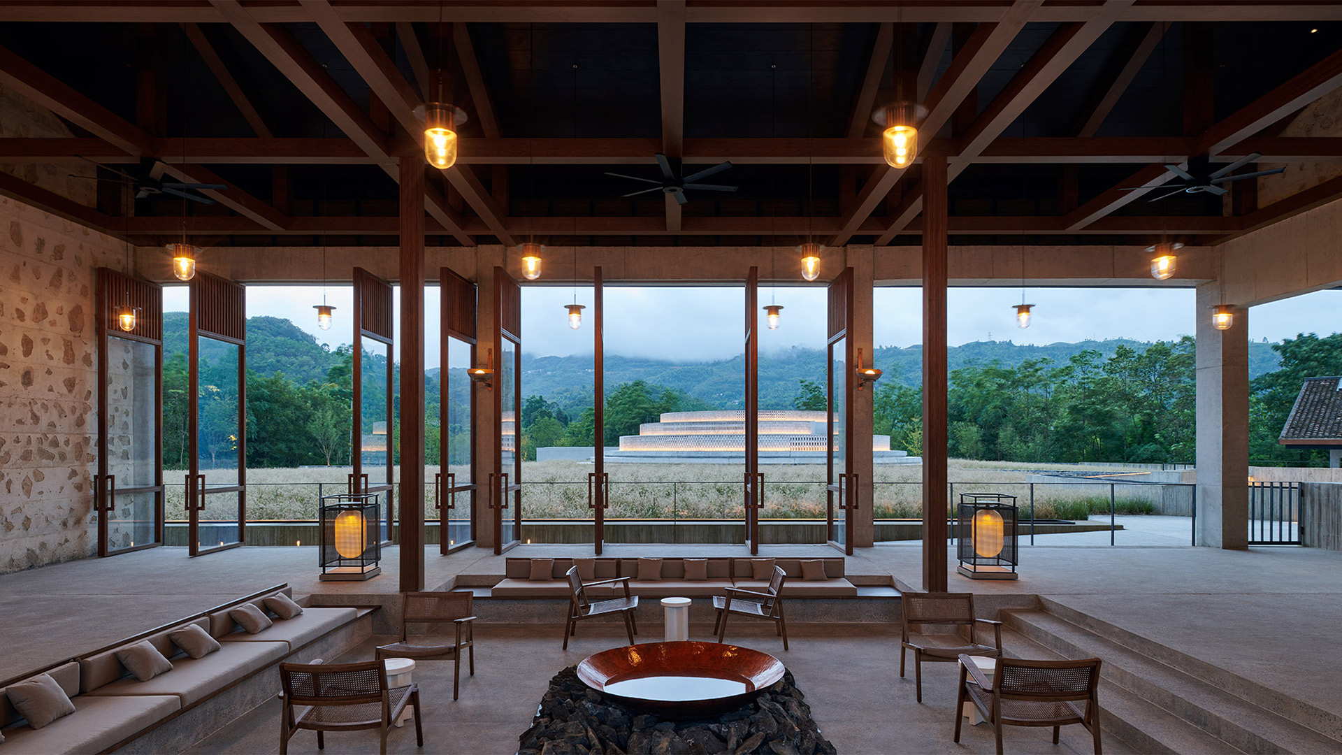
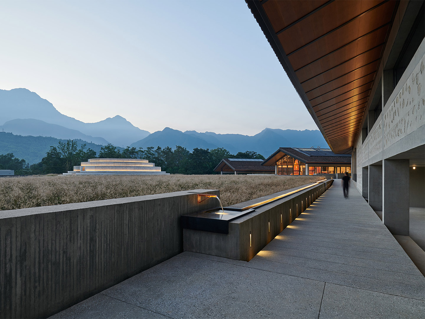
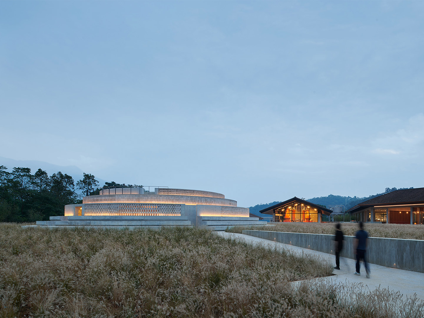
Three years ago, Shanghai-based architecture firm Neri&Hu won the competition to design the distillery and home-base for Pernod Ricard’s first malt whiskey venture in China. Named The Chuan, the facility has this month opened to the public. From the very beginning, the project for the French wine and spirits seller – the second largest company of its kind in the world – represented an opportunity to create something “timeless,” explain Neri&Hu’s founding architects, Lyndon Neri and Rossana Hu. “Something that speaks to the core values of a visionary new brand, as well as the material and cultural heritage it aspires to sustain.”
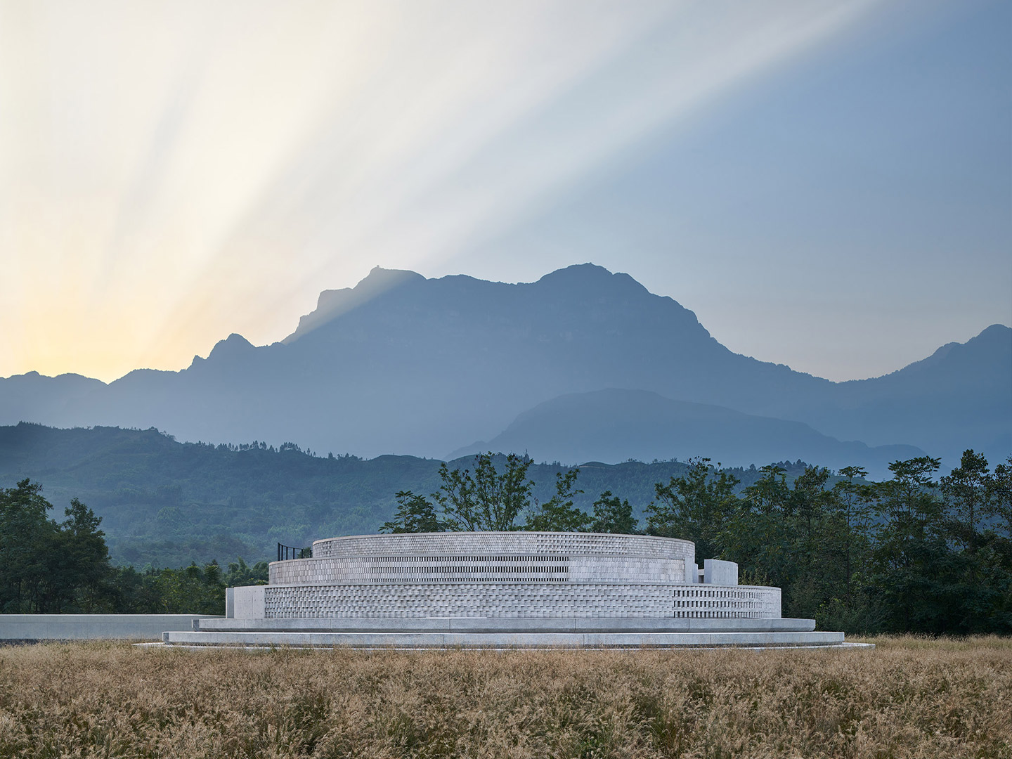
Located in the Emeishan region of China’s Sichuan Province, in the country’s south-west, the revered ground upon which The Chuan now sits was a natural source of inspiration for the building’s design. For more than a thousand years, the nearby Mount Emei has persisted as one of the most deeply spiritual places in China, leading to its classification as a UNESCO World Heritage Site. Closer to home, the project site was once an impressive monastery. It was also the location of several historic battles, and has acted as a stopping point for merchants travelling along the region’s ancient trade routes. While no built remnants of the past remain on-site, “its very emptiness is powerfully suggestive of all of its fabled memories,” the Neri&Hu team insist.
Neri&Hu unveils The Chuan Malt Whiskey Distillery in China
Surrounded on three sides by a meandering creek, and with the 3099-metre peak of Emei as its magnificent backdrop, the location for the distillery is an exemplification of the Chinese notion Shan-shui (literally translating to ‘mountain-water’). Representing the duality of natural elements that make up the world we live in, shan suggests strength and permanence, while shui means fluidity and transformation. “They are two opposing yet complementary forces,” Lyndon and Rossana explain.
In the spirit of this philosophy, the architects aimed to strike a balance between architecture and landscape, industry and visitor experience, and mountain and water. The strength of Neri&Hu’s architectural response lies in its humbleness and simplicity, exampled by the way the distillery’s industrial buildings have become a modern interpretation of vernacular Chinese architecture. And how the visitor experience buildings appear as elemental geometries grounded in the terrain.
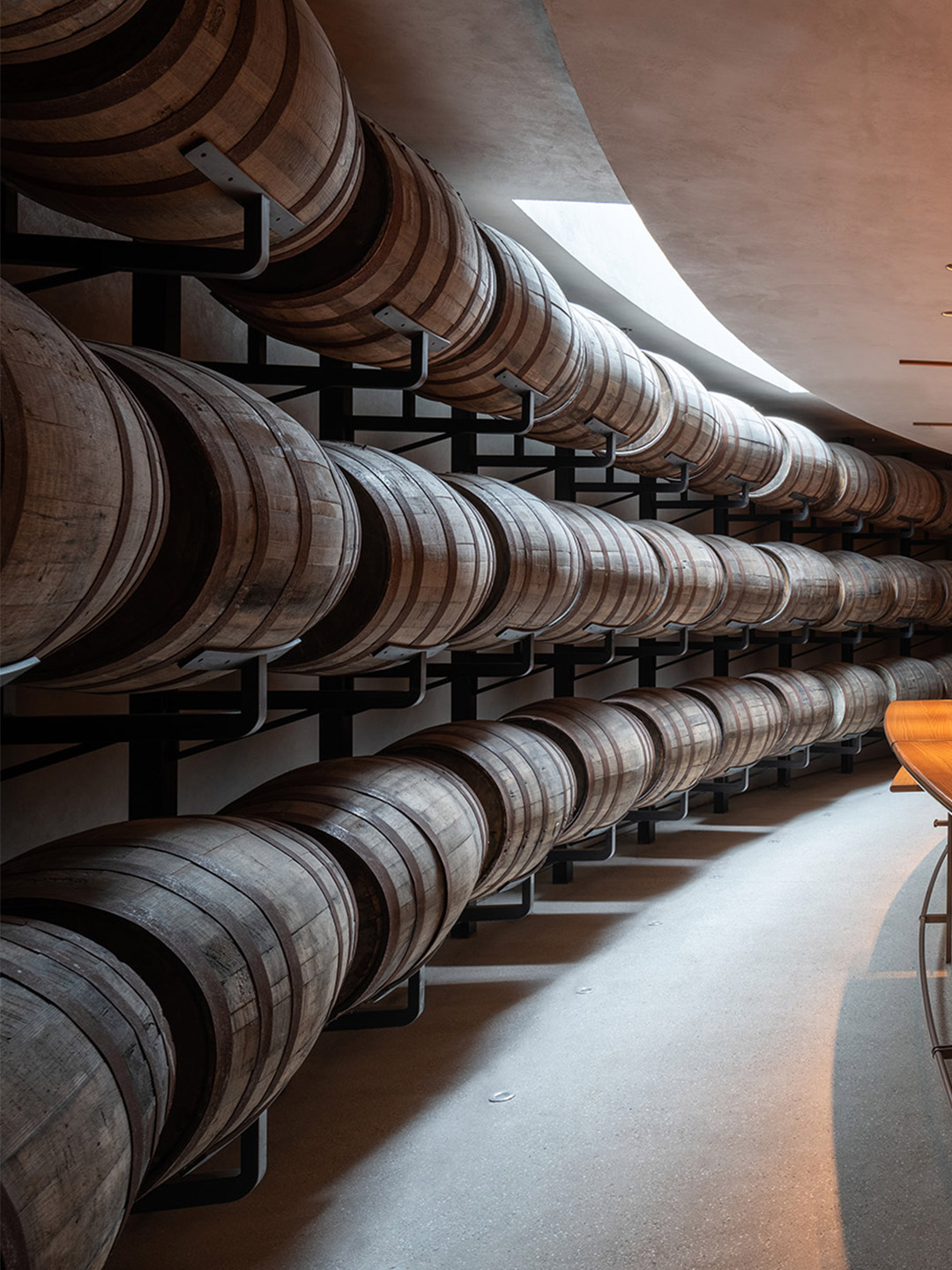
The industrial component, emerging on the north side of the site, consists of three long buildings that contain the whiskey production facilities. Parallel in formation, they are tucked into the gentle slope of the land with gradually descending rooflines. Salvaged clay tiles give them their familiar appearance, as do the pitched roof shapes that rest upon a modern concrete post-and-beam structure. The infill of rock walls is made from the very boulders extracted from the ground during site excavation, “so that the cycle of destruction and recreation may continue in permanent evolution,” the architects say.
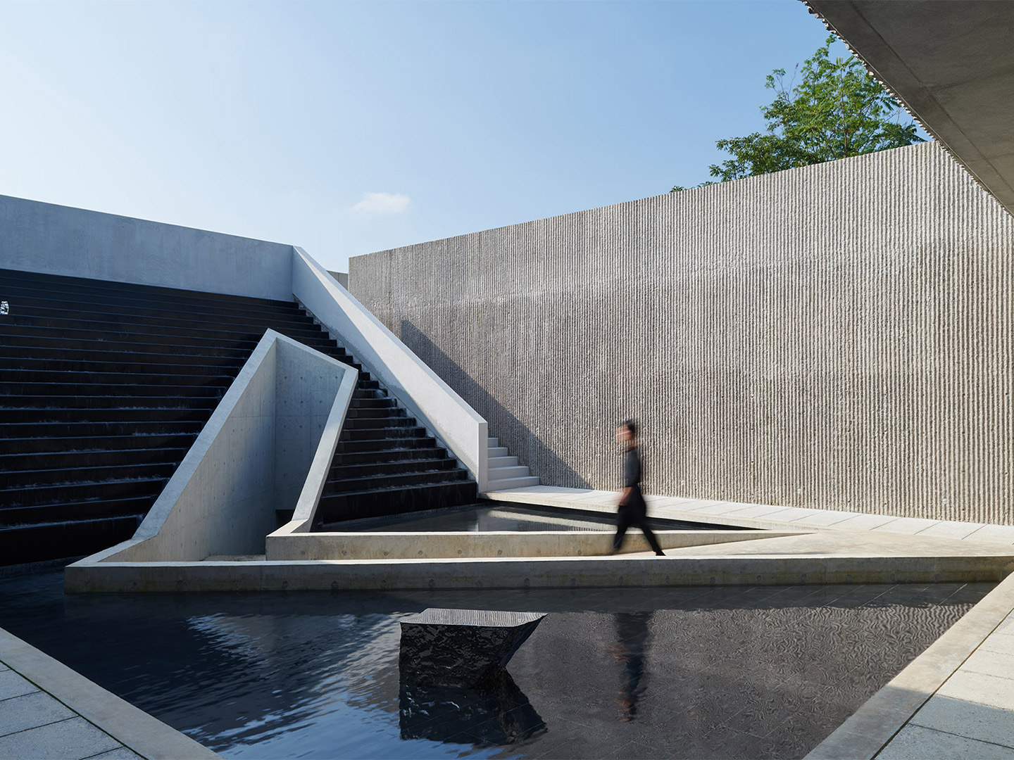
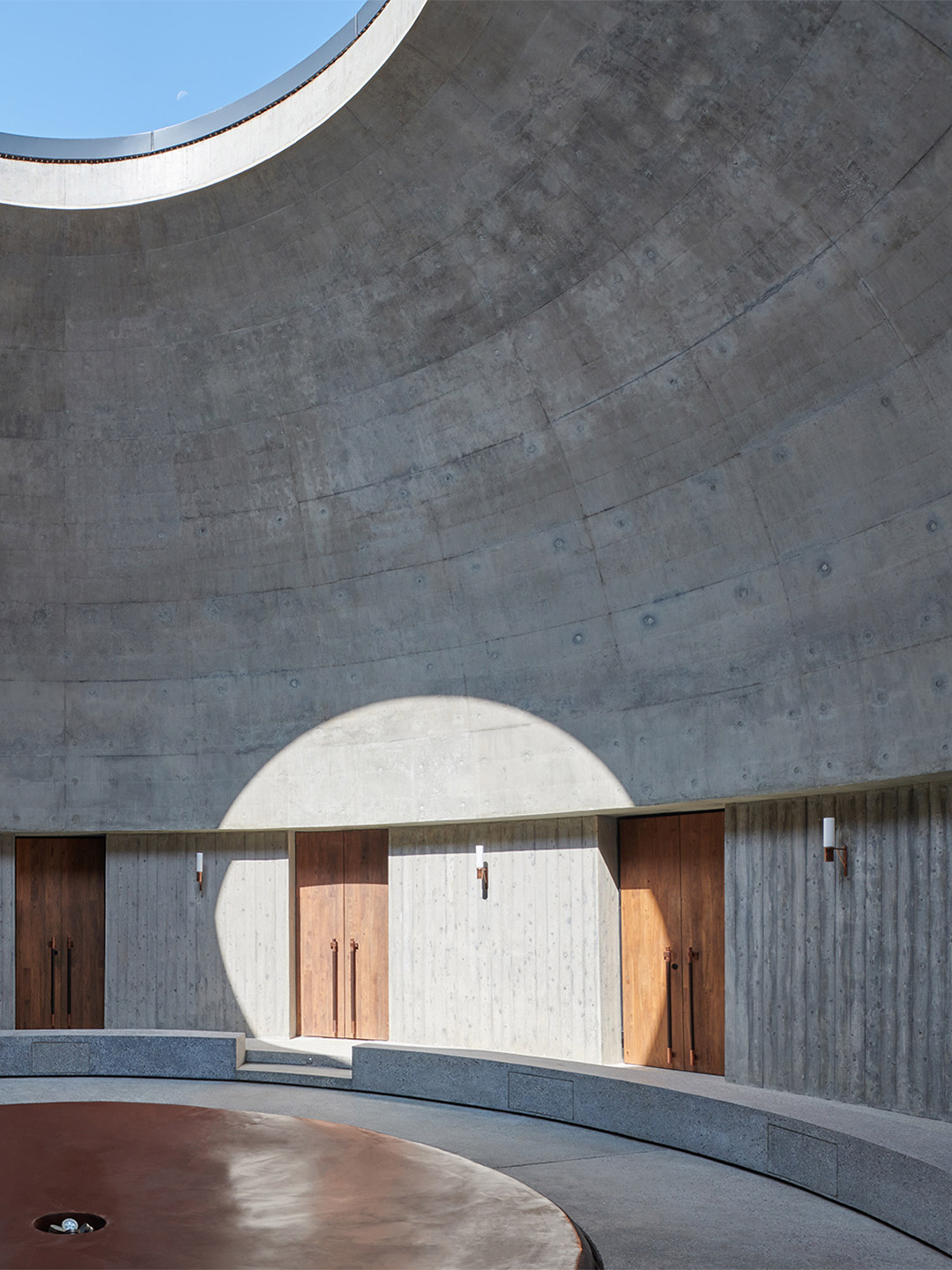
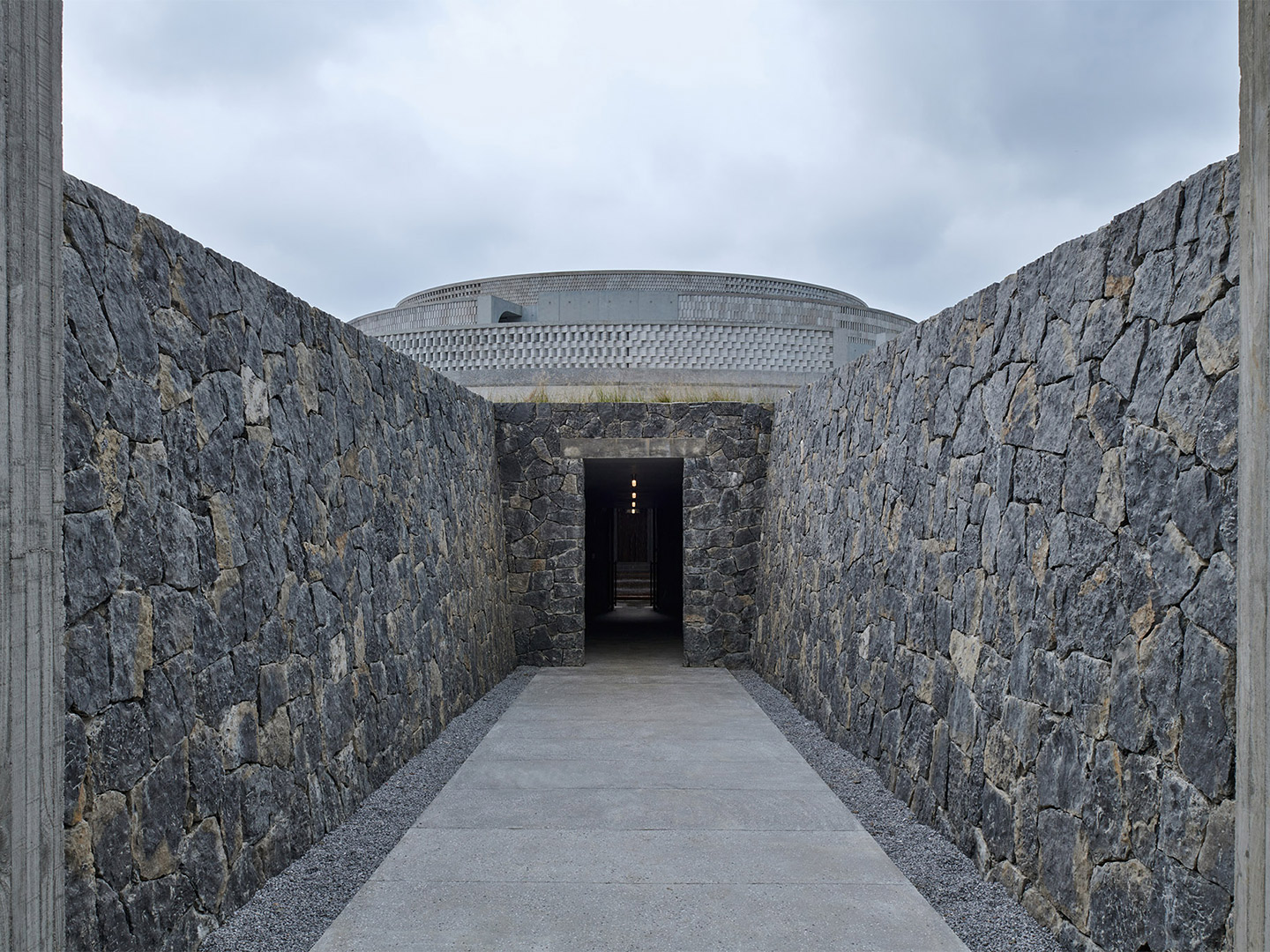
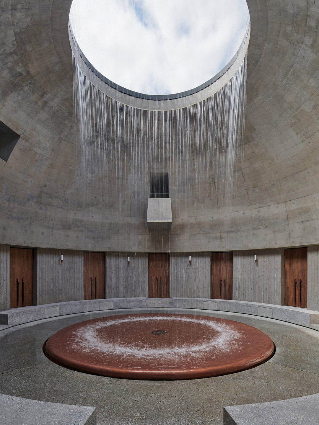
In contrast to the vernacular roots of the industrial buildings, the two visitor experience buildings are built upon fundamental geometries, namely the circle and the square. In Chinese philosophy, these shapes represent heaven and earth, respectively. The round “tasting experience” building is partially submerged in the ground, with five subterranean tasting rooms surrounding a domed courtyard that contains a cascading water feature in the middle. The upper part of the dome reveals itself above the ground slightly; its three concentric brick rings subtly mirroring the silhouette of Mount Emei in the distance.
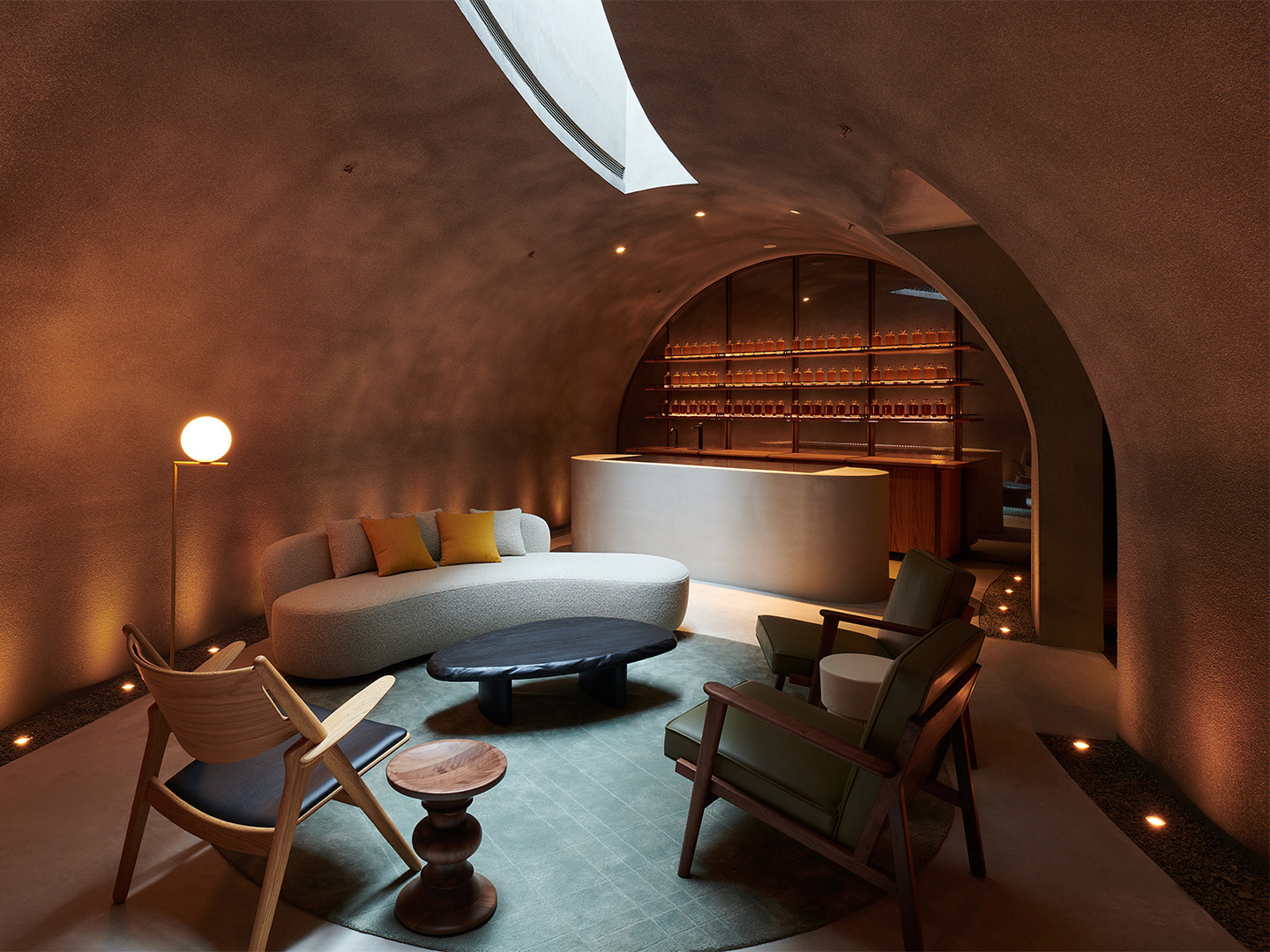
This sculptural landform has become a powerful presence that can be seen from every part of the site. On the flip side, it also acts as a gathering point for visitors from which they can look out and enjoy panoramic views. The square-shaped restaurant and bar building is located further down the topography, cantilevered on two sides with one corner hovering over the river bank. While the dining space is organised along the building’s perimeter to take advantage of expansive views, at its core an open-air courtyard is oriented to frame the Emei peak.
A variety of concrete, cement and stone mixtures form the base material palette of the distillery, “finding resonance in the strong mineral presence of the site,” say the architects. But besides this deep appreciation for the location’s natural charms, the project also embodies the refined sense of artistry embedded in whiskey making and blending. Accent finishes are drawn from those used in whiskey craft, such as the copper distillation pots and aged oak casks, which is in dialogue with traditional Chinese craftsmanship and knowledge of materials.
Besides a deep appreciation for the site’s natural charms, the project also embodies the refined sense of artistry embedded in whiskey making and blending.
Catch up on more architecture, art and design highlights. Plus, subscribe to receive the Daily Architecture News e-letter direct to your inbox.
Related stories
- Venus Power collection of rugs by Patricia Urquiola for cc-tapis.
- Bitossi celebrates centenary in Florence with new museum and 7000-piece display.
- Casa R+1 residence in southern Spain by Puntofilipino.
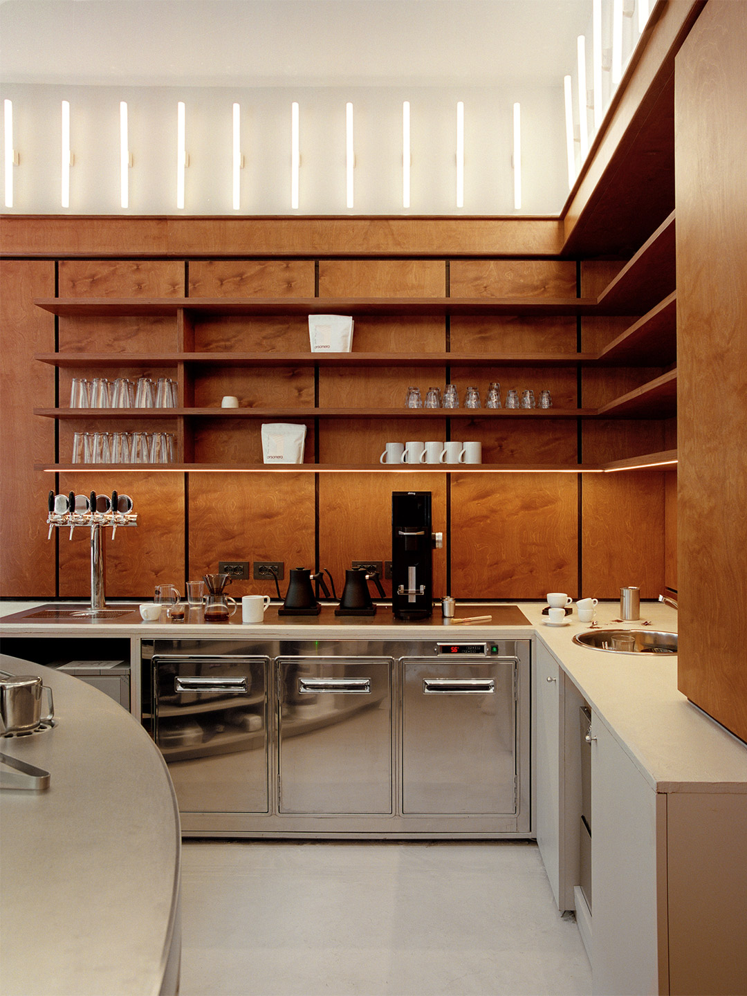
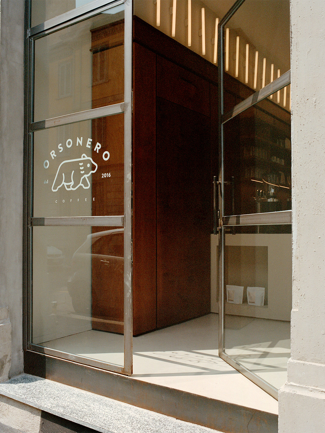
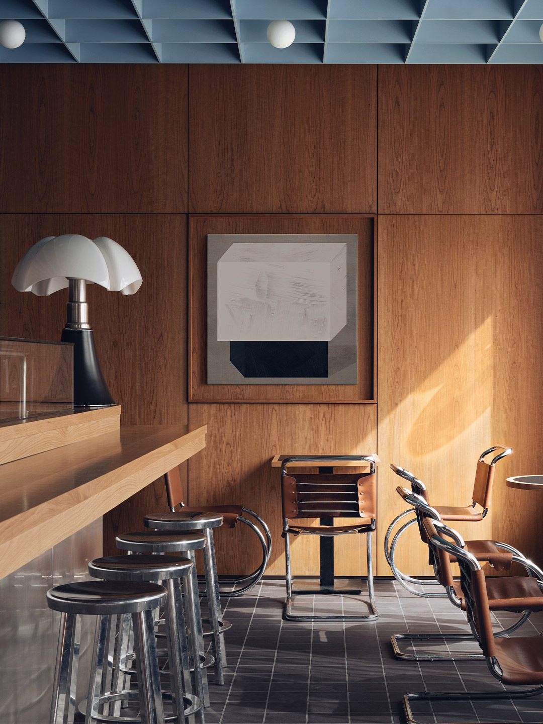
Inspired by the energy of London’s small food markets, META is a new culinary concept in Milan, spearheaded by the “twenty-something entrepreneurs” Ludovico Leopardi and Leo Schieppati. Just like its name, a portmanteau of the words ‘merging’ and ‘taste’, META sees the joining together of five temporary food outlets under the one roof. Cuisine-lovers who step inside META this month will discover the street-food restaurant (named Uovodiseppia) by Michelin Star chef Pino Cuttaia; the Young Rice diner, whose mission is to cook rice in innovative ways; an experimental food outlet, called Rare, where cooking methods include infrared technology; the Gusto 17 ice-cream shop; and Orsonero Coffee – one of Milan’s most popular espresso shops.
Located at Via Bonvesin de la Riva in Milan’s Zona Risorgimento, META features eight street-facing windows. It’s an outlook that was made famous by the old restaurant of master-chef Gualtiero Marchesi, who is credited for transforming the peninsula’s cuisine and training some of Italy’s best chefs. Inside the building, META’s open space is overlooked by the kitchens of the restaurants and accompanied by the retail room that houses Orsonero Coffee.
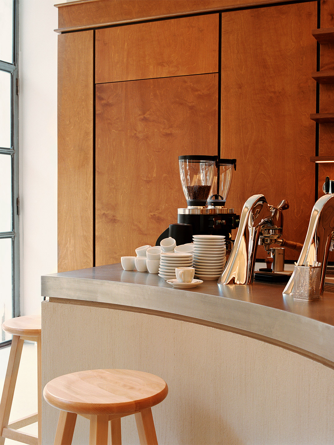
Orsonero Coffee at META in Milan by David/Nicolas
Zooming in on Orsonero, the interiors of the coffee spot were imagined by Beirut-based firm David/Nicolas, made up of design duo David Raffoul and Nicolas Moussallem. The award-winning team has created a vibrant atmosphere that plays up the contrast between the dark timber panelling and the neon batons on the walls, together exuding an overall sense of warmth.
The bustling space is made even more dynamic by the sweeping lines of the cafe’s service counter. Crowned by a thick polished-steel top, the counter lures in customers on the hunt for their daily brew. They gather in close to the glimmering espresso machines that are signed by high-end Italian manufacturer La Marzocco.
A cult-status coffee shop in Milan thanks to its many alternative extraction methods, Orsonero Coffee is managed by Canadian barista Brent Jopson. He’s a pioneer of Milan’s “Third Wave” coffee movement and, together with his team, offers customers specialty coffees as well as viennoiseries by day. Of an evening, the cafe shifts to serving aperitivo, including craft beers sourced from local micro-breweries.
But the innovations presented by Orsonero and META at-large aren’t just about the bricks-and-mortar retail format. The new-age food court is joined by a high-tech delivery platform, accessible via both app and web-browser, enabling users to place a single order from different outlets in one go. The delivery service relies on electric scooters, zero-impact packaging and cutting-edge sustainable practices, positioning META as a one-of-a-kind food collective that’s on a mission to reshape Milan’s culinary scene.
davidandnicolas.com; tastemeta.com
Crowned by a thick polished-steel top, the counter lures in customers on the hunt for their daily brew.

Catch up on more architecture, art and design highlights. Plus, subscribe to receive the Daily Architecture News e-letter direct to your inbox.
Related stories
- Venus Power collection of rugs by Patricia Urquiola for cc-tapis.
- Bitossi celebrates centenary in Florence with new museum and 7000-piece display.
- Casa R+1 residence in southern Spain by Puntofilipino.
Named after the street it occupies, the Saint-André des Arts Hotel in Paris lies directly in the heart of Saint-Germain-des-Prés, a short stroll from the historic Procope restaurant. Once the favoured haunt of brooding artists and musicians, especially during the swinging sixties, the completely rejuvenated hotel is the latest gem in the Hôtels Paris Rive Gauche collection, ready and awaiting a new generation of movers and shakers.
Stepping off the street and passing through the hotel’s original solid-oak entrance doors, guests arrive in a lobby area seemingly preserved through time. Tunes from another era fill the space, resonating from a small record player in the corner. But an emerald-coloured lacquered rattan reception desk offers a glimpse of what’s to come – a daring arrangement of 1960s and ’70s-inspired furniture and fittings, sourced and imagined for the hotel by French designer Chloé Nègre.


Saint-André des Arts Hotel by Studio Chloé Nègre
From there on in, the interiors of Saint-André are a playground for cheerful curves, bold colour and enchanting patterns. Flower-shaped mirrors and table-stands join carefully sculpted timber detailing. Vibrant swirling carpets are illuminated by bulbous lamps decorated with lace-like fabrics. And the bedheads upstairs make a statement in a confident mix of colour gradients and materials.
Here and there, vintage furniture pieces are combined with custom makes. And modern classics make an appearance, too. Including examples by iconic designers from the late 1960s, such as Verner Panton’s ‘Fun’ ceiling and wall lights; Vico Magistretti’s ‘Eclisse’ lamp by Artemide; Henry Massonet’s ‘Tam Tam’ stools; and Anna Castelli Ferrieri’s ‘Componibili’ bedside tables by Kartell, each finished with a burr walnut top.
On the ground floor, to the right of the reception, the intimate salon features retro burgundy and beige floor tiles that immediately set the tone. Four custom armchairs in citrus yellow fabric, a wall-seat in burgundy velvet and a psychedelic 1960s-style mirror immerses guests in the hotel’s new mood. An ambience which the hotel staff describe as feeling “a little pop, a little bohemian, slightly daring but totally timeless”.


To the left is the bar with its celadon green ceramic wall tiles, earmarked by the hotel staff as “the perfect place to relax, delicately hidden from the street by netting on the windows”. Green velvet and leather wall-seats provide the space with a visual accent. As do the bespoke timber chairs that are placed around walnut-topped tables with “flower power” feet – a signature flourish of Chloé’s Paris-based studio.
The centrepiece of the room is a round rattan table (another custom piece by Chloé) that allows guests to share a moment together, seated in the vintage wooden chairs that accompany it. The large yellow tabletop echoes the velvet of the armchairs in the room next door. “This is the perfect place to enjoy breakfast,” the team insist. Towards the back of the room, the granite bar adds elegance to the space, which feels bright yet intimate during the day. In the evening, it offers the ideal hideaway for sipping a pre-dinner cocktail or a nightcap nearer to midnight.
The elevator, decorated with fabric representing artist Jean Cocteau’s work Le Dormeur, is responsible for transporting guests to the hotel’s 28 rooms, spread over four floors. A mezzanine wing offers two additional rooms bringing the total to 30 rooms. Several of these have an extra sofa bed, others interconnect, but “both [types] are perfect for family stays,” the hotel staff say. Room sizes range from a petite 14 square metres to about 29 square metres in the Prestige suites, costing from €179 (A$280) to €710 ($A1115) per night.


While each room at Saint-André has a unique layout (“this is a venerable building with a very Parisian feel,” the team say), each floor offers a different chromatic interpretation of the 1960s and ’70s. The curtains are the surprise stars of the rooms, featuring dreamy colours and alluring patterns that create an overall feeling of harmony. On the third floor, for example, Jim Thompson’s Melusine landscape (on fabric from Pierre Frey) sets the bar high for a joyful material palette to follow.
“You’ll love the original vaulted stone ceilings and zesty colours that give the space its energy,” the hotel team tell their guests. And whether your room has a view of the street and the rooftops of Paris or is one of those nestled under the eaves, both of which are part of the hotel’s resolutely Parisian charm, the team insist that each room is a “new encounter between colour and light, the present and the past”.
From the in-house spa to the charming lodgings, “everything at Saint-André has been designed to revitalise guests, far from the effervescence of the city,” the team say of the hotel’s foundations, now poised to witness a new chapter. A future backdropped by iconic design, glorious colour and the inimitable stylings of Chloé which the hotel staff predict will come with a few surprises. “Expect classics with a twist, touches of humour, arty objects… and a little craziness.”
chloenegre.com; saintandredesarts.com


Once the favoured haunt of brooding artists and musicians, especially during the swinging sixties, the completely rejuvenated hotel is the latest gem in the Hôtels Paris Rive Gauche collection.


Catch up on more architecture, art and design highlights. Plus, subscribe to receive the Daily Architecture News e-letter direct to your inbox.
Related stories
- Venus Power collection of rugs by Patricia Urquiola for cc-tapis.
- Bitossi celebrates centenary in Florence with new museum and 7000-piece display.
- Casa R+1 residence in southern Spain by Puntofilipino.
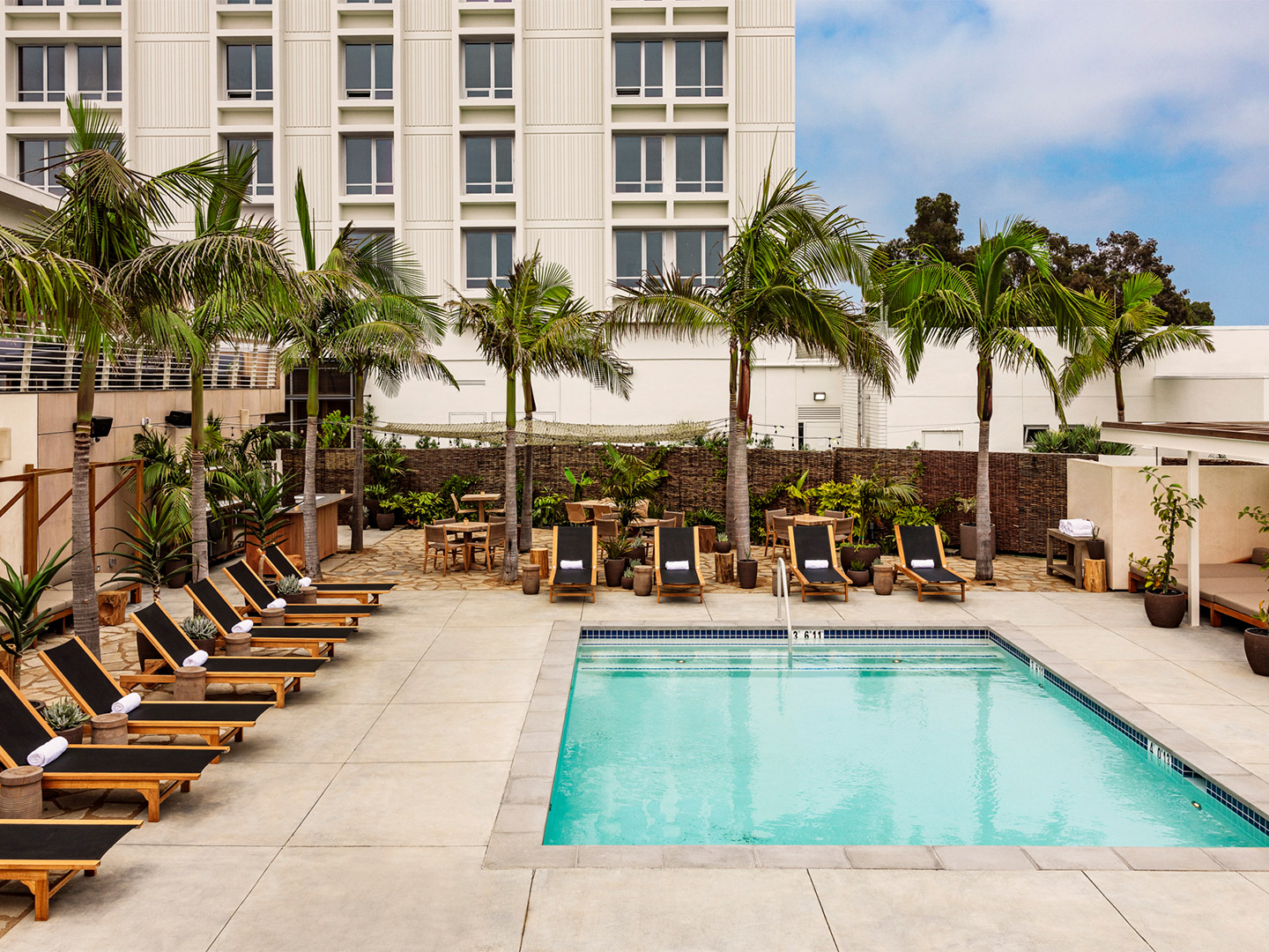
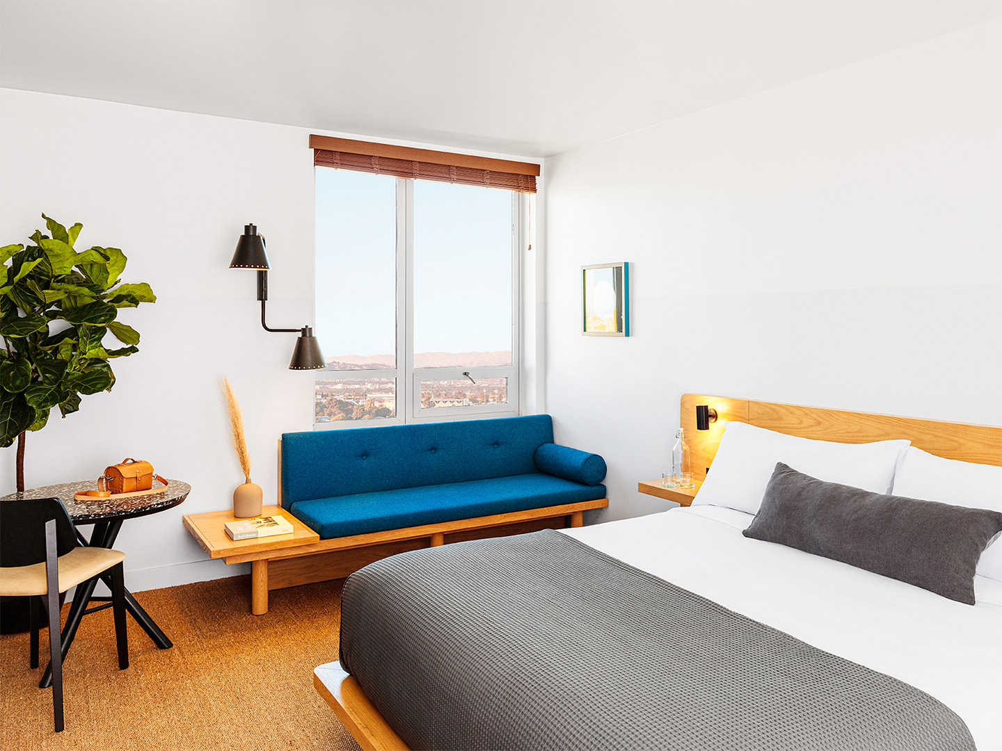
Lay back and think of California, and the vision might just be soundtracked by a number of songs. From 2Pac’s California Love and the aptly titled California Dreaming by The Mamas & The Papas. To the 1960s Beach Boys hit California Girls and the similarly titled California Gurls by Katy Perry. The lyrics and unforgettable melodies of these songs bring the Golden State to life as North America’s Daisy Duke-wearing playground; a palm-studded paradise where sun-kissed style is backdropped by sand, surf and plenty of panache. The blissful vision is incomplete, of course, without imagining the perfect place to park for the summer. And so, welcome to the daydream Hotel June, the Proper’s more affordable yet thoroughly suave spin-off.
With multiple stateside locations, including San Francisco, Downtown Los Angeles and Austin, the Proper hotel group claims to offer a “looser kind of luxury” through its Kelly Wearstler-designed properties, part-owned by her husband Brad Korzen (who is one of three co-founders of the now cult-status brand). There’s even a Proper hotel in Santa Monica, just a 15-minute car ride from Hotel June, or a bit longer if opting for a leisurely stroll along Venice Beach towards Santa Monica Pier.
Hotel June in California by Studio Collective
Loosening up the hotelier’s luxury offering just that little bit more, the 250-room Hotel June is “a Proper for the people,” says Proper Hospitality co-founder and president Brian De Lowe. “June will cater to travellers with a passion for design, community, and food and beverage offerings – all the same things Proper guests care about, but with more accessible pricing,” he adds. For context, a sleepover at June can cost guests about A$400 less per night than a room at one of the Propers.
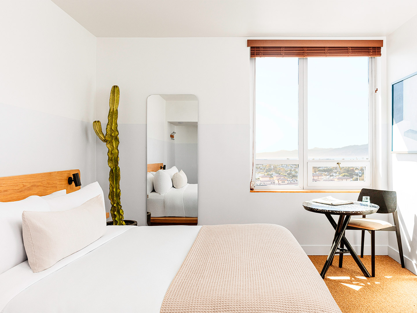
Located in the former Custom Hotel, in a classic Westside building designed by renowned local architect Welton Becke, June seamlessly merges the past with the present by pairing mid-century nostalgia with contemporary coastal minimalism. It’s at once airy, bright and chilled, becoming a place where clean lines and warm natural timbers meet earthy finishes, custom furnishings and Californian sunshine.
The laidback interiors of Hotel June were spearheaded by LA-based firm Studio Collective (a departure from the Proper’s go-to designer Kelly Wearstler). There are, however, to the benefit of budget conscious style-seekers, undeniable similarities between June and the more prestigious Propers. Including the spectrum of custom-made furniture, hand-glazed tiles from Brazil, sisal carpeting and Italian bed linens, not to mention the bountiful Aesop products in each of the bathrooms.
The hotel’s central location, right near LAX International Airport, places guests just minutes away from everywhere they might want to be on LA’s Westside. They’re five minutes from Playa Del Rey Beach, Playa Vista (Silicon Beach), Otis College of Art and Design and Loyola Marymount University, and little more than ten minutes from Venice, Marina Del Rey and Culver City. “Whether you’re headed to the beach, a show at The Forum or a game at the nearby SoFi NFL stadium, our location allows for ease in travelling around the city,” the hotel team insist. They add that there’s also “easy access to a range of restaurants, boutiques and parks within walking distance”.
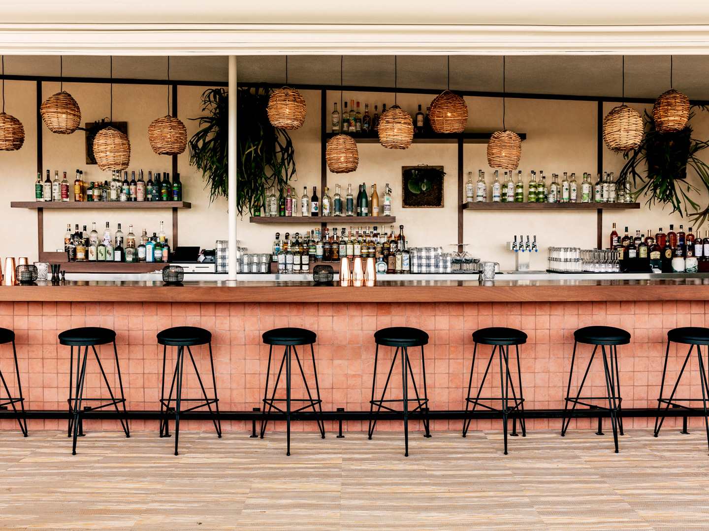
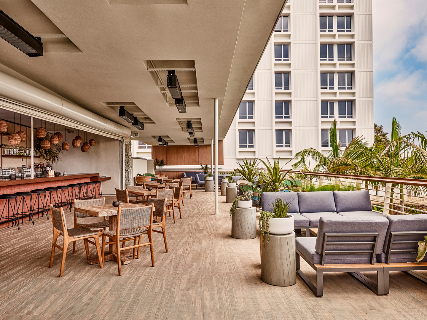
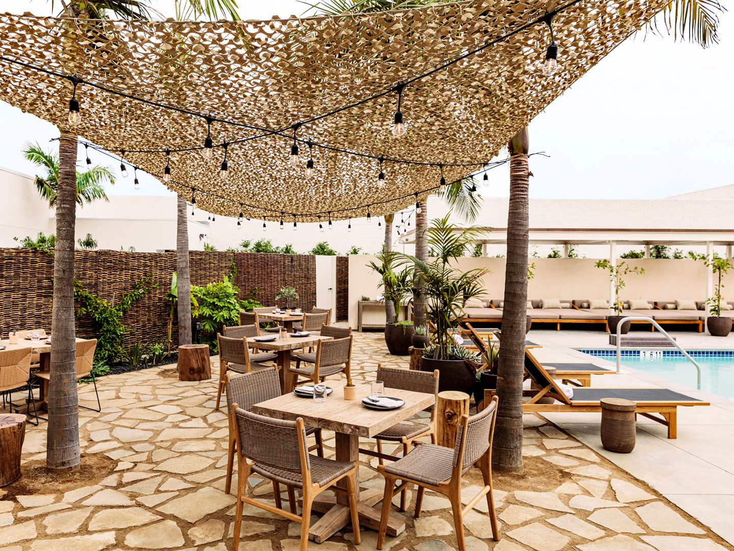
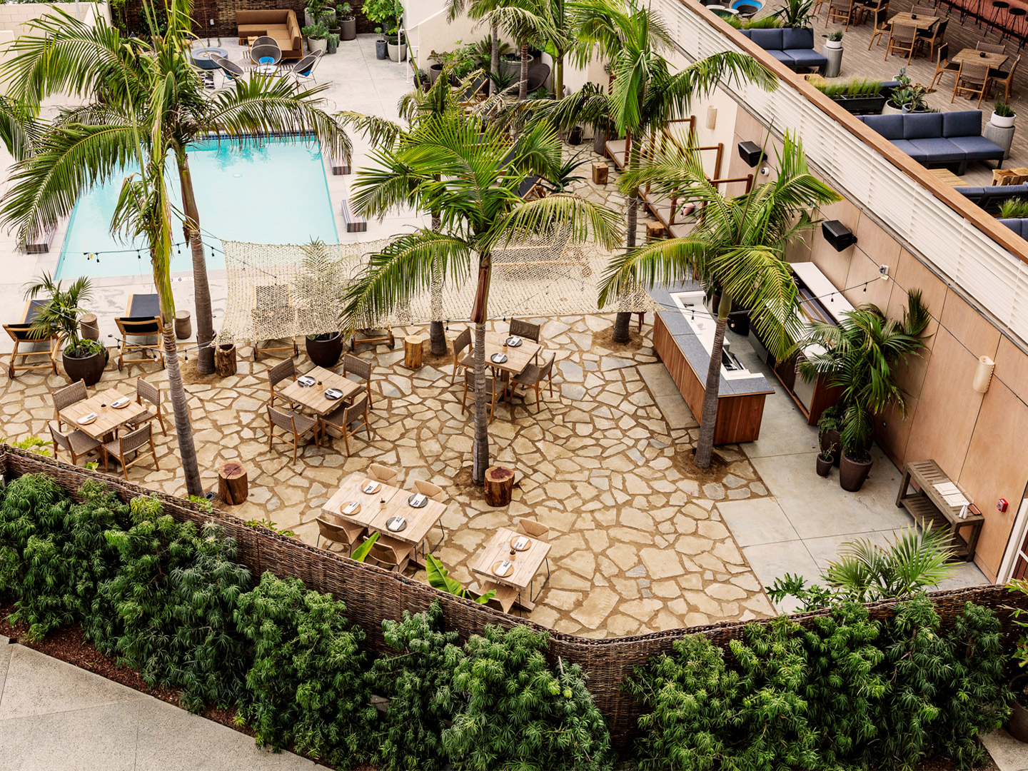
But after a day of soaking in the rays by the pool, a relaxed night-in at the hotel is often top of mind for guests. On standby to please the people of such persuasion, Hotel June offers dining concepts helmed by Steve Livigni (ex Scopa Italian Roots restaurant) featuring irresistible menus inspired by a 500-kilometre culinary road trip, extending southbound from Santa Barbara on the central California coast to Northern Baja in Mexico.
Perhaps the most laidback dining destination is the breezy Baja-inspired Caravan Swim Club – the poolside gathering place for everything from cabana drinks to fire-side snack sessions. It’s a relaxed spot where guests can spend the day immersed in music, before moving to an elevated terrace position to enjoy the evening view towards Venice Beach. All the while with house favourites in-hand, including biodynamic wines, craft beer and small-batch tequilas.
Opening just weeks before the pandemic swept the globe, Hotel June has had plenty of time to adapt its offering to include Covid-safe protocols. “We certainly couldn’t have predicted this moment when our vision for Hotel June began,” recall the hotel team. “But the timing has allowed us to open our doors with a new space that authentically embraces adaptability, is streamlined for social distancing, and – above all – considers the wellbeing and safety of our guests.”
thehoteljune.com; studio-collective.com
Located in the former Custom Hotel, in a classic Westside building designed by renowned local architect Welton Becke, June seamlessly merges the past with the present.
Take a look inside the Santa Monica Proper by Kelly Wearstler. Catch up on more architecture, art and design highlights. Plus, subscribe to receive the Daily Architecture News e-letter direct to your inbox.
Related stories
- Venus Power collection of rugs by Patricia Urquiola for cc-tapis.
- Bitossi celebrates centenary in Florence with new museum and 7000-piece display.
- Casa R+1 residence in southern Spain by Puntofilipino.
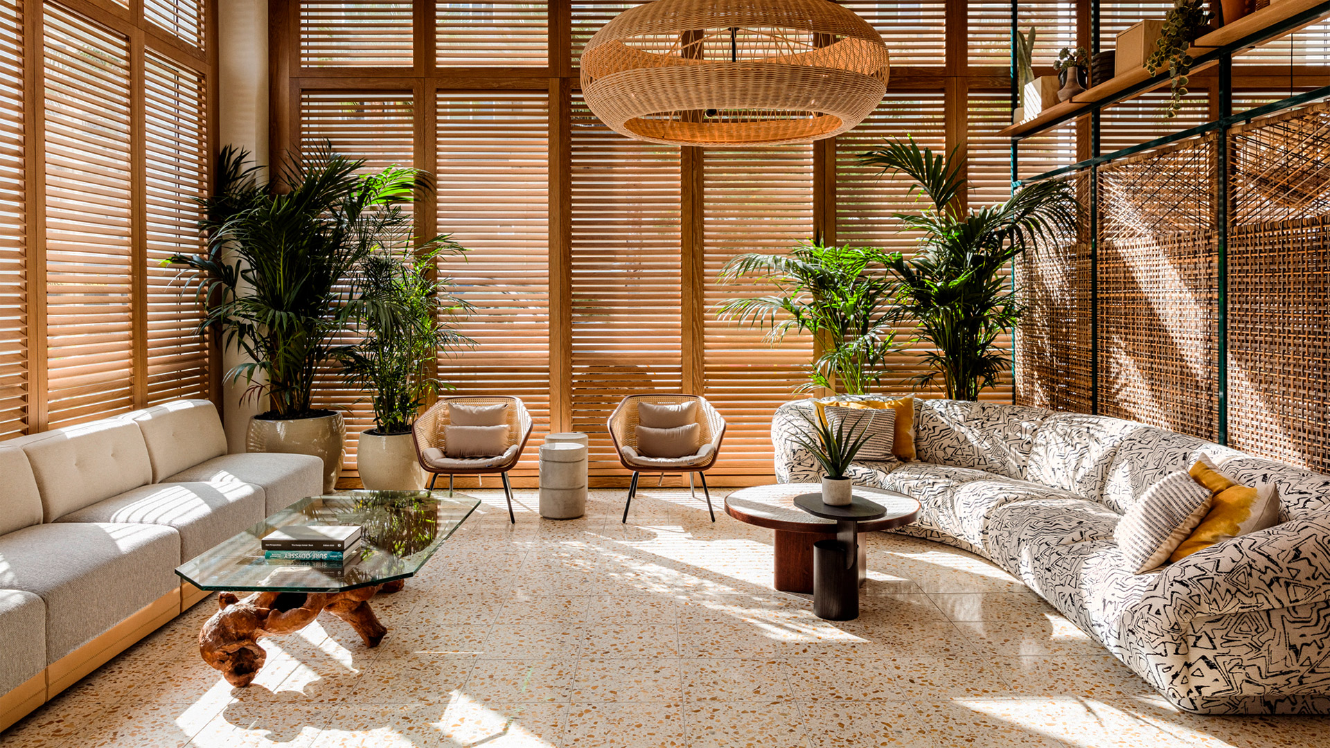
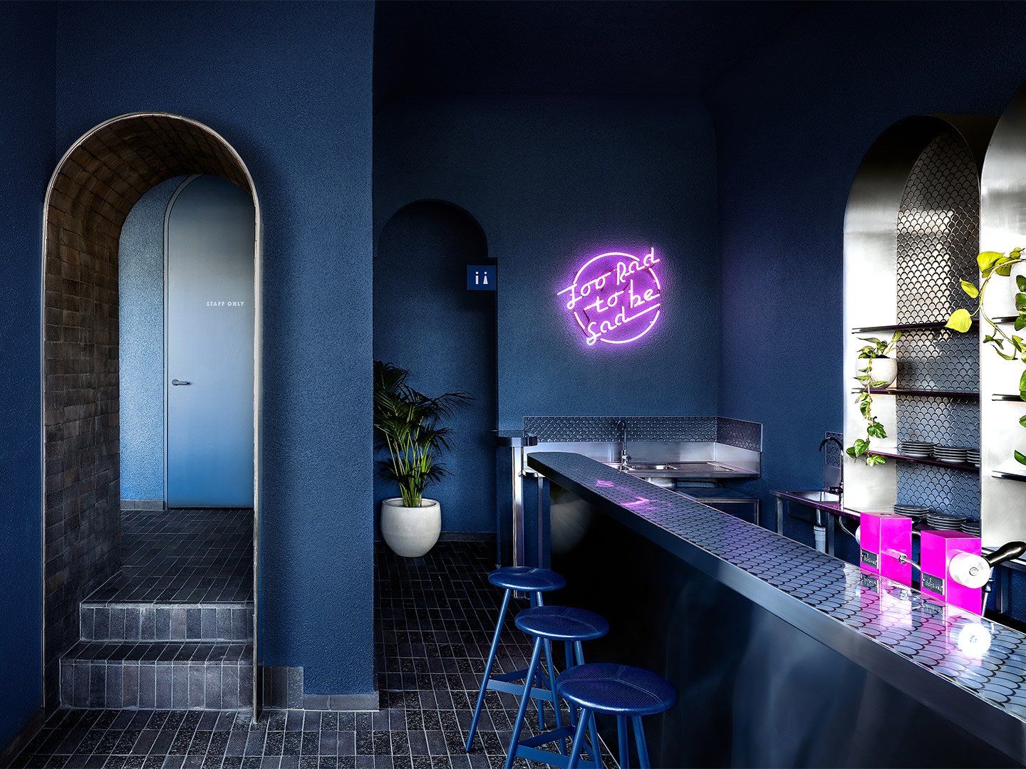
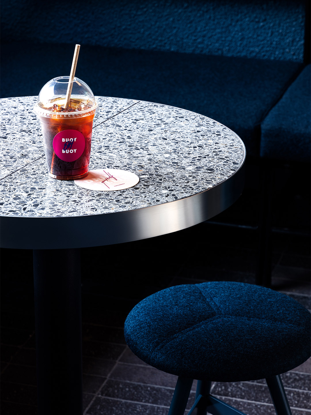
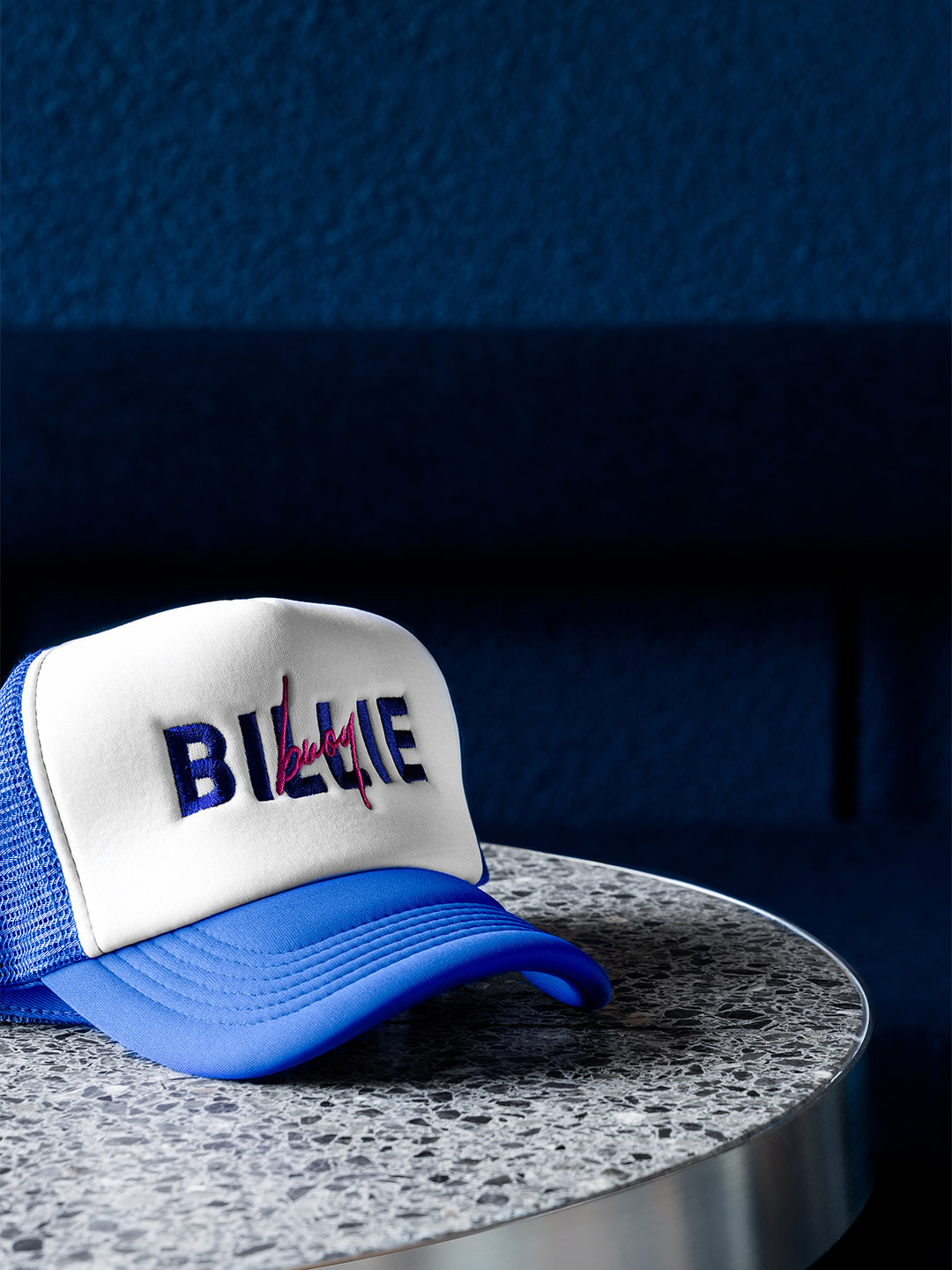
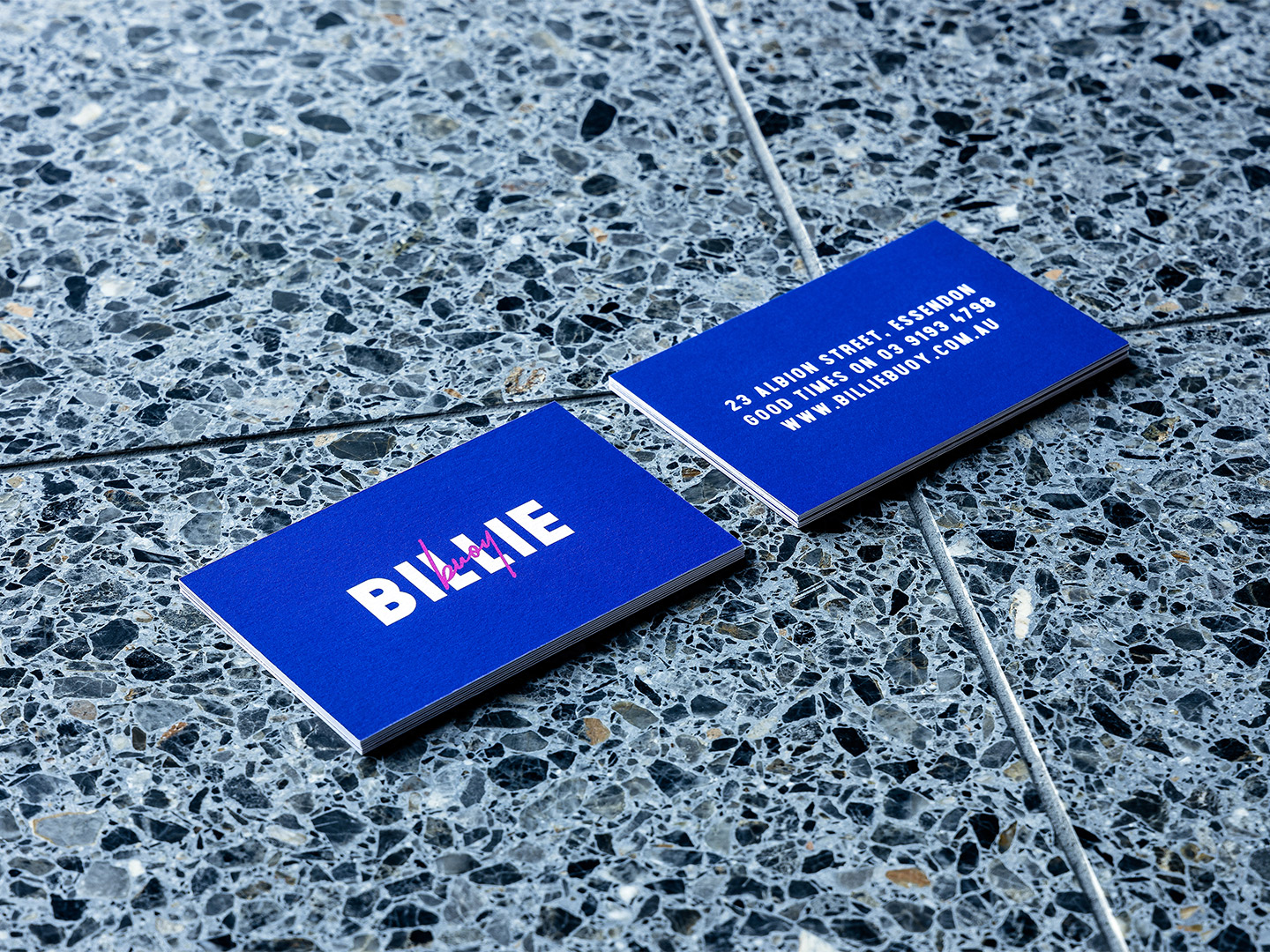
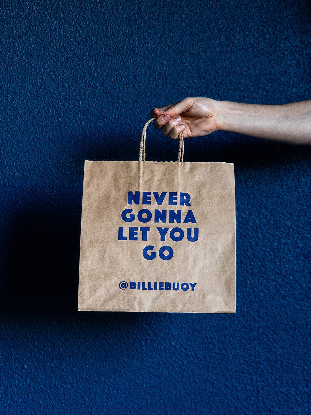
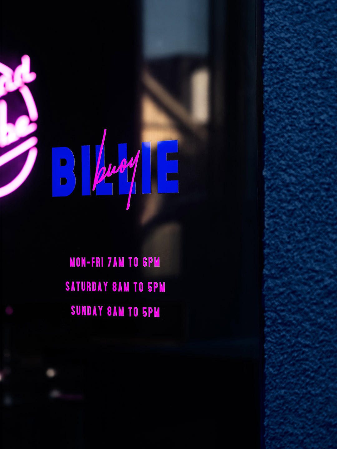
Radical, hip and a little offbeat” is how Melbourne-based design office Biasol describes the pocket-sized Billie Buoy bar, whose blue and pink-tinged interior adopted a personality of its own when the venue opened in August 2020. “We looked back to the days before internet and cell phones,” says the team of their design response, which was completed in May of the same year. “We dusted off our Atari and Walkman, put a John Hughes movie in the VHS, and jammed to New Order and Madonna – and conceived Billie Buoy as a 1980s character.”
Opening its doors to Melbourne in the early stages of Victoria’s pandemic response, the good times were all set to roll at Billie Buoy. At least before a series of COVID-induced lockdowns swung those doors shut. Until its final day, the short-lived “community-friendly” eatery served up healthy food and old-school tunes, drawing in “young people and young families with its feel-good vibes of the 1980s,” the designers say.
Electric blue: Billie Buoy bar in Melbourne by Biasol
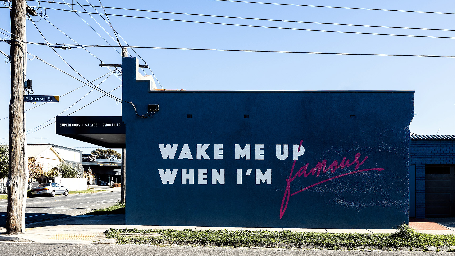
Occupying a corner location in Essendon, the building – a former neighbourhood butcher – has strong street presence to its front and side. Glass windows provide a view into the front of the venue, while the side wall was splashed with the words Wake Me Up When I’m Famous, “providing a memorable backdrop for Instagram fame,” the designers enthuse. Defined by deep blue tones, archways and blurs of neon, the interiors and branding of Billie Buoy were developed in unison, creating high impact and strengthening the outlet’s appeal.
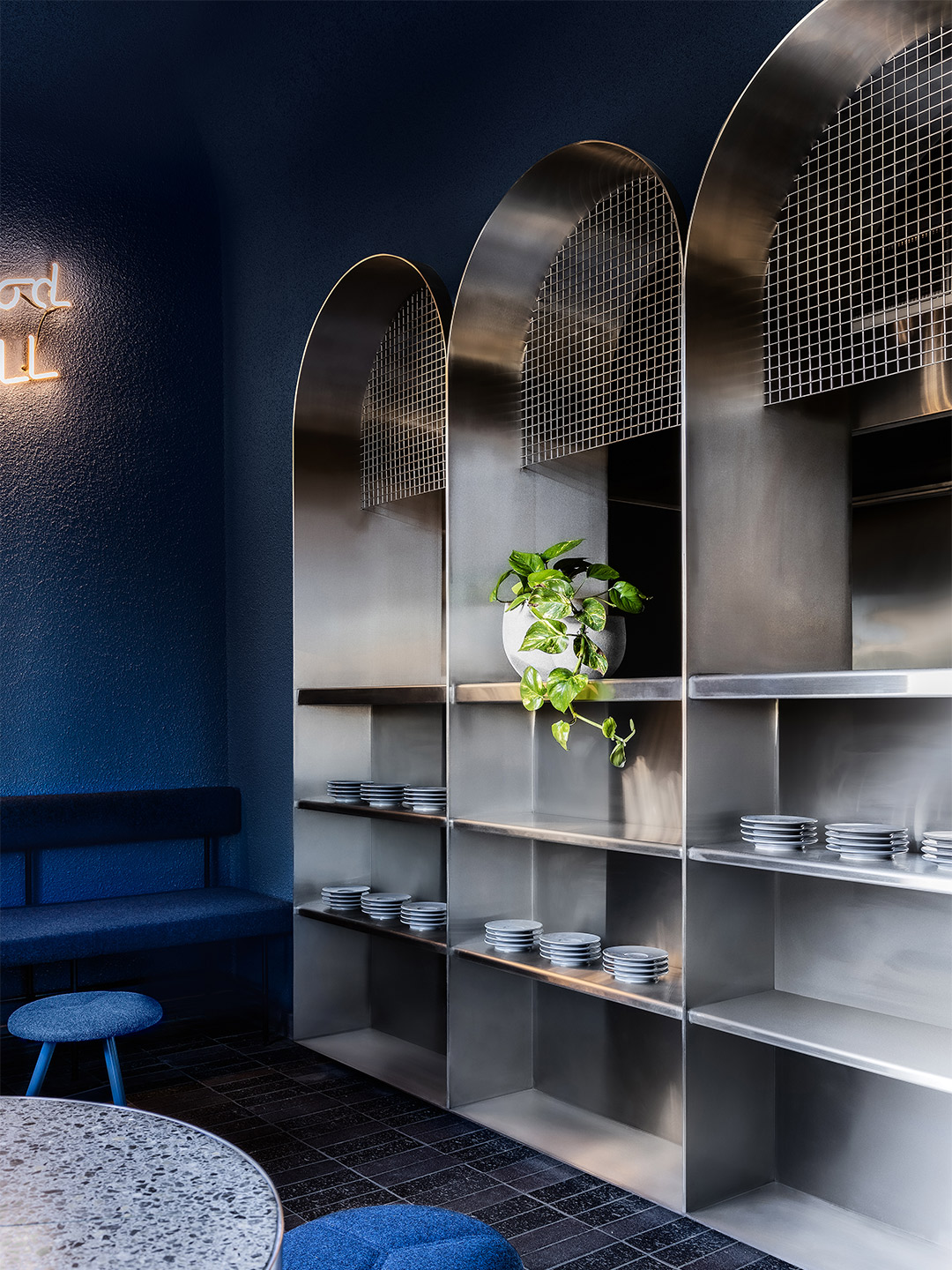
Designed somewhat like a diner, a corner arrangement of banquette seating rested at the entry, flowing into the counter area with stools, which was open to accommodate circulation in and out. An arched tunnel led to more banquette seating in the rear dining room and to the back-of-house. The arch was a distinctive feature throughout Billie Buoy – its geometric curvature reducing the height of the ceiling in places and softening the junction between ceiling and wall.
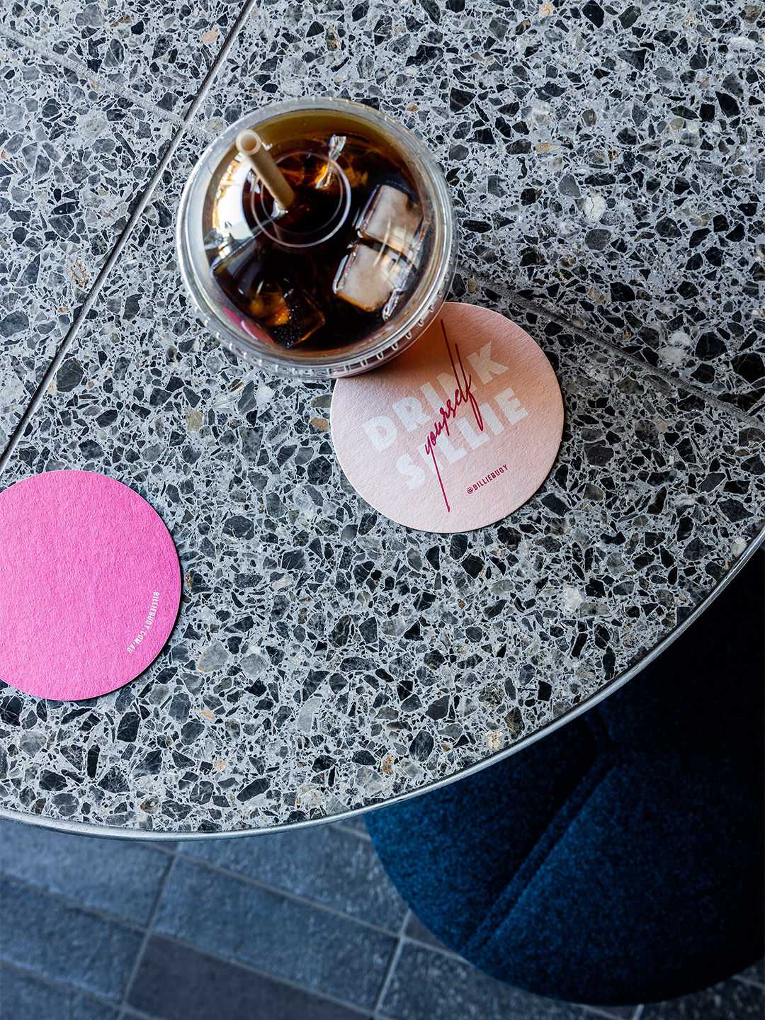
“Nothing says 1980s like a palette of cobalt blue and hot pink,” the designers say. “Blue is bold and moody, with textural materials – terrazzo, mosaic tiles, rendered walls and felt upholstery – to create depth, richness and variation within the singular hue.” Brick flooring grounds the space, while the stainless-steel bar and arched shelving provides old-school vibes. “Hot pink and neon punch up the palette and [helped] get customers into the groove,” the designers add.
“We developed the brand identity, including the signage, coffee cups, packaging and apparel, inspired by the bright, colourful designs of Memphis,” says the Biasol design team, who printed the lyrics of Rick Astley songs on the takeaway bags. “A Billie Buoy play on the Billionaire Boys Club appears on the branded apparel.”
Gone but not forgotten, Billie Buoy was a fun, youthful and retro-cool experience, where feel-good dreams of 1980s nostalgia could come true. “The signs were taken down last week, and the frontage has now been painted over,” commented one reviewer on Trip Advisor in April. But perhaps all hope is not lost. The bar’s website and Instagram account suggest Billie Buoy is moving on after a “difficult year” and a makeover, asking its patrons to “stay tuned” for the next chapter.
Gone but not forgotten, Billie Buoy was a fun, youthful and retro-cool experience, where feel-good dreams of 1980s nostalgia could come true.

Catch up on more architecture, art and design highlights. Plus, subscribe to receive the Daily Architecture News e-letter direct to your inbox.
Related stories
- Cinematic style: The Budapest Cafe in Carlton by Biasol.
- Carla Sozzani curates new colours for classic Arne Jacobsen chairs.
- Adam Goodrum stamps all-Australian style on new breezeblock design.
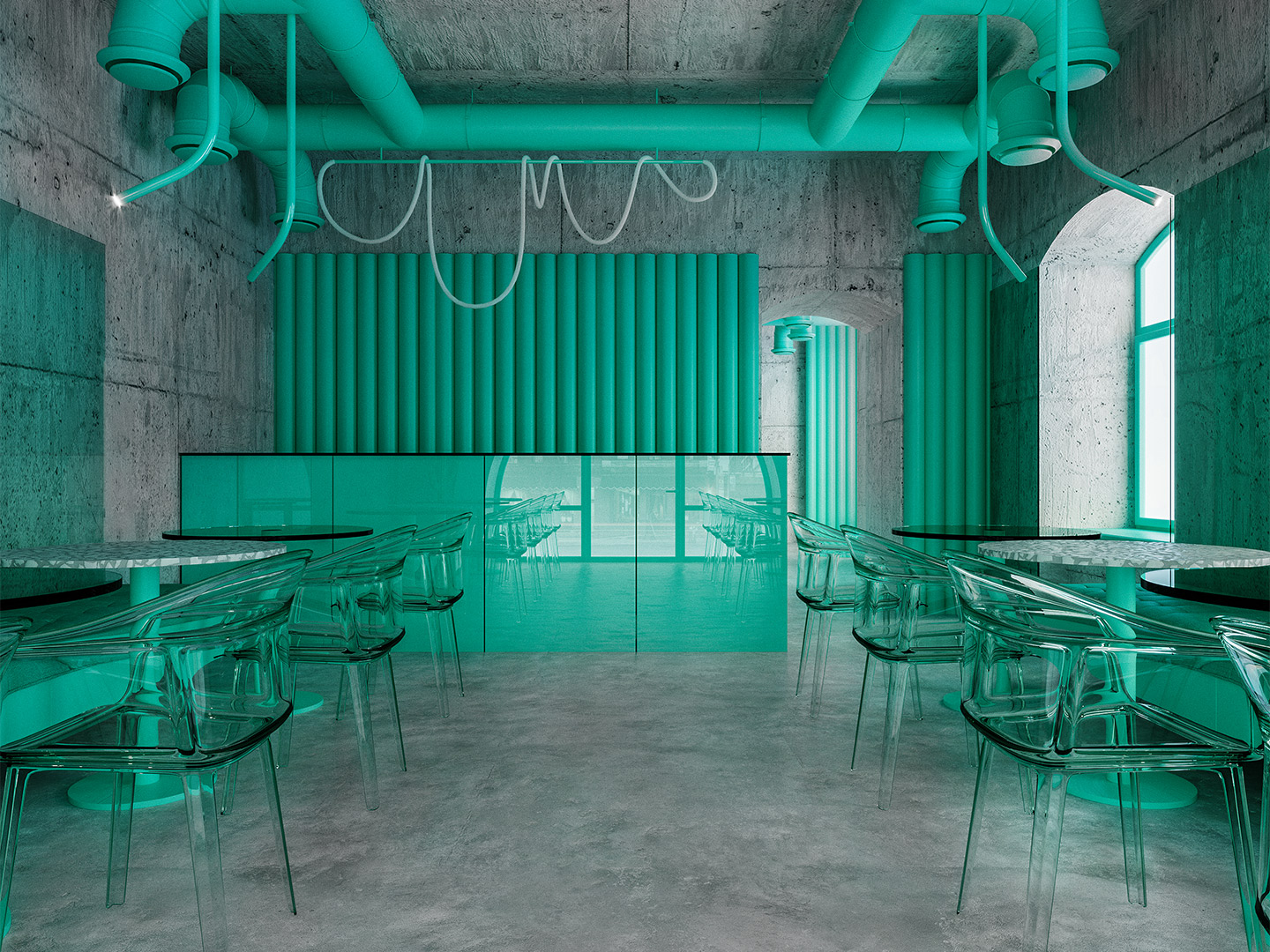
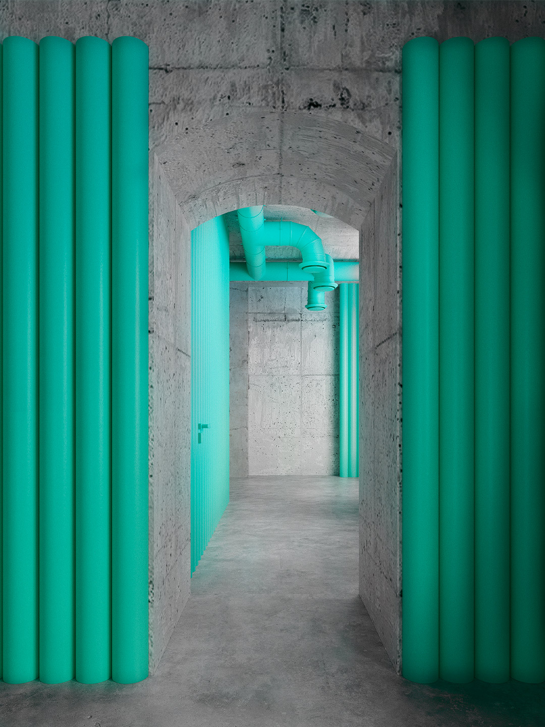
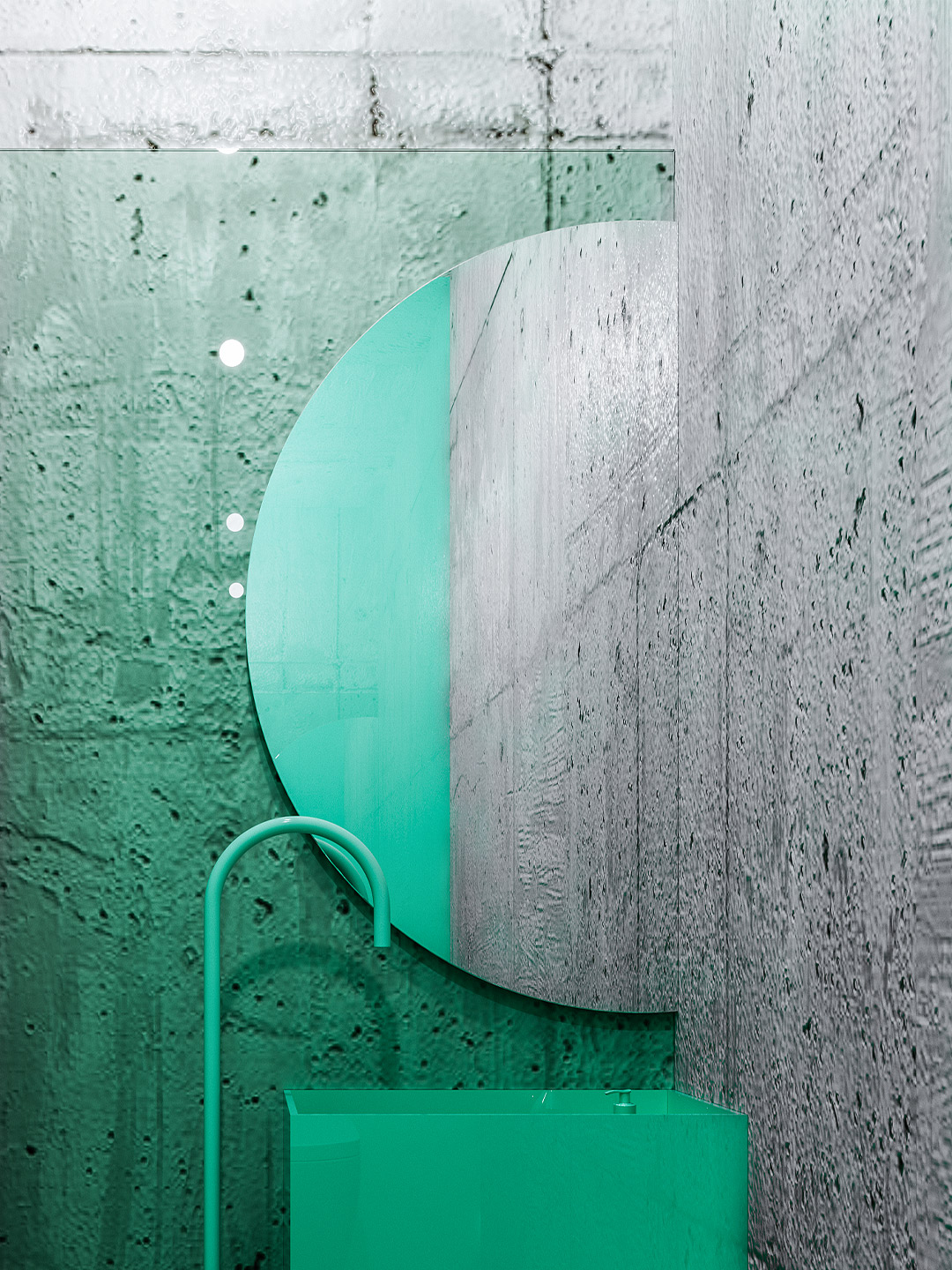
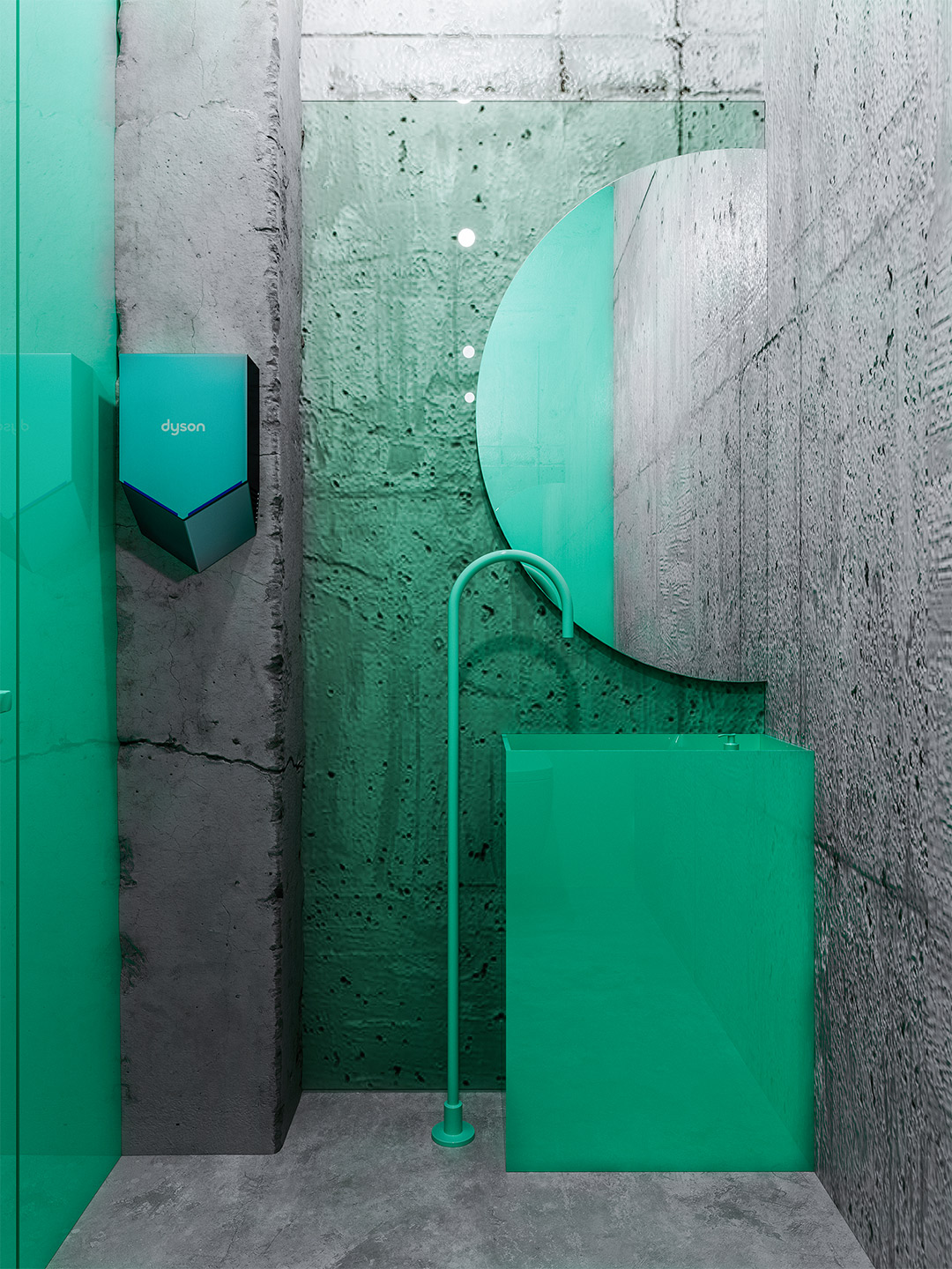
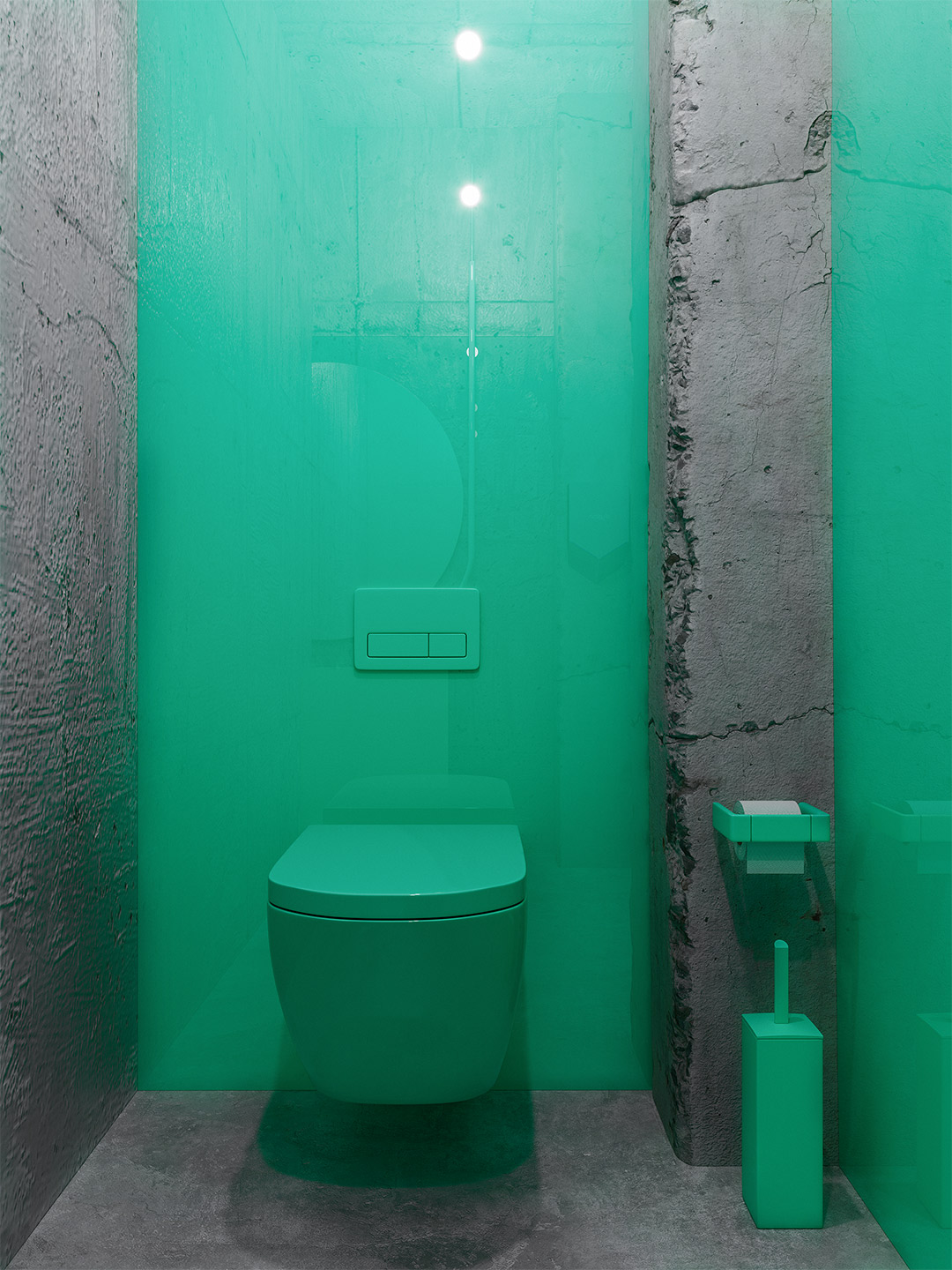
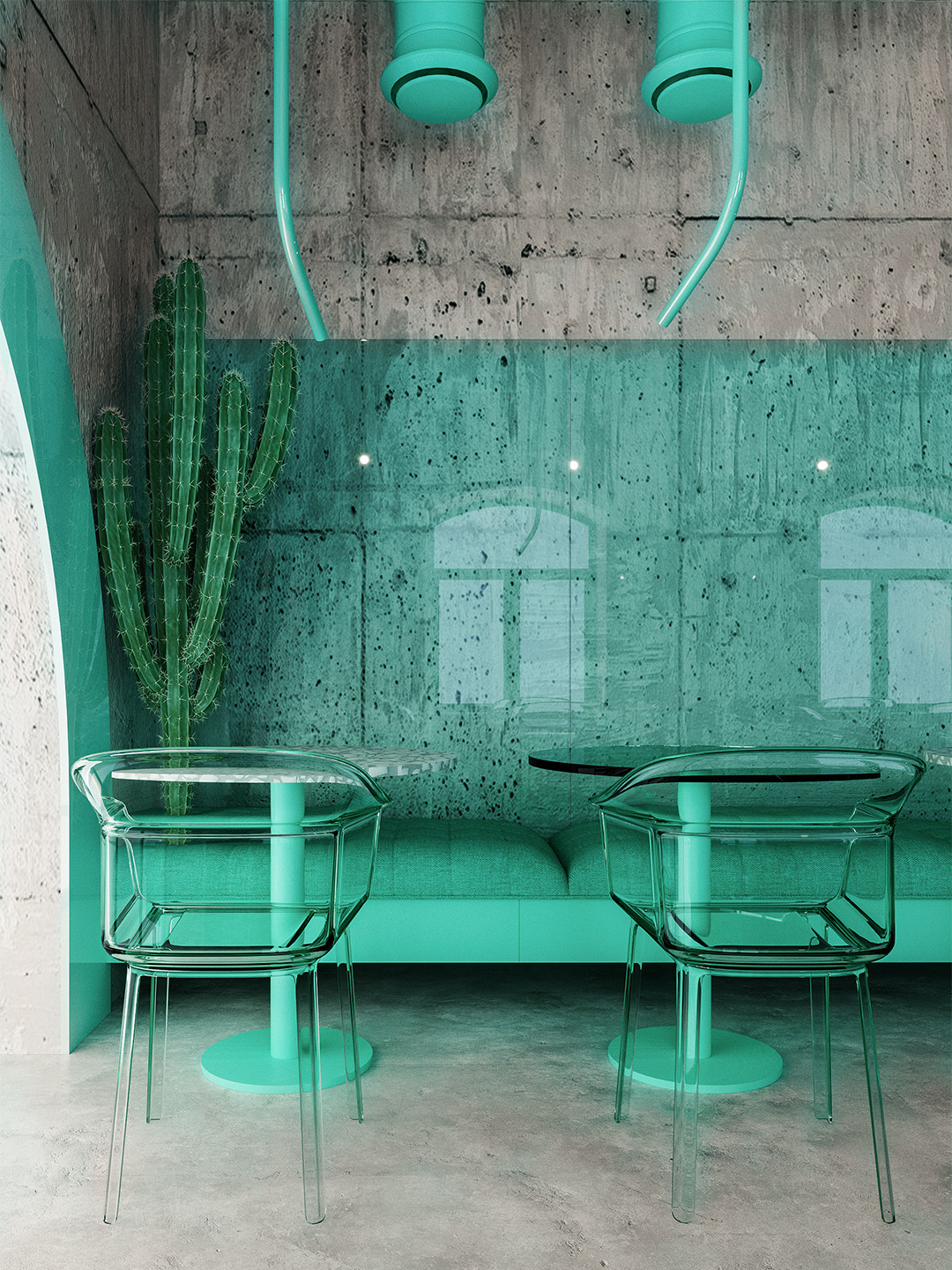
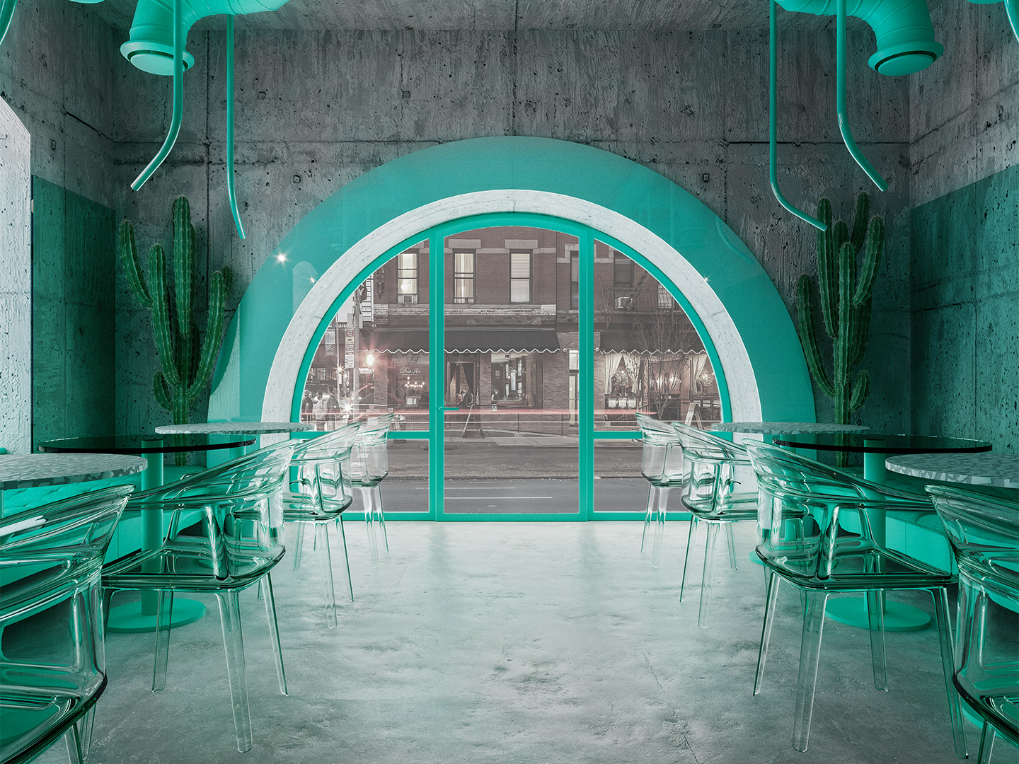
Tucked away in one of the world’s greatest urban jungles, a 46-square-metre concrete shell is bursting with life. Reimagined by Russian creative studio Reutov Design, the elevated ground-floor space in New York City is now home to an eye-popping eatery. It’s a special place where Dmitry Reutov, founder and principal of Reutov Design, believes that city workers, food fanatics and coffee-lovers will find respite from the chaos of The Big Apple.
“Among the endless movement of millions of people and cars, you often want to get in touch with nature,” Dmitry says of his New York experience. “Here is an oasis in the midst of a raging stream. We have created a cafe in which it will be comfortable not only to relax, but also to work, escape from the general bustle, enjoy delicious coffee and pleasant music.”
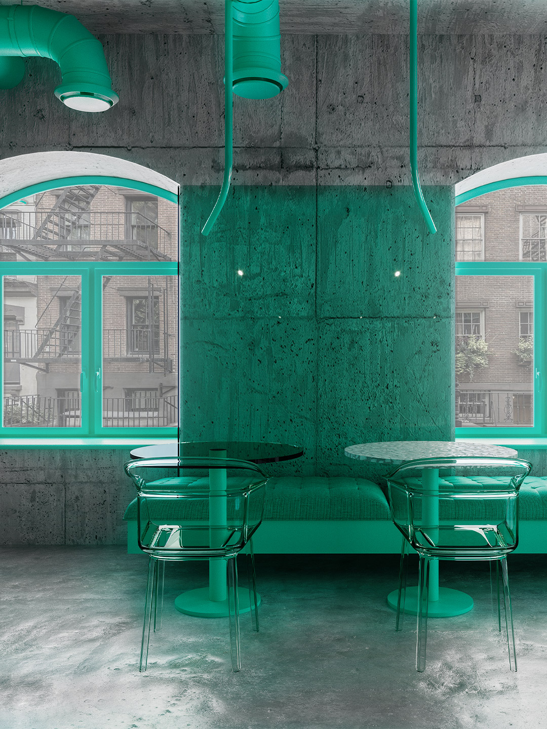
Colourful cafe in New York by Reutov Design
Featuring a bare concrete backdrop with a high-intensity injection of greenery – artificial and otherwise – you’d be forgiven for thinking there’s a ‘lost world’ meets ‘nature reclaims the earth’ post-apocalyptic theme at play. But the designer says there’s a finer balance at play, between nature and mankind’s endeavours. “The rich green colour of nature evokes harmony in the soul,” Dmitry explains. “With the help of glass and metal materials, we convey how natural style and modern architecture can coexist in tandem.”
This partnership sees green reeded panels climb the off-form concrete walls, transparent green-tinged panels colour the room’s greyness and tendril-inspired light fittings dropping from the cafe ceiling. Thes ecustom-designed light pieces, which peek out from a canopy of exposed service shafts (also coloured green), are compared by Dmitry to “bamboo sprouts breaking through the grey concrete” as they clamber towards the plumply upholstered banquettes.
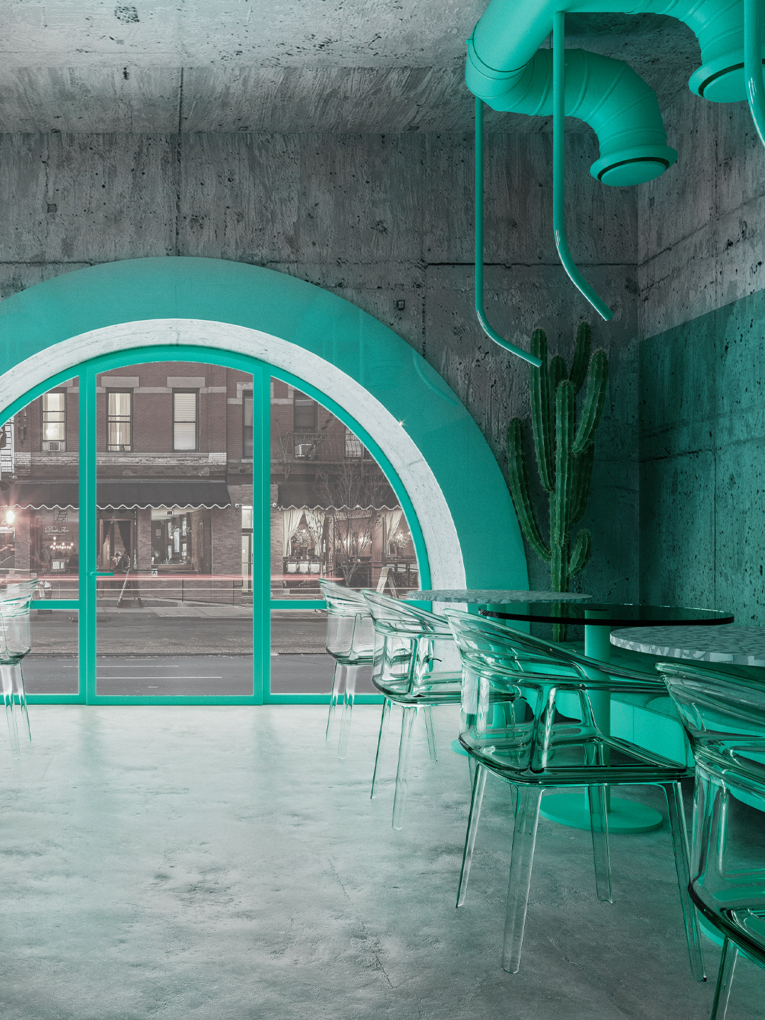
For New Yorkers who opt to dine-in, they can perch in one of eight familiar-looking ‘Papyrus’ armchairs, designed by Ronan and Erwan Bouroullec for Kartell. The transparent quality of the chairs is mirrored in the glass wall panels, which don’t fully cover up the concrete but rather colour it ever-so-slightly. The mix of glass-topped and terrazzo-patterned tables were designed by Dmitry and his 18-person team at Reutov Design. And the cartoon cloud-like chandelier above the sales counter is the ‘Tracer Bar I’ by Luke Lamp Co.
Viewed from the main dining room, the bustling streetscape is framed by three windows: one large semi-circle and two smaller deep-set windows, located off to the side. Each trimmed with the same green colour that dominates the cafe, the windows allow natural light to flood the space. As it bounces off blocks of solid green and filters through the glass and plastic finishes, the quality of light is otherworldly. A feeling that’s continued in the bathrooms, which are again swathed in the same shade of green, from the wall-hung toilets to the hardware and accessories.
The skilful use of a memorable, high-octane colour palette is somewhat of a signature for Reutov Design, ever since the studio dramatically shifted its approach after nearly ten years into practice. “In 2017, I decided to radically change my vision of design and architecture,” Dmitry says, who launched Reutov Design in 2008. “I decided to create bright and bold, slightly fantastical interiors.” Living up to the revised direction, the colourful cafe in New York is certainly a feast for the eyes – and no-doubt the appetite, too.
We have created a cafe in which it will be comfortable not only to relax, but also to work, escape from the general bustle, enjoy delicious coffee and pleasant music.

Catch up on more hospitality architecture and design and retail design, plus subscribe to receive the Daily Architecture News e-letter direct to your inbox.
Related stories
- Resa San Mamés student accommodation in Spain by Masquespacio.
- The bar and restaurant at La Sastrería in Valencia by Masquespacio.
- Mama Manana restaurant in Kyiv by Balbek Bureau.
- Gold ‘n’ arches: Bun burger restaurant in Milan by Masquespacio.
Tucked away in one of the world’s greatest urban jungles, a 46-square-metre concrete shell is bursting with life. Reimagined by Russian creative studio Reutov Design, the elevated ground-floor space in New York City is now home to an eye-popping eatery. It’s a special place where Dmitry Reutov, founder and principal of Reutov Design, believes that city workers, food fanatics and coffee-lovers will find respite from the chaos of The Big Apple.
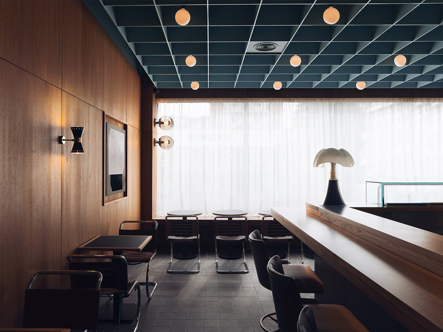
“The post office was built in the 1960s and our design pays tribute to London’s modernist heritage of that era,” explains Alexy Kos and Che Huang, co-founders of Child Studio. “Our aim was to rediscover and celebrate the unique history of this building and the neighbourhood.”
Maido sushi restaurant in London by Child Studio
The late-modernist building casts its gaze along the leafy main street, watching over a nearby greengrocer and bookseller, a bank, library and a scattering of chic eateries and boutiques. Out the front, colourful blooms spill over pots suspended from typical London lampposts.
Inside the restaurant, the moody dining room welcomes visitors with a refreshing blend of European and Japanese design influences. “The Japanese references are subtle,” say the Child Studio team. “[They] present themselves through the choice of materials, the play of geometric patterns and the hand-crafted woodwork detailing.”
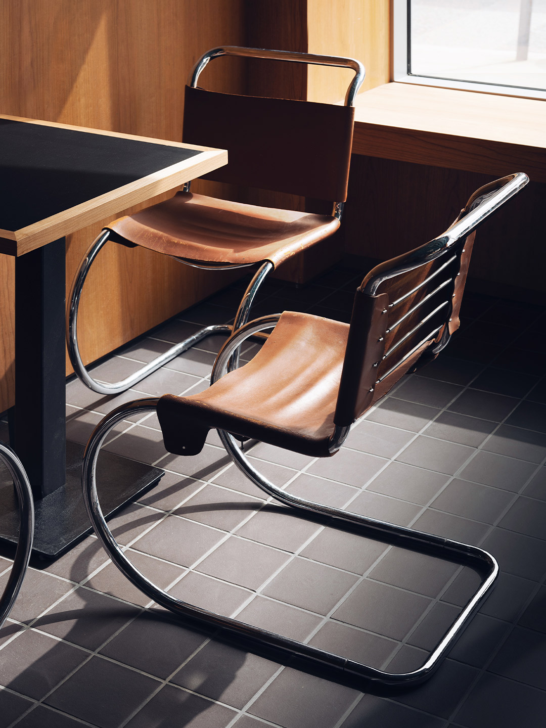
The dialogue between the East and West begins with the selection of antique and modern furniture: tubular steel chairs by Mies Van Der Rohe and moulded plywood armchairs by Norman Cherner (designed in 1958) are paired with cast-aluminium stools by Japanese designer Naoto Fukasawa.
The post office was built in the 1960s and our design pays tribute to London’s modernist heritage of that era.
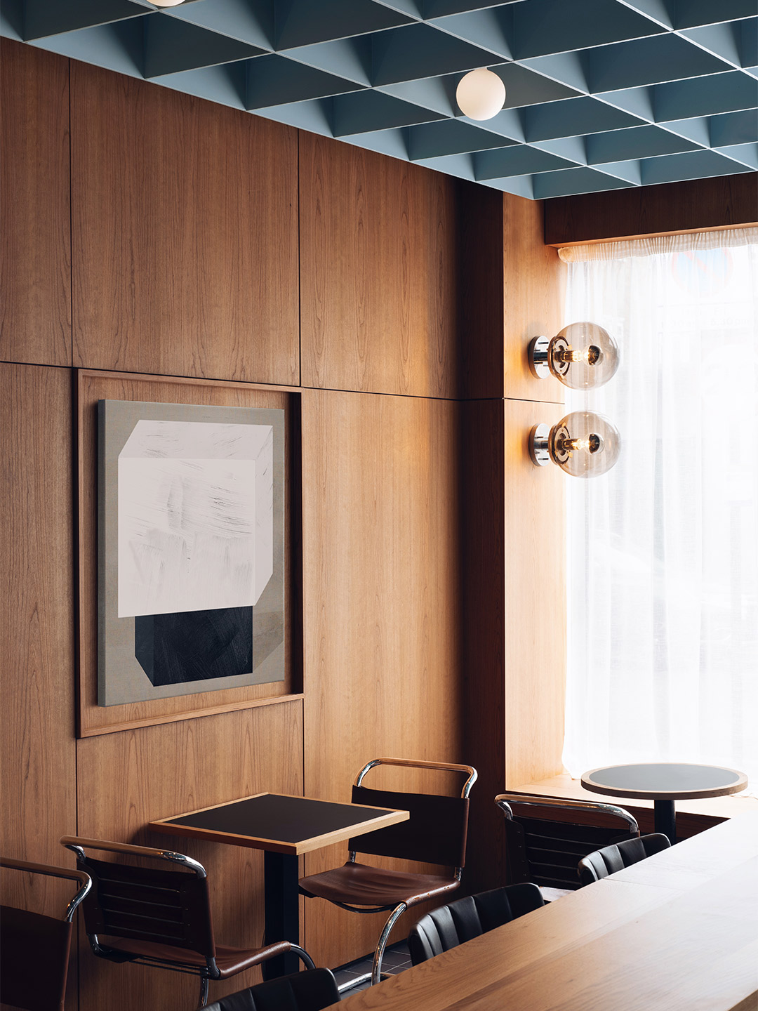
Sixties style is introduced throughout the restaurant with walls lined in dark cherrywood panelling. Large abstract paintings are tucked within shallow timber-framed alcoves, set between brass wall sconces by Stilnovo, the Italian pioneers of rationalist design.
Overhead, Child Studio devised a suspended coffered ceiling – reminiscent of the pattern created by Japanese shoji screens – finished in a soft blue hue. The straightforward geometric layout of the ceiling is echoed on the floor, where a smaller grid of black quarry tiles provides gentle detail underfoot.
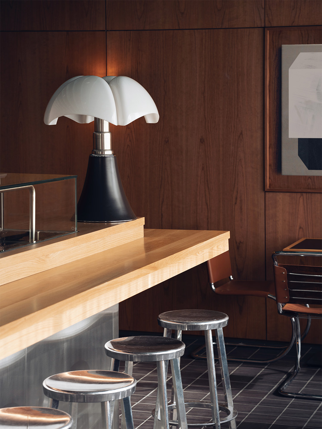
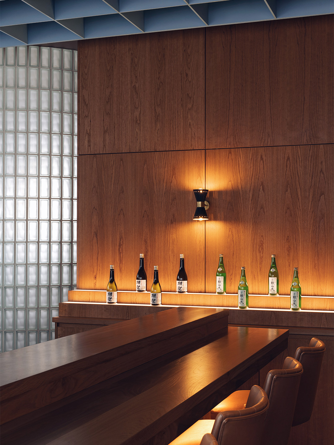
The star attraction of the restaurant is perhaps the open kitchen where the reflective steel panelling of the counter-front is partnered with a 1960s ‘Pipistrello’ lamp, designed by Italian architect Gae Aulenti. Behind the counter, Maido’s sushi master prepares and plates-up authentic Japanese cuisine, from eel and masago California rolls to “fatty tuna” sashimi.
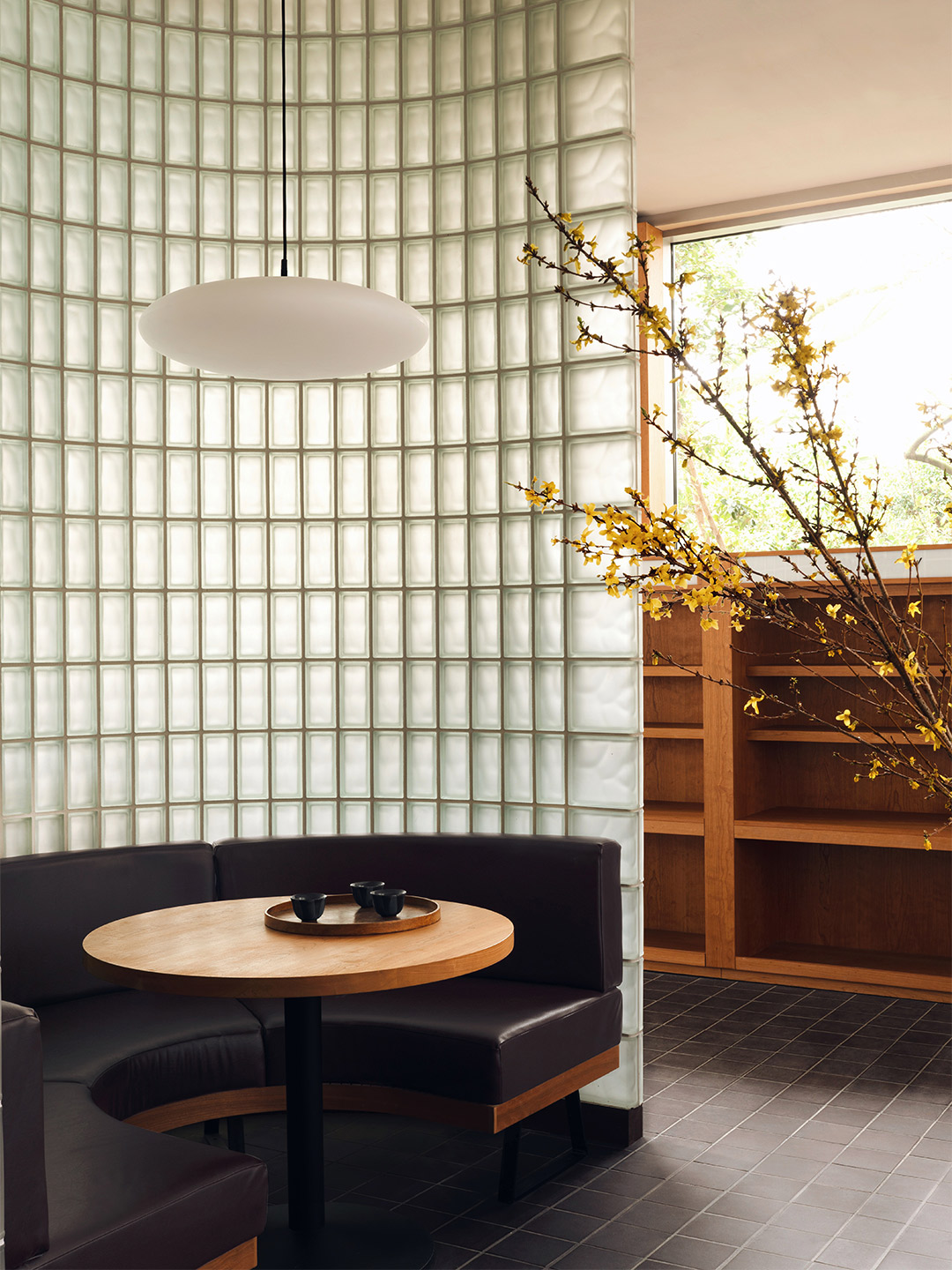
Towards the rear of the restaurant, a curved glass-brick wall splits the dining room into two, creating a semi-private area. As daylight filters through the sheer curtains and the textured glass, a familiar atmosphere is born. “The inspiration for this feature came from the St John’s Wood Library, the next-door building of the same era,” say Alexy and Che. “The library entrance is a beautiful combination of square glass blocks and dark wooden framework.”
In other areas, sake bottles, arrangements of flowering cherry blossom and tea sets (comprising contemporary pots and traditional Japanese cups) reference typical Japanese eateries. Dovetailed with mid-century finishes and iconic furnishings, the result is a convivial place that balances cross-cultural cool with a touch of nostalgia.
childstudio.co; maidosushi.com
Catch up on more hospitality architecture and design and retail design, plus subscribe to receive the Daily Architecture News e-letter direct to your inbox.
Related stories
- Resa San Mamés student accommodation in Spain by Masquespacio.
- The bar and restaurant at La Sastrería in Valencia by Masquespacio.
- Mama Manana restaurant in Kyiv by Balbek Bureau.
- Gold ‘n’ arches: Bun burger restaurant in Milan by Masquespacio.
Tucked away in one of the world’s greatest urban jungles, a 46-square-metre concrete shell is bursting with life. Reimagined by Russian creative studio Reutov Design, the elevated ground-floor space in New York City is now home to an eye-popping eatery. It’s a special place where Dmitry Reutov, founder and principal of Reutov Design, believes that city workers, food fanatics and coffee-lovers will find respite from the chaos of The Big Apple.
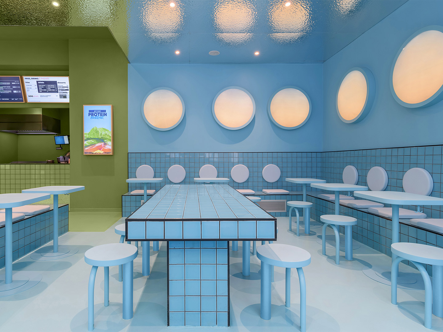
In Milan, this flexibility led to existing architectural archways and exposed bricks becoming defining features of the space. At the second Bun restaurant to open under Masquespacio’s vision, located in Turin, three existing windows informed the decision to expand the colour palette and split the interior into three clearly defined sections. “The idea to play with one colour for each window creates a visual effect from the outside that makes the spectator walk from one visual world into the other, travelling through different experiences in the same space,” says Ana, creative director of Masquespacio.
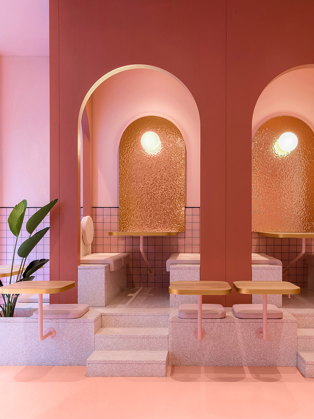
Bun burger restaurant in northern Italy by Masquespacio
The new restaurant in Turin delivers diners from its front door to the counter via a ribbon of pastel green; the same “iconic” shade used at the Bun restaurant in Milan, explains Ana and Christophe. The trademark colour blankets the floor and ceiling and everything that falls within its territory. Including refrigerators, signage and the odd stool which didn’t quite make it over the line into the neighbouring colour zone.
On each side of the central entryway, the newly introduced pink and blue palette lures diners to two completely different sitting spaces. To the left, a segment of the restaurant swathed entirely in tones of fairy-floss pink tempts diners with two semi-private booths. Elevated from the ground level, the booths feature elegant archways – a nod to the fit-out in Milan – while the pink terrazzo stairs that lead to the dining zones pave the way for additional tables and chairs.
The idea to play with one colour for each window creates a visual effect from the outside that makes the spectator walk from one visual world into the other.
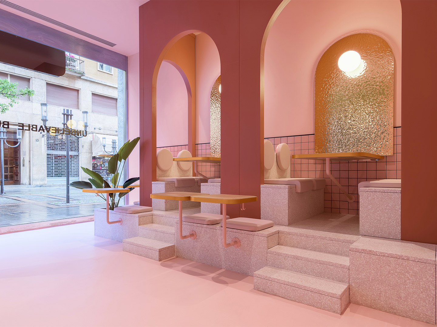
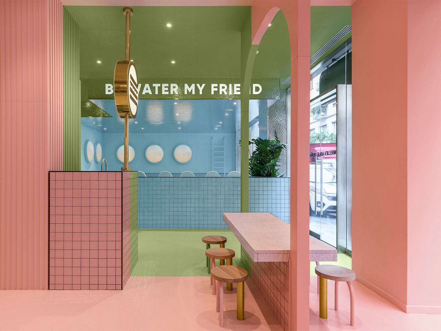
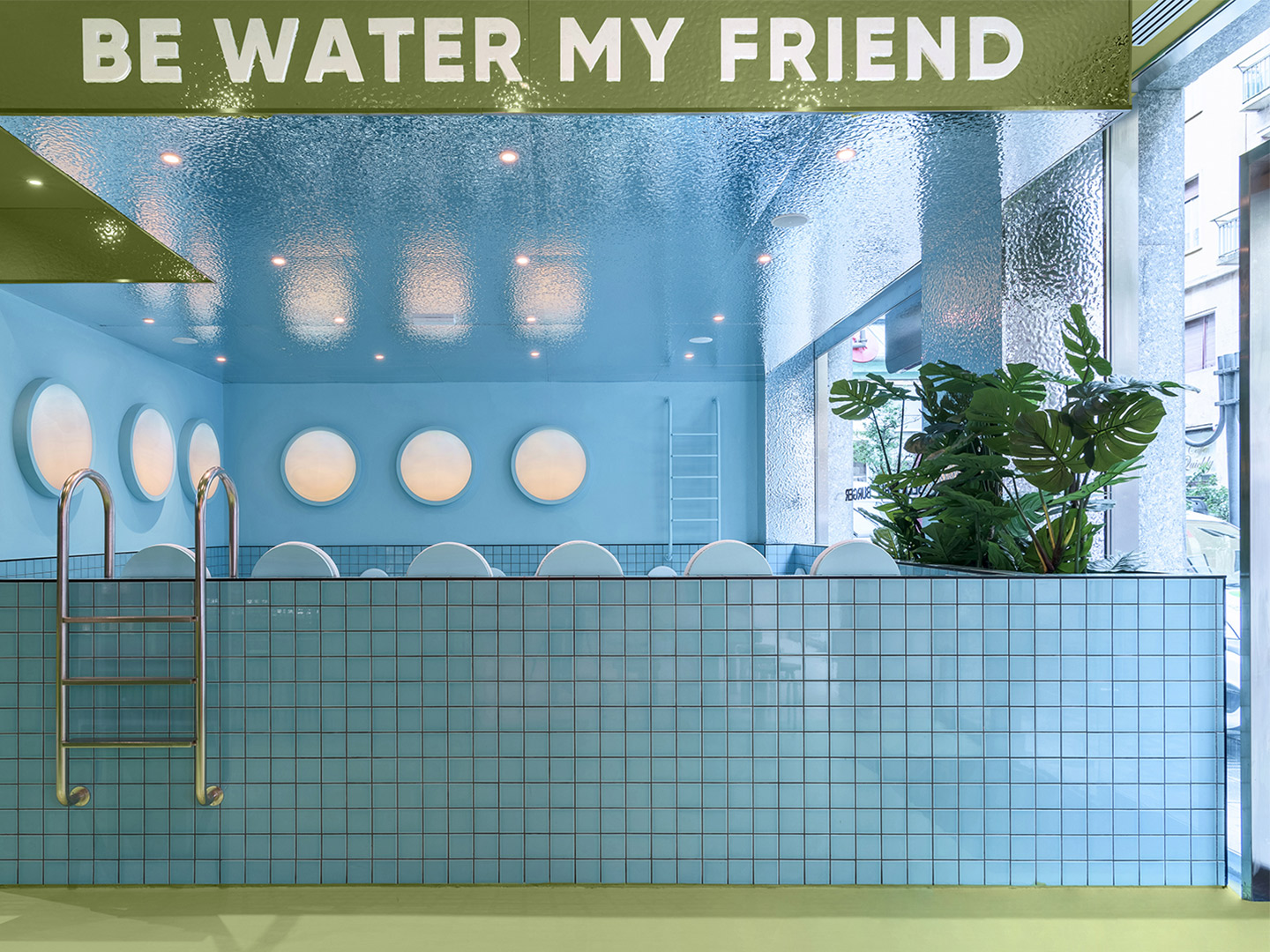
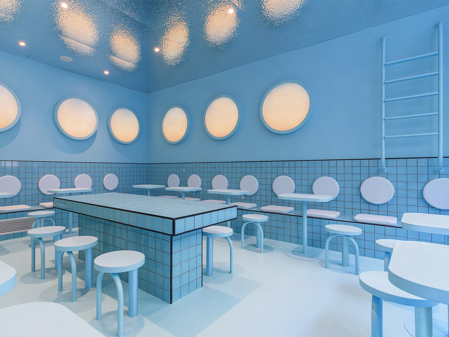
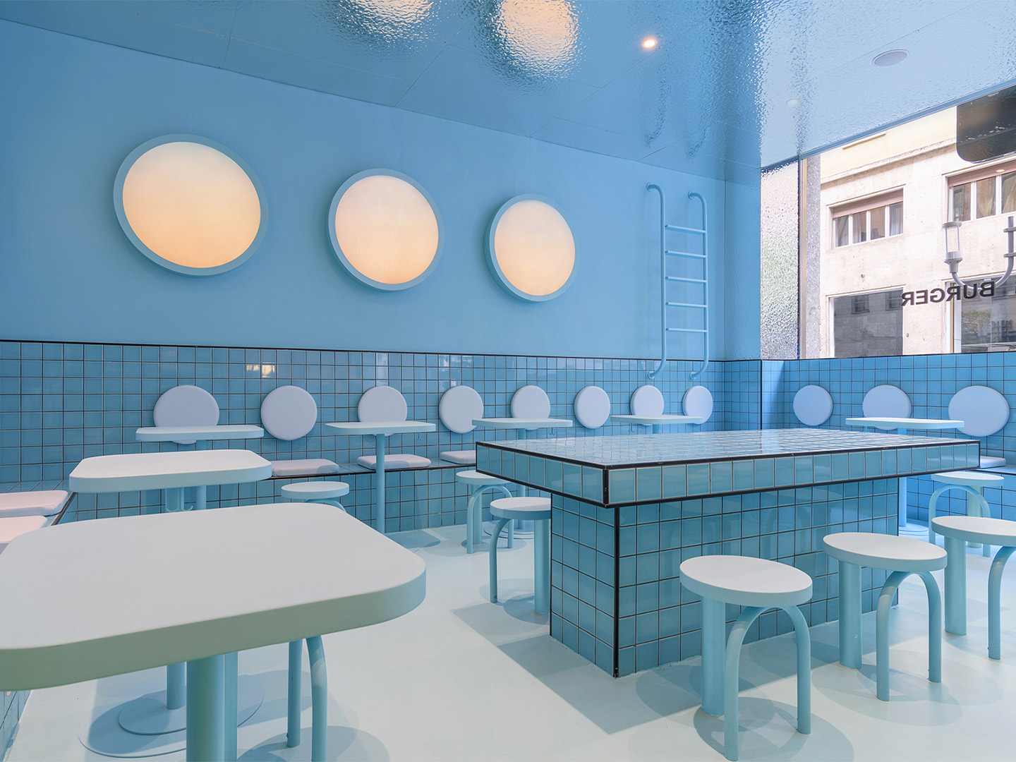
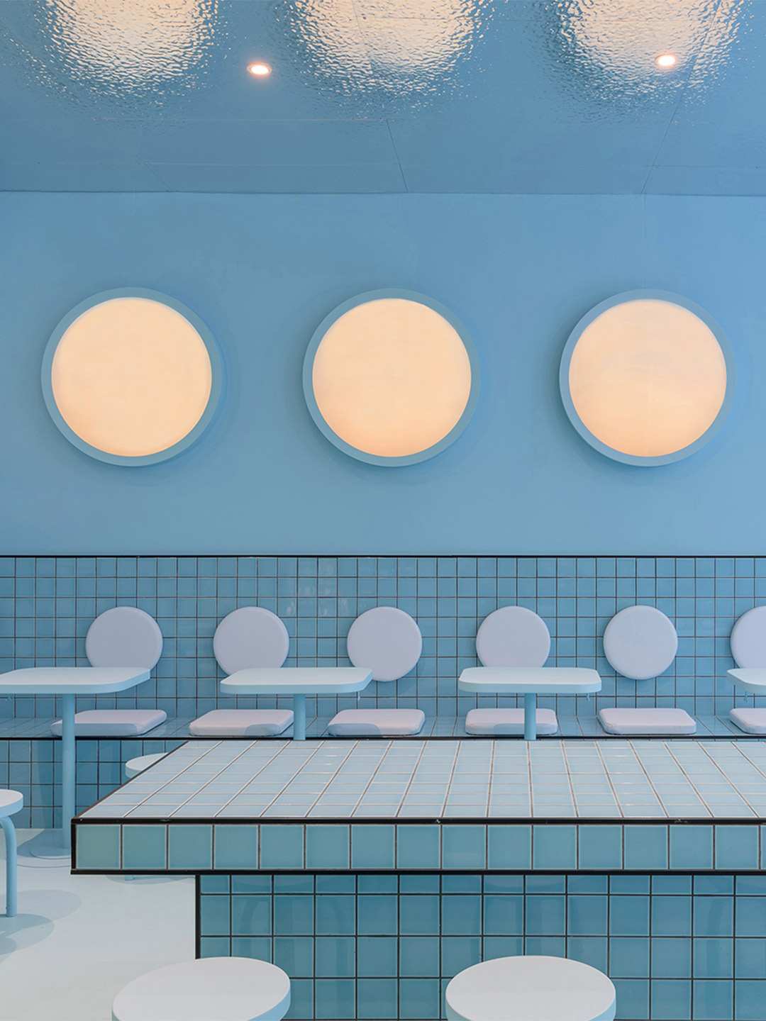
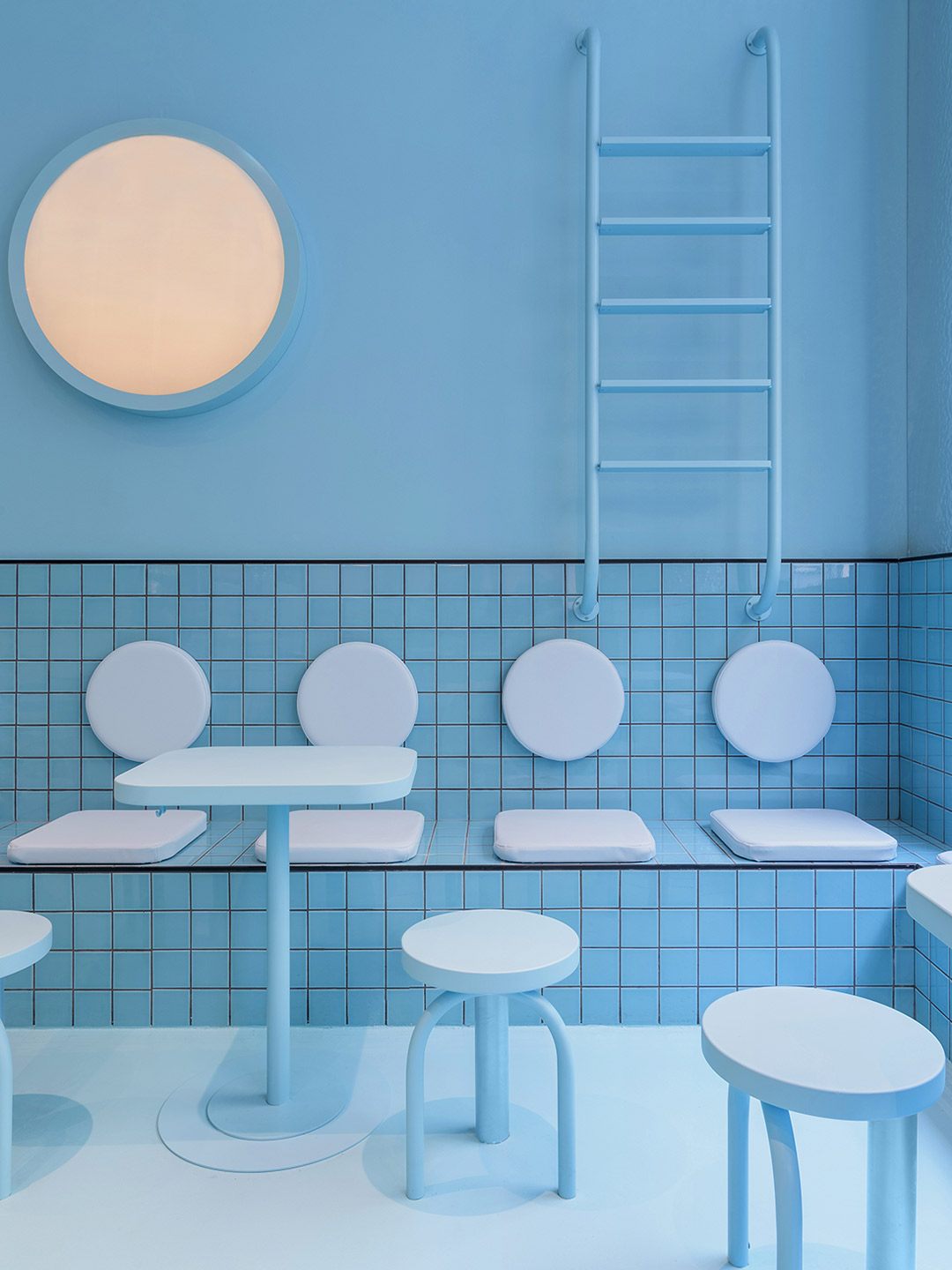
Emblazoned with the words ‘Be water my friend’ – a saying made famous by the late martial-arts star Bruce Lee – the blue zone to the right of the restaurant “adds a touch of fun,” remarks Ana. “[It] gives visitors the chance to enjoy the delicious Bun burgers in a space that simulates a huge swimming pool that would make them feel like floating in the water.” Featuring wall-mounted ladders plunging playfully into an ocean of pale-blue tiles, the swimming pool reference isn’t lost on diners. Especially when they consider the porthole-shaped light fittings and the metallic finish of the ceiling – a design device which mimics the effect of diving into a pool of water and looking up at its rippled surface.
With two completed Bun burger restaurants now tucked firmly under their belts, each united by memorable colour, shapes and materiality, Christophe and Ana intend to work on more of the chain’s outlets in Italy. Returning to Milan from Turin, the design duo will roll-out their refined interior design formula in selected spaces across the city, continuing their mission to make the Bun brand edgy, fun and instantly recognisable.
Also in Italy, Masquespacio designed the Bun burger restaurant in Milan. Catch up on more hospitality architecture and design and retail design, plus subscribe to receive the Daily Architecture News e-letter direct to your inbox.
Related stories
- Resa San Mamés student accommodation in Spain by Masquespacio.
- The bar and restaurant at La Sastrería in Valencia by Masquespacio.
- Mama Manana restaurant in Kyiv by Balbek Bureau.
- Gold ‘n’ arches: Bun burger restaurant in Milan by Masquespacio.
Tucked away in one of the world’s greatest urban jungles, a 46-square-metre concrete shell is bursting with life. Reimagined by Russian creative studio Reutov Design, the elevated ground-floor space in New York City is now home to an eye-popping eatery. It’s a special place where Dmitry Reutov, founder and principal of Reutov Design, believes that city workers, food fanatics and coffee-lovers will find respite from the chaos of The Big Apple.
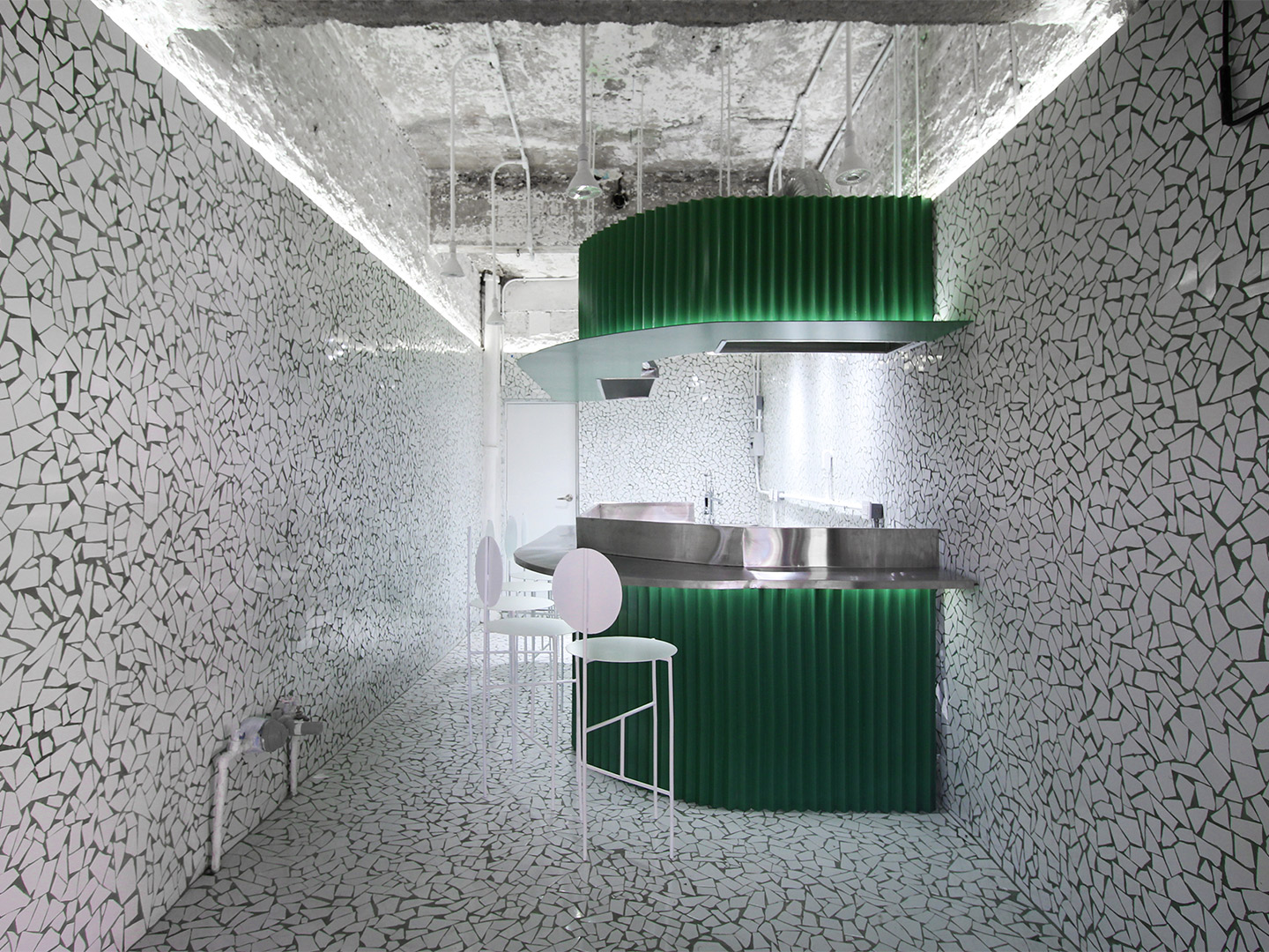
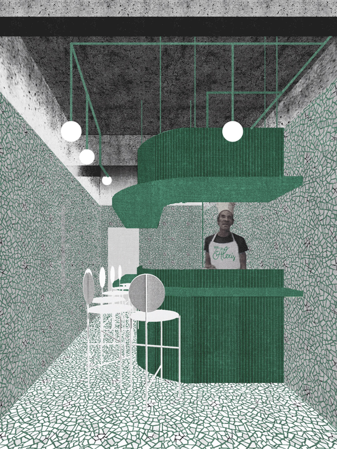
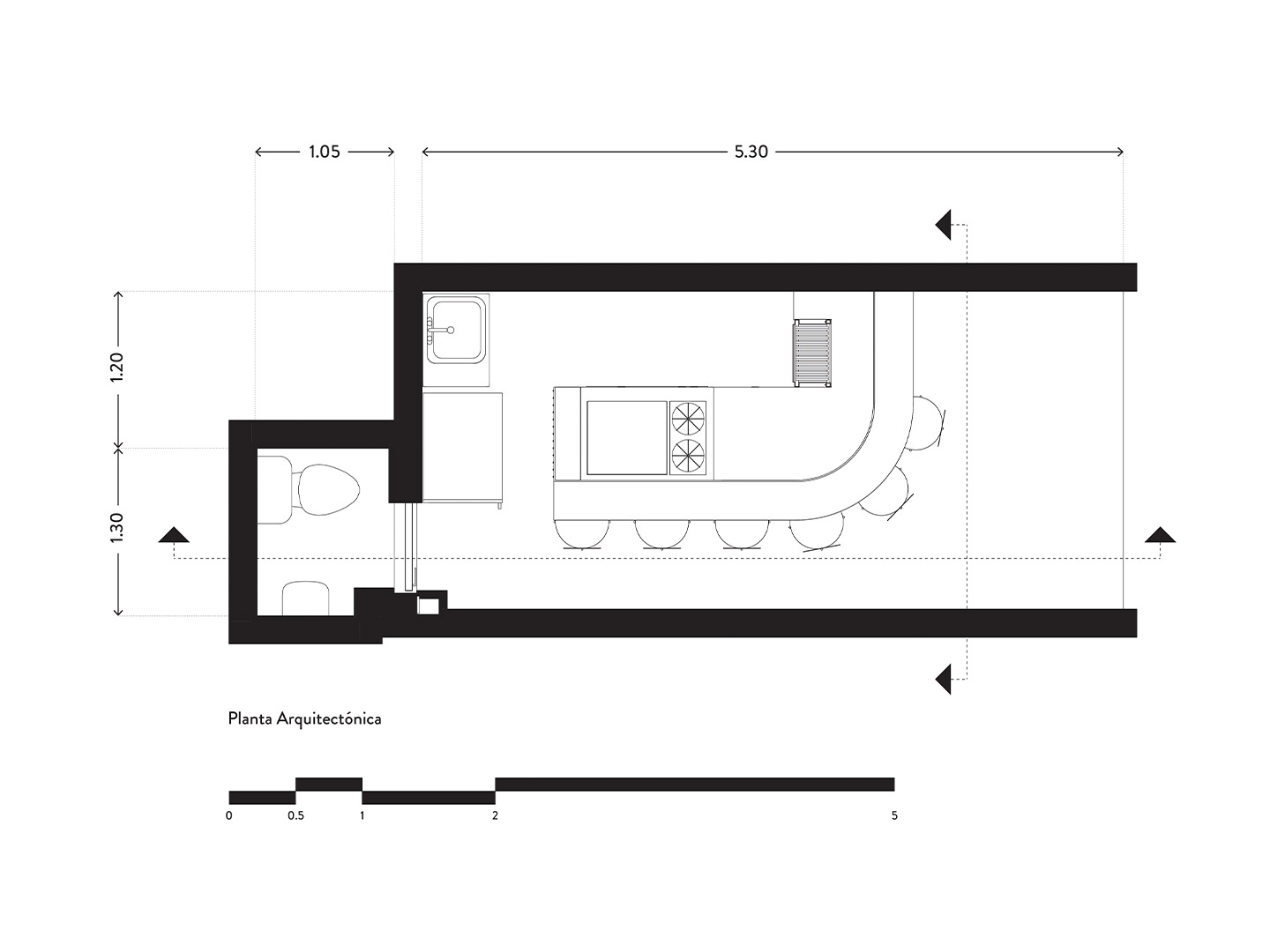
The Los Alexis taquería measures in at only 15-square-metres. But the small footprint was certainly no coincidence. The space reinterprets the scale and food-focussed theatrics of a taco-selling changarro (the name given to the type of small shops that line the city’s roadsides). Mirroring the tiny floor plan, the menu at Los Alexis is equally limited. The kitchen concentrates on delivering only two classic taco styles, taurinos and asada, where grilled meat is the key ingredient in each dish. Just as the minimal fare needs to pack a punch with diners, the restaurant renovation by RA! was also required to make an impact.
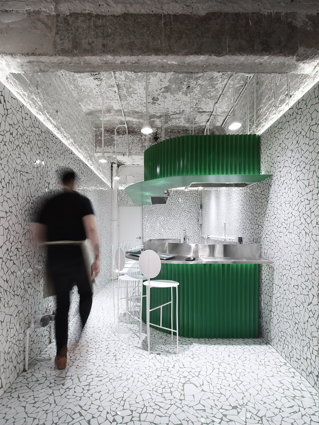
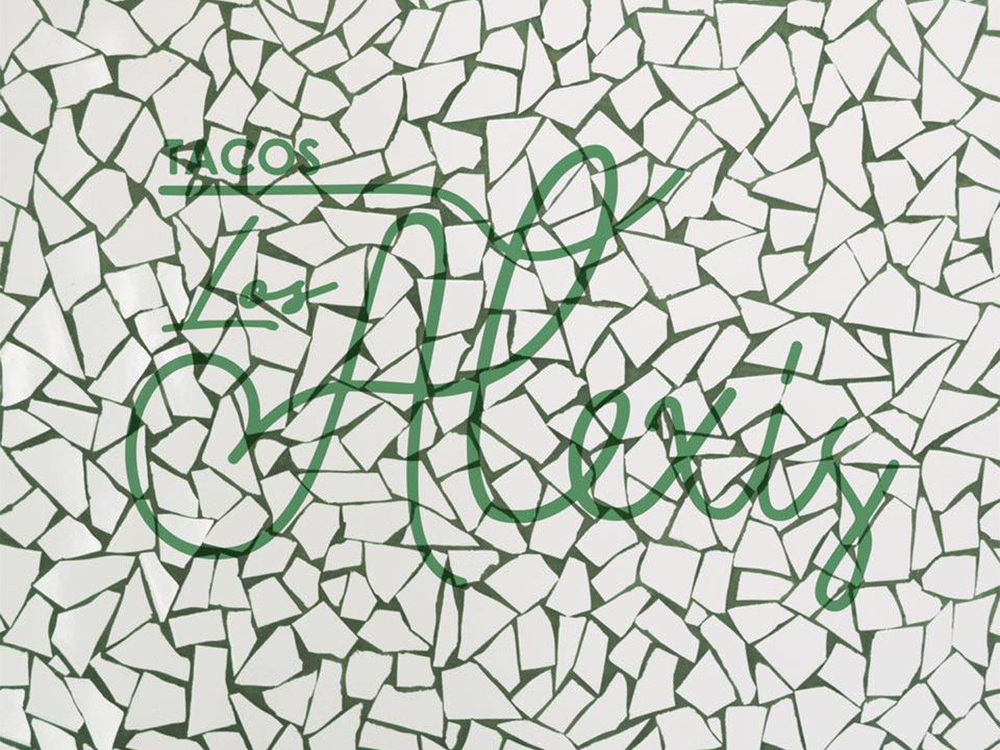
Los Alexis taquería in Mexico City by RA!
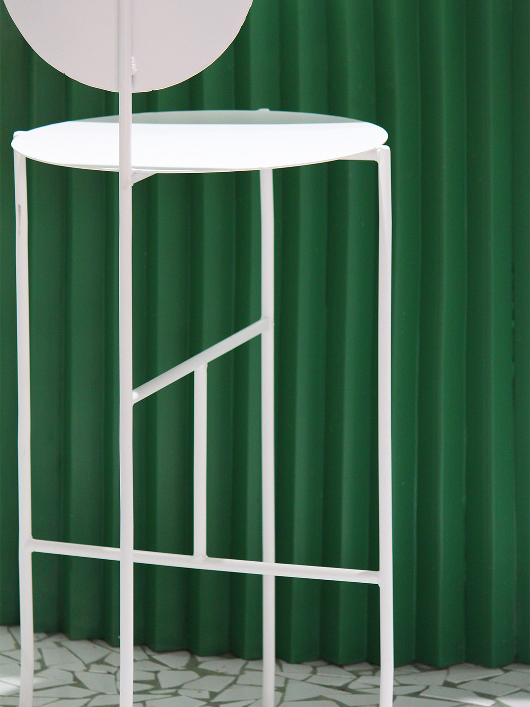
When viewed from the outside, and indeed from the shoebox interior, the focal point of the pint-sized taco restaurant is its counter. Swathed in punchy green, the bar and its concertina-fold facade playfully dominates the space. It also performs two simple tasks. Firstly, the bar format separates diners from the kitchen, where there’s just enough elbow room for the cooks to whip up tonnes of tacos. And, secondly, the bar and its six stools give permission for guests to indulge in a quick bite at the counter, perched in close proximity to the action of the kitchen.
Tiles are a commonly used material in Mexican architecture and design, so it’s only fitting that an age-old mosaic technique has been given a contemporary reboot by RA!. The design team specified smashed white tiles in countless shapes and sizes to hug the walls and line the floor of the restaurant. Between each glossy piece of broken tile, a sea of green-tinted grout visually connects the mosaic envelope to the colour of the bar.
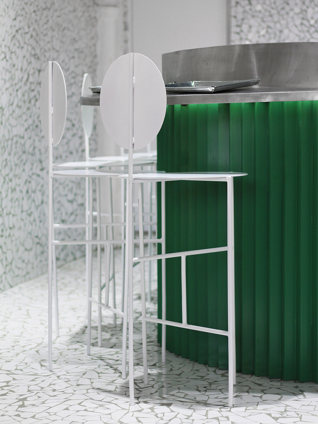
Left mostly untouched during the renovation process, the ceiling of the restaurant is expressed in bare concrete. Only a new lighting system and the bulkhead containing exhaust facilities were added to the overhead space. The chalky texture and appealing patina of the concrete is highlighted by a horizontal ribbon of lighting that borders the top edge of the mosaic walls. Emitting a soft glow, the lighting pulls into focus a dynamic canvas where cult-status food and fleeting social interactions are set to deliver heightened levels of buzz and plenty of panache.
Catch up on more architecture and design highlights. Plus, subscribe to receive the Daily Architecture News e-letter direct to your inbox.
A hole-in-the-wall taquería has emerged in the Roma Norte region of Mexico City; a reimagined neighbourhood whose once upper-class footpaths are now frequented by cuisine-seeking hipsters.

Related stories
- Introducing the New Wave collection of 80s-inspired vases by Greg Natale.
- Carla Sozzani curates new colours for classic Arne Jacobsen chairs.
- Adam Goodrum stamps all-Australian style on new breezeblock design.
Tucked away in one of the world’s greatest urban jungles, a 46-square-metre concrete shell is bursting with life. Reimagined by Russian creative studio Reutov Design, the elevated ground-floor space in New York City is now home to an eye-popping eatery. It’s a special place where Dmitry Reutov, founder and principal of Reutov Design, believes that city workers, food fanatics and coffee-lovers will find respite from the chaos of The Big Apple.
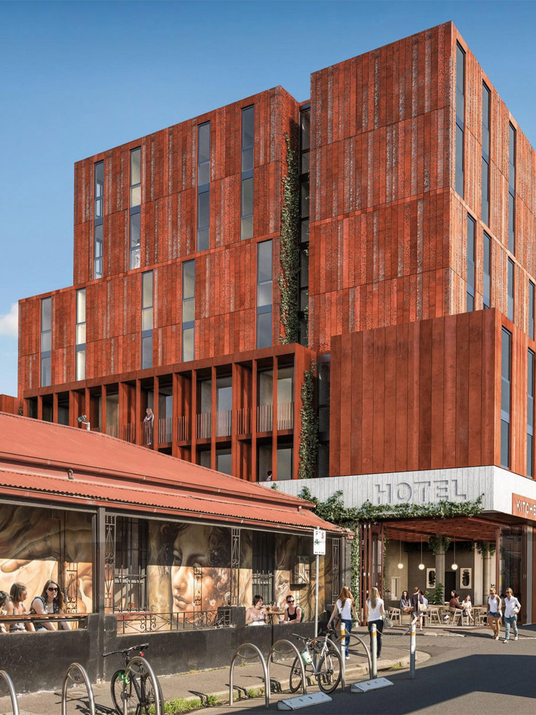
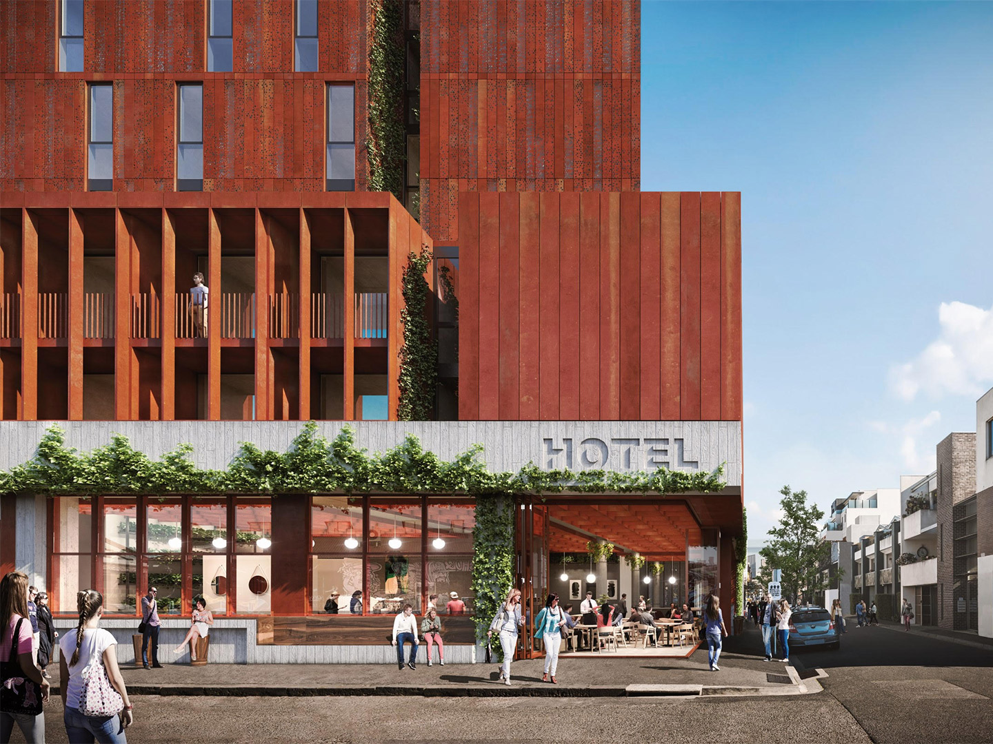
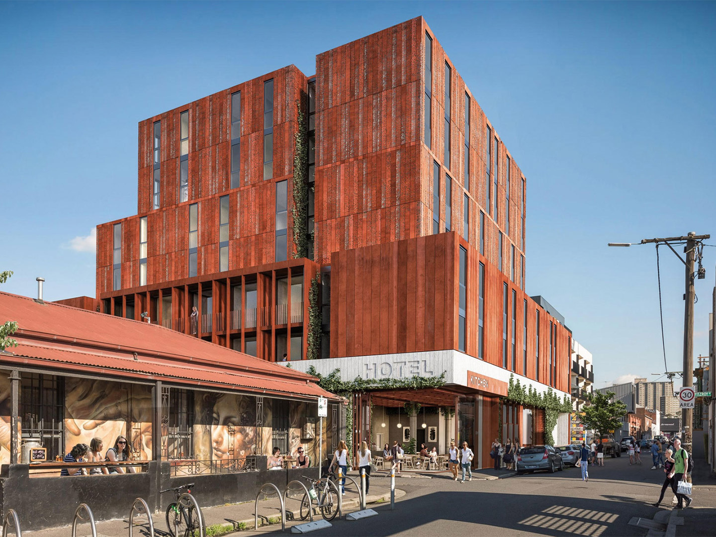
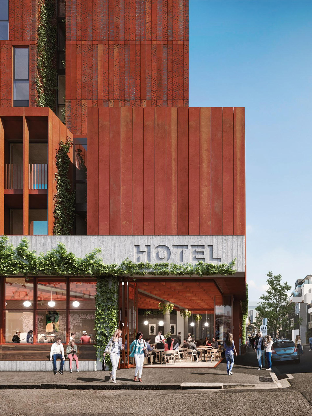
Featuring architecture by Woods Bagot and interiors from the team at Hecker Guthrie, preliminary illustrations of the 127-room, seven-level hotel show that the building takes creative cues from Fitzroy’s rich industrial heritage and bohemian spirit, while also respecting its residential surrounds.
Yet to be officially named, the new Standard Hotel in Melbourne (not to be confused with the existing Standard Hotel at 293 Fitzroy Street) is just one of many new hotels in the pipeline for the US-based hospitality chain as they look to expand into Asia and Europe. The hotel group has a raft of boutique accommodation venues slated for Hua Hin, Bangkok, Singapore, Porto, Lisbon, and Brussels, all listed on the company’s website as coming soon.
Construction of The Standard Hotel in Melbourne is expected to begin later this year and completed by 2023.
thestandardhotels.com; woodsbagot.com; heckerguthrie.com
A hole-in-the-wall taquería has emerged in the Roma Norte region of Mexico City; a reimagined neighbourhood whose once upper-class footpaths are now frequented by cuisine-seeking hipsters.
Catch up on more architecture and design highlights. Plus, subscribe to receive the Daily Architecture News e-letter direct to your inbox.
Related stories
- Introducing the New Wave collection of 80s-inspired vases by Greg Natale.
- Carla Sozzani curates new colours for classic Arne Jacobsen chairs.
- Adam Goodrum stamps all-Australian style on new breezeblock design.
Tucked away in one of the world’s greatest urban jungles, a 46-square-metre concrete shell is bursting with life. Reimagined by Russian creative studio Reutov Design, the elevated ground-floor space in New York City is now home to an eye-popping eatery. It’s a special place where Dmitry Reutov, founder and principal of Reutov Design, believes that city workers, food fanatics and coffee-lovers will find respite from the chaos of The Big Apple.
The design brief was straightforward, explains Masquespacio co-founders Christophe Penasse and Ana Hernández: to develop a “sensorial experience” that builds upon the health-focussed fare on offer at Pukkel. In response, the designers drew inspiration from the nearby Pyrenees mountains and the natural surroundings of the Aragon province, arriving at an earthy palette with the power to evolve each season through a “forest” of plants and flowers.
Pukkel restaurant in Huesca, Spain, by Masquespacio
“After a workshop with Jorge and Mikel, we immediately proposed to work with one hundred percent natural materials and integrate nature into the space,” says Christophe, whose next step, along with Ana, was to search for inspiring connections between the city and the salutary lifestyle promoted by Pukkel’s health-centric gastronomy. “We investigated the province of Huesca and started to discover the beauty of the mountains and parks in its surroundings,” Ana adds. “We definitely found the reference we were looking for and that fitted perfectly with the healthy lifestyle concept from Pukkel.”
The result is a restaurant where diners are pleasantly reminded of nature first-and-foremost through colour: a grounding blend of terracotta, beige, sand and mushroom tones, offset harmoniously by warm white, sage and forest-inspired greens. Glimmers of gold arrive courtesy of metallic finishes that wrap furnishings, columns and drifts of light-fittings overhead, elevating the ambience of the interior to meet its fine-dining expectations.
After a workshop with Jorge and Mikel, we immediately proposed to work with one hundred percent natural materials and integrate nature into the space.
The materiality and planning of the restaurant also taps into the spirit of nature, beginning with the plushy banquette pods positioned beside meandering tiled pathways. “The imperfect forms are mainly organic and draw a path on the floor like if you were walking through the forest,” says the designers. “All around the path, circular spaces are recreated like if we were in the mountains and allow the customers to share a moment with family or with friends, disconnecting from the daily routine.”
The enchanting curves of the pathways and secluded banquettes are echoed on the ceiling through tiered levels of plasterwork that are capped with flowing ribbons of interlocking terracotta tiles. These tiers form bulkheads for concealed services while also appearing to trace undulating terrain like an extruded topographic map.
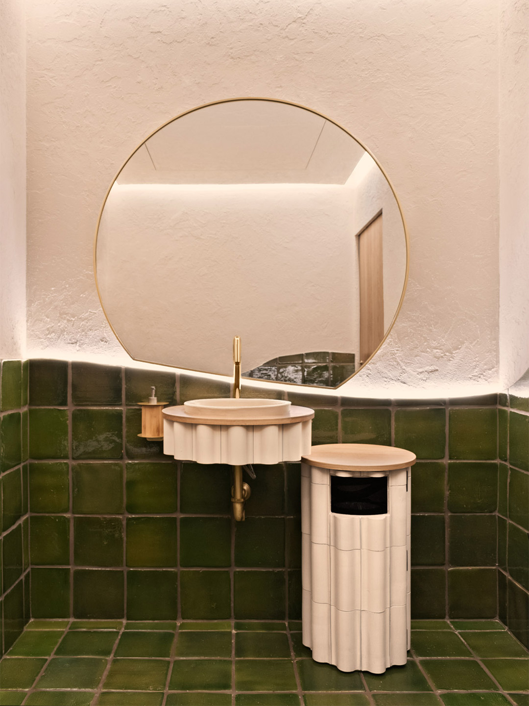
Terracotta is the key ingredient on the floors, bar fronts and some of the walls where tile patterns and profiles were designed by Masquespacio specially for Pukkel, including in the restrooms where sculptural terracotta tiles clad the bathroom furniture. Next to the ceramic tiles on the dining room walls, the application of rough stucco nods to the tactility of bare earth, says the designers, who also specified the textured stucco finish to appear on the curved framework of the banquettes.
It’s here, on top of the part-walls that cocoon the banquettes, where tufts of flowers and foliage are displayed in magnificent arrangements of differing heights. Some shoot up tall while others spill over, breaking up the sharp-edged lines of the joinery. Through this simple gesture by Masquespacio, the restaurant space is given permission to connect with the seasons and the produce-driven menu, offering scope for spatial transformation and an ever-changing atmosphere for returning guests.
Catch up on more hospitality architecture and design and retail design, plus subscribe to receive the Daily Architecture News e-letter direct to your inbox.
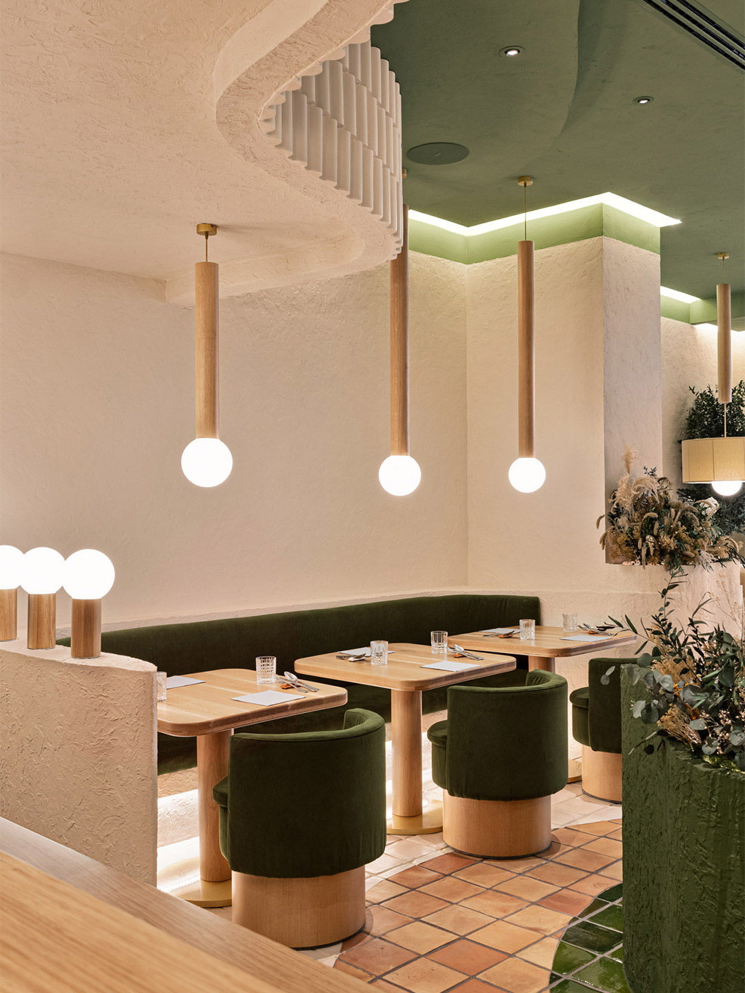
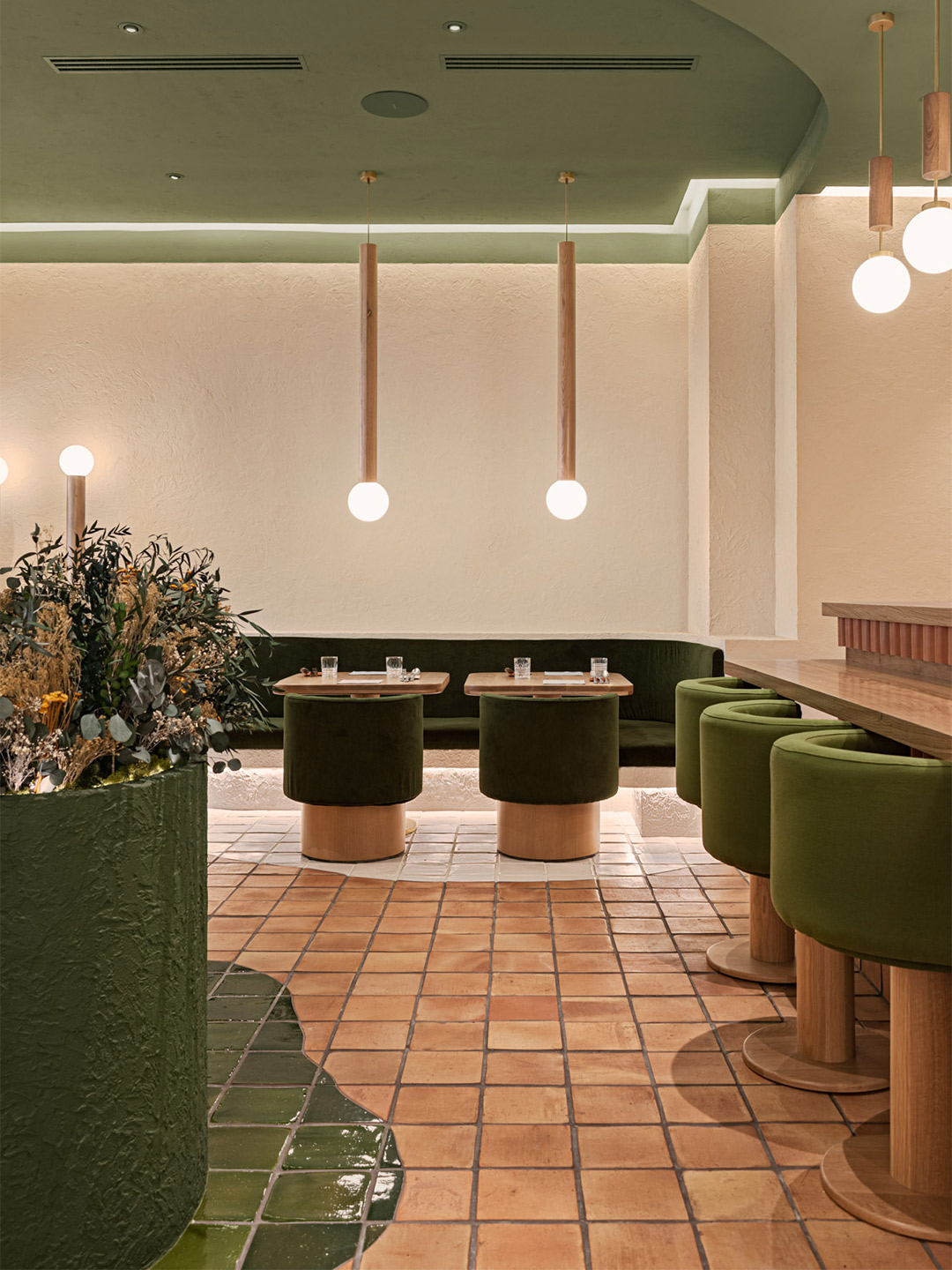
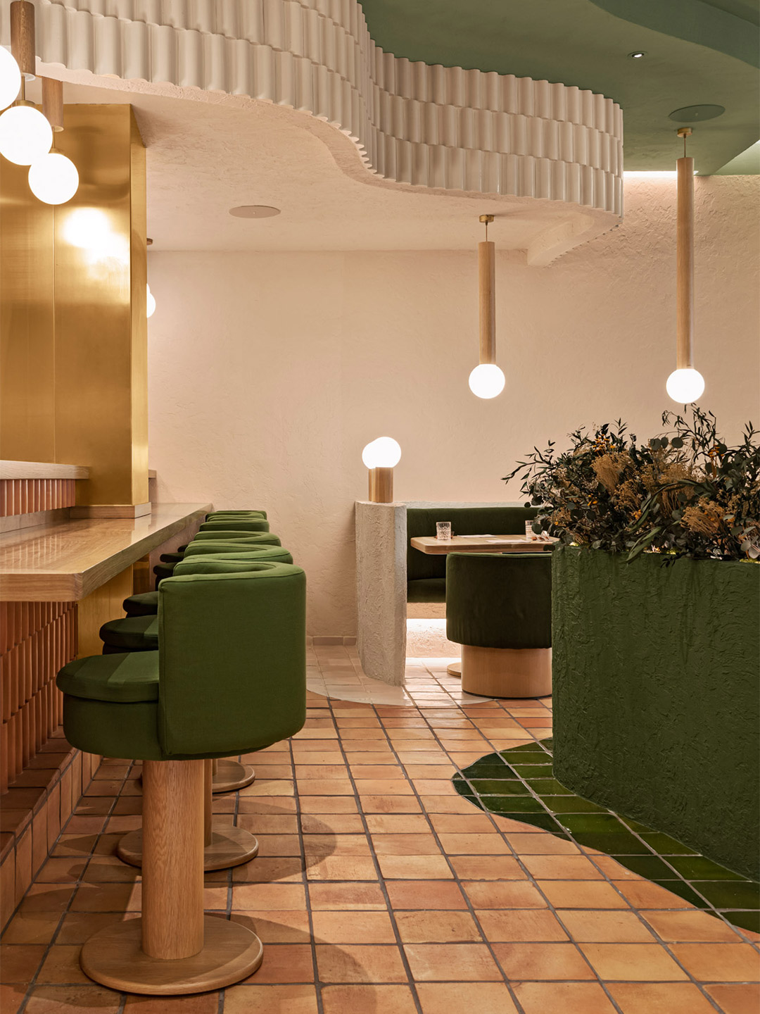
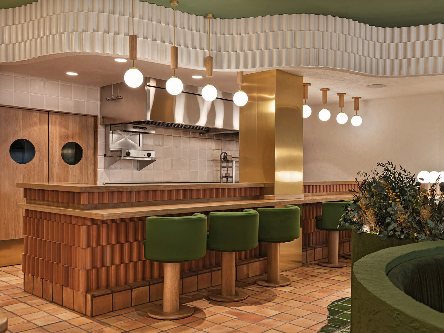
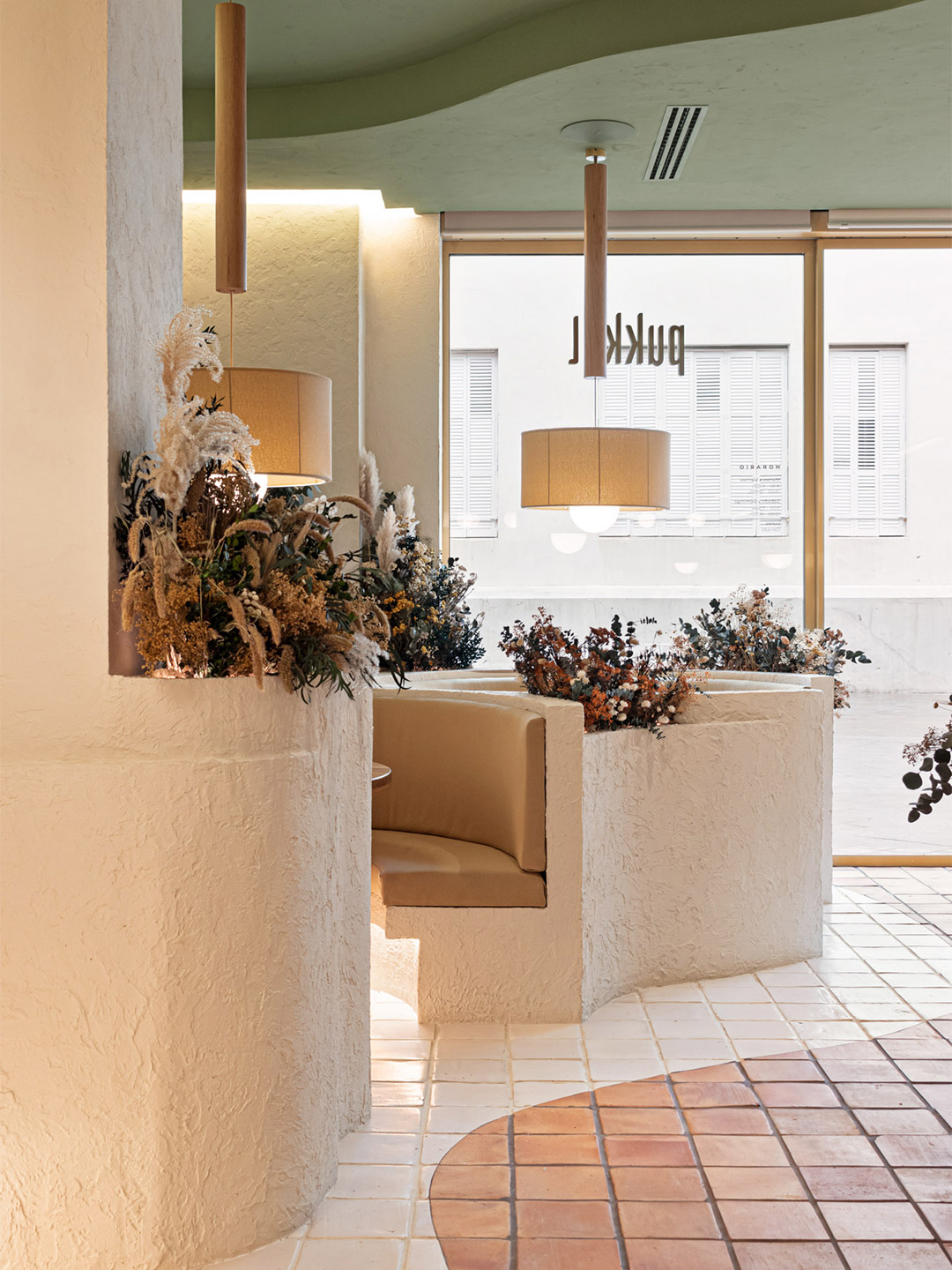
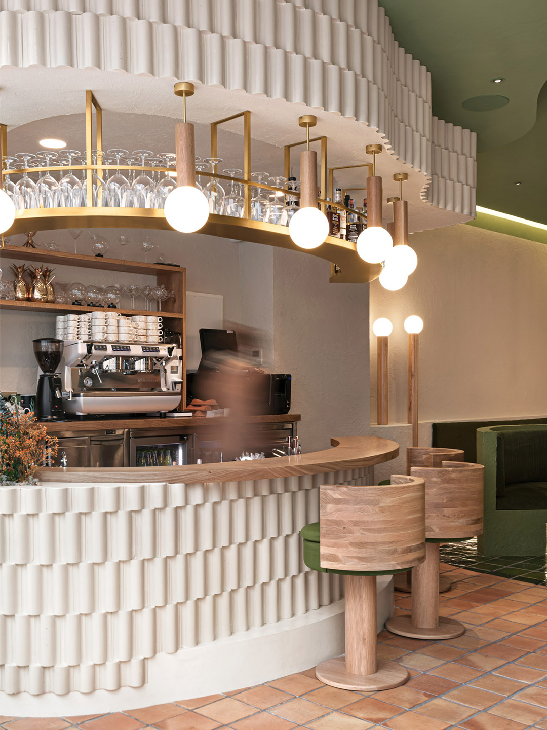
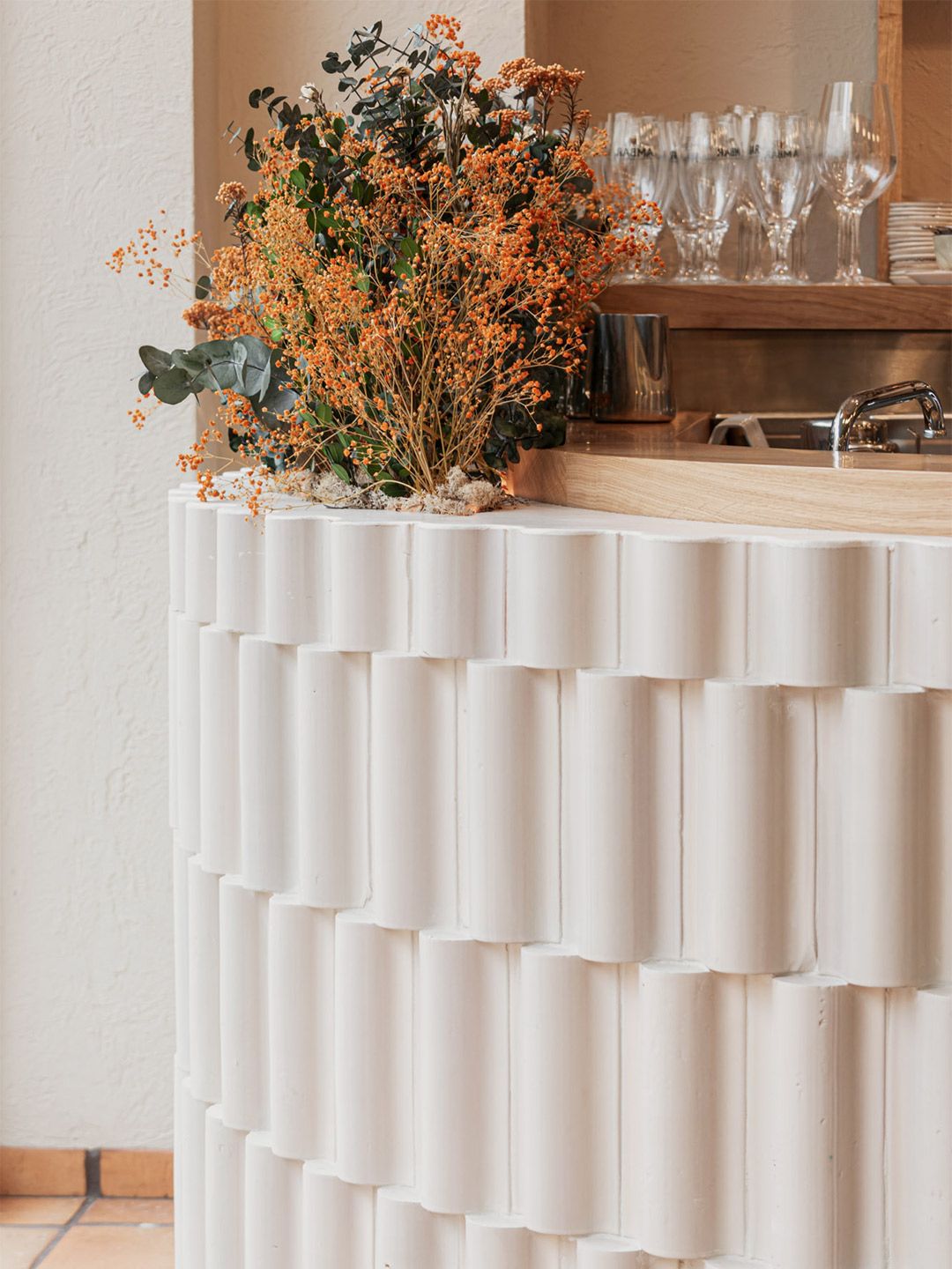
Related stories
- Resa San Mamés student accommodation in Spain by Masquespacio.
- The bar and restaurant at La Sastrería in Valencia by Masquespacio.
- Mama Manana restaurant in Kyiv by Balbek Bureau.
The Shiroiya Hotel in Maebashi, Japan, occupies the site of a former ryokan – a type of Japanese inn – that hosted guests from all corners of the globe for more than 300 years. “The Shiroiya Ryokan had been in operation since the Edo Period but it sadly had to close, leaving the building vacant,” says architect Sou Fujimoto, who began working on the project when his client, a Maebashi native, purchased the uninhabited edifice.
Standing in front of the deteriorating building, which would later become the hotel’s Heritage Tower, the client’s vision was to inject renewed energy into the structure through a new-era lodging – a hub for art and culture – with the hope that it might spark a wave of revitalisation in the “hollowed-out centre” of Maebashi, known as the machi-naka area.
The Shiroiya Hotel in Maebashi, Japan, by Sou Fujimoto Architects
During the hotel’s design phase in 2016, the client and Maebashi City council joined forces to research and analyse the principal features of the city, arriving at the concept of mebuku, which translates to mean ‘sprouting’. This idea would become the driving force for visualising the Maebashi City of the future and the guiding keyword for the hotel’s design response.
“We visited the site at the earliest opportunity, and found a banal four-storey RC structure,” Sou says. “We felt that something drastic was needed to realise any potential, and at the start of the design process, we decided to dismantle the walls and floors across all four storeys to create a gigantic central atrium.”
Caged beneath the atrium’s skeleton of powerful concrete columns, exposed beams and network of tubular lighting, the Shiroiya Hotel was reborn as the “city’s living room”. It’s a place where local residents and travellers now come together, drawing inspiration from Japanese art and the country’s much-loved culinary culture.
“It is a city-scale internal piazza where diverse elements coexist, such as artworks, plants, furniture, curtains and staircases,” explains the architect. “Several artists, designers and city residents participated to support the vision, and the Shiroiya project embraced diversity through collaboration with those individuals and groups.”
When a visitor climbs the stairs, they perceive spatial changes, stretching and reducing in depth and overlapping in all directions, as their sightlines and body direction alter along the route. The intention of this gesture was to replicate the experience of moving through an actual city, explains Sou. “The seamless three-dimensionality continues right up to the top of the atrium. This vertical cavity forms a 3D urban district of ‘streets’, which continue on from outdoor pathways.”
We hope this new space, born from a mixture of city, architecture and landscape will contribute to the remaking of a future city.
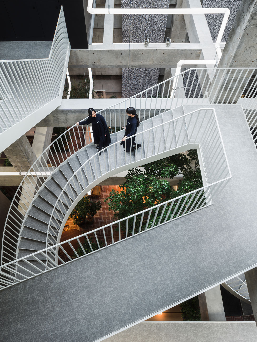
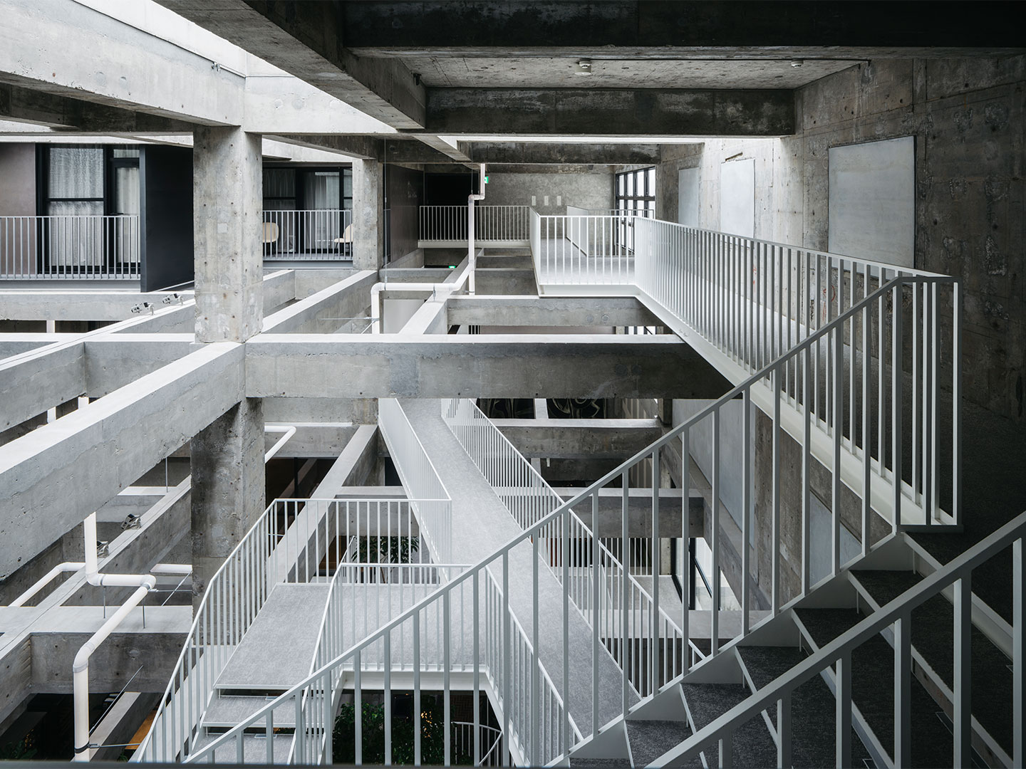
Adjacent to the Heritage Tower, the newly built Green Tower and its grassy knoll was inspired by the verdant banks of the Tonegawa River. The tower’s location was once a terrace over a tributary of Tone River, and the two tower sites have a height difference equivalent to one storey.
“Originally, the main building had a public footpath traversing its site from the main road at the front, to Babakkawa-dori street in the back,” says the architect. “We therefore proposed a green bank to function as similarly, running from the main road to the rear street, which would also compensate for the height difference.”
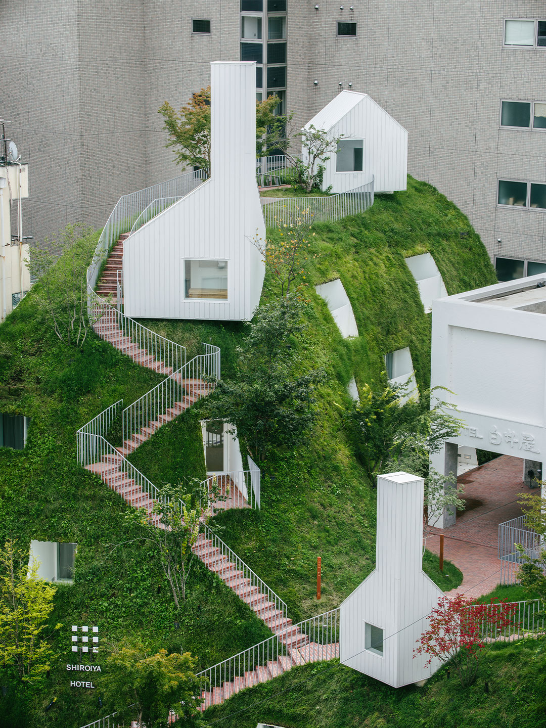
“We created a raised bank to offer a new urban space and to be a three-dimensional extension of the existing route,” Sou says. “It is also a spatial expansion of the sidewalk and is surrounded by curved surfaces.”
The undulating green hills that unexpectedly accompany the Green Tower resonate with the concept of mebuku or ‘sprouting’, while also building upon Maebashi’s former life as a silk-manufacturing city – a history that greatly contributed to Japan’s modernisation. “We hope this new space, born from a mixture of city, architecture and landscape will contribute to the remaking of a future city, growing and resonating throughout Maebashi.”
sou-fujimoto.net; shiroiya.com
Catch up on more hospitality architecture and design. Plus, subscribe to receive the Daily Architecture News e-letter direct to your inbox.
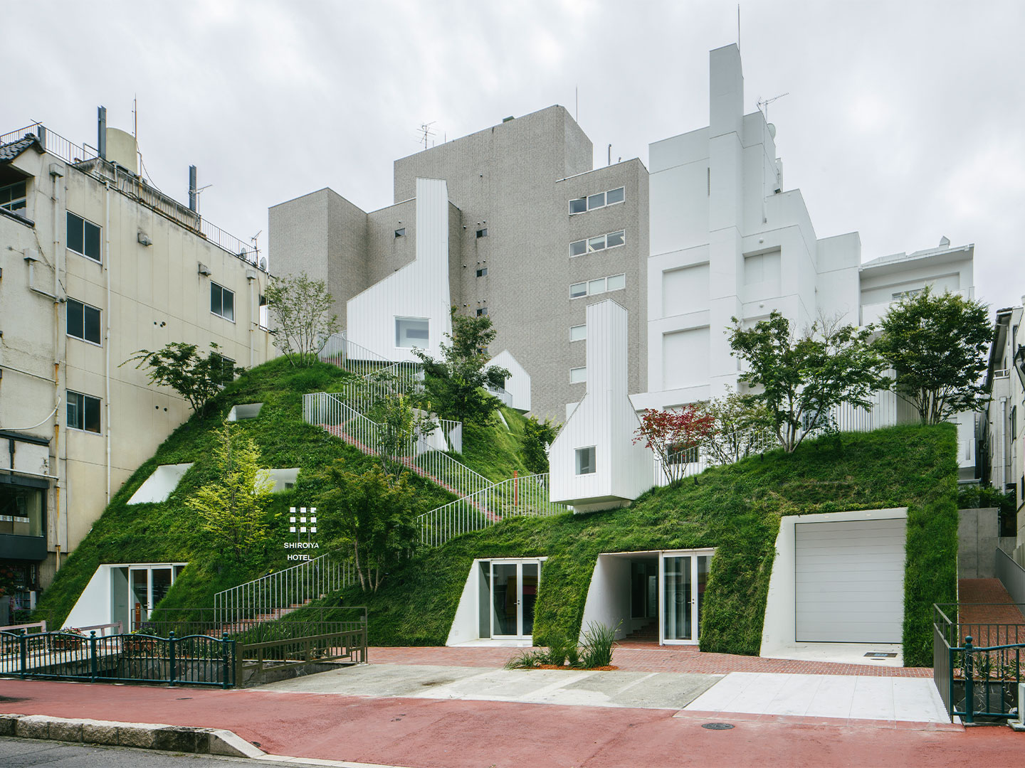
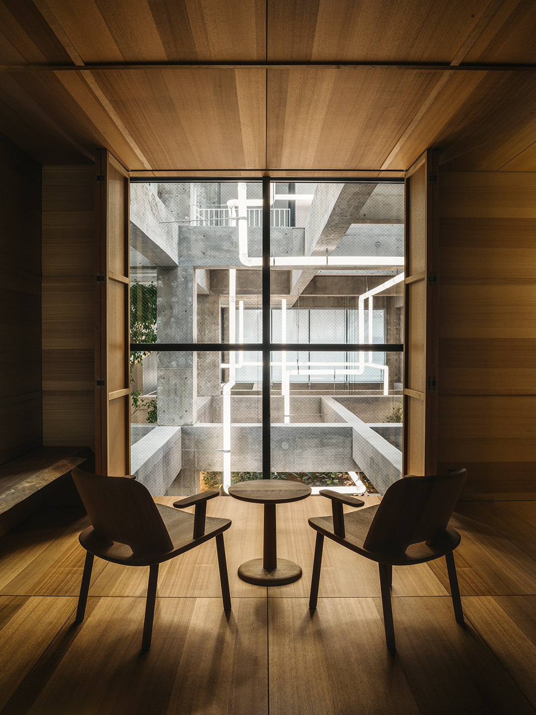
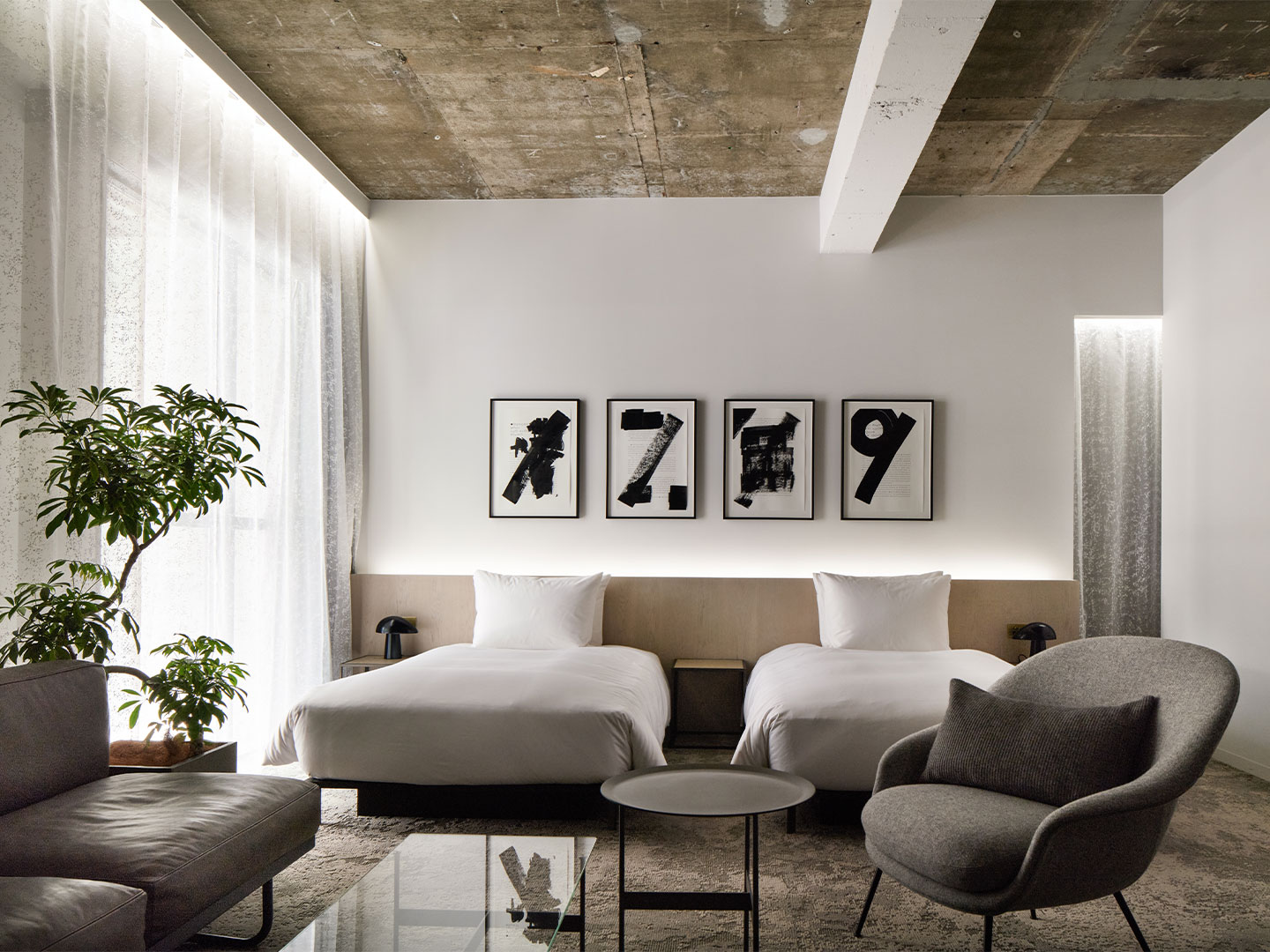
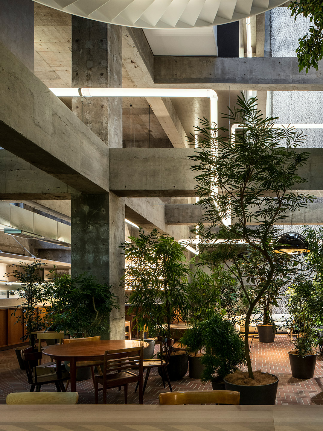
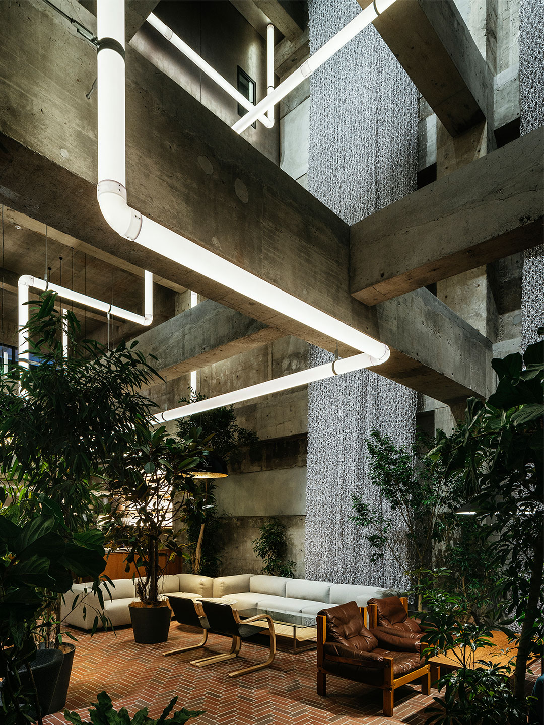
Related stories
- Introducing the New Wave collection of 80s-inspired vases by Greg Natale.
- Carla Sozzani curates new colours for classic Arne Jacobsen chairs.
- Adam Goodrum stamps all-Australian style on new breezeblock design.
The Shiroiya Hotel in Maebashi, Japan, occupies the site of a former ryokan – a type of Japanese inn – that hosted guests from all corners of the globe for more than 300 years. “The Shiroiya Ryokan had been in operation since the Edo Period but it sadly had to close, leaving the building vacant,” says architect Sou Fujimoto, who began working on the project when his client, a Maebashi native, purchased the uninhabited edifice.
Named Cafe Krujok (also Kruzhok) after the specific type of doughnut that influenced the fit-out, the dreamland diner is defined by squishy-looking furniture and delectable lines, bejewelled with popcorn-shaped wall decorations by Russian artist Elena Minaev (reflecting “an important element of the dessert”) and ‘glazed’ with lashings of lavender – all inspired by the sticky-sweet treats.

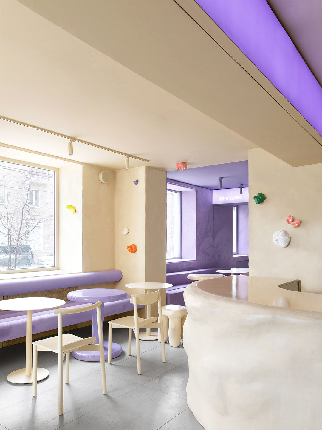
Cafe Krujok by Eduard Eremchuk and Katy Pititskaya
“Once you are inside, a new reality absorbs you. The pastry is everywhere, it looks and even feels like the cafe is made of dough,” says Eduard and Katy. “The goal was to create an ambience so each guest could dream their own dream in the world of pastry.”
Reflecting two of the three key components of a doughnut, the interior space is divided into two main rooms. “The first one, you start your journey as if you are inside a doughnut – crumpled glossy furniture, beige and sand-coloured walls and furniture refer to different forms of dough,” says the designers.
We wanted to create an unusual, slightly crazy, and unreal place, but at the same time, understandable to the guests.
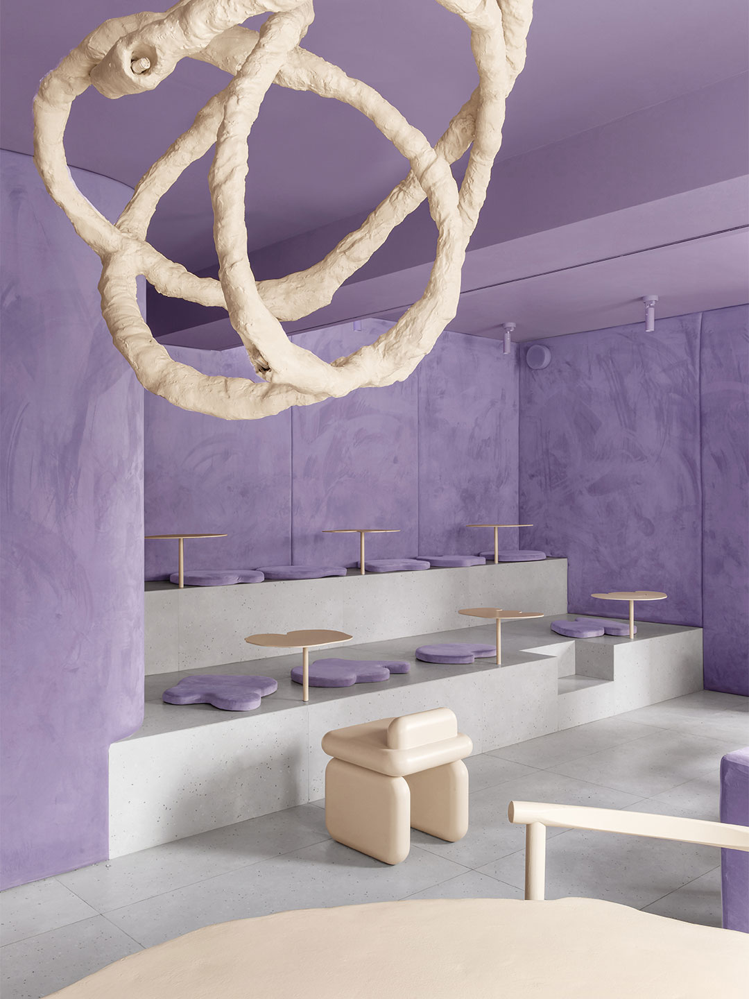

In the next space, remembered for its amphitheatre-like seating arrangement, Katy and Eduard reinterpreted decadent, gooey glaze. The room is finished with delicious shades of purple on the ceiling, soft velvety wall coverings and accessories, and part-lit by glowing purple light boxes.
Connecting back to the light and fluffy atmosphere of the entry zone, a crumpled table with chairs takes centre stage in the middle of the room while a chandelier overhead appears freshly suspended from strings of malleable dough.

When diners arrive in the restroom, the designers say they should feel as though they have just entered “the creamy-sweet filling of the pastry” as it ‘melts’ around them. The frothy, textured wall-finish runs from floor to ceiling, as if painstakingly applied with a pâtissier’s piping bag, achieved with construction foam that was painted beige and coated with clear epoxy resin.
Coupled with the edible delights served up at the eatery, the tongue-in-cheek design response at Cafe Krujok delivers a playful breath of fresh air in the city; a fantastical contrast to the grey concrete streetscape that exists outside the front door. “We wanted to create an unusual, slightly crazy, and unreal place, but at the same time, understandable to the guests,” says the designers. “As a result, Krujok has become a prominent and desired place to be – a key spot on the map.”
eduarderemchuk.com; @pititskaya
Catch up on more hospitality architecture and design. Plus, subscribe to receive the Daily Architecture News e-letter direct to your inbox.
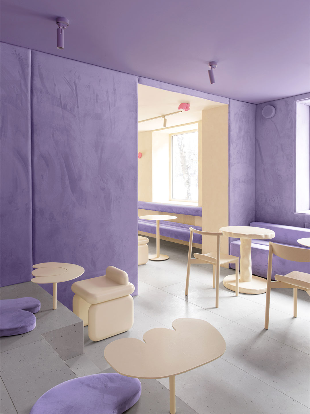

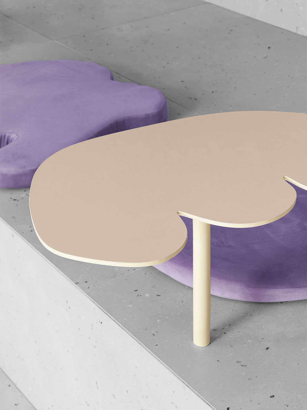


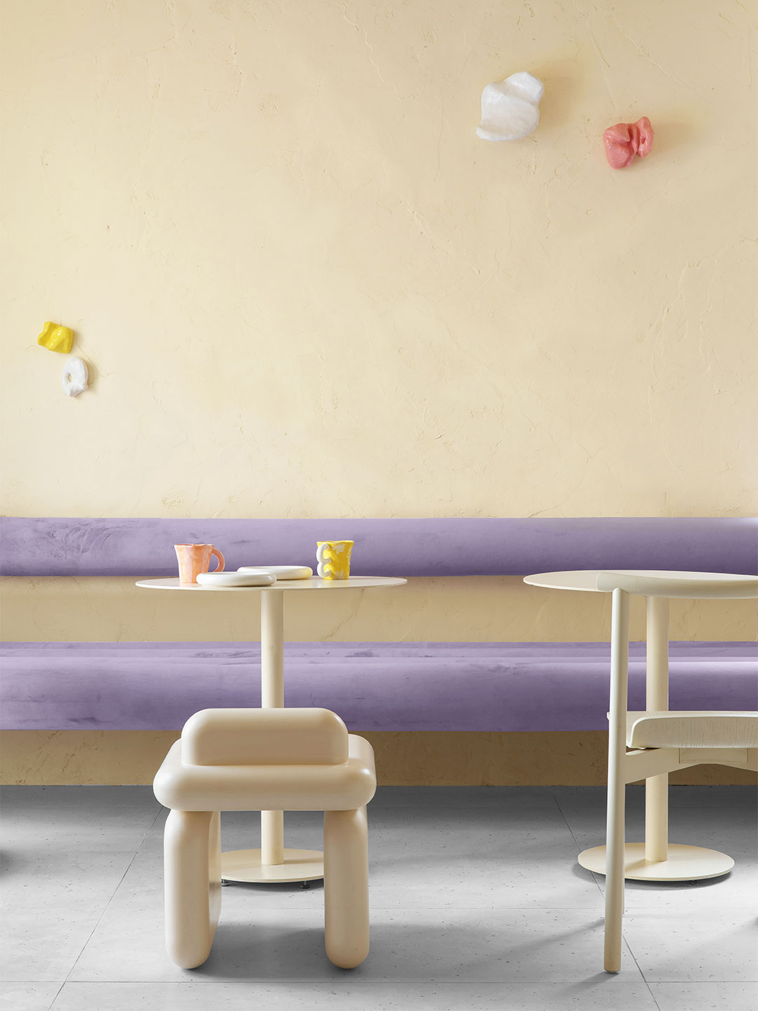

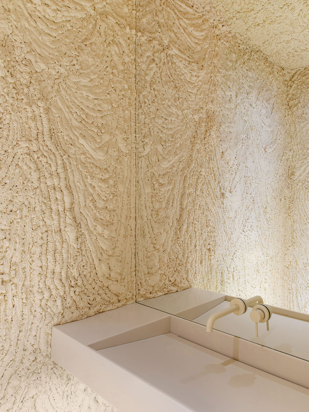
Related stories
- Introducing the New Wave collection of 80s-inspired vases by Greg Natale.
- Carla Sozzani curates new colours for classic Arne Jacobsen chairs.
- Adam Goodrum stamps all-Australian style on new breezeblock design.
Few creative studios expertly juggle high-octane colour quite like Spanish design practice Masquespacio. The latest project to come from the dynamic designers – an upbeat restaurant in Milan belonging to the Bun burger chain – is testament to such seemingly effortless skill, spearheaded by practice co-founders Christophe Penasse and Ana Hernández.
Surprisingly, the Bun burger restaurant is Masquespacio’s first interior design project in Milan. And it’s one that saw the designers make a return to the Italian fashion and design capital outside of Milan Design Week, where in 2019 they presented an exhibition with Italian terracotta artisan Poggi Ugo, and in 2016 showed their Memphis-inspired Toadstool collection of furniture. The project also marks the design firm’s debut restaurant design for the Bun burger group.
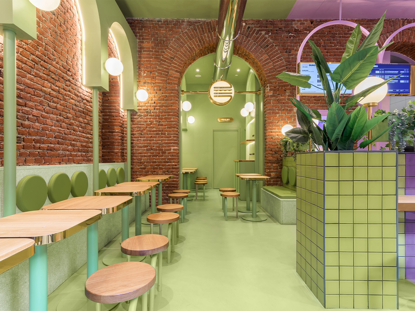
Bun burger restaurant in Milan by Masquespacio
Located in the student-dense area of Viale Bligny, next to the Bocconi University in Milan, the newly completed diner unveils a new visual identity for the burger brand, daringly defined by Christophe and Ana’s signature use of saturated colour alongside gold ’n’ arches: glimmering gold accents and rows of archways that unwittingly nod to the nickname of another world-famous burger chain.
In recent years, the designers have observed an increase in hamburger restaurant chains appearing in the region, and around the world, but they say that most of them straddle a vintage-industrial design aesthetic. The fit-out conceived by Masquespacio for the Milanese outlet of Bun paves a completely different path. The restaurant is presented as an innovative, fresh-faced concept that showcases the authenticity of the Bun brand, its plastic-free attitude and, of course, the smash-hit burgers.
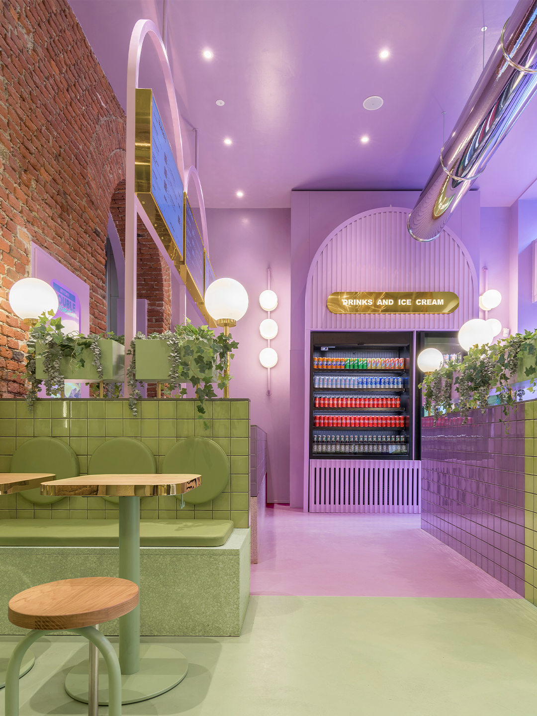
The Bun restaurant project in Milan began with Masquespacio’s designers Christophe and Ana investigating the existing elements of the site, fuelled by the underlying hope that the location would speak to them, perhaps through original architectural characteristics that could be incorporated into the final design response. “When we saw the beautiful bricks and arcs from the space it was evident for us that we would use these two elements as the starting point of the design,” Ana says.
Enchanted by the existing brick archways, the design duo embraced the arch when developing a uniform aesthetic for the hamburger restaurant. New arc forms were constructed throughout the space and brought to the fore with a distinctive pairing of pastel purple and green: a statement-making two-tone colourway that offers a subtle salute to the burger bars of yesteryear.
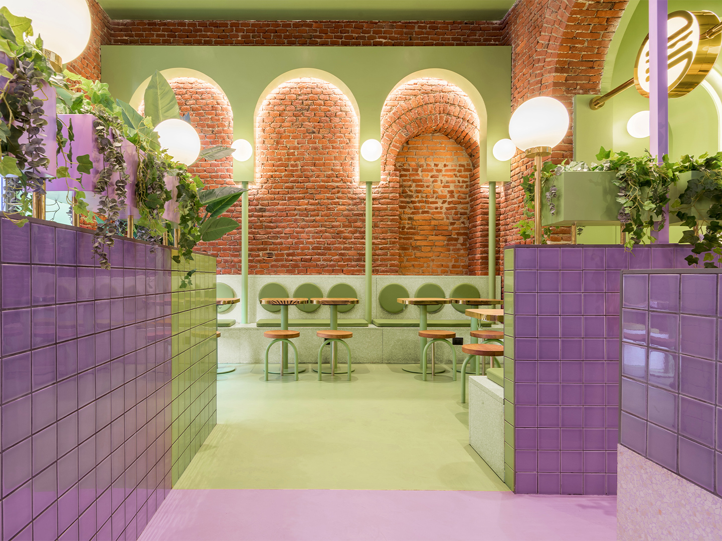
Some of the archways are “totally independent” and others are “highlighting the already existing arcs from the interior architecture,” says the designers, who also specified terrazzo, block-colour tiles, spherical light shades, timber furniture and potted foliage throughout the 140-square-metre restaurant.
The result is a space where Masquespacio and Bun have successfully captured the interests – and satisfied the appetites – of a youthful demographic in Milan, while also building upon the Italian city’s reputation for edginess, polish and sophistication. For each party, that means it’s a mission accomplished. But so thrilled is the client with Masquespacio’s restaurant design, the creatives have revealed they are now set to collaborate with Bun on the creation of several new restaurants in the brand’s portfolio, including an outlet in Italy’s north-west: “The next one will be Bun’s first opening in Turin”.
masquespacio.com; bunburgers.com
Catch up on more office architecture and design and retail design, plus subscribe to receive the Daily Architecture News e-letter direct to your inbox.
When we saw the beautiful bricks and arcs from the space it was evident for us that we would use these two elements as the starting point of the design.