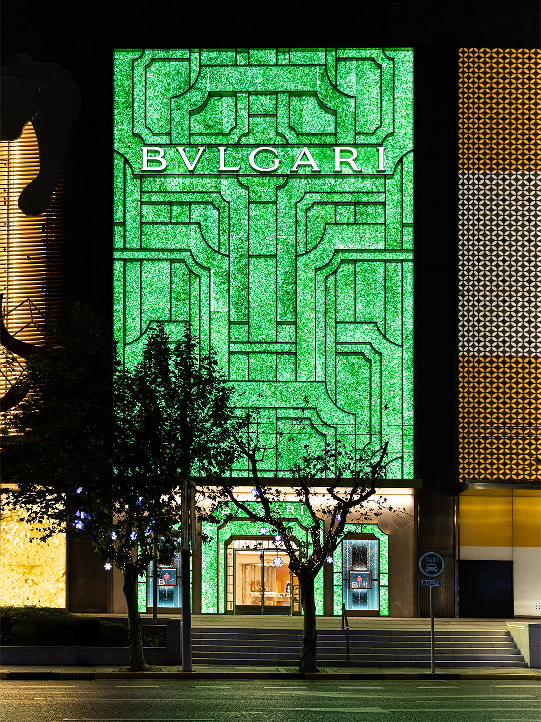
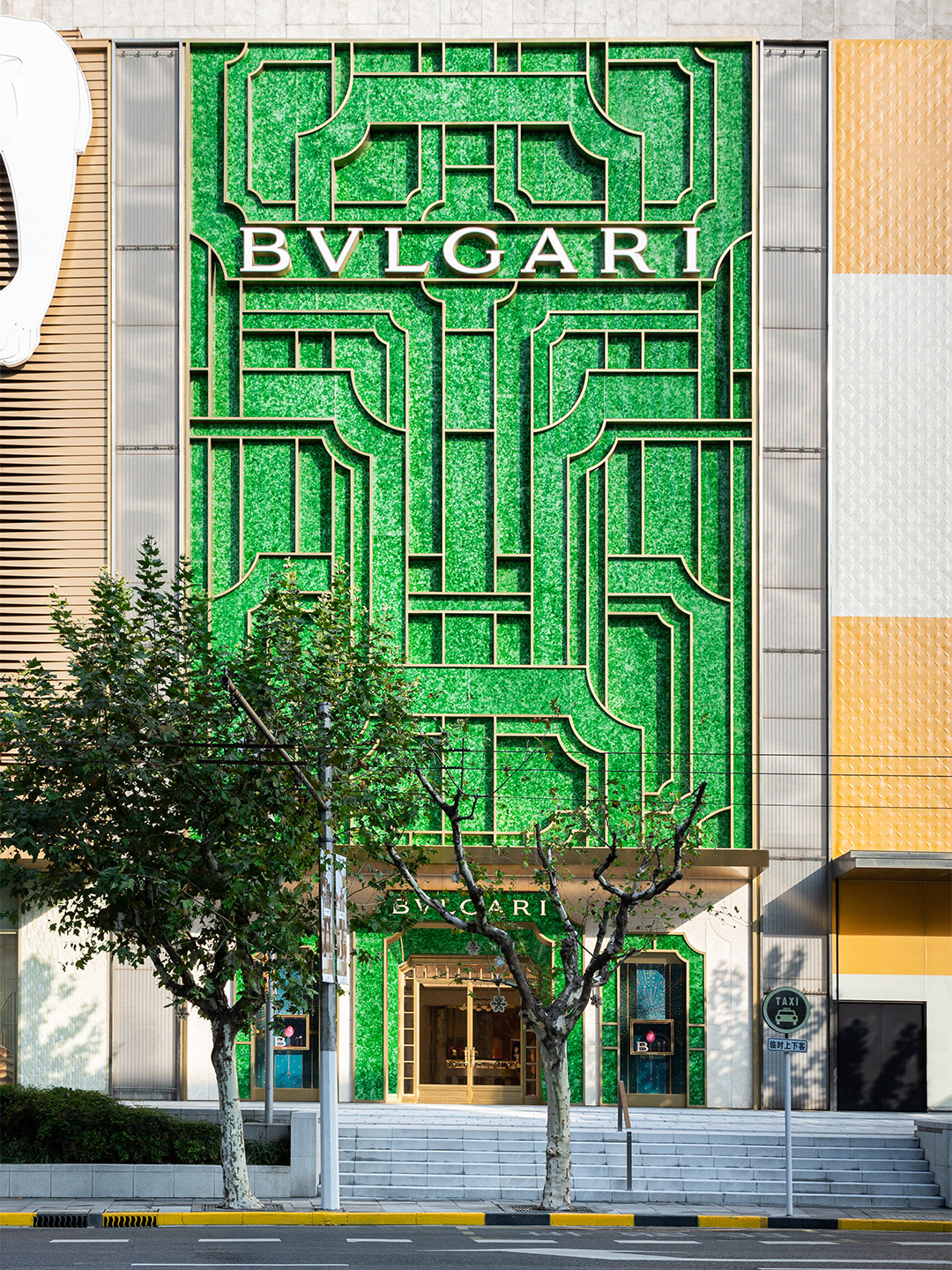
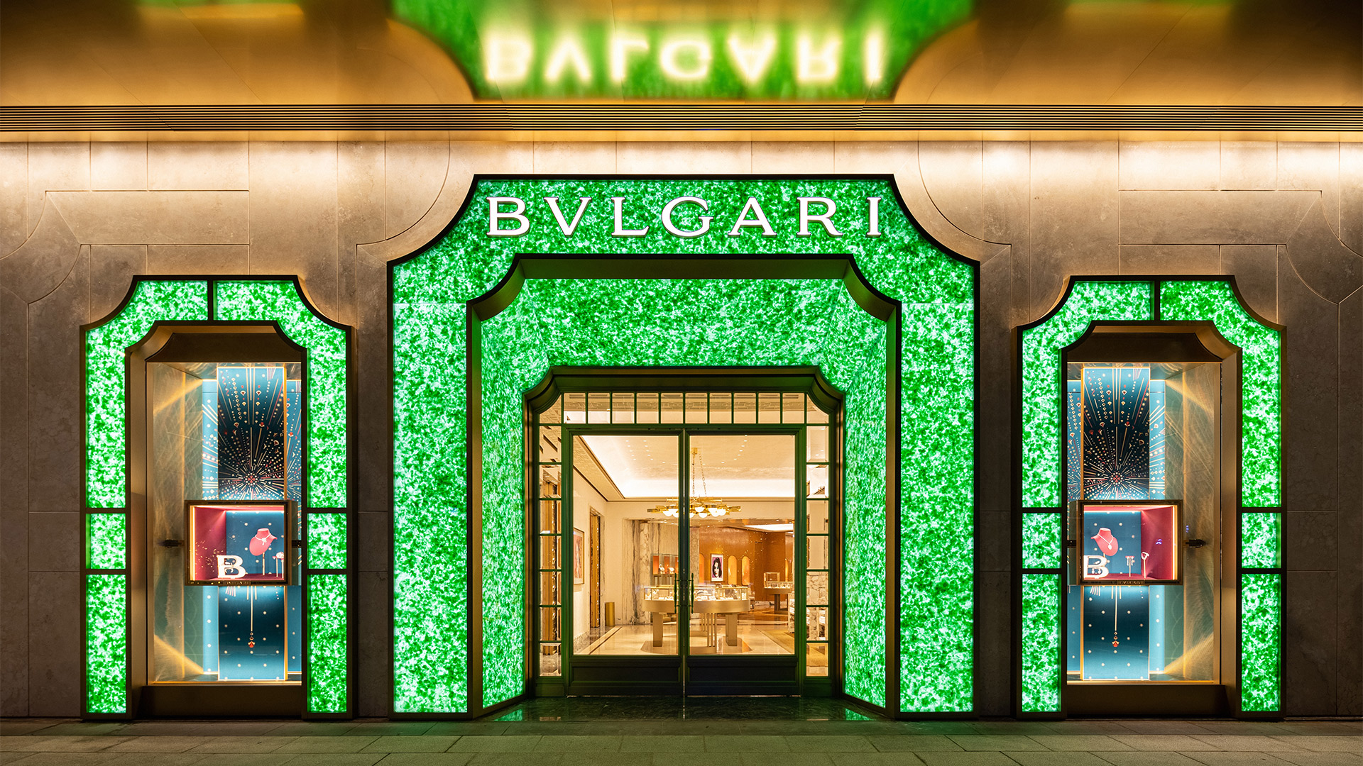
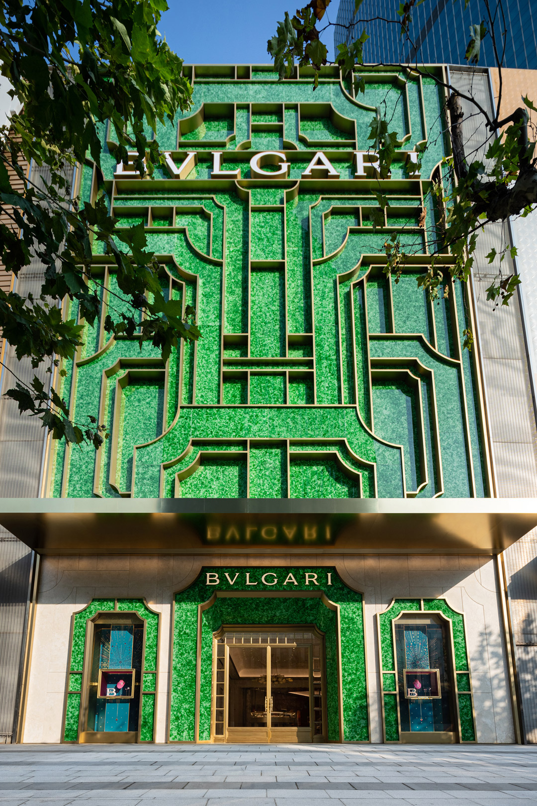
Shanghai Plaza 66 – one of the largest and most popular shopping malls on China’s central coast – is now home to the new Bulgari flagship store. Located on the bustling Nanjing Road, the multi-level boutique features a glowing green facade made from old champagne and beer bottles, embellished with shimmering brass accents. Inspired by a medley of influences, ranging from the original Bulgari store in Rome to Shanghai’s unique connection with Art Deco architecture, the project is considered “innovative and sustainable” by its designers, Netherlands-based architecture office MVRDV, who also suggest it “remains true to the heritage of both Bulgari and the city of Shanghai”.
The opening of the Bulgari flagship in Shanghai represents the third facade designed by MVRDV in the ongoing partnership between the Dutch architects and the luxury Italian jewellery brand. As with the other store designs, the Shanghai project makes use of a visual motif inspired by the portals and cornices of Bulgari’s earliest boutique (on the fashionable Via dei Condotti shopping strip in Rome), adopting the recognisable visual identity that now distinguishes the brand’s stores globally.
MVRDV unveils the Art Deco-inspired facade of Bulgari Shanghai
However, in a twist on the previous designs, this motif is not used to form windows in the facade. Instead, the Shanghai street-frontage is mostly windowless, and the cornice motif is employed in panels that form a pattern inspired by the Art Deco movement – an era with which Shanghai and Bulgari share a connection. The Chinese city’s status as a key port connecting East and West in the early 20th century gave it a rich tradition in the Art Deco architectural style, while Bulgari’s Déco collection characterised its jewellery in the same period.
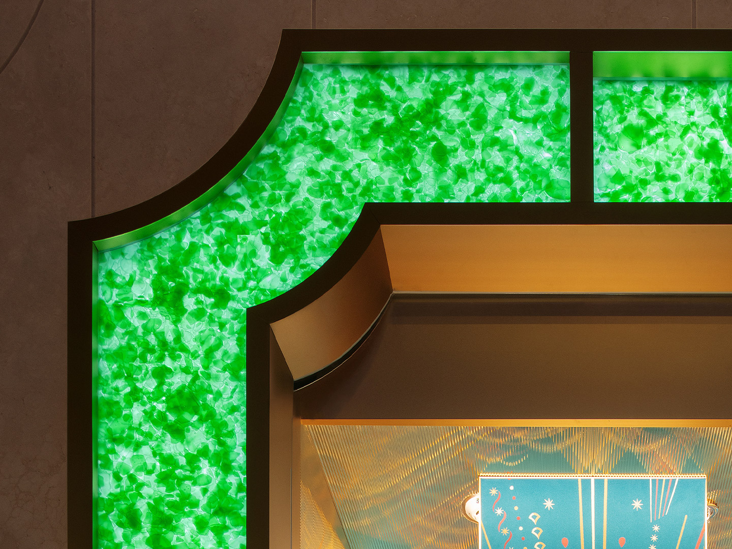
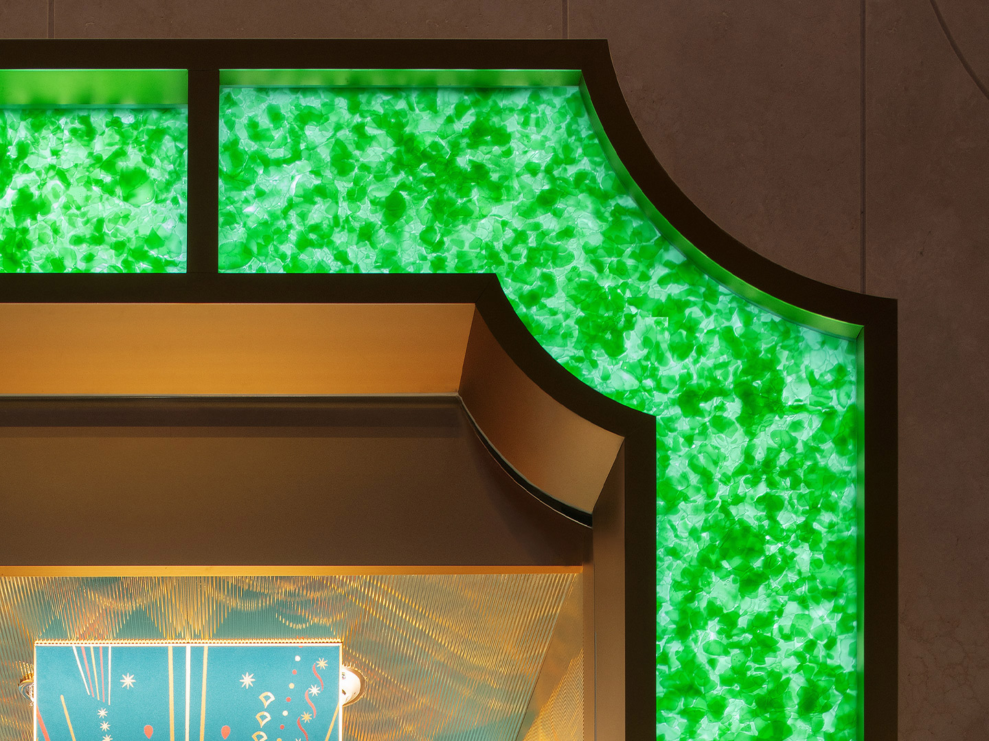
To close this circle of inspiration, the facade takes on the materiality of fine jewellery with its coloured panels that resemble jade – China’s most precious stone. The panels were fabricated in Germany using compressed green glass, creating a mesmerising effect with a translucent finish. At night, backlighting gives the facade its striking glow, highlighting the unique textural quality of the recycled glass. By day, the alluring panels transport the building into the fabled streets of Emerald City.
Demonstrating the potential of sustainable recycled materials, even in luxury contexts, the project takes another step towards MVRDV and Bulgari’s shared goal of creating stores that are built using 100 percent circular economy materials. This includes the backlighting that is engineered in Shanghai to minimise the facade’s energy footprint, using less than half the energy of a typical comparable installation.
“Our collaboration with Bulgari has yielded some fascinating material experiments,” says MVRDV founding partner Jacob van Rijs. “It’s a passion we share with them, albeit in different design disciplines. The Shanghai store encapsulates the value of these experiments. Given the right treatment and detailing, leftover champagne and beer bottles, which would otherwise be thrown away, [have] become a jewel for the city.”
Given the right treatment and detailing, leftover champagne and beer bottles, which would otherwise be thrown away, [have] become a jewel for the city.
Catch up on more architecture, art and design highlights. Plus, subscribe to receive the Daily Architecture News e-letter direct to your inbox.
Related stories
- Venus Power collection of rugs by Patricia Urquiola for cc-tapis.
- Bitossi celebrates centenary in Florence with new museum and 7000-piece display.
- Casa R+1 residence in southern Spain by Puntofilipino.
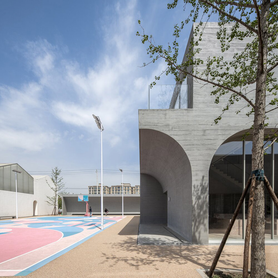
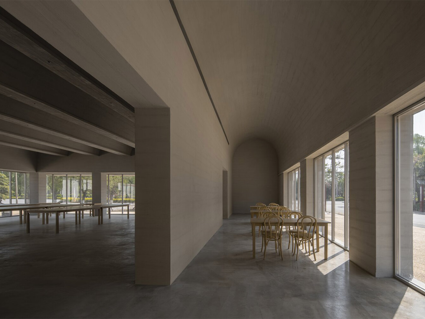
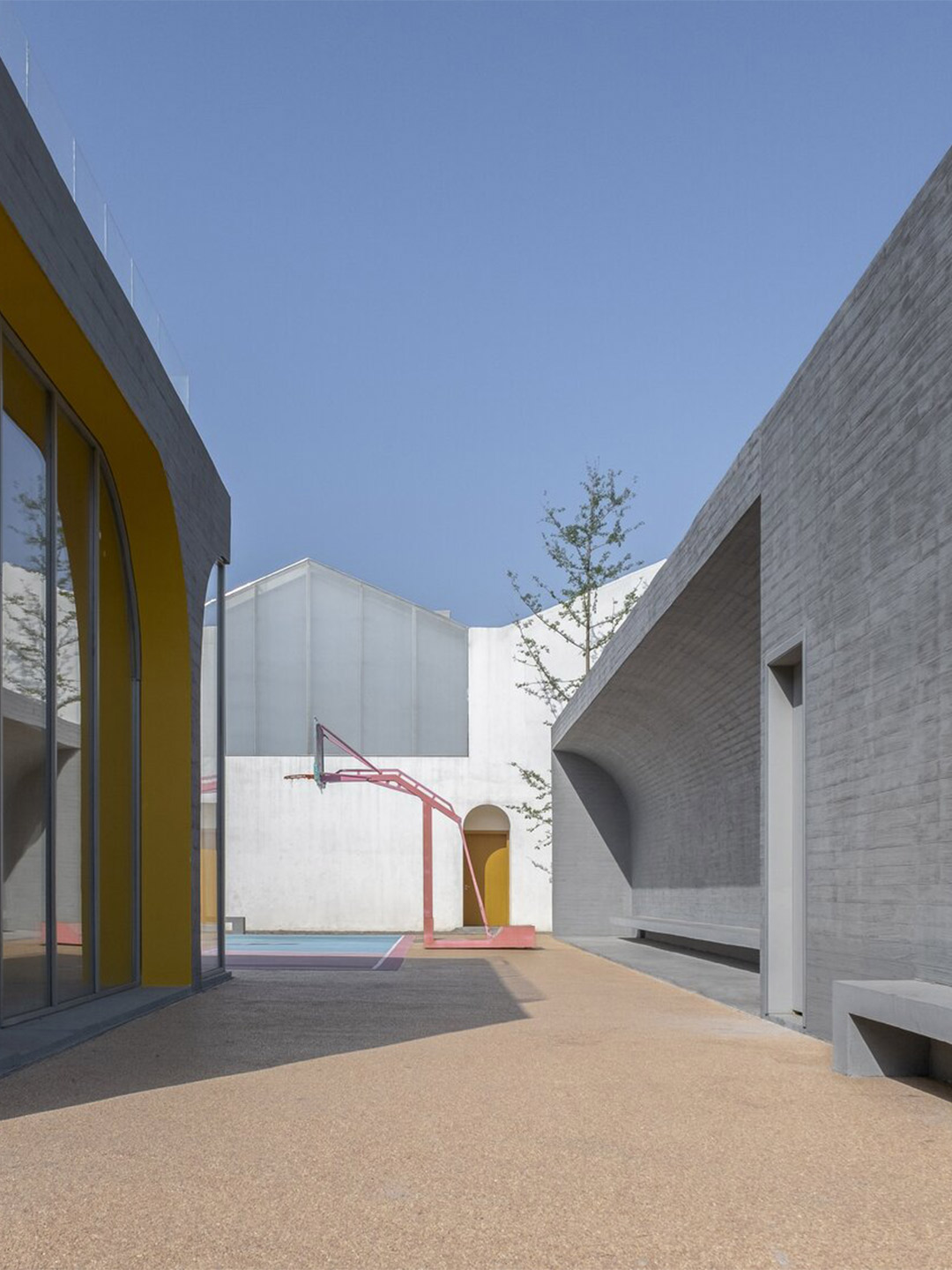
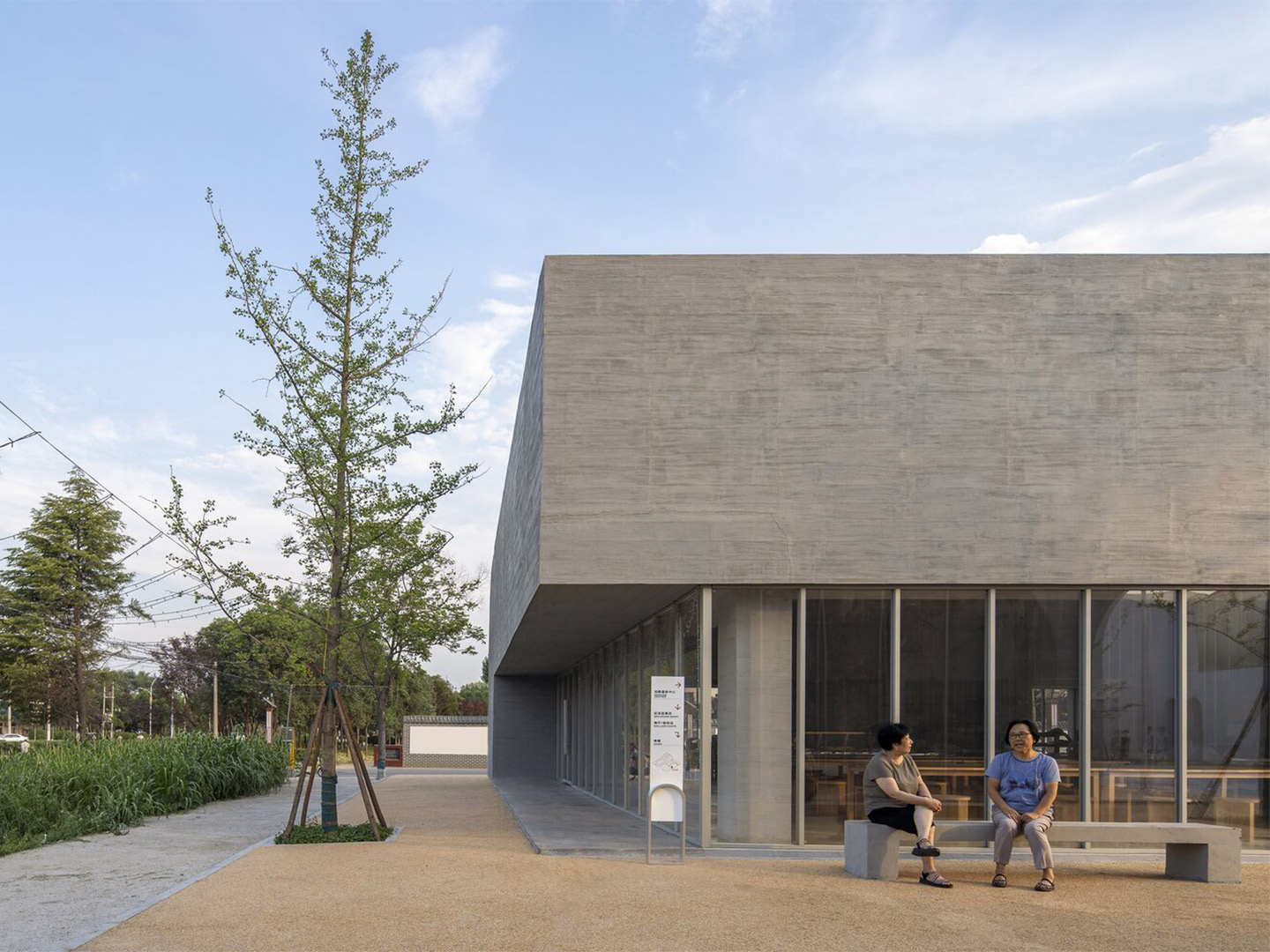
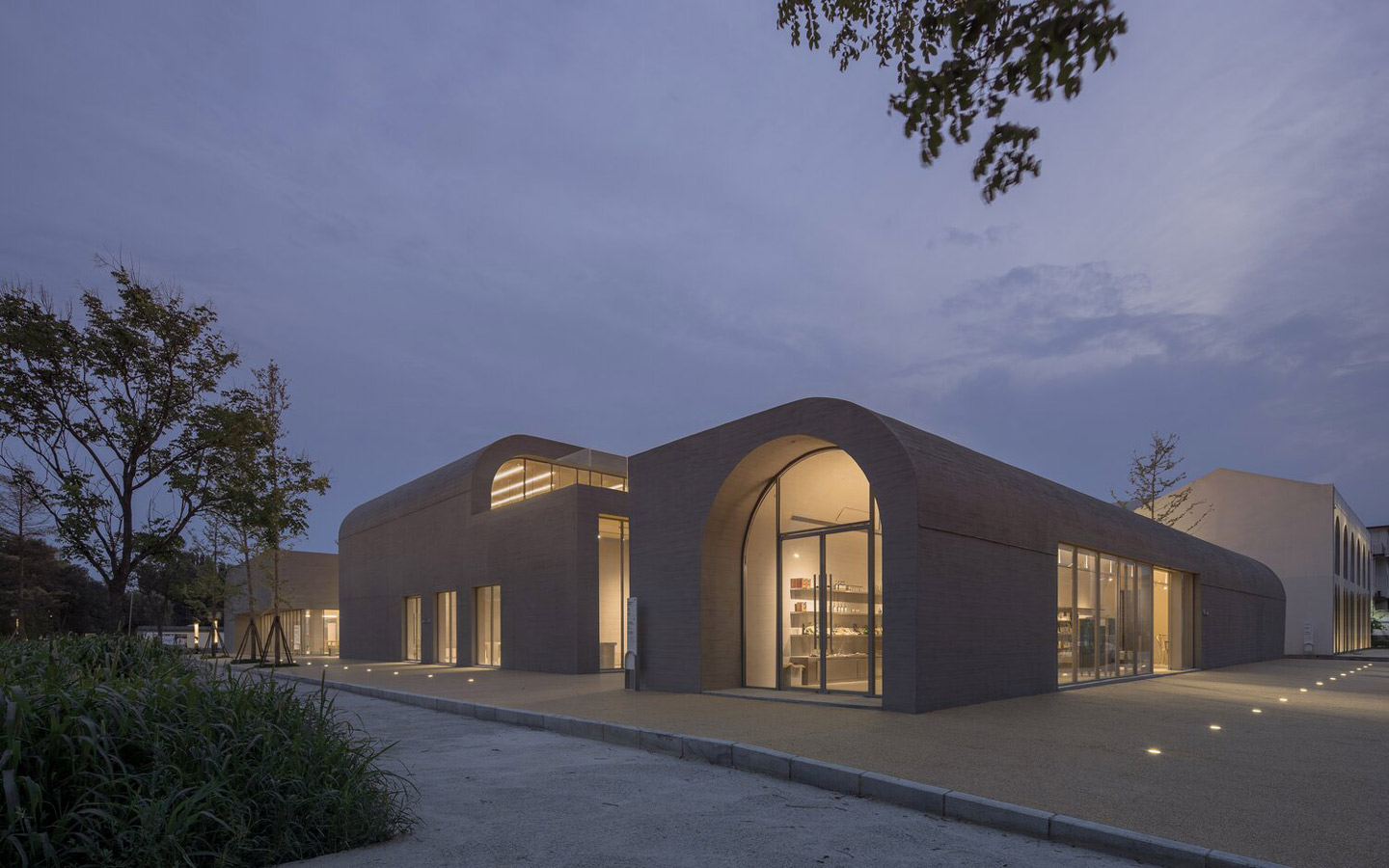
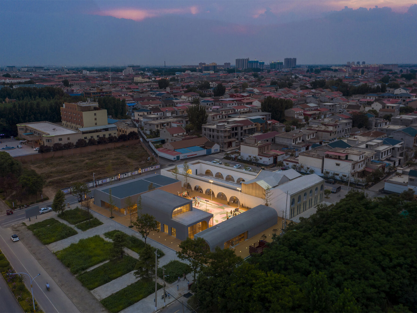
Designed by Shenzhen-based architecture practice Studio 10, the Qinchang Village Town Hall is positioned directly next door to the Qinchang Village Community Centre in the Xiuwu County of China’s Henan Province. It signals the second phase of the larger Qinchang Village project. The first stage of the development, located on the western side of the precinct, accommodates mostly non-profit community service programs and ceremonial spaces. The new proposal to the east focuses on the introduction of small businesses, as well as cultural and recreational pursuits, including a store selling local farm produce and handicrafts, a gallery, small cafe and a larger restaurant, as well as a children’s library.
“The space is both a medium and a generator to create potential employment and start-up business opportunities for the villagers,” says the Studio 10 team, who also explain that they explored “an innovative and sustainable model” for the economic and cultural revitalisation of the rural community.
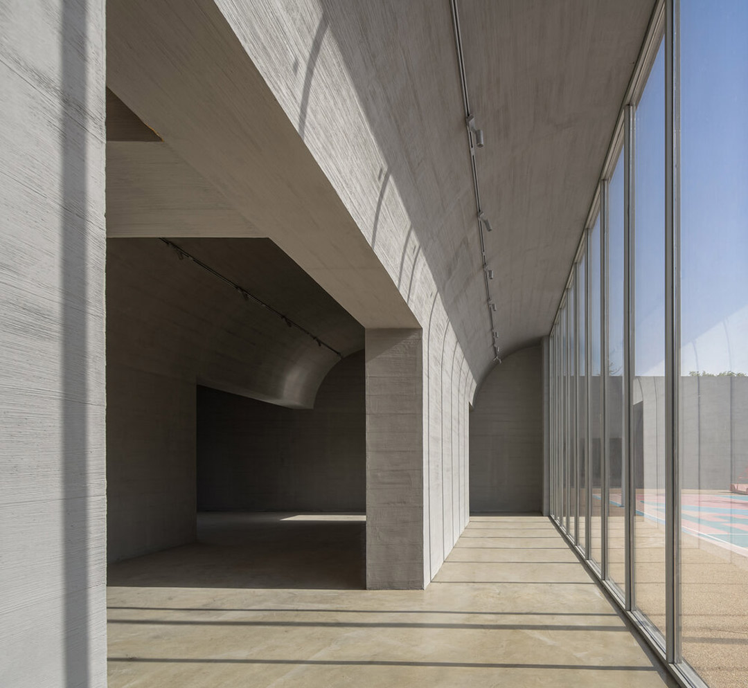
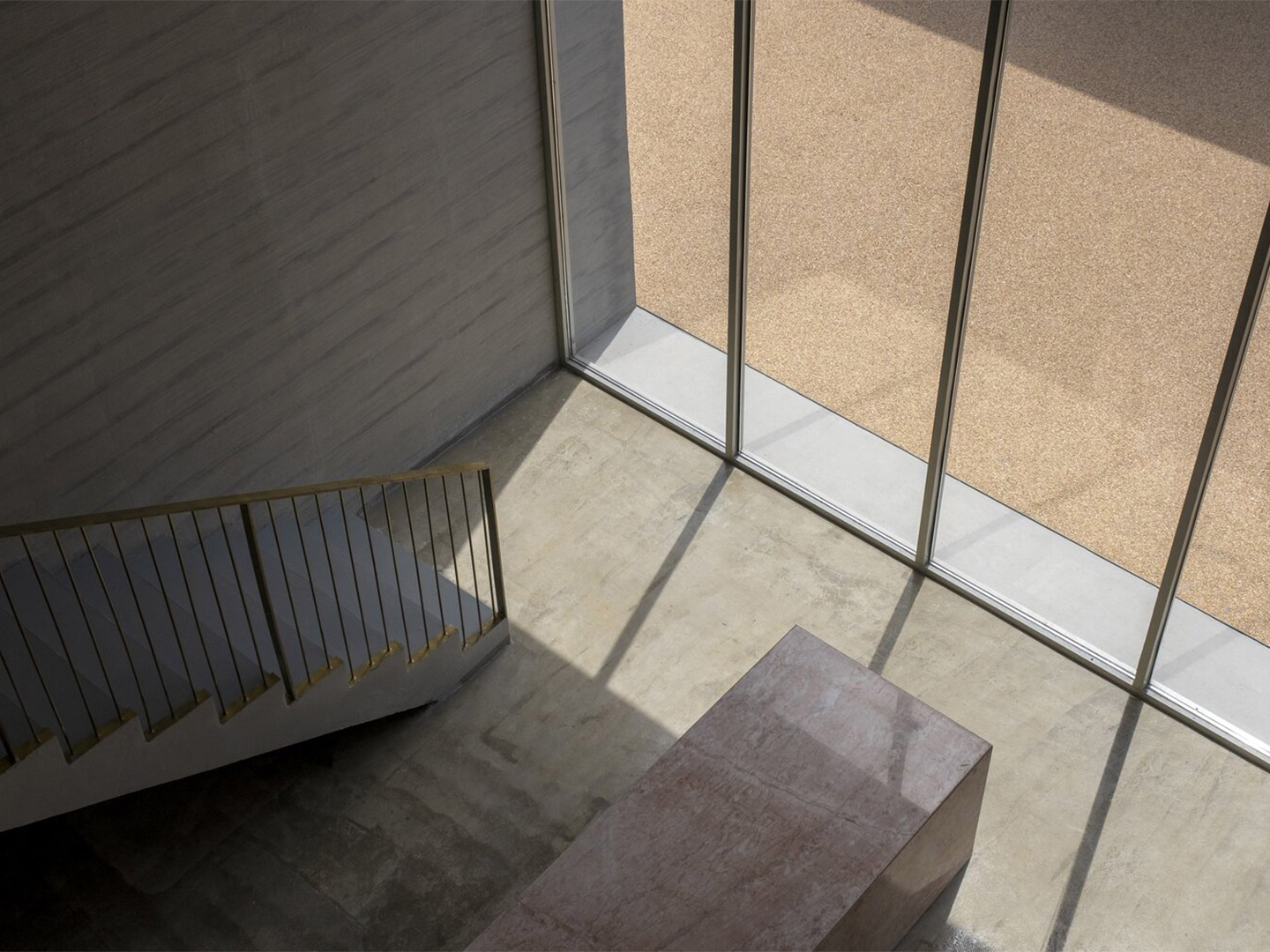
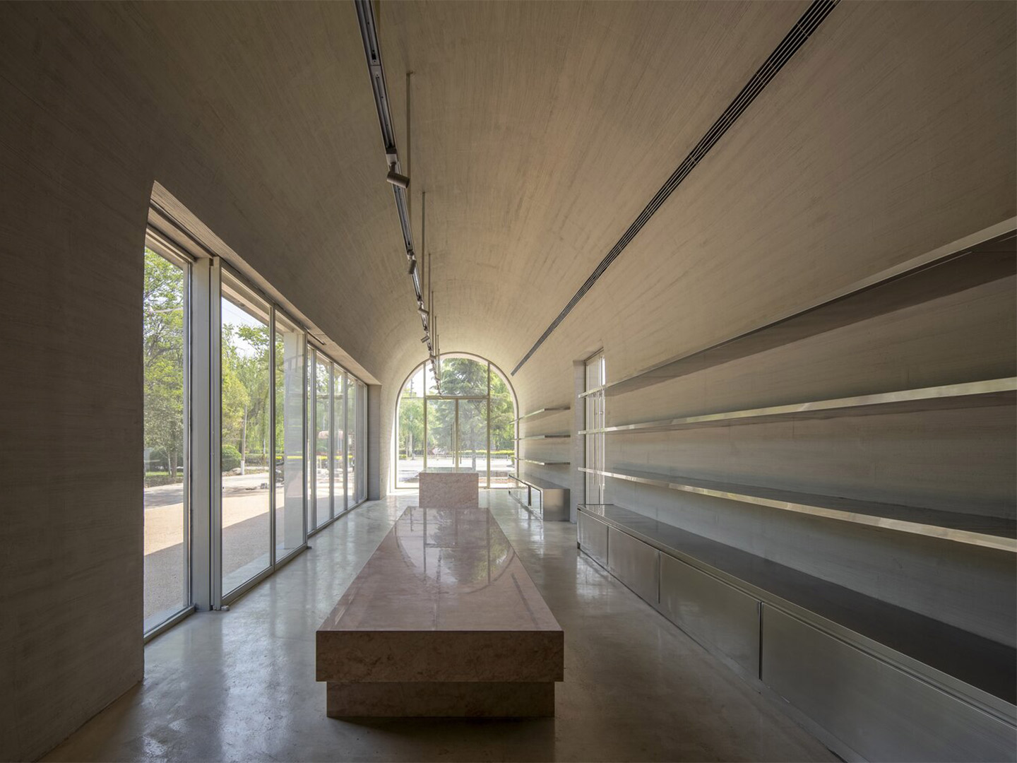
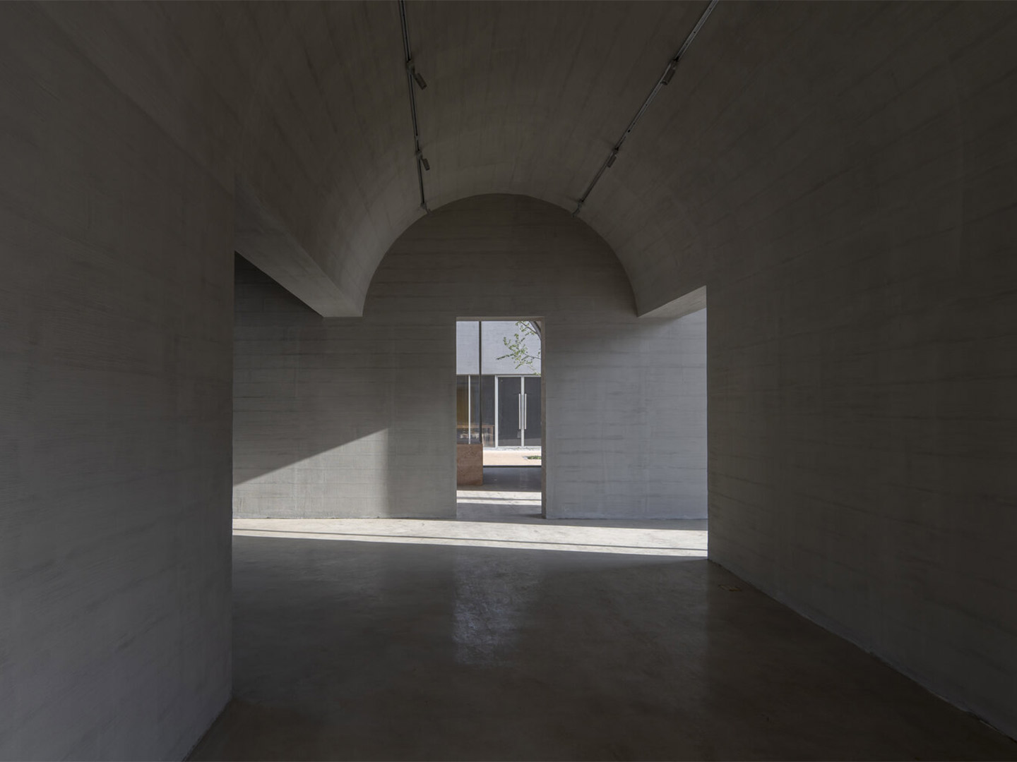
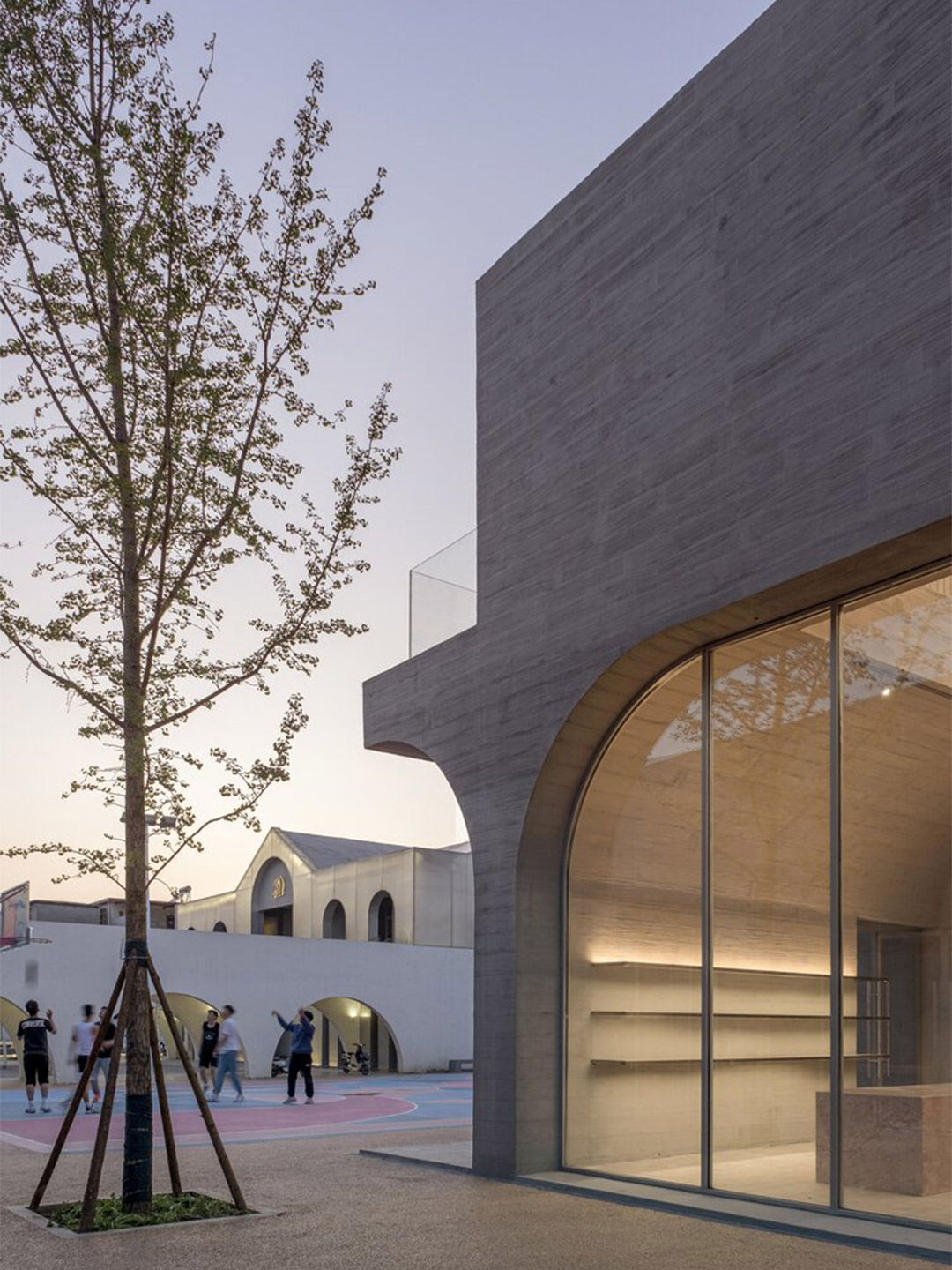
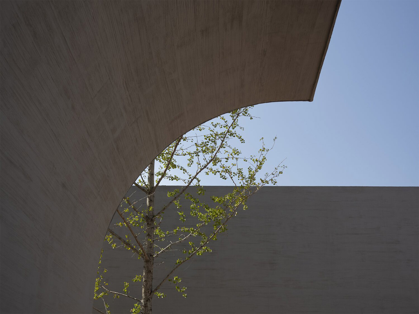
Mirroring the approach of the project’s first phase, the Qinchang Village Town Hall precinct has played with the geometry and motif of arches, “which is a typical component in the local, traditional semi-underground dwellings,” the architects say. The cluster of buildings adopt “cast-in-place” concrete to achieve a series of fluid archways which have been extruded to form tunnel-like structures. “Based on the geometric prototype and modules previously set up in the west side, arches have been further abstracted and evolved from planar ones into vaults, catering to the various spatial and programmatic needs of the Town Hall.”
Qinchang Village Town Hall in rural China by Studio 10
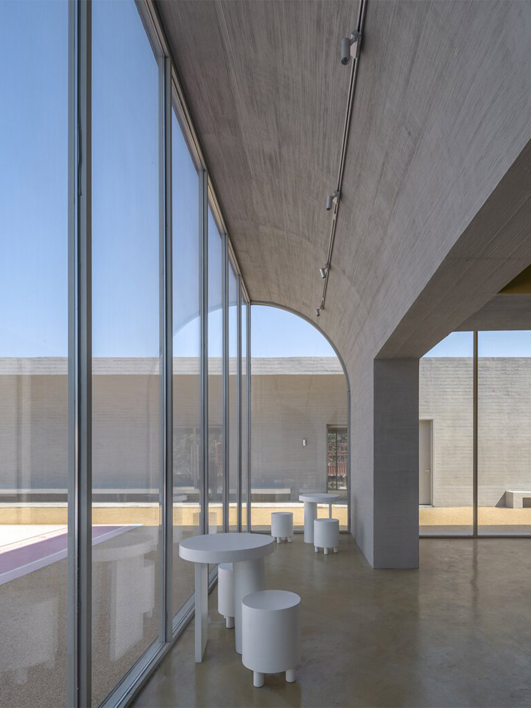
The layout of the new campus has adopted what the architects call a “courtyard-centered configuration”, borrowed from the arrangement that appears to the west. However, when compared to the symmetrical and ceremonial layout of its sister plot, the ambiance of the Village Town Hall was intended to be more “intimate, earthly and effortless,” they say. “The massing of the complex is broken up into three one [and] two-storey small-scale volumes, which follows an asymmetrical layout and are set out at the three sides of the site to define the street interface.”
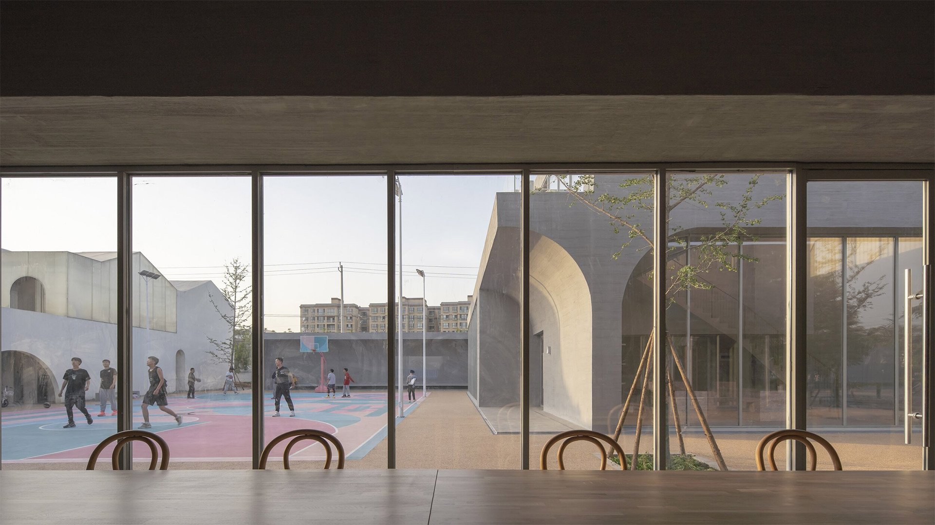
The central courtyard formed by these three individual buildings interacts with the cloister-style formation of the west, “continuing and reinforcing the porosity and accessibility” across the entire site, the architects say. Openings between each of the individual buildings allow villagers to access or pass-through the site conveniently. The central multi-functional open space provides the community with a place for social and recreational activities, which, the architects explain, “complements, balances and enriches the tranquil, ceremonial ambience of the west courtyard”.
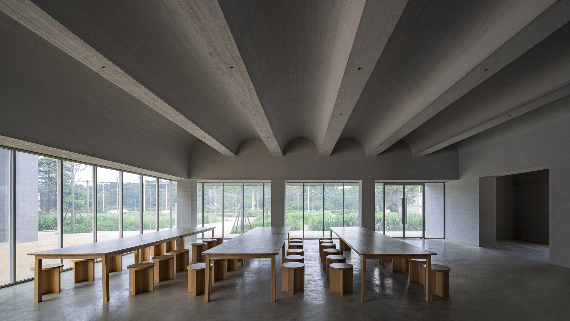
The single-storey restaurant building is located in the southeast corner of the Town Hall campus, and is the closest to the main street of the village. On a regular day it is the main outlet that serves both villagers as well as tourists, while on special occasions it can host large-scale events such as weddings and birthday celebrations. The two-storey building on the eastern side features a small gallery that opens up to both the street and the open-air courtyard, a library/reading room (where children can scan QR codes to borrow books), as well as the cafe where tourists and villagers can intermingle.
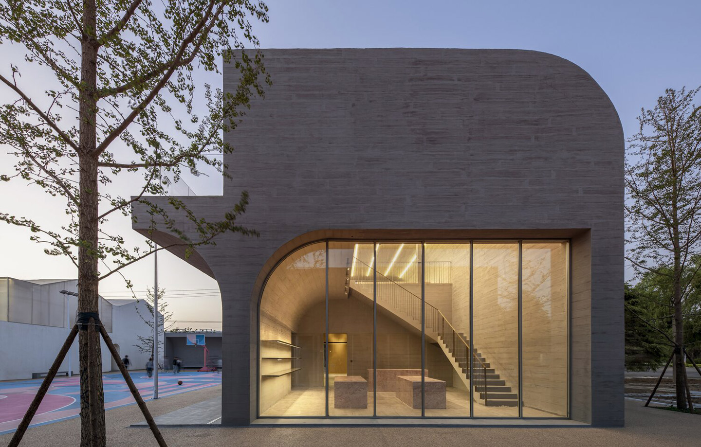
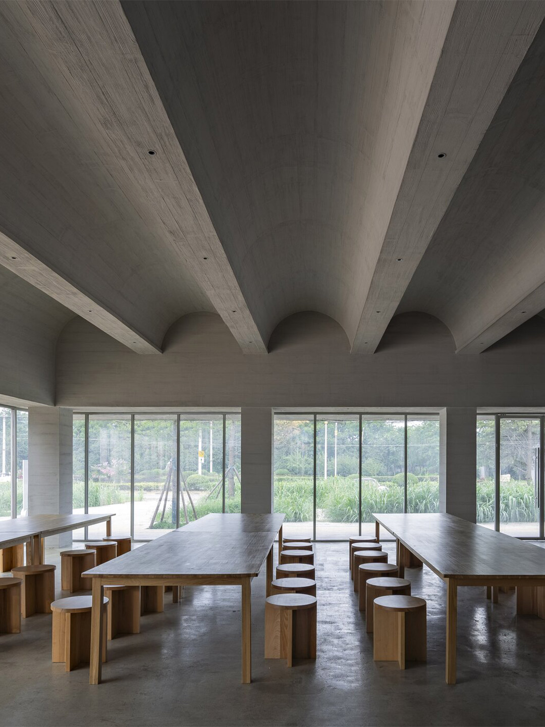
The “bar-shaped” single-storey building to the north hosts the shop which showcases and sells locally grown food as well as wares made by the nearby villagers – these souvenirs are particularly popular with tourists. On the southern facade of the building, facing the courtyard, a covered arched porch with benches serves as both spectator seating for basketball games as well as a makeshift stage and backdrop for large-scale outdoor public events held in the courtyard.
When surveying the social landscape in Xiuwu County, the architects discovered that all public basketball courts in the region, regardless of their condition, were highly appealing to villagers, especially teenagers. “In fact, the basketball courts in the villages are almost always occupied except for during extreme weather,” the Studio 10 team says. “Therefore, we suggested to the client to add the basketball court in the courtyard at [the] early stage of design.” Even before the complex reached absolute completion, the basketball court was already extremely popular among young villagers.
The benches in the court-side porch as well as the rooftops of surrounding buildings naturally form spectator areas, providing vantage points for villagers to watch basketball games. The court can also be utilised as spill-out space for the restaurant on its busiest days, in addition to its role in hosting large ceremonies. But it’s the striking pattern that has been painted on the ground of the court, created by a local graphic designer, that has positioned the basketball arena as the unexpected star of the Town Hall proposal, making it one of the most sought-after gathering spaces for the local community.
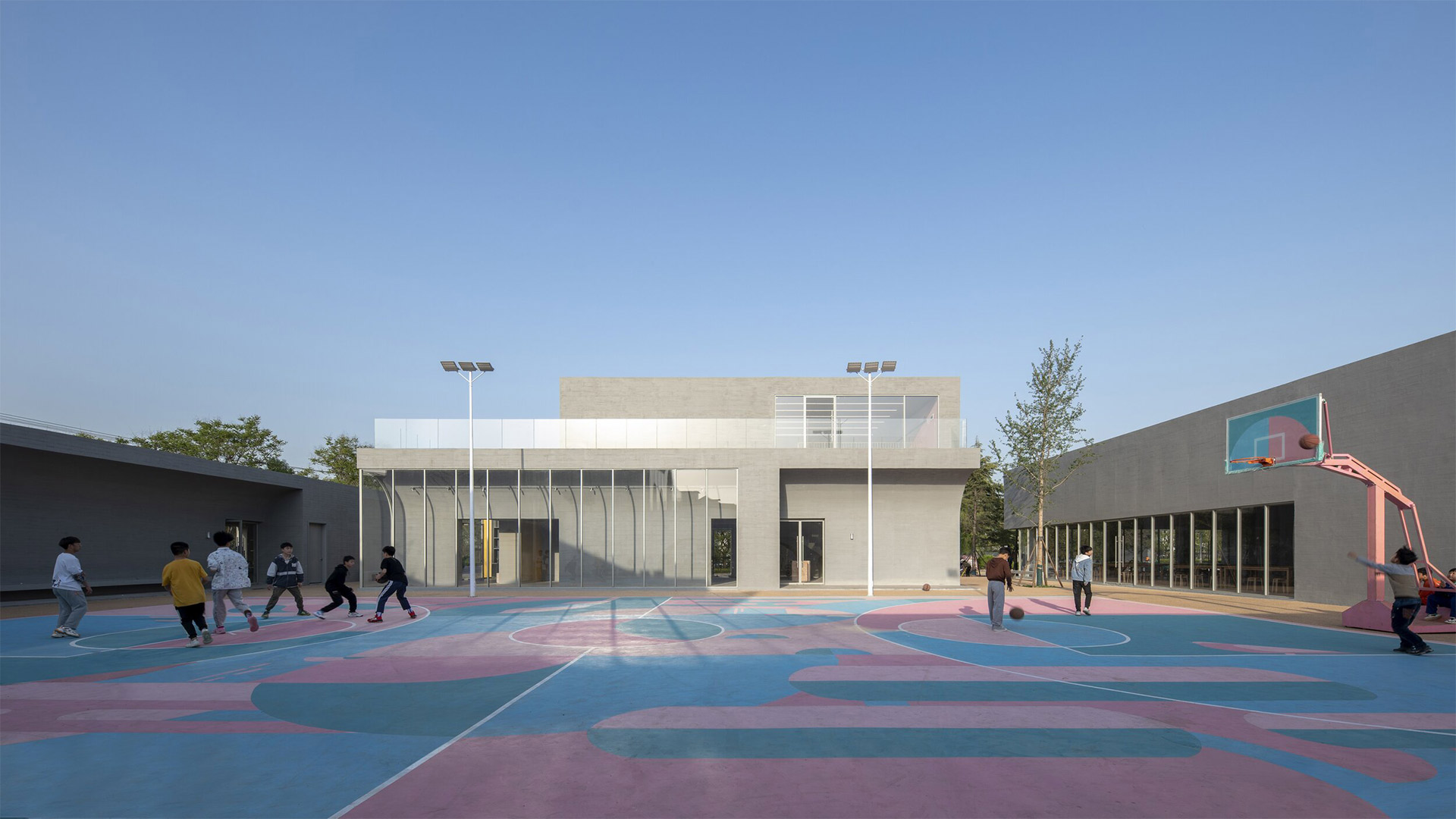
It’s the striking pattern that has been painted on the ground of the court that has positioned it as the unexpected star of the Town Hall proposal, making it one of the most sought-after gathering spaces for the local community.
Studio 10 also designed the futuristic fit-out for a minimalist fashion label in China. Catch up on more architecture, art and design highlights. Plus, subscribe to receive the Daily Architecture News e-letter direct to your inbox.
Related stories
- Venus Power collection of rugs by Patricia Urquiola for cc-tapis.
- Bitossi celebrates centenary in Florence with new museum and 7000-piece display.
- Casa R+1 residence in southern Spain by Puntofilipino.
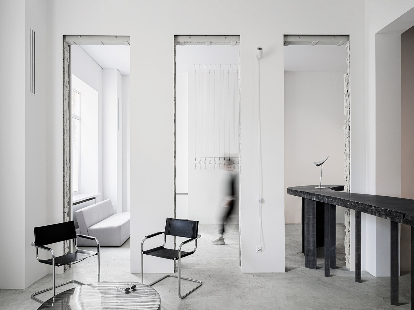
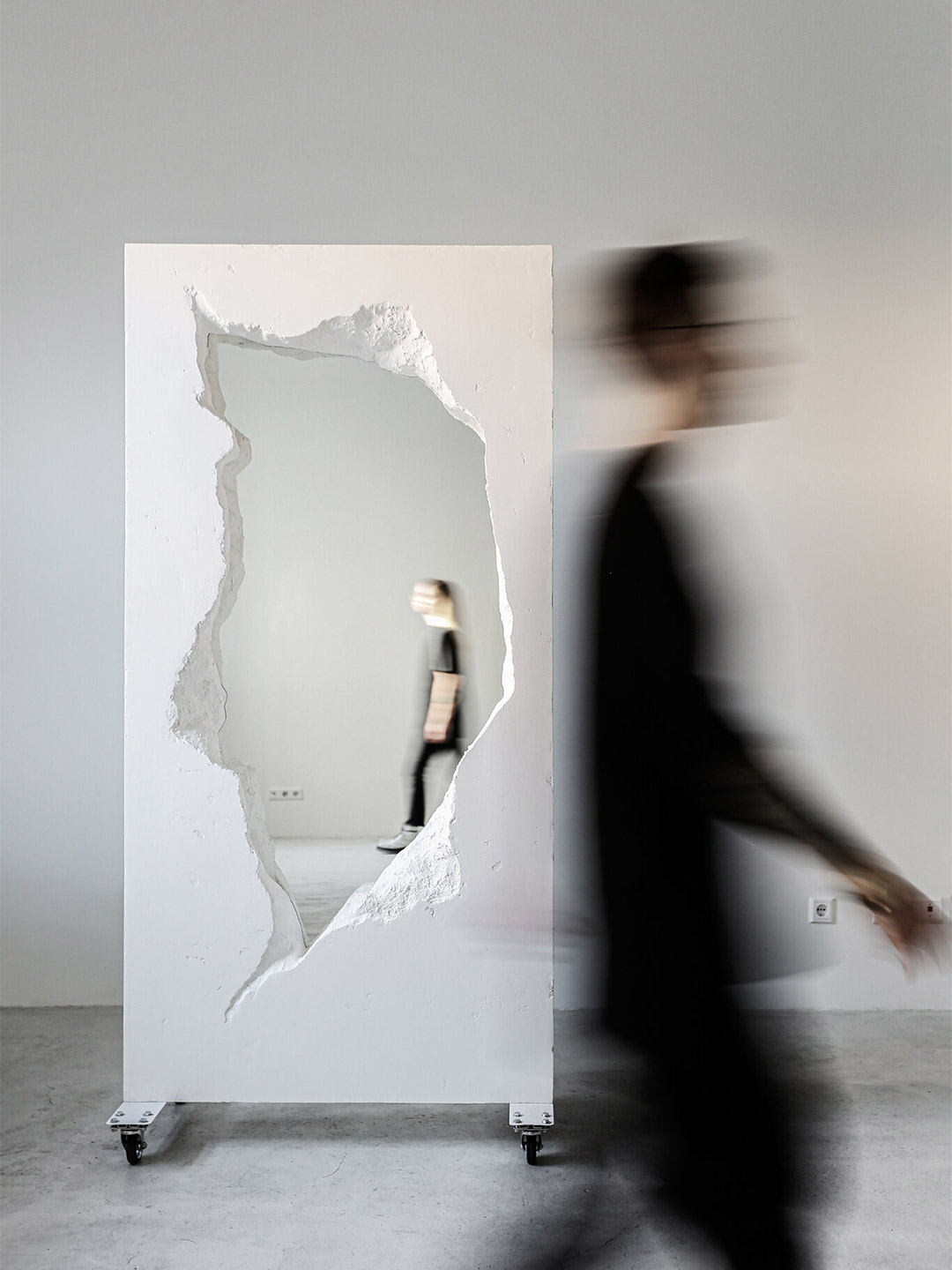
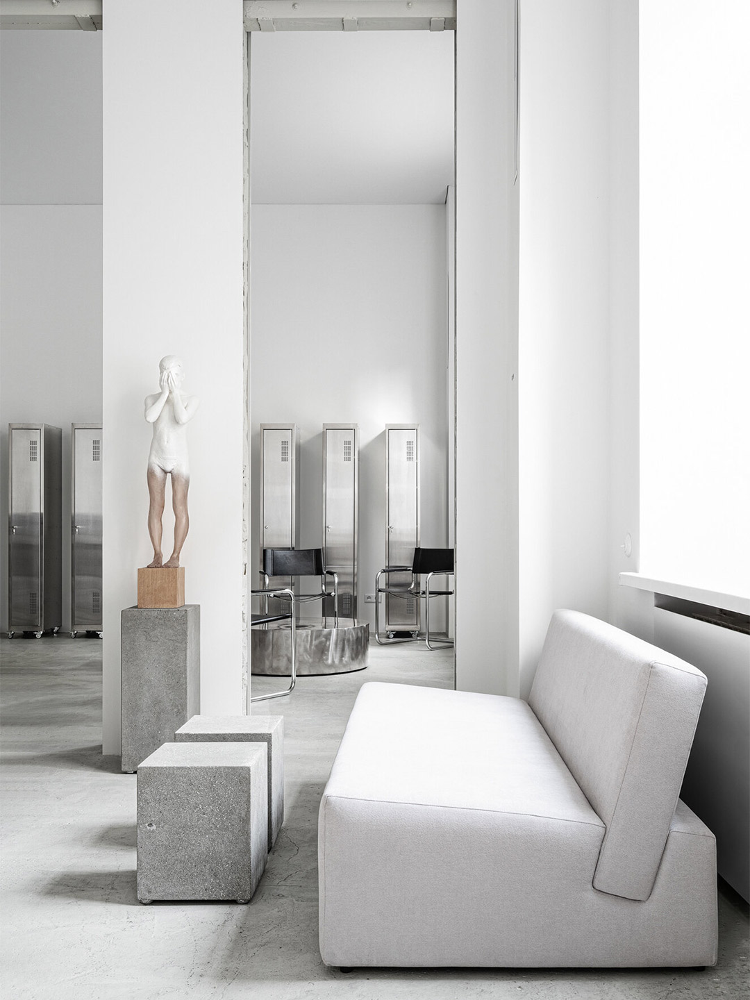
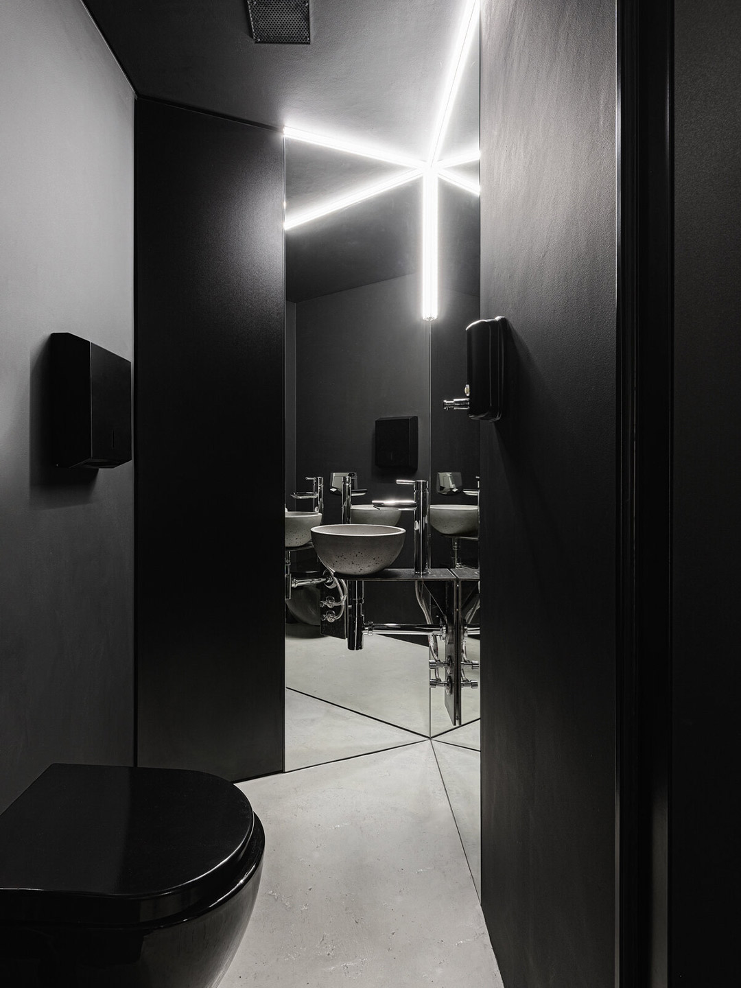
Located in the historic Podil neighbourhood of Kyiv, the recently completed 6:19 Studio walks the line between tattoo parlour and contemporary art gallery. Founded by local artist Ulyana Nesheva, the sophisticated space spans an area of 111 square metres, tucked within the ground floor of a residential building. “Ulyana has dedicated her life to art, so the interior of her first studio was to become a reflection of her style and artistic vision,” say the Balbek Bureau team, led by practice principal Slava Balbek, who were tasked with bringing the interior to life.
The brief to the Ukrainian architecture and design office called for the “perfect space” for Ulyana’s creative endeavours; a tattoo parlour that resembles a contemporary art workshop. “The concept of the studio is also that all our artists, despite the diversity of their styles and colours, are united by an exploration of minimalism,” Ulyana says of her brief. “Simplicity is the ultimate goal and the highest form of complexity.”
6:19 Studio tattoo parlour in Kyiv by Balbek Bureau
In response, Balbek Bureau pursued the concept of minimalism. “We opened up space and focused on each element of the interior,” the team say. “An open plan was achieved by inscribing a round hole in straight-cut architecture, increasing the height of existing openings, and adding several new ones.”
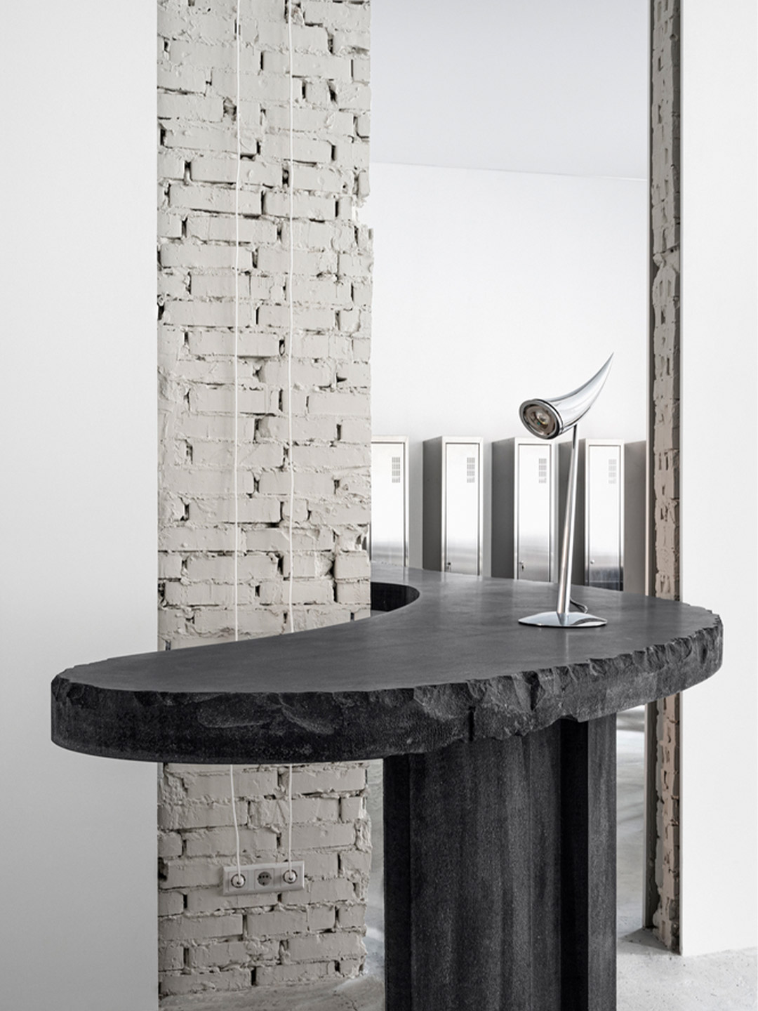
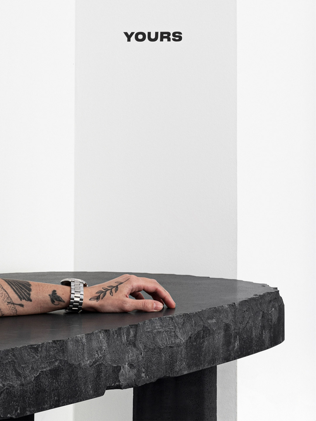
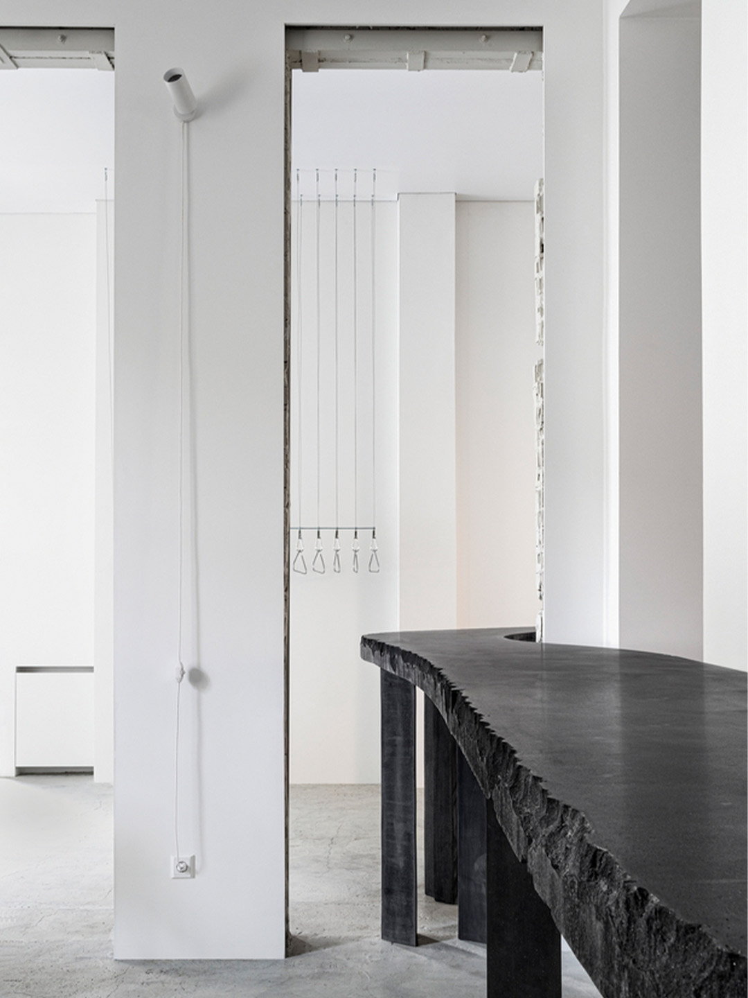
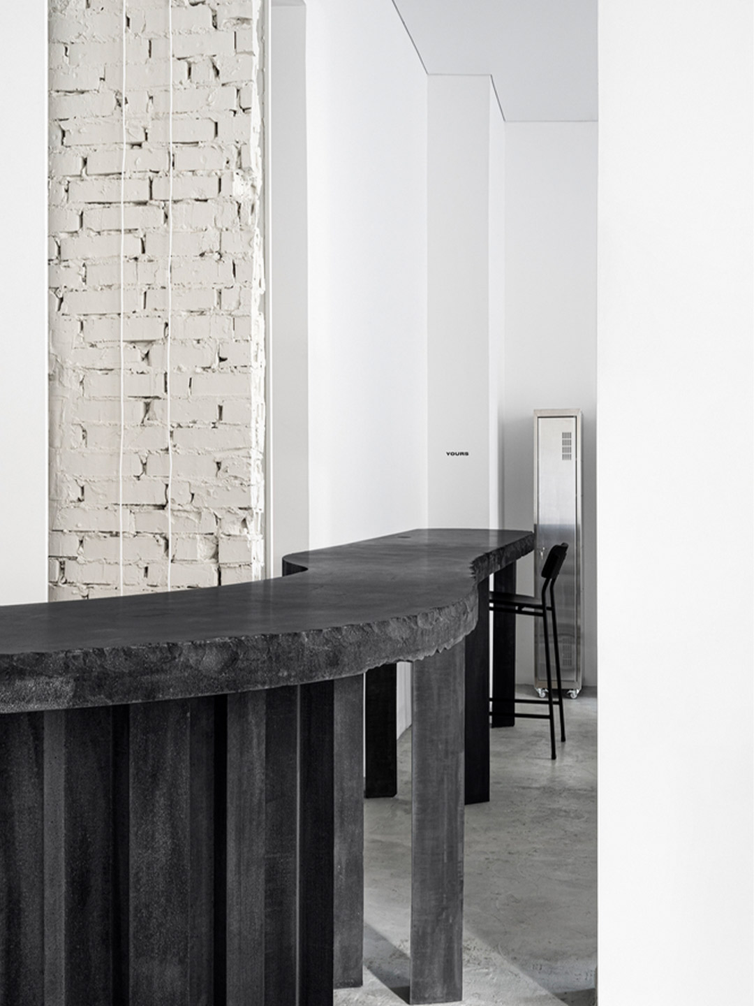
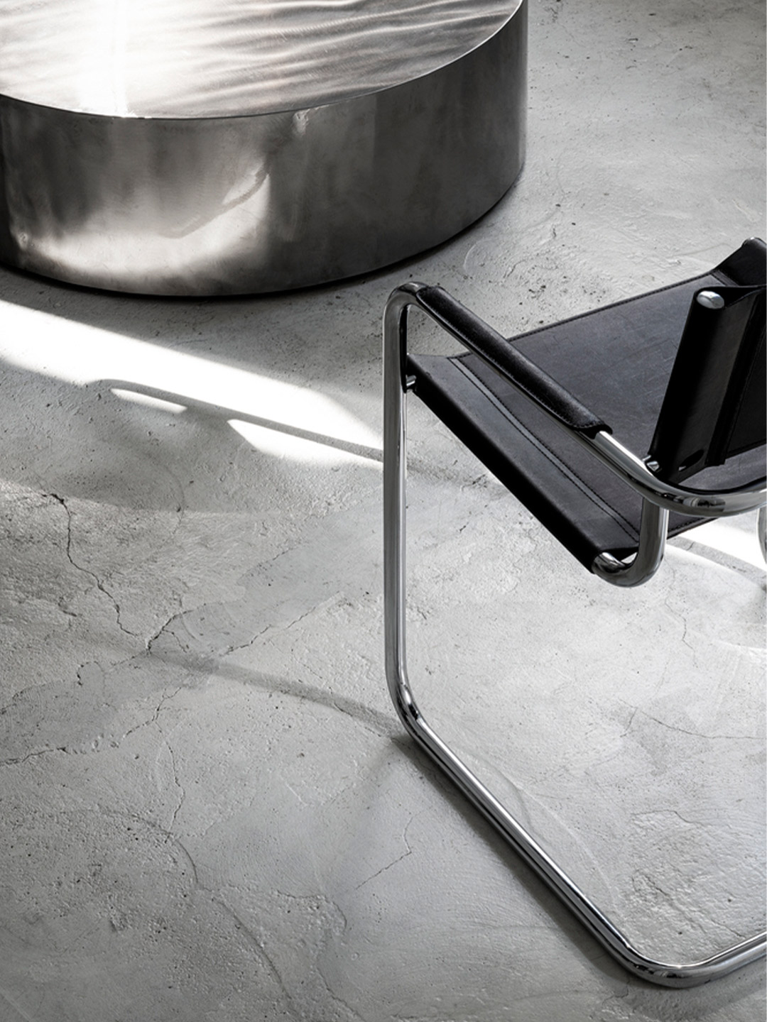
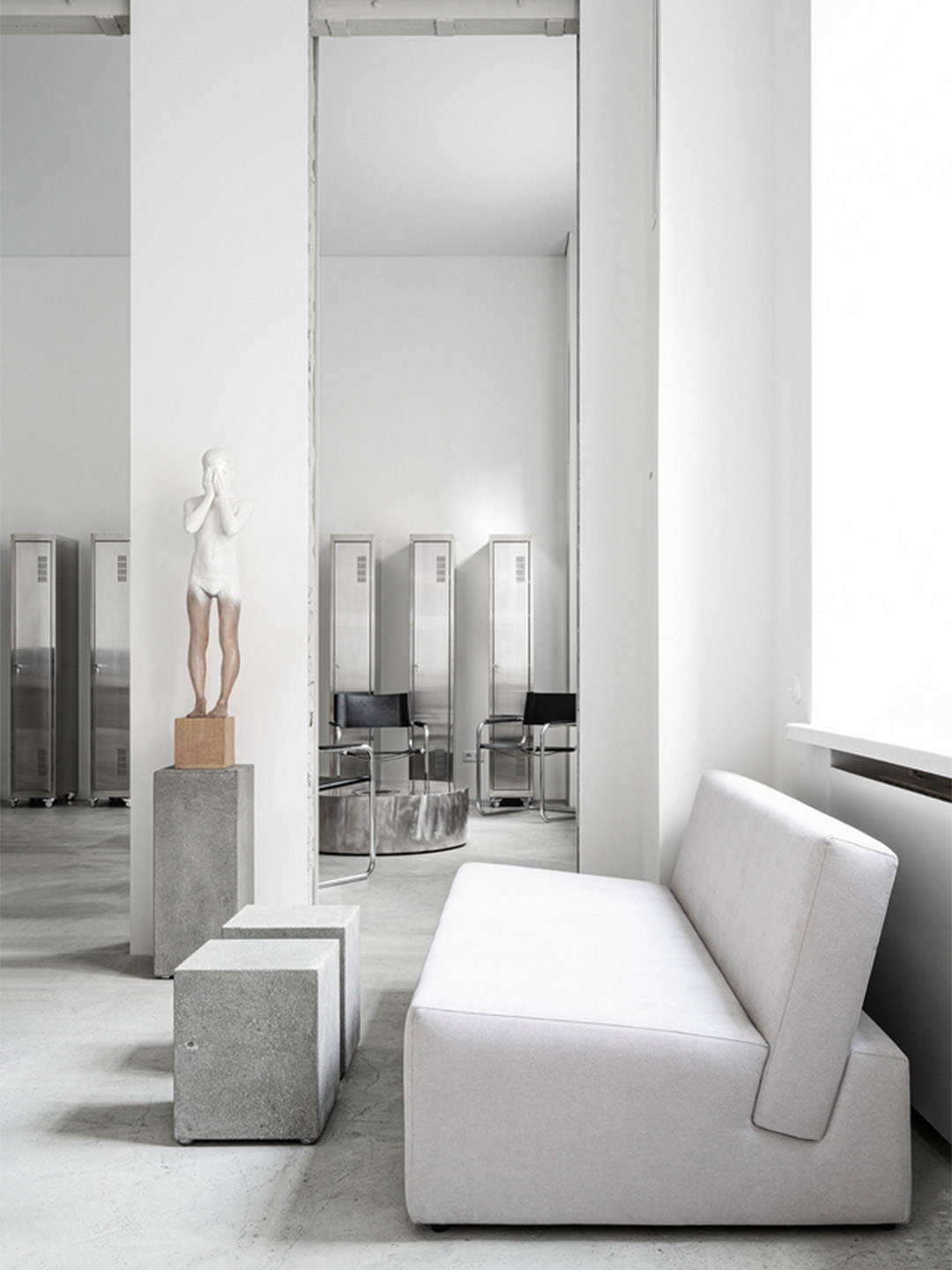
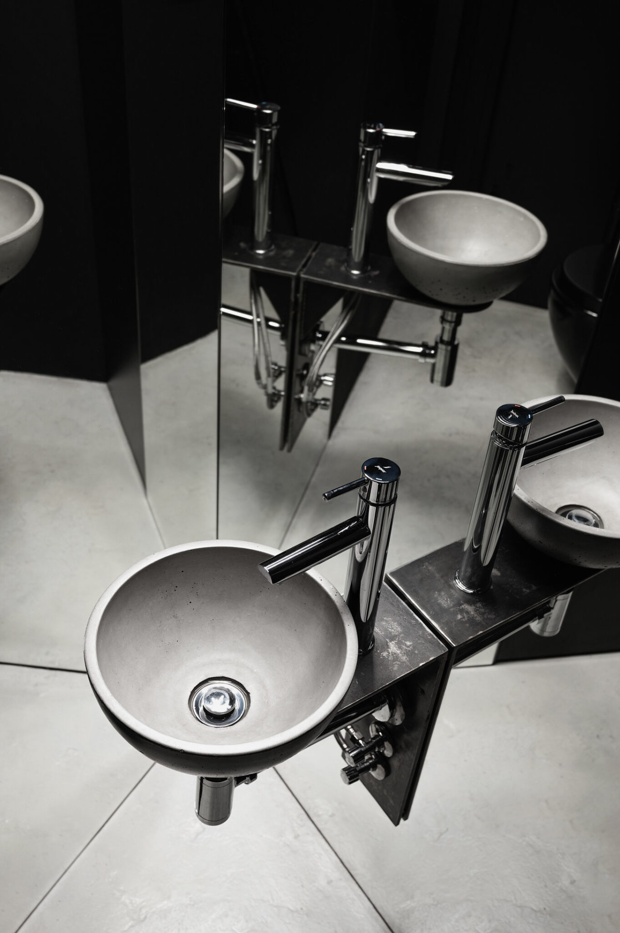
There are almost no doors within the studio. All the halls are unified, so visitors immediately enter into a large open space. “To the right of the entrance, we placed a soft waiting area, and to the left, a uniquely-shaped, 800-pound (365kg) graphite concrete table,” say the designers. “Its edge has been beaten down by hand, giving it a unique and enchanting power, as a tattoo on the human body.”
Slava himself contributed to the chiselling of the table, which unites all of the internal areas and serves as both a reception desk and a work surface for artists to design future tattoos. It resembles a wave flowing from the reception space into the “living area”. Its velvety-matte surface sits in stark contrast with the polished chrome of the shiny vintage table lamp.
“During construction work, we opened up the walls to see what they are made of and found that all the interior partitions are made of brick and foam, and the top is lined with plasterboard,” the designers say. “We liked the idea of showing this multi-layered wall, and it was implemented spontaneously during construction.”
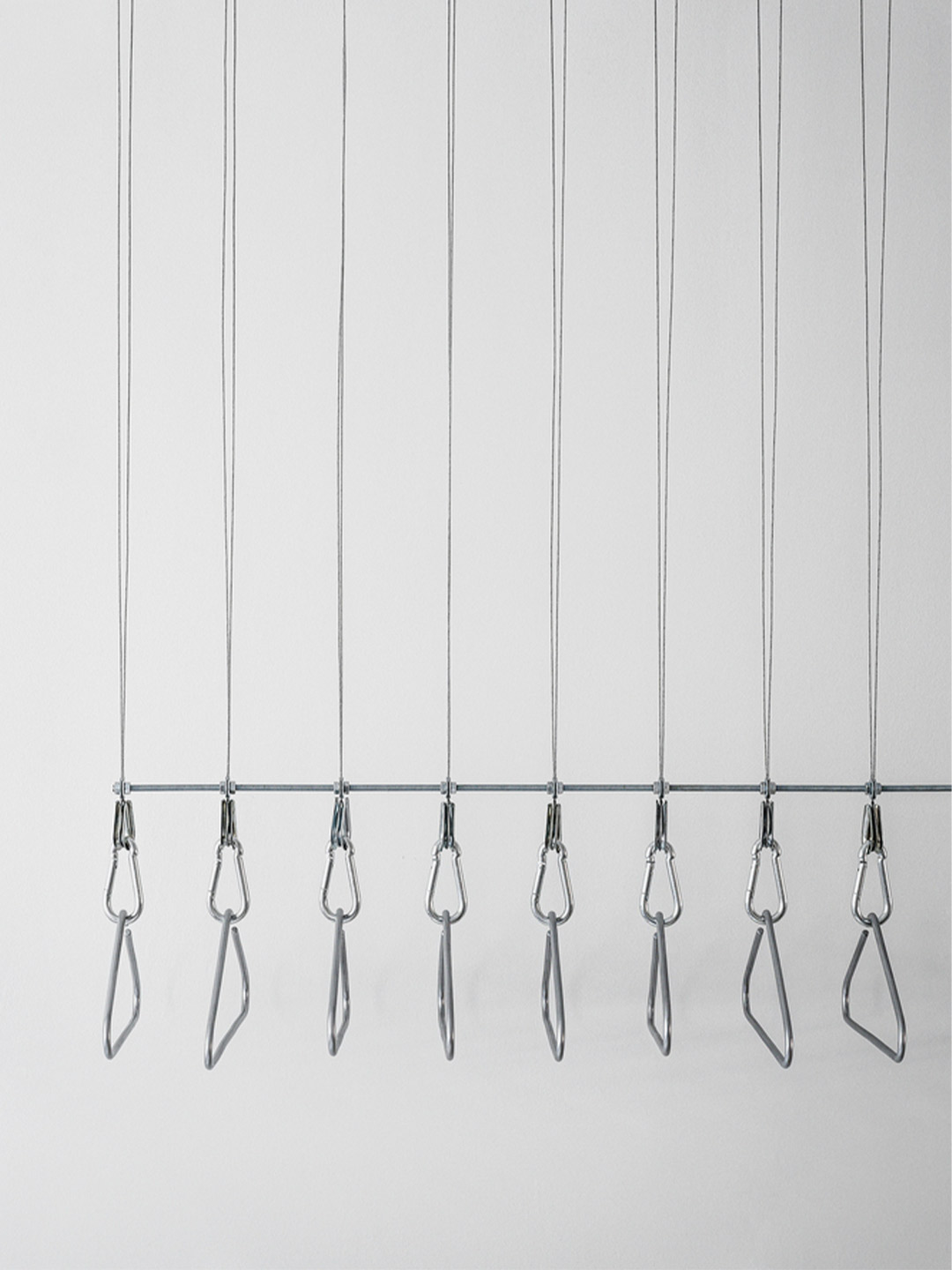
At the entrance, Balbek Bureau suspended a clothing display system from the ceiling, made of metal cables and clothes hangers from propro (a local design emporium). “The total length of the cables measures 100 meters, uniquely designed by our team,” say the designers. Opposite the entrance is a room for rest, where artists can spend their free time. The room is united with the studio space through tall “rectangular portals”.
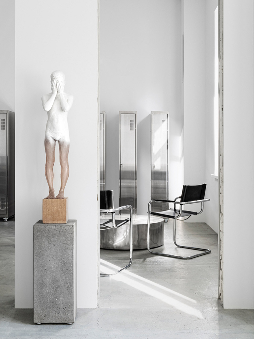
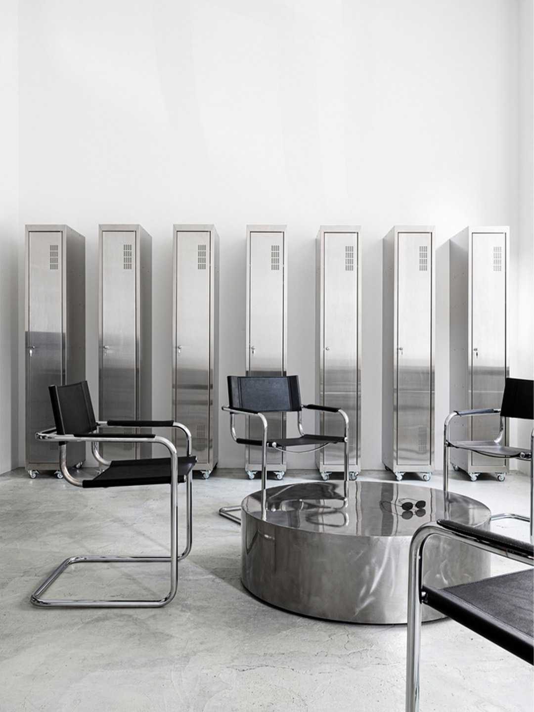
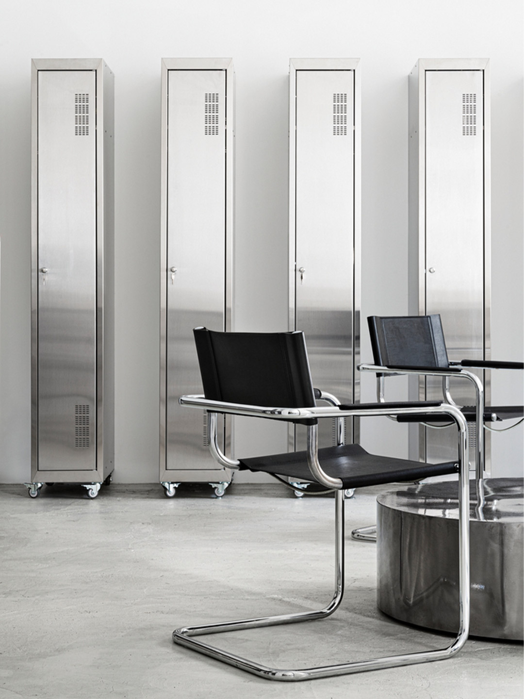
In this area, the designers have placed vintage black-leather and chrome armchairs by designer Mart Stam. “As the graphite table continued into this room, next to it we placed high chairs from propro,” the designers add. The metal table is also from propro. And narrow metal lockers are provided for the storage of the artists’ personal belongings.
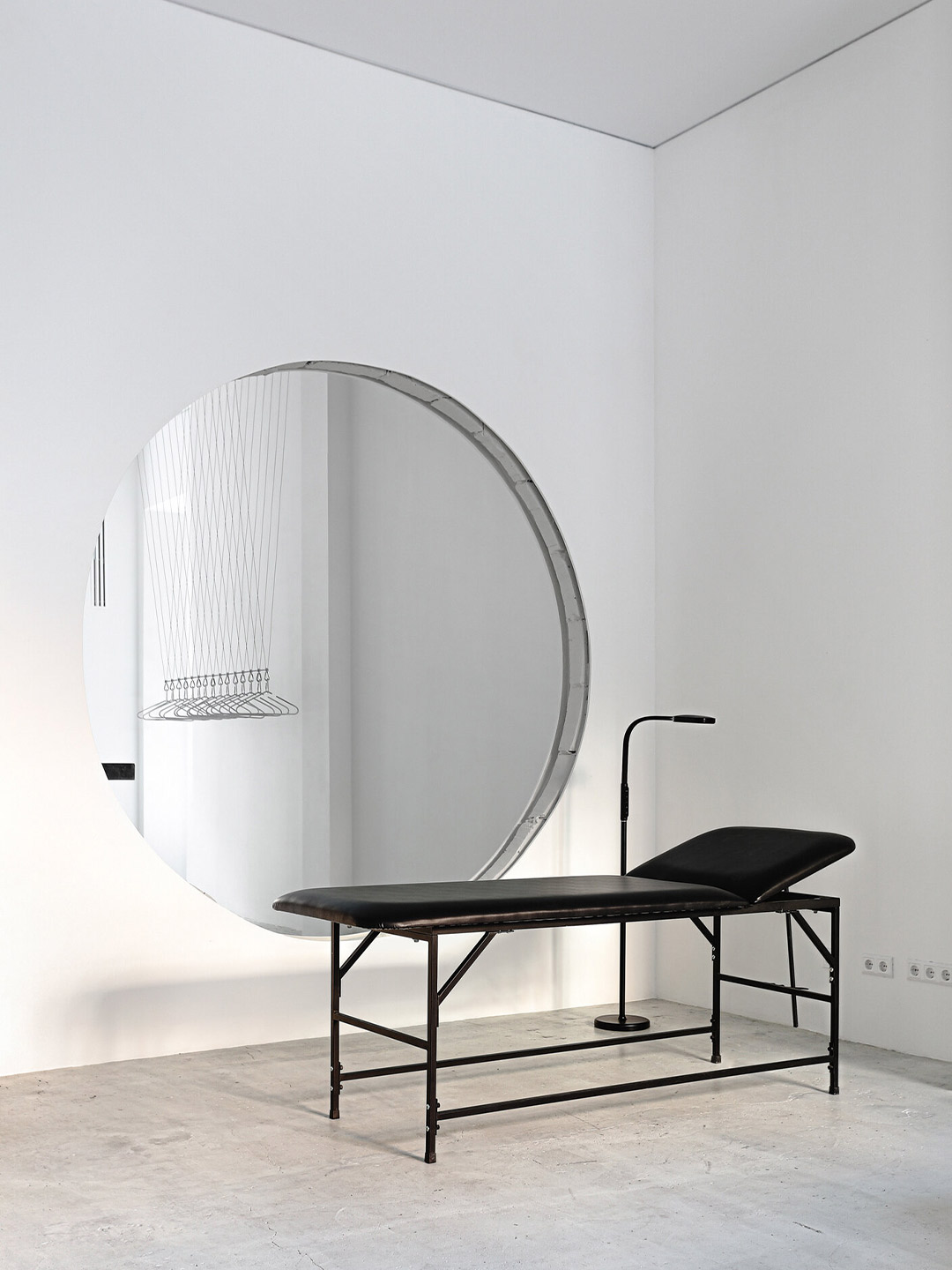
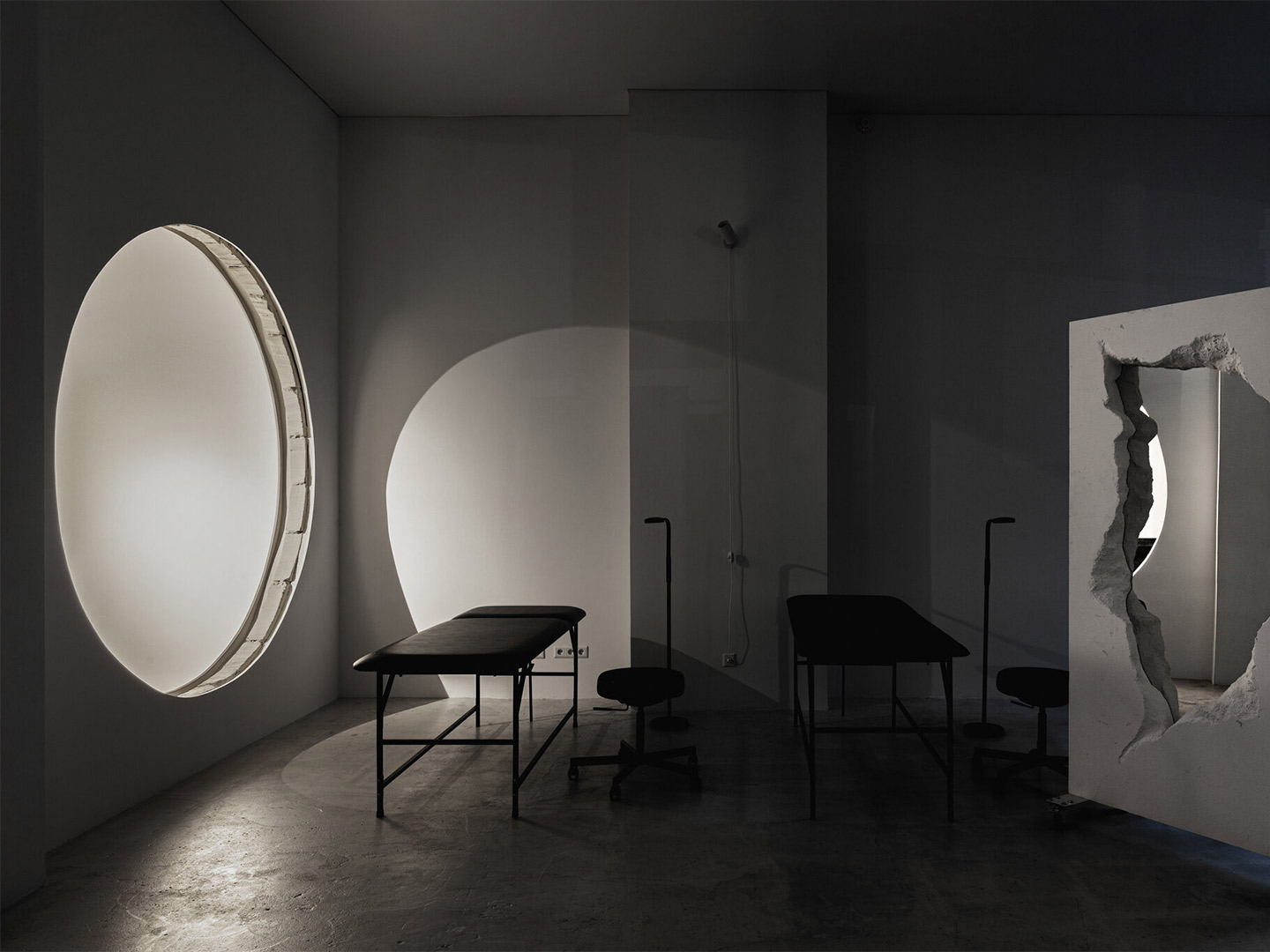
Behind the reception appears a wall with a large round hole. Through it, the main studio hall where the tattooing takes place is visible. To the right is another passage that leads directly to the hall and dressing room. The main hall is a large spacious room filled with light while minimalist black tattoo beds stand along both sides. “We moved the air conditioning system from the ceiling to the walls,” explain the designers. “We also did this with lighting fixtures, fire, and security systems to achieve a smooth and calm canvas ceiling.”
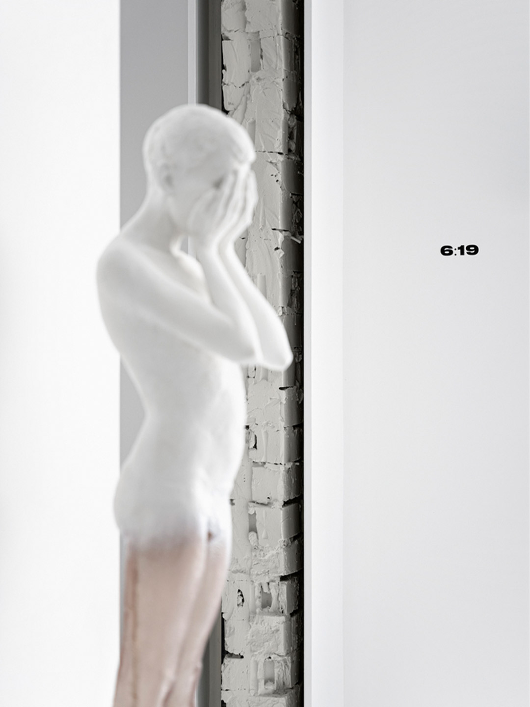
For studio founder Ulyana, an important part of her work is her love for art. She saw the sculpture Boy in artist Сhristina Ridzel’s studio and immediately knew that it had to become part of the 6:19 workspace. “Boy symbolises a person’s role in society; you dissolve into the crowd in the rhythm of the metropolis, forgetting who you are,” say the Balbek Bureau team. “This artefact was placed directly before the entrance, telling his story to everyone who steps inside.”
“Art is an integral part of the founding artist’s life. Podil was exactly the place where Ulyana’s first studio was founded and where she lives and finds inspiration,” the Balbek Bureau team say, adding: “Her idea of a split mirror in the form of Podil was embodied by two Kyiv sculptors from H&Co. Sculpture Studio.”
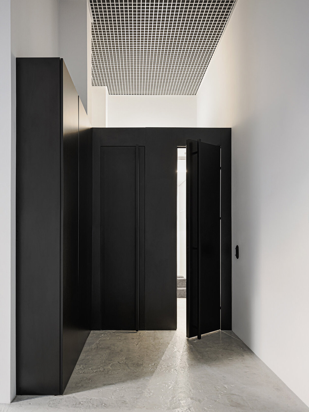
Between the tattoo studio’s two main walls appears a blackened cube formation. It houses a hidden wardrobe, a bathroom and a dressing room for artists and customers. “We placed the mirror in the bathroom at an angle,” say the designers. “[This] gives an impression of a broken geometry of the space and the illusion of repeated reflection.”
The concept of the studio is also that all our artists, despite the diversity of their styles and colours, are united by an exploration of minimalism.
Catch up on more architecture, art and design highlights. Plus, subscribe to receive the Daily Architecture News e-letter direct to your inbox.
Related stories
- ‘The Apple tree’ by Foster + Partners blossoms in Bangkok.
- Carla Sozzani curates new colours for classic Arne Jacobsen chairs.
- Adam Goodrum stamps all-Australian style on new breezeblock design.
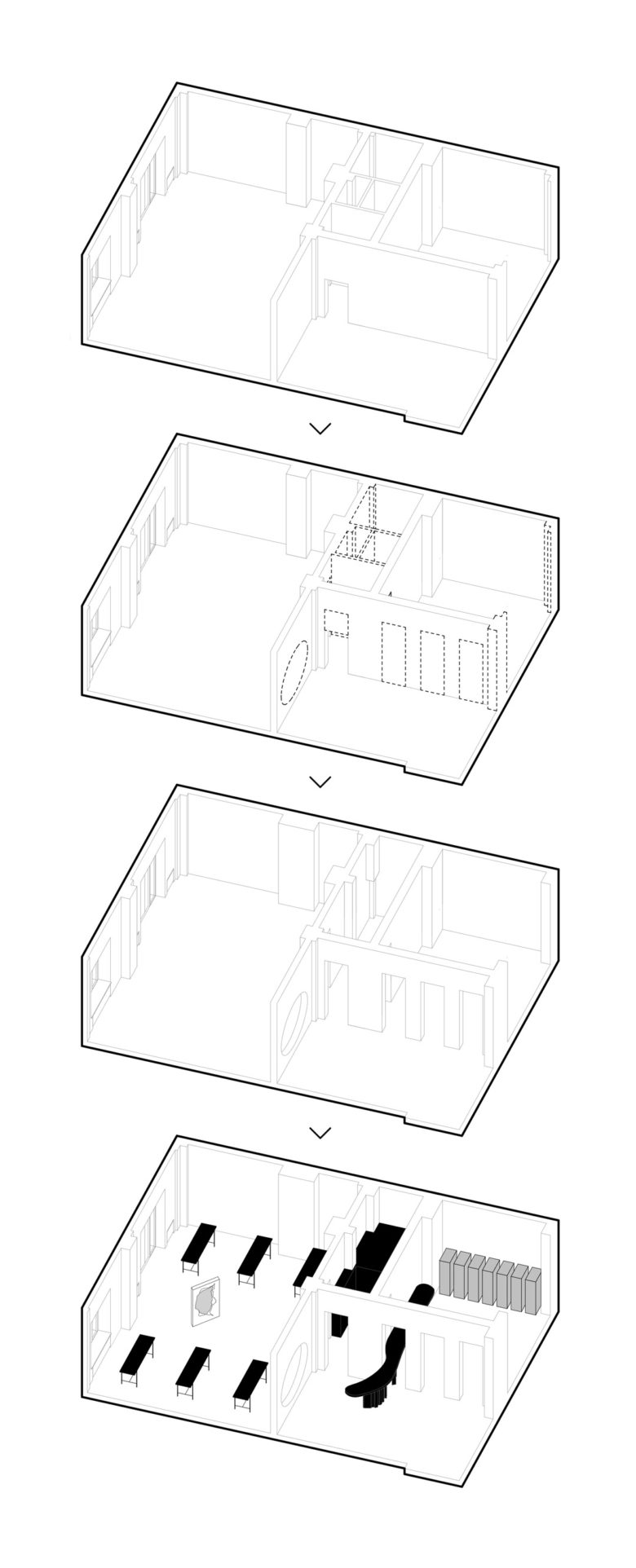
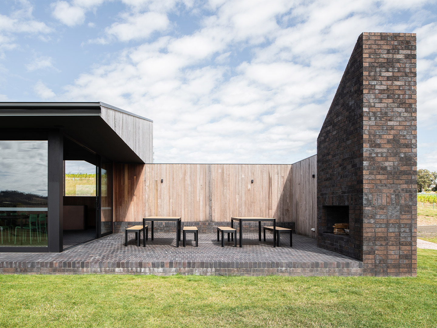
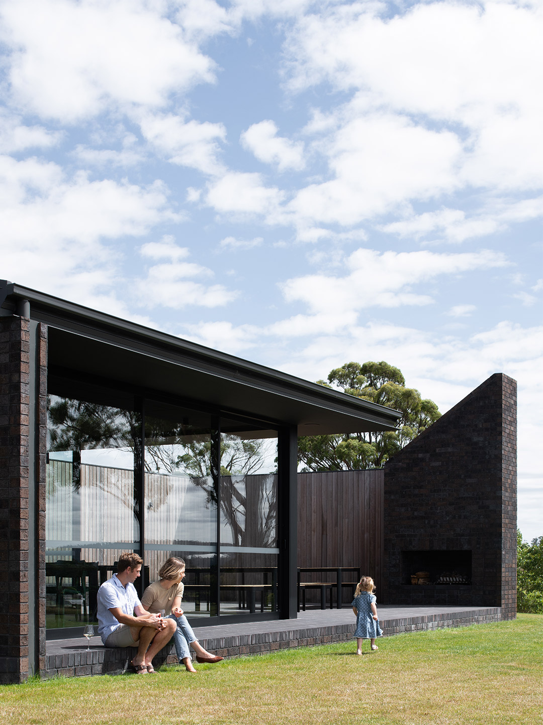
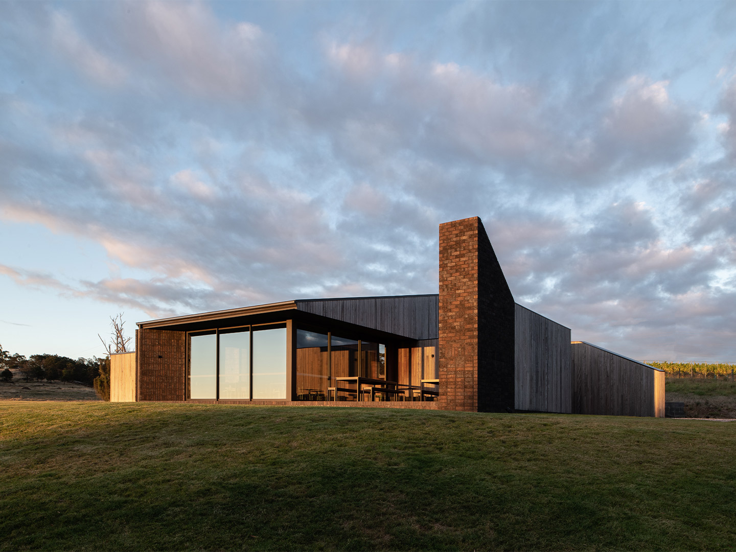
Conceptualised by Cumulus Studio, the new cellar door for Stoney Rise Wine is a sculptural build, where modern forms meet natural materiality. Set in the idyllic township of Gravelly Beach on Tasmania’s Tamar River, it’s an angular architectural arrangement with sloping diagonal features. The project plays with light, casting shadow over the grassy hills that surround the small but striking structure.
Given the awe-inspiring landscape, and the character of the client’s business, the materiality of the project was deeply considered. The team at Cumulus Studio wanted to ensure that the selected material palette for the cellar door was durable and hard-wearing, and that its patina would develop beautifully over time, adding more texture and character to the project.
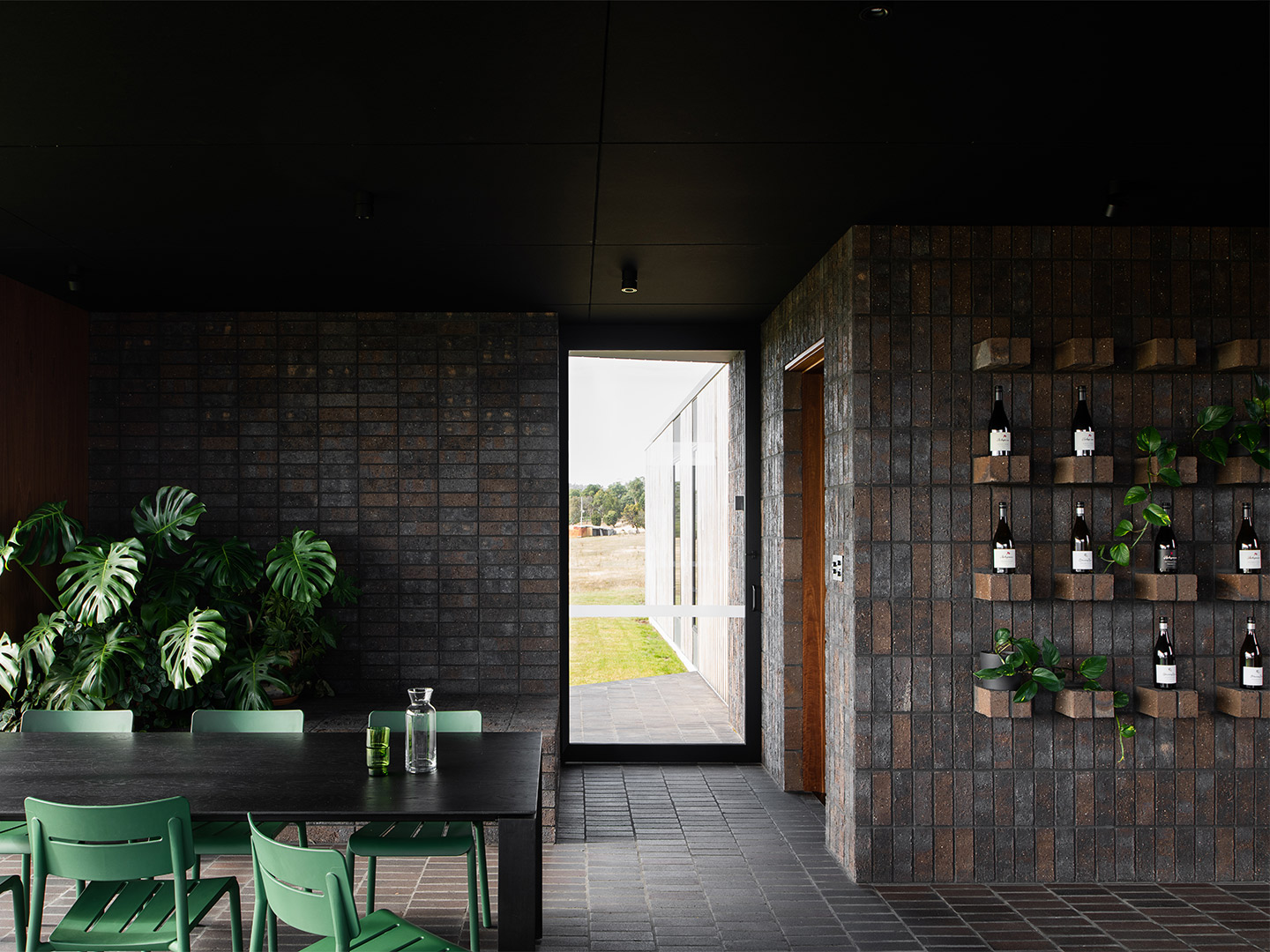
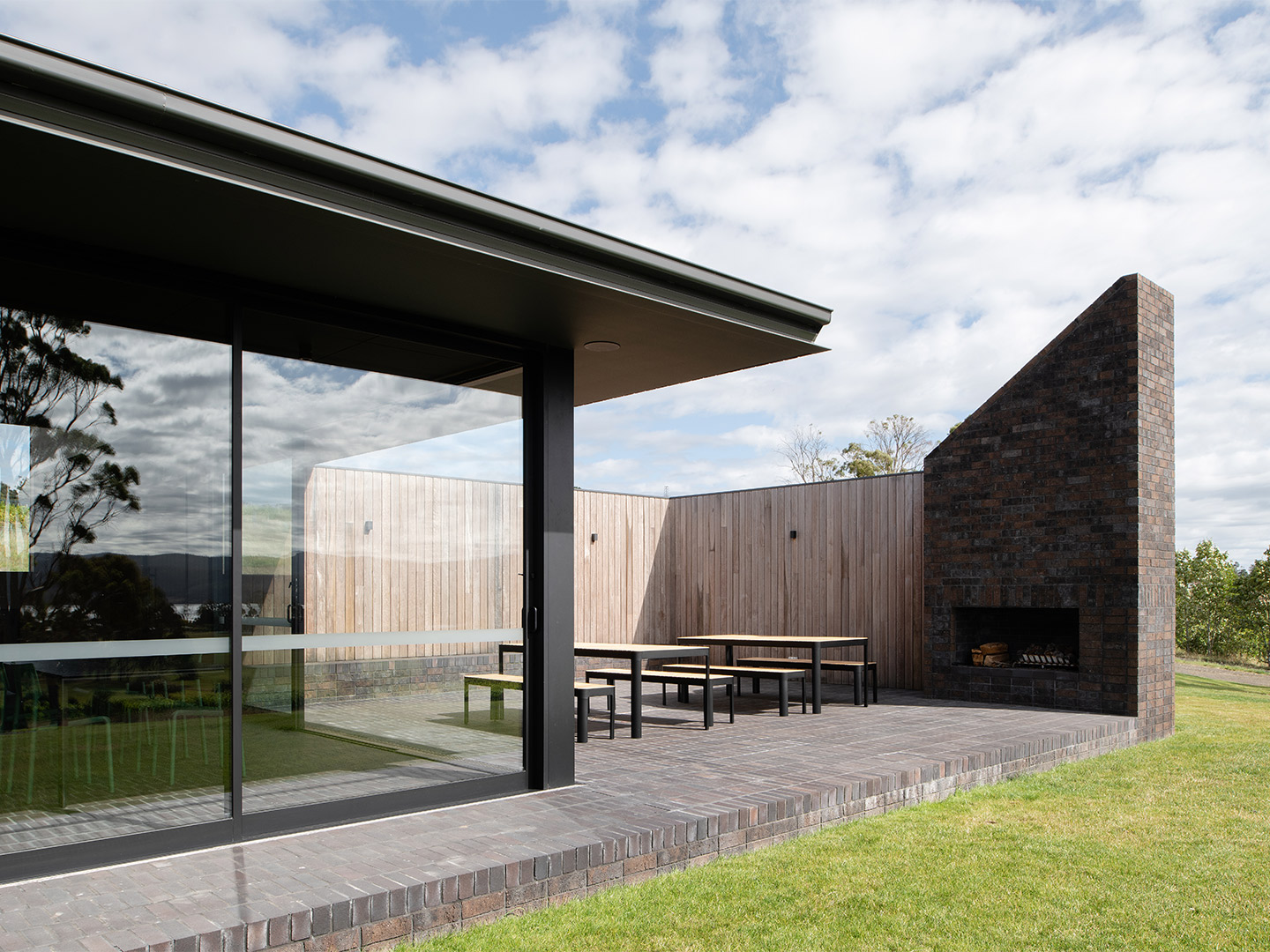
The Stoney Rise cellar door in Tasmania by Cumulus Studio
Since the building stands alone, atop a grassy knoll without any protection from the elements, the materials chosen had to have the wherewithal to withstand any impact from environmental factors. With this in mind, the key materials chosen were brick and concrete, with timber detailing that will silver as it weathers under the Tasmanian sun.
Cumulus Studio used brick in particularly creative ways that double as functional and sculptural gestures. An example of this is reflected in the laying pattern of the wall next to the bar, where extruding bricks act as small shelves, each perfectly displaying a Stoney Rise bottle of wine. Perpendicular to this, a low brick bench provides extra seating or a spot to perch indoor plants.
Outside, at the intersection where the two sections of the building meet, there is a small paved brick courtyard. This open-air space functions as a small entry foyer and sitting area, and a means of incorporating another geometric element to the project. The exterior brick features also include blade walls and a brick-framed fireplace, ideal for wine-tasting sessions in the winter months.
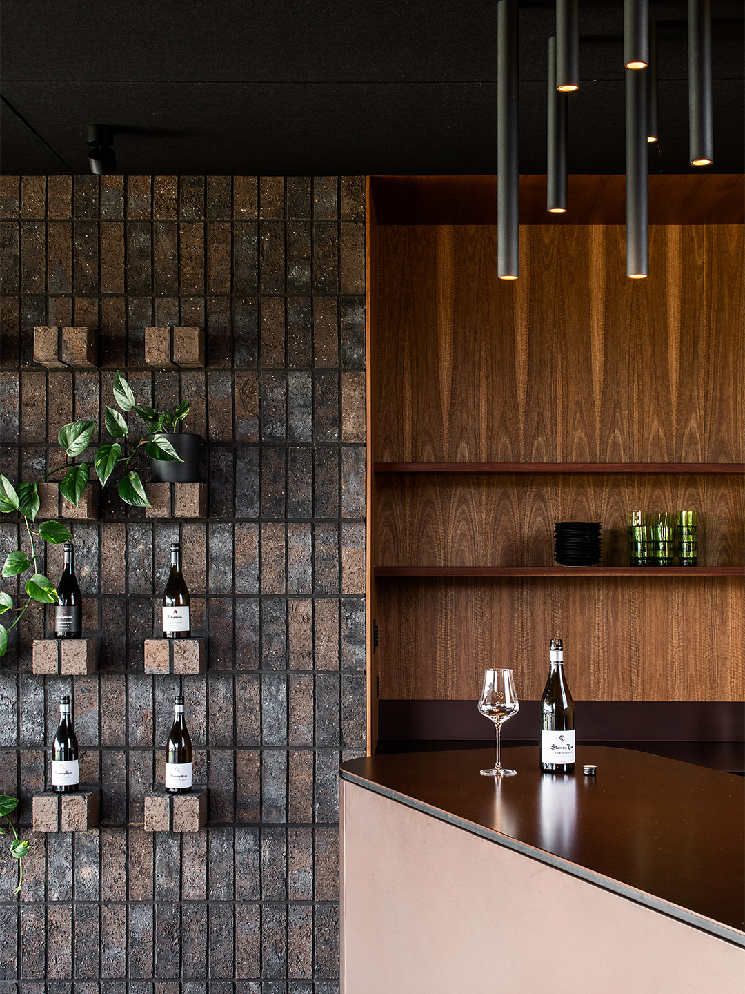
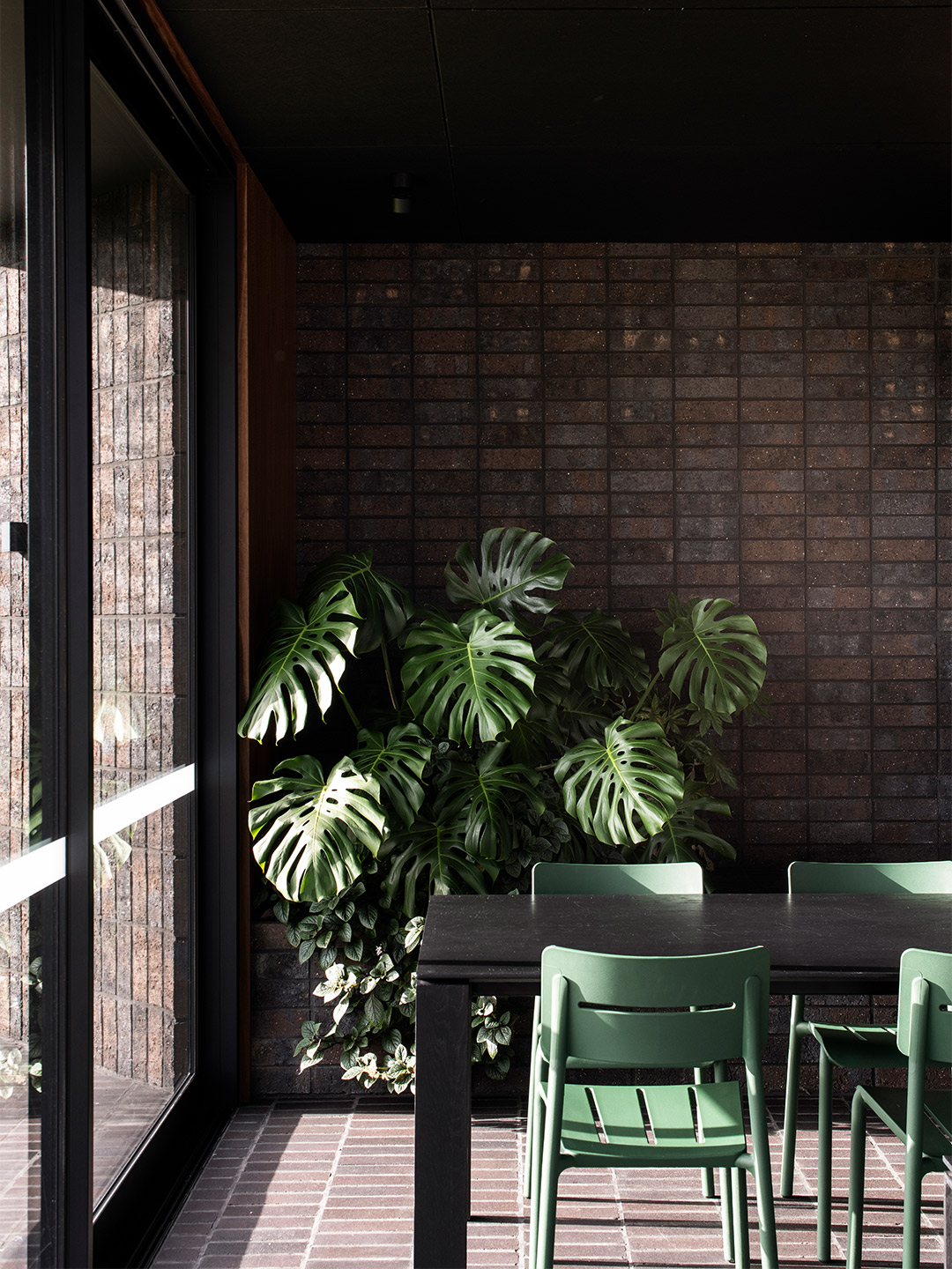
Creating continuity and making reference to the natural environment, renewable spotted gum timber wraps the building from the inside out, adding warmth to the interiors and creating an inviting environment. Inside, in the foyer and bar, Cumulus Studio chose a combination of both Bowral Blue bricks and locally sourced Daniel Robertson bricks.
This materiality grounds the building and offers a thermal mass, especially useful during the cooler Tasmanian winters. The untreated nature of the chosen materials creates an organic sensibility; the unrefined finish of the timber and the tiles on the walls pays homage to the natural milieu and the Tasmanian landscape.
The internal colour palette is moody, creating congruence with the dark ceilings and flooring, cocooning the guests inside and creating a warming atmosphere. The Bowral Blue bricks used for the internal flooring are smooth, both in texture and in colour, whereas the Daniel Robertson bricks that run along the walls are textural, with a mottled finish and rougher surface.
The continuity between the floor and ceiling can be seen as both an interior and an exterior feature. At the entrance to the building, the untreated timber in a washed-grey tone meets the smooth concrete, creating a juxtaposition of texture but a uniformity of colour.
Beyond materiality, a key desire for the client was to make the most of the small footprint, and the views of Kanamaluka to the east and the crop of Trousseau grapes to the west. The project was also led by practical requirements. The cellar door needed to be designed with the ability to be staffed by just one person, as well as having the capacity to host an array of functions in the day-to-day trading of the business.
cumulus.studio; stoneyrise.com
A prime example of creating a project that assimilates into the natural landscape, Stoney Rise Wine’s cellar door makes the most of the Tasmanian elements.
Catch up on more architecture, art and design highlights. Plus, subscribe to receive the Daily Architecture News e-letter direct to your inbox.
Related stories
- ‘The Apple tree’ by Foster + Partners blossoms in Bangkok.
- Carla Sozzani curates new colours for classic Arne Jacobsen chairs.
- Adam Goodrum stamps all-Australian style on new breezeblock design.
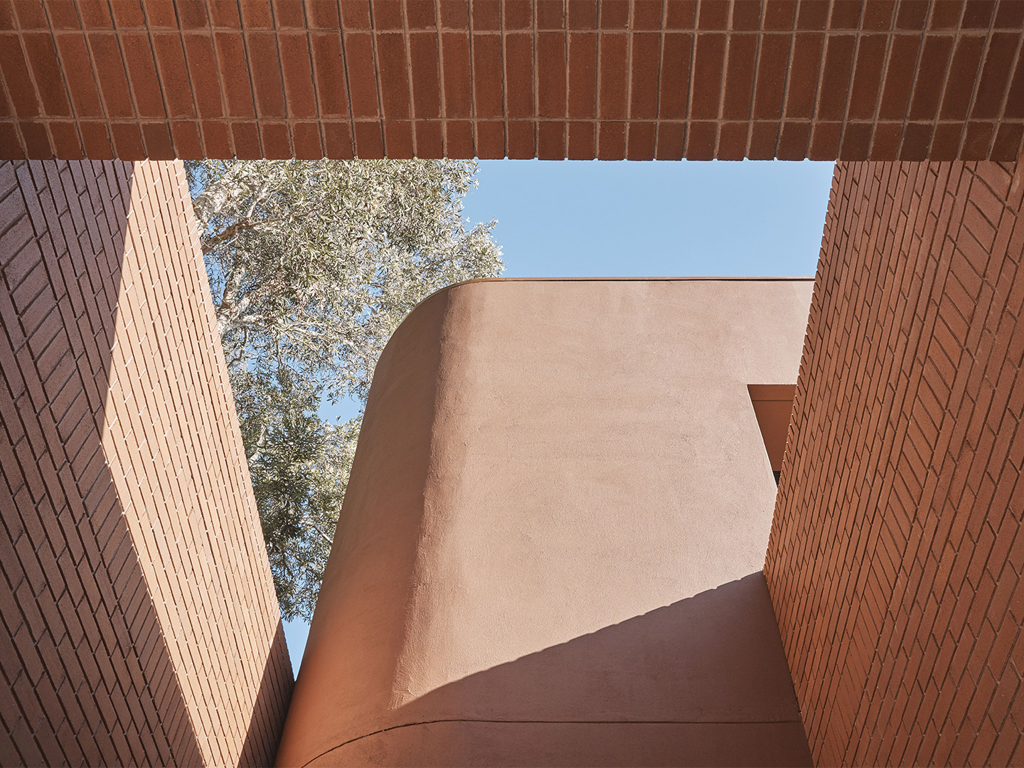
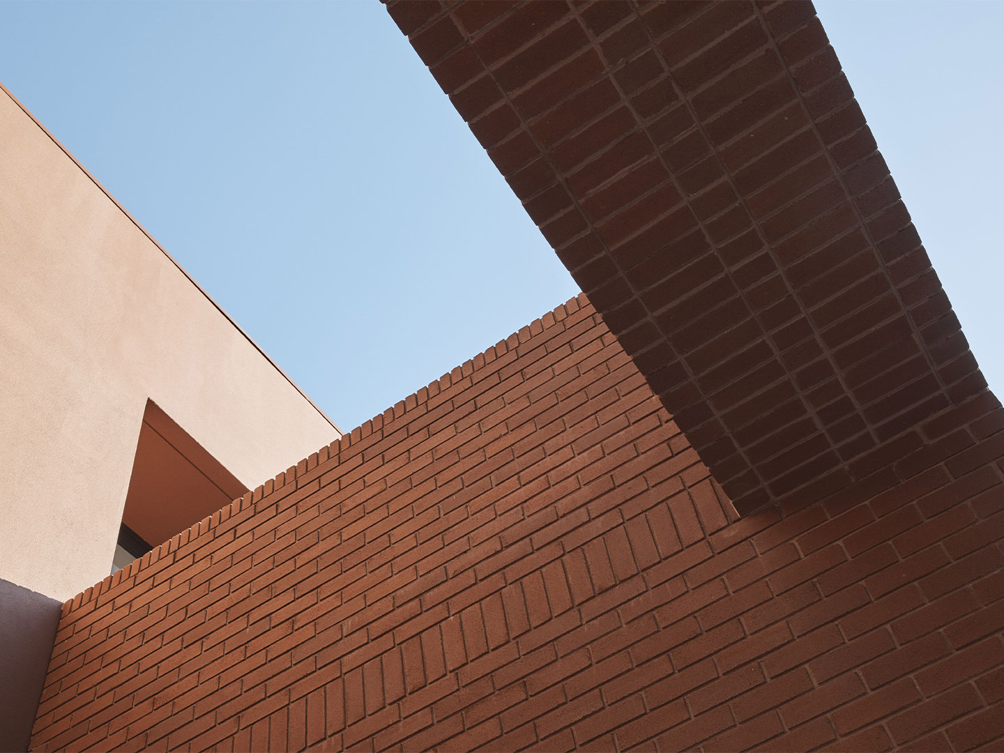
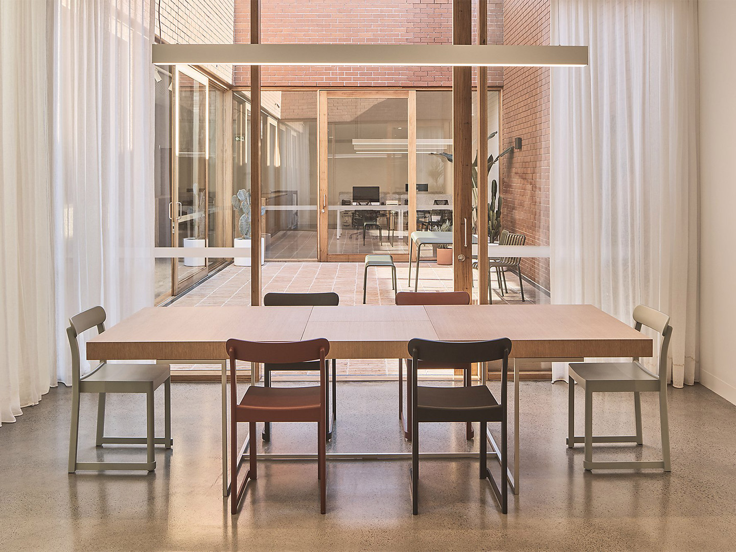
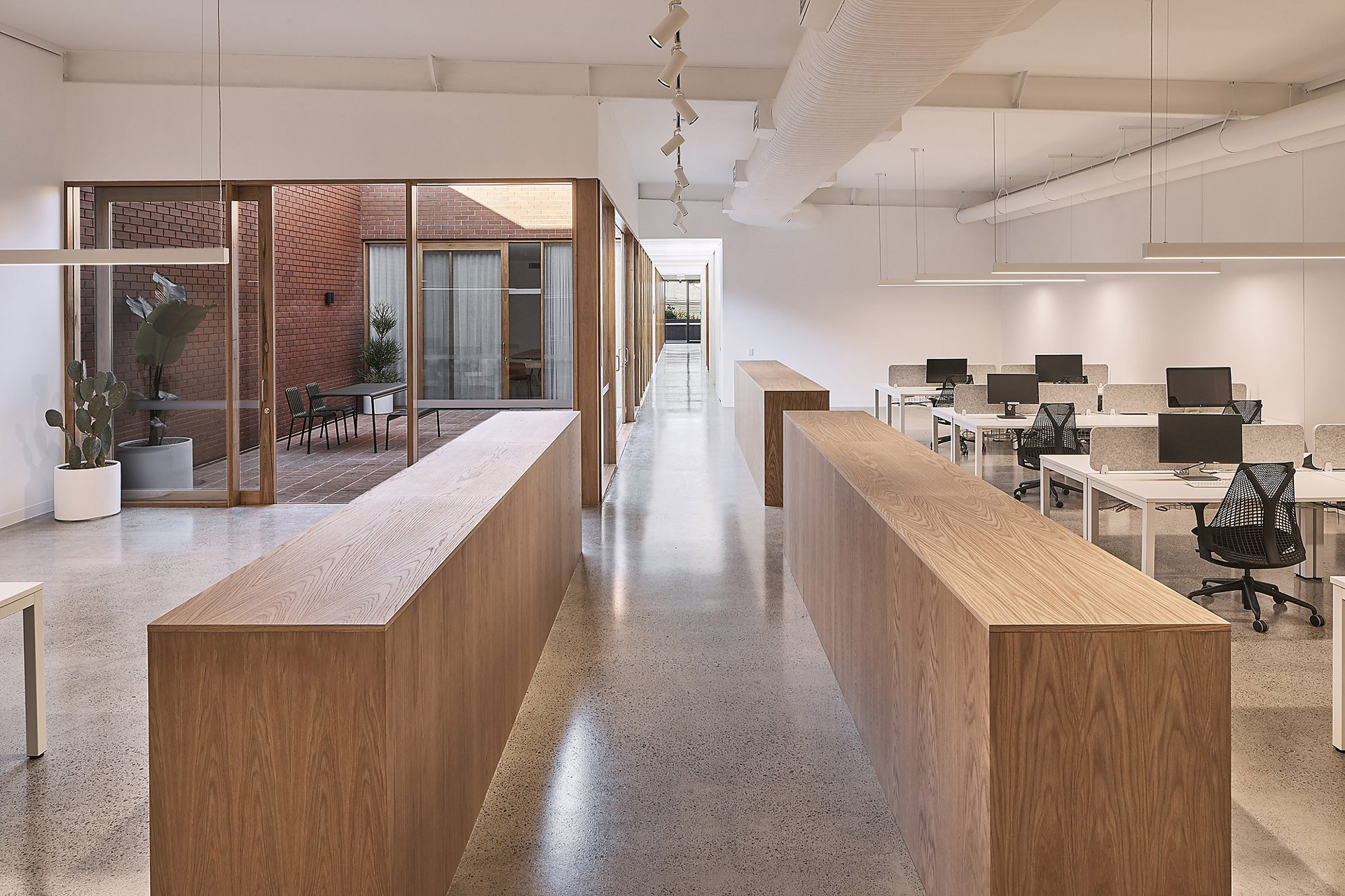
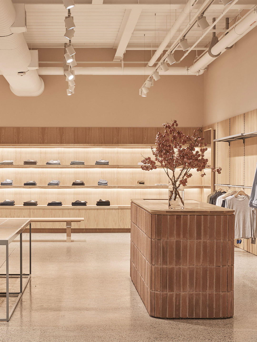
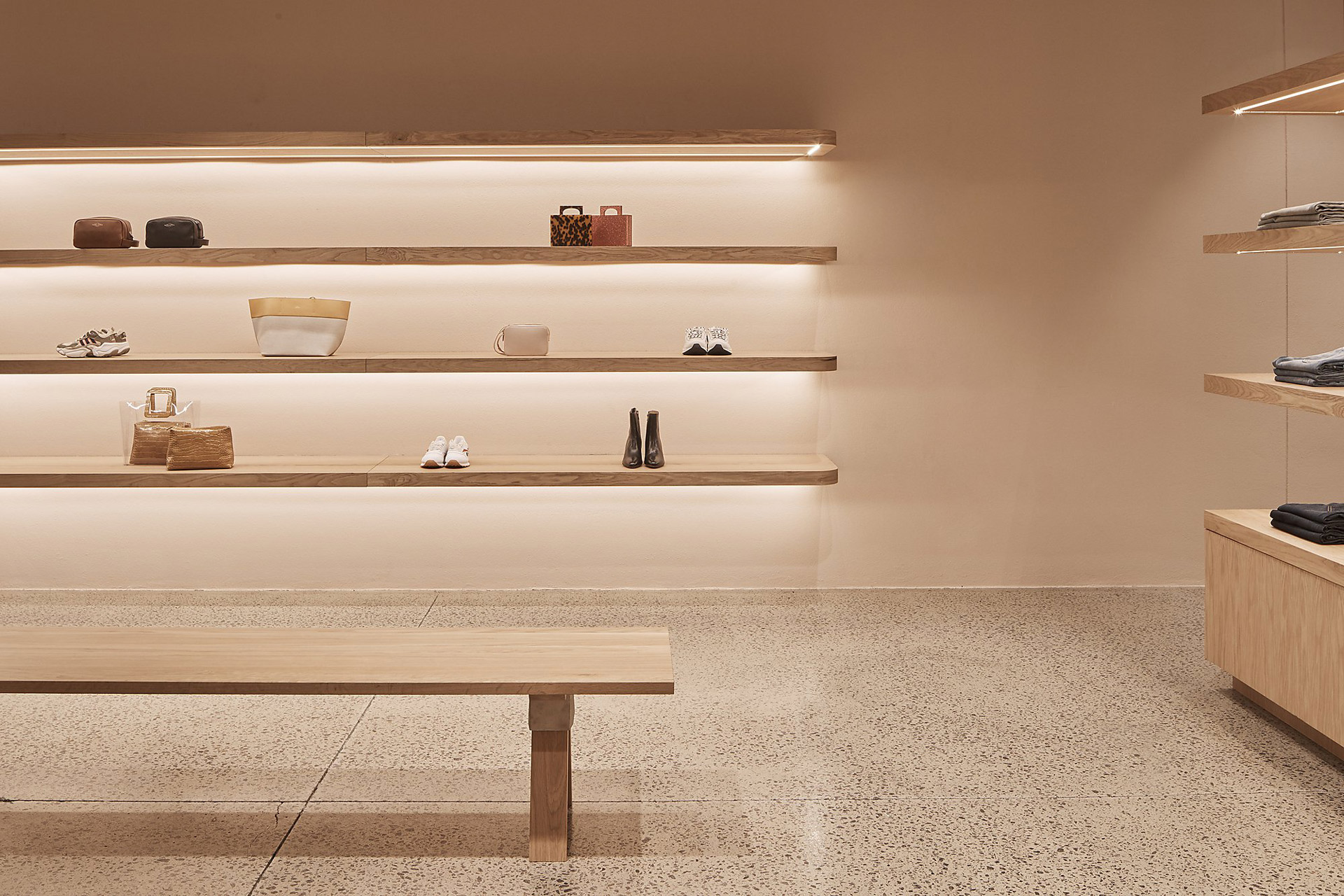
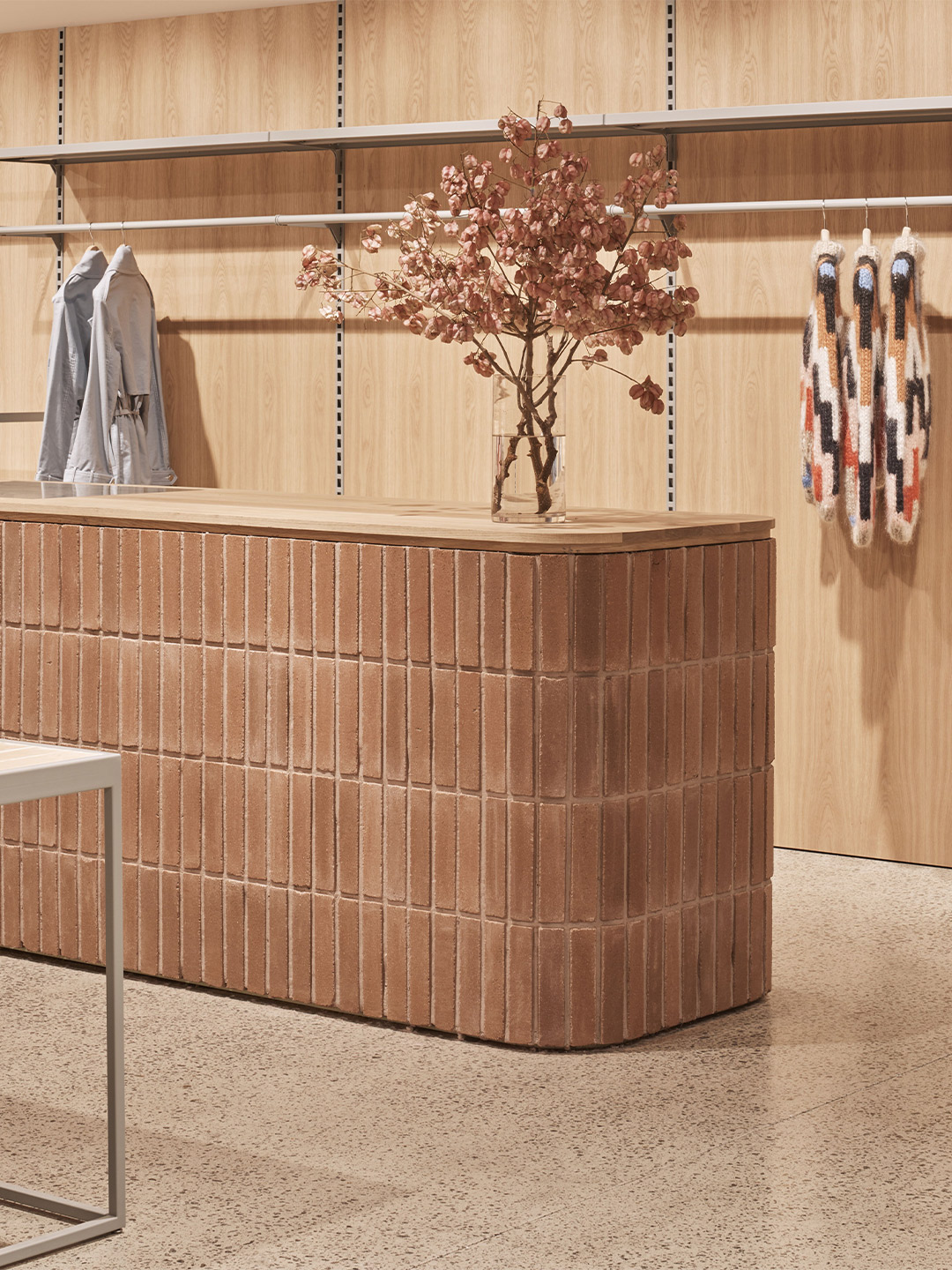
Australian architecture outfit Akin Atelier, led by director Kelvin Ho, was tapped by Brian and Vincent Wu, the founders of fashion retailer Incu, to create the brand’s multi-purpose headquarters in the Rosebery neighbourhood of Sydney. But the finished result is much more than just an HQ. The newest Incu address performs as an outlet store, event facility, warehouse and office space.
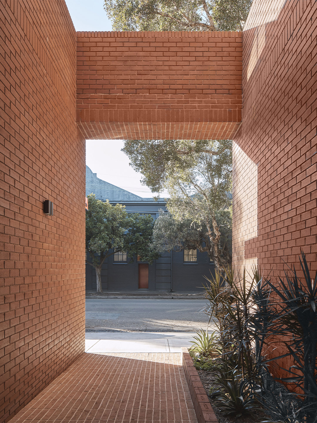
A key element of the building’s design is the intricate brickwork that extends from the outside in. The brick materiality pays homage to the history of the site (originally a mechanic’s workshop), the surrounding industrial area and the storied brick buildings that remain.
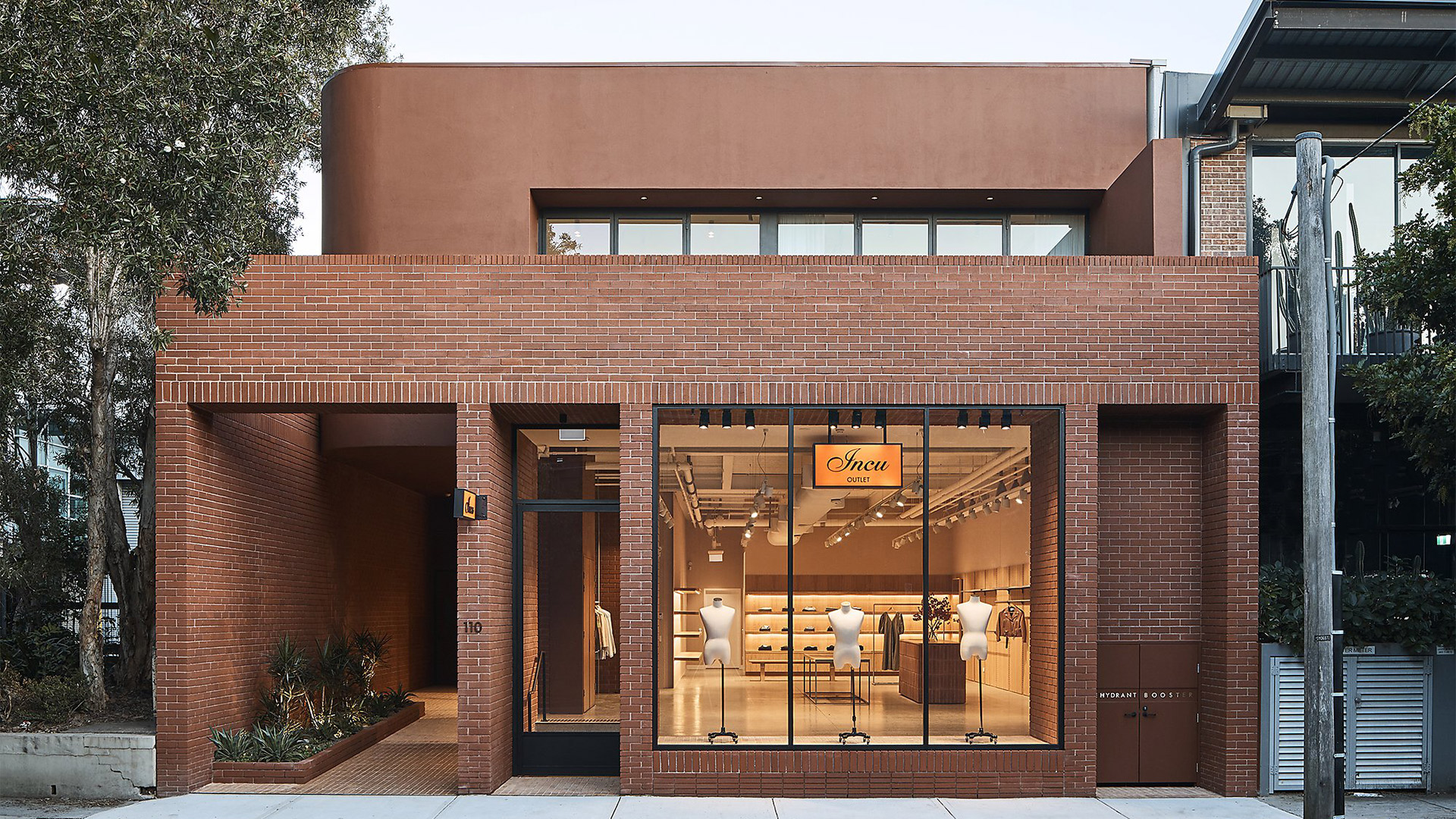
The Sydney HQ of multi-brand retailer Incu by Akin Atelier
The facade of the Incu HQ is constructed with Bowral Bricks in Capitol Red; the dry-pressed bricks are a modern take on the classic red brick, quintessential to the Australian architectural landscape. The strong uniformity of the colour and structure is offset and softened by curved edges and smooth terracotta-tinged render.
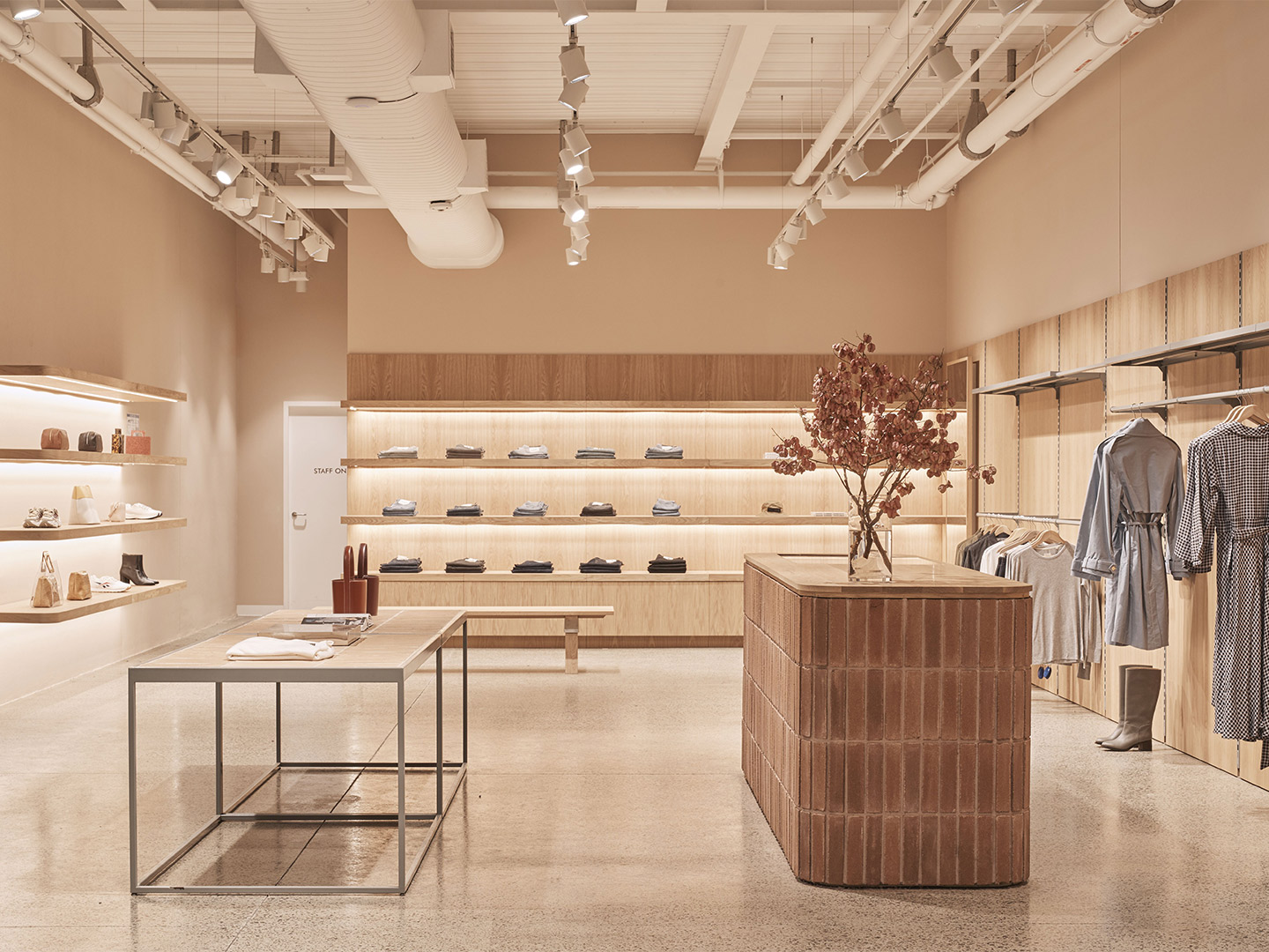
The building consists of predominantly natural materials, including timber joinery and door frames throughout. The earthy materiality contributes to the calming and neutral sensibility of the space – impressive in its form and structure, but refined in colour and texture so as to not detract from the range of products on display.
“We work predominantly with natural materials for Incu’s material palette,” Kelvin says, highlighting the use of premium oak, stone and ceramic tiles. “There is always a gesture of colour but it never overwhelms the space. We place fixtures and displays as visual clues to guide customers through the micro-departments of each store – almost like an intuitive map.” As well as the material palette, Kelvin describes the way that the Australian identity is painted through the store, creating a “mood [that] is contemporary, warm, familiar and tactile, accessible”.
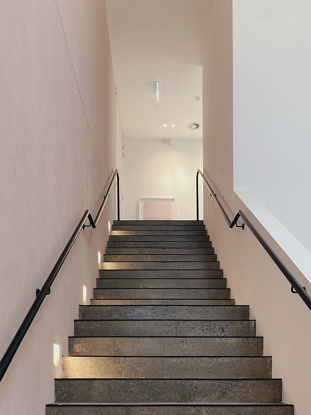
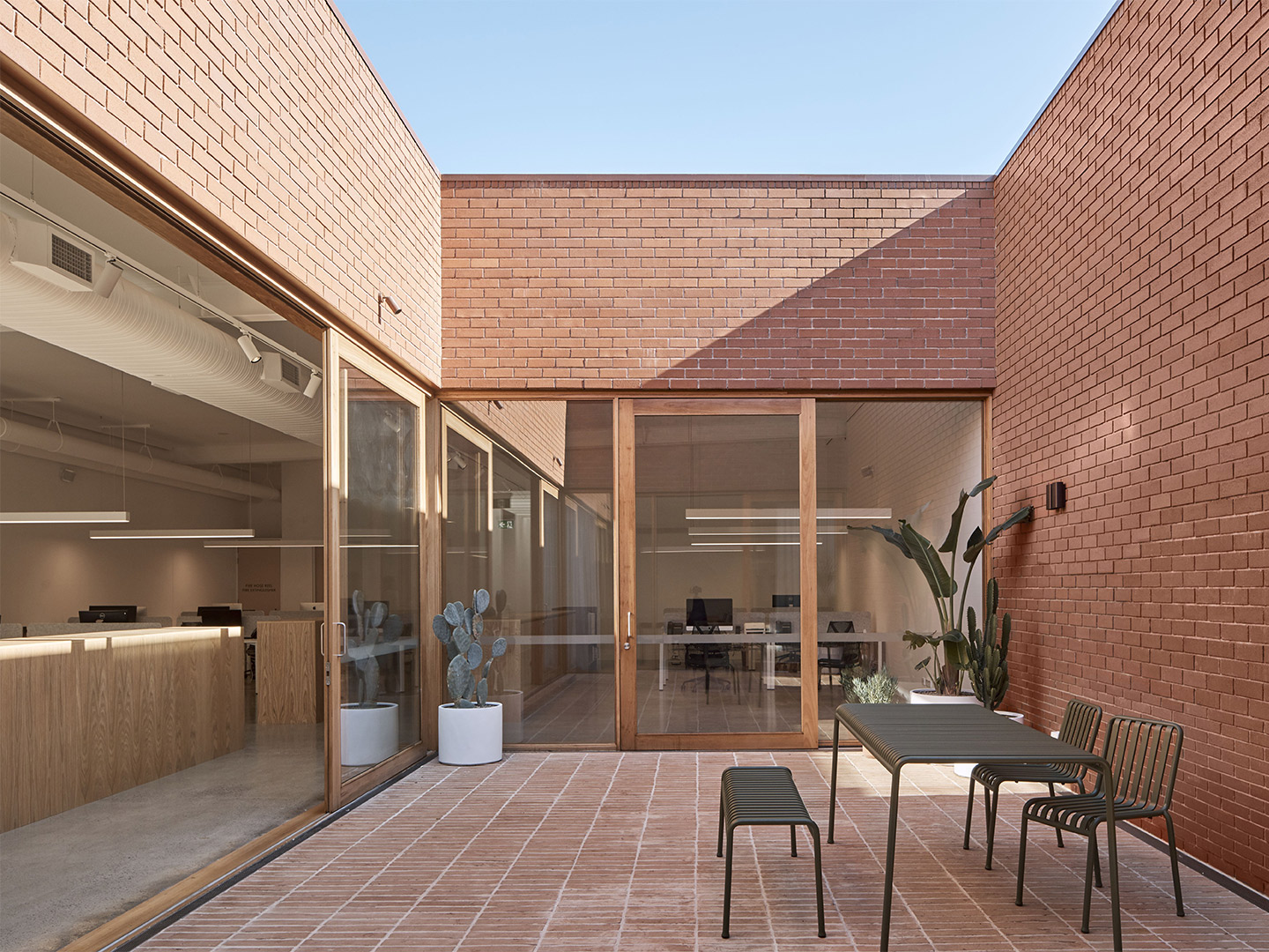
Despite the reasonably large footprint, the dimensions are narrow, and so in order to let light into the space, the team at Akin designed floor to ceiling windows, both as a means of illuminating the space and as a design feature. Placed around the internal courtyard, the windows also promote cross-ventilation, fostering an open, cool sanctuary in the urban environment.
Though not visible from the street, the courtyard acts as the heart of the upper-level office. Doubling as an intimate place to relax and a means of drawing light into working spaces, the open-air courtyard is the ideal location for an alfresco meeting, mid-day repose or after-work drinks.
We work predominantly with natural materials for Incu’s material palette. There is always a gesture of colour but it never overwhelms the space.
Catch up on more architecture, art and design highlights. Plus, subscribe to receive the Daily Architecture News e-letter direct to your inbox.
Related stories
- ‘The Apple tree’ by Foster + Partners blossoms in Bangkok.
- Carla Sozzani curates new colours for classic Arne Jacobsen chairs.
- Adam Goodrum stamps all-Australian style on new breezeblock design.
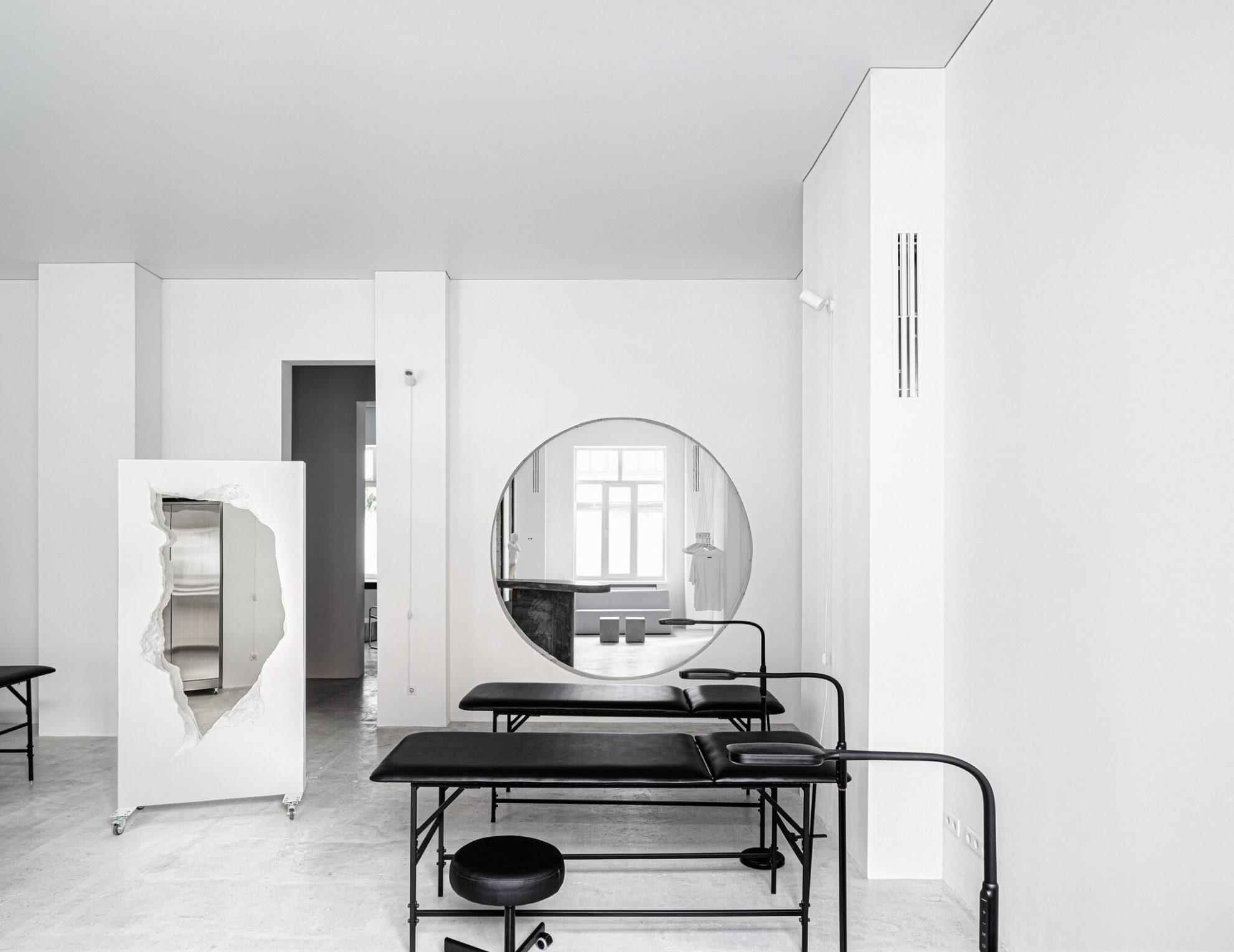
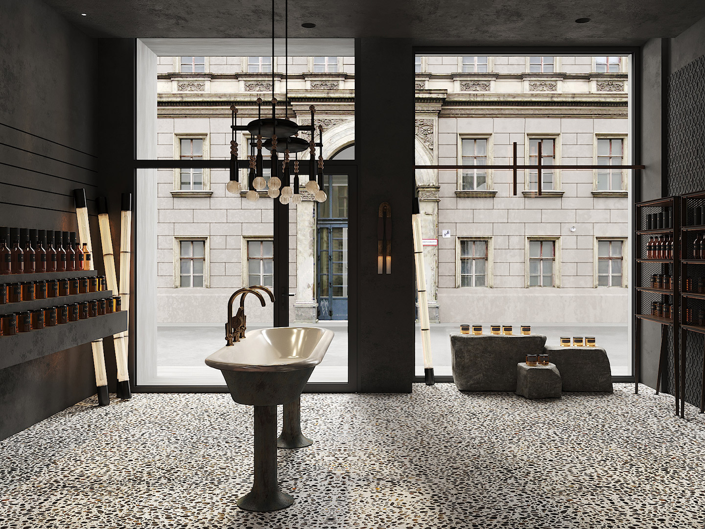
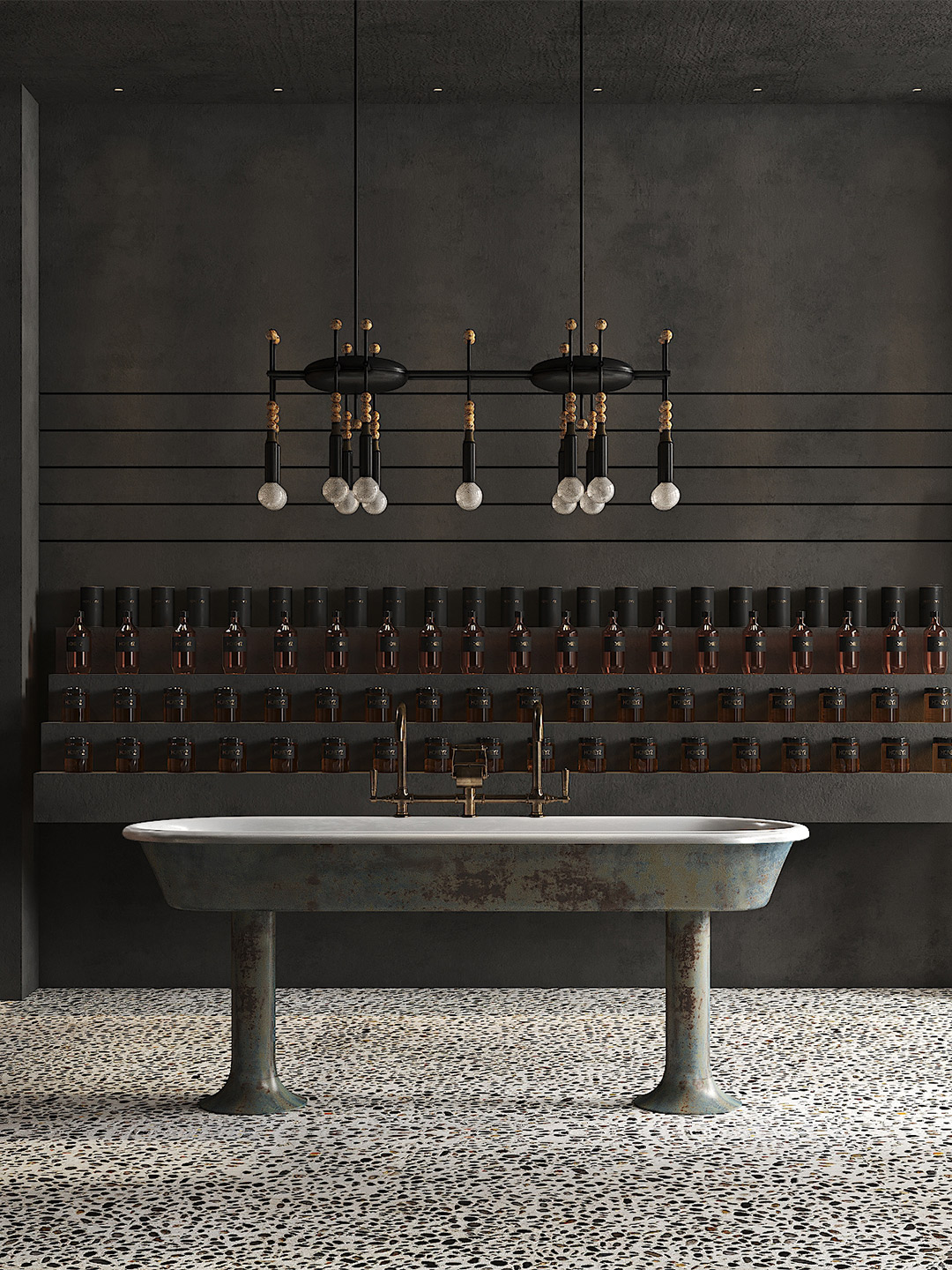
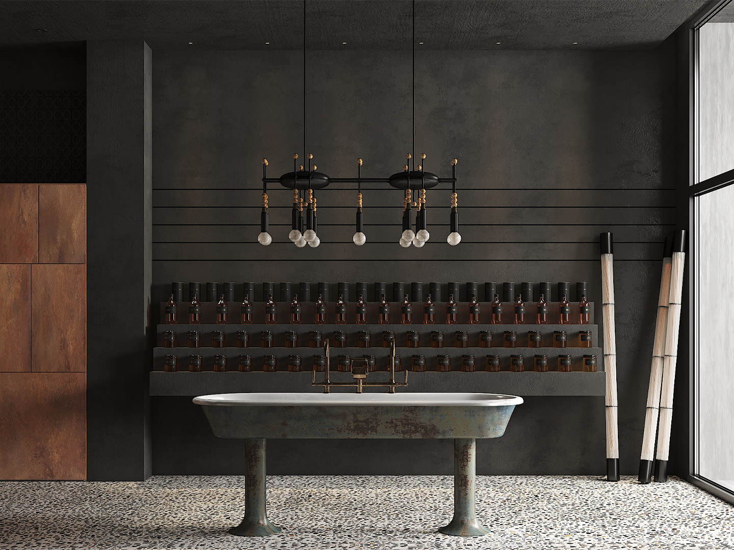
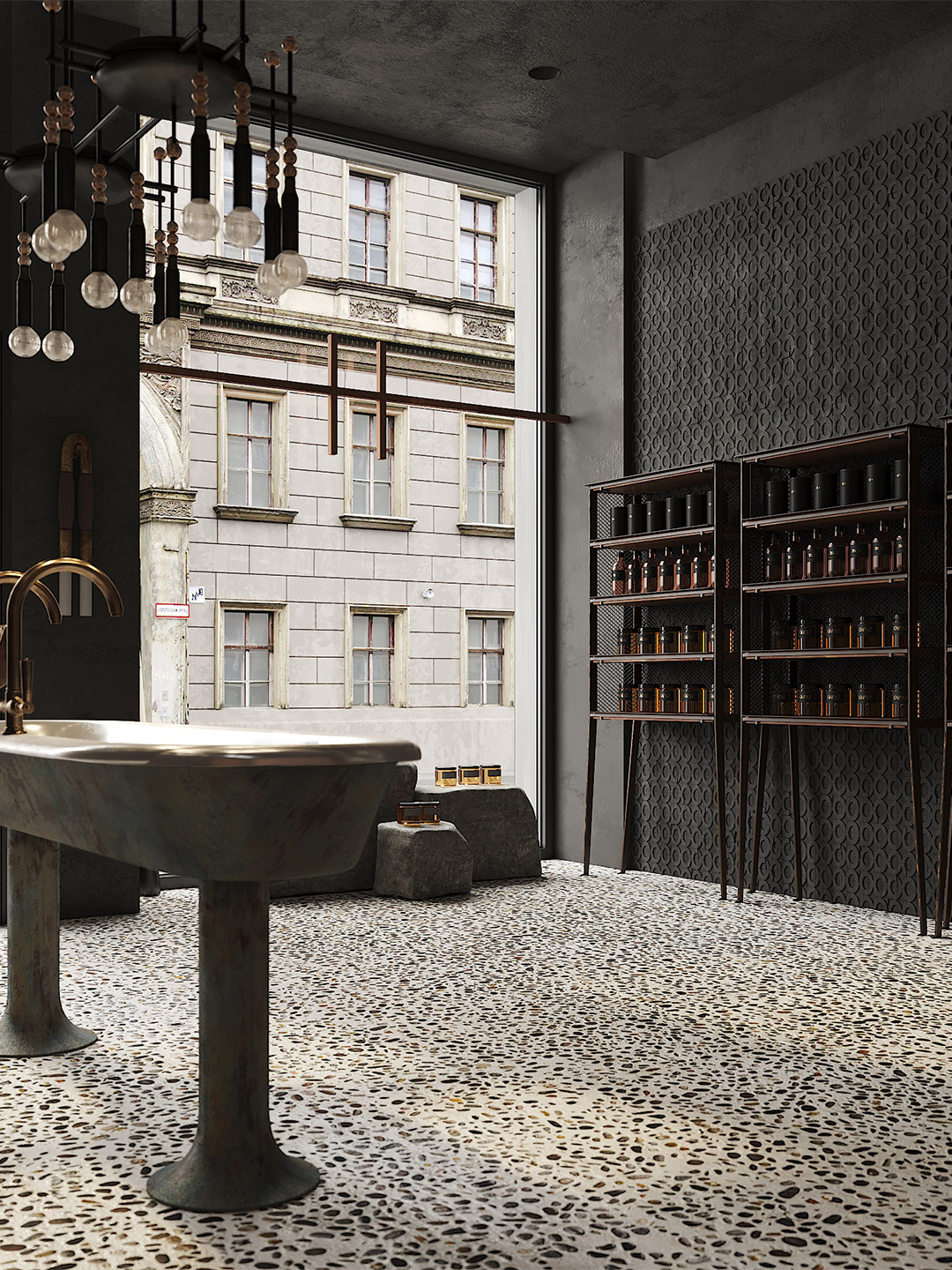
Madrid-based design office Puntofilipino, led by Gema Gutiérrez, eschewed glitz and glamour in favour of industrial materials and an “apocalyptic atmosphere” for the Berlin home of honey and skincare retailer Honeyz. Hidden at the end of a beautiful avenue of ancient trees, the outlet is located within a cluster of several neoclassical buildings, each with great historical value. “The charm of the building and the architectural setting was what attracted the founders of Honeyz to this place, with the intention of making it a destination of reference,” Gema says.
Measuring in at just 75 square meters, the Honeyz retail store references the sophisticated history of a city that, for hundreds of years, has been celebrated as an epicentre of arts and cultural events. “Though visually rich in contrast, colour, texture and shape, the interior draws from a limited palette of materials, which resonates with an almost sacred sense of scarcity,” Gema explains.
Honeyz boutique in Berlin by Puntofilipino
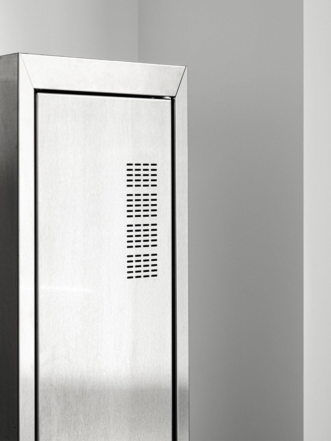
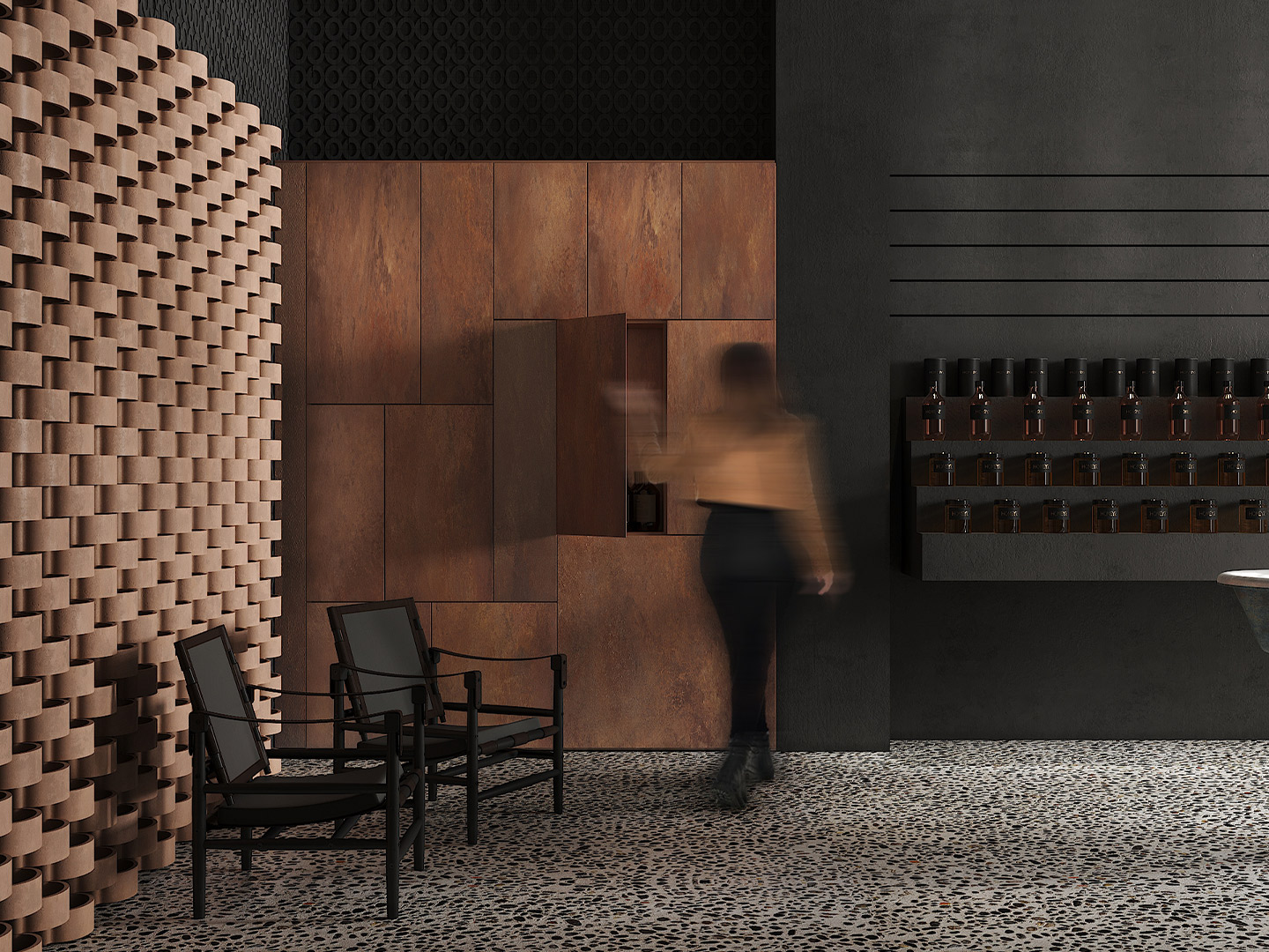
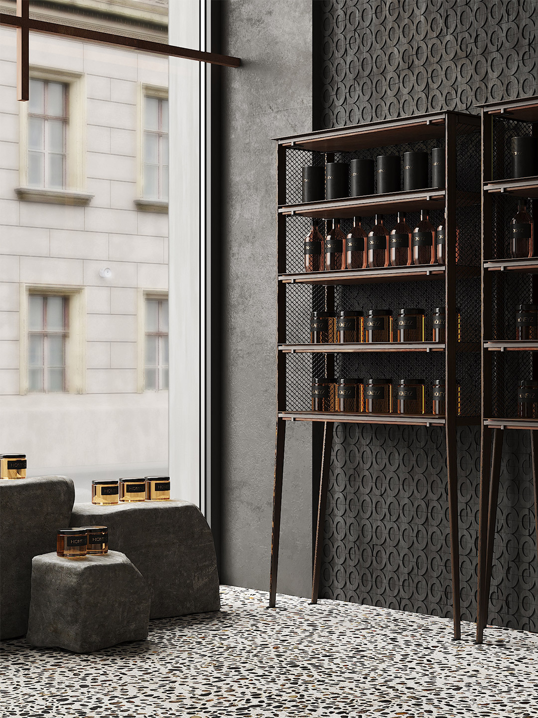
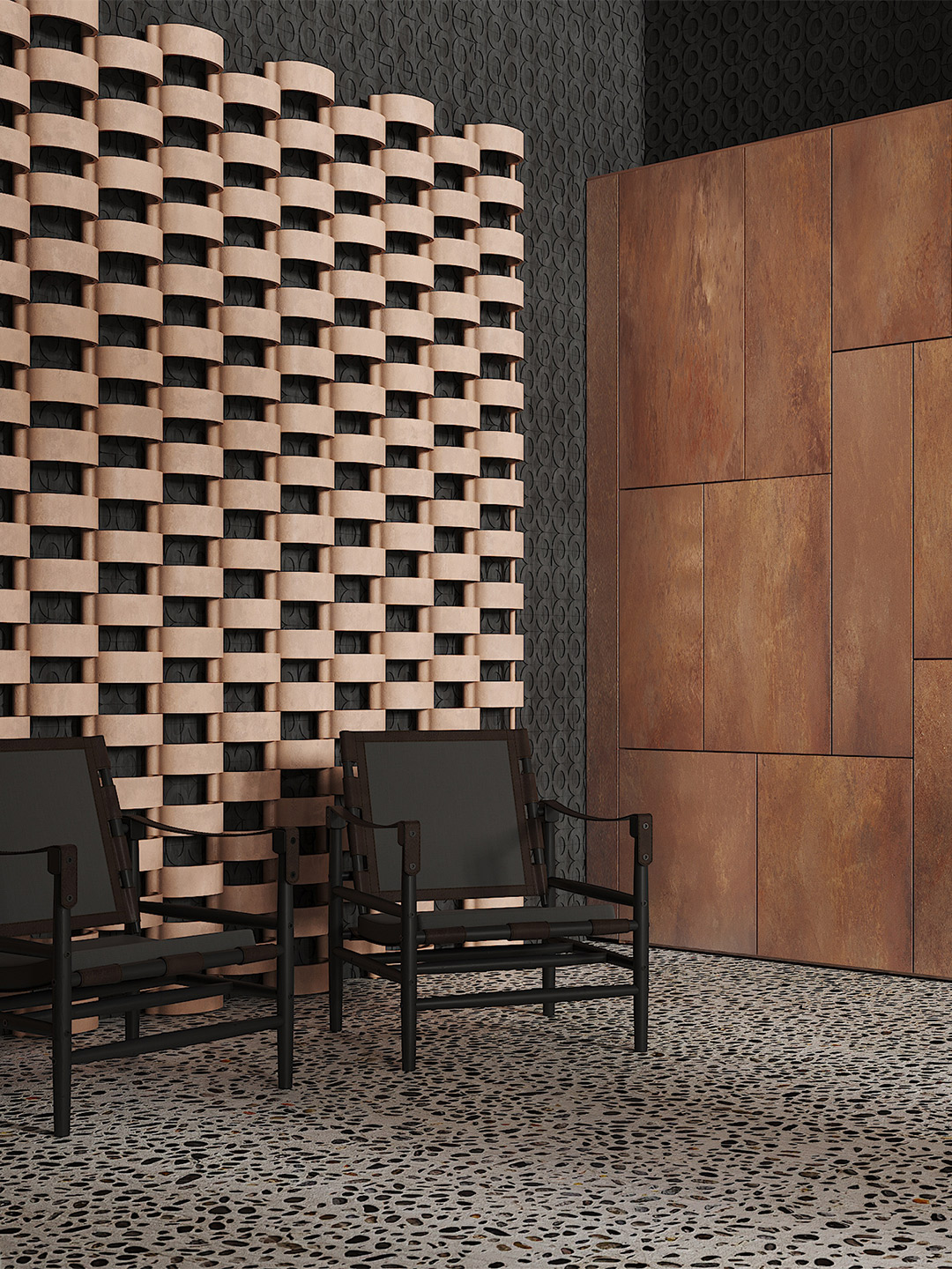
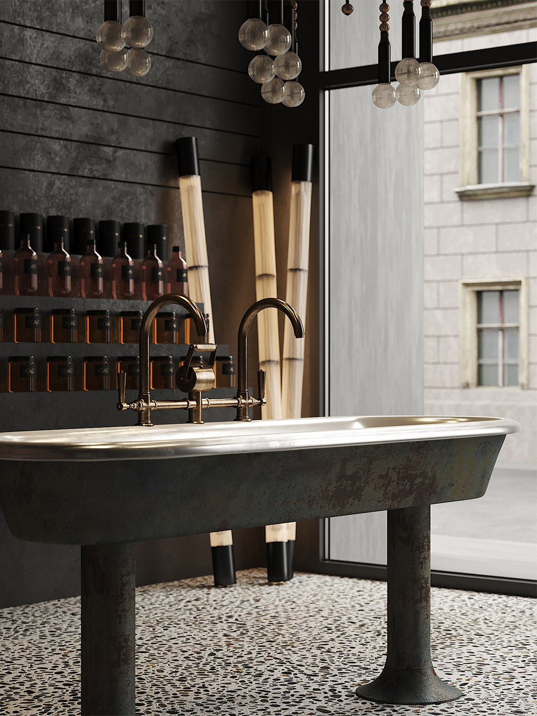
Driven by a commitment to preserving the building’s historic character, Gema stripped the unoccupied edifice back to its essentials and introduced a palette of earthy tones. “The space’s stark aesthetic of concrete, pebble floors, and corten steel elements harks back to its bunker days,” she says.
Natural materials such as wood, stone and corten steel then ensure that the furniture, much of which has been custom made, blends in harmoniously. “A contemporary furniture collection imbues the space with subdued elegance,” Gema enthuses. The additions that perhaps stand out the most are the natural stone blocks and the sculptural, freestanding bronze washbasin that was designed by Puntofilipino.
“Subtle juxtapositions between clean lines, polished textures and the immaculate craftsmanship of modern furniture and the worn patina of the building’s fabric create a harmonious interplay between old and new, further sharpening the spirit of the flagship store,” Gema explains.
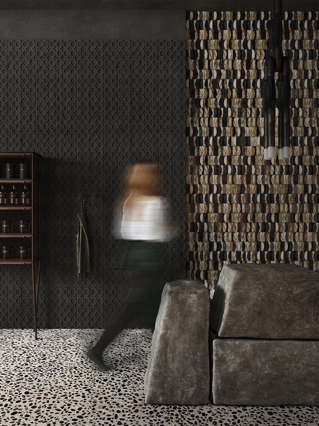
The designer adds that the studio approached this project as an exercise in “artistic expression” underpinned by the desire to create a unique space connected to the history of the city. Based on a nuanced palette of black tones and the predominance of concrete surfaces, the store is a fine example of minimalist design and conceptual rigour.
Despite the monochromatic colour palette, the concrete landscape that Punotfilipino has conjured up is far from dreary. A variety of concrete finishes and textures – including polished, stained and rough stucco – create a rich spatial tapestry, enhanced by changing light and moving shadows as the day progresses. “The use of concrete and pebbles, seductively illuminated by filtered daylight, creates a meditative atmosphere that resonates with the contemplative tranquility of nature,” Gema says.
The predominance of concrete is fortified by the subtle presence of complementary materials, which appear in bespoke and selected furniture and fittings. As an eye-catcher, a suspended lamp from Apparatus can be seen in the distance; at the back of the premises, a screen of clay latticework by the Spanish firm Cerámicas Ferrés takes pride of place.
But to give shoppers a truly unexpected experience, the designer leaned into the dystopian theme – not the most common trope employed in beauty retail – resulting in dark, bunker-like areas. “A bunker is probably the last place you’d think of buying your honey and skincare products, but that’s part of the fun of this space,” Gema says. “We believe this is a mindset that more retailers should adopt with their physical locations; it’s these kinds of Instagrammable, story-driven interiors that will really incentivise shoppers to spend their money offline.”
A bunker is probably the last place you’d think of buying your honey and skincare products, but that’s part of the fun of this space.

Puntofilipino also designed the Memphis Milano apartment in Italy. Catch up on more architecture, art and design highlights. Plus, subscribe to receive the Daily Architecture News e-letter direct to your inbox.
Related stories
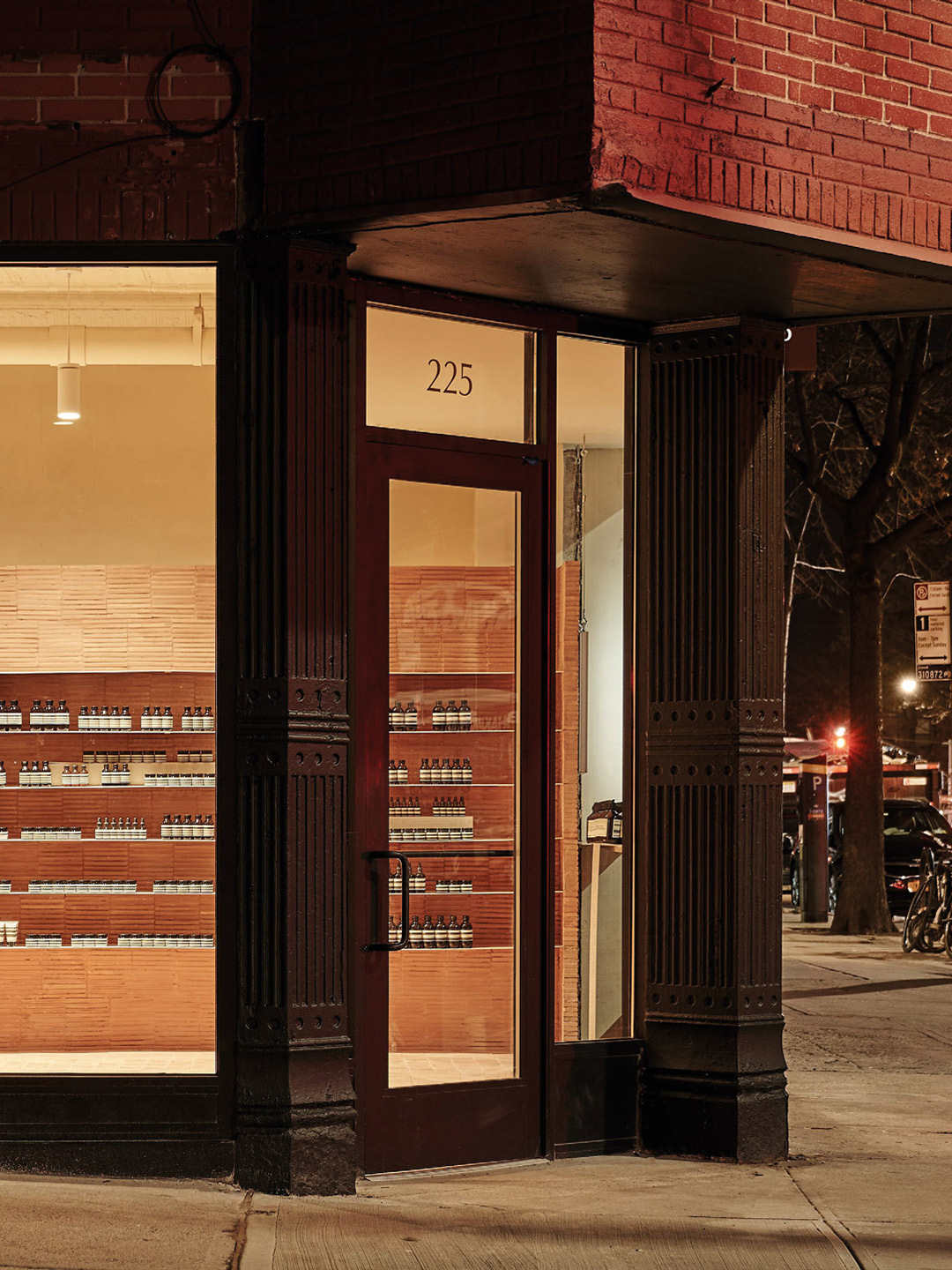
- Brooklyn’s famed brownstones inspired the Aesop Park Slope store.
- A 1960s London post office is now a swinging sushi restaurant.
- Designer diner: Los Alexis taquería in Mexico City by RA!.
Swedish fashion brand Axel Arigato is fond of describing itself as a “digitally native” business. So the steady expansion from online to offline, by way of bricks-and-mortar stores, is not only a surprising move – it’s one that bucks the trend. After launching its first physical store in 2016, Axel Arigato has continued to expand its presence; putting its foot in the door of cities that are key to business growth. The latest store to join the enlarging lineup is located in the Marais district of Paris. Backdropped by a lively neighbourhood, where many French traditions remain intact, the Axel Arigato store disrupts the typical retail model.
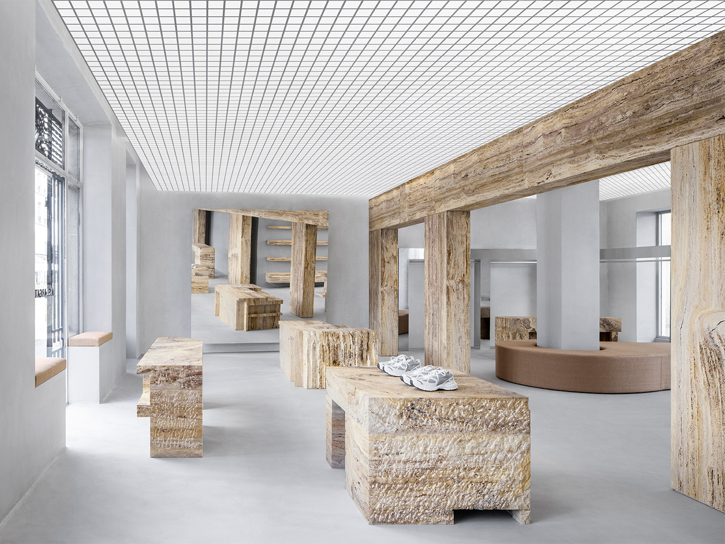
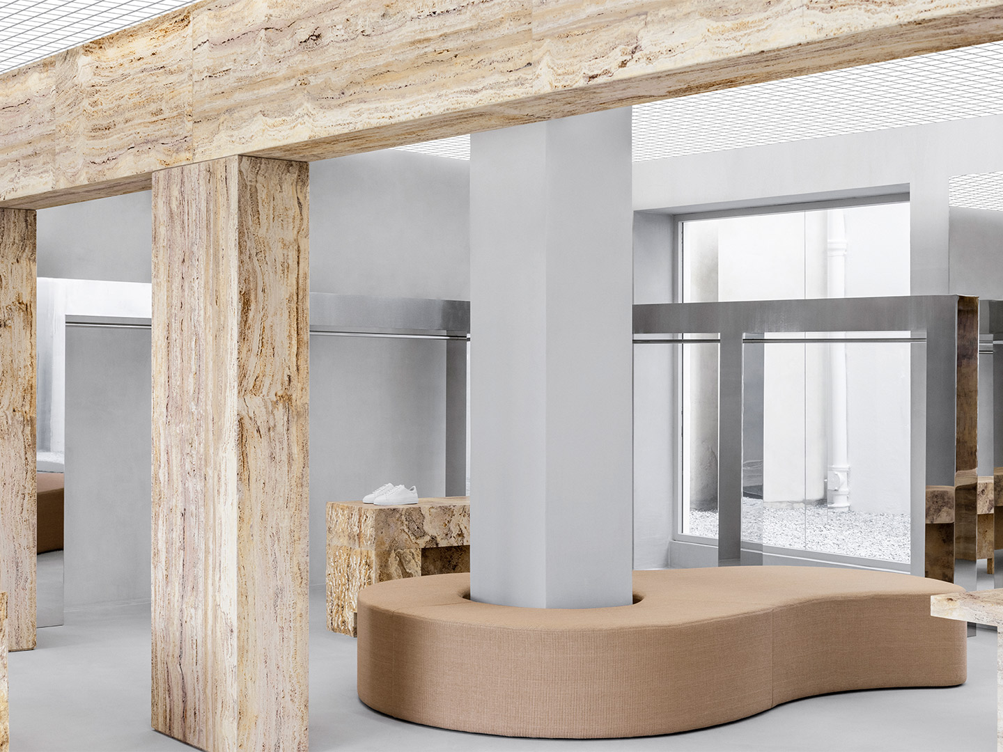
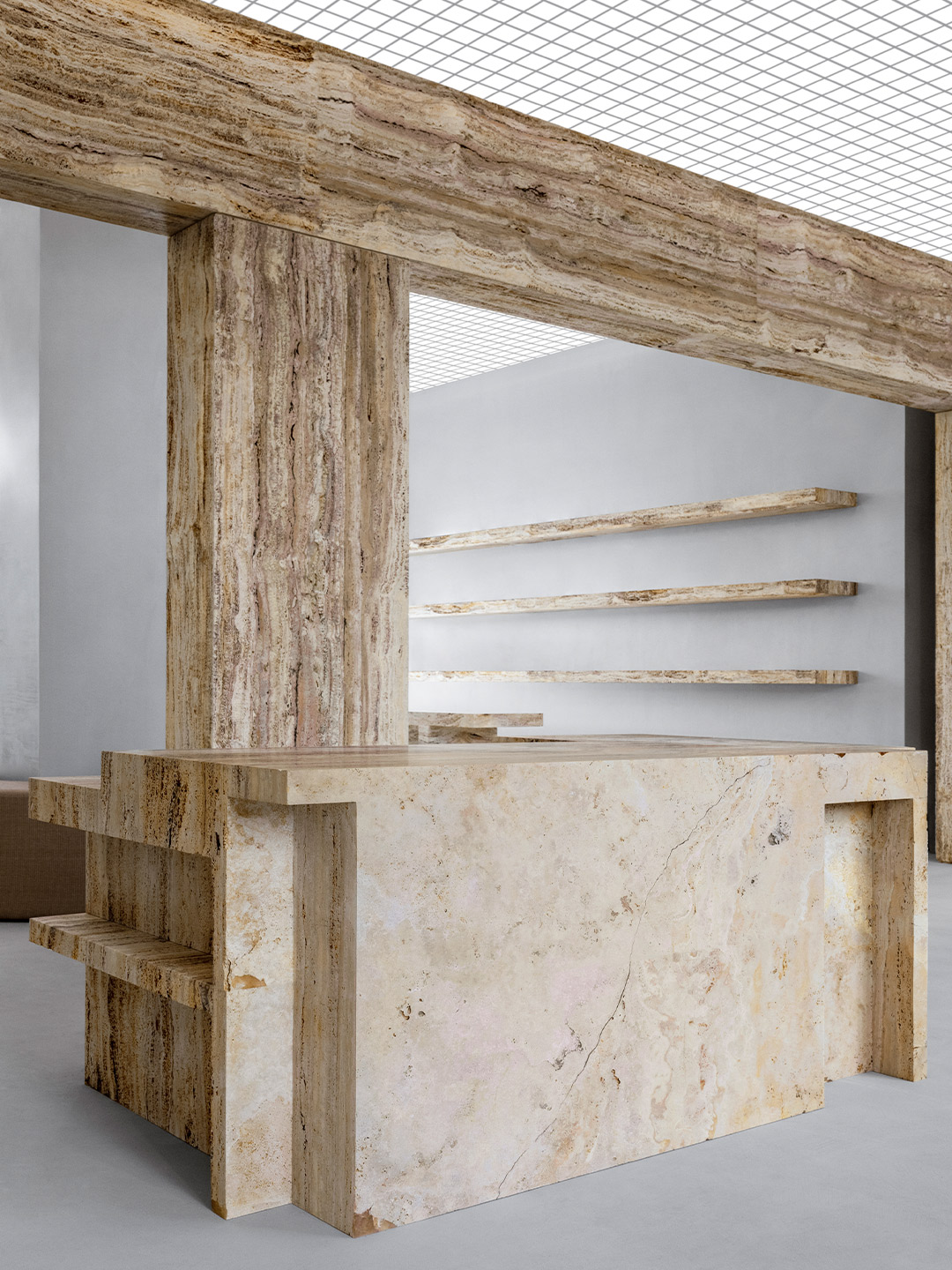
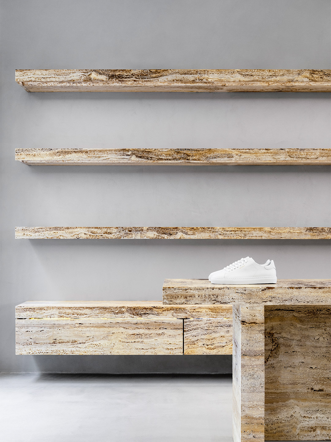
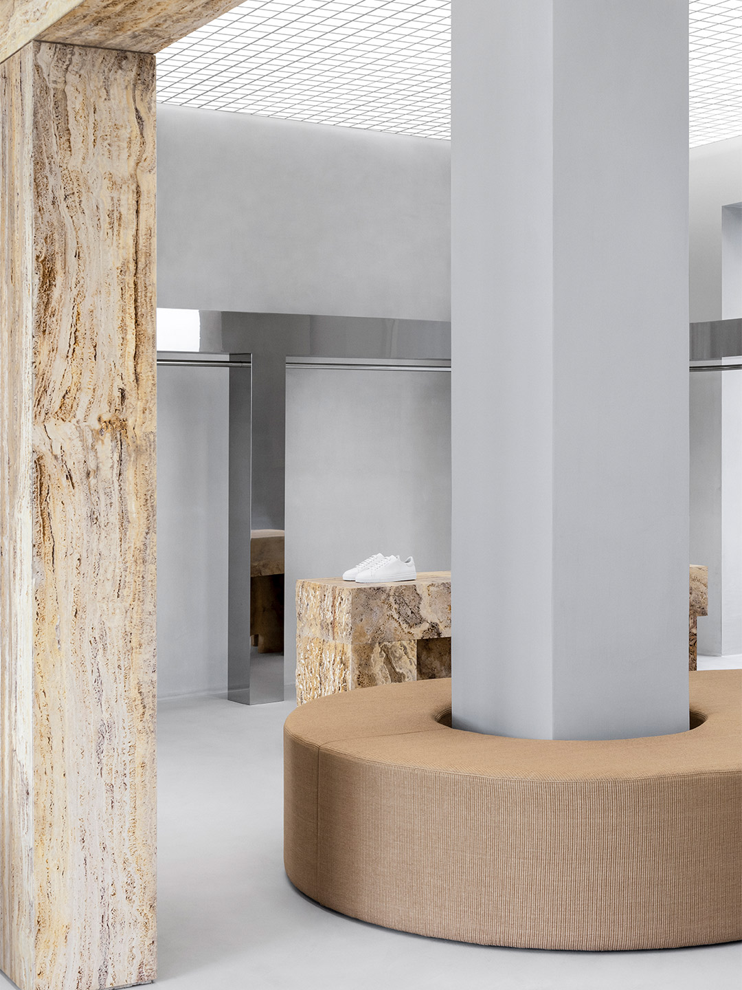
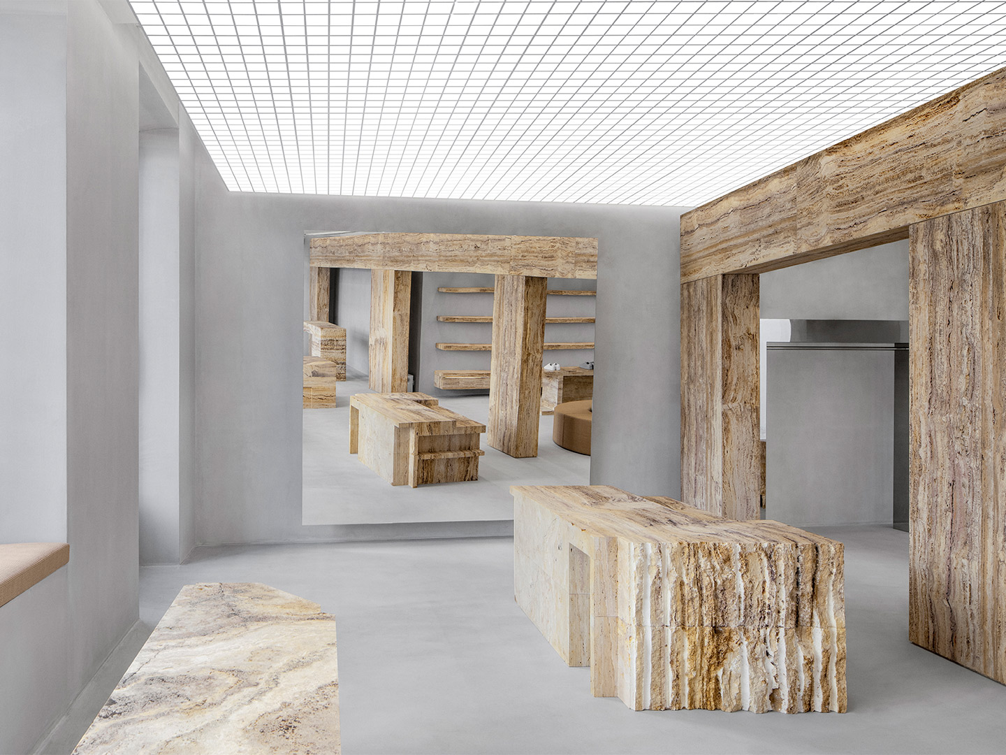
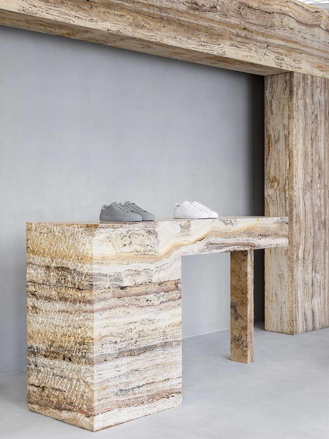
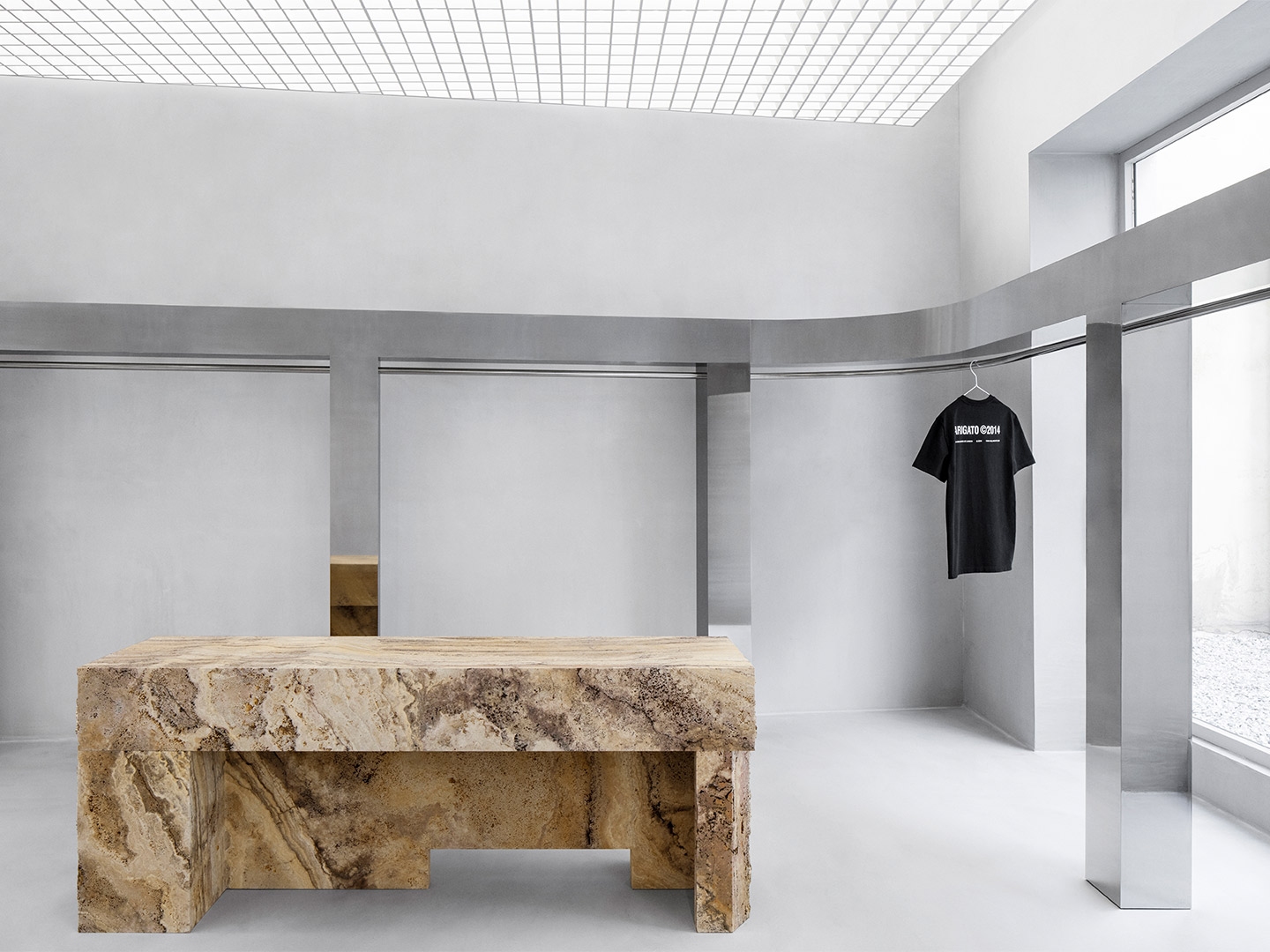
Designed by Scandinavian architecture studio Halleroed, the outlet is driven by the desire to forge real connections with customers, inviting them into a unique experience of the world of Axel Arigato. The store’s aesthetic is glaringly modern, combining art gallery techniques with classical architecture references, as well as different materials and colours. The clean and bright colour palette blends brutalism with minimalism as the sleek interiors juxtapose the robust use of concrete.
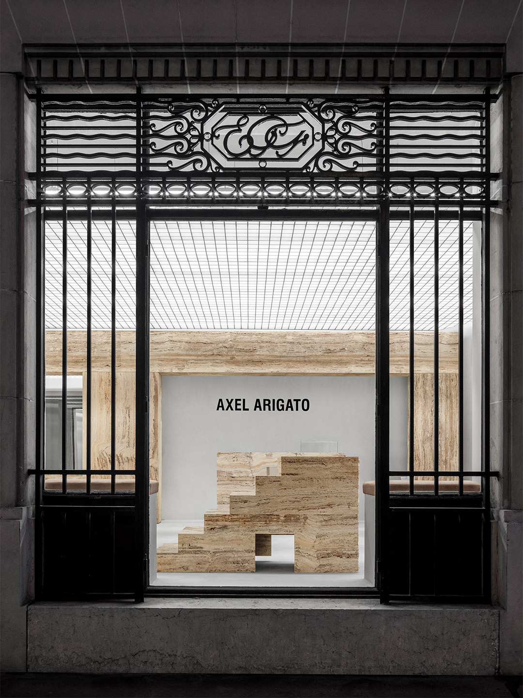
Axel Arigato Paris by Halleroed
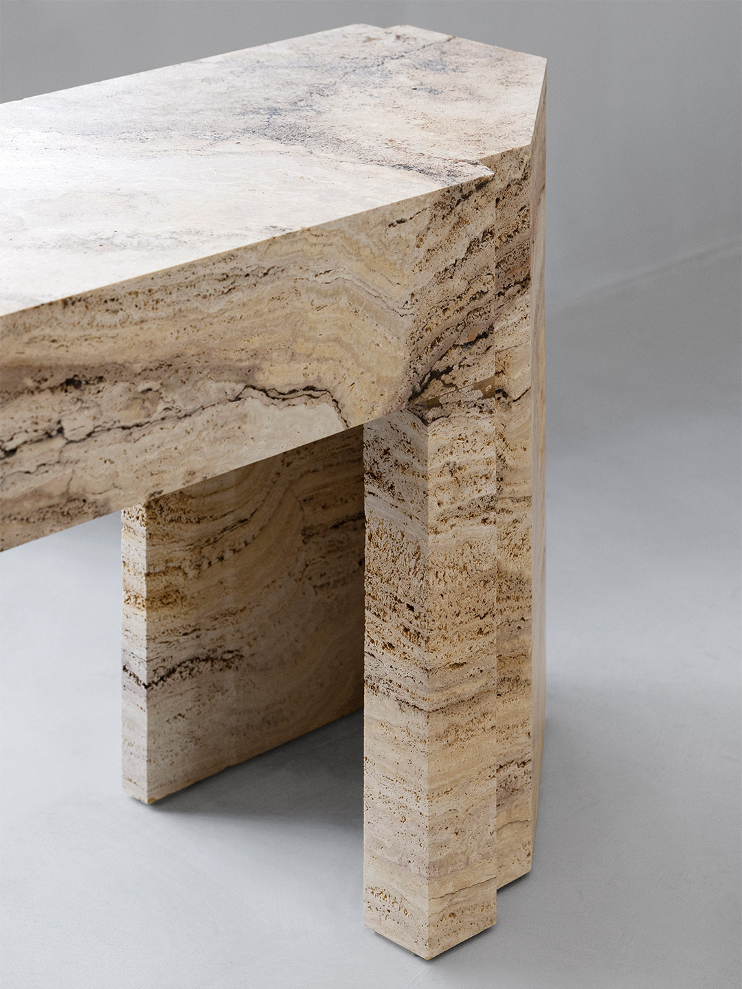
The interior is curated to play with forms and shapes and features light-yellow travertine in an array of finishes, such as honed, bush-hammered and natural. The space consists of two main rooms divided by a freestanding travertine wall; an abstraction of the classical architectural elements of a column and beam. Overhead, the punctured grid ceiling with concealed lighting is visually connected by the largely monochromatic palette featured in the warm yet raw concrete walls and floors.
Placed rhythmically in the centre of the space to form a grandiose entrance and create a gallery-like surrounding, the sculptural merchandising podiums are made in travertine (as are the shelves and the dressing room’s custom-designed chairs). The podiums are emphasised by the mirror component of the stainless steel rails, creating a contrast between the materials. The mirror feature extends out into the store’s rear backyard, where its surface, surrounded by small stones, reflects a peaceful oasis in the beating heart of Paris.
Designed by Scandinavian architecture studio Halleroed, the outlet is driven by the desire to forge real connections with customers, inviting them into a unique experience of the world of Axel Arigato.
Catch up on more architecture, art and design highlights. Plus, subscribe to receive the Daily Architecture News e-letter direct to your inbox.
Related stories
- ‘The Apple tree’ by Foster + Partners blossoms in Bangkok.
- Carla Sozzani curates new colours for classic Arne Jacobsen chairs.
- Adam Goodrum stamps all-Australian style on new breezeblock design.
Swedish fashion brand Axel Arigato is fond of describing itself as a “digitally native” business. So the steady expansion from online to offline, by way of bricks-and-mortar stores, is not only a surprising move – it’s one that bucks the trend. After launching its first physical store in 2016, Axel Arigato has continued to expand its presence; putting its foot in the door of cities that are key to business growth. The latest store to join the enlarging lineup is located in the Marais district of Paris. Backdropped by a lively neighbourhood, where many French traditions remain intact, the Axel Arigato store disrupts the typical retail model.
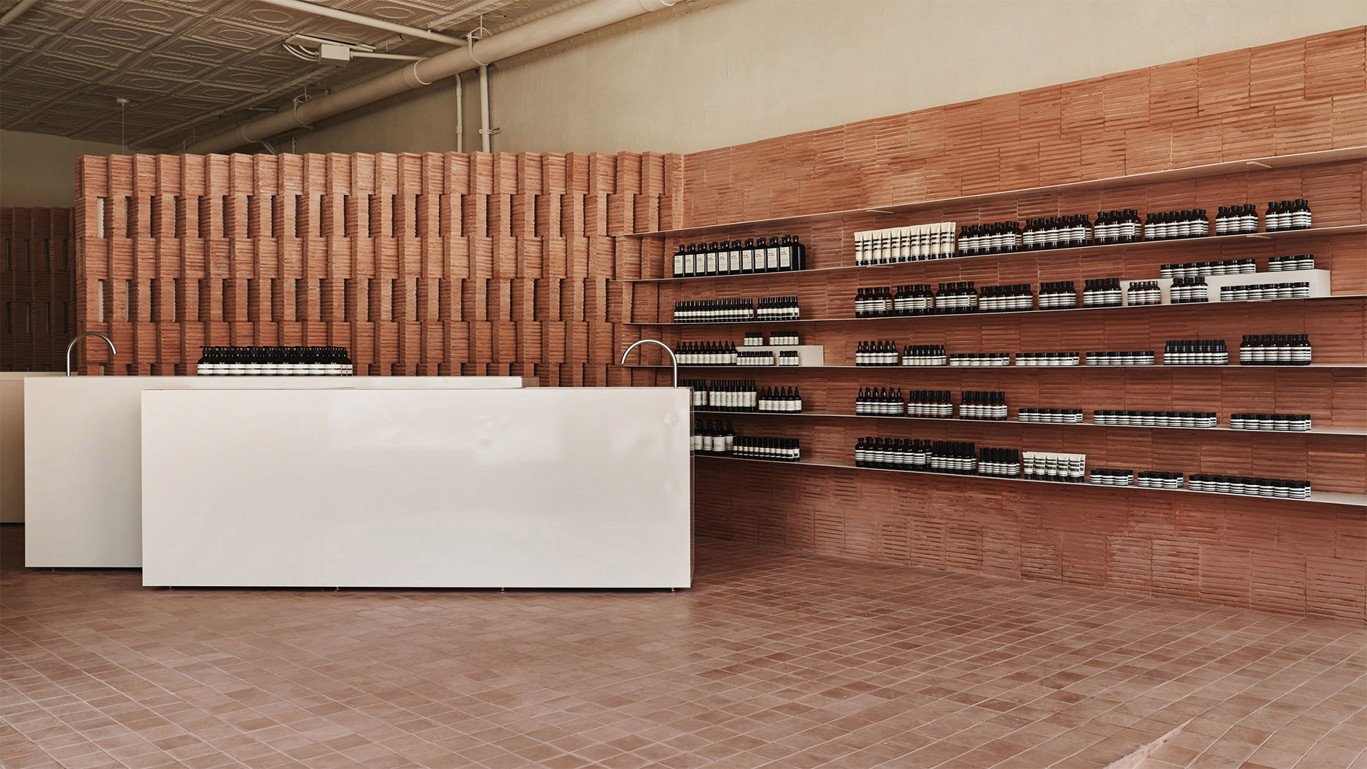
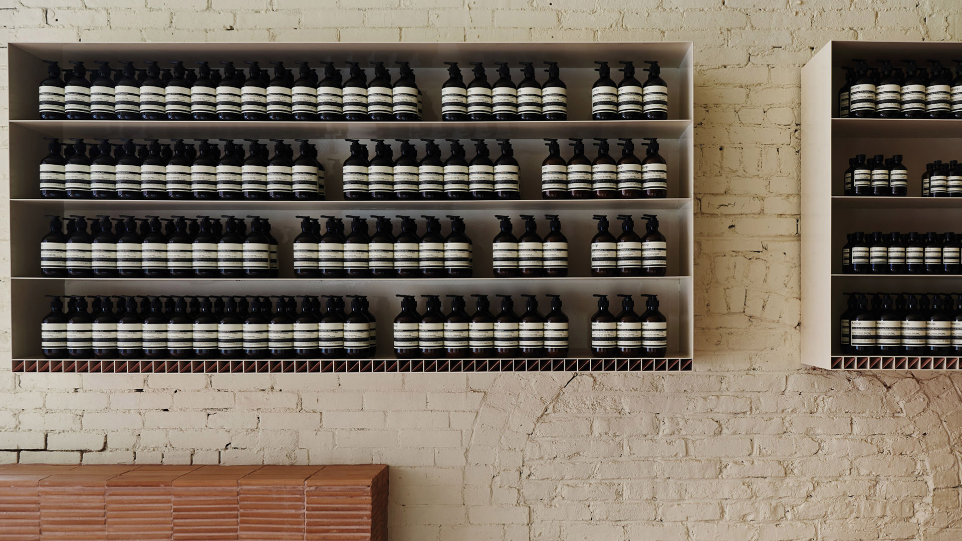
A corner entrance gives way to interior walls that weft in brownstone formation. Alcoves and corners emerge as areas of inhabitation and display; the negative space behind the walls becomes a place of repose for staff. In this way, the space’s choreography simulates the meandering experience of walking through the neighbourhood.
Aesop Park Slope store by Frida Escobedo
Location New York City, New York
Function Retail store
Client Aesop
Completion date 2019
Architect Frida Escobedo, taller de Arquitectura
Design team Frida Escobedo, José María Gómez De León
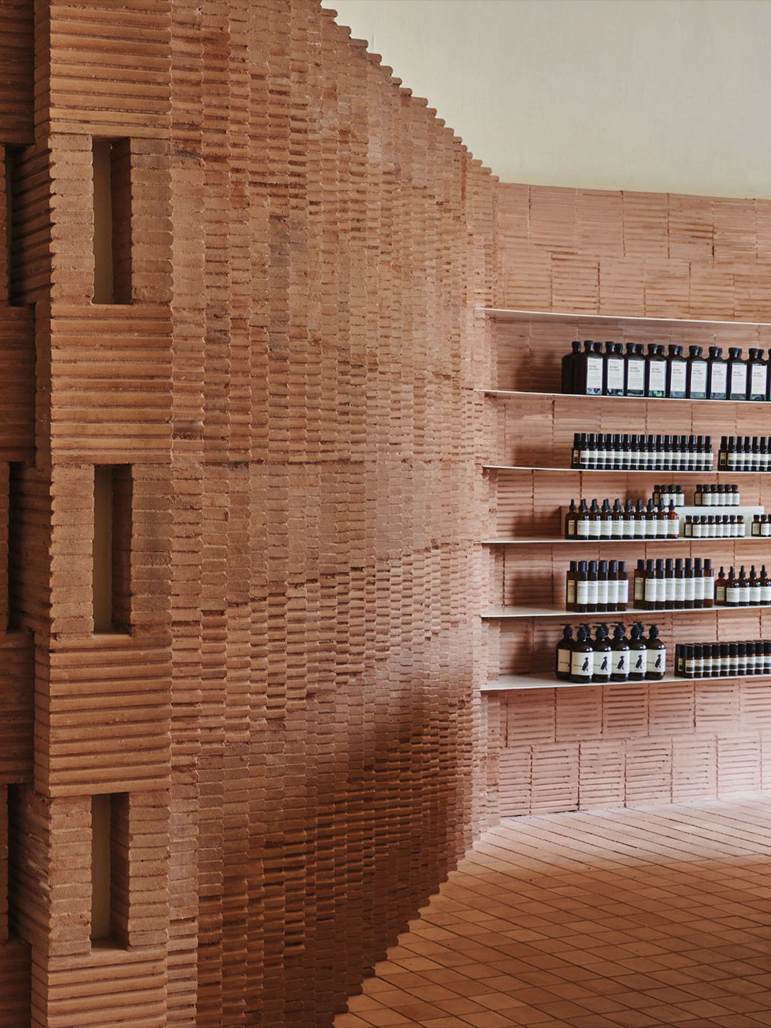
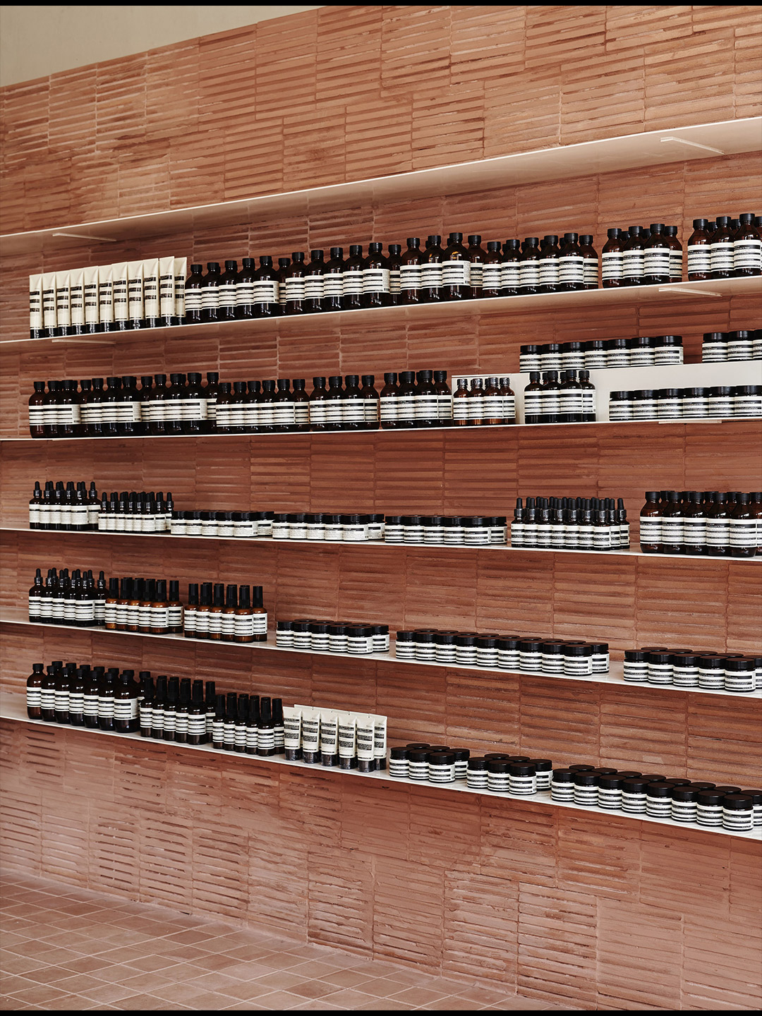
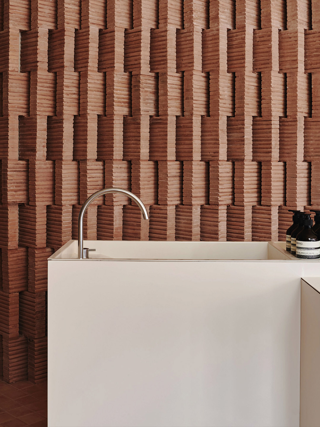
Rammed earth from Oaxaca in Mexico was handcrafted into auburn bricks with rich imperfections, variations of tone and texture. The bricks draw connections and contrasts between Mexico and Brooklyn, between the global and local. They tessellate in diagonal rows that reiterate, at a smaller scale, the angling brownstone streetscapes.
Frida Escobedo’s approach to design is driven by the conviction that architecture and design represent, above all, a crucial means to interrogate and comment on contemporary social, economic, and political phenomena. In this formulation, art (both contemporary and historical) serves as an indispensable touchstone. The studio’s creative output operates at a wide array of scales and mediums, encompassing buildings and experimental preservation projects, temporary installations and public sculpture, limited edition objects, publications and exhibition designs.
Informed by material sensibility and intuitive feeling for pattern, Escobedo’s work is undeniably architectural, yet frequently and intentionally blurs the boundary between architecture and art.
Aesop Park Slope by Frida Escobedo is just one on many projects featured in Materialty 2021, a free cloth-bound publication from Brickworks that explores the use of brick and concrete block in contemporary architecture. Register for your free copy.
Rammed earth from Oaxaca in Mexico was handcrafted into auburn bricks with rich imperfections, variations of tone and texture. They tessellate in diagonal rows that reiterate, at a smaller scale, the angling brownstone streetscapes.
This article is an edited extract from Materiality 2021, a publication by Brickworks Building Products. Catch up on more architecture highlights. Plus, subscribe to Daily Architecture News for weekly updates delivered directly to your inbox.
Related stories
- March Studio’s latest Aesop store sparkles in Hong Kong.
- The bar and restaurant at La Sastrería in Valencia by Masquespacio.
- Resa San Mamés student accommodation in Spain by Masquespacio.
- Kennedy Nolan’s ‘Workplace’ puts the cool back into water-cooler conversation.
Swedish fashion brand Axel Arigato is fond of describing itself as a “digitally native” business. So the steady expansion from online to offline, by way of bricks-and-mortar stores, is not only a surprising move – it’s one that bucks the trend. After launching its first physical store in 2016, Axel Arigato has continued to expand its presence; putting its foot in the door of cities that are key to business growth. The latest store to join the enlarging lineup is located in the Marais district of Paris. Backdropped by a lively neighbourhood, where many French traditions remain intact, the Axel Arigato store disrupts the typical retail model.
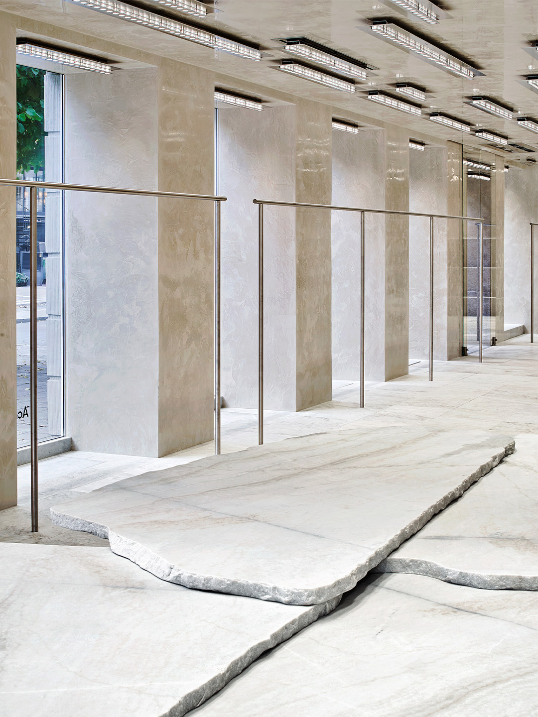
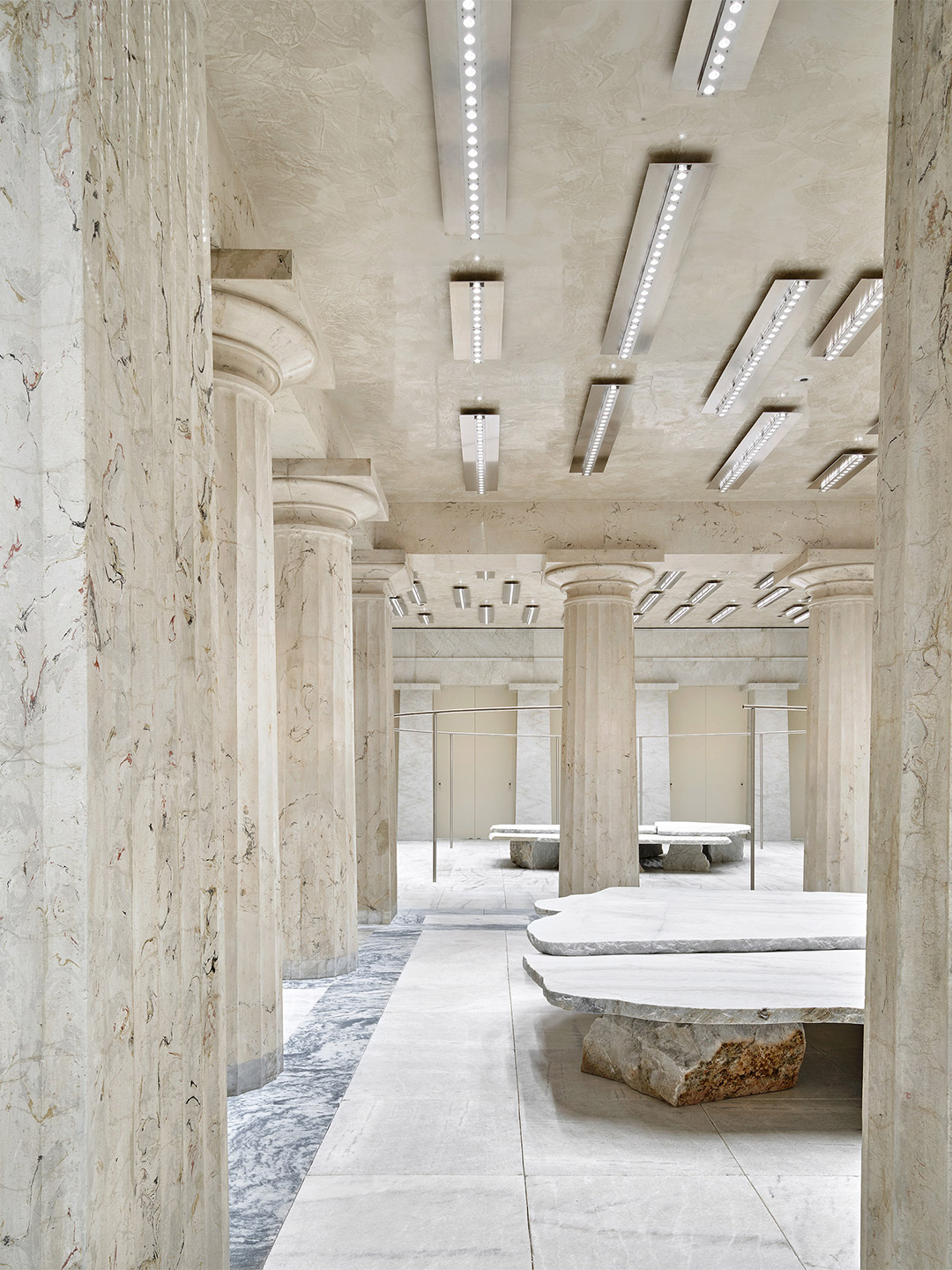
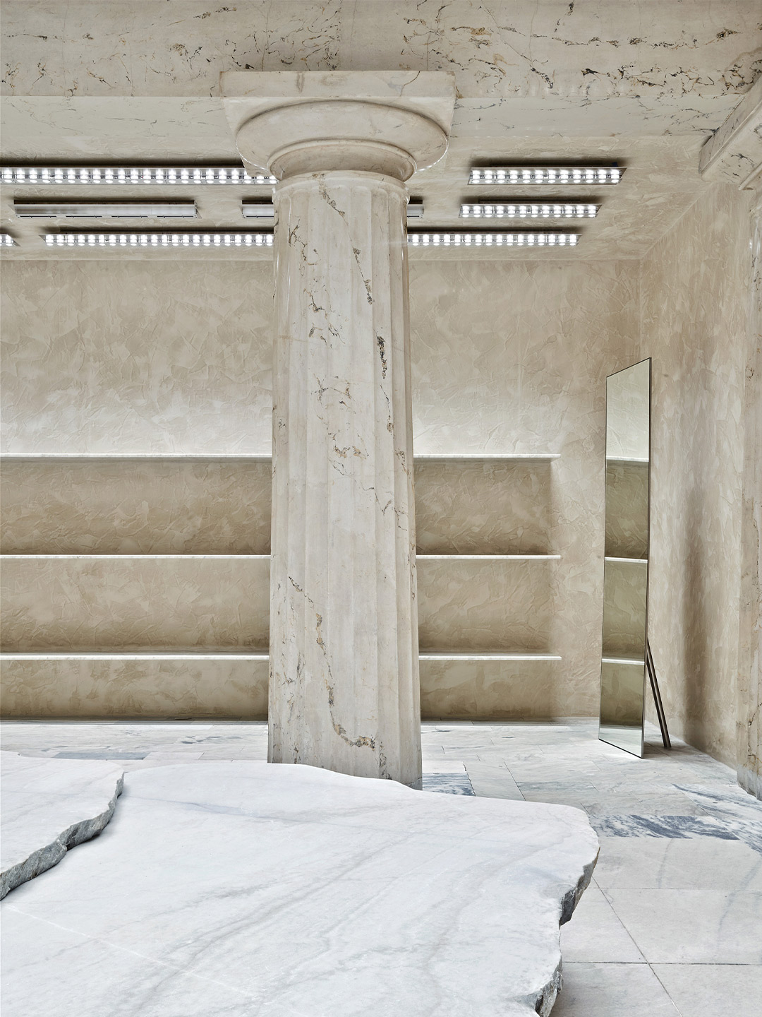
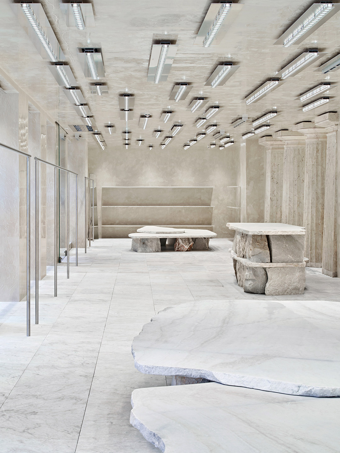
In the years to follow, after the bank closed its doors, countless commercial fit-outs covered up the original bones of the building. Now, nearly half a century later, the storied site has been reborn as the Stockholm base of Swedish fashion label Acne Studios; a place of quiet creativity that reflects on its past while setting the stage for new beginnings.
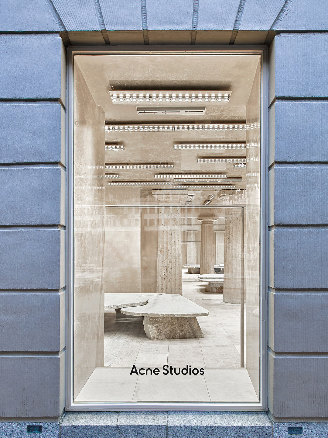
Acne Studios boutique in Stockholm by Arquitectura-G
Through its collections of garments, Acne Studios has developed a reputation for partnering the eccentric with the essential, offering its devotees something timeless and minimalist yet undeniably outgoing. In many ways, a similar approach has been deployed at the fashion retailer’s Stockholm outpost.
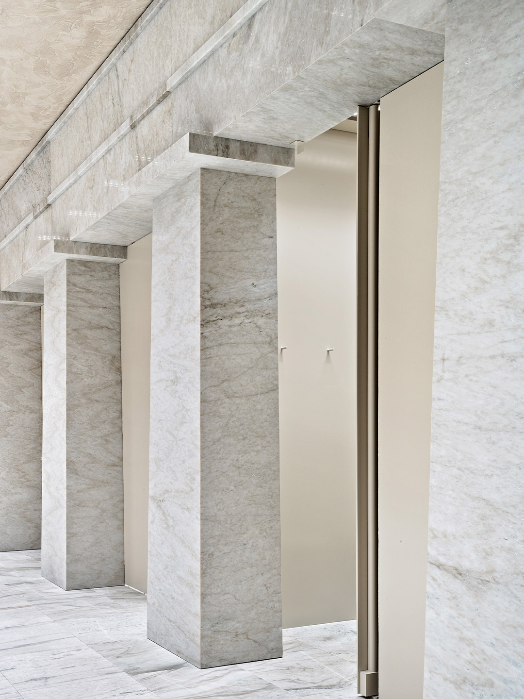
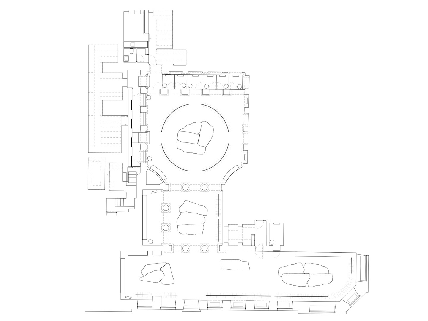
Completed in 2020 by Barcelona-based firm Arquitectura-G, the design scheme revives the neoclassical architecture of the bank building, resetting it as a splendid hallmark of the 20th century. The architects returned the L-shaped, 400-square-metre tenancy to its essential features – predominantly chiselled from monochrome marble – and, through considered yet quirky interventions, paved the way for Acne Studios to showcase their wares.
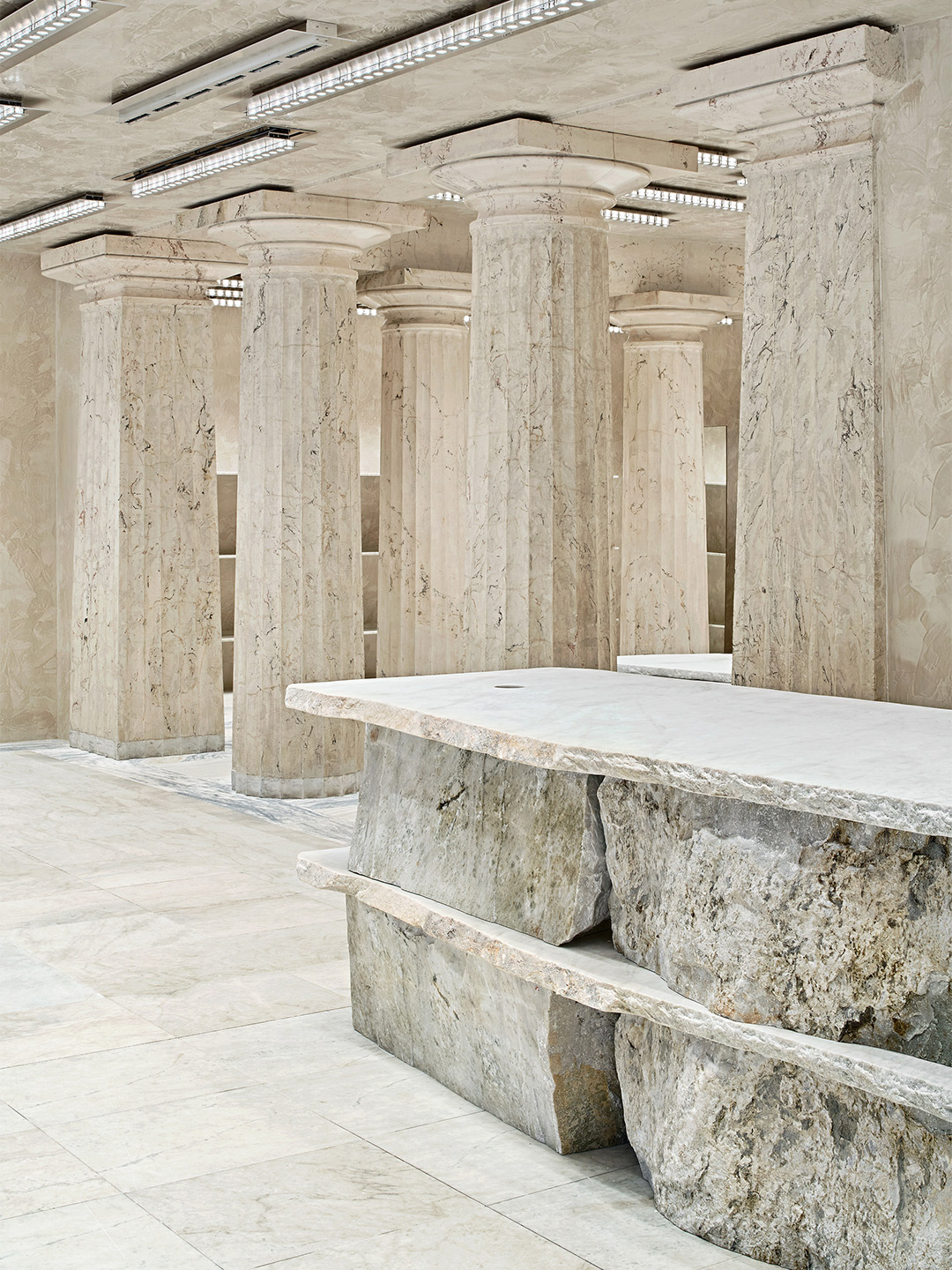
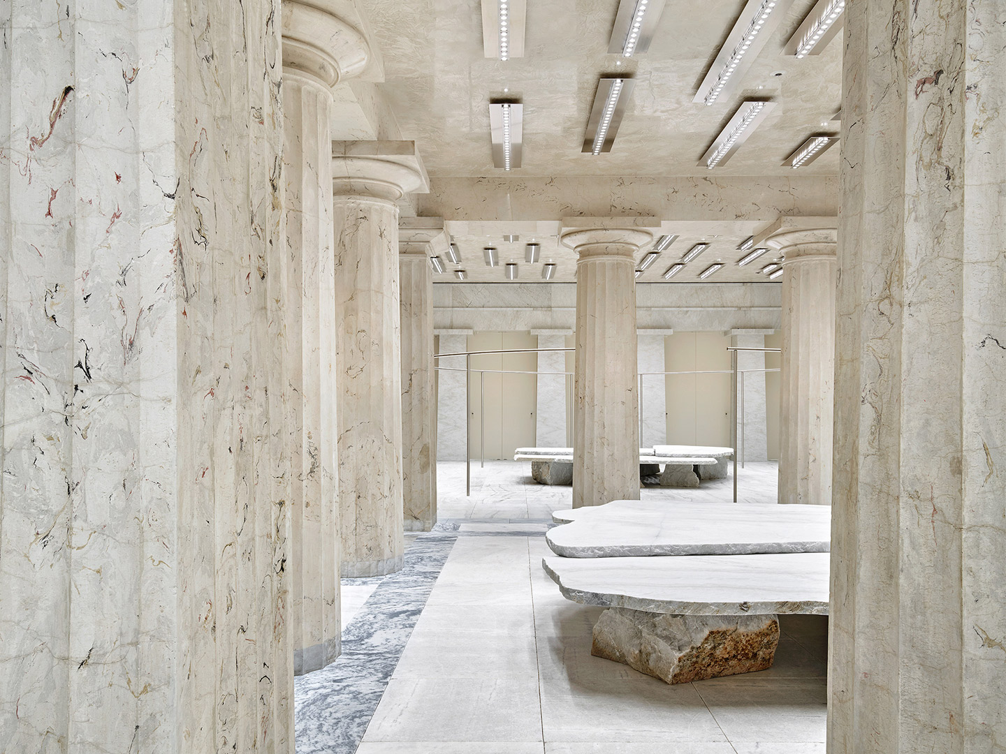
Shoppers now journey through three rooms which are connected by large doric-style columns, culminating with an abstract ‘colonnade’ that opens up to a series of fitting rooms. Throughout the store, tonnes of real marble rubs shoulders with lashings of faux, while plenty of mirrored surfaces are on standby to play up the illusion.
Hefty stone furniture by British designer Max Lamb adopts a Bedrock approach, featuring giant flat-faced slabs of stone placed upon rough-edged boulders. Positioned decisively in the centre of each room, below linear steel light fixtures by Benoit Lalloz, the primitive furniture pieces act as monolithic podiums for point-of-sale facilities and street-facing retail displays.
arquitectura-g.com; acnestudios.com
Catch up on more architecture and design highlights. Plus, subscribe to receive the Daily Architecture News e-letter direct to your inbox.
Hefty stone furniture by British designer Max Lamb adopts a Bedrock approach, featuring giant flat-faced slabs of stone placed upon rough-edged boulders.