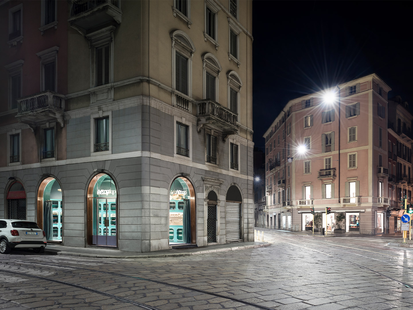
Amid the barrage of Instagram posts put live during this year’s Milan Design Week, it was frequently observed (albeit from afar) that the Aesop store on Corso Magenta is just as beautiful today as when it opened in 2016. Located on the corner of via San Giuovanni sul Muro, directly across the road from the famed Marchesi bakery, the store was created by Milanese interiors firm Dimore Studio in collaboration with Aesop’s in-house design team.
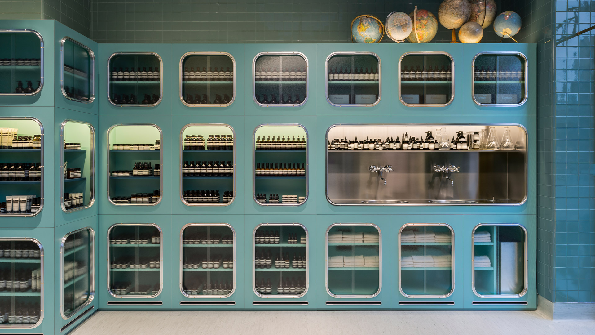
The 35-square-metre Aesop store is described by the Dimore Studio team as a “whimsical essay” on typical materials employed in the butlers’ pantries of 1930s Italian villas. Think tiles and joinery in saturated pastels, polished chrome details and no-frills linoleum flooring. The designers refer to the store as a contemporary version of the small neighbourhood bottega (translating to ‘shops’) that are still common among the streets of Milan. But it also leans into the history and culture of the fashion and design capital, most notably by joining a precinct famous for housing Leonardo Da Vinci’s masterpiece The Last Supper – one of the Western world’s most recognisable artworks.
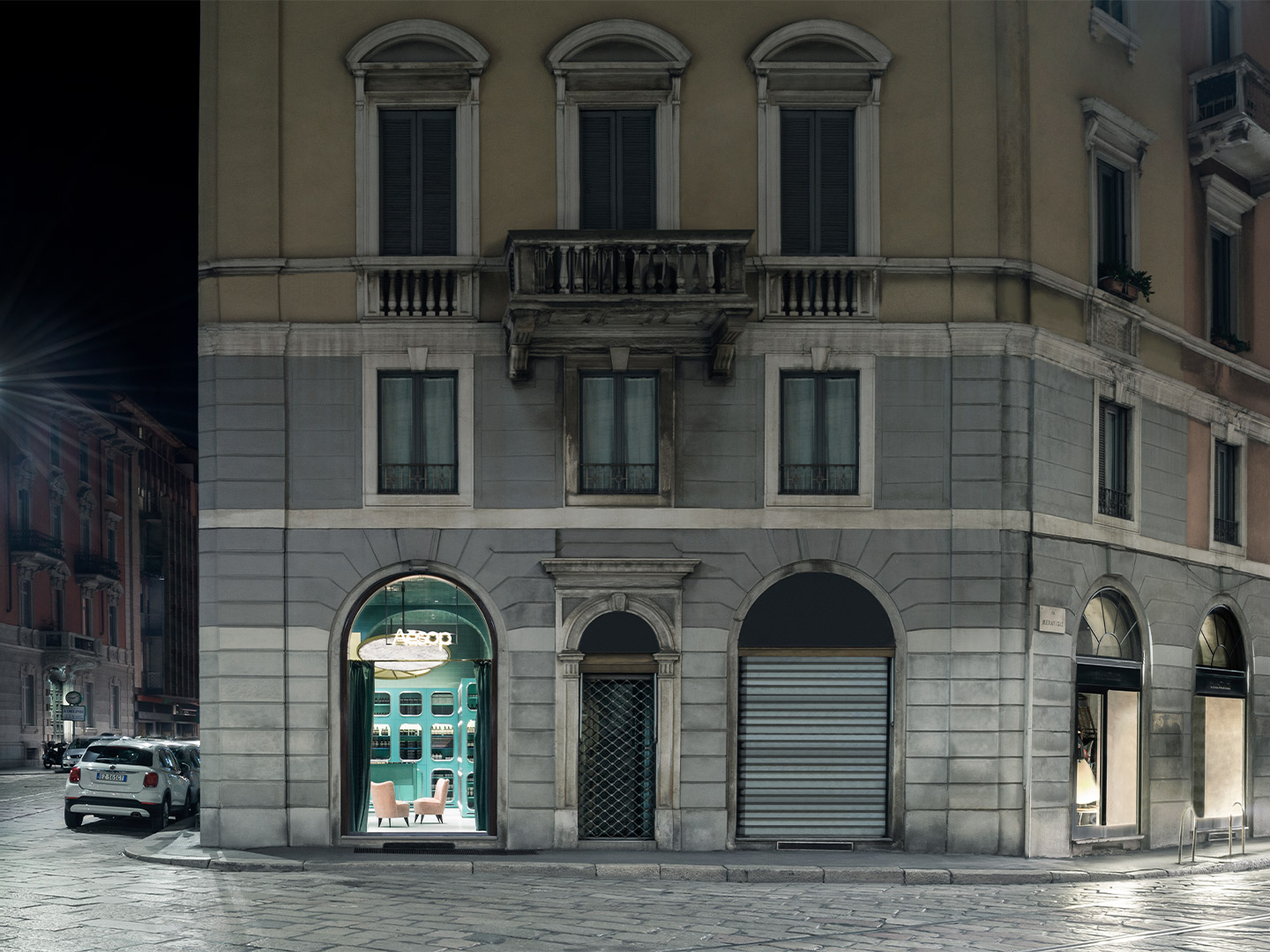
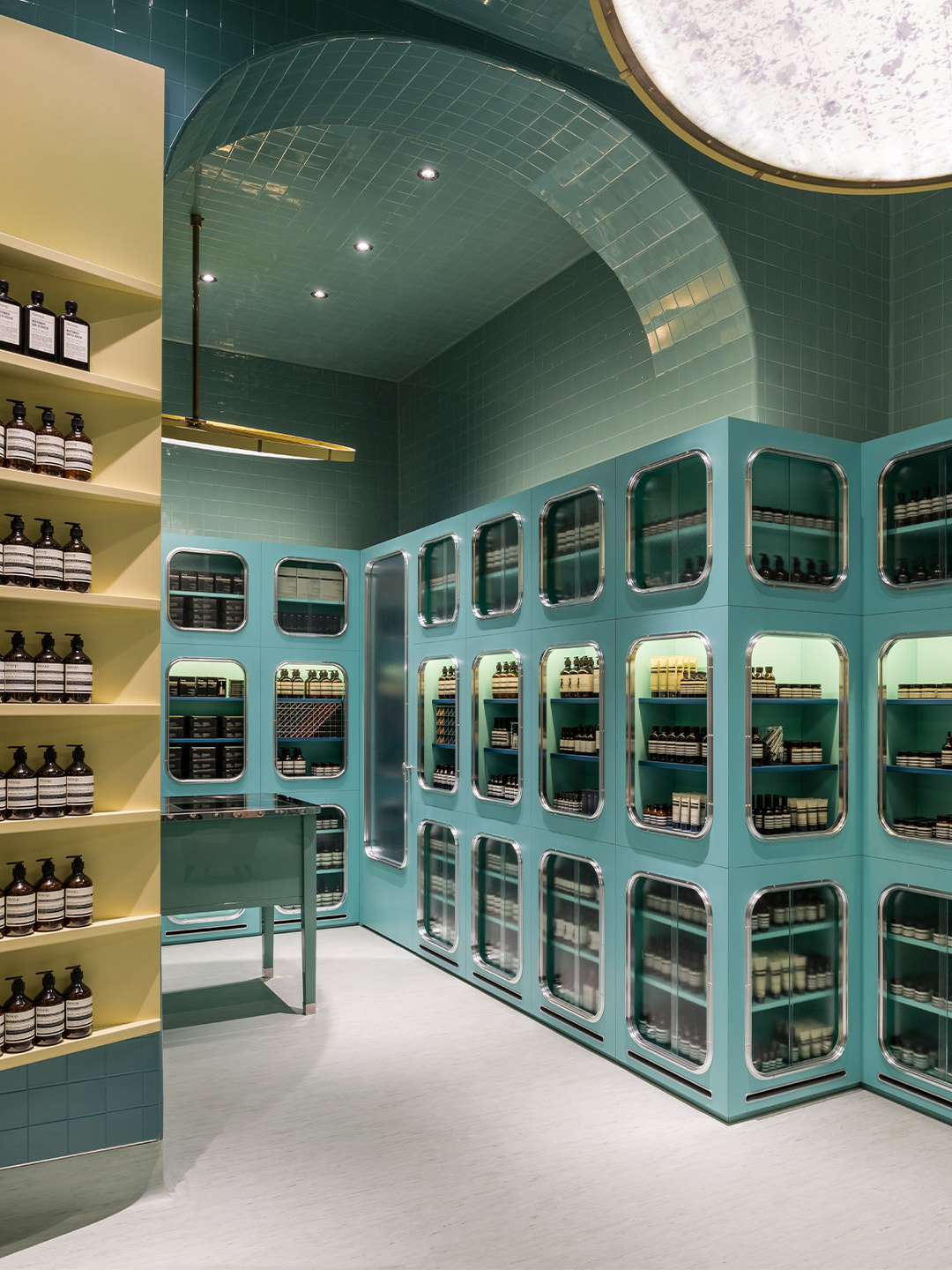
Aesop Corso Magenta in Milan by Dimore Studio
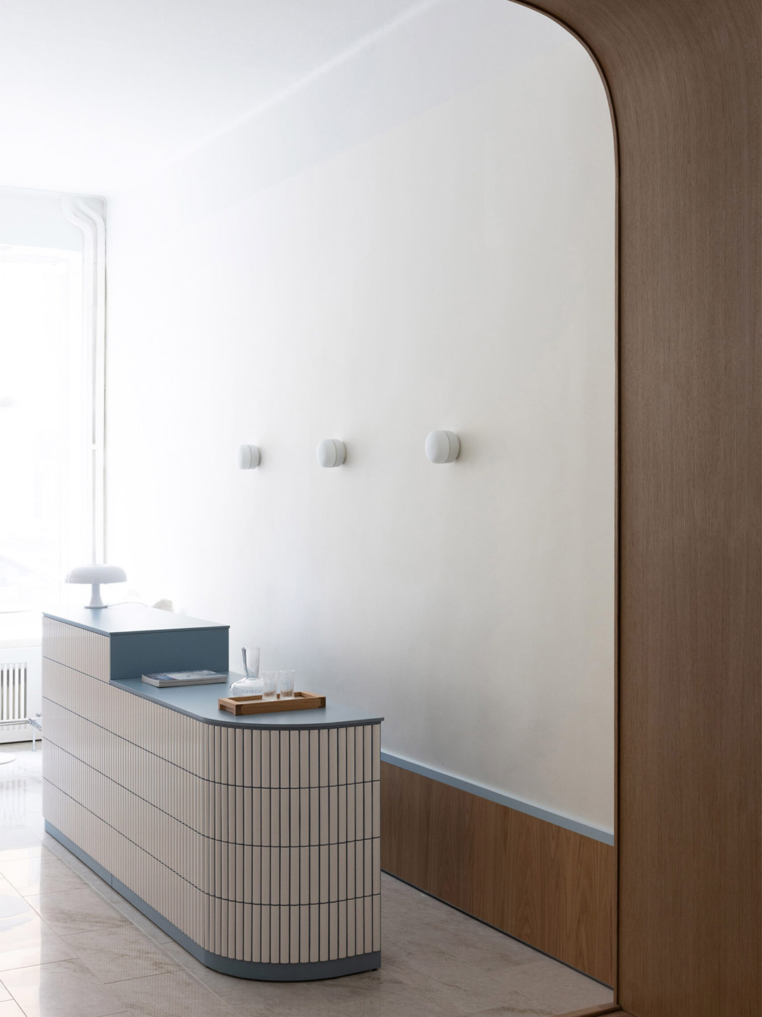
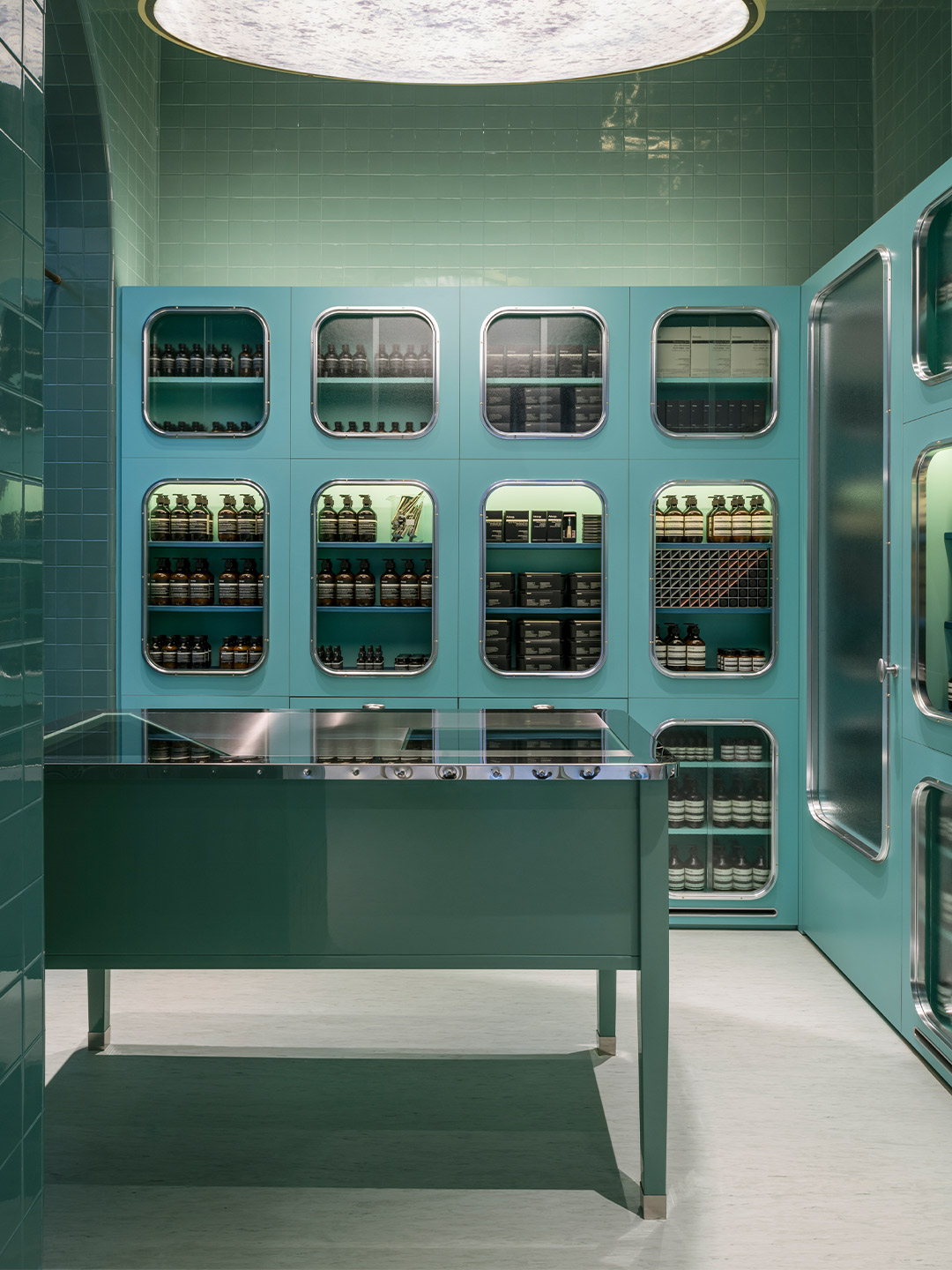
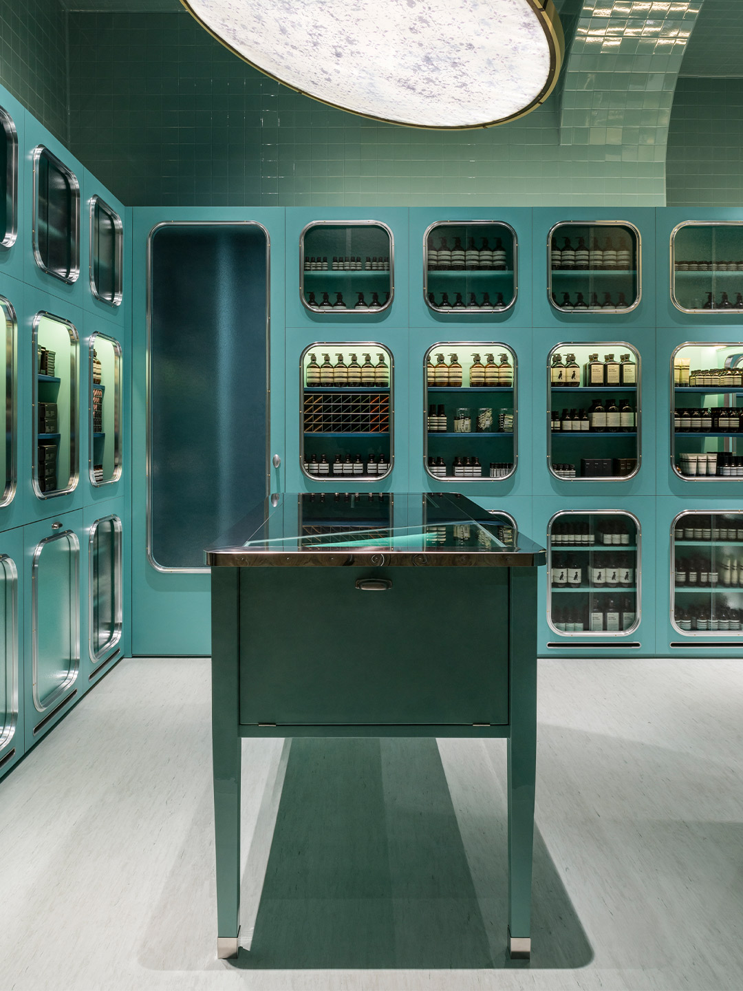
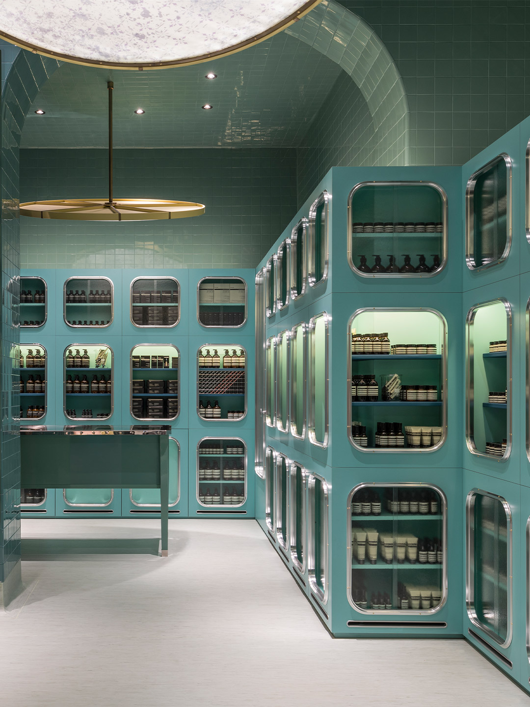
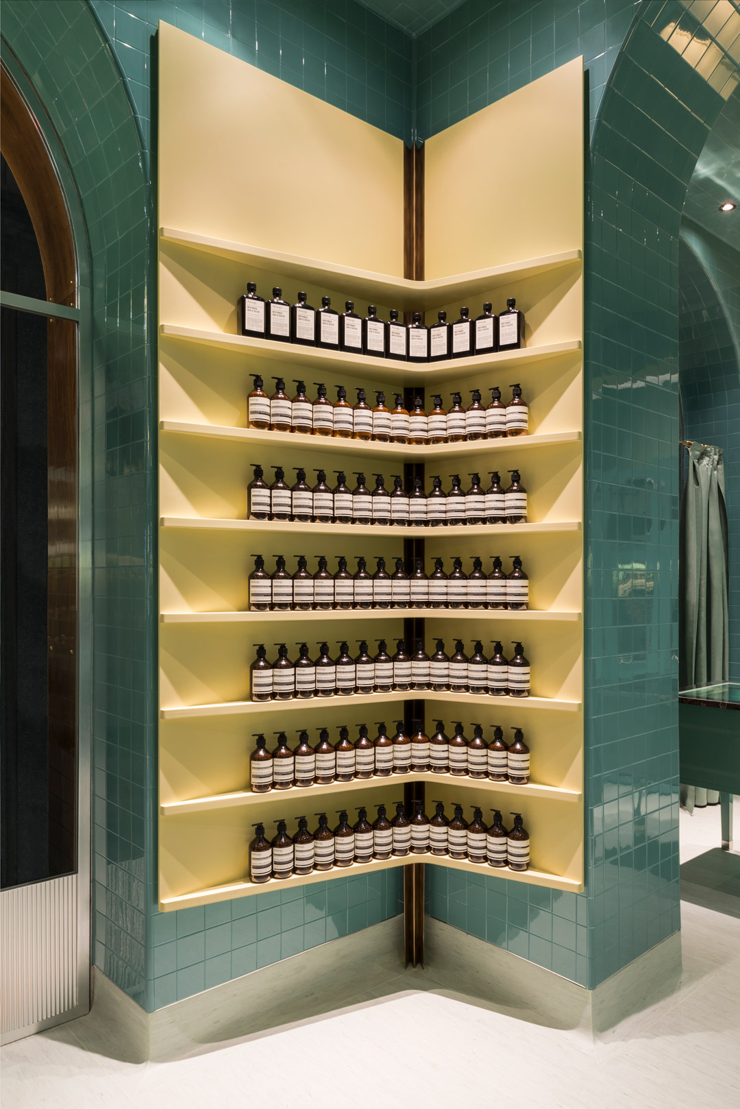
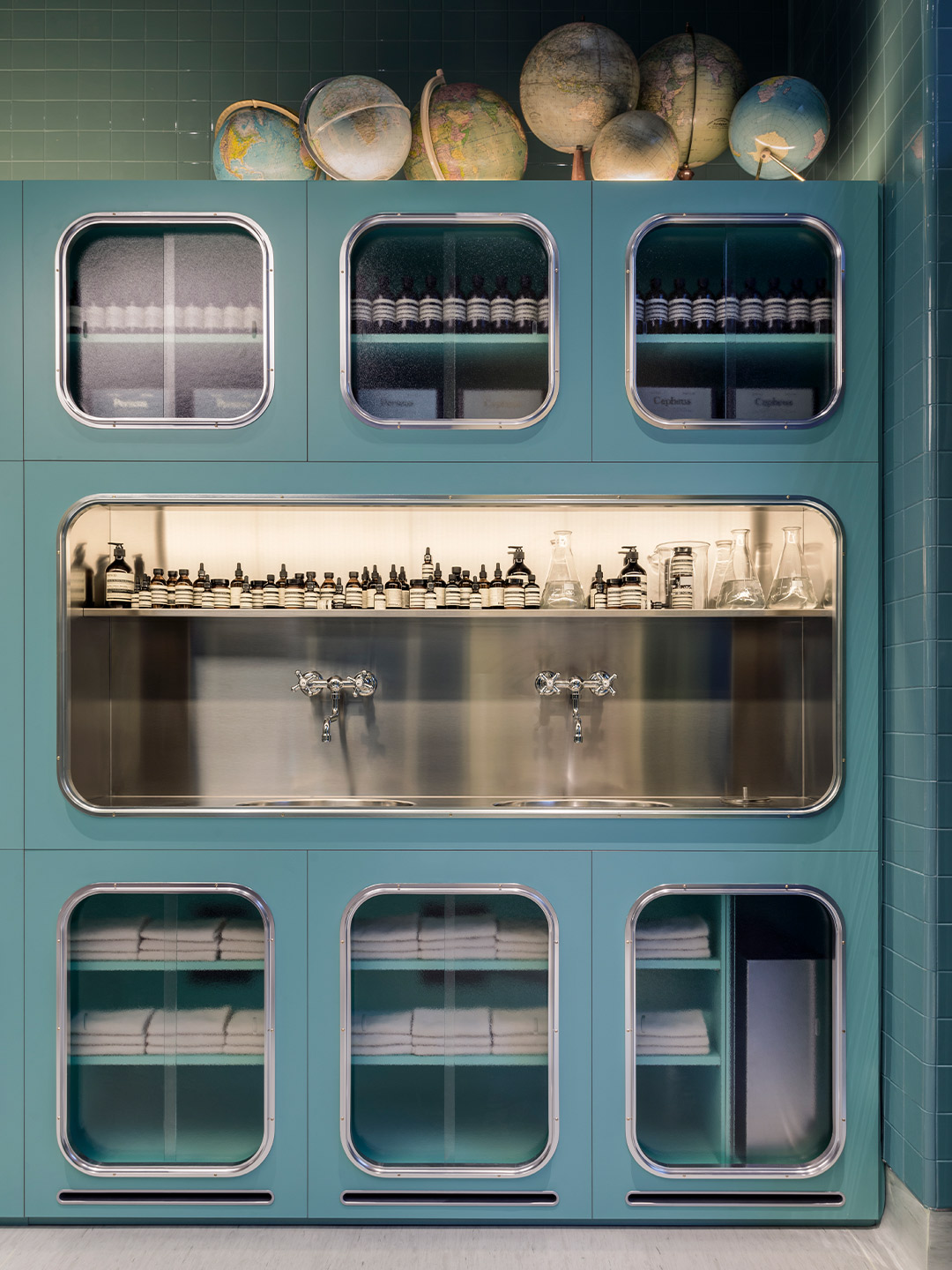
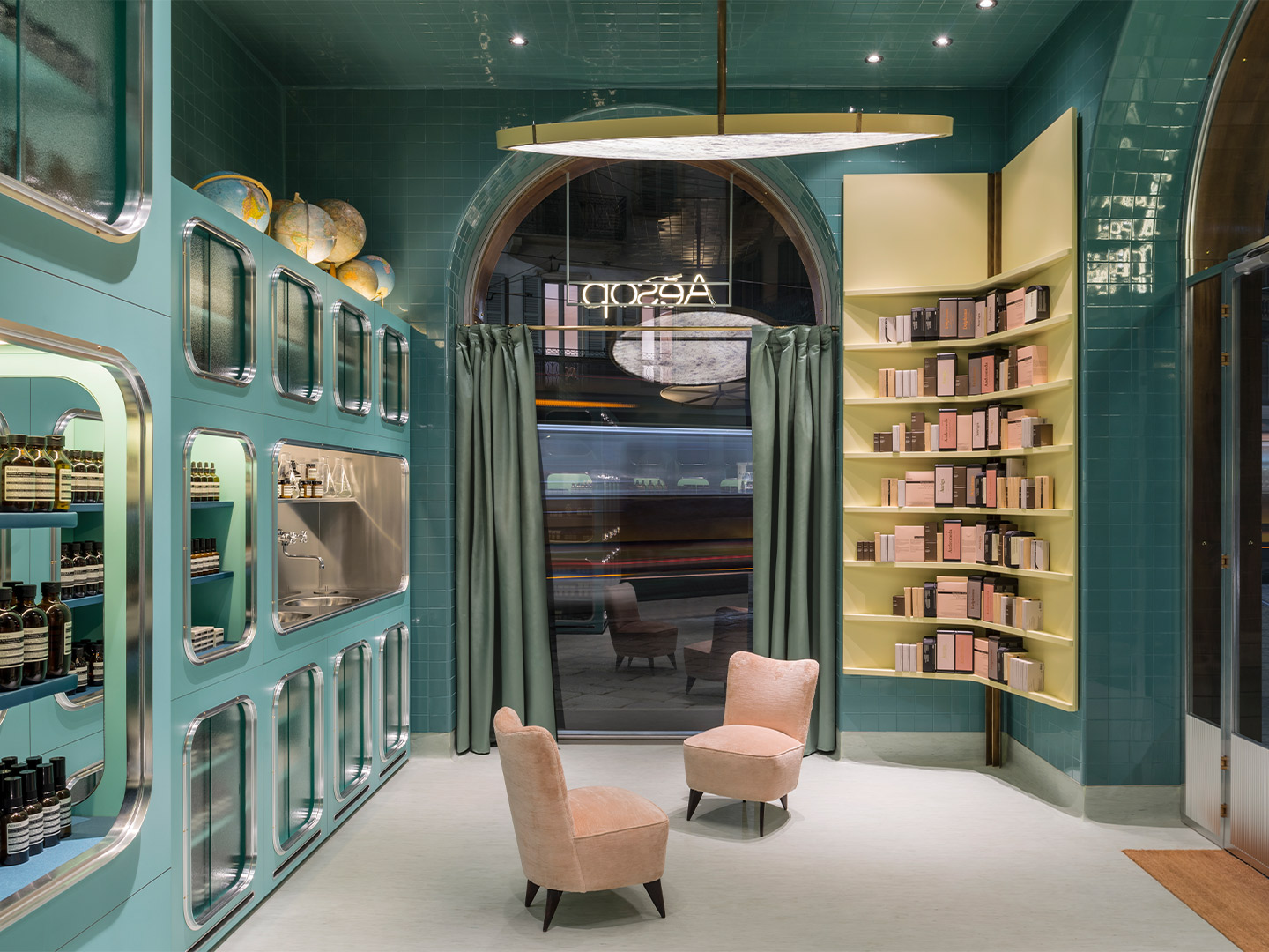
Inside the store, nuanced greens, creamy yellows and faded pinks facilitate a trip back in time. They’re “muted as if to cover every surface in talcum powder,” the designers explain. Glossy teal subway tiles cover the planes and arches of the ceiling, finished with matching coloured grout, while lemon-yellow corner shelving offers contrast. Product display cabinets feature a tone of green that’s similar to the tiles; their rounded window frames referencing an early twentieth-century aesthetic. Soft and simple grey-coloured linoleum sweeps the floor, complemented by two mid-century velvet-covered chairs and a stainless steel “demonstration sink” which offers a nod to the utilitarian troughs traditionally used for food preparation.
Illuminating the entire interior are two large discs suspended by a canopy of brass rods, with decorative fibreglass shades that filter light through faded amber motifs. Shoppers can explore and select from a complete range of Aesop’s skin, hair and body care products, distinguished by top-notch botanical and laboratory-generated ingredients. As with all of Aesop’s stores, the fit-out in Milan provides an ambience and experience of its own – a legacy that started with the brand’s first-ever outlet in the Victorian seaside suburb of St Kilda.
The Australian-born company was founded in Melbourne in 1987, and the brand’s first ‘shopfront’ occupied a narrow ramp descending into an underground carpark. Some 34 years later, Aesop operates more than 250 one-of-a-kind stores around the globe. As the company has evolved and changed ownership, meticulously considered design remains at the heart of each bricks-and-mortar boutique. Created in direct response to their surrounds, with enduring traits as evidenced in Milan, the look and feel of the stores is just as embedded in Aesop’s DNA today as the pursuit to develop superior health and beauty formulations for the body.
aesop.com/au; dimorestudio.eu
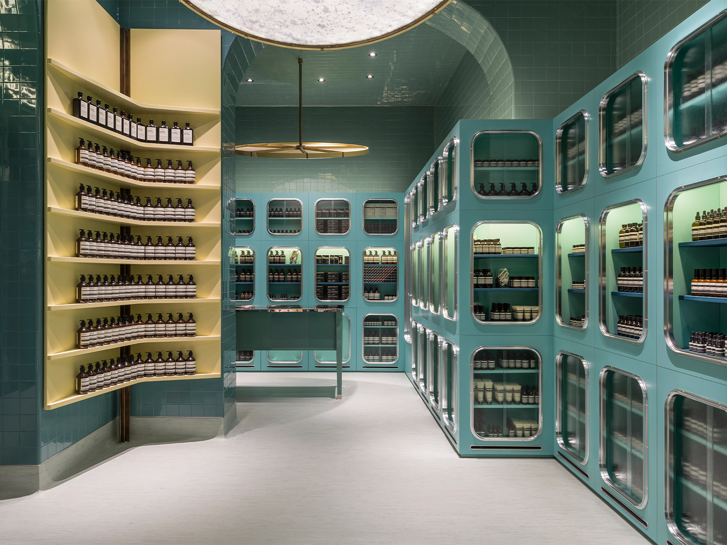
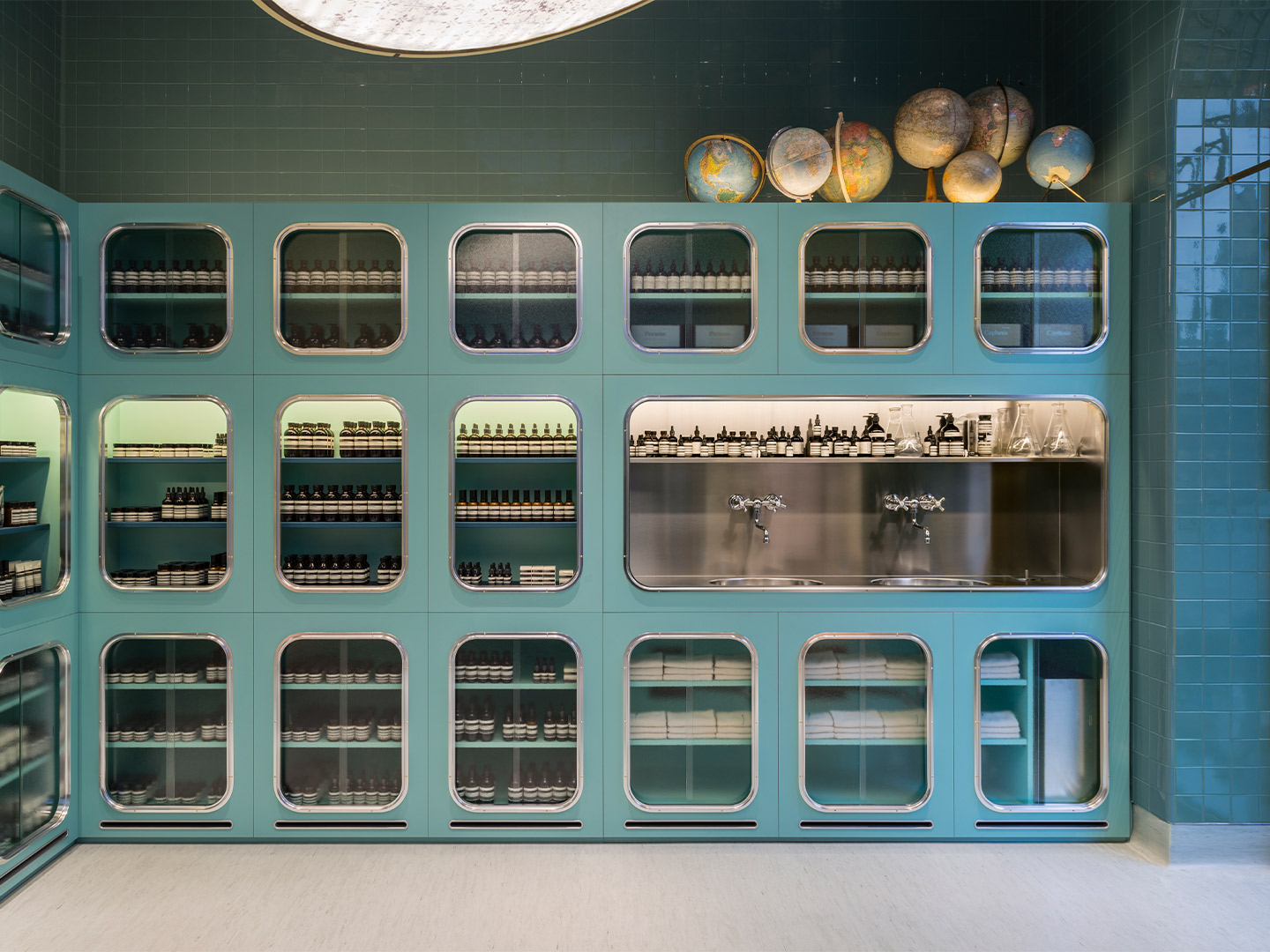
Inside the store, nuanced greens, yellows and pinks, “muted as if to cover every surface in talcum powder,” the designers say, facilitate a trip back in time.
Catch up on more architecture, art and design highlights. Plus, subscribe to receive the Daily Architecture News e-letter direct to your inbox each week.
