In October 1992, the inaugural edition of Casa Decor was held in an old convent on General Oráa Street in Madrid. It marked the first time that fifty design professionals had come together with the shared intention of carrying out a revolutionary project, the likes of which had never before been seen in Spain. From decorators and interior designers to architects, landscapers and artists, the participants were each assigned an empty room in the abandoned convent. They transformed its many spaces into a snaking “catwalk” of design, where the latest trends and innovations were displayed in a mould-breaking showcase, far from any conventional format.
The great success of the debut edition – and those that followed in its footsteps – lies in its formula. Casa Decor is unique and exclusive, and focused on three fundamentals. Firstly, it brings together in historic locations a large group of professionals with experience and prestige who, with great enthusiasm, wish to show their work and creativity beyond their projects for clients. It loops in brands from the homes and lifestyle sector, willing to make themselves known outside the circuit of the typical fairs. And finally, Casa Decor opens its doors to a non-professional public who are eager to discover new sensory and immersive experiences.
Patricia Bustos Studio unveils ‘Serene Touch’ installation for Bathco at Casa Decor 2022
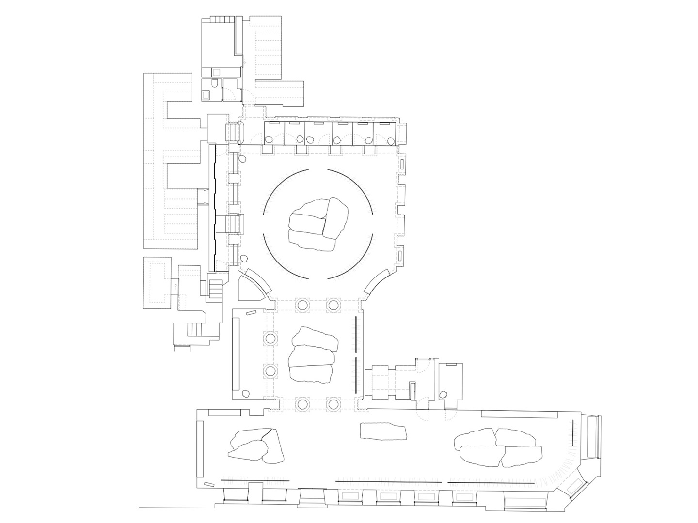
For Casa Decor 2022, which is open for six weeks until May 22, the exhibition returns to the same neighbourhood that saw the birth of the first iteration 30 years ago, where 12 editions have cropped up since. On this occasion, the fair settles into the Goya 89 building in the commercial area of Goya Street, a 15-minute walk from the convent location of 1992. Built in 1920, the 4,600-square-metre residential building retains the original layout of the bourgeoisie homes that were common in this part of Madrid’s Salamanca district. In total, 54 spaces have been adapted across seven levels with many of the traditional elements retained. The succession of rooms, with high ceilings and an abundance of natural light, make magnificent vessels for the designers to do their best work, becoming a spectacular setting for Casa Decor’s 30th anniversary.
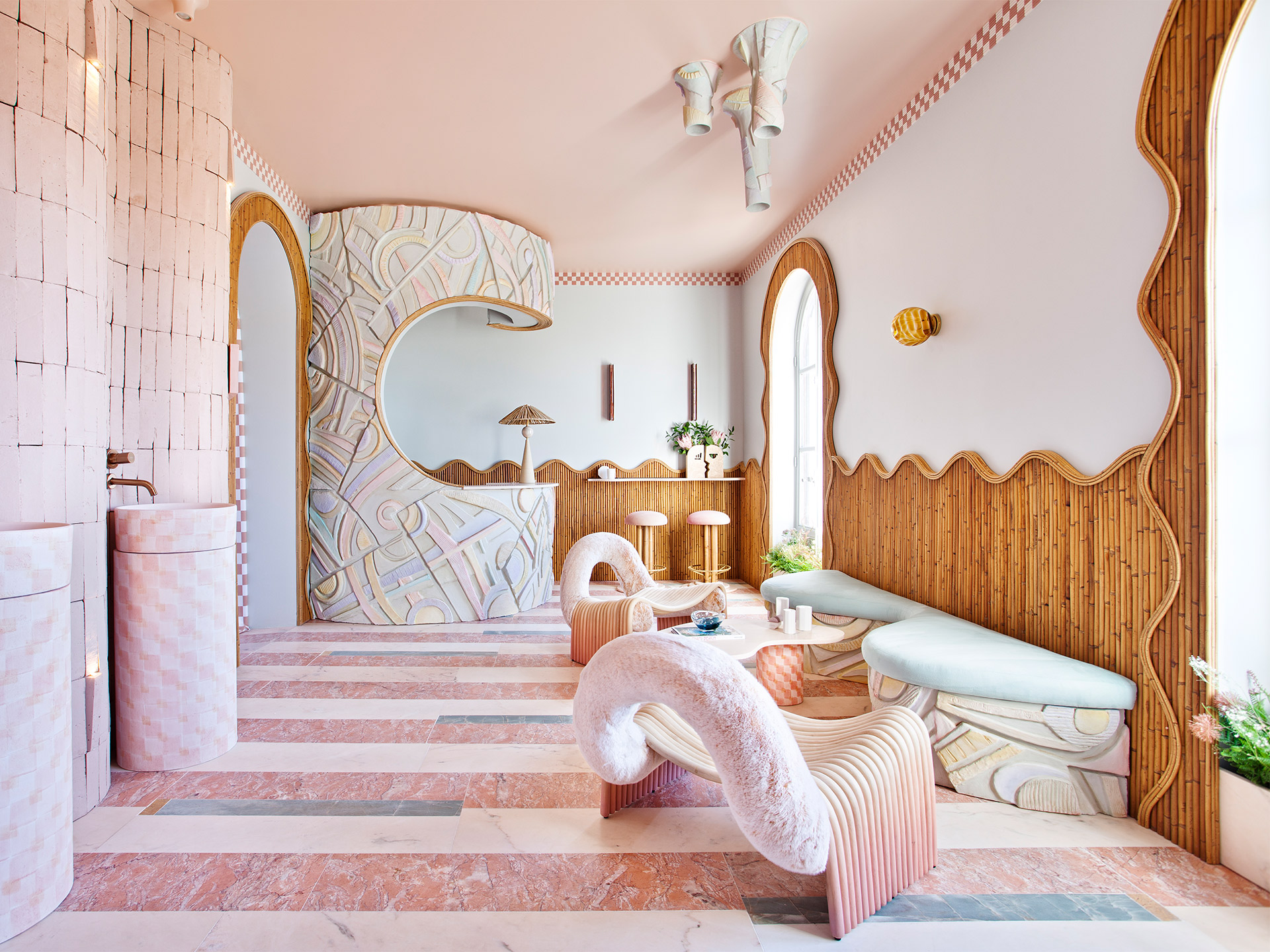
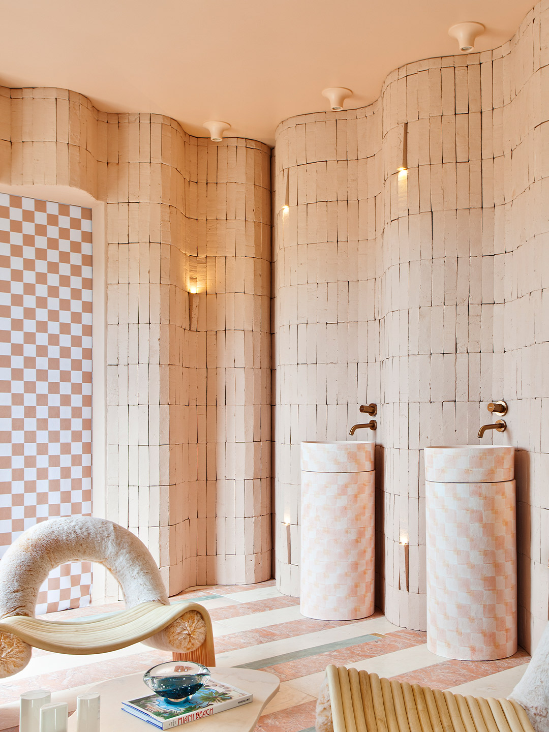
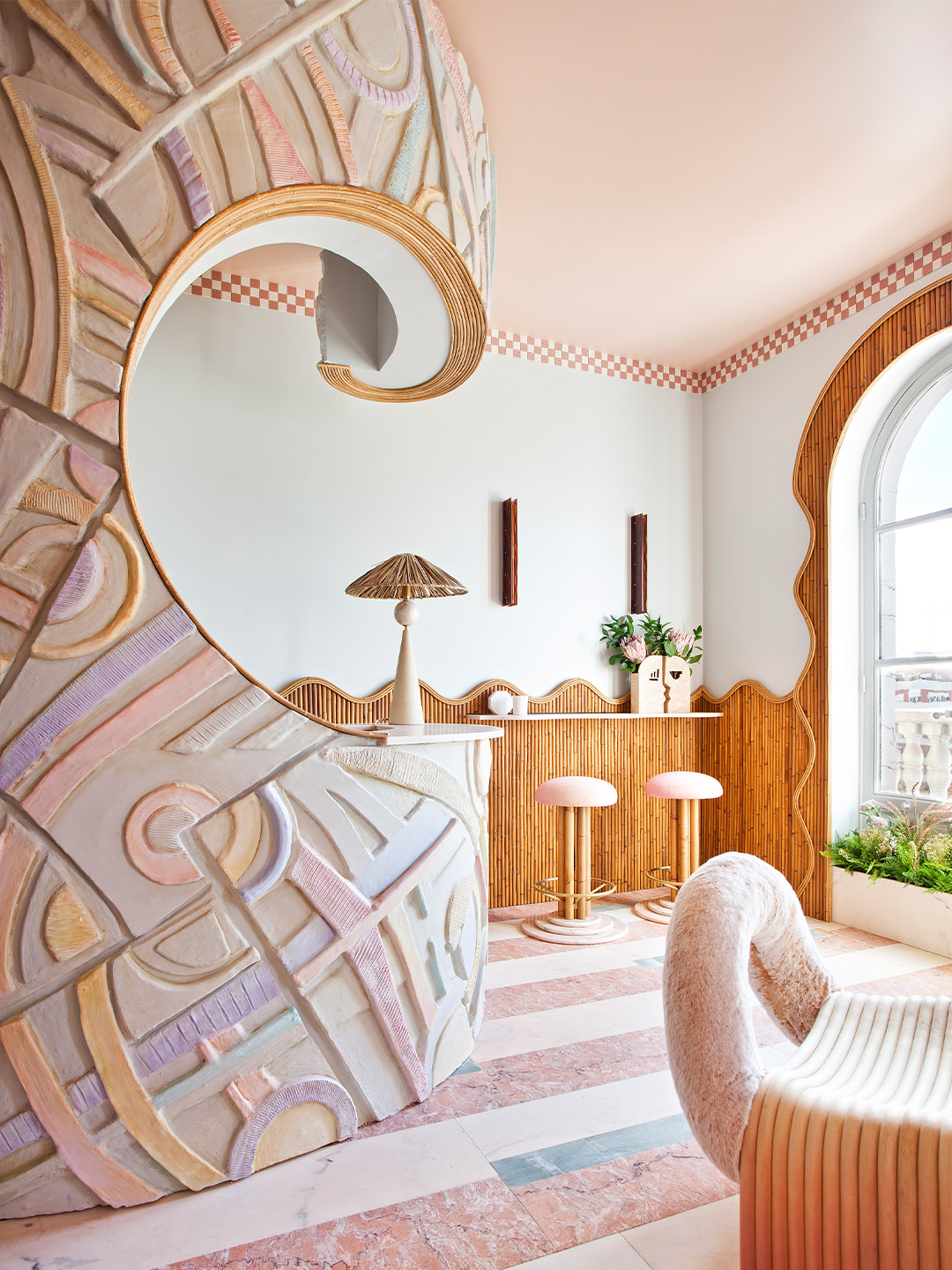
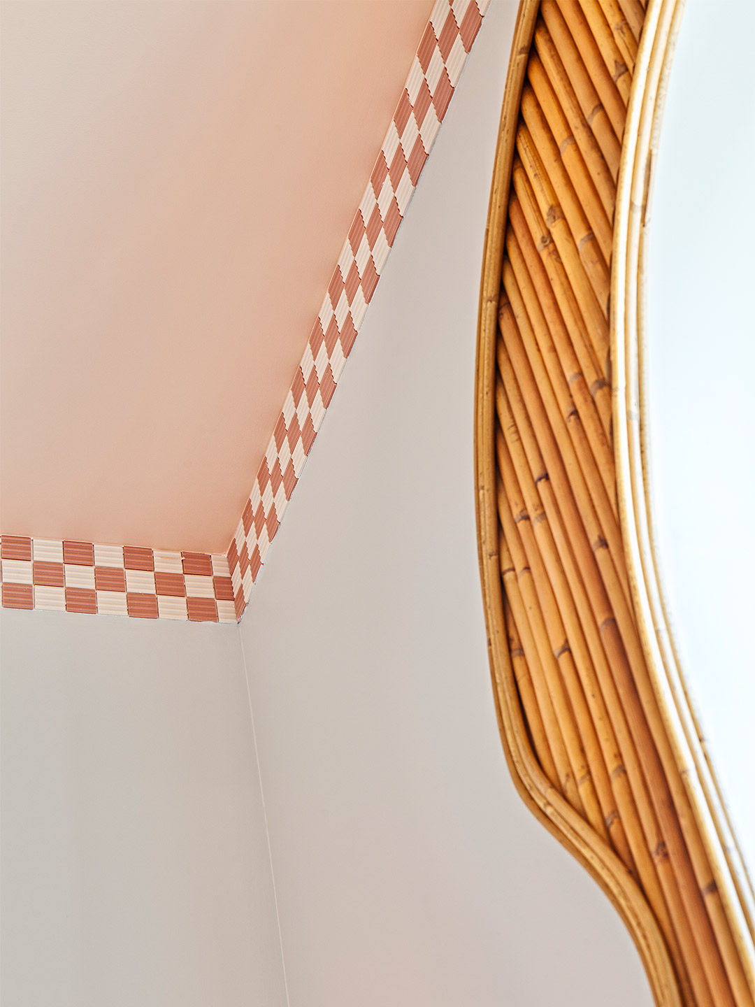
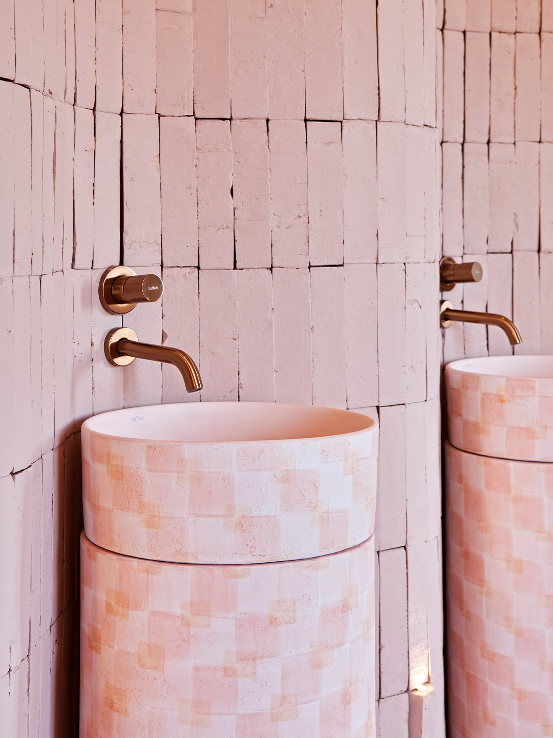
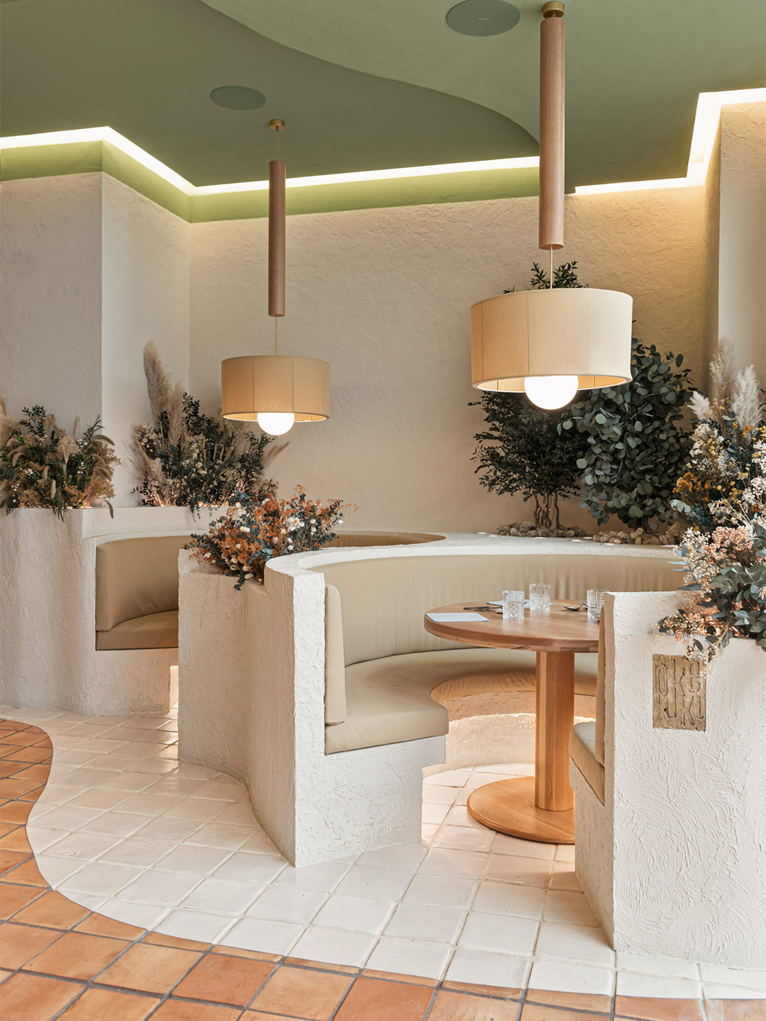
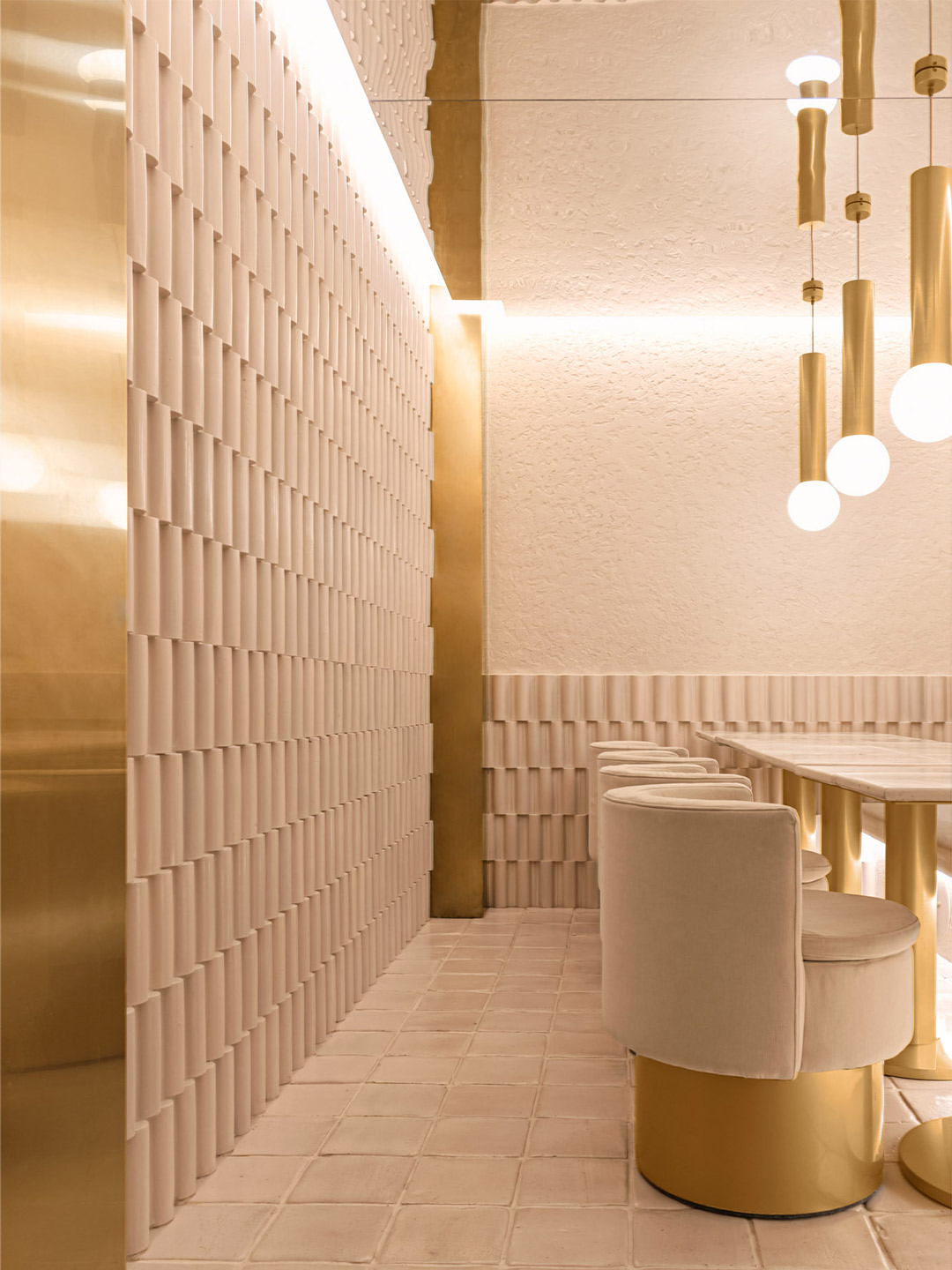
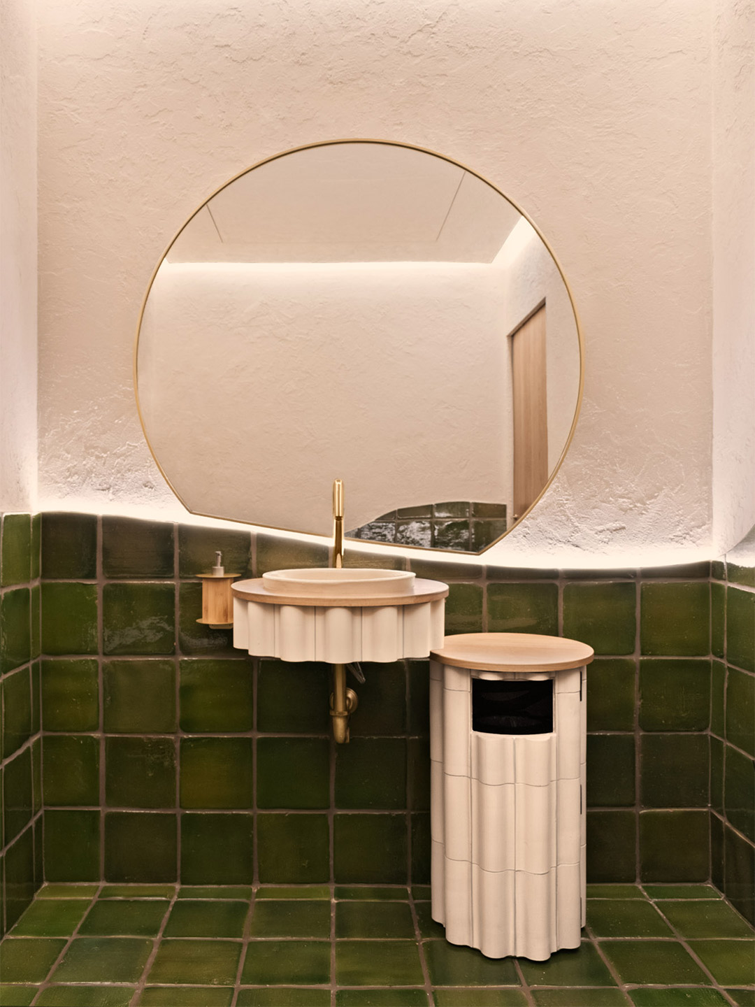
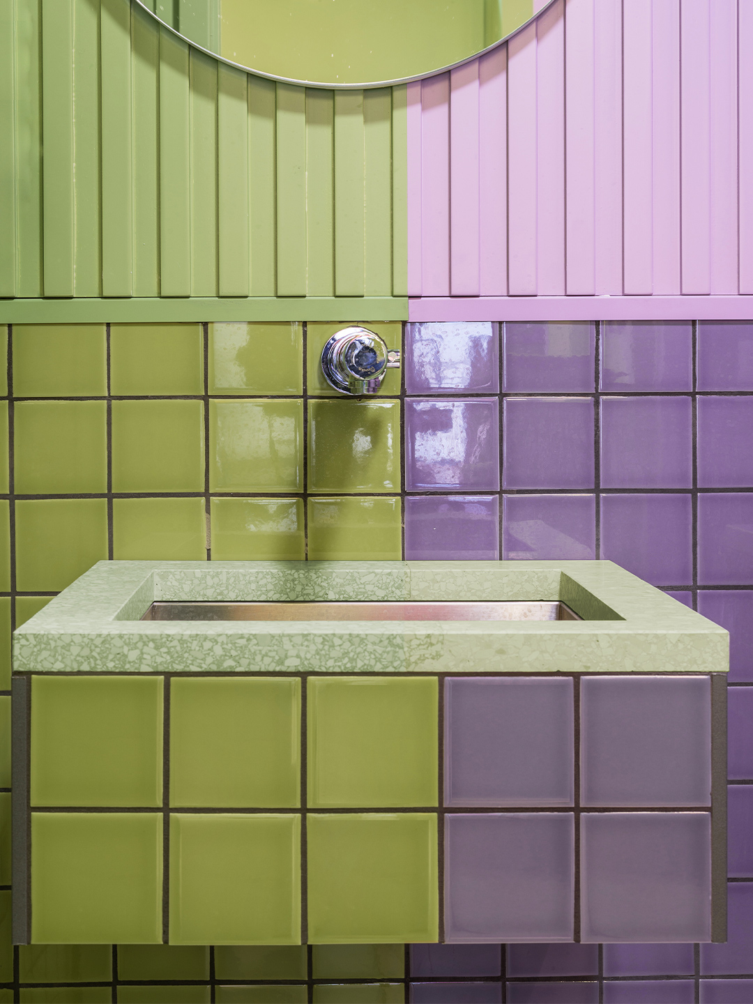
One of the spaces among this year’s presentation is the “hotel hall” – a new kind of hotel reception area by Patricia Bustos Studio, whose signature use of a dreamy pastel-coloured palette gives it a stand-out role. Created in partnership with bathroomware company Bathco, the conceptual interior, titled Serene Touch, is a tribute to the power of craftsmanship and how it can enhance experiences. It centres around the basin as a symbol of renewal and offers tactility through the diverse mix of materials put to use. “In a world in which we want to recover physical contact, the sink becomes a spring that returns us to space ready to use our most primitive and fundamental sense,” Patricia says, referencing what she believes is the first sense that humans develop at birth. “The one that produces the most pleasure – touch.”
Making use of shapely furniture and natural finishes such as hand-worked rattan, marble, ceramic and brick, Madrid-based Patricia explains that organic forms were employed in her studio’s design to reignite and encourage this sense of touch and exploration. “Feeling, in an era where everything is over-intellectualised, is presented to us as a way to explore what was always there,” she says. “Throughout all these years, craftsmanship has brought our body closer, through sight and touch, to experiences of beauty, respect and care. Now we flee to parallel universes without being aware of the loss of the corporeal and the impact it has on our lives, leading us to copied imaginaries, without soul, without meaning.”
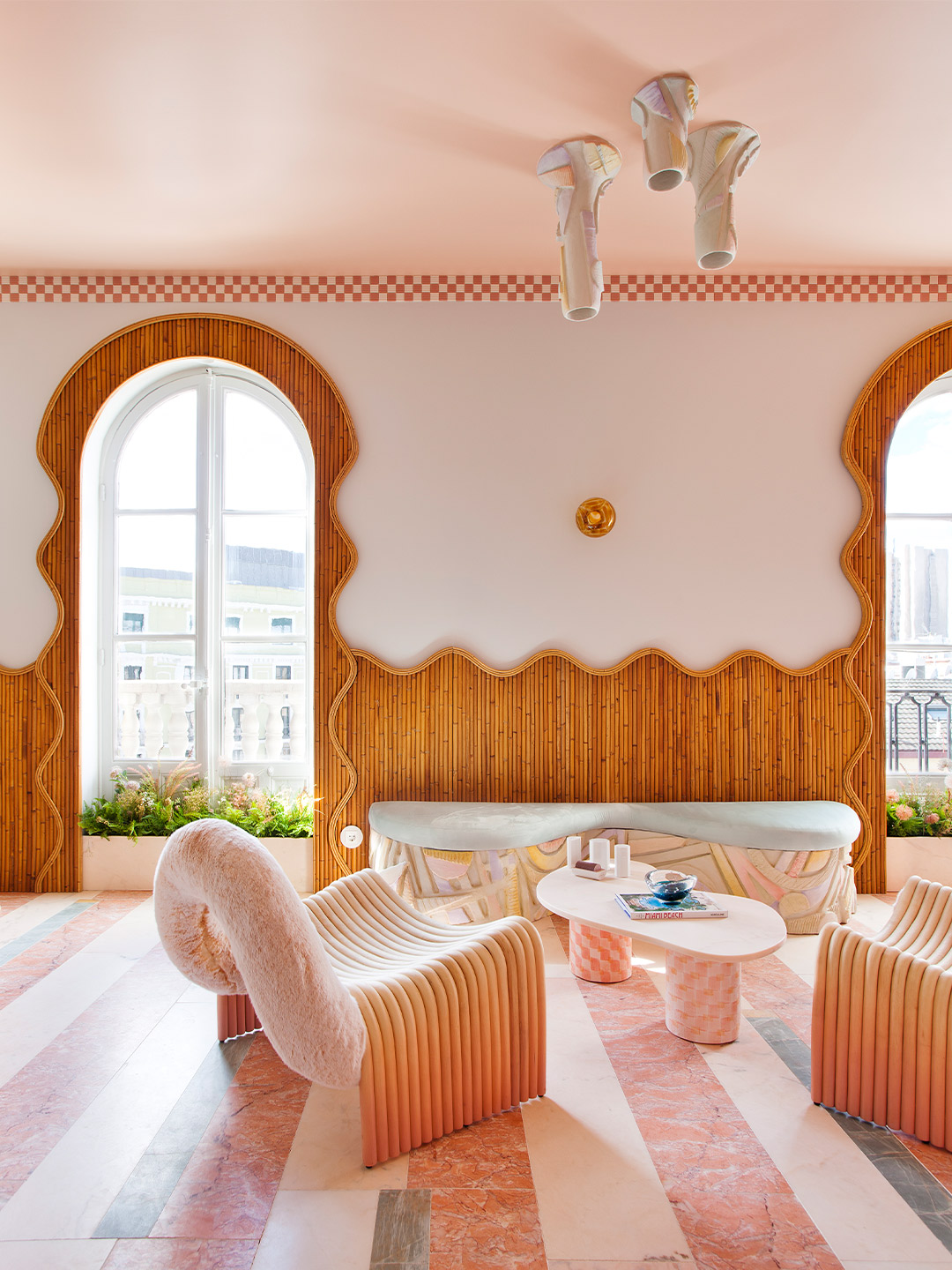
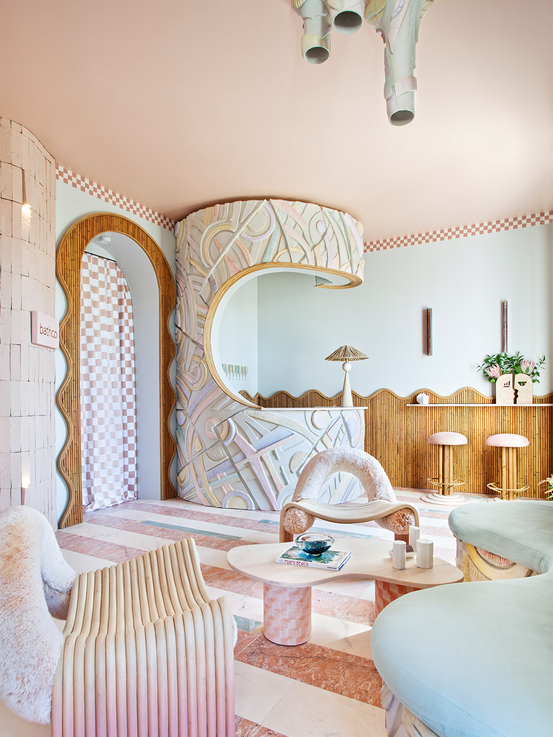
Adding to the appeal of the interior, the washbasins selected from Bathco’s range are unique and handmade. “We want to celebrate the imperfection of the artisan process, its affection, its nuances, its character and identity, making each product original,” says Patricia, who echoed the hand-painted chequerboard pattern of the ceramic basins on the legs of a low table, flowing drapes and as a cornice detail that traces the ceiling of the space. Enhancing the idea of imperfection, dry-stacked pink brick walls ripple behind the wet area. The wavy surface of the walls is then mirrored in the shape of the nearby panelling, connecting the doorway and windows in a gentle tide of rattan that brings warmth and inspiration. For the sculptural counter and central light-fitting, a troop of Bathco artists built the ceramic profiles by hand and painted them in gradients of pastel tones.
Over its 30 years, Casa Decor claims to have “anticipated” the houses of the future, suggesting that its presentations of inspiring rooms, such as Patricia’s, are eventually incorporated into homes and other spaces all around the world. With a similar level of passion, the exhibition’s organisers maintain a “real and inalienable” commitment to sustainability, something which must be applied in all areas of the exhibition. Imbued with its own character and personality, each Casa Decor building becomes the flagship to transmit the values of the exhibition: diversity, creativity and innovation. The buildings represent new challenges for design professionals and brands that, in turn, surprise and delight hordes of curious visitors each year.
casadecor.es; patricia-bustos.com
We want to celebrate the imperfection of the artisan process, its affection, its nuances, its character…
In Italy, Spanish design firm Masquespacio created the Bun burger restaurant in Milan and in Turin. Catch up on more hospitality architecture and design and retail design, plus subscribe to receive the Daily Architecture News e-letter direct to your inbox.
Related stories
- Resa San Mamés student accommodation in Spain by Masquespacio.
- The bar and restaurant at La Sastrería in Valencia by Masquespacio.
- Mama Manana restaurant in Kyiv by Balbek Bureau.
- Gold ‘n’ arches: Bun burger restaurant in Milan by Masquespacio.
In October 1992, the inaugural edition of Casa Decor was held in an old convent on General Oráa Street in Madrid. It marked the first time that fifty design professionals had come together with the shared intention of carrying out a revolutionary project, the likes of which had never before been seen in Spain. From decorators and interior designers to architects, landscapers and artists, the participants were each assigned an empty room in the abandoned convent. They transformed its many spaces into a snaking “catwalk” of design, where the latest trends and innovations were displayed in a mould-breaking showcase, far from any conventional format.
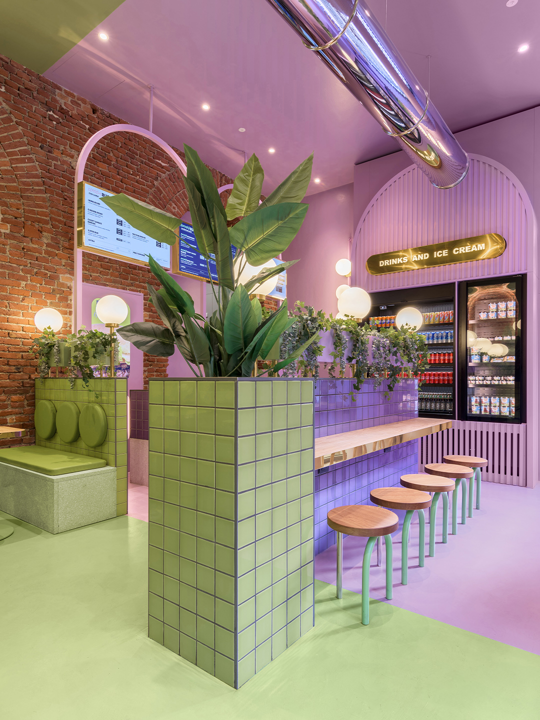
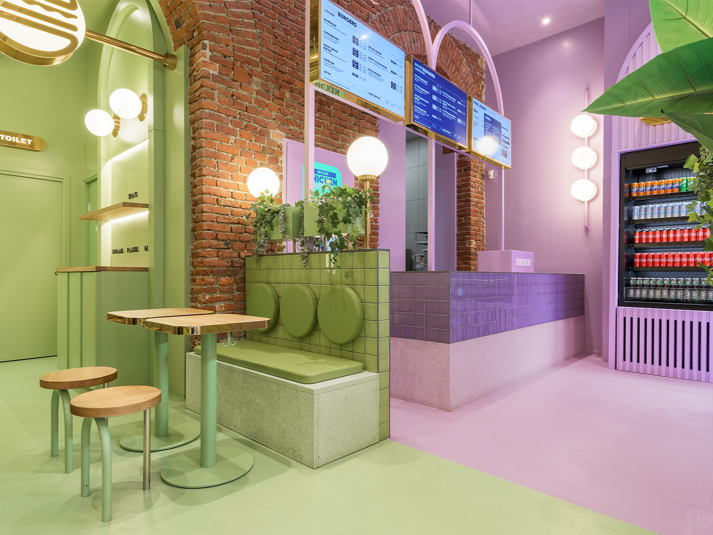
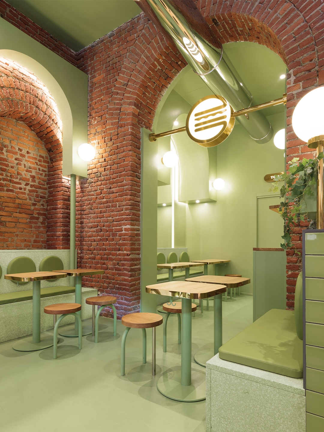
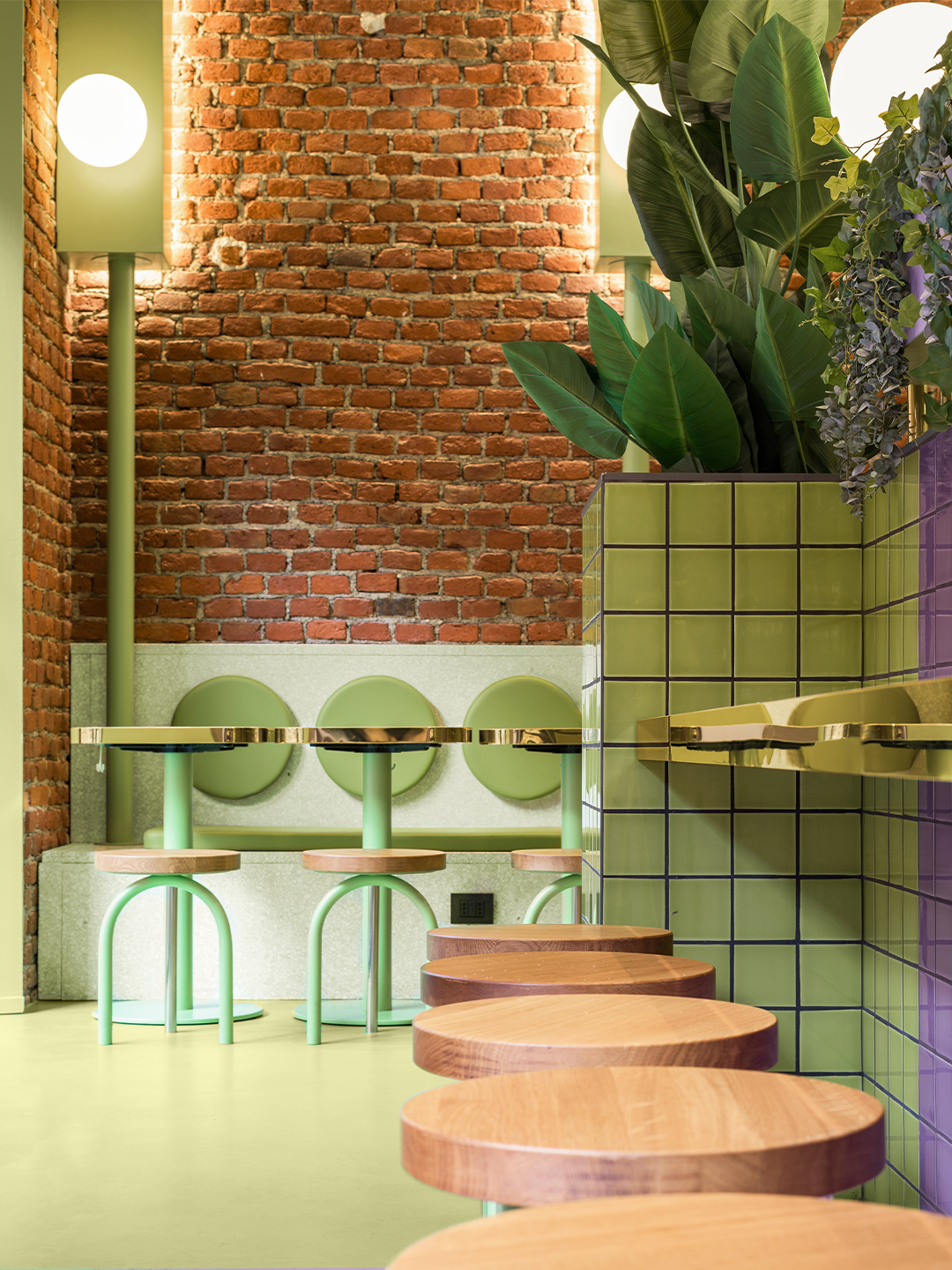
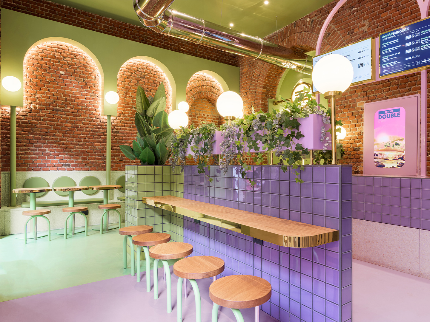
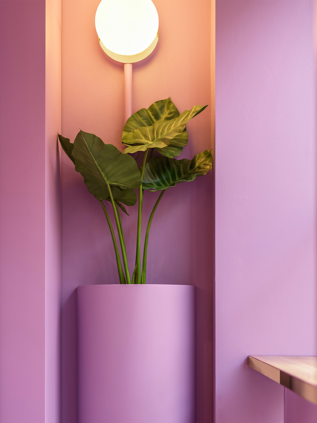
In Milan, this flexibility led to existing architectural archways and exposed bricks becoming defining features of the space. At the second Bun restaurant to open under Masquespacio’s vision, located in Turin, three existing windows informed the decision to expand the colour palette and split the interior into three clearly defined sections. “The idea to play with one colour for each window creates a visual effect from the outside that makes the spectator walk from one visual world into the other, travelling through different experiences in the same space,” says Ana, creative director of Masquespacio.
Bun burger restaurant in northern Italy by Masquespacio
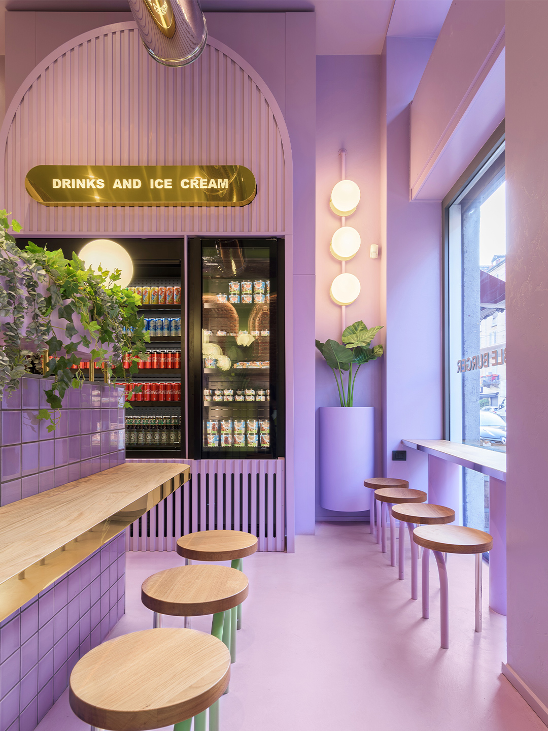
The new restaurant in Turin delivers diners from its front door to the counter via a ribbon of pastel green; the same “iconic” shade used at the Bun restaurant in Milan, explains Ana and Christophe. The trademark colour blankets the floor and ceiling and everything that falls within its territory. Including refrigerators, signage and the odd stool which didn’t quite make it over the line into the neighbouring colour zone.
On each side of the central entryway, the newly introduced pink and blue palette lures diners to two completely different sitting spaces. To the left, a segment of the restaurant swathed entirely in tones of fairy-floss pink tempts diners with two semi-private booths. Elevated from the ground level, the booths feature elegant archways – a nod to the fit-out in Milan – while the pink terrazzo stairs that lead to the dining zones pave the way for additional tables and chairs.
The idea to play with one colour for each window creates a visual effect from the outside that makes the spectator walk from one visual world into the other.
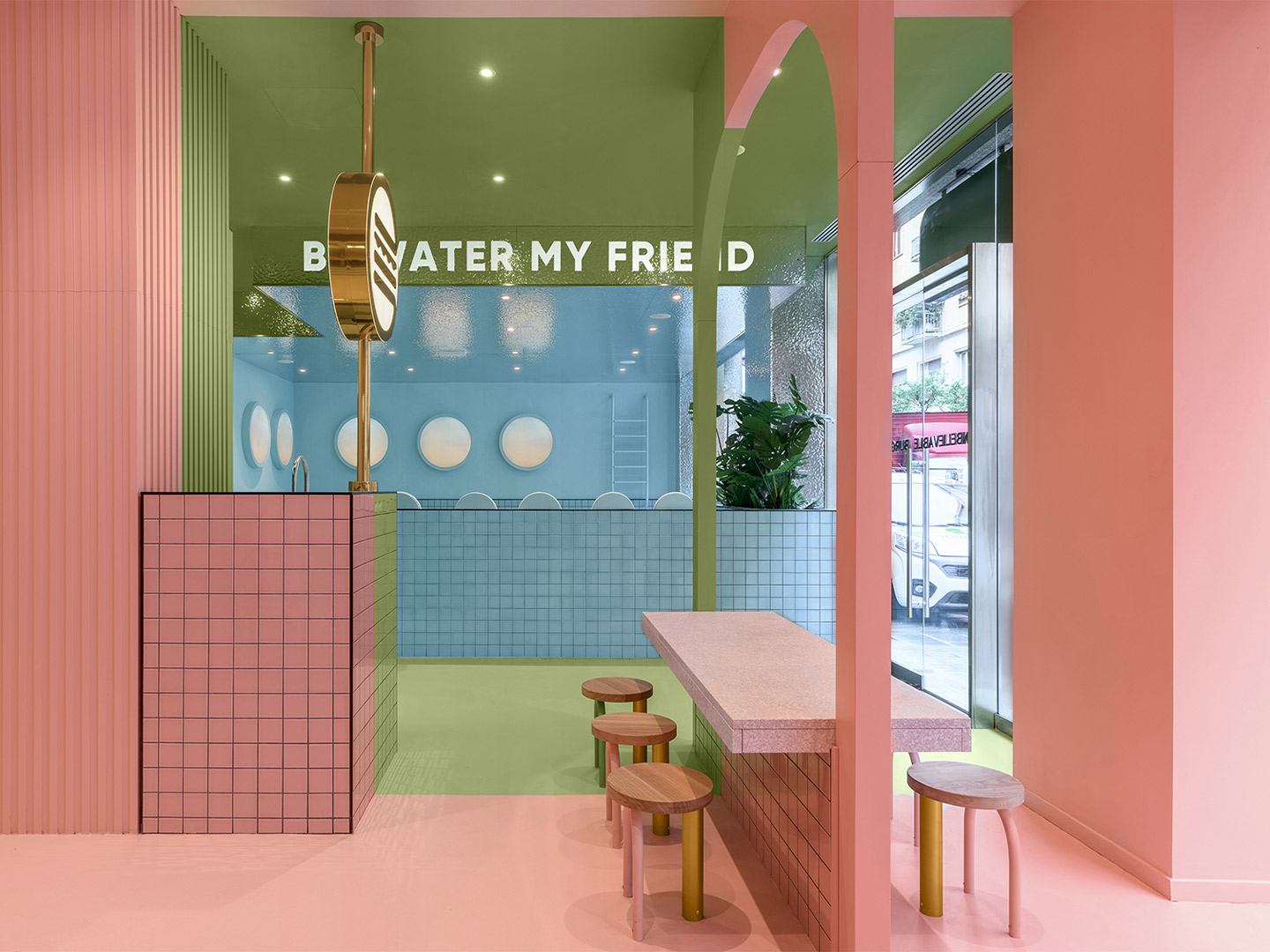
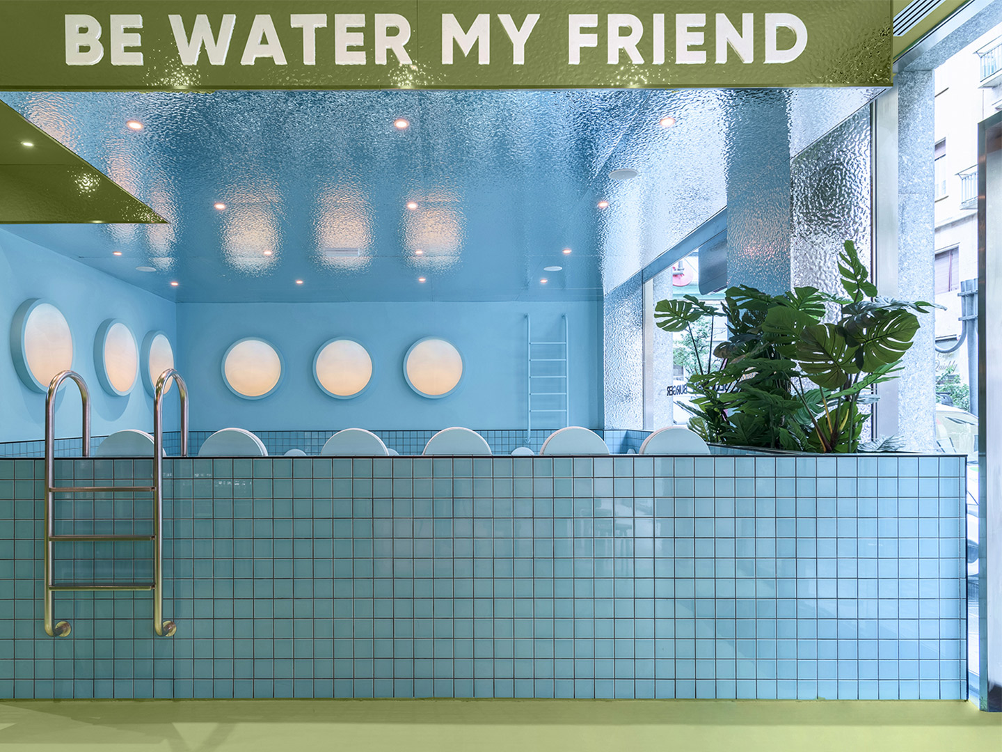
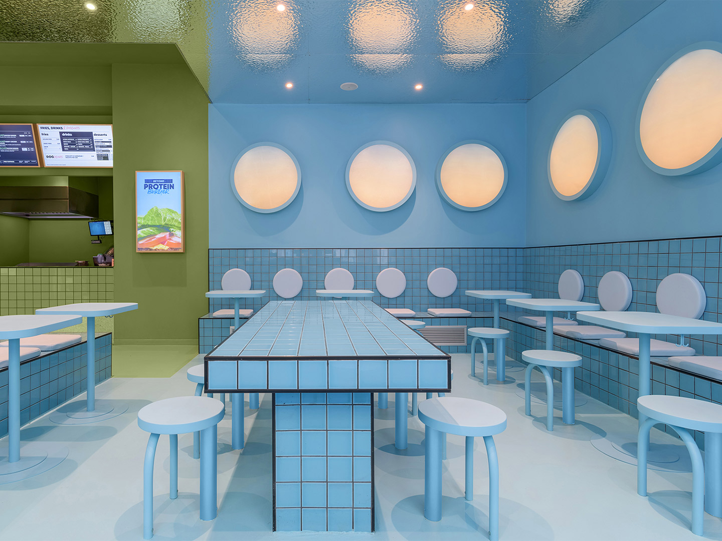
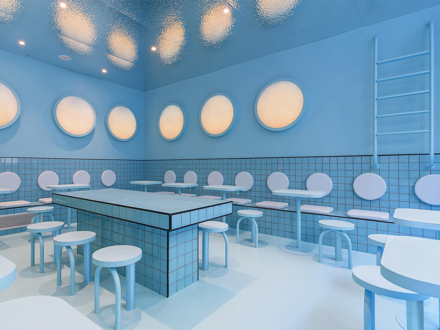
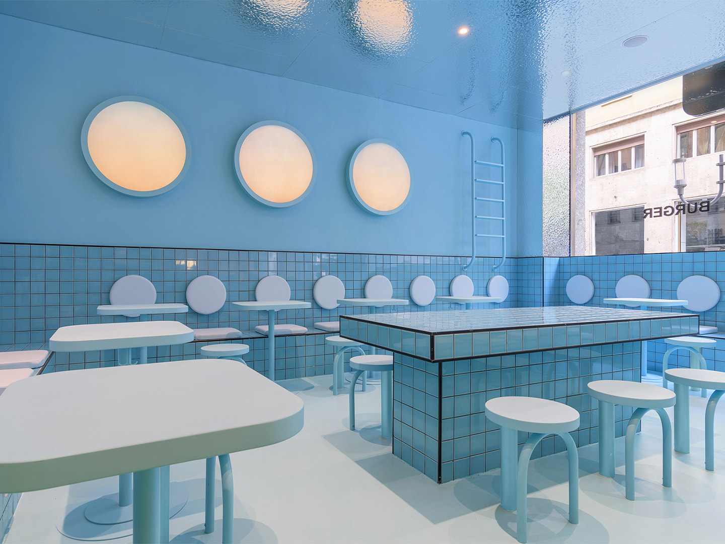
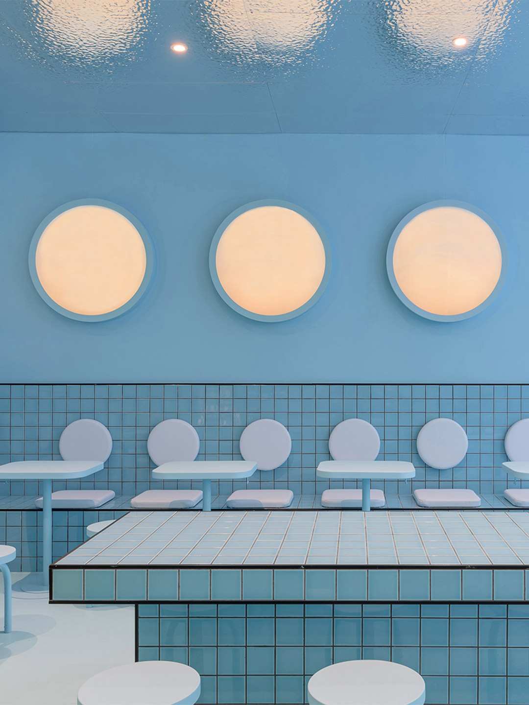
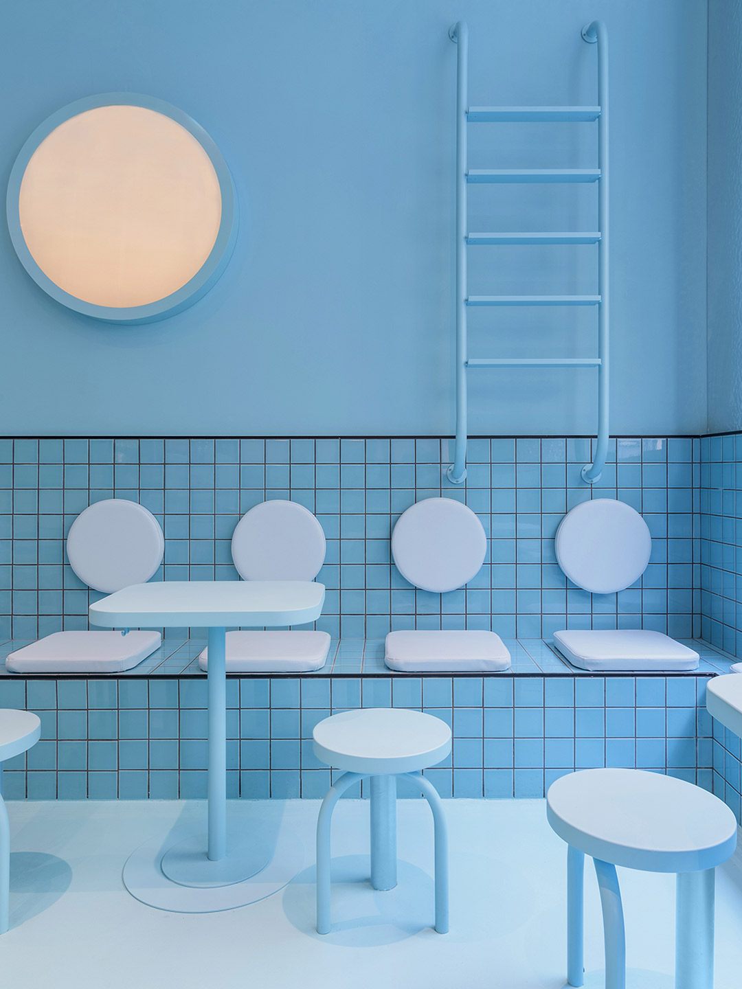
Emblazoned with the words ‘Be water my friend’ – a saying made famous by the late martial-arts star Bruce Lee – the blue zone to the right of the restaurant “adds a touch of fun,” remarks Ana. “[It] gives visitors the chance to enjoy the delicious Bun burgers in a space that simulates a huge swimming pool that would make them feel like floating in the water.” Featuring wall-mounted ladders plunging playfully into an ocean of pale-blue tiles, the swimming pool reference isn’t lost on diners. Especially when they consider the porthole-shaped light fittings and the metallic finish of the ceiling – a design device which mimics the effect of diving into a pool of water and looking up at its rippled surface.
With two completed Bun burger restaurants now tucked firmly under their belts, each united by memorable colour, shapes and materiality, Christophe and Ana intend to work on more of the chain’s outlets in Italy. Returning to Milan from Turin, the design duo will roll-out their refined interior design formula in selected spaces across the city, continuing their mission to make the Bun brand edgy, fun and instantly recognisable.
Also in Italy, Masquespacio designed the Bun burger restaurant in Milan. Catch up on more hospitality architecture and design and retail design, plus subscribe to receive the Daily Architecture News e-letter direct to your inbox.
Related stories
- Resa San Mamés student accommodation in Spain by Masquespacio.
- The bar and restaurant at La Sastrería in Valencia by Masquespacio.
- Mama Manana restaurant in Kyiv by Balbek Bureau.
- Gold ‘n’ arches: Bun burger restaurant in Milan by Masquespacio.
In October 1992, the inaugural edition of Casa Decor was held in an old convent on General Oráa Street in Madrid. It marked the first time that fifty design professionals had come together with the shared intention of carrying out a revolutionary project, the likes of which had never before been seen in Spain. From decorators and interior designers to architects, landscapers and artists, the participants were each assigned an empty room in the abandoned convent. They transformed its many spaces into a snaking “catwalk” of design, where the latest trends and innovations were displayed in a mould-breaking showcase, far from any conventional format.
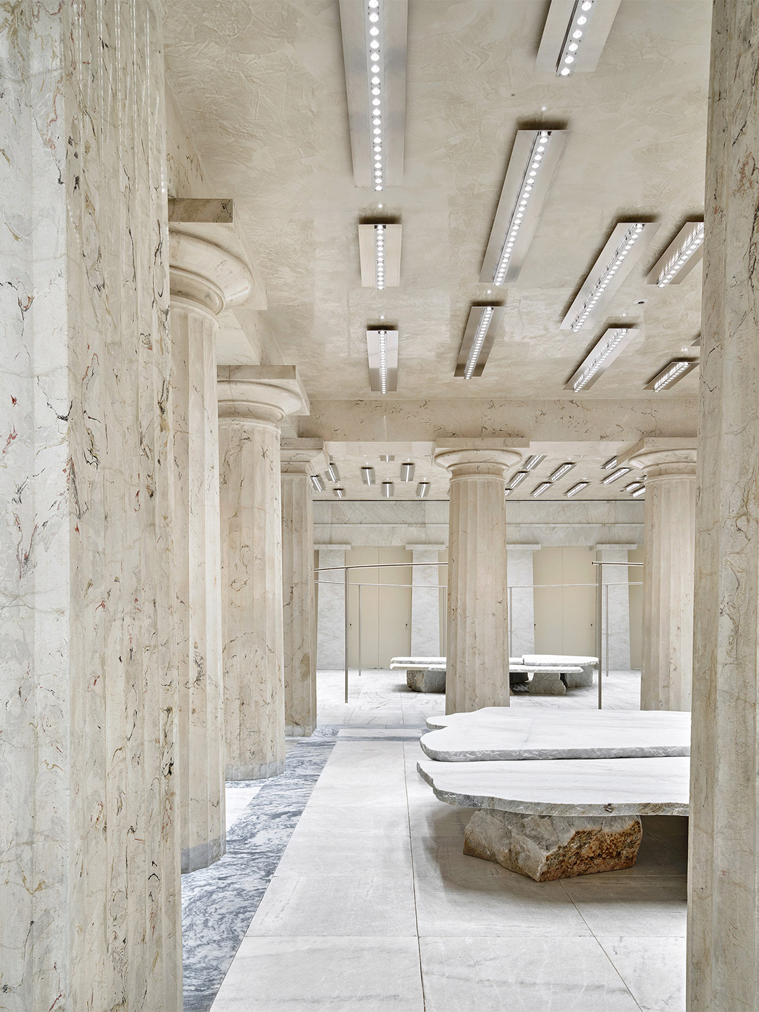
In the years to follow, after the bank closed its doors, countless commercial fit-outs covered up the original bones of the building. Now, nearly half a century later, the storied site has been reborn as the Stockholm base of Swedish fashion label Acne Studios; a place of quiet creativity that reflects on its past while setting the stage for new beginnings.
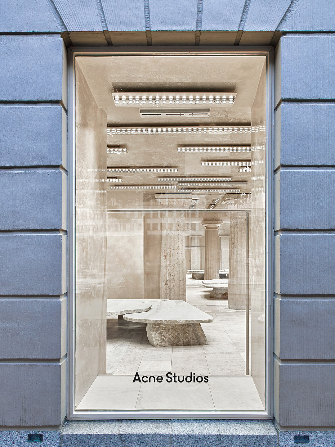
Acne Studios boutique in Stockholm by Arquitectura-G
Through its collections of garments, Acne Studios has developed a reputation for partnering the eccentric with the essential, offering its devotees something timeless and minimalist yet undeniably outgoing. In many ways, a similar approach has been deployed at the fashion retailer’s Stockholm outpost.
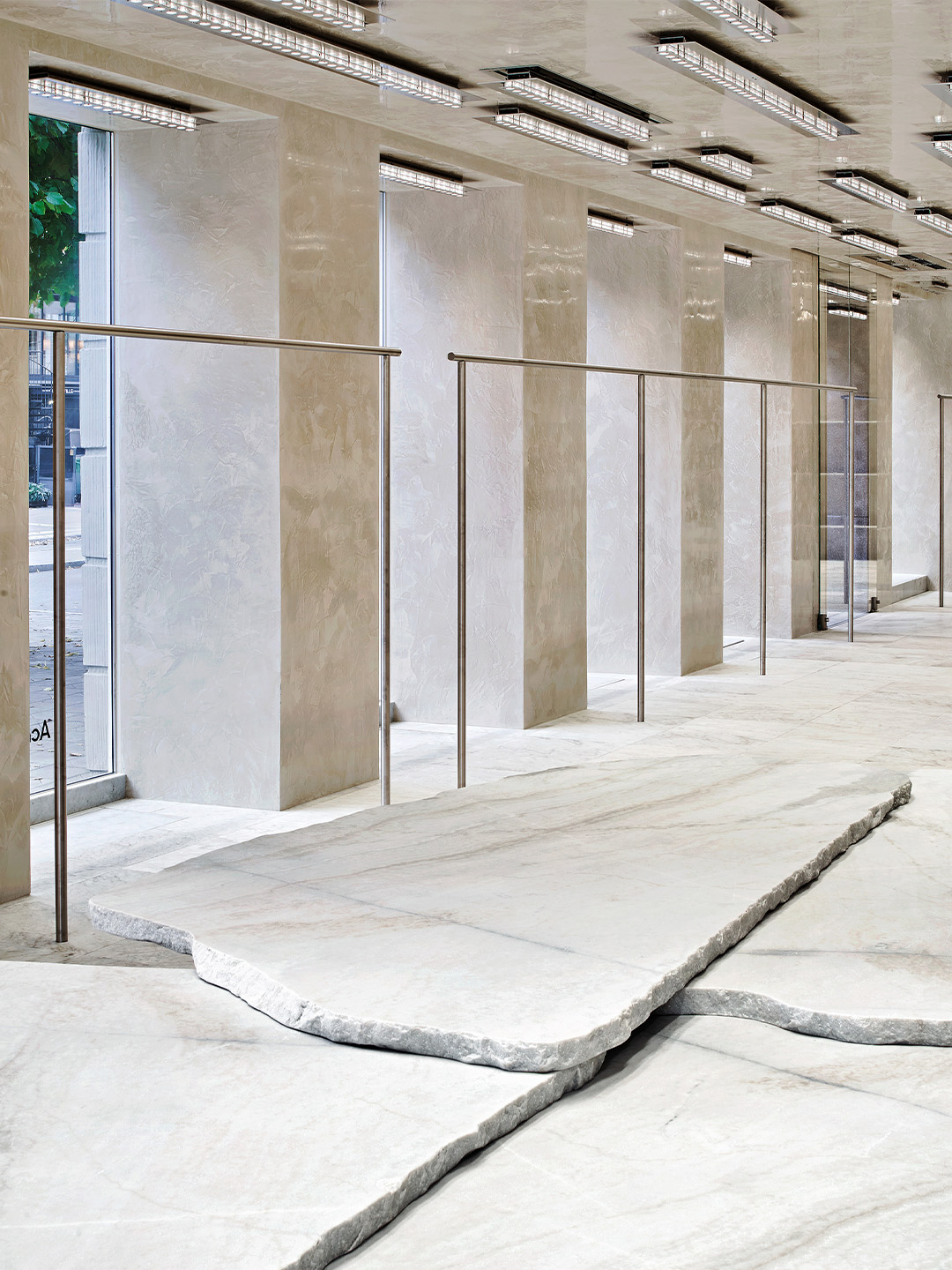
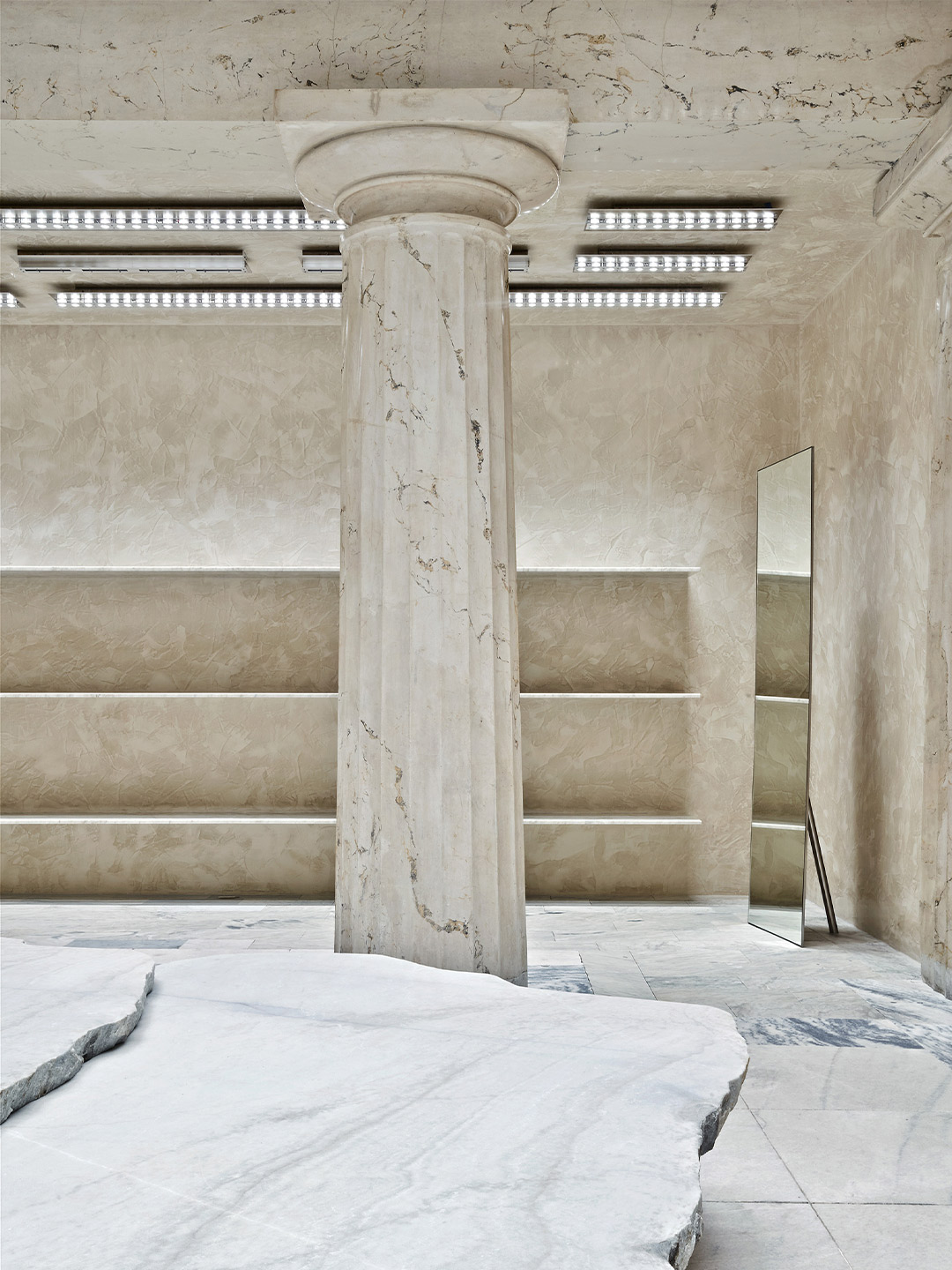
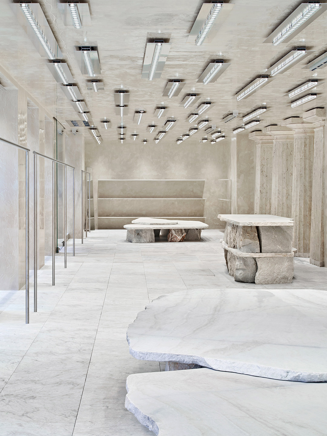
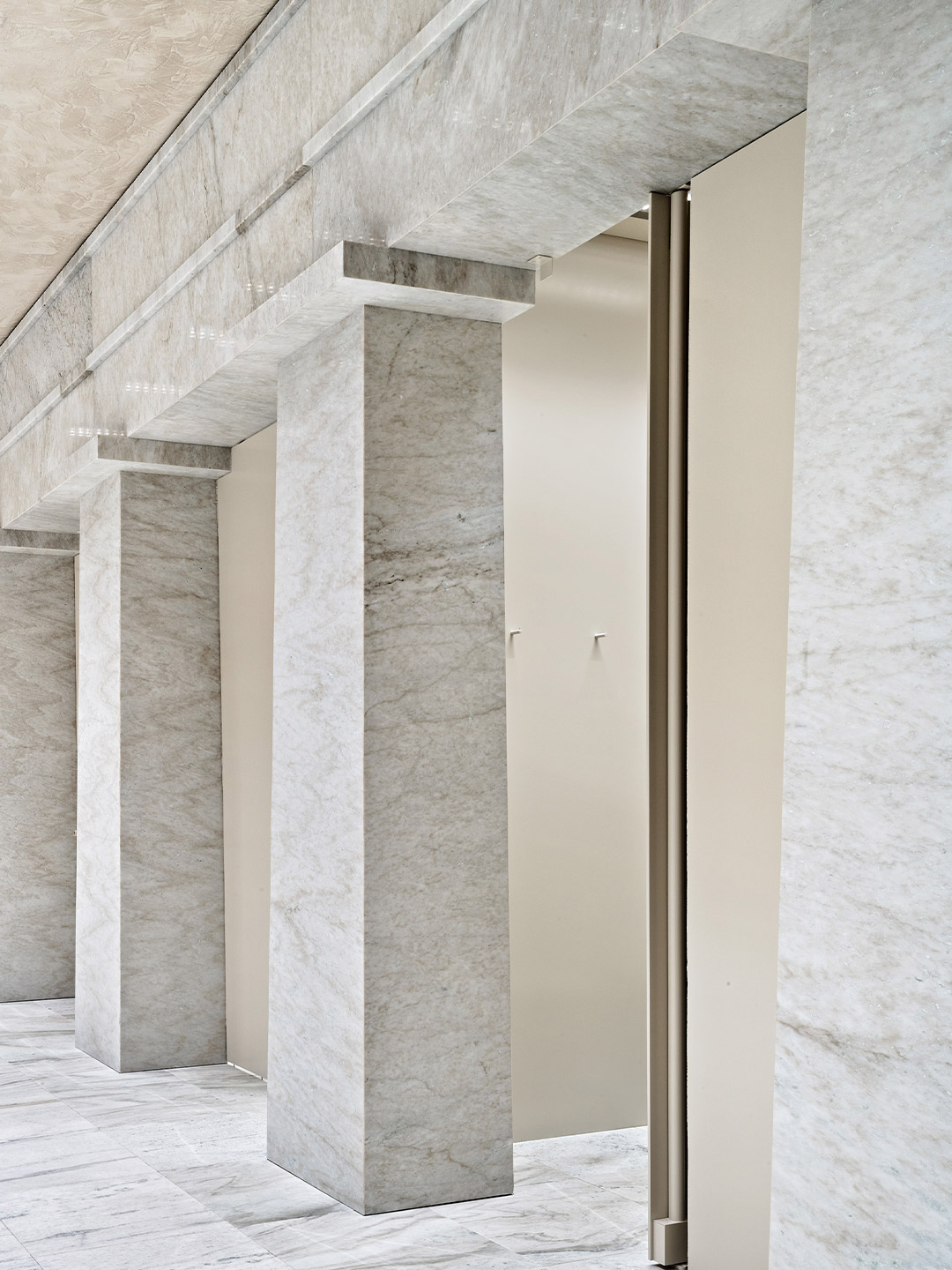
Completed in 2020 by Barcelona-based firm Arquitectura-G, the design scheme revives the neoclassical architecture of the bank building, resetting it as a splendid hallmark of the 20th century. The architects returned the L-shaped, 400-square-metre tenancy to its essential features – predominantly chiselled from monochrome marble – and, through considered yet quirky interventions, paved the way for Acne Studios to showcase their wares.
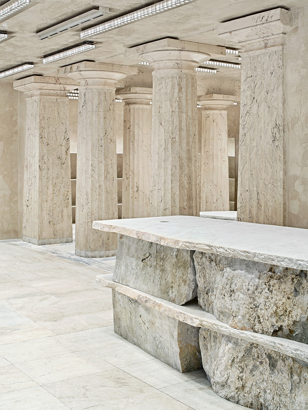
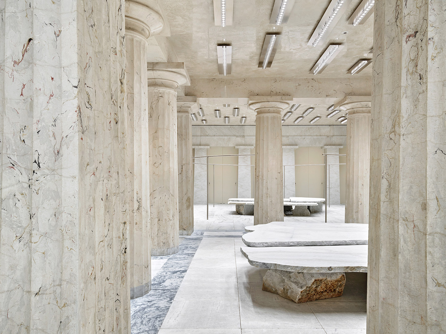
Shoppers now journey through three rooms which are connected by large doric-style columns, culminating with an abstract ‘colonnade’ that opens up to a series of fitting rooms. Throughout the store, tonnes of real marble rubs shoulders with lashings of faux, while plenty of mirrored surfaces are on standby to play up the illusion.
Hefty stone furniture by British designer Max Lamb adopts a Bedrock approach, featuring giant flat-faced slabs of stone placed upon rough-edged boulders. Positioned decisively in the centre of each room, below linear steel light fixtures by Benoit Lalloz, the primitive furniture pieces act as monolithic podiums for point-of-sale facilities and street-facing retail displays.
arquitectura-g.com; acnestudios.com
Catch up on more architecture and design highlights. Plus, subscribe to receive the Daily Architecture News e-letter direct to your inbox.
Hefty stone furniture by British designer Max Lamb adopts a Bedrock approach, featuring giant flat-faced slabs of stone placed upon rough-edged boulders.
Related stories
- Introducing the New Wave collection of 80s-inspired vases by Greg Natale.
- Carla Sozzani curates new colours for classic Arne Jacobsen chairs.
- Adam Goodrum stamps all-Australian style on new breezeblock design.
In October 1992, the inaugural edition of Casa Decor was held in an old convent on General Oráa Street in Madrid. It marked the first time that fifty design professionals had come together with the shared intention of carrying out a revolutionary project, the likes of which had never before been seen in Spain. From decorators and interior designers to architects, landscapers and artists, the participants were each assigned an empty room in the abandoned convent. They transformed its many spaces into a snaking “catwalk” of design, where the latest trends and innovations were displayed in a mould-breaking showcase, far from any conventional format.
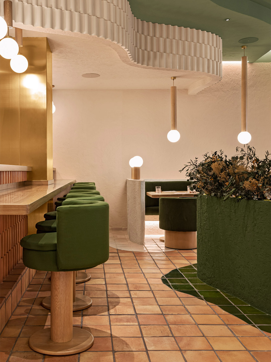
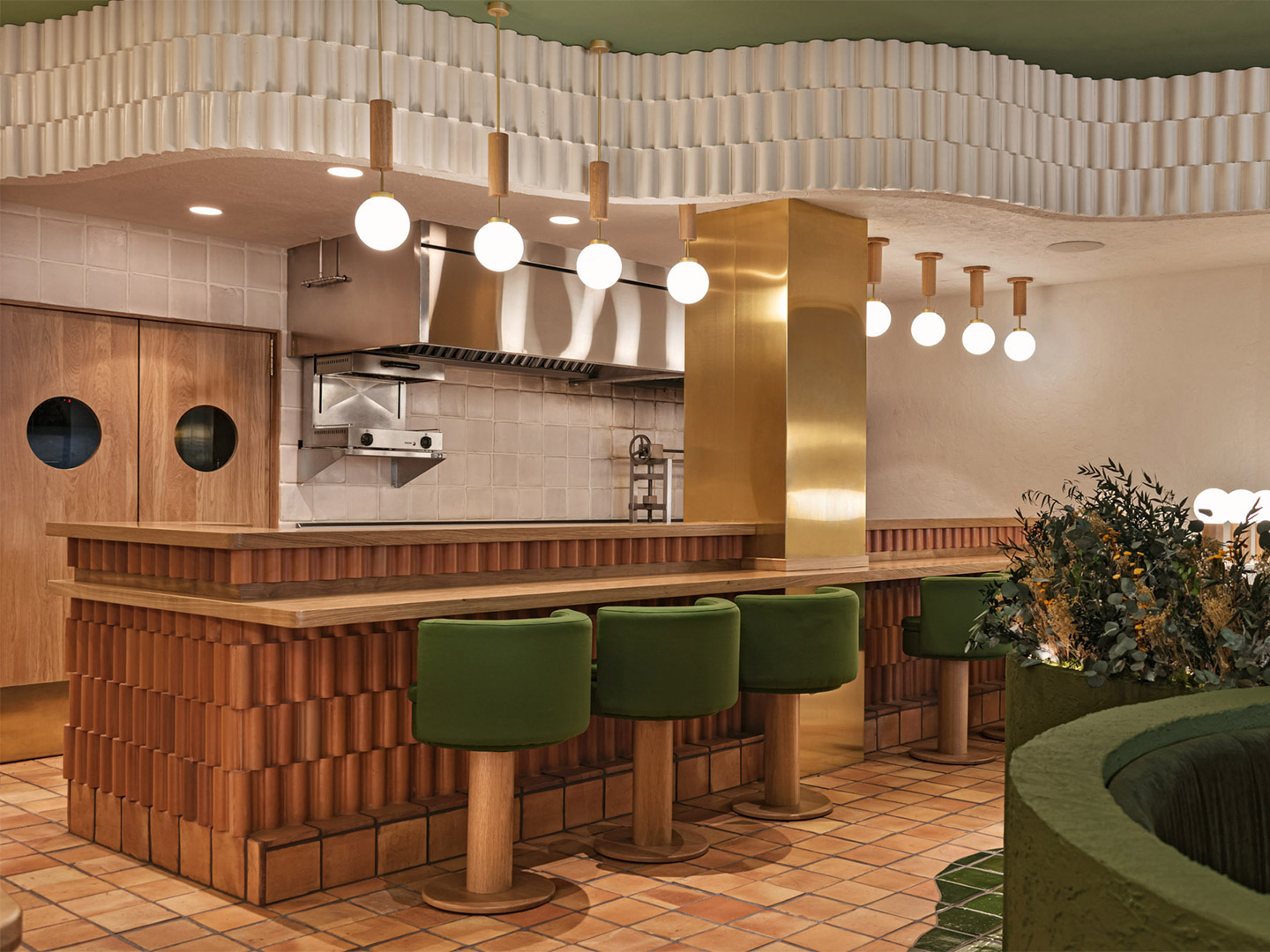
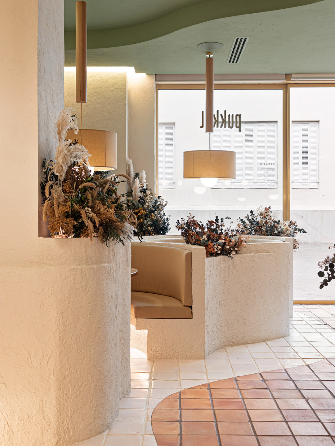
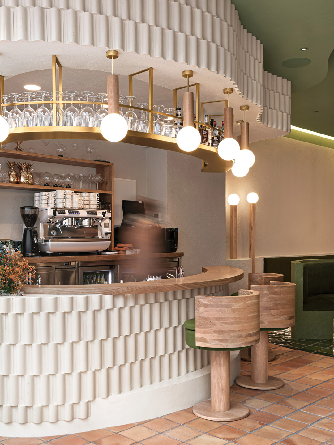
The design brief was straightforward, explains Masquespacio co-founders Christophe Penasse and Ana Hernández: to develop a “sensorial experience” that builds upon the health-focussed fare on offer at Pukkel. In response, the designers drew inspiration from the nearby Pyrenees mountains and the natural surroundings of the Aragon province, arriving at an earthy palette with the power to evolve each season through a “forest” of plants and flowers.
Pukkel restaurant in Huesca, Spain, by Masquespacio
“After a workshop with Jorge and Mikel, we immediately proposed to work with one hundred percent natural materials and integrate nature into the space,” says Christophe, whose next step, along with Ana, was to search for inspiring connections between the city and the salutary lifestyle promoted by Pukkel’s health-centric gastronomy. “We investigated the province of Huesca and started to discover the beauty of the mountains and parks in its surroundings,” Ana adds. “We definitely found the reference we were looking for and that fitted perfectly with the healthy lifestyle concept from Pukkel.”
The result is a restaurant where diners are pleasantly reminded of nature first-and-foremost through colour: a grounding blend of terracotta, beige, sand and mushroom tones, offset harmoniously by warm white, sage and forest-inspired greens. Glimmers of gold arrive courtesy of metallic finishes that wrap furnishings, columns and drifts of light-fittings overhead, elevating the ambience of the interior to meet its fine-dining expectations.
After a workshop with Jorge and Mikel, we immediately proposed to work with one hundred percent natural materials and integrate nature into the space.
The materiality and planning of the restaurant also taps into the spirit of nature, beginning with the plushy banquette pods positioned beside meandering tiled pathways. “The imperfect forms are mainly organic and draw a path on the floor like if you were walking through the forest,” says the designers. “All around the path, circular spaces are recreated like if we were in the mountains and allow the customers to share a moment with family or with friends, disconnecting from the daily routine.”
The enchanting curves of the pathways and secluded banquettes are echoed on the ceiling through tiered levels of plasterwork that are capped with flowing ribbons of interlocking terracotta tiles. These tiers form bulkheads for concealed services while also appearing to trace undulating terrain like an extruded topographic map.
Terracotta is the key ingredient on the floors, bar fronts and some of the walls where tile patterns and profiles were designed by Masquespacio specially for Pukkel, including in the restrooms where sculptural terracotta tiles clad the bathroom furniture. Next to the ceramic tiles on the dining room walls, the application of rough stucco nods to the tactility of bare earth, says the designers, who also specified the textured stucco finish to appear on the curved framework of the banquettes.
It’s here, on top of the part-walls that cocoon the banquettes, where tufts of flowers and foliage are displayed in magnificent arrangements of differing heights. Some shoot up tall while others spill over, breaking up the sharp-edged lines of the joinery. Through this simple gesture by Masquespacio, the restaurant space is given permission to connect with the seasons and the produce-driven menu, offering scope for spatial transformation and an ever-changing atmosphere for returning guests.
Catch up on more hospitality architecture and design and retail design, plus subscribe to receive the Daily Architecture News e-letter direct to your inbox.
Related stories
- Resa San Mamés student accommodation in Spain by Masquespacio.
- The bar and restaurant at La Sastrería in Valencia by Masquespacio.
- Mama Manana restaurant in Kyiv by Balbek Bureau.
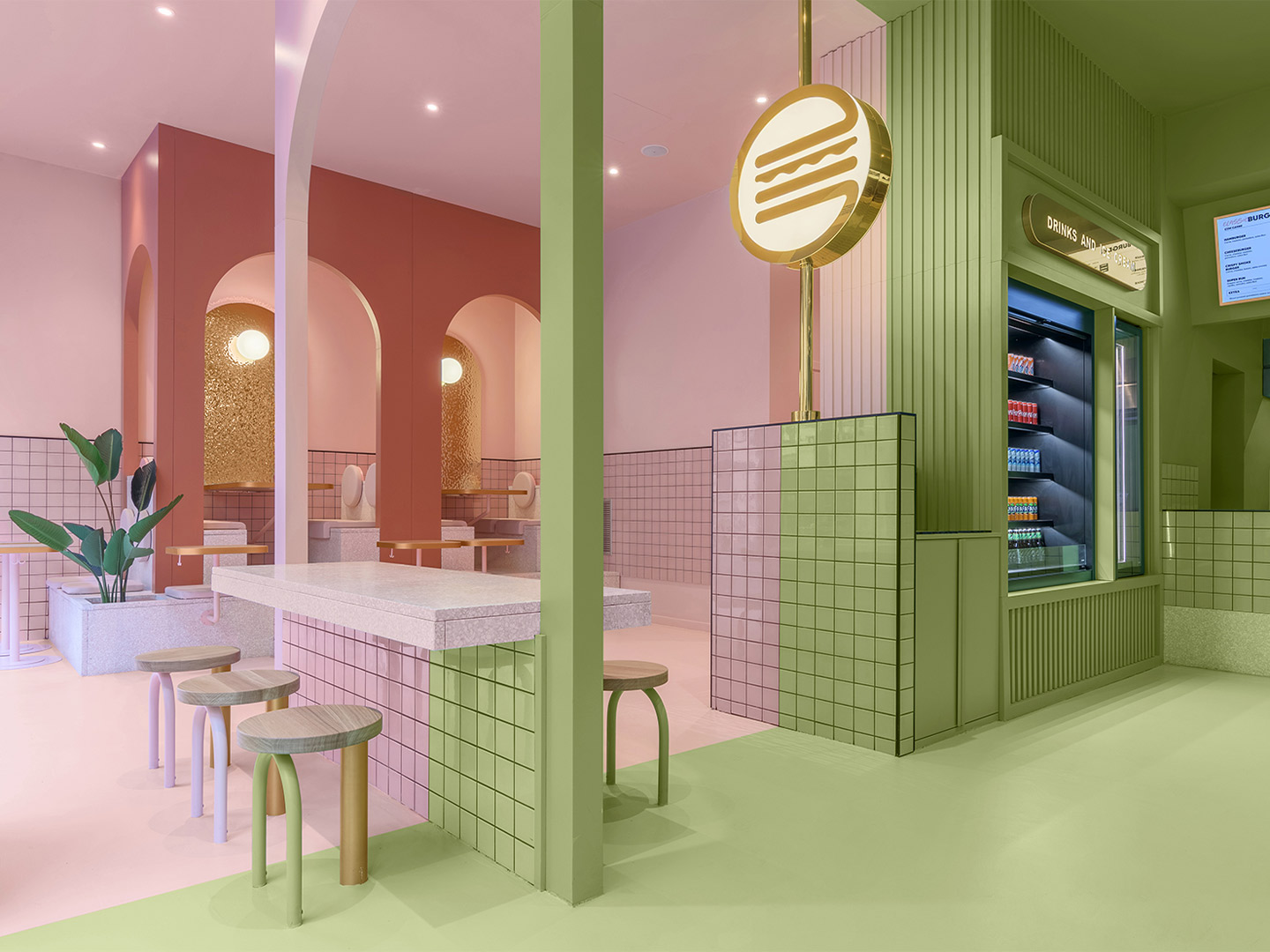
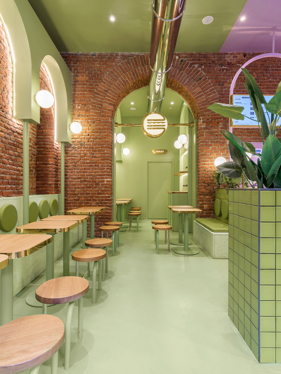
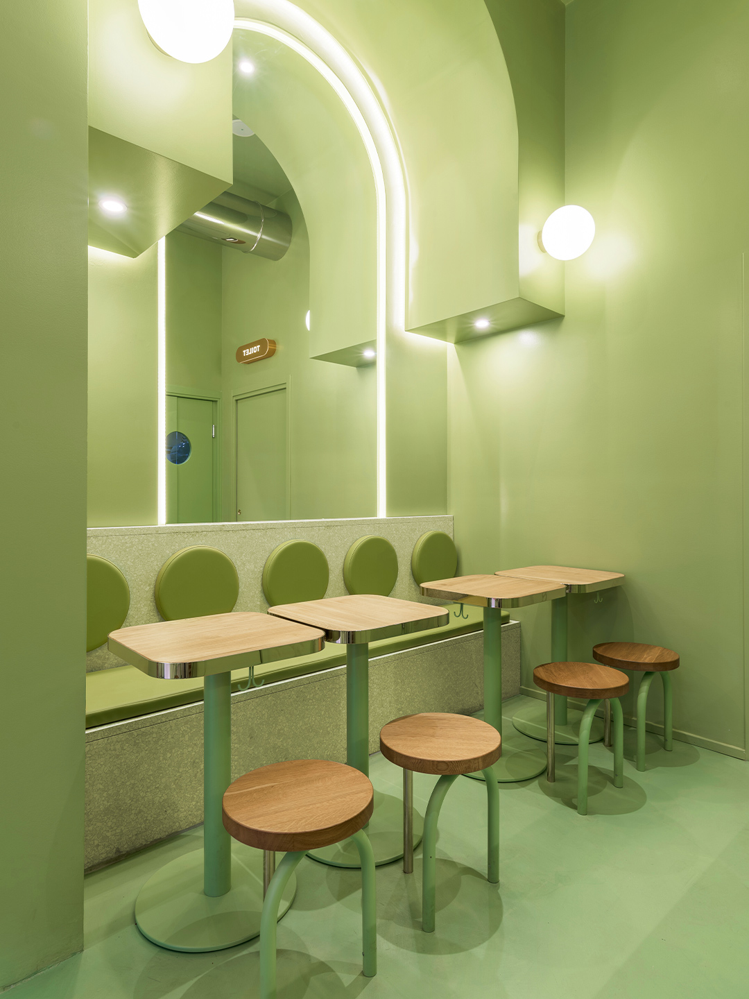
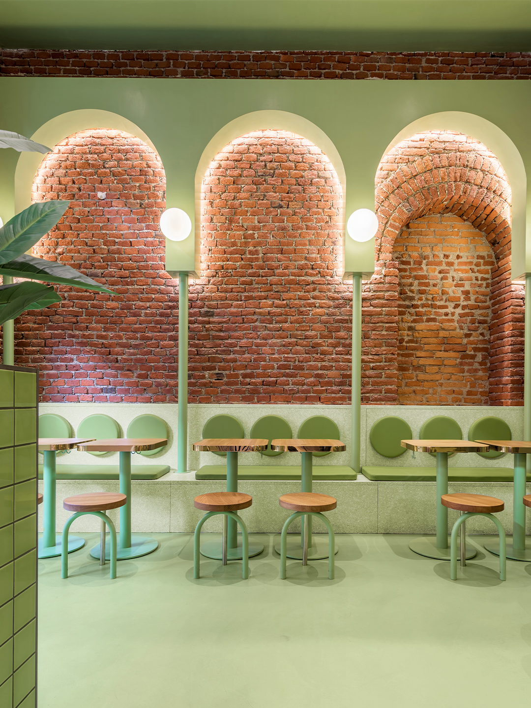
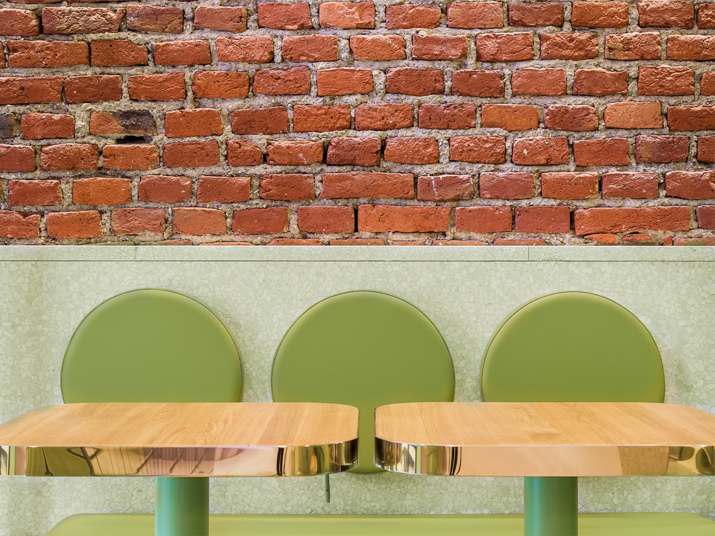
Few creative studios expertly juggle high-octane colour quite like Spanish design practice Masquespacio. The latest project to come from the dynamic designers – an upbeat restaurant in Milan belonging to the Bun burger chain – is testament to such seemingly effortless skill, spearheaded by practice co-founders Christophe Penasse and Ana Hernández.
Surprisingly, the Bun burger restaurant is Masquespacio’s first interior design project in Milan. And it’s one that saw the designers make a return to the Italian fashion and design capital outside of Milan Design Week, where in 2019 they presented an exhibition with Italian terracotta artisan Poggi Ugo, and in 2016 showed their Memphis-inspired Toadstool collection of furniture. The project also marks the design firm’s debut restaurant design for the Bun burger group.
Bun burger restaurant in Milan by Masquespacio
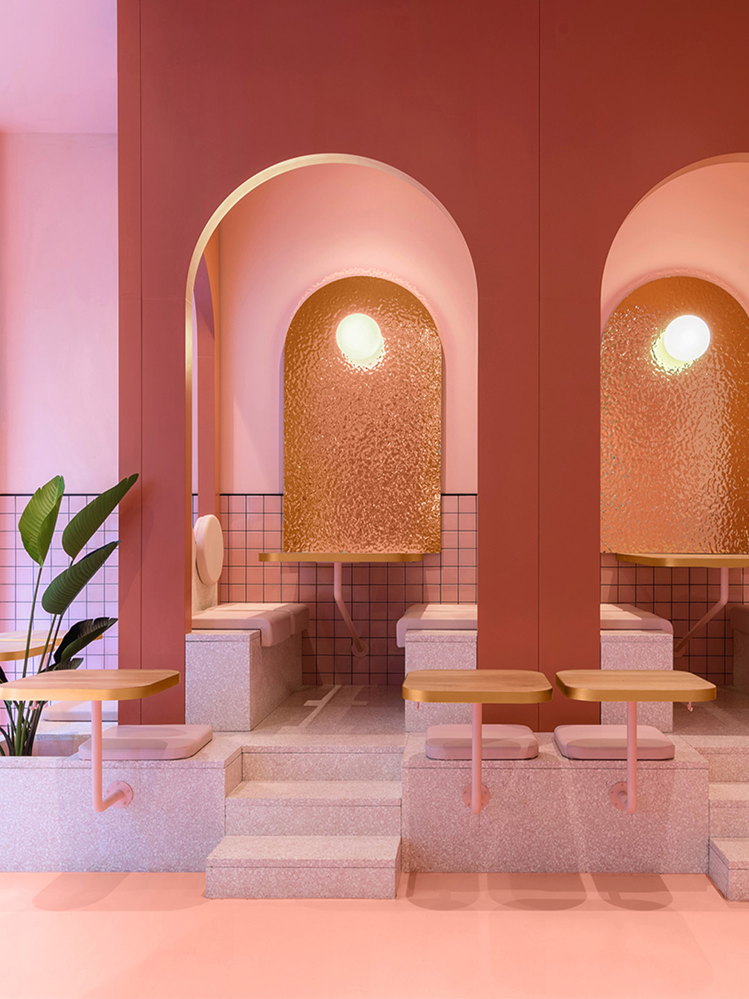
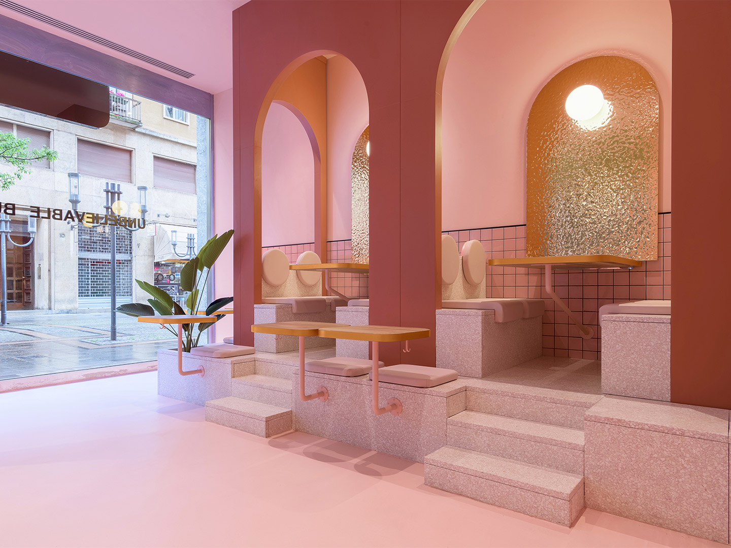
Located in the student-dense area of Viale Bligny, next to the Bocconi University in Milan, the newly completed diner unveils a new visual identity for the burger brand, daringly defined by Christophe and Ana’s signature use of saturated colour alongside gold ’n’ arches: glimmering gold accents and rows of archways that unwittingly nod to the nickname of another world-famous burger chain.
In recent years, the designers have observed an increase in hamburger restaurant chains appearing in the region, and around the world, but they say that most of them straddle a vintage-industrial design aesthetic. The fit-out conceived by Masquespacio for the Milanese outlet of Bun paves a completely different path. The restaurant is presented as an innovative, fresh-faced concept that showcases the authenticity of the Bun brand, its plastic-free attitude and, of course, the smash-hit burgers.
The Bun restaurant project in Milan began with Masquespacio’s designers Christophe and Ana investigating the existing elements of the site, fuelled by the underlying hope that the location would speak to them, perhaps through original architectural characteristics that could be incorporated into the final design response. “When we saw the beautiful bricks and arcs from the space it was evident for us that we would use these two elements as the starting point of the design,” Ana says.
Enchanted by the existing brick archways, the design duo embraced the arch when developing a uniform aesthetic for the hamburger restaurant. New arc forms were constructed throughout the space and brought to the fore with a distinctive pairing of pastel purple and green: a statement-making two-tone colourway that offers a subtle salute to the burger bars of yesteryear.
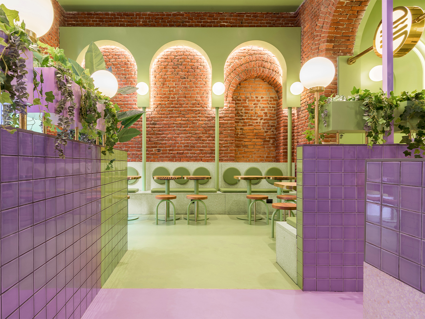
Some of the archways are “totally independent” and others are “highlighting the already existing arcs from the interior architecture,” says the designers, who also specified terrazzo, block-colour tiles, spherical light shades, timber furniture and potted foliage throughout the 140-square-metre restaurant.
The result is a space where Masquespacio and Bun have successfully captured the interests – and satisfied the appetites – of a youthful demographic in Milan, while also building upon the Italian city’s reputation for edginess, polish and sophistication. For each party, that means it’s a mission accomplished. But so thrilled is the client with Masquespacio’s restaurant design, the creatives have revealed they are now set to collaborate with Bun on the creation of several new restaurants in the brand’s portfolio, including an outlet in Italy’s north-west: “The next one will be Bun’s first opening in Turin”.
masquespacio.com; bunburgers.com
Catch up on more office architecture and design and retail design, plus subscribe to receive the Daily Architecture News e-letter direct to your inbox.
When we saw the beautiful bricks and arcs from the space it was evident for us that we would use these two elements as the starting point of the design.

Related stories
- Resa San Mamés student accommodation in Spain by Masquespacio.
- The bar and restaurant at La Sastrería in Valencia by Masquespacio.
- Mama Manana restaurant in Kyiv by Balbek Bureau.
Few creative studios expertly juggle high-octane colour quite like Spanish design practice Masquespacio. The latest project to come from the dynamic designers – an upbeat restaurant in Milan belonging to the Bun burger chain – is testament to such seemingly effortless skill, spearheaded by practice co-founders Christophe Penasse and Ana Hernández.
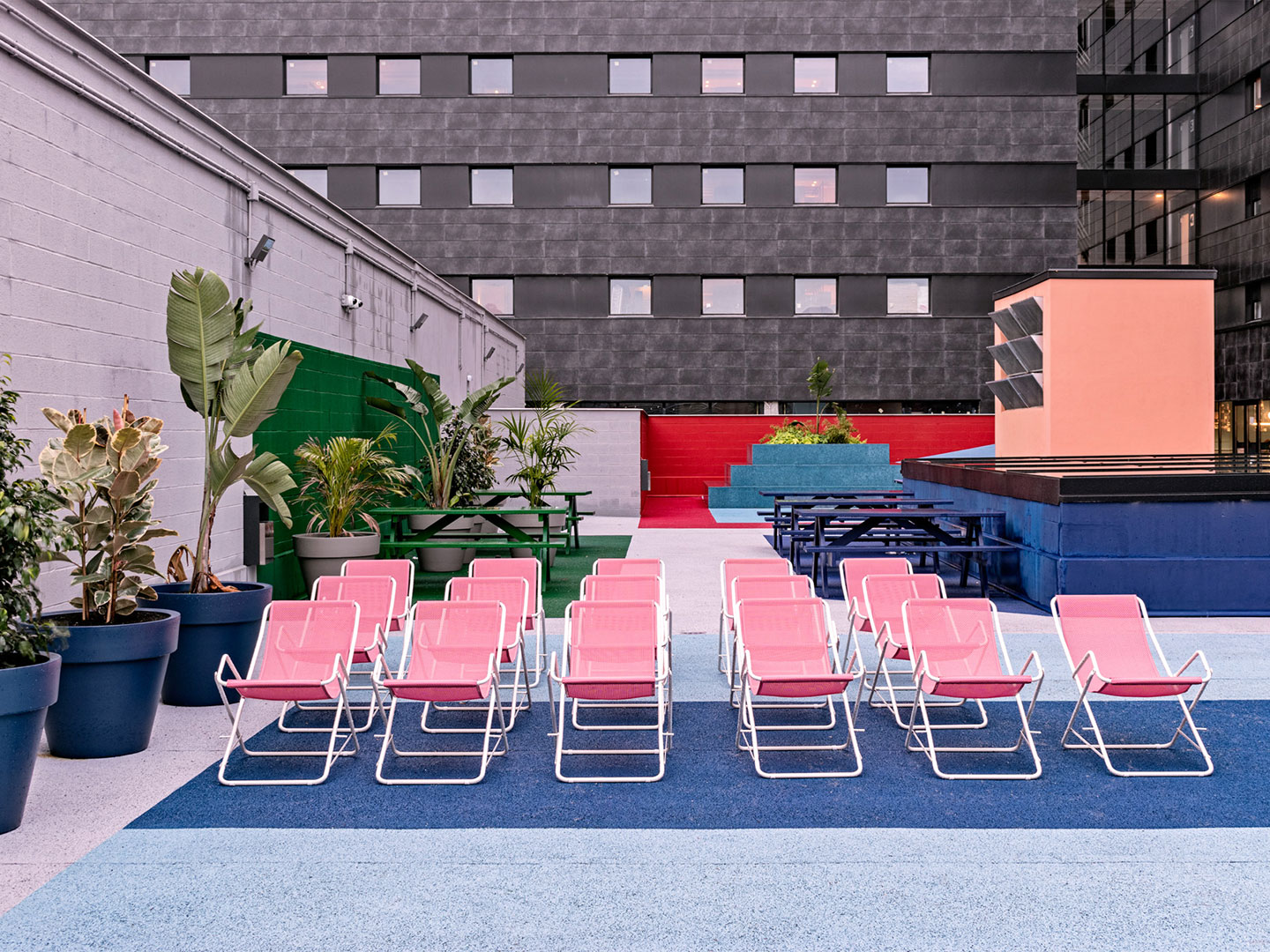
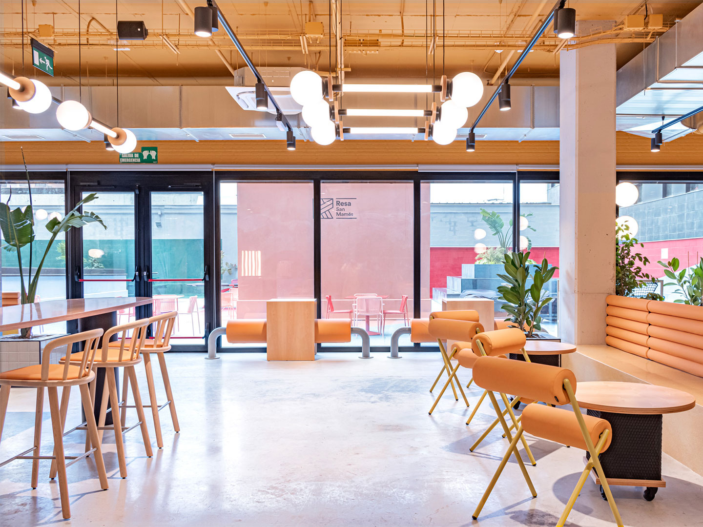
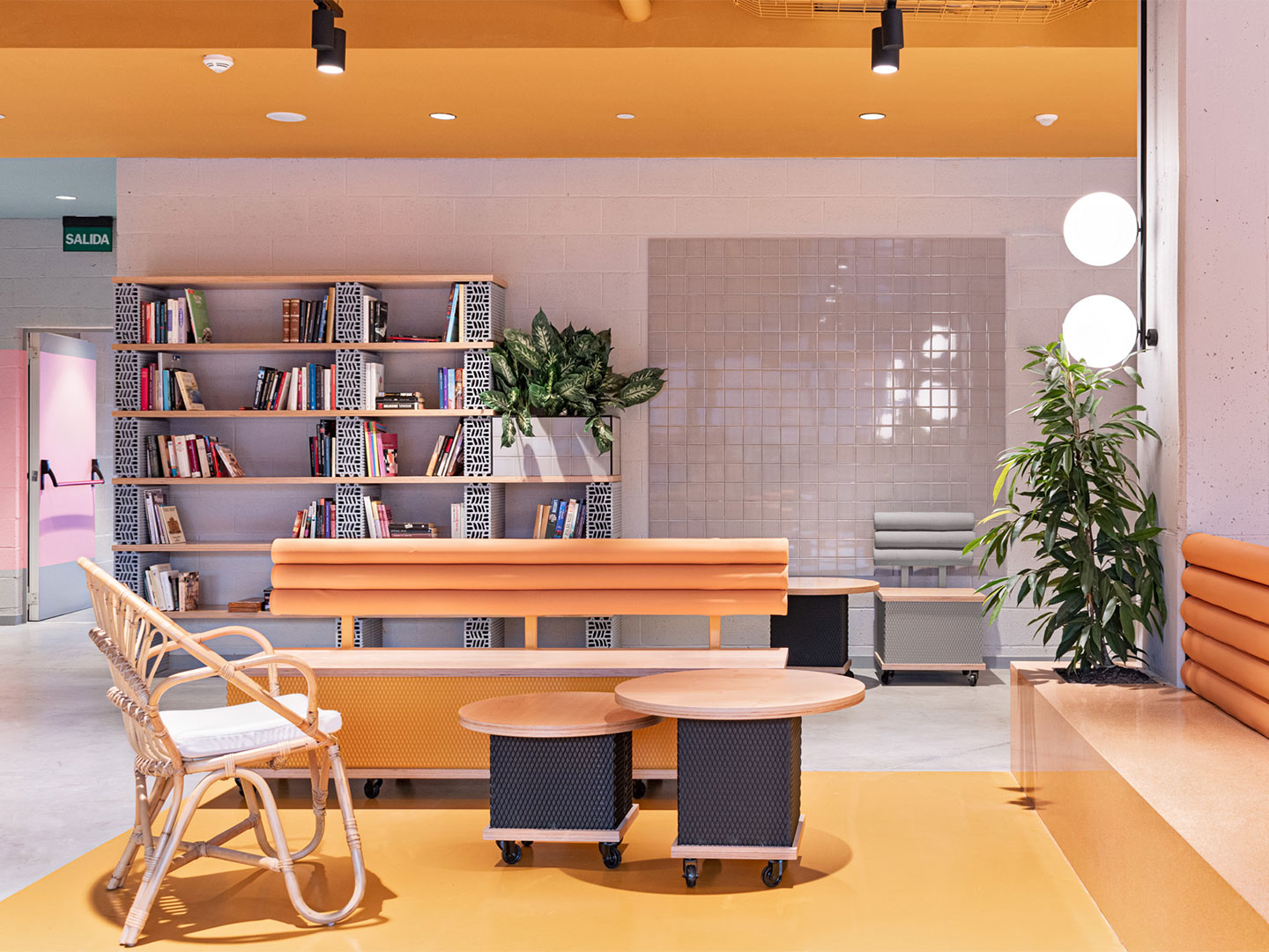
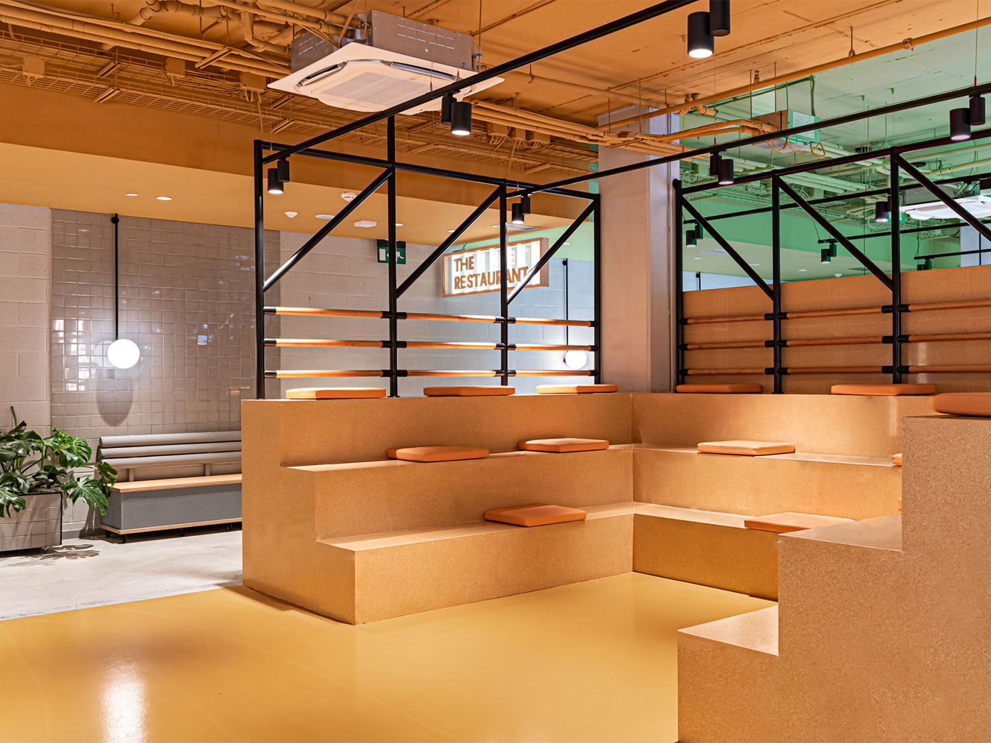
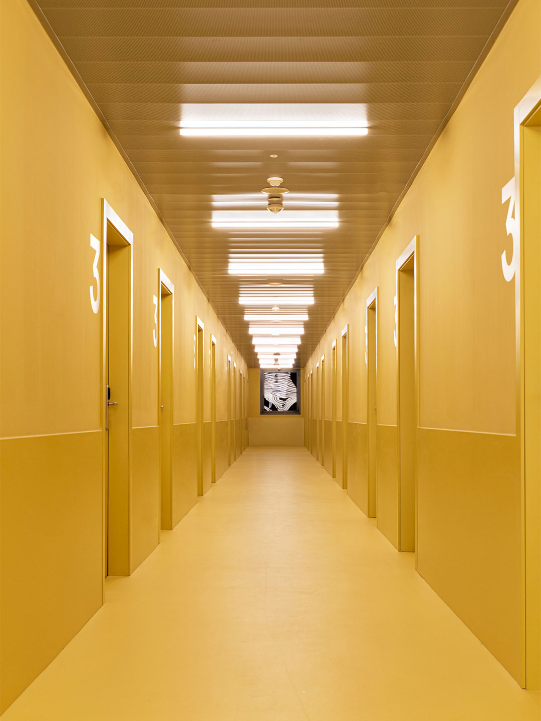
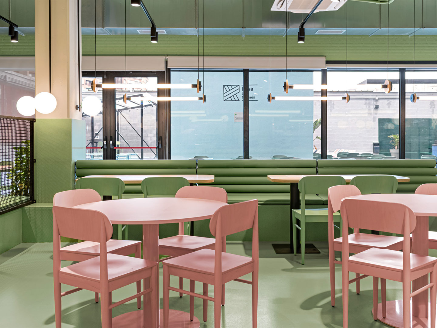
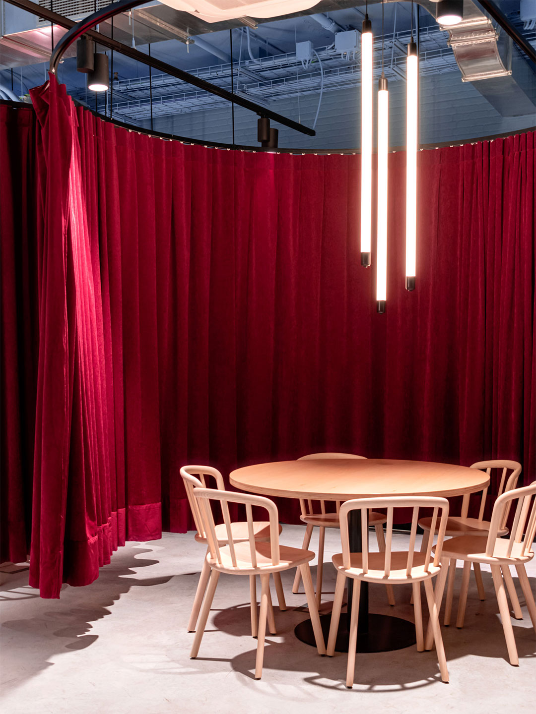
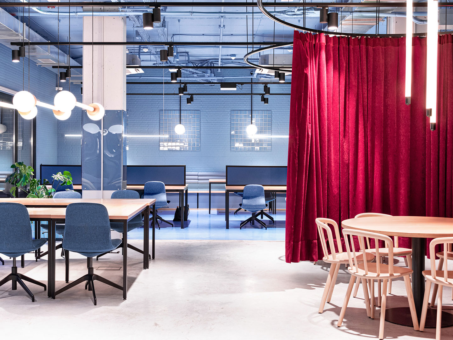
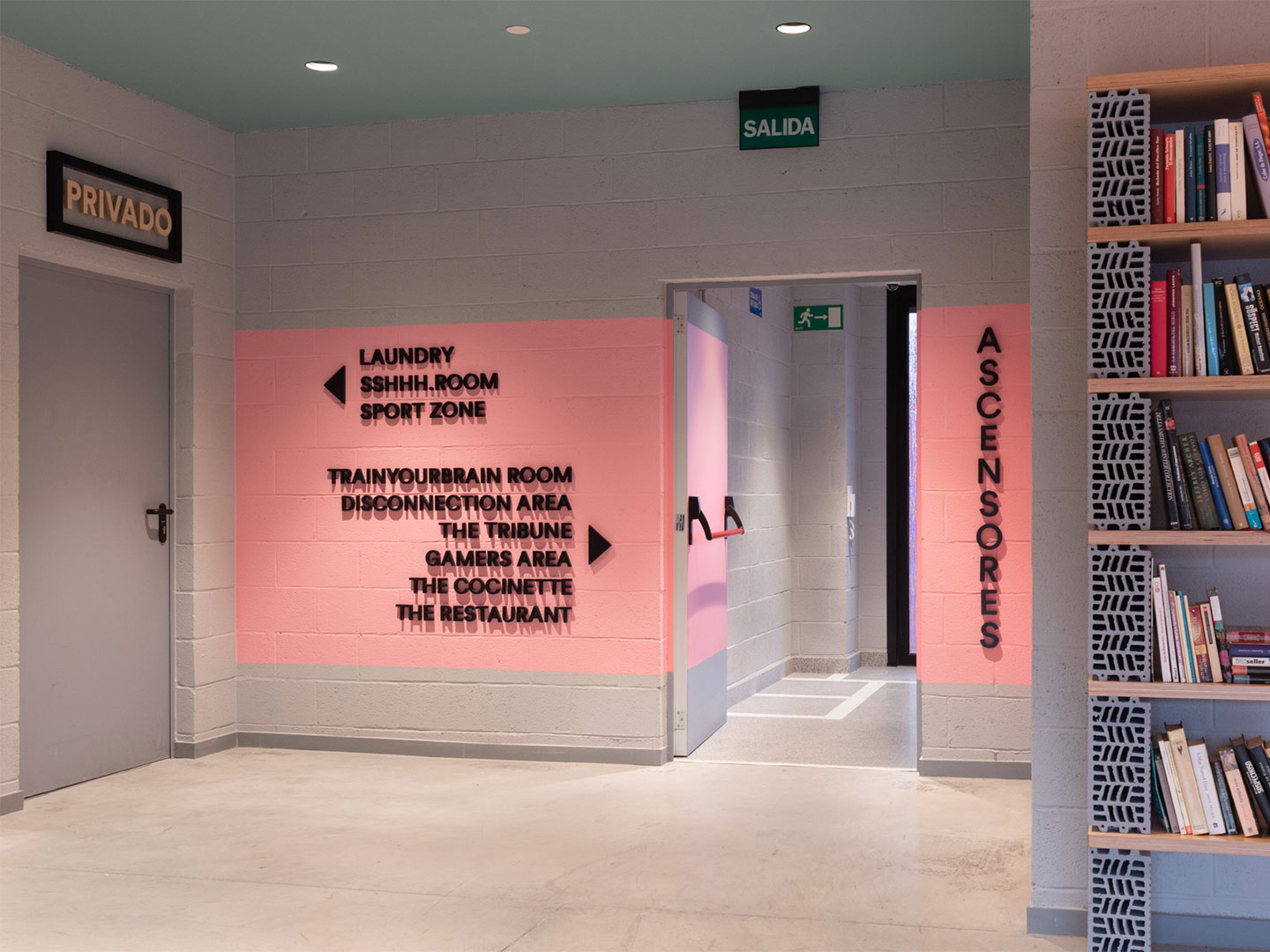
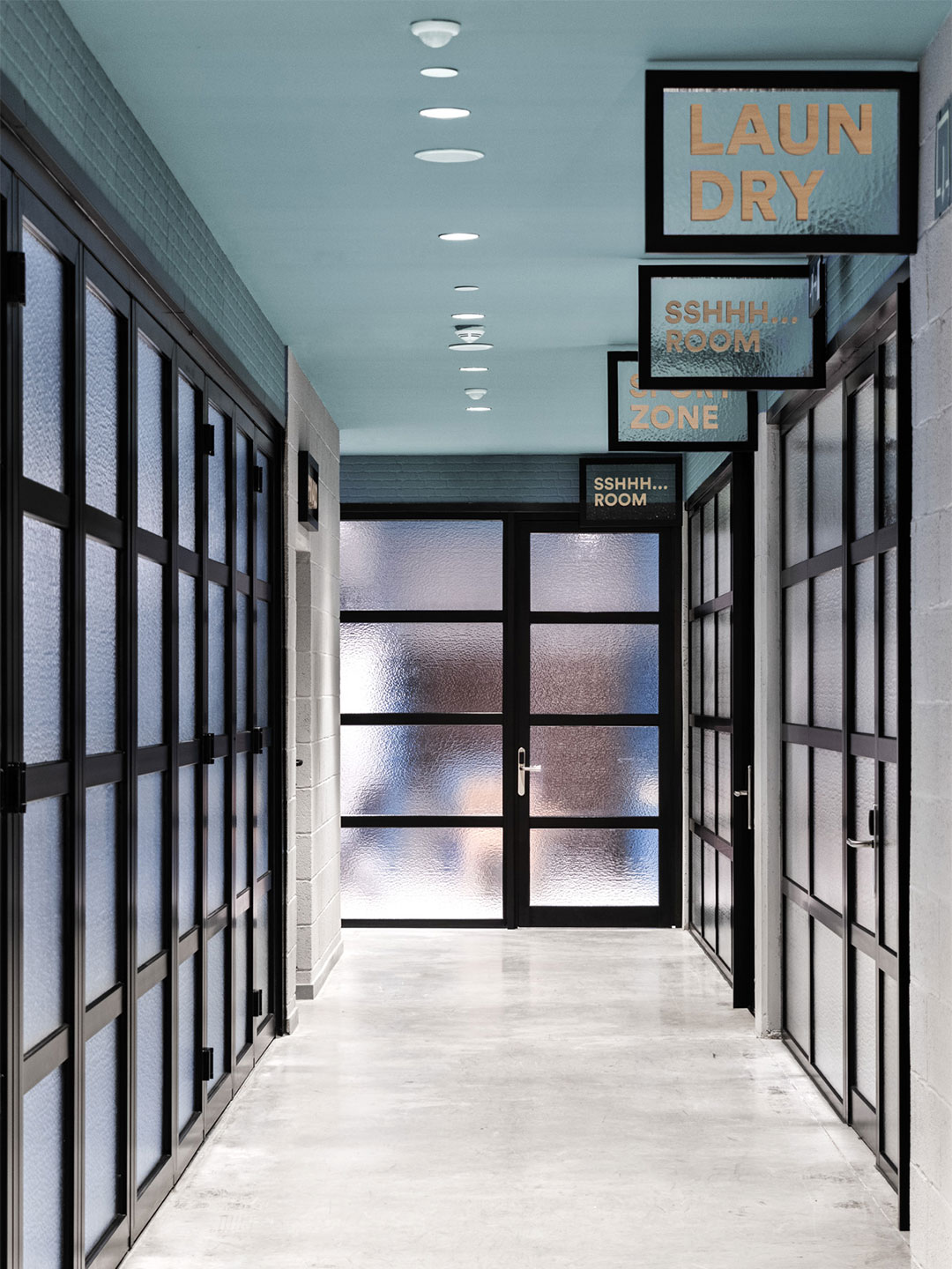
As such, a “diaphanous layout” was devised to accommodate the mix of study, social and relaxation spaces, creating connection between the different areas and facilitating the desired sense of community. The versatile floor plan is also conducive to impromptu change. “Some zones like the study rooms include flexible glass walls that can be closed to maintain the room in silence or organise events unrelated to the other spaces in any given moment,” says the designer.
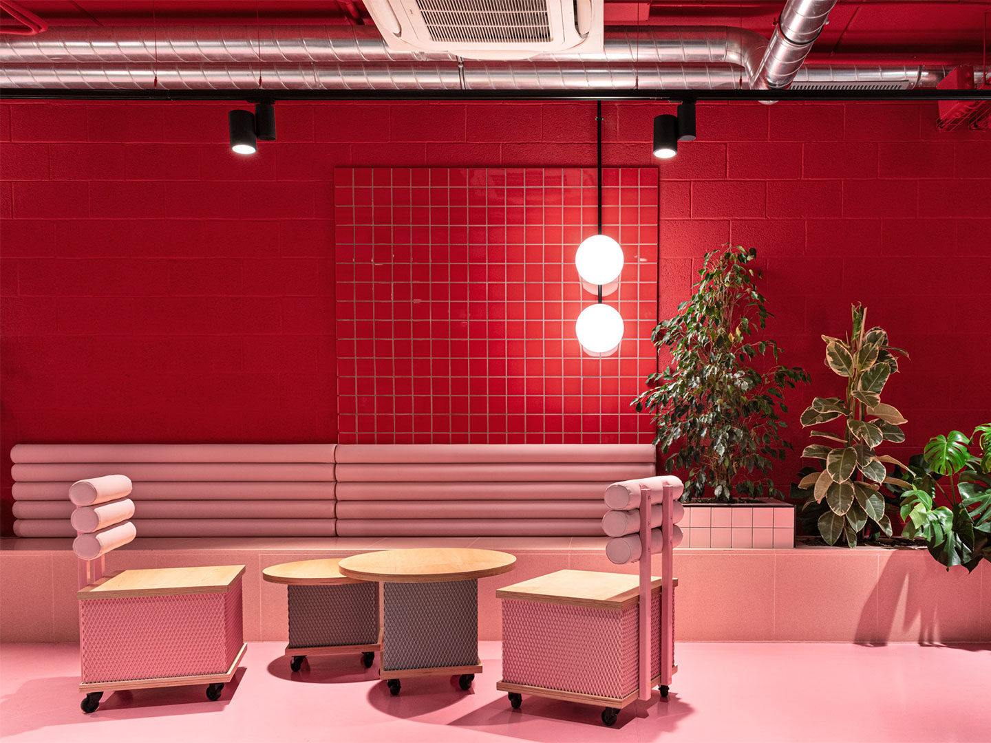
The project began with a clear direction from the client to search for creative solutions that would fit within a limited budget. For this reason, Masquespacio became involved at the early construction phase, selecting humble materials, such as brick and concrete, in an effort to avoid the installation of unnecessary additional finishes.
Further, the decision was made to express all of the pipes and overhead services as visible gestures. This approach contributes to the project’s contemporary yet industrial appearance, altogether finessed with the design studio’s deft use of high-octane colour. “Using the technique of colour blocking we obtained a strong visual impact for the space,” says Ana Hernández, creative director at Masquespacio. “At the same time we created a clear distinction between each zone.” The result is vivid and joyful, establishing Resa San Mamés as a welcoming home away from home for its studious residents.
For more residential design projects and the latest in design trends, subscribe to Daily Architecture News today.
Using the technique of colour blocking we obtained a strong visual impact for the space.