fbpx DAN | Daily Architecture News Under the sea: Discover a cave-like jewellery store in Melbourne's upmarket Armadale - DAN | Daily Architecture News
Under the sea: Discover a cave-like jewellery store in Melbourne’s upmarket Armadale

Under the sea: Discover a cave-like jewellery store in Melbourne’s upmarket Armadale

Interior Design
Retail Design
08-02-2021
WATCH: Highlights from the world of architecture and design.

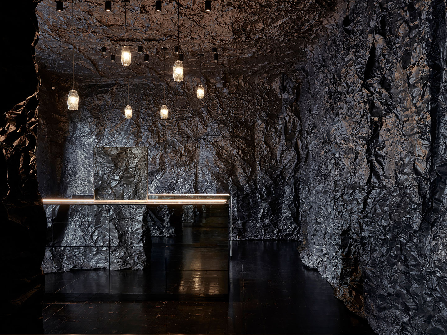
Vast, mysterious and unfathomably deep, the world’s oceans are at the heart of the new boutique for jewellery brand Sarah & Sebastian, located in Melbourne’s upmarket Armadale. But expel any visions of a twinkling Tiffany store or crystal-cut Cartier shopfront. This eerie cave of wondrous delights is sooner compared to Davy Jones’ Locker or Ursula’s lair over any glitz-and-glam engagement ring dispensary.

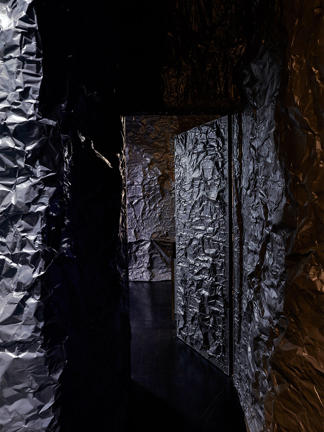
Designed by local Australian architecture firm Russell & George, the captivating fit-out was inspired by an underwater cave that Sarah Gittoes, creative director at Sarah & Sebastian, experienced while travelling. The architects also referenced a quote from Japanese manga creator Naoshi Arakawa: “Even in the depths of the darkest oceans, some light always pierces through”.

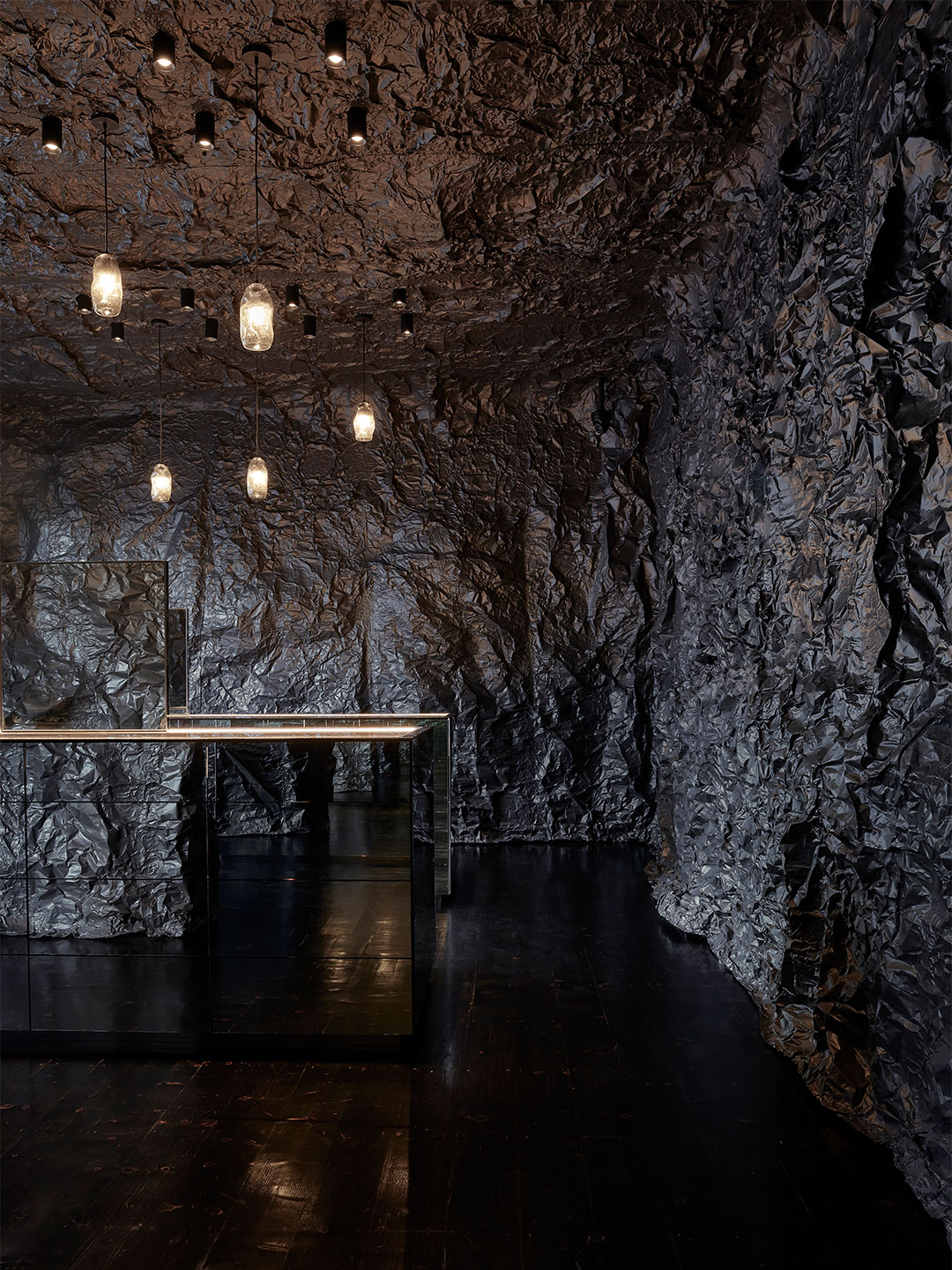
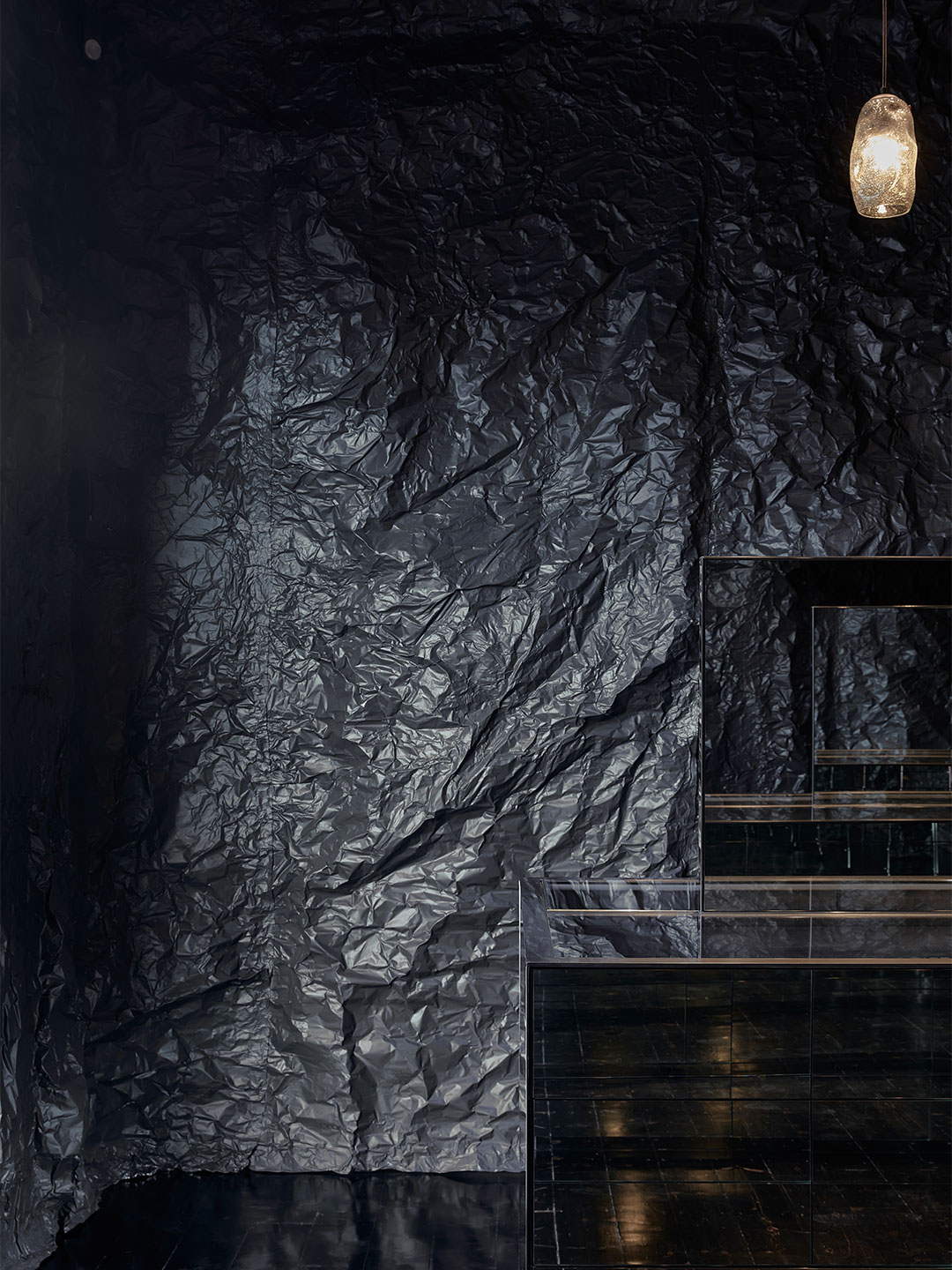
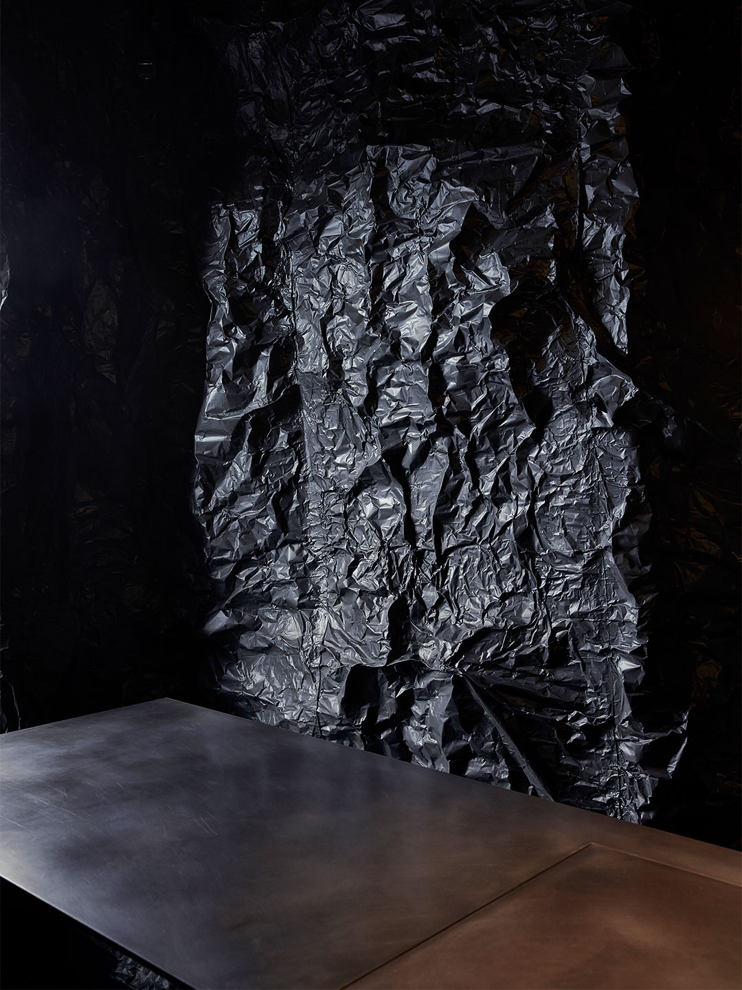
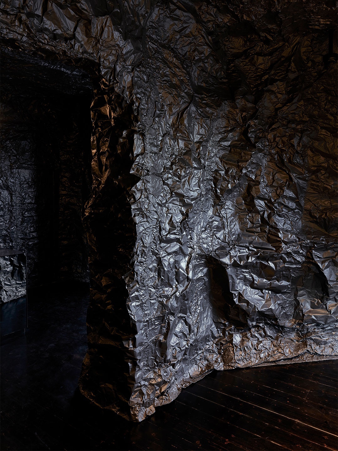
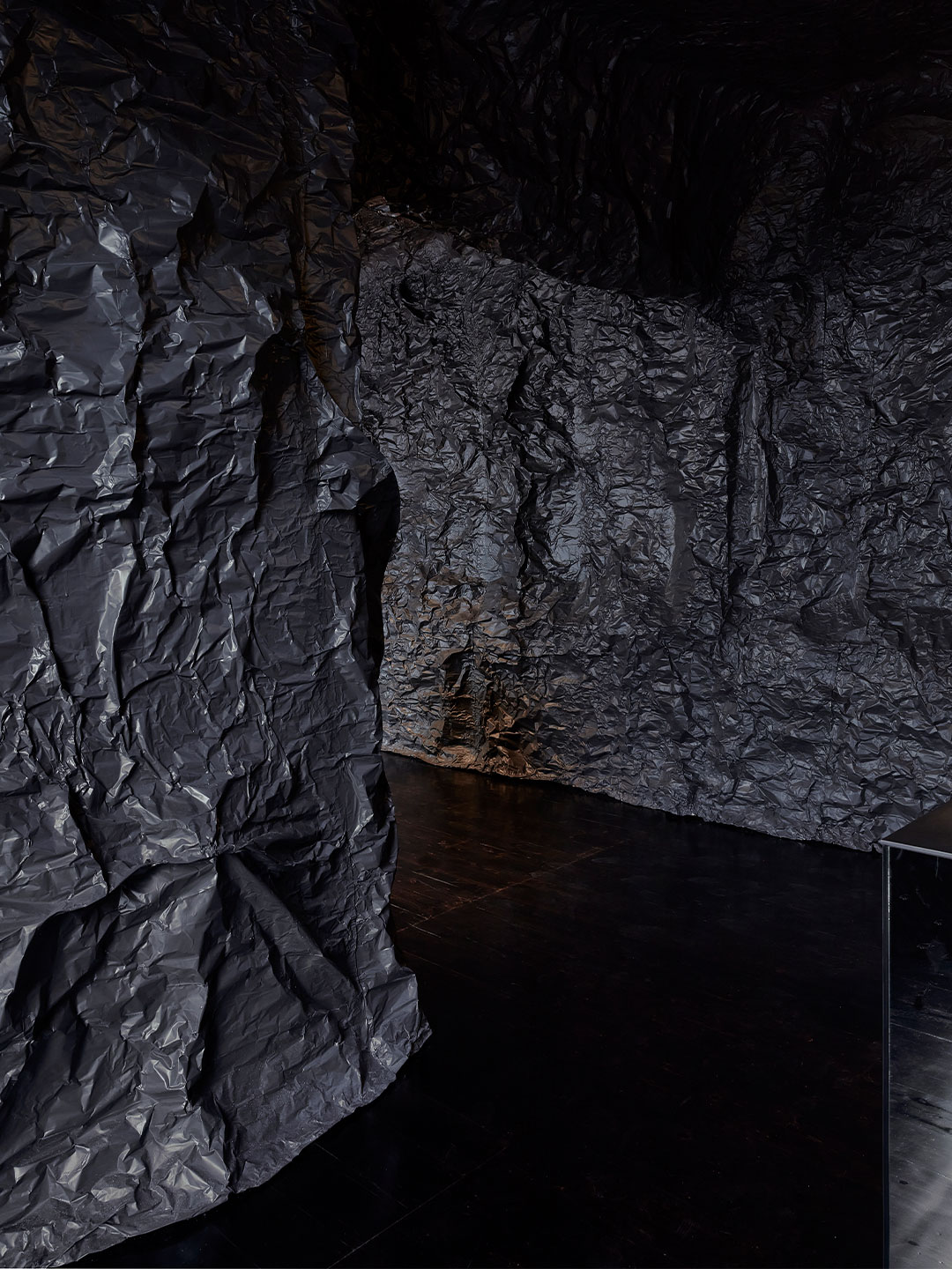
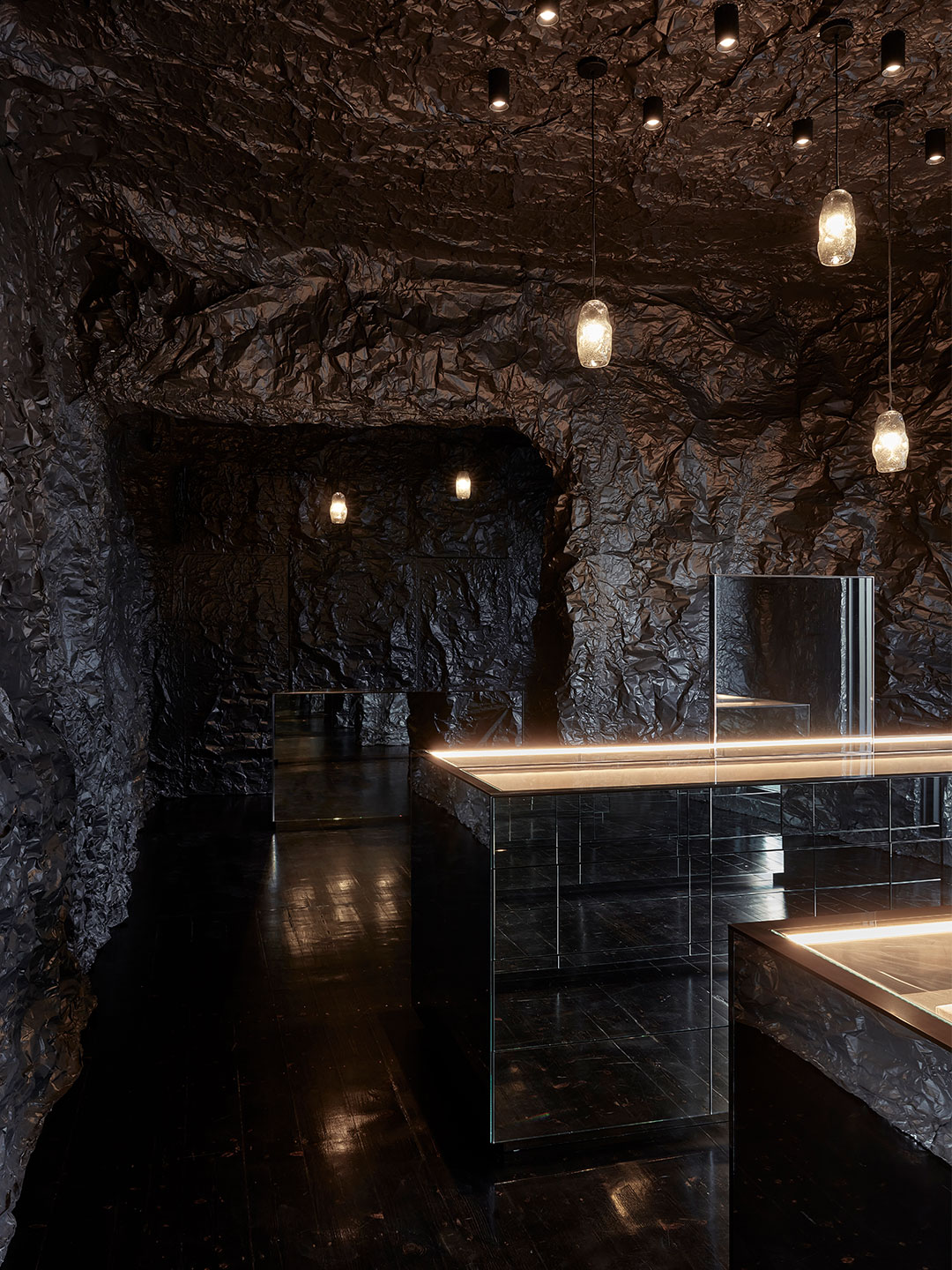
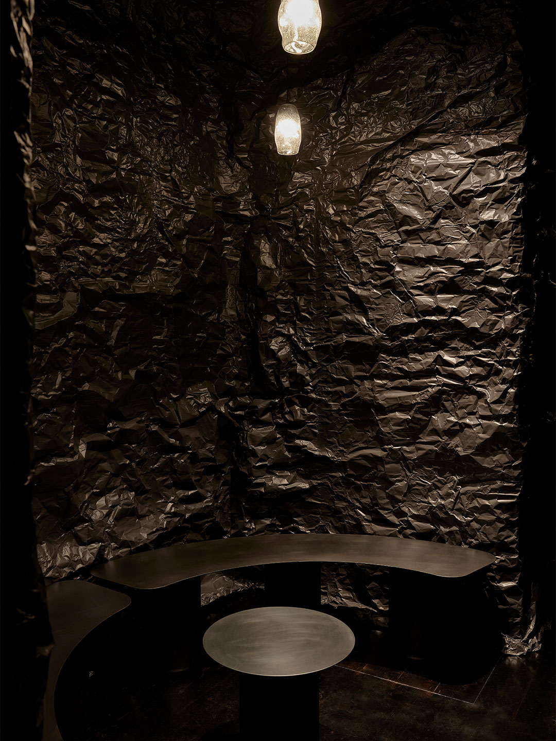
Naoshi’s words were brought to life by Russell & George through a complex palette of all-black materials, where subtle shifts in sheen and intensity of pigment represent the mostly unexplored world beneath the waves. 

Sarah & Sebastian by Russell & George

Sarah & Sebastian Melbourne by Russell & George

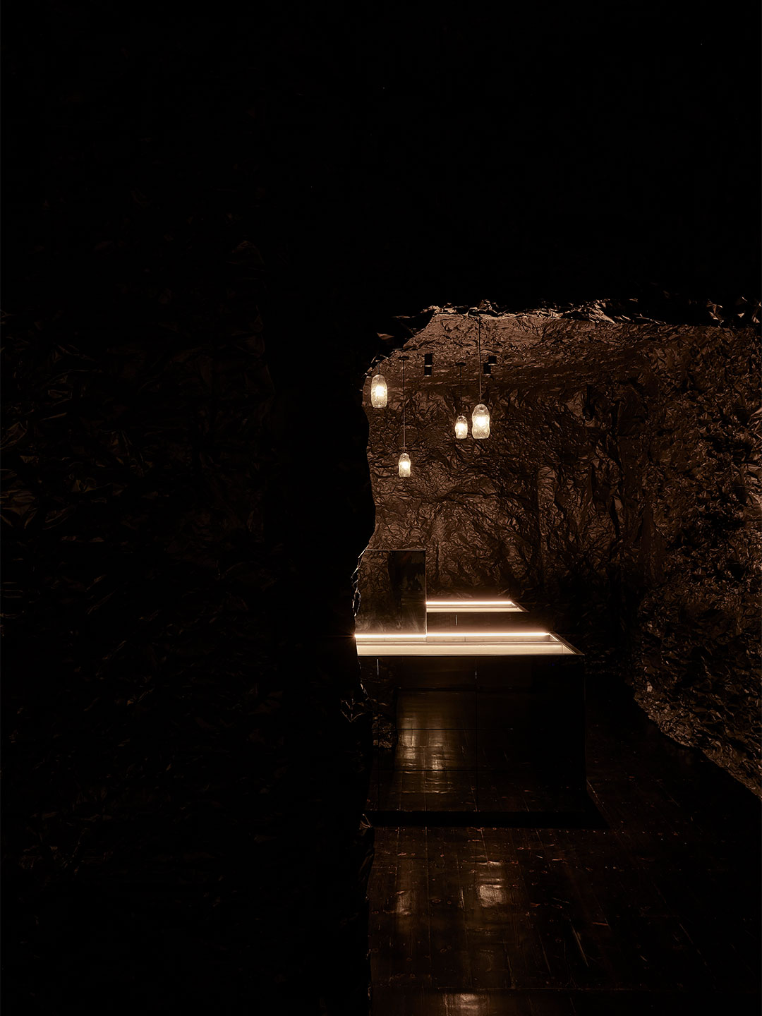
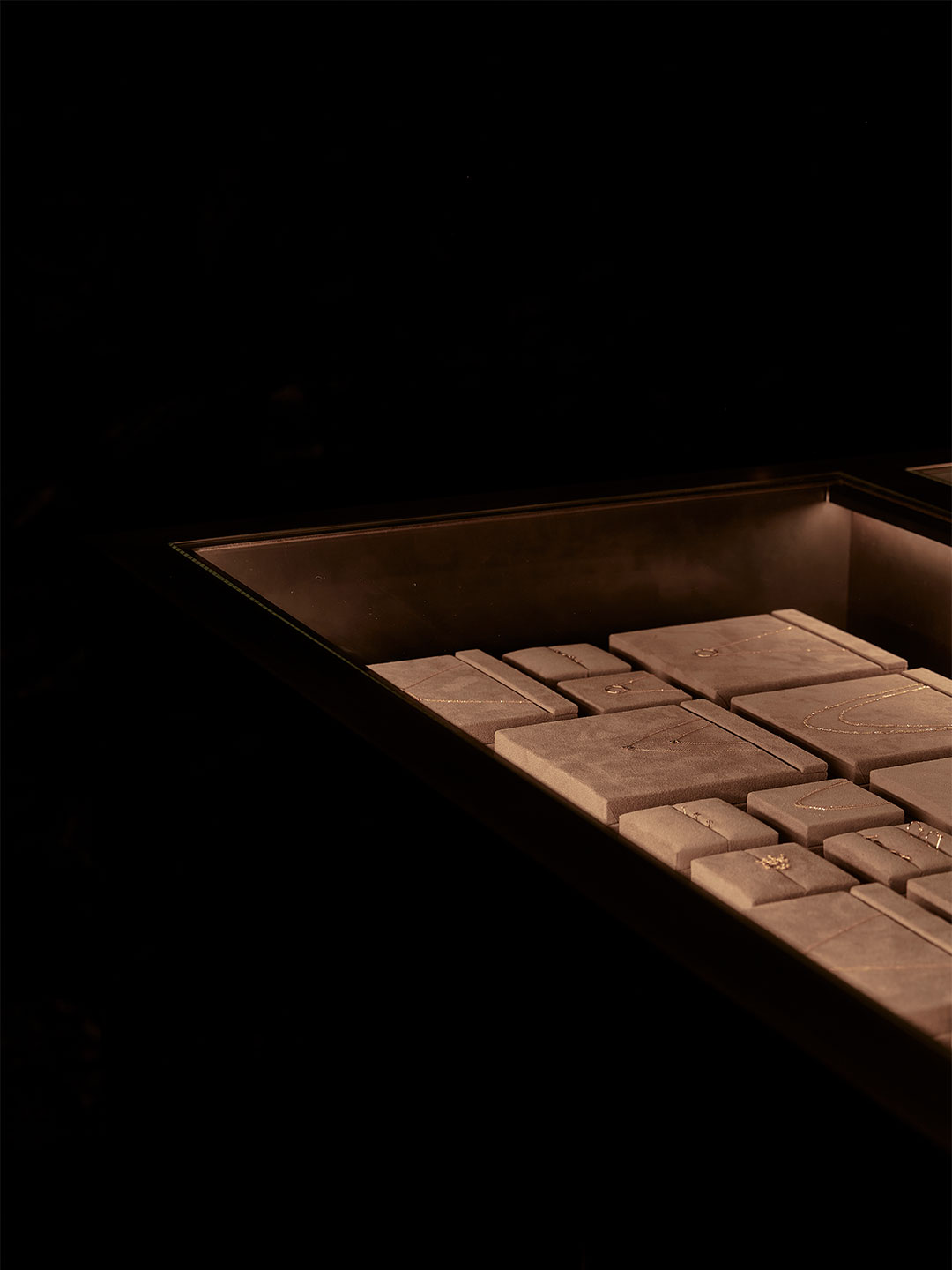
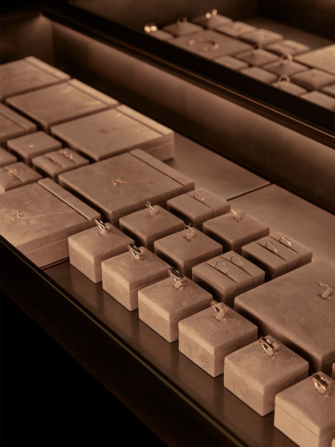
The piercing light that Naoshi speaks of is expressed by streams of targeted rays from overhead spotlights. Captured by the gleaming jewellery and mirrored surfaces, the light is brought to the fore with an intensity that’s all the more amplified by the numbing surrounds. “The store design creates a moody, immersive and playful experience where light can be focussed on even the smallest of elements,” says the design team, led by practice directors Ryan Russell and Byron George.

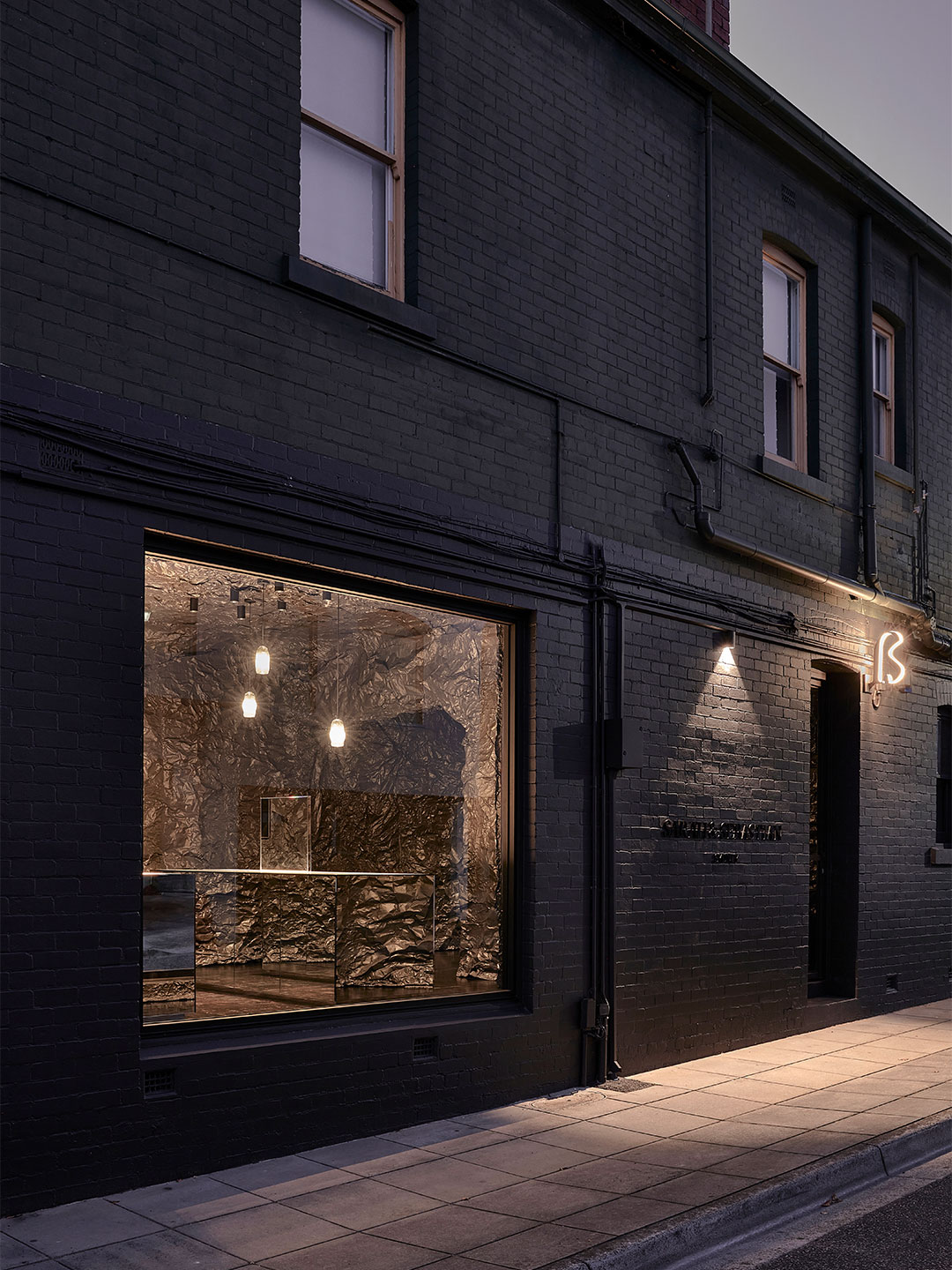
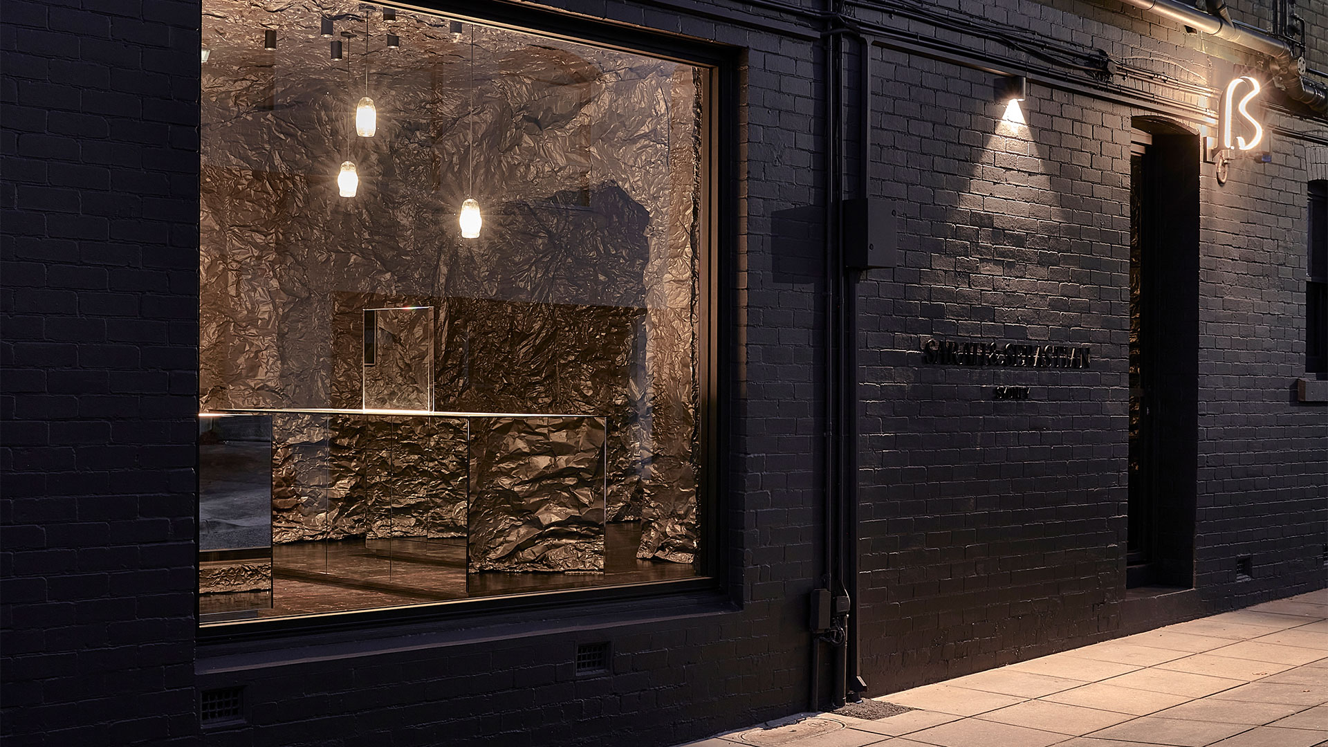
Enveloped by a “cave-like landscape installation” made from crinkled sheets of aluminium, three mirror-lined joinery pieces are arranged in the blackness, each housing jewellery alongside essential point-of-sale components. The timber floor is coated in satin-finish Black Japan, adding another layer of depth to the spatial composition, while a hidden consultation room that is reserved for private conversations and commissions completes the organisation of the small footprint.

Sarah & Sebastian by Russell & George

Overhead, hand-blown glass pendants that resemble bio-luminescent creatures bobbing in the deep are fitted with colour-changing bulbs. These luminaires emit uplifting effects when the store is closed, amplifying its connection with the ocean through a carnival of coral reef-inspired light.

“The store is considered as an urban gesture and an artwork, giving back to the street and the city of Melbourne,” says the architects. “It is a retail space that is designed to prompt a sense of discovery, and through its use of biophilic design principles gently reminds the customer of larger issues to do with the fragility of our planet.” On that note, it’s worth mentioning that 98% of the store’s fit-out materials can be recycled for use in another life. 

While some onlookers might comment that it’s “so Melbourne” to unveil a hole-in-the-wall jewellery store – swathed in black, loaded with grungy appeal and accessed via a discrete side lane – Sarah & Sebastian in Armadale is an invigorating redefinition of the jewellery shop as we know it. Skillfully manufactured by its architects Russell & George, the abyss-like burrow delivers an experience worthy of abandoning the online cart, reminding style-savvy shoppers to rediscover the allure and lasting impressions that thoughtfully designed bricks-and-mortar storefronts have to offer.

sarahandsebastian.com; russellandgeorge.com

Read about more beautiful boutiques and stellar stores. Plus, subscribe to Daily Architecture News to receive the latest updates straight to your inbox.

Subtle shifts in sheen and intensity of pigment represent the mostly unexplored world beneath the waves.
Daily Architecture News
Sarah & Sebastian by Russell & George
The Melbourne boutique belonging to jewellery brand Sarah & Sebastian was designed by architects Russell & George.

Related stories

Advertisement
Login to join the conversation

Subscriber comments are moderated first. Respect others. Criticise ideas, not people. No offensive language View commenting guidelines

0 Comments
Inline Feedbacks
View all comments
Further Reading
View all in Interior Design
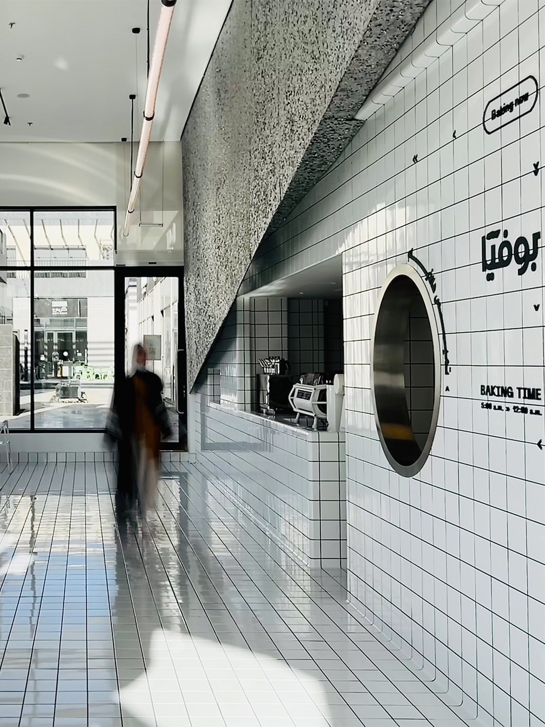
'The Tiled Cloud': Bofia restaurant in Riyadh by Azaz Architects
Located in the centre of Riyadh, the main financial hub and capital city of Saudi Arabia, the Bofia restaurant (also referred to as “The Tiled Cloud”) is tucked within an unassuming standalone structure. Exhibiting simple geometry and straight lines, the building was once described by the restaurant’s architects as feeling rather “ordinary” in the overall […]
Interior Design
01-04-2222
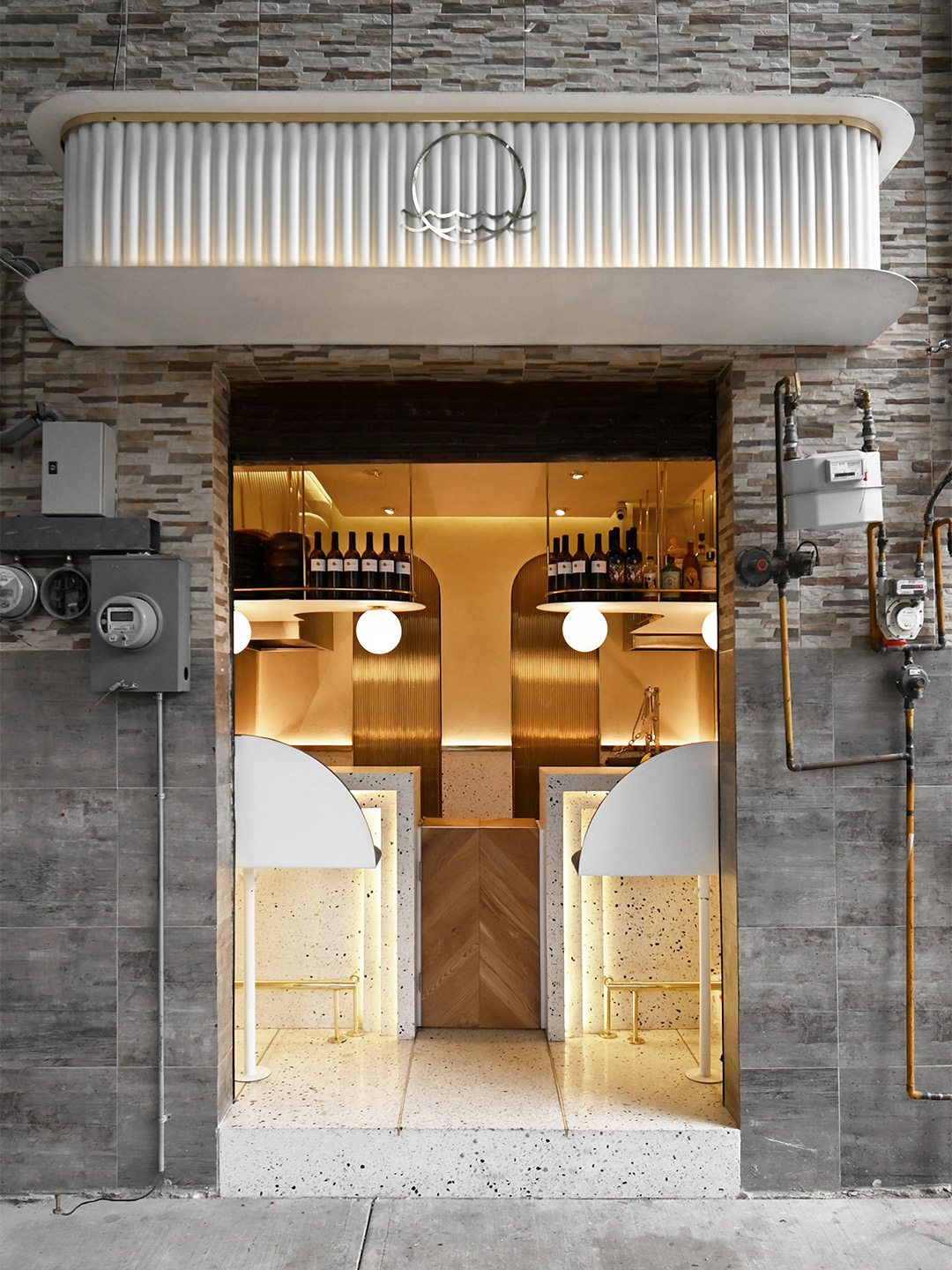
'Tiny diner': Pargot restaurant in Mexico City by RA! Arquitectos
Tucked behind an unassuming roller door, between a messy patchwork of electrical wires and gas metres, the hole-in-the-wall footprint of Pargot doesn’t leave much to the imagination. The dining area is limited to a duo of high bars, each with bench seats, that flare out to accommodate four diners at any one time. Behind the […]
Interior Design
25-03-2222
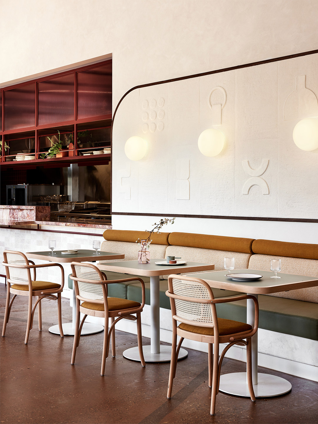
St. Alma restaurant in Freshwater by Five Foot One
When discussing the design for St. Alma, the name given to the new diner, Jack and Tim felt strongly about two key points. They believed “first impressions are everything” – a mantra adopted with the launch of their first restaurant. But they also recognised it was important for St. Alma to “stand her ground” rather than […]
Interior Design
03-03-2222
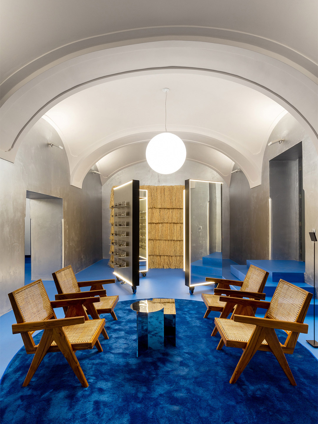
Lunet eyewear store in Romania by Bogdan Ciocodeica Studio
Shimmering silver-lined surfaces and lashings of bold colour were among the gestures that made the cut, ensuring a continuation of Lunet’s retail aesthetic and unconventional approach towards the experience of buying eyeglasses. “The idea was to borrow a few of the elements from the first store in such a manner that it feels like you […]
Interior Design
24-02-2222
Beauty clinic: MBS by Malika in Stockholm, designed by ASKA
The atmosphere within the MBS by Malika clinic is described by the ASKA team as feeling something akin to “modern nostalgia”. They arrived at this thematic title due to the way in which some of the design elements appear recognisable, giving the space “a rigid and trustworthy flavour,” the architects say. Other fragments, however, arrive […]
Interior Design
22-02-2222
The Brick Bond in Delhi flips the script on showroom design
Since tapping local Delhi-based architecture office Renesa to undertake the ambitious project, Jindal’s dream has been realised through what is now known as The Brick Bond. Completed in late 2021, it’s an “experience centre” like no other, where the company’s core product – the humble brick – is placed at the very heart of its visual […]
Interior Design
21-02-2222

Back to Top