In Saudi Arabia, bofia is the name given to the unassuming canteens that dot the country’s roadsides, regularly visited by locals and travellers for quick, authentic and reasonably priced street food. In an attempt by Azaz Architects to find an architectural solution and material identity for a modern-day version of this no-fuss eatery style, the new Bofia restaurant reinterprets the unapologetic, blunt and straightforward nature of street-side dining, presenting equally delicious cuisine within a polished interior space.
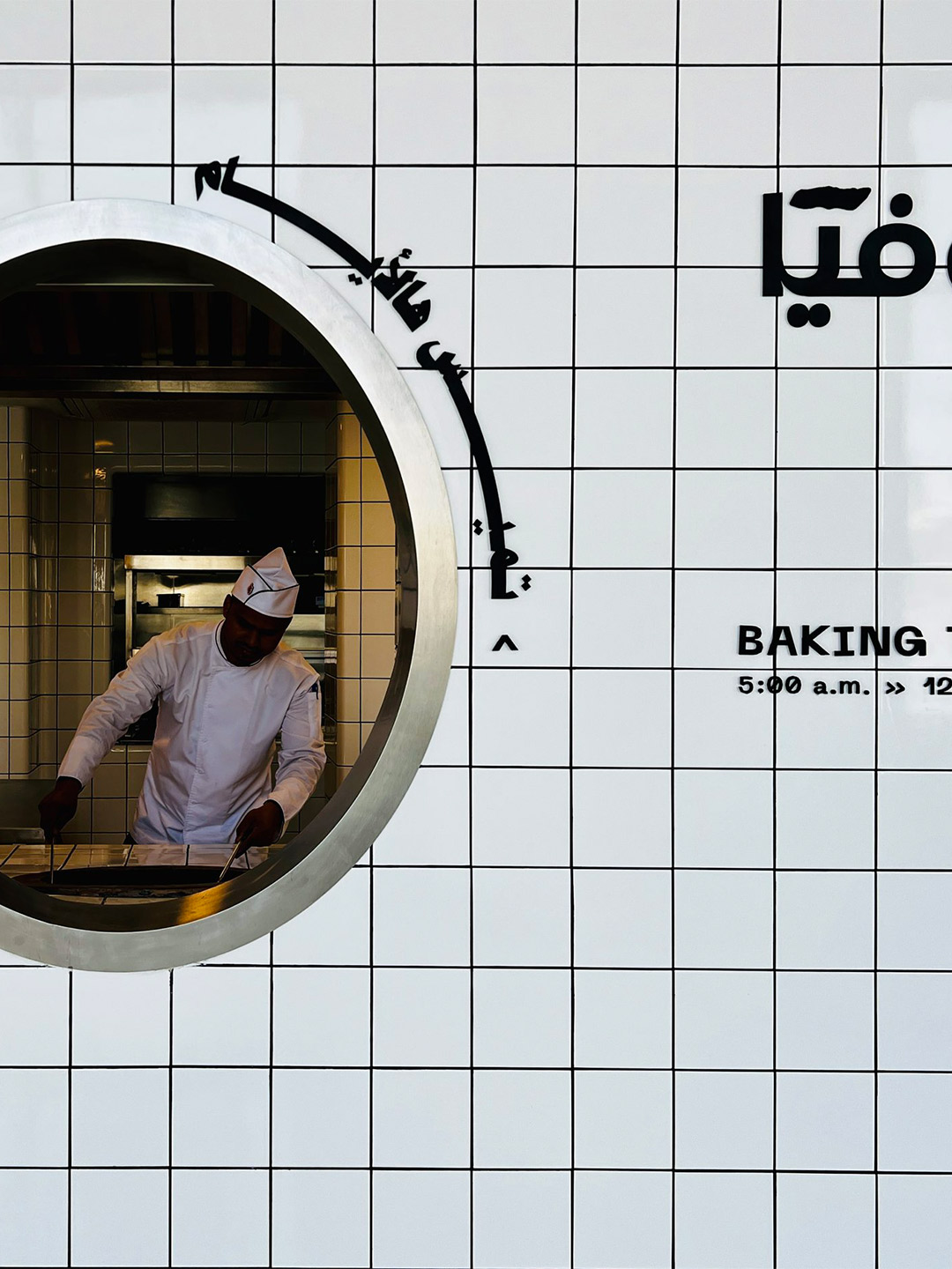
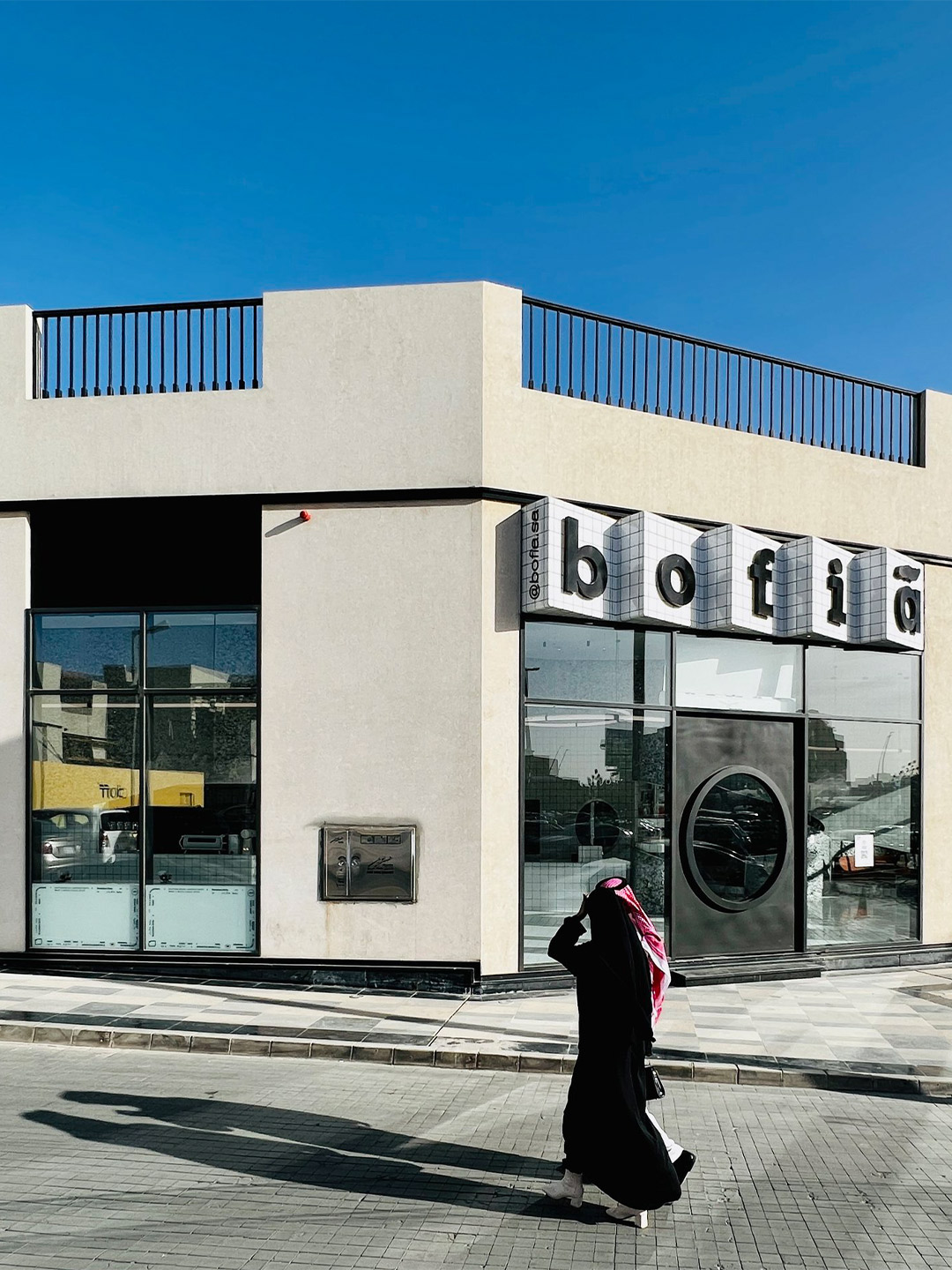
Located in the centre of Riyadh, the main financial hub and capital city of Saudi Arabia, the Bofia restaurant (also referred to as “The Tiled Cloud”) is tucked within an unassuming standalone structure. Exhibiting simple geometry and straight lines, the building was once described by the restaurant’s architects as feeling rather “ordinary” in the overall streetscape. That was, of course, before it was given a tiled marquee emblazoned with the name Bofia, positioned neatly above a new door with a circle-cut peephole framing a very different world.
‘The Tiled Cloud’: Bofia restaurant in Riyadh by Azaz Architects
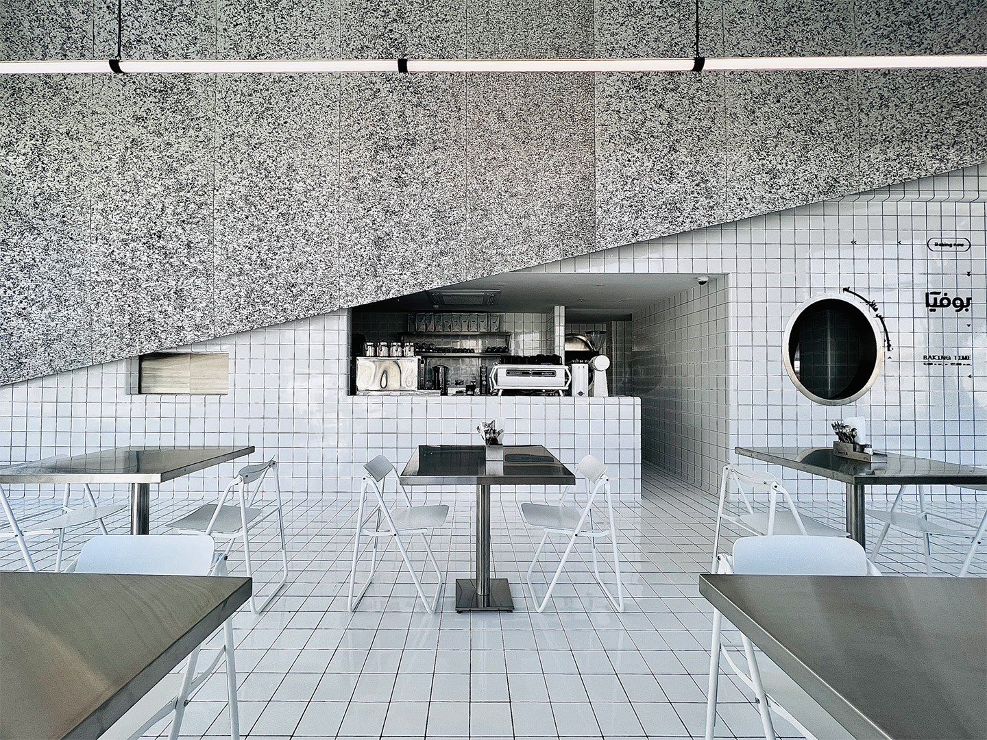
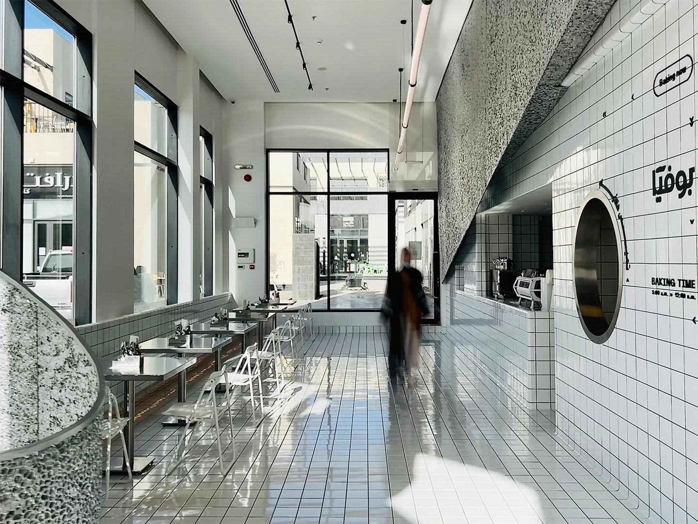
To create contrast from the grey-tinged street, the team at Azaz Architects played with the idea of forming a cloud-like installation inside the building. This approach sparked the restaurant’s nickname, The Tiled Cloud, and allows diners to experience a feeling of surprise and airiness as they enter the restaurant. “The interior mass is imagined as a cloud that floats within the space,” the architects say of their design response. “[It] seamlessly separates and lifts the busy back-of-house from the front-of-house areas.”
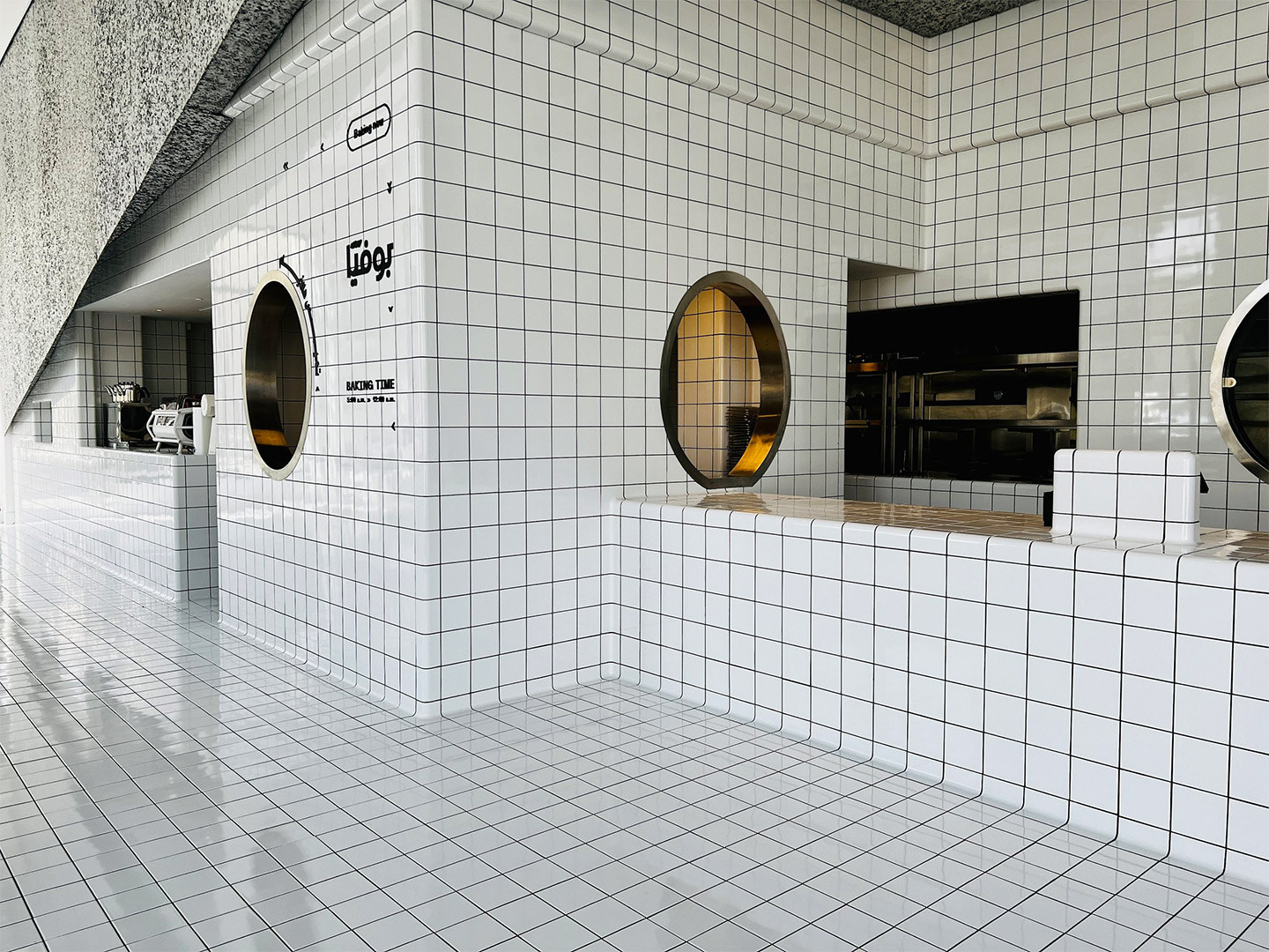
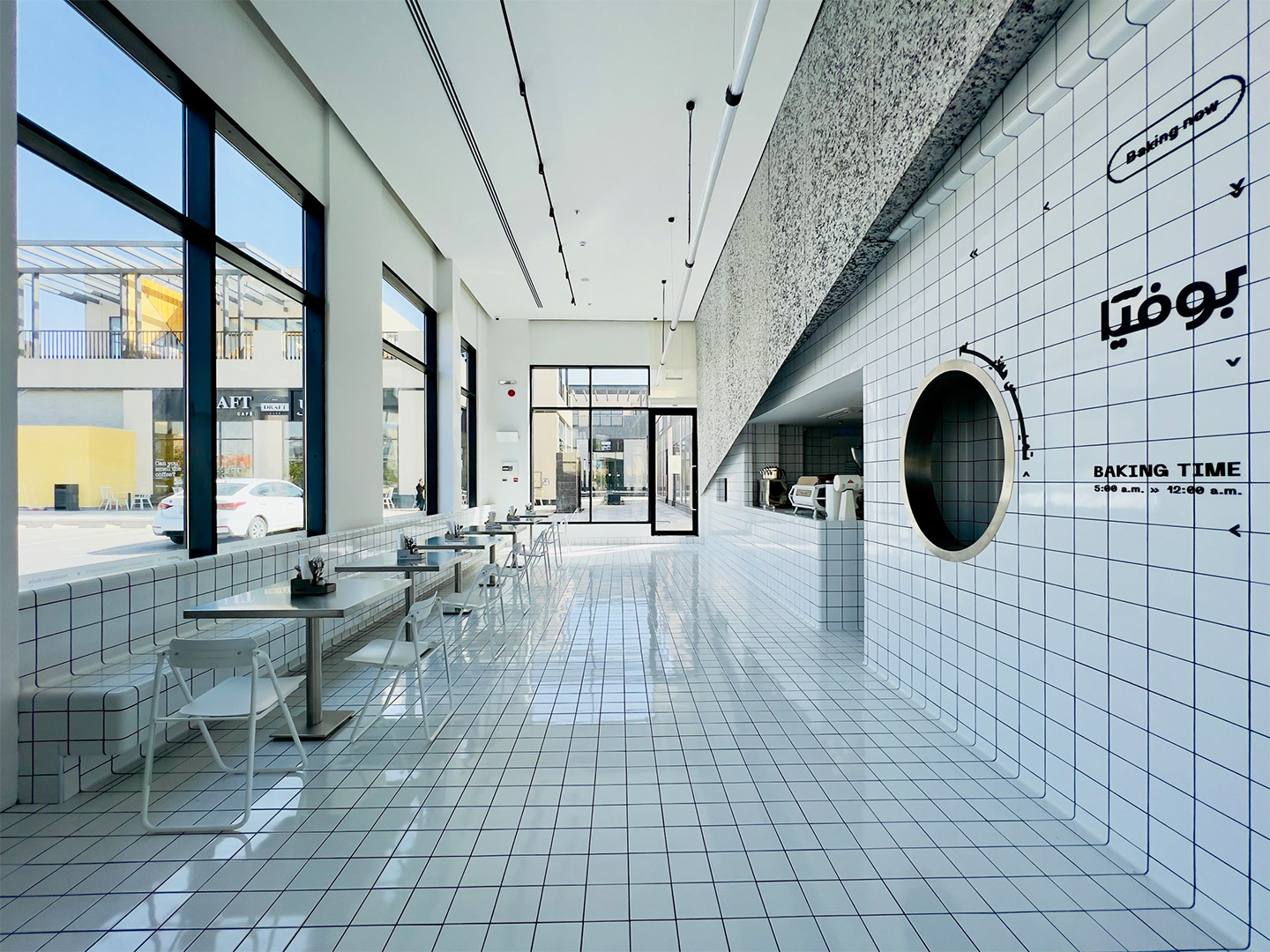
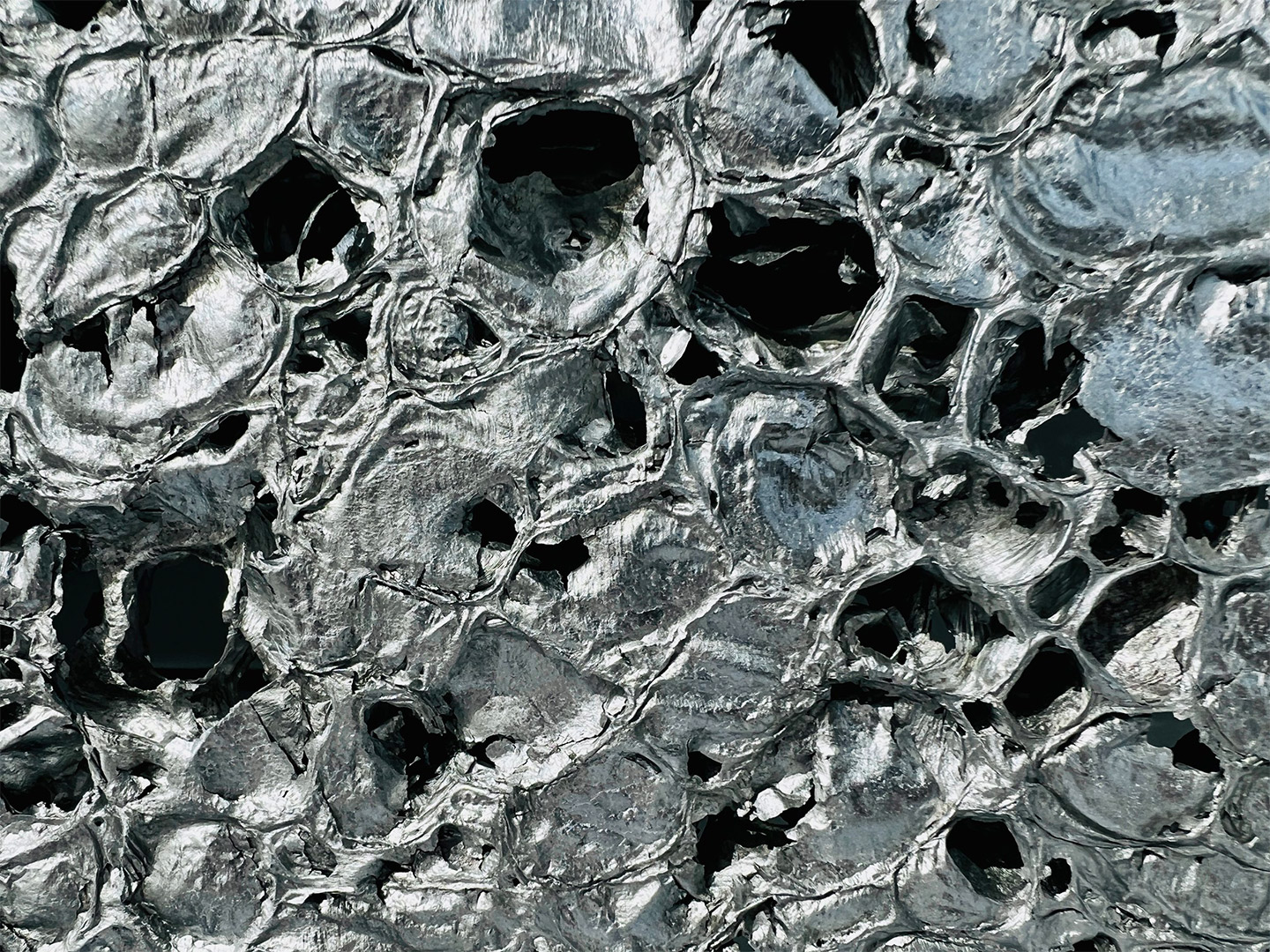
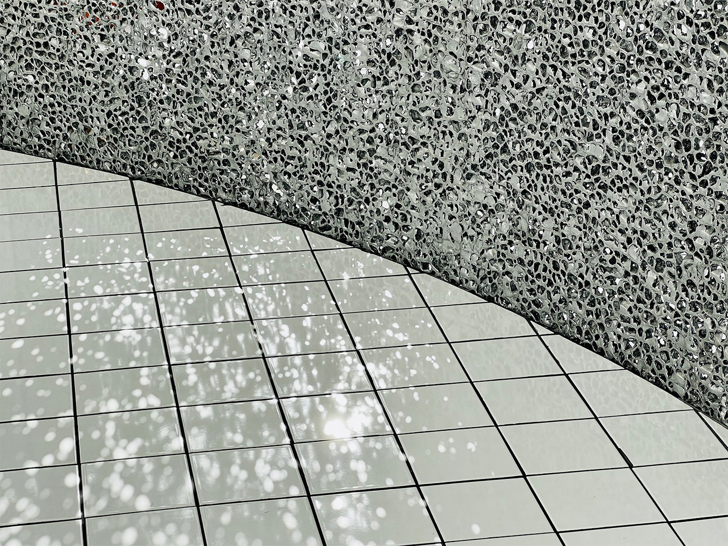
Capped with an angular panel of textured aluminium foam, the interior facade of the “cloud” is clad in crisp white tiles, mostly concealing the kitchen and staff-only spaces. The glossy square-format tiles extend across the floor of the L-shaped public zone, wrapping underneath guests’ feet to form a built-in banquette for dining along one window. Here, carefree steel tables and white folding chairs mimic the traditional set-up of street food outlets.
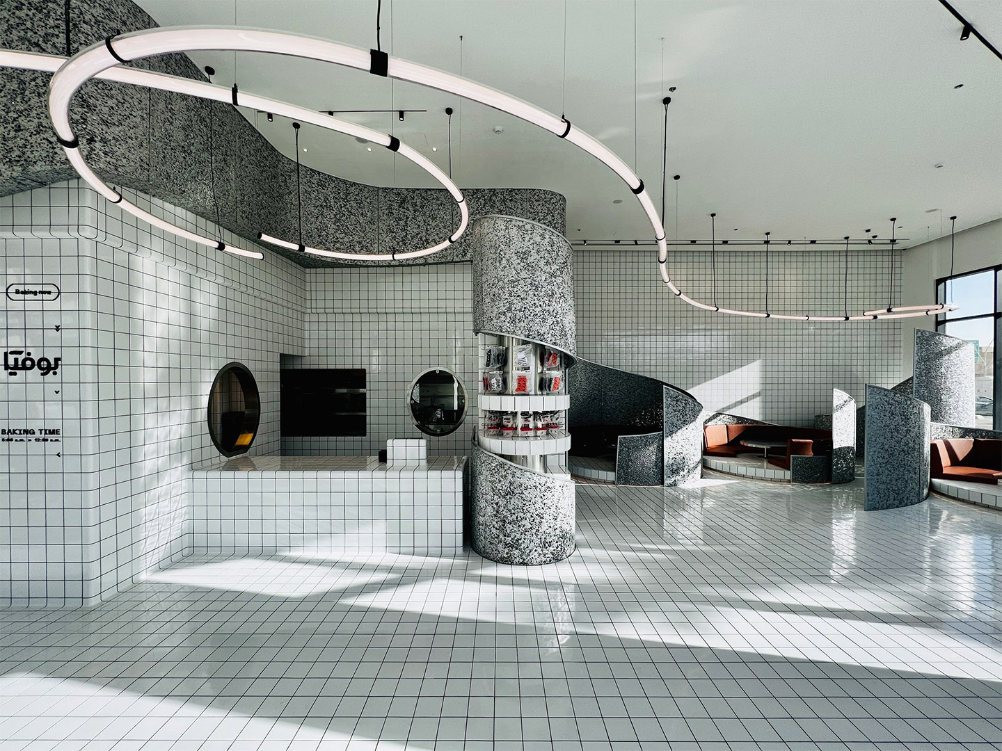
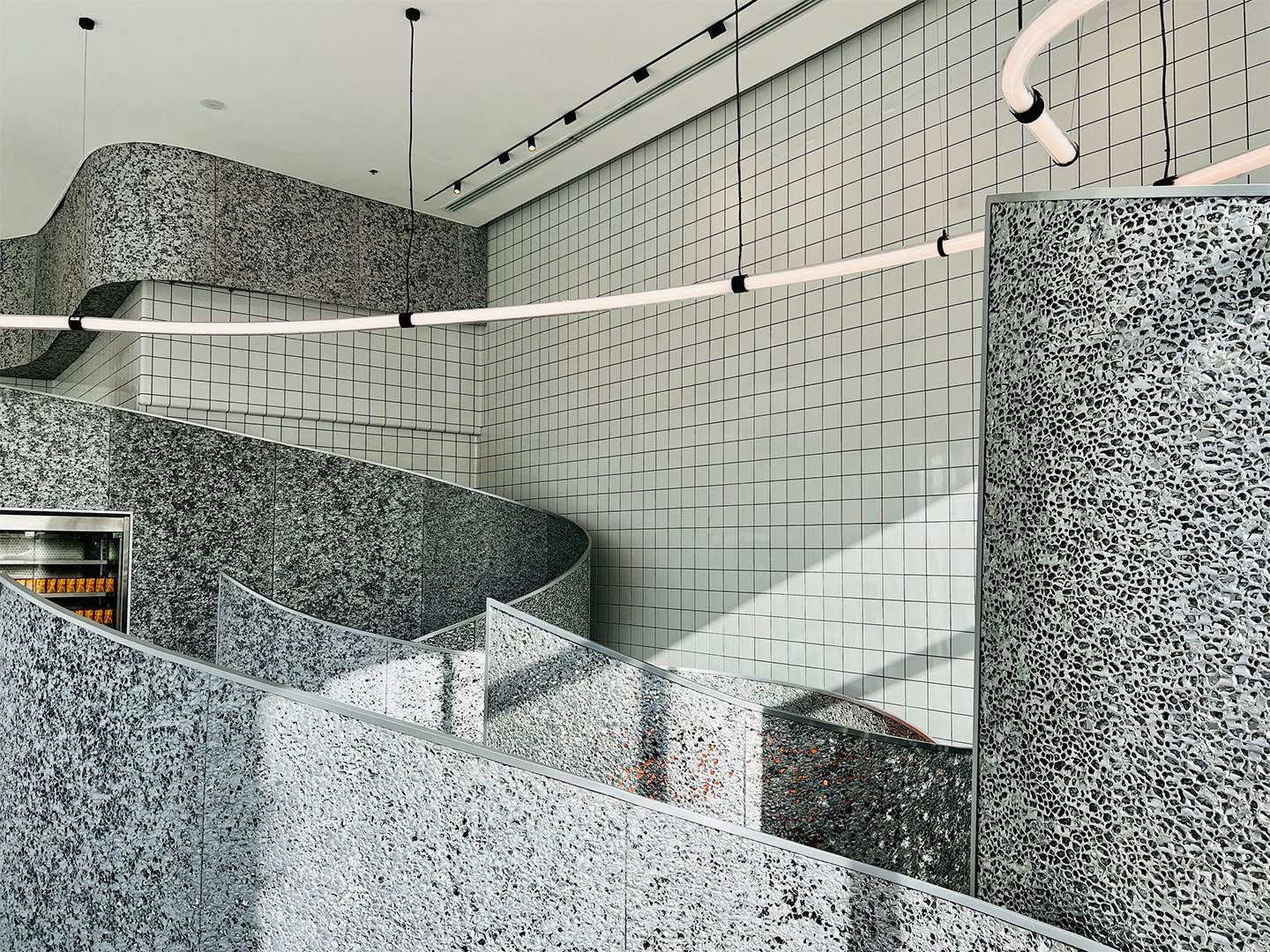
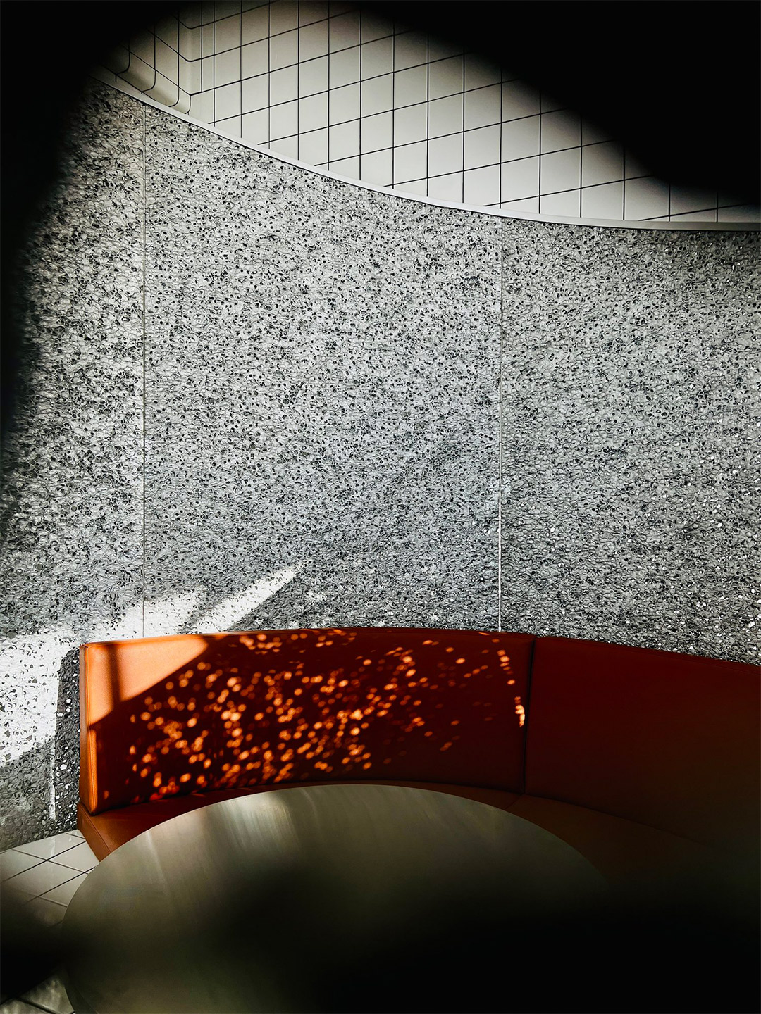
In the other smaller wing of the restaurant, the white tiles make an appearance on raised circular dining platforms, where upholstered bench seats are cocooned by curvy panels filled with the same aluminium foam that embellishes the main counter. These panels provide privacy for anyone dining in the booths. But when it reaches the central column, the foam peels back to reveal circular tiled shelving with retail products on display.
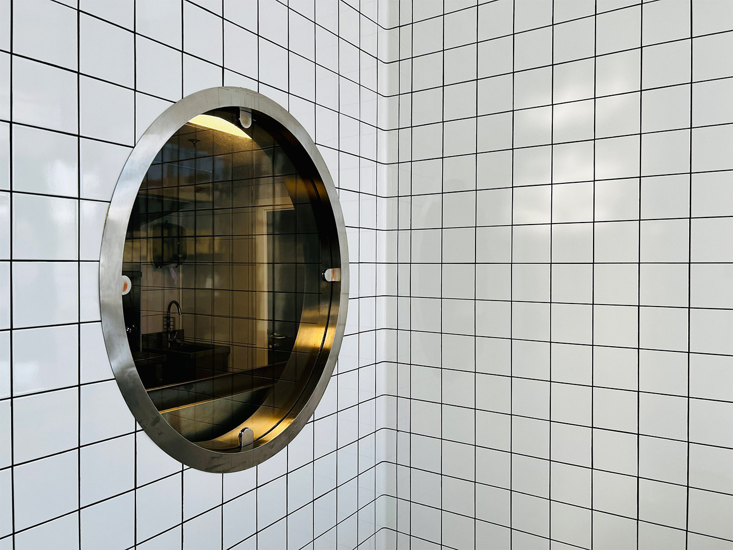
As with the planning of a traditional diner, the public area at Bofia is placed outside the back-of-house zone. It was important to the architects, however, that diners could sit within a close enough distance to the cloud-like facade that allows them to appreciate the architectural geometry on display. From their seats, diners can then also witness the action of the kitchen, observed through small cut-outs and round portholes carved into the tiled walls.
Overhead, the heavenly details continue with the addition of a “strike of light” that propels through the space, like a wobbly bolt of lightning that brings energy to the mostly white interior. Through smart programming the luminaire offers functional performance, as well as different “story-telling potential” during both daytime and nighttime service. “Interestingly, visitor and observer opinions have been evenly split on whether the design is considered minimalist or maximalist,” the Azaz team says. Either way, they suggest, the fit-out is “an architectural fantasy turned into reality”.
Interestingly, visitor and observer opinions have been evenly split on whether the design is considered minimalist or maximalist.
Catch up on more architecture, art and design highlights. Plus, subscribe to receive the Daily Architecture News e-letter direct to your inbox.


