Few creative studios expertly juggle high-octane colour quite like Spanish design practice Masquespacio. The latest project to come from the dynamic designers – an upbeat restaurant in Milan belonging to the Bun burger chain – is testament to such seemingly effortless skill, spearheaded by practice co-founders Christophe Penasse and Ana Hernández.
Surprisingly, the Bun burger restaurant is Masquespacio’s first interior design project in Milan. And it’s one that saw the designers make a return to the Italian fashion and design capital outside of Milan Design Week, where in 2019 they presented an exhibition with Italian terracotta artisan Poggi Ugo, and in 2016 showed their Memphis-inspired Toadstool collection of furniture. The project also marks the design firm’s debut restaurant design for the Bun burger group.
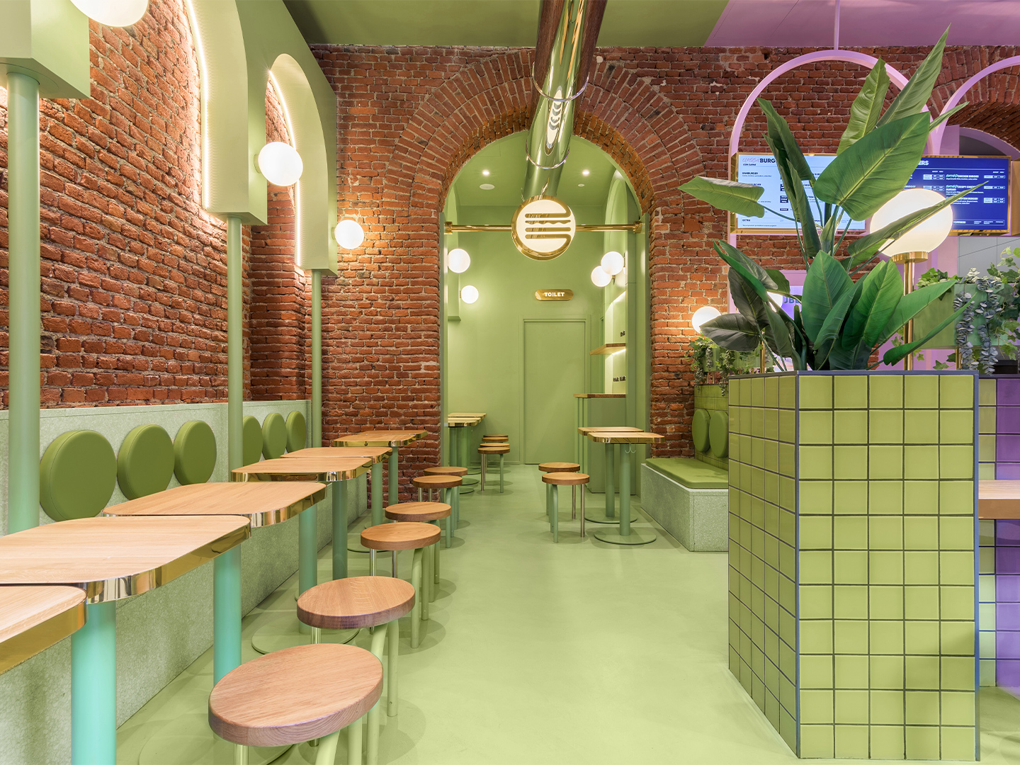
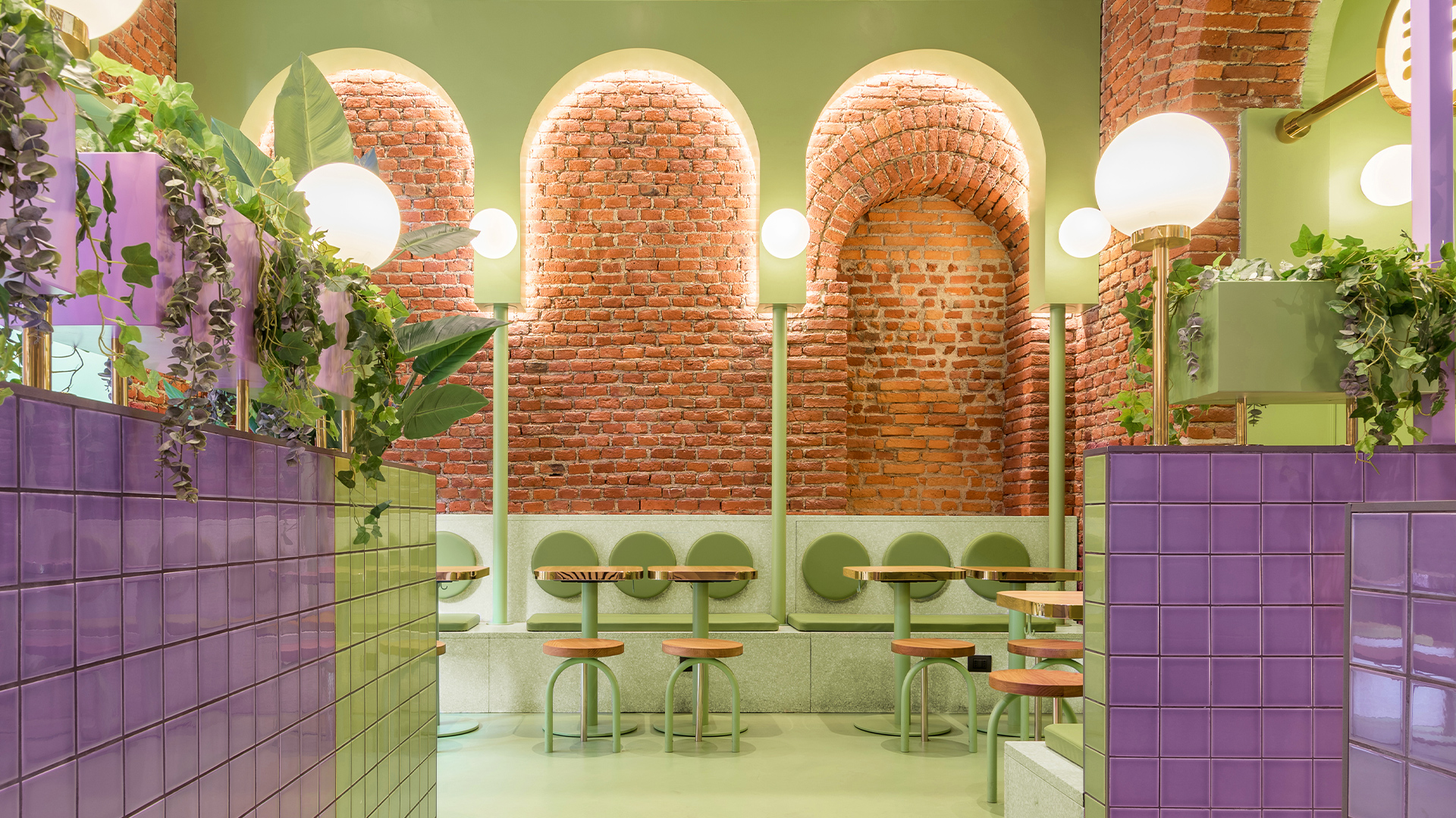
Bun burger restaurant in Milan by Masquespacio
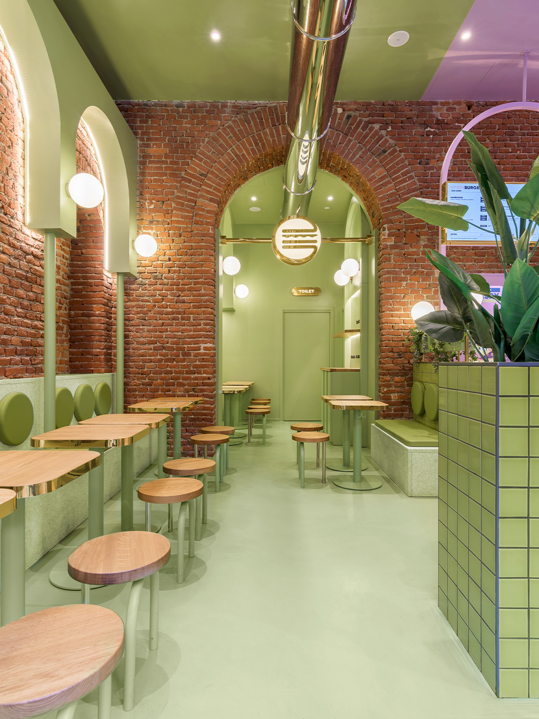
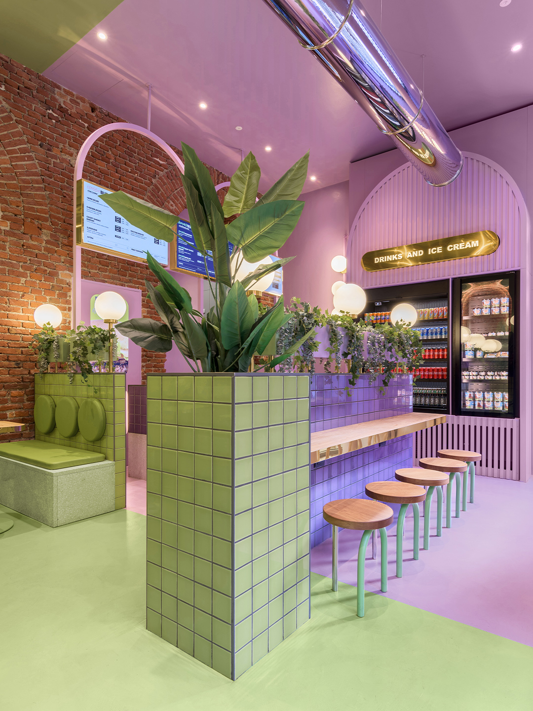
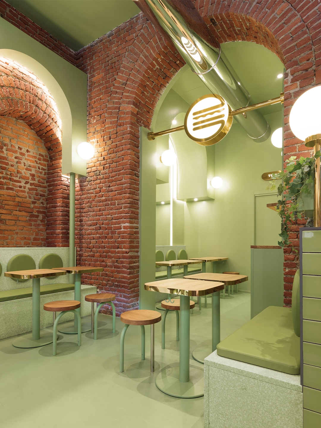
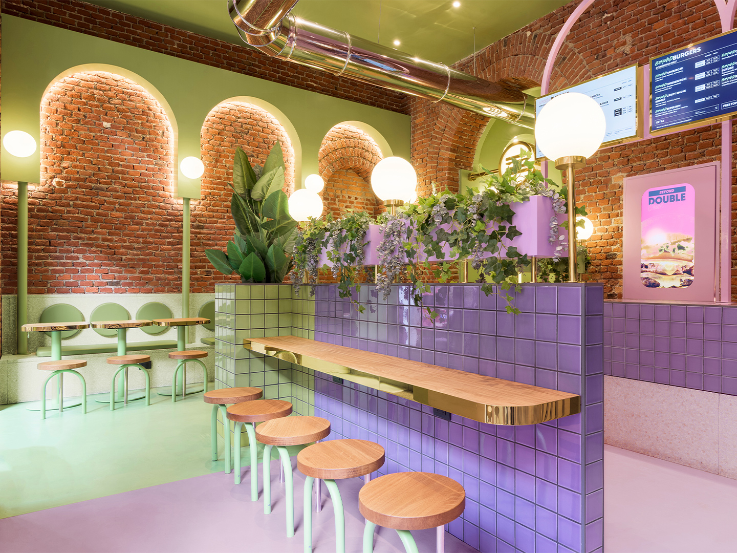
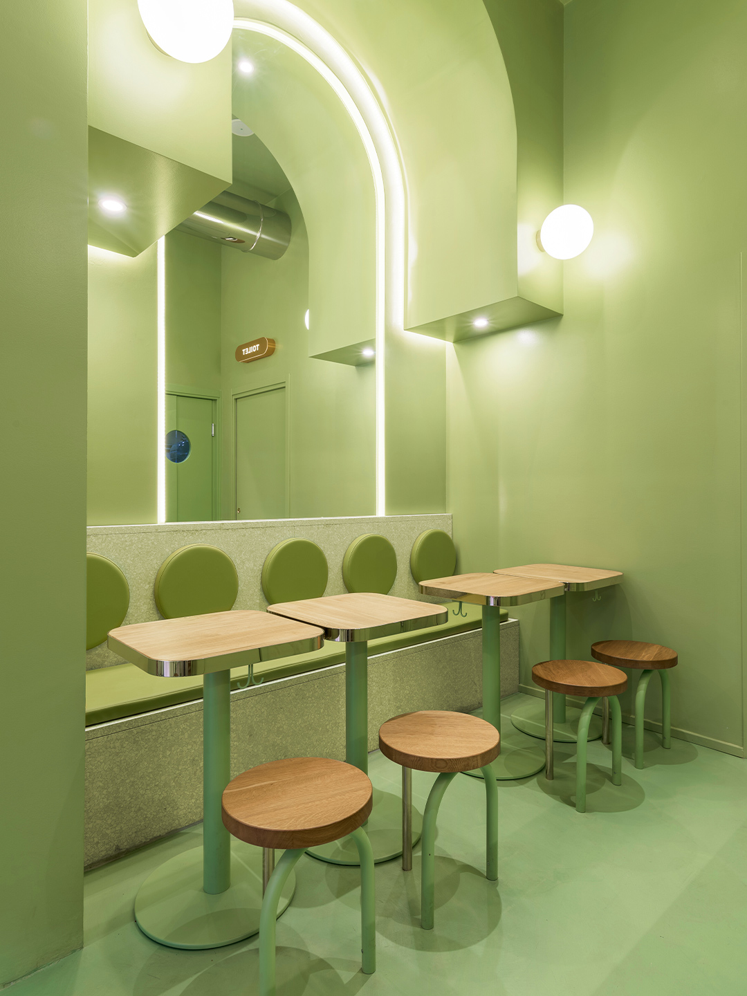
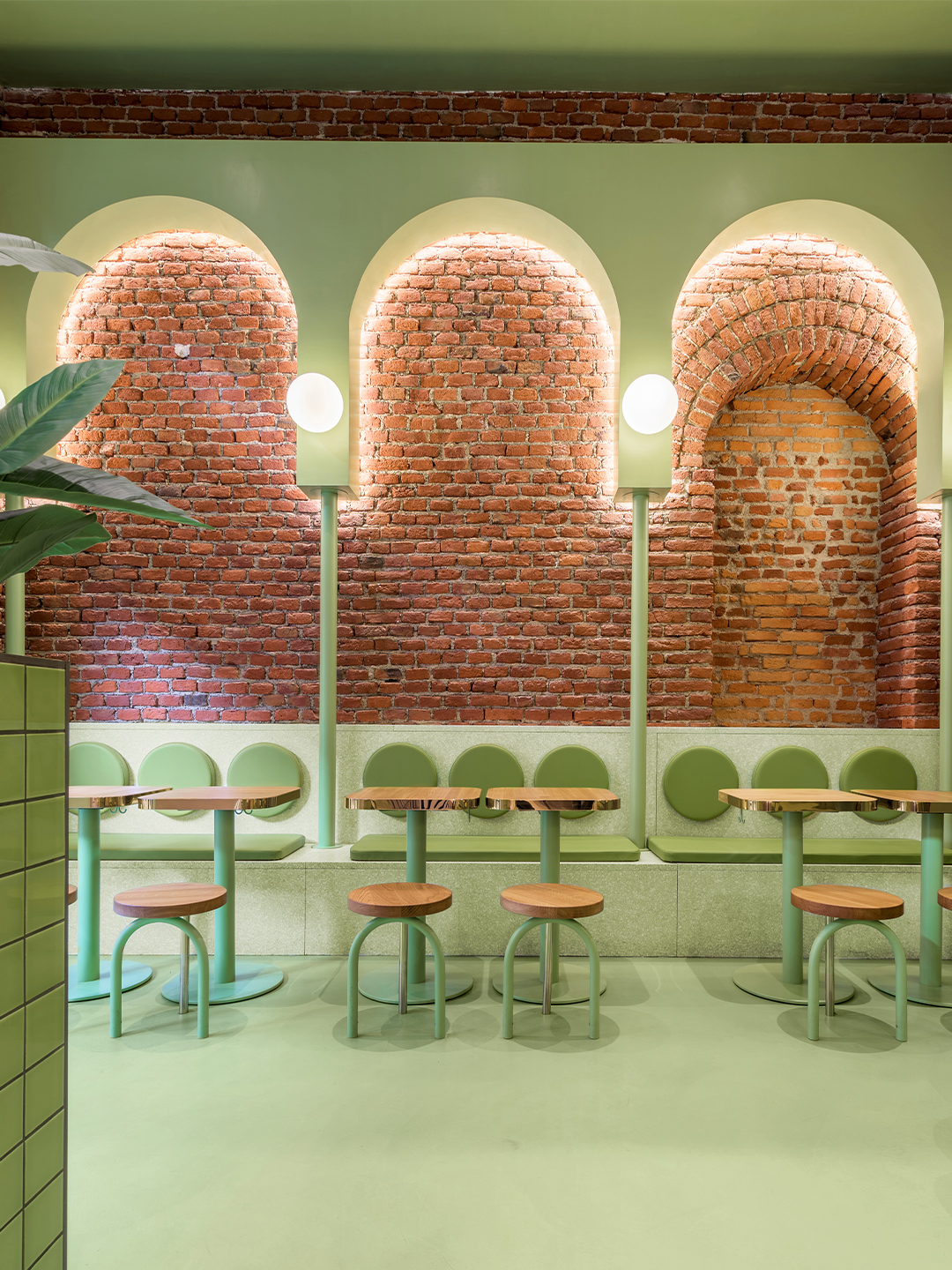
Located in the student-dense area of Viale Bligny, next to the Bocconi University in Milan, the newly completed diner unveils a new visual identity for the burger brand, daringly defined by Christophe and Ana’s signature use of saturated colour alongside gold ’n’ arches: glimmering gold accents and rows of archways that unwittingly nod to the nickname of another world-famous burger chain.
In recent years, the designers have observed an increase in hamburger restaurant chains appearing in the region, and around the world, but they say that most of them straddle a vintage-industrial design aesthetic. The fit-out conceived by Masquespacio for the Milanese outlet of Bun paves a completely different path. The restaurant is presented as an innovative, fresh-faced concept that showcases the authenticity of the Bun brand, its plastic-free attitude and, of course, the smash-hit burgers.
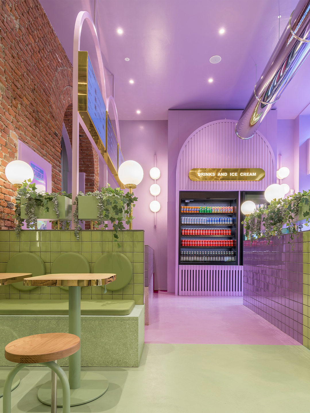
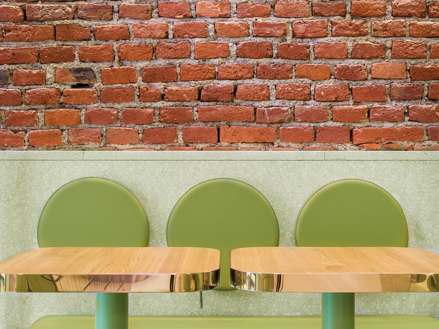
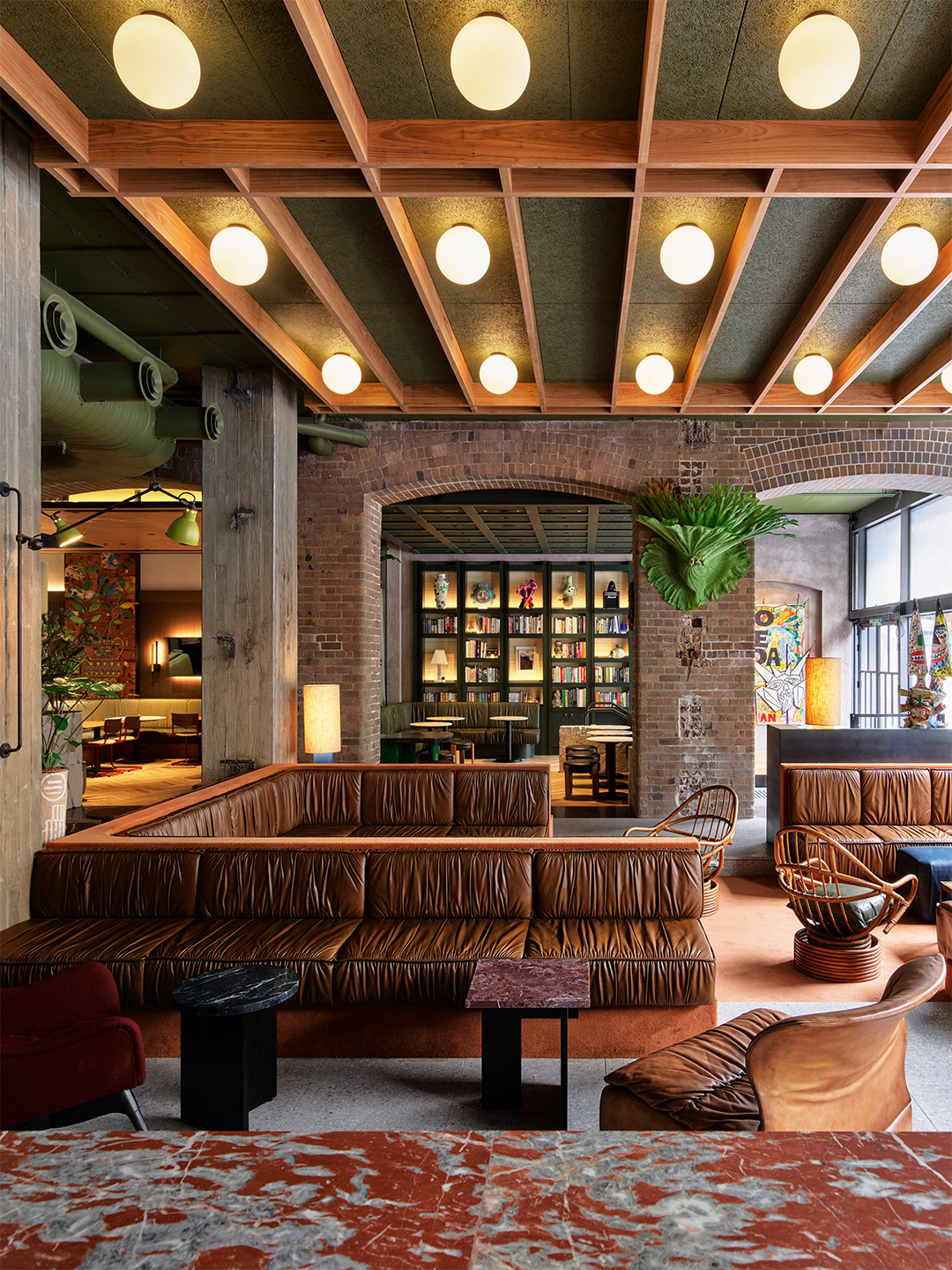
The Bun restaurant project in Milan began with Masquespacio’s designers Christophe and Ana investigating the existing elements of the site, fuelled by the underlying hope that the location would speak to them, perhaps through original architectural characteristics that could be incorporated into the final design response. “When we saw the beautiful bricks and arcs from the space it was evident for us that we would use these two elements as the starting point of the design,” Ana says.
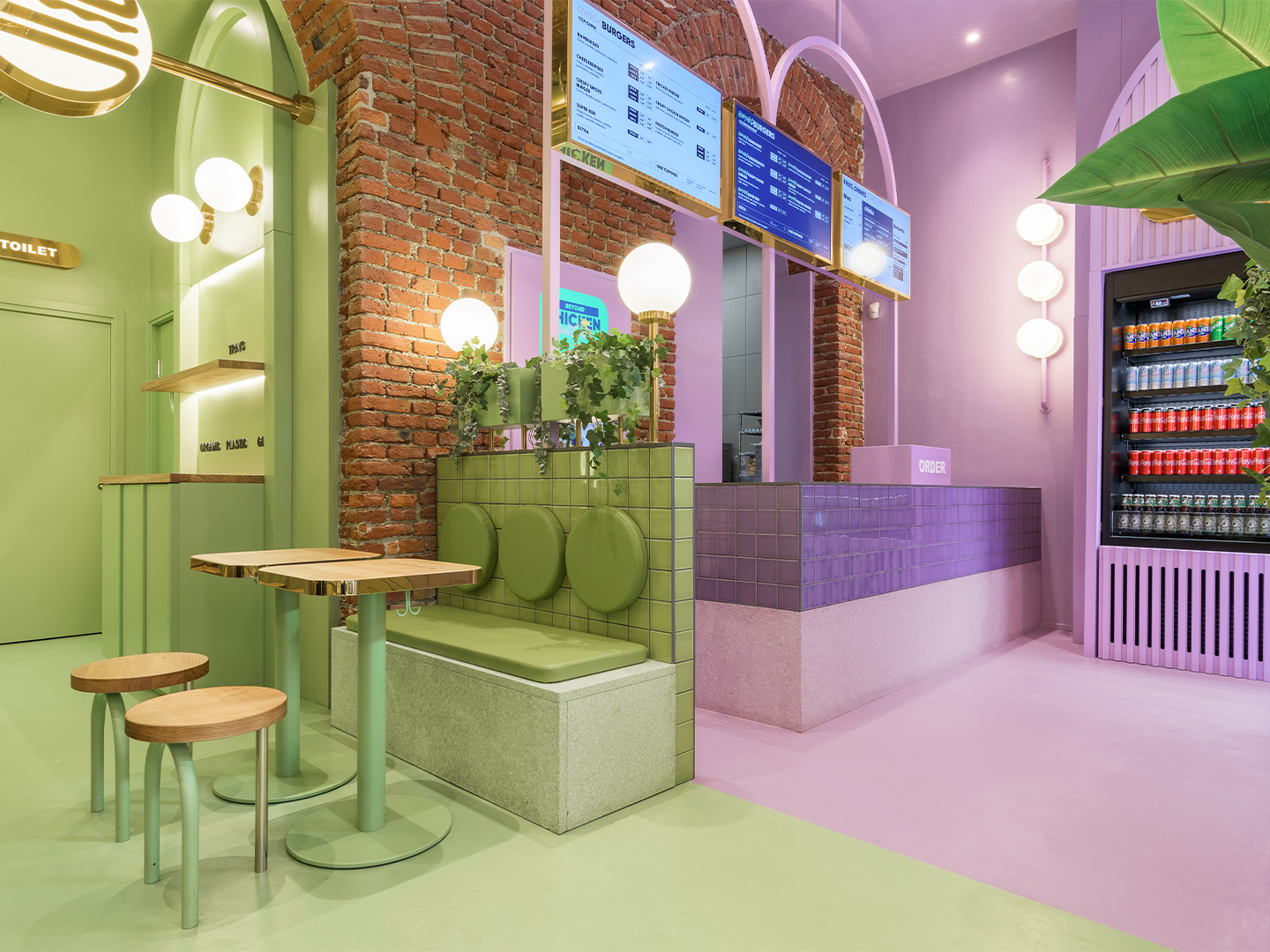
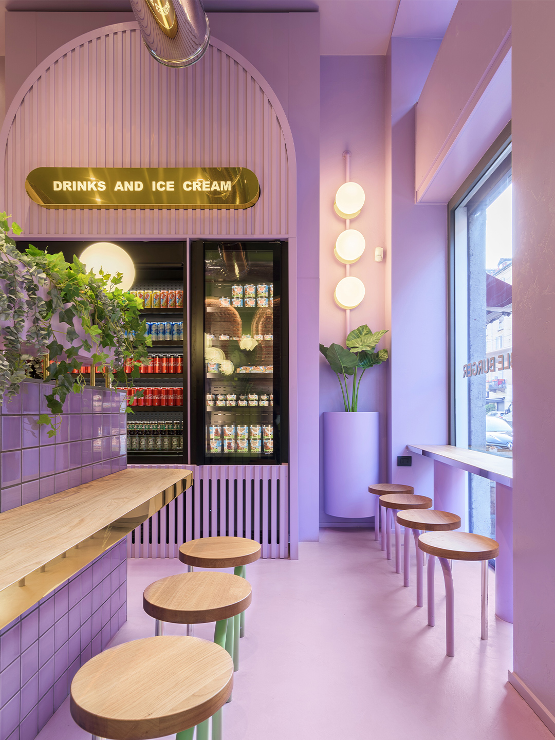
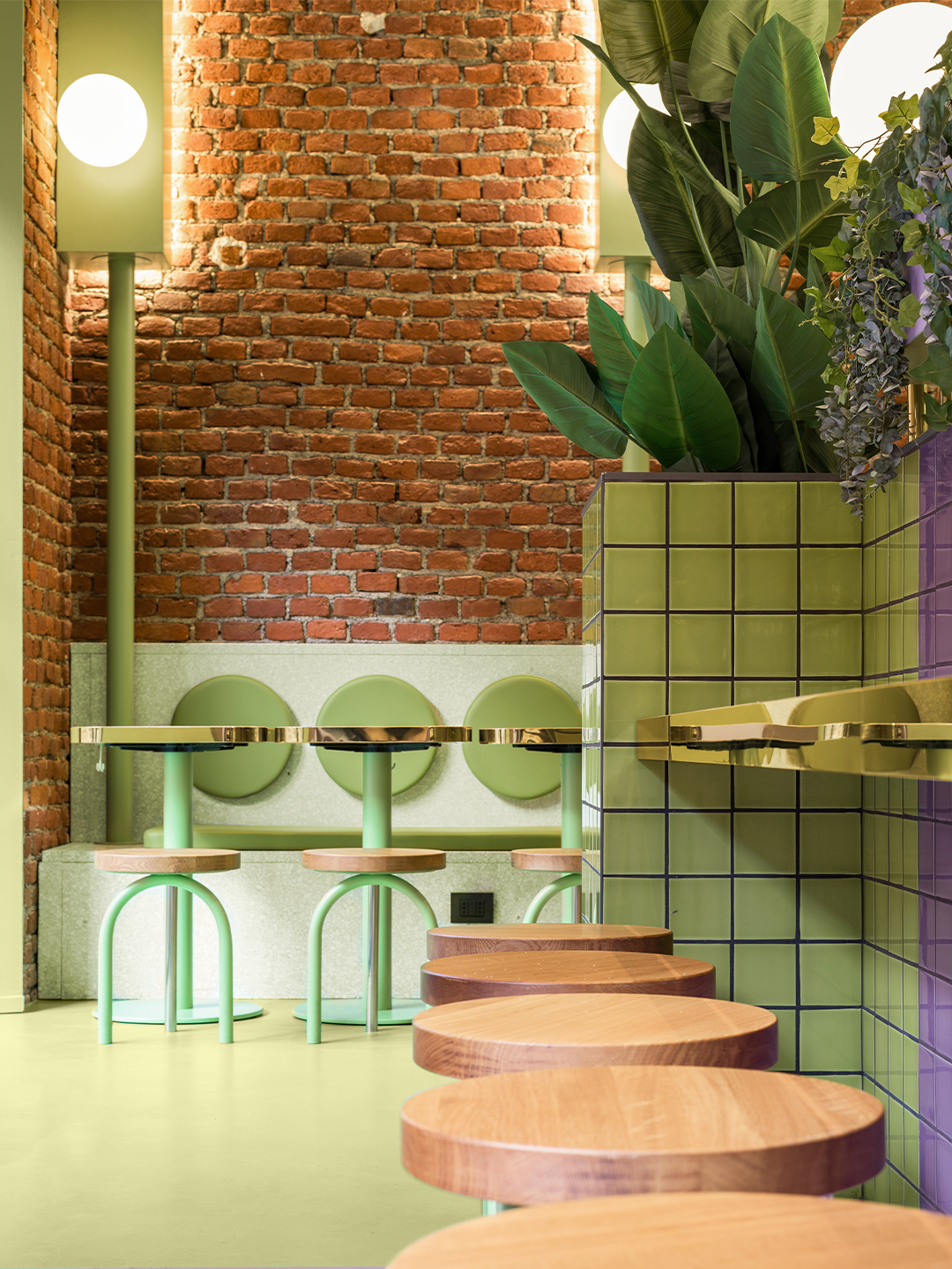
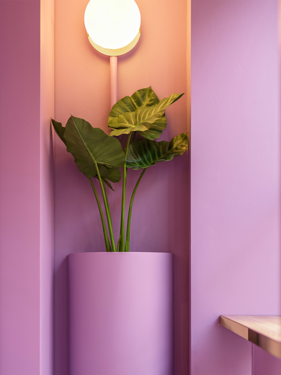
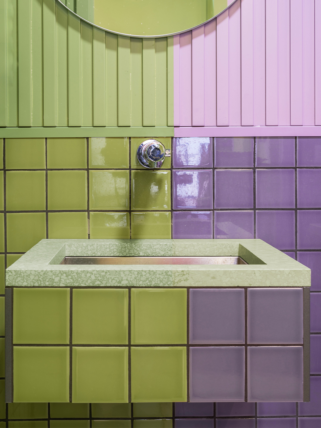
Enchanted by the existing brick archways, the design duo embraced the arch when developing a uniform aesthetic for the hamburger restaurant. New arc forms were constructed throughout the space and brought to the fore with a distinctive pairing of pastel purple and green: a statement-making two-tone colourway that offers a subtle salute to the burger bars of yesteryear.
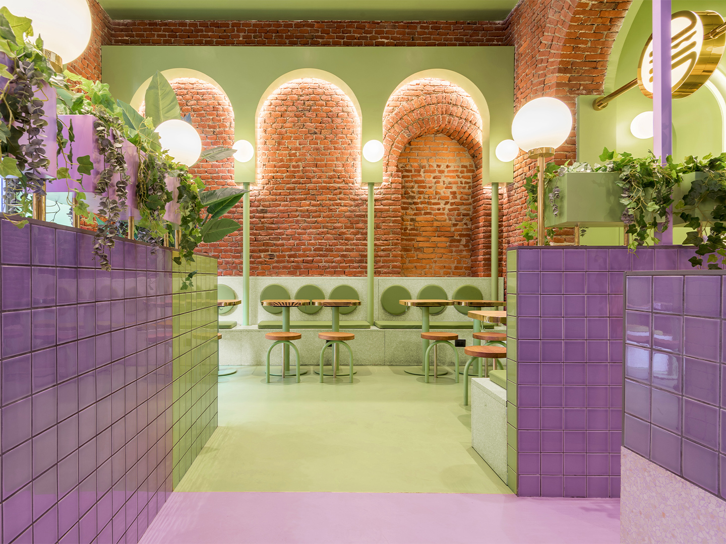
Some of the archways are “totally independent” and others are “highlighting the already existing arcs from the interior architecture,” says the designers, who also specified terrazzo, block-colour tiles, spherical light shades, timber furniture and potted foliage throughout the 140-square-metre restaurant.
The result is a space where Masquespacio and Bun have successfully captured the interests – and satisfied the appetites – of a youthful demographic in Milan, while also building upon the Italian city’s reputation for edginess, polish and sophistication. For each party, that means it’s a mission accomplished. But so thrilled is the client with Masquespacio’s restaurant design, the creatives have revealed they are now set to collaborate with Bun on the creation of several new restaurants in the brand’s portfolio, including an outlet in Italy’s north-west: “The next one will be Bun’s first opening in Turin”.
masquespacio.com; bunburgers.com
Catch up on more office architecture and design and retail design, plus subscribe to receive the Daily Architecture News e-letter direct to your inbox.
When we saw the beautiful bricks and arcs from the space it was evident for us that we would use these two elements as the starting point of the design.
