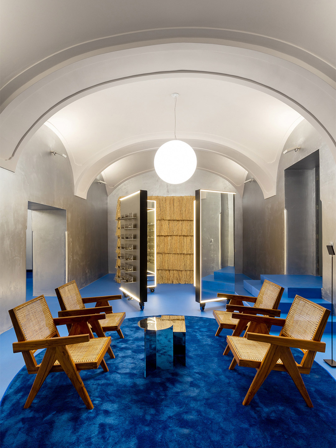
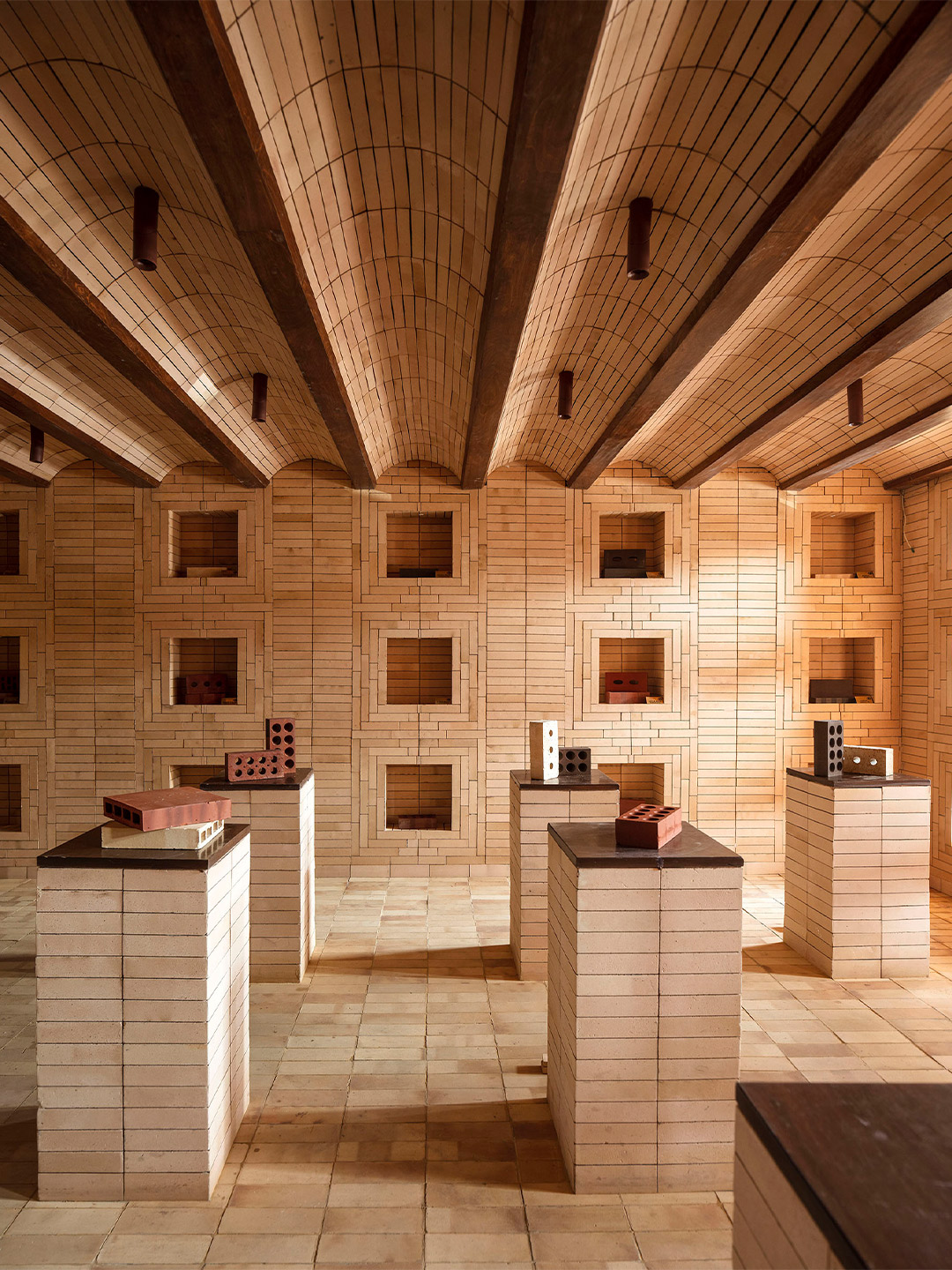
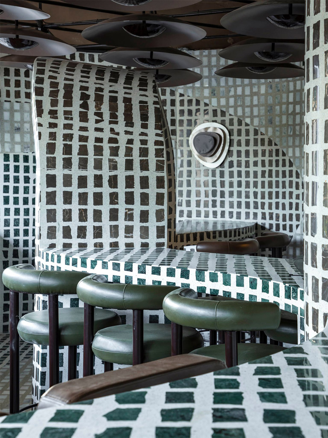
For architects Polina Sandström and Madeleine Klingspor, founders of Swedish practice ASKA, the 1930s aesthetic of a building in Stockholm was a rich source of inspiration. The design duo reawakened the modern Scandinavian style of the site (often categorised as Nordic functionalism or Funkis) for their latest rejuvenation project – a beauty clinic in the MBS by Malika portfolio. “The goal of the project [was] to create a specific and memorable experience,” Madeleine reveals.
The atmosphere within the MBS by Malika clinic is described by the ASKA team as feeling something akin to “modern nostalgia”. They arrived at this thematic title due to the way in which some of the design elements appear recognisable, giving the space “a rigid and trustworthy flavour,” the architects say. Other fragments, however, arrive unexpectedly, adding a “sharp and slightly playful touch,” they add. “This makes the design feel effortless while at the same time managing to surprise”.
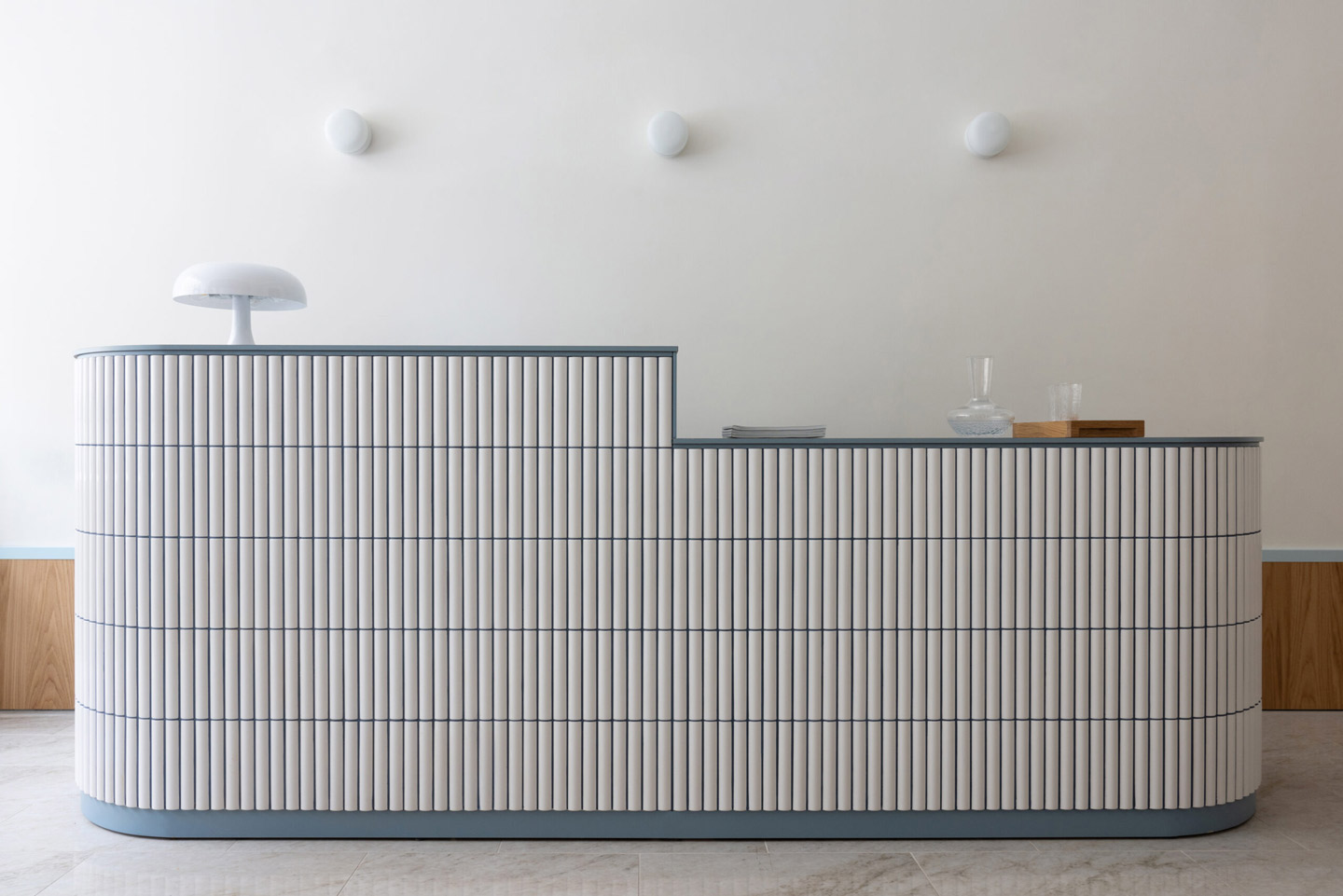
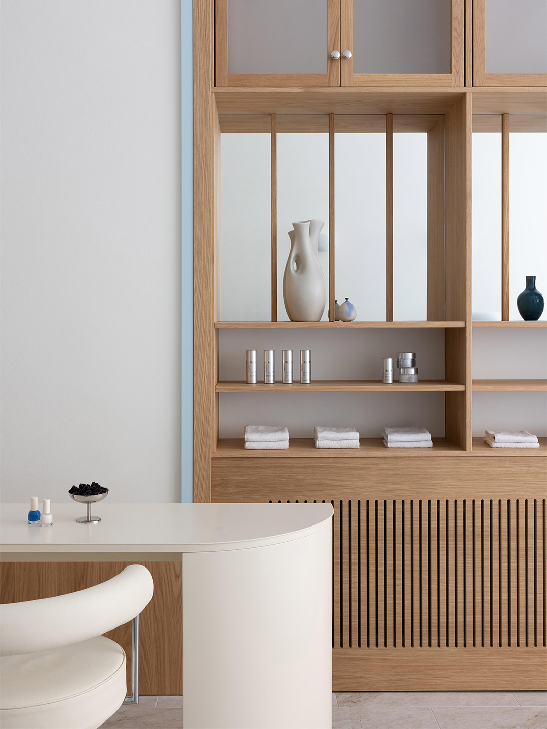
MBS by Malika beauty clinic in Stockholm by ASKA
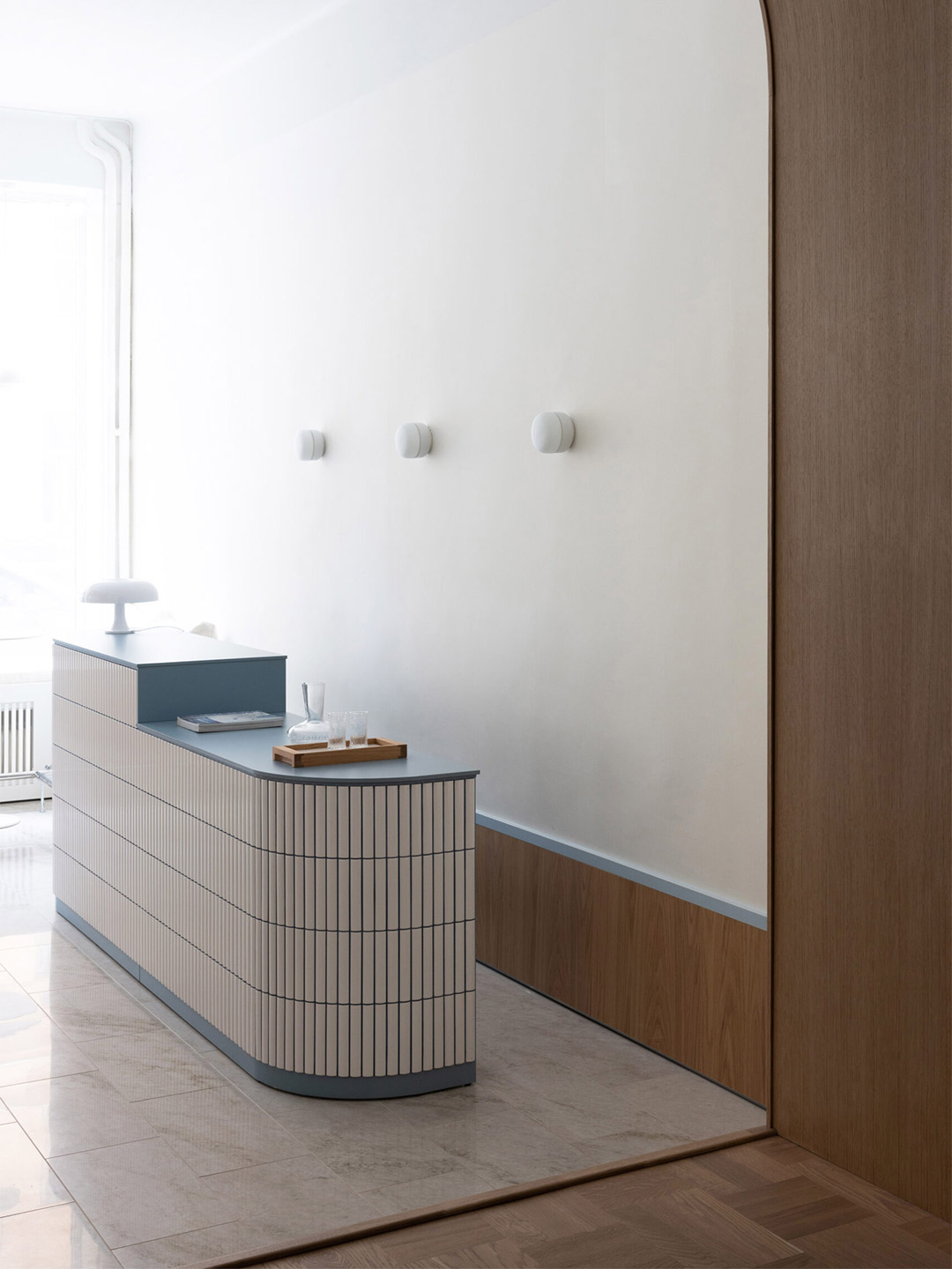
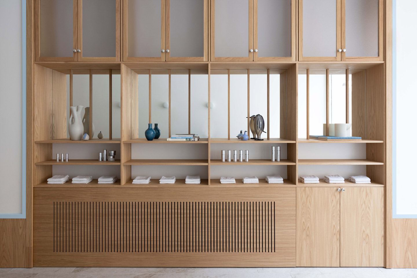
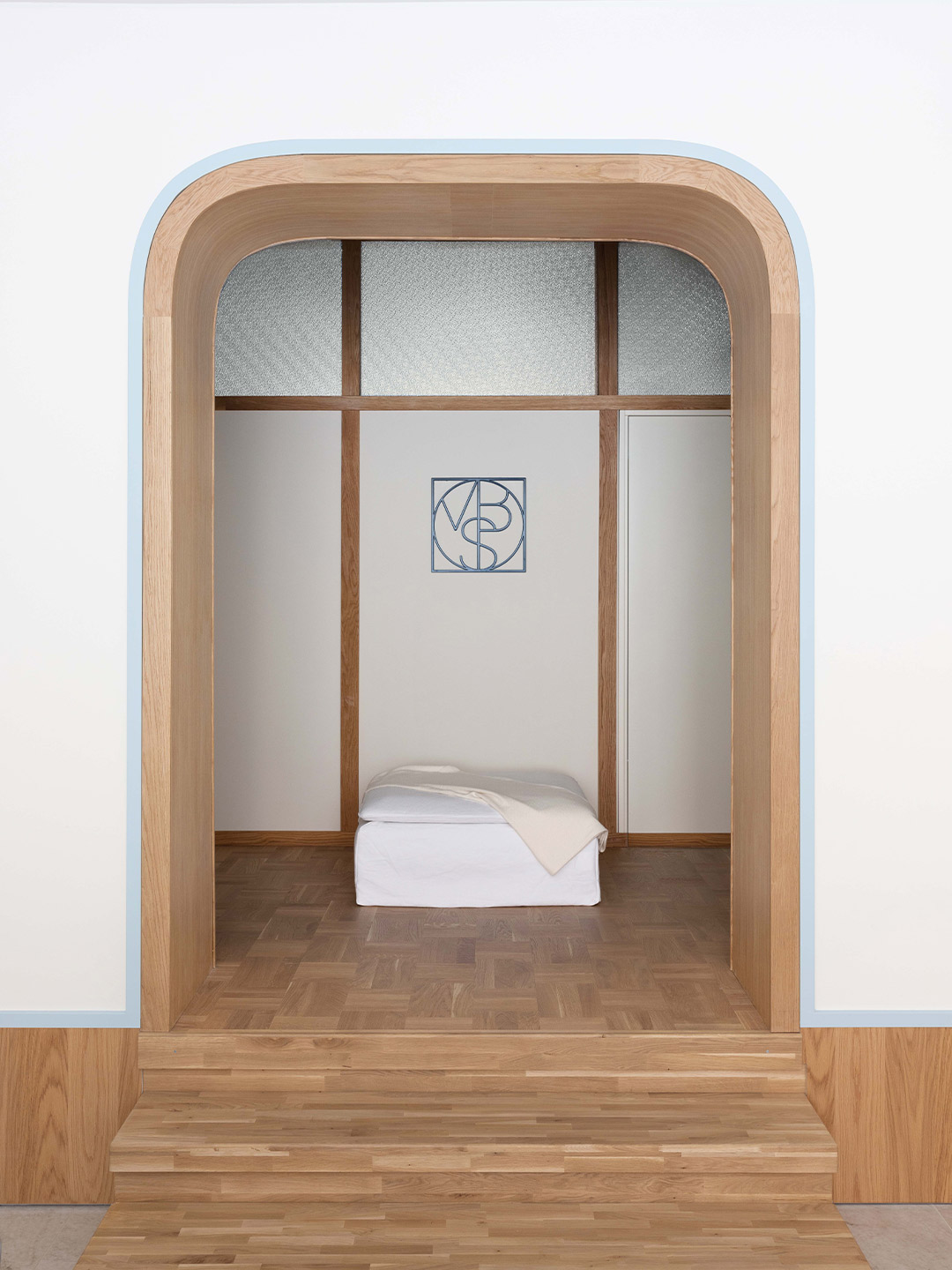
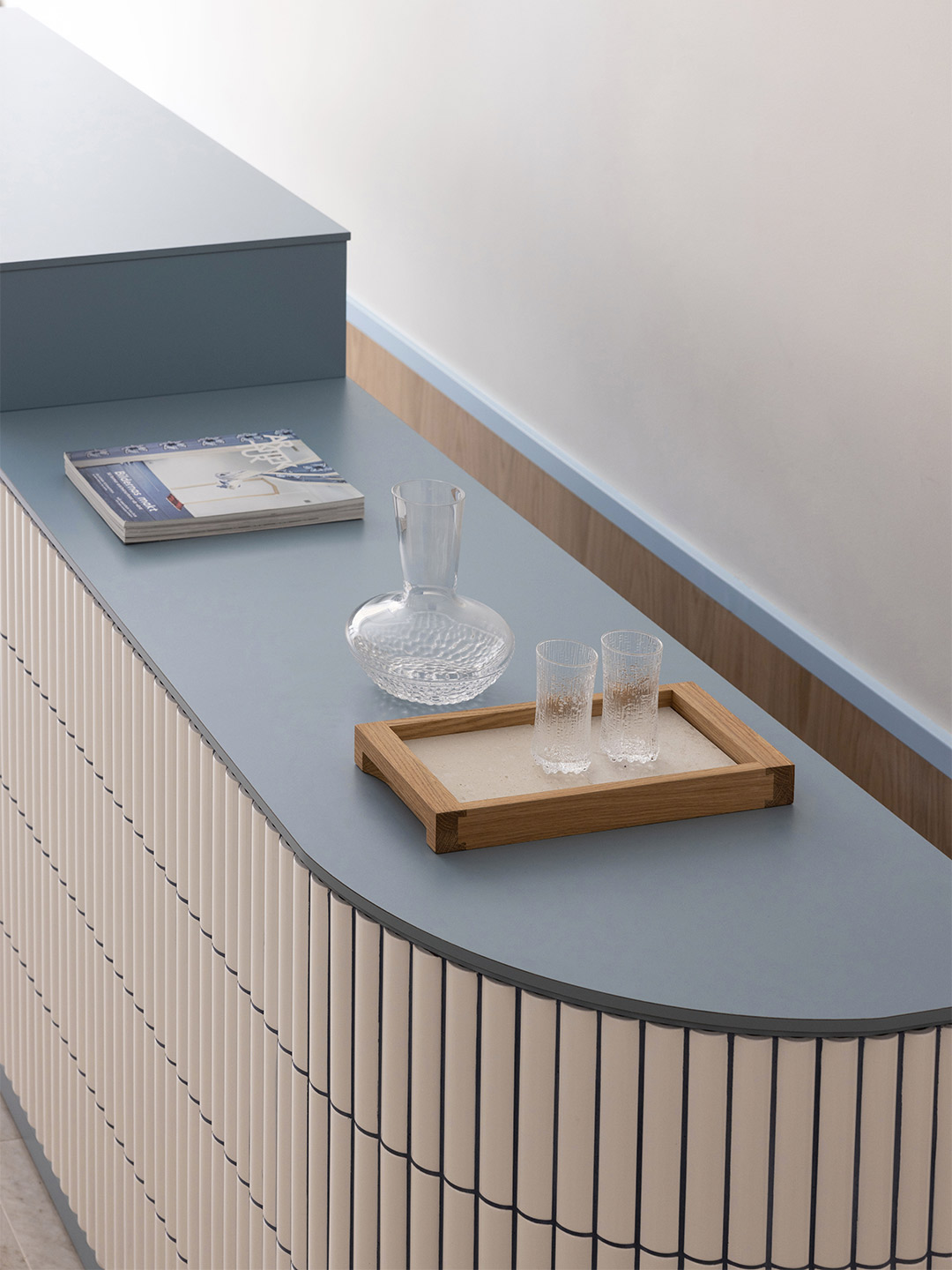
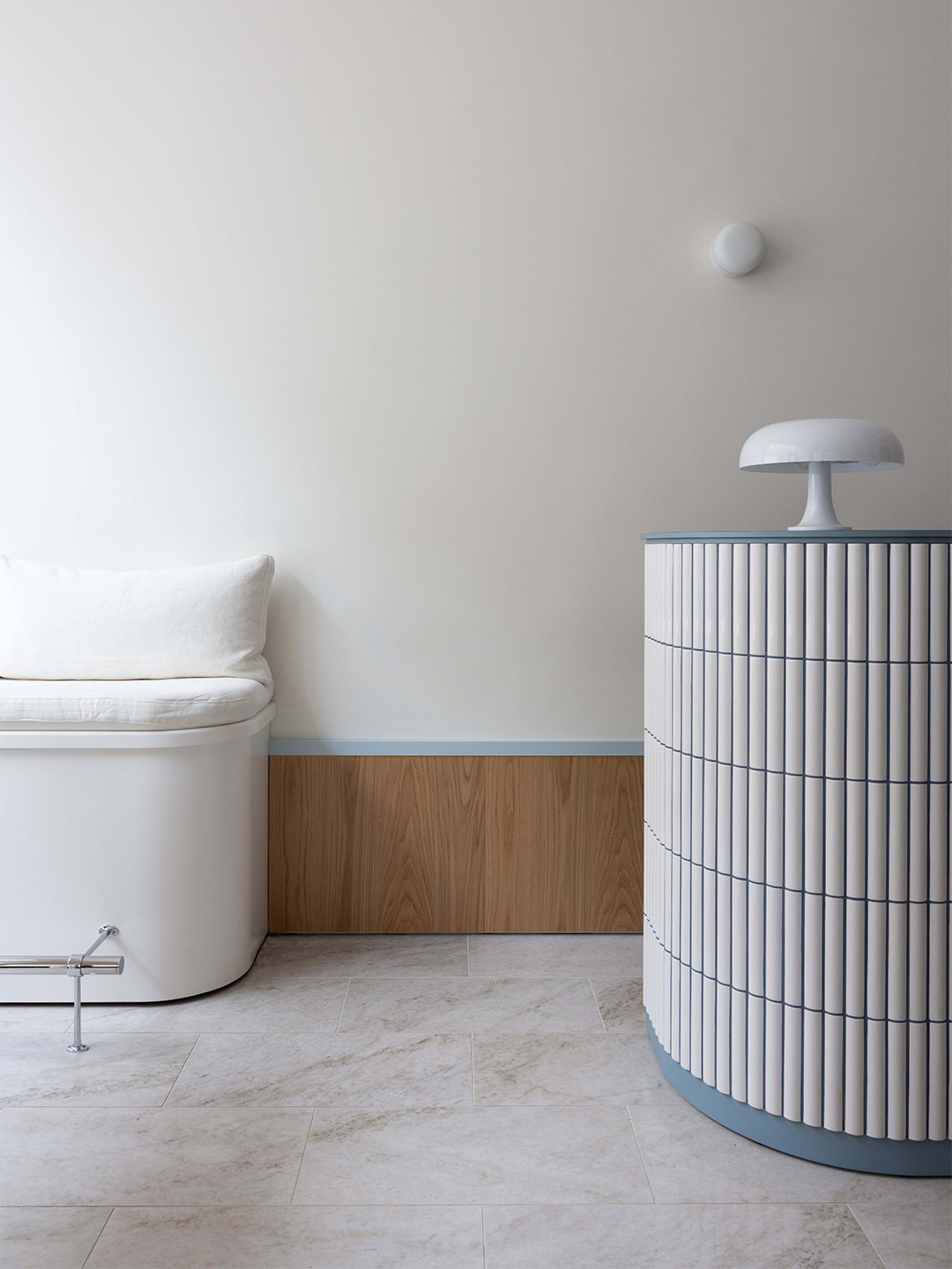
Typical Funkis-style materials, such as white Alvar Aalto-inspired tiles, oak veneer, compact laminate and structured glass dominate ASKA’s design response. But by adding details like the nickel-plated brass handles, linen fabrics and porcelain floor tiles (inspired by the Swedish Ekeberg marble), the architects were able to layer contemporary elegance and an air of exclusivity into the user experience.
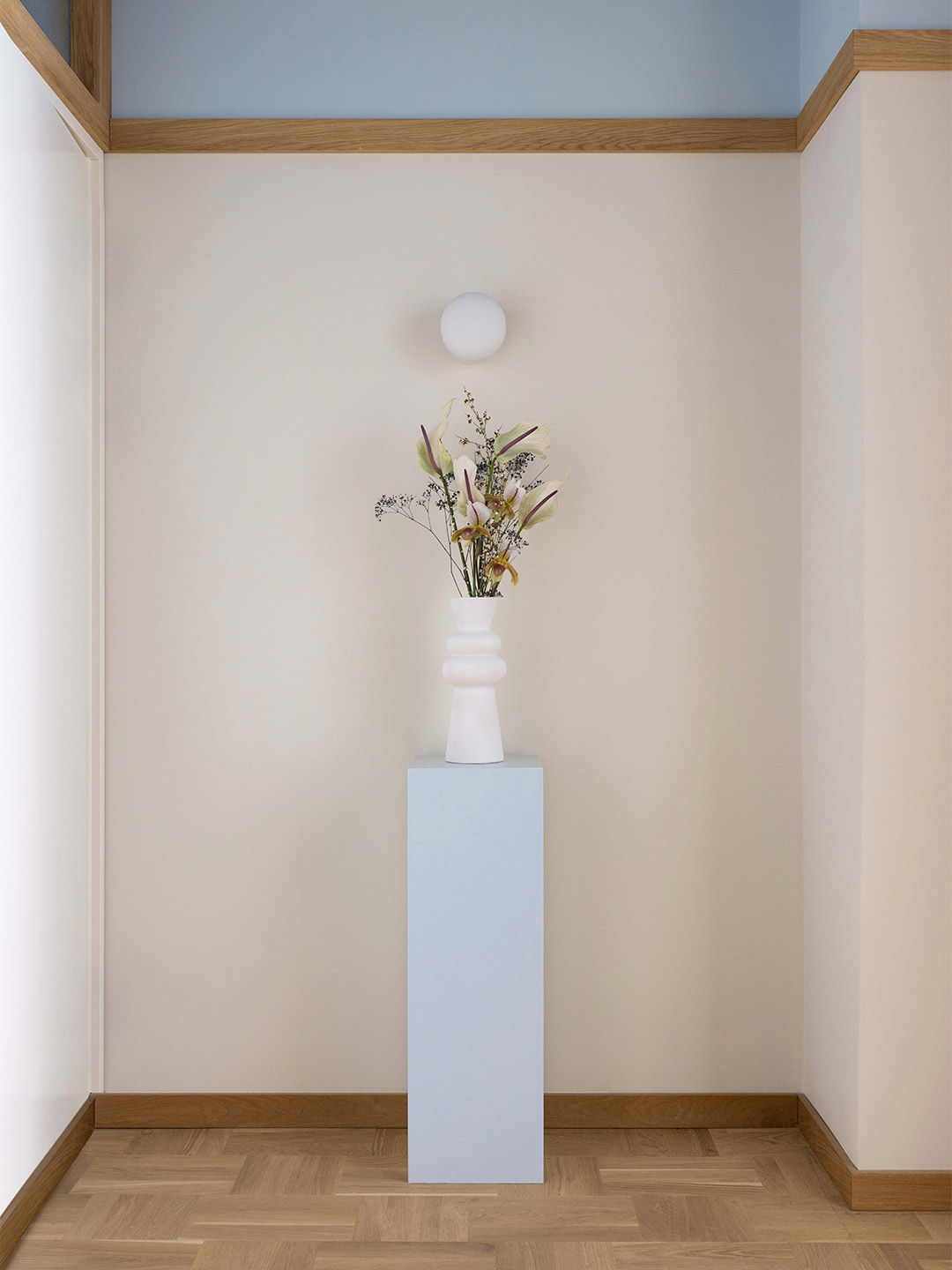
“We saw potential in adding luxury, softness and a young vibe to this simple, strict and socialistic style,” Polina says of ASKA’s vision for the clinic. “[We believed] that something new and unique could rise from the merger,” she adds, which includes the layering of light and dark blue colour accents to deliver a modern and fresh feeling to the space.
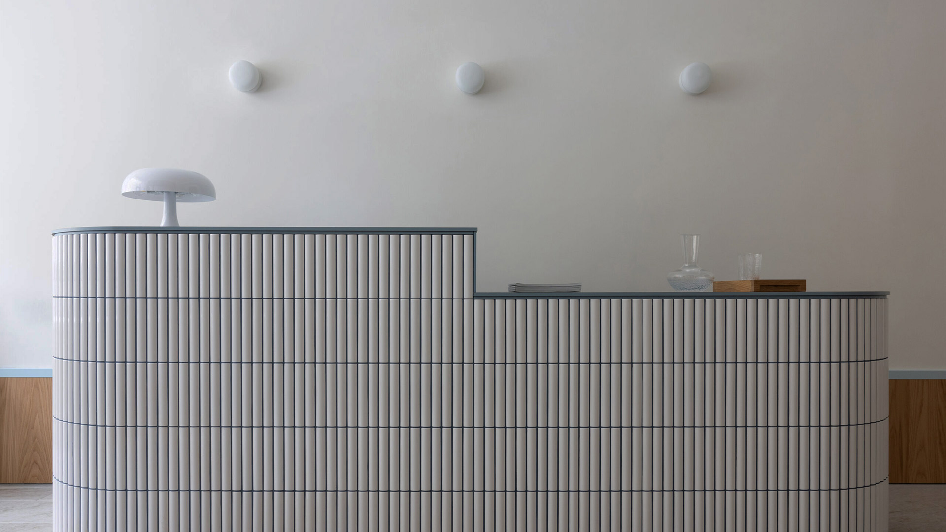
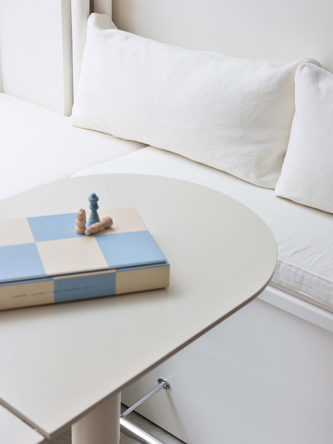
In order to reach a conceptually strong and effective spatial composition, Polina and Madeleine worked across differing scales and disciplines, including designing most of the furniture. The cream-coloured lounge tables and nail manicure stations are just some of the items created exclusively for the venue. “[These pieces] aim to blend into the environment in a smooth, seamless way,” the designers say. “The reception desk, on the other hand, is something of a key piece, designed to capture the visitors’ focus thanks to its size and level of detailing.”
Sitting somewhere between blending in and standing out, all other finishing touches have been designed to reference and complement each other. “The shape of the three pseudo arches reappears in the form of the table-tops,” the designers point out. “The foot panel melts together with the product shelf [and] the dark blue tone of the grout on the reception desk goes hand-in-hand with the MBS logo.”
We saw potential in adding luxury, softness and a young vibe to this simple, strict and socialistic style.
Renesa Architecture also created the Tin Tin bar and restaurant in India. Catch up on more architecture, art and design highlights. Plus, subscribe to receive the Daily Architecture News e-letter direct to your inbox.
