Published over two volumes, The Common Reader is a collection of essays exampling the eccentricity and entertaining brilliance of English writer Virginia Woolf as a literary critic. The same title was recently given to an independent bookstore in Hangzhou, the capital of China’s Zhejiang province. The store, designed by Shanghai-based architecture and interiors firm Atelier tao+c, takes inspiration from Woolf’s writings. But it also recalls the nostalgic experience of reading among the aisles in an intimate old library, where turning the pages of an unputdownable tome would capture the spirit and transport the mind.
From an early stage in the design process, the architects at Atelier tao+c reached a mutual understanding with their client that the Common Reader should not just be a “storage room” for books. Rather, it should also be a place for people to get involved with “collecting social memories and absorbing knowledge,” the tao+c team suggests. As such, the architects say they seized the opportunity to “probe” into reading behaviour. This investigation allowed them to craft an interior where readers can concentrate solely on reading, achieved by reducing the objects in the space to only what was necessary: bookshelves, display tables, seats and reading lights. “There are no other elements standing in the room,” the architects explain.
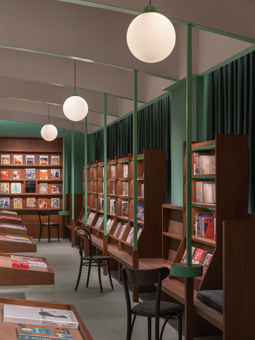
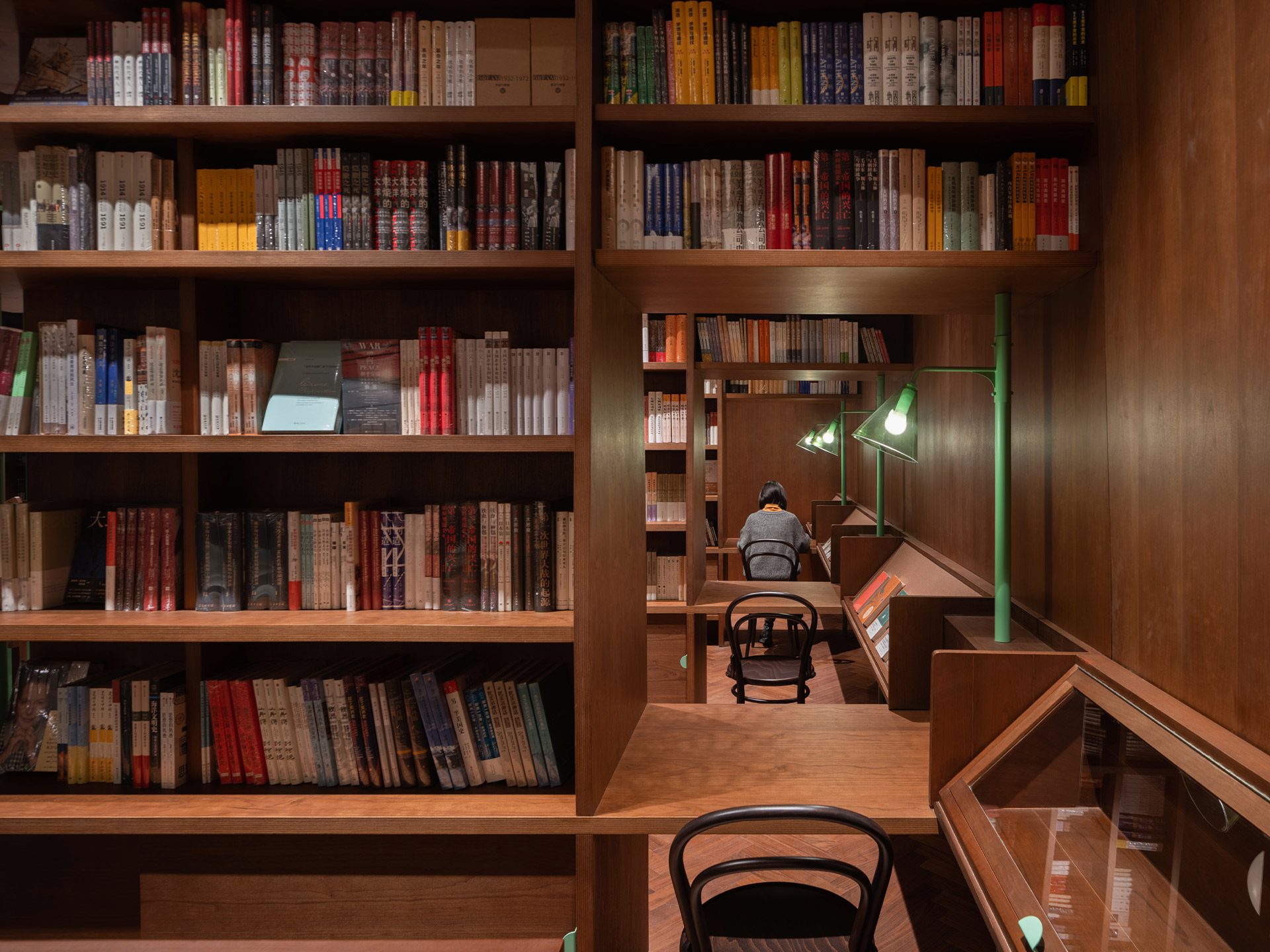
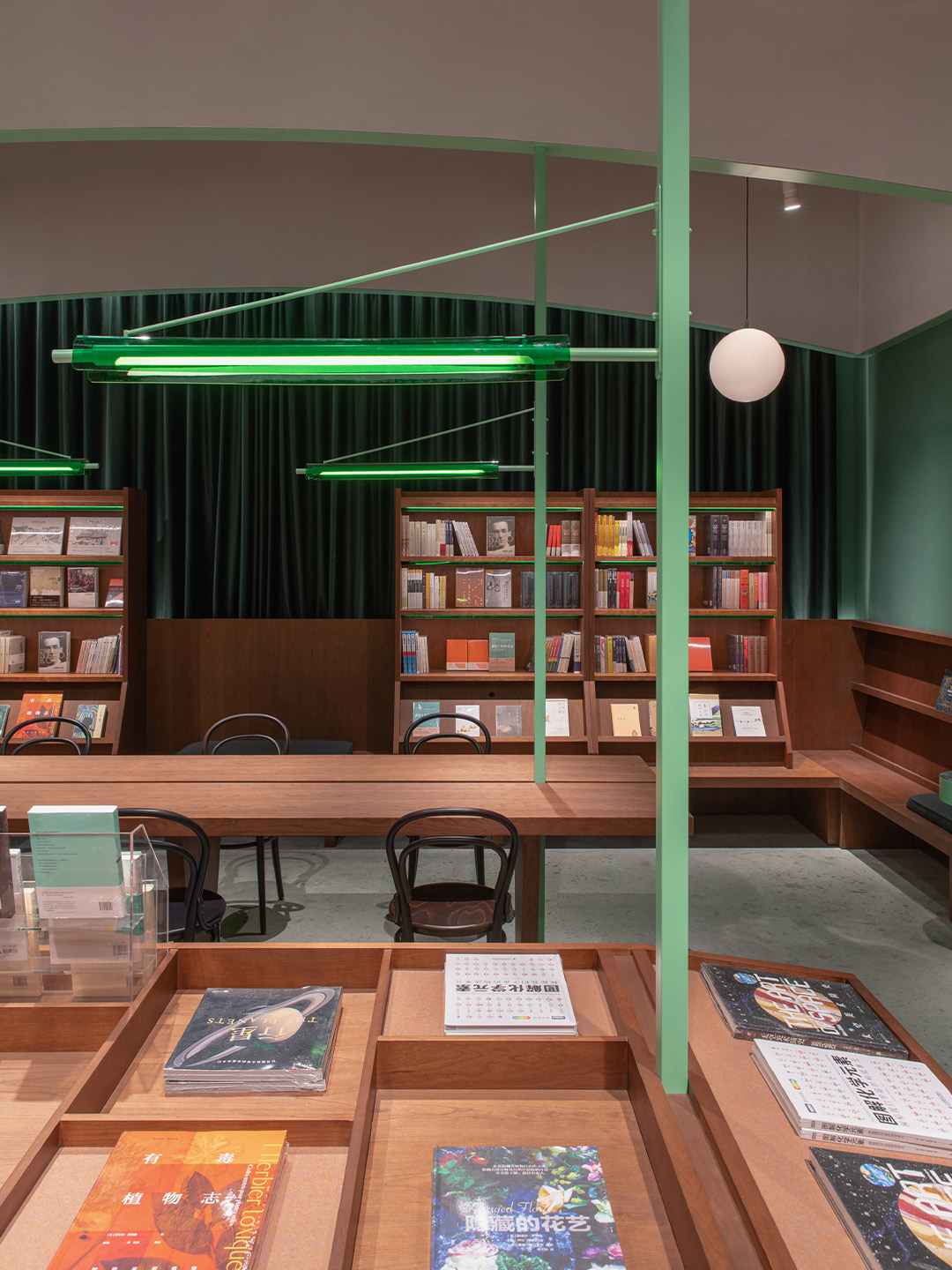
Common Reader bookstore in Hangzhou by Atelier tao+c
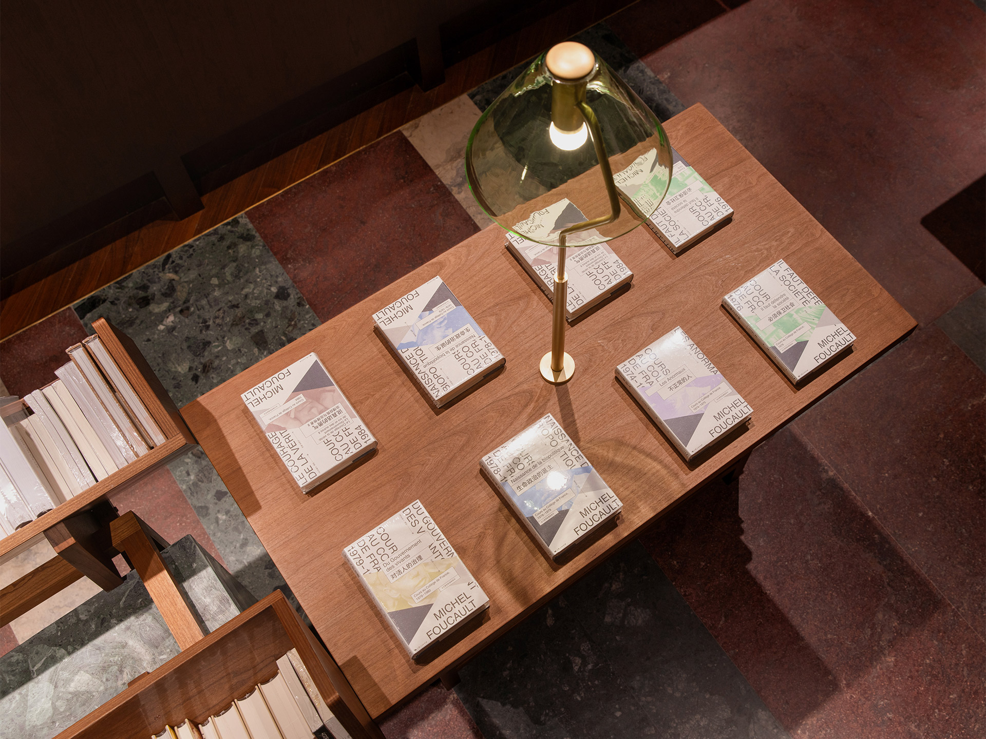
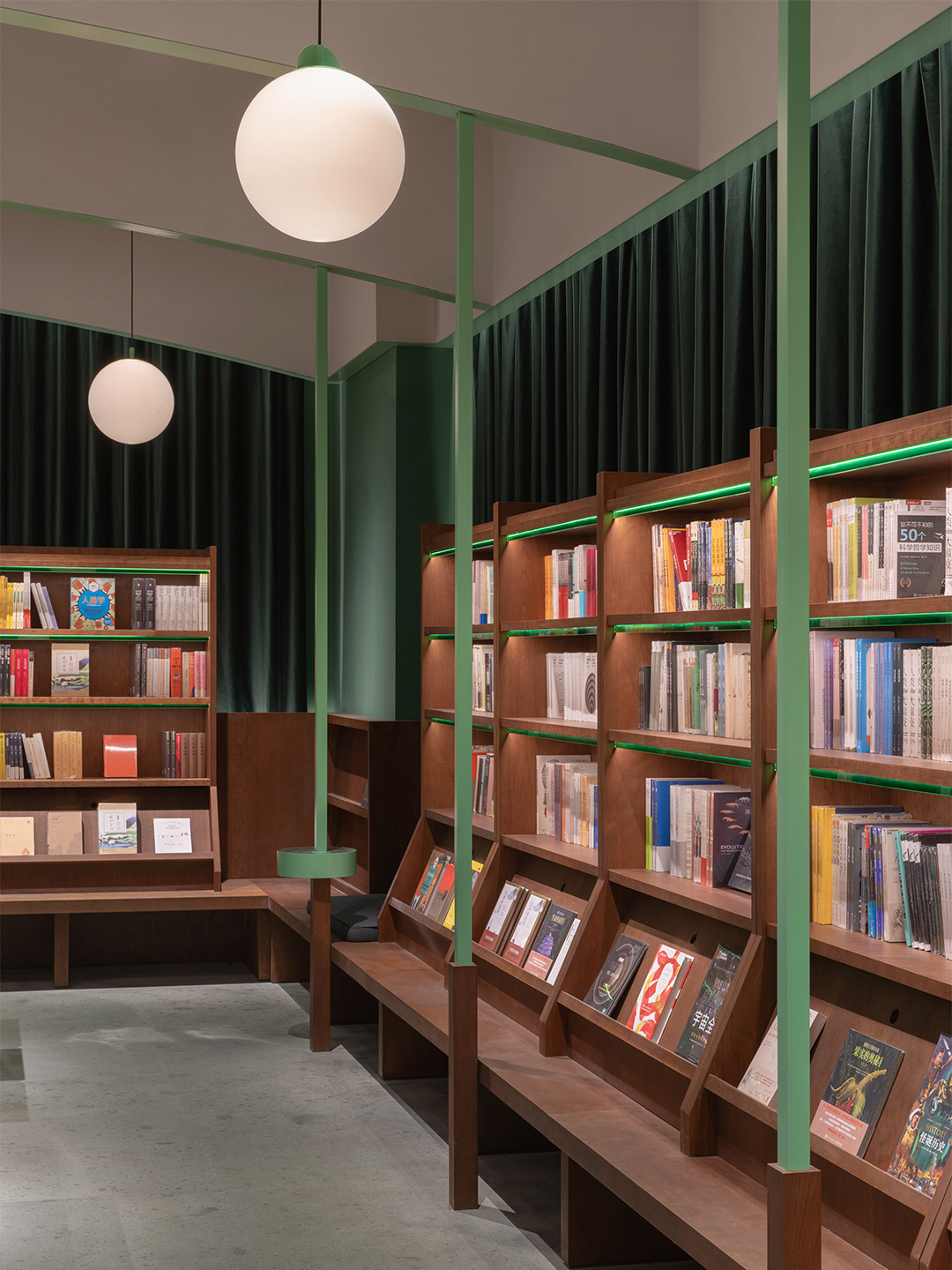
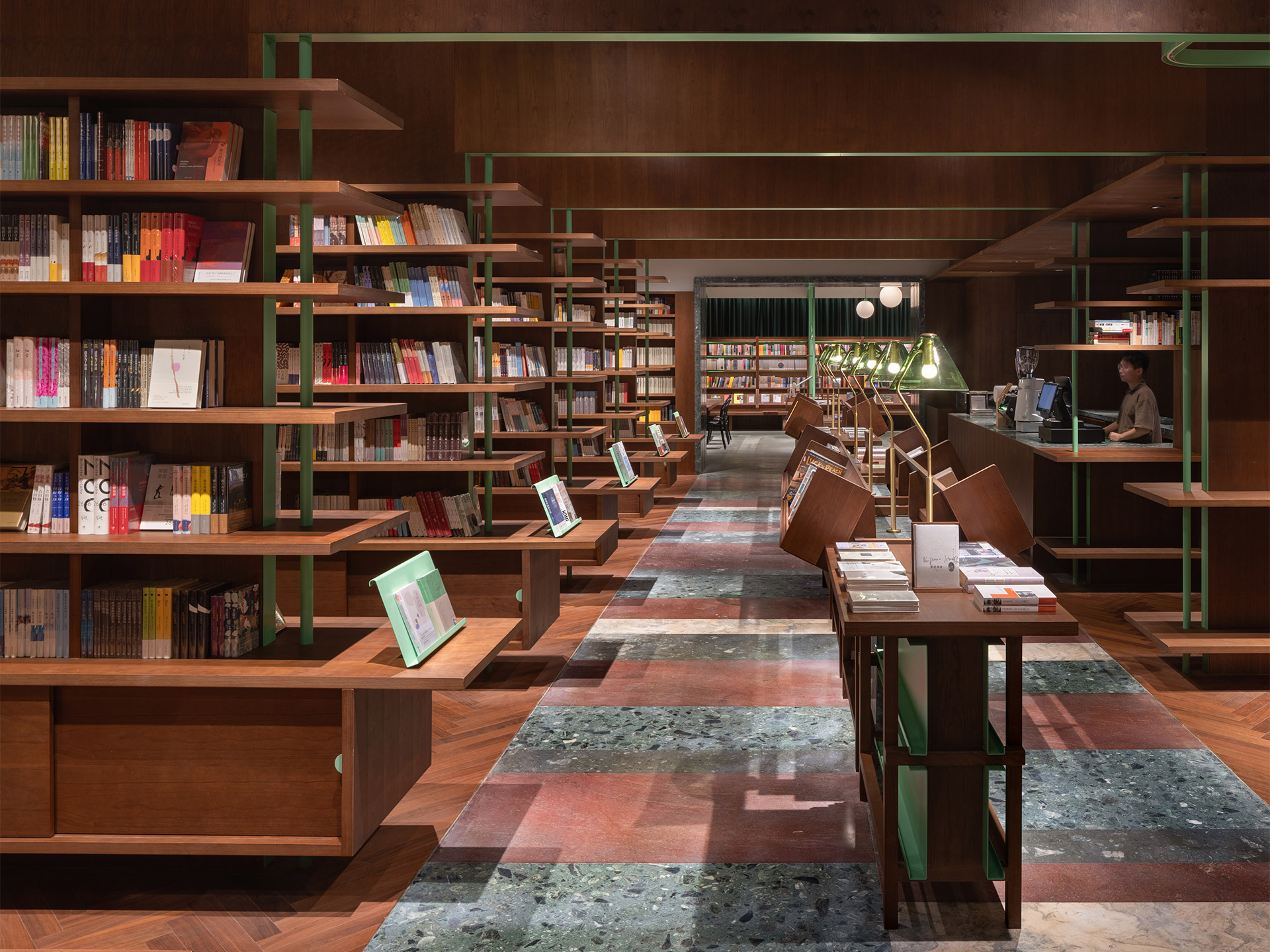
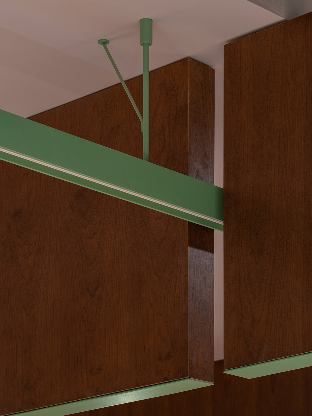
In order to encourage the bookstore’s visitors to find a spot and settle in, the tao+c team says they introduced a combination of dark-toned timbers and bright green detailing. This is intended to evoke people’s memories of spending time in classic woody-scented libraries, surrounded by the colours presented by the bindings of beautiful books. At the Common Reader, the ambiance created by the finishes alone invites readers to stay in, while the thoughtful patchwork of practical task lighting enables them to read and write.
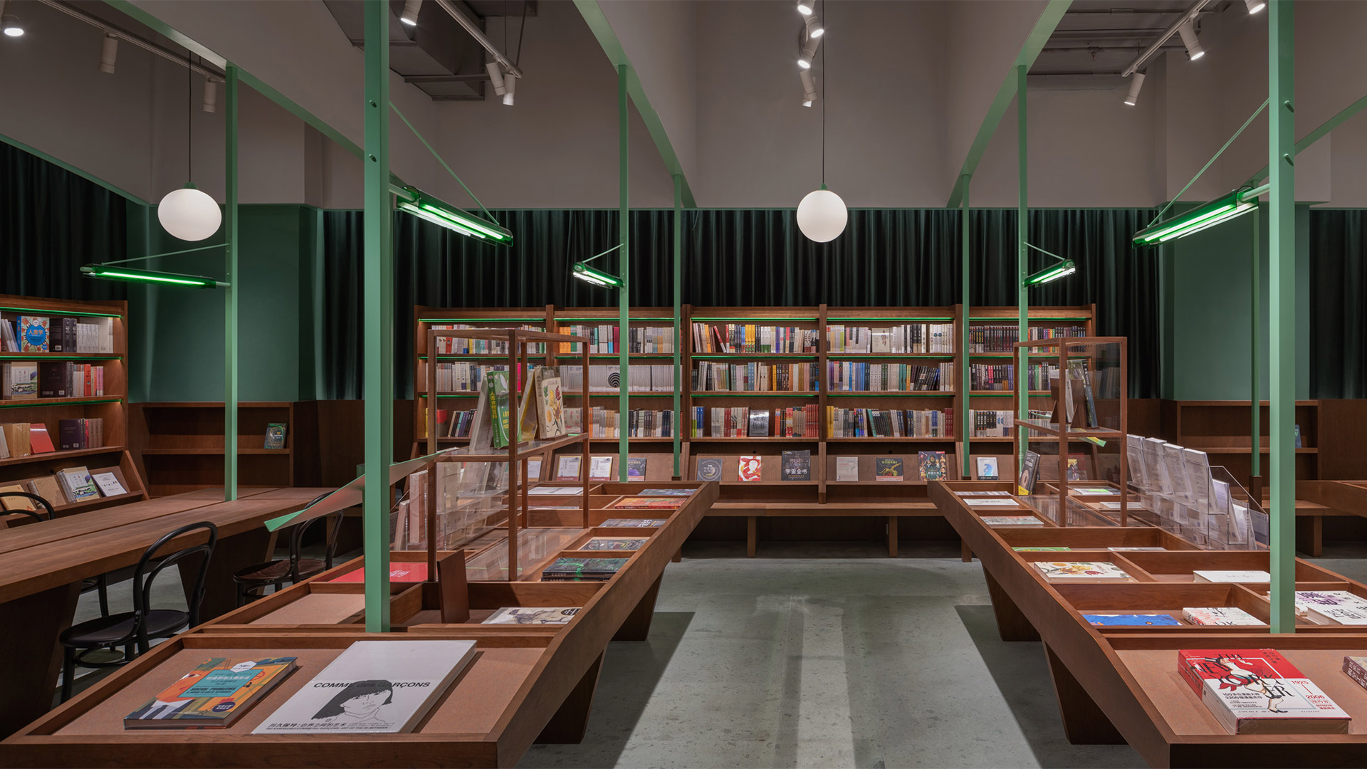
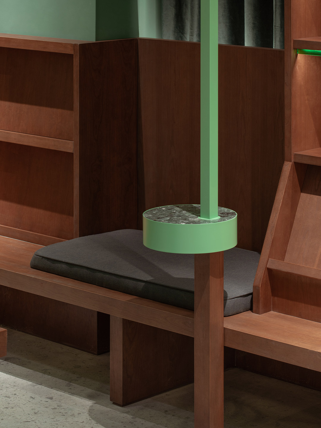
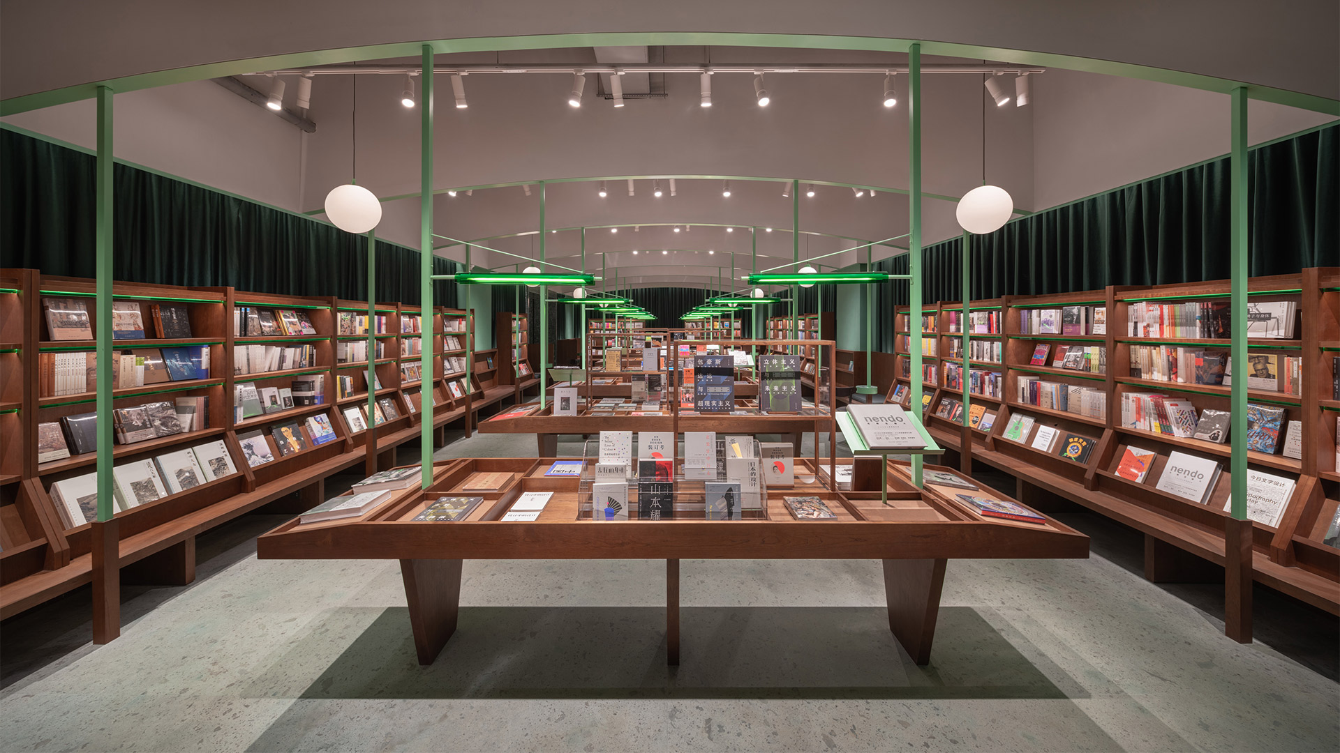
The L-shaped site was broken down into two rectangular rooms with two different atmospheres, where the layout of each space became informed by the direction of the bookshelves. In the room nearest to the street, dark green curtains cloak the perimeter, creating a soft boundary that offers a sense of privacy. A timber bench forms a continuous horizontal surface around the fringe of the space. The tall bookshelves are placed on top “like loose furniture,” the architects say. “Those bookshelves are hovering at a suitable height to ensure that every book is accessible,” they add.
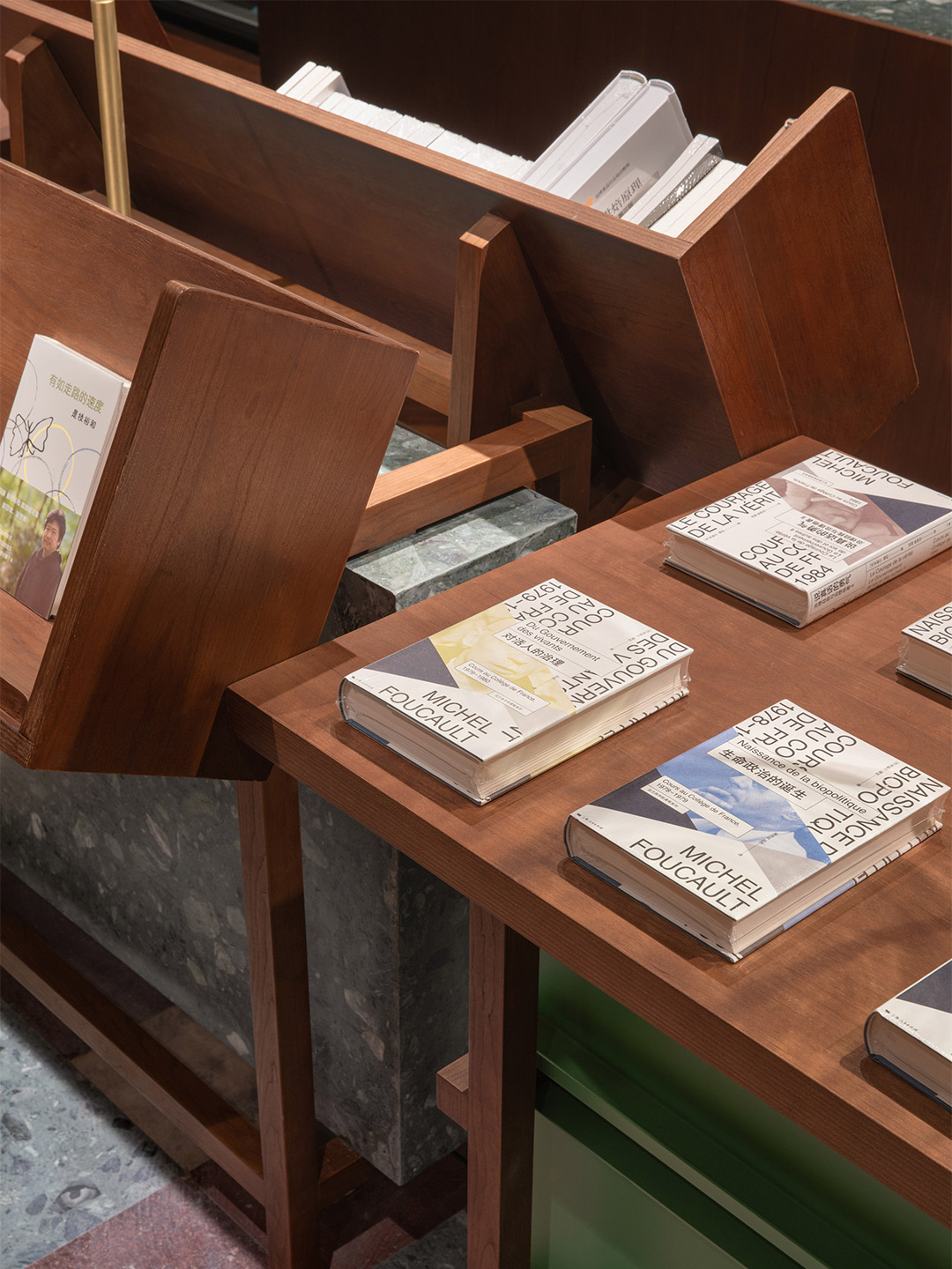
The gaps between the sets of bookshelves form deep seats, here and there, so that people can sit and start reading as they discover their favourite book. In the centre of the atrium, seven display tables are equipped with customised glass bookshelves and magazine shelves, the surfaces of which are divided according to the size of the titles they showcase. “The horizontal array of tables and the vertical green metal columns [forms] the spatial sequence which enhances the feeling of depth,” the tao+ team says, adding that they believe this design technique also reminds people “of the old-time reading room”.
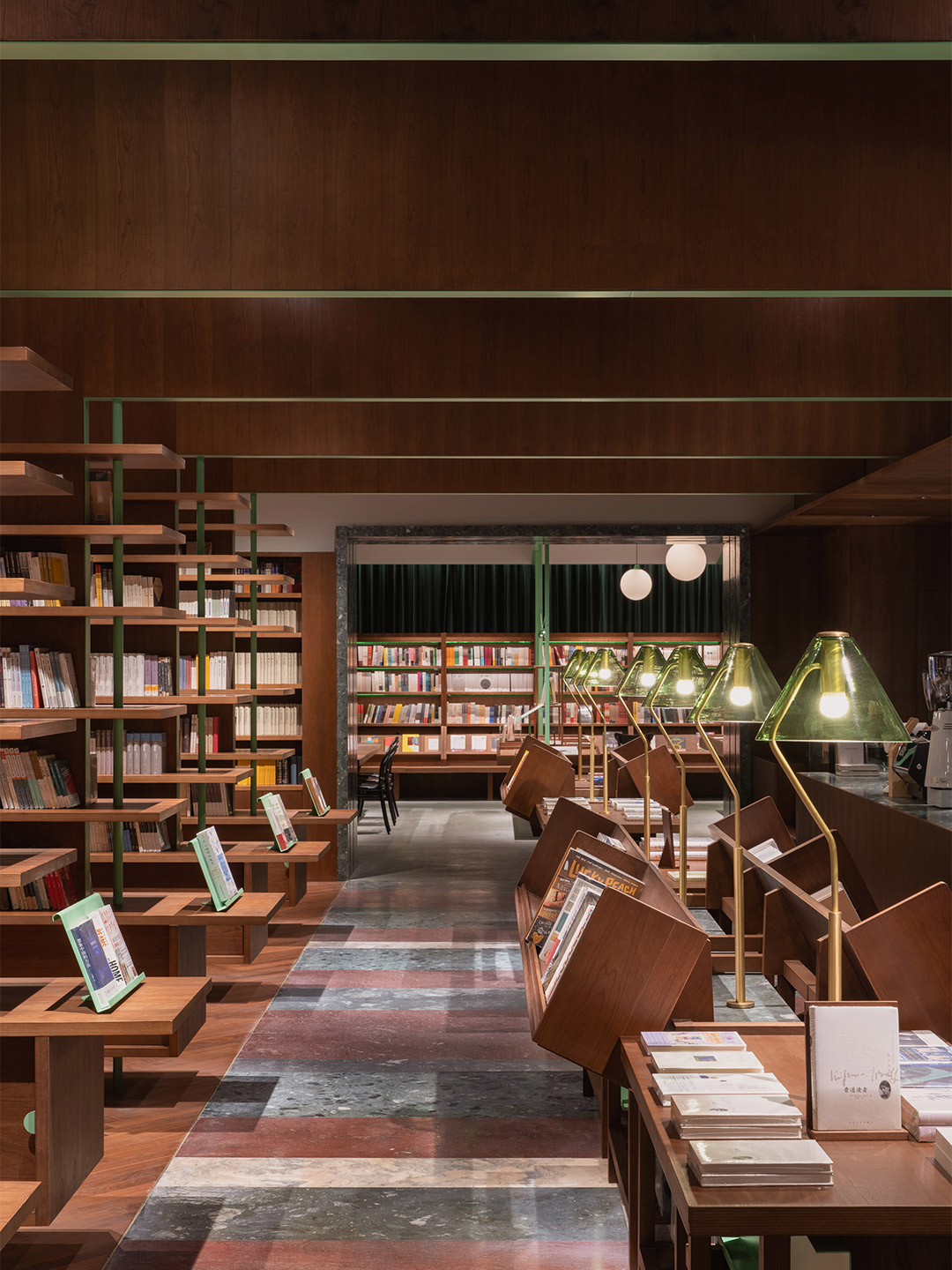
The other main zone in the bookstore is reached through a green stone doorway. It’s described by the architects as feeling “deeper” than the first room and invites readers to explore more thoroughly the private library ambiance of the bookstore. Here, the double-sided shelves form multiple layers in the space. “The distance of the bookshelves [and] the scale of the walkway have been deliberately compressed, constructing an intimate spatial atmosphere,” the designers say. “A four-sided enclosure was embedded at the end of each bookshelf, which functions as a single desk within a relatively private reading space,” they add, noting that the seats that service each desk are also rather isolated.
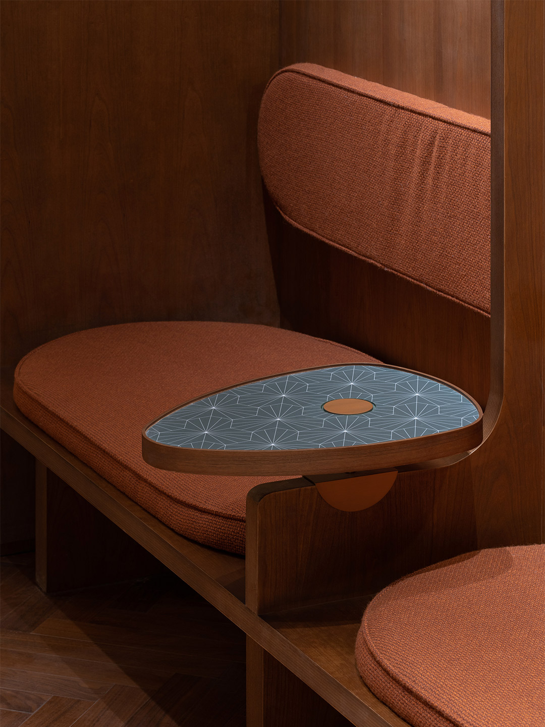
Like any good bookstore, Common Reader features a cafe that keeps its visitors caffeinated between chapters. Set to one side, the cafe’s banquettes feature partitions between diners, offering readers a moment of “tranquility without interfering with the neighbours,” the designers suggest. But this isn’t the only customer-focused detail. “Every bookshelf, seat, and lamp [has been] specifically designed for each book and conforms to human’s reading behaviours,” insists the tao+c team, highlighting the oblique angles of the bookshelves that make it easy to grab and replace books, the mix of reading spots, and the carefully curated mood. “Just in the arrangements of the bookshelves, together with the relationship of the seats, [the bookstore] advocates the renaissance of daily reading and poetry which is quietly growing in the metropolis.”
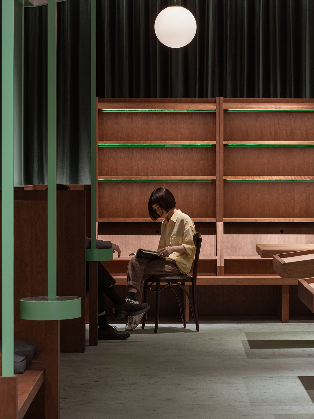
Every bookshelf, seat, and lamp [has been] specifically designed for each book and conforms to human’s reading behaviours.
Some quotes in this feature have been adjusted for clarity.
In Italy, Spanish design firm Masquespacio created the Bun burger restaurant in Milan and in Turin. Catch up on more hospitality architecture and design and retail design, plus subscribe to receive the Daily Architecture News e-letter direct to your inbox.


