As anyone who has jetted into Hong Kong will attest, approaching the densely populated metropolis by air is a surreal, SimCity-like vision. The bustling centre is home to the greatest number of skyscrapers of any city in the world; the towers of glass and steel rise suddenly out of the terrain as if from nowhere. On the ground, albeit frequently humid, the city is best experienced by foot – the enticing cuisine, cultural delights, neon lights and boundless opportunities for a spell of retail therapy are a climax for locals and urban explorers alike.

Aesop Hong Kong by March Studio
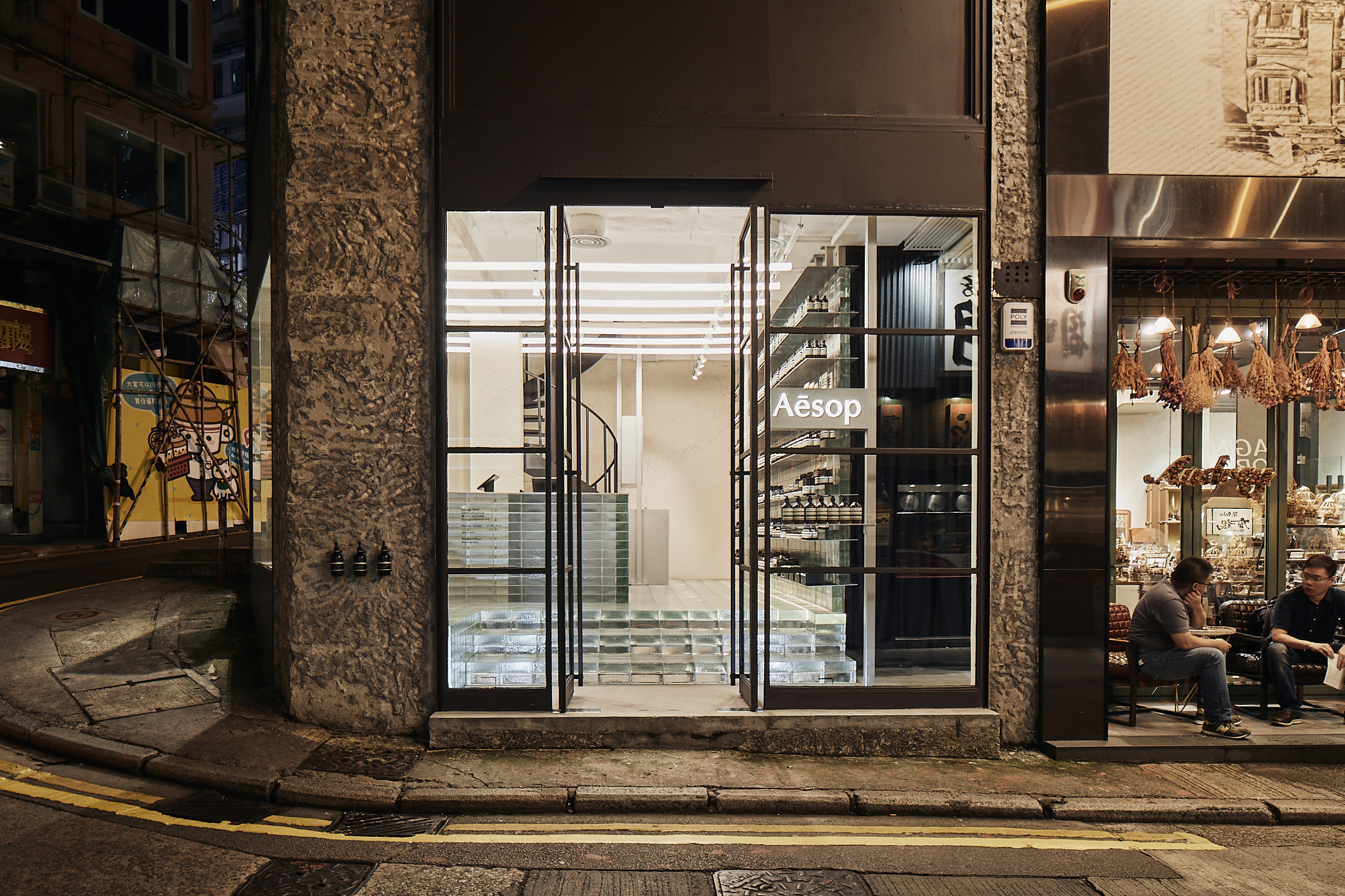
Joining the extensive retail scene in Hong Kong is the recently opened Aesop Gough Street store. The Australian-born luxury skincare brand – renowned for its alignment with prominent architects and designers from around the globe – has opened its latest boutique in Central, the city’s main business district.
Occupying what at first glance is a rather unremarkable wedge-shaped block, this is the 17th Aesop space designed by Melbourne-based architecture firm March Studio. At 44-square-metres on the ground floor and 38-square-metres on the second floor, the relatively cramped footprint of the location meant that this was always going to be a challenge for the team. Rising to the task of creating the new store, March Studio co-founders Rodney Eggleston and Anne-Laure Cavigneaux borrowed inspiration from the site’s storied past as a printing press, the hilly locale and the glitzy visage of the cityscape.

“The first challenge to overcome was to embrace the shape of the site,” says the architects. “Being present and visible from two-thirds of its sides, and being a wedge shape cut on the angle by Aberdeen Street, a central square counter with free-standing, oscillating testing sinks was the solution.”
The rear wall of the boutique lends itself to the display of Aesop products and the existing spiral staircase was retained. The new layout, however, was reliant upon the floor being levelled across a 700mm differential. Upon achieving a level floor plane from front to back, a Venetian glass brick floor was specified – without doubt the star material of the fit-out.
This isn’t the first time that March Studio has celebrated a single material within an interior scheme. It’s a technique that the practice has developed over a period of time for Aesop, having worked with bottles and cardboard en masse in other stores, with a resulting effect that is memorable and impactful.
The first challenge to overcome was to embrace the shape of the site.


