In the St John’s Wood district of Westminster, not far from the Abbey Road crossing made famous by The Beatles, a former London post office became a rich source of inspiration for Child Studio. The British design firm drew upon the storied past of the decommissioned building and its surrounds to transform the 170-square-metre interior into the latest Maido sushi restaurant.
“The post office was built in the 1960s and our design pays tribute to London’s modernist heritage of that era,” explains Alexy Kos and Che Huang, co-founders of Child Studio. “Our aim was to rediscover and celebrate the unique history of this building and the neighbourhood.”
Maido sushi restaurant in London by Child Studio
The late-modernist building casts its gaze along the leafy main street, watching over a nearby greengrocer and bookseller, a bank, library and a scattering of chic eateries and boutiques. Out the front, colourful blooms spill over pots suspended from typical London lampposts.
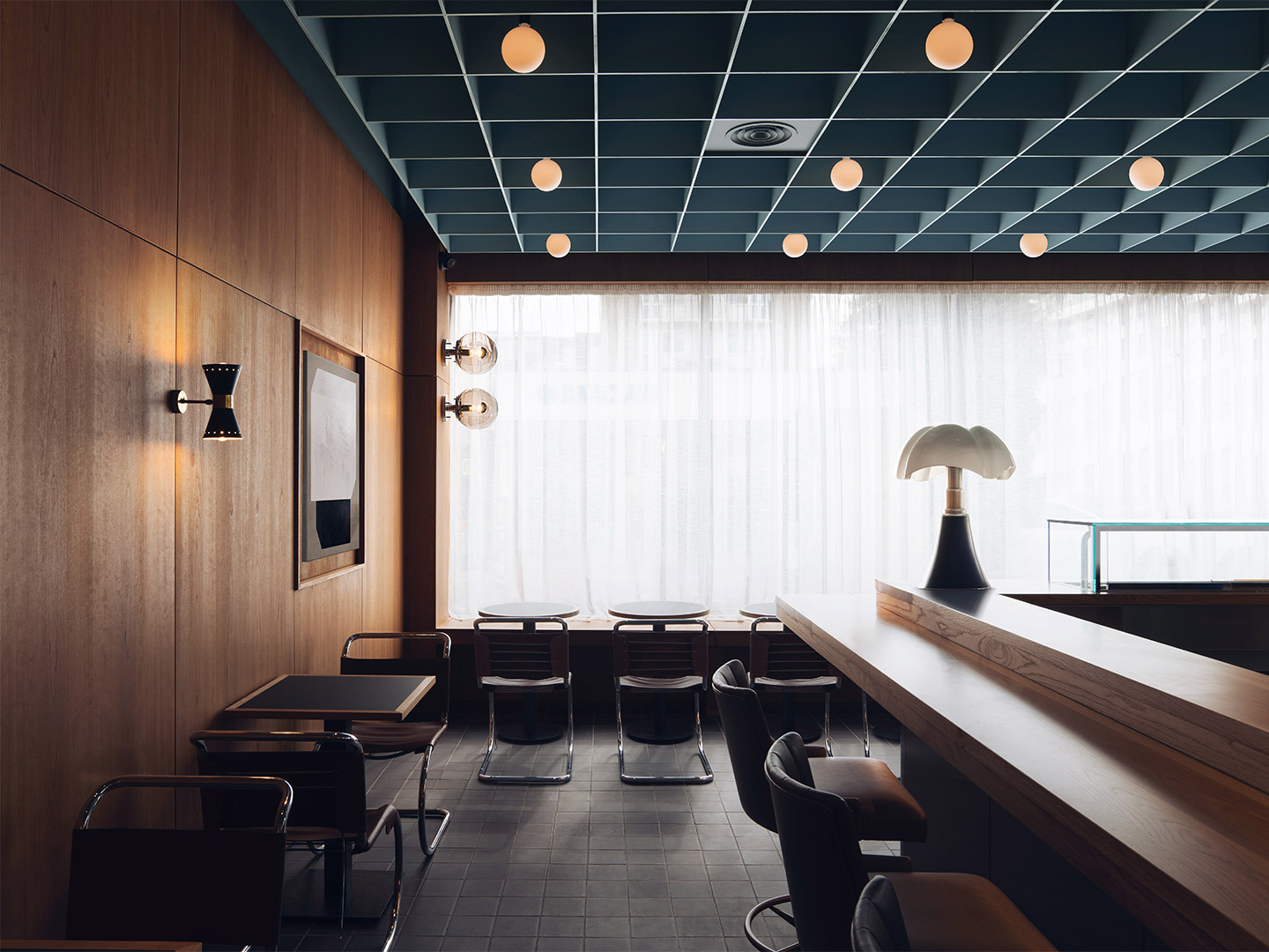
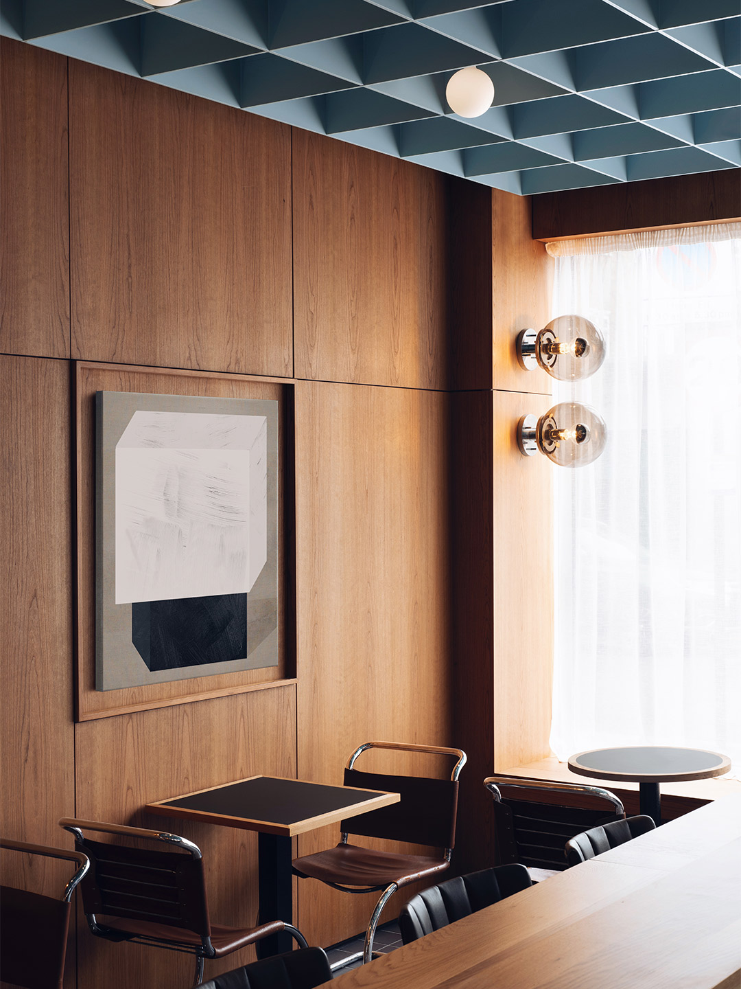
Inside the restaurant, the moody dining room welcomes visitors with a refreshing blend of European and Japanese design influences. “The Japanese references are subtle,” say the Child Studio team. “[They] present themselves through the choice of materials, the play of geometric patterns and the hand-crafted woodwork detailing.”
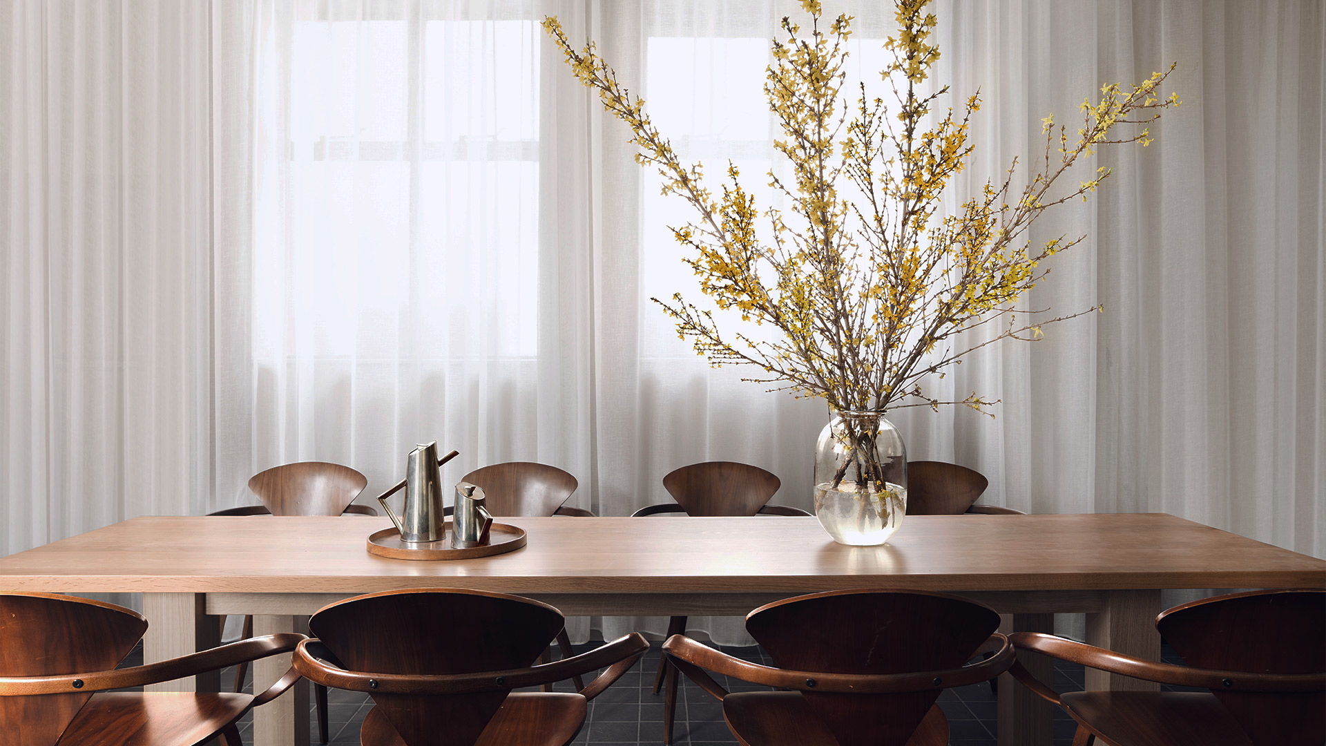
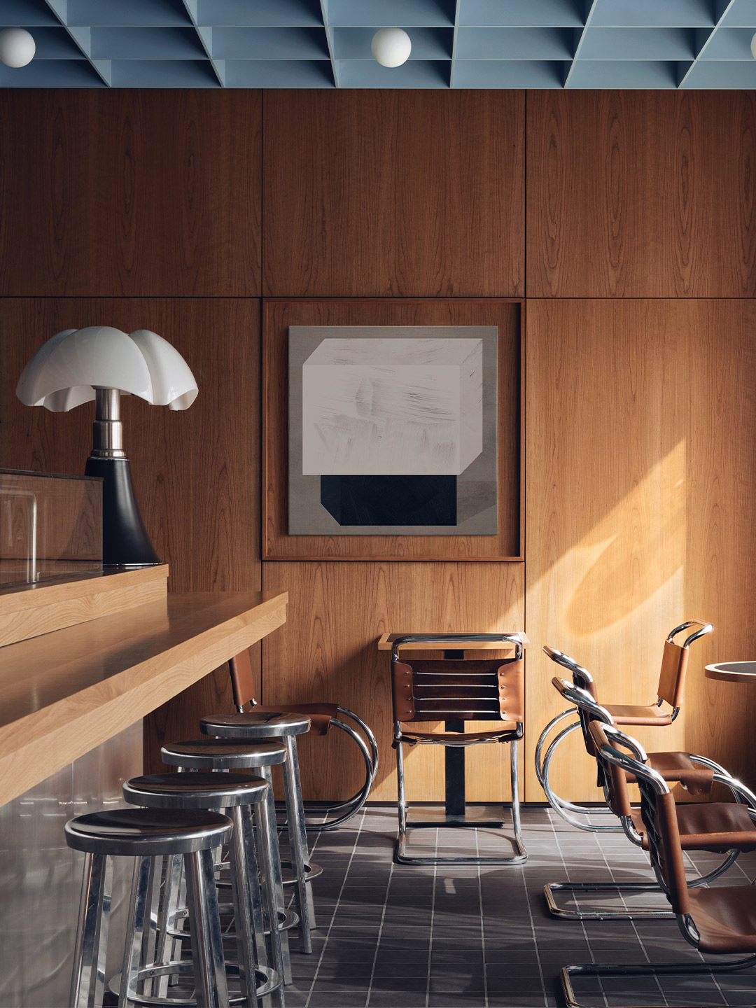
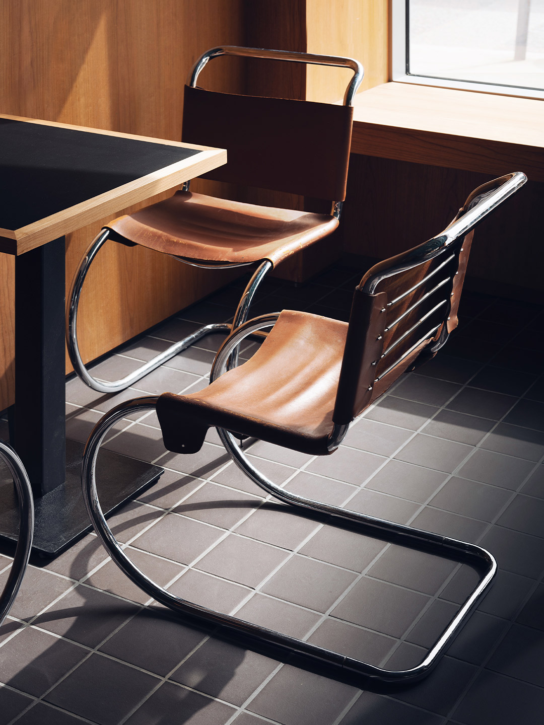
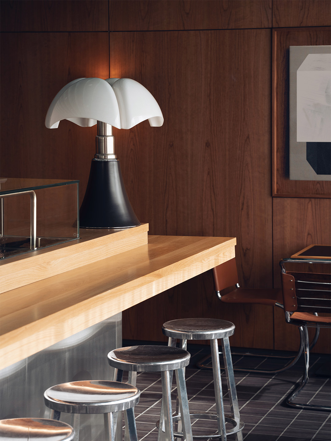
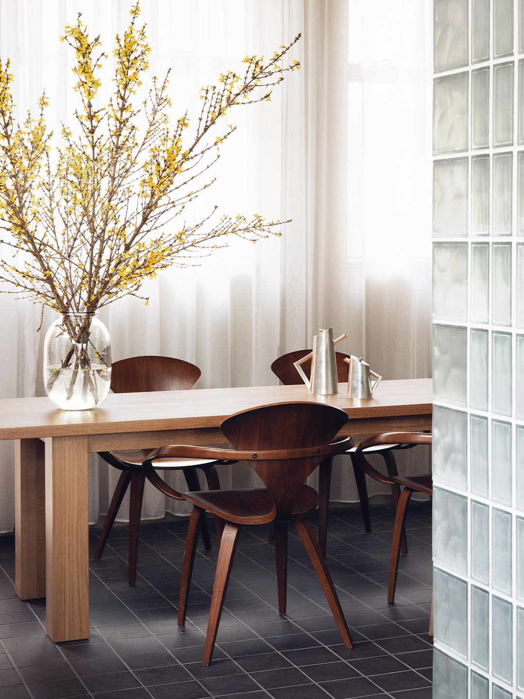
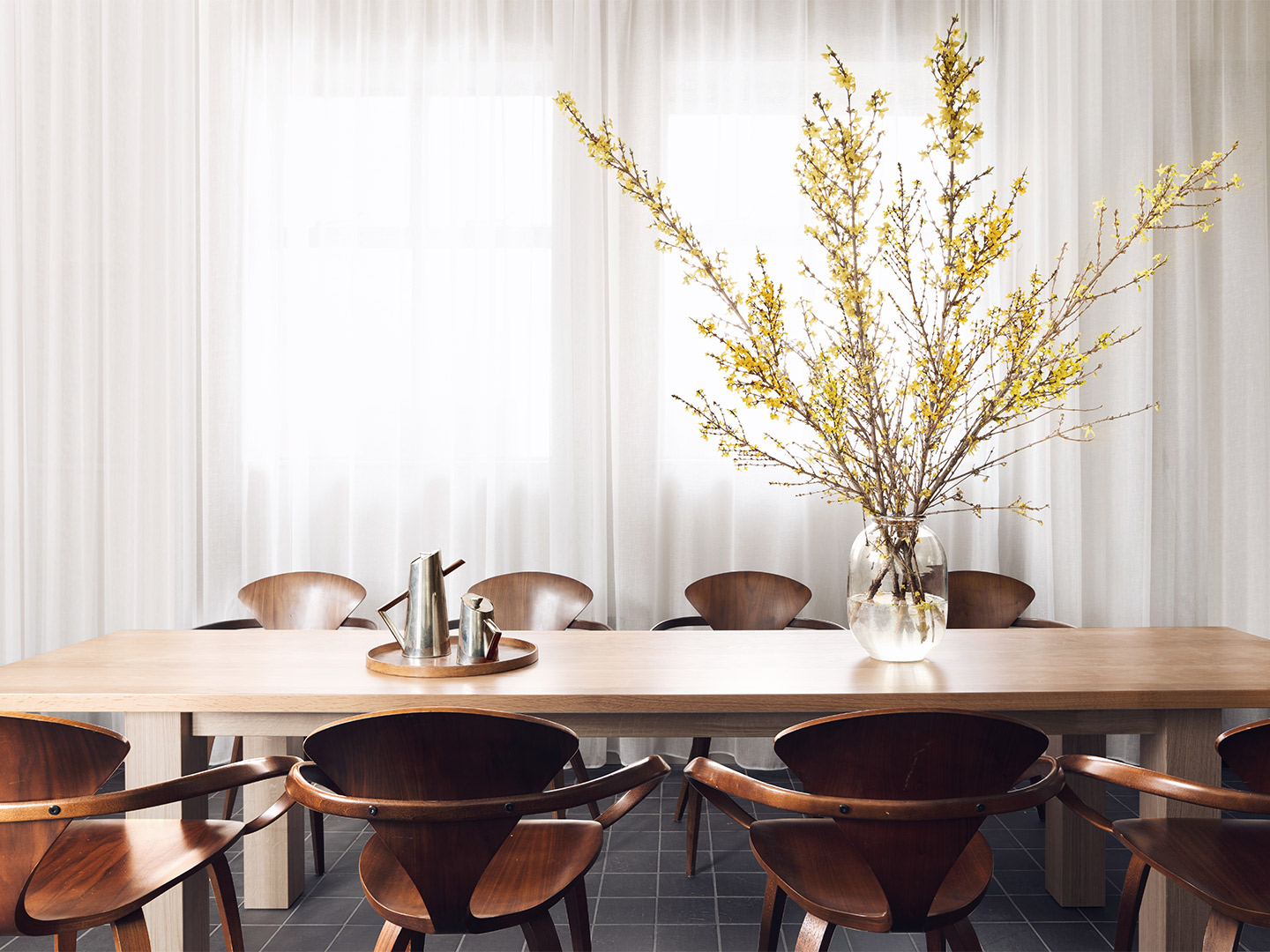
The dialogue between the East and West begins with the selection of antique and modern furniture: tubular steel chairs by Mies Van Der Rohe and moulded plywood armchairs by Norman Cherner (designed in 1958) are paired with cast-aluminium stools by Japanese designer Naoto Fukasawa.
The post office was built in the 1960s and our design pays tribute to London’s modernist heritage of that era.
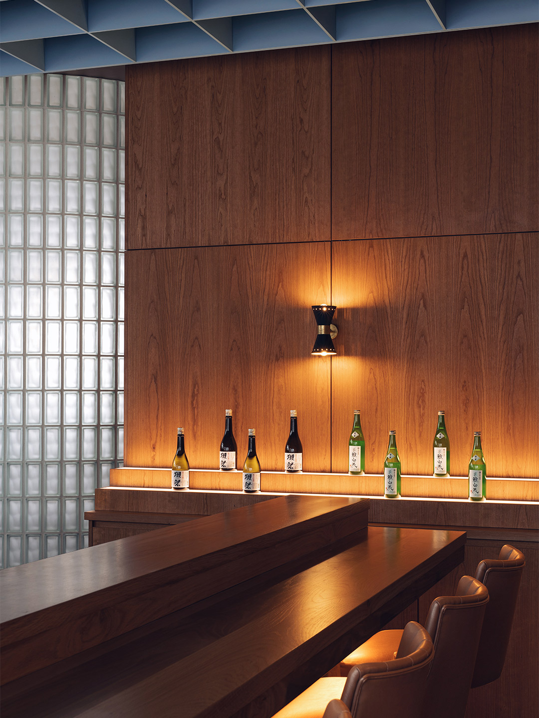
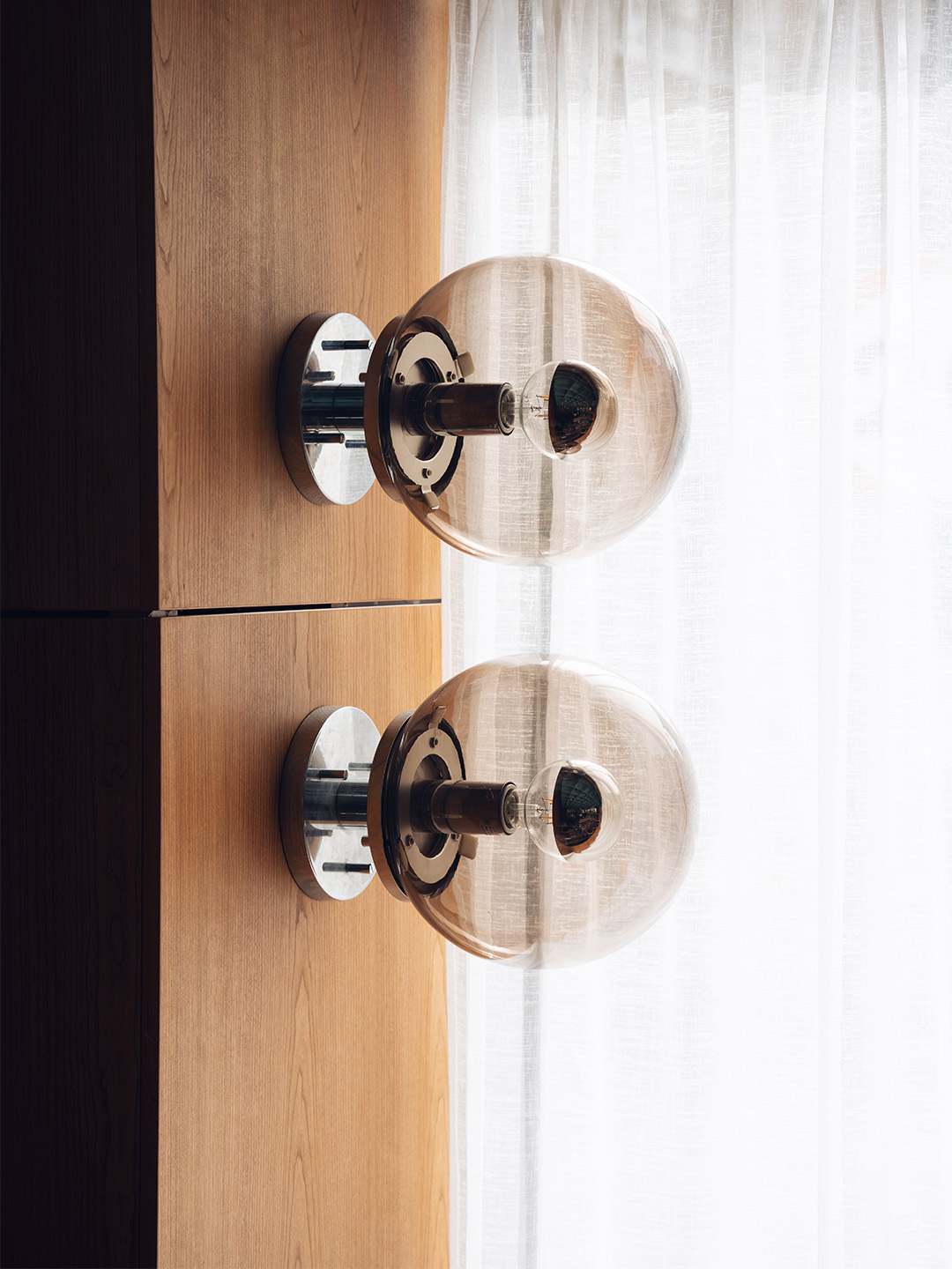
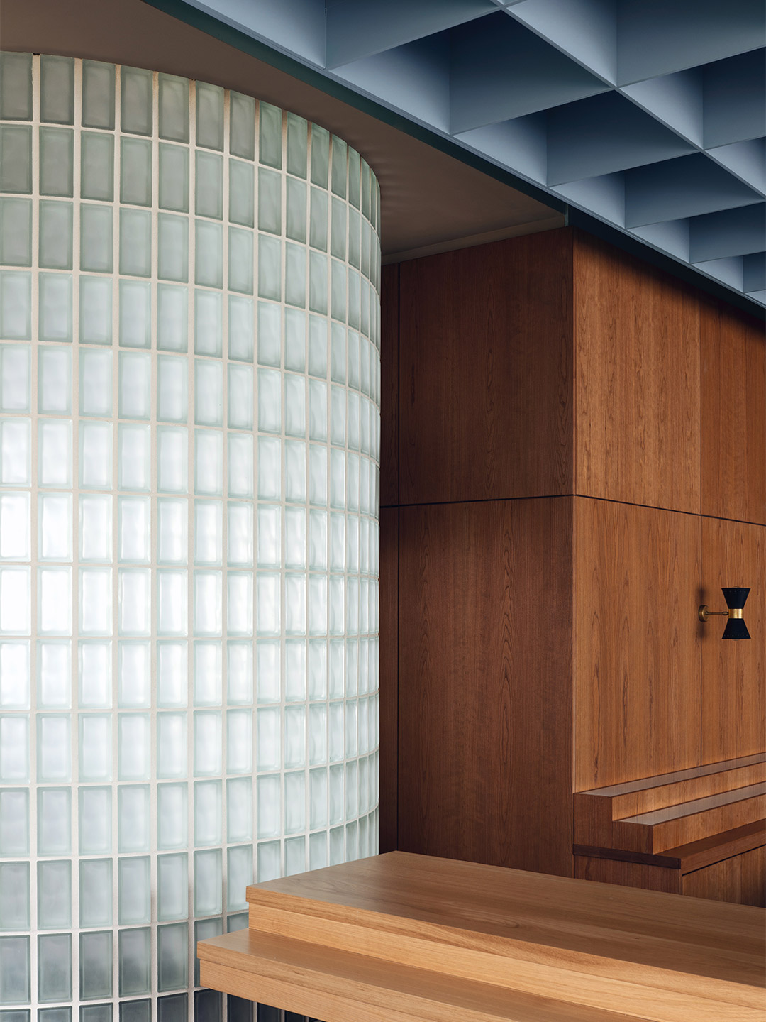
Sixties style is introduced throughout the restaurant with walls lined in dark cherrywood panelling. Large abstract paintings are tucked within shallow timber-framed alcoves, set between brass wall sconces by Stilnovo, the Italian pioneers of rationalist design.
Overhead, Child Studio devised a suspended coffered ceiling – reminiscent of the pattern created by Japanese shoji screens – finished in a soft blue hue. The straightforward geometric layout of the ceiling is echoed on the floor, where a smaller grid of black quarry tiles provides gentle detail underfoot.
The star attraction of the restaurant is perhaps the open kitchen where the reflective steel panelling of the counter-front is partnered with a 1960s ‘Pipistrello’ lamp, designed by Italian architect Gae Aulenti. Behind the counter, Maido’s sushi master prepares and plates-up authentic Japanese cuisine, from eel and masago California rolls to “fatty tuna” sashimi.
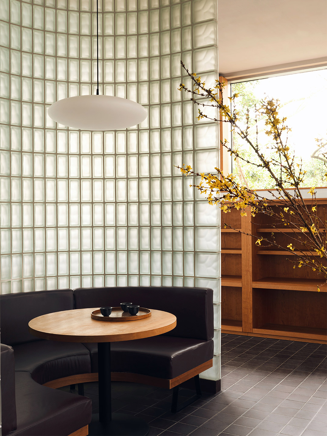
Towards the rear of the restaurant, a curved glass-brick wall splits the dining room into two, creating a semi-private area. As daylight filters through the sheer curtains and the textured glass, a familiar atmosphere is born. “The inspiration for this feature came from the St John’s Wood Library, the next-door building of the same era,” say Alexy and Che. “The library entrance is a beautiful combination of square glass blocks and dark wooden framework.”
In other areas, sake bottles, arrangements of flowering cherry blossom and tea sets (comprising contemporary pots and traditional Japanese cups) reference typical Japanese eateries. Dovetailed with mid-century finishes and iconic furnishings, the result is a convivial place that balances cross-cultural cool with a touch of nostalgia.
childstudio.co; maidosushi.com

Catch up on more hospitality architecture and design and retail design, plus subscribe to receive the Daily Architecture News e-letter direct to your inbox.
