When architect Bogdan Ciocodeica designed the first Lunet eyewear store in Bucharest, Romania, he and the team at his eponymous studio established a suite of “key elements” that would eventually define the brand’s in-store experience. The fit-out was so resolved that when the opportunity arose to carve out Lunet’s second Romanian store, in the city of Cluj-Napoca, the studio was armed with a readymade lookbook from which they could pluck memorable moments to replicate.
Shimmering silver-lined surfaces and lashings of bold colour were among the gestures that made the cut, ensuring a continuation of Lunet’s retail aesthetic and unconventional approach towards the experience of buying eyeglasses. “The idea was to borrow a few of the elements from the first store in such a manner that it feels like you have stepped into the Lunet universe,” Bogdan says. “At the same time, [we created] a unique and specially designed space, adapted to the new context.”

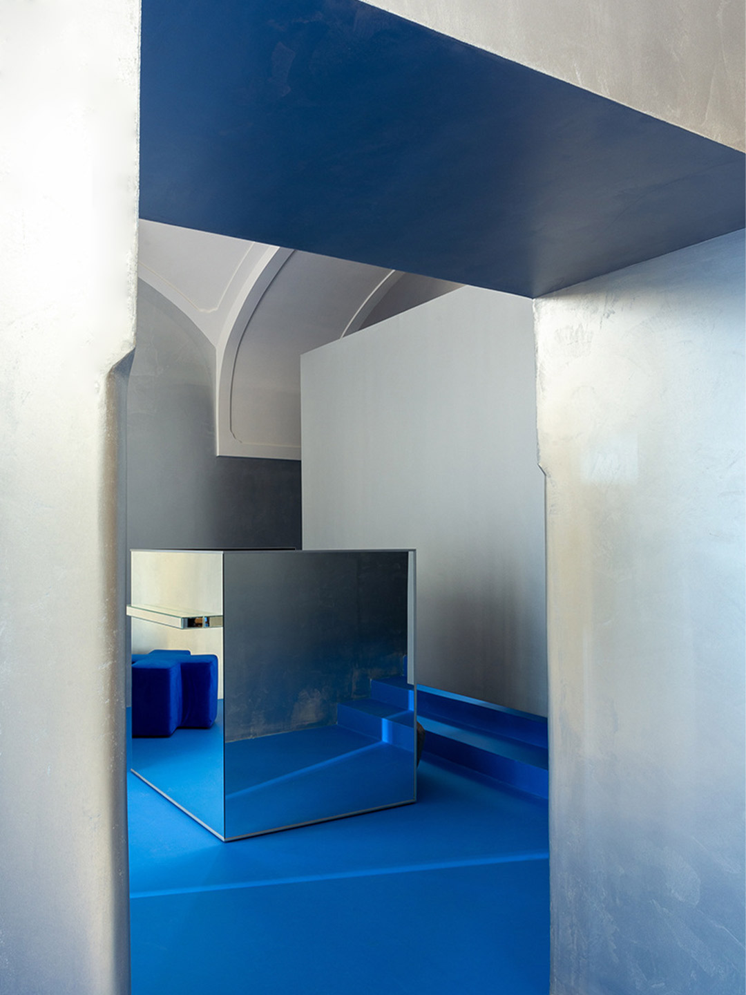
Lunet eyewear store in Romania by Bogdan Ciocodeica Studio
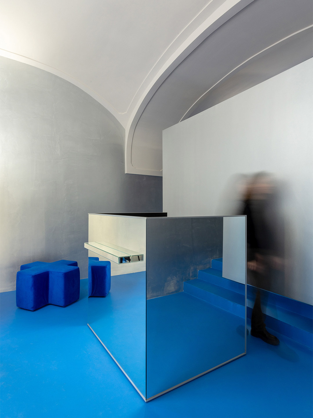
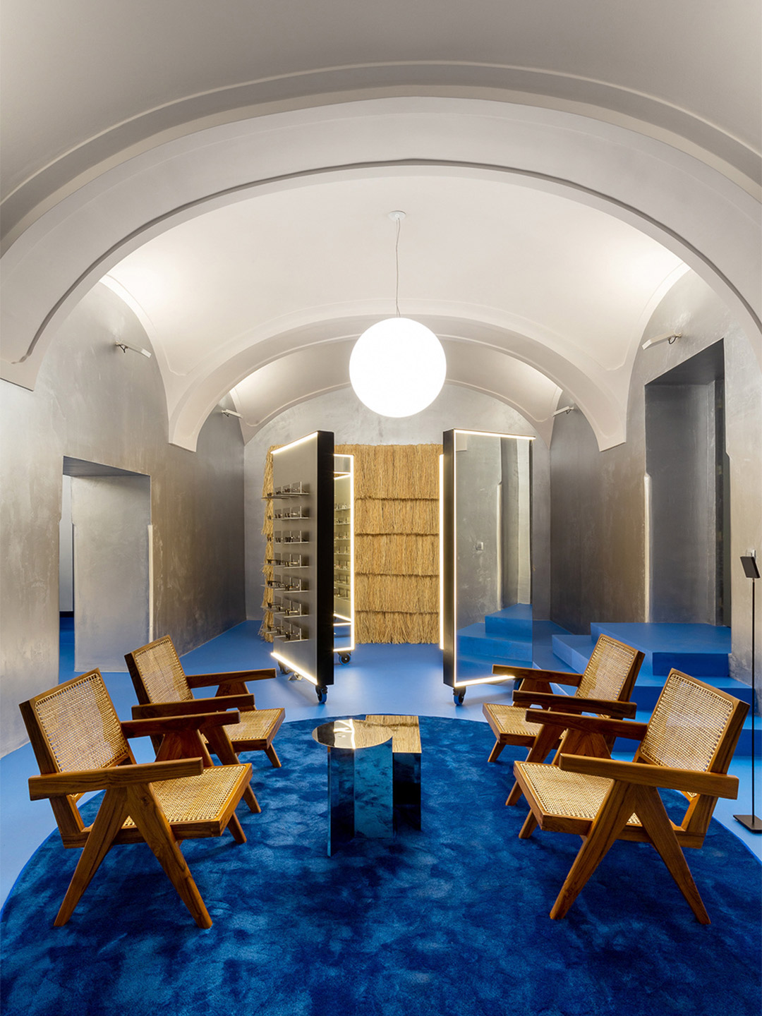
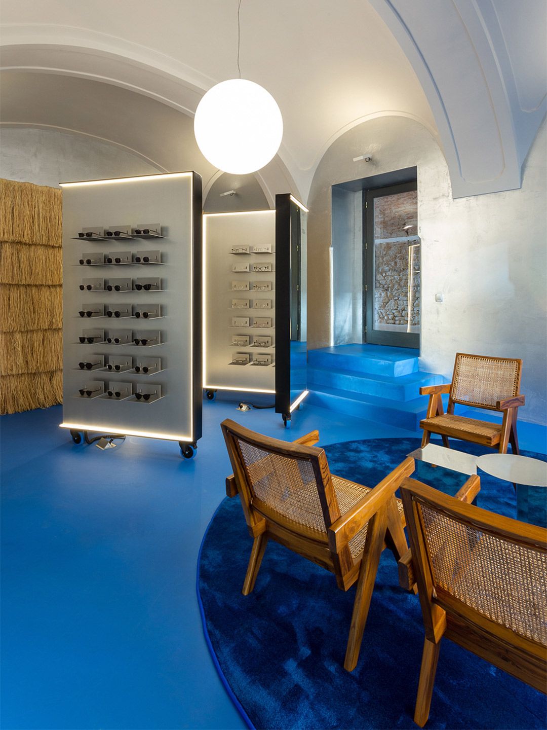
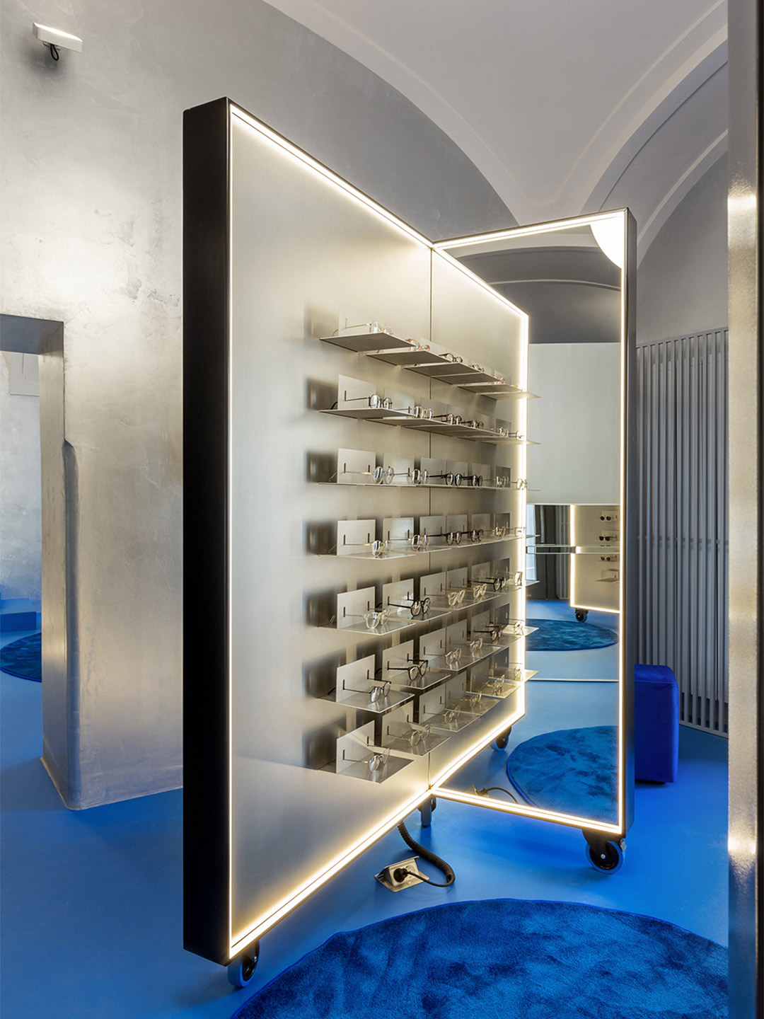
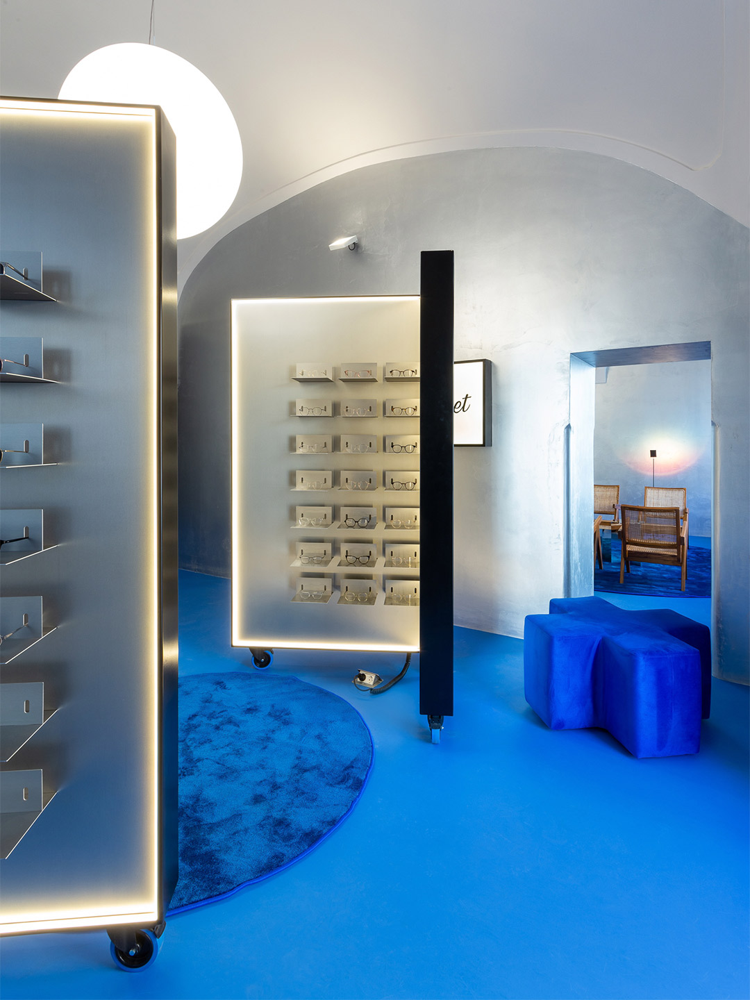
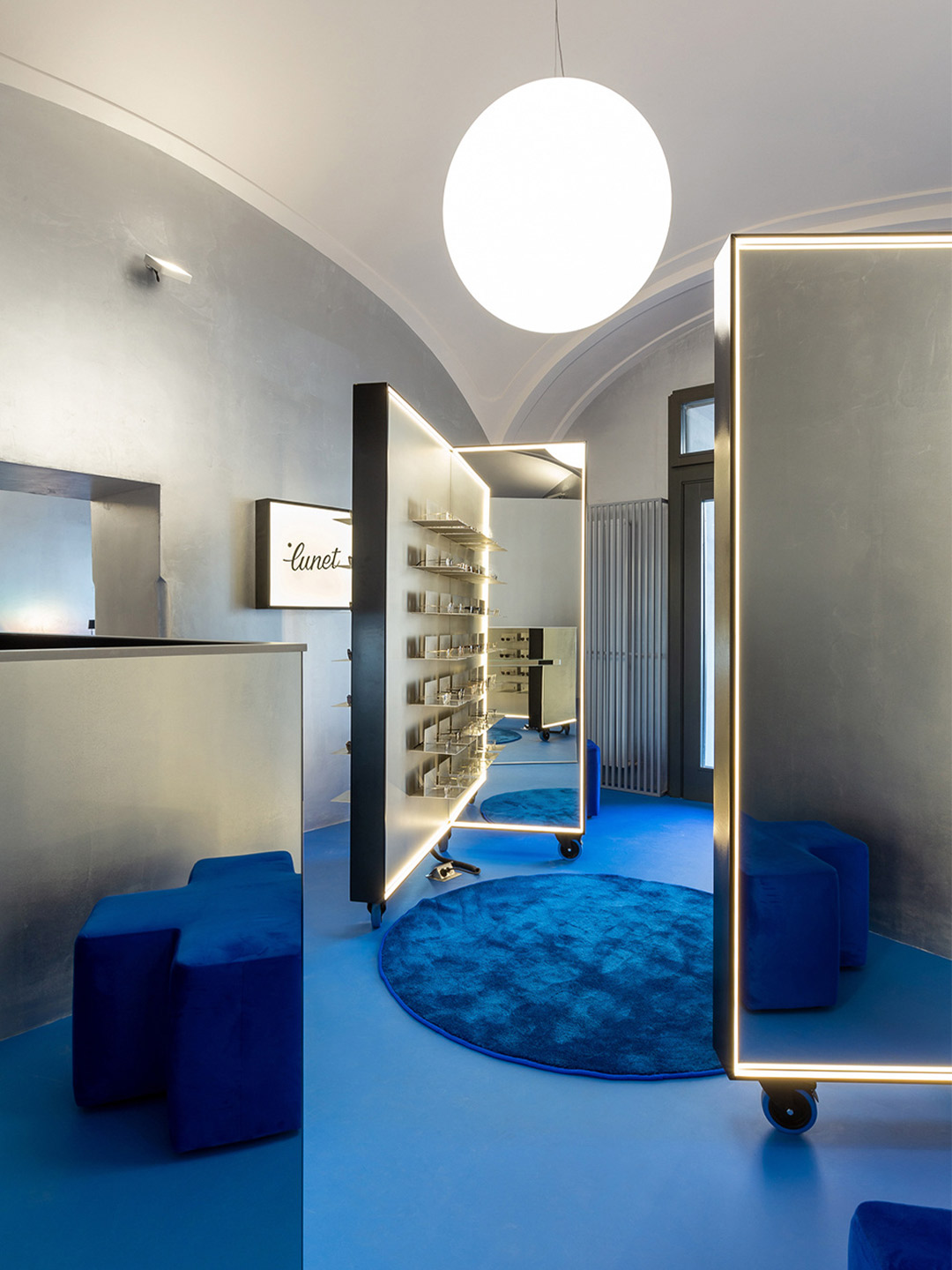
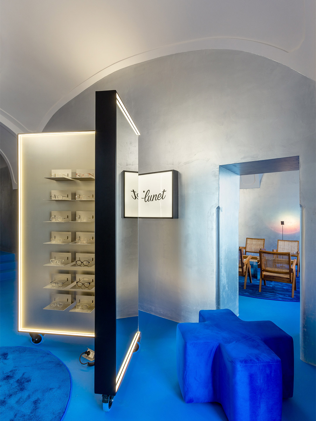
Located in an 18th-century building, in the unofficial capital of Transylvania, the store is designed as a “conversation” between old and new. “[It] aims to mitigate almost three hundred years of history with a contemporary aesthetic,” Bogdan says. But the store’s most important exchange is the way it communicates with potential clientele who seek to frame their faces with the latest eyewear. The moveable pieces of joinery that rise to this challenge adopt the same shape as those in Lunet’s first outlet, forming private “try-on” stations, as well as spaces for multiple customers to test-out specs at the same time. Such versatility “adds to the tailored, client-focused experience,” Bogdan explains.
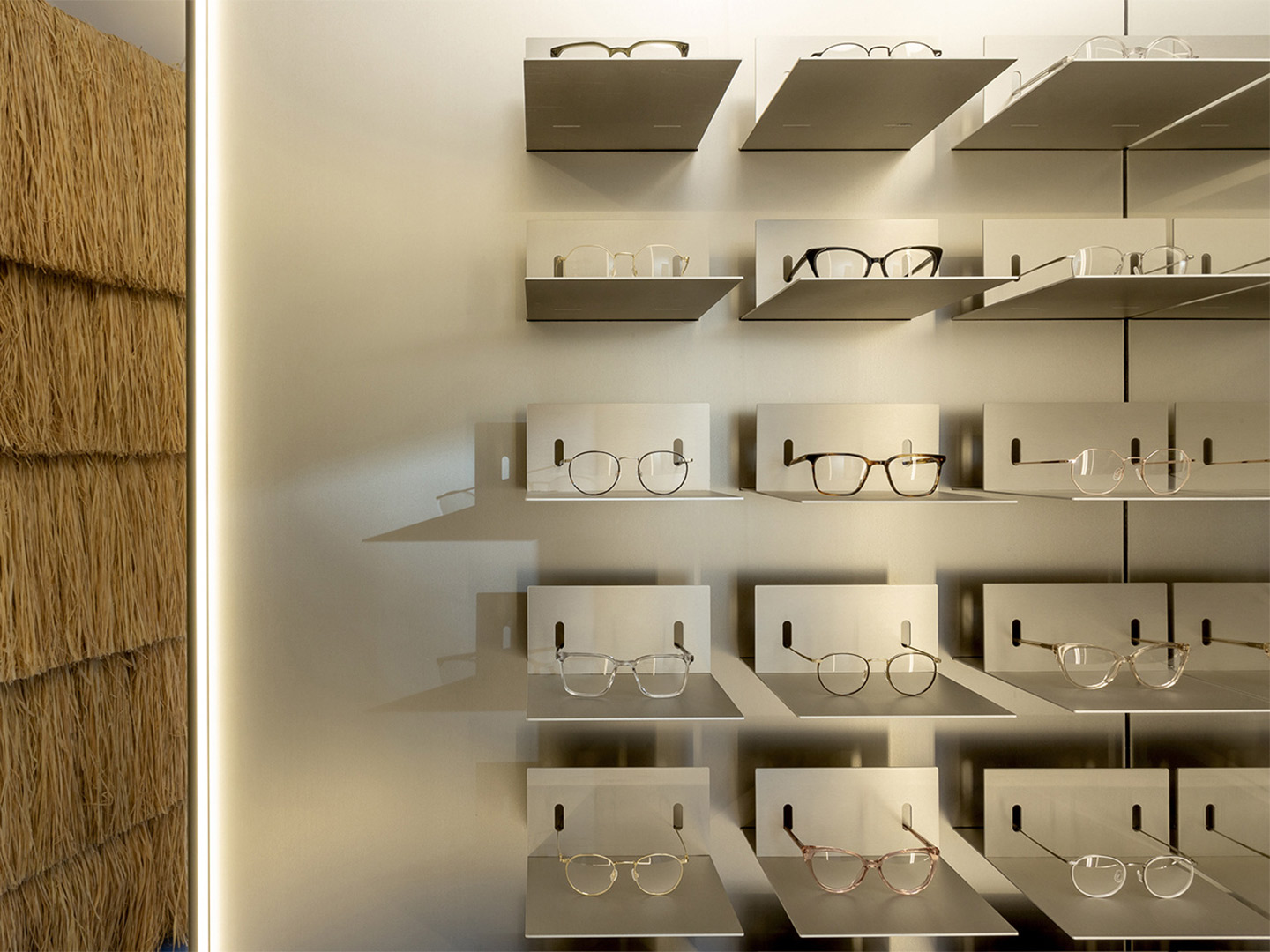
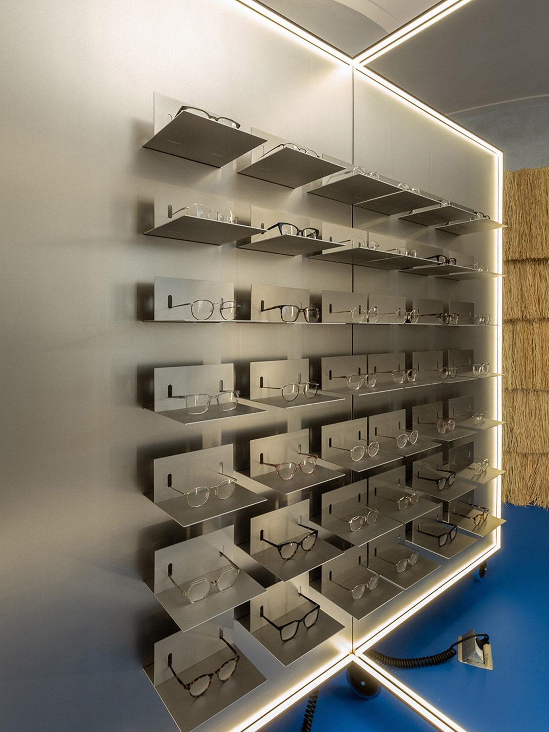
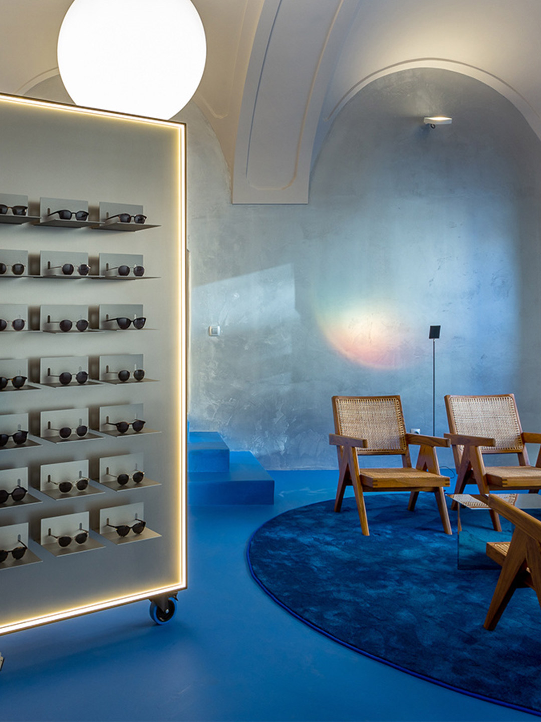
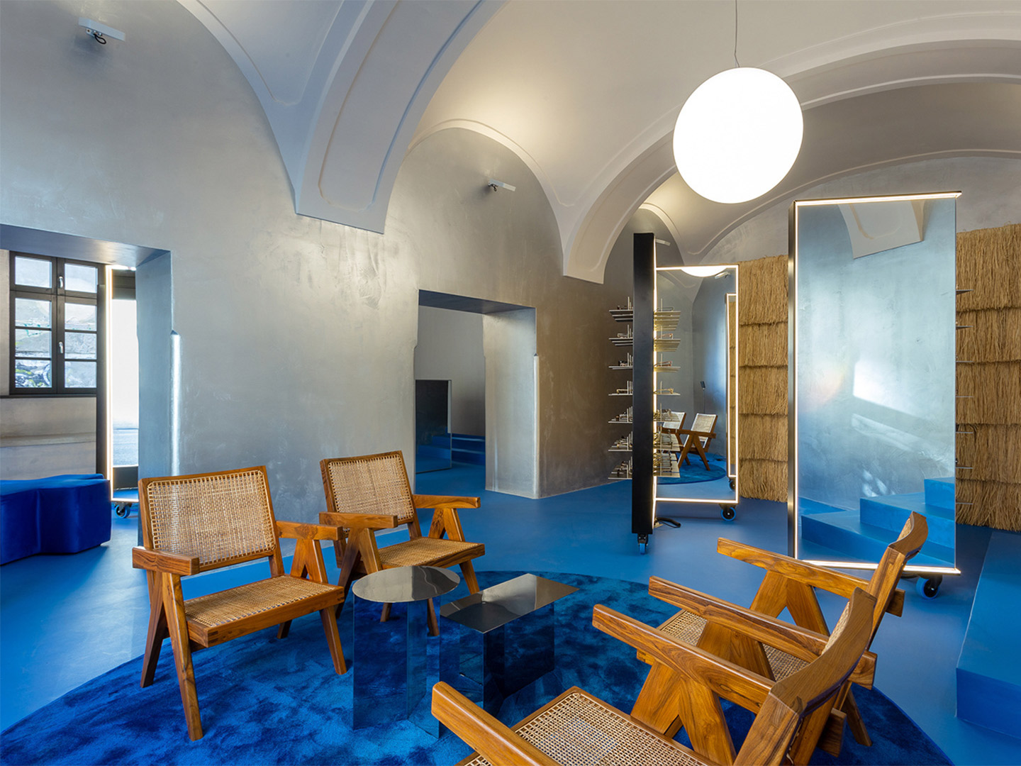
The lighting of the store bolsters the overall customer experience, playing a crucial role in how the product and the retail space are each perceived. LED strips outline the shapes of the display units, and the mirrors they contain, offering a uniform blanket of light for customers trying on glasses. (Anyone that’s used a halo light for a more superior selfie will recognise the benefits of this.) Crowned by “floating” luminous spheres, the space at-large basks in the light bouncing back from the overhead arches and vaults that are directly illuminated, creating a soft and immersive atmosphere.
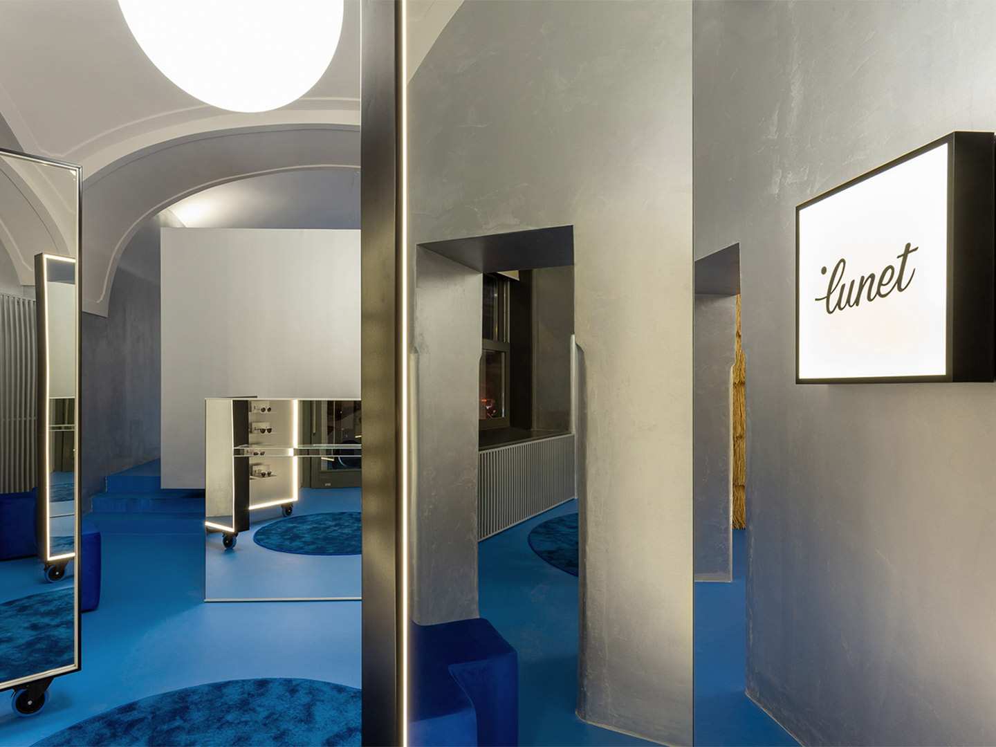
Reinterpreting the metallic curtains that line the perimeter of the first Lunet store, silver-painted walls in the Cluj-Napoca outlet act as a glittering buffer between the off-white ceiling and the vivid blue floor, rugs and occasional furniture that anchor the scheme. “The metallic silver walls, almost like those of a spaceship, descends from the future, enhanced by the sharp aluminium eyeglasses displays,” Bogdan suggests.
The dominating effect of the floor creates an “oasis of feel-good emotions,” the architect says, referencing the colour’s likeness to Majorelle blue, a shade made famous in the Marrakesh gardens of artist Jacques Majorelle. “The intense, vibrant blue is replayed in various textures, from the epoxy resin to the lush carpet, offering the perfect background for all the silver metallic elements and also for the natural textures.”
Raffia is one of those natural materials, tasked with wrapping the wall of the operational area in the showroom. It’s mounted in successive horizontal rows and trimmed to resemble the traditional reed-roof homes of Romania. Teak-and-cane easy chairs by Swiss architect Pierre Jeanneret add to the layer of warmth established by the raffia, beautifully paired (“and juxtaposed!” Bogdan declares) with the mirrored ‘Slit’ tables by Danish brand Hay.
Zooming out from the details, the entity aligns with Lunet’s core vision, steering away from the conservative-looking spaces typically associated with eyewear locations. It aims to provide a familiar experience, like a “living room”, Bogdan suggests, that encourages socialising, a sense of discovery and practical solutions. “The space continues to reimagine a new type of eyewear experience, one that focuses on emotions and human connection, making the purchase of glasses a memorable, positive interaction.”
ciocodeica.com; luneteyewear.com
Zooming out from the details, the entity aligns with Lunet’s core vision, steering away from the conservative-looking spaces typically associated with eyewear locations.
Catch up on more architecture, art and design highlights. Plus, subscribe to receive the Daily Architecture News e-letter direct to your inbox.
Related stories
- Introducing the New Wave collection of 80s-inspired vases by Greg Natale.
- Greg Natale launches 70s-inspired glassware (and a signature cocktail for summer).
- Swatch list: Kelly Wearstler curates paint range for Farrow & Ball.
- Stokes 14: Architect William Smart’s creative studio in Sydney.
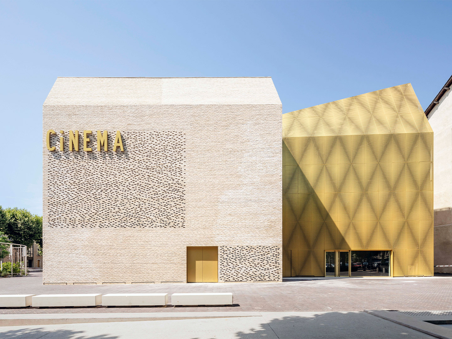
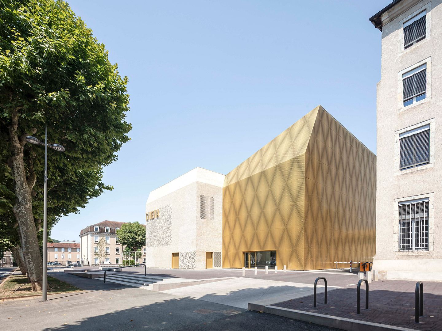
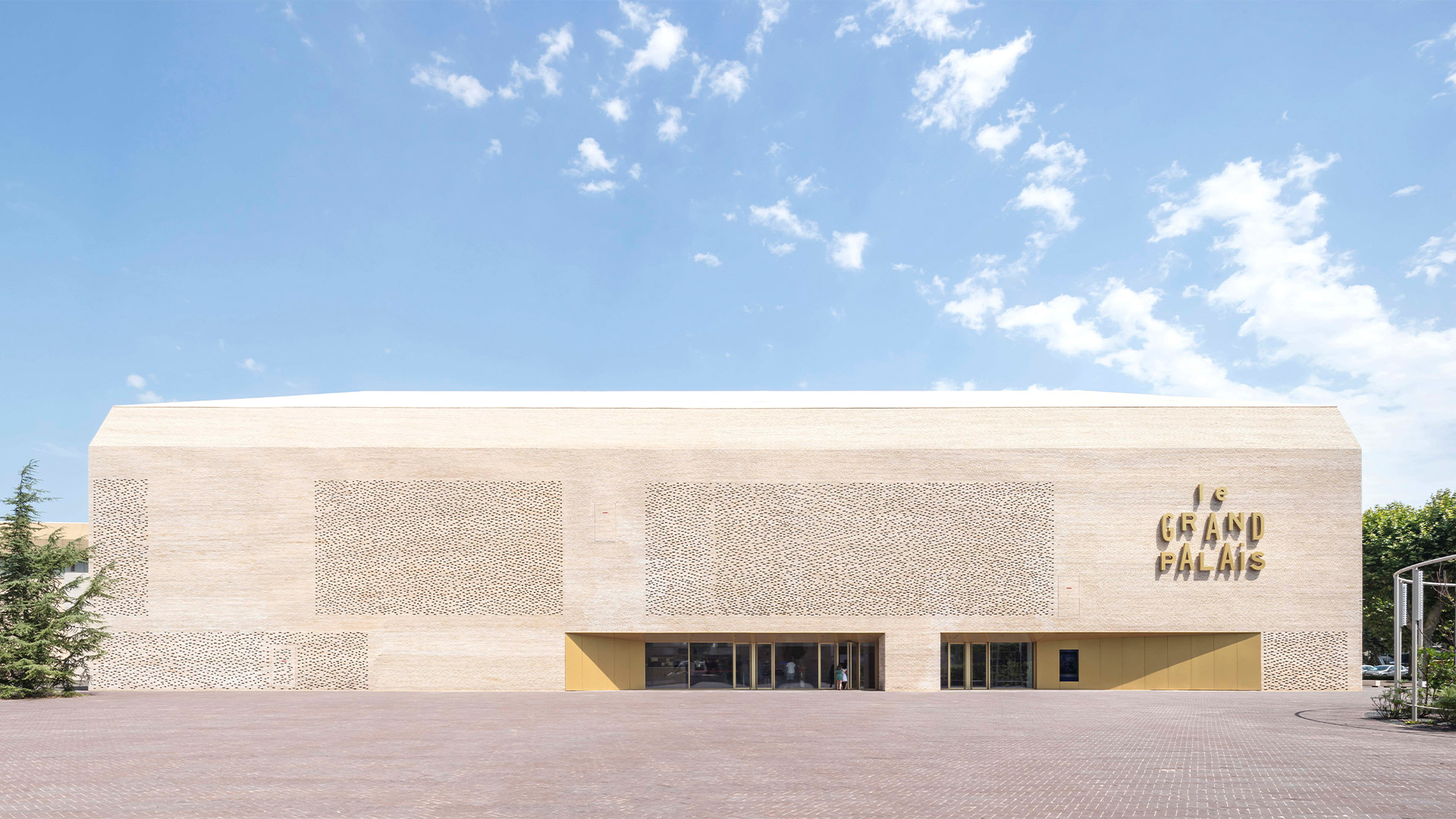
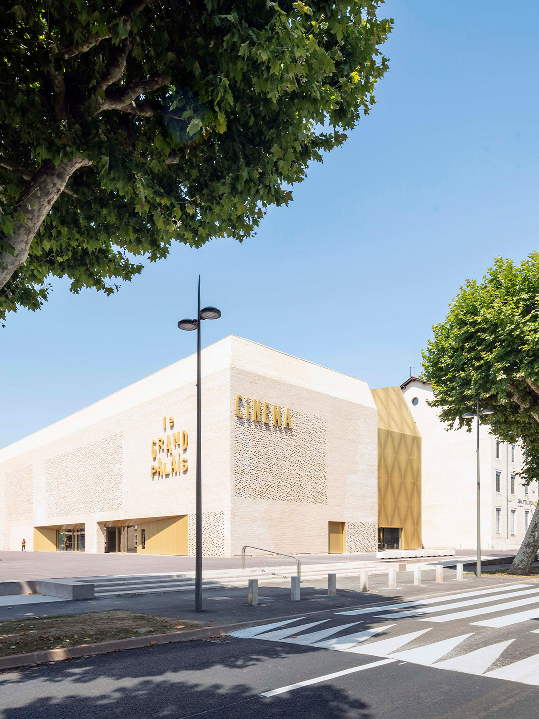
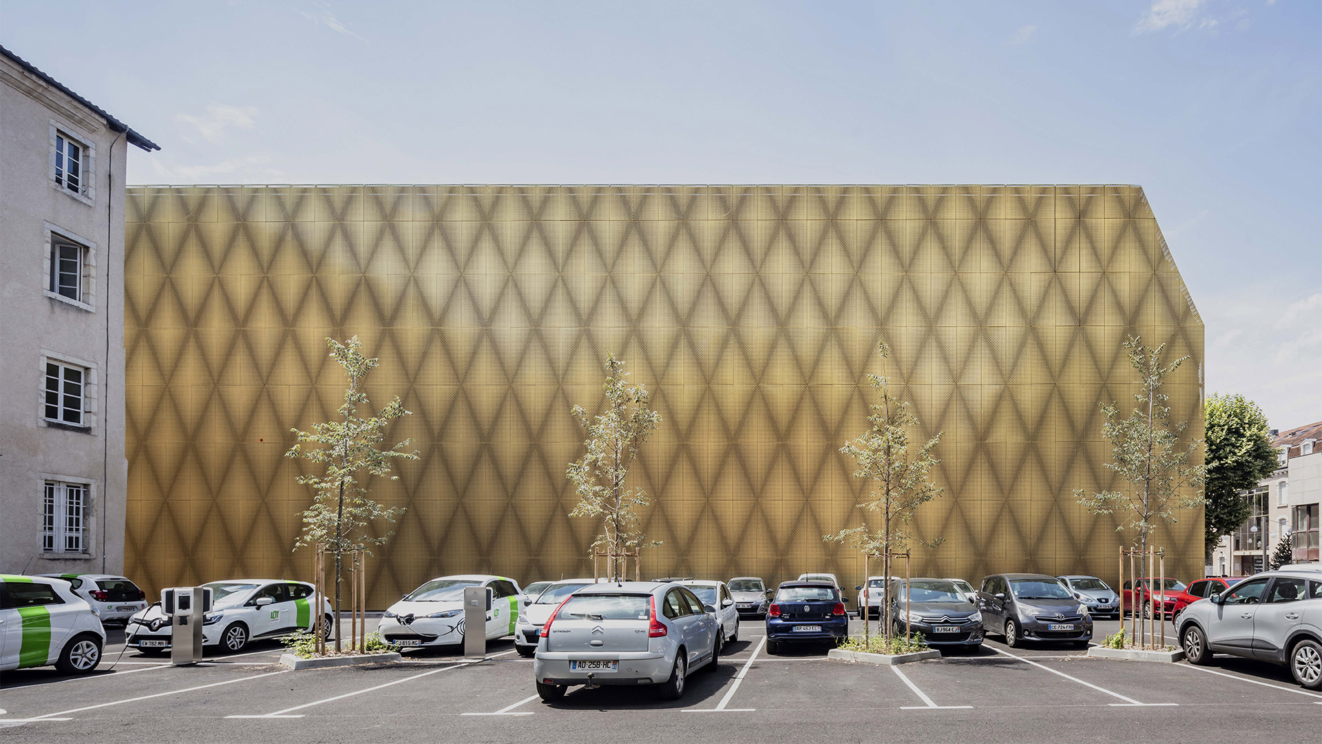
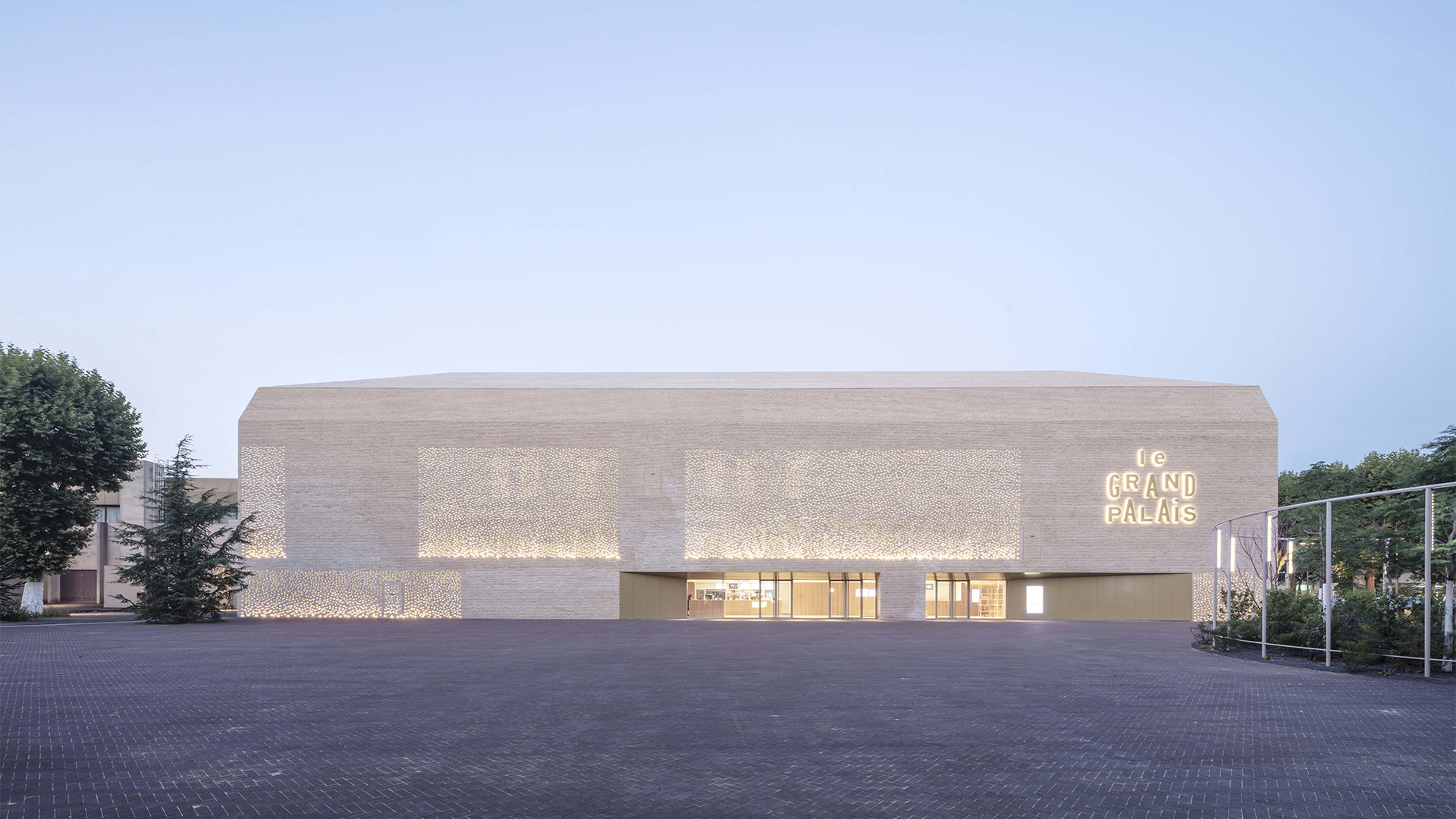
In the south of France, Cinéma Le Grand Palais is a new addition to the historic village of Cahors. Located to the north of the township’s centre, just a few steps away from the banks of the magnificent Lot River, the cinema complex joins a precinct with a storied past; an ensemble of buildings that were originally used as a convent, then later employed as a military base. After a fire in 1943 left the east wing of the complex in ashes, the then vacant space between the remaining buildings – now the site of the cinema – became a poorly defined parking lot.
When designing Cinéma Le Grand Palais, the team from Antonio Virga Architects looked to the existing buildings and their surrounds for inspiration. In particular, a commonality that was shared between each of the structures on-site. “All of the buildings were organised according to a rigorous set of planning rules, in accordance with 19th-century design practices for military and public facilities,” say the architects. To properly restore the scale of this ensemble, where the new cinema filled a long overlooked void, the group of spaces was treated with “great simplicity,” they add. “With a coherent choice of materials, furniture and plantations.”
Cinéma Le Grand Palais in Cahors by Antonio Virga Architects
Taking full advantage of the existing elements, such as the buildings, trees and sightlines, the architects reveal that the basis of the project was to find the “lost urbanicity” that the site once had or could have. They explain: “It was important to have a timeless architectural expression, so that [the cinema] would not stand as just something new in the old, but as something that would connect strongly with the existing, maybe as if it had been there for a long time – avoiding all pastiche or faux vieux.”
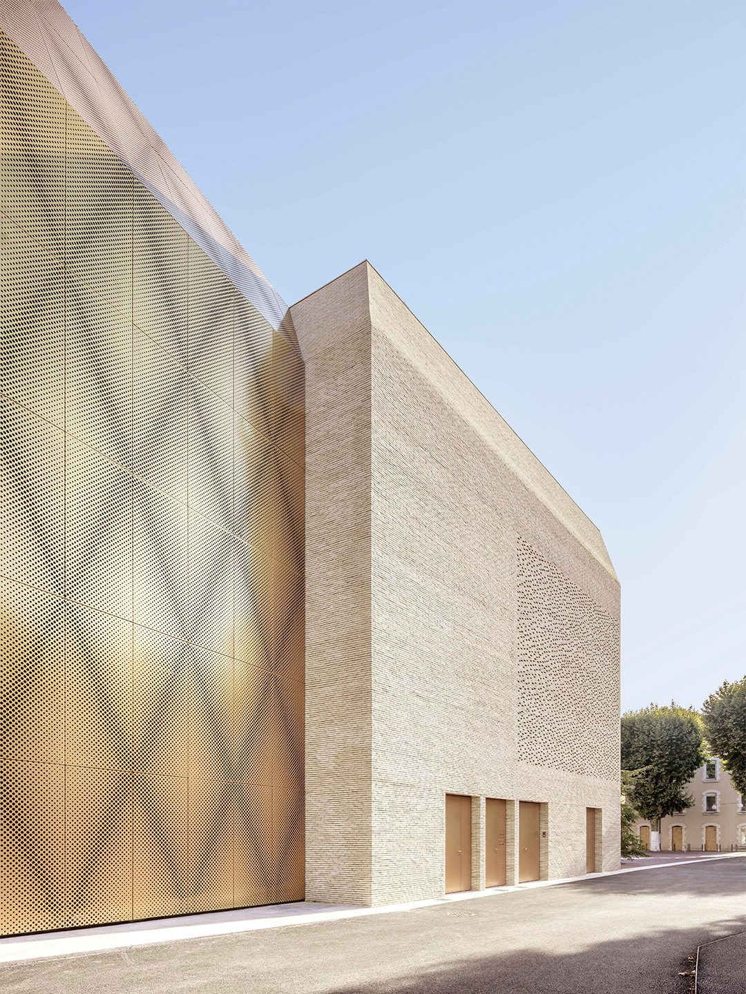
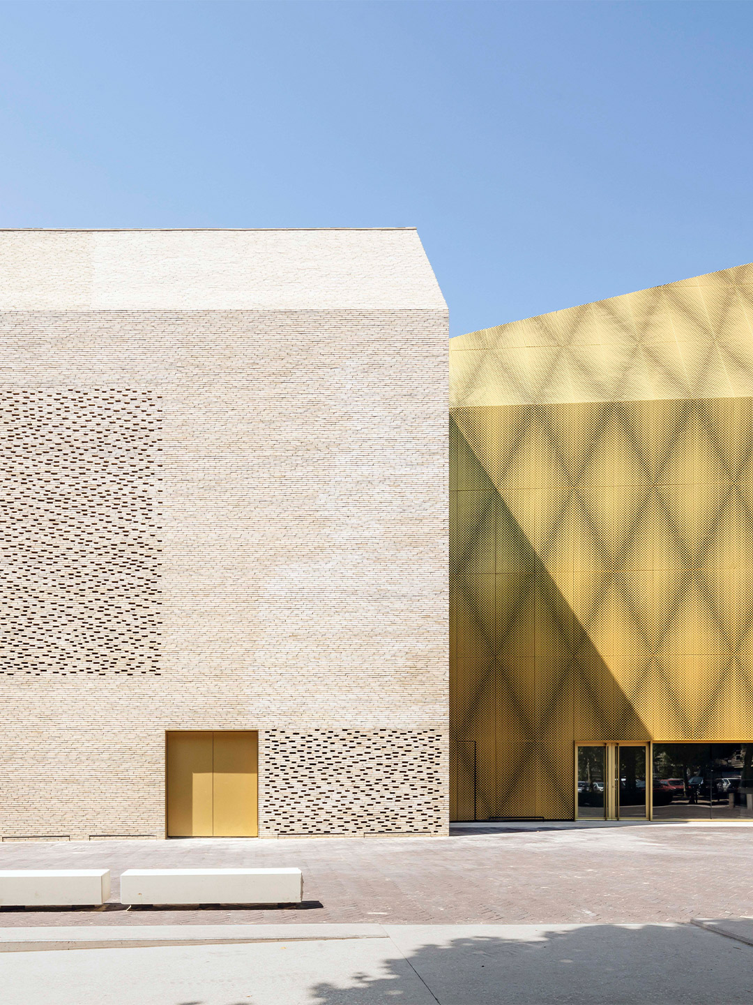
To achieve this sense of understated newness, the brick volume of the cinema mirrors the volumes of the existing buildings, reinterpreting their materiality with new-generation masonry products. “We wanted to use a material that would blend well with the materials of old Cahors,” say the architects. Brick is commonly used in the traditional architecture of Cahors – visible, for example, on the facade of the nearby church of Saint Barthelemy – and thus functions as an obvious link between the new architecture of the cinema and that of the old town.
“We also chose a [brick] colour that is reminiscent of the natural stone of Cahors,” the architects add. Again, this was something new that was sympathetic to the existing architectural fabric, yet it gave the building a contemporary edge. Especially in the way the pale-coloured bricks were put to use with patches of perforated brickwork replacing standard windows. “The building was designed as a virtually windowless volume, all covered in brick – including its roof,” the team say. “We wanted to use this traditional material in an inventive and surprising way.”
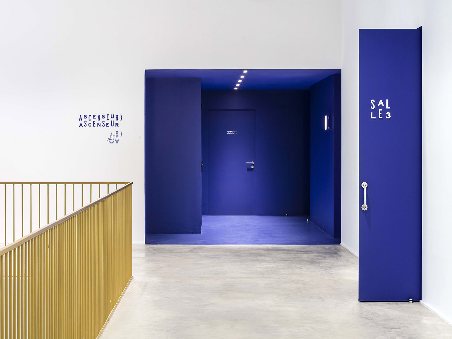
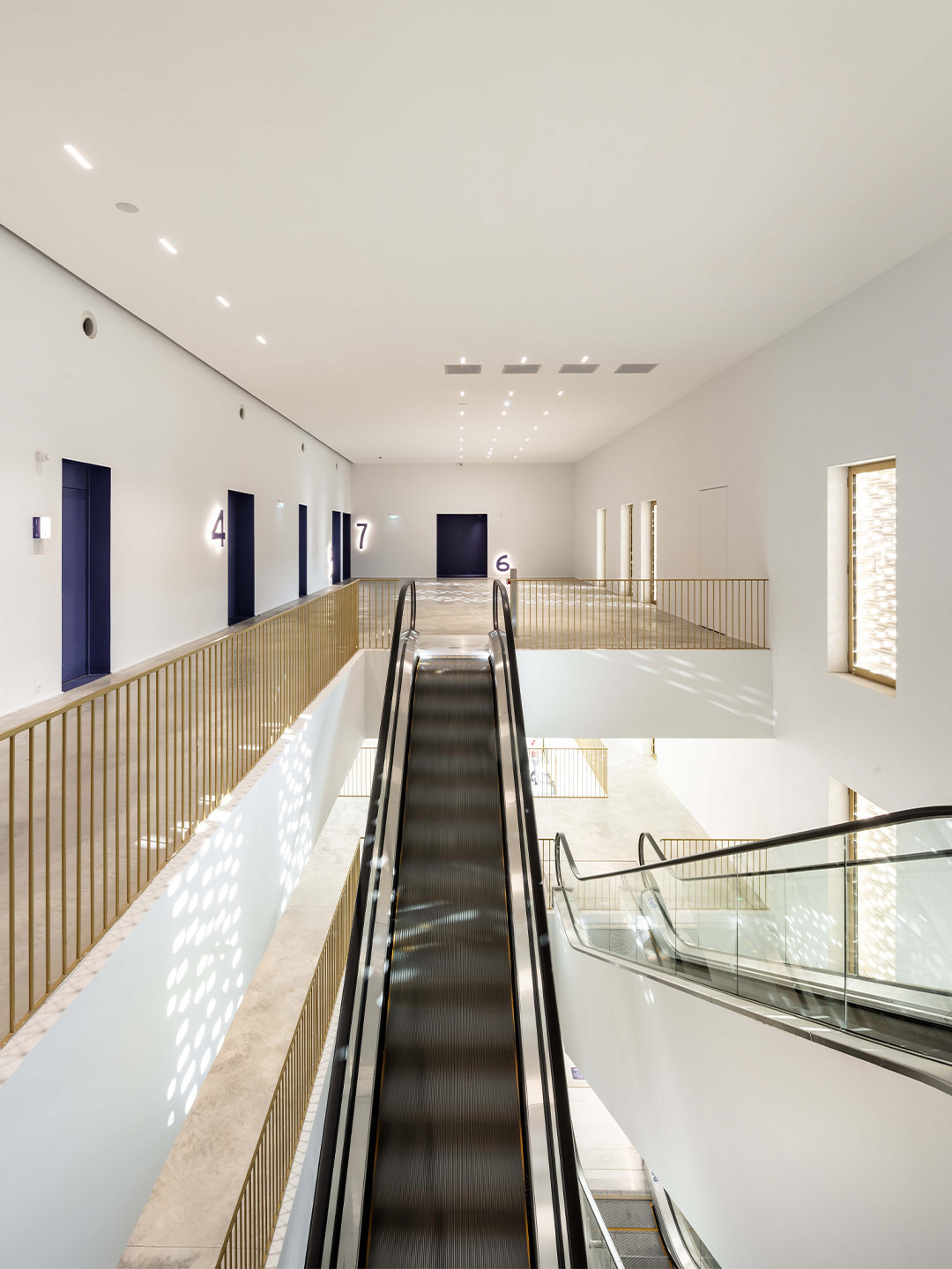
The desired program of Le Grand Palais (a cinema with seven rooms) was always going to be larger than the area made possible within the brick building, so the team at Antonio Virga Architects needed to make it bigger. This was achieved via a glimmering gold-panelled annexe. “To not lose the symmetry created by copying the older buildings, we opted for this false extension,” the architects explain. “A second building [wrapped] in golden metal – a material that, again, blends well with the colours of Cahors.” Just like the brick building, the so-called “false extension” is a totally new structure. It’s considered by the architects to be “more flagrant” than the first, but it’s also more hidden from certain viewpoints, positioning the cinema complex as an architectural jewel and cultural gem just waiting to be discovered.
It was important to have a timeless architectural expression … maybe as if it had been there for a long time.

Catch up on more architecture, art and design highlights. Plus, subscribe to receive the Daily Architecture News e-letter direct to your inbox.
Related stories
- Venus Power collection of rugs by Patricia Urquiola for cc-tapis.
- Bitossi celebrates centenary in Florence with new museum and 7000-piece display.
- Casa R+1 residence in southern Spain by Puntofilipino.
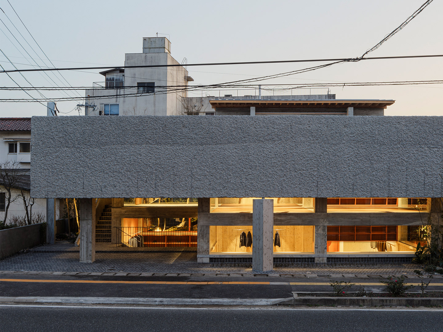
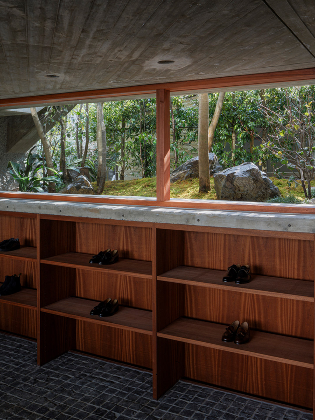
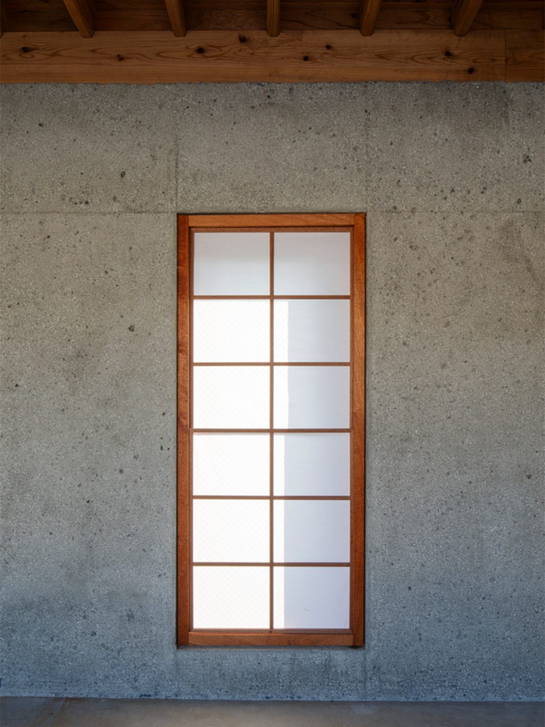
Designed by architect Toru Shimokawa, the flagship store belonging to one of Japan’s most stylish multi-brand fashion outlets is located in Hita City, in the country’s Oita Prefecture. Tucked between a dense mixture of shops and houses, not far from the Ohara-hachimangu shrine, the site and its surrounds gives the impression that nature is scarce – a theme that the client encouraged the designer to explore. “The client asked for an architecture that fits the historically heavy Ohara approach,” the architect explains.
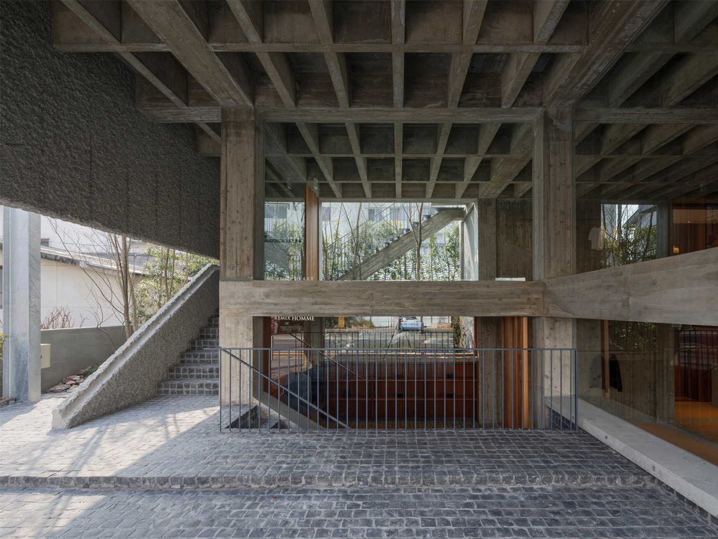
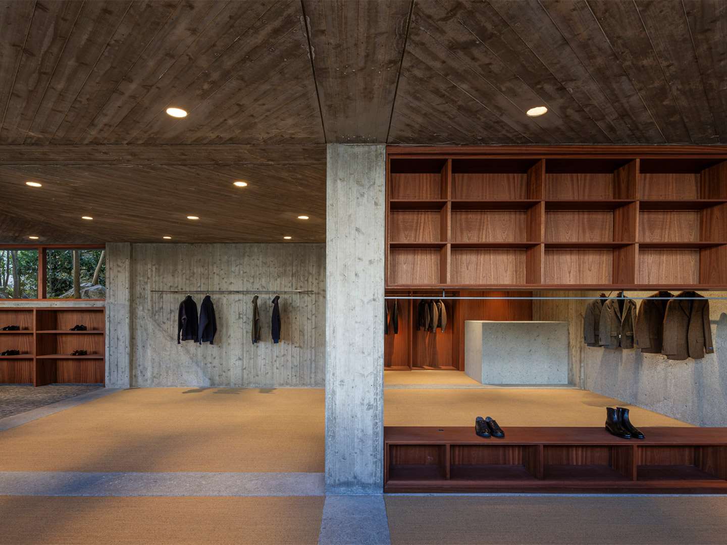
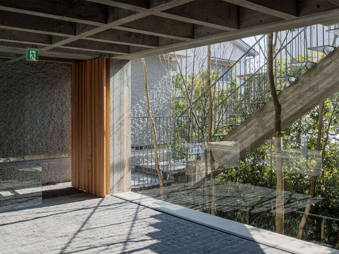
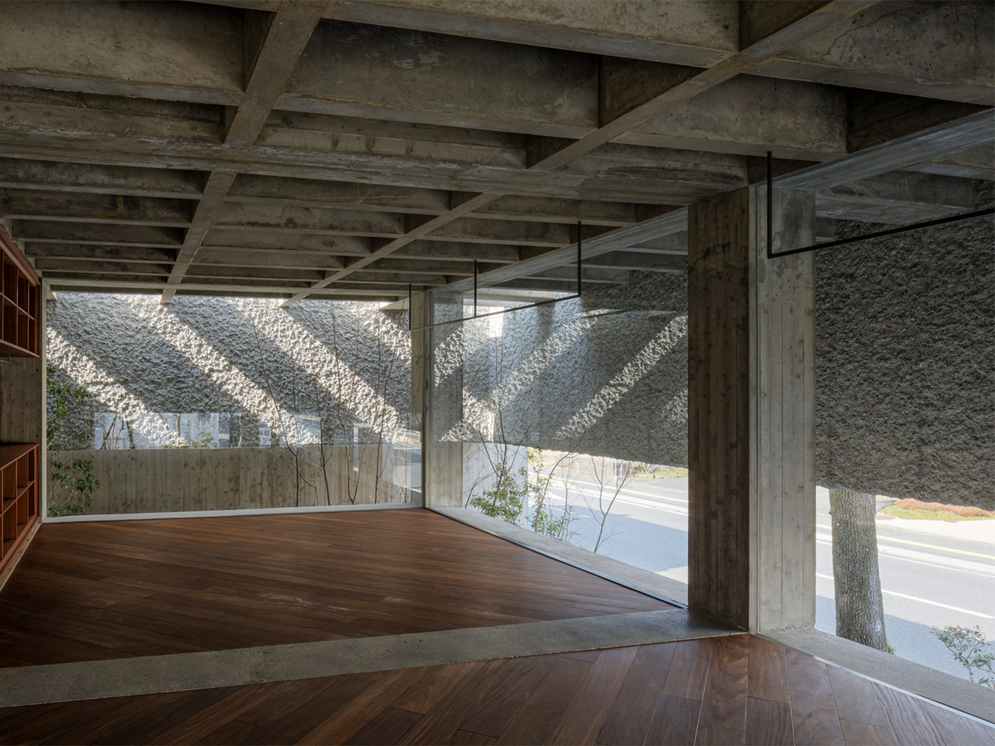
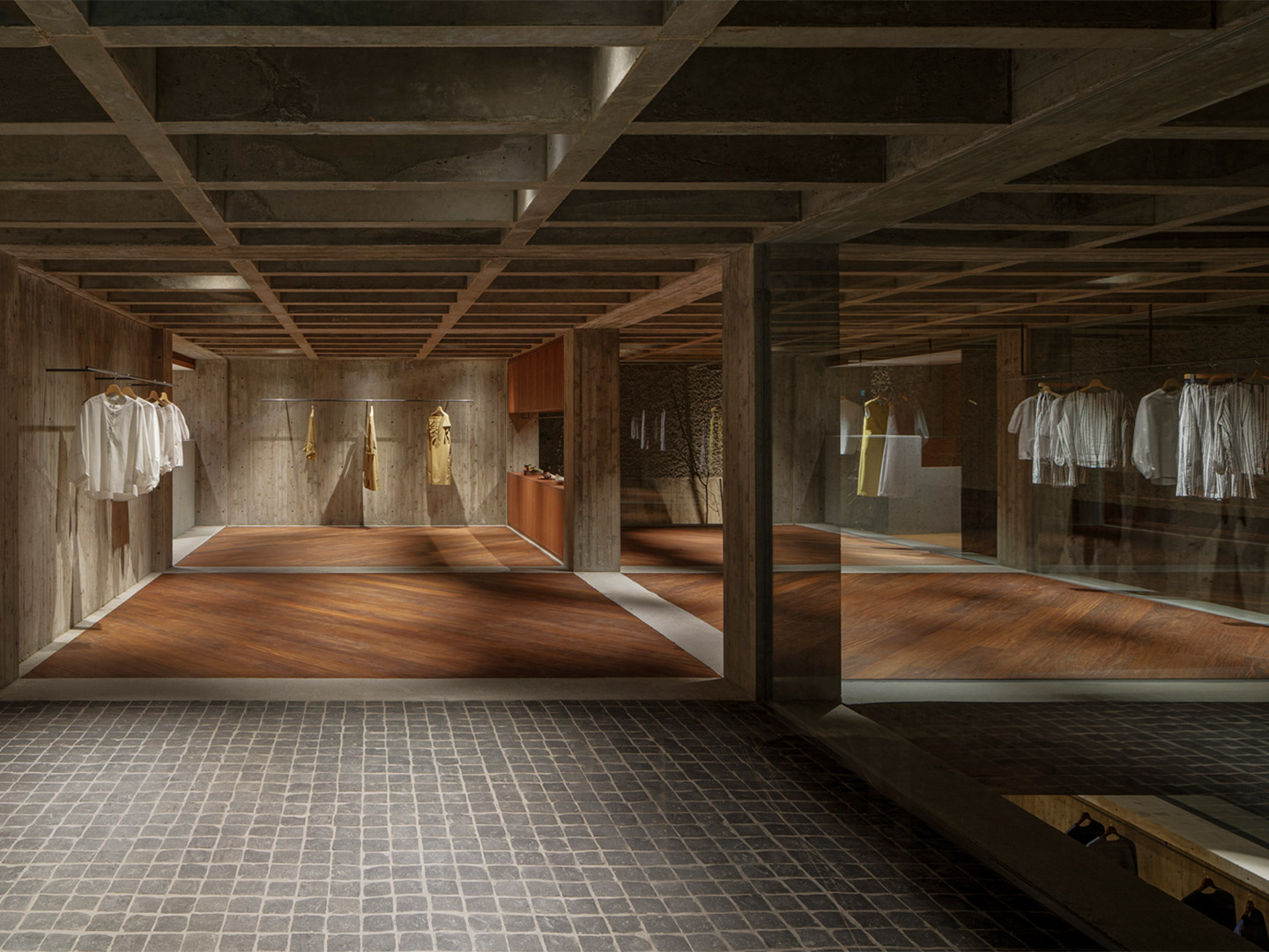
In response to the client’s brief, Shimokawa-san created the Oharasando Building; a bunker-like retail experience that moves away from the typical high-street tenancy where access and sightlines are usually granted directly from the street. The heavy building was dropped down from the bustle of the road, providing a basement level for the men’s fashion offering, while the ladies’ floor is positioned just above street level, creating a shopping environment that’s mostly free from external distractions.
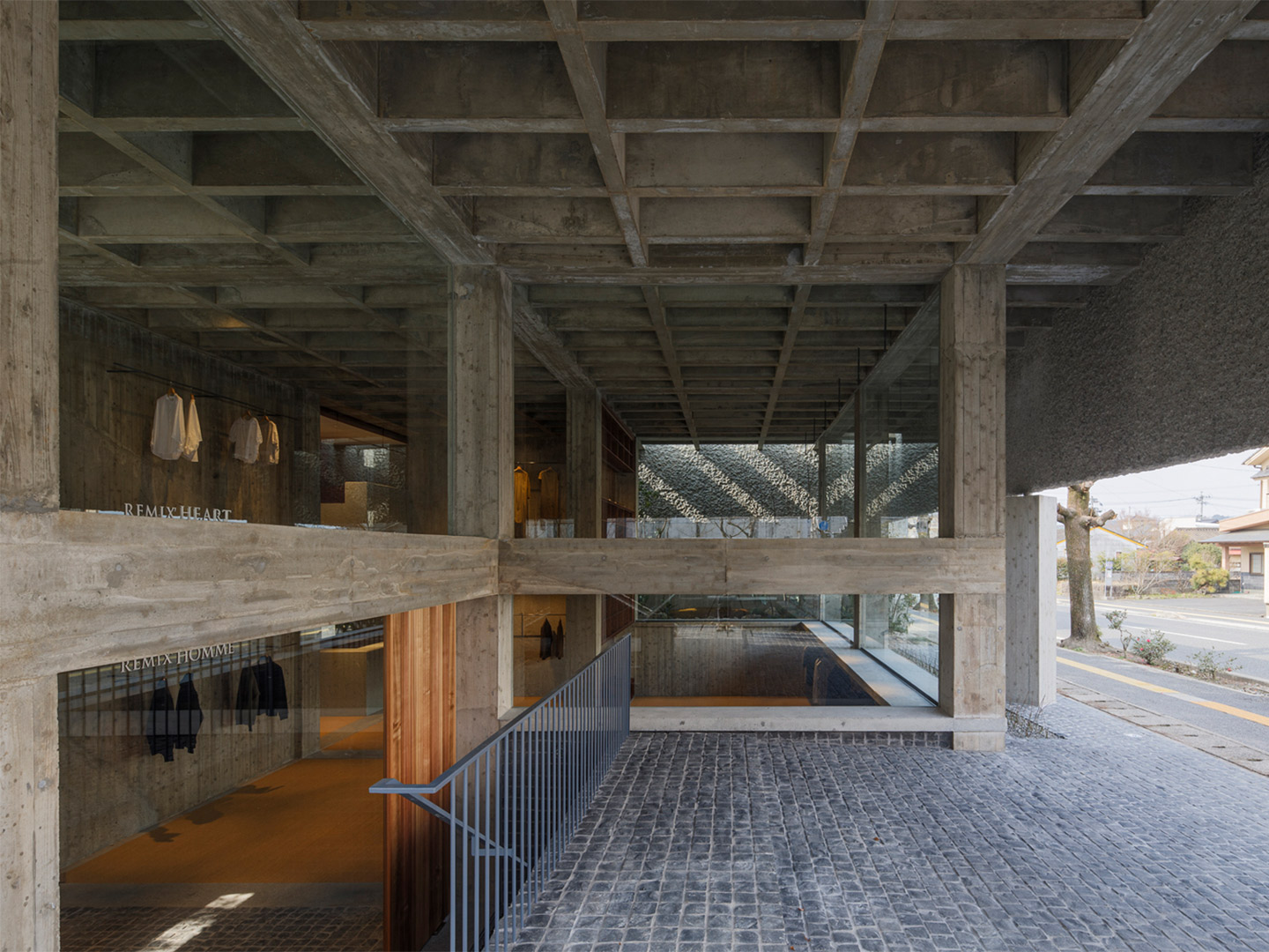
Oharasando Building in Hita City, Japan by Toru Shimokawa
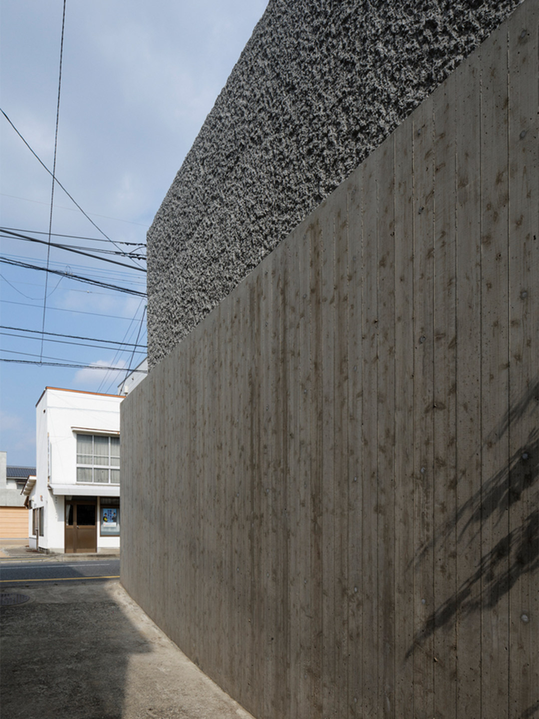
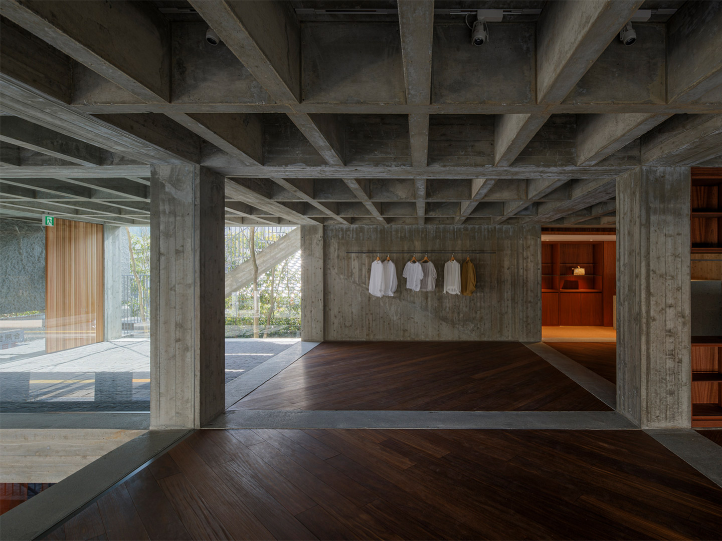
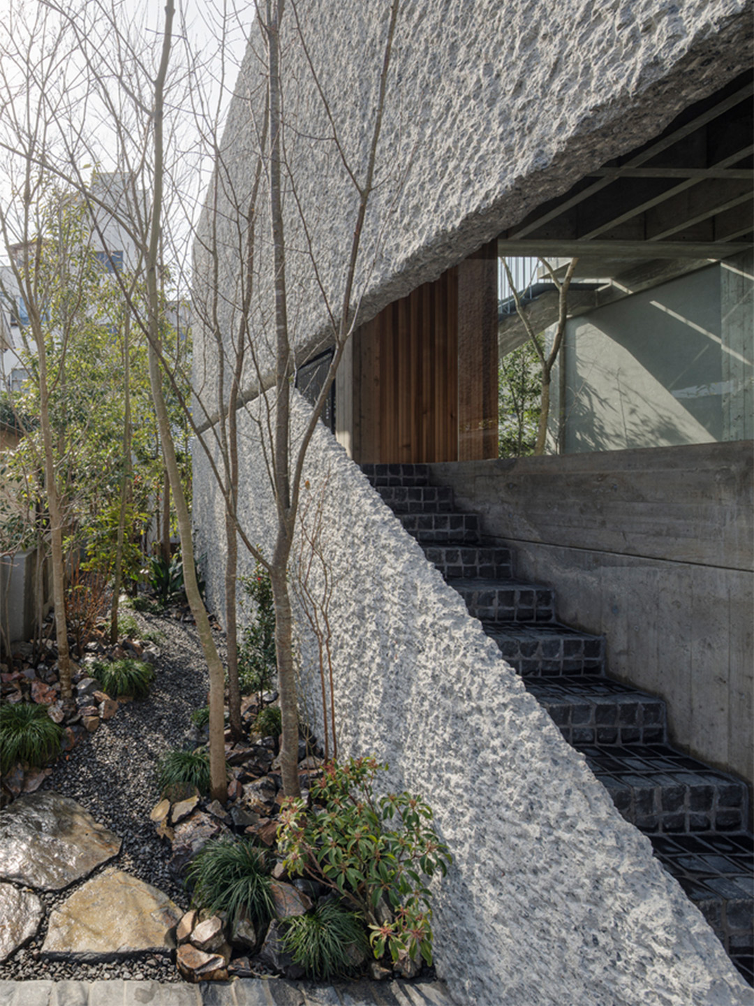
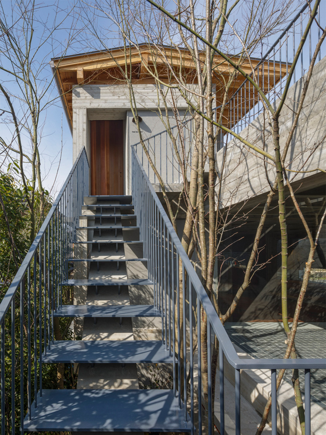
With the lines of sight now askew, a buffer space was also provided by way of concrete latticework that covers the building from above. This is joined by a concrete obi (translating to ‘belt’) that wraps the building’s uppermost external perimeter. Trees were then planted densely in the rear buffer space, softening the intensity of the concrete and providing an ever-changing filter for the sun to trickle through.
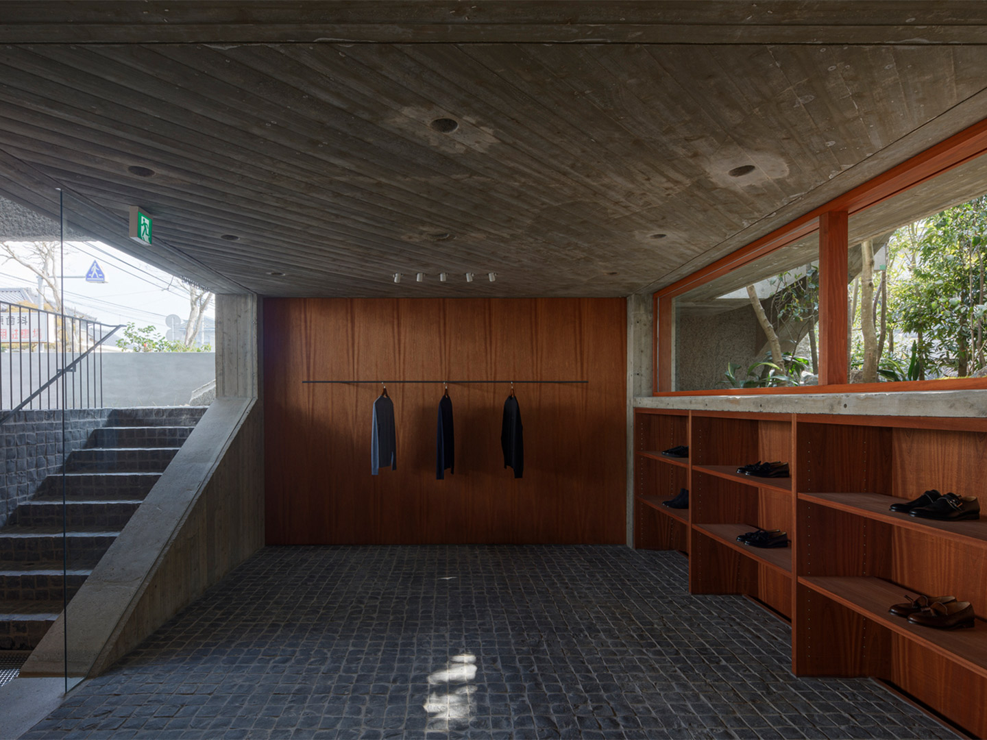
Experienced from the inside, the ambience turns to a soft glow as any direct natural light is almost always diffused by the concrete obi. The heavily textured finish of the belt also serves as a background to the range of clothing that changes season-by-season. “I think that the obi seen from the outside will be exposed to the rain and wind, and darken [over time],” says the architect. “The concrete skeleton and the shop space protected by it will become more prominent.”
Although the architect placed a strong emphasis on reducing the transparency of the interiors from the street, the strong horizontal lines coupled with the volume of the space, accentuated by the gridded concrete beams, gives the store an open yet private feel. It’s certainly not claustrophobic, especially towards the rear where strips of glazing frame views of lush foliage and narrow pathways that lead into the garden. “I hope that over the years the architecture and trees will be in harmony, and that it will become familiar with this area,” Shimokawa-san says. “And that it will become a place with a refreshing atmosphere, like Ohara-hachimangu, which you can see to the west.”
I hope that over the years the architecture and trees will be in harmony, and that it will become familiar with this area.
Catch up on more architecture, art and design highlights. Plus, subscribe to receive the Daily Architecture News e-letter direct to your inbox.