When architect Bogdan Ciocodeica designed the first Lunet eyewear store in Bucharest, Romania, he and the team at his eponymous studio established a suite of “key elements” that would eventually define the brand’s in-store experience. The fit-out was so resolved that when the opportunity arose to carve out Lunet’s second Romanian store, in the city of Cluj-Napoca, the studio was armed with a readymade lookbook from which they could pluck memorable moments to replicate.
Shimmering silver-lined surfaces and lashings of bold colour were among the gestures that made the cut, ensuring a continuation of Lunet’s retail aesthetic and unconventional approach towards the experience of buying eyeglasses. “The idea was to borrow a few of the elements from the first store in such a manner that it feels like you have stepped into the Lunet universe,” Bogdan says. “At the same time, [we created] a unique and specially designed space, adapted to the new context.”

Lunet eyewear store in Romania by Bogdan Ciocodeica Studio
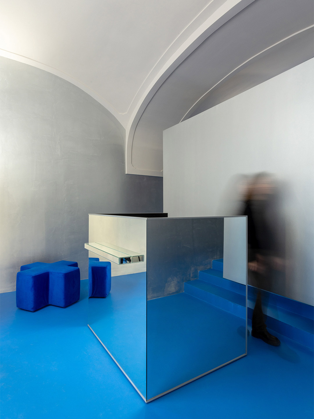
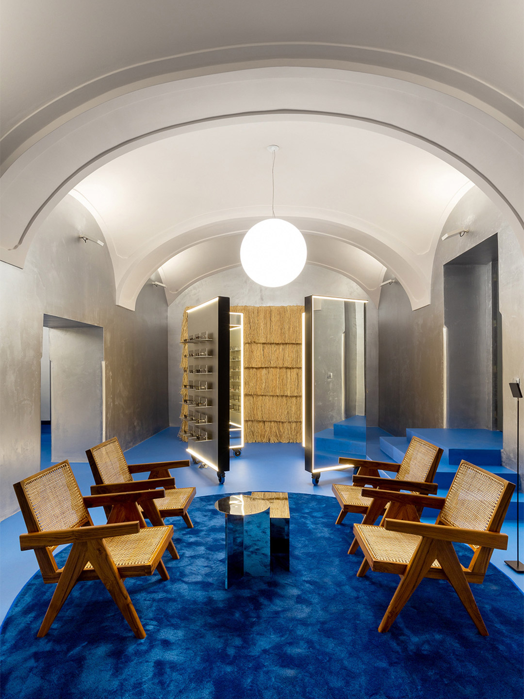
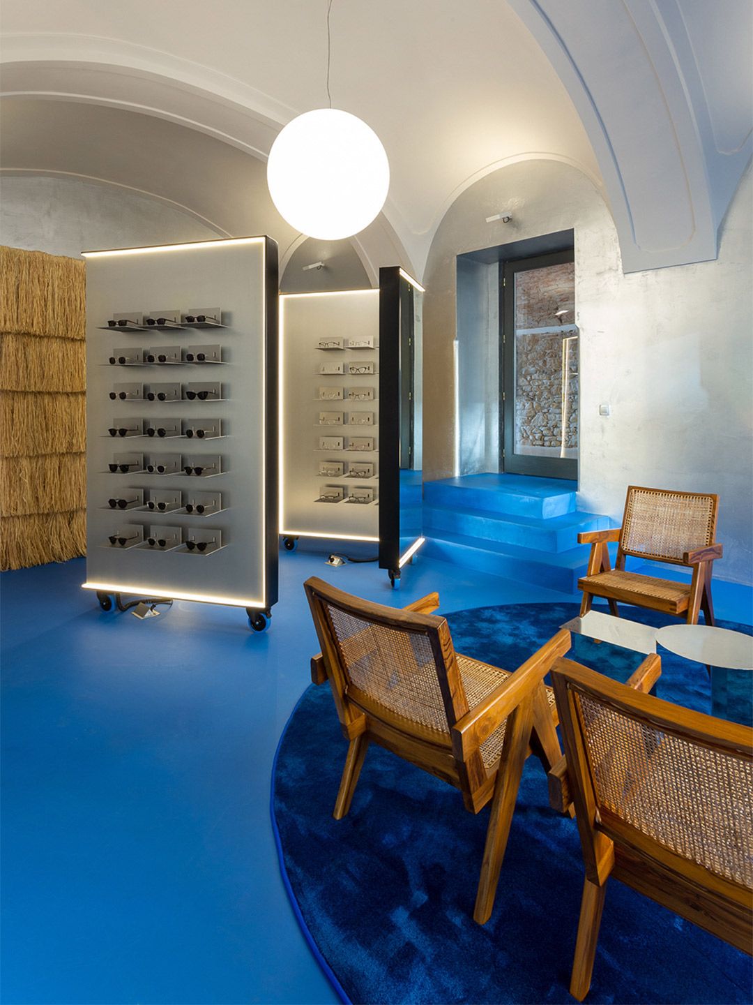
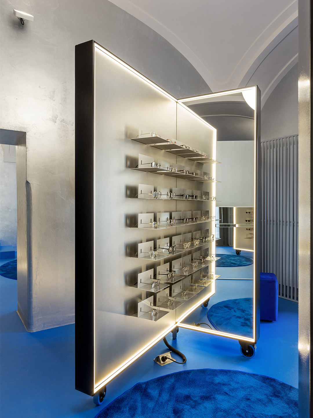
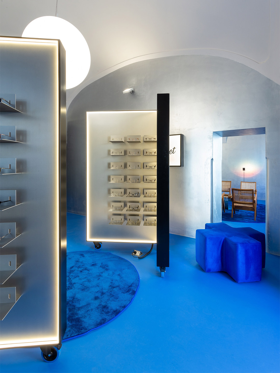
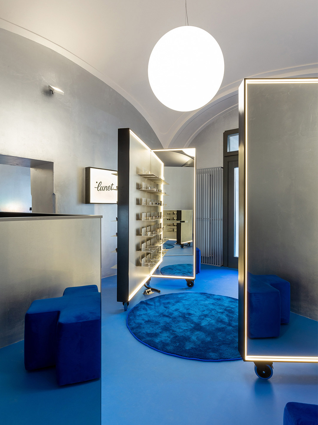
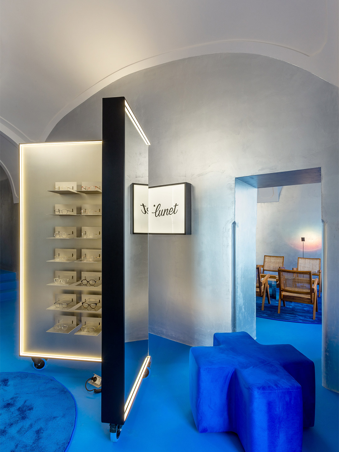
Located in an 18th-century building, in the unofficial capital of Transylvania, the store is designed as a “conversation” between old and new. “[It] aims to mitigate almost three hundred years of history with a contemporary aesthetic,” Bogdan says. But the store’s most important exchange is the way it communicates with potential clientele who seek to frame their faces with the latest eyewear. The moveable pieces of joinery that rise to this challenge adopt the same shape as those in Lunet’s first outlet, forming private “try-on” stations, as well as spaces for multiple customers to test-out specs at the same time. Such versatility “adds to the tailored, client-focused experience,” Bogdan explains.
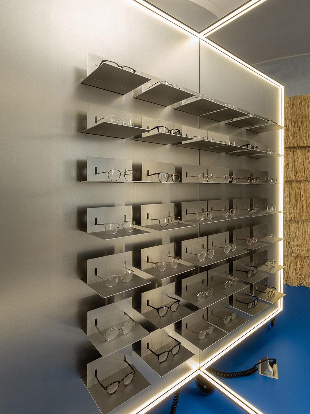
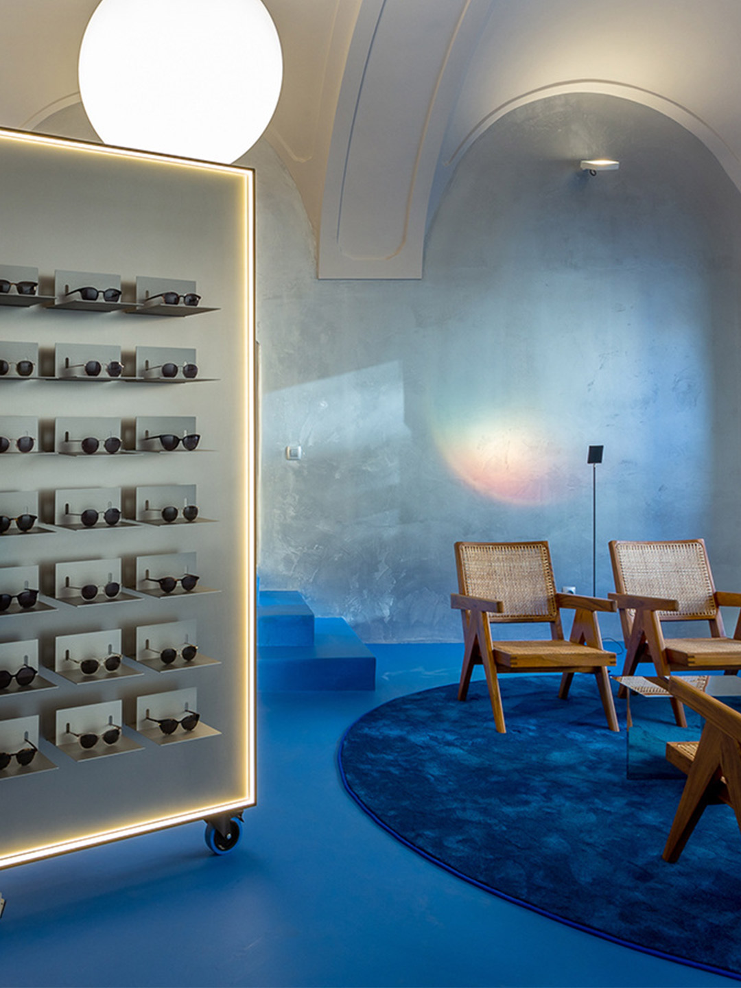
The lighting of the store bolsters the overall customer experience, playing a crucial role in how the product and the retail space are each perceived. LED strips outline the shapes of the display units, and the mirrors they contain, offering a uniform blanket of light for customers trying on glasses. (Anyone that’s used a halo light for a more superior selfie will recognise the benefits of this.) Crowned by “floating” luminous spheres, the space at-large basks in the light bouncing back from the overhead arches and vaults that are directly illuminated, creating a soft and immersive atmosphere.
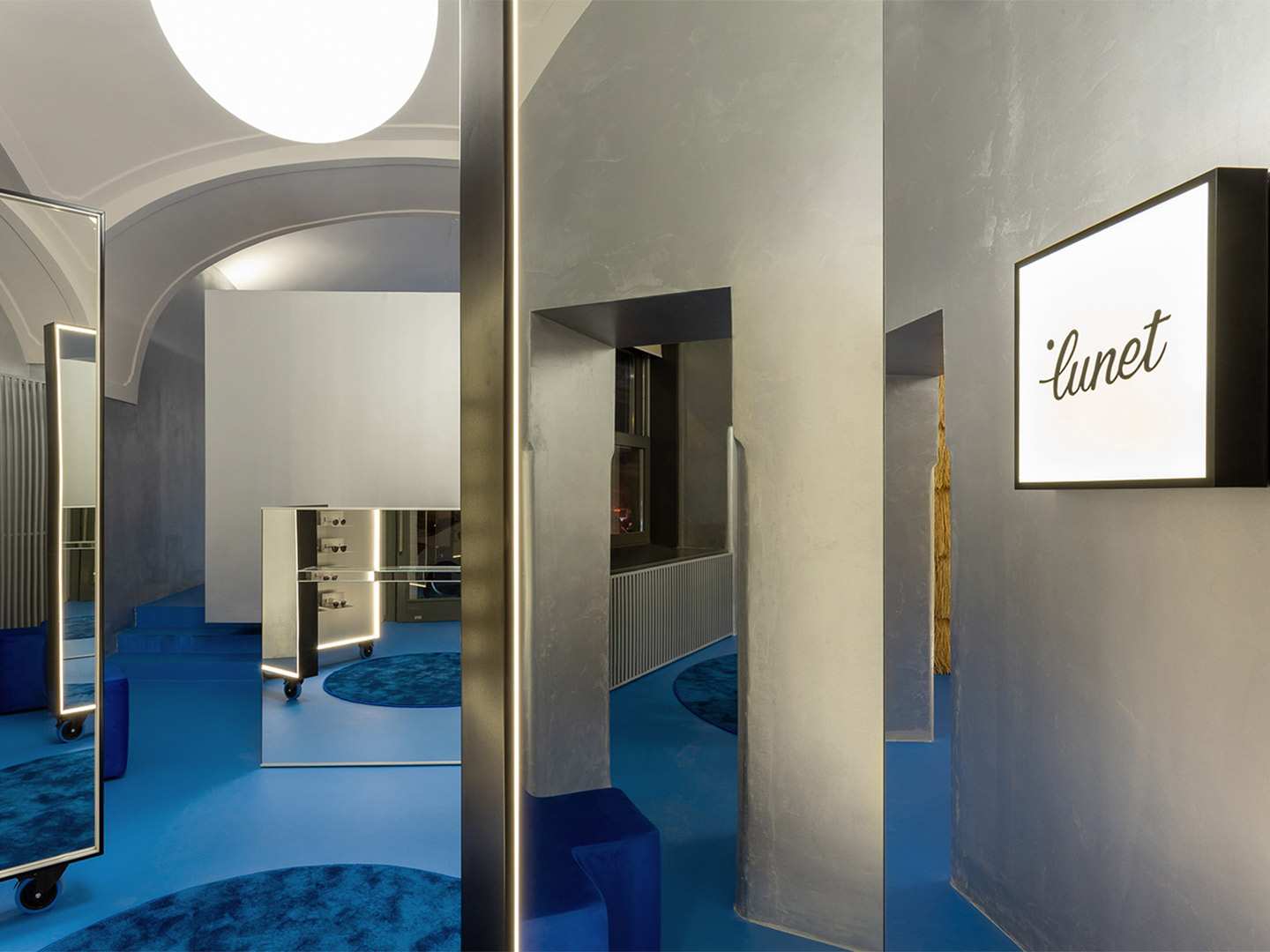
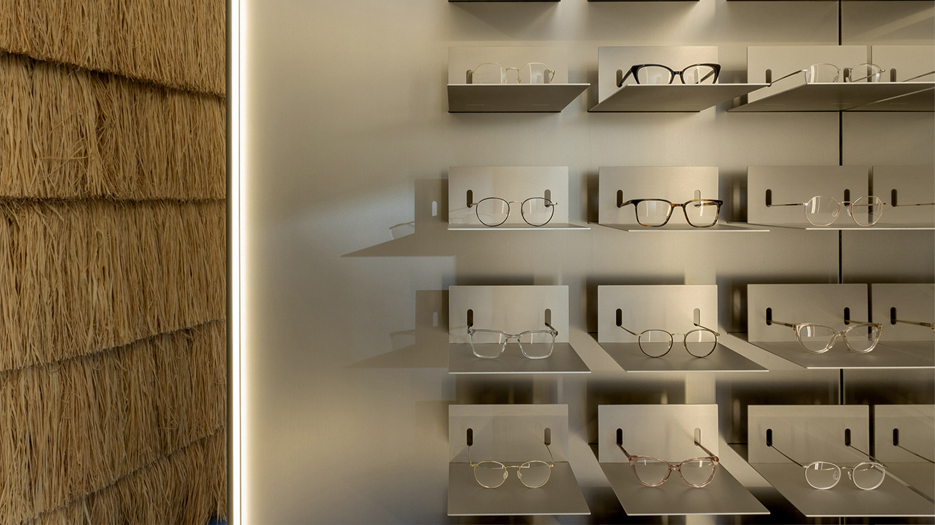
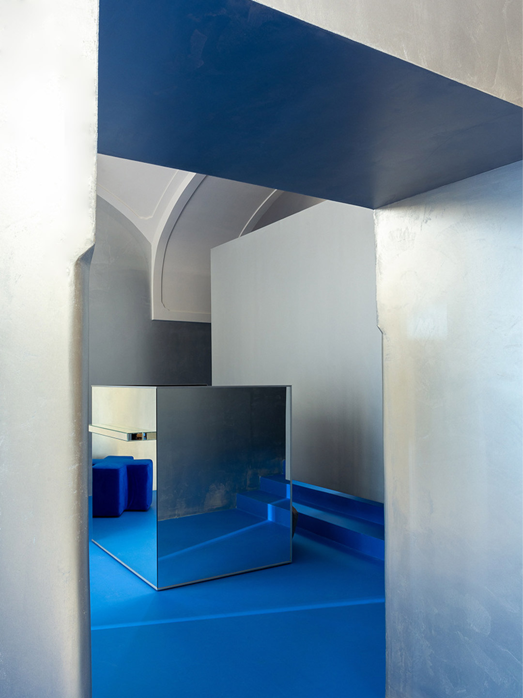
Reinterpreting the metallic curtains that line the perimeter of the first Lunet store, silver-painted walls in the Cluj-Napoca outlet act as a glittering buffer between the off-white ceiling and the vivid blue floor, rugs and occasional furniture that anchor the scheme. “The metallic silver walls, almost like those of a spaceship, descends from the future, enhanced by the sharp aluminium eyeglasses displays,” Bogdan suggests.
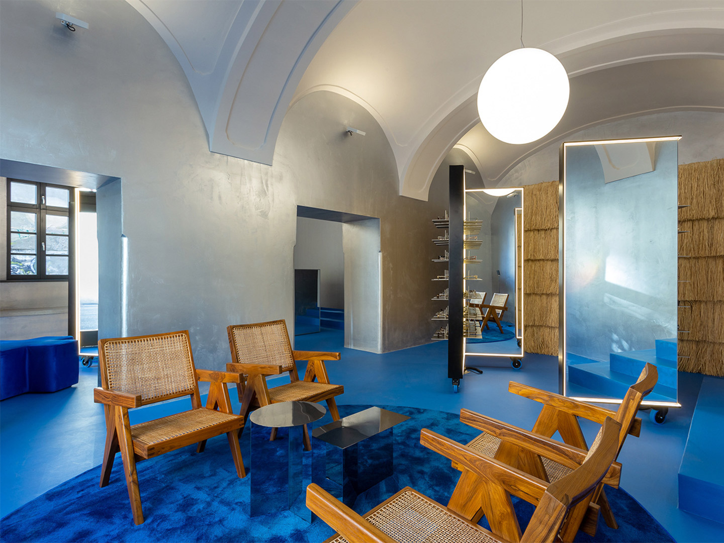
The dominating effect of the floor creates an “oasis of feel-good emotions,” the architect says, referencing the colour’s likeness to Majorelle blue, a shade made famous in the Marrakesh gardens of artist Jacques Majorelle. “The intense, vibrant blue is replayed in various textures, from the epoxy resin to the lush carpet, offering the perfect background for all the silver metallic elements and also for the natural textures.”
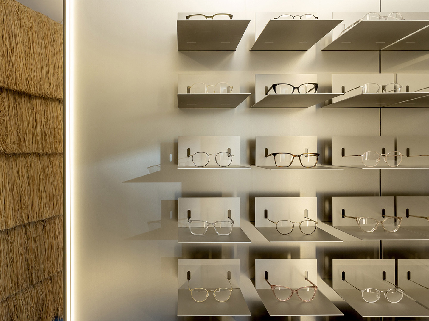
Raffia is one of those natural materials, tasked with wrapping the wall of the operational area in the showroom. It’s mounted in successive horizontal rows and trimmed to resemble the traditional reed-roof homes of Romania. Teak-and-cane easy chairs by Swiss architect Pierre Jeanneret add to the layer of warmth established by the raffia, beautifully paired (“and juxtaposed!” Bogdan declares) with the mirrored ‘Slit’ tables by Danish brand Hay.
Zooming out from the details, the entity aligns with Lunet’s core vision, steering away from the conservative-looking spaces typically associated with eyewear locations. It aims to provide a familiar experience, like a “living room”, Bogdan suggests, that encourages socialising, a sense of discovery and practical solutions. “The space continues to reimagine a new type of eyewear experience, one that focuses on emotions and human connection, making the purchase of glasses a memorable, positive interaction.”
ciocodeica.com; luneteyewear.com
Zooming out from the details, the entity aligns with Lunet’s core vision, steering away from the conservative-looking spaces typically associated with eyewear locations.
Catch up on more architecture, art and design highlights. Plus, subscribe to receive the Daily Architecture News e-letter direct to your inbox.
