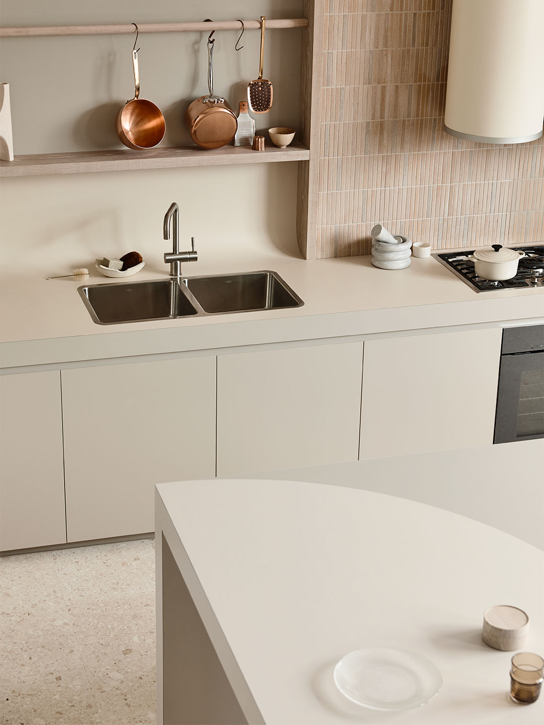
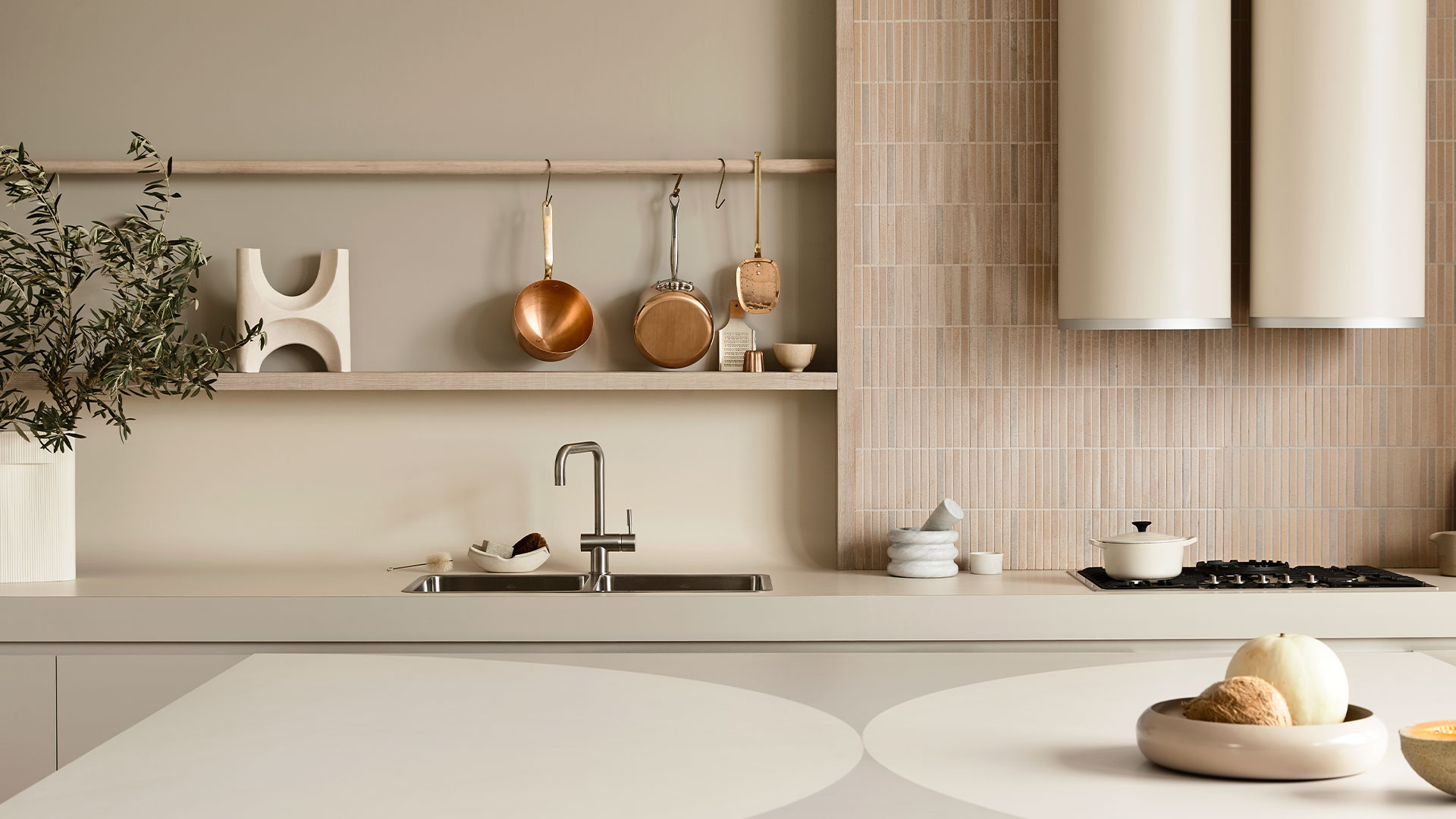
Defined by its colossal curves, scalloped detailing and coved rear benchtop, the Expansive Kitchen boasts all the hallmarks of Melbourne architecture outfit Kennedy Nolan. But this certainly isn’t a cookie-cutter response to the client’s brief, explains practice principal Rachel Nolan. “Every approach we take for kitchens is always new,” she says. “We try not to ever roll out just what we’ve done before.” The client in this instance was Australian company Laminex and the challenging brief called for the brand’s range of laminates to be put to the test in innovative and exciting ways by Rachel and practice co-principal Patrick Kennedy.
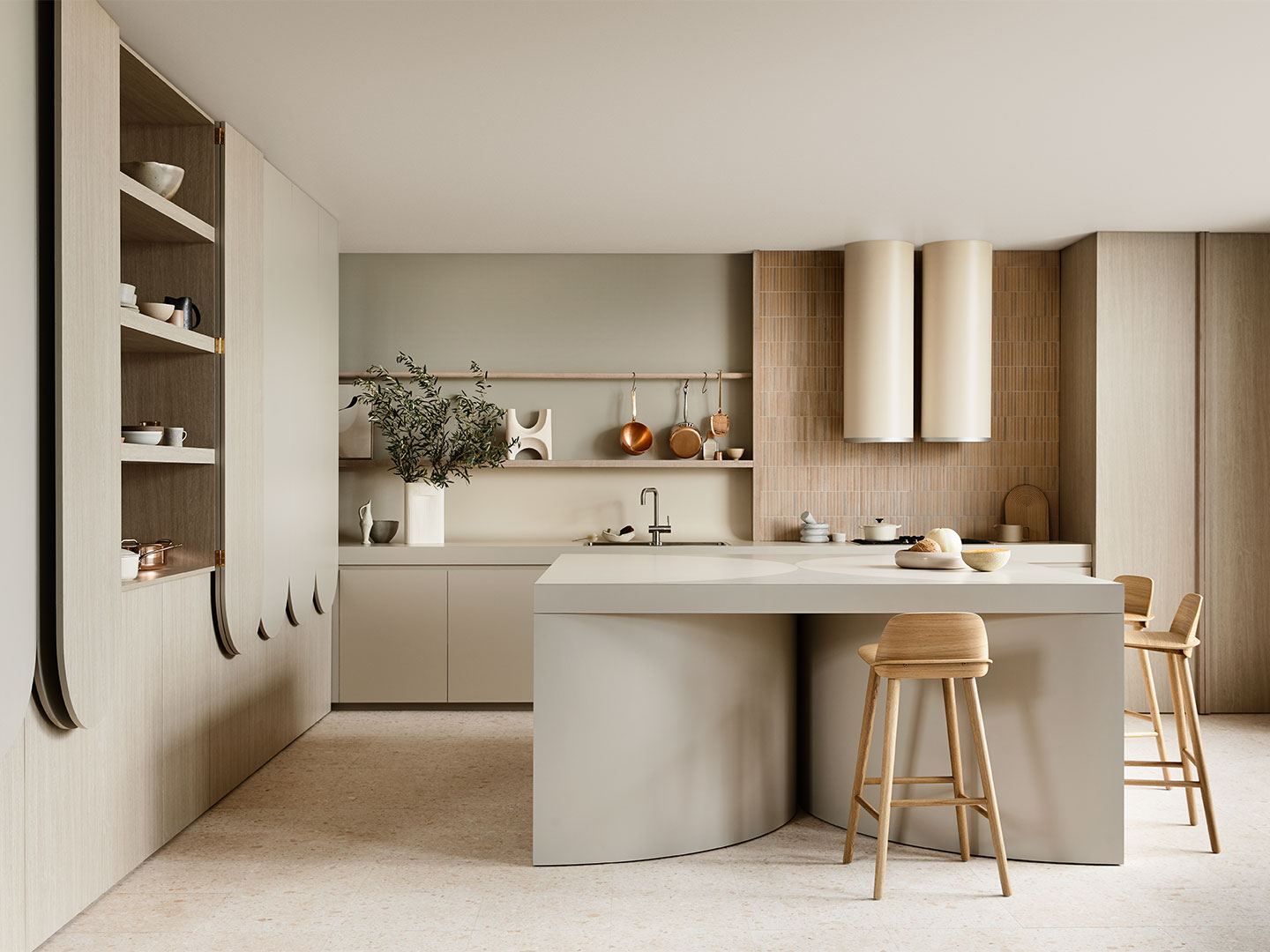
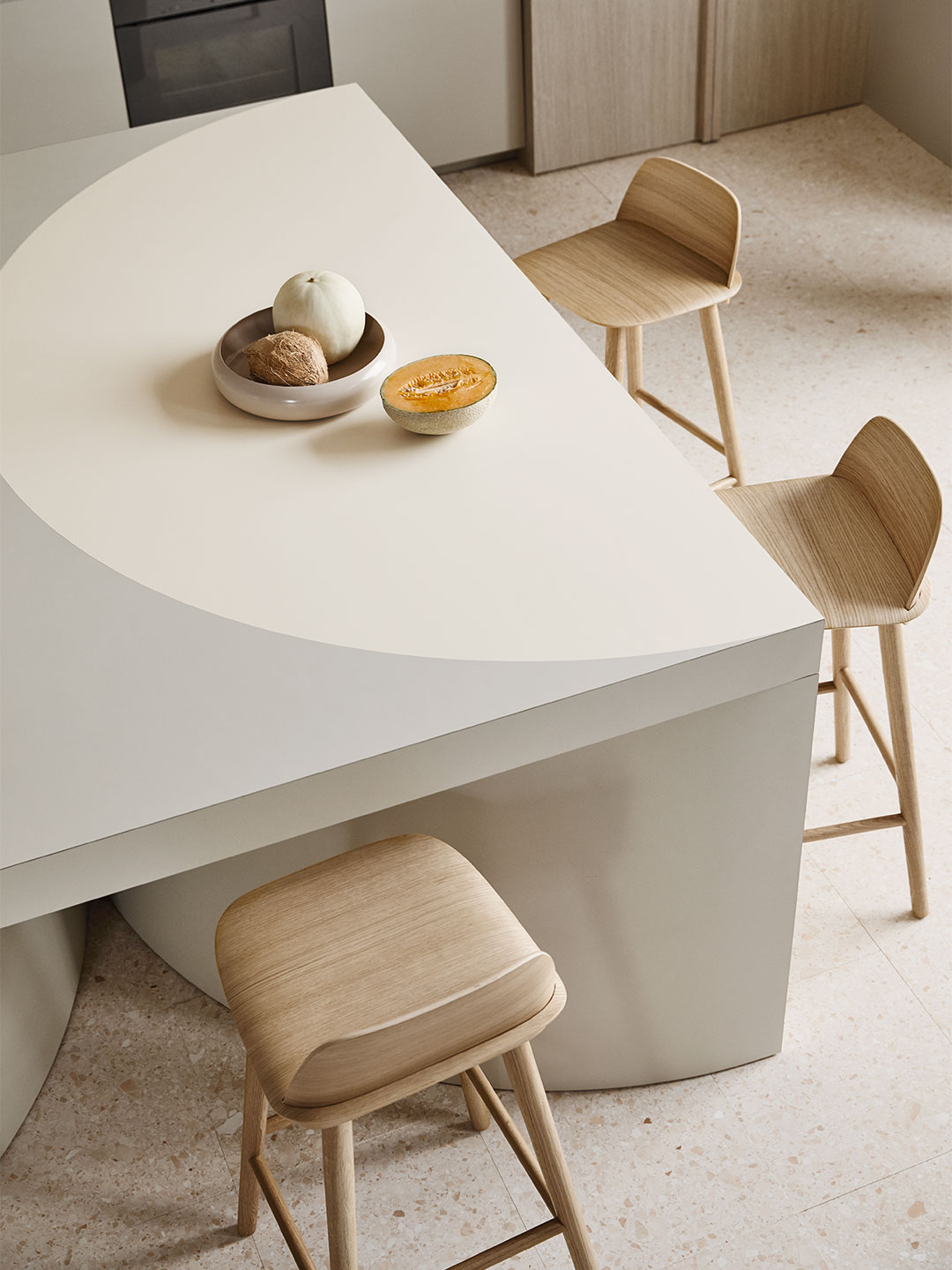
The first of two kitchens designed by Kennedy Nolan for Laminex, the Expansive Kitchen is the more spacious, family-centric edition, anchored by an island bench with superb curved ‘legs’. The natural gathering spot in any kitchen design, the island bench is treated more as a piece of furniture – “like a big table,” says Rachel. Approached in this way, the table is void of the regular considerations that you’d expect to be integrated into a typical island bench arrangement.
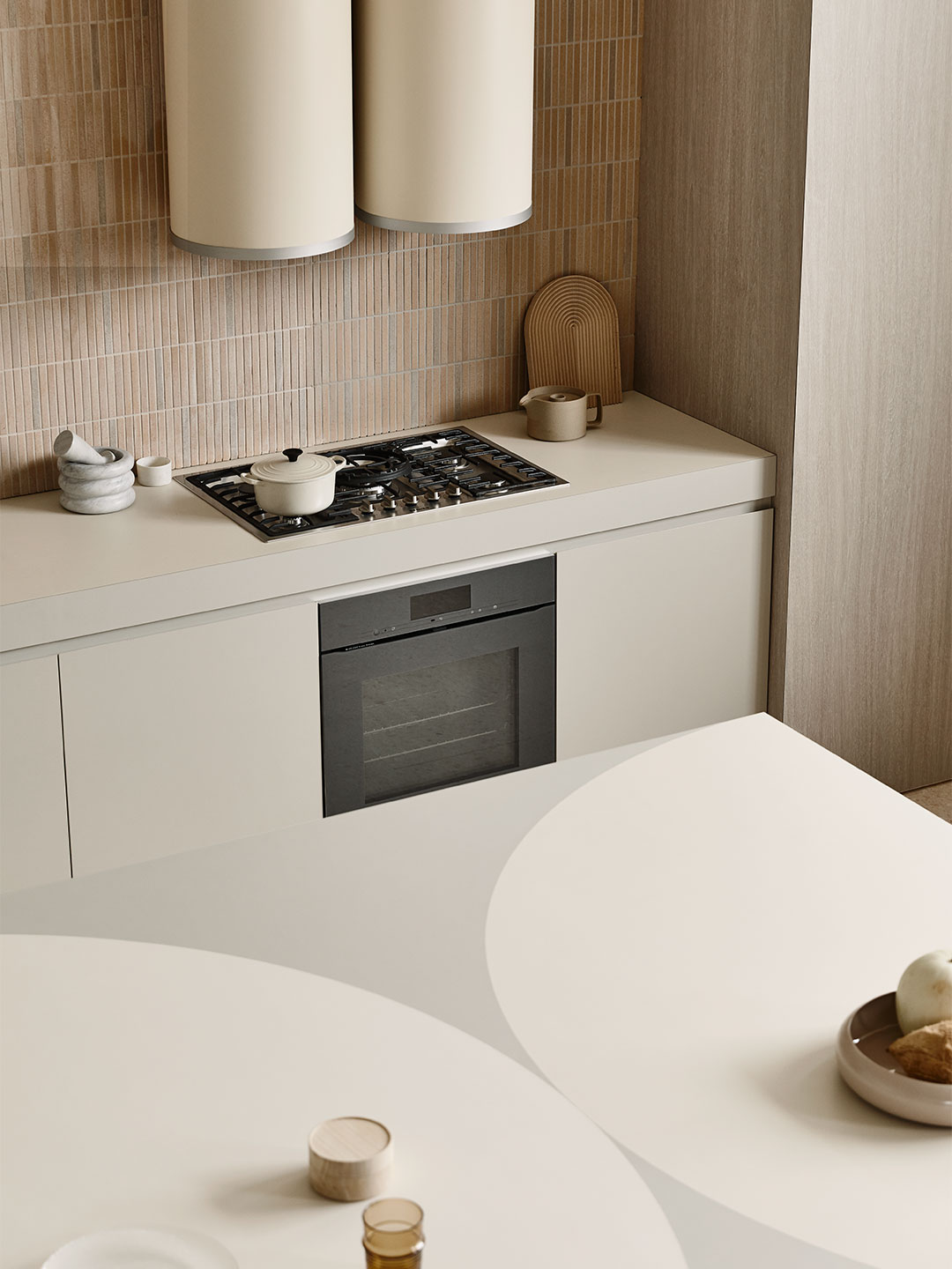
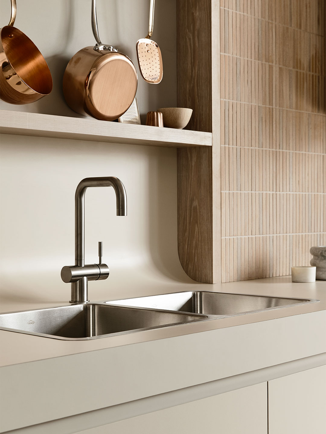
Determined to push the sculptural limits of laminate, Kennedy Nolan balanced dynamic design ideas with intricate detailing. In most cases, the finer details are only discoverable upon close inspection. An example of this rests alongside the scallops of the cabinetry. While big on impact, the scalloped doors are cleverly set forward to create shadow-lines and to conceal finger pulls. Another example is how the sweeping curves of the central table’s legs are mirrored by an understated two-tone treatment of the laminate on the counter surface. Further, the junction between the rear bench and splashback is expressed as a gentle curve rather than a run-of-the-mill 90-degree join.
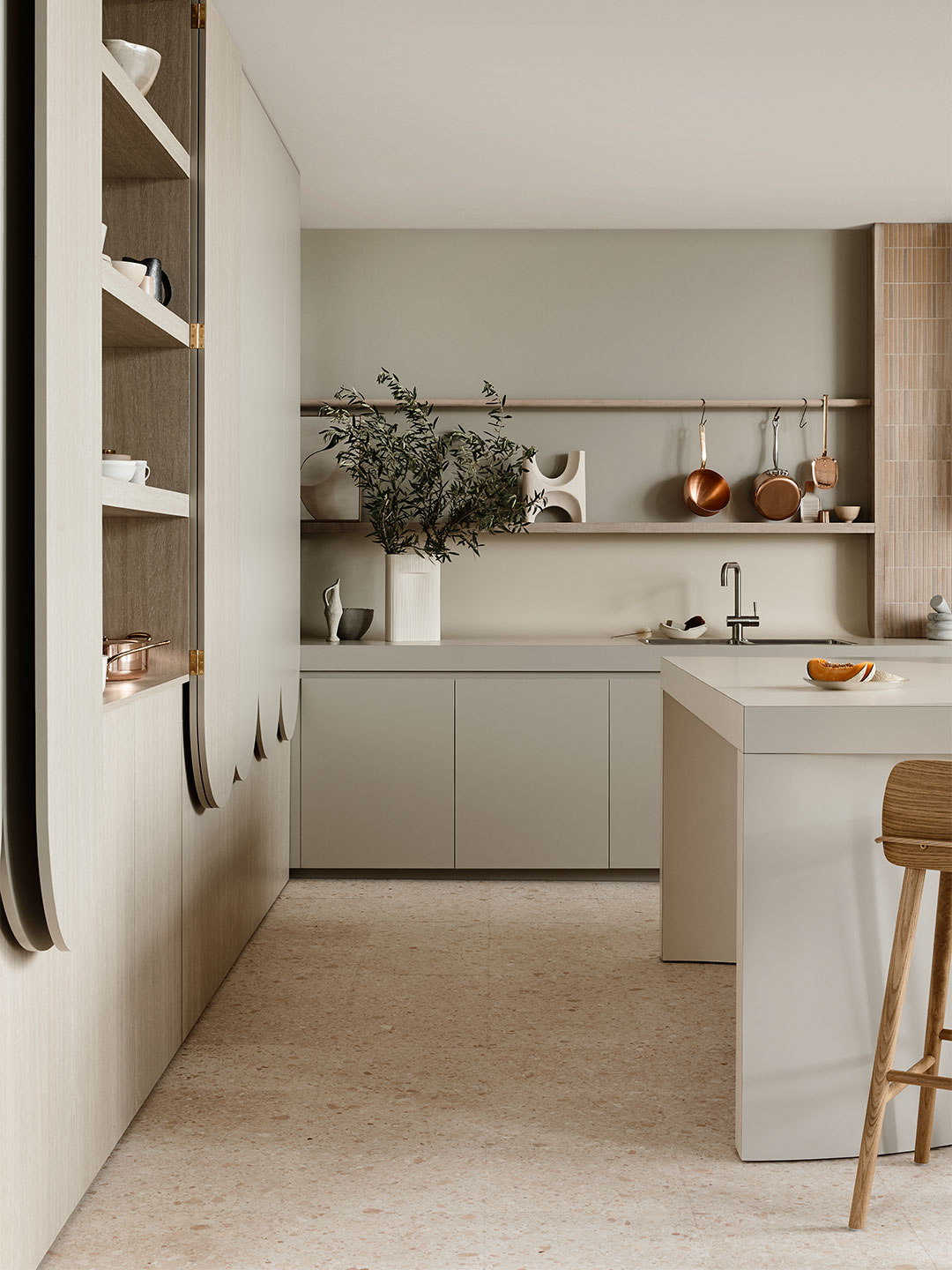
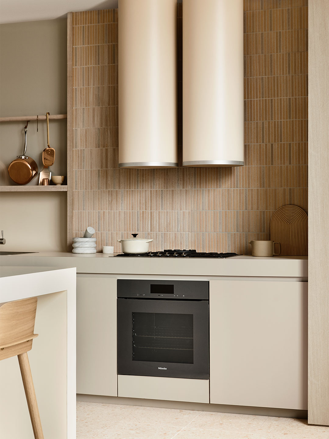
But it’s not all about the handsome facade, explains Rachel. “It’s important for us in practice that it’s understood that architecture isn’t just what you see,” she says. “For us, it’s really about how well it works.” With this focus on function in mind, some of the hardest-working elements of the kitchen – the sink and appliances – are deployed to the rear wall. Here, the striking dual cylinder rangehood, also impressively clad in laminate, is partnered with a generous run of cabinetry below and to its sides.
While the kitchen’s design was driven by material, the soothing colour palette was informed by the softer hues of the Australian natural landscape. “We were really looking at something that felt very Australian,” Rachel says. As such, the full-height cabinetry is lined with Whitewashed Oak – inside and out – and the benchtops and splashback are clad in Paper Bark laminate, selected for its slight eucalyptus-green tinge. French Cream laminate was applied to the rangehood cylinders, set against pencil tiles reminiscent of the country’s dusty plains. French Cream also forms the contrasting colour of the two-tone benchtop.
It’s important for us in practice that it’s understood that architecture isn’t just what you see.
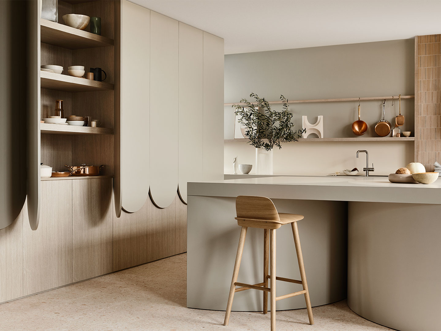
With the Expansive Kitchen experiment, the Kennedy Nolan design team has fashioned a sophisticated family zone for the future, setting the kind of scene where the residents might cook, eat and socialise. Or perhaps pull up a stool and work from home at times like these. The material-led design is forward-thinking in the way it has challenged the traditional use of laminate, resulting in a kitchen blueprint that is beautiful and practical in equal measure. The calming and convivial space, swathed in a symphony of nature’s gentlest tones, responds wonderfully to the contemporary Australian approach to living.
