Prior to 2020, you’d be forgiven for not being familiar with the pharmaceutical and biotech brand AstraZeneca. But after the COVID-19 pandemic swept the globe and the race to develop a vaccine dominated the headlines, AstraZeneca, like its counterparts, has become somewhat of a household name. Long before the pandemic, however, in 2013, the company had begun discussions with architecture firm Herzog & de Meuron to establish a new global research and development facility. Nicknamed The DISC (an abridged version of its full title, The Discovery Centre, but also a reference to its ring-like form), the facility has recently opened at the Cambridge Biomedical Campus (CBC) in England.
Located in the wider precinct known as the Cambridge Southern Fringe Area, the CBC is described by the architects as a “future-leading centre for biomedical research and development”. It’s a place where institutions and companies from the education, health care, science and research sectors converge. Positioned in the middle of the campus, The DISC reflects the ambition of AstraZeneca to be a main point of exchange and collaboration among its peers. The facility builds on the CBC’s many existing partnerships, including with members of the Cambridge Life Science community: the University of Cambridge, the Medical Research Council and Cancer Research UK.
AstraZeneca global R&D facility in Cambridge by Herzog & de Meuron
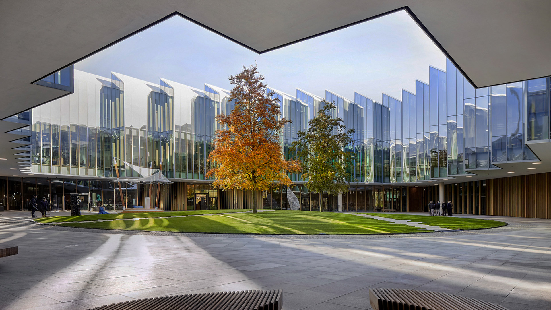
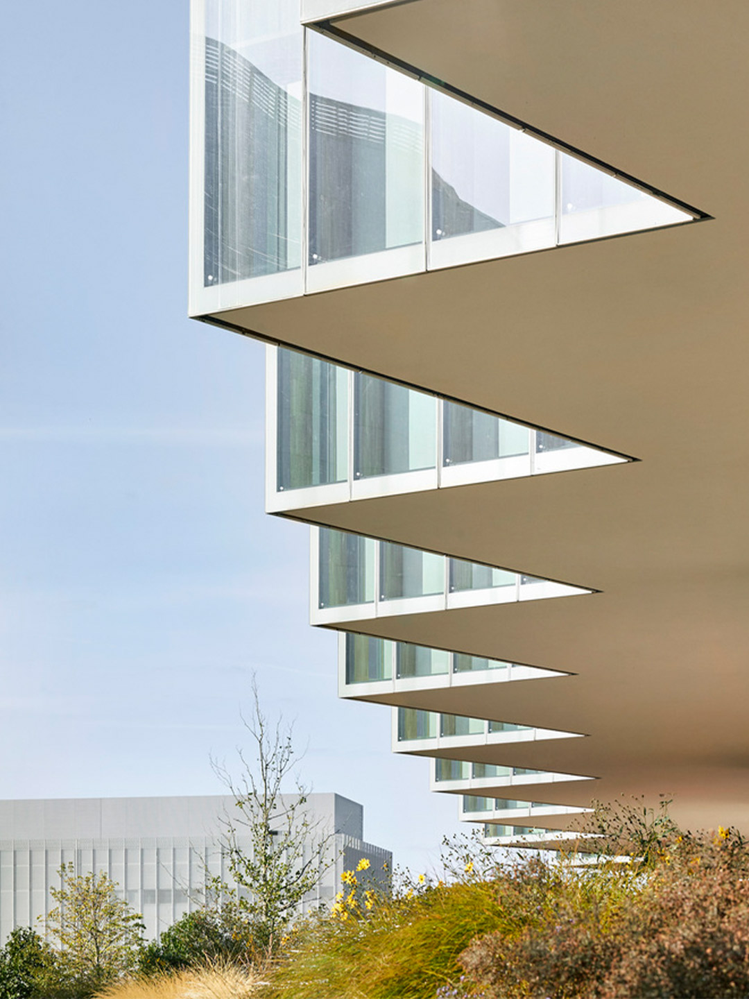
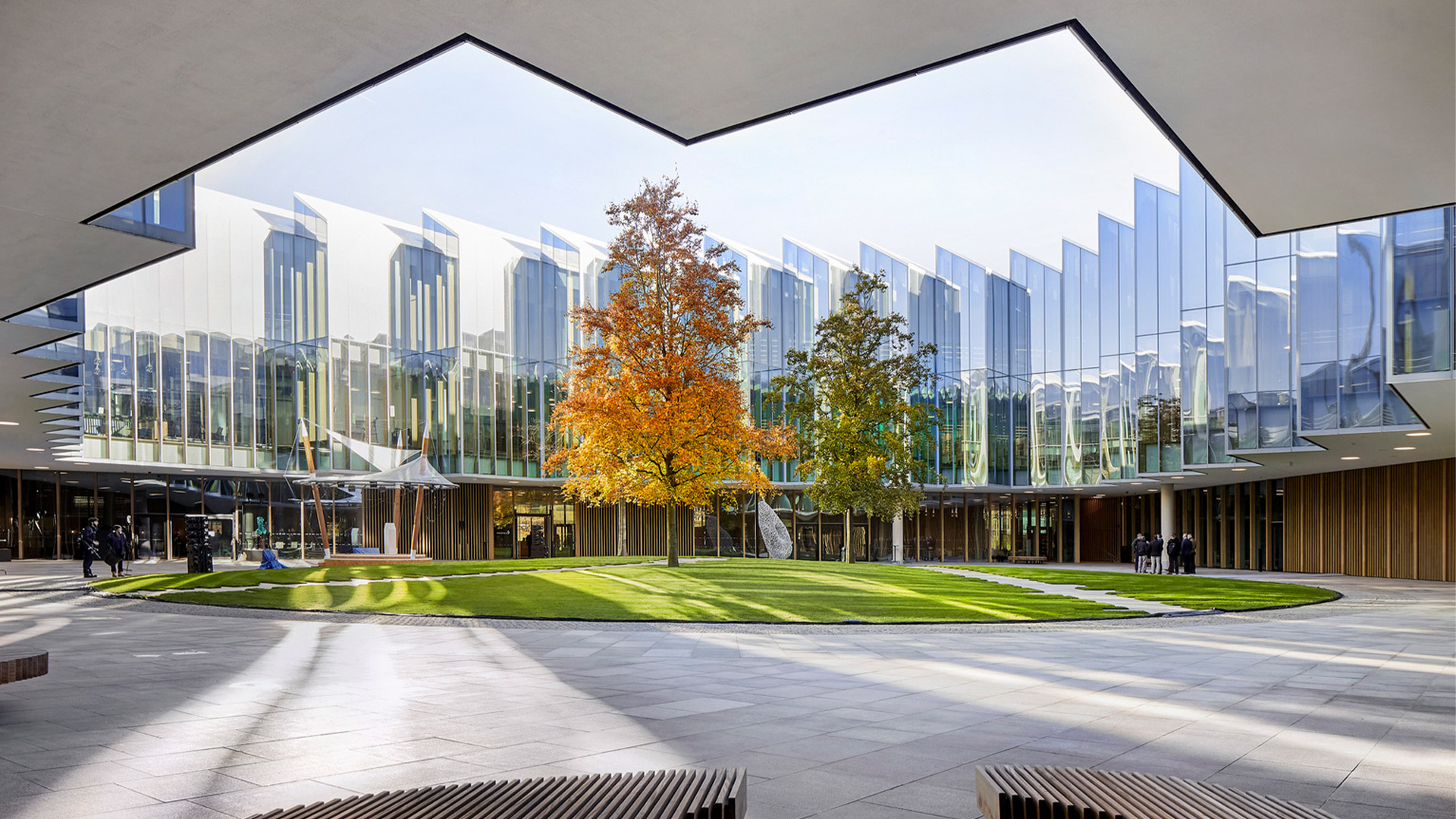
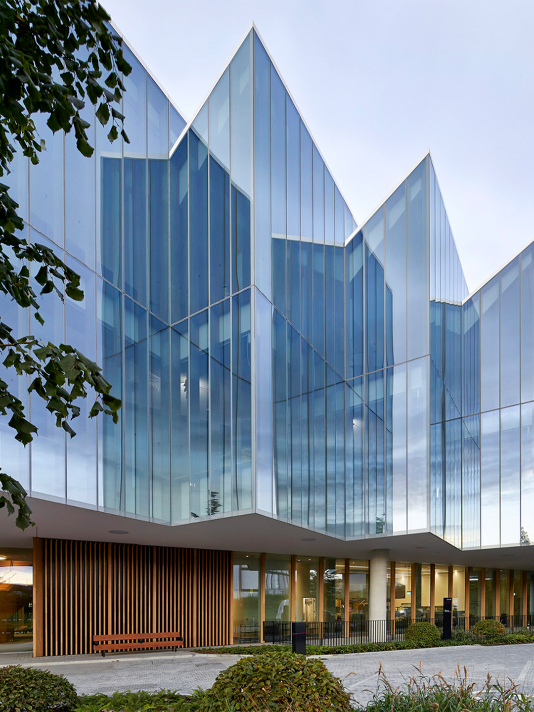
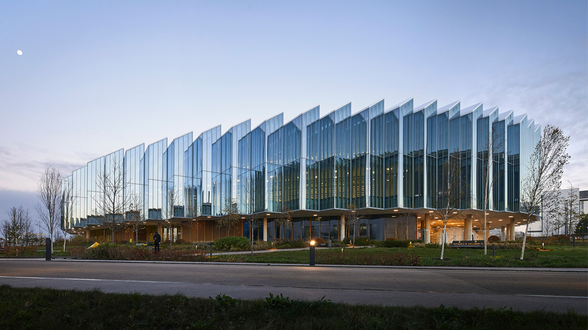
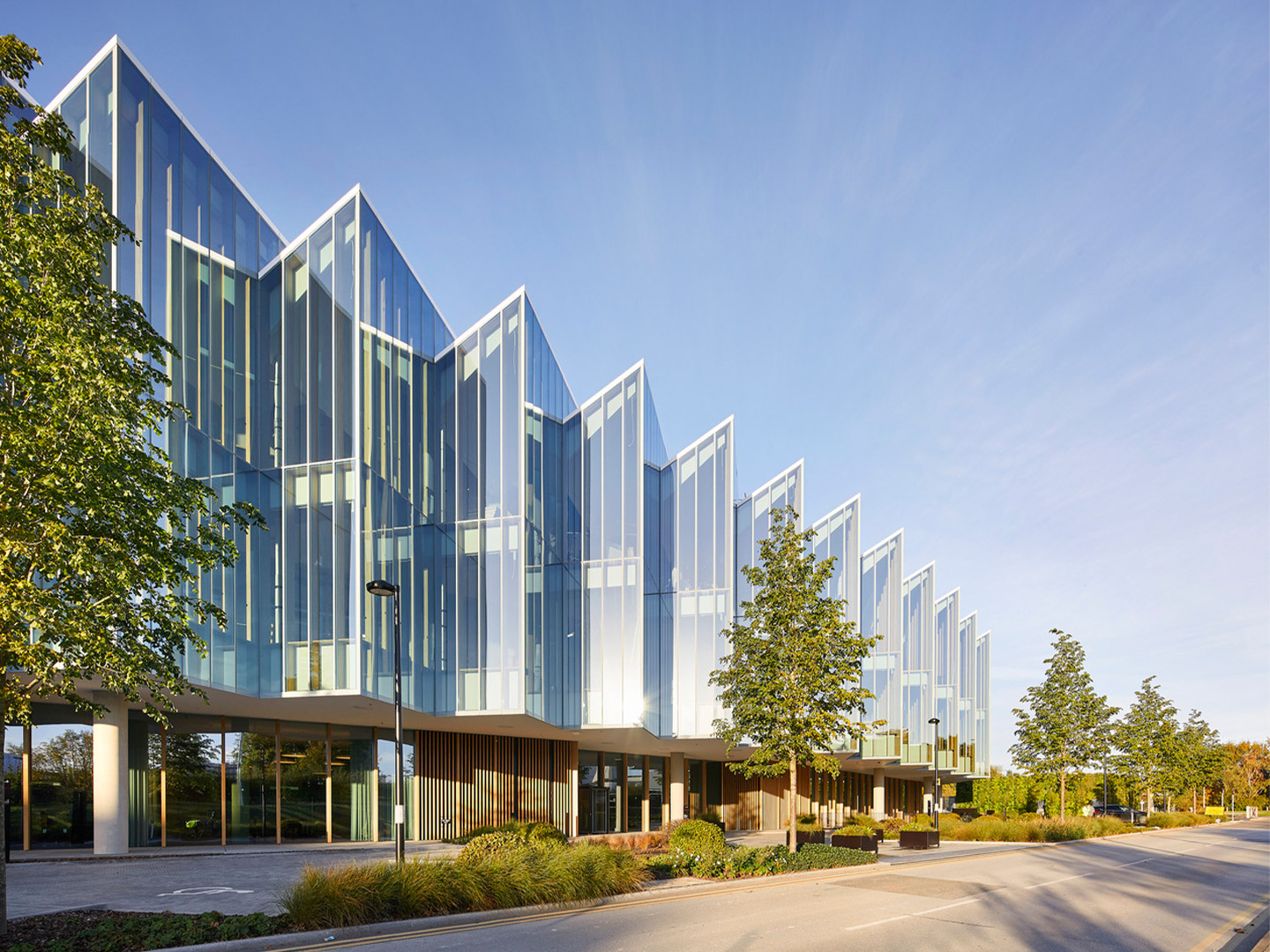
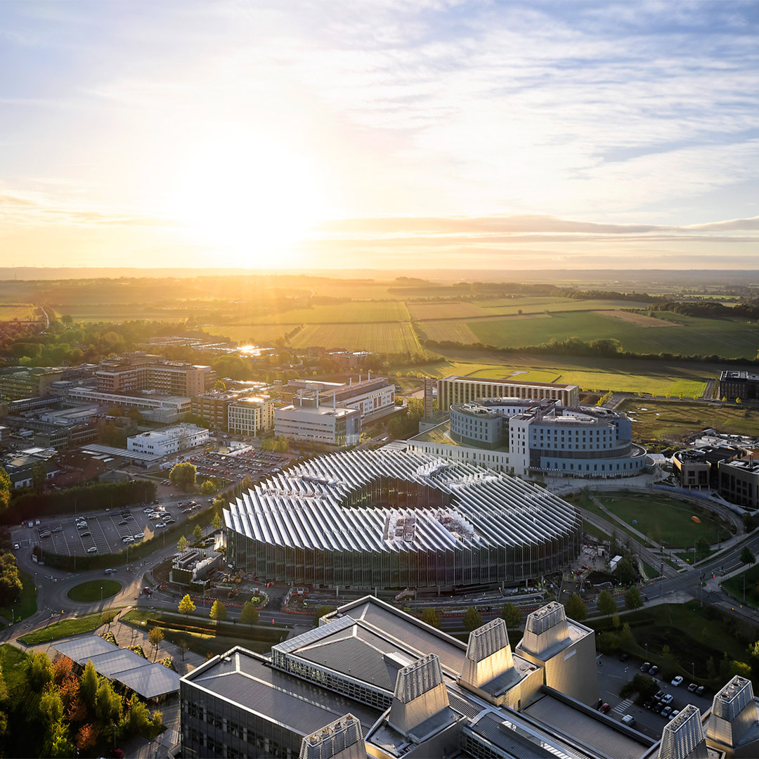
Herzog & de Meuron’s architectural response makes visible AstraZeneca’s drive. Indeed, it supports it, with a “porous building” that is accessible at ground level from all three of its sides. “The new building is a triangular glass disc with rounded edges that loosely follows the shape of the site,” explain the Switzerland-based architects. “It is defined by a saw-tooth roof that runs east to west, to provide optimal natural light inside the building.”
The saw-tooth roof continues through to the building’s facade, becoming a tighter and larger vertical zig-zag geometry. The “glass disc” effect this creates, with its dramatic roof and stepped facade, is responsible for giving the building its distinctive appearance. Described by the architects as appearing to “hover” in the landscape, the disc is perched on six rectangular glass boxes grouped into three pairs. The arrangement of boxes forms an open courtyard, which in combination with the low-rise structure references the historic colleges in central Cambridge.
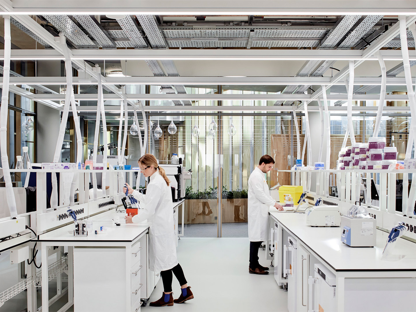
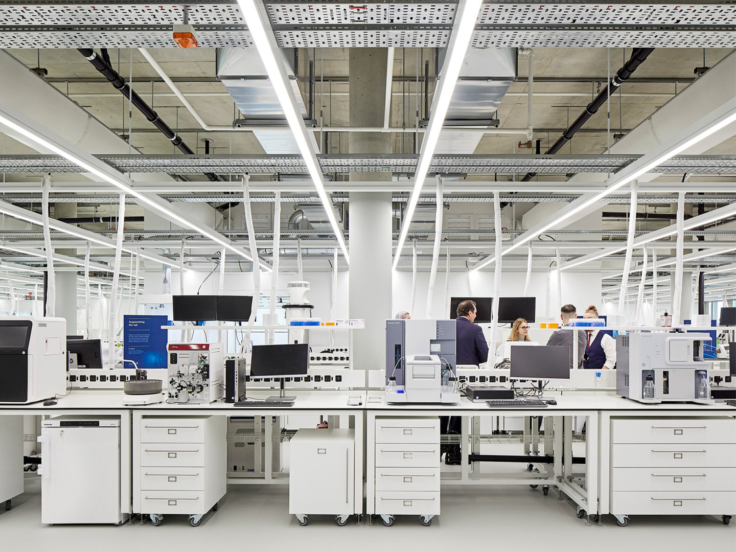
Running vertically through all floors of the facility, the rectangular glass boxes contain the laboratories – the building’s main programmatic element. Internally, the labs each allow multiple groups of personnel to work side-by-side at any given time, enhancing the collaborative nature of the work being done. The glazed perimeters of the boxes, where possible, promote maximum transparency through the building “making science visible for employees and visitors,” the architects explain.
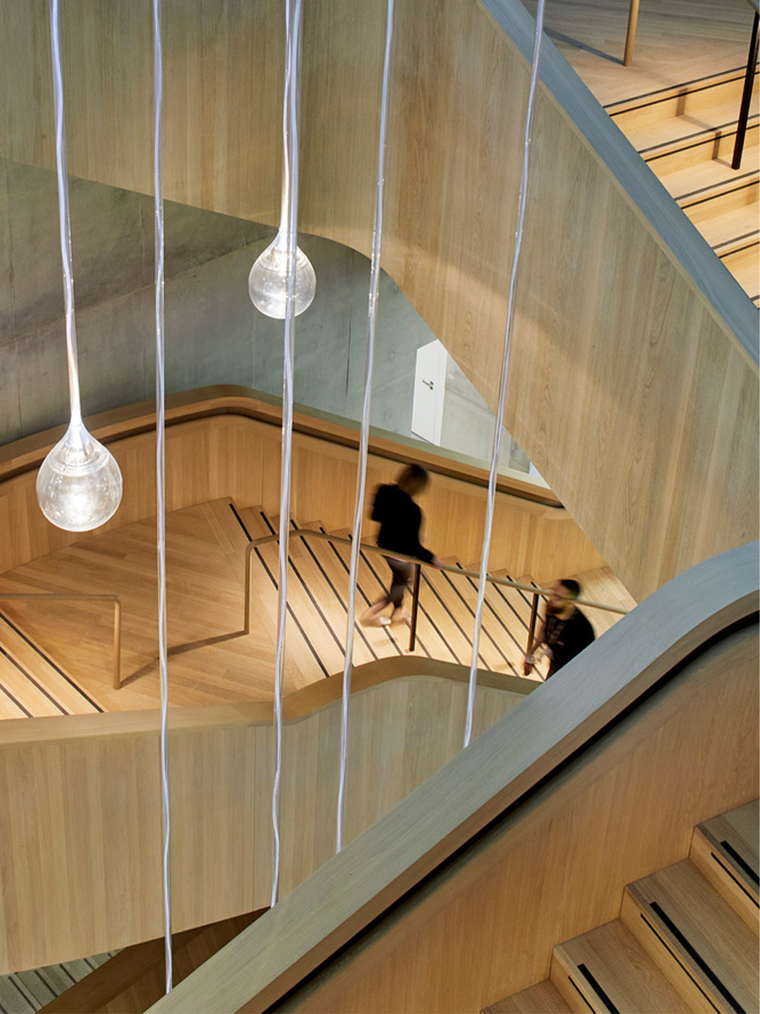
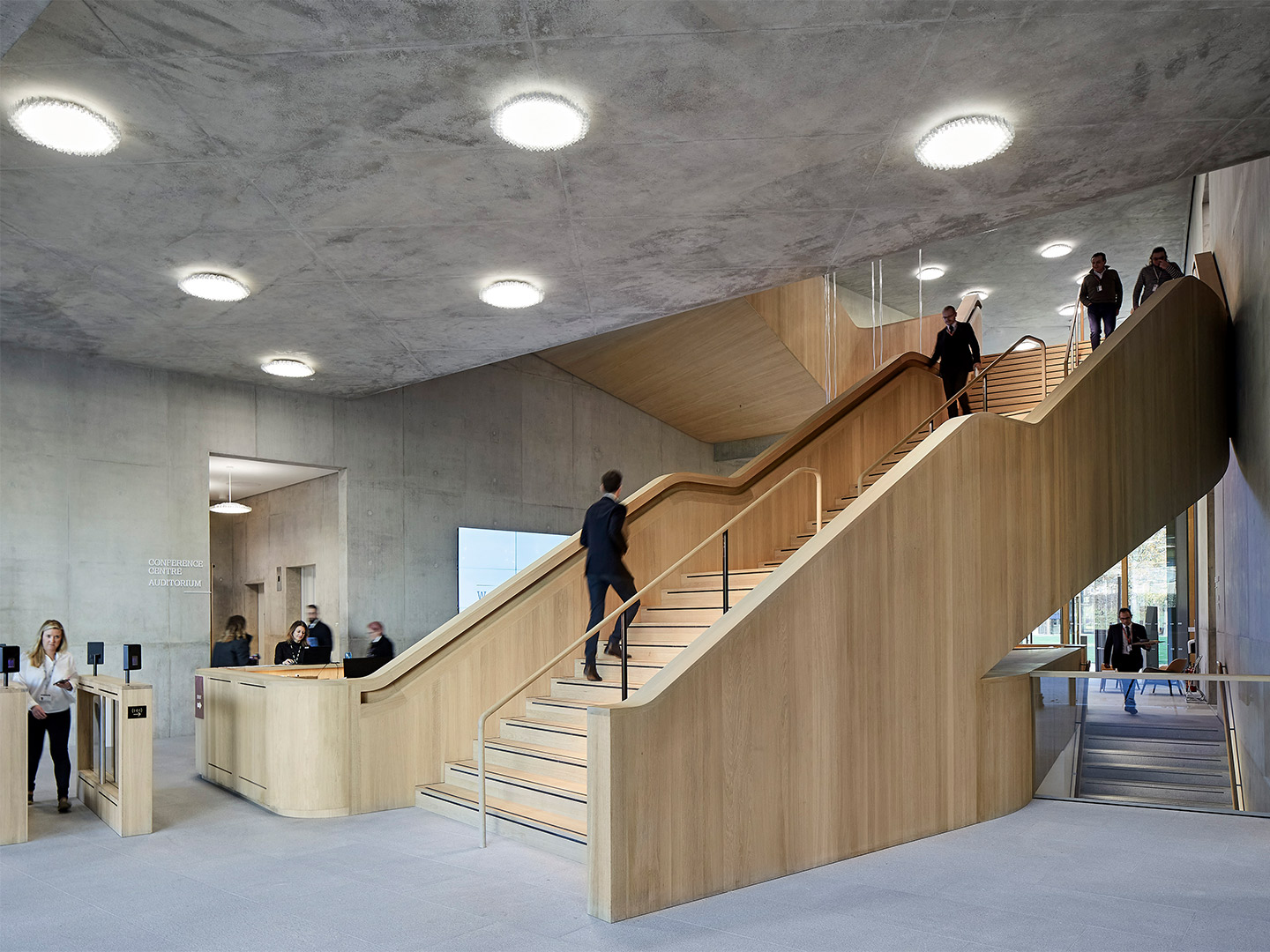
For the most-part, this openness is adopted throughout the building, offering AstraZeneca employees a range of alternative workplace settings, such as private study spaces and quiet booths, as well as informal collaboration spaces. Along the inner ring (the main circulation space that traces the inner courtyard on the upper floors), there are more complementary zones providing a range of diverse spaces for exchange, informal meetings and on-floor catering. All additional amenities – conference centre, auditorium, cafe and restaurant – are concentrated on the ground floor, afforded direct access from the main entrance to ensure they’re easily reached by anyone on campus.
The building’s material palette is kept to a minimum and typically varies only when used to provide clear distinctions between different programs. The floor materials, for example, reflect the functional organisation of the building. There’s natural stone for the entrances, rough sawn solid oak for the main stairs and inner-ring area, and carpet for the offices and write-up spaces. The floor in the laboratories is finished in continuous white resin. Allowing transparency and seamless transitions between areas, the main partitions within the building are full-height glass walls. Another key material is exposed concrete, revealing the construction method and structural core of the building.
The functional diversity required of The DISC means that each space is specific in its design and vastly different in atmosphere. The underground level contains support facilities, a loading area and plant zone; the street level is open and porous with both the amenities and science labs on display; the first floor of the “hovering disc” is connected through the inner ring; and the second floor is top-lit by the skylight of the saw-tooth roof. But despite the distinct work environments that inhabit each floor, the building, as a whole, appears as “one characteristic structure,” suggest the Herzog & de Meuron team. “It serves as a pivotal point for the entire CBC campus.”
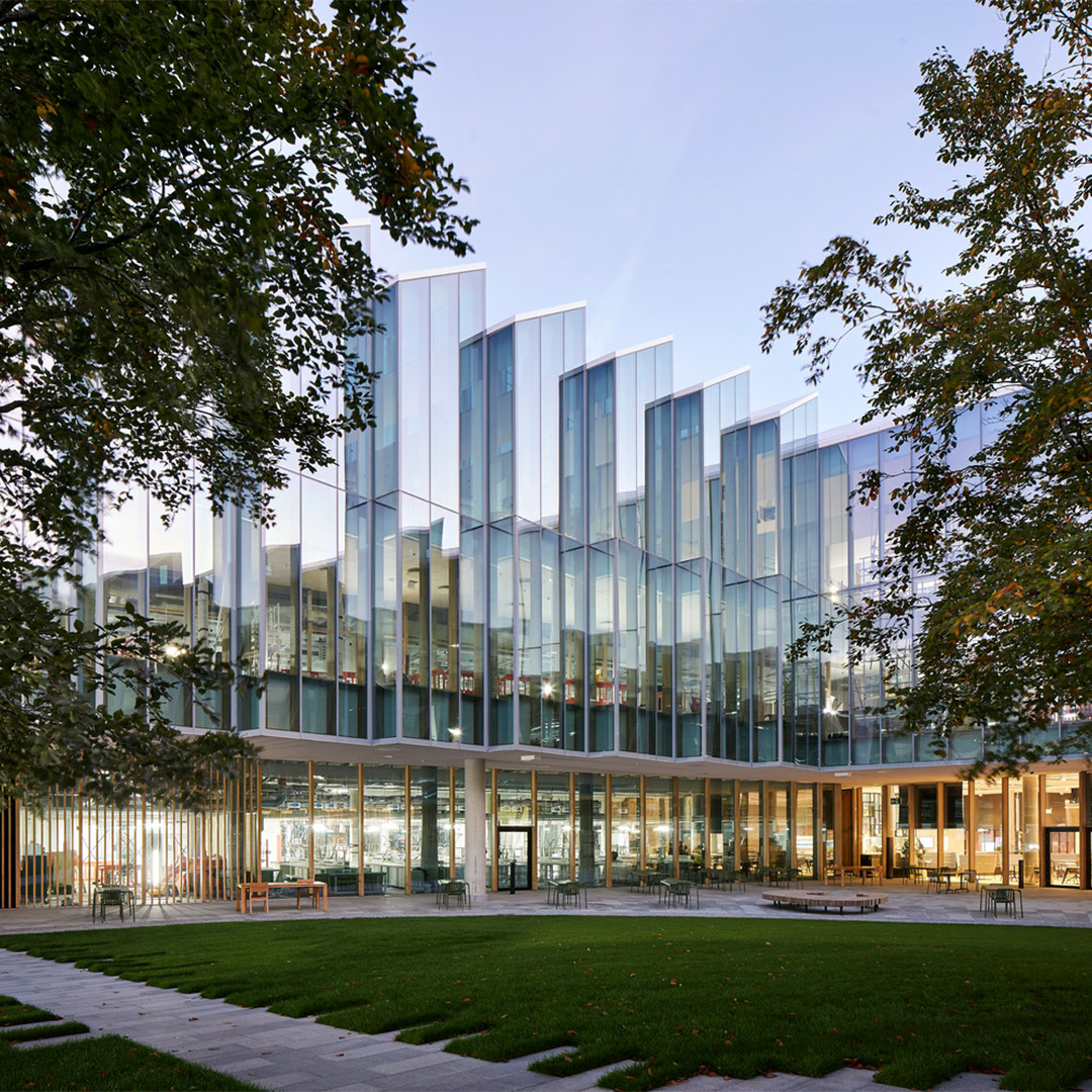
The building, as a whole, appears as “one characteristic structure,” suggests the Herzog & de Meuron team. “[It] serves as a pivotal point for the entire CBC campus”.
Catch up on more architecture, art and design highlights. Plus, subscribe to receive the Daily Architecture News e-letter direct to your inbox.
