The second of three spaces created by architects Patrick Kennedy and Rachel Nolan for Australian company Laminex seeks to challenge typical commercial office design. Titled ‘Workplace’, Kennedy Nolan’s eye-catching prototype showcases a curated mix of solid colours and natural textures alongside the firm’s uniquely sculptural approach to form-making. The workspace possesses two other qualities essential for a fit-out of its kind: a high level of durability and ease of maintenance, all made possible by the inherent qualities of laminate.
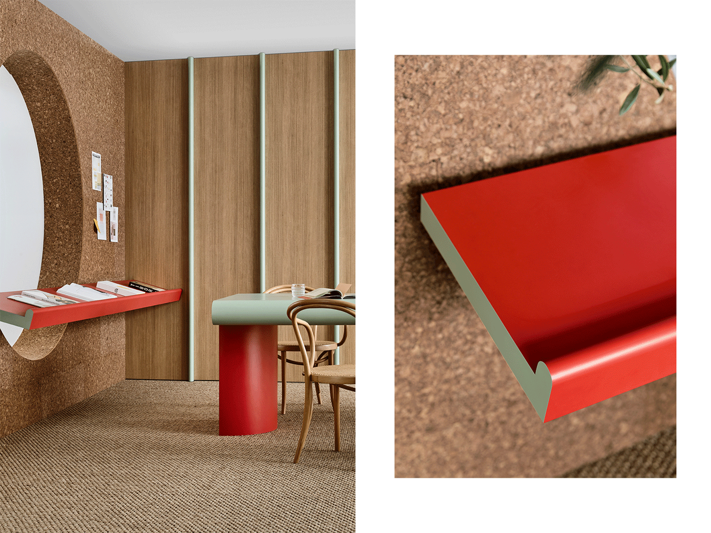
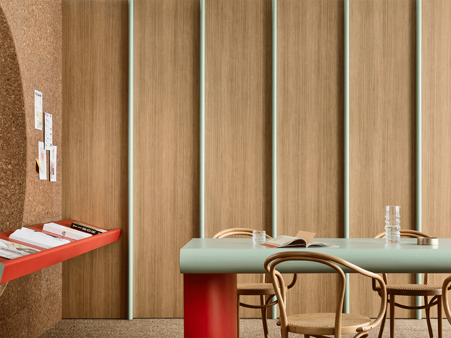
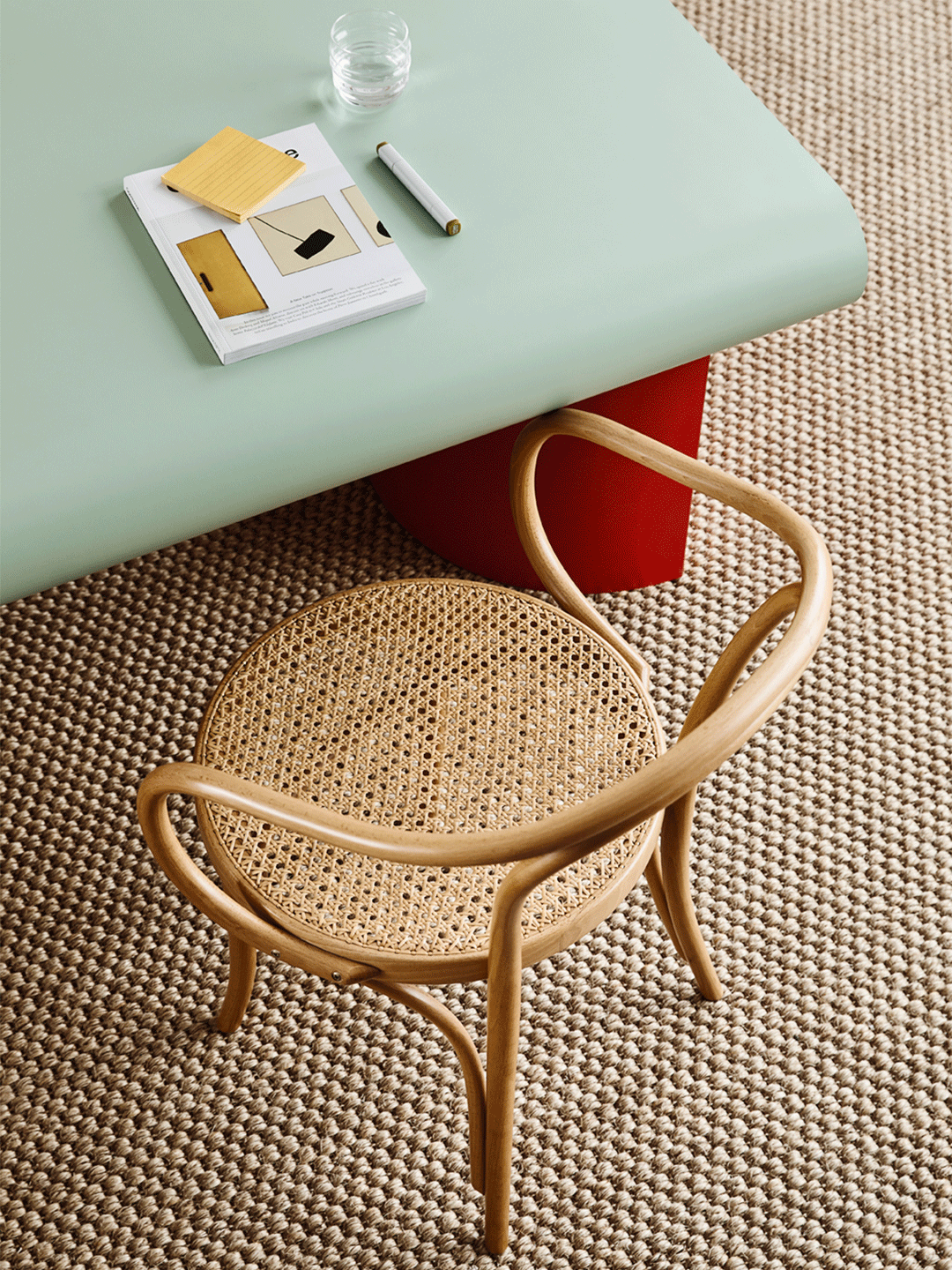
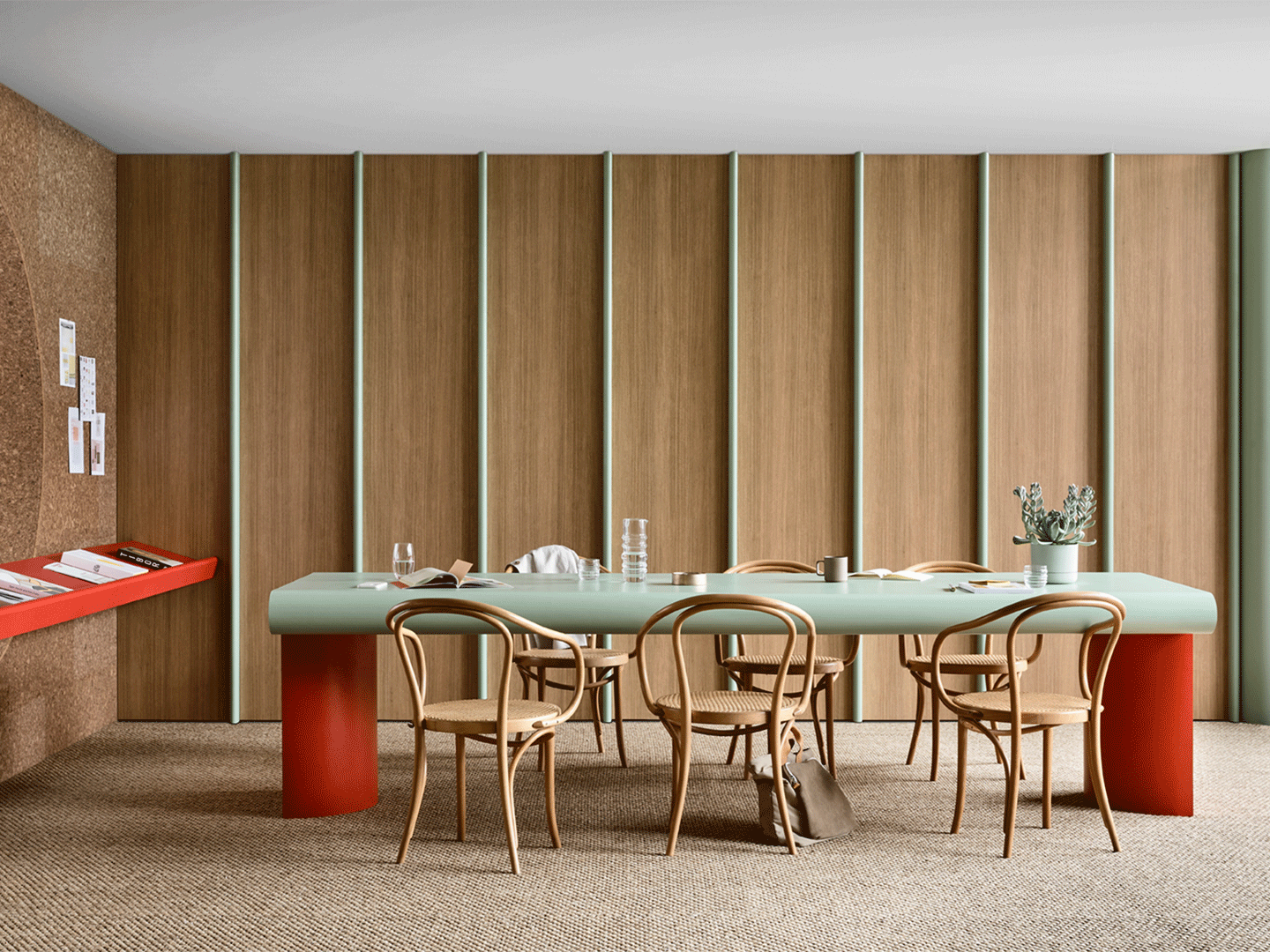
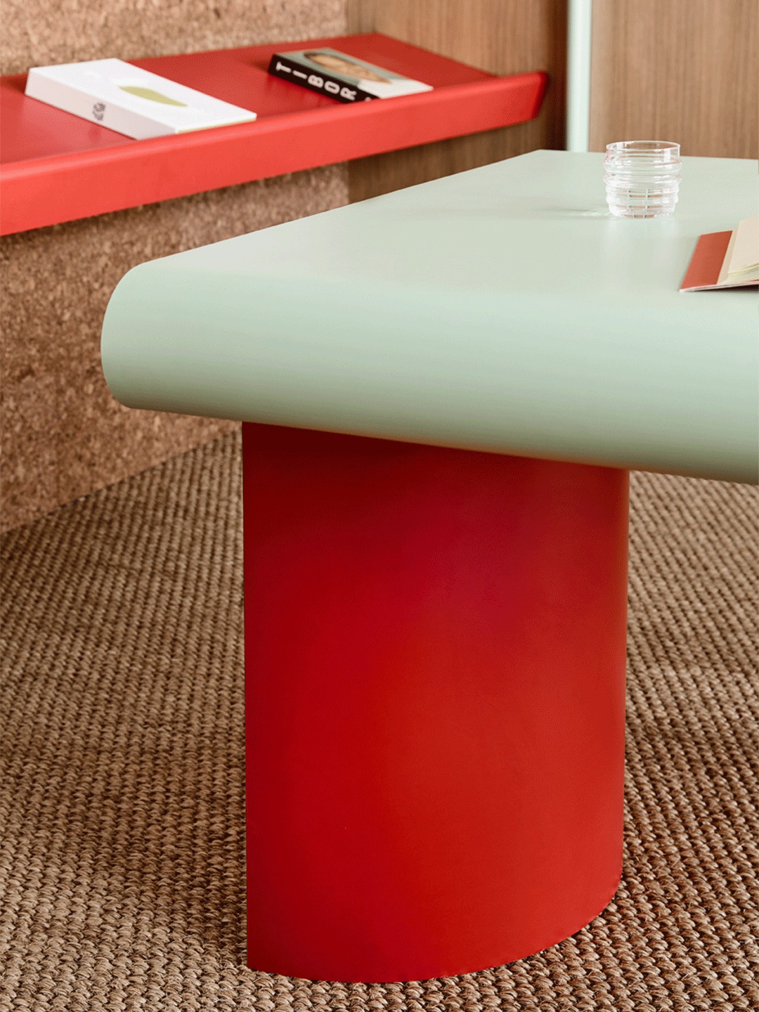
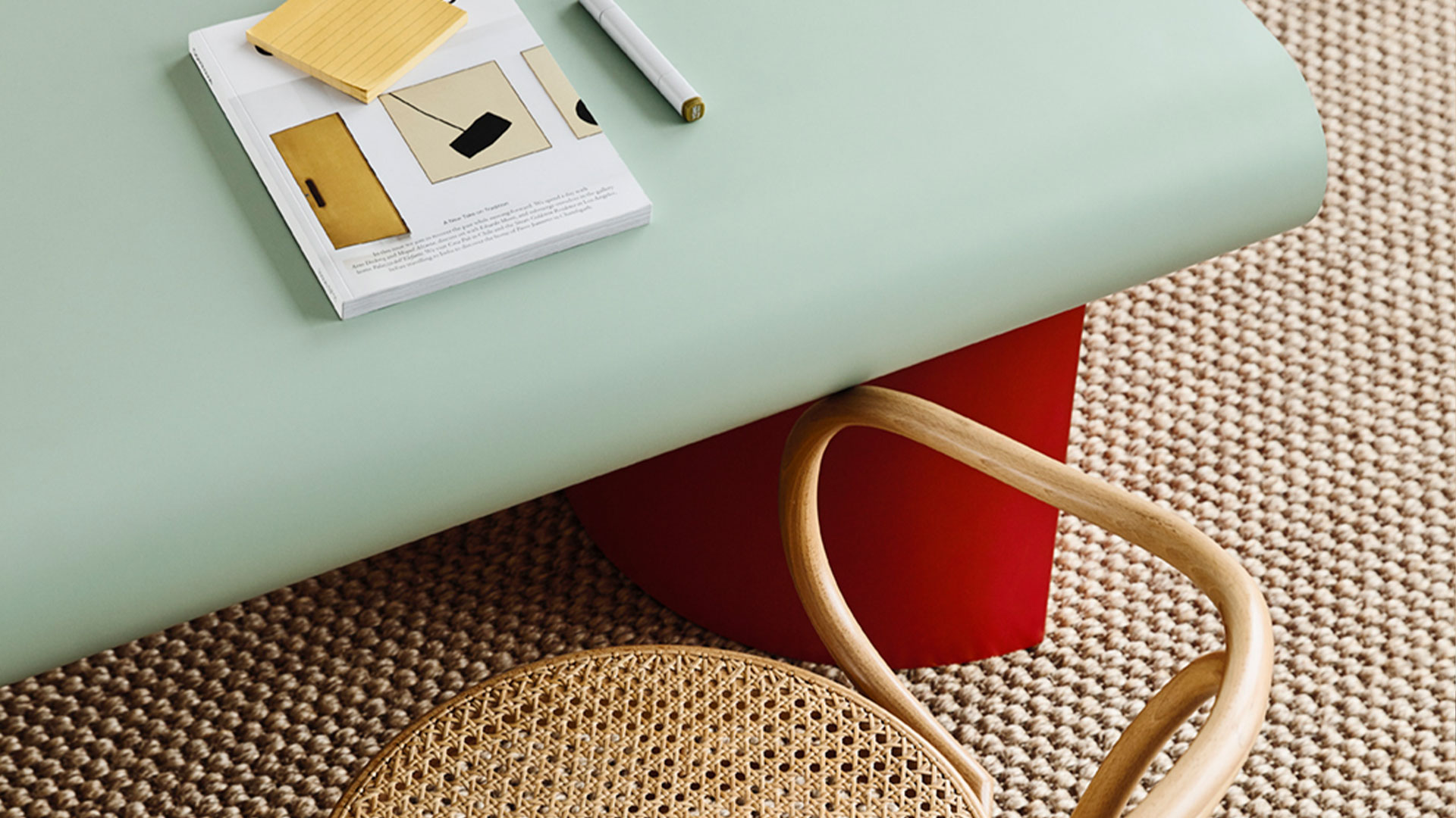
Crafted from pale blue-green ‘Enamel’ and luscious red ‘Pillarbox’ laminates, the meeting table is the hero piece of the space, conceived as a celebration of the material’s flexibility. The tabletop and drum-shaped legs were cold-formed into curved shapes, giving the table a softness and roundness that’s contrary to the rectangular formality of a typical corporate boardroom.
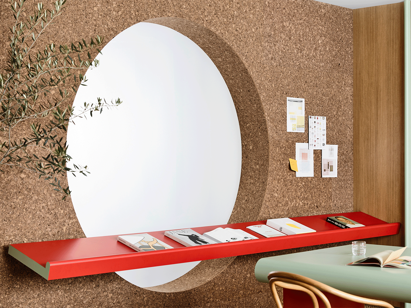
Created in reverse of the meeting table’s colour scheme, with ‘Pillarbox’ laminate on the outside and ‘Enamel’ as the “section”, the nearby display shelf features a delightful curved lip. This detail was created through the process of post-forming and enables the shelf to perform dual roles in a work environment. “If you’re laying documents out, it provides a really nice place to work,” says Rachel. “But it can also play a curatorial role, providing a focal point in the room for displayed items.”
Above the shelf is a circular cut-out – somewhat of a Kennedy Nolan hallmark – and the surrounding wall is clad in cork to form a large-scale pinboard, another place to display documents, inspiration and ideas. The cork’s subtle patterning is one of three natural textures that work together to imbue the space with a sense of calm.
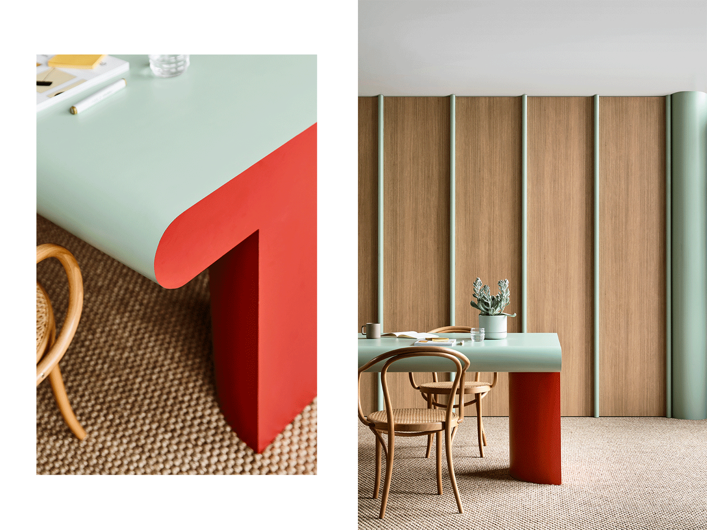
Beneath the shelf, the floor is covered in large-weave natural sisal carpet. To the side, a vast bank of storage is concealed behind floor-to-ceiling cabinetry doors in the authentic warm-toned woodgrain of ‘Sublime Teak’ laminate. The joinery is given contemporary rhythm by vertical handles post-formed in ‘Enamel’ laminate and presents more as a wood-panelled wall than practical built-in storage.
“There’s this kind of poetry, but then really practical qualities too,” says Rachel, of the ‘Workplace’ experiment. The shapes and palette are edgy and uplifting, the cabinetry and furniture facilitate contemporary ways of working and collaborating, and the natural textures and gently curved surfaces are comforting and relaxing.
As such, ‘Workplace’ responds to ideas about commercial interior design that are thankfully becoming more prevalent. Most notably that there’s a direct link between comfortable, welcoming, energising workspaces, and productivity.
