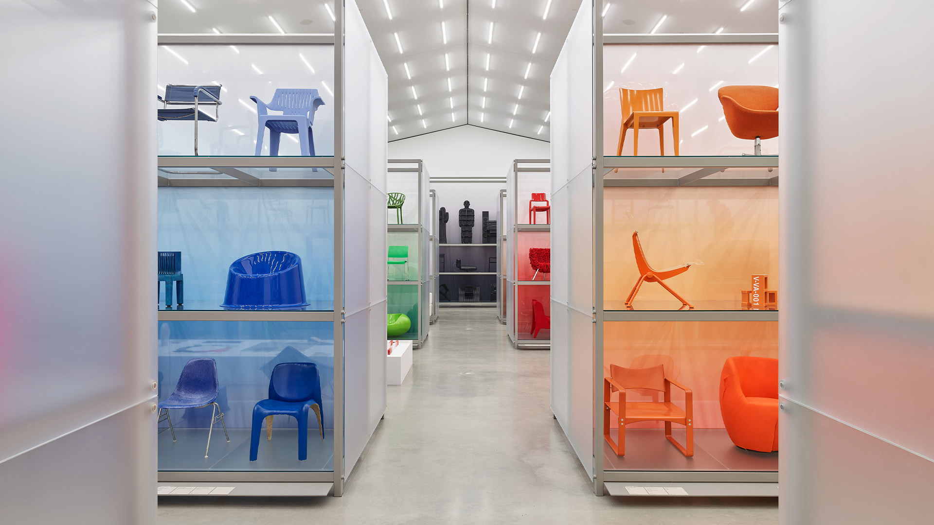

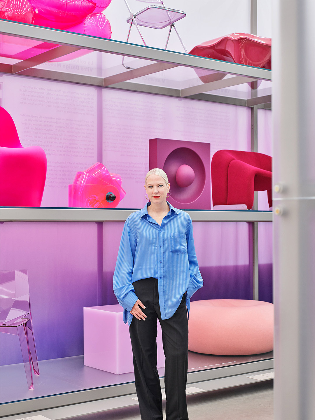
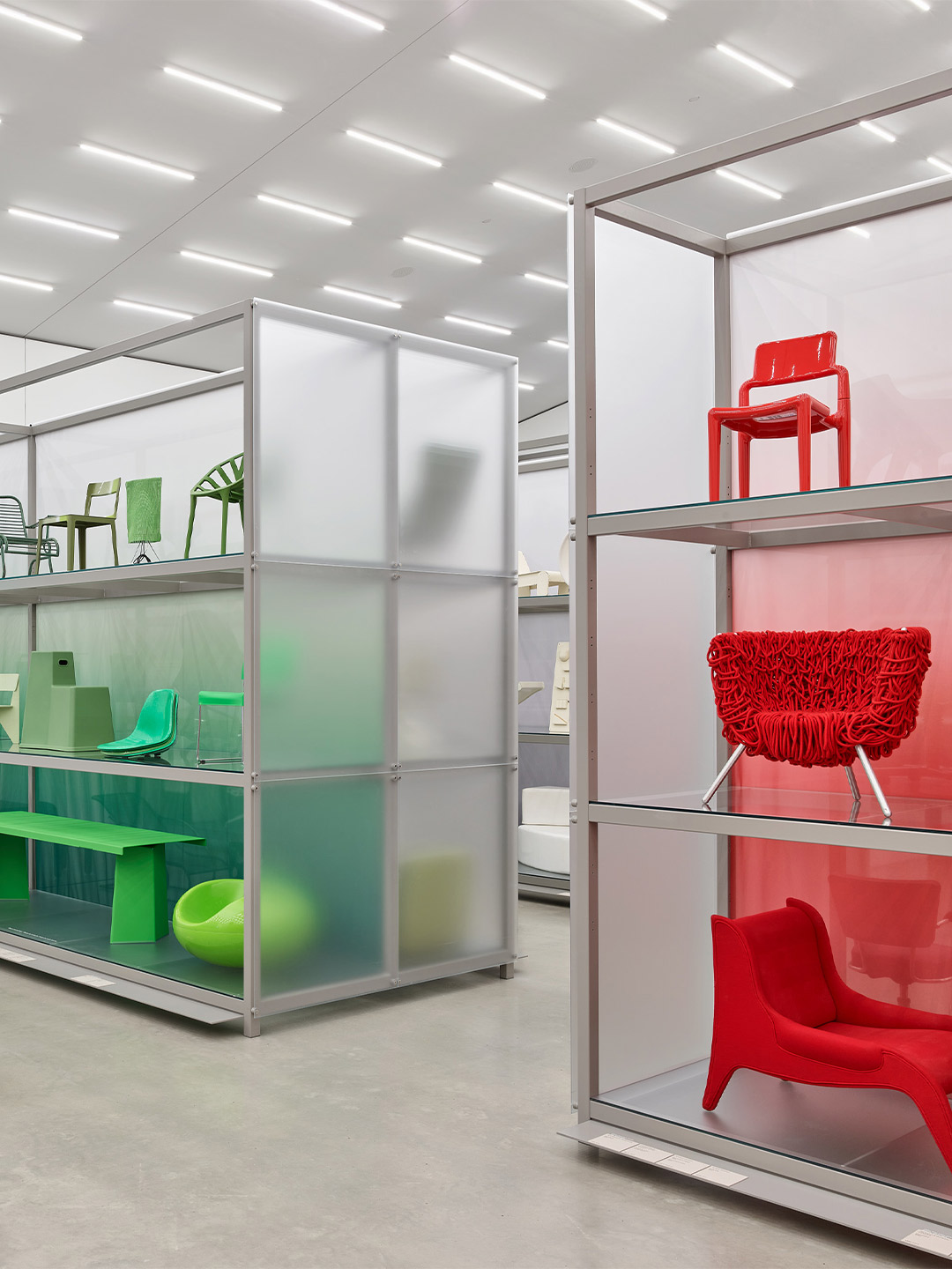
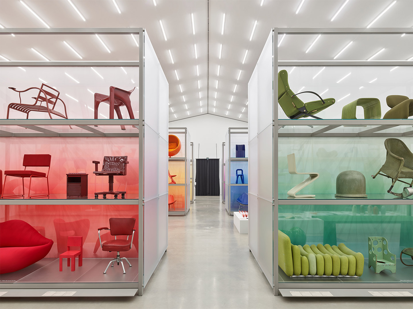
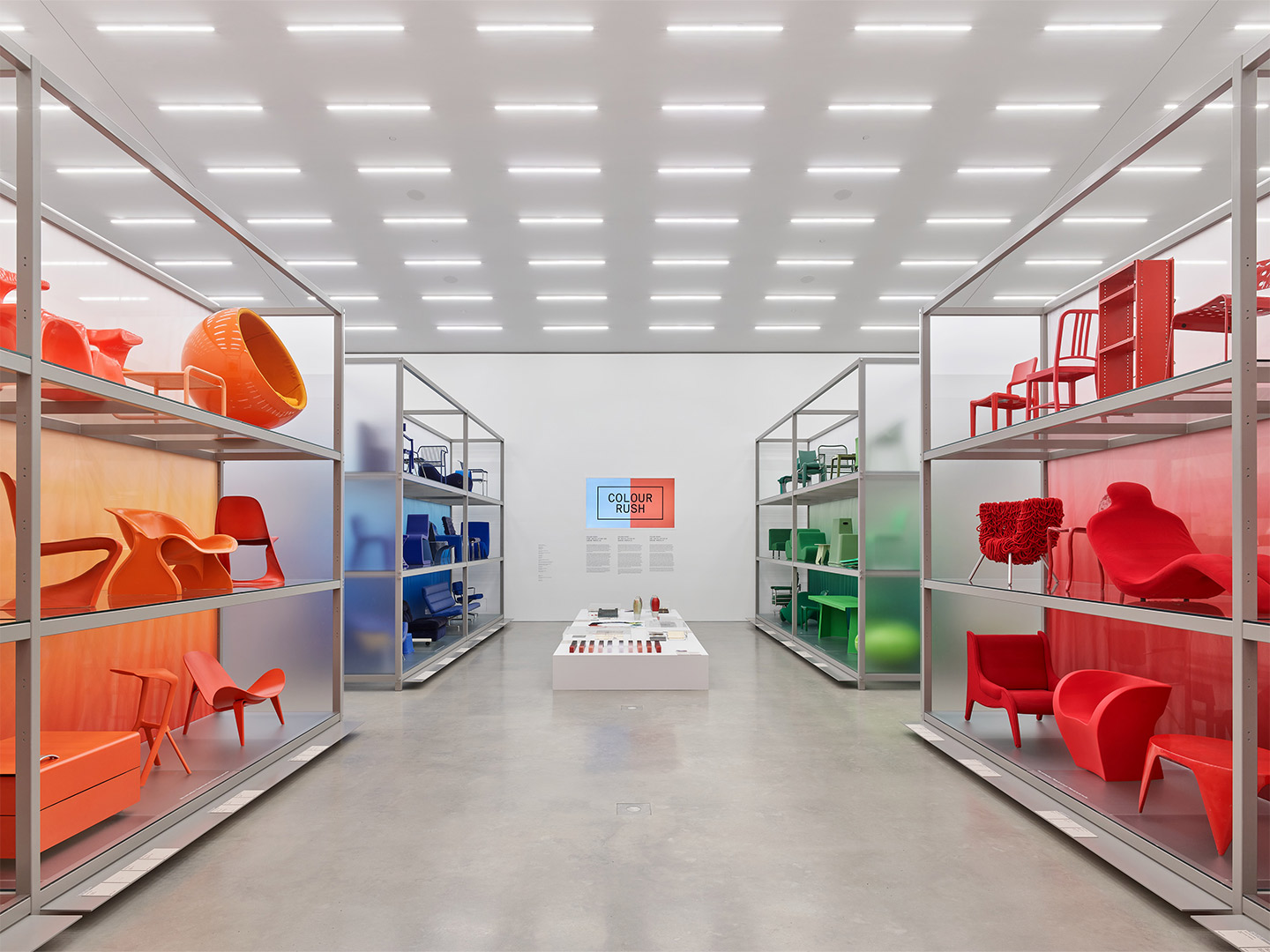
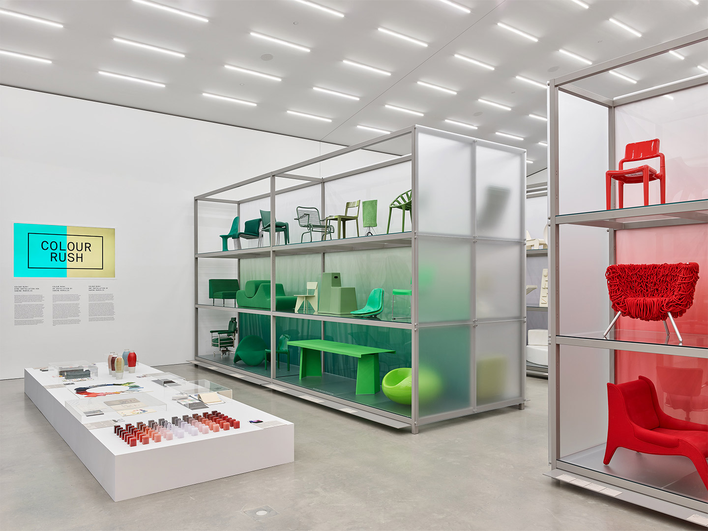
From blazing fuchsia and rich berry to saccharine fairy floss, pink is on show in all its bright and bubbly glory until May 2023 at Vitra’s new Colour Rush! installation in Weil am Rhein, Germany. So too are shades of green, with fern and icy spearmint alongside furniture and objects in blood red, cherry and full-bodied burgundy.
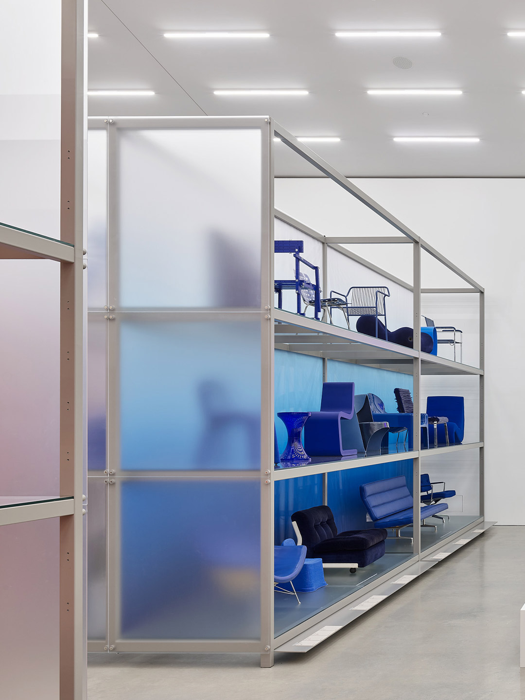
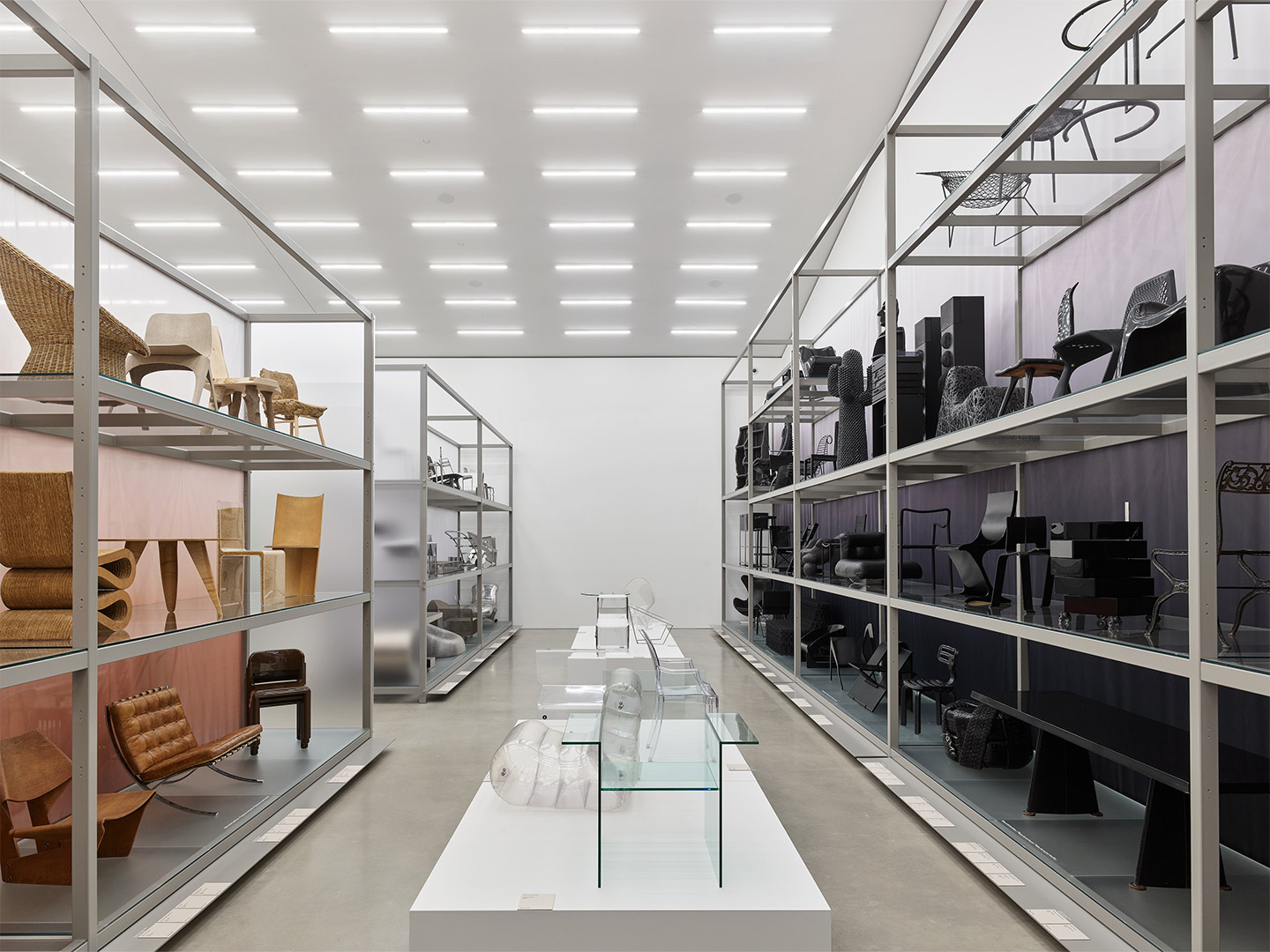
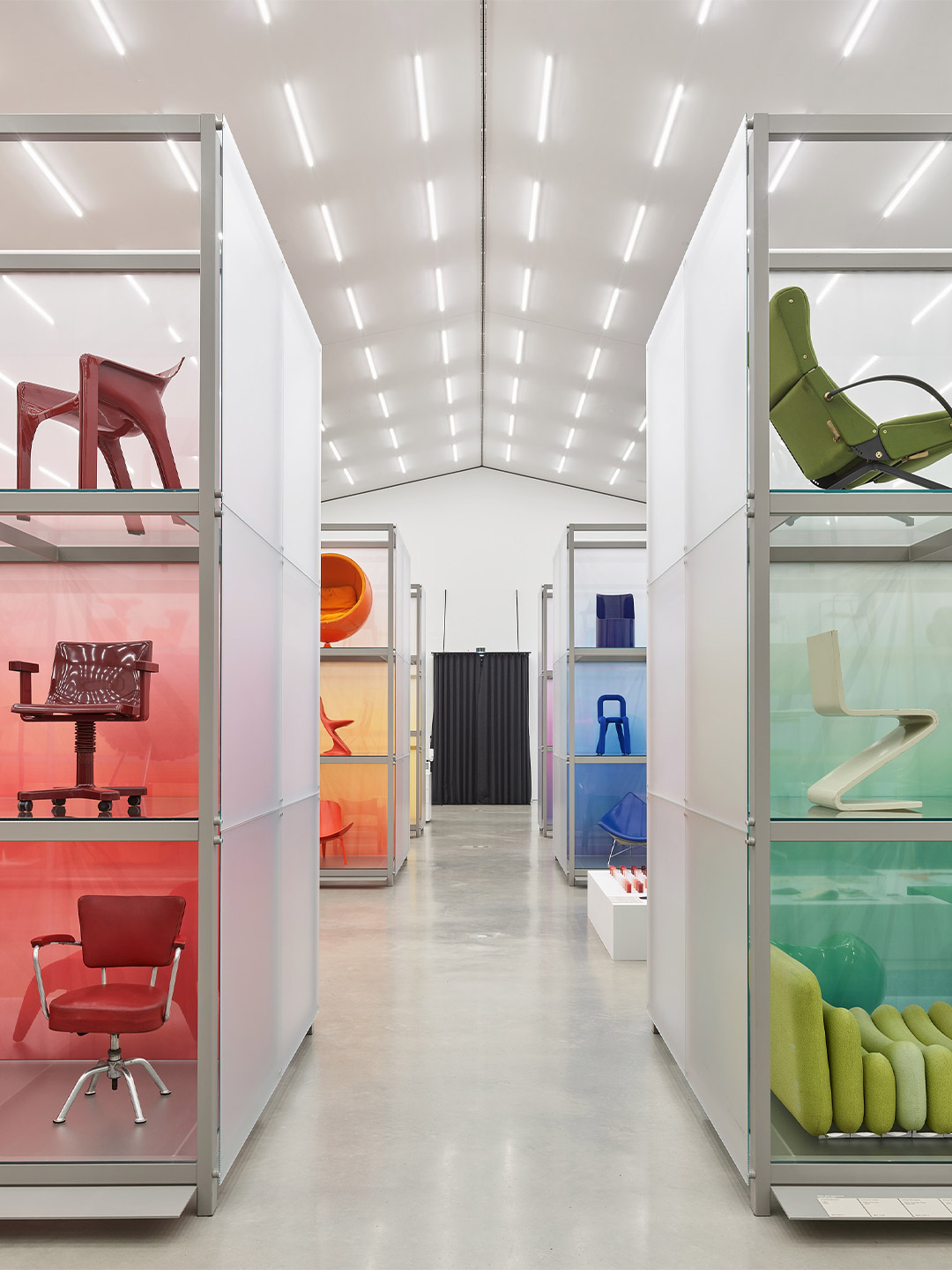
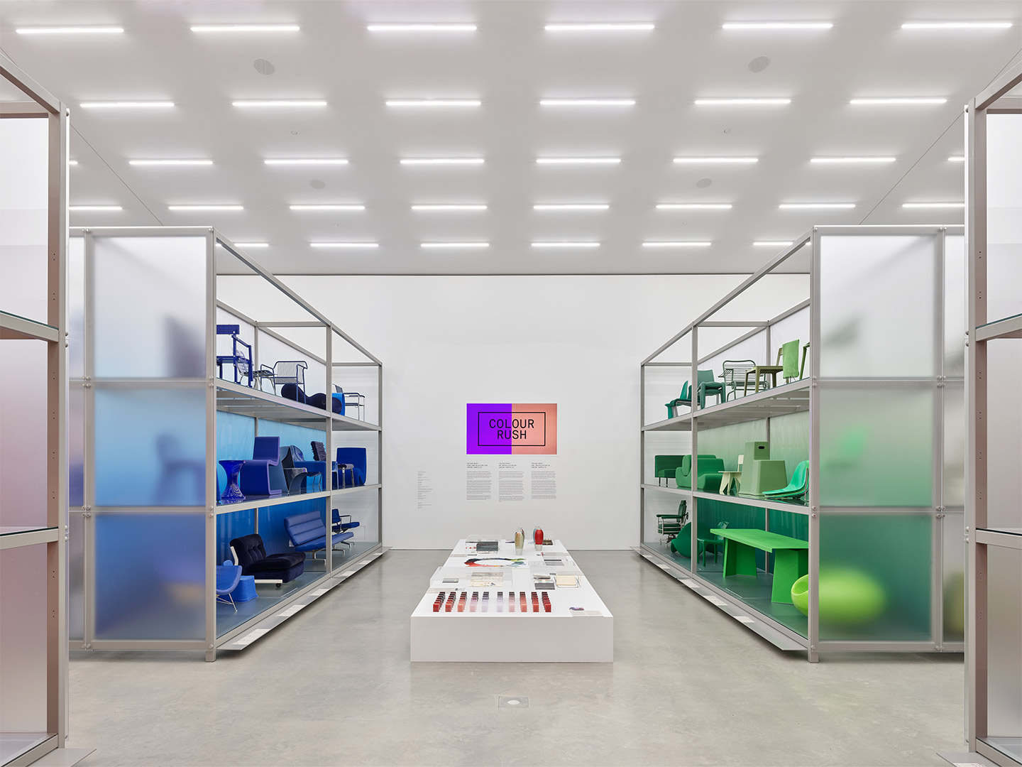
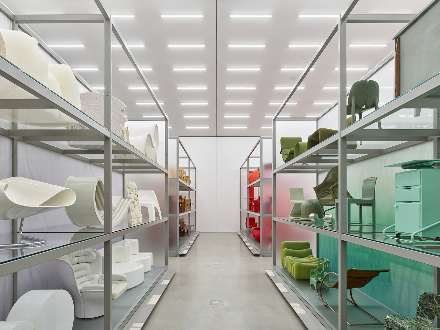
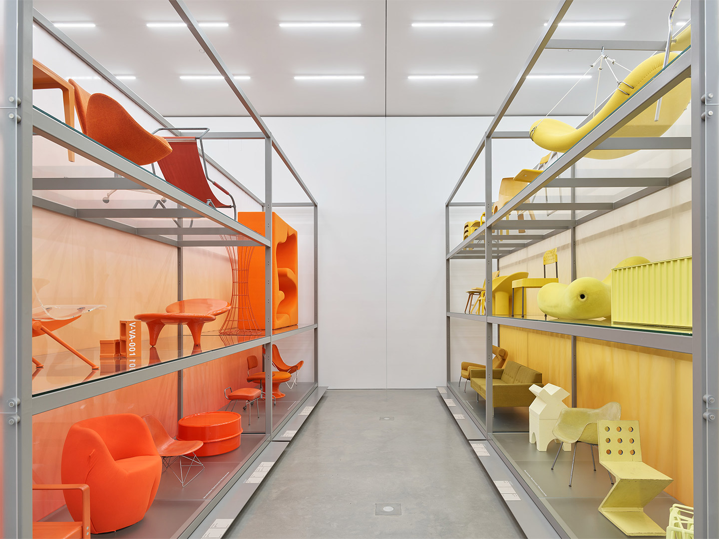
Curated by New Zealand born, Rotterdam-based designer Sabine Marcelis, the exhibition categorises 400 iconic historical and contemporary objects and furniture pieces from the archives of the Vitra Design Museum by colour group. When assembled together, the nuances of tone become more evident and the display intensifies how hues contrast and intensities shift depending on material and surface. Presented side-by-side, gradients appear overwhelmingly apparent as they dance and refract across everything from fabrics to fibreglass.
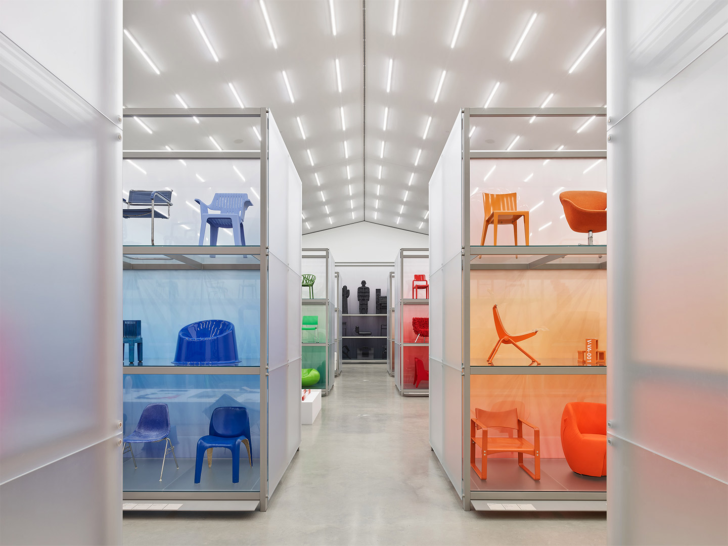
Sabine Marcelis x Vitra: The Colour Rush! installation in Germany
The exhibition, arranged on large translucent shelves, is an immersive one with viewers encouraged to consider how colour triggers emotion, particularly when it comes to the home, furniture and the interior environment. While traditional theories suggest that muted colours denote cosiness, vibrant hues stand for unconventional attitudes and unpainted surfaces express a minimalist philosophy, Colour Rush! posits whether colour is a science or intuition.
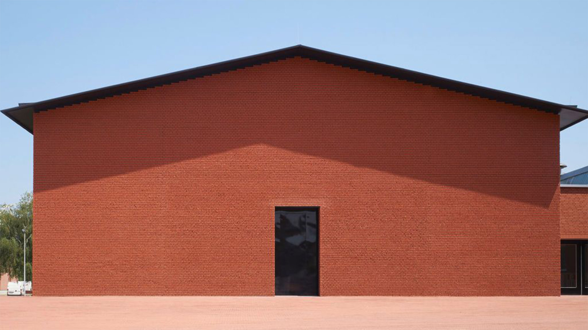
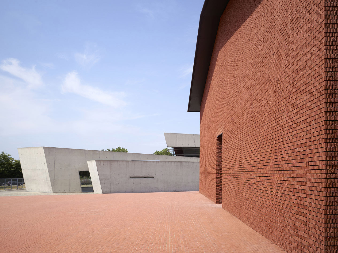
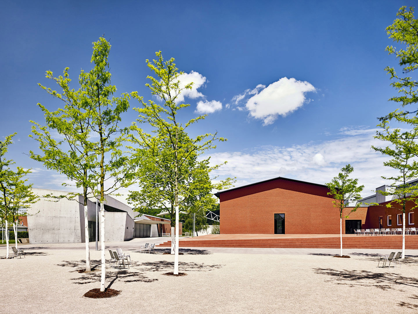
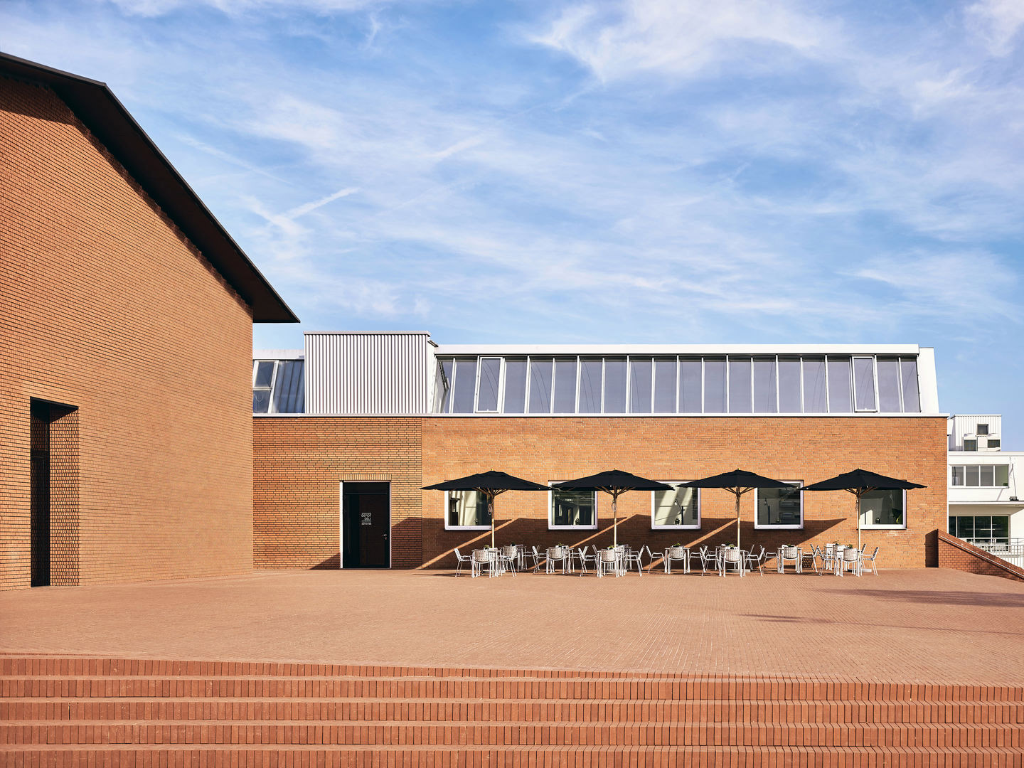
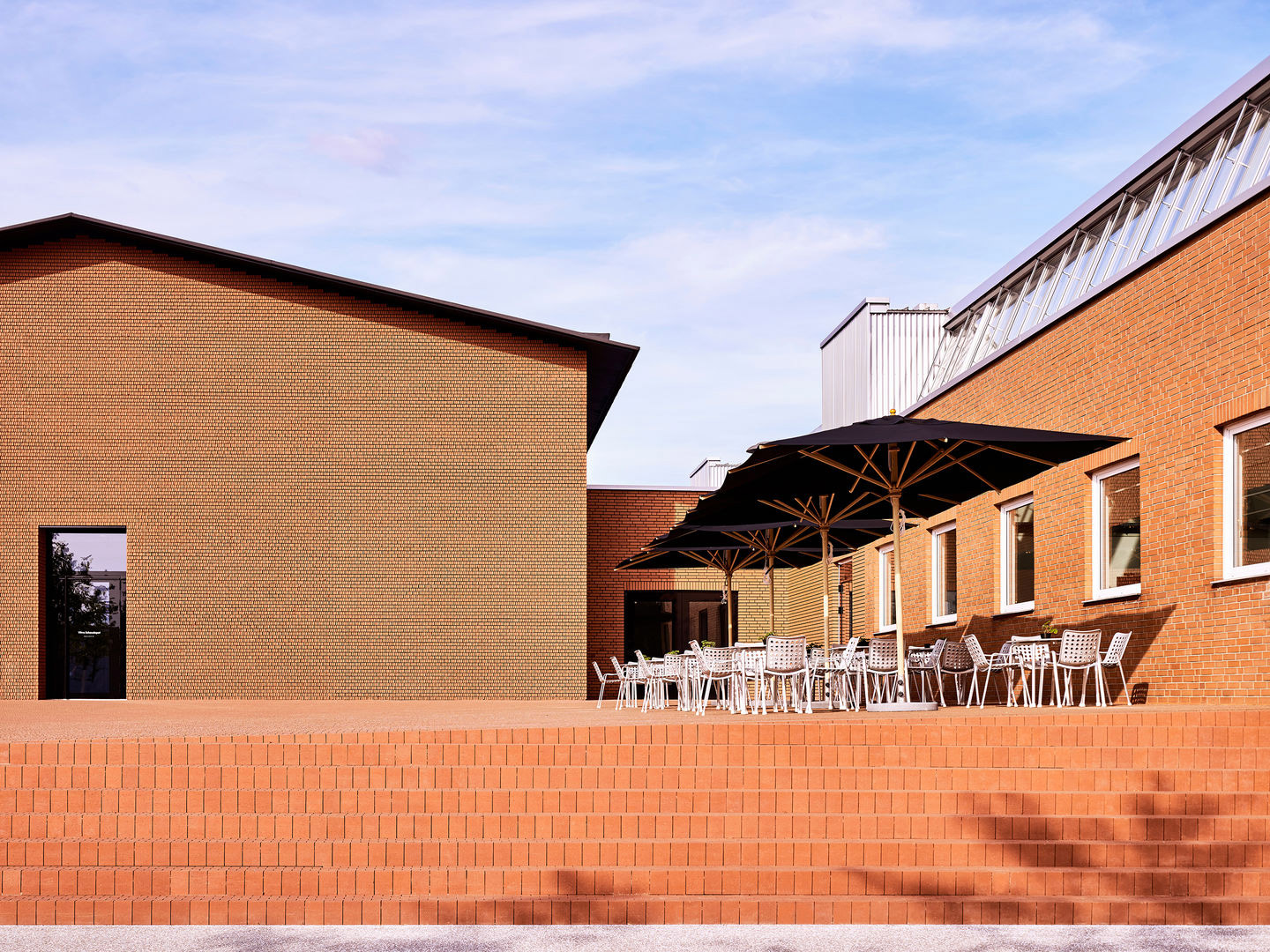
On show at the Herzog & de Meuron-designed Vitra Schaudepot which houses hundreds of pieces and the estates of several prolific designers, Colour Rush! also has an academic focus. Looking to the examination of colour by a raft of designers who have developed their own unique theories and standardised methods for sorting and identifying colours by their various qualities and characteristics, well-known examples such as RAL, Munsell and Pantone Matching Systems are on display too.
Lifted from Vitra’s comprehensive archives are detailed sketches, sample books and records by colour visionaries: Le Corbusier, who devised a palette of carefully graded shades; Alexander Girard, renowned for his graphic textiles; Verner Panton, whose bold colours communicated the hippie vibe of the 1960s and ’70s; Yves Klein, who trademarked his own Yves Klein Blue; and Hella Jongerius, celebrated for her career fusing distinctive high- and low-tech, and her work developing Vitra’s Colour & Materials Library, a system that enables the versatile combination of different materials throughout the Schaudepot’sextensive product collection on the Vitra Campus.
With Vitra’s vast archive at her disposal, Sabine took her pick of iconic historical and contemporary objects, traversing periods and styles to produce a sizeable installation where legendary pieces such as Eames fibreglass armchairs in sunshine yellow sit alongside Ettore Sottsass’s vivid red Olivetti typewriter, Naoto Fukasawa’s ergonomic tangerine chair, and Sabine’s own pastel pink polished resin Candy Cubes. It’s a rainbow feast for the eyes, but also for contemplating how colour elicits emotion for all of us.
From blazing fuchsia and rich berry to saccharine fairy floss, pink is on show in all its bright and bubbly glory at Vitra’s new Colour Rush! installation.
Love the Vitra Colour Rush! installation in Germany by Sabine Marcelis? Catch up on more hospitality architecture and design and retail design, plus subscribe to receive the Daily Architecture News e-letter direct to your inbox.